When Cleo and McShane Murnane of Project M Plus built their home, they knew they wanted to carve out space for an attached studio apartment. Whenever parents come to visit or friends need a place to stay, this apartment is here for exactly that. When it is not occupied by guests, they list it on Airbnb so it needed to be functional for short-term living while also paying homage to their style and aesthetic. What you are about to see is 325 square feet of beautiful, practical design. And fun fact: many years ago when this space was first built, Emily and Ginny Macdonald helped with the design by sourcing furniture and decor. So suffice it to say, this is a project close to EHD that we are thrilled to finally showcase.
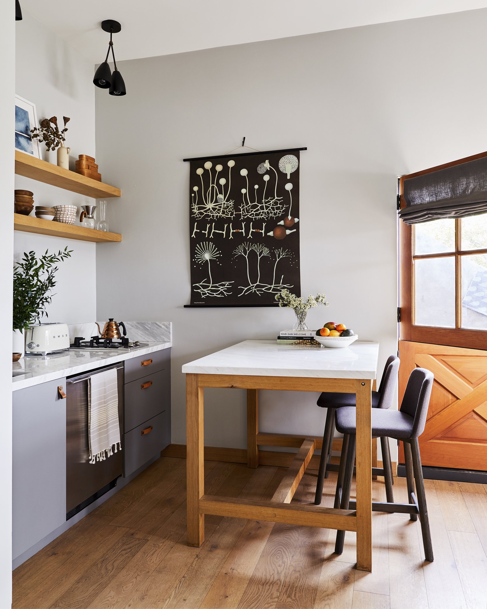
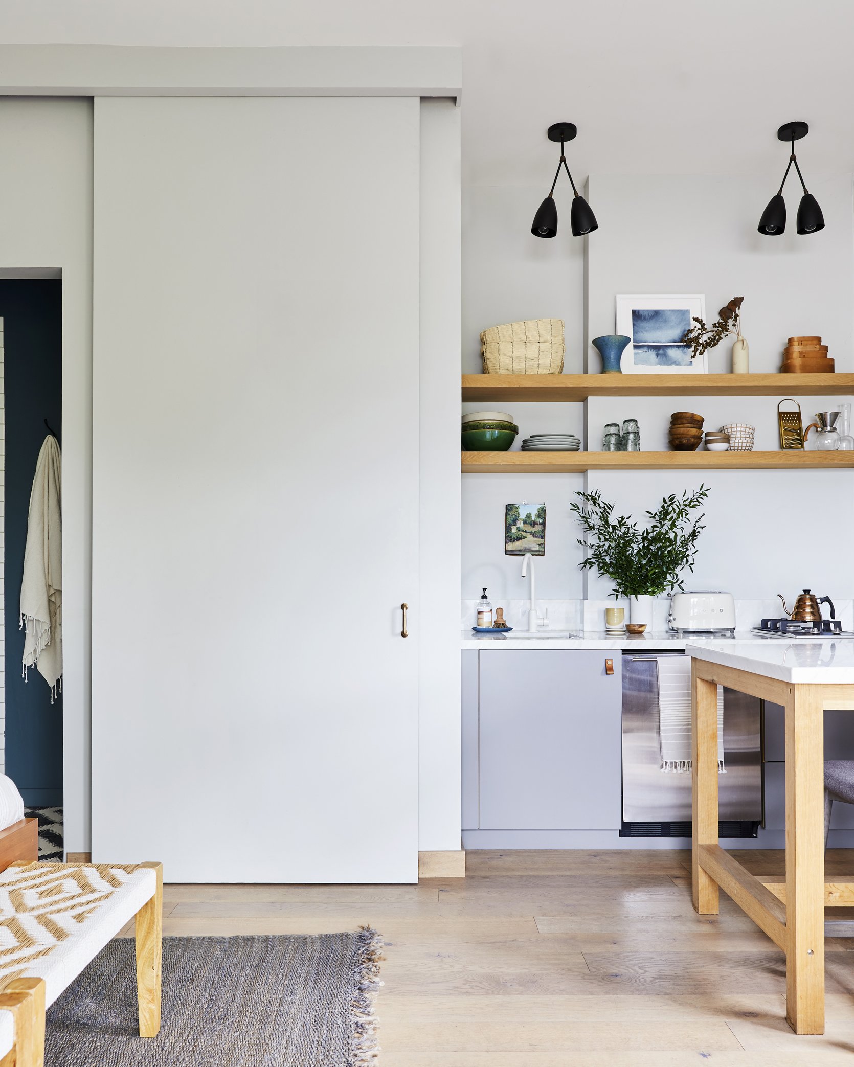
From the jump, Cleo and McShane knew they wanted the studio to feel like a calm, restorative place. To create this effect, they focused on light finishes and colors that complement each other to evoke ease and tranquility. The walls have a light gray limewash to inspire a sense of calm, and the furnishings and decor are practical, elegant, and simple. Functionally speaking, the kitchenette is equipped with everything you would need for short-term living. A small stove top with two burners, a dishwasher, a sink, and a table that can act as more counter space, a dining table, or a WFH desk. Finally, open shelving stores the dishes and other kitchen utensils, and lower cabinetry offers closed storage.
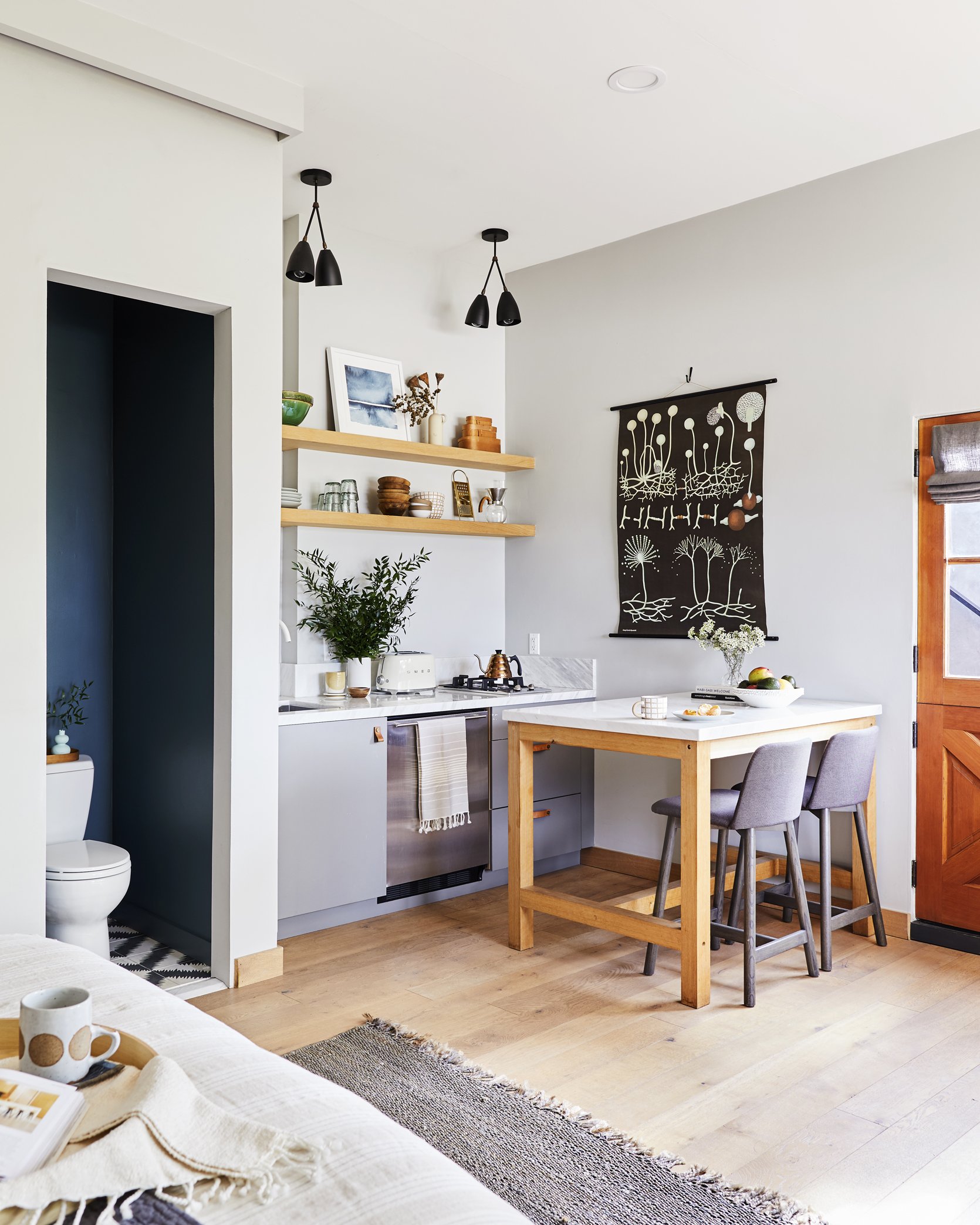
When planning the layout, it was important to them to leave as much square footage open, which is why they opted for functional furniture that wouldn’t take up a ton of space. The kitchen “island” is not built in so it can pull away from the wall to accommodate more guests or stay put for kitchen prep. I really love how they matched the marble tabletop and countertop to create continuity.
And now onto the awesome water closet…
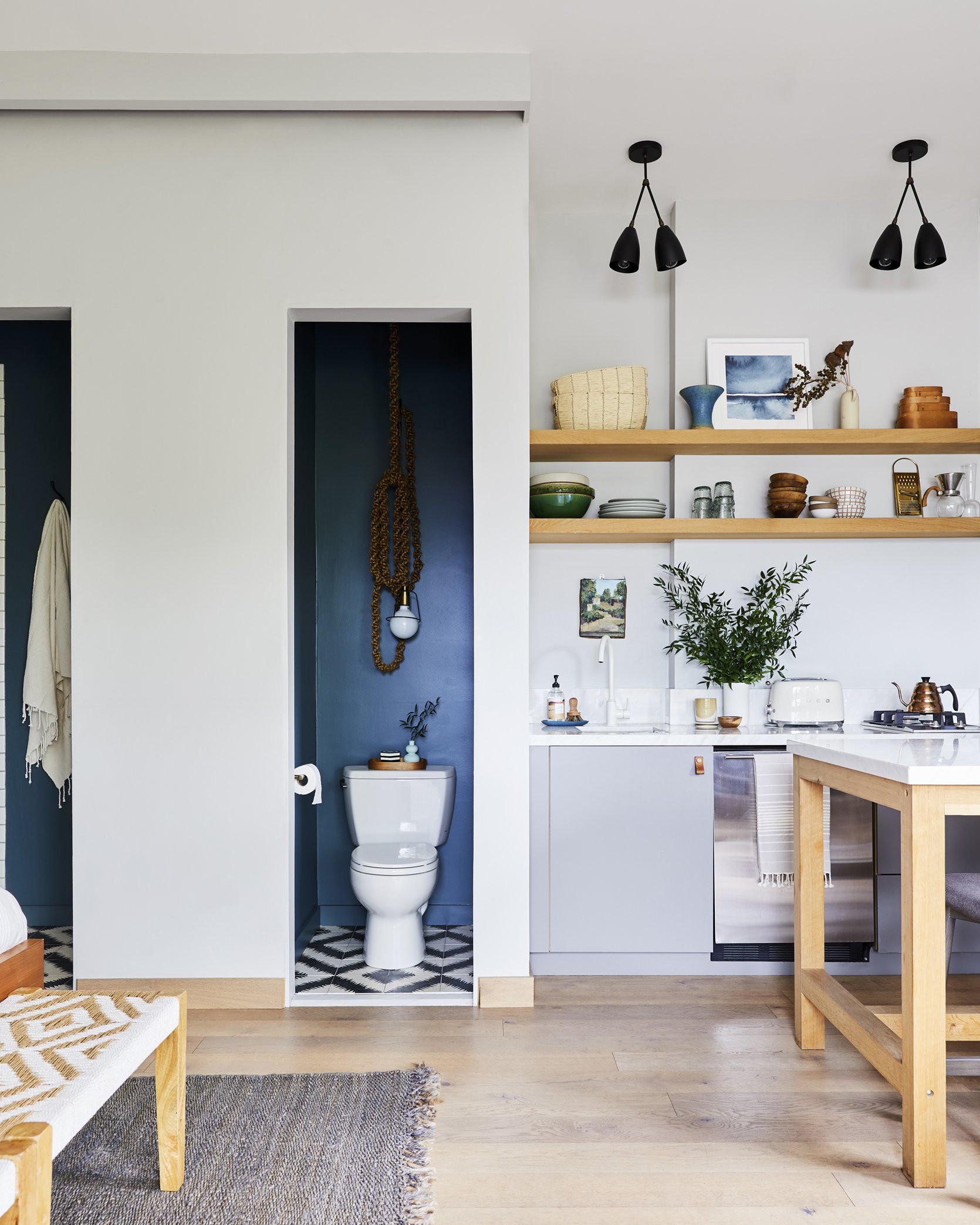
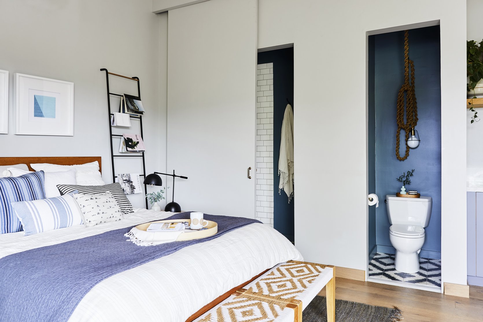
This is one of the most innovative “design risks” I’ve seen, but it was actually done out of necessity more than anything else. The single shared wall was the only place they could set up the kitchenette and the bathroom plumbing so they had to be creative when carving out the space. Instead of creating a full powder room, they separated the toilet from the sink and shower and arranged them where a closet would normally be. This layout saved SO MUCH space. The closet door slides over to provide privacy but one side is always uncovered so the pops of blue paint color are always visible. Also please note the incredible hanging rope pendant light! It adds a touch of drama to accent the bold walls. They sourced it from Lawson-Fenning but it’s no longer available there (but I would never leave you hanging (HA) so I found similar versions here and here).
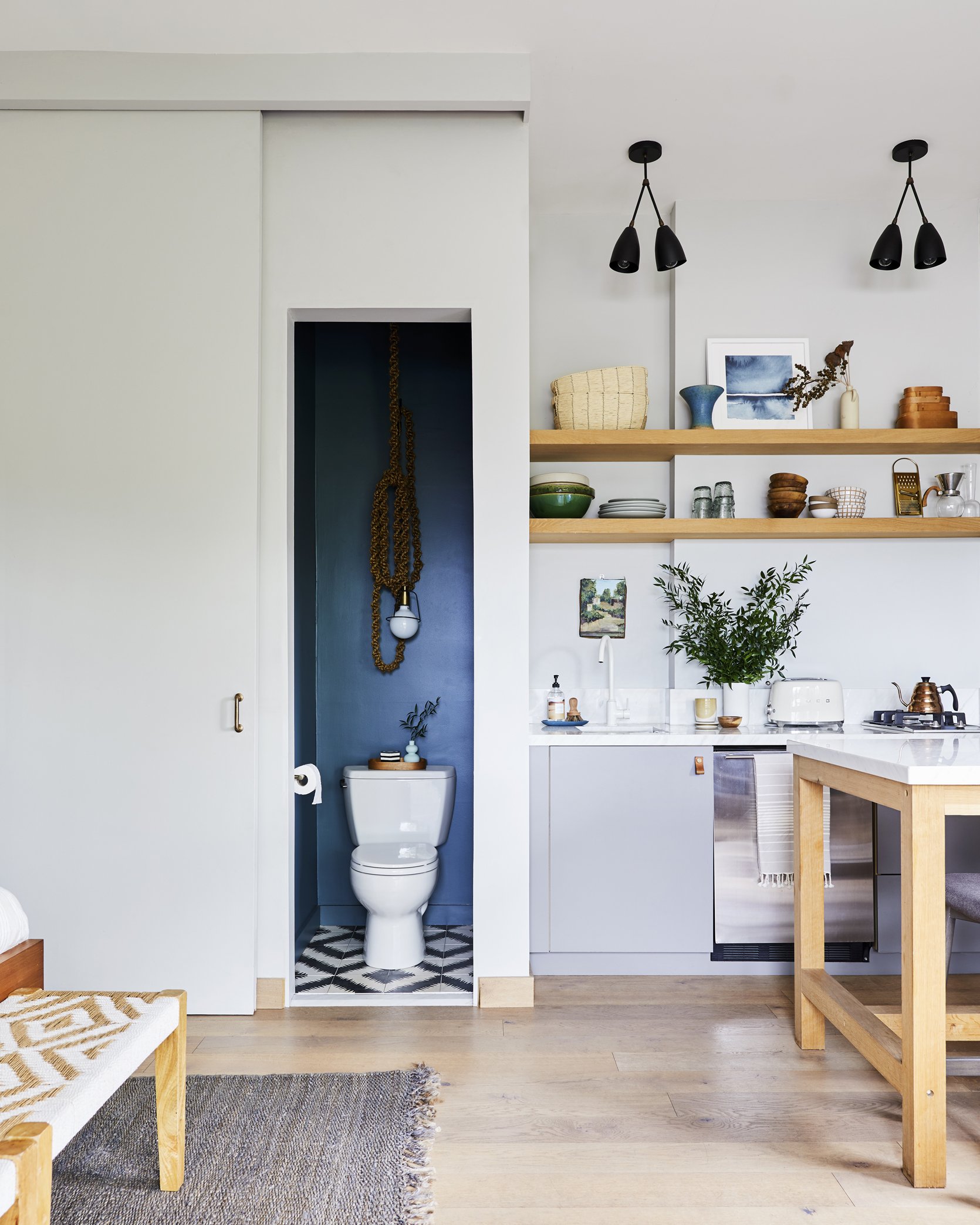
As you can see the door slides over which then opens up the separate area where the sink and shower are. I really love how the blue paint pops and creates a subtle yet impactful design moment.
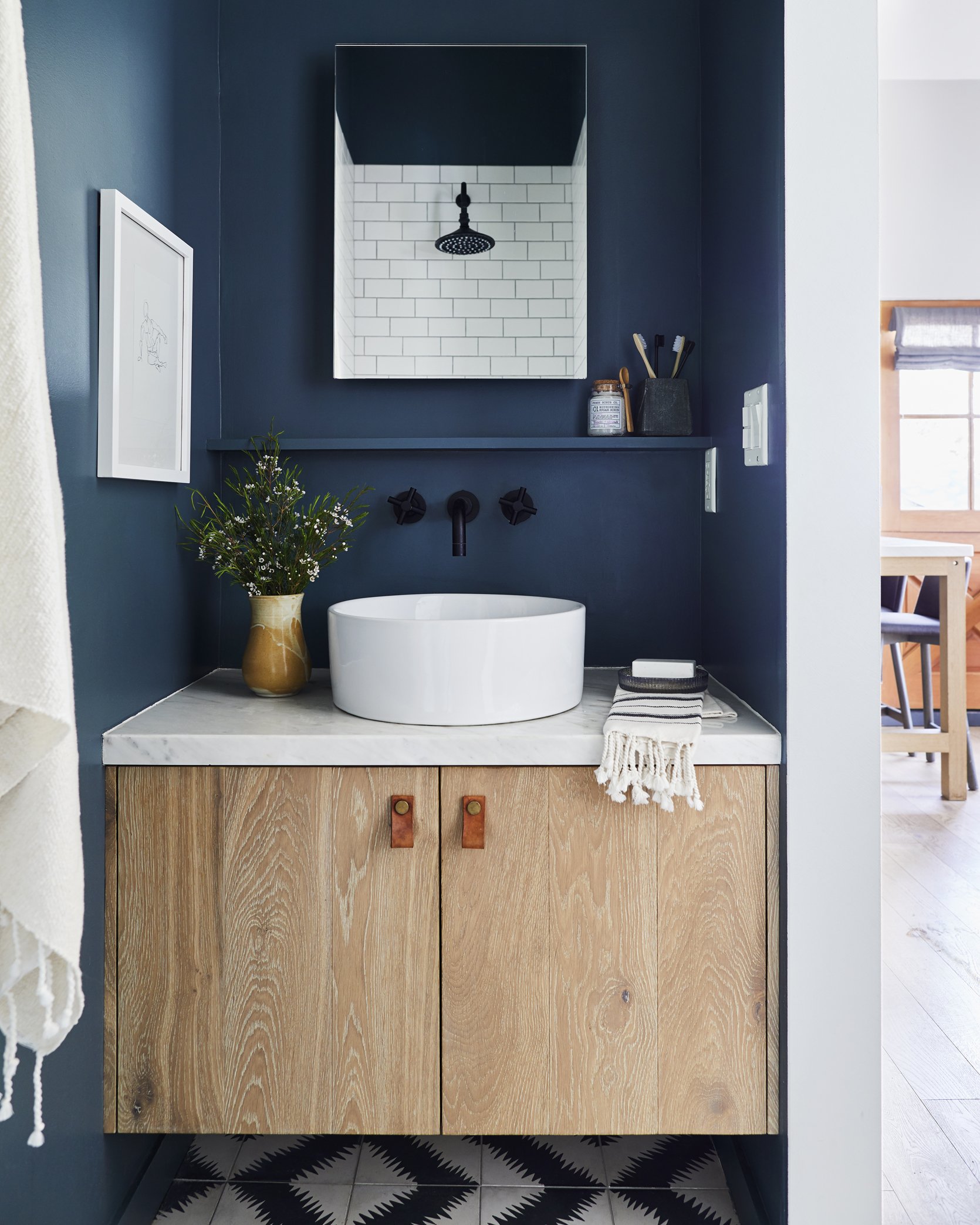
In the sink and shower room, they really made the most of such a small space. A small shelf creates open storage for toiletries and the built-in vanity has a closed storage underneath. The vanity was actually built by Cleo’s dad (who helped with a lot of the construction for this project) from leftover pieces of wood flooring. The shower lives opposite the sink and is properly mechanically ventilated through the roof to avoid any water damage. One tip Cleo shared with me when it comes to designing a small space is to optimize square footage by opting for a small but practical shower. Large showers are great but not when you are fighting to utilize every inch of a space 🙂
When it comes to studio living, it’s important to maintain a cohesive color palette throughout. In this case, the white walls lay the backdrop for pops of blues, grays, black accents, and light wood tones. With such a neutral color palette, pattern and texture play an important role in creating a dynamic, lived-in look. The throw pillows add that pattern and texture as well as the two benches at the end of the bed. Also, do you see how the floor tile and bench seat patterns almost imitate each other? It’s a really cool detail that adds a ton of personality.
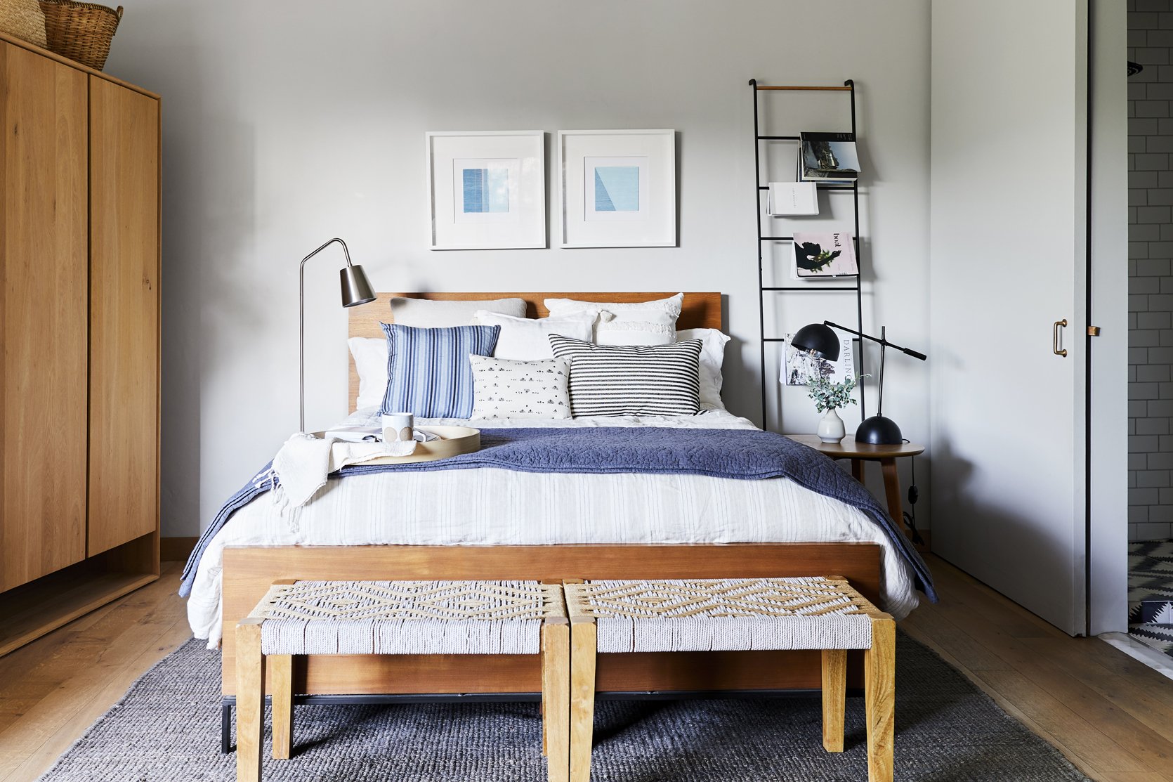
Please note what we now formally refer to as the “book ladder”. Without a coffee table or bookcase, there was little space to display books, so Velinda and Emily Bowser styled the books by draping them over the rungs of the ladder. We are all quite obsessed with this trick and need to see more of it!
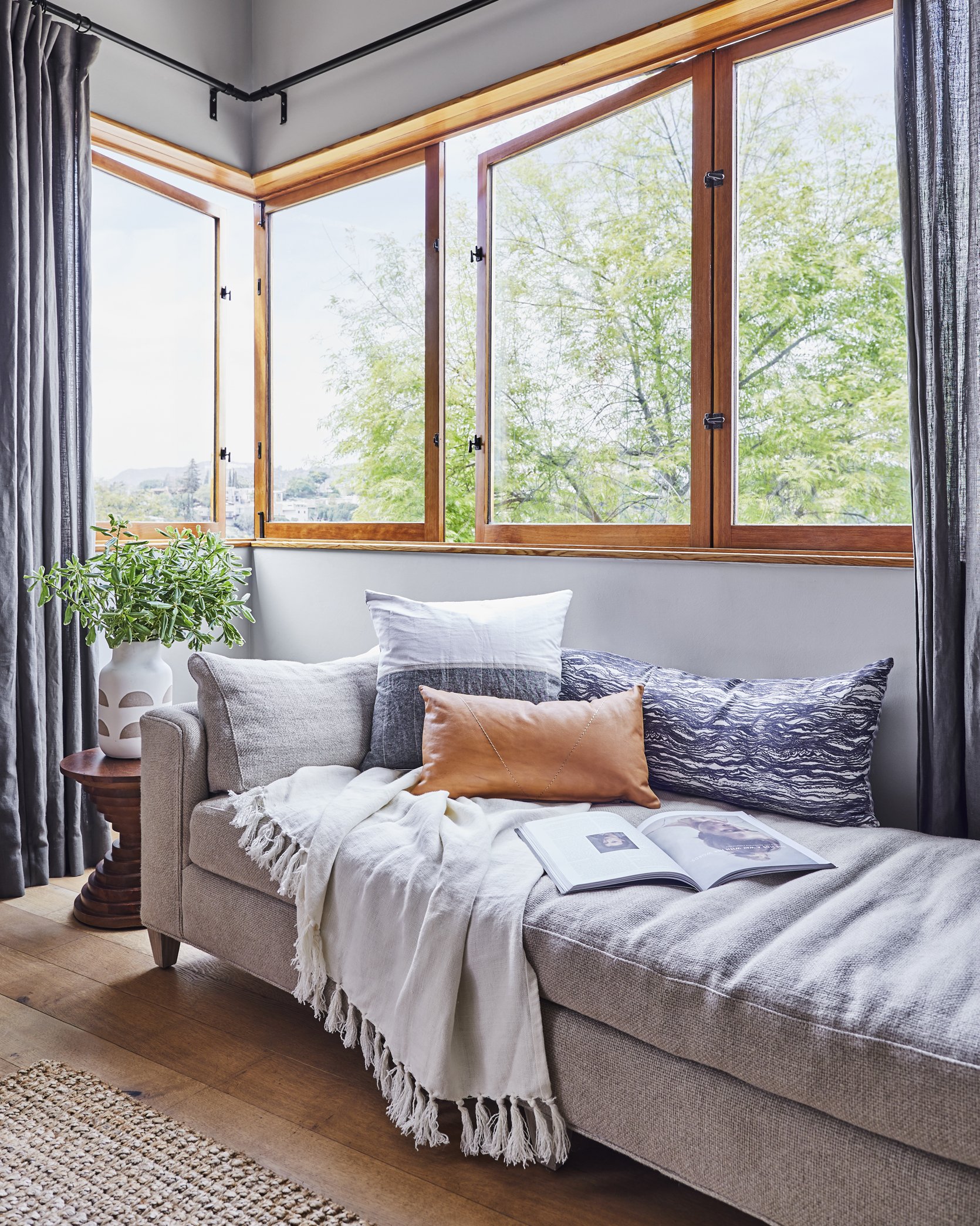
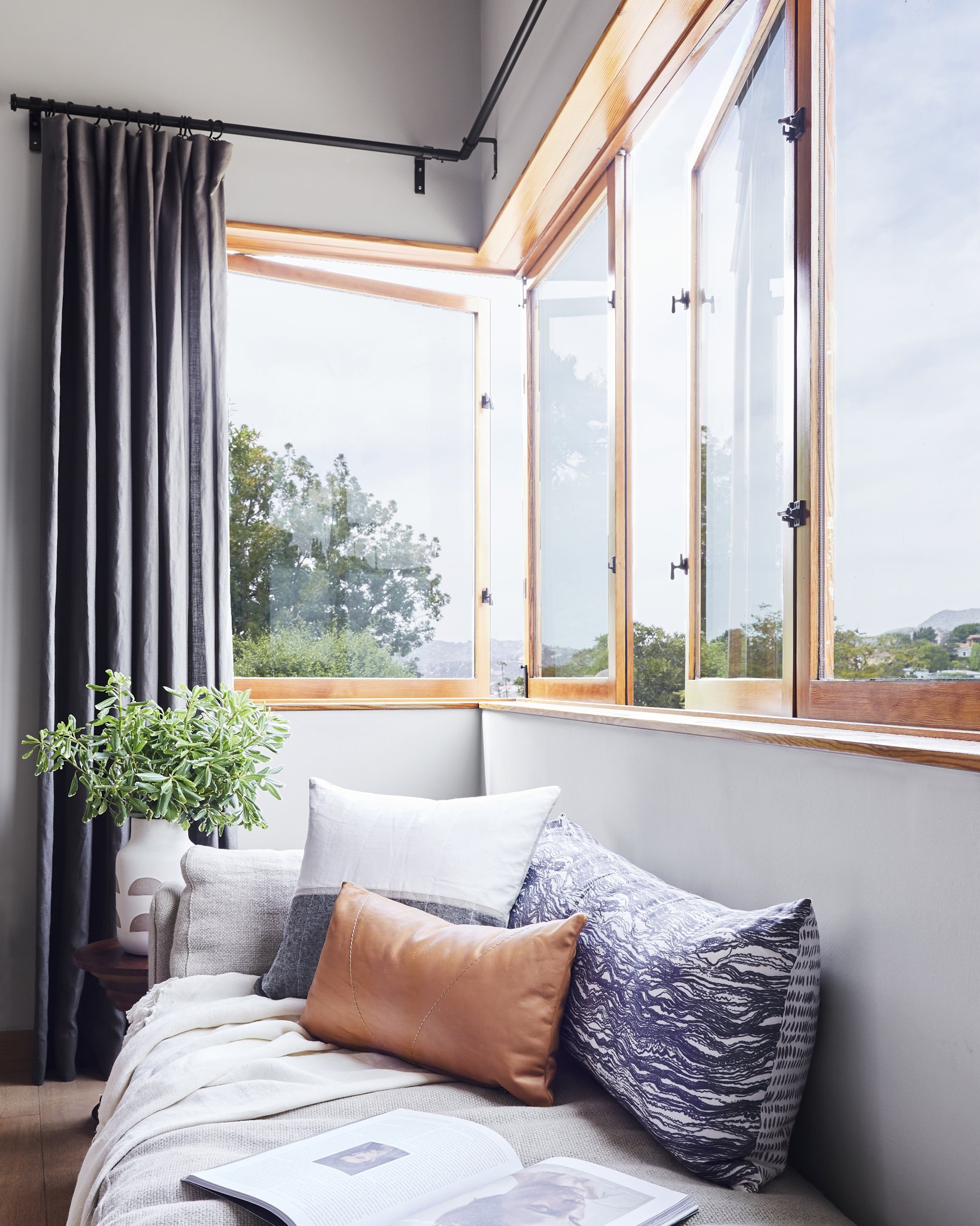
What you don’t see in these pictures is the breathtaking view of the Hollywood sign and Griffith Observatory, so of course Cleo and McShane made it a priority to put in wrap-around windows. The hinges allow them to open up completely and with such a small space, this is a real luxury. I love that they made space for a daybed here so one could relax, read a book, and take in the fresh air and incredible view.
That’s a wrap, ladies and gentlemen. What detail is your favorite? I think you already know that mine is the awesome water closet 🙂 Sound off in the comments below! xx
*Design by Project M Plus
**Styling by Velinda Hellen & Emily Edith Bowser
***Photo by Sara Ligorria-Tramp
THIS POST WAS ORIGINALLY PUBLISHED HERE.
