As someone who has never had a big kitchen in any of the apartments I’ve lived in, I really love and appreciate the ingenious ideas that come out of designing a small space (most notably, kitchens). I myself have had to get a little creative with this specific type of room so if you have a small kitchen you want to upgrade, I have truly been in your shoes. Actually, I’m in your shoes right now! I look at my sweet little kitchen every day and ask it, “How can I make you better?! Talk to me!” So my hope today is to inspire some cool ideas that you can use whether you are a renter or renovator. Maybe I’ll get some fun ideas too:)
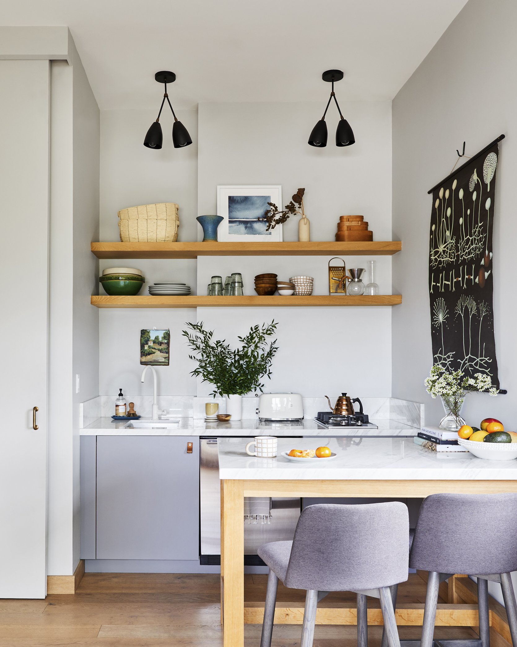
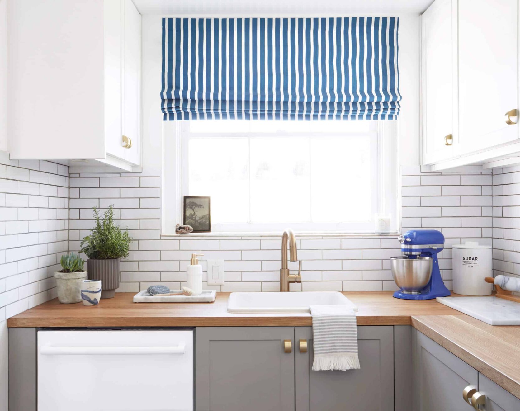
Ok, ok I know that you just saw this kitchen last week but since it was the inspiration for this post I thought it should be first. I think the most notable first idea to steal is the timeless design idea. While it was shot and styled for Em’s new book, this kitchen was actually designed at least seven years ago. Could you tell?? Me neither. The classic materials (white oak and white marble), the neutral but chic color pallet, the clean lines, and the simple appliances are all ingredients for a kitchen design that is going to look awesome for many many years.
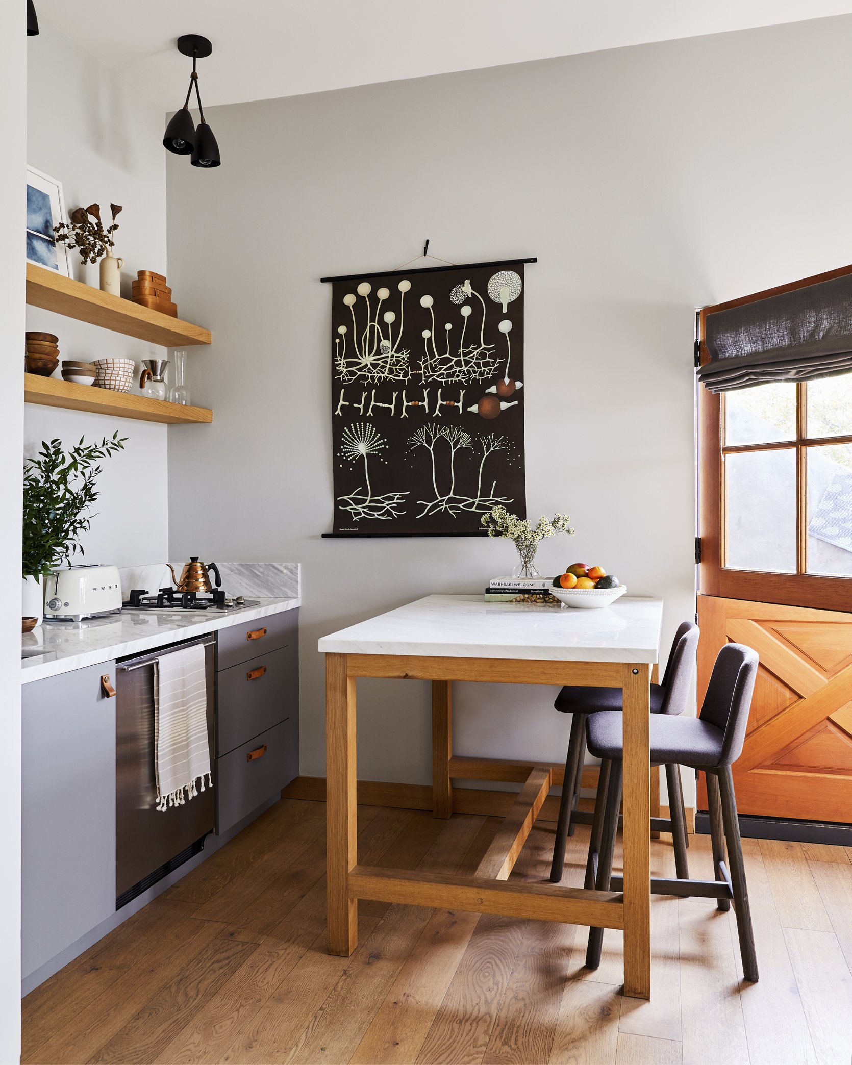
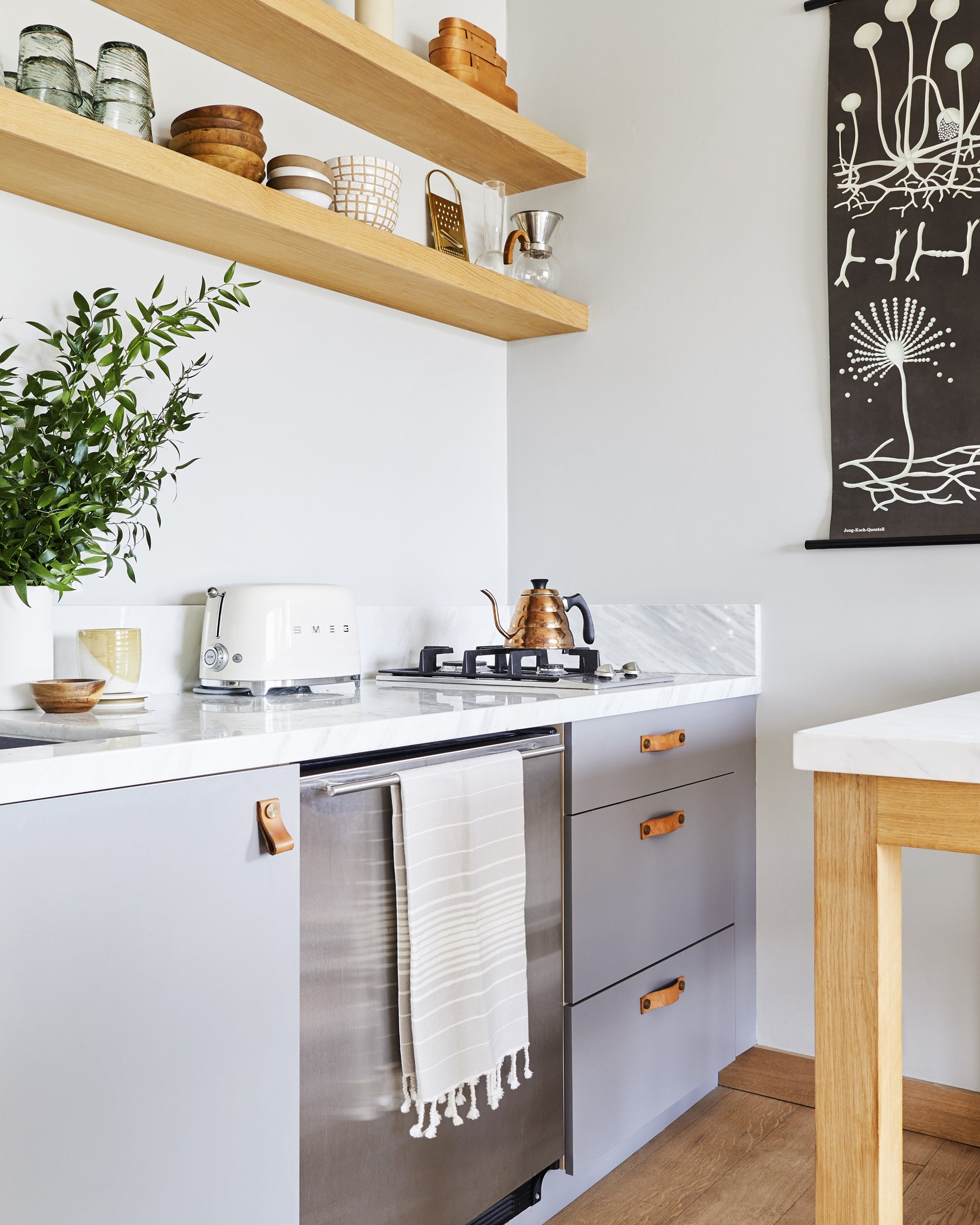
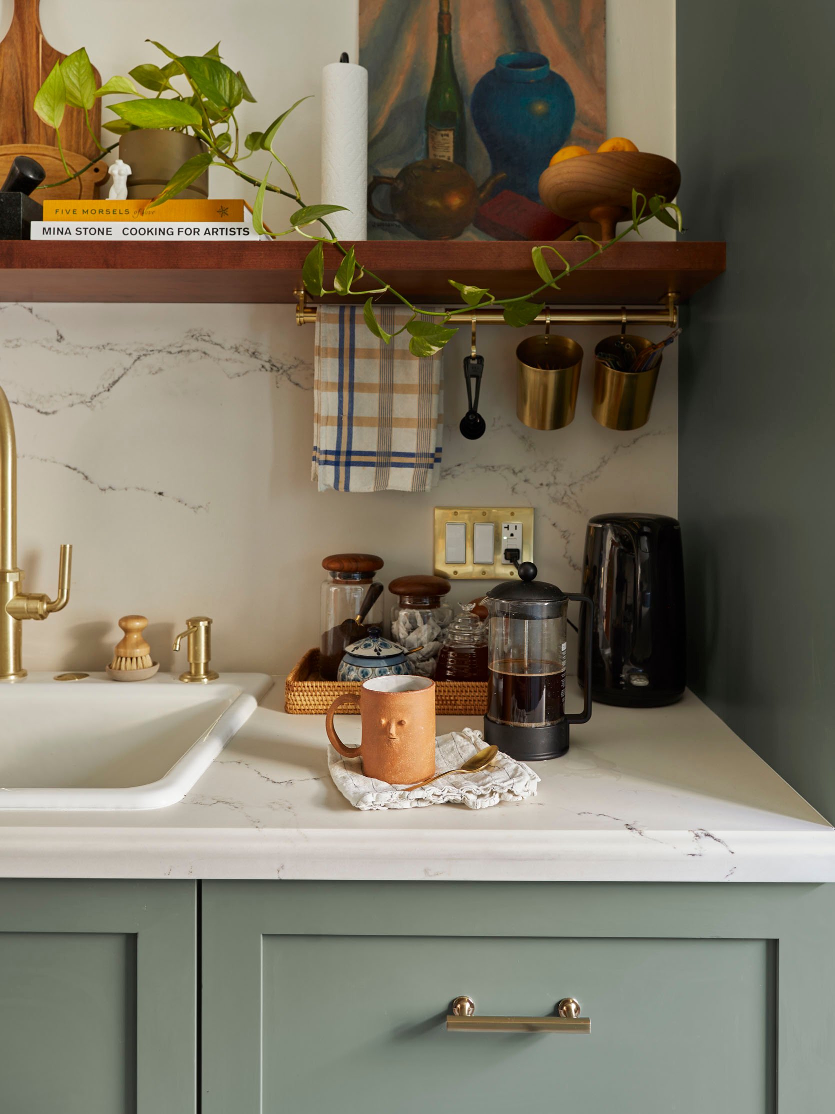
One thing that Ryann pointed out in the post was how the island and kitchen countertops were made out of the same marble. Not only is it simple and pretty but it helps to make that corner area look more cohesive. Your eyes are also able to rest. That is a great thing since they went with open shelving. As you will see in a second, I am a HUGE fan of open shelving when it makes sense. I especially think really small kitchens are a perfect place for them. Why? Well, if you live alone or with just another person you likely don’t have a need for a ton of dishware, glassware, etc. This makes it waaaay easier to maintain and keep everything looking organized. It also opens up the top half of your kitchen, making it feel bigger and visually lighter. And lastly, it’s an easy way to make your kitchen look pretty and give it some personal style. You can effortlessly add color with plates or glasses, style some pretty vases and bowls, the sky’s the limit. It’s a fun playground:)
Oh, and I of course have to mention the transformer-like capabilities of that island. As shown above, it can be an island but it can also be a desk. And if necessary, it can be moved into the center of the studio and become a dining table for four (maybe even six:))
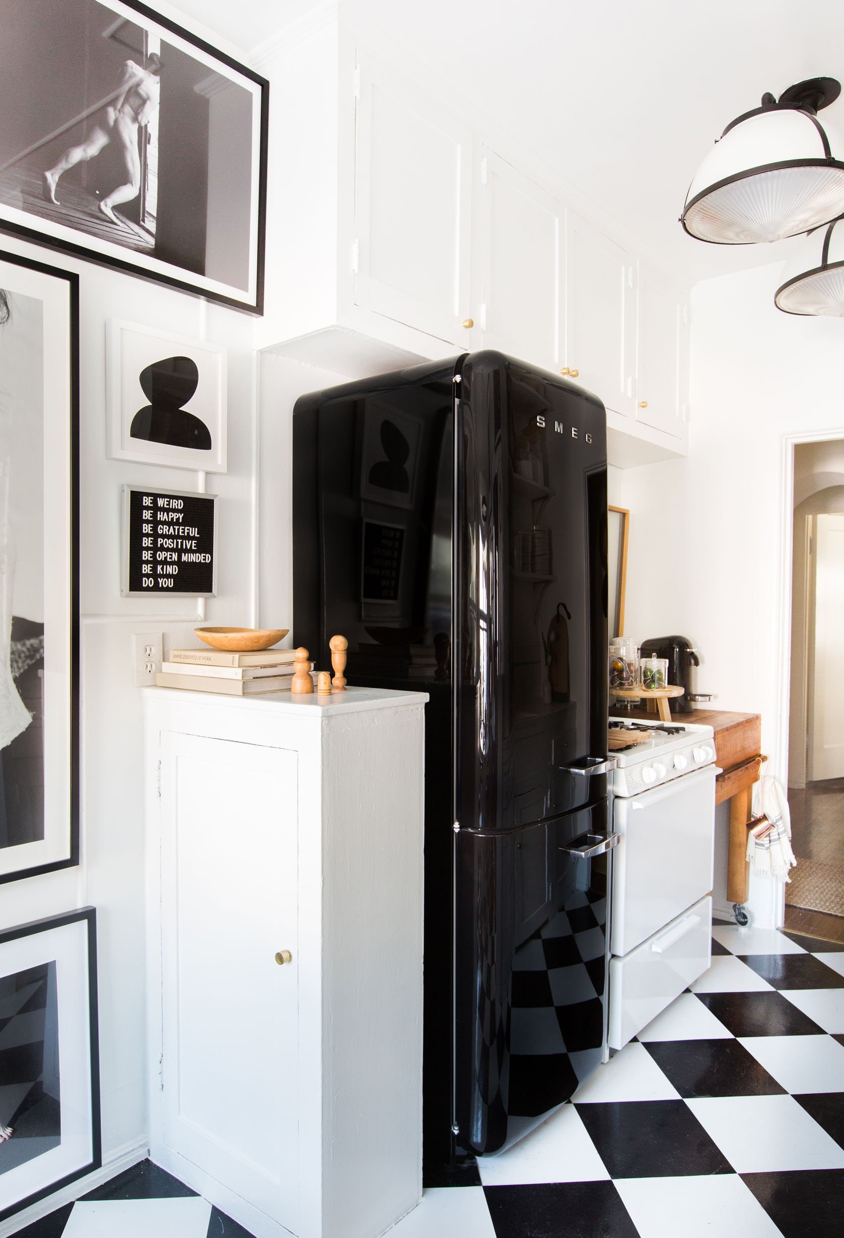
And here is my former little oasis. While I don’t miss the lack of usable closed storage (peep the cabinet facing the oven – less than easy access) and UGLY flooring, I do miss most everything else. This kitchen was a real labor of DIY love that likely made my dad consider disowning me due to my “specific and detailed” requests.
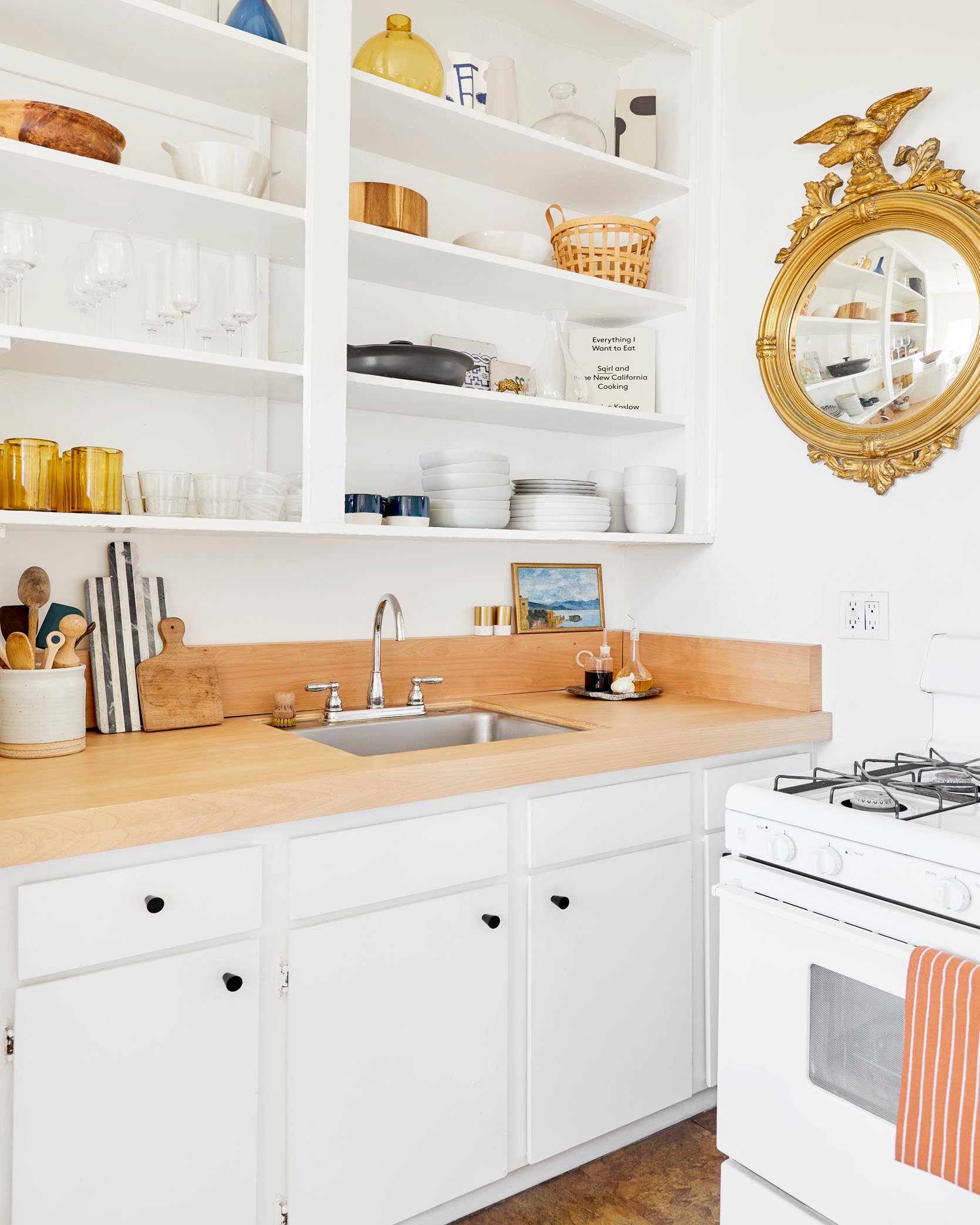
So what did I actually do to my truly tiny kitchen?? Fun fact: this was not the smallest kitchen I lived with – Hey, San Francisco! Ok here’s the list:
- Custom alder plywood counter cover and backsplash by my dad (no damage to actual ugly “stone” countertop). There were a few tries before it was perfect:) Remember the disowning joke??
- Replaces cabinet knobs (I loved the pop of matte black to ground the space a bit and balanced with the dark tones in the decor and banquette backrests).
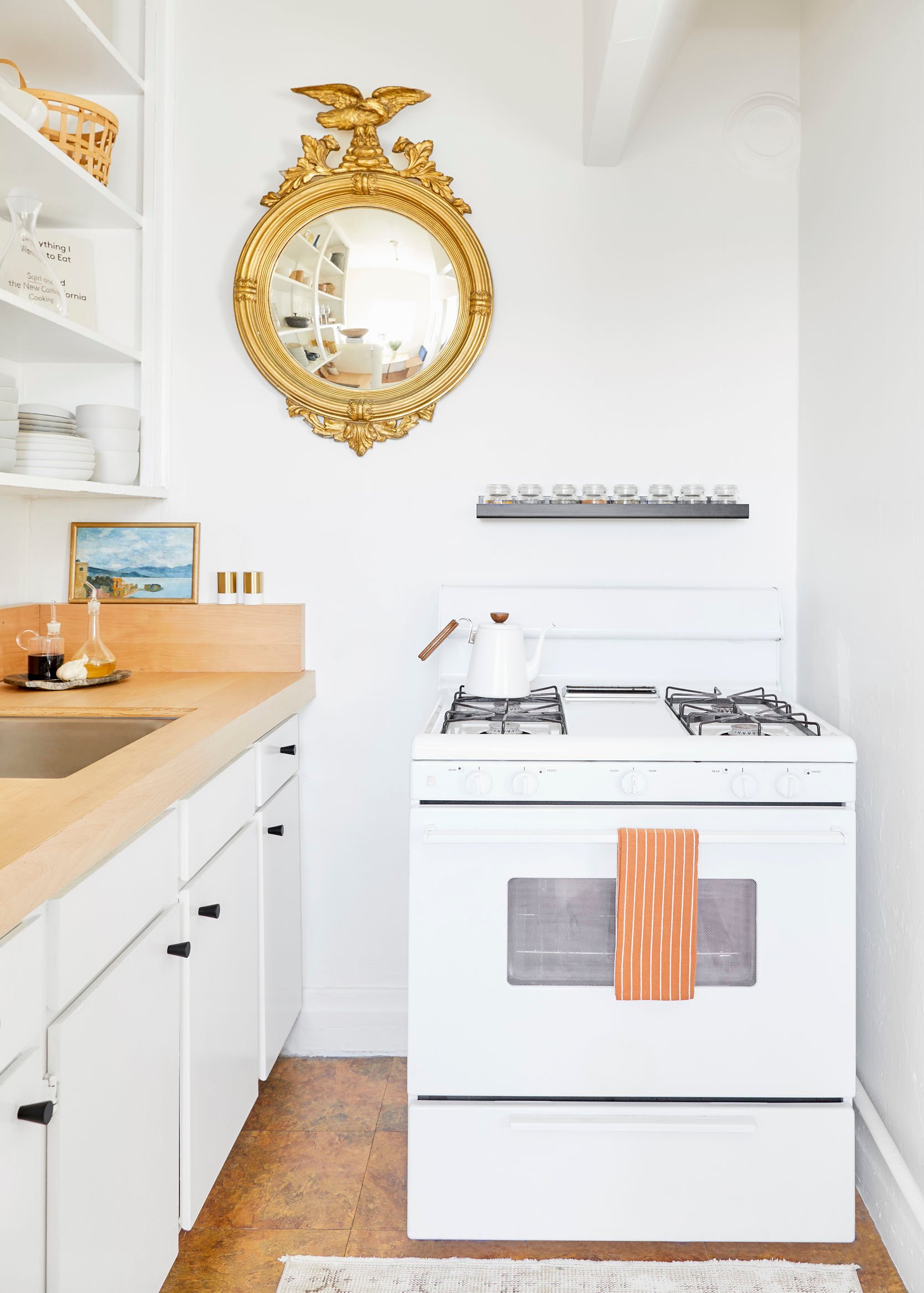
- Added metal shelf as a spice rack to free up counter space and added some more visual interest to the wall.
- Added a mirror (family heirloom) to make the light bounce around and help the space to feel a tiiiiny bit bigger. Ha. But truly I think it helped!
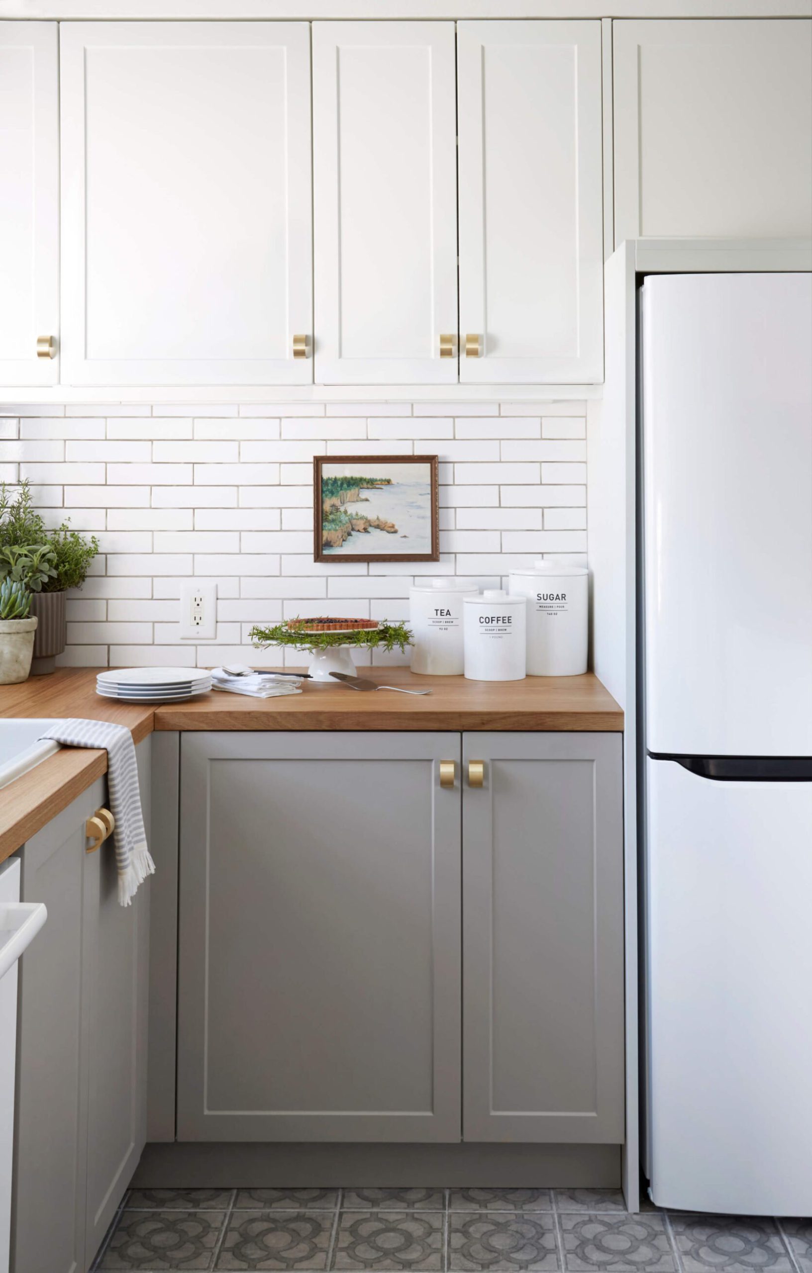
If you are wondering if I removed the cabinet doors off of the uppers, I did not. They were already like that. Although I think once upon a time they did have doors. I loved getting to style them out and displaying all of the things I loved to look at and use. Having doors would have been such a missed design opportunity in my opinion. Sooo if you have enough closed storage consider taking down some (or all) of your upper cabinet doors and paint everything the same color so it looks intentional (unless everything is already the same color). I’m actually considering this in my new kitchen.
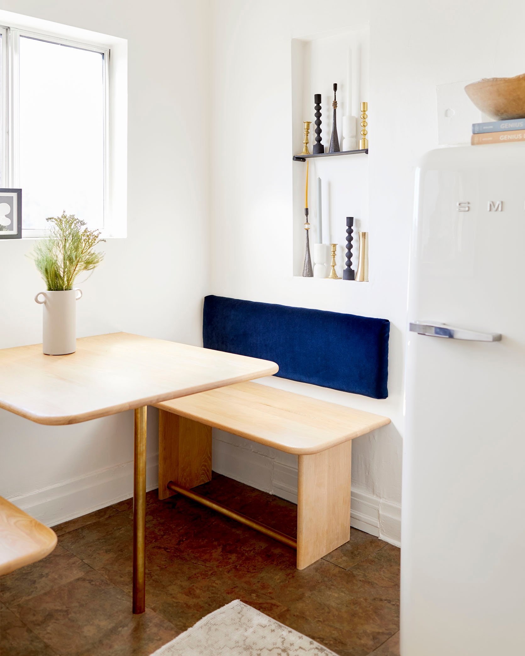
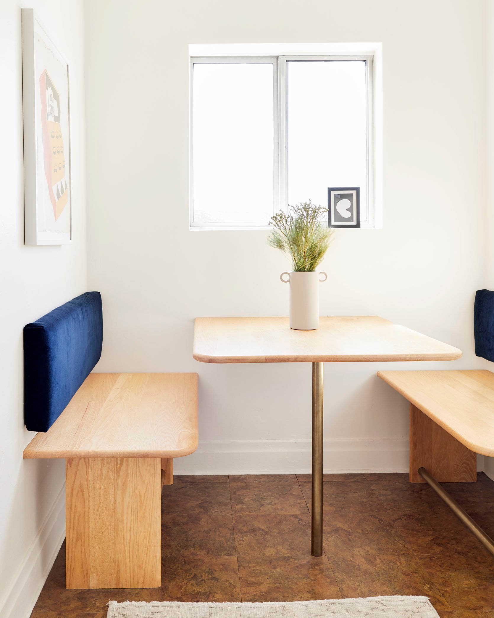
So then to the left is my other love – my old banquette. Look, I could have plopped a pretty bistro table and two dining chairs and called it a day. But a) I tend to like to make things more complicated for myself but more so b) I wanted to really utilize as much of the square footage as possible – something everyone should try to do if they can when designing a small space. Every. Inch. Counts. Plus I can say from experience this made the area feel much bigger. I temporarily had a bistro set in there and it really did make it feel smaller.
All the wood pieces were made from stair risers! This meant that the front of each piece was already rounded. Now, I was crazy lucky that my dad had friends with cool tools that could round the corners and sides very easily. But if you want to make a bench or banquette between two walls, then you don’t have to worry about that! I then made those blue velvet backrests with my cousin (not sewing machine necessary) and the brass poles were cut-down Restoration Hardware curtain rods from their outlet store that my dad’s girlfriend found. I get into all of the details in the original post but I just wanted to show you that even if you are renting there is SO MUCH you can do still. Don’t let the “I’m only renting” keep you from really designing a home you really love.
My only regret with the kitchen (aside from not doing something about those floors) is that I didn’t get a freaking roman shade for the window. Always room for improvement right?? 🙂
Now let’s see the most inventive yet beautiful 49-square-foot kitchen maybe ever.
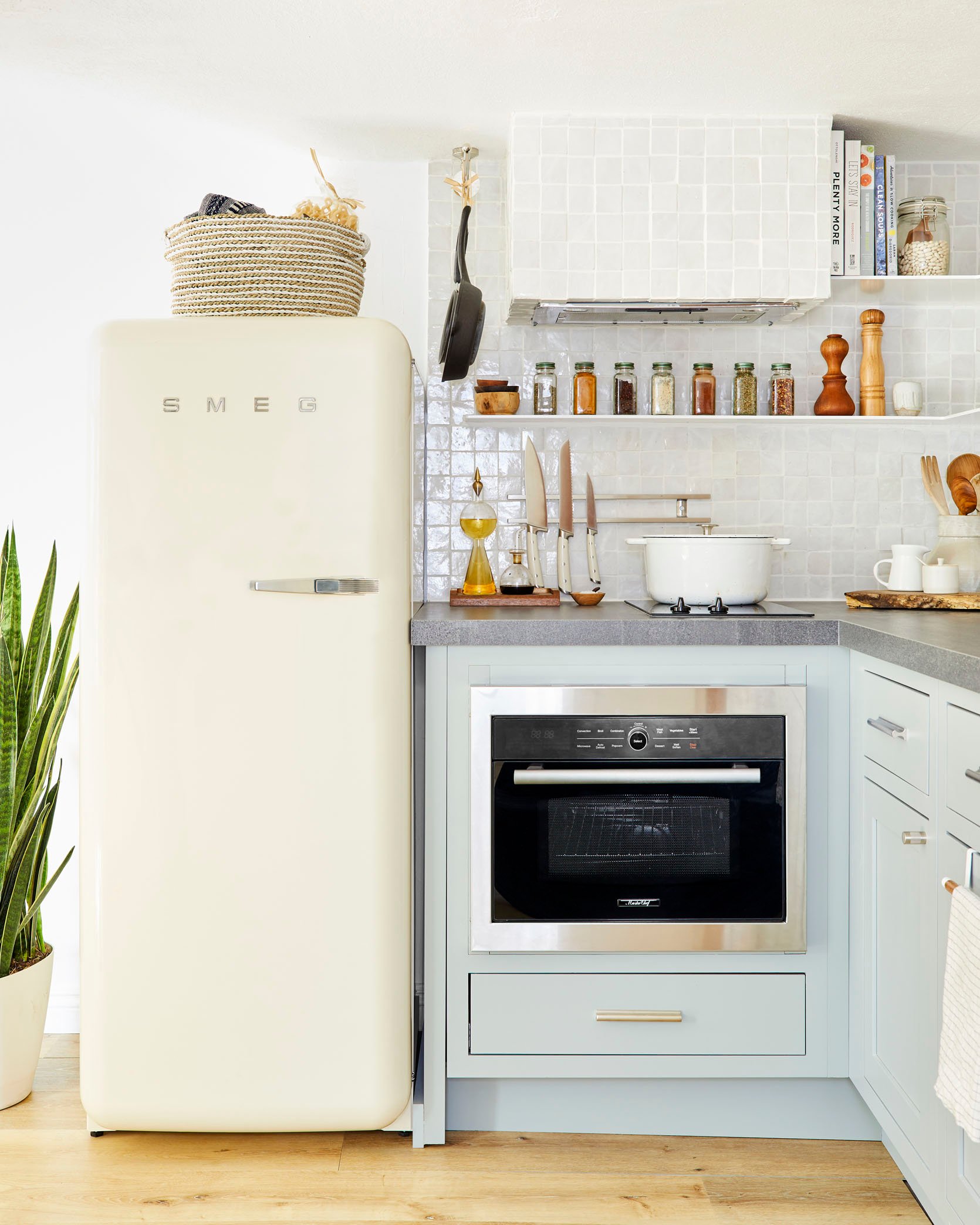
Welcome to Velinda’s basement apartment kitchen. It lives in an apartment, or as she kindly refers to it, “the 400-square-foot tiny hobbit-home that my 980-square-foot bungalow sits above” that she rents out. There are truly so many ideas so buckle up. First, let’s talk appliances. That little oven you see there is actually a 5-in-1 oven! According to her “it bakes, grills, broils, cooks and microwaves…and can fit in a 24” cabinet.” I am SO sorry to report that I don’t think that one is available anymore but you get the idea, when it comes to appliances and small spaces, see what you can combine.
Another really smart and out-of-the-box thing she did was take a standard-size sink and rotated it sideways. I’ll let her tell you why:
“I didn’t want the standard, mini-kitchen sink. I wanted something that’d fit a stock pot or dutch oven but still maximize counter space. So I turned a standard-sized sink sideways…meaning the drain isn’t centered. Uncouth, I know, but this utilized every inch allowed by the narrow 20” wide (yet 24” deep!!) base cabinet. PLUS, it maximized the storage space below by positioning the garbage disposal (which was one of my must-haves) off to one side instead of centering it, freeing up half the cabinet!”
Smart, right!!!!? Also, notice how she chose a wall-mounted faucet so she didn’t need the counter space when she turned the sink’s orientation. It all feels so intentional…because it is.
Velinda also mentioned that she chose those glazed Zellige tiles to help bounce the light around. It’s such a great way to make the space feel bigger. It’s like a mirror but without having to look at yourself! Basically, think twice before using a matte tile in a tiny kitchen for that reason.
Did you notice those beautiful super-skinny shelves too?? Since she made a bigger design statement with the tiled walls and hood, choosing those slim metal shelves was the perfect choice to not overwhelm the space yet not compromise the needed storage. Plus they look so good!
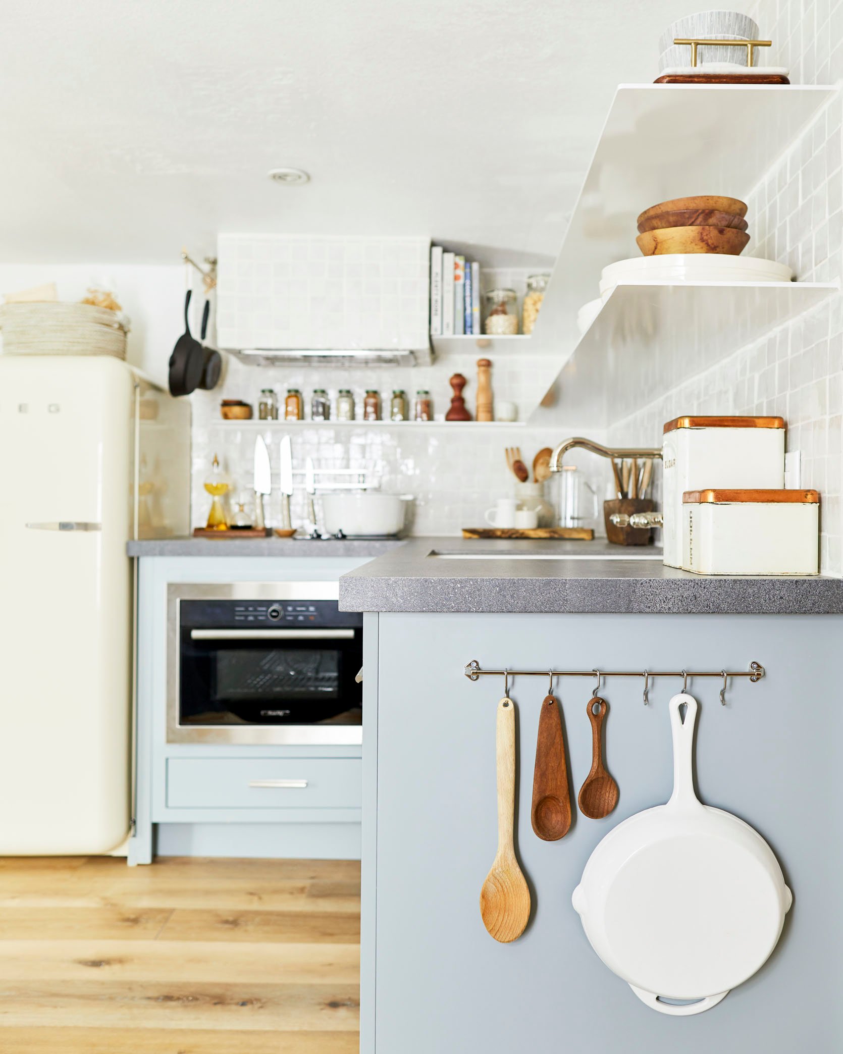
The last little Velinda’s tiny kitchen hack (but seriously go read her full post) are the metal bars she used as a kitchen tool storage rack. One is a hand towel bar that is next to the hood for heavier pots and the other on the side of the cabinet is a tie bar. It was the perfect size, had lots of hooks, and helped to free up drawer space. A must when a kitchen is fun-sized:)
Ready for another rental kitchen and a really good DIY?
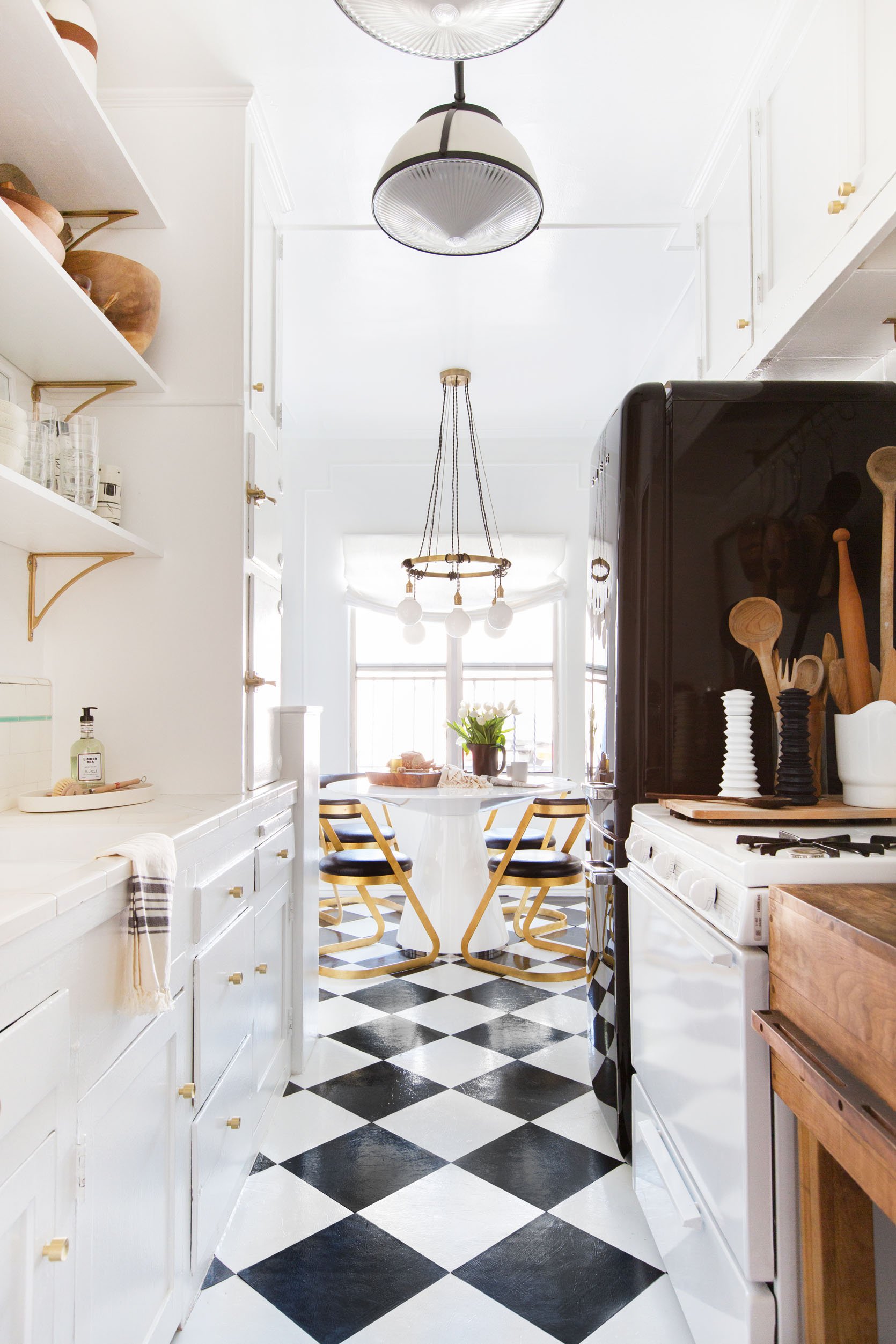
Yes, I am talking about those DIY vinyl floor tiles. How good do they look? And it all cost UNDER $50! This isn’t the only steal-worthy idea but boy will it forever be a great one.
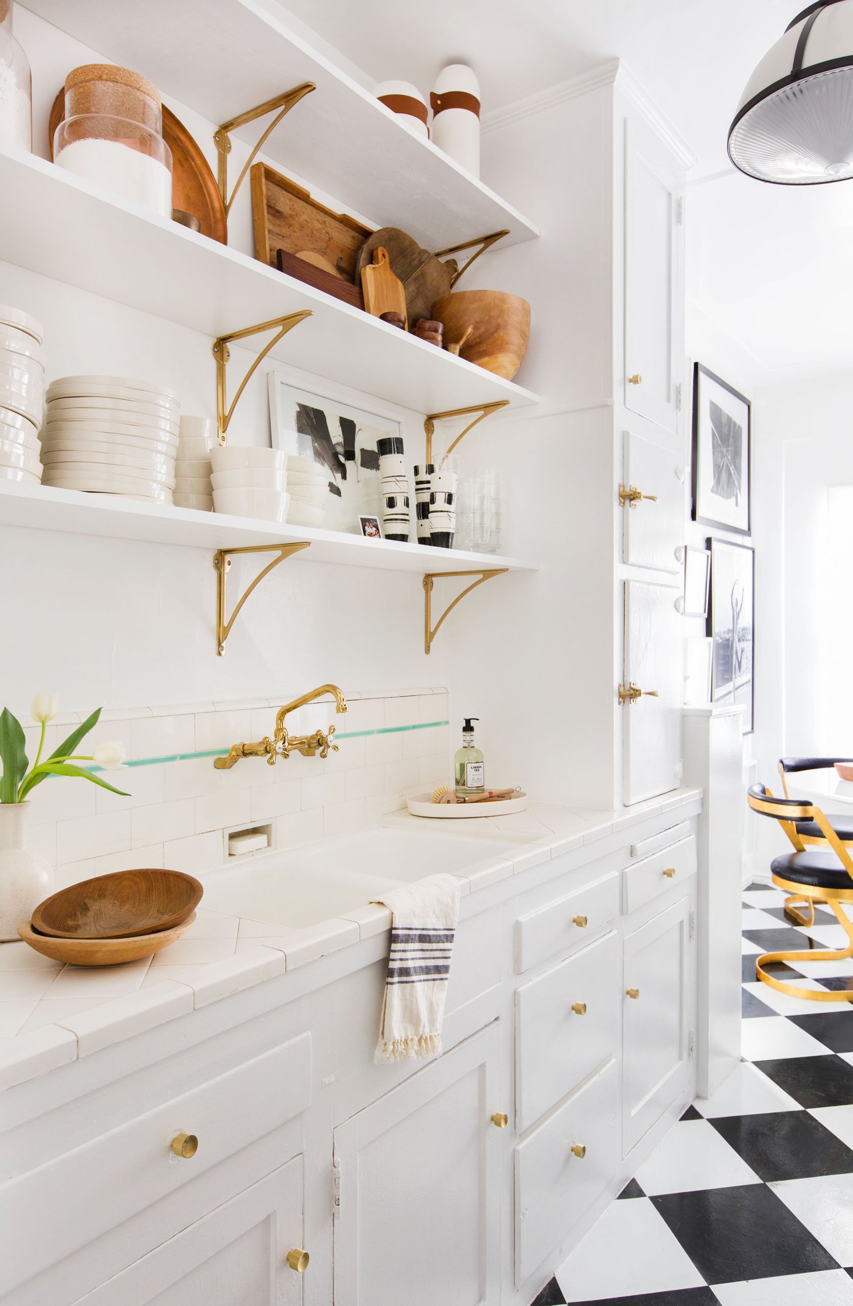
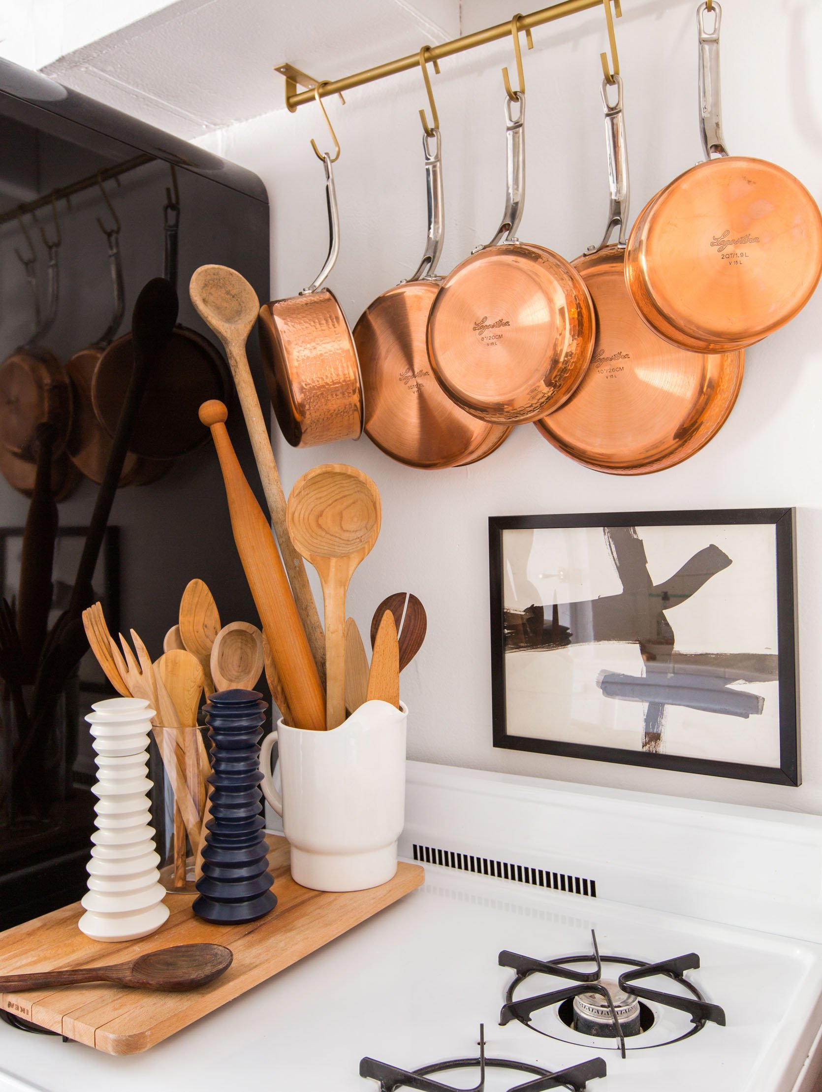
So unless you’ve been around for a long time you might not be super familiar with Brady Tolbert. He is an incredible designer and was one of Emily’s first blog help hires (who also worked at EHD for 5 years). He is also a bit of a rebel as you will soon see why:) Those shelves were not always there. Originally there was an upper cabinet on one side that he decided to take down and replace with all open shelving. He may or may not have cleared it with the landlord but I don’t think anyone can say they don’t look amazing! He clearly stands by the idea that open shelving is ideal for small kitchens. Clearly, there’s already A TON of closed storage so why not make the whole space look bigger, right? But maybe check in with your landlord first unless you are willing to gamble your deposit.
Aside from that, see how using all those brass accents helps to warm up and brighten the space??
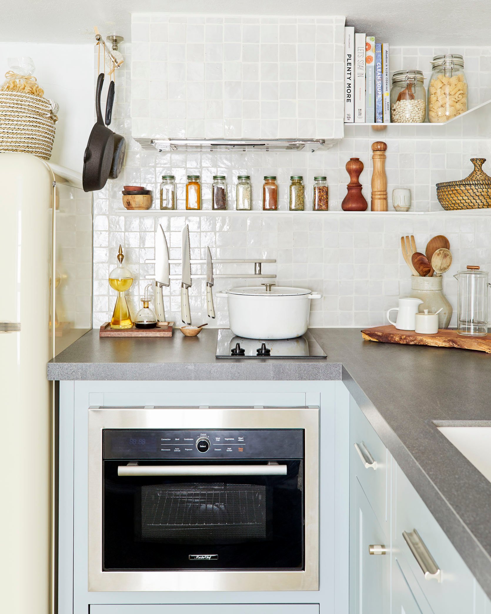
Always remember that a pretty cutting board on your stove burners can also give you more display or prep space. Just remove it before you turn anything on, k?
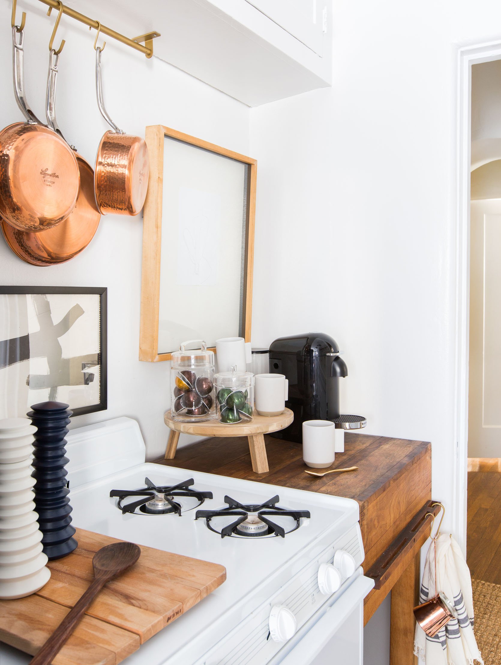
I now want to point your eyes to that rolling butcher block island/table. First off, stylishly they add so much warmth and character. Second, the extra counter/prep space they provide is wild. I have one that I was given in my kitchen by a family friend and now I can’t remember how I prepped food before it. Plus they are usually small which is great when square footage is tight. They can be pricy but if you keep an eye out on Craigslist or FB Marketplace, you might get lucky.
Ok, Sara’s new beautiful kitchen may not be tiny but it’s definitely not farmhouse size, right? So a lot of thoughtful and clever planning had to go into maximizing all the storage capabilities in order to get everything they wanted.
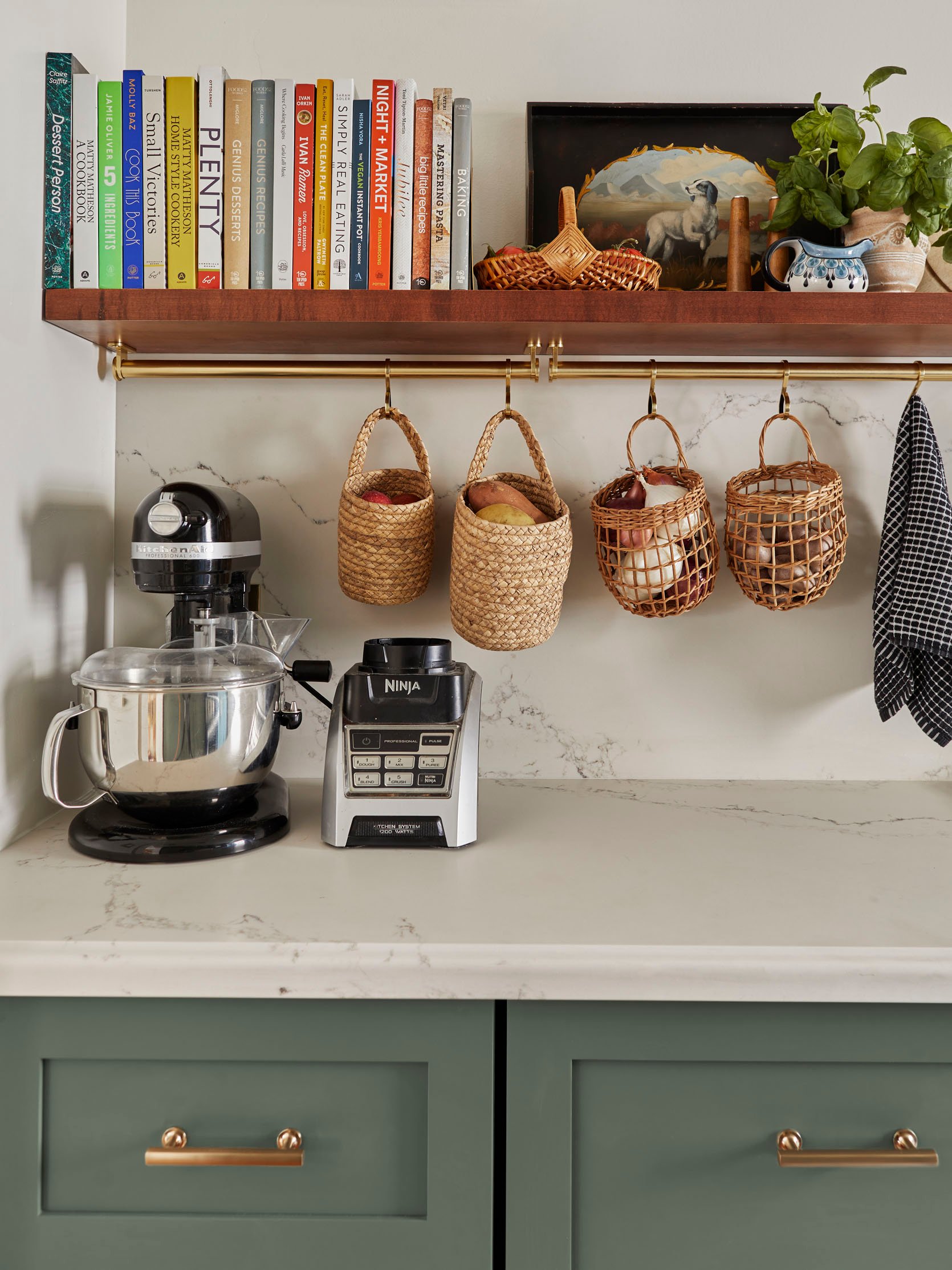
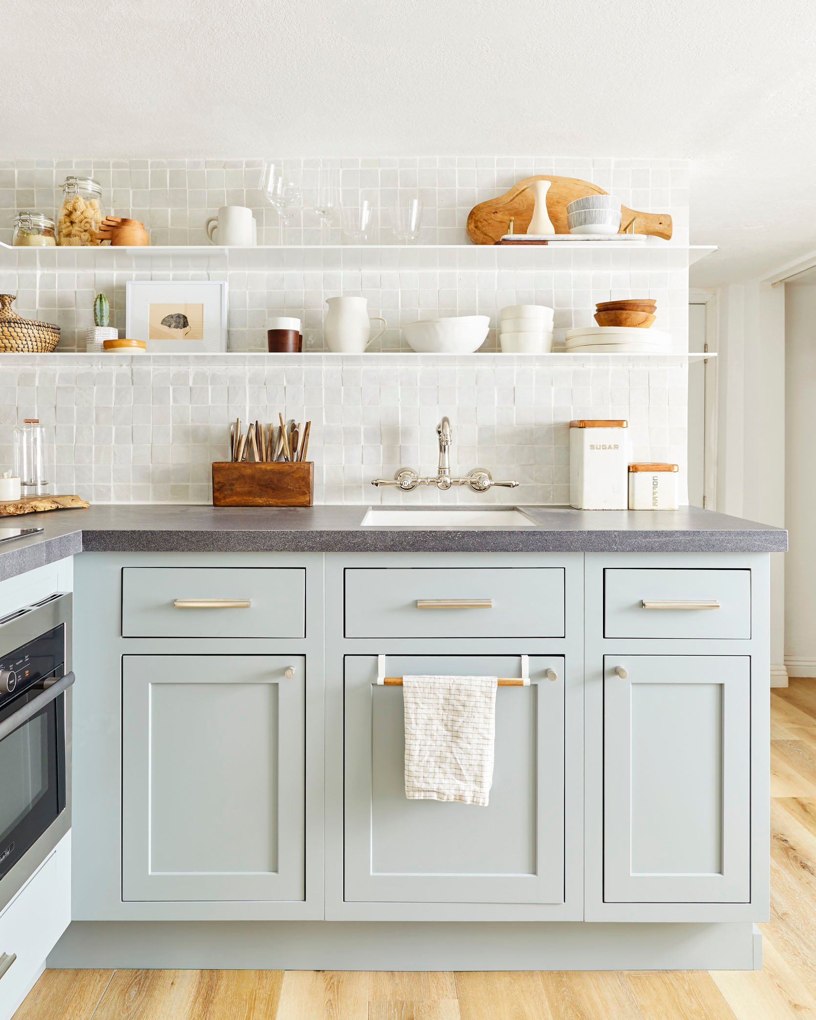
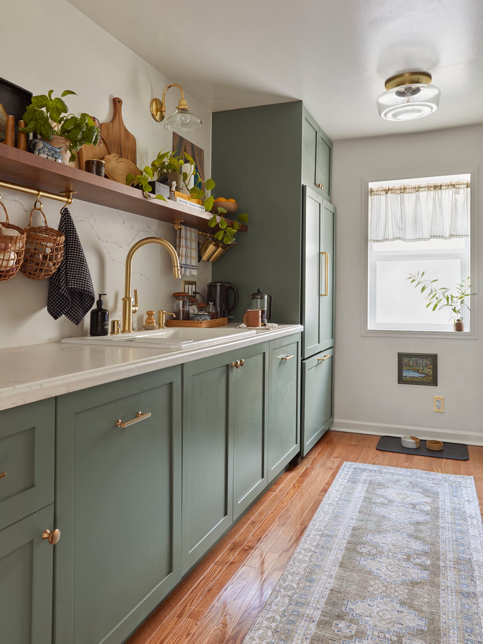
She also went for a single open shelf on one side of her galley kitchen to keep it feeling happy and airy (and also so she could store all her cookbooks, pretty cutting boards, and art openly). But she doubled the functionality of that shelf with those pretty brass rails underneath. See how they are perfect for storing garlic, onions, potatoes, etc? Think of how much that frees up the countertop.
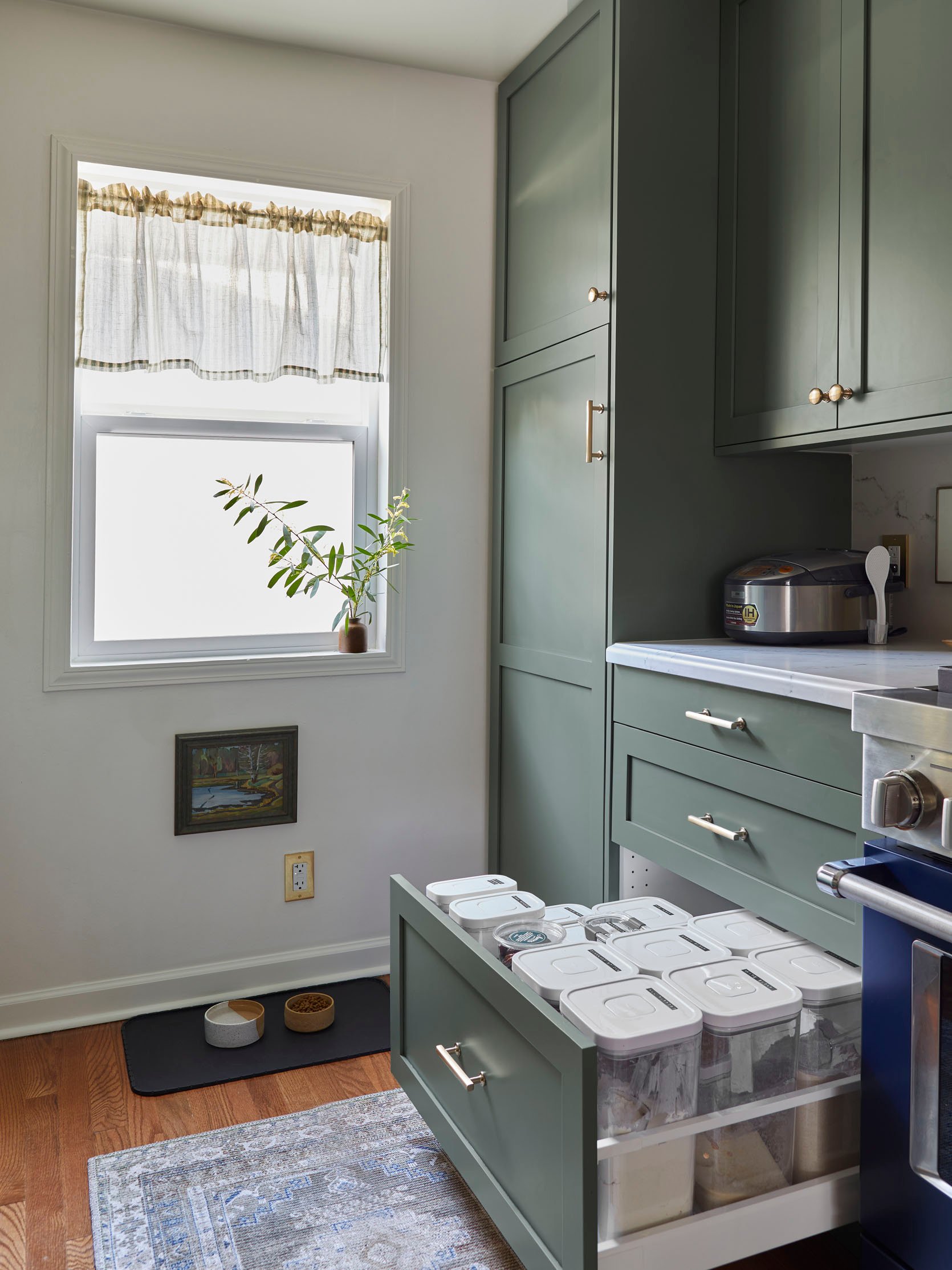
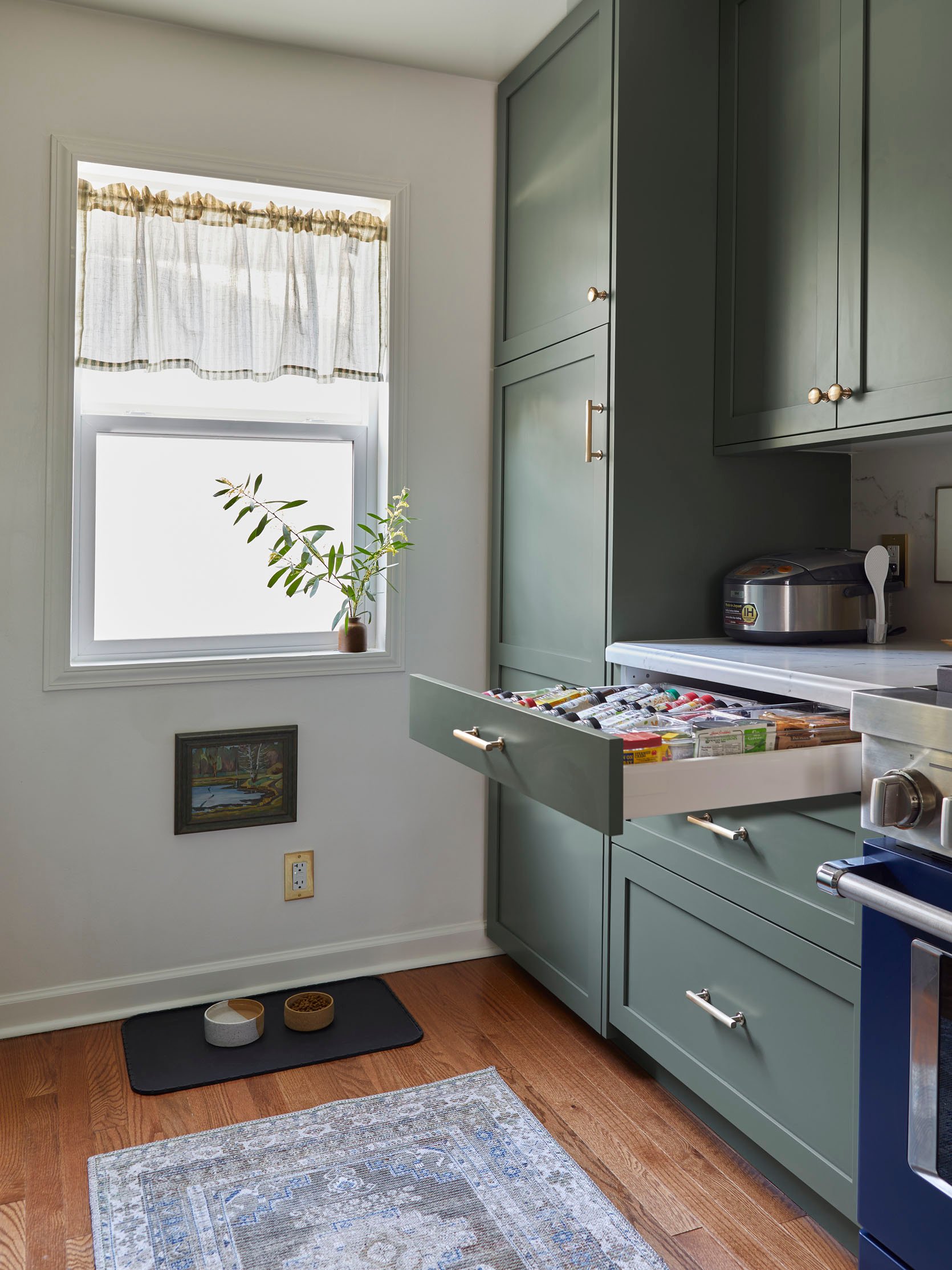
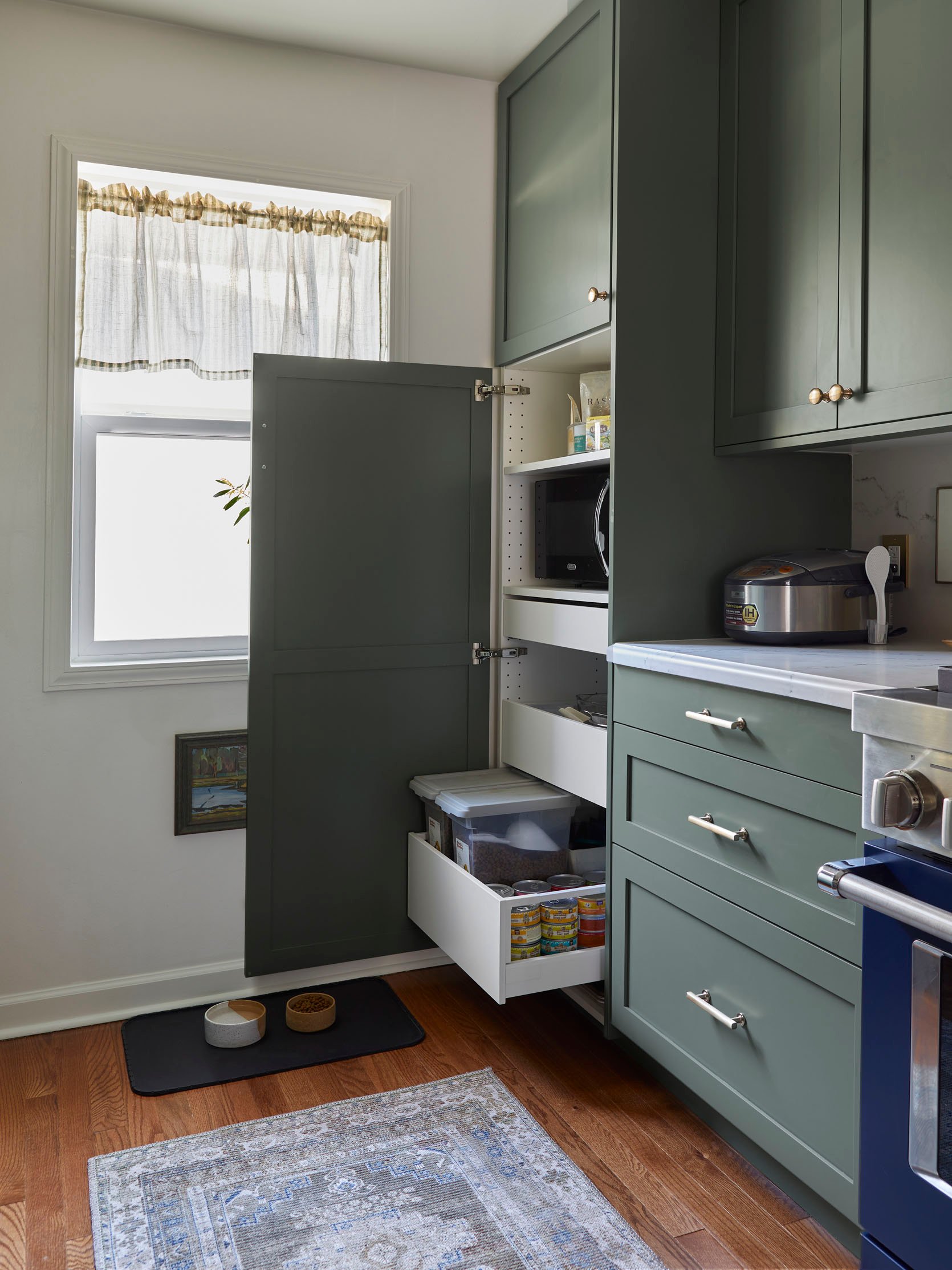
Sara also really utilized kitchen organization products to help keep everything in there place and accessible.
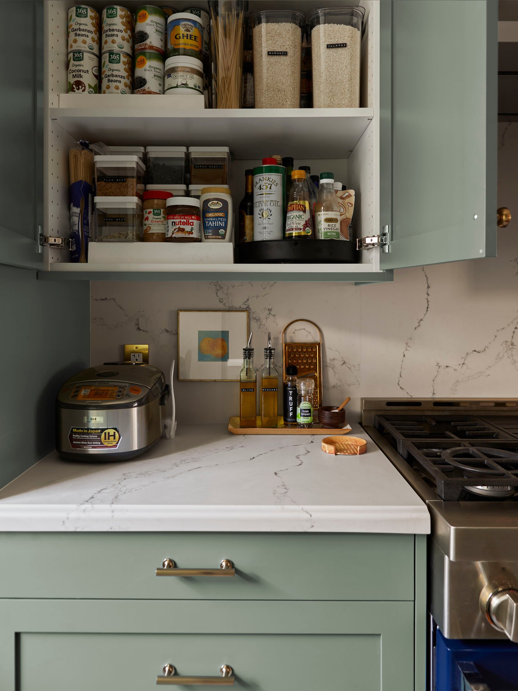
When a kitchen is small and starts to decline into chaos because things don’t have a place, it makes life so much harder. You could obviously say that for any kitchen but a small kitchen, since it has fewer places to shove things, can get and stay crazy SO FAST without a dialed-in system. Sara’s has a great system:)
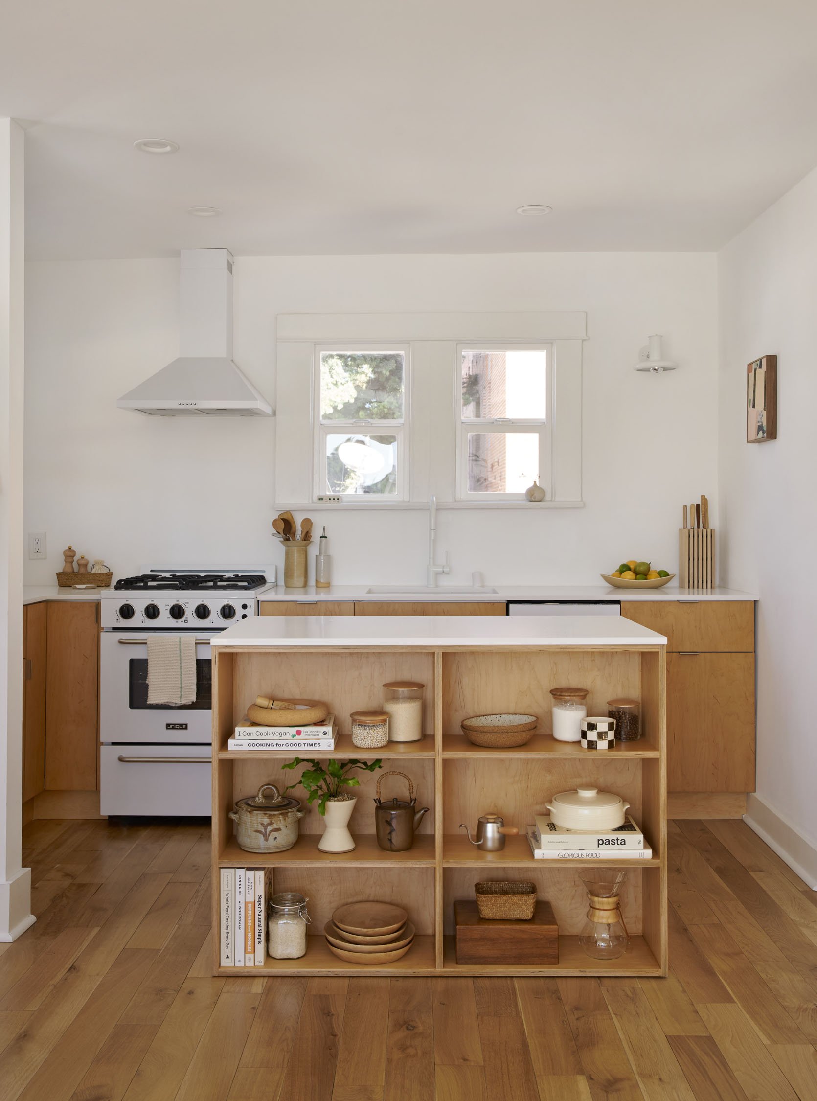
The biggest idea to steal from Mel’s kitchen (aside from the stunning warm but minimal aesthetic) is designing a custom island that works best for you. What is also so impactful about making an island for a kitchen that is open to a communal space is that it helps to create a definitive “kitchen zone”. If you go to the end of her revel post you will see what I mean. And with this island specifically, I love how she used the side facing the dining/living room to display her beautiful kitchen things. It invites you in as opposed to having a solid piece of wood which might look visually heavy and abrupt, especially since this island isn’t raised.
While her appliances came with the home, I love that they are smaller than standard US sizes but not mini if that makes sense. This is a two-bedroom apartment, meaning there likely wouldn’t be enough people to big need a full-sized dishwasher or range, right?
Of course, everyone has different size needs, but if you have a small kitchen and not a lot of people living in the home, why not create more space for storage or counter space, right? However, I will say that while I love my small SMEG fridge so much and it was perfect in my last place, my life would be minimally 10% better if I had a larger freezer since my love for cooking and using fresh veggies in a timely manner is still a work in progress. Mel’s fridge lives in my dreams.
Last but most definitely not least is Orlando’s rental kitchen that got renovated. This was his LA kitchen before he left for Yosemite a couple of years ago. As a design influencer, he desperately wanted to update his kitchen and got his landlord’s permission.
What Orlando did such a great job with is toeing the line between expressing his style while also honoring the style of the home (and the fact that many people were going to have this kitchen after him). The two-tone cabinets feel special and yet are an easy way to make the kitchen feel lighter (the white uppers) and yet grounded (the darker lowers). He also went with classic, affordable tiles for both the walls (fun tan grout!) and flooring. Then for some real Orlando-ness, those modern brass knobs were the perfect addition (and something he could have taken with him and replaced with a super affordable option).
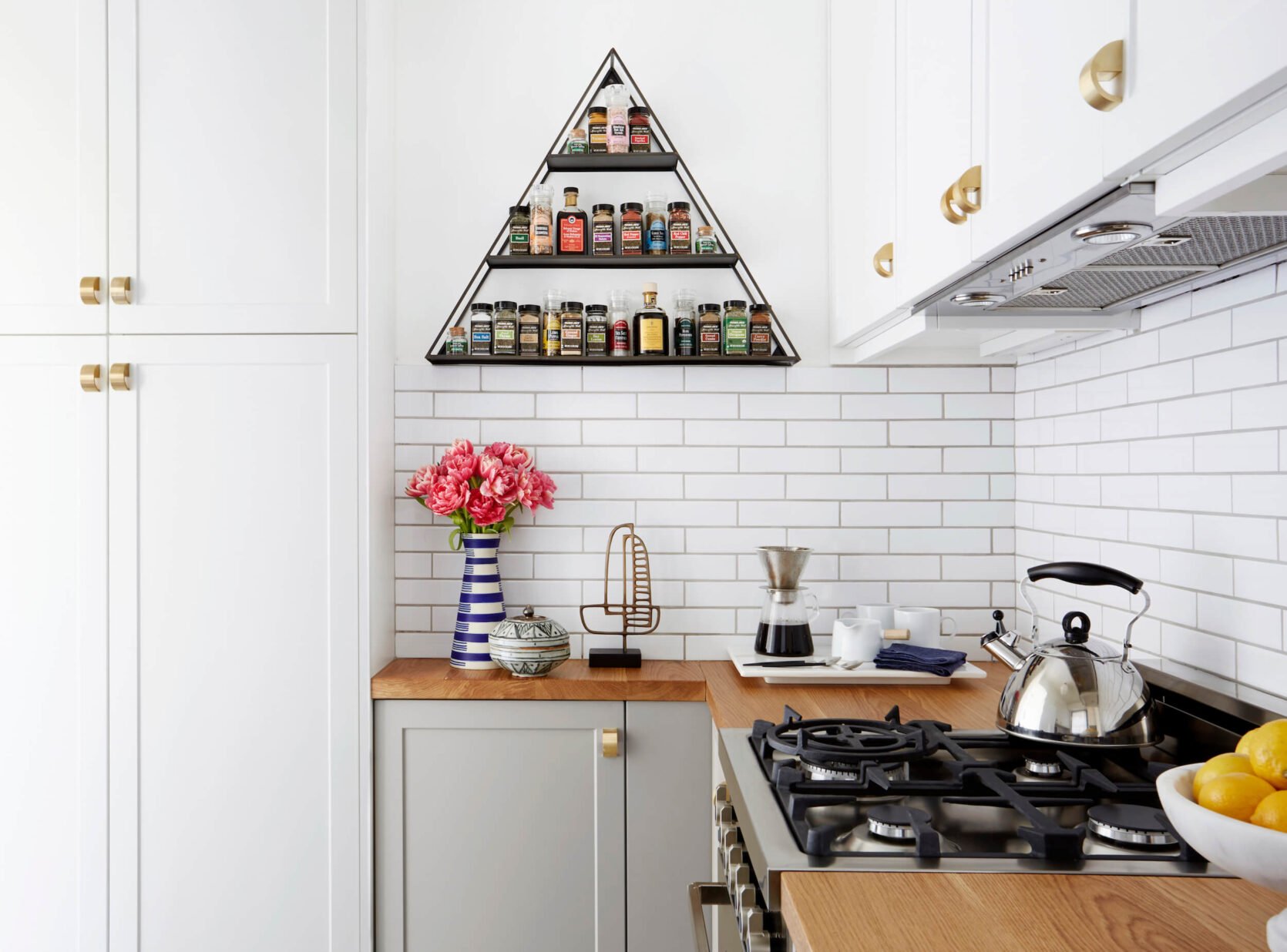
Another Orlando design stamp is a fun, geometric shape. So freeing up the counter space and using a spice rack that screams “THIS IS ORLANSO’S KITCHEN, DUH” was a great and easy way to make this kitchen really look like it belonged to him. Basically, it can be scary to invest in risky permanent finishes so still make sure to add pieces that really speak to your individual style.
Lots of ideas, right?! Fingers crossed if a small (or big) kitchen design has been on your mind that your creative juices are really flowing and you’re ready to go:) If you saw a kitchen you love, please be sure to read the original post (and maybe even the intro if it has one). They are filled with A LOT more information that will probably be pretty helpful.
Love you, mean it.
Opening Image Credits: Design by Velinda Hellen | Photo by Sara Ligorria-Tramp | From: Velinda’s Tiny Kitchen Makeover Takeover (with Tons of Smart Storage Hacks)
THIS POST WAS ORIGINALLY PUBLISHED HERE.
