I am shocked but always delighted when it’s time to write these trends posts each year. It’s always the same cycle for me. I think, is there anything actually new? How many new trends can there truly be for just one room year after year??? But then I take a second, look through everything I’ve saved, what’s been on the other design sites, what other designers are showing on their accounts, and BOOM, I see trends. Not to mention chatting with Em and the team about their thoughts. So despite what feels a bit like January 2021 deja vu, this new year is feeling hopeful (I say this with caution). And for some silly reason, new trends add to that feeling… at least for me. Like newness and creativity are still thriving. Honestly thank god. I know I need any kind of hope to sink in deep into my bones. So since kitchen renovations are also still very much thriving, let’s talk about all the trends we think are going to hit this year.
P.S. As always, these trend posts are not meant to make anyone feel like they need to redo anything in their homes. These are just ideas IF you are planning on renovating or wanted to change something up. Trends are only awesome if you genuinely love them (making them not actually a trend in the long run;))
Breaking The Triangle – Fridges Further Away And Hidden
Rules be damned! We have been seeing A LOT of designers designing their kitchens how it will work best for them and their families. And isn’t that how it always should be? If you don’t want your refrigerator near your range and sink then you don’t have to.
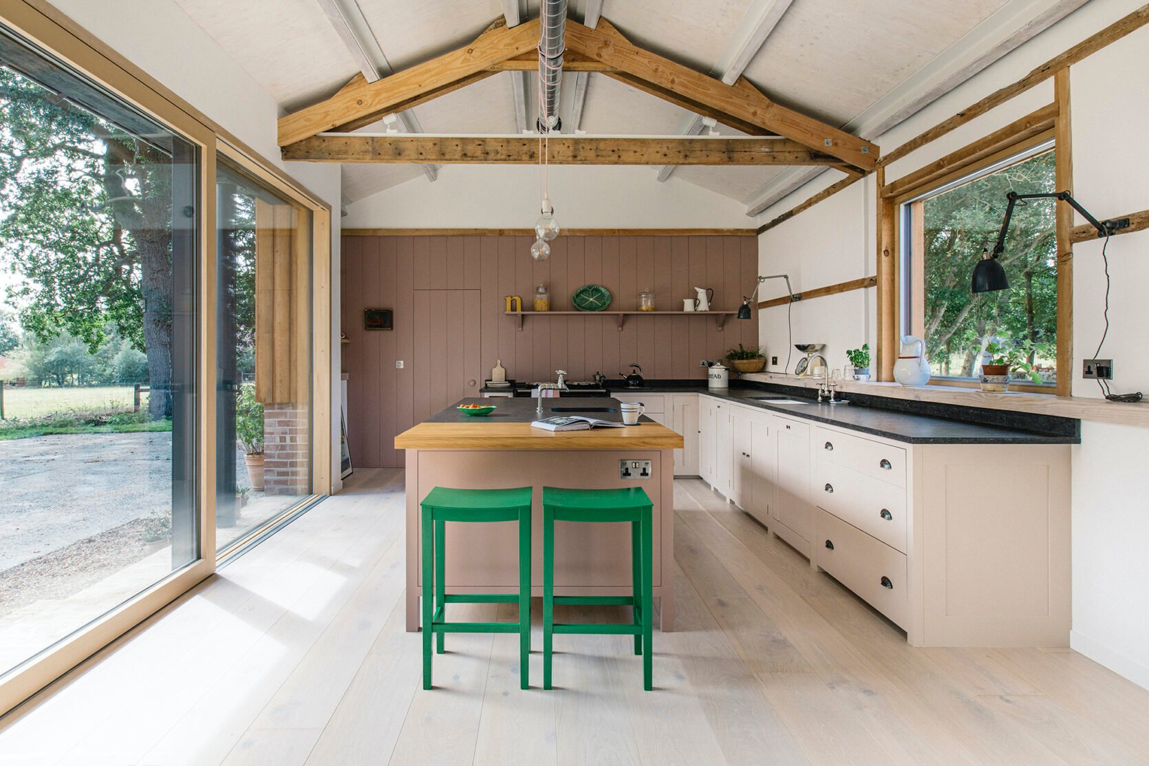
Look, I love rules. LOVE them. Ask anyone that knows me even a little. But even I know and can respect that (in terms of design), rules are really just the jumping off point. It’s not that I’m saying go crazy for the sake of going crazy with your layout. But if you are mindful about how you would like or want to move around your kitchen/have a specific aesthetic in mind – GO FOR IT.
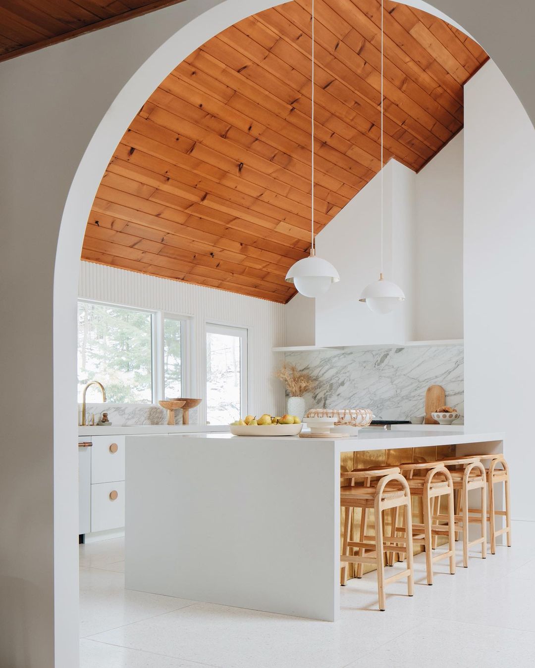
Ok, I know this is Sarah Sherman Samuel’s kitchen from a couple of years ago. It’s still beautiful (duh) but since her new show house is still very much under construction, this photo will clearly do to make my point. Both in this kitchen and in the new one (which her and her husband haven’t decided if they are going to move into) the fridge is not in the main kitchen area. Talk about “screw the triangle!”. From what I got from the last tour she did about the new house on her stories was that the fridge, like I believe it is in the kitchen above, will be in the pantry. The only caveat with this trend is that you need enough space to have a large enough pantry… But I really am into this idea because it visually really lightens the overall look of a kitchen. I know this isn’t for everyone but something to think about.
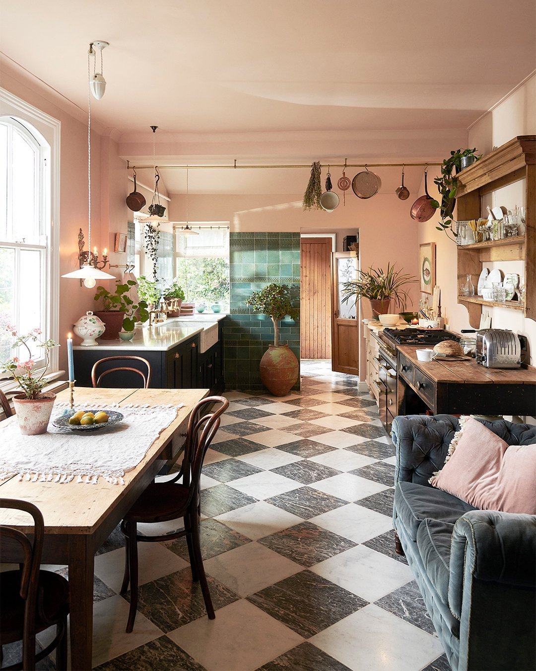
Plus as someone who is constantly looking in the fridge because “maybe there’s a magical new snack I have yet to discover”, I like the outta sight, outta mind idea. I mean it could help, right?? Not the point but I’m looking at all the reasons why, K? So with everyone who’s renovating and creating their dream homes we predict that we are going to be a lot less of that big icebox. Could/would you??
Plum Kitchen Cabinetry
I wouldn’t say that purple is a color I gravitate towards really ever but my oh my am I into these rich plum-y cabinets. Bright, “classic purple” kitchens will always be a great fit for the right bold person who is color obsessed. But this deep rich version is not the like it’s more say, lavender colored friends. This purple’s got some sex appeal. This purple is very cool. Is this a new neutral??
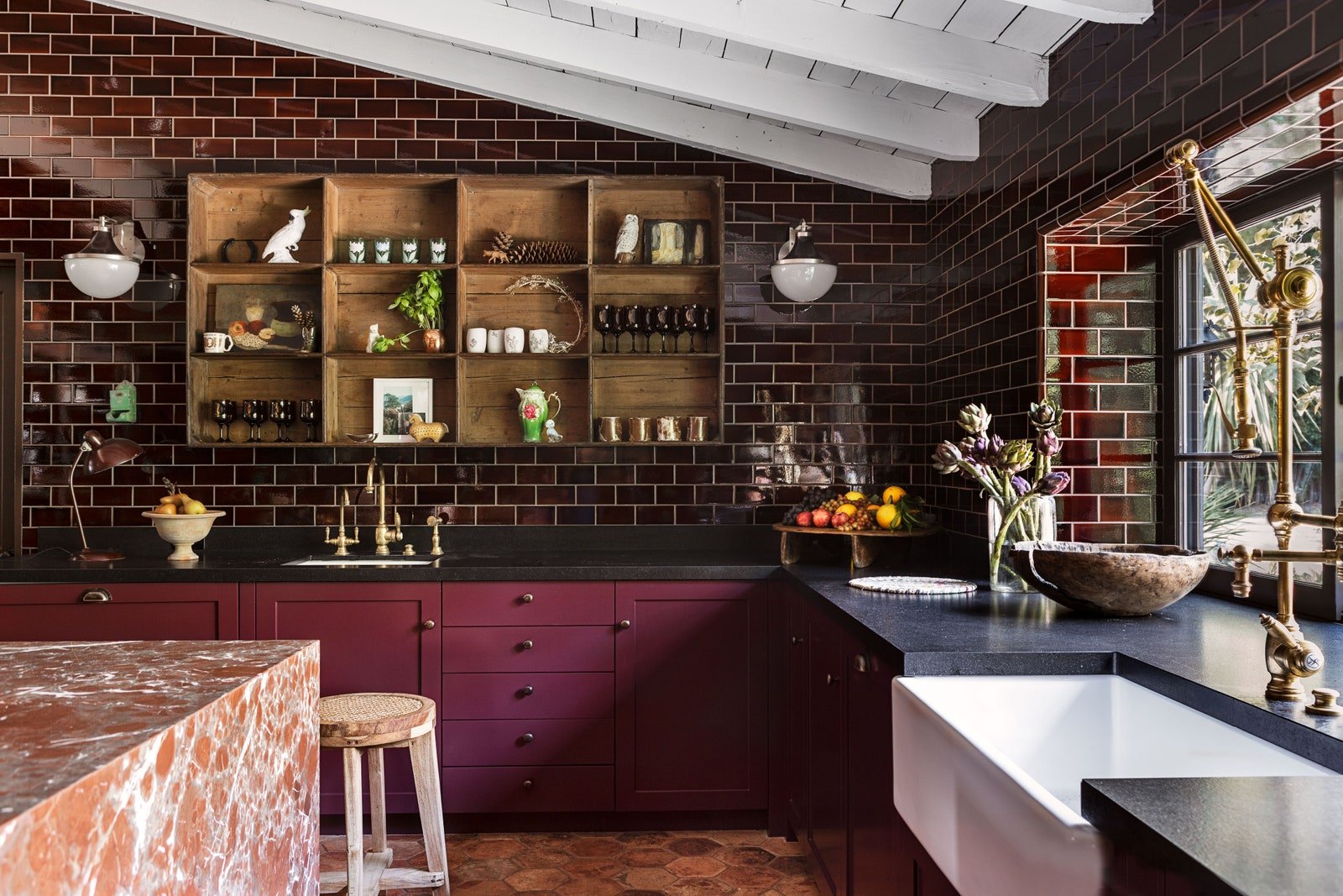
I think the world fell over themselves when they saw Jane Hallworth’s work in Kirsten Dunsts’ new kitchen. It’s happy, moody, playful and full of an infinite amount of soul. But those plum cabinets really bring the space to life and help to not make it look too serious. It just feels classic.
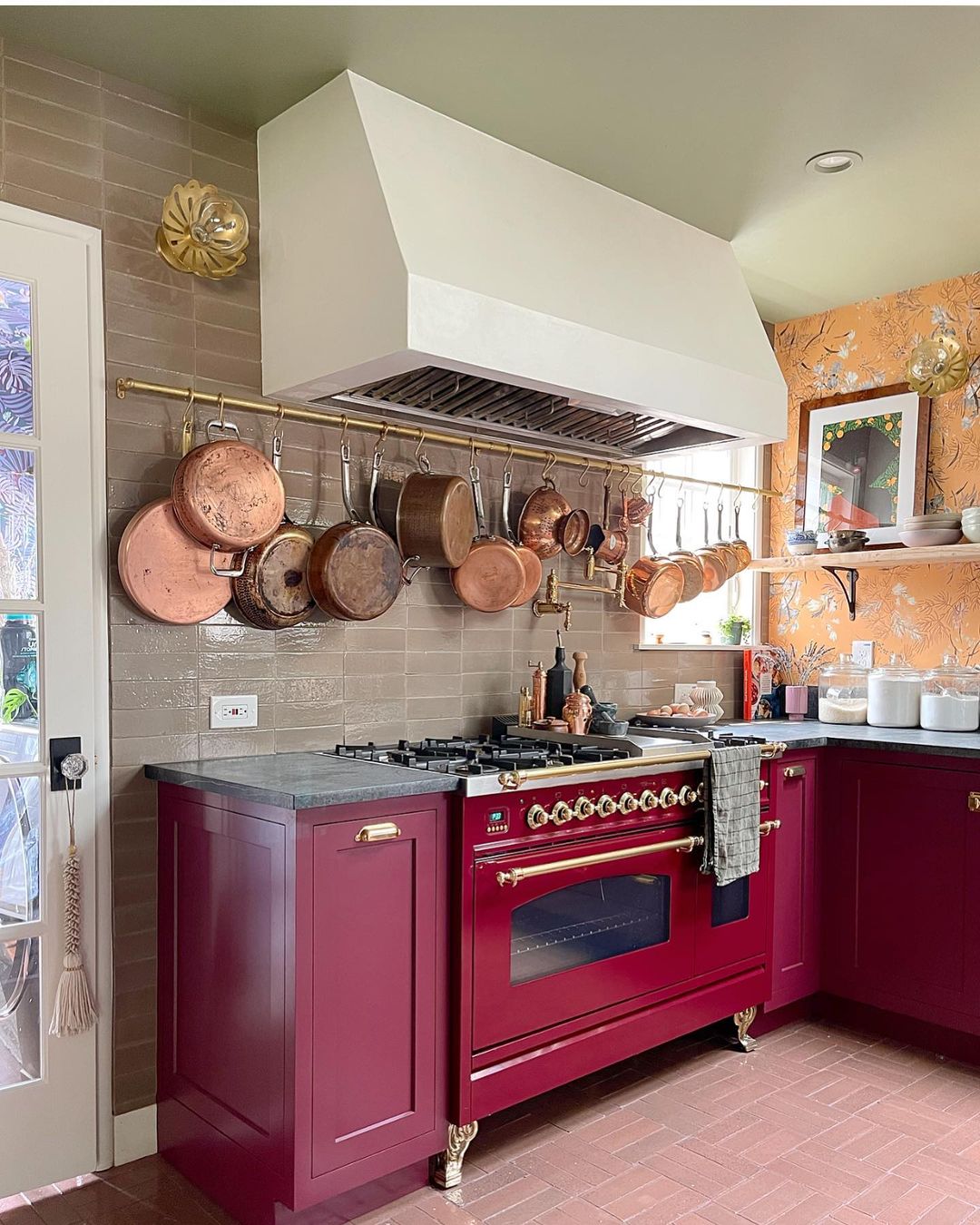
Then we have the great Shavonda Gardner’s kitchen, where she also dove head first into happy, juicy, purple forward kitchen cabinetry. Shavonda’s home is filled with luxurious saturated tones, so this color simply makes sense in her home. See how bold yet natural it looks in the space?? I dare you to walk into that kitchen and be in a bad mood.
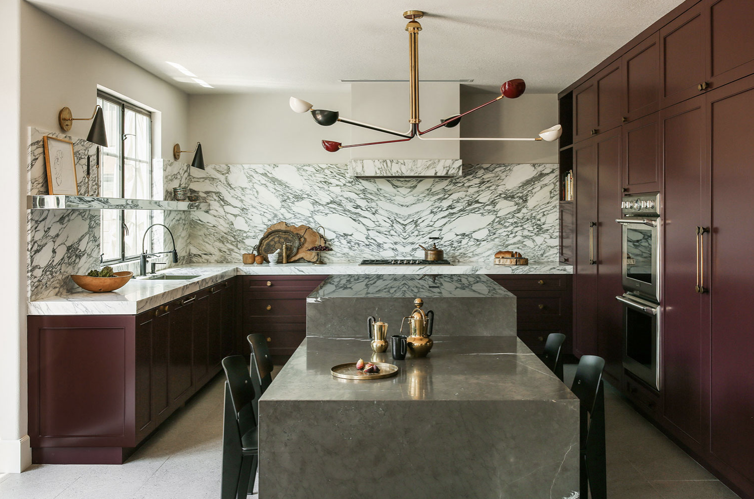
I was new to Studio Hus’ work until I spotted this kitchen in my research and wow do they create stunning spaces. This kitchen is no exception. What I love about this particular plum tone is that if you were to look super quick at this photo you might think that’s regular wood toned cabinetry. But with another look are completely drawn in by that dark, rich plum tone that is stunningly contrasted by the marble counters and backsplash. I could say a lot more about what I love in this kitchen (*cough the chandelier* *cough the chrome wrapped shelf*) but what I want you to take away from this space is that you can (and maybe should expand your mind about kitchen cabinet colors. You might just get something really special out of it.
Metal Kitchens
Whether it’s IKEA or custom, stainless kitchens can be pretty darn chic and practical. I know, I wasn’t totally on board at first either.
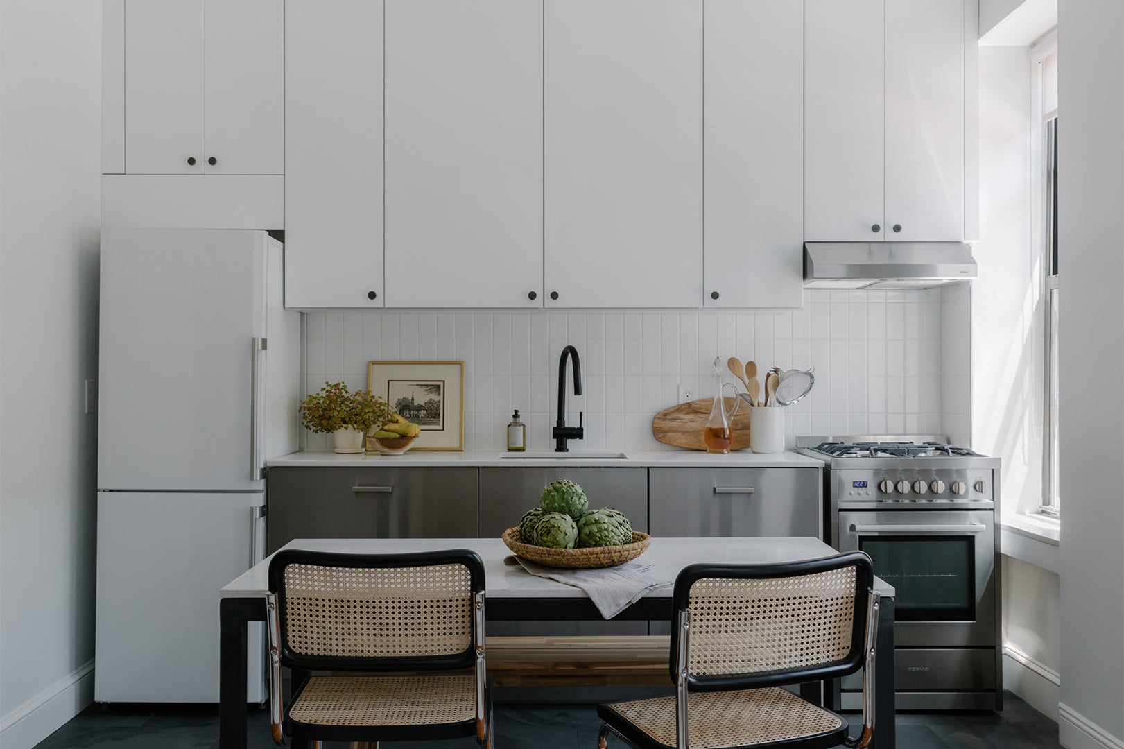
Historically, metal kitchens (especially silver ones) haven’t been my favorite. But they’ve been popping up more and more and I might be slightly changing my tune. What I really like about Justin Dipiero’s kitchen above is that he only used metal cabinetry on the lowers. It helps make the range and hood effortlessly blend in while not making the space feel visually cold.
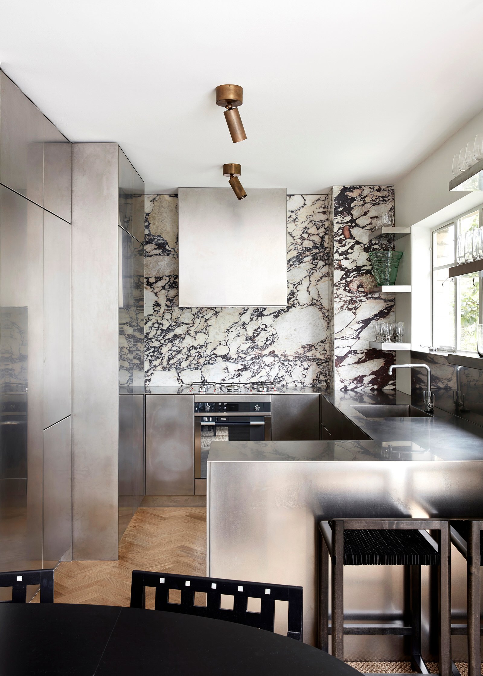
This kitchen by Tamsin Johnson is all brushed stainless steel and honestly pretty awesome (and easy to clean??) It’s a modern design lover’s dream. I do think that incorporating other natural materials like marble and wood (as they did) is a great way to still have that super modern look but making it feel a little warmer.
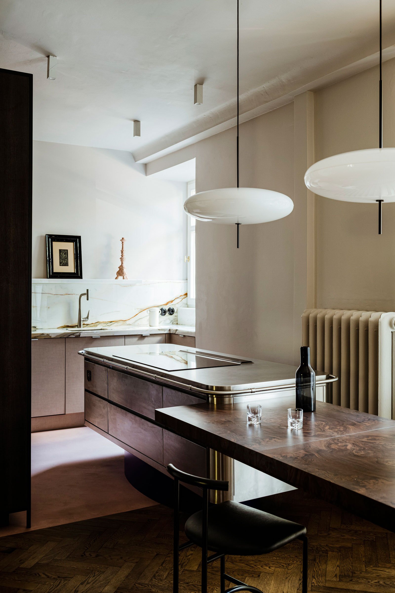
I think it’s fair to say that metal kitchens or metal accented kitchens have been more popular abroad. That really just means it’s only a matter of time for it it hit on the American design scene. Even I can wholeheartedly get behind that incredible 1970s kitchen island above. It also looks like brushed metal which might be the key to really pulling off this look if you are interested. Feels more organic and less…surgical? Can anyone vouch for stainless steel cabinetry? Pros? Cons?
Apron Front Sinks
This one comes straight from the brain of Julie Rose, the kitchen queen herself. This women is constantly studying new kitchen ideas for her clients so when she sent this over asking if I needed any trend ideas I jumped. Let’s get into these sinks…
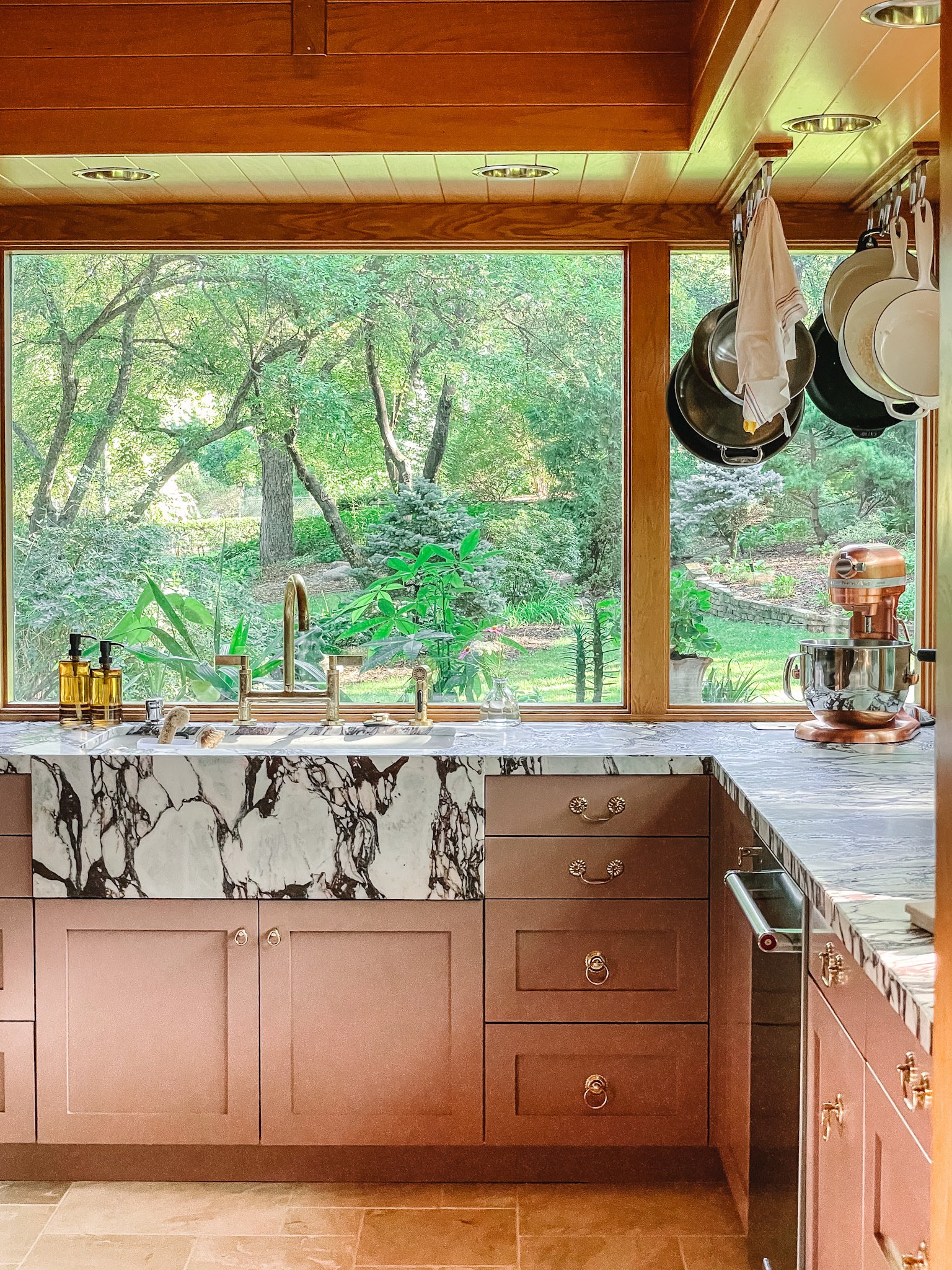
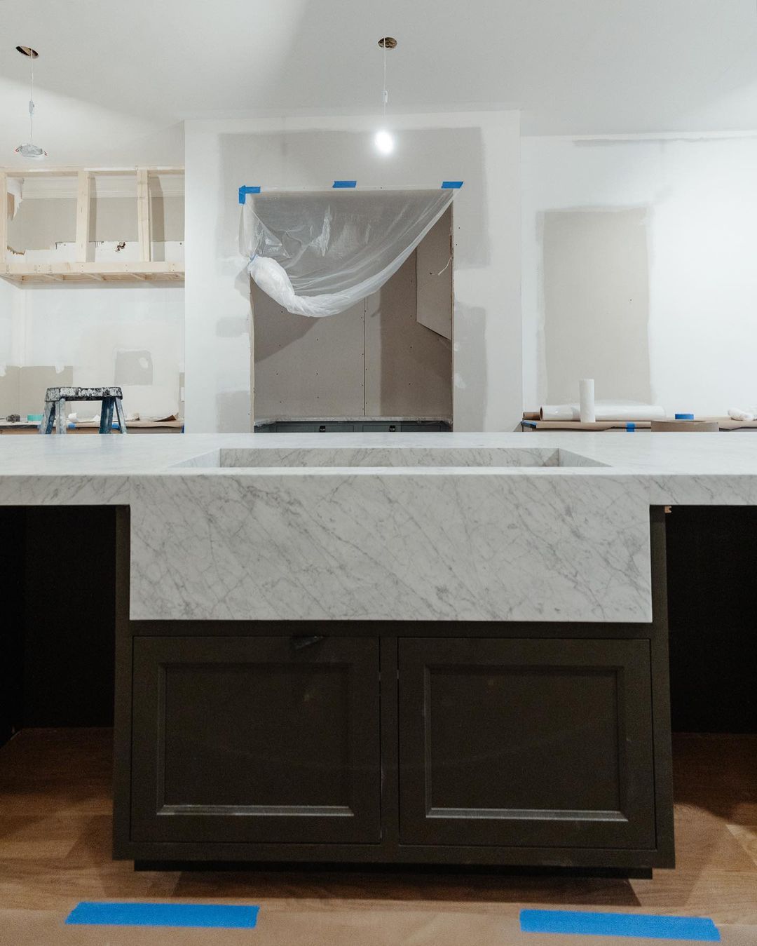
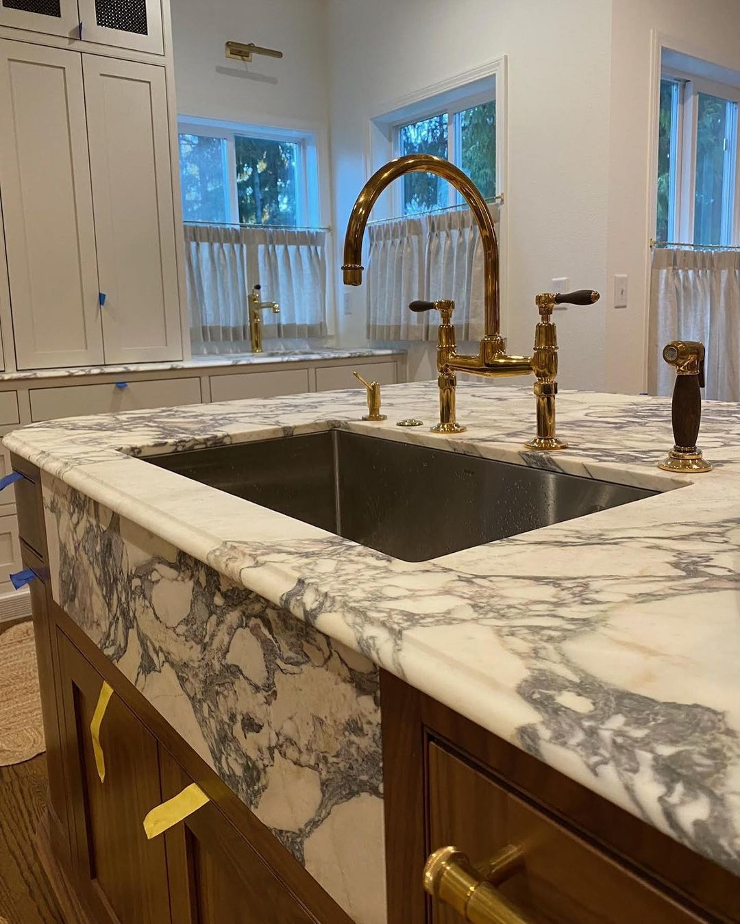
It’s funny because before Julie sent me Kate’s new sink my first instinct was to drool over that marble. Kate if you have any extra I will gladly take it off of your hands. But when Julie pointed out the apron front style, I thought, “how did you miss that?” I love how it gives you the farmhouse sink look but it’s sleeker, more modern, and you can play with fun materials instead of it just being the color of the sink.
Even Chris Loves Julia and EHD fav designer, Heidi Caillier are on the trend. I know I normally only show “done” photos but I think that fact that these designers are in implementing them as we speak only drives this trend home.
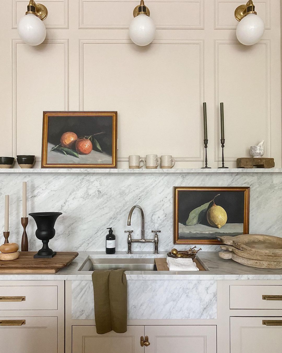
I mean how pretty is that?? Jean Stoffer is another wildly talented designer that knows kitchen design. So if the other’s didn’t convince you, this likely will.
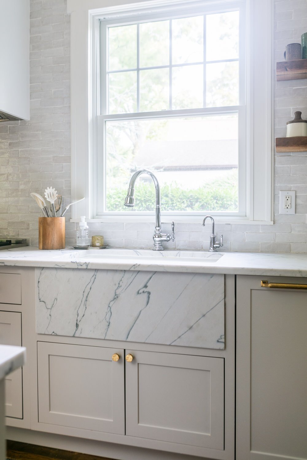
What I also think is cool about this trend is that you have a style options. Both Kate and Julia went more modern with the counter lip and front piece looking like they are seamlessly connected. Then Heidi went for a more traditional and detailed look with having the counter beveled all the way across and the front piece just sitting flat under it. And lastly, the final two are somewhere in between where there is less detail in the counter edge but the front piece still sits under. I wouldn’t assume that last look is probably the most cost effective but maybe not! Just talk to your fabricator to see what the best option is for your design and budget.
The Return Of The Tile After Years Of Only Slab
Large stone slabs have been king for a hot minute (aka years). And while no one is saying goodbye to a stunning marble slab, tile is really picking up some steam.
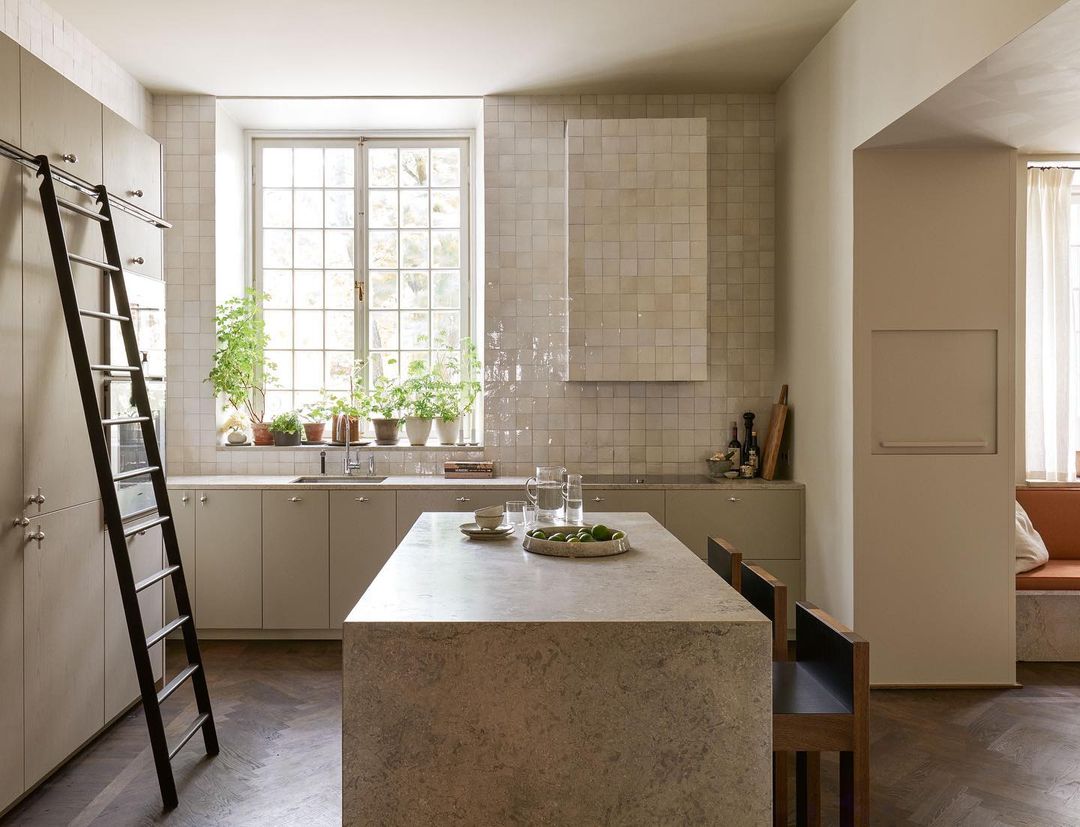
You might have guessed that slabs can be expensive. And it’s not just the slab you need to think about. The fabrication is what really can get you. So tile is really coming in strong. I mean look at that Zellige tiled counter to ceiling backsplash and hood??? Heart, be still. Sheer quantity can be a huge showstopper. Don’t forget that.
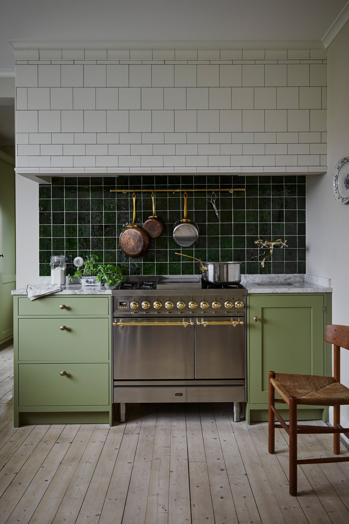
I mean this isn’t beautiful or anything. Emily has been talking about this kind of tiling for most of last year (here specifically). All of these tiles individually are fairly simple. You’ve got some green squares and white rectangles and squares in varying sizes. But when mixed together in an unexpected way it freaking sings the most beautiful song. A slab would have been pretty but not nearly as special and unique as this.
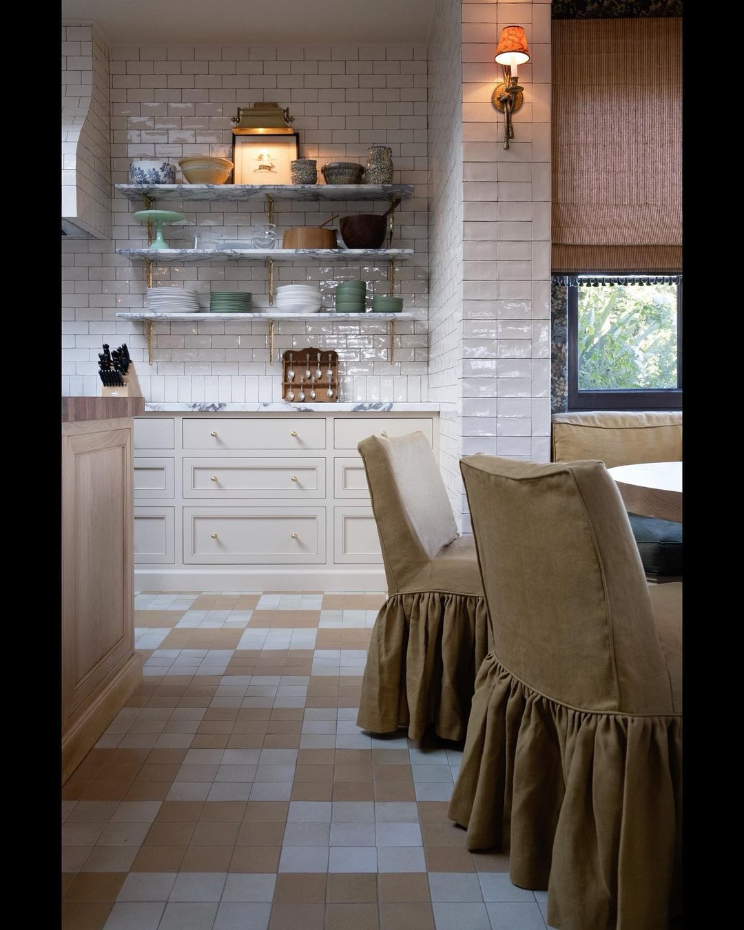
Here we are again with marble countertops and a VERY special tiled wall. Look at all of those tiles orientations! The vertical line along the counter and the brick offset on that one wall and stacked on the other wall. So good. Oh and see the one column of vertical tiles on the what’s probably the load-bearing wall? Too cool and way more affordable than slabs.
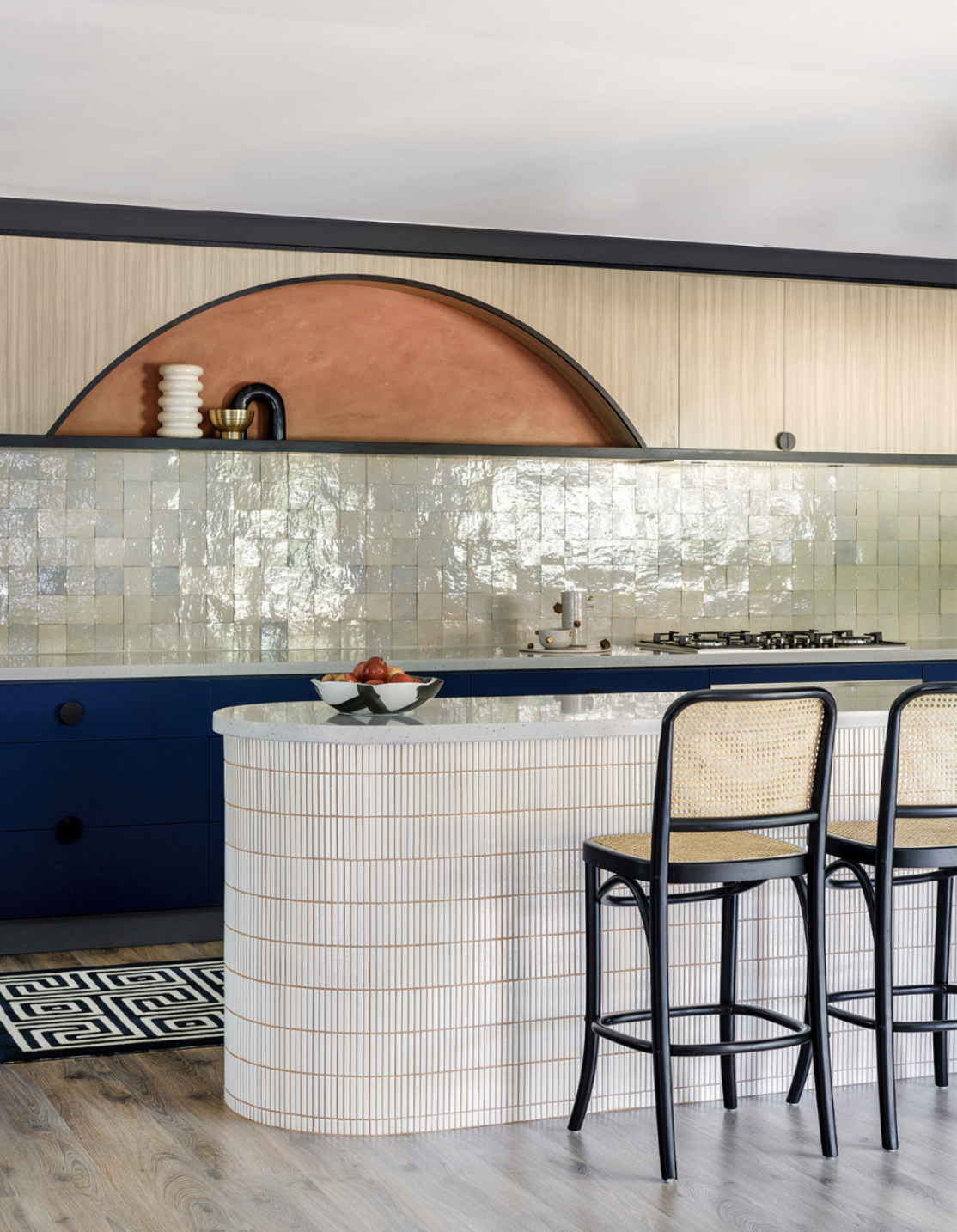
But going with tile doesn’t mean you can’t go modern. Above Exhibit A. Notice though that everything is stacked and vertical. That’s an easy way for tile to look modern.
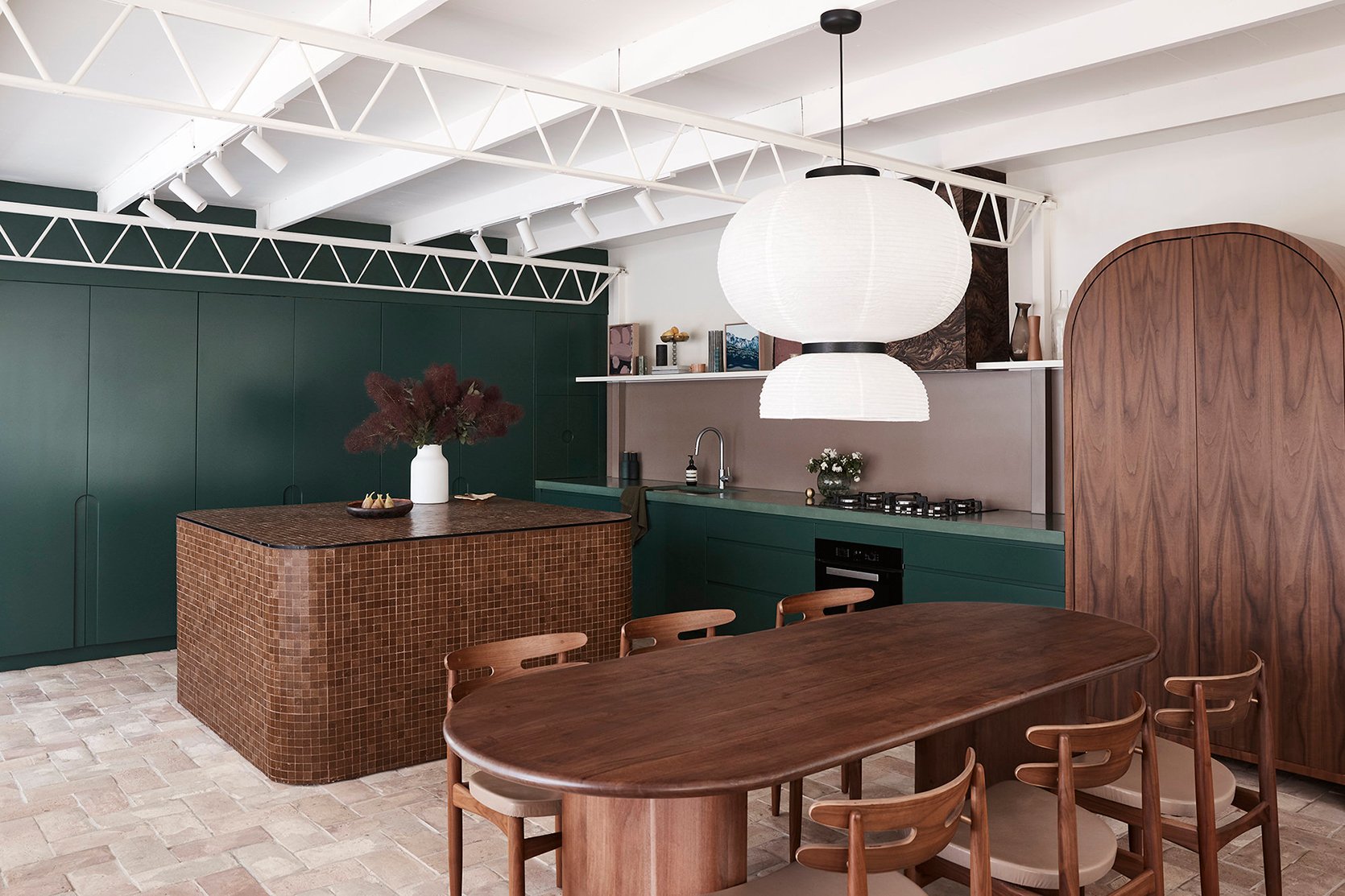
Exhibit B. Tile on the island that gives lots of movement and texture when the rest of the cabinetry is very smooth and ultra modern.
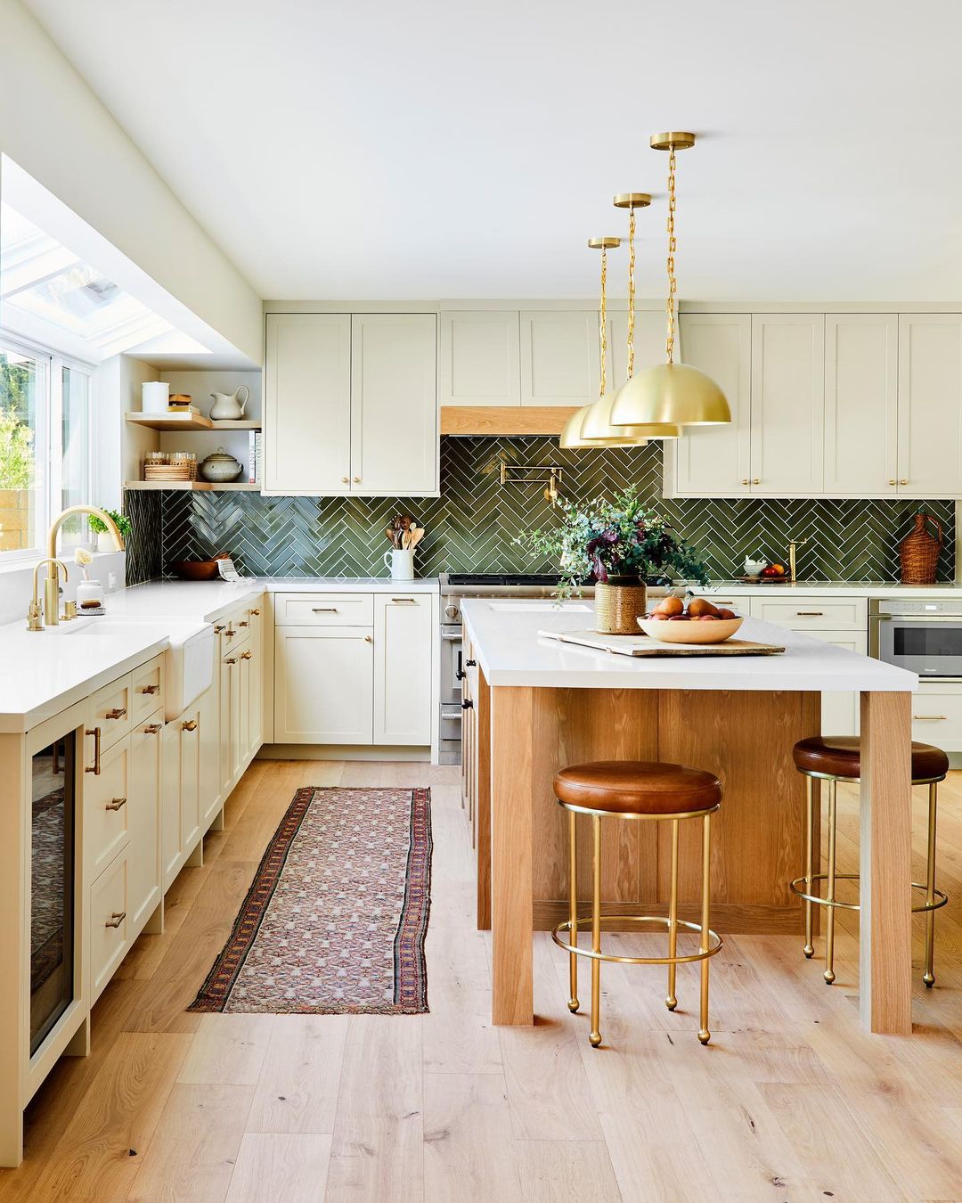
And here we have the amazing Ginny Macdonald with the in-between. Not modern, not traditional. Just fresh, colorful, and in a classic pattern. Has movement like a slab but way more cost effective. Plus it’s just pretty!
Large Scale Marble Veining On Countertops
Ok I know we just talked about tile potentially replacing slabs but large scale, high contrast veining on marble is finally not just for “AD” homes. The high end trend is coming into our real homes.
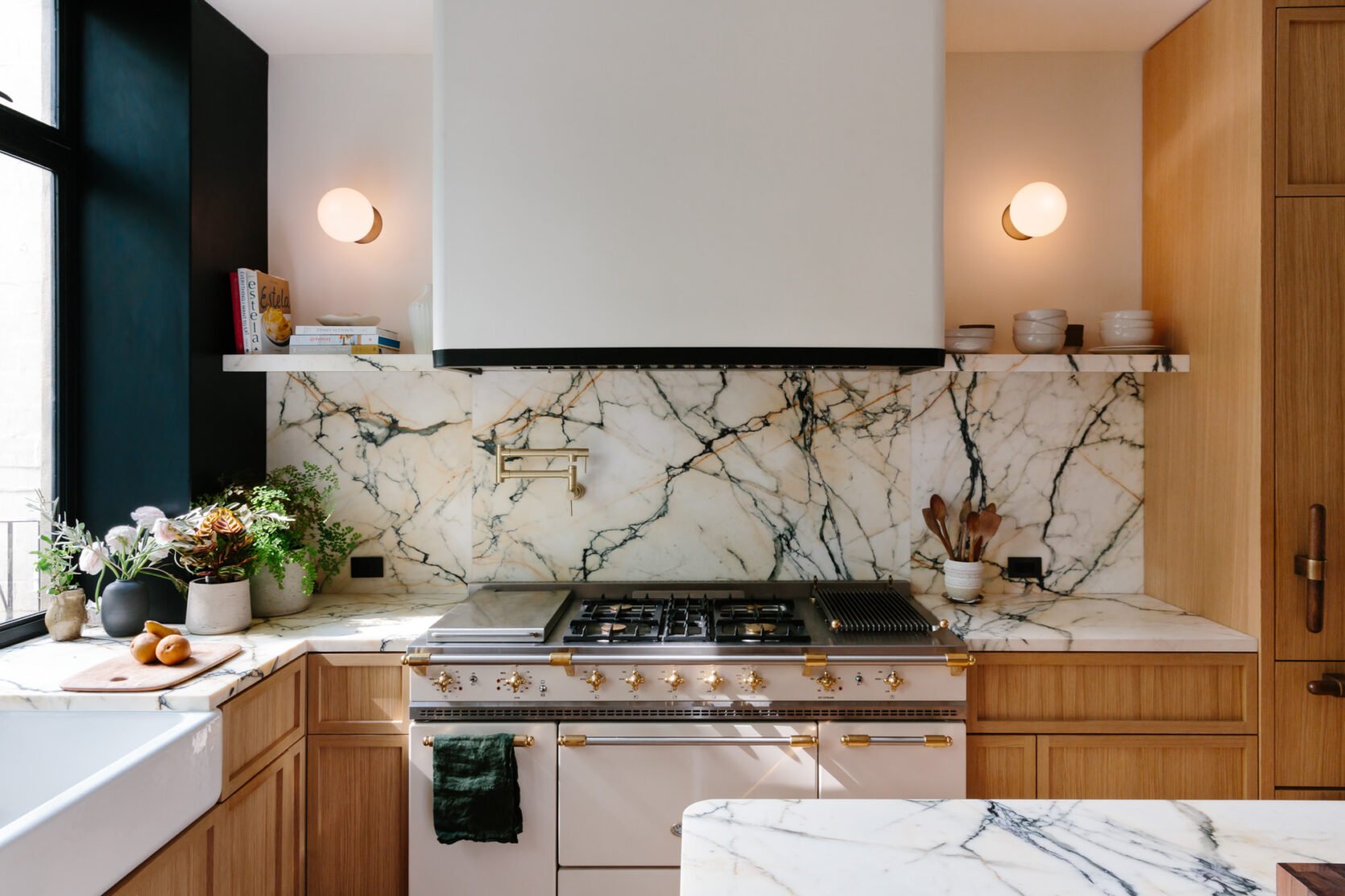
Maybe this first photo isn’t the best example of a “normal home”. BUT it doesn’t look like a real person lives there and that’s the kind of marble I’m talking about. High contrast, big veins.

I know I already used this photo when talking about apron sinks but remember when I said the marble was the first thing that grabbed my attention? How could it not?? But what also struck me was that while Kate is a design influencer, that kinda bold marble isn’t what you see outside of a crazy rich celebrity home. I thought it’s here! For all of us! We are taking more risks and I love it!
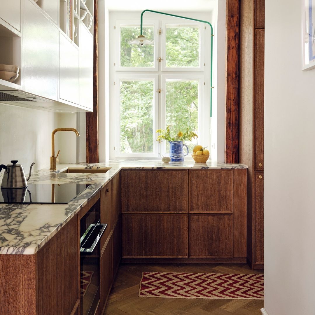
This is another great example of using a very bold veined marble but in a way that feels approachable. I really love the dark walnut, contrast marble mix. Isn’t it beautiful but not super overwhelming?
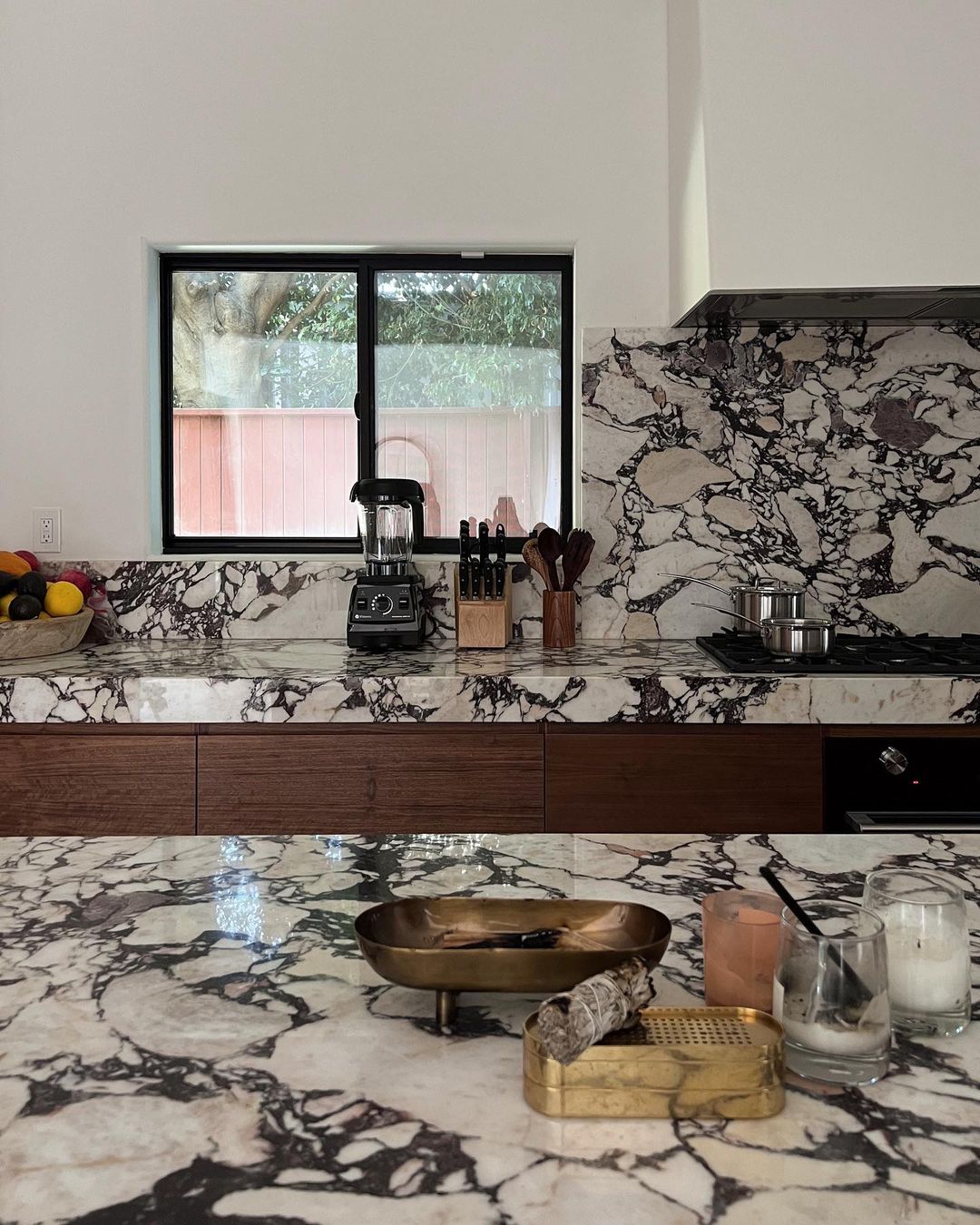
Aimee Song also went for the bold marble and dark cabinets. With the marble super thick and also being the backsplash, it makes a much bigger statement. I think it’s so stunning and when you have a marble like this, your kitchen doesn’t need a whole lot else.
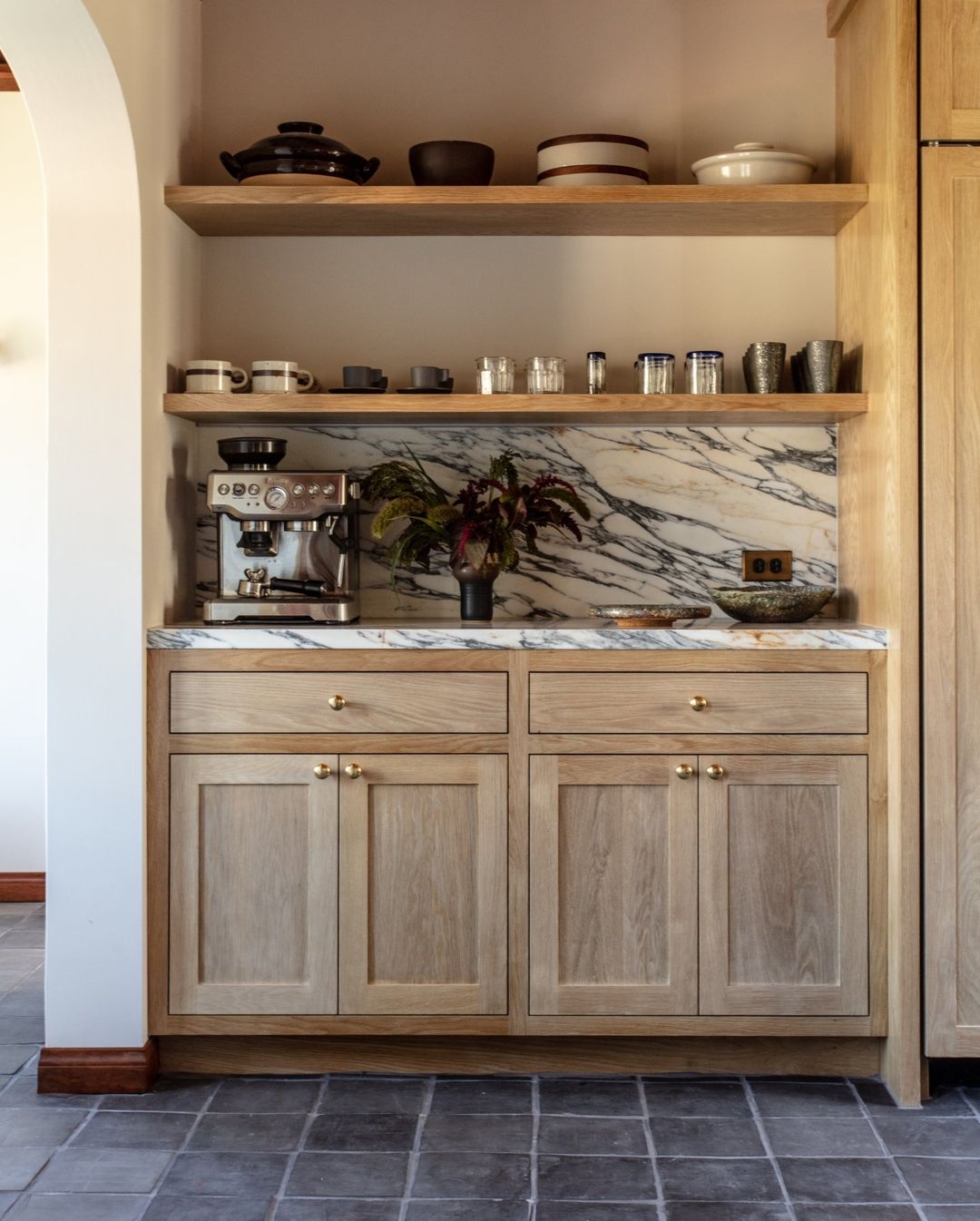
Bold marble proves to look incredible with colorful cabinets, dark cabinets and light cabinets. Hence why this trend is going to stay strong in 2022.
Double Islands…
Em asked if we thought this was a trend. I immediately wanted to say, “NO, two islands?? I refuse to say that’s a thing”. I mean unless you have a very large family or live in a multigenerational home, why would anyone need TWO islands?! To say I thought (and kinda think) it’s wild is an understatement. Can you tell? But trends aren’t here for me to say if they exist or not. They just exist (some last longer than others). Also maybe I should take a chill pill and recognize that there could be a ton of totally valid reasons for needing more than one island.
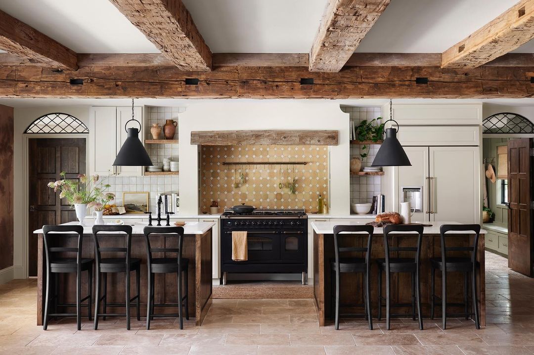
Now, this one from the upcoming season of Fixer Upper feels less “we need two islands” and more “let’s split up what would have been a veeeery long island into two parts”. This I can wrap my brain around. Have any of you done this look?
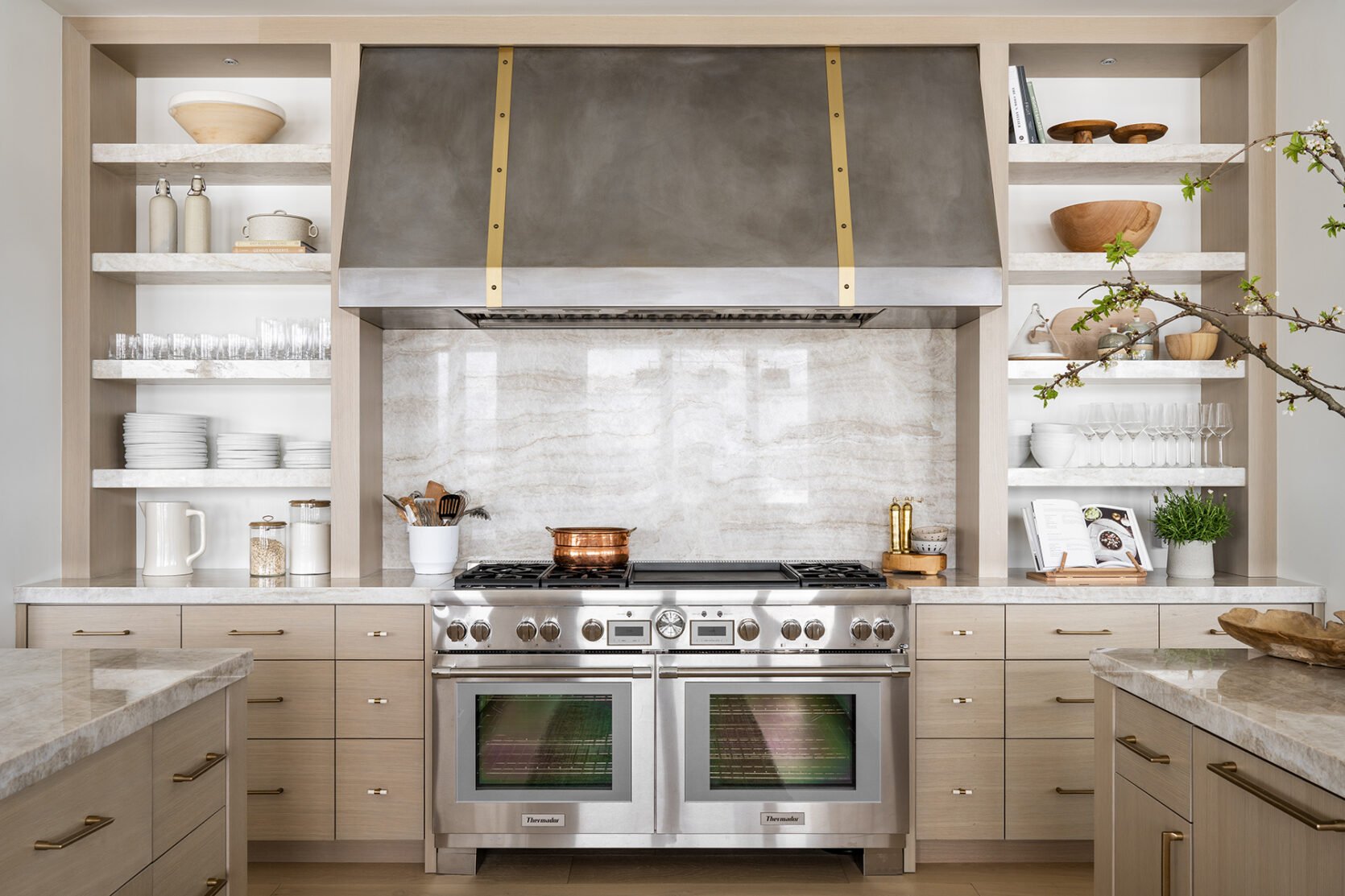
But then when Em sent me this kitchen, while extremely beautiful, the two islands are just… a lot. Maybe this is a big party house? Maybe as I said before this house is FULL of kids? Or it’s filled with parents, kids, grandparents, cousins, etc.?
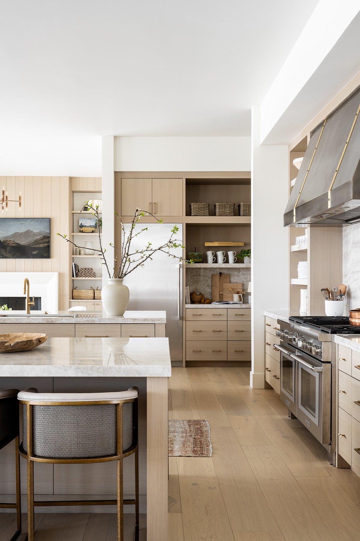
There is a part of me that hopes this stays niche and only happens on an absolute need basis. But also if my whole philosophy is design the home you want to live in and one that works best for you then who am I to judge, right?? I’m sure for some double Islands are a live saver.
Frosted Cabinet Doors
Afraid of see-through cabinets but love the airy look? This could be the middle ground you were looking for…
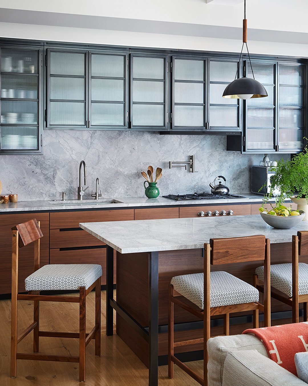
This is another one that feels very European but is creepin’ its way over to the states and I’m personally into it. I love that you can have the look and feeling of your cabinets being light and open but not needing to have the contents of your cabinets perfect organized. I also feel that especially with the texture of the panels that they wouldn’t look dirty easily. Another win!
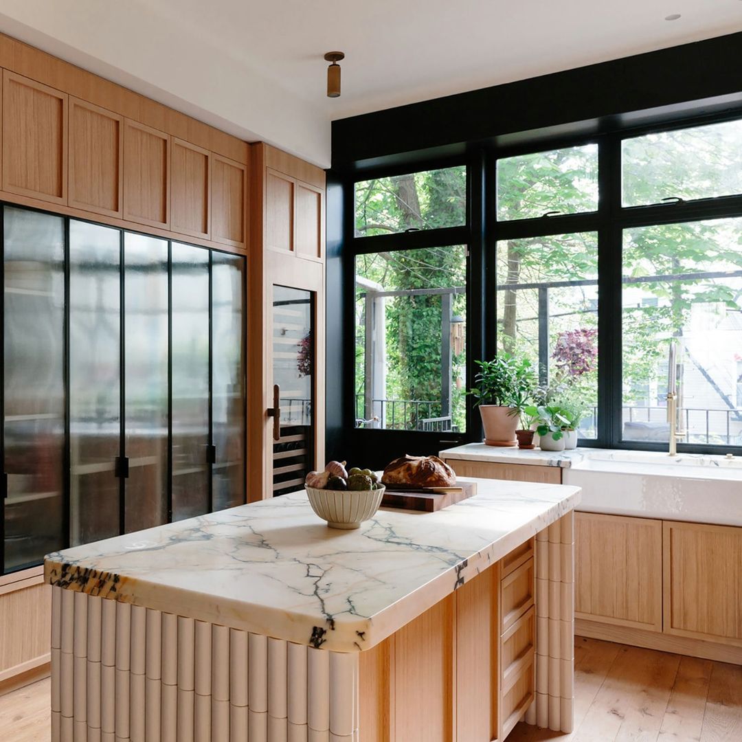
In this very beautiful kitchen, the doors look less textured but instead slightly tinted giving you a similar sense of privacy. What is also great is that it’s almost like a built-in organizing alert. It’s concealed enough so it doesn’t have to be perfect but you can also easily tell when it’s gone too far.
All in all, I think these types of cabinet doors really help to open up a kitchen and am happy to see this trend go the distance.
Another way that these frosted panels are being used is a as a hood cover over the stove. It seems like an interesting choice given that they likely get dirty quick being over the range but maybe I’m wrong. Any insight? Regardless the look great and make the ceilings feel taller.
The HOT Return Of The Pot Rack
Hear me out on this one. I know that pot racks aren’t new…like at all. BUT I feel like they are dominating my feed. I can’t go 5 minutes without seeing a great pot rack in a kitchen shot. But also they are really being thoughtfully (and sometimes boldly) incorporated into kitchen designs. Let me show you.
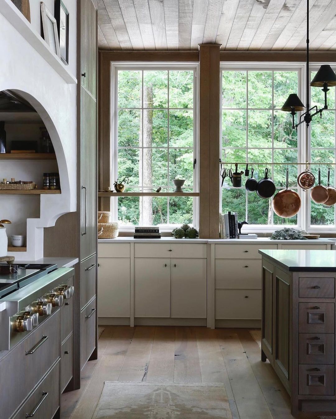
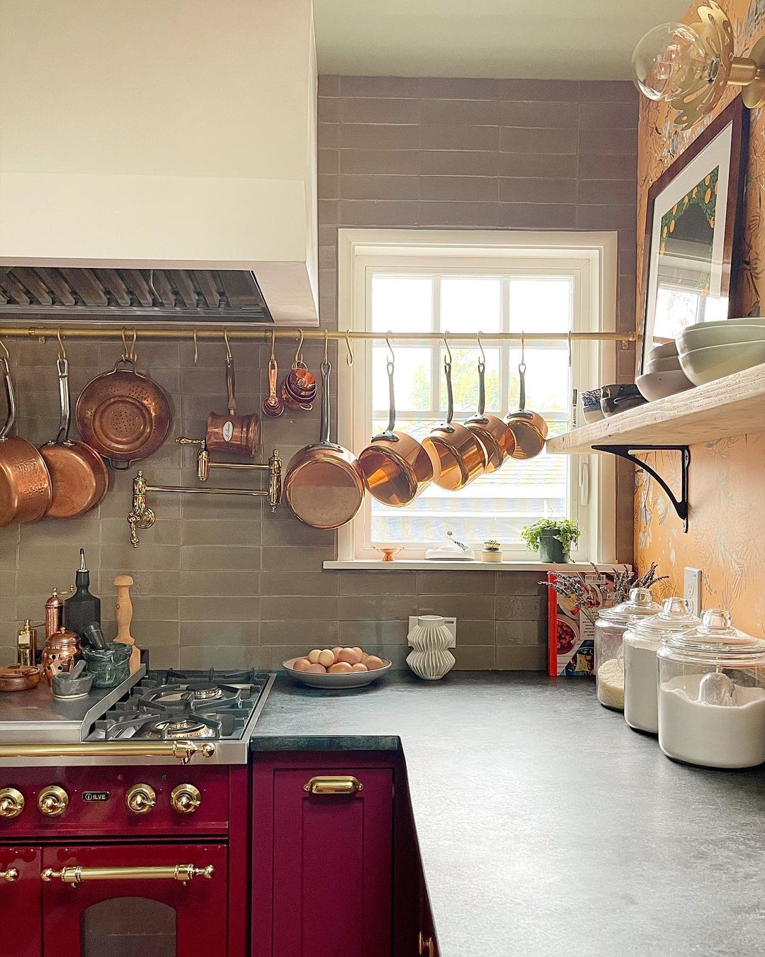
Take this, almost too beautiful, kitchen and see how that pot rack was very thoughtfully placed in front of the window. It’s so stunning but also not that hard to incorporate into your own kitchen (and window). Honorable mention to that floating shelf. You’re perfect.
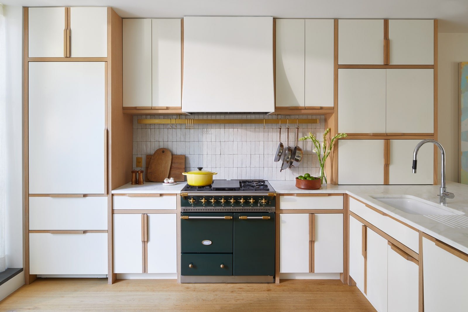
Here’s another “statement pot rack”. What I love about this one is that it feels like an effortless way to make a dramatic statement without screaming, “look how dramatic I am!”
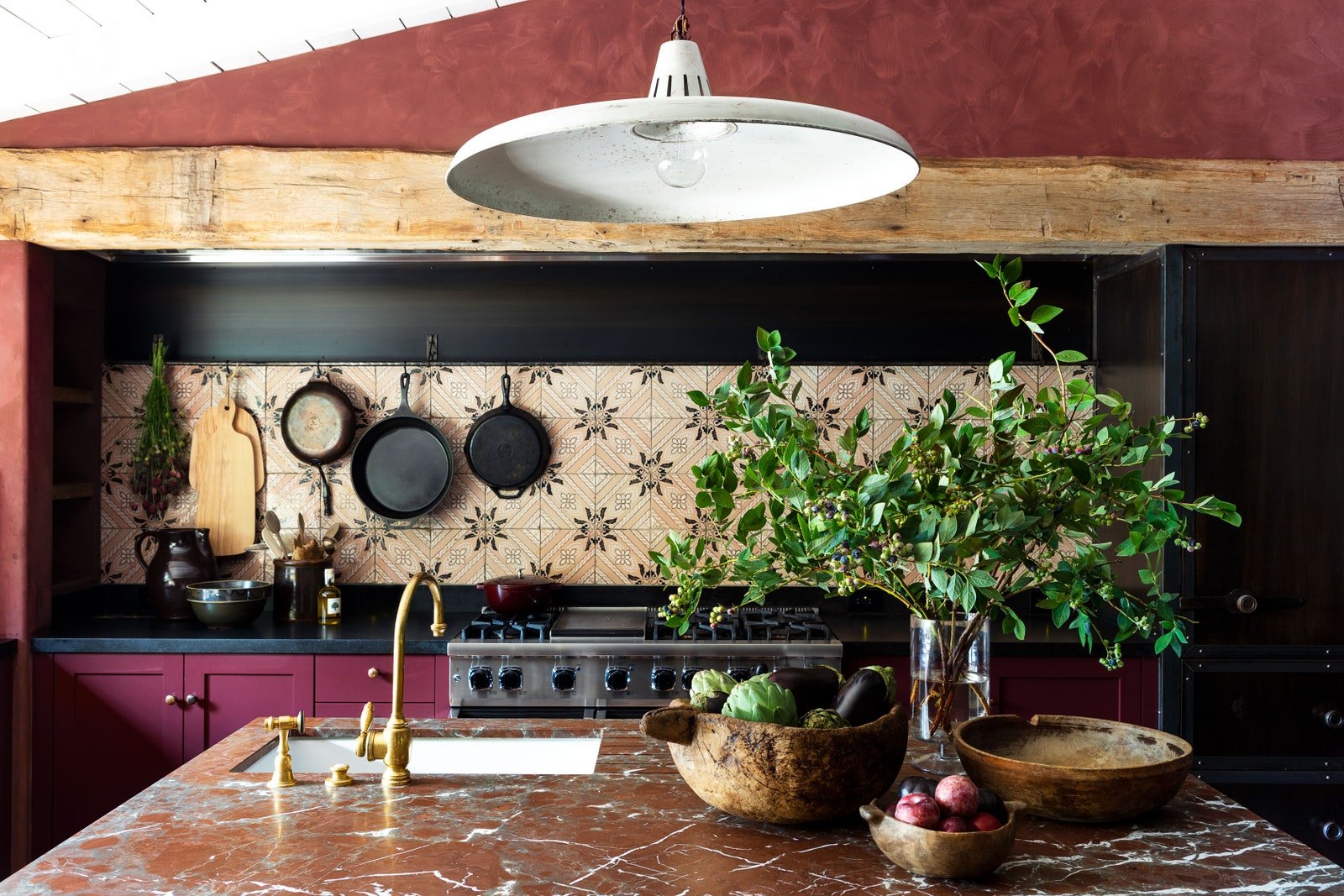
This one is another “all the way across the range wall” but more understated which I also love. Like you wouldn’t even know it was there unless there were pots hanging. So chic!
Shavonda is here is show off that copper pot collection and were are here for it! Plus she shows us that you don’t need a massive window like in the first photo to have that window-pot rack moment.
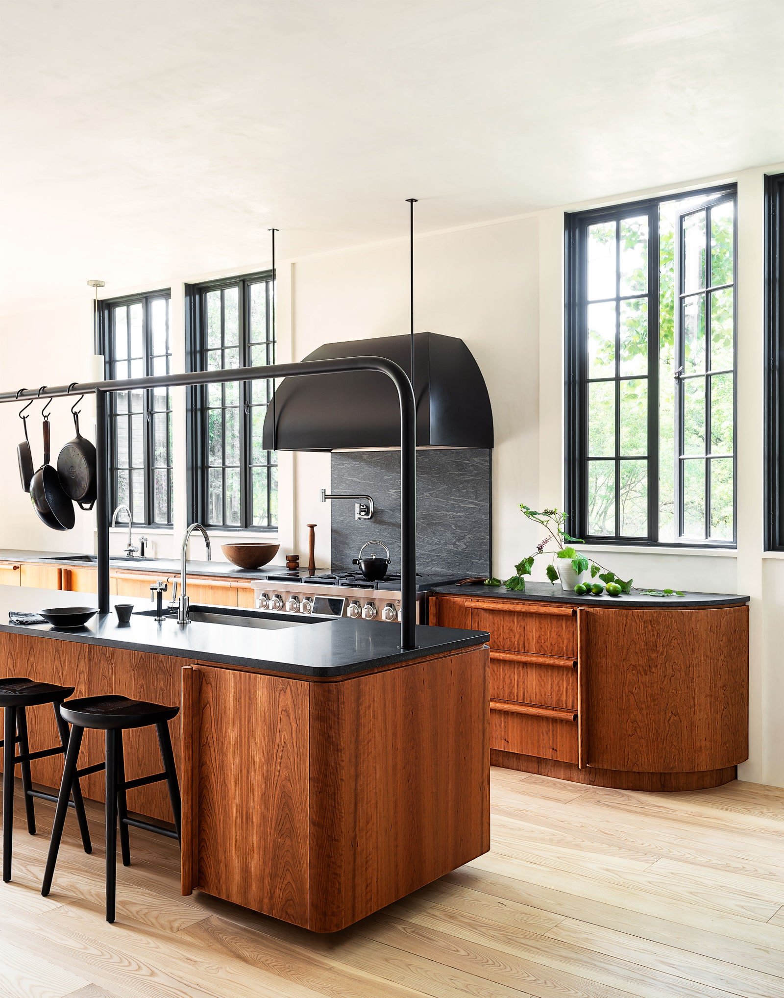
But also know that you can mix things up and put those pots over your island. Sure that’s probably a custom island, but for those who love to DIY this could be a super cool (and practical) project to tackle.
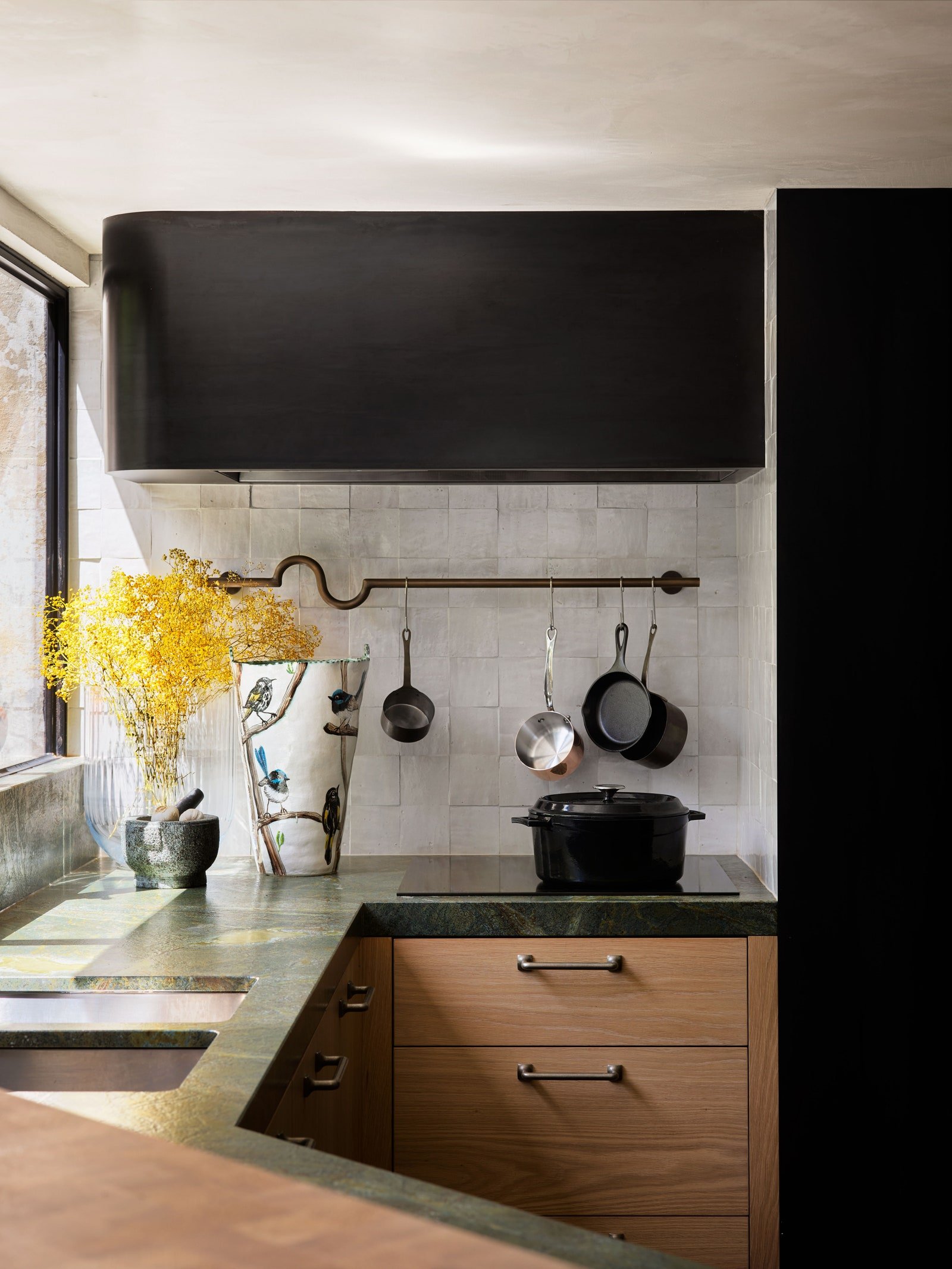
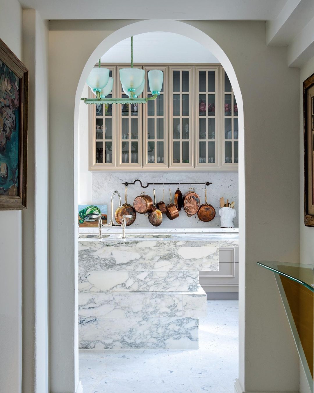
A rack can have a personality of its own. This “S” bar is everything to me. I love it so much and the first time I saw it in Troye Sivan’s home my heart jumped out of my chest.
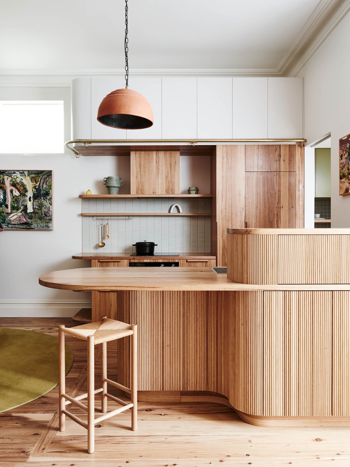
However, small and simple is just as effective. I also think that pot or utensil racks help to give a little more dimension and bring your eye up. Basically they’re pretty, helpful, and can be put in nearly every kitchen. Happy they are very much back for 2022.
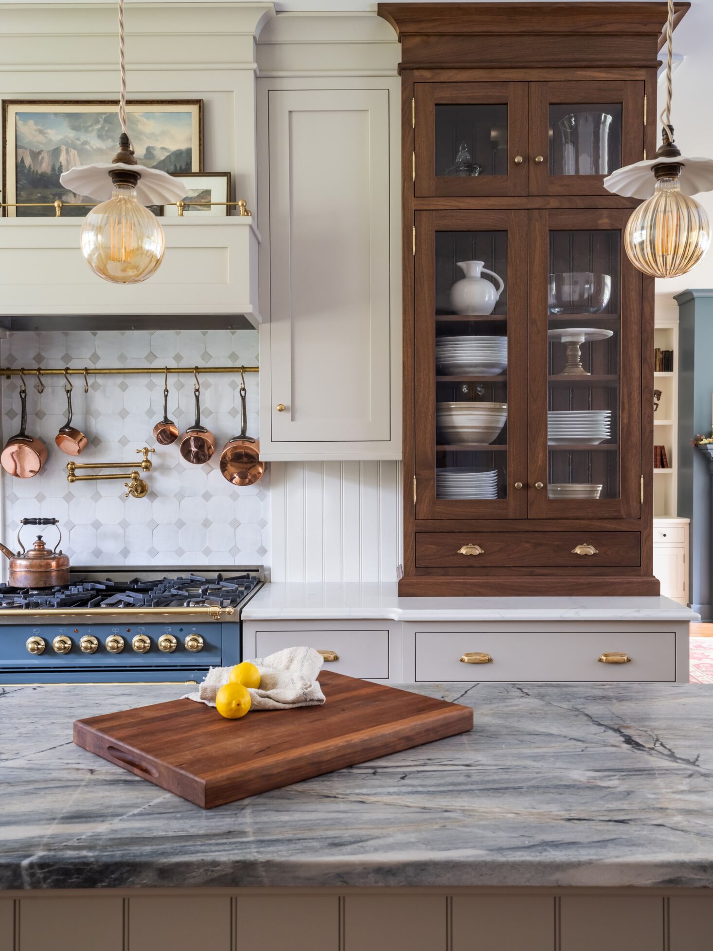
I just thought this photo was super pretty:) Ok, we are done with the racks.
So what do you think? Did any of these spark your reno imagination? Let’s talk trends. O and we are doing a first time ever kitchen appliance trend post. We have LOTS of thoughts so get ready:)
Love you, mean it.
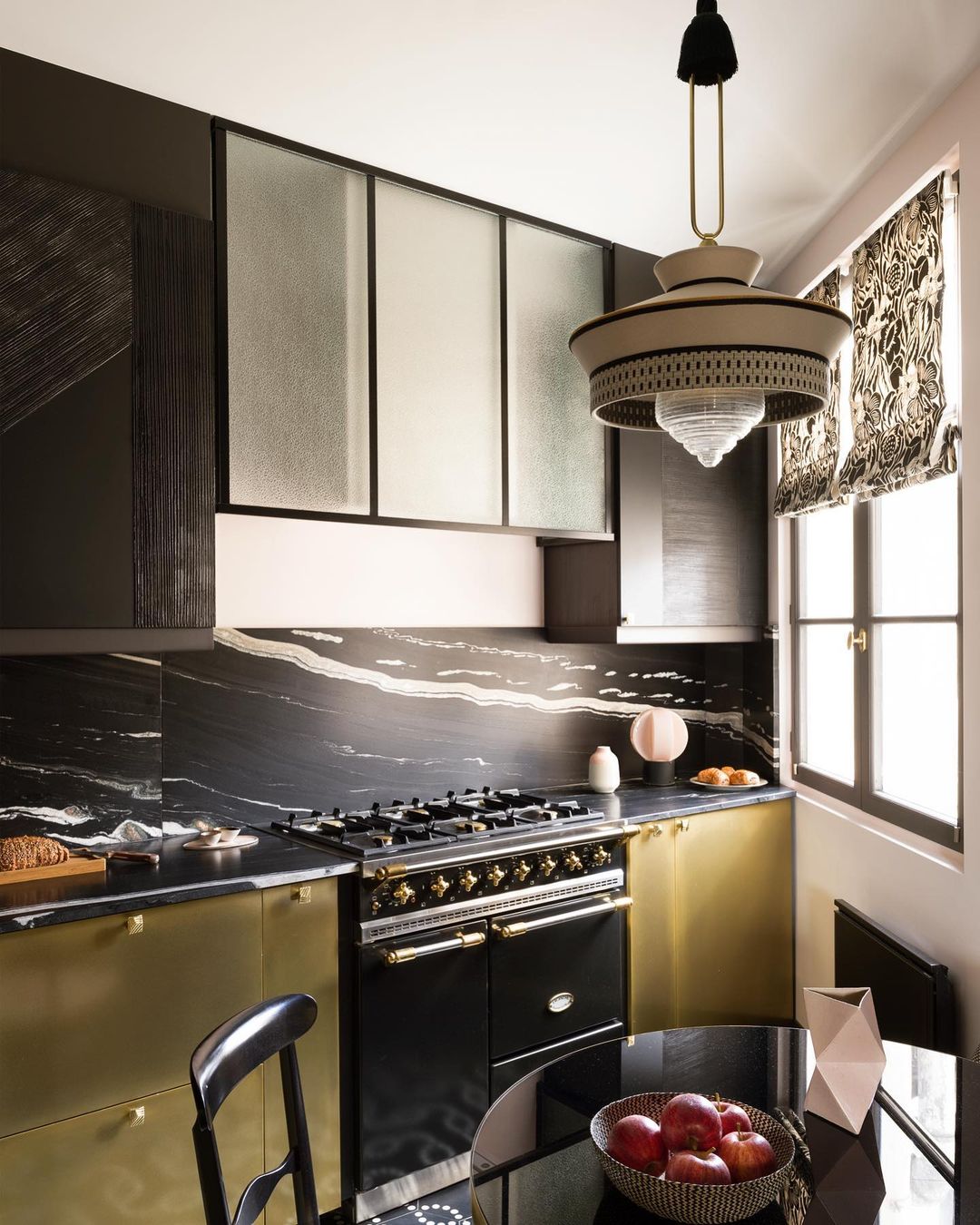
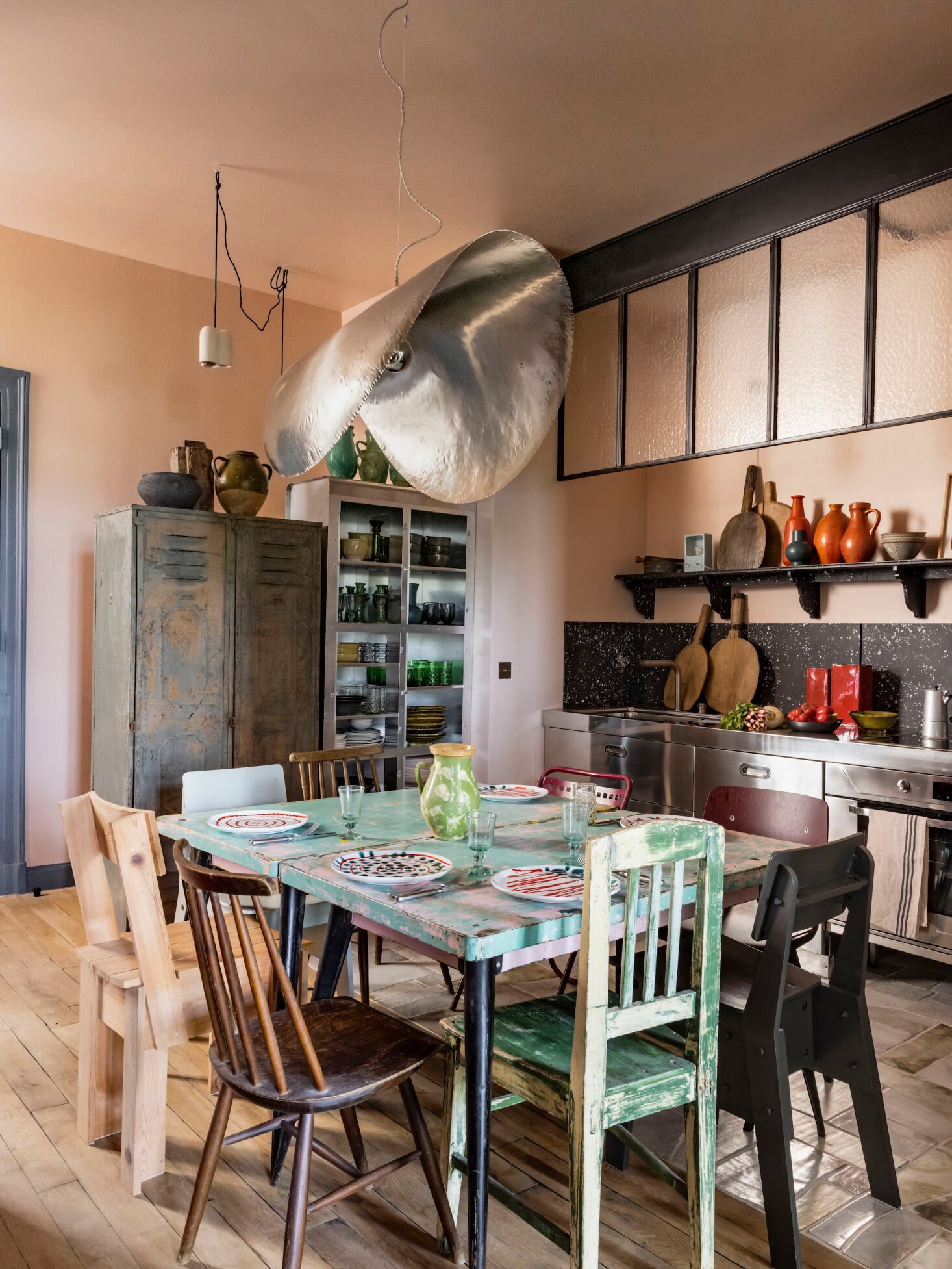
Opening Image Credits: Design by Home Studios | Photo by Brian Ferry | via Yellowtrace
THIS POST WAS ORIGINALLY PUBLISHED HERE.

