Welcome to Part One of our 2022 bathroom trends predictions. That’s right, this year we’ve spotted so many that we are dividing them up into two categories. Today I am introducing the non-renovation-based (so also renter-friendly) trends, but stay tuned for all things renovation coming soon. Now I have to say when it comes to bathrooms, I find the risk-takers and rule-breakers in design keep me on my toes every year. We tend to think of bathroom design in terms of permanent fixtures–the flooring, sink placement, faucets, etc.– but bathrooms have more decorative elements than we give them credit for. As a renter, I am certainly guilty of taking my bathroom for granted, focusing more on my more lived in spaces. But those days are gone because the trends we are expecting to see in 2022 are more approachable, innovative, and exciting than ever. Allow me to demonstrate…
The New Window Treatment: CAFE CURTAINS
Last year we predicted roman shades would dominate and while that trend is still going strong, we expect cafe curtains will be huge in 2022. When I think of cafe curtains I think of the charming greasy spoon diner down the street that’s been around for 50 years. There is a certain nostalgia about them, perhaps because they are often associated with ruffles, pattern, and good old fashion bacon and eggs. In 2022 we predict nostalgic vintage aesthetics will continue to thrive, so it should be no surprise that cafe curtains are defying odds by becoming the newest bathroom window treatment trend. I am all for it.
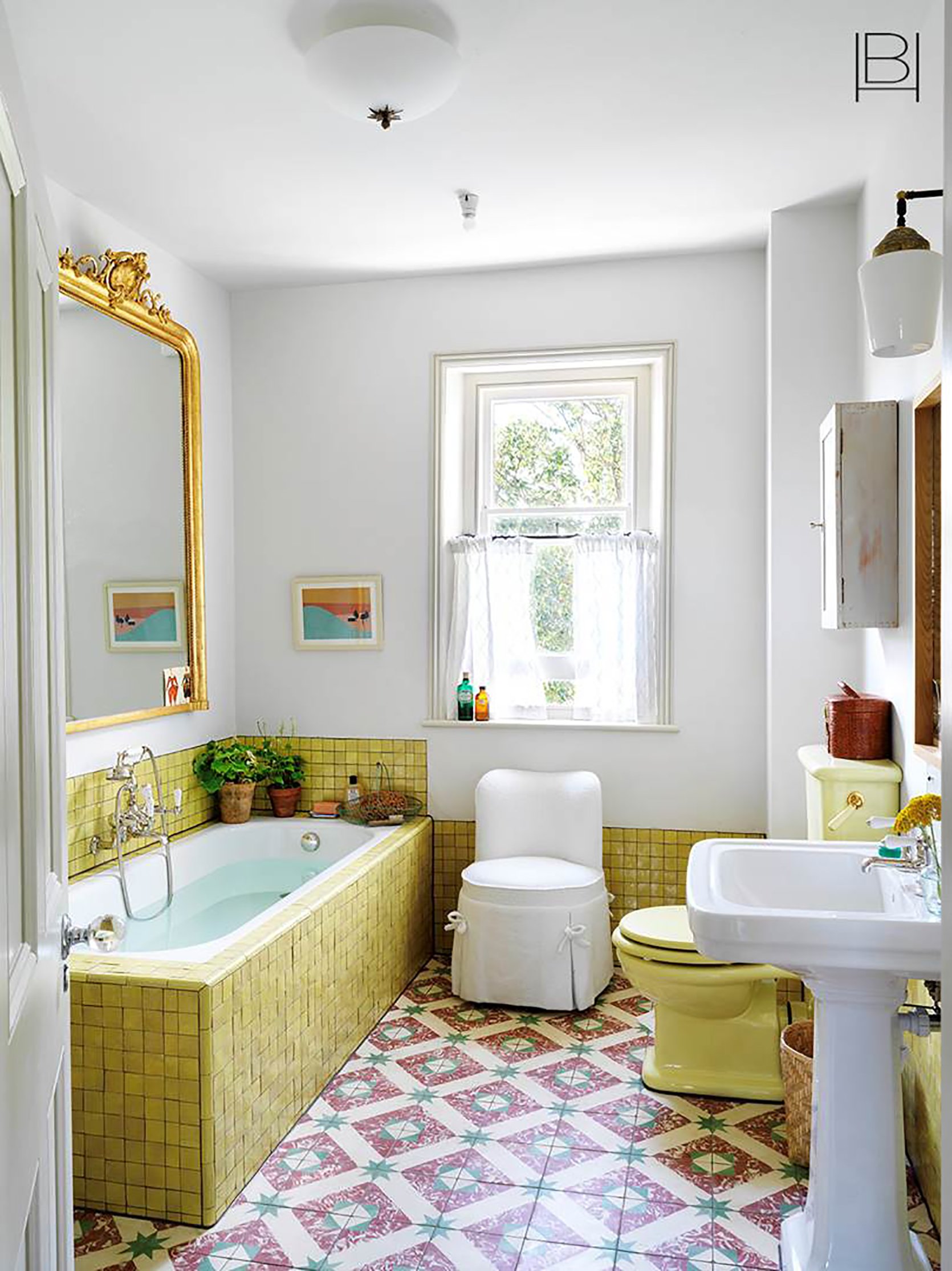
A delicate white cafe curtain like in the above bathroom designed by Beata Hueman gives just the right amount of whimsy to this colorful vintage style bathroom. This bathroom is undeniably playful, so I love that Beata went with a neutral curtain to level it out (although if anyone can make pattern work it’s Beata herself).
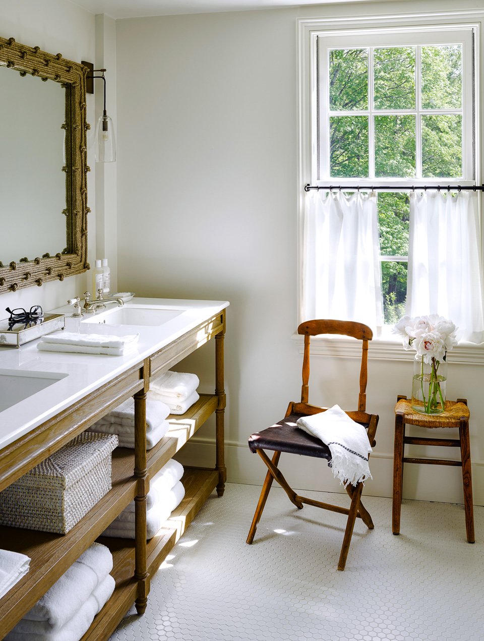
Cafe curtains are not only a stylistic choice. They are also a great way to allow as much natural light in as possible as we can see here in this bathroom designed by Kara Mann. Side note: if you are worried about privacy, think of cafe curtains for second-story windows or windows that face a private outdoor area (like a backyard or side yard).
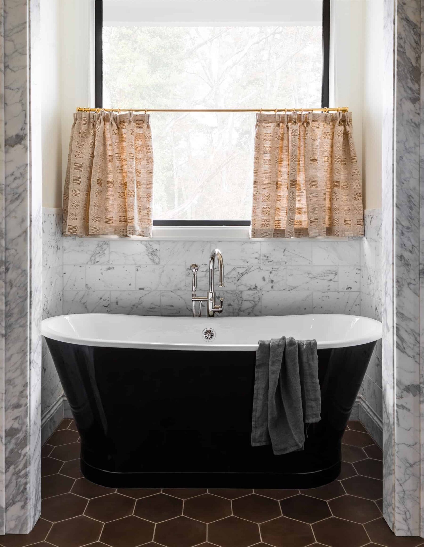
Of course, a cafe curtain is an excellent way to add pattern and color. Heidi Caillier is an expert at pattern and material mixing and this bathroom is no exception. As an added bonus, cafe curtains have less fabric and require smaller rods so they are inherently a cheaper window treatment option. Yep, that means they aren’t just cute–they are also budget-friendly!
Upholstered Furniture
Consider me shocked yet delighted that upholstered furniture is making its way into the bathroom. I think this is yet another residual effect of Covid–with so much staying at home, we want every room to be a place we’d like to spend time in. Every space needs to be multifunctional and yes, that includes bathrooms. I am not talking about taking Zoom calls from your tub, (if you do that then more power to you) but I know bathrooms are becoming the relaxing escape rooms we all need at times. So if a comfortable, pleasing to the eye cushioned seat is what you crave in the bathroom, you are not alone. Let’s observe:
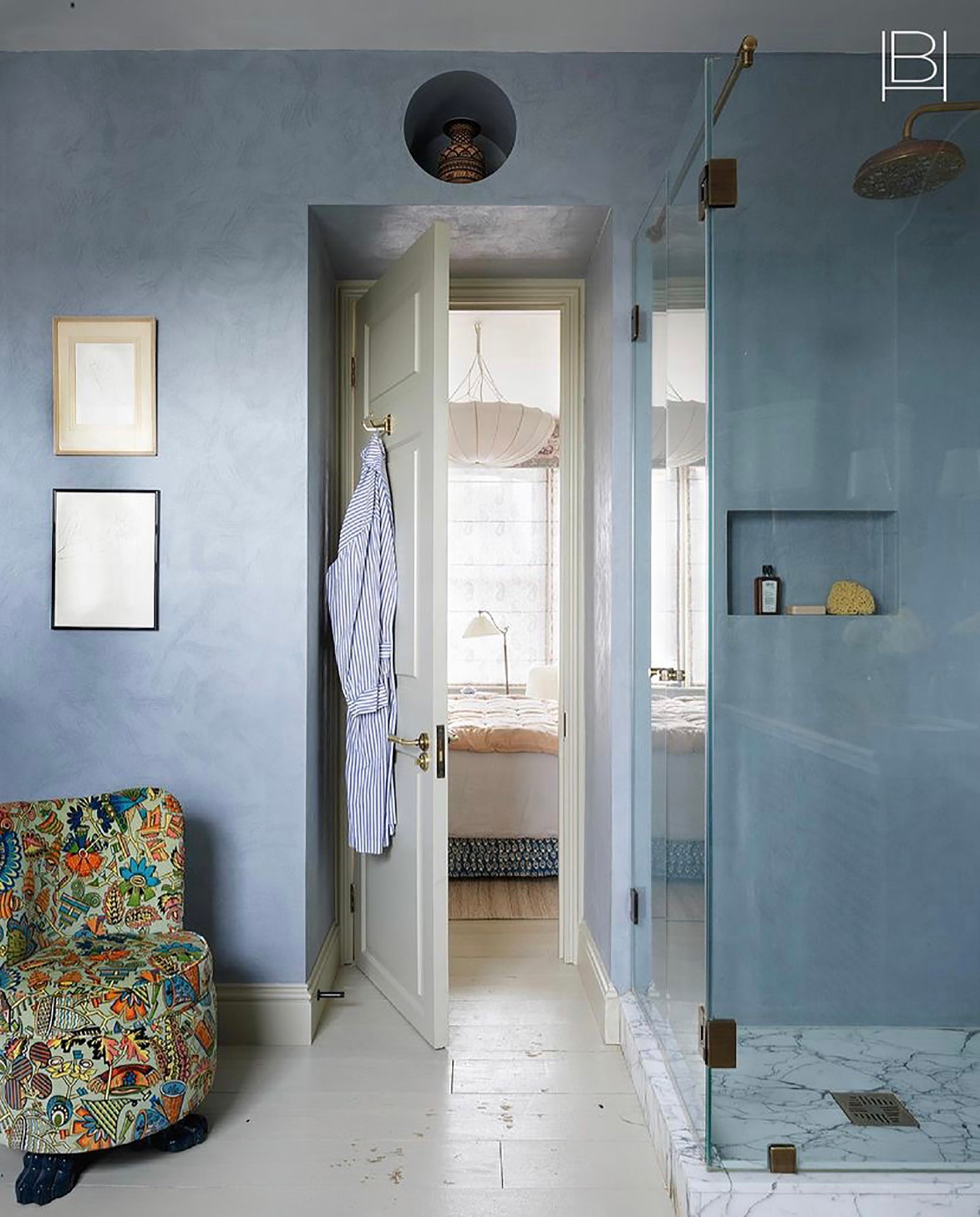
In this predominantly blue bathroom, a patterned upholstered chair adds character and of course, a place to sit. Look, no one is saying every bathroom should be equipped with comfortable seating but if it is a viable option and makes sense for your needs, we say go for it. I’ll never knock function and style and as a huge fan of sitting, I am a big supporter of this trend.
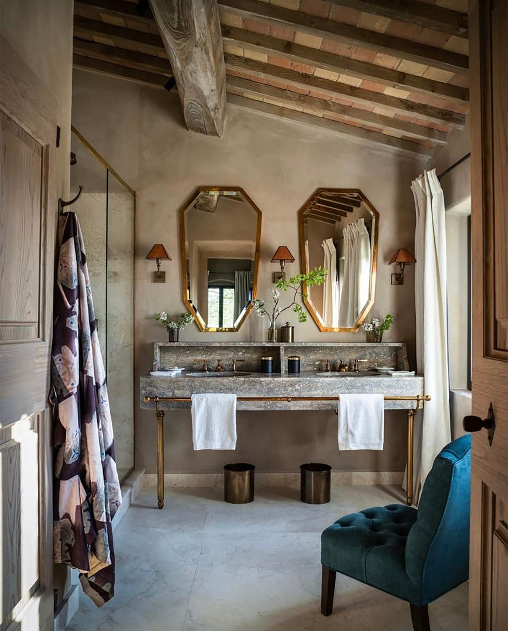
If there is one word I associate with this trend it is luxury. The above bathroom is via Reschio, a 1000-year-old castle turned decadent luxurious hotel, so of course a tufted chair is an appropriate bathroom accessory. Is it over the top? Maybe. But no one can deny a velvet blue chair is a lavish treat for the eyes.
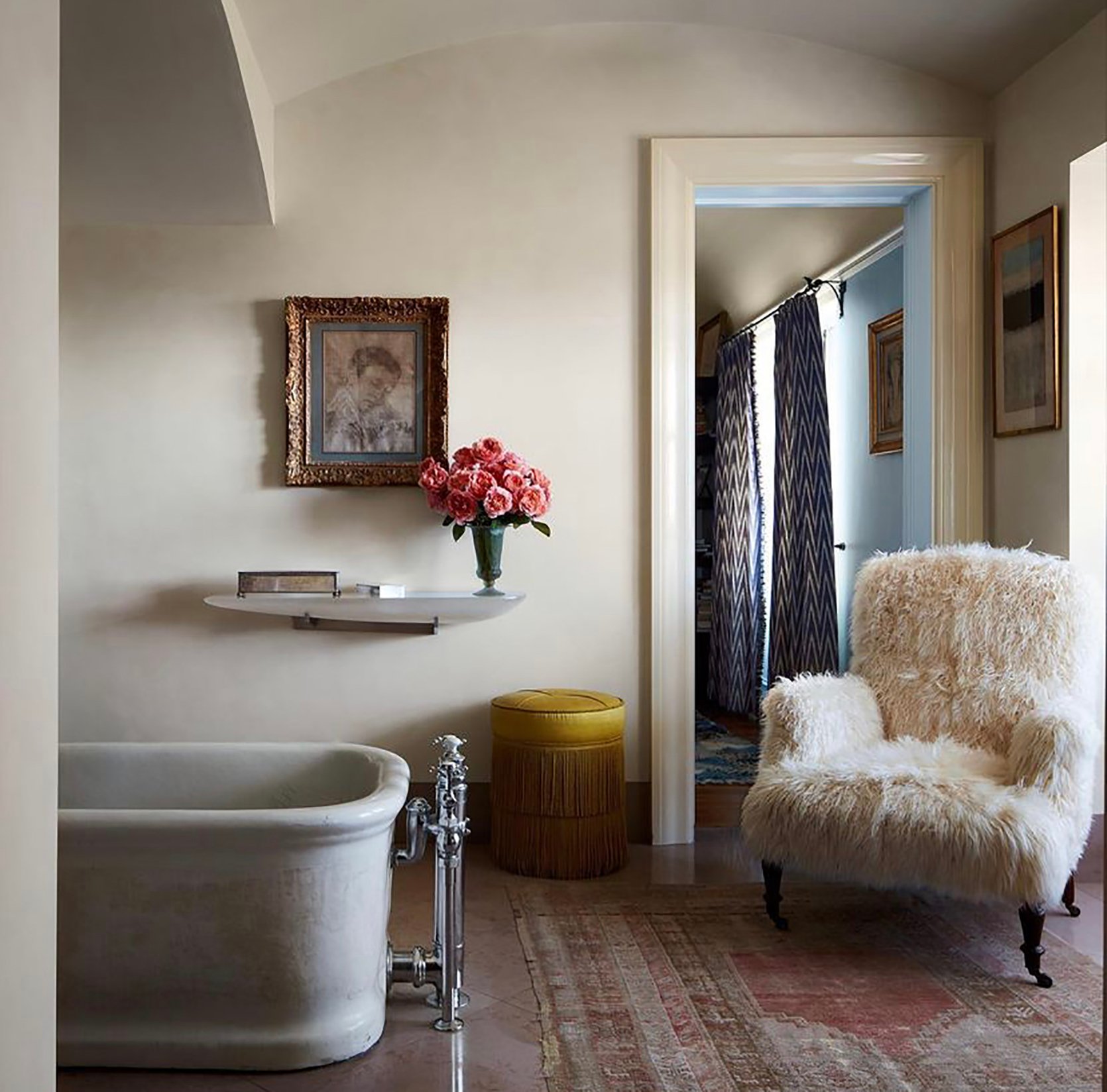
You will never hear me complain about a furry armchair. EVER. Studio Shamshiri pushes the envelope (which is why we love them so much) and you know what? Why not have a fur armchair beside your bathtub. It’s 2022 and we deserve that luxury.
You do of course want to consider the amount of steam, moisture, and ventilation before bringing in your grandma’s French velvet stool.
Vintage Gallery Walls (+ Vintage Inspired Everything)
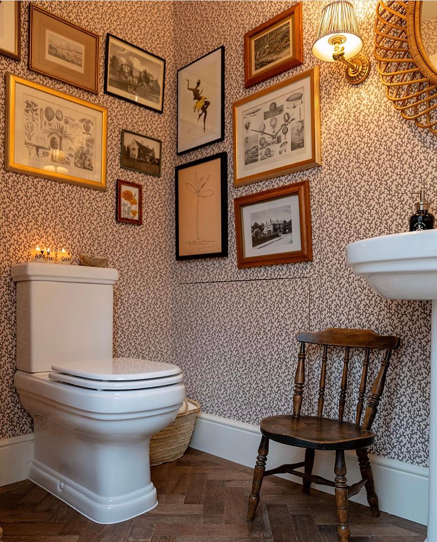
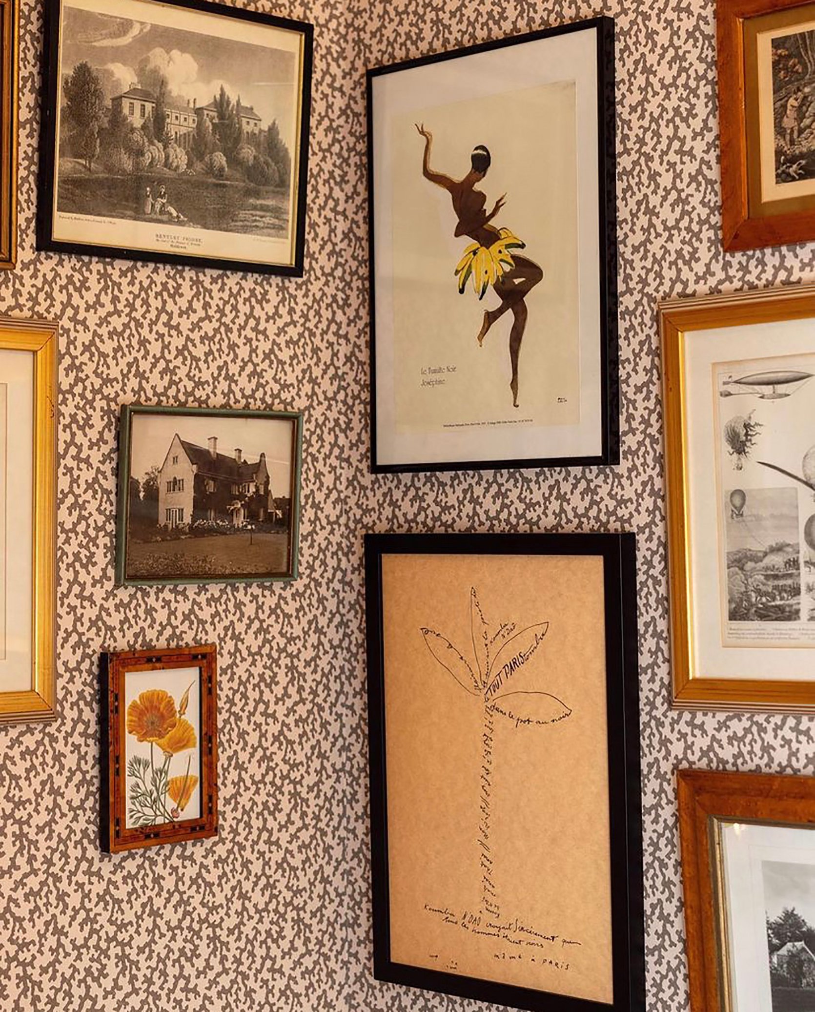
You all know I love a budget and renter-friendly trend and this is it. We are seeing a huge shift towards vintage aesthetics and one-of-a-kind pieces in every room. Bathrooms are now a place where you can flex your eclectic vintage finds whether that’s an antique chair, vintage lampshades, or a gallery wall. We always advocate for art in unexpected places and if you have the wall space, the bathroom is a fun place to curate an old-world style gallery wall. It’s also quickly becoming home to vintage light fixtures and faucets so if you are intrigued by this trend, just know you can go all out.
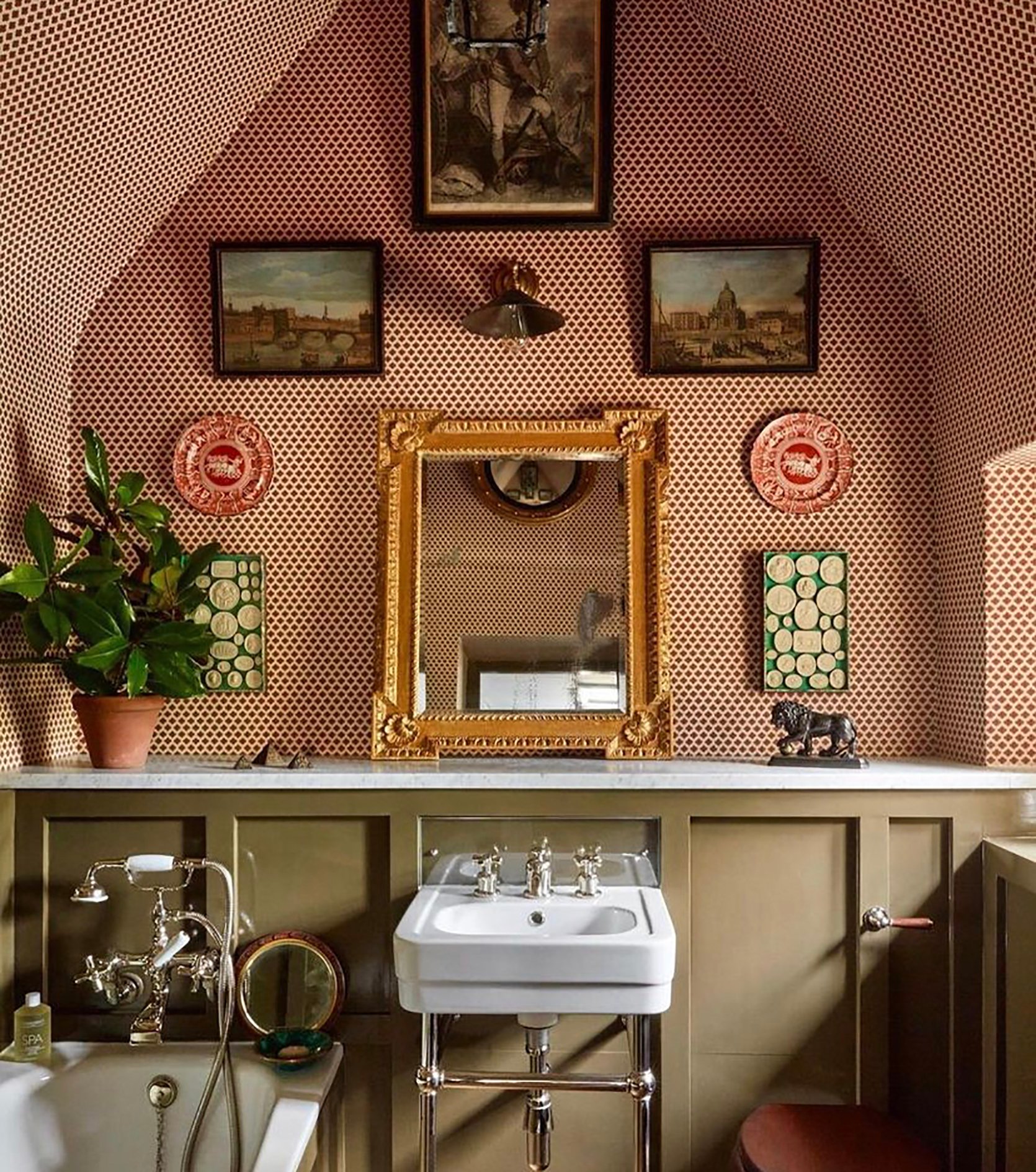
Louise Roe is sort of my idol when it comes to vintage-inspired design. She really knows how to choose a color palette that feels simultaneously retro and fresh, which is what I love about the above bathroom. The oil paintings bring in moody, earth tones that juxtapose the bright (but not too bright) red pattern wallpaper. All of that mixed with a gold frame mirror, wall plates, and olive green paneling? Let’s just say I am sold.
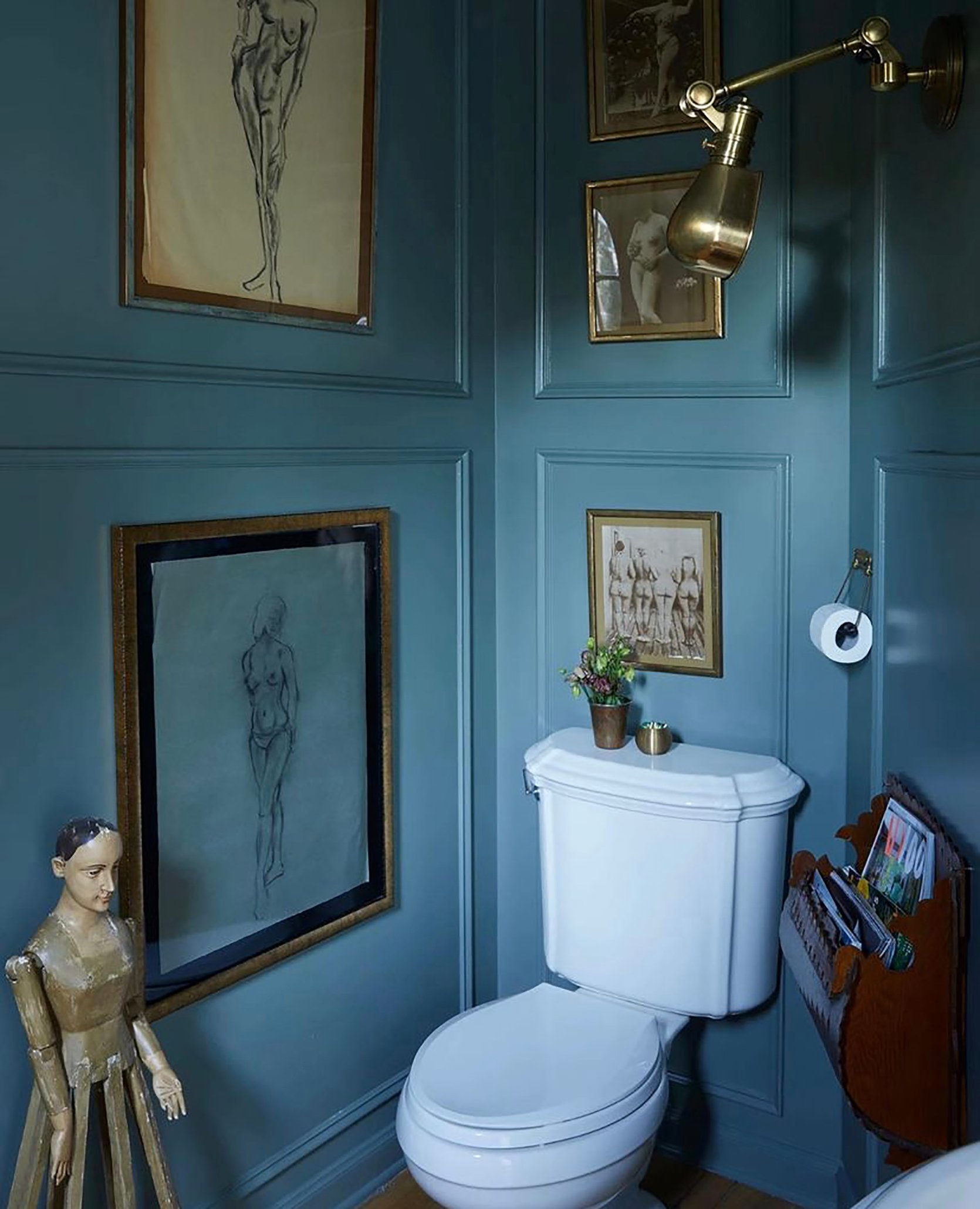
This blue paneled bathroom by Pierce & Ward has been on my Pinterest board for a minute, and I think it sums up this trend perfectly. We love a gallery wall that is essentially a collection of the same subject art, and to me, nothing feels more eclectic and vintage than hand-drawn female form prints.
Tiny vintage chairs might also be an emerging bathroom trend but don’t quote me…yet. All I am saying is vintage furniture is having its moment in bathrooms and whether they are for functional purposes or not, I am on board. But back to the gallery wall. For even more vintage charm, a gallery wall paired with small-scale botanical wallpaper is the perfect marriage. Mix and match frames of different colors and styles is also a sure-fire way to bring your gallery wall to the next level.
Risky, Highly Saturated Wall Colors
Honestly give me all the rich, saturated colors in every room but especially in the bathroom. Have you ever walked into a bathroom for the first time and had to catch your breath because you were suddenly enveloped in an unexpected color? Like I said, the bathroom can be a private space, making it the perfect spot for an unexpected color exploration.
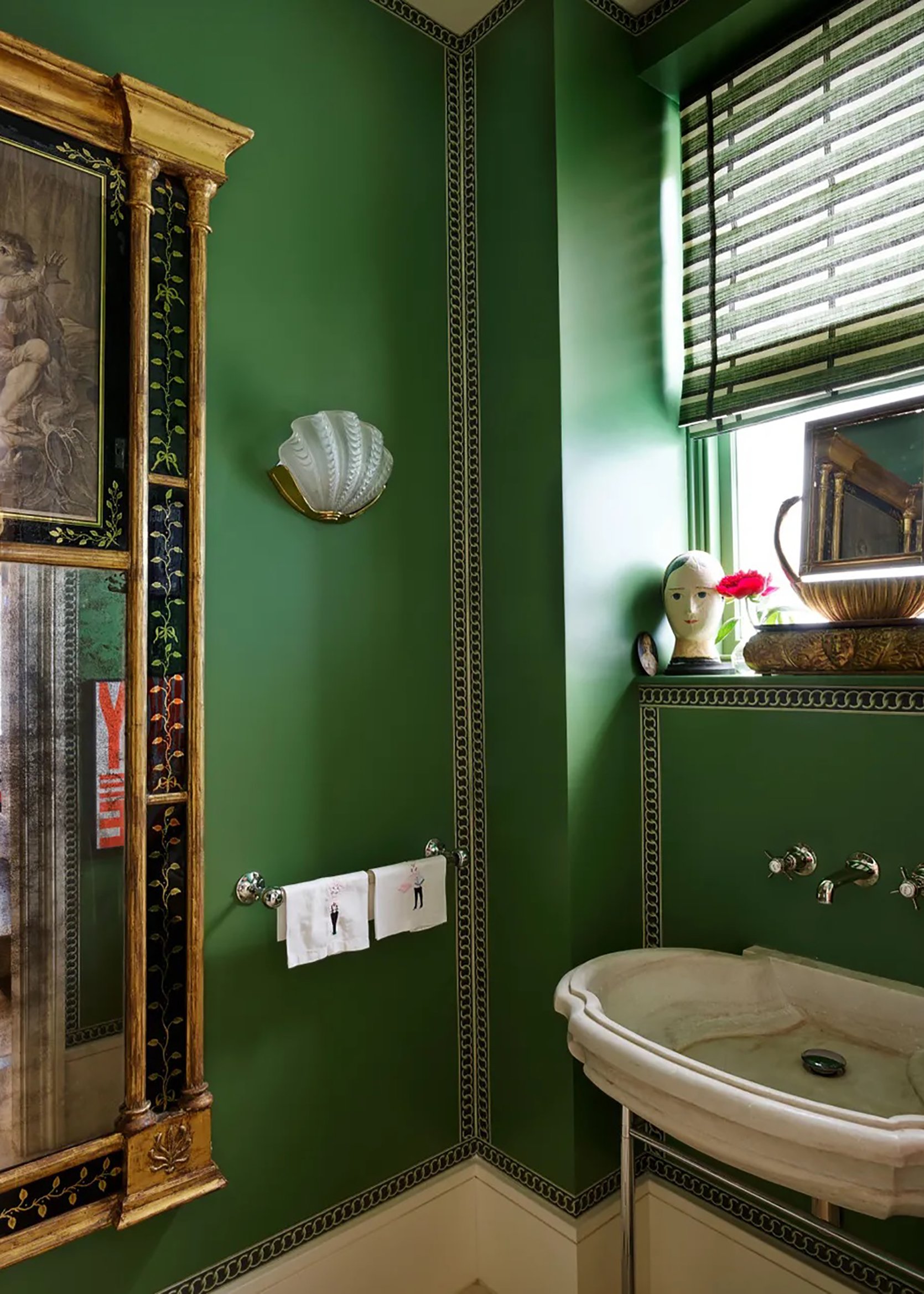
The richness of the green walls here sends me to another dimension. The color is custom by Donald Kaufman color, so I am not surprised that it is capturing my attention so vehemently. Also, the border detail here is simply stunning.
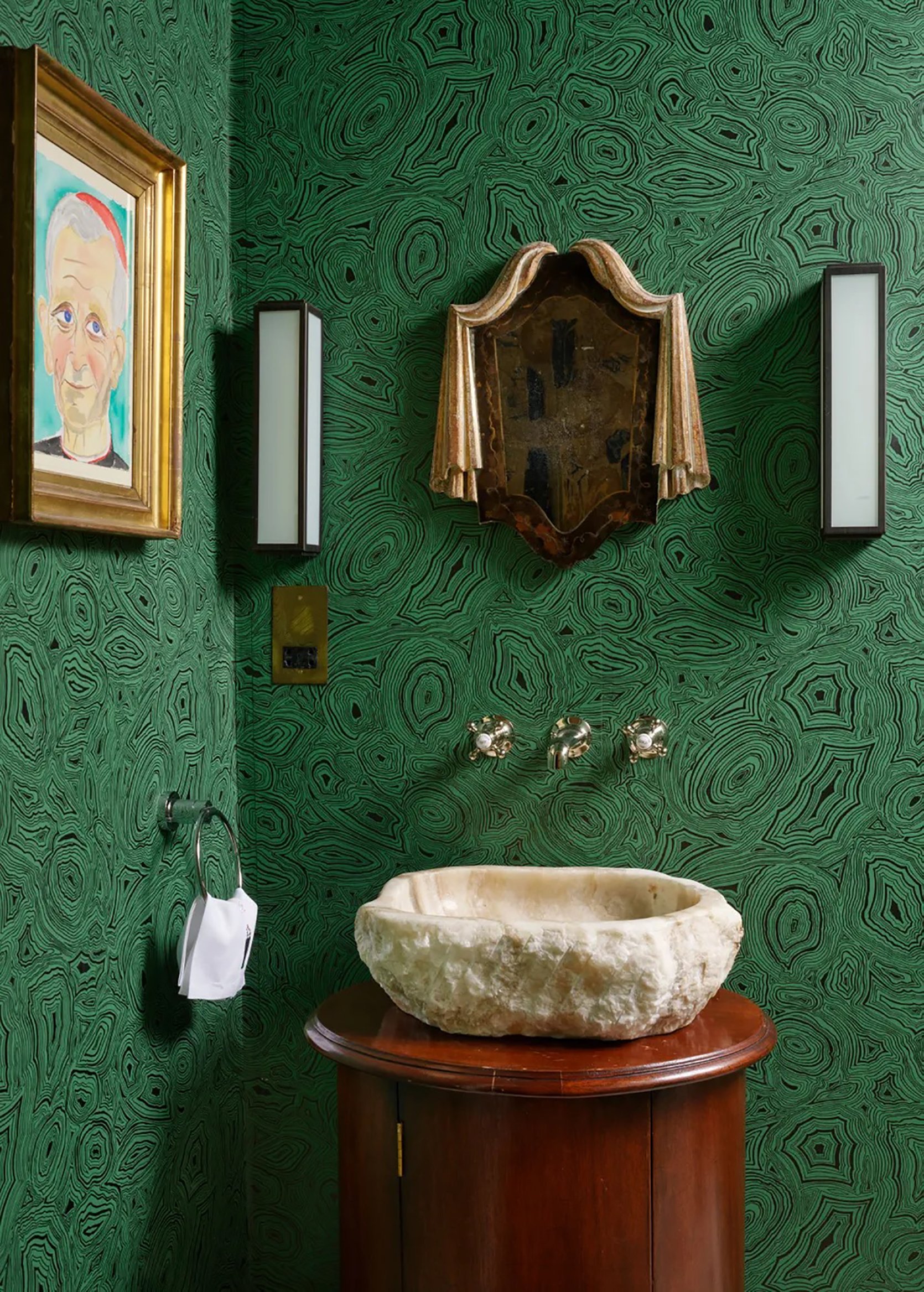
Rachel Chudley blows me away again, this time with a marble-inspired green wallpaper. I think what is most impressive about going with a rich saturated color is the texture and secondary colors that one chooses to accommodate it with. The almost cherry redwood vanity is simply *chefs kiss* up against this green and same goes for the organic stone sink.
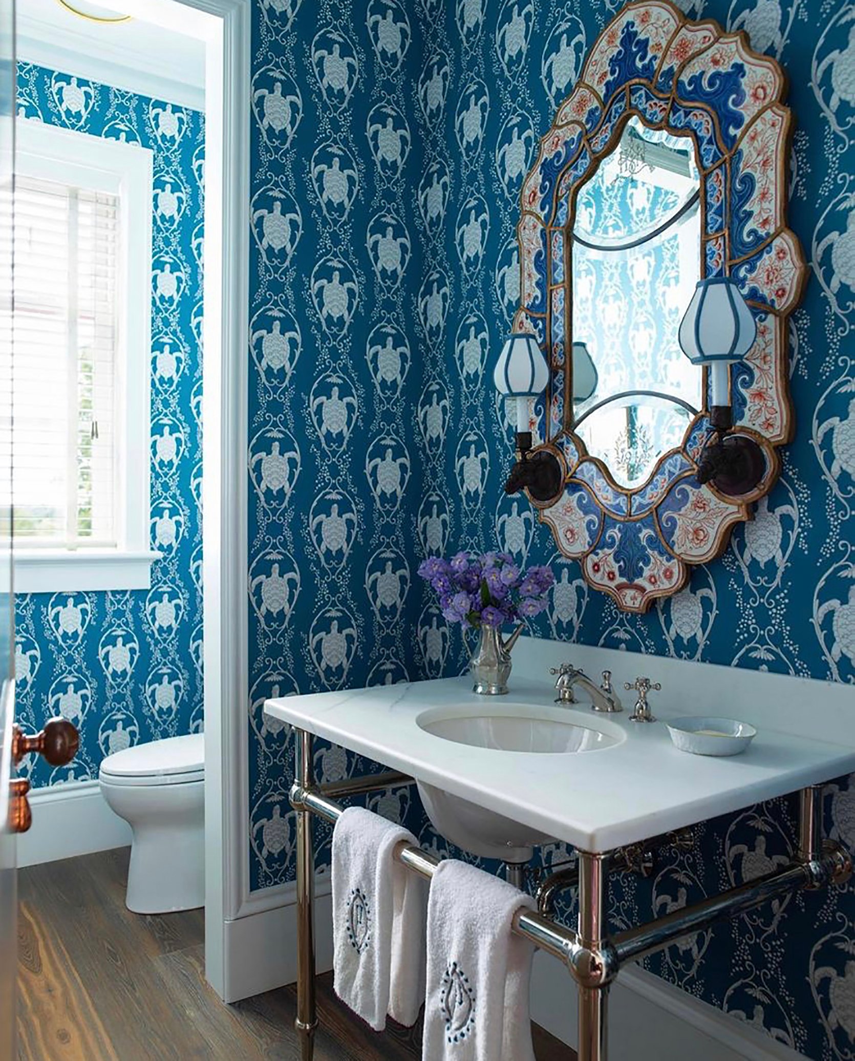
Try not to get too distracted by the turtle-shaped wallpaper (I know it’s hard) and just look at how that blue invites you in. Staring at it is like dessert for my eyeballs, and has me believing a bright blue bathroom is something we all need in our lives. Also, can we talk about that colorful tiled mirror with built-in sconces?? It is so good I have GOOSEBUMPS.
Stand Alone Table Lamps
While minimalism is certainly not out the window, we expect to see more decor in bathrooms than ever before. Stand-alone table lamps are not a typical bathroom accessory which is why this a such a fun (renter-friendly!) trend that we can’t wait to see more of.
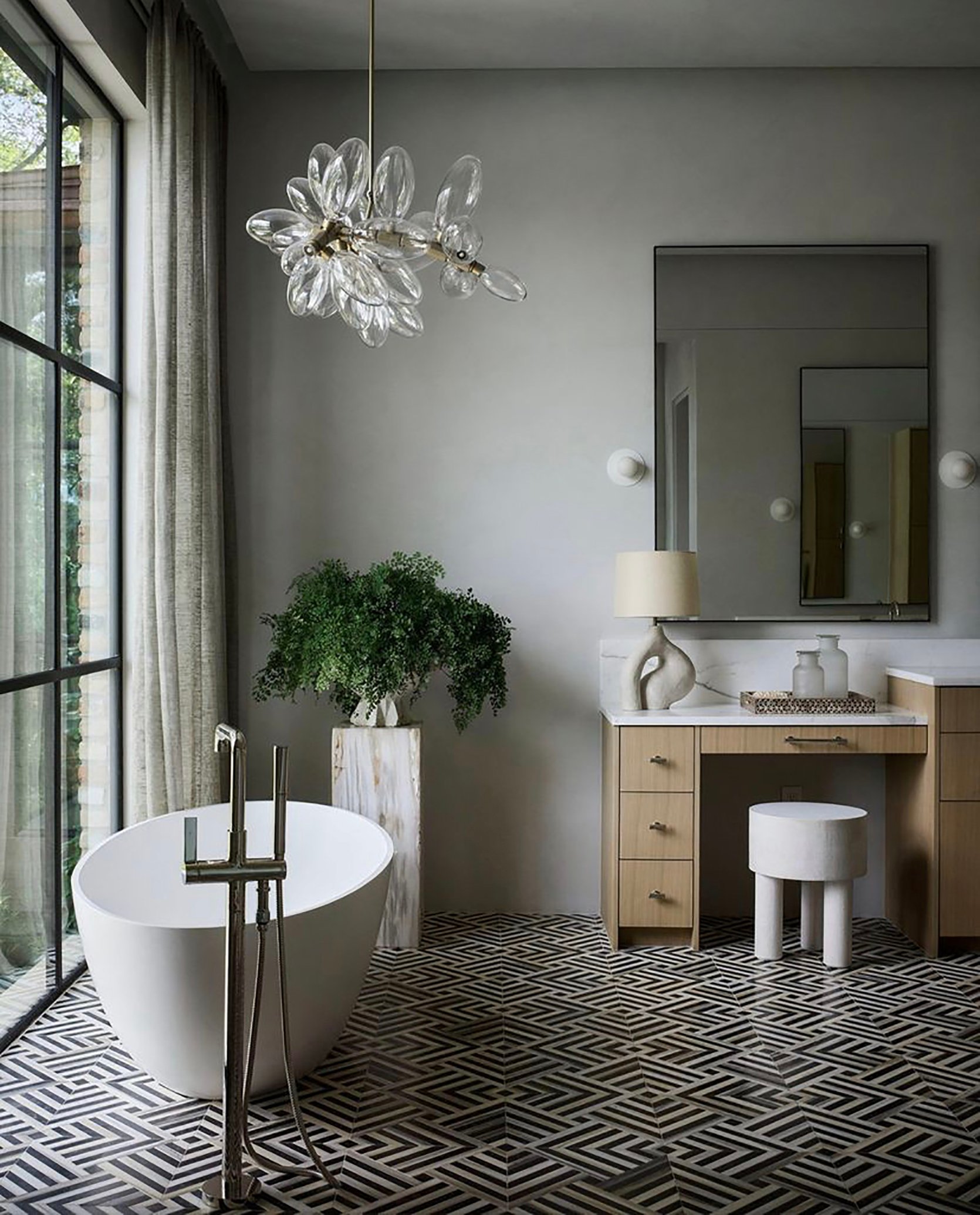
Speaking of minimalism, this neutral organic bathroom proves that adding extra decor pieces is not synonymous with maximalism. The stone curved lamp is neither loud nor show-stopping, but it is an added decor element that brings texture and movement to the space.
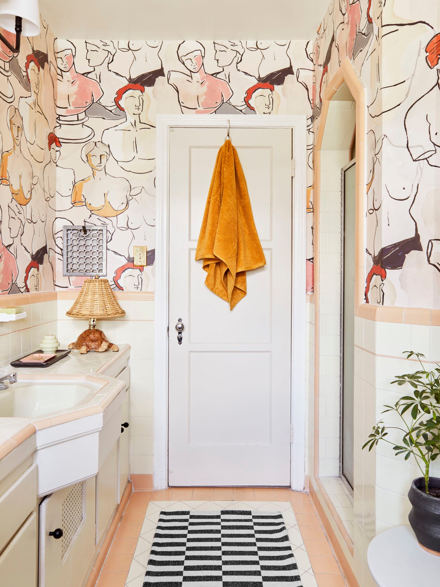
If you remember Caitlin’s bathroom reveal, you know that that turtle lamp is not the only animal sculpture that makes an appearance. I’ll just say there’s a leather giraffe sculpture and leave it at that. But back to the lamp, here is a clear example that lamps should not be secluded to living rooms and bedrooms. You can absolutely opt for a novelty lamp simply because it’s a fun decor element that will take your maximalist style to another level.
The Return Of The Shower Curtain In High-End Spaces
There is no question that shower curtains are more budget-friendly than say, glass shower doors, so it’s somewhat surprising (and exhilarating) to see more curtains in high-end spaces. We expect this shift is in response to a collective desire for more pattern mixing, color exploration, and again, vintage-inspired everything. Some of these spaces do not require a shower curtain at all, so the design choice to include one is that much more intriguing.
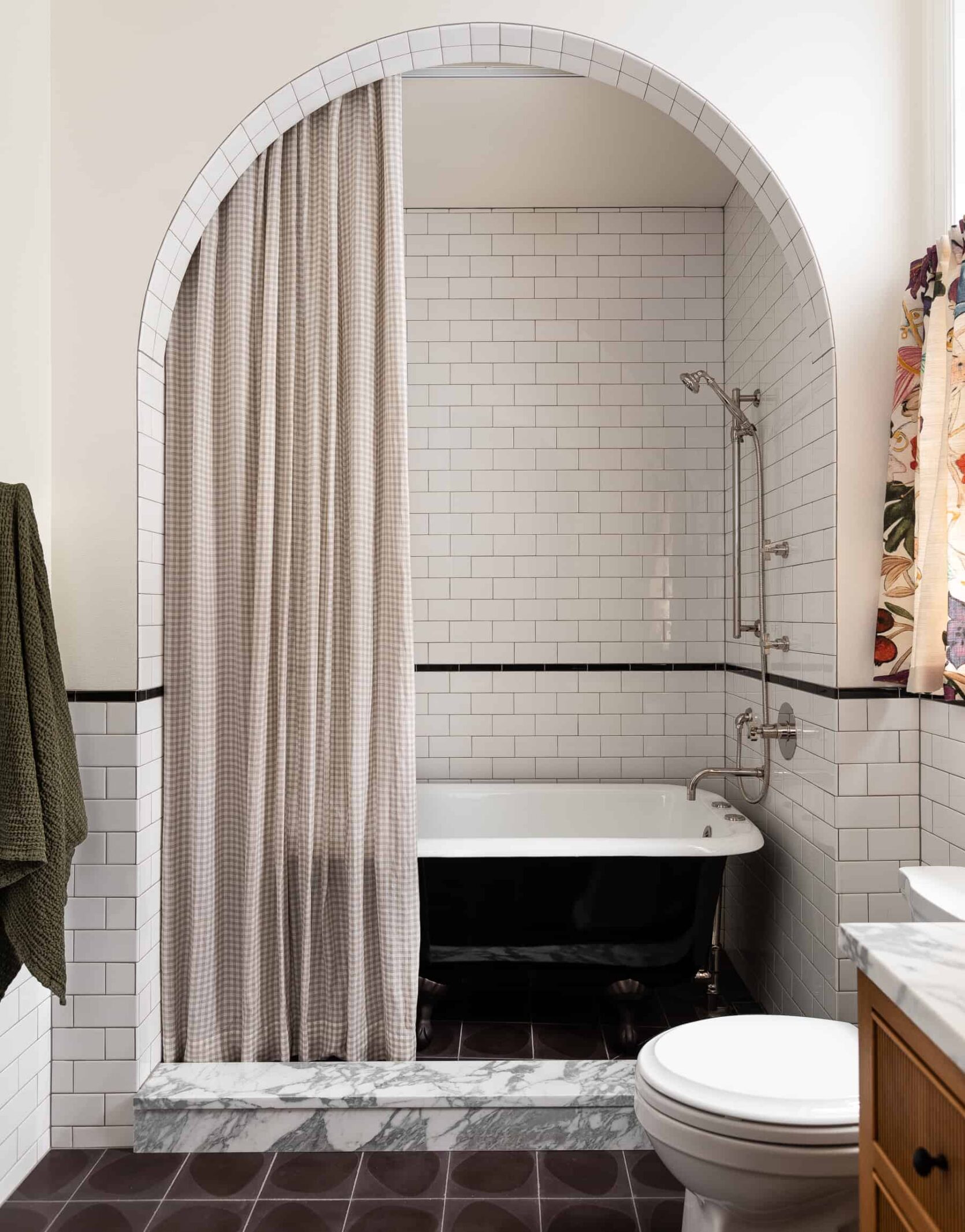
The choice to add a shower curtain here is wildly unexpected and very fun. This little bath nook would be completely acceptable bare-bones, so it’s exciting to see a curtain here for even more pattern mixing.
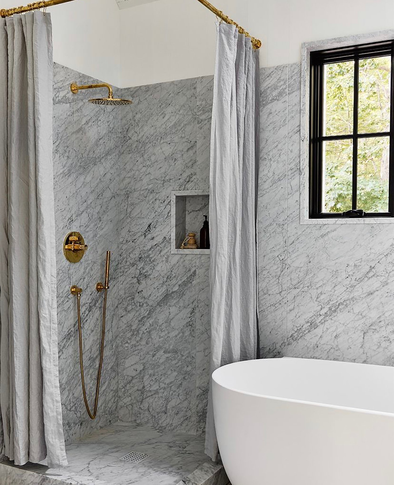
Here is an example of a shower curtain that could easily have been replaced with glass shower doors. Whether the choice was to save on expenses or simply for the aesthetic, I am here for it. The curtains add movement and a bit of texture so this bathroom feels all the more inviting.
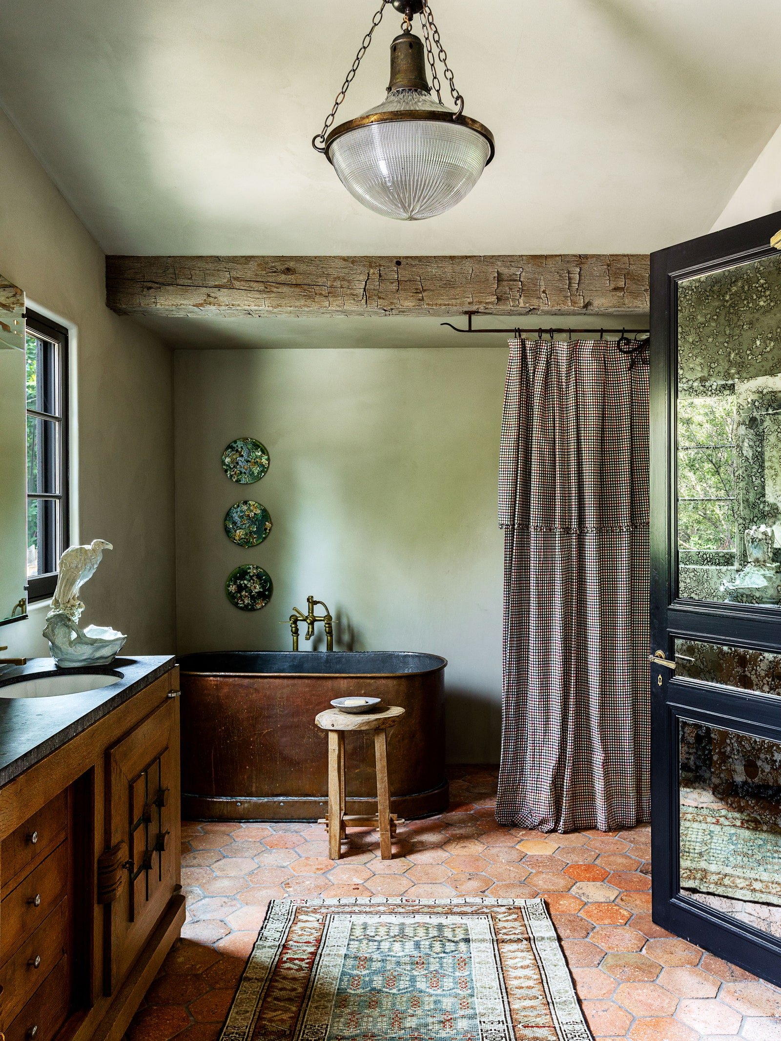
I am not sure if there is a showerhead behind those curtains but my gut is telling me there isn’t, which means those curtains are purely for style. I am not mad about it at all. The small-scale plaid plays off the rustic vibe here extremely well and adds just the right amount of pattern.
MAKE ROOM FOR MONOCHROME
Let’s call the monochrome bathroom trend pattern mixing’s introverted but daring cousin. It’s not in-your-face maximalist but it’s still bold and takes some guts to pull off. You can’t go monochrome without taking somewhat of a leap of faith (talk about commitment to a color am I right?) so it is fun to see how much designers are leaning in. For example…
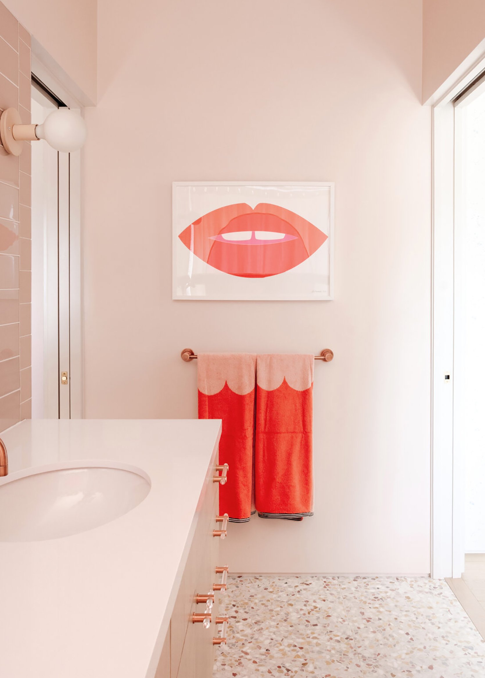
My secret dream is to have a pink bathroom so I love this one designed by Joy Cho and Cleo Murnane of Project M Plus. The trick with monochrome is to mix tones so you don’t risk overwhelming your senses with one single color. Here, the terrazzo tile sprinkles in more blush tones and the decor goes the opposite direction with brighter hues.
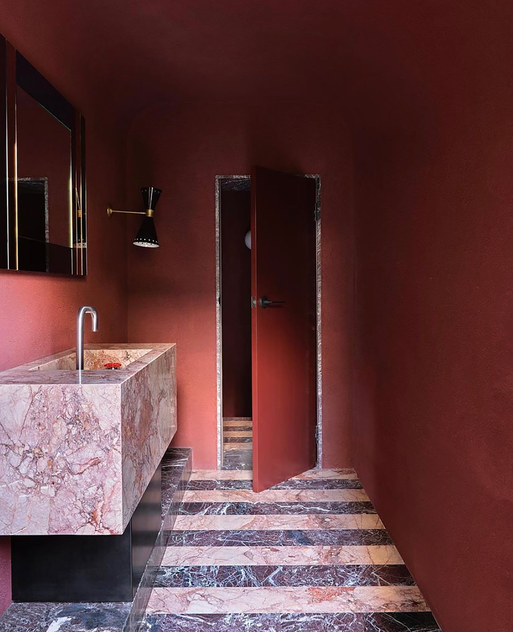
Again, materials play a huge role in making monochrome work. The marble sink brings in several red hues that make the wall color absolutely pop. To ground it out (literally and figuratively) the floor adds darker and lighter tones that round out the entire color wheel.
If you are a renter or a non-renovator like myself, you can still opt for the monochrome look without ripping out tile. Painting or installing wallpaper to your walls and ceiling will help achieve this and as I said above, adding decor items in differing tones is what really makes monochrome work. If you do have less than ideal flooring, try adding a larger scale rug within your desired color wheel so you can achieve the monochrome look from top to bottom.
And that concludes our non-renovation-based bathrooms trends for 2022. Be sure to come back for our renovation trends, and let me know what you expect (or want) to see when it comes to bathrooms in 2022. xx
Opener Image Credit: Design by Jane Hallworth | Photo by Laure Joliet | Styling by Colin King | via Architectural Digest
THIS POST WAS ORIGINALLY PUBLISHED HERE.

