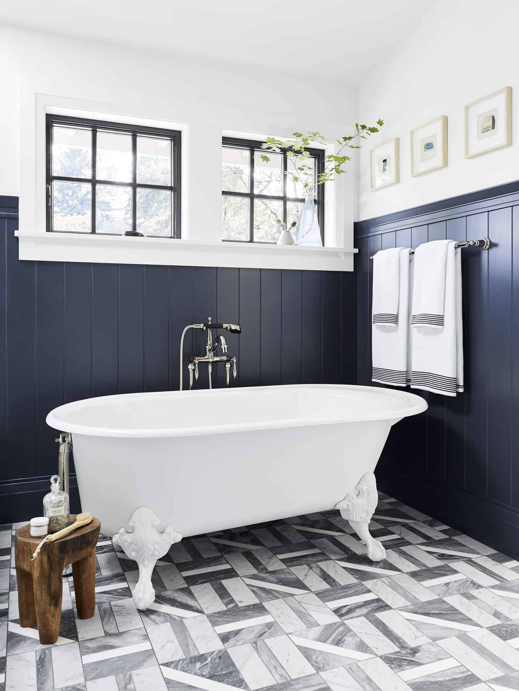
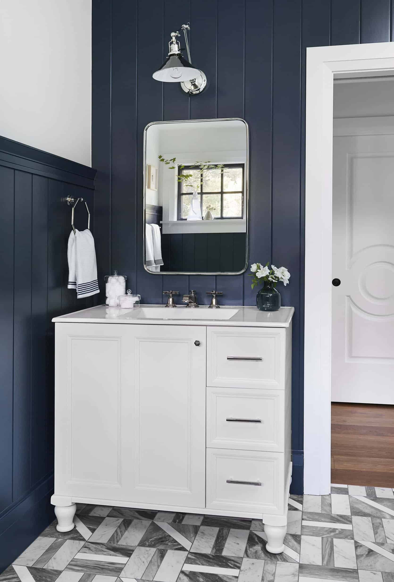
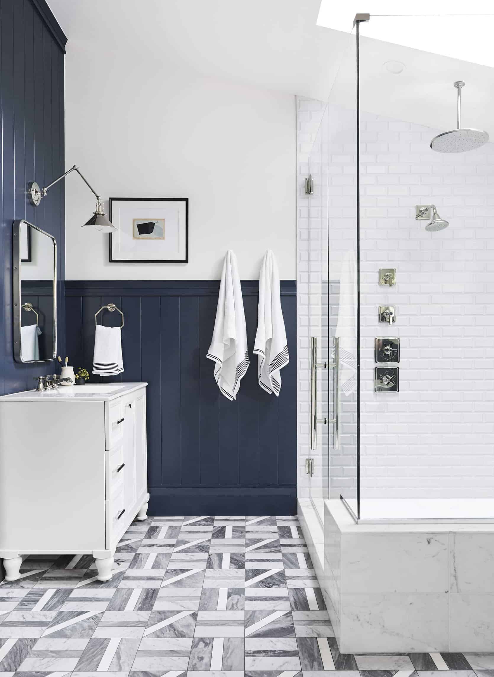
Oh, I received the most fun DM last month where I learned that the original (OG) Portland Project, the “flip” (ha) that my brother and I did and sold 3 years ago was going on the market, and them BOOM it went pending (listed at 2.8 mil WOW sold for far more… keep reading). I LOVE this house, and yet have such conflicting feelings about the 2 years leading up to it. You see this house is where I made the most mistakes on a much larger scale than ever before – mistakes in managing budgets, managing timelines, managing people, knowing what you should splurge on, and mostly learning what really adds up in a renovation (CUTS, it’s CUTS – every time you cut something it takes time and labor and is really the budget-busting culprit – not materials). It was renovation grad school and my book that comes out in the spring was inspired by the frustrations of that year. But I learned SO MUCH and can easily say that it has made me far more confident in every other project since. Funny how getting on the other side of failures and mistakes does that. I never really broke down or wrote about how we “profited” so I thought it would be fun 3 years later to show you how they styled/shot it for the latest real estate listing and what I learned from it. I love a good reflection post…
The Entry
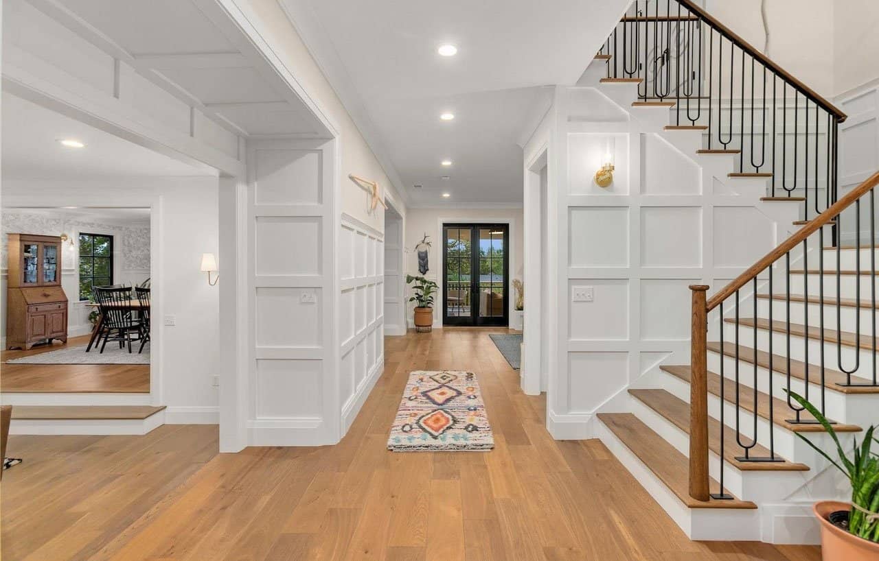
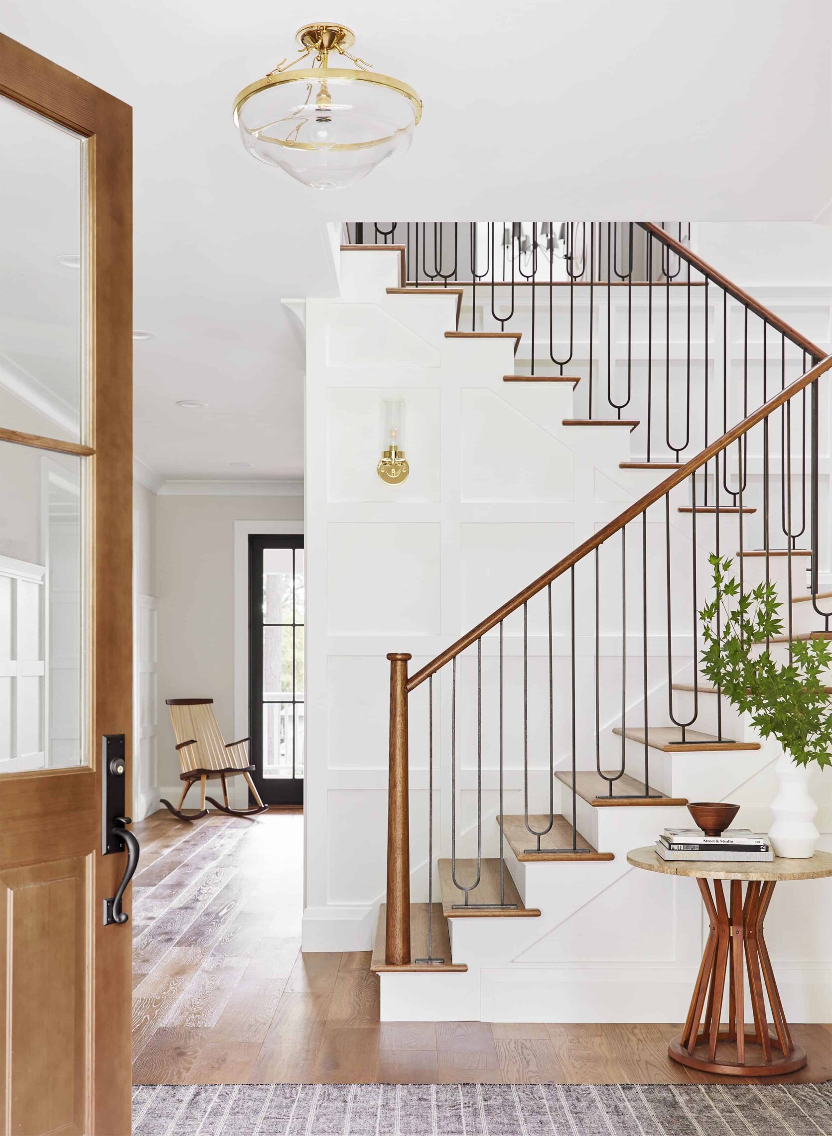
I love those stairs so incredibly much. And still so proud of that newell post that I OBSESSED over. Thanks again to Base Modern for executing the design. I love seeing the real estate photos next to the shots art directed by Sara and I. This was the same with our house in LA – the real estate photos are always more pulled back showing a sense of space, making everything look bigger, while our photos are meant to feel more intimate and tell a story. Both certainly have a purpose.
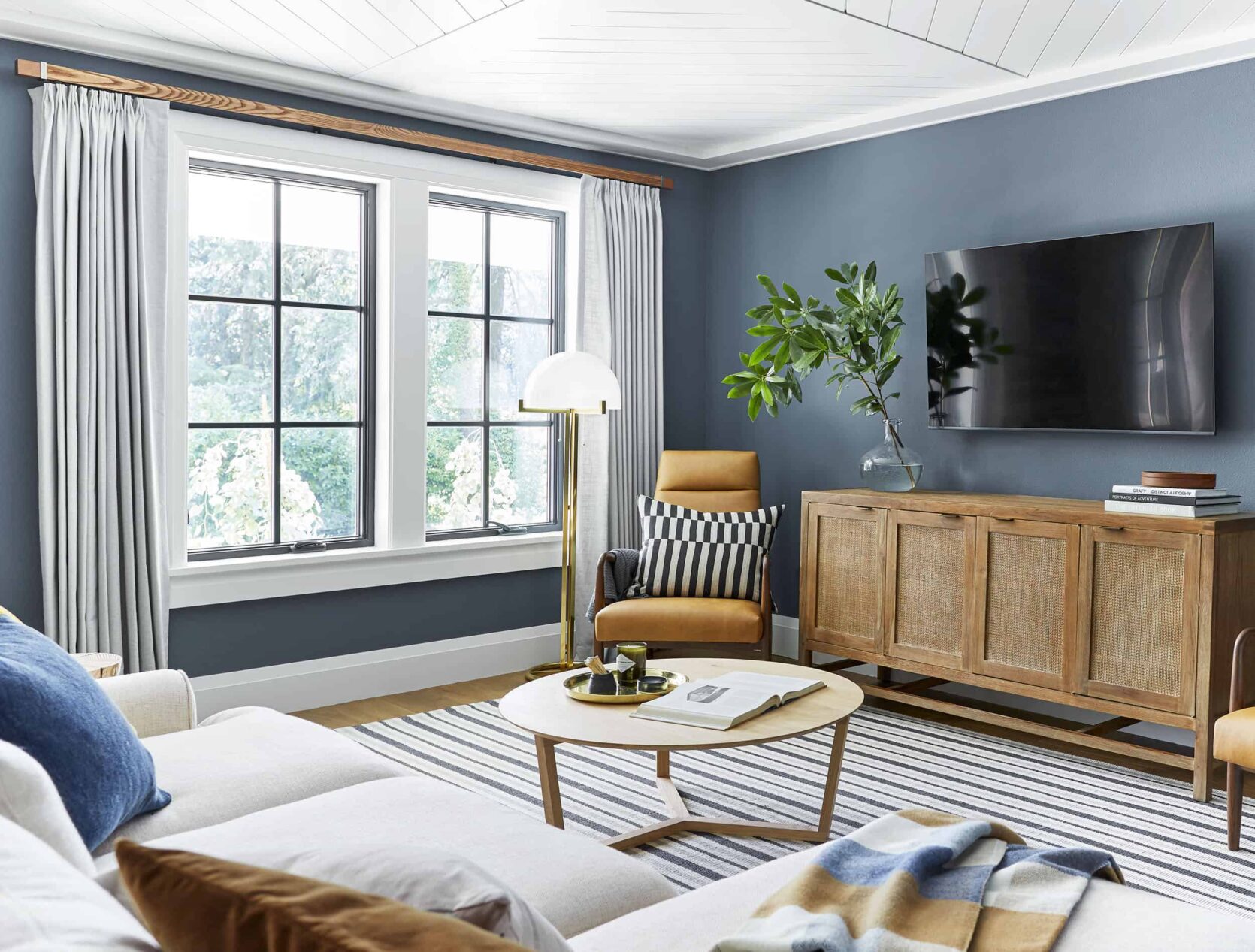
The Living Room
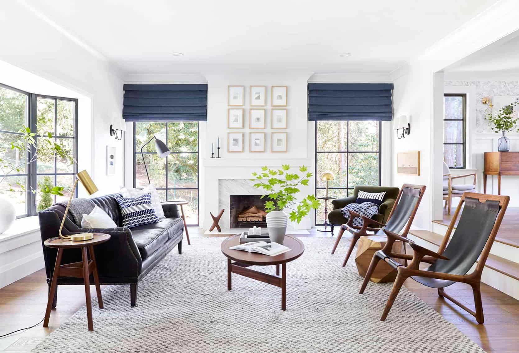
My goodness, I love that room (thanks to Brady and Julie for their large hand in this project – I miss you guys!!!). Real estate photos also always have all the lights on (see below), our photos never do and instead rely on natural light (it’s not lying it’s making it feel how it actually does in the room, which is hard for a camera to always get). By the way, this was Sara’s first big photography project. She trained herself and did such an incredible job. Just want to give her a big shout out here (and working with her last month shooting at the mountain house for Target was, as always, VERY FUN).
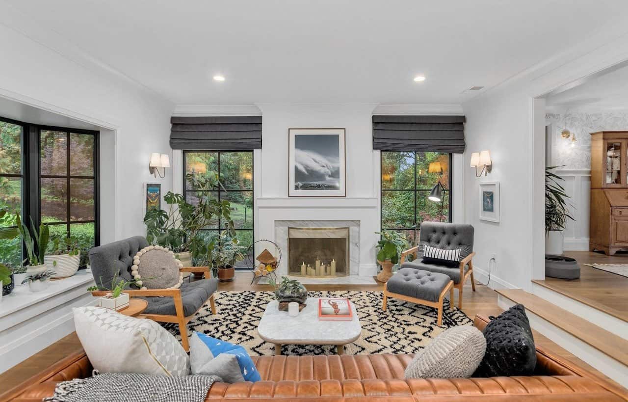
I think it looks so cute! And probably more livable for a family than what we did.
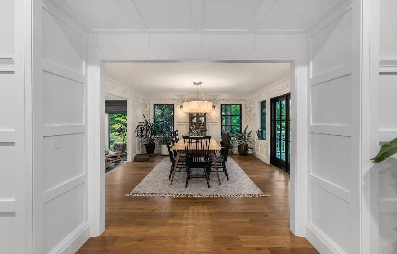
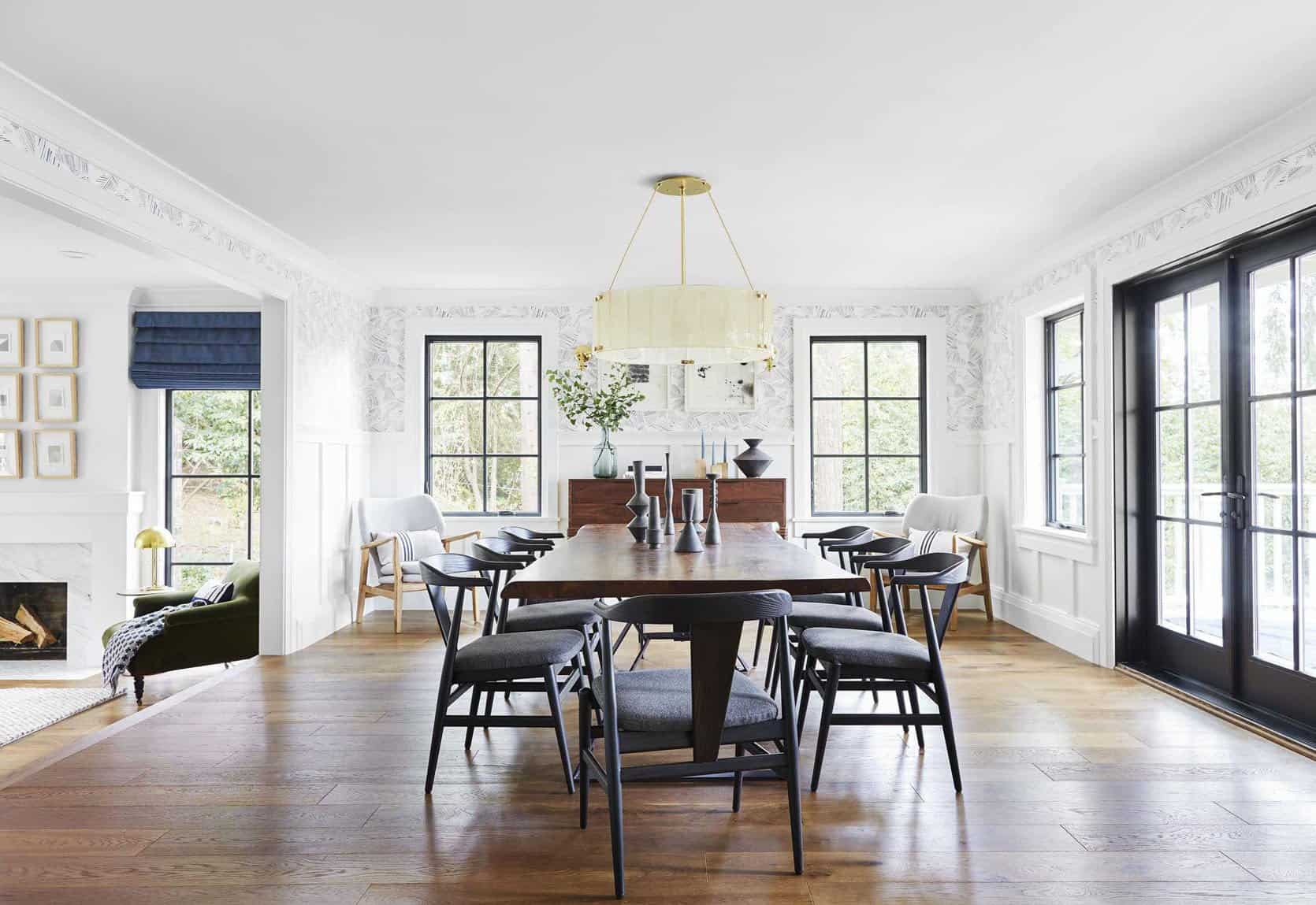
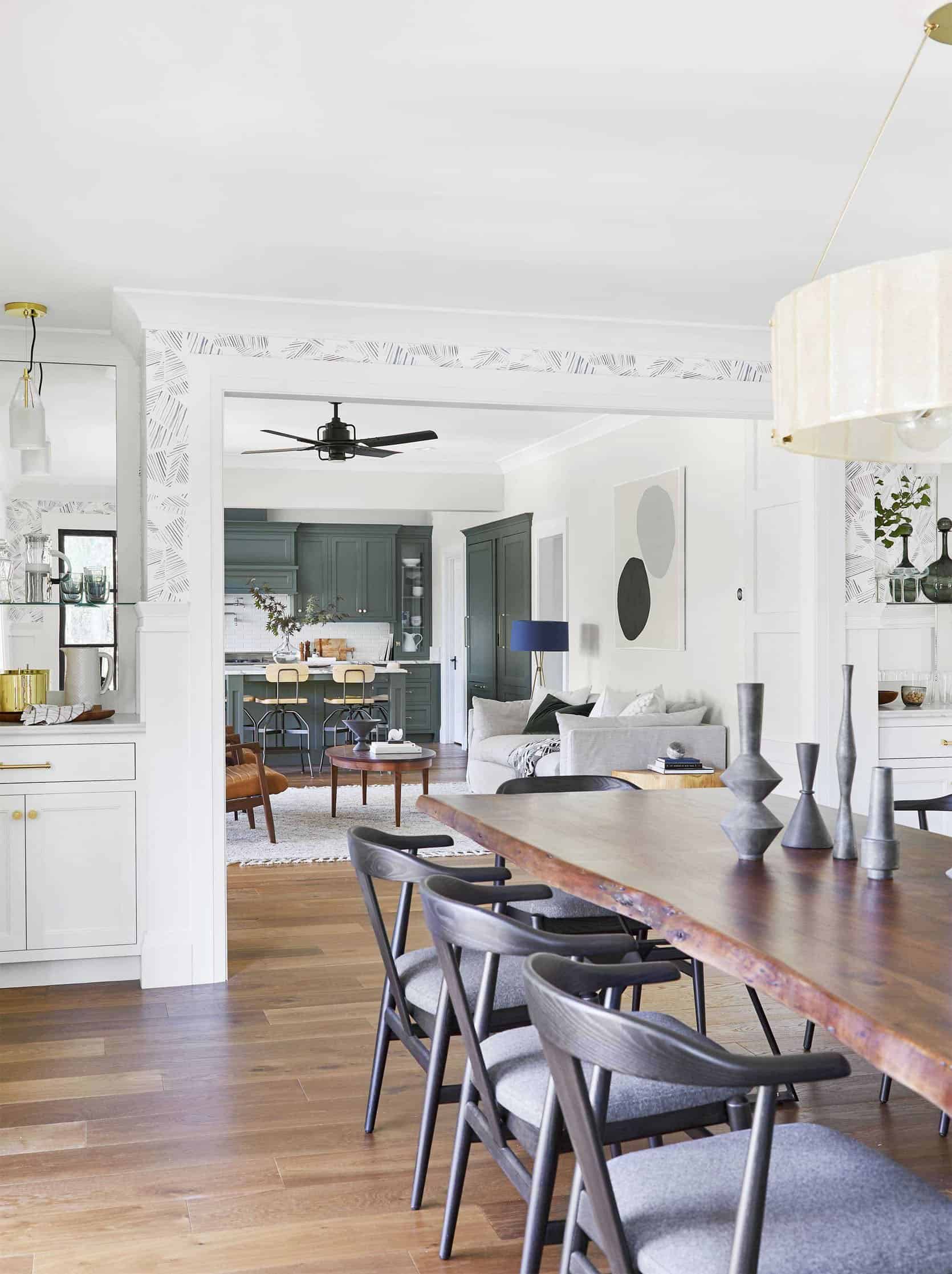
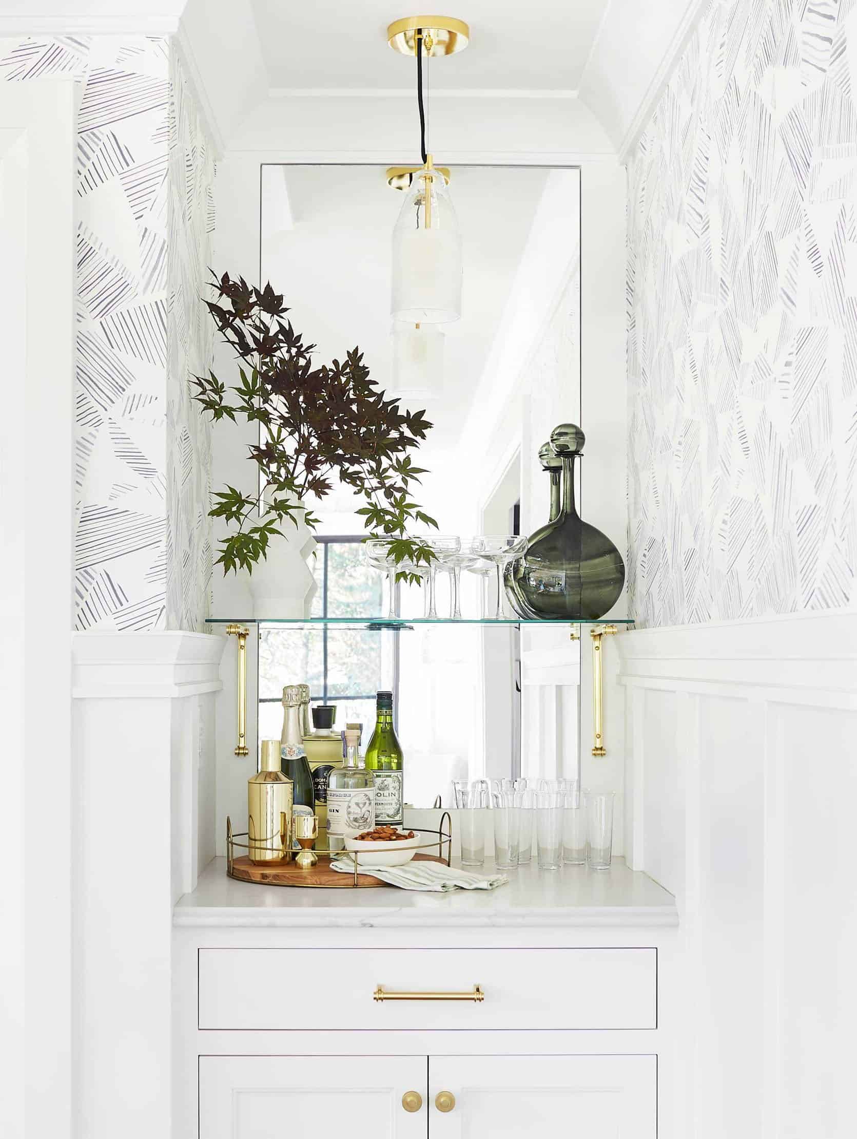
The Dining Room
Our shot is on the right, obviously. The flow of this house was/is so good and the natural light everywhere is just stunning.
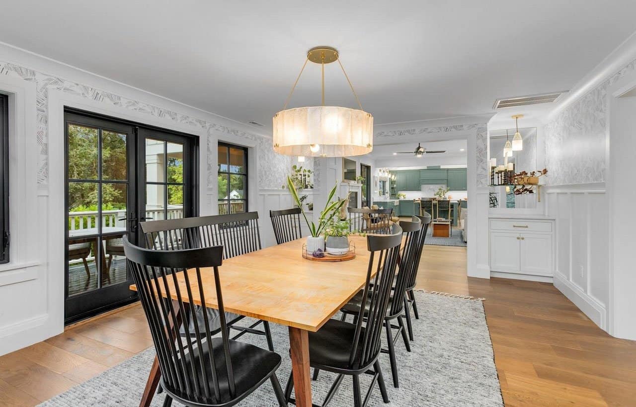
This shot reminded me of how awesome those dining chairs are – so comfortable, ergonomic back, padding on the seat, nice scale… I’m shopping now and looking mostly for vintage but I remember sitting in these for long periods of time and loving them (from Room & Board)
The Kitchen
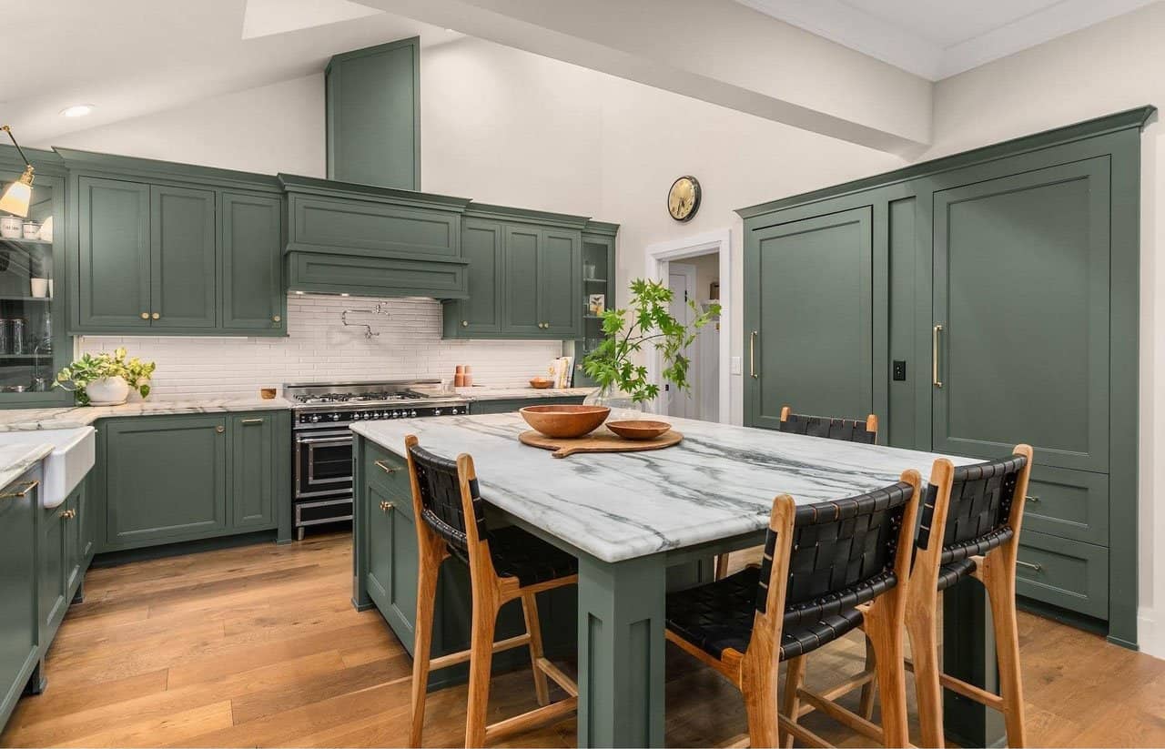
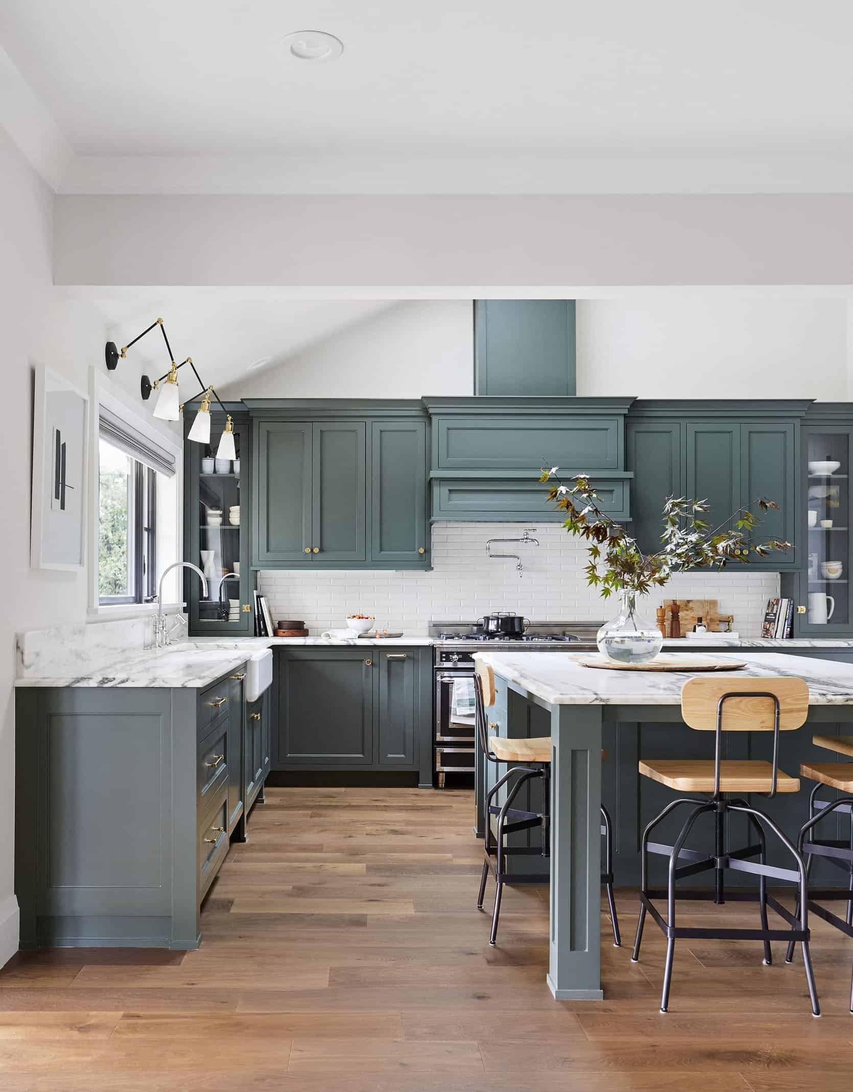
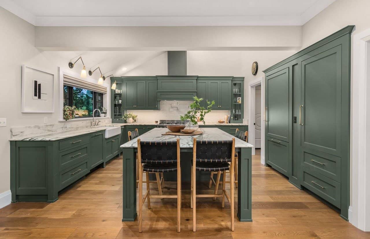
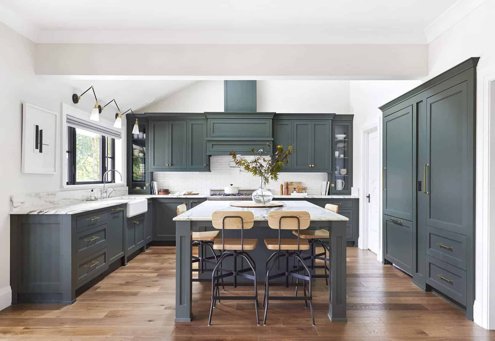
I think I under-styled that shot. We needed a rug in that kitchen! Fun fact is that my brother and his wife were THIS CLOSE to not selling this house at the end and moving in instead. And I get it. It is such a great house for a family and I would imagine during Covid having that 5k of square feet and almost an acre property would just be wonderful with kids.
The Family Room
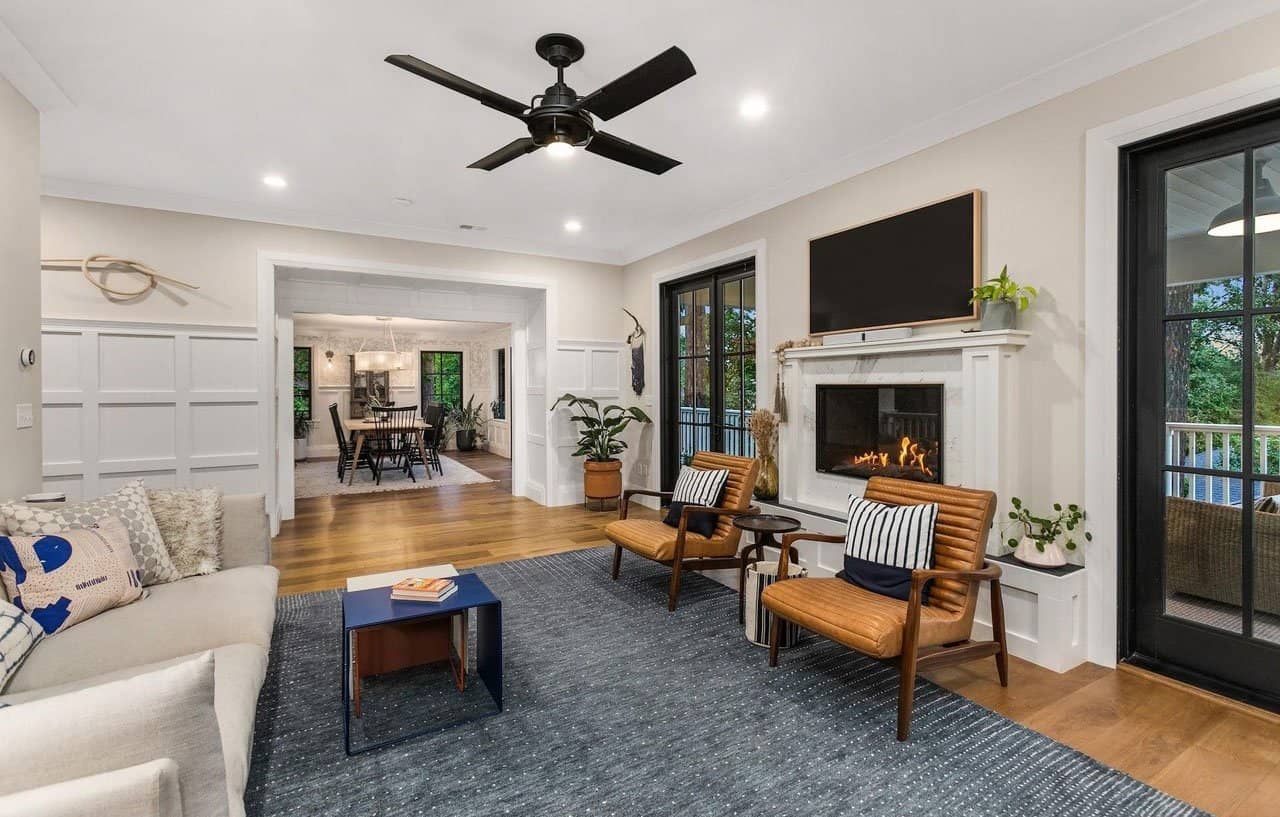
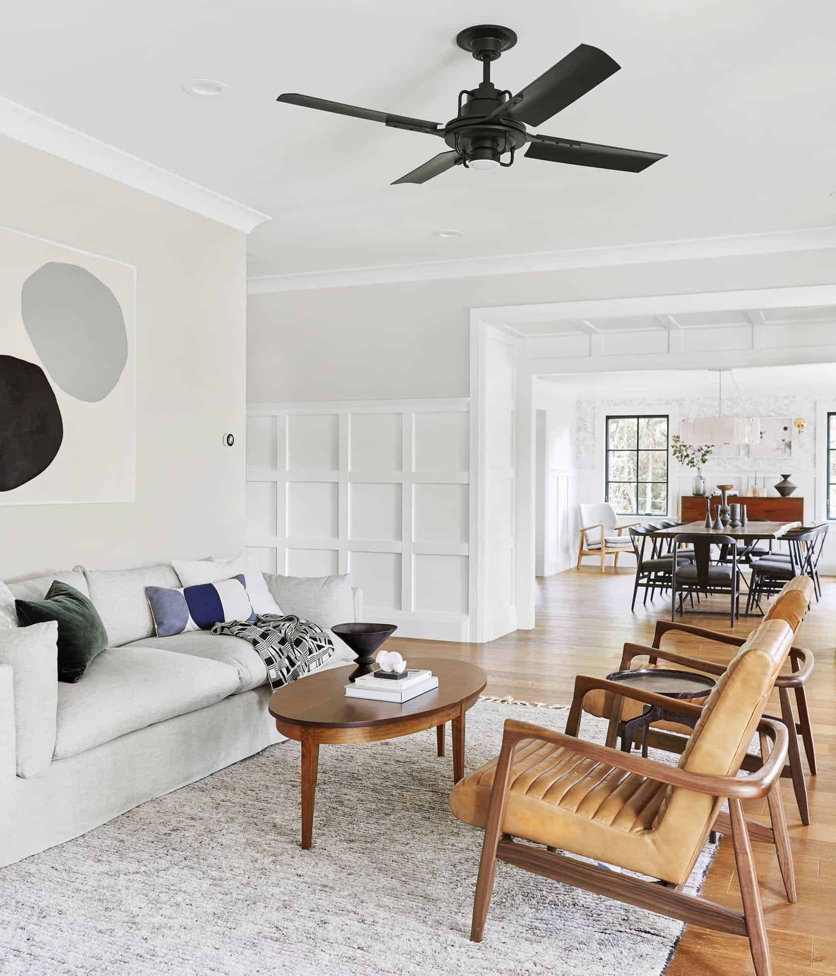
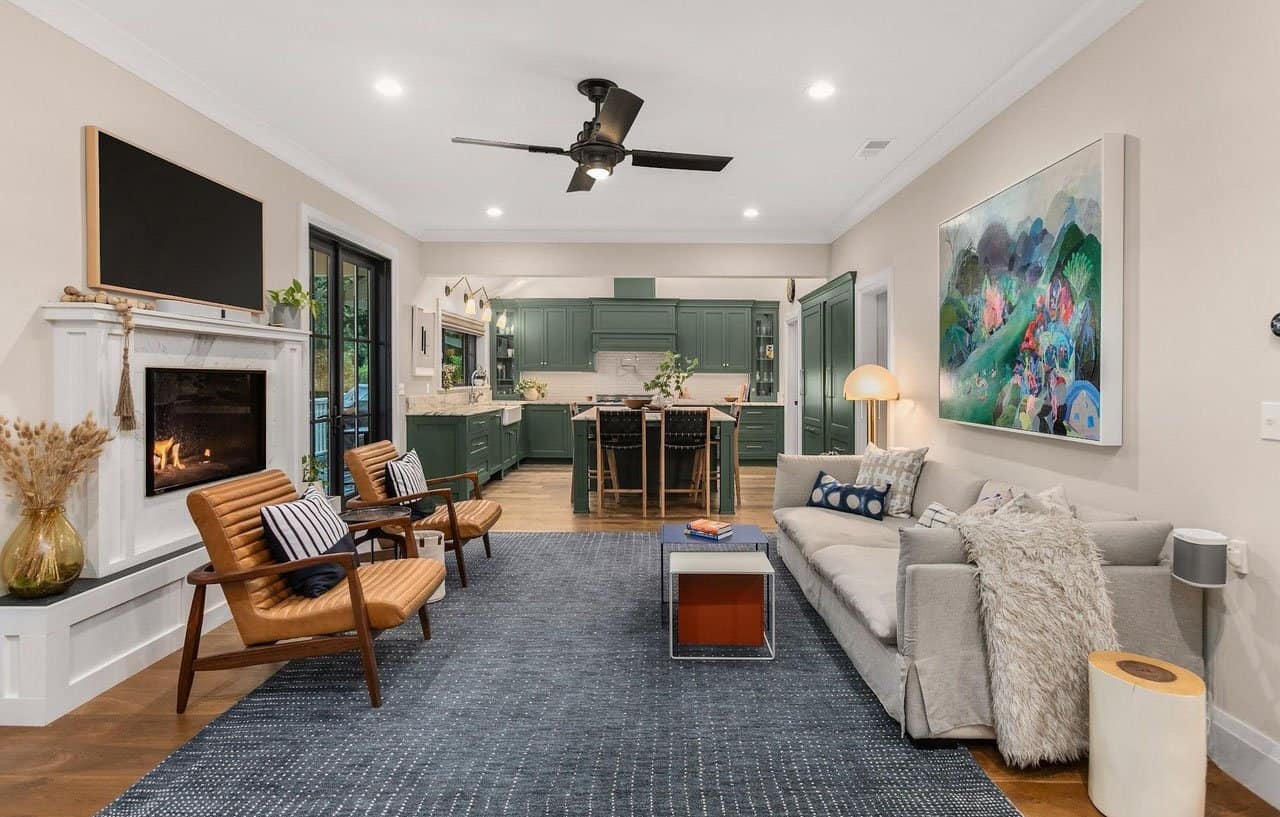
It’s just so fun to see. I actually LOVE their rug in that family room.
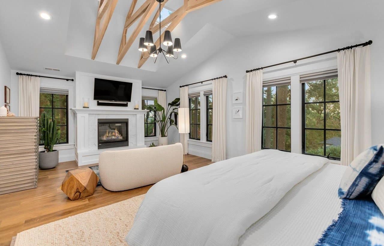
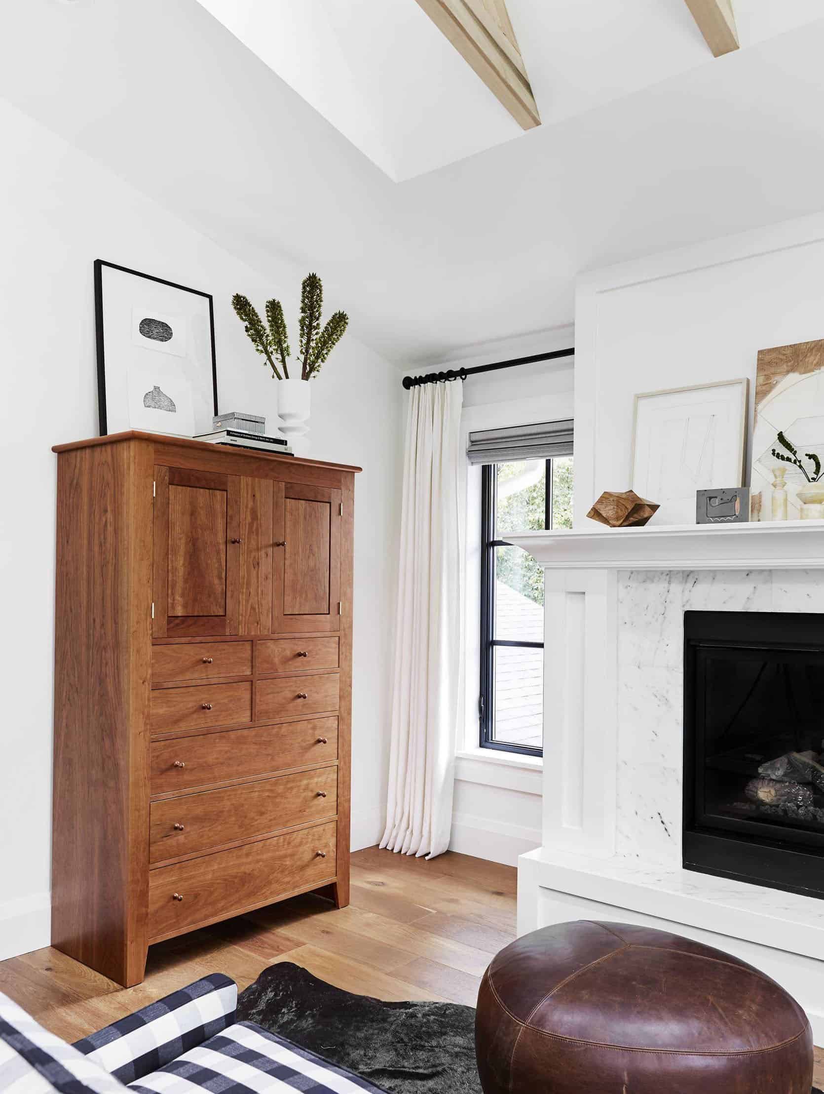
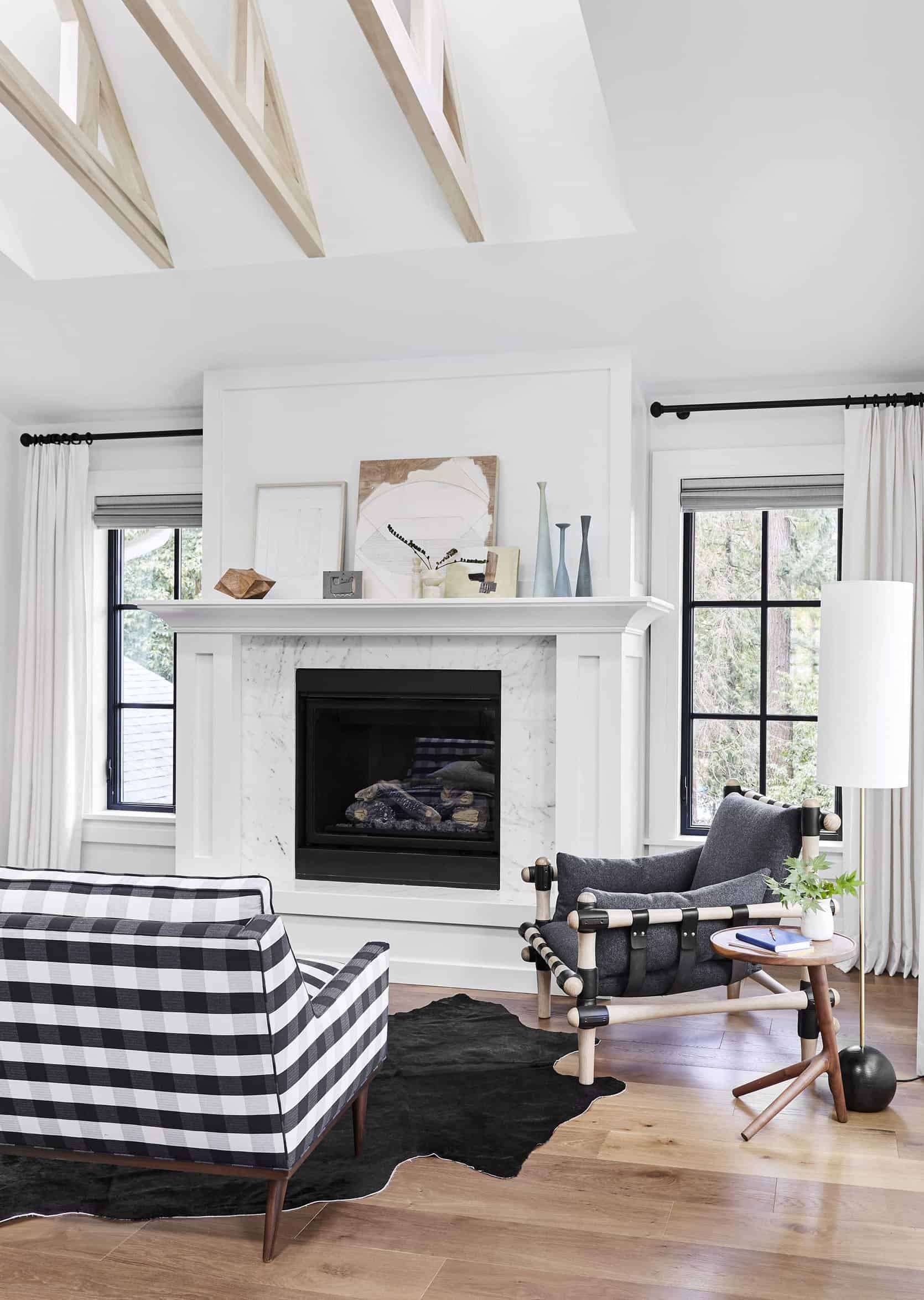
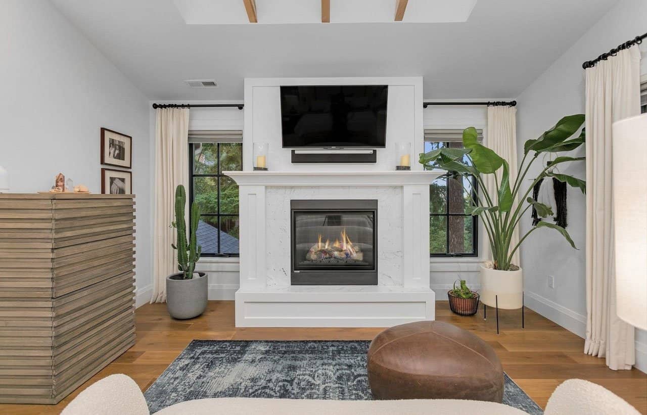
The Primary Bedroom
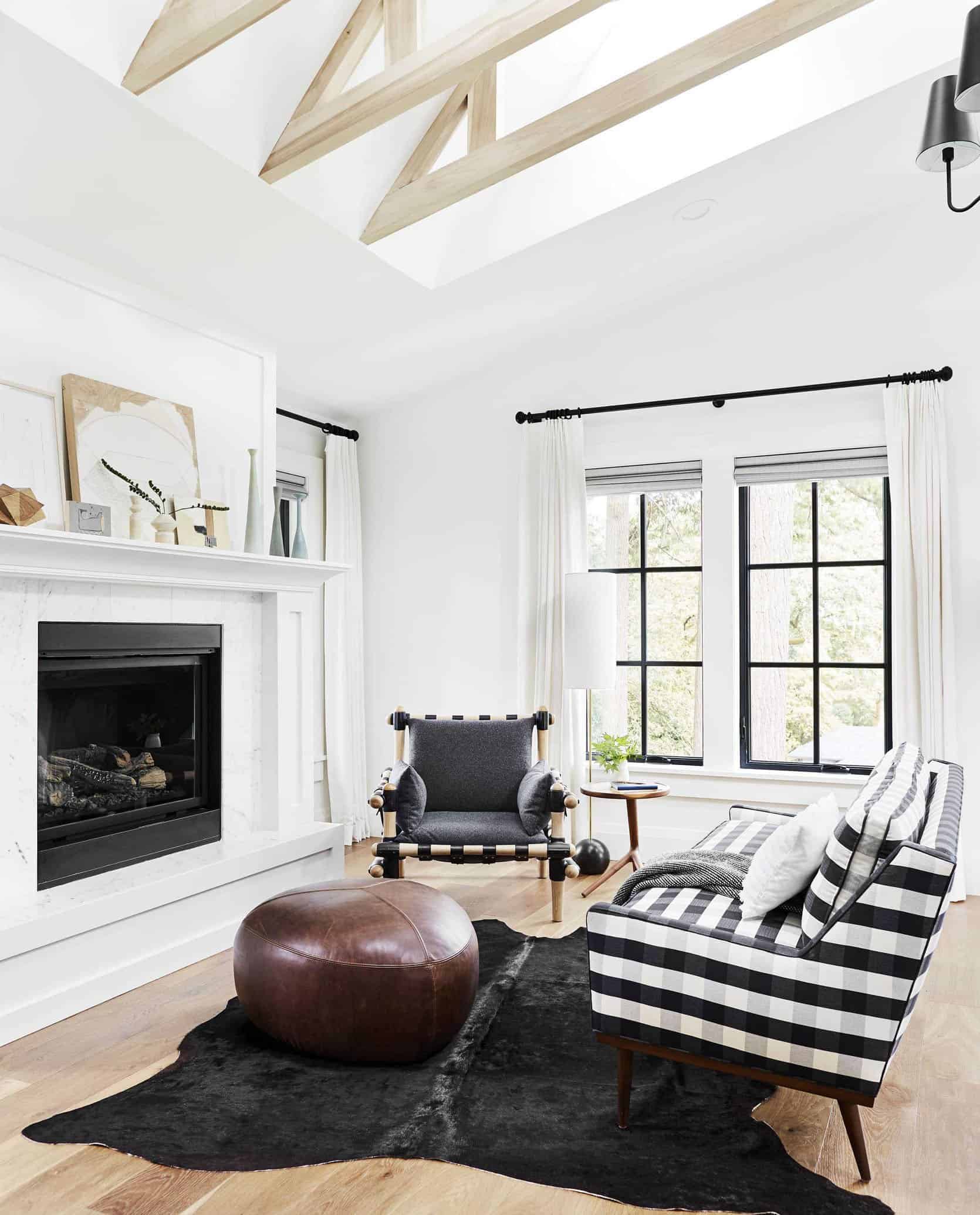
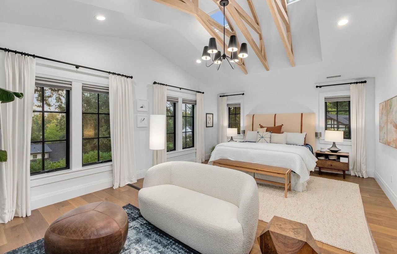
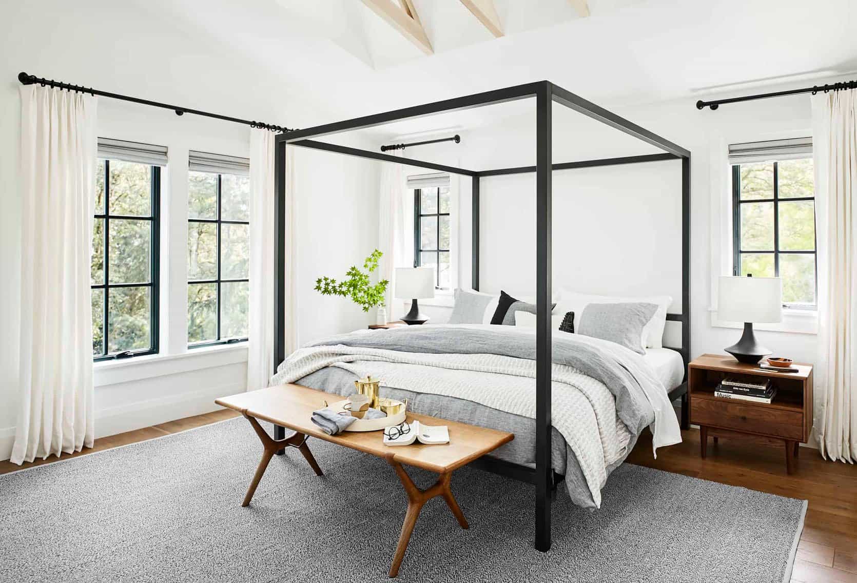
Ugh. I love that shot. And WHY didn’t we turn the fire on when we shot it??? Silly us.
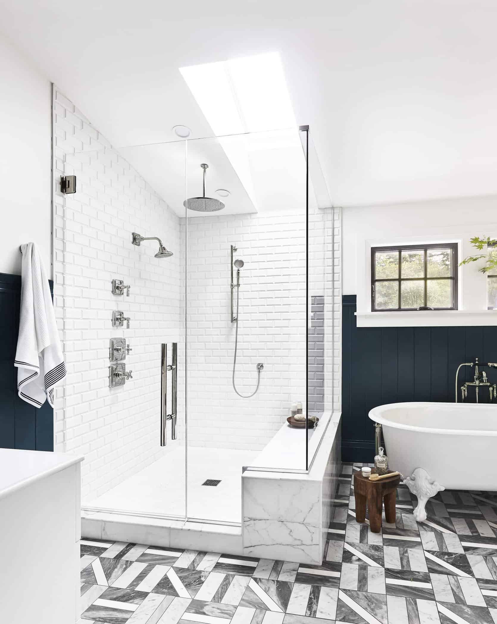
The Primary Bathroom
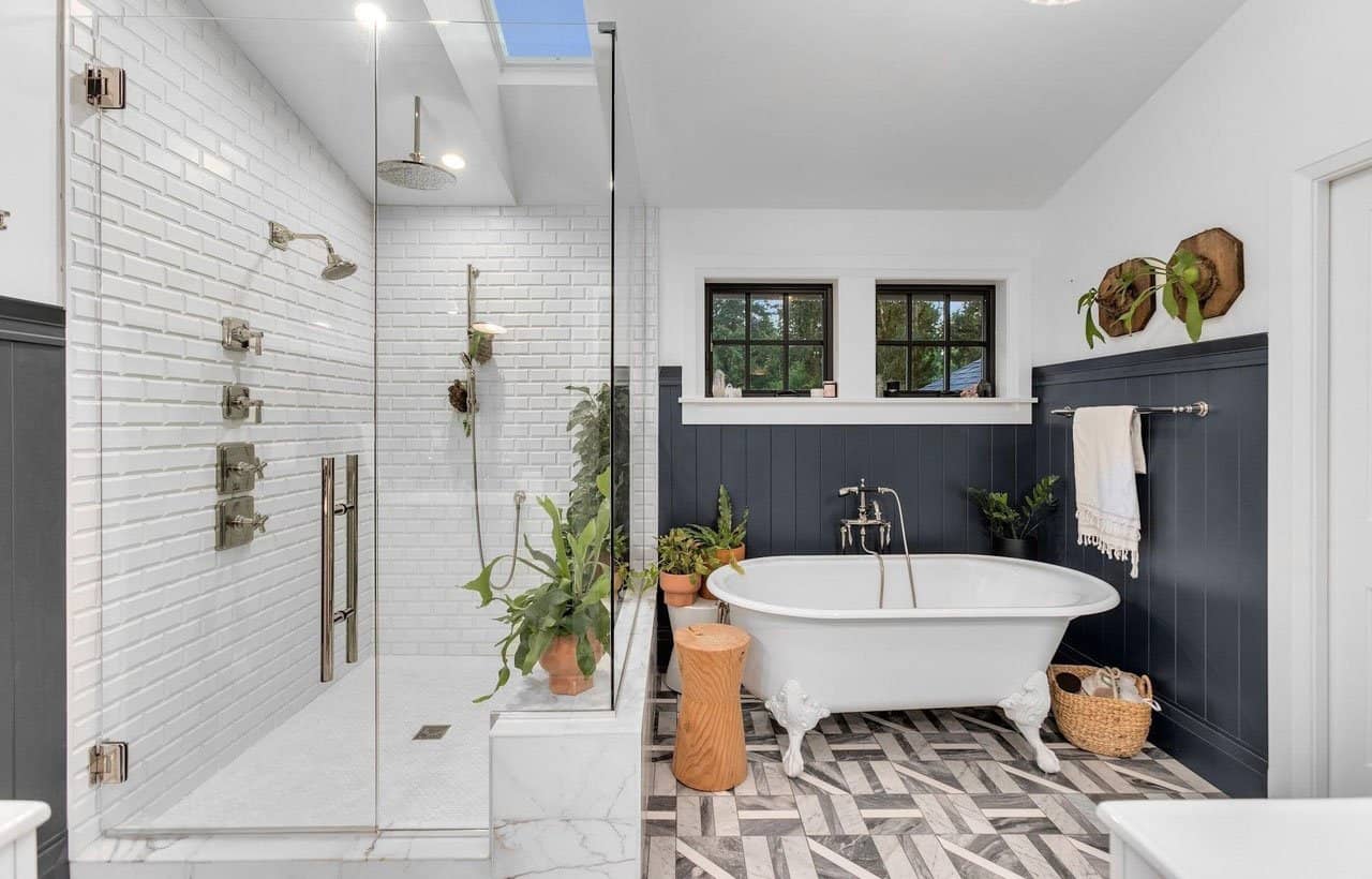
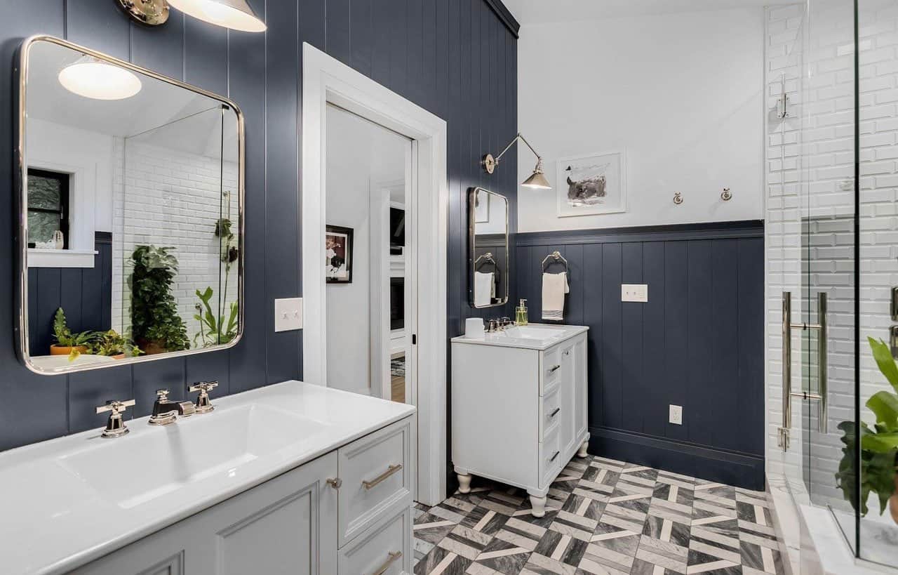
I love how they put plants in there. I feel like having them in a bathroom is the only way I might remember to actually water them.
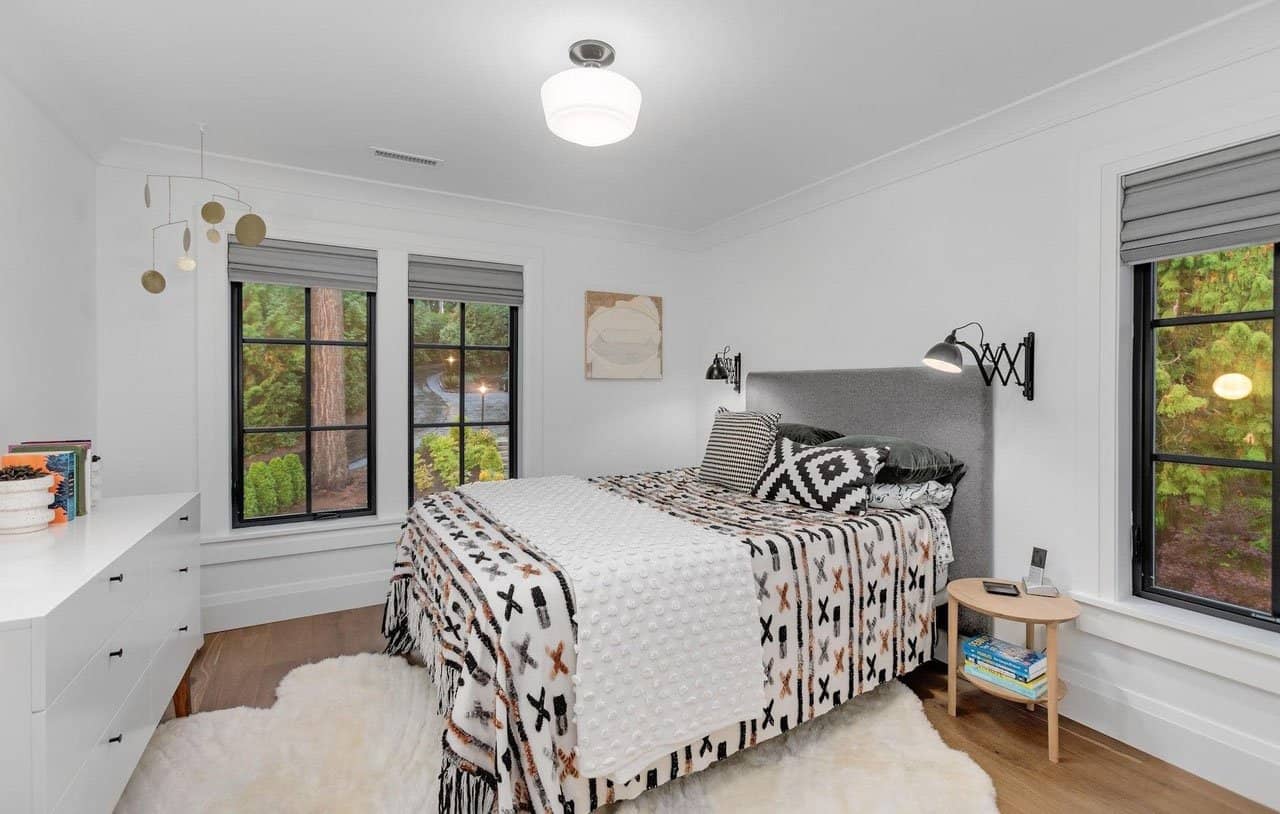
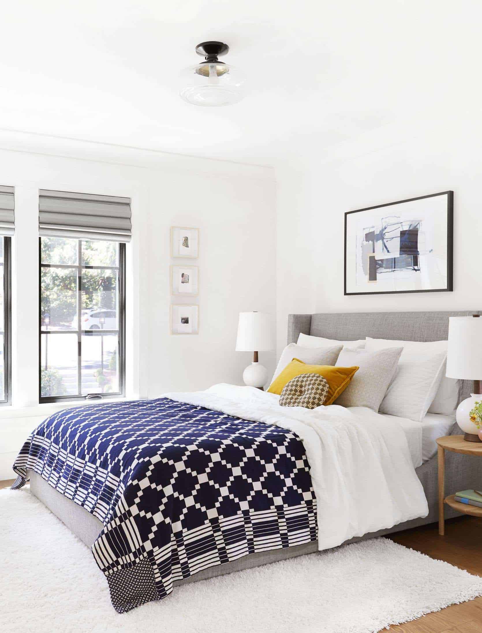
An Upstairs Bedroom
The Upstairs Hall Bathroom
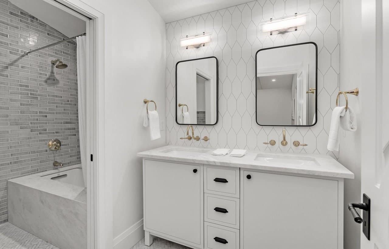
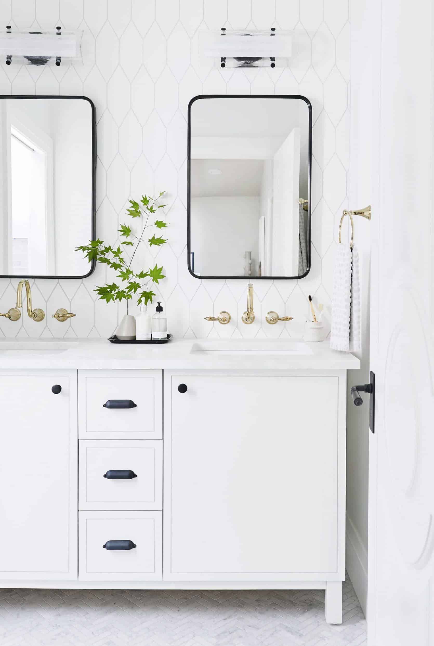
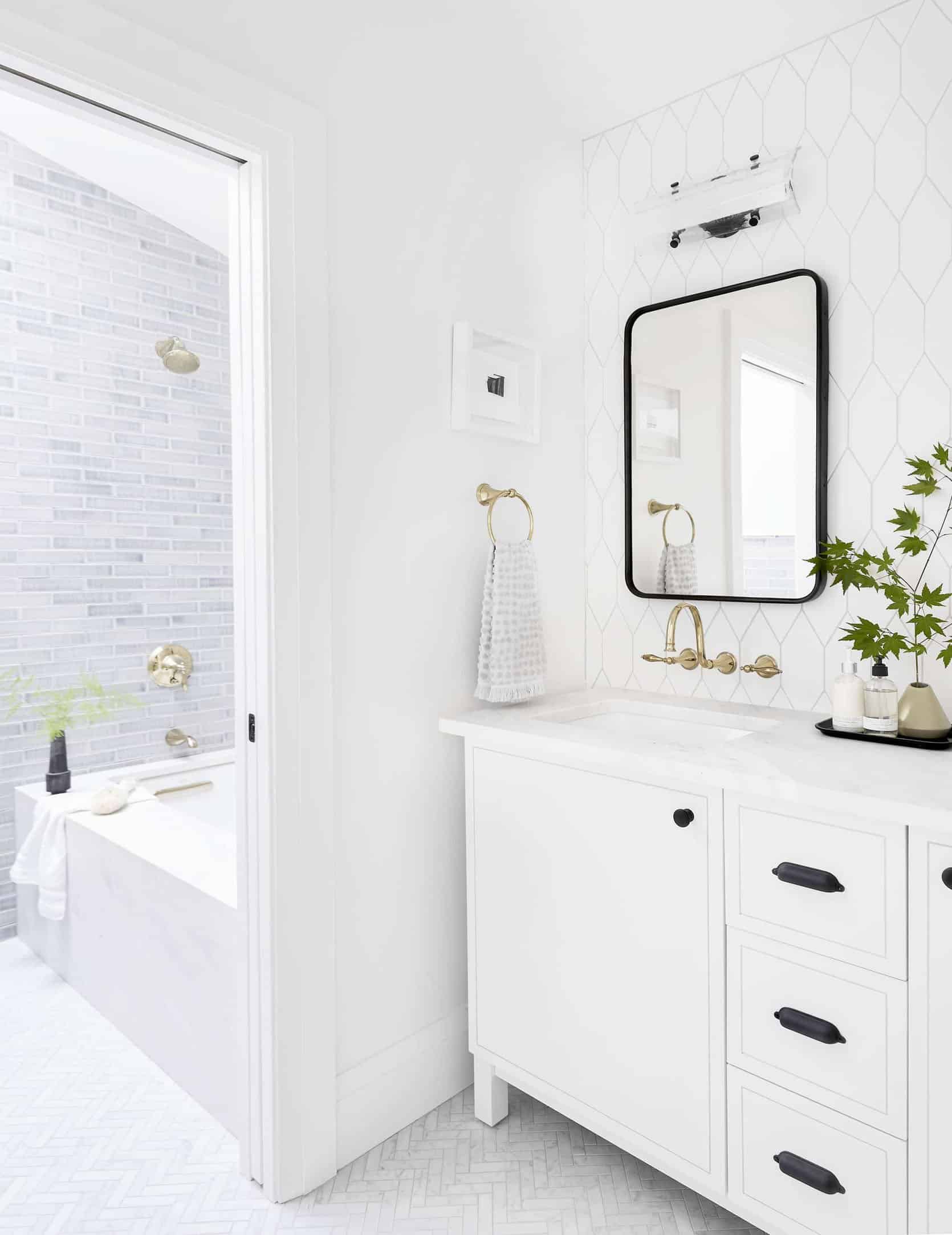
I still love those french gold gooseneck faucets (Kohler but sadly discontinued!) and that Pratt + Larson tile. And if I could go back in time and hoard more of that stone for the farm from Bedrosians I would – it’s still my favorite and haven’t been able to find it since.
The Media Room
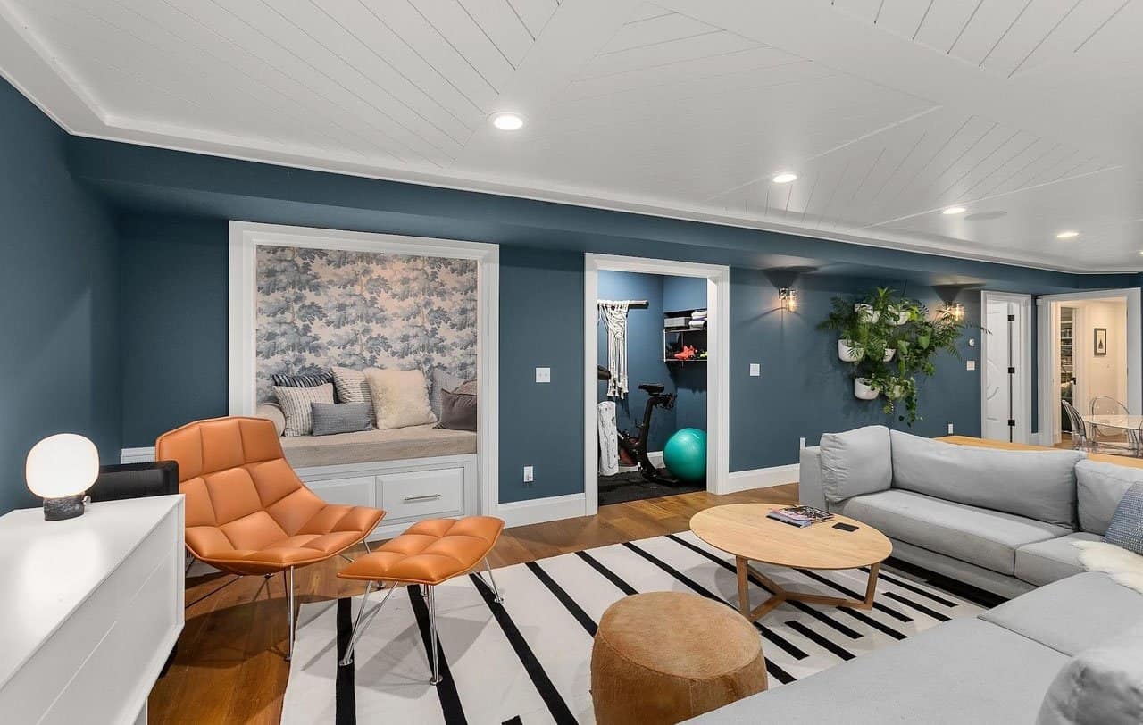
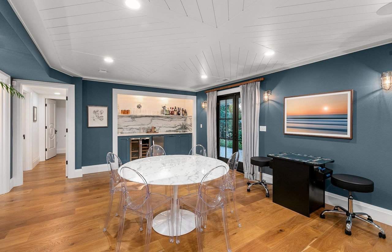
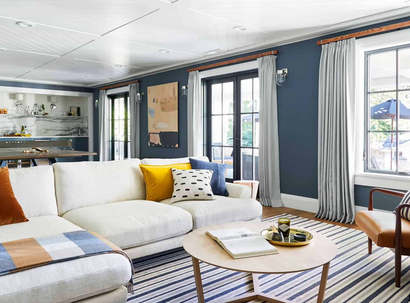
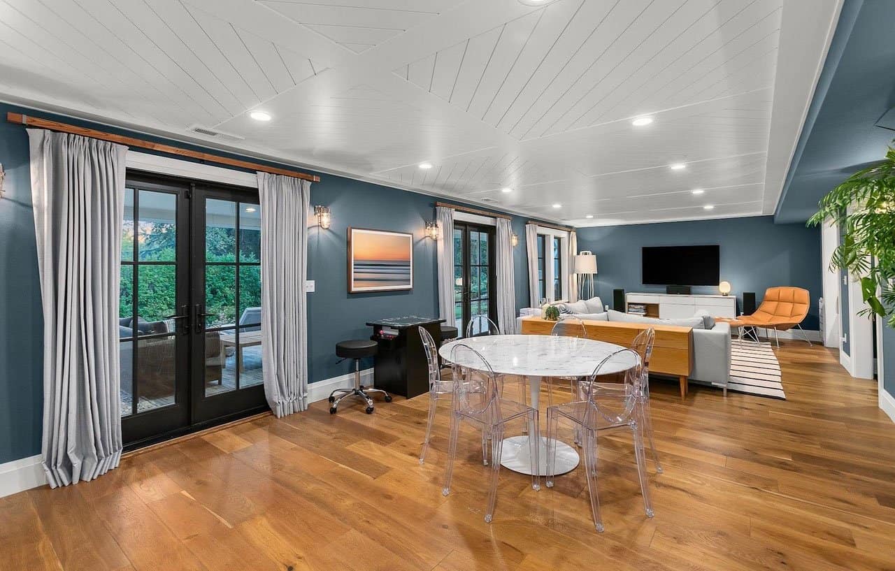
I miss that basement!! It turned out to be such a great family/media room.
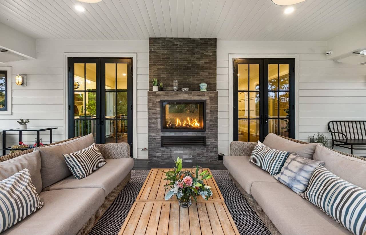
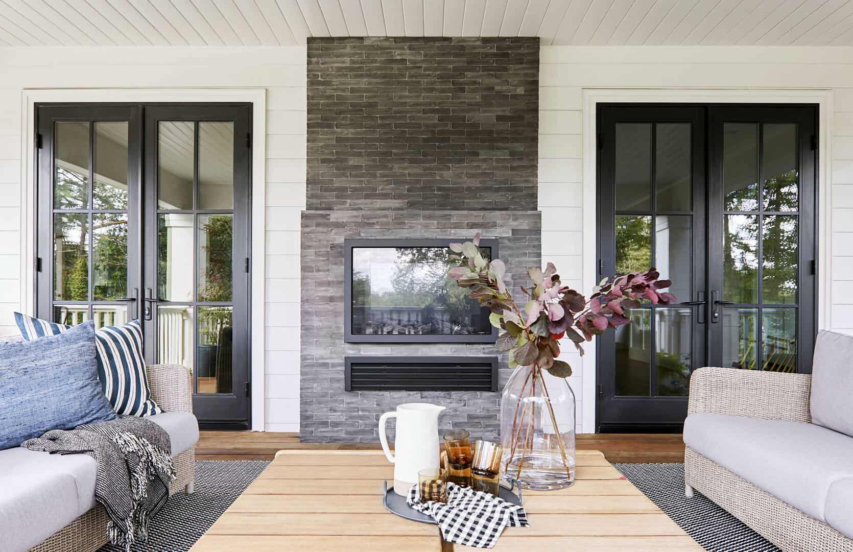
The Upper Deck
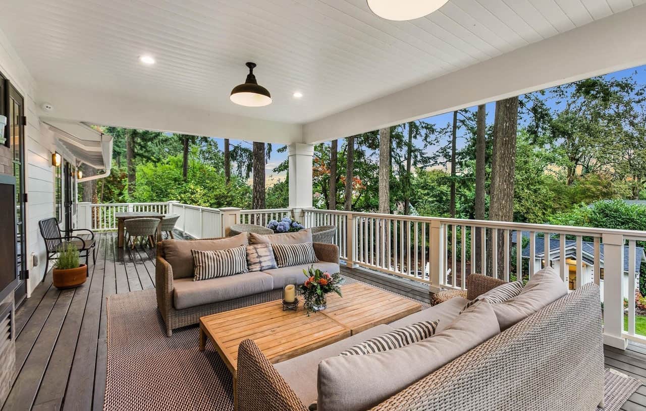
I’m sure the family spent a LOT of time here during quarantine. Such a dream, overlooking the yard that is now fully grown in (all plants and design were Monrovia, BTW). Our shot below.
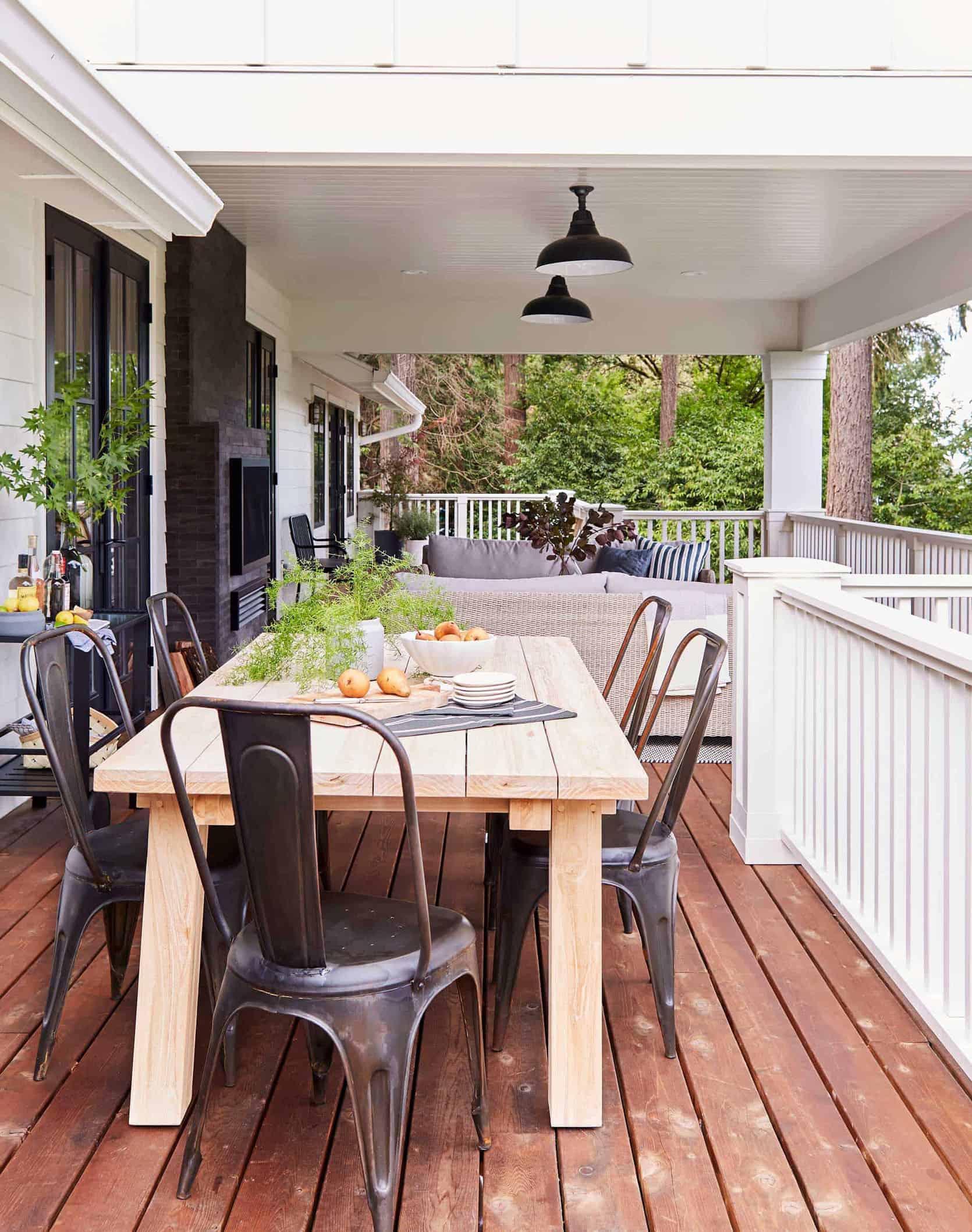
The Lower Patio
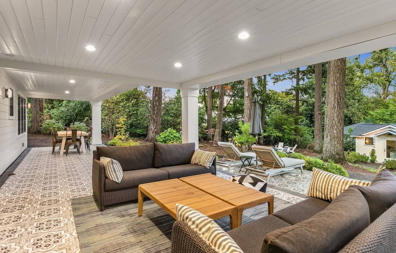
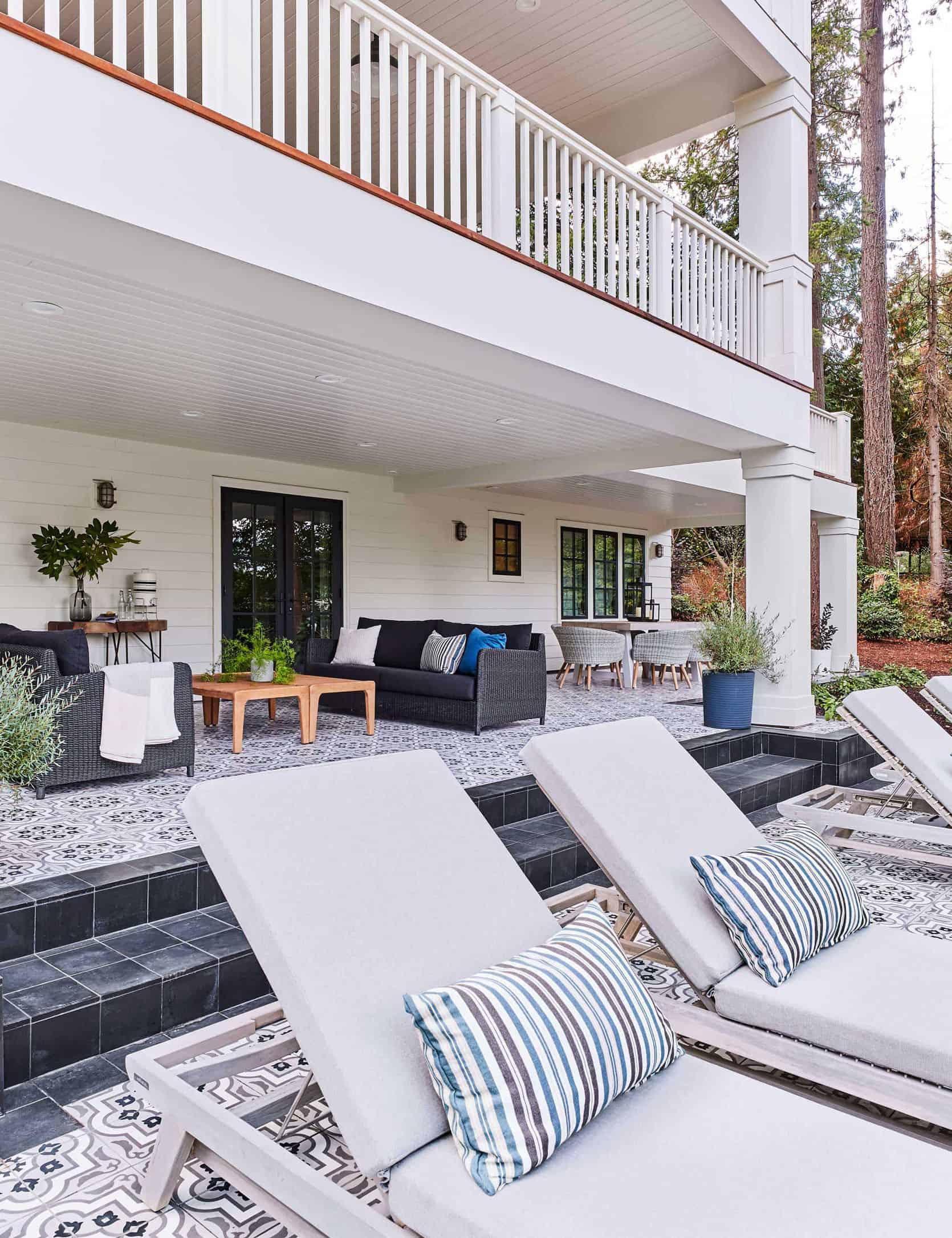
Now onto the juicy stuff.
How Did The Partnership Work With My Brother And SIL?
Ok. When my brother and SIL wanted to go in on a project with me we worked it out so that they would make the investment, take all the financial risk, pay for the renovation with construction loans and I would do the design for the blog/fun, splitting the net profit 70/30, after everything was paid for. I would of course try to leverage the blog for product trade, ensuring editorial and photography coverage, to help keep the budget down knowing that in this neighborhood it had to be a high-end, not builder grade flip. But what I did was not typical for a “flip” and even though many of the materials were traded for editorial coverage (not free, nothing is “free”). Here is the biggest warning I have for you:
Warning: I Designed The House In A VERY “Labor Expensive” Way…
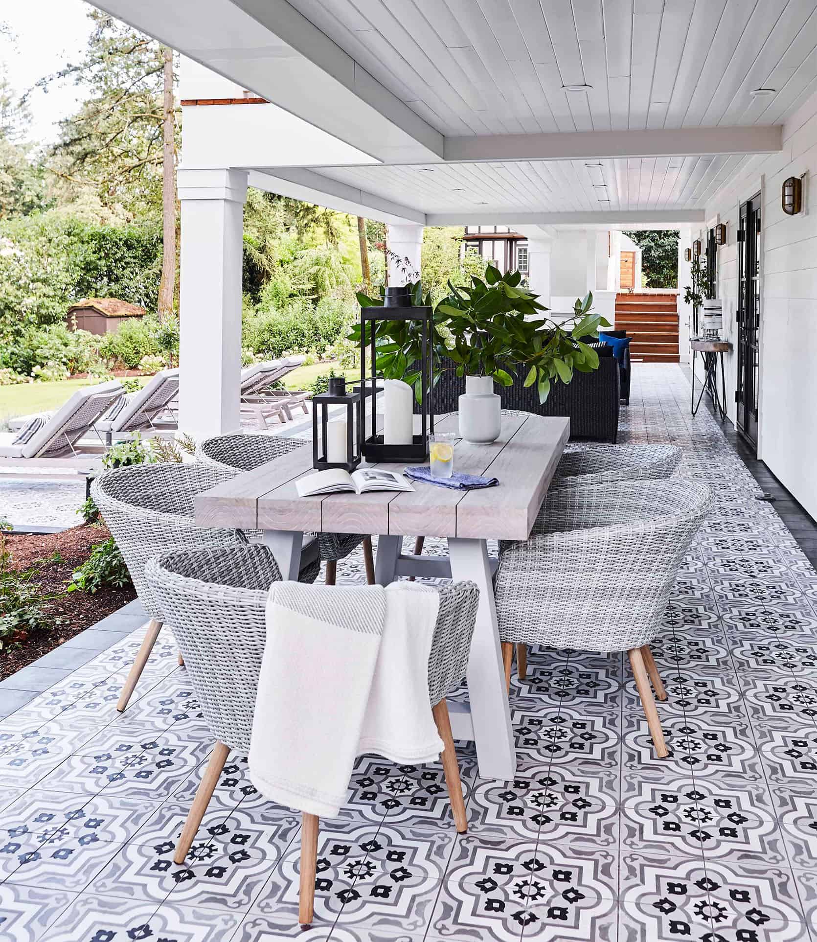
This was my biggest lesson, not that you shouldn’t do special things but you should KNOW that doing these things will cost a ton more. Example #1: The back patio – that Cle tile – it’s incredible, but cost SO MUCH MORE than a wood deck would have. Sure the tile was traded in exchange for coverage and photos, but the labor to put it down was 10 times that of wood (and wood at the time was so cheap!). If it were my house I would do this again in a second, but for a ‘flip’ the labor certainly added up.
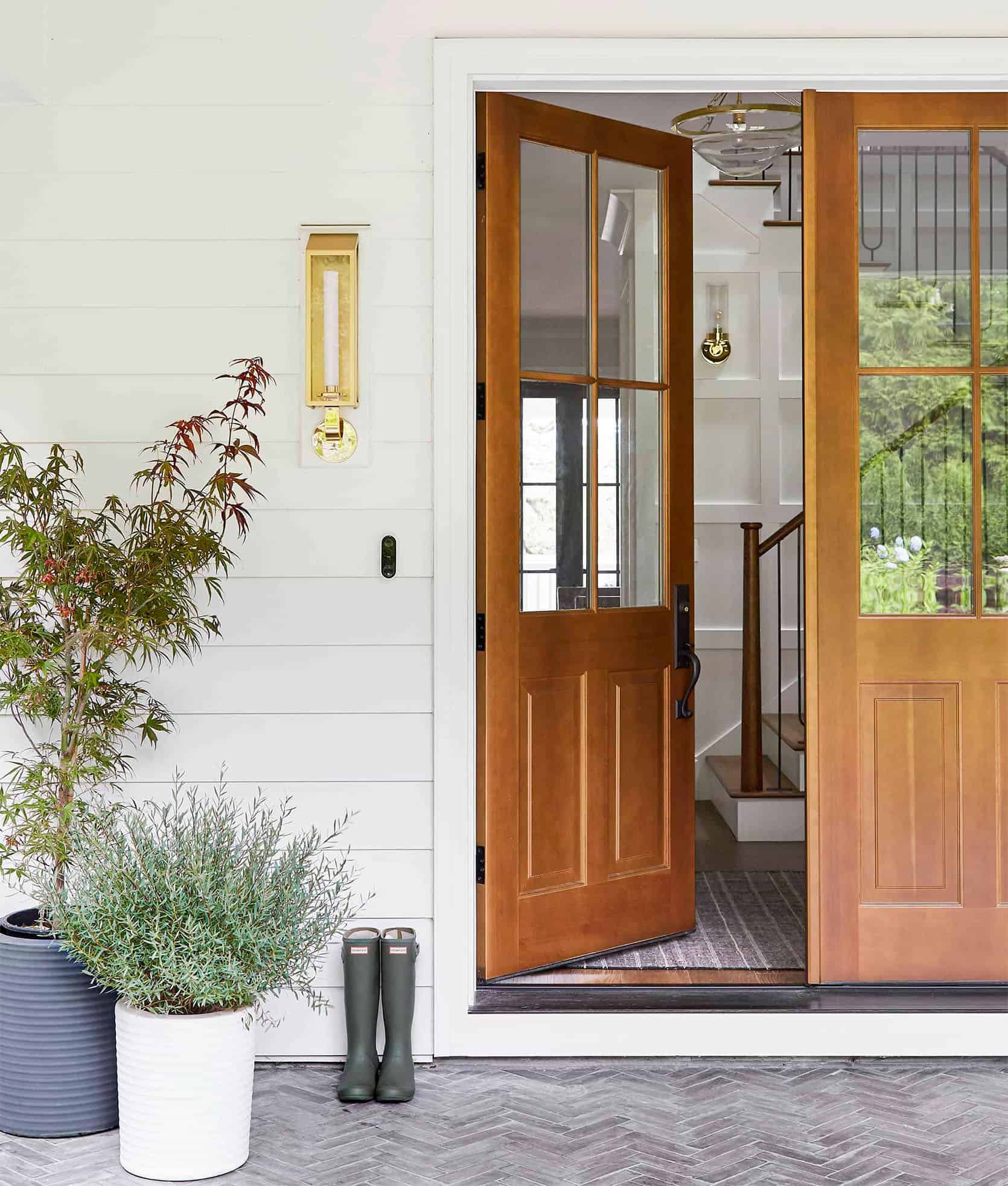
Example #2: For the front patio I wanted the tile herringboned with a border instead of a normal running bond field. The cost was easily 5 times more in labor because of that little decision (it took 3 weeks to tile, btw). I didn’t know that and my brother thought it was that important to me so he didn’t question it. Do I love it so much? YES! And I would do that for my own home, but for an investment property, it didn’t make sense and didn’t get the ROI back on that decision.
Example #3: The amount of paneling we installed, instead of just drywall took WEEKS to install and so. many. cuts.
Do I Regret Any Of These Expensive Choices?
If it were my house, of course not – they made a massive difference in it looking so beautiful and special, but for a project that was meant to be an investment? It wasn’t wise financially. My design decisions ate up the profits quickly.
Miscommunication Costs Money
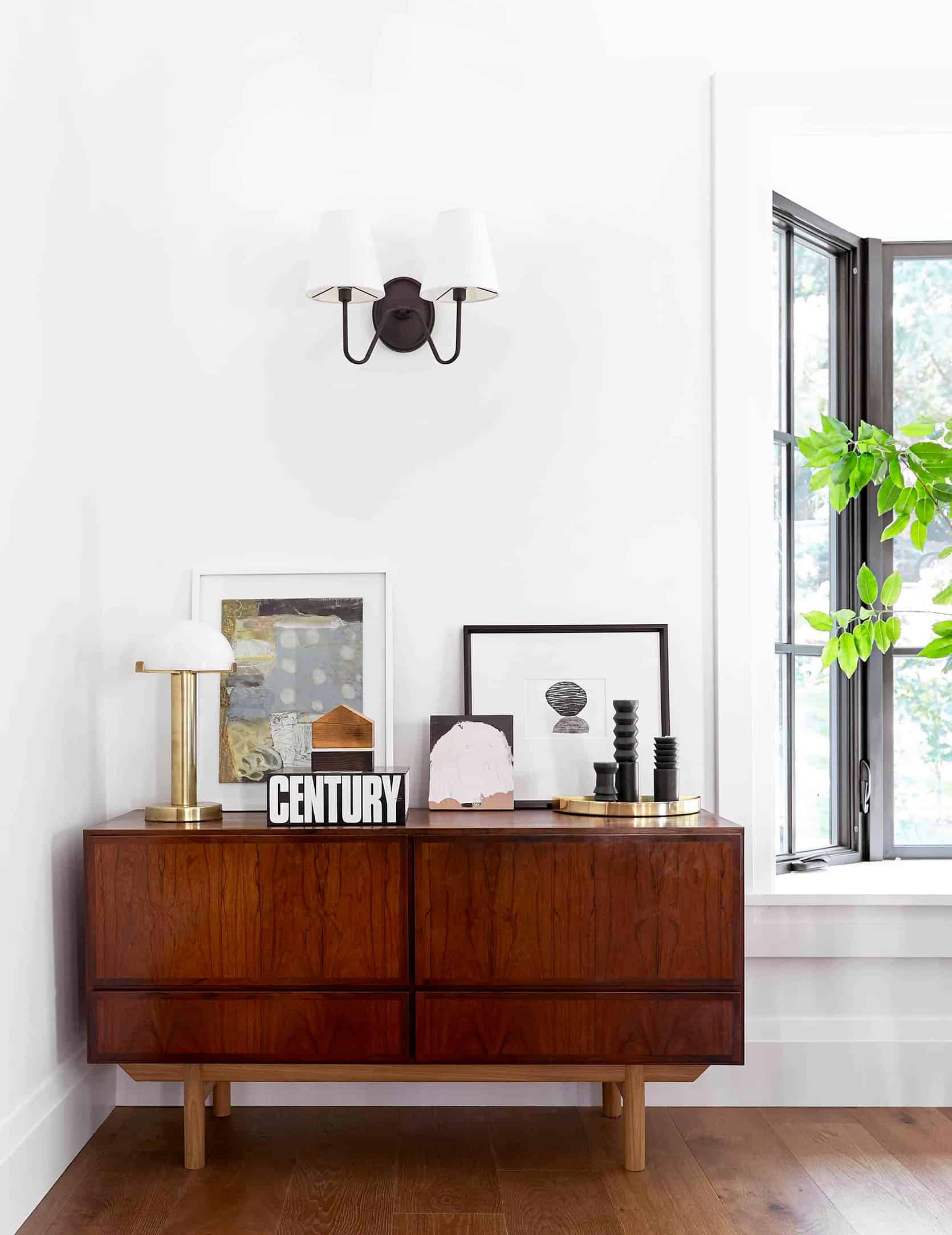
Because I was slammed and trying to do this from LA while doing the mountain house, I couldn’t properly oversee it at the beginning. I outsourced the electrical plan (aka didn’t have my team on the project…yet) and frankly didn’t understand what I was looking at when I approved it. My brother trusted that the plan reflected exactly my choices but it was RIDDLED with mistakes. Issues like the sconce placements were all off, and there were so many rooms with no overhead lighting because my “I don’t really like canned lighting” was interpreted as just NONE. J-boxes had to be moved and drywall then repaired, over and over and over. Could we have just left them? NO. Not when you are showing the whole world your “work” and there’s a sconce 1″ away from a door casing. Besides when you are working with partners it’s your job to make the rooms look AMAZING so that their product looks good. So the sconce that is 4″ too high or the wall-mount faucets that are far too high off the vanity have to be moved. I couldn’t spend so much time (and money) on a project and also be embarrassed by it. It was highly stressful knowing that I was the one driving up the cost of the renovation and that my bro/SIL would suffer financially because of my high-end labor choices and my mistakes.
So How Much Did The Total Renovation Cost?
All in all the renovation cost (and the expenses surrounding it including the mortgage, real estate fees, loan interest, etc) were around 1.1 million (supported through construction loans). The house originally cost $790K I believe and it sold for 2.39 mil in 2018. So, essentially we were left with $400K “profit”, with my cut being 30% of that (around $125K). Sounds like a great investment, right? Well, it would have been…
How Much Did I Spend?
So right after we closed on it I thought it would be smart to try to track the EHD expenses – while I didn’t pay for the contractor or anything, I had a whole team of people working on this for over a year, and then when we styled and staged it we spent a ton on furniture and decor (far more than a normal stager would obviously). So I started tallying it up and stopped when I was over $140K without putting in any of Brady’s time and none of my time. WHOOPS. Where did that budget go? Three freelancers that were easy to track, and then of course flights/hotel, and furniture/decor. But a lot of my team’s full-time salaries weren’t even included because we didn’t track it throughout the project unless we were actually in Portland working on it. But we also styled it out to such extremes. It took two weeks to install, style, and shoot with my whole team – which typically wouldn’t happen. We had it SO DIALED IN, with beautiful pencils in the pencil cups, $12 toothbrushes in the bathrooms, $40 beautiful body wash on the tub – you get it. But that kind of styling and shooting is beyond the normal scope of work on a flip investment, obviously. I knew that and was prepared to pay more to ensure the best photography.

So Was It A “Success” Or A Failure?
At a certain point, I could sense that I was overspending, and like I said, that’s not what it was about for me anyway – which I fully realize is a huge privilege, so I made the mental shift to just make it SO BEAUTIFUL, a portfolio piece, and of course content for the blog and press. And listen, it made the cover of Portland Monthly and a year later it was on the cover of Real Simple, y’all!!!! I was SO HAPPY when that happened.
I made some really solid partnership connections and proved even more that we can design and style with our partner’s product beautifully – broadening our business in a big way for the future. We built a lot of trust with our partners and that feels really, really good. I learned so much more about the “business” of content creation from this project that has made all future projects run far more smoothly. We took the data and learned how to properly budget for content creation, which has shifted how we negotiate and has given us some leverage as proof of the ROI. Yes, I say ROI a lot now. Creating quality content is very very very expensive and time-consuming, and after that project, we were able to properly budget in order to profit and simply make smarter decisions for future room makeovers and collaborations.
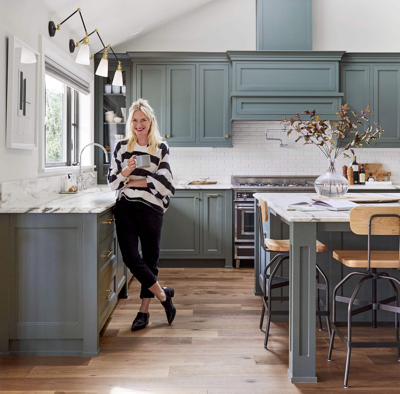
I was SO PROUD of the project and have never, not once thought it was a failure. I also realize how privileged I am to have this particular career and not have that loss devastate me financially.
It was an absolute success in my book. So yes, technically I lost money on it 3 years ago, but throughout it, I also knew that every blog post about the project, both process and reveals (including this one) drives revenue, and continues to do so. I haven’t added those up, but it’s not nothing. I also sold a lot of the pieces to the buyer so was able to make some money back there.
But most importantly it was a success because frankly the lessons I learned (in design, budget, business, and management) HAD to be learned, and now I know them. It was VERY HARD in many ways, but it was huge for my personal growth. I learned that I can only do one major renovation at a time, and not be far from it. I simply couldn’t be on top of the project in the early stages when a lot of the bad decisions were made, because I had zero bandwidth and didn’t have an in-house design-only team yet. I learned pushing myself and my team beyond my limits and saying yes to too many projects at the same time creates a lot of mistakes and waste. And I didn’t have the right kind of help early on – so I learned what type of team I need to execute something of this scale. A huge thank you especially to Julie for her hard work on this once she was hired, then Grace and Velinda joined her, and of course, Brady and Emily Bowser to help me decorate and style – many hands make light the work. 🙂 This project also introduced me to Priscilla who is an incredible local designer now whom I’m working with on my friend’s basement and I LOVE HER.
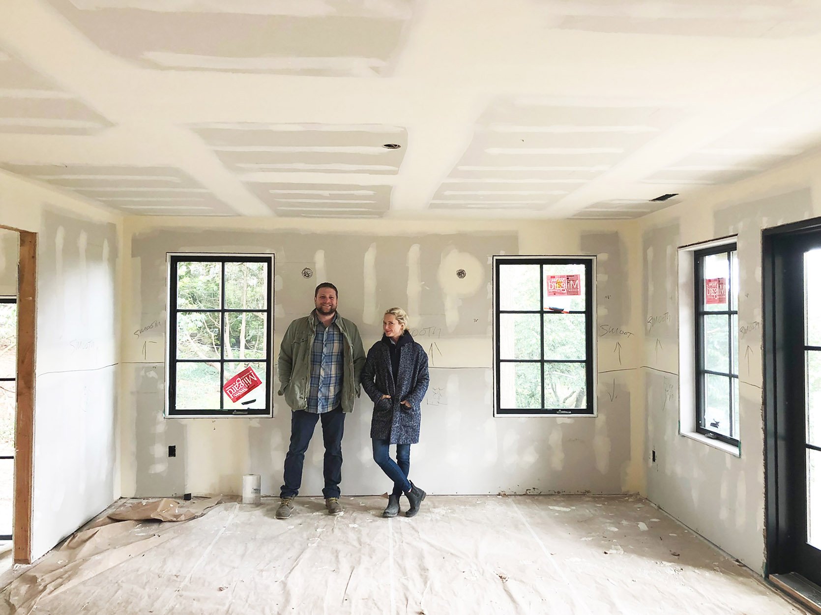
Also, this is the project where I started releasing the shame I felt when I made a mistake publicly and instead was like “OK. GOOD TO KNOW, LET’S FIX IT, MOVE ON AND NOT DO THAT AGAIN”. It’s also when I resigned myself that every project is full of mistakes no matter how experienced you are. Every single one. Only now we make mistakes or change our minds early on, hopefully avoiding the expensive changes and big mistakes when it’s almost too late. Now I KNOW that herringboning a tile will cost so much more than a regular running bond. Now I can make a “choice,” not a “mistake”. I guess it’s also why I felt compelled to write this book that comes out in the spring (a handbook for renovation). I felt so frustrated with myself, dumb, and stupid throughout the whole design process that year, and wished so badly for a resource like this. So I have that house to thank for this next endeavor.
It also reconfirmed to only enter huge projects with people you trust and who you enjoy being around. Despite the overspending on my end and racking up the labor budget with my mistakes and design choices on Ken’s (my bother) budget, there was not one second of weirdness in our family. We both own mistakes well, are extremely upfront and honest and talked very openly about the whole thing both during and after. And we both believe in fairness and common sense.
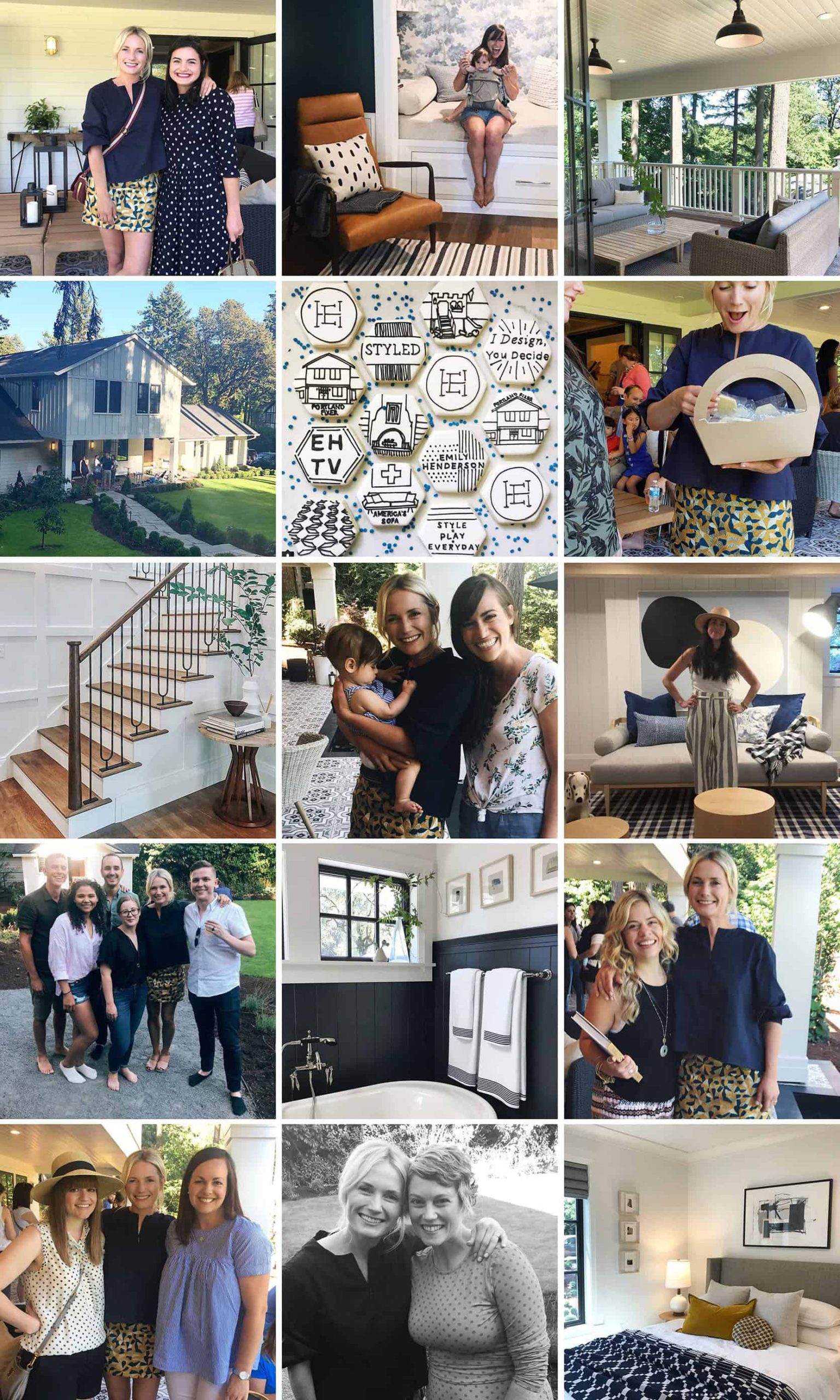
Once it was all styled and done, and we had that huge awesome party, it really was SO FUN. We were all so proud of the home, it was very fulfilling as a designer and I was so proud of my team’s hard work. I truly did enjoy most of the design process and the parts that I didn’t were super valuable lessons that I needed to learn. Would I warn others about doing a high-end flip without a lot of experience with a family member if you aren’t a design blogger? YOU BET. But it worked out. And the reason I never talked about this before was because I didn’t want anything to taint the sale or the experience of the family living in the home. She’s a follower, so I didn’t want her to know that this house was a source of stress. But now that they have sold it and we have 3 years of distance from it, it’s fun to share all the lessons learned from that renovation process.
How Much Did It Finally Sell For??
You are going to die – I almost did. It went on the market in October for 2.8 (remember “we” sold it for 2.4ML 3 years ago), it went pending real quick so I was dying to find out what the final sale was. 3.2ML – that’s right, 400k over asking, already 400K over what they paid just a few years before. What is this world?????? Caitlin wrote about the real estate market last week in a highly entertaining but wildly different post. It’s insanity out there. And the last homeowners didn’t do much to do, so the new buyers essentially bought the house we designed, just in a MUCH BETTER MARKET. HAHAHA (funny, not funny).
So there you have it – a much overdue recap with some numbers that might make us uncomfortable, but I think it’s helpful for people to know what really goes into huge renovations like that and how much time, effort, and labor goes into simply designing them well. Again a huge thanks to my incredible design team who helped see it through (Julie, Grace, Velinda, Brady, Priscilla, Emily Bowser, and all shot by always lovely, Sara Tramp). I feel honestly so lucky to have done that project, with my brother for this blog. Thanks to, of course, all of you who watched along and supported throughout the way, and thanks to all the lovely partners who helped make it look beautiful. Ok, that’s all. 🙂
All EHD After Photos by Sara Ligorria-Tramp
THIS POST WAS ORIGINALLY PUBLISHED HERE.

