I can design a mediocre room pretty fast. But to design a great room, one that meets our practical needs, works with the architectural intent of the home but feels like “me” – until I die – is far more laborious. And I honestly love (almost) every second of it. I wish I could be more cavalier about each decision, throw them out willy nilly, but I can’t. And regardless of the choice, I will wish I had done some things differently. I obsess about each macro and the micro choice when it’s my house, even while not following all of my own formulas, and intentionally breaking some “rules”. But this can only be done with a certain level of obsessive planning and painstaking attention to what we want for this home. What sacrifices in the name of style will we make? What practicalities will we forego in order to have it represent our personalities? The pitfalls of being so obsessive are that once you change one thing, it’s a full domino effect. I don’t know if I’ll ever do client work again, but if I do I’ll likely feel so guilty about the time that I put into each decision – because folks, IT ADDS UP. So today we are discussing our choice between painted or stained wood kitchen cabinetry. Let us remind you where we started:
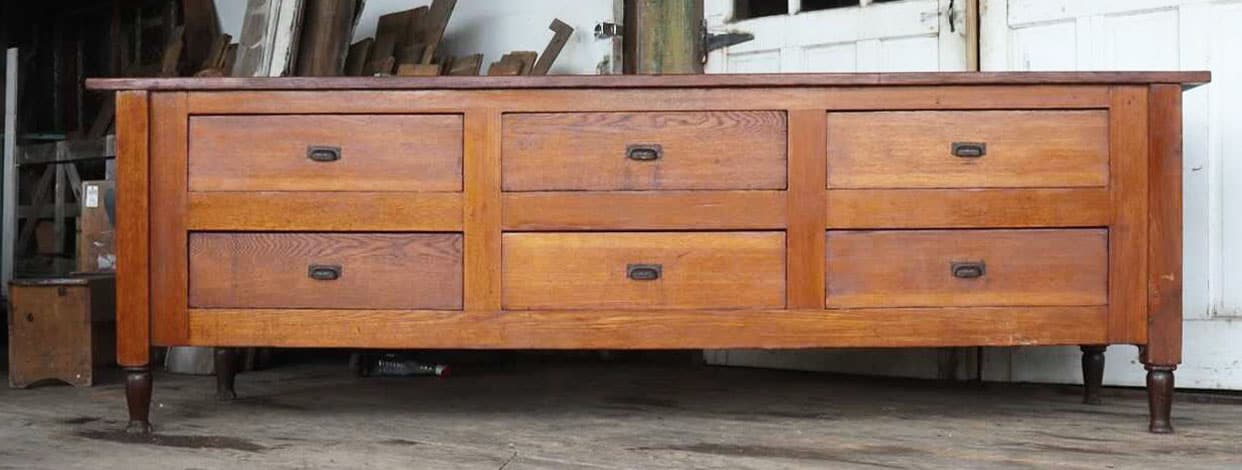
This lady. Knowing that we really loved vintage we found this soulful piece of furniture to use as the island. It’s red oak (!!) and absolutely stunning. Brian and I both said “yes to that dress” immediately upon viewing and haven’t had an ounce of regret since. We forewent practicality of “cabinetry” for functioning but old drawers and we feel pretty darn great about it (mostly because we have a large pantry for storage and we have way less stuff than we used to and want to keep it that way). But having this red oak piece made the decision to do the rest of the kitchen cabinets in natural wood even harder, prompting me to write the post about “can you have too much wood in your kitchen?“
Our answer is apparently NO, you can’t have too much wood. But to recap I’ll remind you of the pros and cons of paint versus stained cabinetry:
- Painted cabinets can chip, revealing the primer or wood underneath. Many manufacturers or cabinet makers say that theirs don’t (and it has so much to do with the painting formula and techniques). But if a drawer hits another drawer when open (in corners), if you slam vacuums against the toe kick, or if you are just super rough in your kitchen (me), etc – it will chip or ding. Nothing you can’t touch up, of course. Stained wood (especially if it’s naturally stained) will not chip – it can still get dinged but it’s hardly noticeable.
- Painted cabinets can be more fun and colorful. You have a billion options in both color and finish (flat, semi, high gloss). You can go dark and moody, light and airy, or bold and bright. You can choose colors that represent you, stylistically and those colors can wildly change and dictate the look and vibe of the space.
- Stained cabinets are more expensive (for nice wood). And cheap wood will date your house (eventually) but that’s because cheap anything will date your house (especially if the craftmanship is cheap, too). So you want to pay attention to the quality of the wood (veneer clad or 100% wood), and love the grain pattern (because the grain will be the “pattern”). While you absolutely can stain a cheap wood to look darker, never once in my life have I thought that doug fir stained with a walnut stain actually looks like walnut. People will argue with me on this, they’ll protest and say that they have made fir look like walnut, but in my experience, it just looks like darker doug fir (WHICH IS FINE).
That being said my instinct was to go with painted cabinets to offset the island, not compete with it and deal with the risk of having too much wood. Two competing woods with different undertones in one room is absolutely doable, but not without a lot of careful considerations, intentions, and willingness to risk take. Not to scare you but if you are new/nervous to design you can stick to the “one natural wood + painted wood” formula unless you are trying to work in heirloom pieces that you already have – it’s simply less risk.
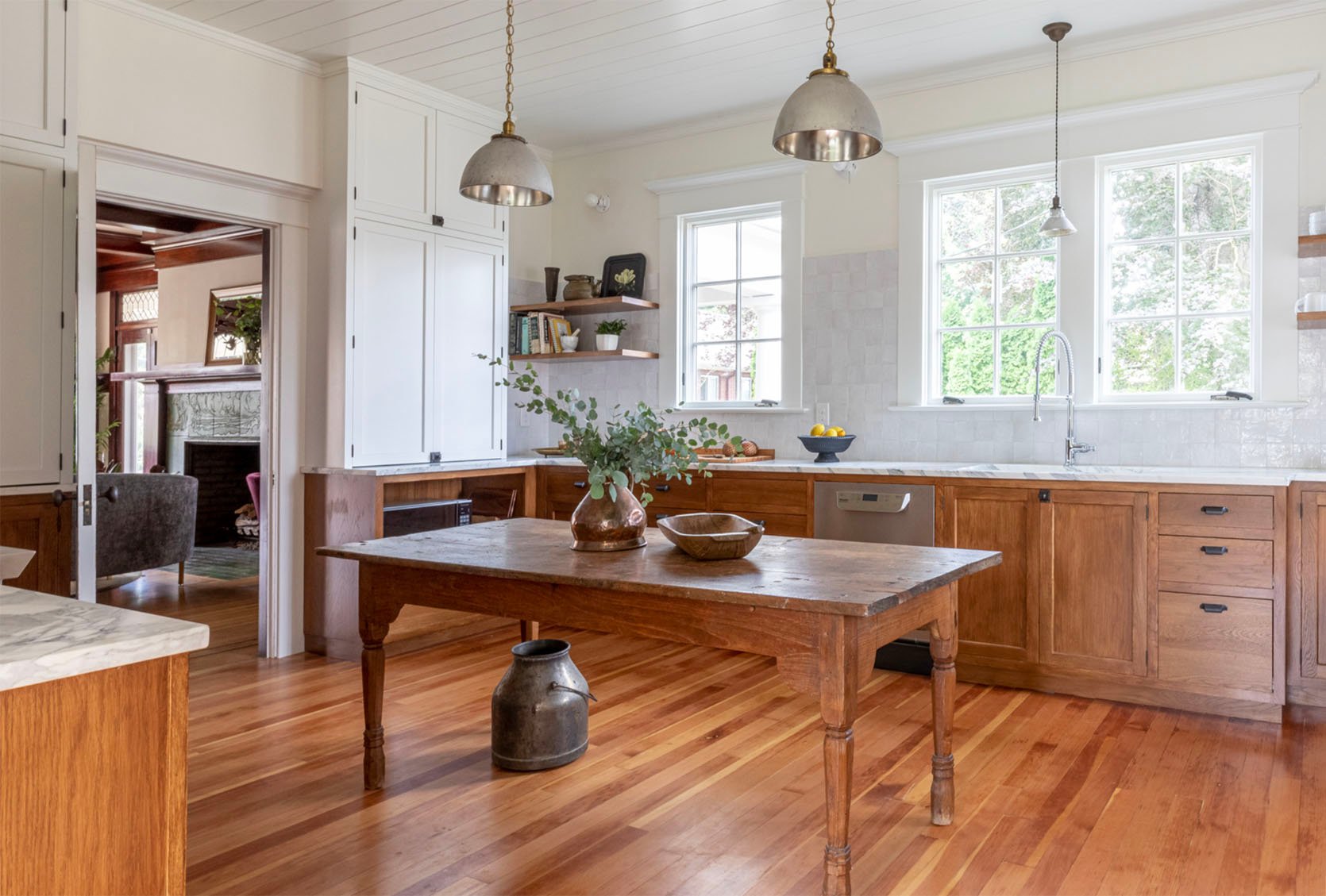
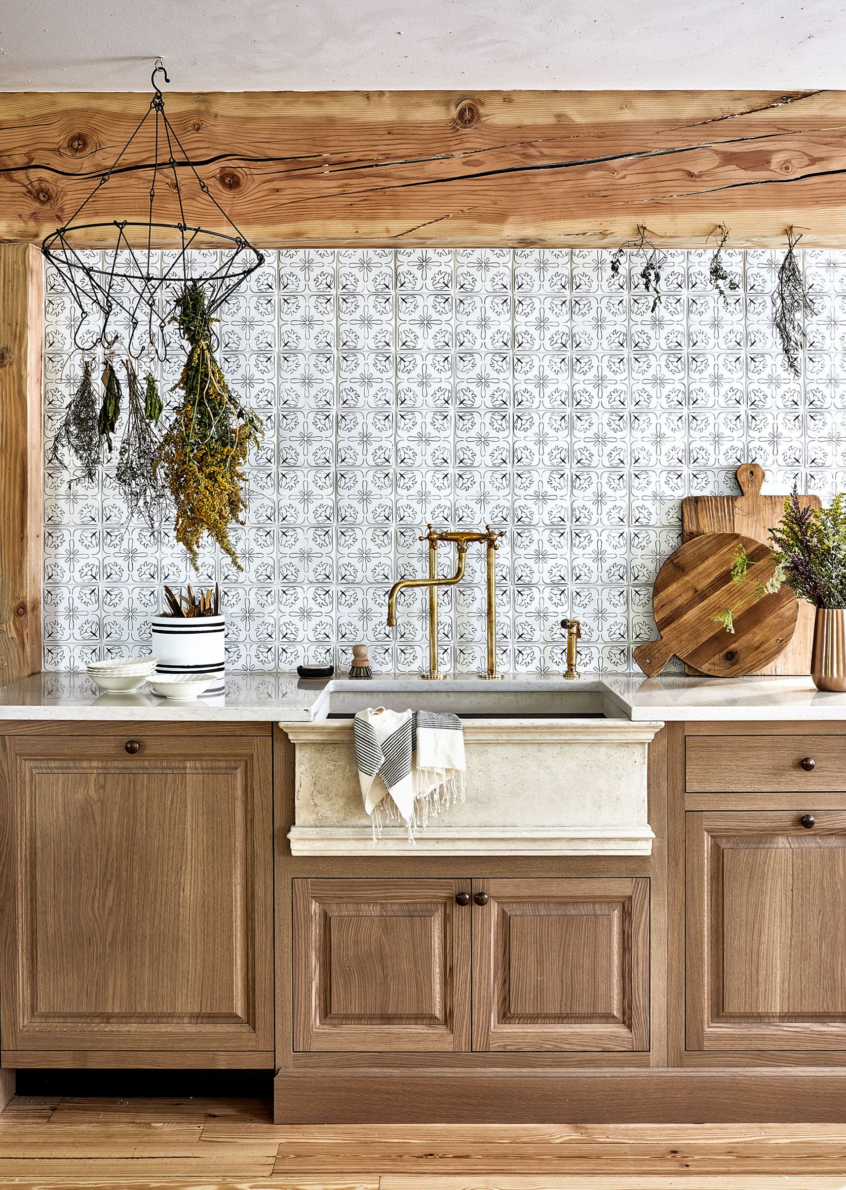
As a reminder, the floor is ALSO white oak. I was captain of “team painted cabinetry’ thinking I’d go for a medium powder blue or a darker green or blue, etc, meanwhile, Anne and Brian were chanting “DOUBLE WOOD! FOR! PRESIDENT!”. Anne was so adamant that this house/kitchen specifically wanted wood cabinets that I started really believing her. Honestly, I prefer wood for practical purposes (no chips ever) and I LOVE wood in general, but I love color, too! And can three different woods in the same room look intentional and not too heavy?? She showed me some photos of rooms where she mixed different woods with different undertones and it just clicked into place. While I wouldn’t recommend this for all styles of homes, for this farmhouse – she was right. The kitchen wanted to be wood. Of course, once we decided on double wood then I had to change the stone and the tile I had in mind (it was white, it is no longer), but these are fun problems to have (if you have time to solve them which we did).
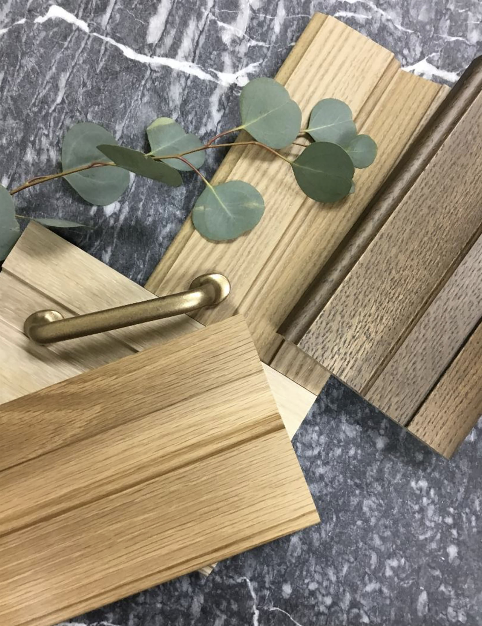
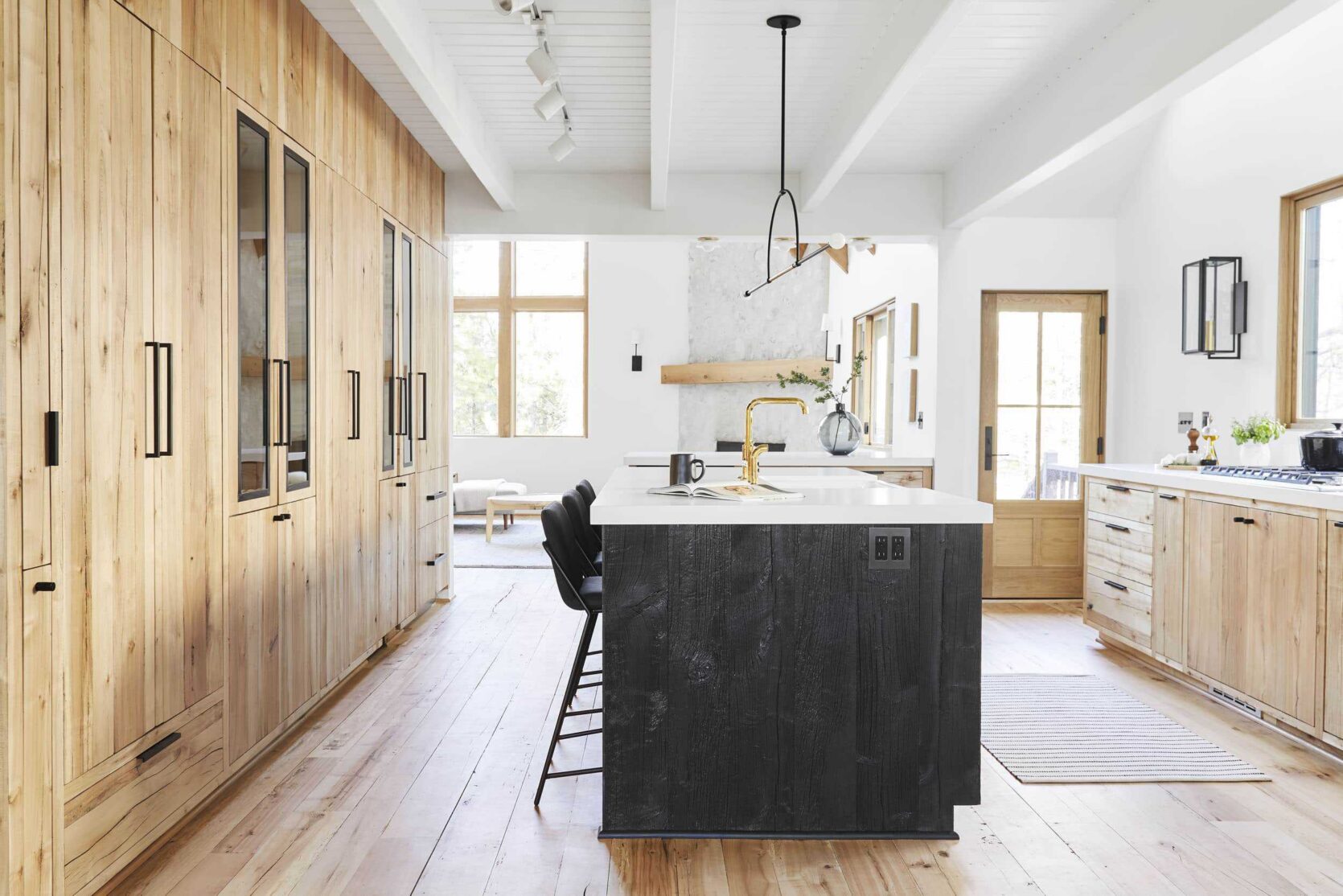
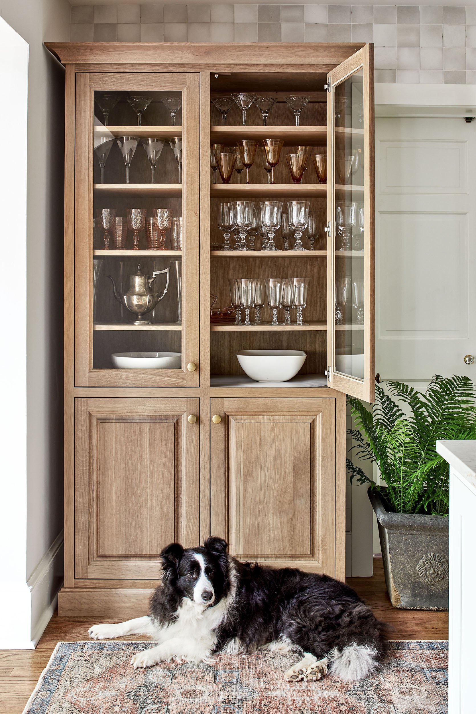
We are working with Unique Kitchens & Baths on the kitchen cabinets so they sent me all their wood samples early on. While I’m trying to not recreate a farmhouse version of the mountain house kitchen, I also really love living in that warm minimal kitchen so maybe I am. That kitchen has gotten a LOT of wear and tear (between parties and living there full time during lockdown) and the cabinets look perfect still (they aren’t, you just can’t see the dings or scratches). We immediately gravitated towards the white oak, in a natural finish.
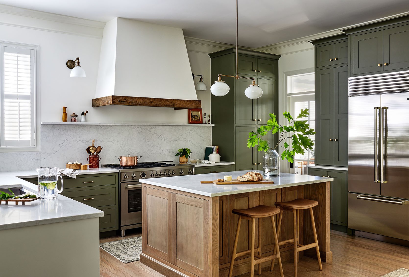
It’s so pretty. So high quality. Just solid, pretty wood made by Mennonites (women-owned) in the US and arrives pre-assembled as boxes (in blankets – no plastic wrap!). The question became – do we do both the sink/range walls in the white oak as well as the fridge/freezer/bar wall? We went back and forth for WEEKS. We stood in the space with paint samples, we changed it over and over in the renderings. The debate was between keeping them all white oak, or doing the fridge/freezer/bar in a light neutral white-ish tone (to disappear into the wall/ceiling. In the renderings, the white all of a sudden popped out too much and called more attention to it. So after so much back and forth we decided to be safe and have it in white oak which is more expensive. However, if we end up wishing they were white then it’s paintable, whereas getting it already studio painted and wishing it were different would be way harder to change. I’m not sure we made the right decision, but it’s the one we made as of now 🙂
So that’s where we are at – a calm, warm, kitchen full of multiple tones of wood… Up next I’ll show you the tile, the stone, the hood design (not done yet), the ceiling treatment, and the controversial hardware decision (spoiler – Brian chose it and I’m not convinced it’s what we should do but no holes are drilled yet). It’s all coming together, folks 🙂
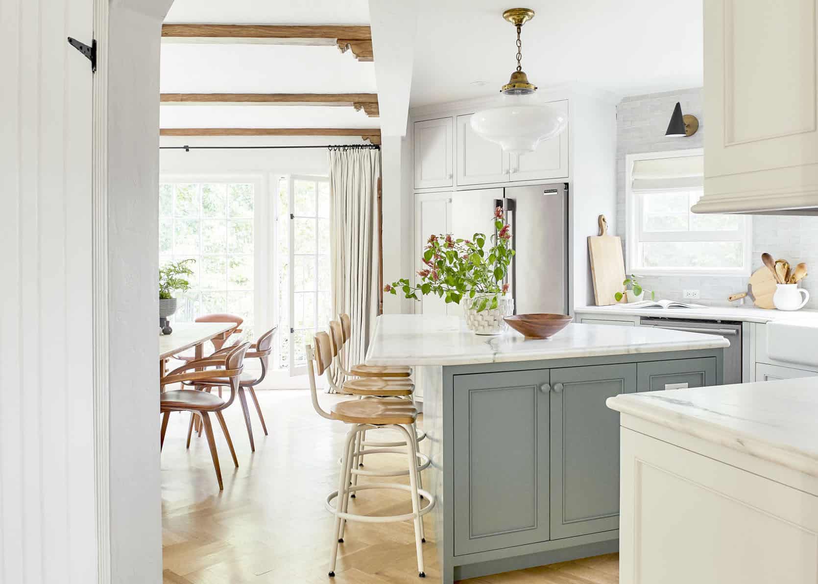
Opening Image Credits: Photos by Sara Ligorria-Tramp | Right From: Mountain House Kitchen Reveal | Left From: Styling to Sell: How We Staged Our Dining Room and Kitchen
THIS POST WAS ORIGINALLY PUBLISHED HERE.

