I think that every single piece of interior design advice on the big, wide, infinite internet can be summed up as follows:
- Find a jumping-off point.
- Jump.
And sometimes, it is that easy. Maybe you’ll fall in love with some wallpaper, or an antique rug, or some textiles from a flea market, or a big piece of statement art. And then, maybe you’ll look at your room, and you’ll just know – a mirror here, a chair there, a gallery wall to the side, rug underfoot. Today’s post is NOT about one of those times.

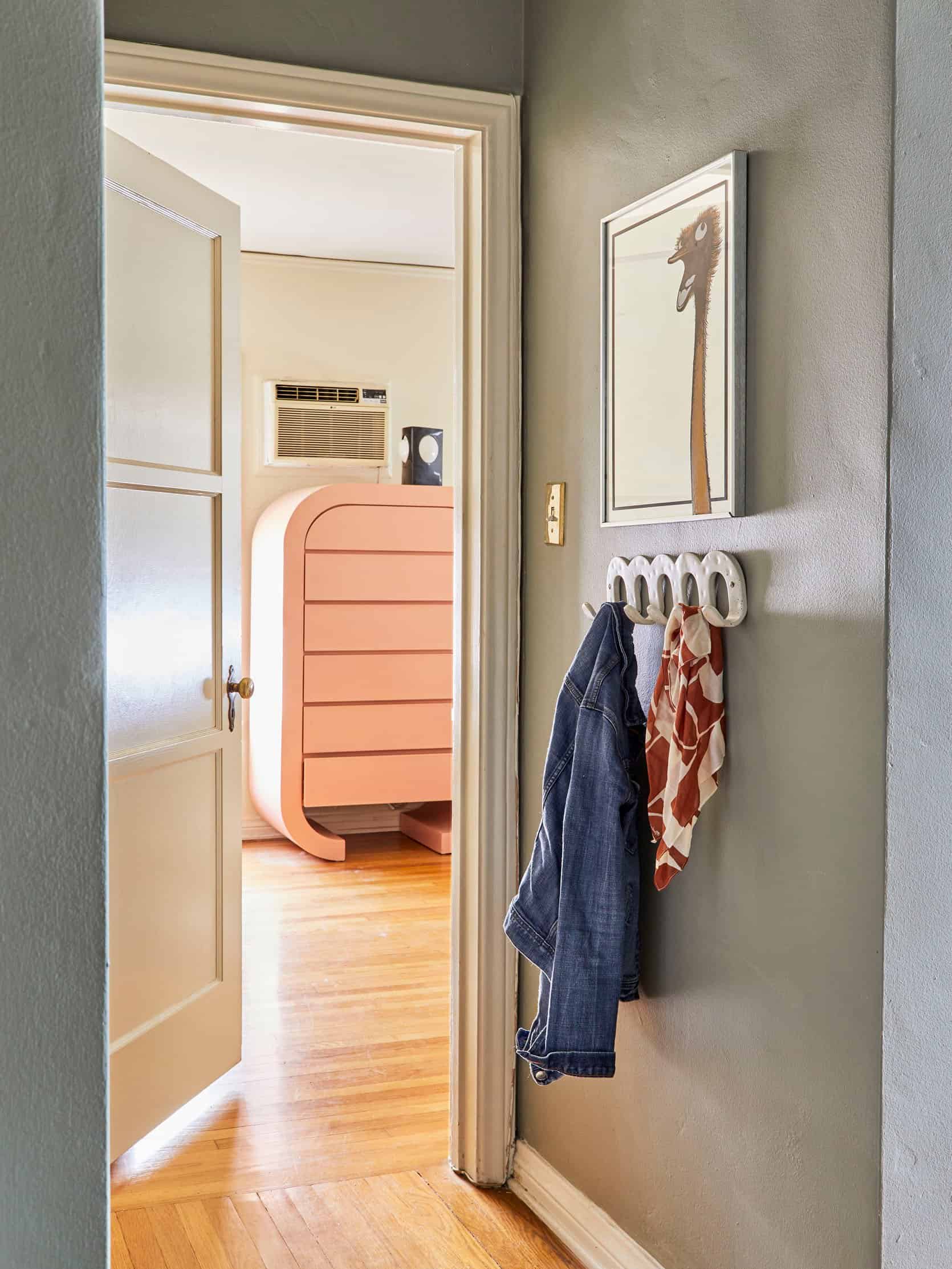
Because, like, what happens when your so-called “jumping-off point” is more of, say, a pretty unintelligible map to an area with lots of bridges? WHERE DO I GO FROM HERE? That’s the situation I’m finding myself in right now as I attempt to design my bedroom (pictured above…kinda). Let’s actually get inside the room, yeah?


That’s better. (Is it really, though?) Here she is in all of her long, beige, freshly-rented glory. This room has it all: an inconveniently-placed wall A/C unit! The world’s tiniest original closet (pictured)! A second, slightly larger closet (not pictured) designed by someone who wanted to put as many gaping holes in the wall as humanly possible! But wait, there’s more: tough proportions. JACKPOT, BABY!
Here’s the thing: 16′ x 11′ is palatial. Opulent. Grandiose, even! IT IS ENORMOUS. Like, guys. I am a person who has slept pretty comfortably in a full bed (admittedly, my feet hang off the bottom which does bring up some latent monster fears, but still – mildly comfortably) for ~2 decades. And now, you expect me to fill out this ARENA-SIZED ROOM with my dinky, child-sized furniture? It felt like a pretty gargantuan task – especially when I had clear jumping-off points for every other room in this place – so the bedroom fell to the back burner, where it’s been set on a low simmer for ~3 years. THAT ENDS TODAY! (Hopefully.)

But first, a refresher. Back in August, I wrote about how this 1970s Sarreid dresser would be my first splurge if money were no object. Sarreid pieces aren’t impossible to find, but they are usually way out of my price range. (Case in point: $2,800 chest; $2,200 nightstand; $3,800 nightstands.) The full-size piece that I’d identified at the time and was saving up for was listed for $3,600, which actually seemed like a pretty great deal – I’ve seen these go for as much as $6,800!!!
The timing didn’t work out, though. First, someone grabbed it before I’d saved the full amount. Second, I also regained some of my sanity. (I almost put a four thousand dollar dresser on my credit with no planning, guys!!!! It wouldn’t have even been the best credit card for the purchase, rewards-wise!!! And it was four thousand dollars, most of which I did not have on hand to spend on DRESSERS!!!)
That’s the dichotomy of vintage: you can get it now and pay a premium, or you can get it later. (“Later,” in this case, could be any amount of measurable time, depending on how your budget changes. Next month? Next year? At some point in your human existence? Who knows?)

In my case, “later” meant six months and three days. (This was far preferable to the “at some point in your human existence” option.) When this near-mint condition dresser showed up at LA’s premier multi-story vintage destination, I was the first person in line to bring it home. List price: $2,495. Price after I employed my favorite vintage-swapping tactic? VERY, VERY AFFORDABLE.
I still can’t believe it. Like, I have acquired my dream dresser for a beyond-reasonable price AND in exchange, some dudes are going to come to my house, carry it upstairs, drop it off, and then haul all the other furniture that I couldn’t sell online. (“NO, I CANNOT HELP YOU CARRY THIS 300 POUND CREDENZA,” – me, ad nauseam, trying to find one single buyer on Marketplace with a friend.) IS THIS REAL LIFE?
But that brings me to my conundrum: how do you design a room around a brass piece of furniture? Everything goes. Nothing goes. It’s so versatile that it’s paralyzing. Which brings us to…
The bed. I started hunting for an extra-wide bed (we’re talkin’ 8′ headboards here!) back in March of 2020 – it was my lockdown hobby. I found a few frontrunners that were ultra-modern (Arlyn ended up getting this one) or SUPER traditional (this has been pinned for a while), but I still couldn’t find my Goldilocks.
Until last week, that is, when Mal walked us through Lulu & Georgia’s new Sarah Sherman Samuel collection. The brand shots featured the above bed in an ivory boucle – a fabric that you could not pay me to have in my house!!! I would destroy it SO QUICKLY!!! One bottle of Gatorade could ruin your room!!! – but I yawped (literally) when I saw that the bed came in velvet options, too. It’s an 8′ wide, saturated, modern take on a classic wingback bed. SOLD. I will be getting one of these…but which one? Paired with the brass dresser, they could all go in pretty disparate directions. Let me show you where my heads’ at – PLEASE ADVISE.
Option One: Loden + Brick


OK, CLASSIC COLOR PALETTE. I see you.
The Pros: This feels like a pretty no-fail option. Like, a dusty green with wood, brass, white walls, hits of black, soft lighting, and some warm hits of color? (Maybe even some leopard, if I’m feeling adventurous.) WRAP IT UP. Let’s go home. I feel like I could have this room finished in a few days if I go this route (well, not including shipping times for the bed, but you get it).
The Cons: Green, wood, brass, white walls, and hits of black feels like the “florals, for spring?” formula for interiors. Seeing as I am a regular left-ish brained person and not some, like, creative mastermind (*cough* Brady’s famous headboard *cough*), I don’t know if I can make anything that feels really special and unique to me.

I am kind of interested in this color mix – it feels a little fresher and kind of discordant (in a good way!), but I’m torn when I try to picture it in my own home. My dining room’s at the opposite end of the hallway and it’s rockin’ a pretty bold pink, green, and orange wallpaper – maybe this would be a nice balance?
Option Two: Goldenrod + Bold Blues


“Beata Heuman photos in a post by Caitlin? Groundbreaking,” – you, now as Miranda Priestly, mocking me. But OMG, THESE DO IT FOR ME.
The Pros: The yellow bed is probably my favorite. I think this room would make me the cheeriest, which I like (the green bed would be more neutral and calming, I think).
The Cons: Is there such thing as TOO much yellow and gold? I keep trying to imagine my dresser replacing that chair and table in the space on the left, but it’s not cute in my mind. I don’t want to feel like I’m living in that all-gold apartment in Trump Tower, you know? It’s just a big commitment to have two anchor pieces that are like, “HEY I’M YELLOW!!!”

I’m in love with these draperies – I’m planning something similar to cover up that wall with my A/C unit. It does feel so happy in here, right? And if I went blue and yellow, my kitchen would have a friend! That’s nice, isn’t it?
Option Three: Cognac + Desaturated Blues


I dropped like, 10 pages on my love of blue and red bedrooms, so I’ll spare you here (you’re welcome). The cognac in question leans a little more orange/rust in person – Jess has the same velvet on her sofa and it’s a total stunner – but I’d still like to pair it with some smoky, desaturated blues.
The Pros: This one actually looks best in the little mockup I did. I also like that it can read as leather from a distance – it feels like a pretty responsible, flexible choice.
The Cons: Do I trust myself enough to believe that my mockup is ACTUALLY what this room will look like in person??? Am I the type of person to own a cognac-colored bed? (In my mind, people with cognac-colored beds are like, eating a nutritious breakfast in bed – off of one of those trays with legs, you know? – while wearing a really luxe robe.)

SEE WHAT I MEAN? All this is is missing is a bougie person in a fancy robe with a fancy breakfast. Anyway – this one’s a little more mustard-y, but I love these rosewood nightstands and am probably going to shoot for something similar (mid-century inspired, though maybe a little more regency. Maybe a campaign nightstand to tie in some brass?).
So there we have it – I don’t have a jumping-off point, so now I’m trying to make my own. Forge my own path, choose my own destiny, ALL THAT JAZZ. This all brings me to my final question: LODEN, GOLDENROD, OR COGNAC? Annnnnnd a few subsequent follow-up questions (if you have time):
- What colors do you have in your room? How do they make you feel?
- If you’re workin’ a classic, more-timeless color palette in your house, do you enjoy it? (Remember, you’re talking to the “creamed corn and melon” bathroom tile owner over here, so standard color palettes don’t really exist in this apartment.)
- Is putting ~64′ cubic feet of yellow velvet next to a 6′ brass dresser a recipe for feeling like I’m inside a Big Bird costume?
- Is Cognac the secret responsible choice?
- Does anyone else have any Sarreid inspo pinned? I have found a whopping 2 (two) photos on Pinterest and am always interested to see how other people styled their space. It’s nice to have some bumpers up, you know?
- Is it weird that I am wholly torn and will fully be relying on your feedback to make my final choice? I have velvet samples en route but once they’re here…we’re off to the races, guys.
As always, thanks for your help. Wouldn’t want to externally process and overanalyze with anyone else! Have the best weekend. But first, LET’S CHAT?? xx
Opening Image Credits: Photo by Sara Ligorria-Tramp | From: Caitlin’s Long, Dark Hallway Makeover
THIS POST WAS ORIGINALLY PUBLISHED HERE.
