If I were charging myself my hourly rate I would have billed/spent around $12,500 in design time for sunroom mosaic floor, followed by quickly firing. That’s 50 hours at $250 and is easily how many hours I put into this endeavor. You see copying or applying something you’ve seen before, even if it’s just classic, is just too easy at times especially when, say, if you are in lockdown in early 2021 dreaming of your future home. Even if I were in a hurry I like to use my own home as an experimental lab, and doing something too classic feels like a missed opportunity to challenge myself (and show my skills to the world). And I’m not alone, many designers obsess about how to reinvent a classic in all art forms. Sometimes it’s worth it (that stained glass from Fig House is a great example) but sometimes it’s not. Maybe sometimes “the classic” was actually the best route anyway and maybe you don’t need to customize everything just to prove that you can do something more special. And while what I landed on won’t have been seen before (because they’re custom colors) I think we can all agree that I spent far more time on this mosaic floor than was probably needed. And that’s ok because it was honestly so much fun and I got to deep dive and learn something new. Remember “the obstacles are part of the journey” and the creative process is super messy if you are doing it right. So today’s post is “the case of the mosaic tile – the one where I spent so much time to actually design something you’ve kinda seen before”.
The Inspiration – My Old Patio
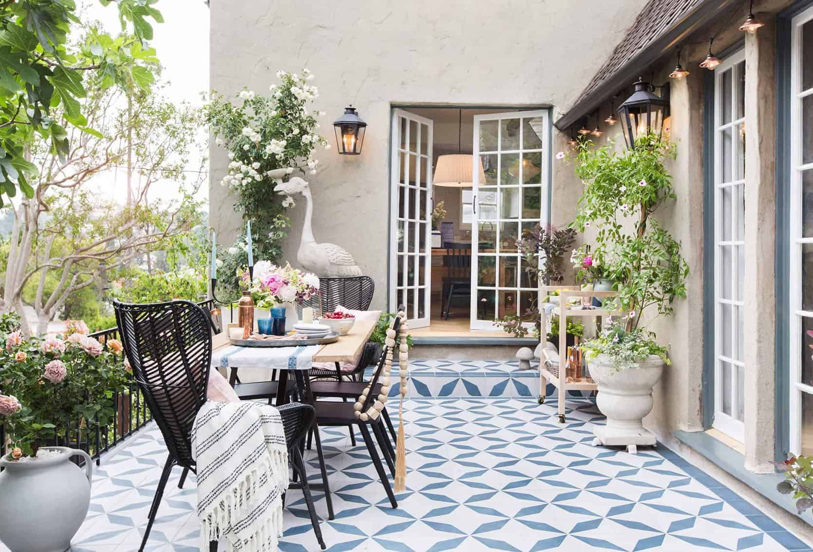
Before we get started – I’m not sure if this is healthy or not but there are certain past rooms of mine that I have loved so much that I find myself wanting to recreate a new version in this home (think Elliot’s first two rooms – this one and this one). Maybe it’s “homage”, maybe nostalgia for that period of time, or maybe they were so “successful” that I want to bring that success into my new home. The tile of our patio in LA is one of them. I LOVE THAT TILE, I love that courtyard. I loved being out there every single second we lived there. So when we bought this farm I was like, “Where is my patio here?? Where is that magical space that feels old-world and eccentric? Most importantly where do I put my 7′ bird????”
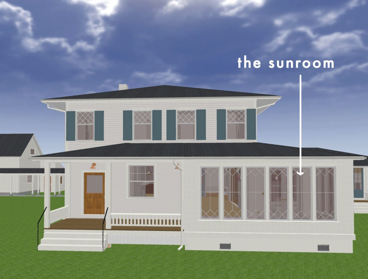
Thus the “sunroom/writing studio” was born and at times I fear that we added this room onto the house for the sole purpose of me getting that tile moment that my heart and eyes wanted so badly. Sure, I could have put it in a bathroom but it wouldn’t have gotten the public attention it deserved. I knew that I didn’t want the kitchen to have this busyness and the dogs didn’t deserve this splurge in the mudroom. This room, since it’s an addition, can be its own style/moment, like a conservatory/sunroom styled with plants, for summertime dinners, meetings, photoshoots, and it’s where I’ll write/design/blog during the day. There is nothing about this room that is “shaker” but it honestly feels separate from the house (different window pattern, different exterior material and it even steps down). I CAN’T WAIT.
So with that patio inspiration in mind, I wanted to come up with this house’s version of my favorite outdoor space. I knew I wanted a larger pattern and I know this is shocking but I was leaning towards the oft-overlooked color combination of, are you sitting down? Blue and white. It’s my “Anna Wintour black dress and big sunglasses” uniform and I’m comfortable with it.
So I obviously asked myself “what is the farmhouse/Victorian version of that tile pattern?’ And knowing that I was working with Pratt and Larsen the challenge became what new pattern could I make with all of their classic tile shapes? Like an evil mad designer from a marvel movie I thought, hands wringing, I will create a new pattern the world has never seen before!! (said every designer, ever before realizing that, spoiler, most things have been done).
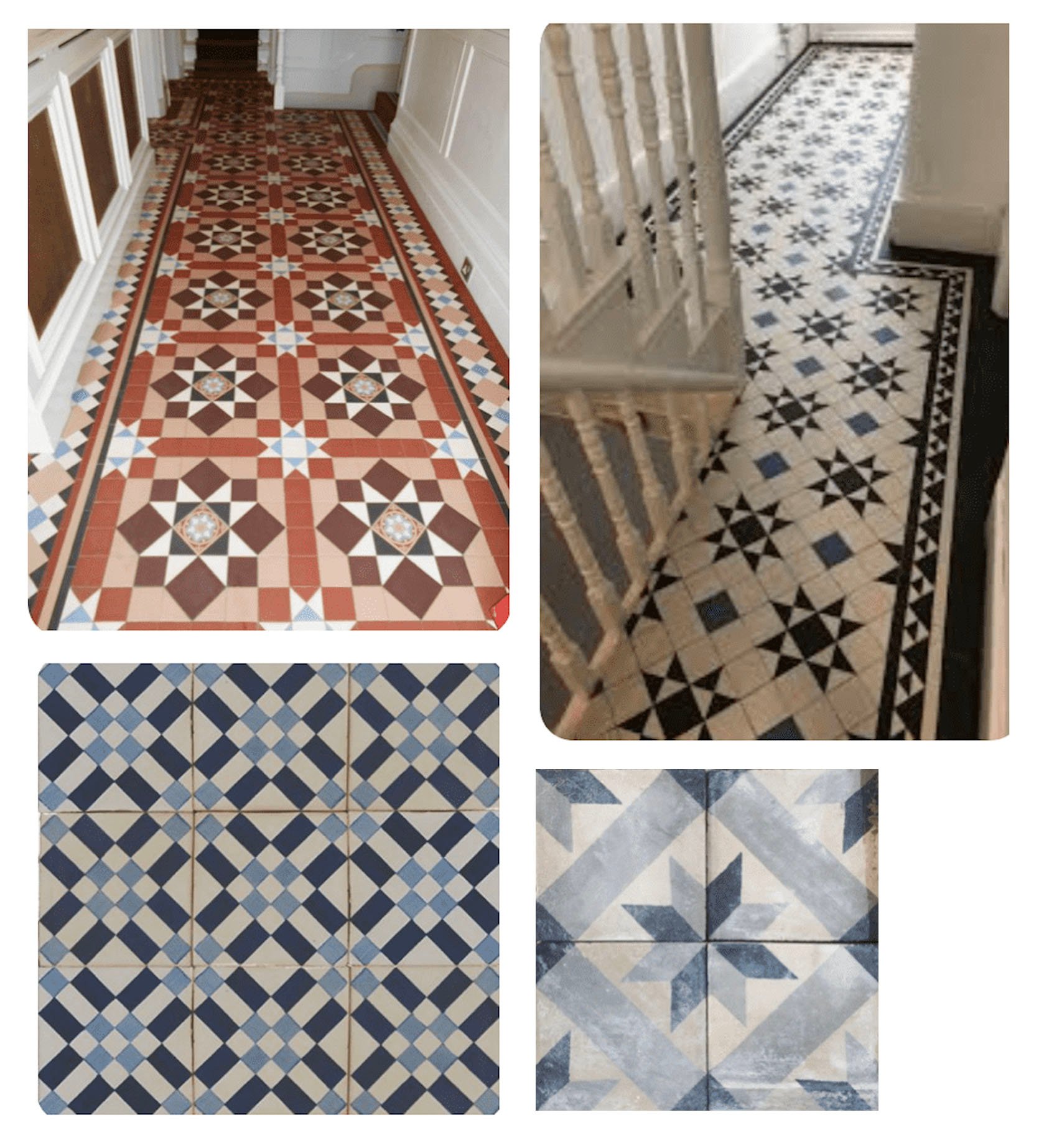
So I did what all internet famous designers do, I googled “Victorian patterned tile floor” and my screen was once again flooded with intricate old-world patterns. Most of them are on the busier side which I love but don’t want. I wanted a fresh take on it, and something that (at the time) felt more appropriate for a farm.
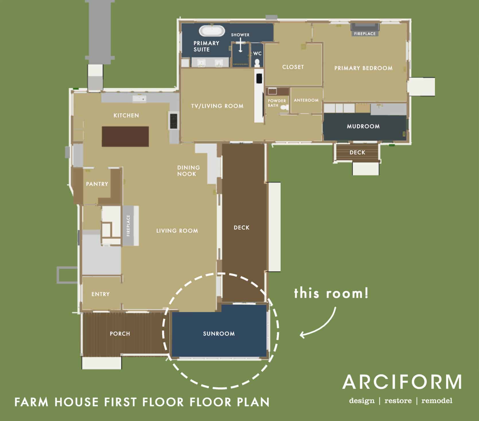
Wanted: A “Farm-Inspired” Mosaic Tile Floor
…But, like, one that isn’t dorky. And that, my friends, can be very tricky and risky. Of course, there are farm motifs that make sense – plaids, stripes, and florals, but I didn’t want it to be lame! Then I had another aha moment… Quilts!!! I love quilts!
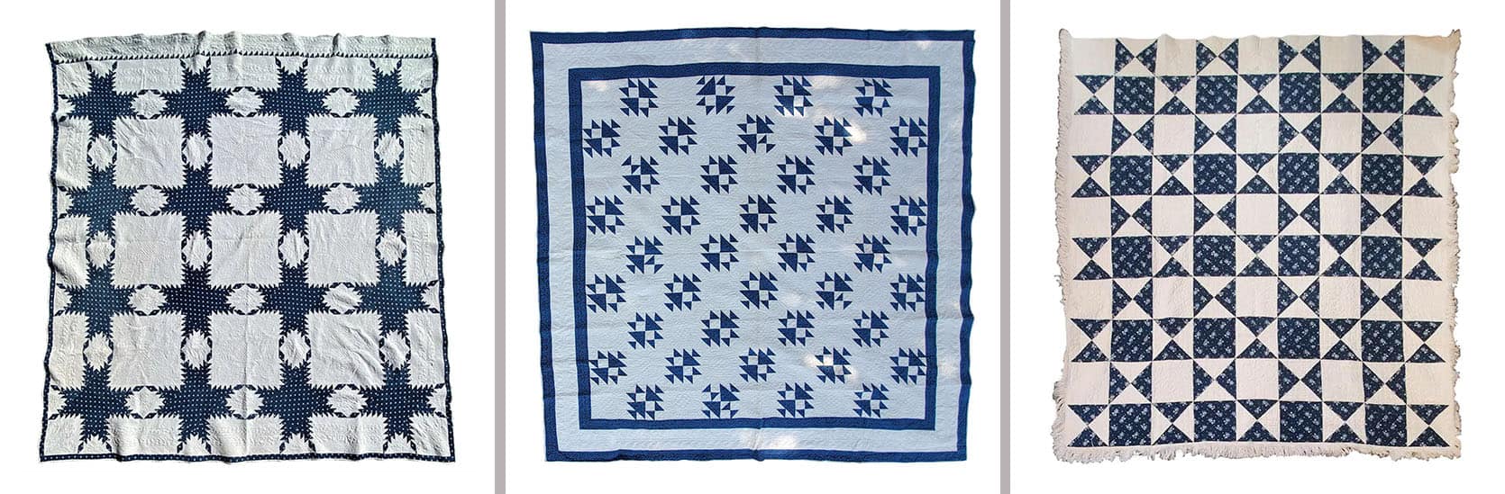
19thc Fine Blue & White Feathered Star Quilt | 19Thc Teal Calico & White Shoe Fly Quilt | Antique Quilt, Mid-19th Century Blue Resist Eight Point Stars
Instantly I was like ooh, that’s so appropriate and could it be done? Of course! The below are “star quilt-inspired Victorian floor patterns” and they are indeed awesome.
Wait… How Expensive Could This Risk/Mistake Be?
Glad you asked because we aren’t shopping for scrunchies if you know what I mean. Installing a mosaic tile will be extremely expensive. We don’t have a quote yet but we are talking between $5-10k just for this room. It was always a tile install I had planned to splurge on (and since it’s my writing/design studio I can write off a large percentage of it) but even so, it’s expensive and it makes a normal pattern decision even weightier. FURTHERMORE, how much is it to potentially replace the tile if it looks bad? Answer: EXTREMELY expensive. Like a year of gut punches. I’d have to change my profile pic on every platform to the hand-to-face emoji. Tile is the most expensive “hard finish” to replace if you get it wrong. It’s not “switching out a faucet” or a sconce. It requires a very messy demo process that is full of waste. I applaud all of you who take tile risks, but in an older home, I’m just VERY nervous to do something risky. I’m not proud of this cowardice, and I do think there are other places I’m willing to take tile risks… but not in a 12’x17′ room that I’ll be spending 6 hours a day in.
Meanwhile, I had gotten all the tile shapes from Pratt and Larson and it was time to “play puzzle” on the floor of my office/loft at the mountain house. This first photo documentation of this is dated April 7th, 2021. Almost 1 year ago.
I experimented with a “plaid”, a broken stripe, and a mixed checkered pattern. None felt right. Ultimately I gravitated to most was the picket shape and forming flowers with it, with a contrasting color as the spacers between.
I tried it in white with blue squares and blue with white squares, both with a Victorian border. This became VERY exciting to me and I thought I had absolutely nailed it. I love flowers so much so that I named the blog originally “The Brass Petal” (and fun fact, I actually wish I never had changed it to my name – word of warning). So a flower-shaped mosaic tile? YES!!!! EUREKA!!!!!!
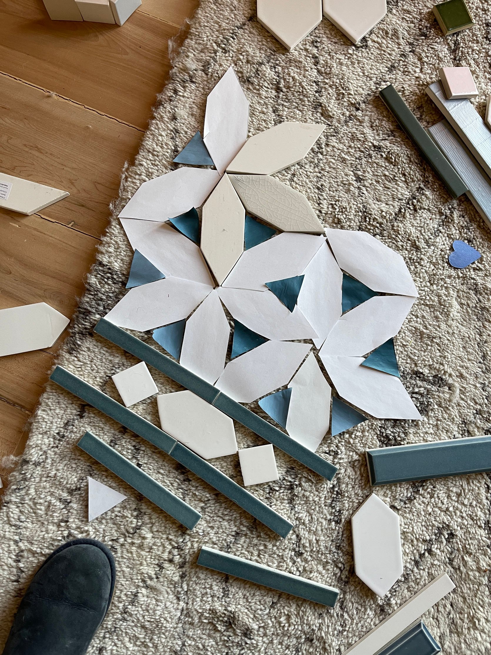
So I did what any professional designer does in 2021, I had my kids paint different blue tones on paper and cut out the “tile” so that I could play with the repeat on a larger scale. If only there were a way via technology that I could have gotten a visual …
TBH it was still lockdown and it’s not that I was bored per se, but with the kids not in school it was a super fun way to get them involved in the design and do “arts and crafts with mama”. And it was super helpful to see it repeated over and over. Until …..
So, confident as a cucumber (?) in my never been seen before mosaic floor pattern, I sent the specs of the tile to a magical person (Stephyn) who knows “computer programs” (chief architect) to render it out in the space, mostly to calculate tile take-offs (square footage per tile) because we were that sure.
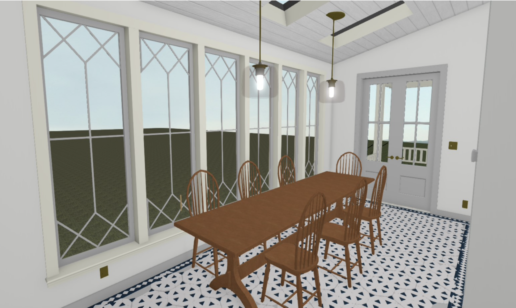
HUH. Our first reaction was not a “hell yes”.
HMM…. still nervous.
We all had the exact same reaction. Uh, no. And listen, Stephyn didn’t finish rendering it out because I think they had a sense that this wasn’t going to be a “yes”. Looking back, I think that renderings are very very hard to get a sense of how it will be in IRL, especially when it comes to texture. How could I love something so much in person, feel so confident in person but then have an immediate negative reaction once rendered out? IDK. It’s frustrating. Sometimes I feel like I should have just gone with it and it would have been beautiful. But this render made it look like polka dots, not flowers and too much white. But this render doesn’t show grout or texture of the tile. That’s all to say that maybe it would have still been awesome, but none of us felt confident to take the risk. I do want to take more risks going forward, but for our permanent residence, I would hate to be confronted daily by a mistake (thinking I’ll take more risks in the Victorian house on our property once we tackle that).
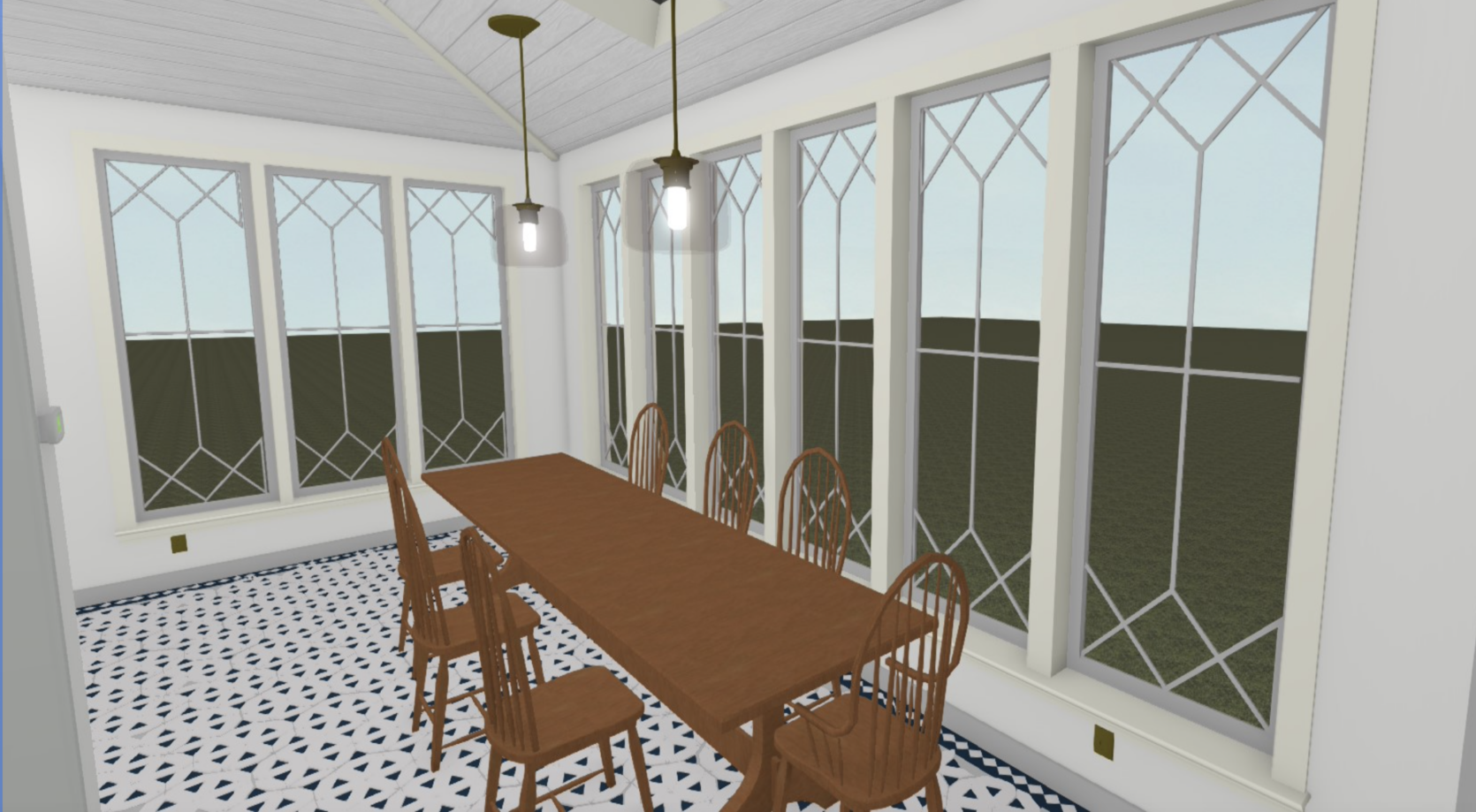
So we went back to the drawing board, wanting a larger scale pattern because we think that that was what we loved so much about the patio. But most companies, Pratt and Larson, included don’t make ceramic tiles larger than 8″ because of waste and fragility. So we created a “square” pattern that is bigger with 2×6 + 2×4 + 2×2 (all separate tiles). This is a classic tile that I did not invent.

We saw it rendered out to mixed reactions. I really liked it but thought it was too, like, regal or something for this house. Too much, too fancy, too formal, not the right vibe. Brian and Anne totally disagreed with me. And needing the actually pull the trigger soon (it’s a 4 month lead time and we were past our deadline) I said OK, thinking that I was wrong.
Then Brian and I went into Pratt and Larson to finalize our kitchen tile and show Suzanne (the wonderful head of marketing who I’ve worked with for years). After going through the rest of the tile choices that were already chosen, we showed her this mosaic flooring and all three of us at the same time had the same reaction – this is a different house. Now we always knew that this room was going to feel different than the rest, but I still wanted an element of simplicity in here – and the ornamental/intricate pattern really made it feel fancy, not classic.
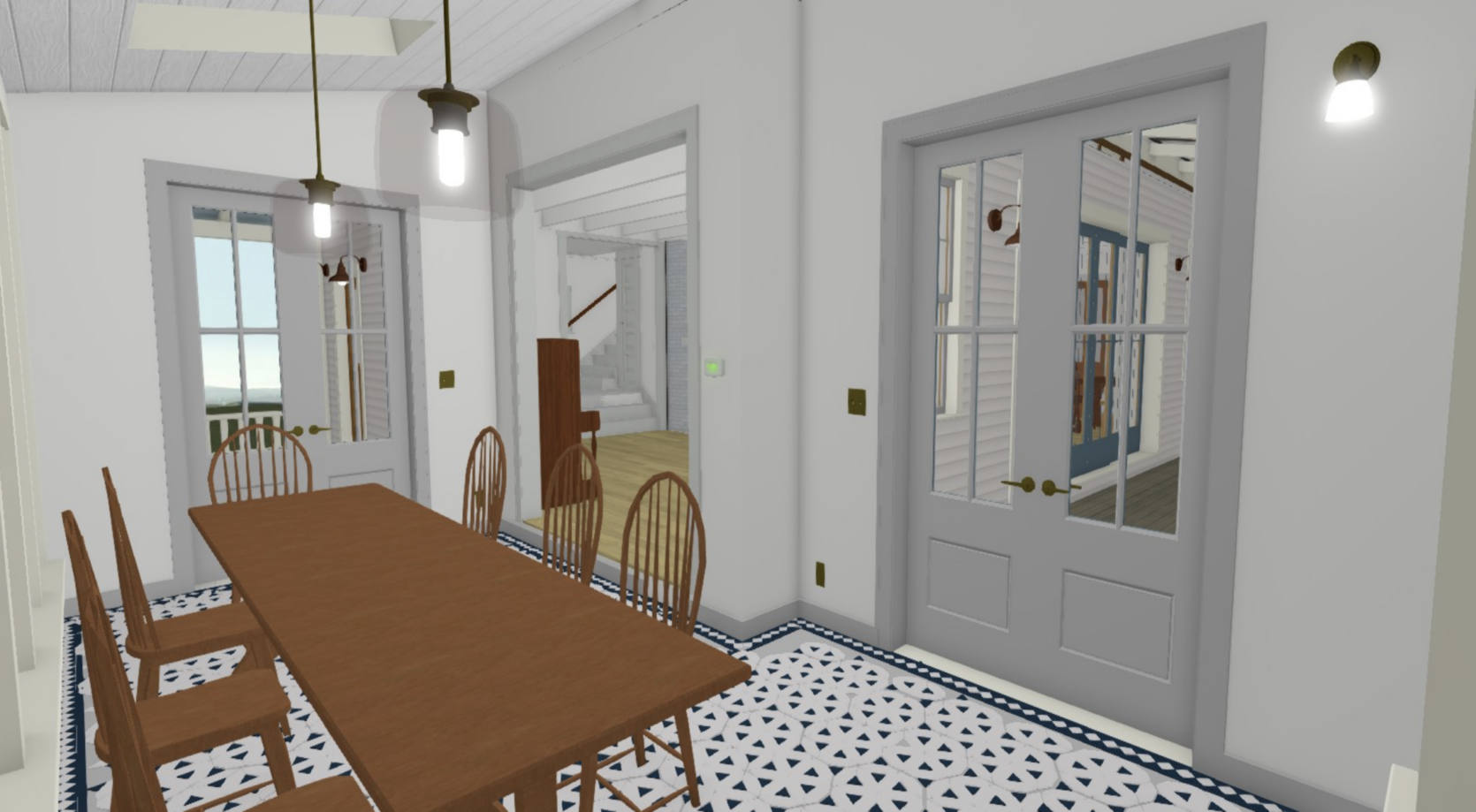
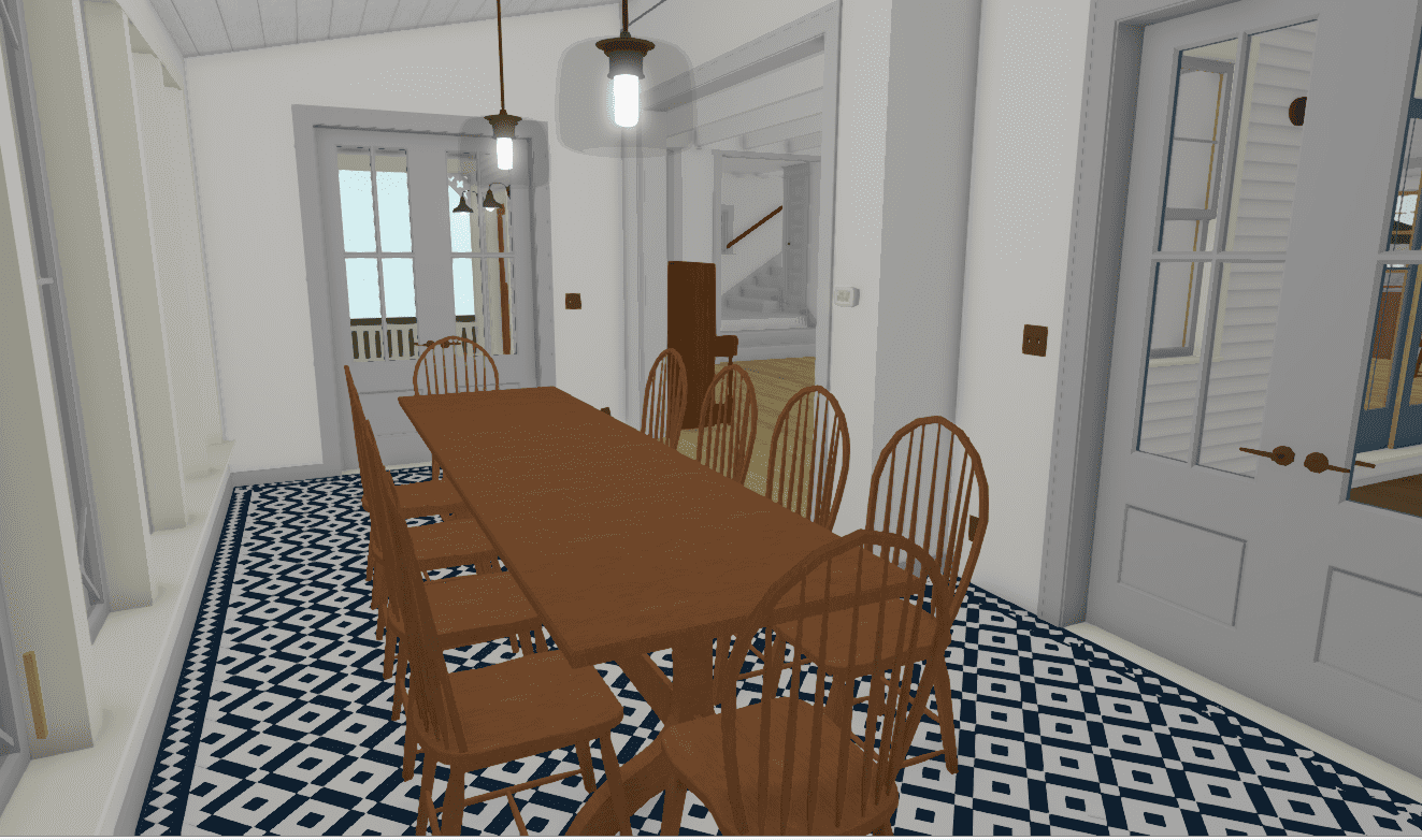
So that day at Pratt and Larson, Brian and I pulled the trigger on the classic diamond shape pattern, in our custom blue that is so happy without being too bold, with a Victorian-style border.
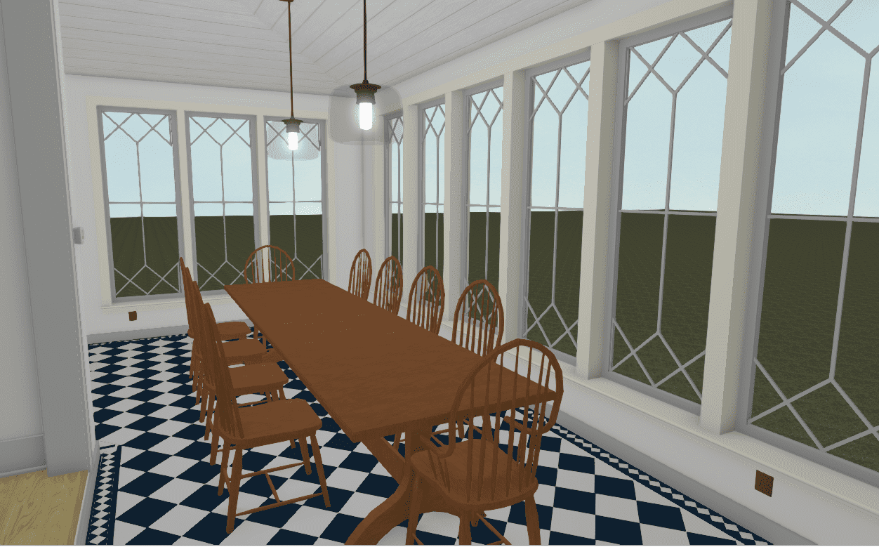
How do I feel about it? GOOD. What you can’t see here is that the border is about 8″ wide so it’s thicker than the renderings, and it includes a light blue/gray accent in it. So it’s more substantial than seen here and it has another tone which we love. Do I wish that I had created something that no one has ever seen? YAH. But I KNOW that this will not date, that this is classic and by keeping the pattern pulled back into just a diamond it still feels restrained and easy for your eye to understand (which is always important to me these days). I find that things that are busy make me mentally slightly more exhausted I think because my brain is trying to understand what is going on. I’m not sure if this is an age thing, a personality type, or a design philosophy that is rooted in truth, but I feel better, more settled in spaces that are less busy. Don’t get me wrong – this floor pattern is BUSY but the experience we want to have in this room is more fun – for dinner parties, creative business meetings, or where I write/design so that added dose of energy is welcomed. I’m just glad we didn’t go overboard. Plus, this install will be probably 30% less than the previous design since it’s just 2 tiles back and forth versus a more intricate pattern.
So that’s the mosaic tile journey. I’m finding myself doing this more and more – going further just to pull it back. And I’m fine with it. It’s like exercising my creativity but being secure in the fact that it may not be what I actually want in life right now for this house anyway. It also aligns with my ethos of designing something once, and for the long term. I just want to make sure that I’m not always being too safe or boring. So my goal (as it has been) is to keep the permanent hard finishes (flooring, tile, lighting, and plumbing) on the safer side, with furniture/decor, art, and textiles with more risks – but only if they make sense for comfort and function. IT’S HARD Y’ALL. 🙂 Thanks for indulging me in my tile journey. I’m having a SERIOUS blast and thanks to Anne and Stephyn for trying out all these different renders to land where we did.
Opening Image Credits: Design by Alessandro Agrati | Photo by Elena Rosignoli | via Vogue Italia
THIS POST WAS ORIGINALLY PUBLISHED HERE.
