A few months ago, one of my best friends was venting about her partner (you know, as folks who have been trapped in a studio apartment with another person for 2 straight years are wont to do) when she uttered this piece of absolute gold: “the things that you fall in love with at first are the things that drive you nuts in the long run.” AND GIRL, DO I HEAR THAT. Case in point: my apartment’s beautiful, huge, design-agony-inducing windows.
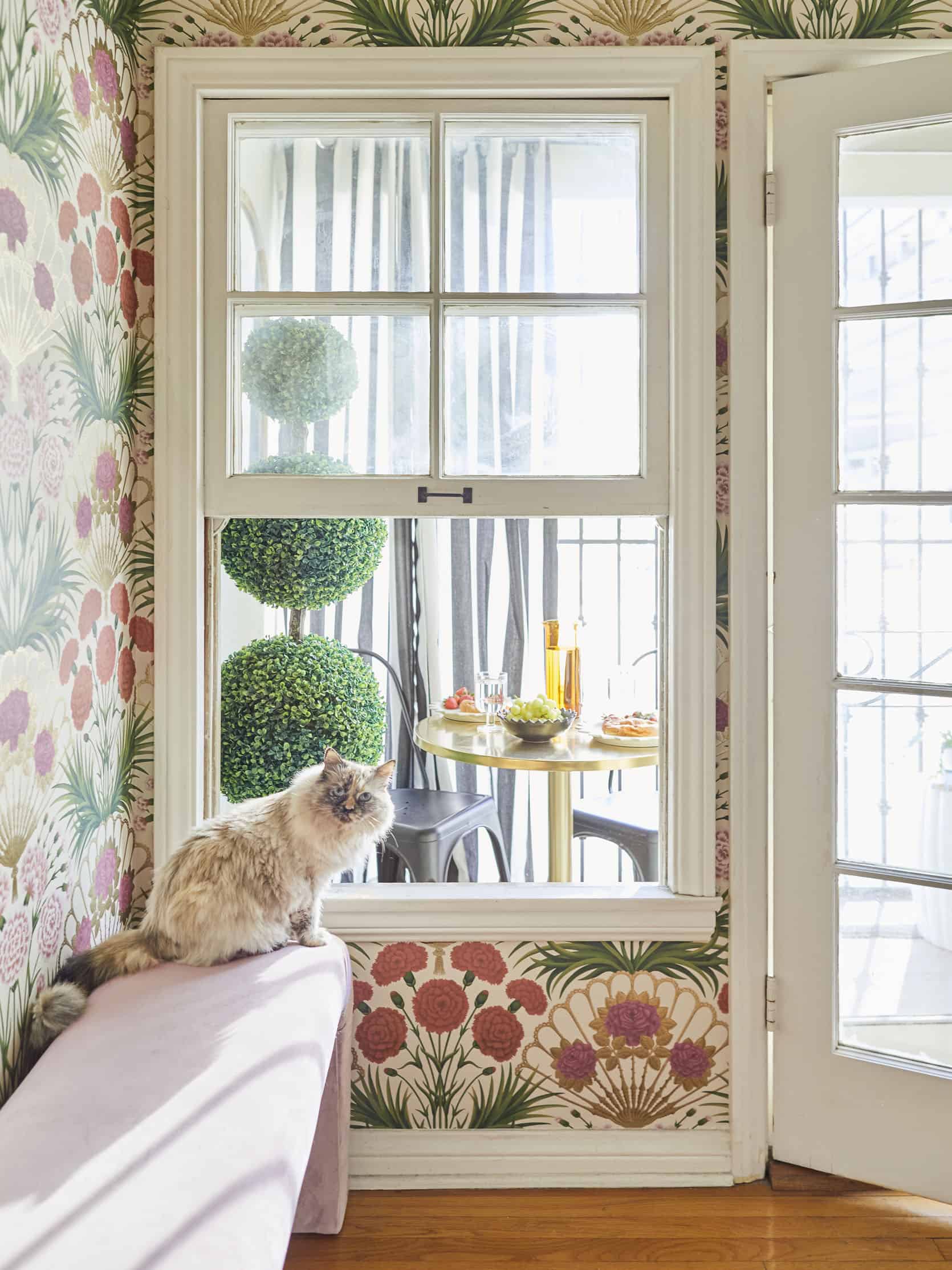
The good news: there are 12 original windows from the 1930s in my little Koreatown palace. They’re sweet and charming and looking at them sends my dopamine and serotonin levels THROUGH THE FREAKIN’ ROOF, which I love. The bad news: they’re only 19″ off the ground (that’s 48 centimeters, for my metric friends) which means that while they’re beautiful to ogle, they’re near-impossible to design around. You can only float furniture for so long before you need to figure out how to get something on a wall, you know?
To that end, I’ve spent the last few weeks digging my teeth in and trying to figure out how to make furniture – or, in my case, a credenza in the living room and a set of nightstands in the bedroom – look intentional and considered while placed in front of a window (as opposed to like, looking as if I just screwed up measurements by a few inches, which is what I’ve been worrying about). It turns out there are a few tips and tricks to pulling off furniture in front of a window, so today, I want to show you what I’ve learned. LET’S SOLVE THIS DESIGN AGONY TOGETHER!
Before we really start, here’s one rule that you will notice in almost off of these photos… make sure your piece of furniture is at least a few inches higher than the top of the window sill. Can you make them the same height? Sure. But when the furniture is taller it looks more intentional. Ultimately your eye and personal preference is the only thing that matters but the more you know, right??
Benches
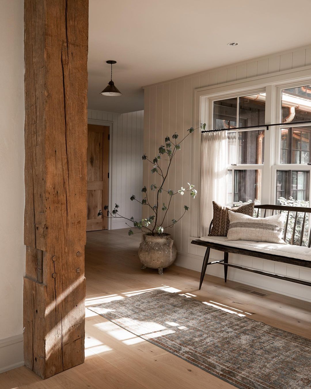
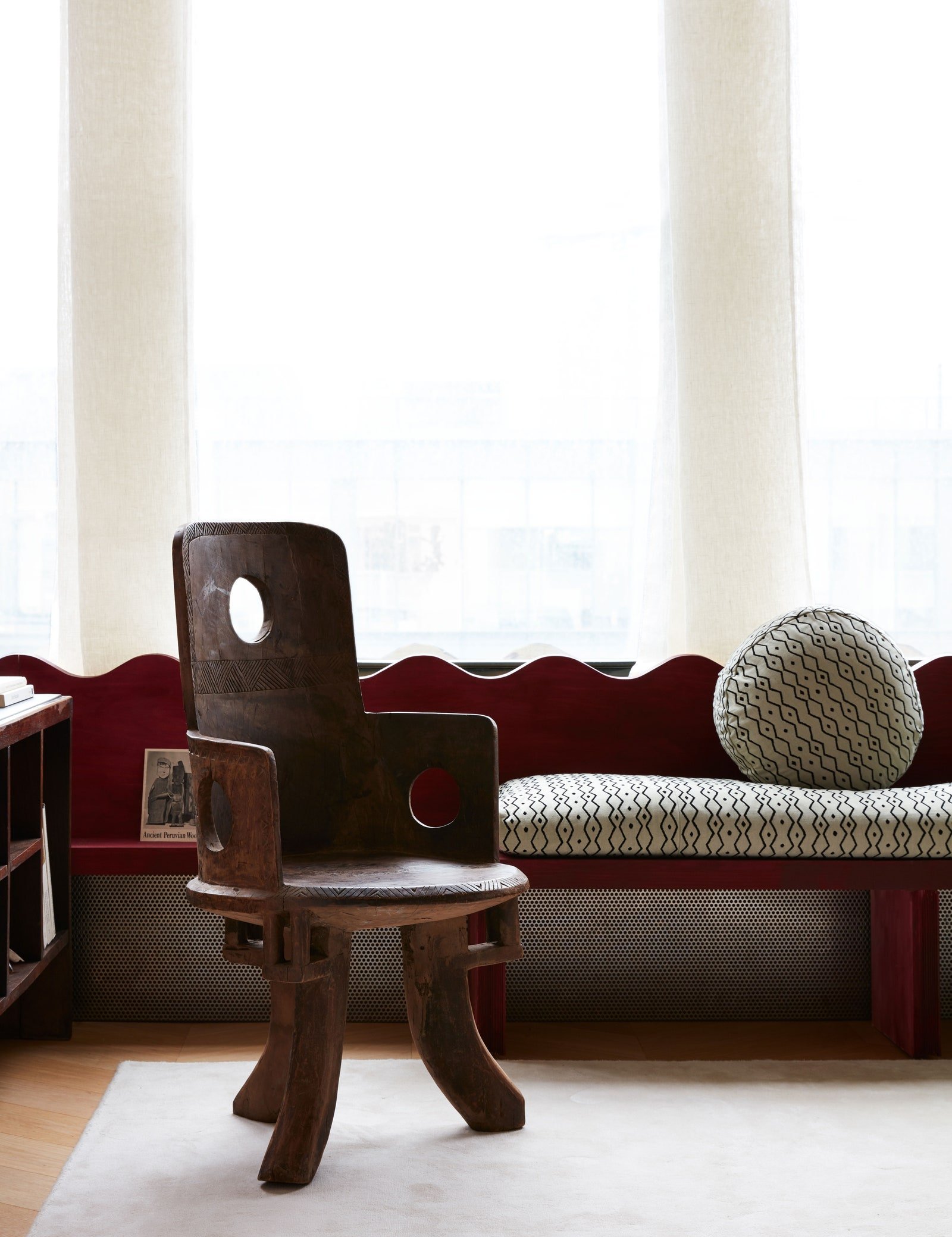
Kicking it off with the easiest and breeziest option out there: the bench. When in doubt, a light and airy option that’ll provide seating without obstructing the view will always look good in front of a window. But if you’re hoping to find a piece that’s a little sturdier or more commanding, keep an eye out for interesting construction – a special detail, like the squiggled seatback above, can contrast the straight angles of a window and bring a ton of oomph to the space. It’s so dynamic, right?
Chairs
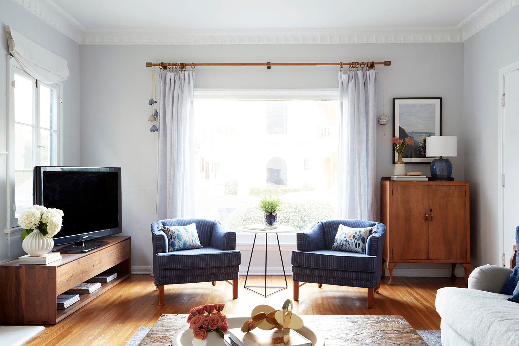
Again – it’s hard to go wrong with a classic chair in front of a window. I’ve always been really inspired by Ginny’s apartment as her layout is SO similar to mine (even down to those super low, super tall windows! Classic LA architecture!) and this shot, in particular, has always been a favorite. These vintage club chairs are the perfect scale for this space – not too wide, not too tall – and they feel like the perfect finishing touch in this room.
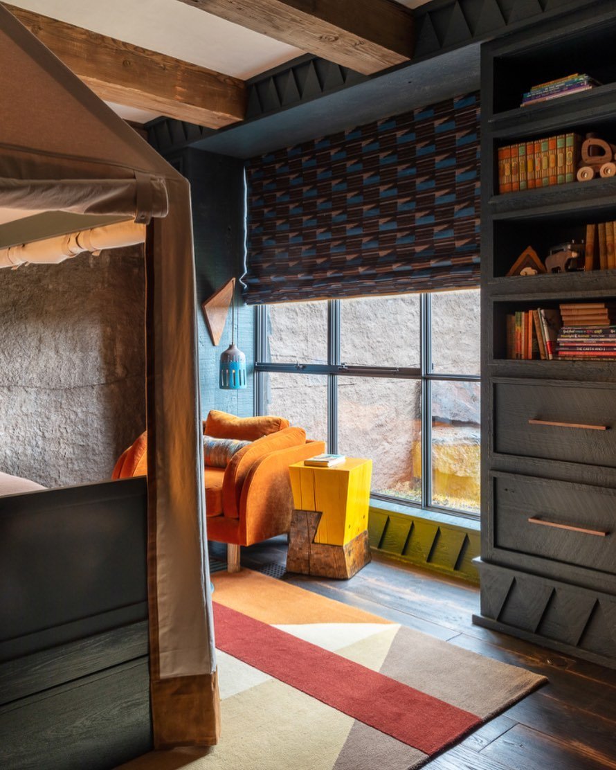
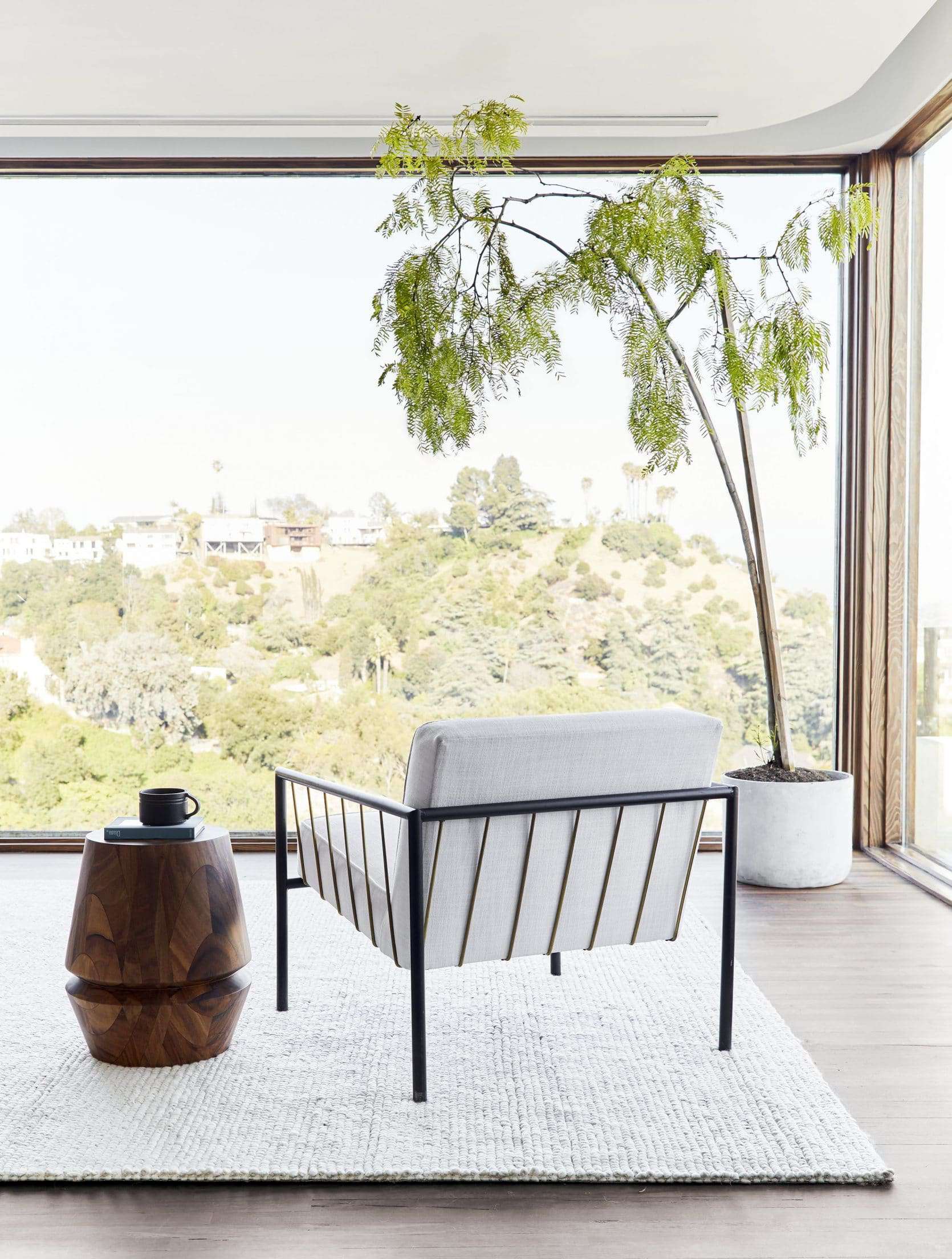
The key here is to keep your profile a little lower whenever possible – like, the window may not be the best spot to display your wingbacks and balloon chairs. Plus, a fully-upholstered piece (or anything with a finished back, like this chair on the right) will look just as nice from the street. YOU’VE GOT THIS.
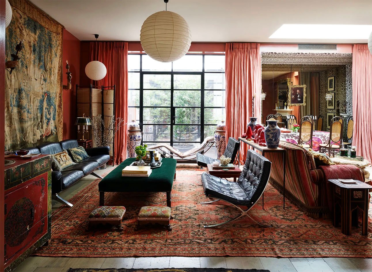
Had to share one more example for my more daring folks – I mean, when your home is this eclectic, why not throw an iconic Le Corbusier chaise in front of your doors? (Beyond that, who woulda thought that Barcelona chairs look so cool next to blue and white ginger jars and Noguchi light fixtures and Thonet dining chairs and super classic portraiture?) Let this serve as license for you to experiment in your own space, too.
Bistro Tables
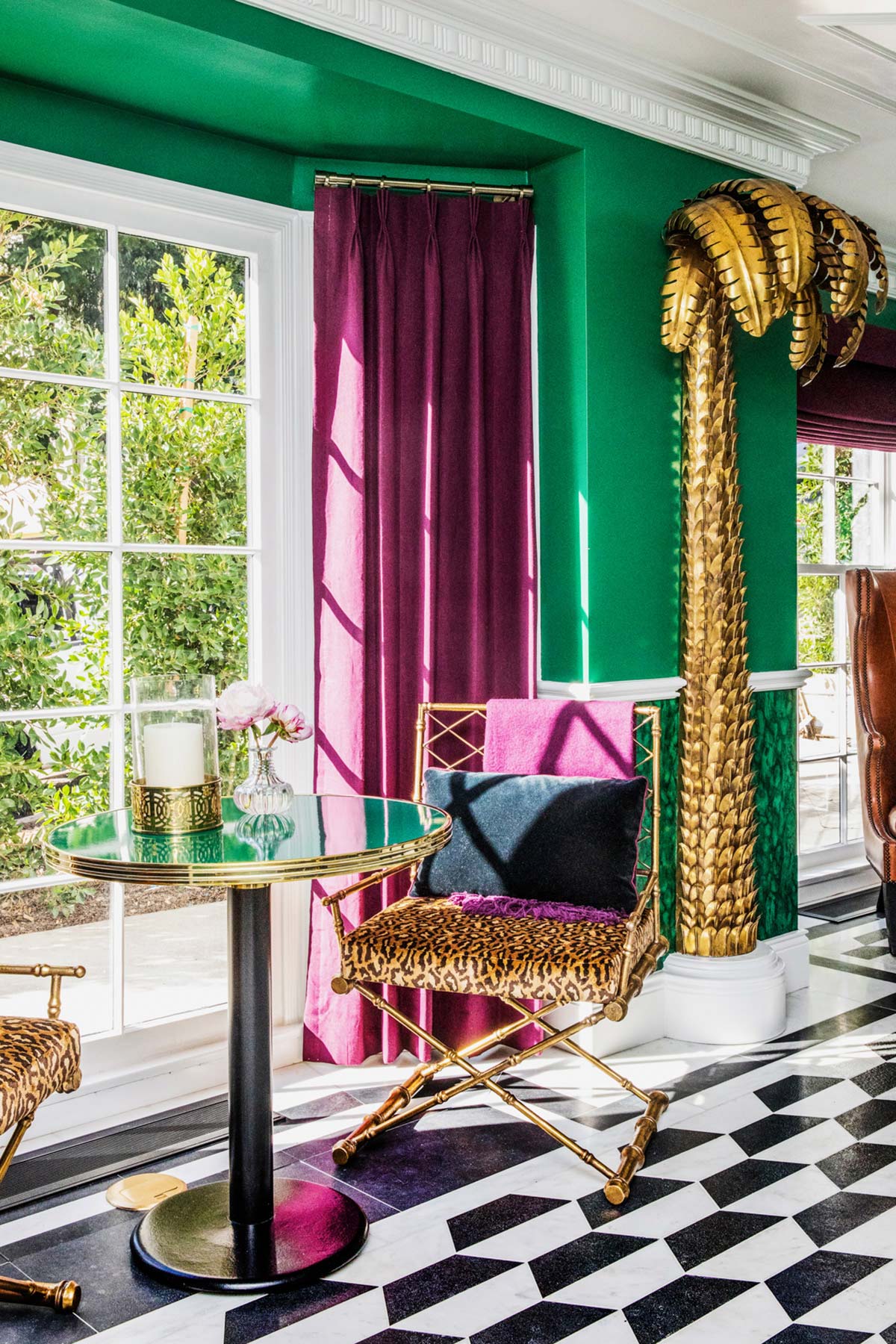
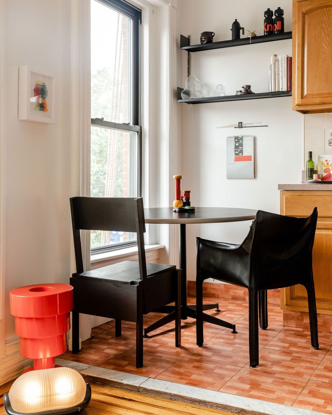
You know what belongs in front of your windows? A sweet little breakfast table setup. Be sure to leave a little bit of breathing room, though – you see how the room on the right didn’t cram 3 chairs around the table? It would have felt way heavier, right? Just keep your styling simple and let that window shine, baby. EASY PEASY. (Also, in my dream life, I live in the hotel pictured on the left.)
Desks
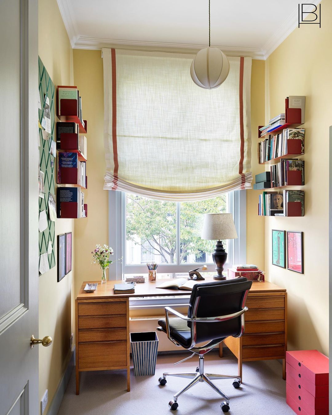
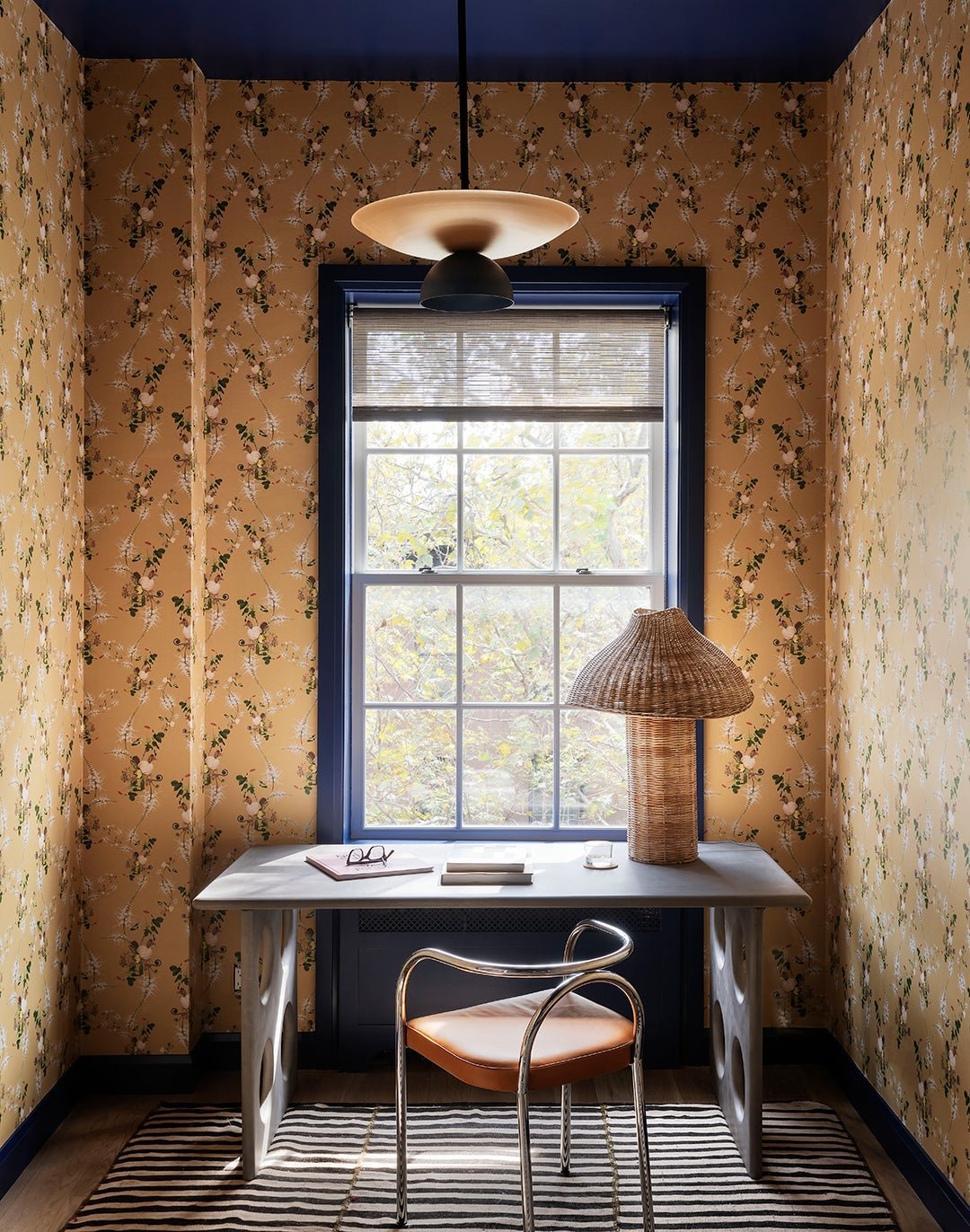
OOOOH. We’re upping the difficulty level a little bit here, compadres!!! When it comes to larger tables (like desks, for example) and case goods, scale is the name of the game. The desk on the left may overlap the window, but that dreamy near-perfect fit makes it feel like a conscious choice instead of a stopgap solution. The right is a total dream, too – the choice to paint the radiator in addition to the window trim, moulding, and ceiling makes a huge impact (and it’s a great backdrop for a contrasting desk, to boot).
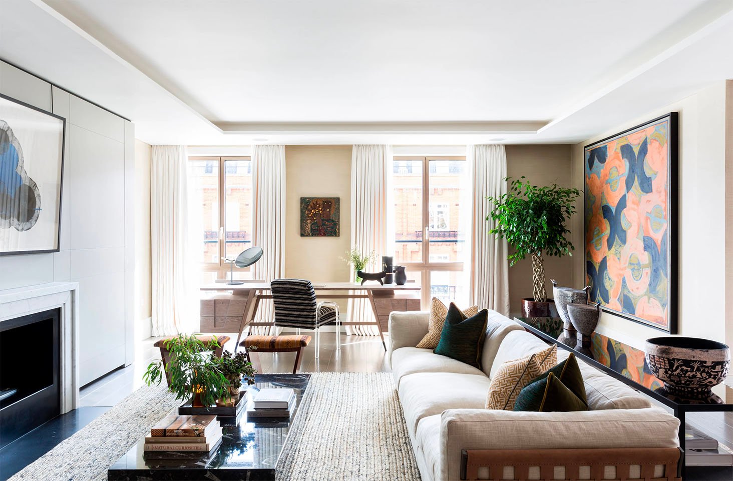
This one is masterful, too – check out the lineup between the ends of the desk and the mullions on those windows. SCALE IS EVERYTHING. Keep some general measurements of your space on your phone – how wide are your windows? How wide are your curtains? How big is the space between window panes? Knowing all of these will help you grab the perfectly-sized piece, no matter what you’re looking for.
Sofas
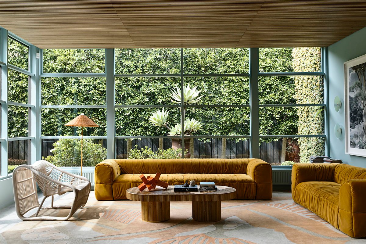
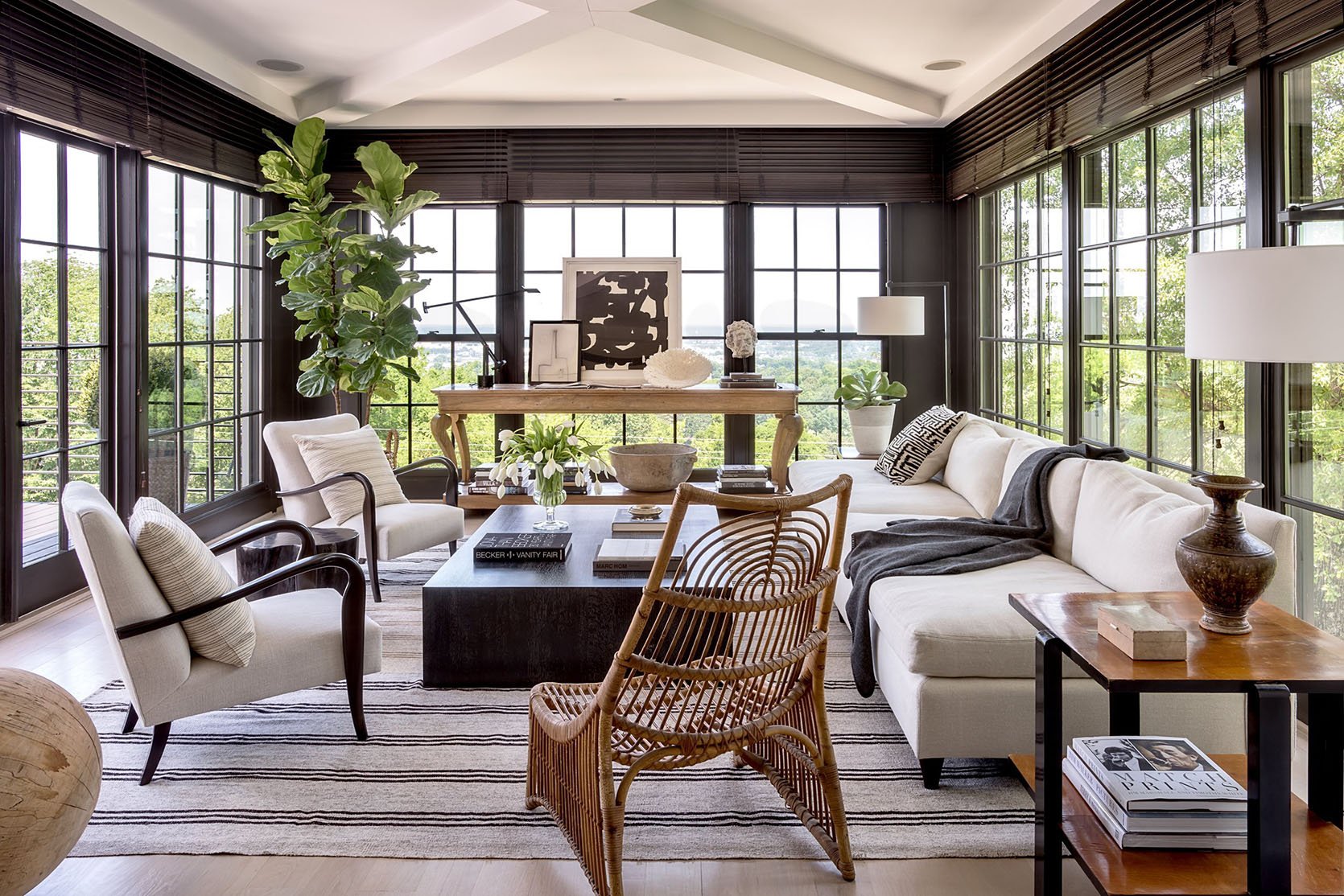
Here’s a fun secret: if you’re rocking floor-to-ceiling windows on more than one wall, the world’s your oyster. Be sure to select pieces that are just as exciting from the back (that rattan chair is to die for; the upholstery on these sofas is swoon-worthy), but otherwise, feel free to play around. Normal rules about windows don’t apply to you. (Lucky.)
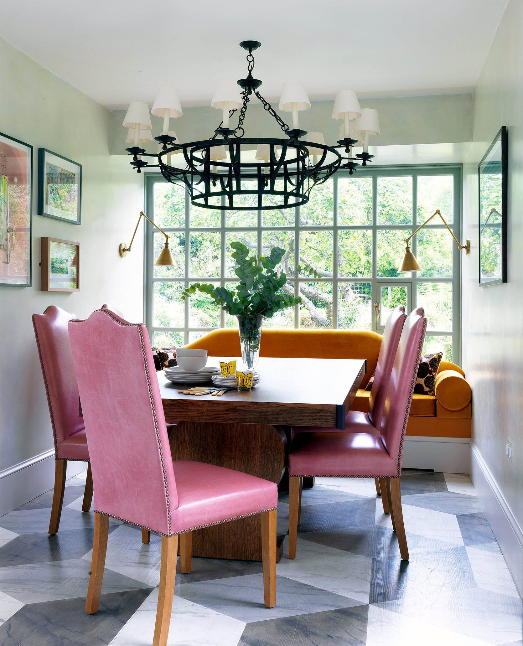
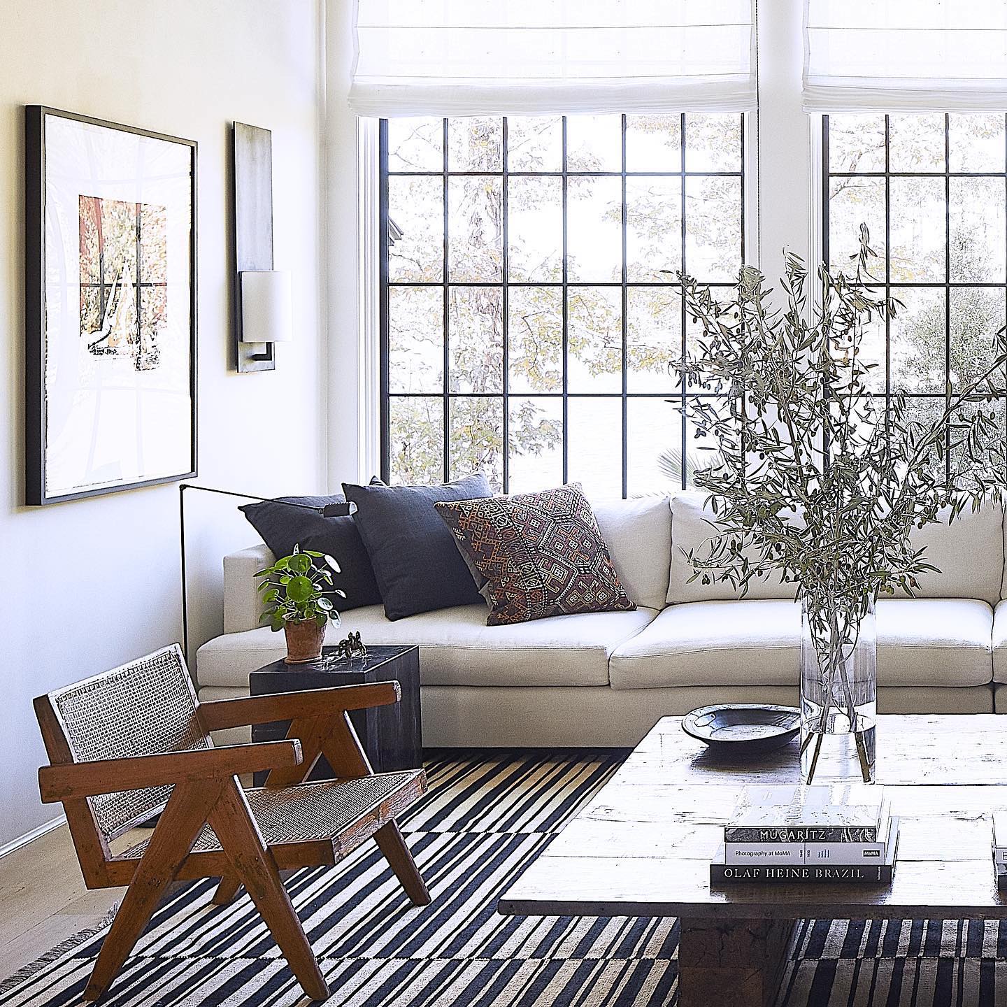
If you weren’t blessed with a solarium (ugh, rude) and you need to throw your sofa directly in front of a window (been there), it all comes down to scale. (Again. Shocker.) In both these examples, filling out as much space as possible is key to these rooms coming together – these bespoke (or bespoke-feeling) sofas feel like they were meant to live in front of a window, you know?
That said, don’t ditch your existing sofa yet!!! Window treatments, which we’ll dig into a bit more below, can really help your already-owned pieces feel much more tailored for your space.
Console Tables
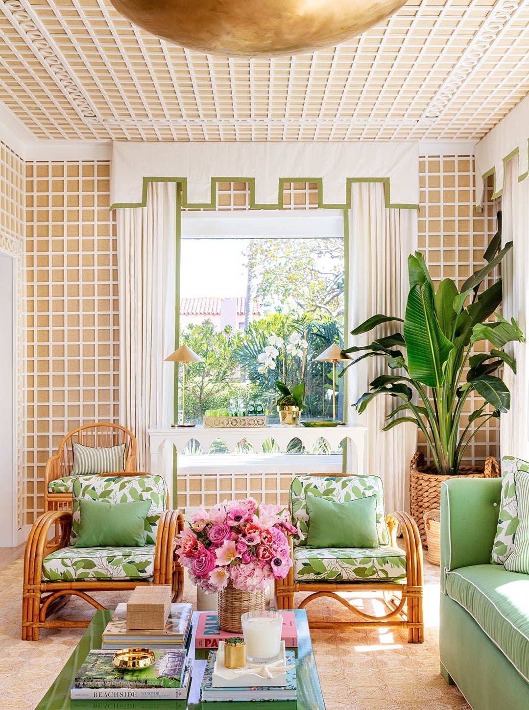
I’m struggling a bit with the idea of a console table in my own kitchen right now – my window is a liiiiittle higher in this room, but every piece I can find is RIGHT on the stool (that’s what the flat area at the base of the window is called). I feel weird about overlapping the apron and sill and trim, so I looooove this above inspiration shot – instead of opting for a lower bench or set of ottomans, this taller console creates an awesome pattern that brings a ton of interest back to the window. I’m inspired!!!
And here’s another shot for all of you lucky folks with walls of floor-to-ceiling windows – again, look at that perfect scale of the console table! Topping the piece by balancing art against the window makes the placement feel really calculated and measured instead of haphazard, too.
Beds
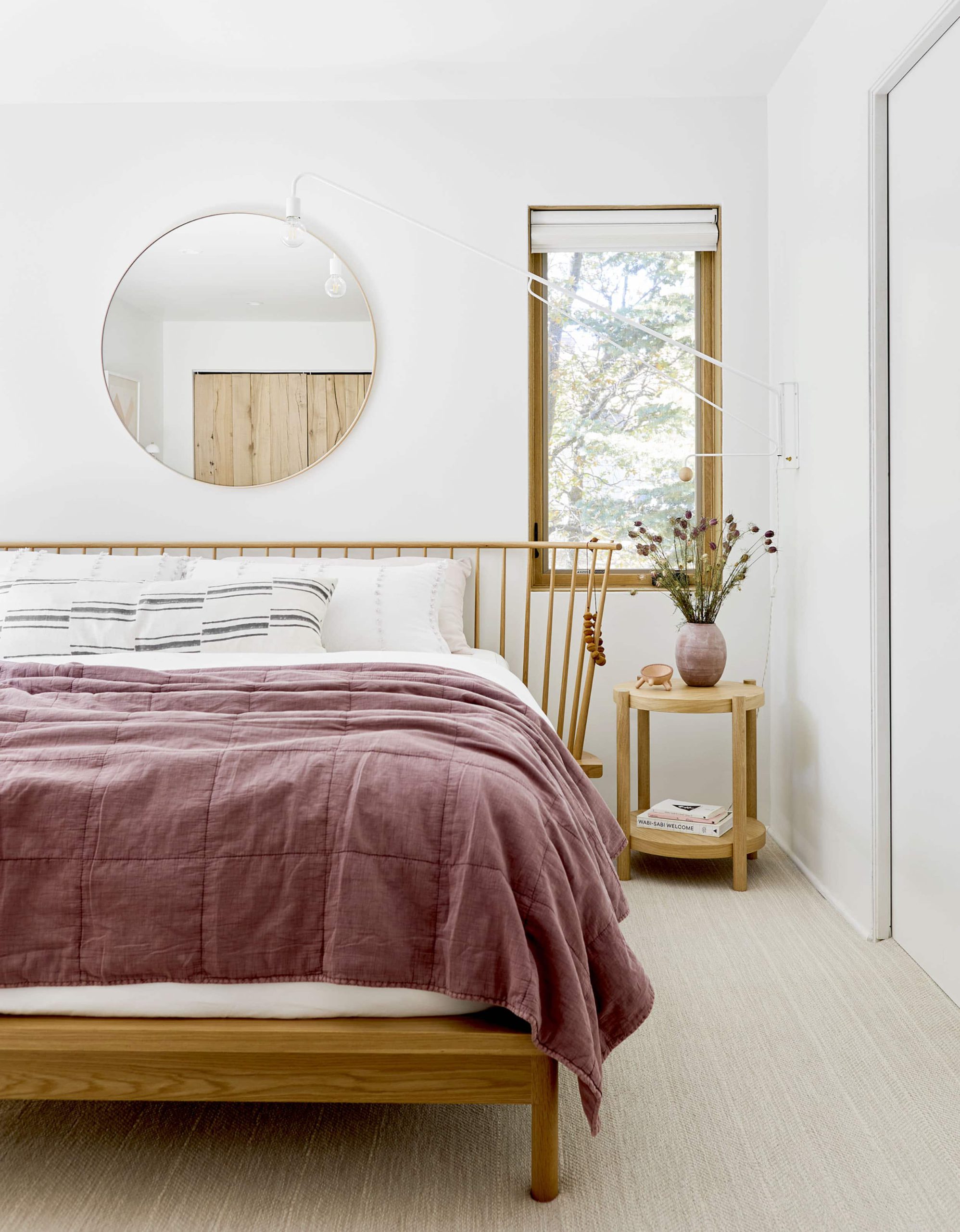
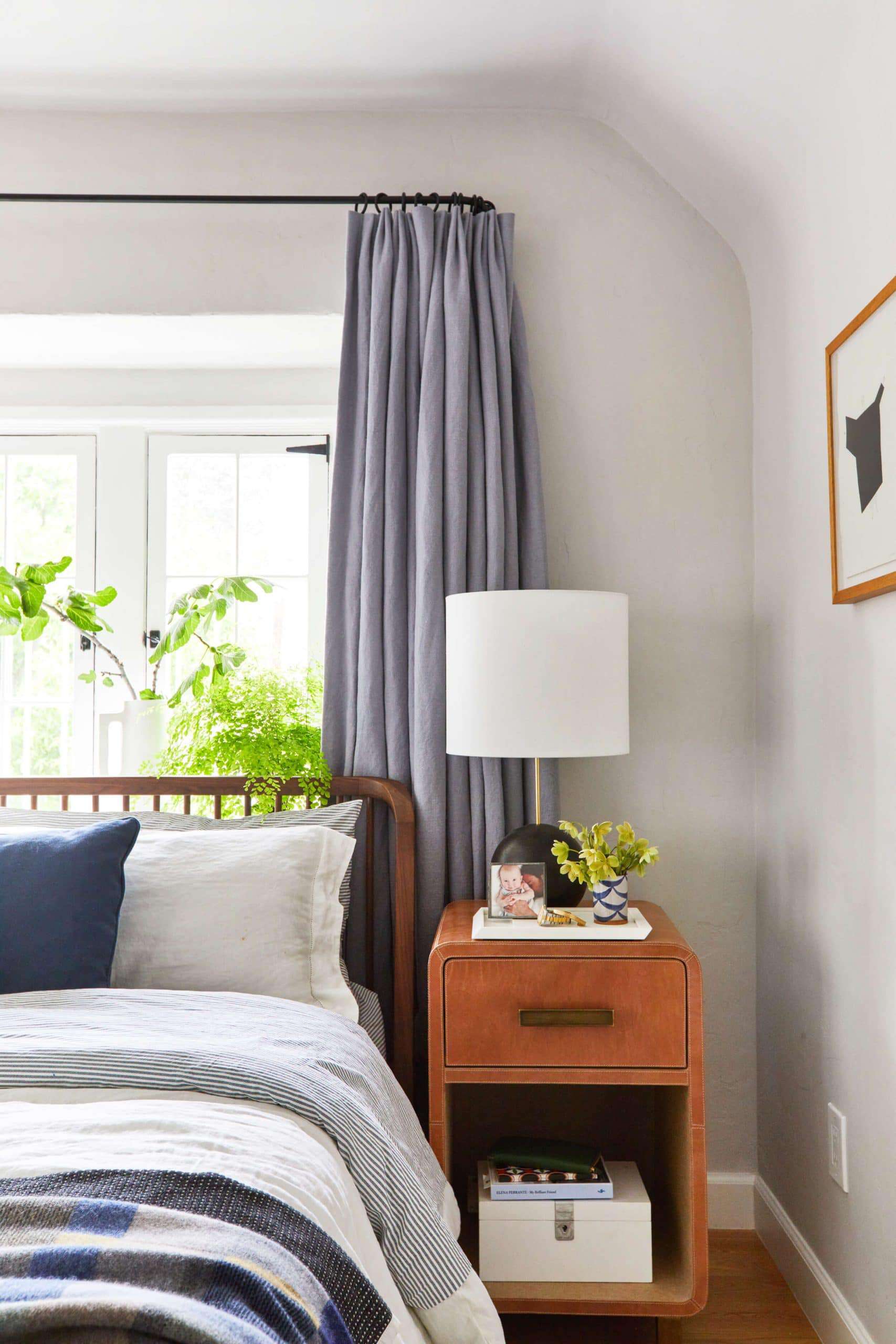
BABY. EHD has already published a full master class on bed placement, so if this is your specific design agony, read that post first!!! On a higher level, though, our advice is pretty simple and consistent: if your bed is going to overlap a window, opt for a lighter, more spindly headboard or frame. Let that light in, kiddo!
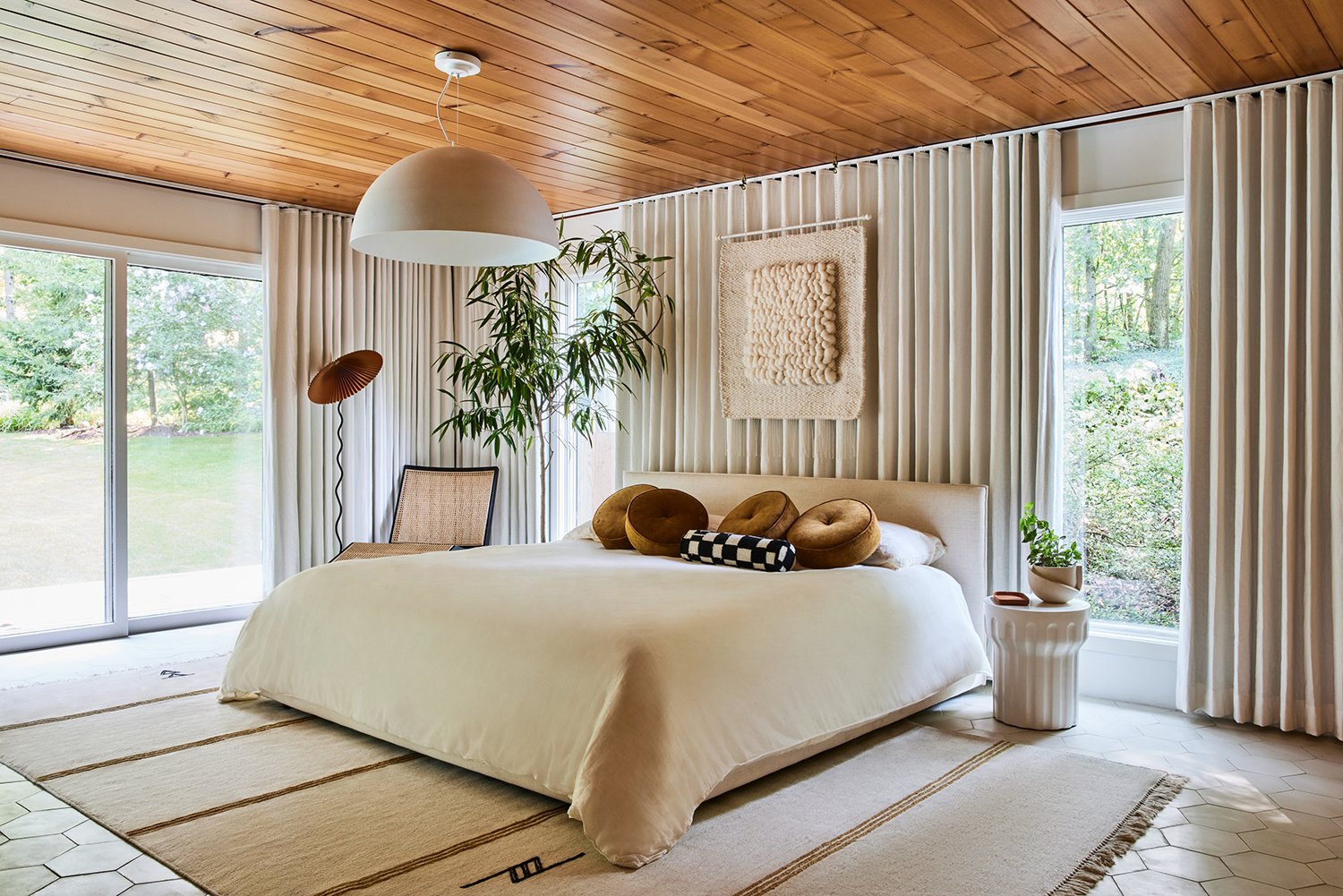
But if your window placement is too weird and hard to live with (case in point: my bedroom), feel free to consider an extra-full window treatment that envelops a full wall. Above, Sarah Sherman Samuel was able to anchor her bed and create symmetry by choosing which parts of the window to show and which parts to hide. Such a simple and elegant solution, right???
Open Shelving
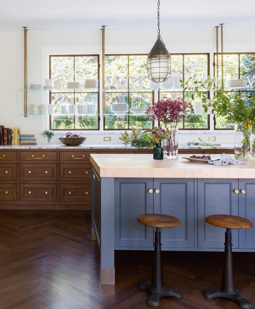
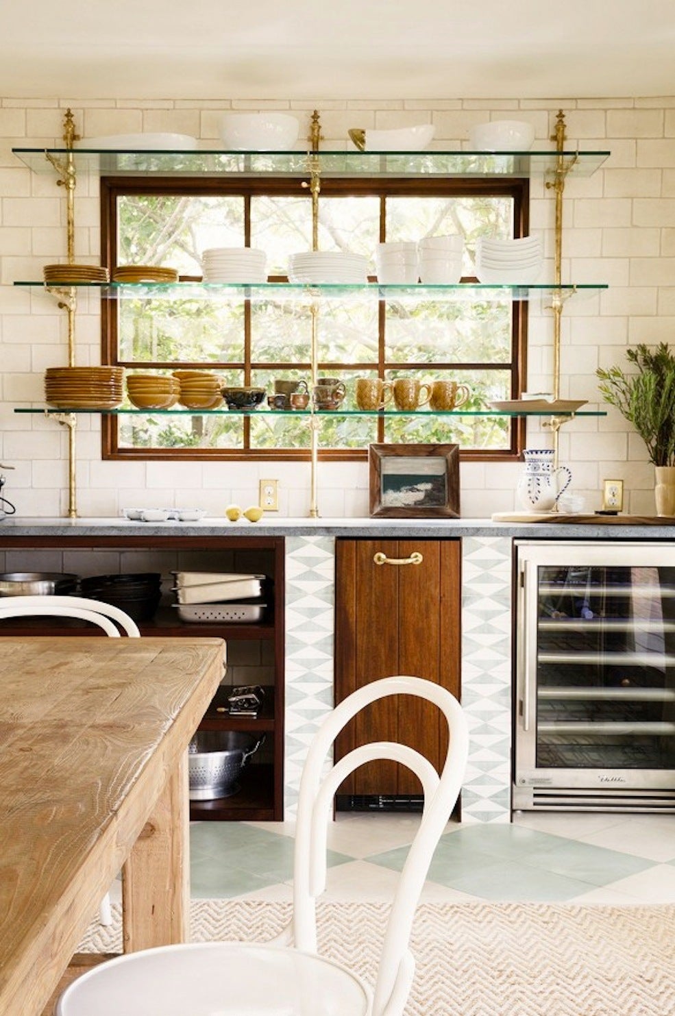
BIG SWOON. I’m curious to hear what y’all think about this trend – I loooove it for more rural areas, I think. (I love an open shelf, but if you could see the amount of grime coming through my windows from the billion-lane road next to my apartment, I think you’d agree.) The proportions in both of these shots are so chic – whether you’re sizing your shelving to line up perfectly with your windows (on the left) or you choose to stagger your supporting poles a bit (on the right), the effect is just SO special and exciting. Can you imagine a better backdrop for your favorite tableware? I can’t 🙂
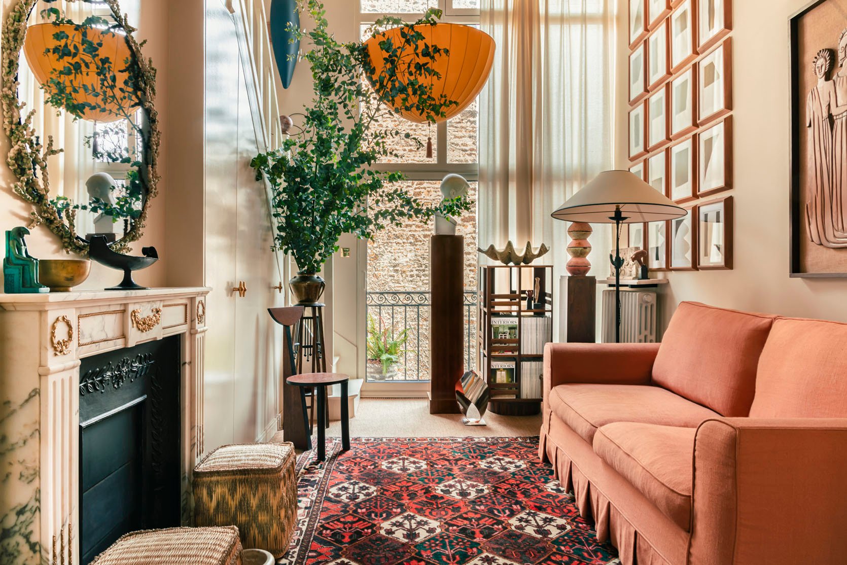
And here’s one with a more traditional shelving unit – turns out that if you treat your home like a gallery, it’ll look like a gallery. I always come back to one of Em’s famous maxims – “pretty looks good next to pretty” – and this is a prime example. If you have a collection of special objects (or objets, if you want to be fancy), why not try to display them in a little cluster near a window? It’s exciting and unexpected.
Dressers and Cabinets

WE’RE IN THE BIG LEAGUES NOW, FOLKS. Case goods are by far the trickiest thing to style in front of windows, IMO – it’s so easy for things to look like “this is my first apartment and I can’t figure out another layout” (admittedly, I may be biased as *I* had case goods in front of the window in my first apartment). The trick to making it work? Frame your dresser, commode, or cabinet with your window treatments. I’m especially enamored by the shot on the right – it’s a little more traditional than what I usually find myself drawn to, but that cornice/valance situation frames that commode in such a beautiful way.
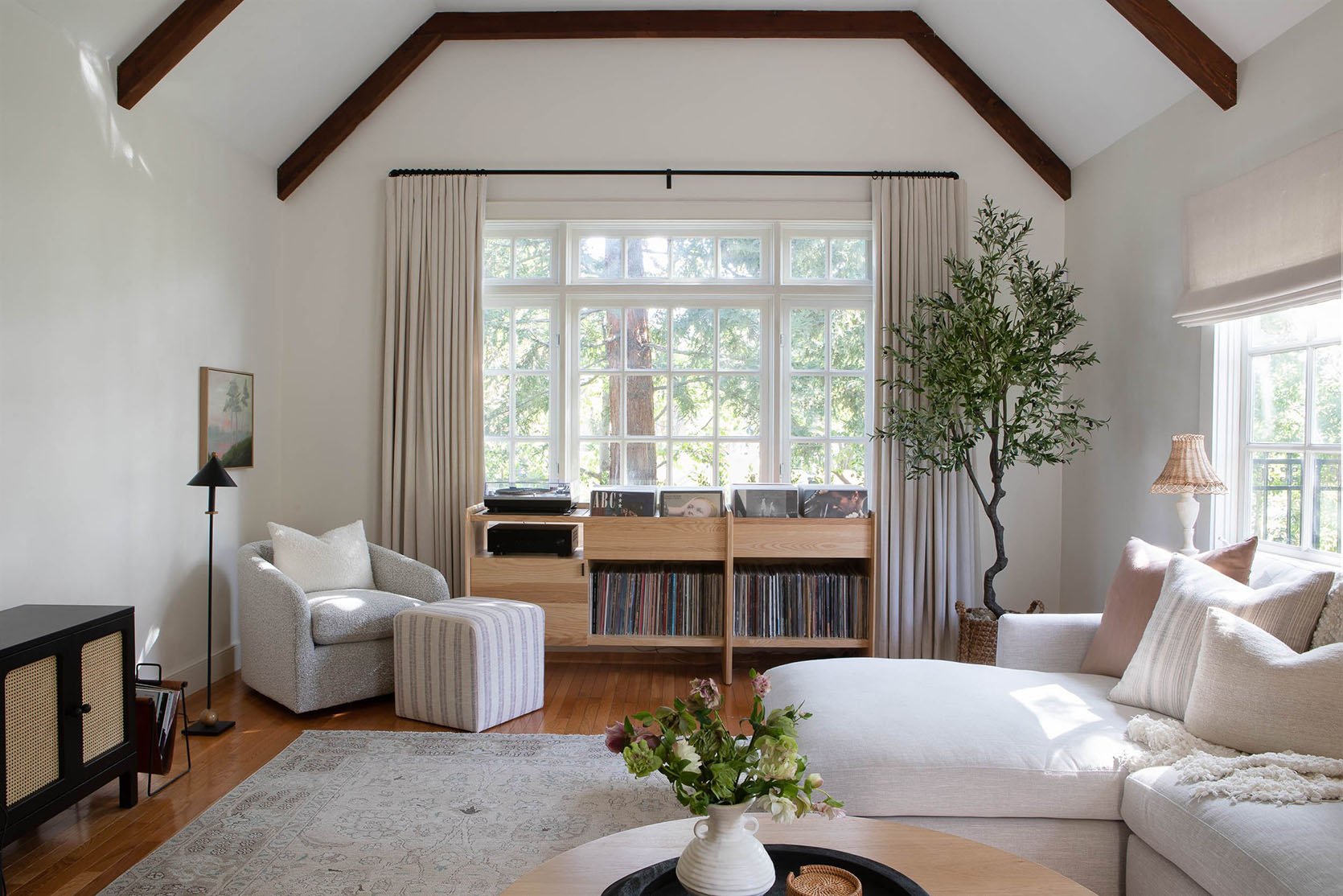
MAJOR HEART EYES FROM ME. I’ve written before about my own vinyl storage woes and this is the best solution that I could ever imagine. (If I didn’t have south-facing windows in my living room, I’d copy this in a heartbeat. Curse my worries about records warping!) Again, this is such a great use of draperies to frame a solid piece – I bet it looks just as good from the street, too. 10/10. Huge inspiration.
Sideboards and Credenzas
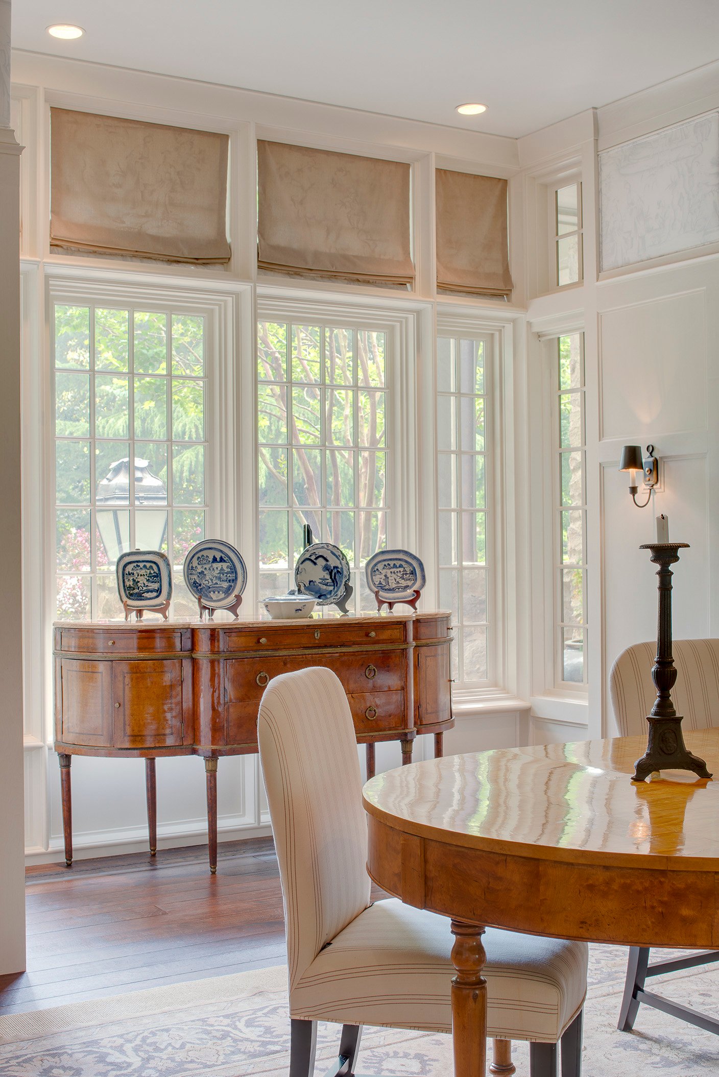
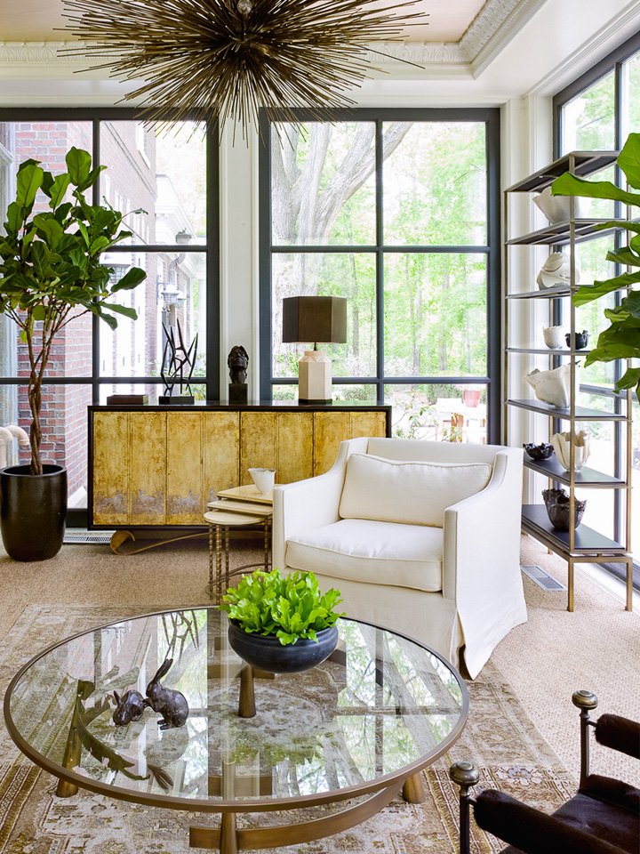
When it comes to bigger pieces, I’m ready to share the craziest tip of all: matching the style of your house is key to making things feel deliberate and planned. On the left, an antique sideboard is stealing the show in a super traditional Tudor home. On the right, a more modern brass-fronted pick (does this remind anyone else of Brady’s OG credenza?) just looks right in front of these bold, contemporary windows. (If that’s not enough, check out the scale on both of those bad larries!!! Perfect!!!) One major note: make sure the back of these pieces are finished so you don’t have weird pieces of plywood peeking out of your windows. You deserve to have your house look just as nice from the outside, you know?
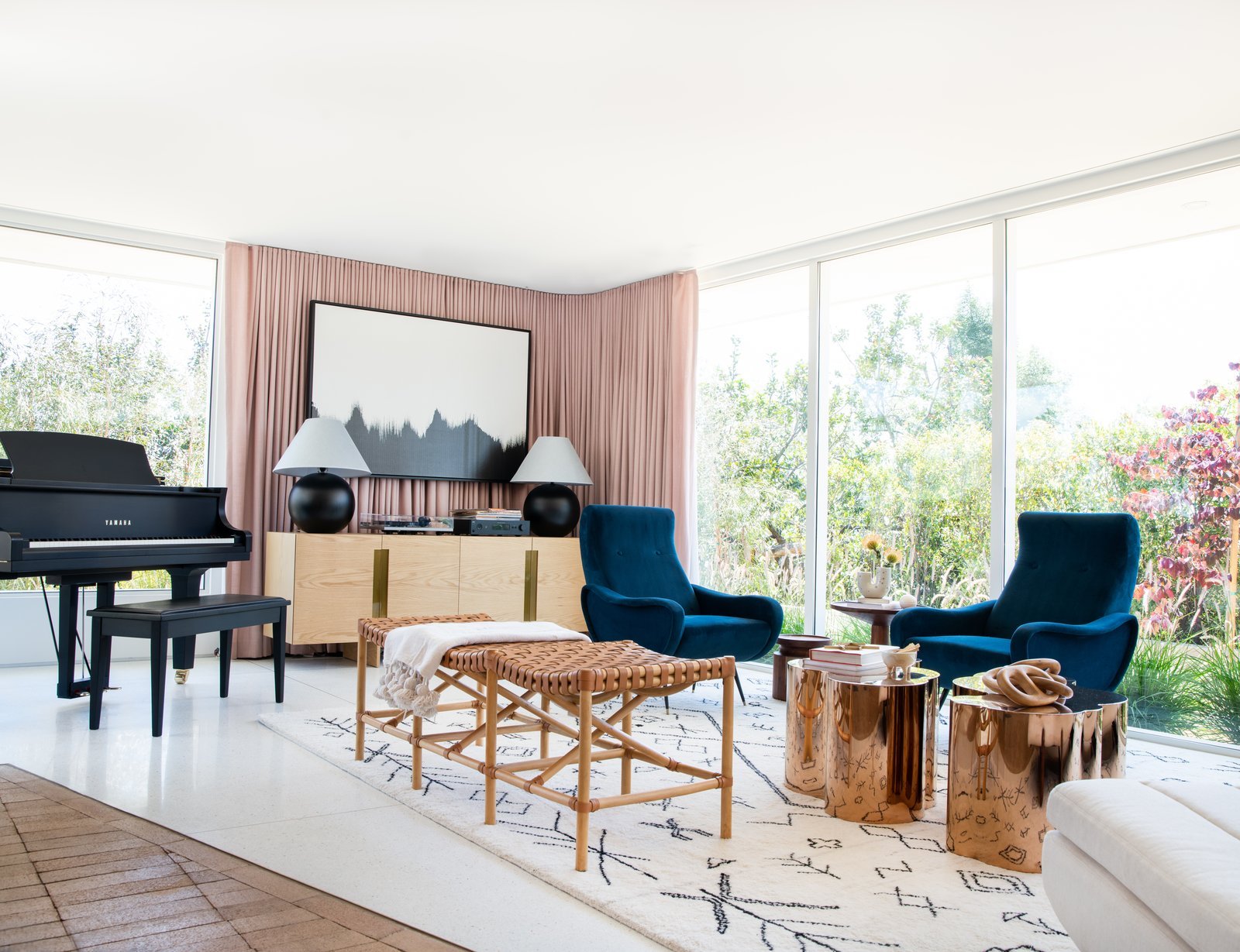
But also…curtains ARE always an option. (And boy, does Sarah Sherman Samuel know her way around some creative draperies or what???) If you’re looking to ground your space a bit more – or if you just feel weird about seeing the back of your favorite media center when you’re pulling into the driveway at the end of the day – consider carving out a corner where you can anchor your larger case goods. We love a creative solution!
Nightstands
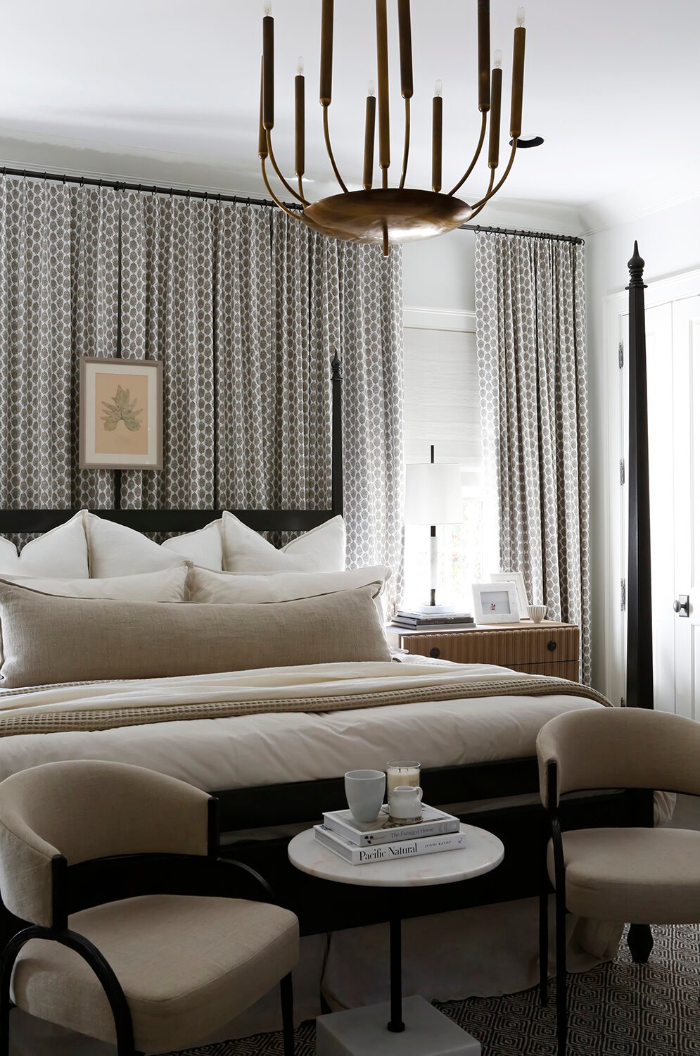
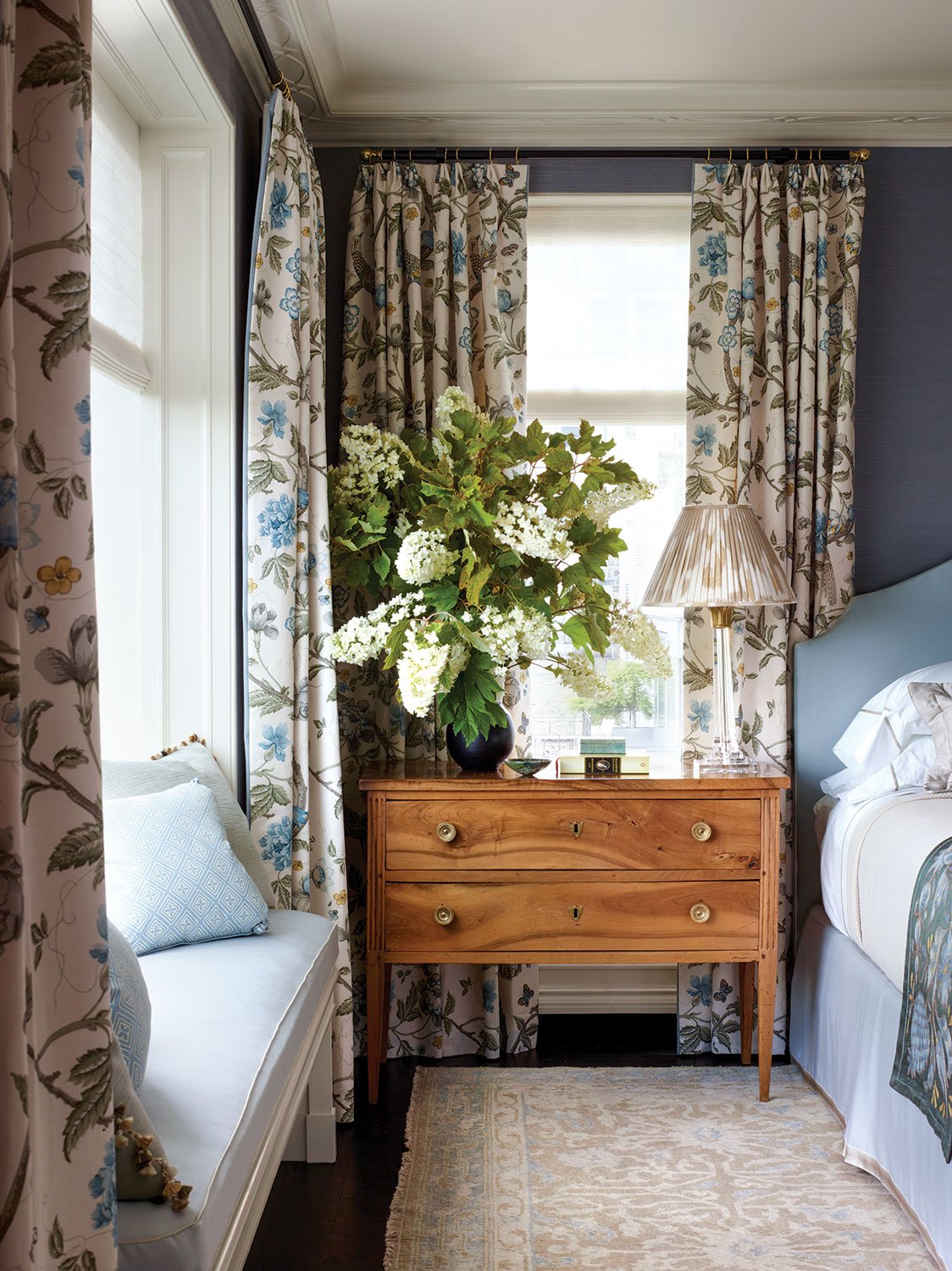
MY. ABSOLUTE. NEMESIS. These are driving me insane, guys. I’m a longtime fan of a pretty high nightstand (does it technically go against design rules? Yes! Is it way easier to put down a glass of water on a higher surface in the middle of the night rather than dislocating your elbow and flailing around for a low surface? Also yes!), so trying to find nightstands that work with my super-low windows has been a challenge. I feel really self-conscious and hyperaware of how my current nightstands are overlapping with my windows and I gotta be honest – I don’t love it, aesthetically speaking. If you’re in a similar pickle, it seems as if (YOU GUESSED IT!) window treatments maaaay be the solution.
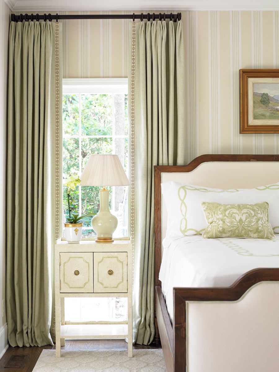
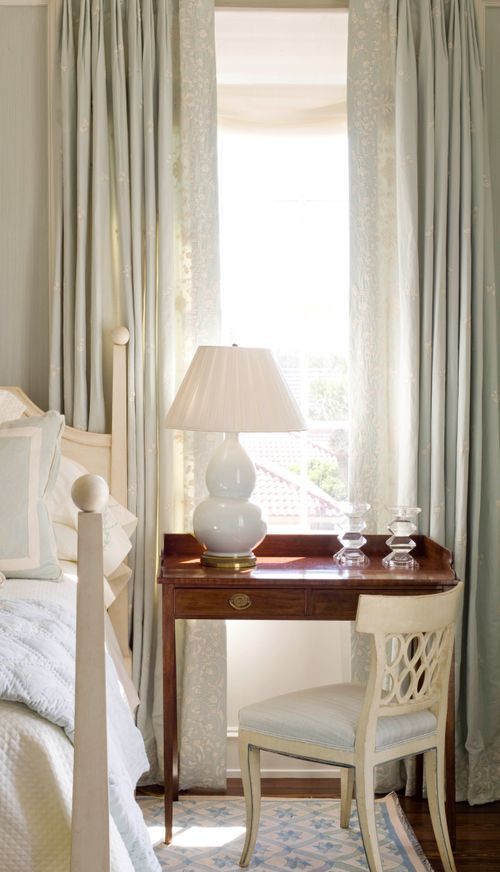
These shots are both so neutral and calming and traditional – three words I don’t think I’ll ever use to describe my own home! – but shape- and scale-wise, they’ve been SO inspiring to me. I loooove how this tiny nightstand just fits perfectly into a little niche on the left (can you imagine it without curtains? It’d be such a bummer!) and I have similar viscerally positive reactions to the little multifunctional writing desk on the right. In my own mind, I’ve been reframing the roles of curtains a little bit – from “things that make your windows look nice” to “things you can use to highlight pieces you love” – and I really think it’s been pretty game-changing for me. I no longer feel super stuck, you know?
SO. If you have also had this problem, please share with the class…how did you solve it? Anyone wanna share photos of their own furniture in front of a window? Anyone else have any inspirational shots or tips or hacks? I learn so much from you every week – I hope today is no exception. Happy Friday. Here’s to eliminating all of our design agonies, one by one. LET’S CHAT??? xx
Opening Image Credits: Design by Nine Dot Design | Photo by Jess Isaac | via Domino
THIS POST WAS ORIGINALLY PUBLISHED HERE.


