There is something about the design process that we don’t talk about much. It’s this thing where you spend a lot of time making one space beautiful and when it is finished you feel so happy and fulfilled. For a while. Then you start to look at the other spaces in your home that aren’t as beautiful and you begin to resent them. It eventually takes away from the beautiful spaces until you are forced to start the design process all over again. This, as you might have guessed, is where I am at with my bedroom. If you read my living room and dining room reveal, you might recall it took me about two years to finish. It was a long but worth it process and the result is a living and dining space my fiancé and I enjoy every day. In fact, we enjoy our living room and dining room so much that the bedroom has become a dreaded room we hate to look at. We want our bedroom to feel like our beautiful living and dining room, and the only way to do that is to dive headfirst into an exciting, nerve-wracking, inevitably long and tiresome, but ultimately fun design process. This is why you are here today and I hope you are ready to be introduced to a room that has given me more grief than I can properly describe. She is a challenging and hard-to-love room, so the best way to begin is with the top challenges we are facing. Ready? Here we go.
Challenge #1: The Bed Placement
My bedroom layout has been a high stake game of Tetris ever since we moved into this apartment. I am reluctant to admit this because this bedroom isn’t shaped like a trapezoid or anything crazy. It’s literally a rectangle. But for some reason (cough * lack of storage * cough), this room has been my Achilles heel for three years. Granted, the array of randomly collected furniture contributes to its downfall. None of the bedroom furniture we have was purchased for this room, most of it is second-hand (our dresser was a side of the road find), and it certainly shows. Our bedroom furniture belongs on the island of misfit toys. So for the past three years, I’ve been at odds with my bedroom with many of the battles taking place at 1 am in a furniture arranging frenzy. Here’s how it began:
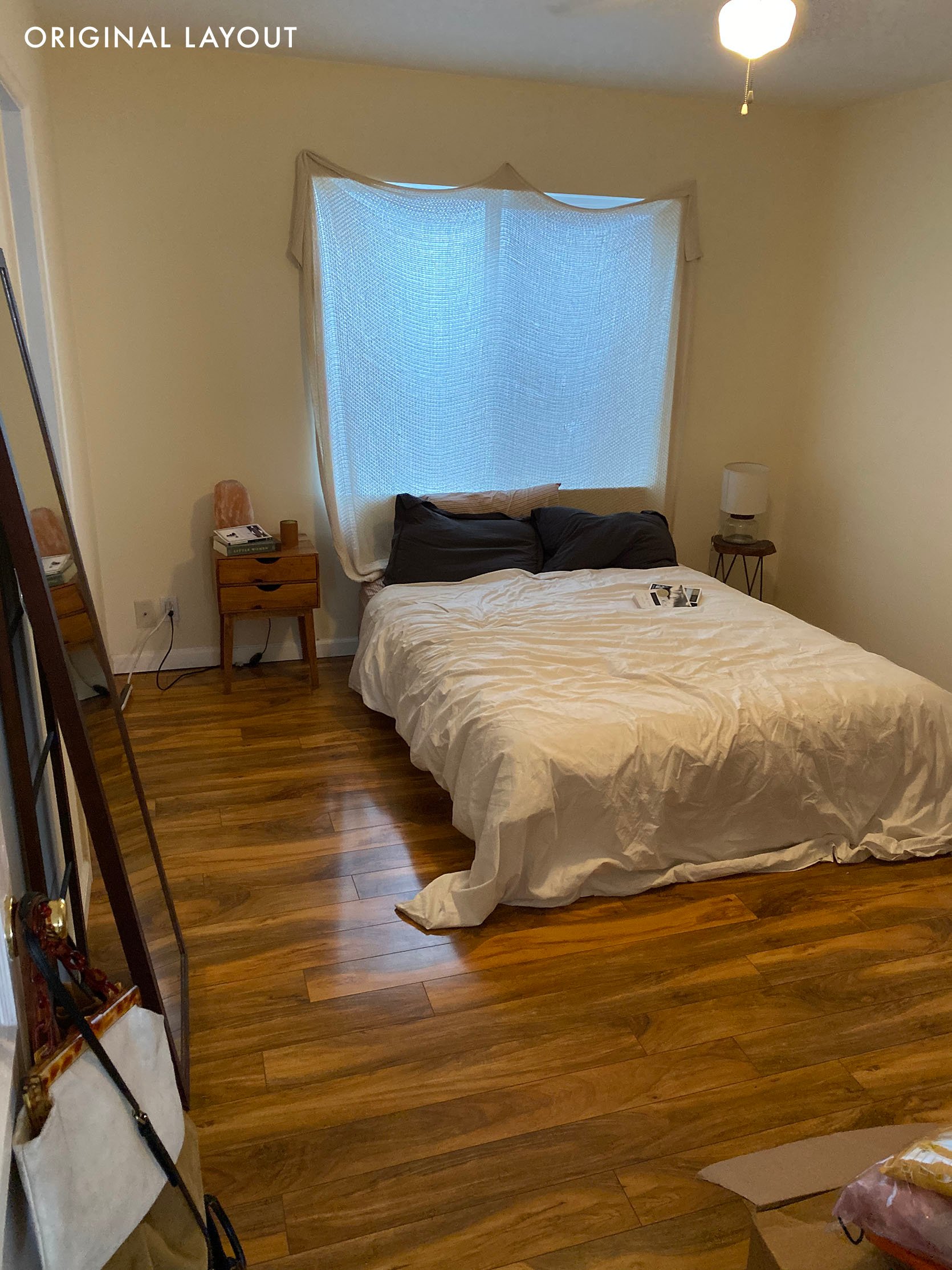
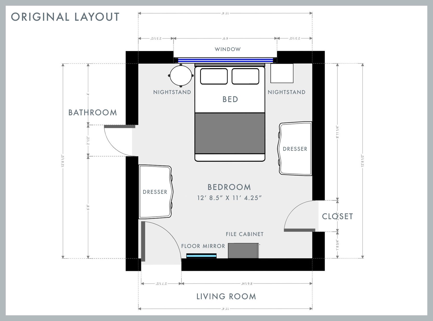
Our initial bed placement was the obvious choice for this bedroom layout. The bed was under the window, facing the door of the room. We had two nightstands on each side, and the remaining furniture was arranged wherever it would fit. At that time we had two dressers, two nightstands, a filing cabinet, a chair stacked with books, and a floor mirror.
THE PROBLEM:
We needed more storage. For over a year, we started accumulating furniture so having a bed and two nightstands taking up the emptiest wall felt wasteful (the other three walls are encumbered with doors). As time went on, we would forgo one of the dressers, replace it with a clothing rack, and add a corner desk which complicated the layout even more. Eventually, some late-night furniture arranging turned into this somewhat puzzling version:
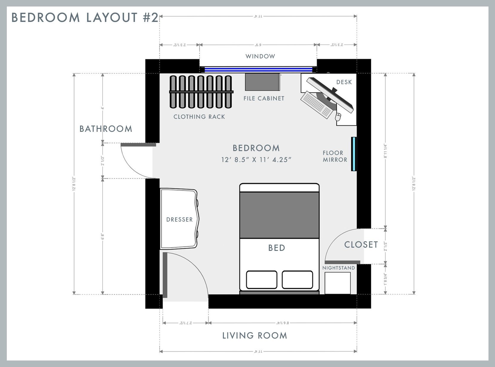
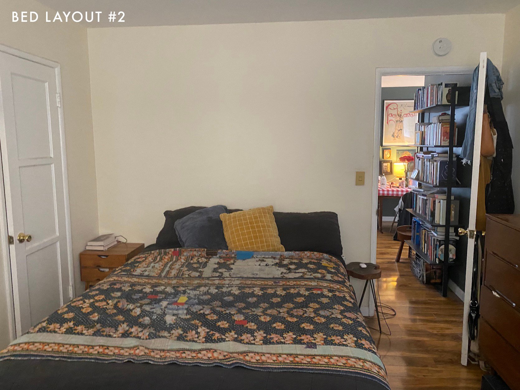
This choice was admittedly influenced by my very limited knowledge of Feng Shui. I heard that sleeping under the window is bad Feng Shui because it brings in negative chi (aka energy) that weakens your personal protection, thus causing interrupted sleep. I decided my terrible sleep couldn’t possibly have to do with any of my various bad sleeping habits (sleeping with the TV on, being on my phone in bed) and MUST be due to the direction of my bed. So to the other side of the room our bed went.
THE NEW PROBLEM:
Visually it was so uninspiring and weird. There was something so disorienting about walking into the bedroom and not seeing the bed right away. It felt like we were living in the upside down. Functionally, it was perhaps worse as the side of the bed near the closet was hard to get to and the far wall under the window always felt cramped and cluttered. The catch is that this felt like our only option because the corner workspace has become absolutely necessary for our lives. I work from home and Rocky has therapy clients that he sees over Zoom. So we’ve increasingly needed two workspaces, one in the living room and one in our only bedroom. If only there was a better way…
The Solution: The Bed Belongs In The Corner
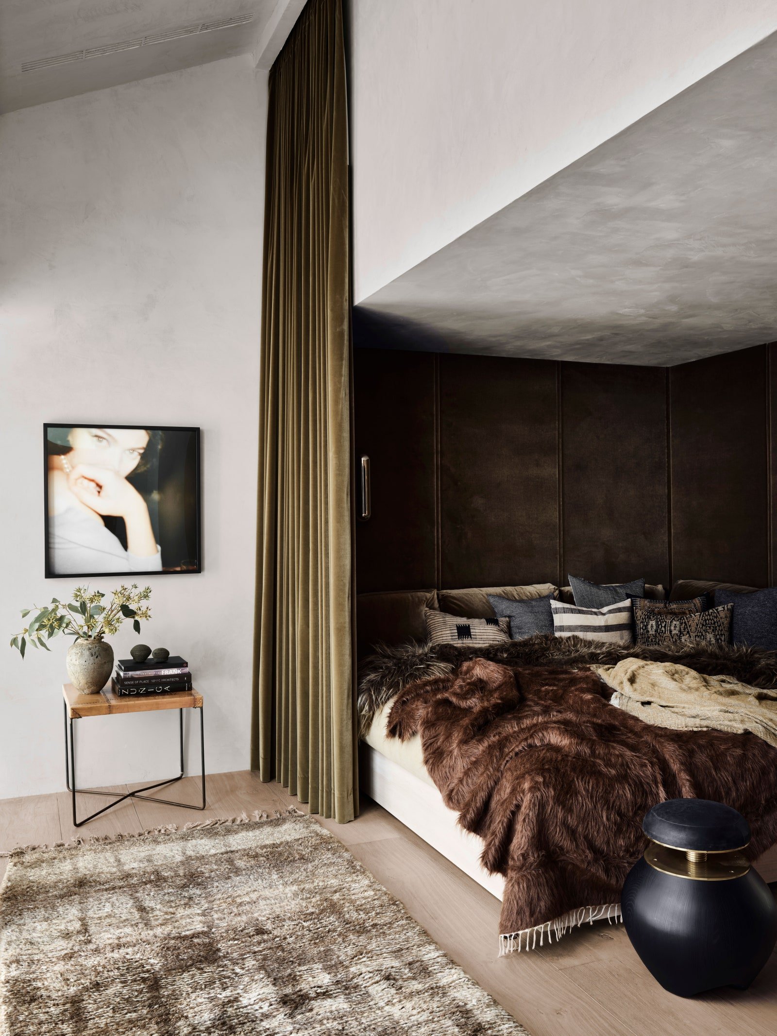
The idea of having a bed in the corner against the wall still feels very pre-teen. I’ve been under the impression that adult bedrooms require a bed in the center of the room, with two nightstands accompanying each side as the interior design gods intended. This idea was apparently branded into my brain because it wasn’t until a few days ago that I even entertained the idea of placing the bed in the corner against the wall. As soon as I thought of it, I realized it would open up the space tremendously but it brought up another design faux pas, or so I thought. If we put our bed in the corner of the room, it would be off-centered under a window which I thought couldn’t possibly be allowed. But then I remembered a very recent EHD project…
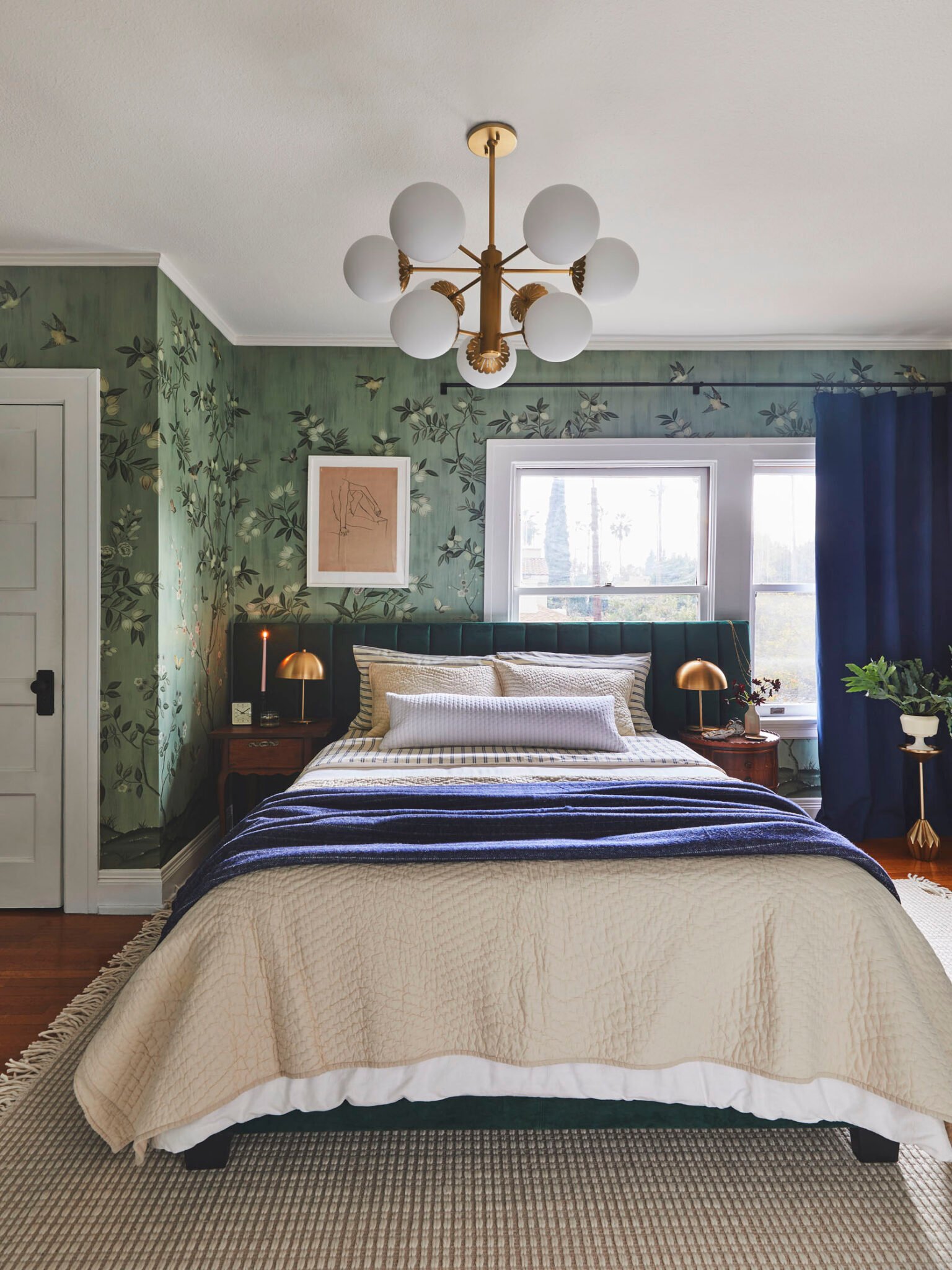
Jess designed this bedroom for a friend of hers, and in doing so disproved my previous notions about bedroom layouts. If you would have asked me a few months ago if your bed can block half your window I’d be like, “there are no rules but it’s probably not the best option!!” and I’d be so wrong. Sometimes, it absolutely is the best option, and as the bedroom above proves, it can also look very cool and interesting. So I did two things I thought were against adult bedroom etiquette and ended up with this:
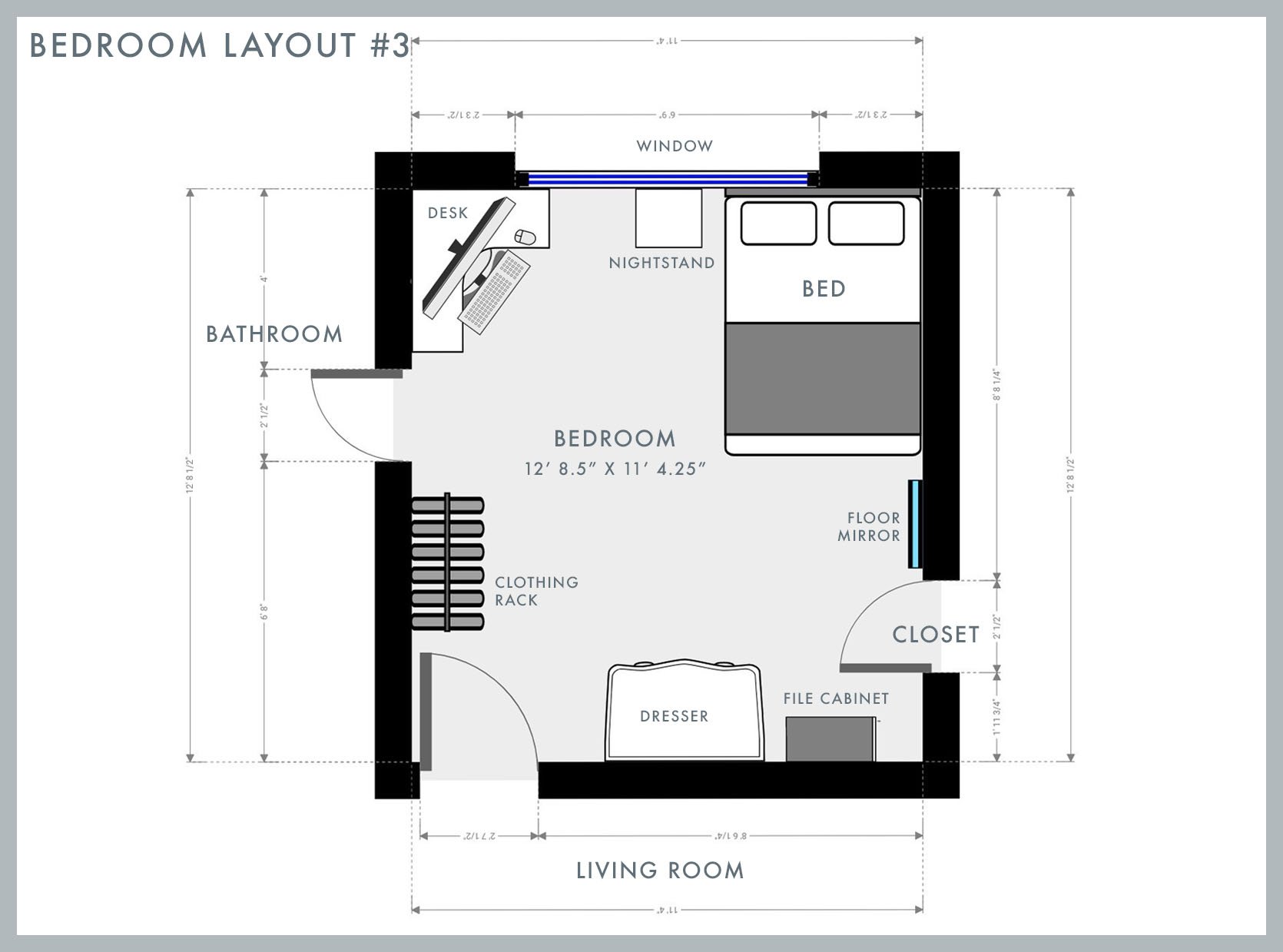
Just like in the beloved game of Tetris, when you arrange shapes to fit just right, you end up with more space. But as I originally feared, a bed in the corner does feel very youthful. I can’t exactly articulate why, but I will say that it was difficult to find an inspiration photo of an adult bedroom with a bed in the corner. So that must mean something. The silver lining is it already feels better visually and spatially and hey, since when is youthfulness a bad thing??
Challenge #2: The Single Nightstand Conundrum
So it turns out when you rearrange your entire bedroom while your fiancé is at work, and then surprise him with an arrangement that means he no longer gets the luxury of a nightstand, they might be a little annoyed. Unfortunately for him, he had to admit this version is a 1000x better than our previous one, so he quickly got on board. His only complaint was about where to put his glasses and phone when he is ready to retire for the night. But luckily he is marrying a genius.
Solution: A Built-Out Ledge
Like many geniuses before me, I quickly decided we can build a shelf “headboard” so he has an area to put his items once it’s time for bed. I am notoriously *not* a DIYer, but this is a project I can get behind, especially if it can look anything like one of these:
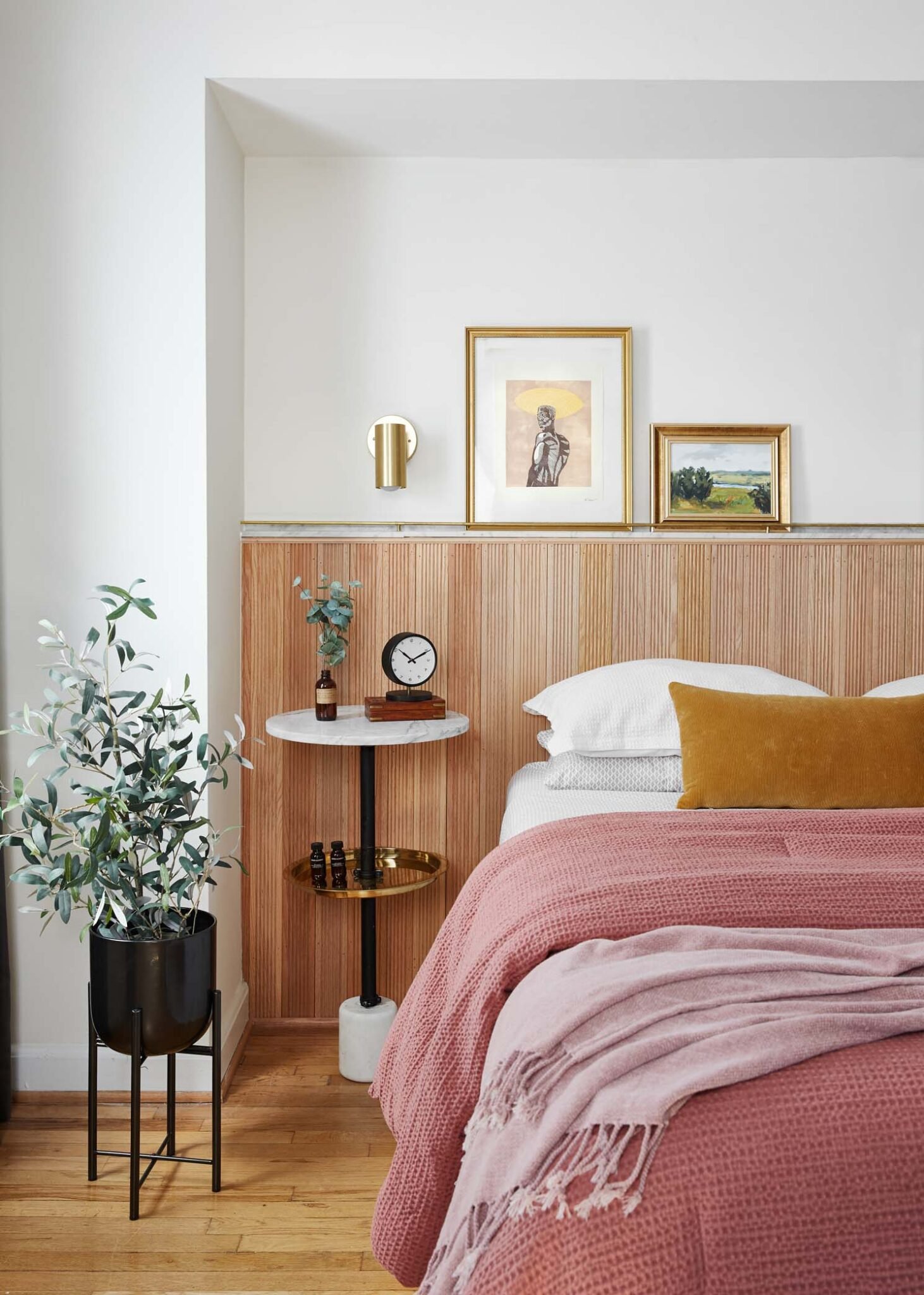
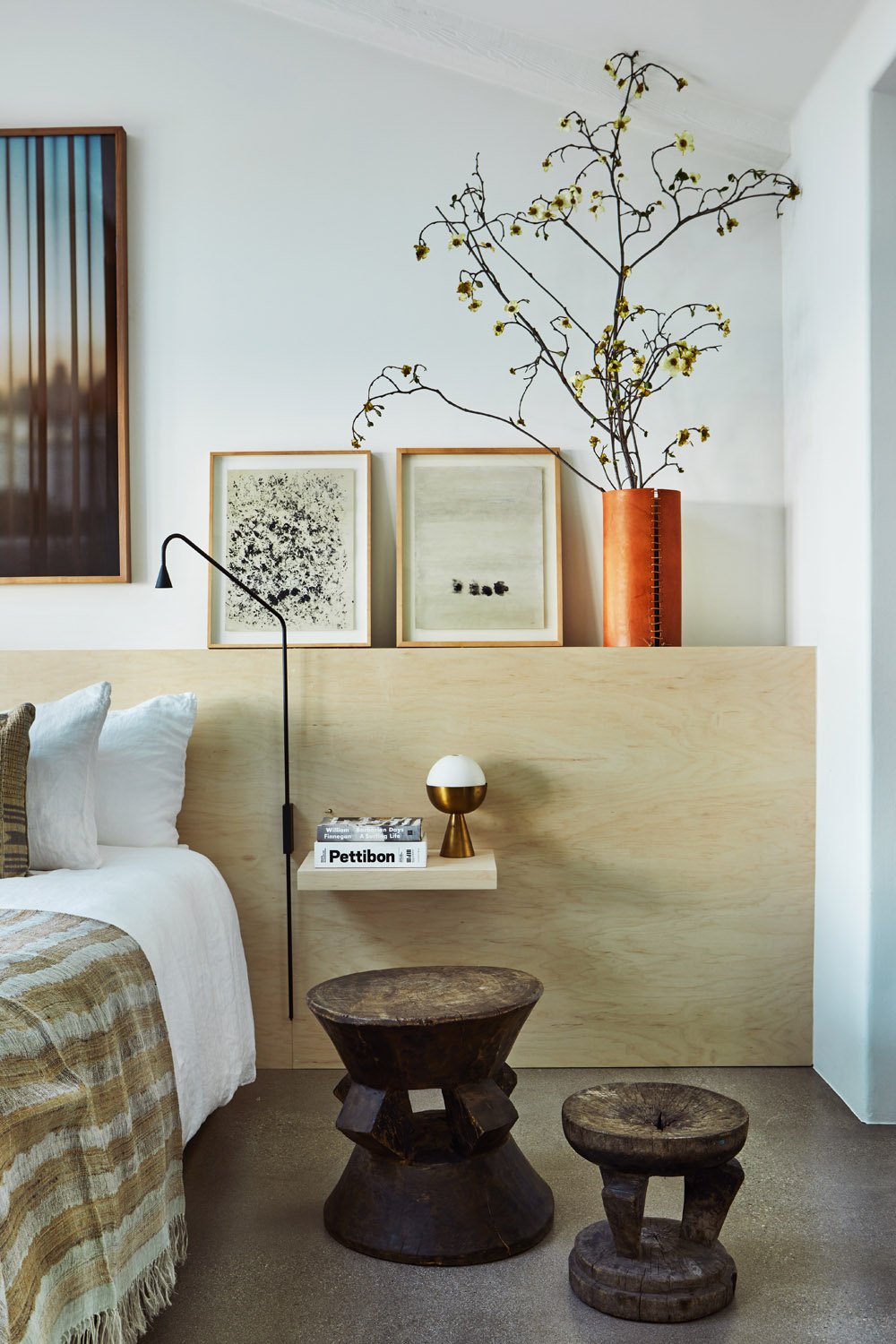
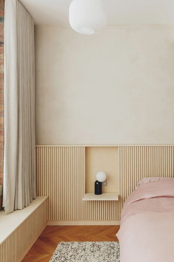
Now because of our layout, our shelf will not be a headboard in the traditional sense. Instead, I picture it aligning with the side of our bed, which can also act as a place to display art and various objects. Here’s how I imagine it:
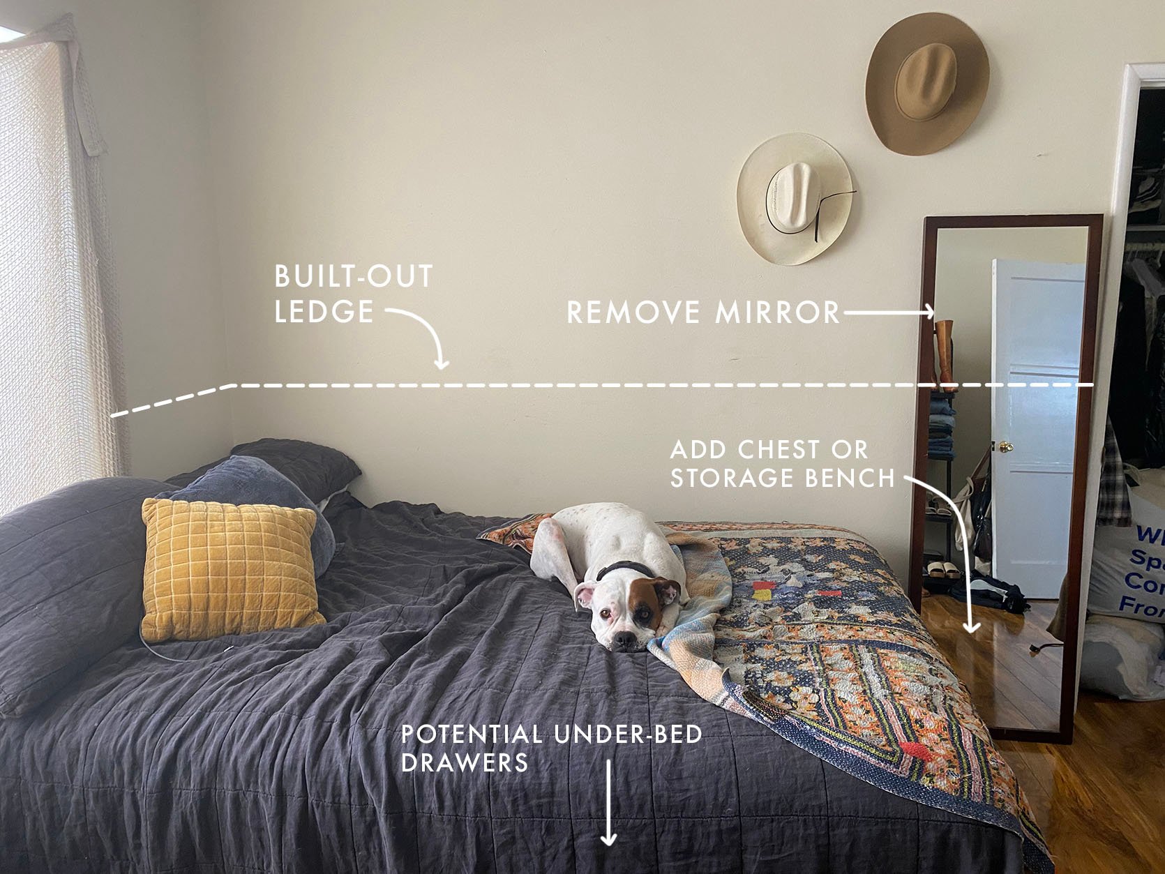
With a ledge by his side, my fiancé will have an easy-access spot for his items, and I in turn win fiancé of the year. As an added bonus, I have a feeling this solution will simultaneously create a more mature bedroom ambiance too. There is something about a built-in DIY ledge that feels very Adult with a capital A. By the way, the dog that takes up half of the bed is 100% optional.
Challenge #3: Too Much furniture Not enough Storage
There is a world where I embrace a maximalist bedroom with so much furniture your eye doesn’t even know where to look next. It would be appropriate considering the amount of things both my fiancé and I have that need a place to live, but I can’t help but want a minimal, peaceful, organic feeling bedroom. A plethora of furniture, unfortunately, would not achieve this vibe. So with such little storage options what does one do?
Solution: A Shift Towards Storage Furniture
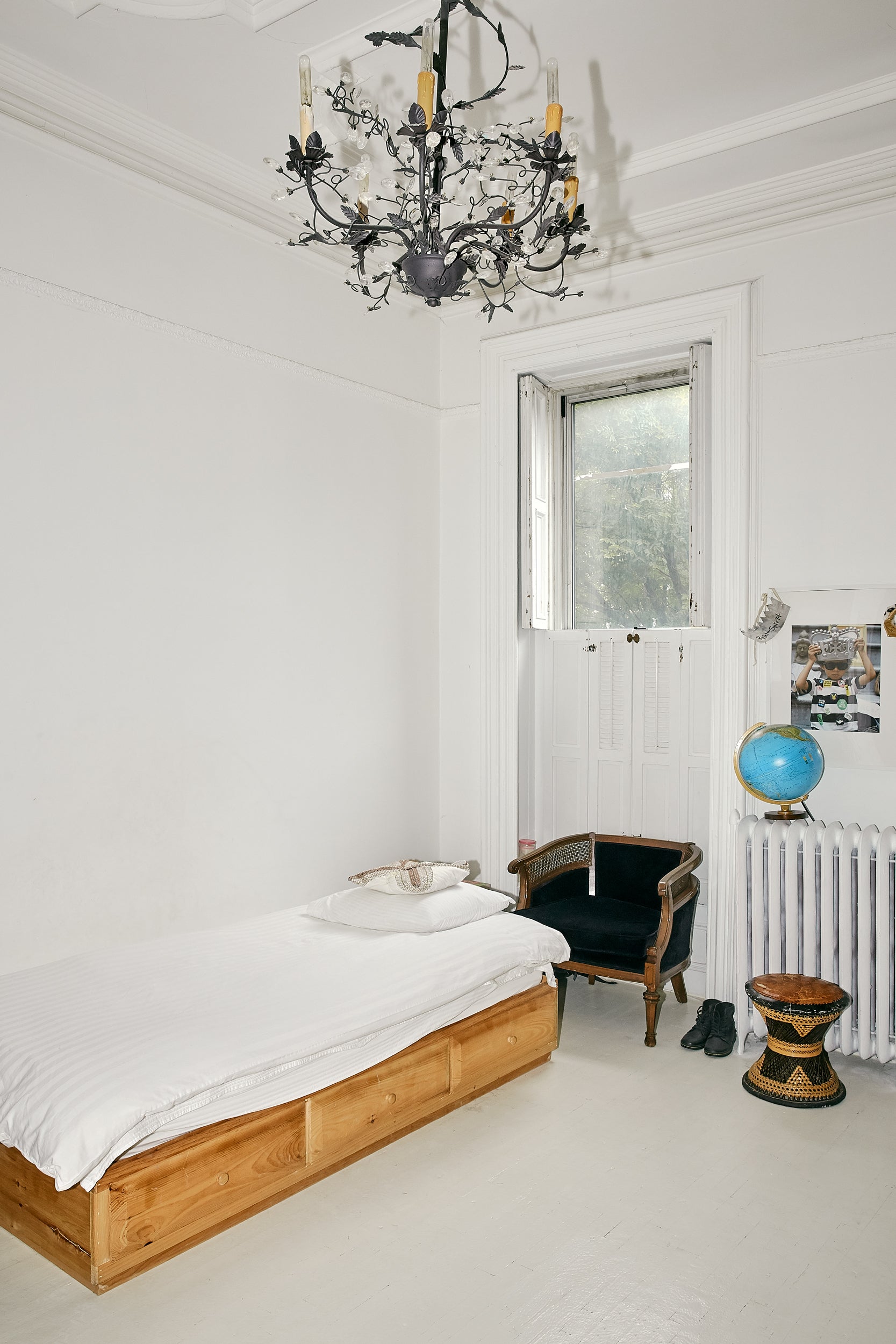
I have avoided a storage bed for too long. The bedroom of my dreams does not have a storage bed but then again, the bedroom of my dreams has multiple walk-in closets. So, I have recently warmed up to the idea of a storage bed and was surprised to find out they can fit my desired aesthetic quite well. A solid wood storage bed has a natural, bare-bones look about it and can help achieve a minimal vibe.
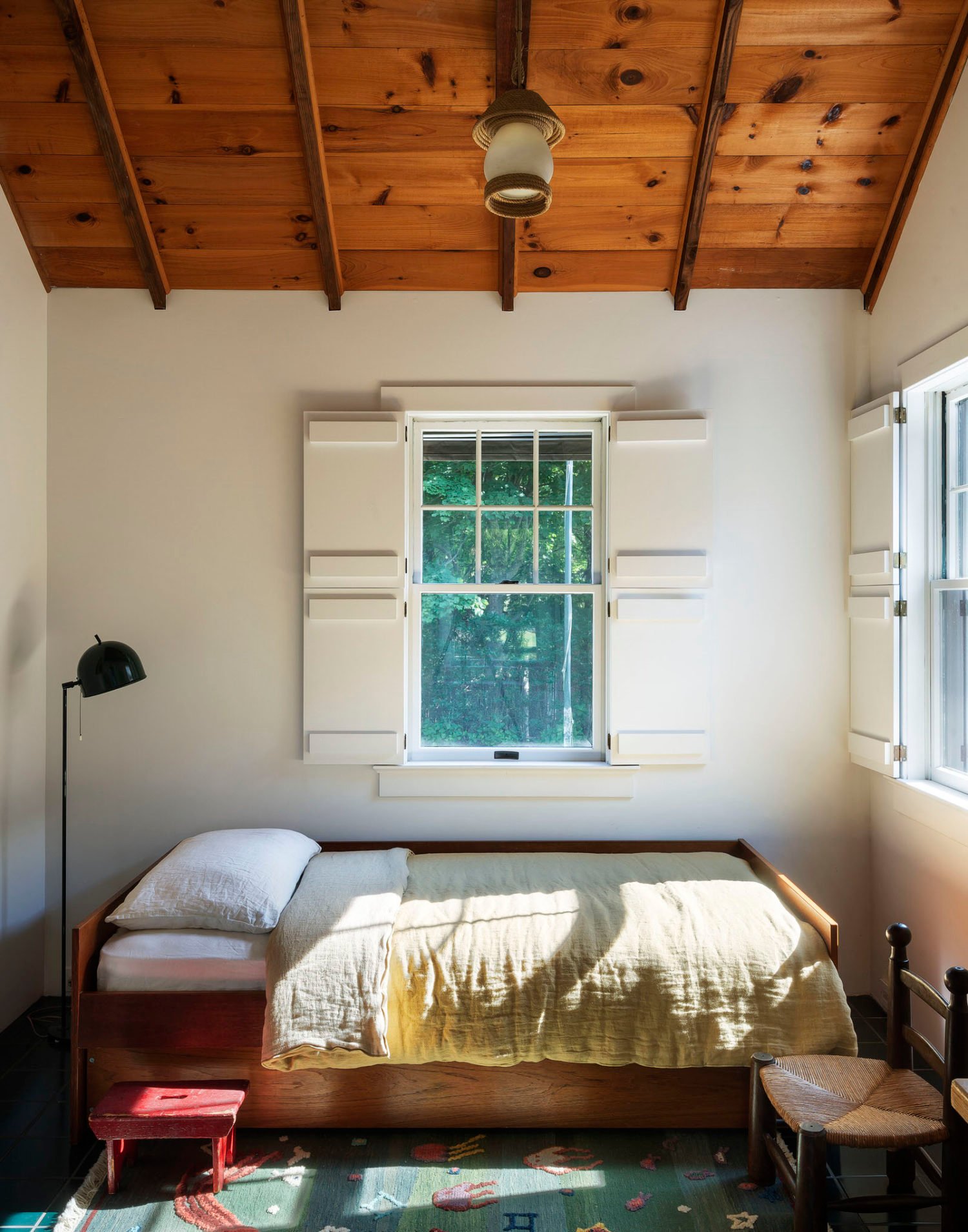
design by workstead | via ny times
The more I look, the more I love the storage bed aesthetic. It has a similar feeling to a mattress on the floor because of the platform with no legs but is more sophisticated because well, it’s not a mattress on the floor.
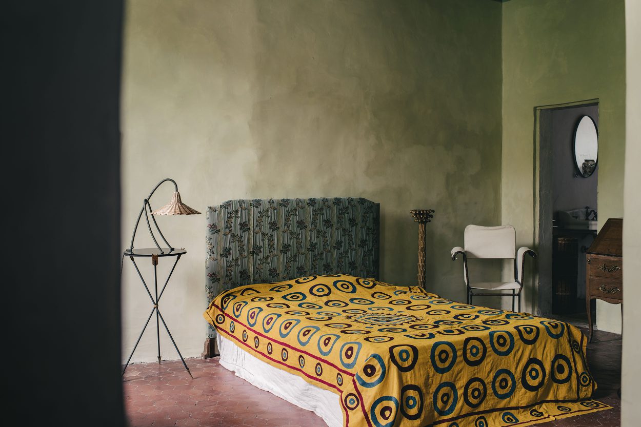
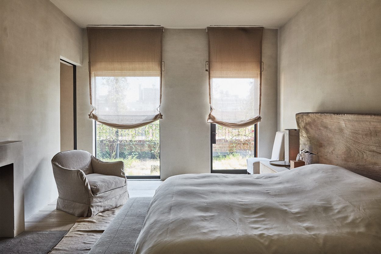
A fancy trick to hiding a storage bed is to have your bedding fall all the way to the floor, which is something we very well may do. Luckily for us, this simple bedding trend aligns with the Wabi-Sabi Monastery Chic that (spoiler alert) we actually are going for in this room. Stay tuned for more on that, in another blog post, on another day. For now, I am so curious what you think about this new layout, and whether you believe adult bedrooms can have a bed in the corner? Sound off in the comments below. xx
Opener Image Credits: Design by Malcolm Simmons | Photo by Keyanna Bowen | From: Malcolm’s Bedroom Reveal Is Here… How He Found Healing Through Design + The Incredible DIYs That Transformed The Space
THIS POST WAS ORIGINALLY PUBLISHED HERE.


