I’M NOT AN ARCHITECT. (“Duh,” said you, and me, and literally everyone I have ever met or spoken to or even glanced at). But I am someone who spends way too much time looking at old houses on the internet, and today I want to introduce you to my all-time favorite type of architecture: Art Nouveau. It’s going to be a pretty high level overview, but I’d love to hear from some trained architects in the comments if anyone would like to expound!!!
Here’s the deal: Art Nouveau was a FLASH IN THE PAN. It came out of nowhere in the 1890s and it was florid and futuristic and sculptural – in modern terms, it’s kind of like The Hobbit meets Vogue. Art Nouveau picked up steam and spread across the globe for 20 years like wildfire, but its ornate aesthetic was too expensive to justify during the First World War. Instead, we saw the rise of Art Deco, which was a simple and streamlined version take on Art Nouveau – deco’s geometric shapes and straight lines were more affordable to produce than all of nouveau’s whiplash curves. BUT THAT’S ENOUGH HISTORY (for now, at least), LET ME SHOW YOU A BUILDING!
PS. There’s no Gaudi in this post because (a.) he’s already world-renowned and (b.) less famous places from my incredibly dense Pinterest board deserve some shine, too. I’ll link up some of his work at the bottom if you want to explore more in this style, though. OKAY NOW HERE’S A BUILDING!
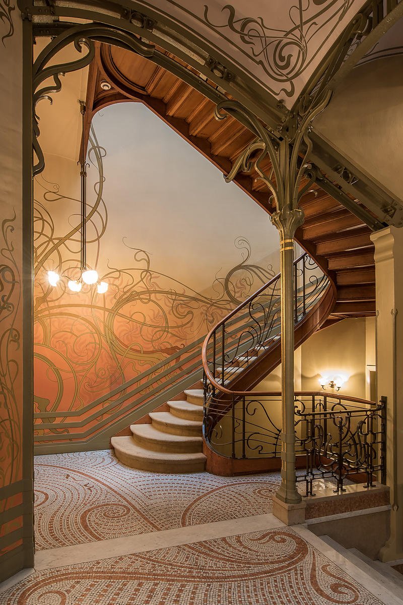
WOW WOW WOW. Y’all, welcome to the Hotel Tassel (not actually a hotel, tragically – just a townhome that bears the name of its former owner) in Brussels, which is coincidentally the #1 spot on my travel list. The home was built in 1893 by an architect named Victor Horta – we’re gonna see a lot of his work later – and when it was unveiled, it literally BROKE PEOPLE’S BRAINS. No one had ever seen anything like this – it was like a period-appropriate art had come to life on a massive scale (scroll through this primer really quickly and you’ll be like “oh my gosh, art really DID inspire this architecture!”).
There are a few classic motifs that we’re gonna be looking for over and over as we stare at all of these photos – exotic woods, luxe stones, detailed mosiac tiles and frescoed walls, stained glass, curved metals, and lots of unexpected and organic whiplash curves. Let me show you one more of my all-time favorite storefronts before we get into the nitty gritty…
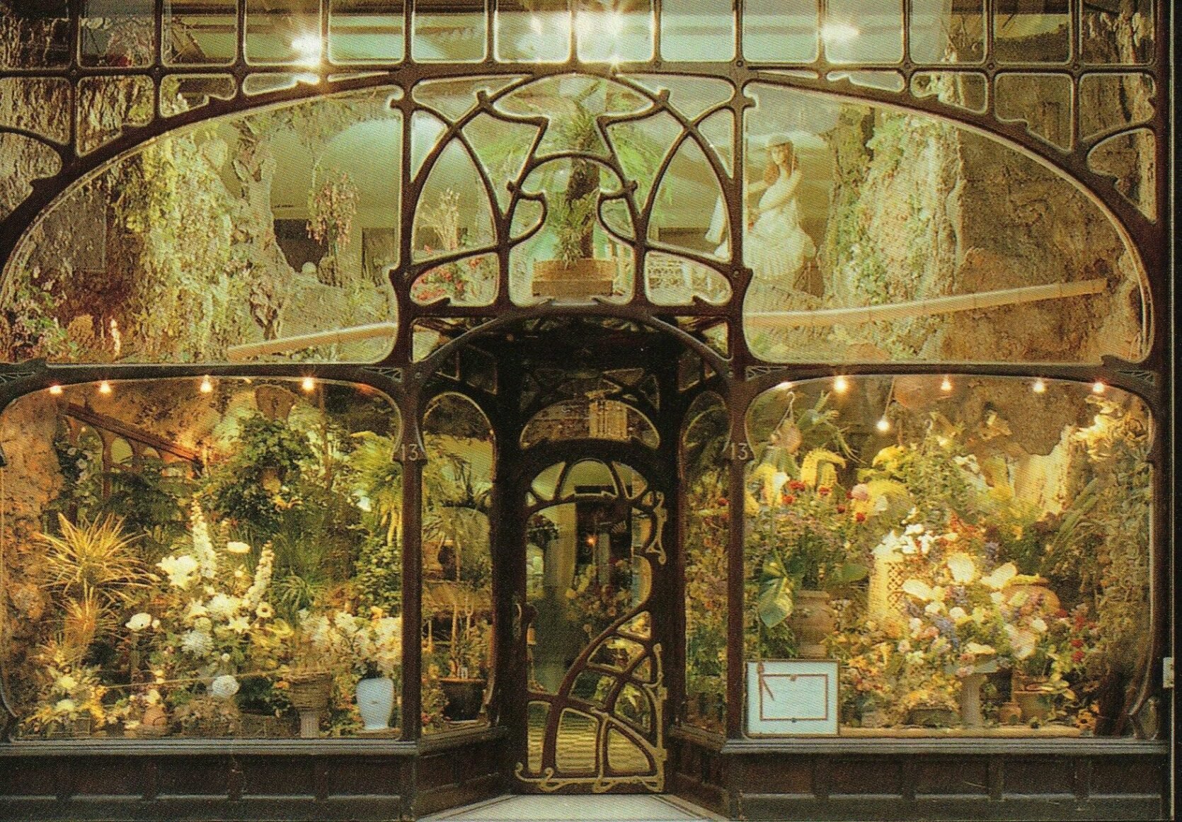
WHEW. I love this story! This 1896 shopfront in Brussels sat abandoned for years before a florist named Daniel Ost was like, “hey, I’m going to fix this.” And, I mean, MISSION ACCOMPLISHED. Box checked. I can’t really think of a more idyllic setting, can you? Art Nouveau was really big on embracing art and beauty in everyday life and it just feels fitting and fascinating to see that ethos celebrated and maintained nearly 130 years later. (Also, word on the street is that the Belgian royal family gets their flowers here, which is pretty neat.) OKAY. Now that we know what we’re looking at, buckle up, pals – I’m about to walk you through a few of my favorite nouveau architectural features…starting with entrances, OF COURSE 🙂
Doors

Let me set the scene: this residence (29 Avenue Rapp, in case you want to add it to your bucket list) is a 10 minute jaunt from the Eiffel Tower. It was built in 1901 and the home was super controversial at the time – turns out that a lot of folks in the neighborhood weren’t super jazzed about a seven-story building covered with partially and/or fully nude figures – but it actually ended up winning an award for the city’s most beautiful façade later that year, so things worked out. This is actually still an occupied apartment building – like, can you believe people get to LIVE here?! UNREAL.
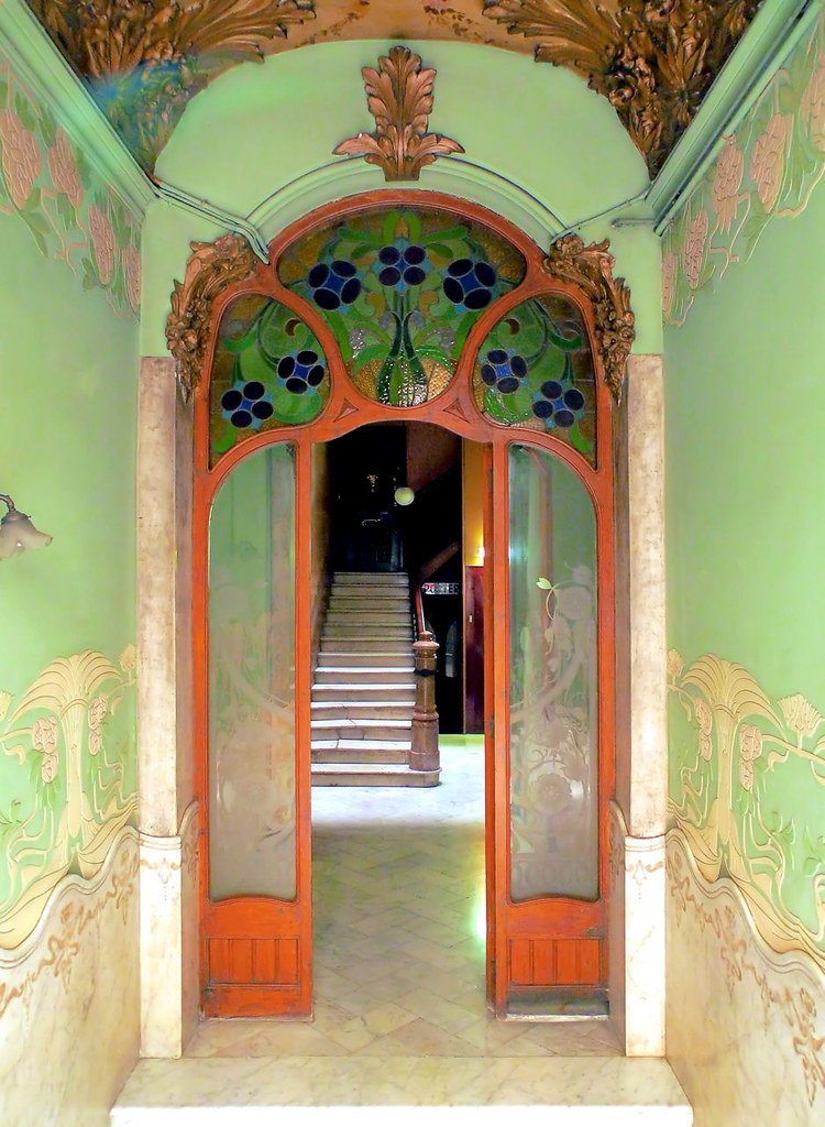
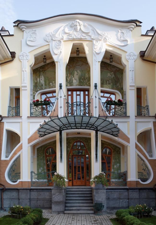
There’s just something about these entries that’s freakin’ magical, right? That door on the left is located in Barcelona. I know it’s hard to tell from this angle, but even the glass is etched! This saturated palette is unbelievable, too. (Who knew pistachio, cobalt, and hot orange could look so good in such a tight space? If you’re in need of some color inspiration, I highly recommend searching for “art nouveau interiors” on Pinterest – so many fresh and unexpected combinations!)
And get ready to have your mind blown: this home on the right is a NEW(…-ish) CONSTRUCTION. Take a minute and scroll down through all of the shots of the interior and exterior right here – everything in this home has maxed out form AND function. It’s all decorative without being super austere or intimidatingly formal – like, there’s a certain amount of fun that’s imbued by this architecture style, if that makes sense. I’m FASCINATED.
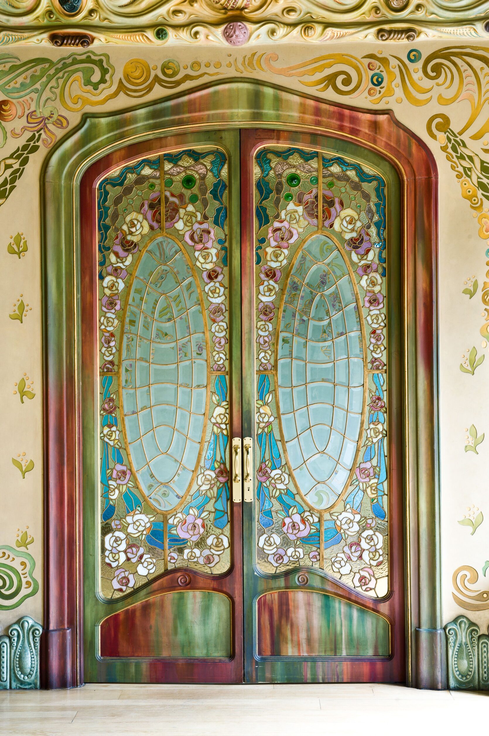
GAH. Another Barcelona gem, guys! This one is the Casa Comalat and it’s the kind of thing Disney princess dreams are made of. Every single thing in this photo was so thoughtfully designed – the floor moulding! The gradients on the doors and casing! That stained glass! The wall treatment! That ceiling moulding! And do you see that super thin gilded line on all of those recessed cutouts on the door? MASTERFUL. I love old houses, guys!!!
Windows + Floors
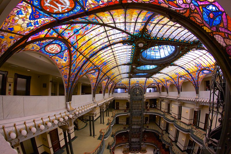
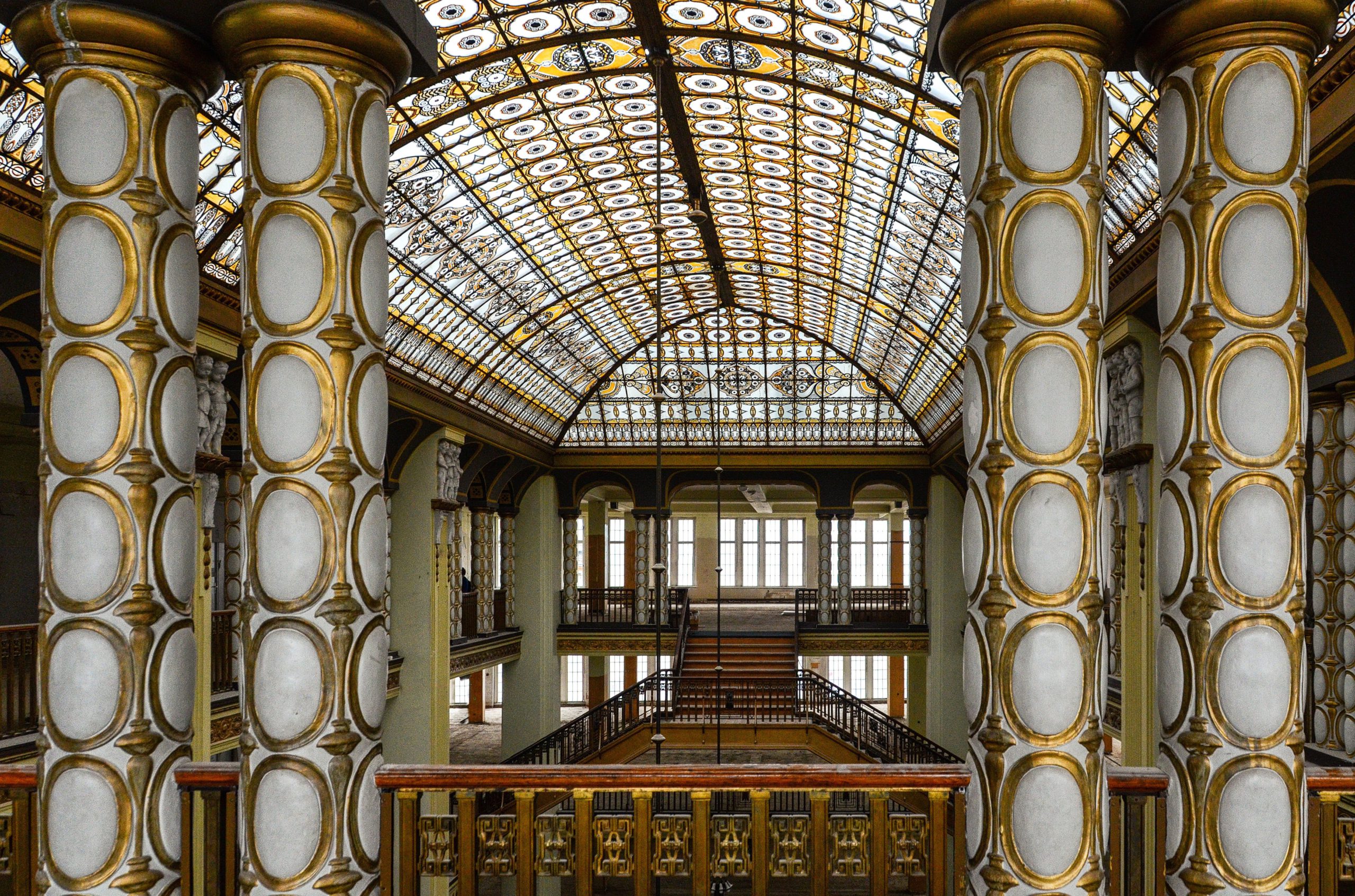
Next up: ALL TYPES OF WINDOWS. This building on the left is in the heart of Mexico City – it was actually constructed in 1899 as a department store (gotta say, probably a good thing stores no longer look like this becuse I would ~bankrupt~ myself), but it’s now the site of the Gran Hotel. The ceiling was actually imported from France (!!!) and that big tube back there was the first iron and concrete elevator in Mexico City, which is SO FREAKIN’ COOL. Added bonus: only big nerds like me (and maybe you?) are THIS excited about imported Tiffany ceilings, so there’s not a ton of hype around the hotel and it’s pretty shockingly affordable. SHOULD WE ALL GO???
And if that formerly-abandoned department store on the right looks familiar, it’s because it’s actually the real-life set of The Grand Budapest Hotel. (Get some glimpses in the trailer right here – the transformation is pretty incredible.) Fun personal fact: I told the man I have a huuuuge crush on that I was gonna be blogging about Art Nouveau architecture and HE was the person who actually flagged this location for me – is this a green flag or the world’s GREENEST flag?? That’s keeper material, right?!
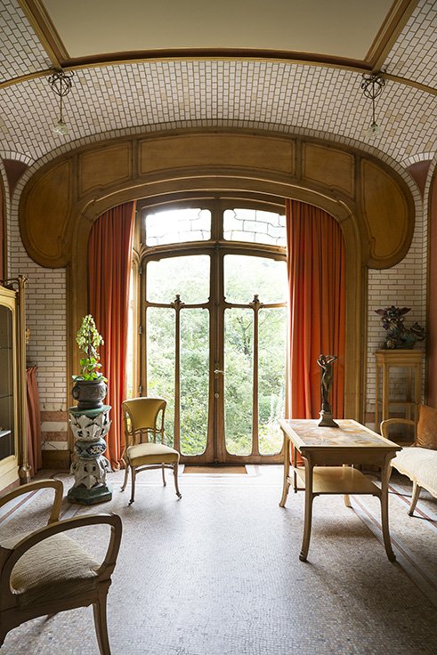
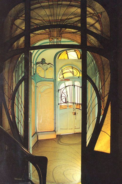
OKAY, OKAY, OKAY. BACK ON TRACK. Let’s look at some more windows, yeah? And while we’re at it, maybe we’ll stare at some of these painstakingly detailed mosaic tile floors, too. This space on the left is actually in the Horta Museum in Brussels – remember, he’s he guy who started this whole movement – and the craftsmanship in this space is straight-up astonishing. The window shape is so good! The built-in space for curtains! The symmetry! The curved AND tiled walls! This puts all of our 2020-era arches to shame, TBH.
The home on the right is the Maison Coilliot, which is about an hour and a half outside of Brussels (and 2 and a half hours from Paris, if you’re planning on embarking upon a European Art Nouveau tour). It’s pretty famous for its exterior – part of it is made from ENAMELED LAVA, GUYS!!! – but I just love this entryway vestibule and these interior windows. Have you ever seen a space look so sparse and so finished all at once? IT’S INCREDIBLE.
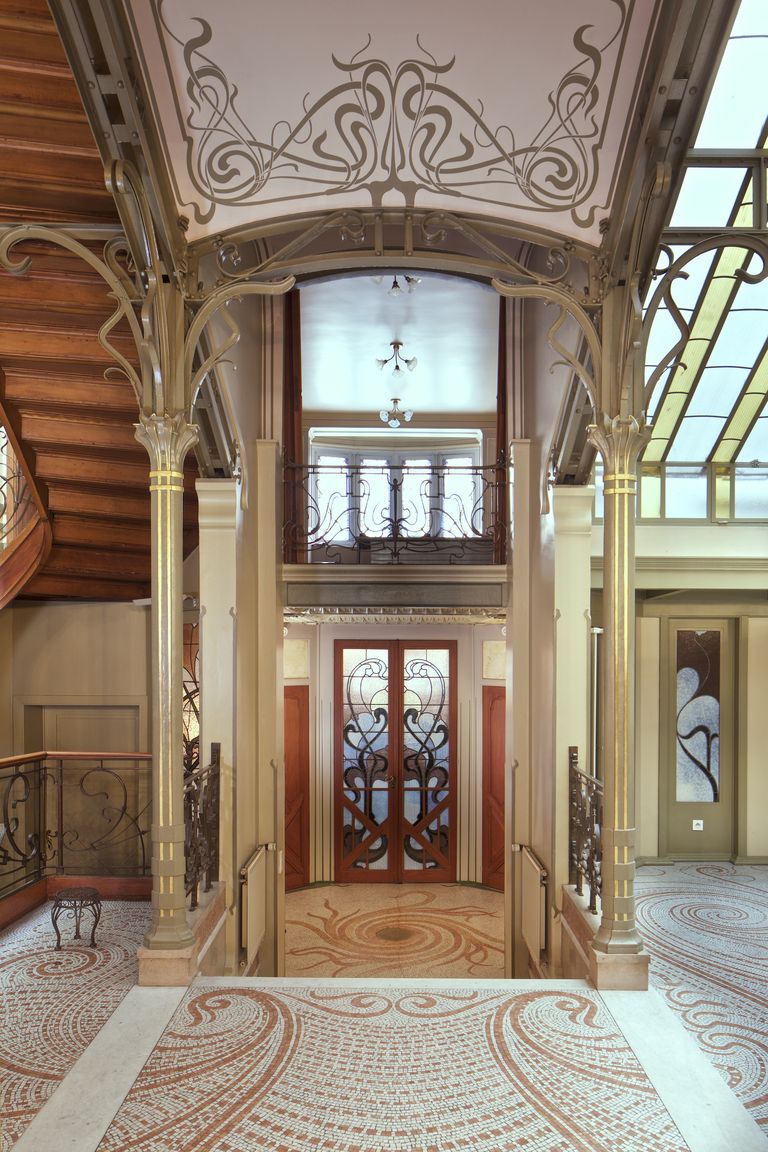
If you’re SUPER eagle eyed, you may recognize that mosaic flooring on the left – this is actually the entryway to Hotel Tassel, which we all (hopefully) freaked out over earlier. It’s really fascinating to me that four pretty definitively different windows (one window on the bottom right, the door in the center, one window up top, and that stained glass ceiling above!) all work together so well – here’s to finding some mixing and matching inspiration in the weirdest places, yeah? 🙂
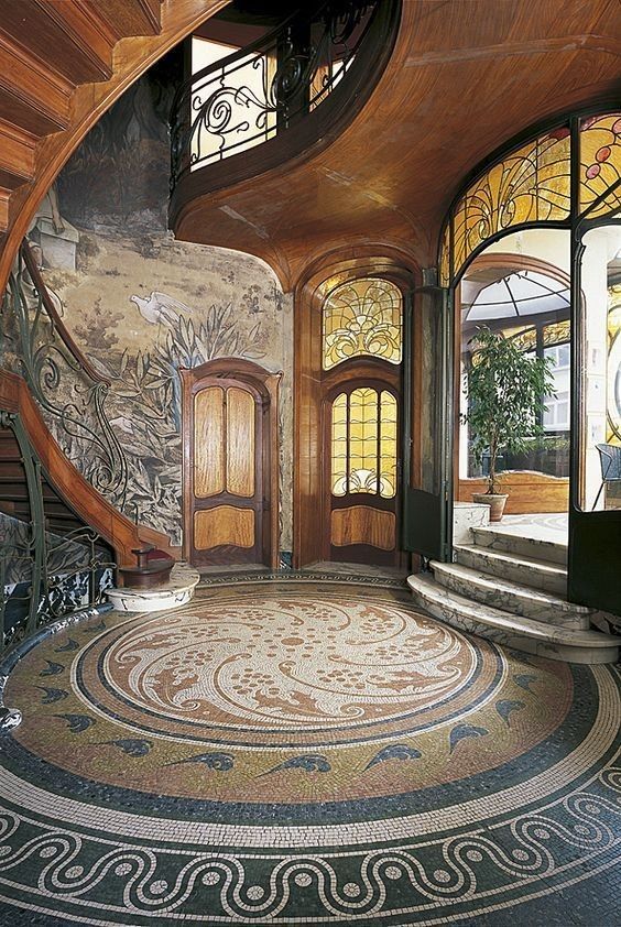
BUT OH MAN. This space on the right is the entryway to the Hotel Hannon in Brussels, which is currently gearing up to reopen to the public as a museum. (Hooray!!!) I love this home because there is SO much going on that still feels kinda relevant – like, get a load of that SUPER veined marble on the steps!! That’s on trend, right?! It’s just so fun and maximalist without being overwhelming. (“Where am I going to put a pattern? Oh, uh, literally every possible place,” – Brunfaut when designing this home, maybe.)
Special Stairs + Iron
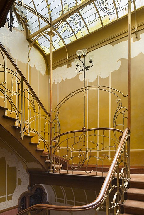
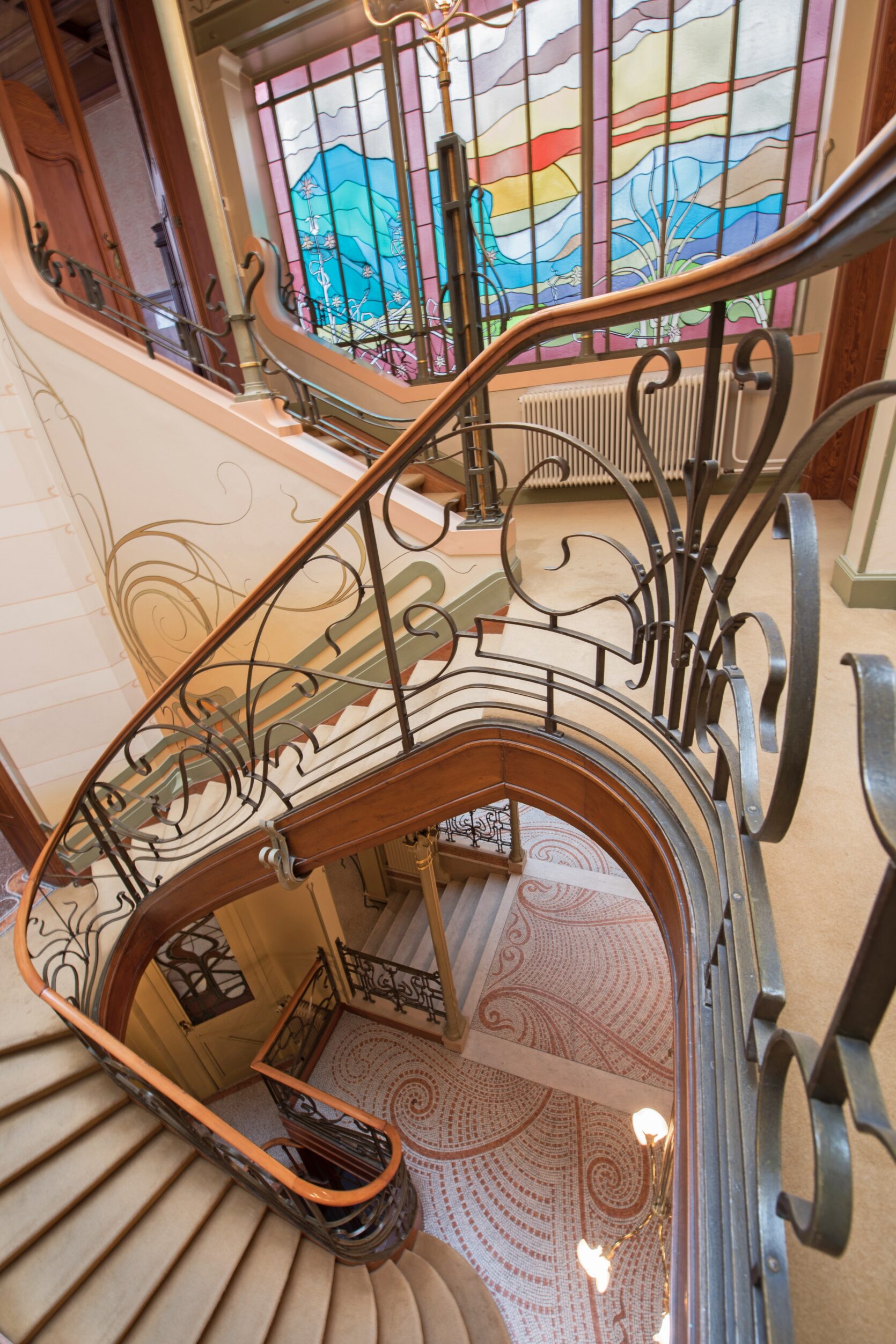
We’re finally putting pieces together – are you starting to clock some of these repeated design elements? (Because if not, I’m always happy to scream some more about stained glass windows and tile floors!!!) Both of these were also designed by Horta – the left is at his museum; the right is a smidge up the stairs from the earlier shot we just looked at! – and they each still feel fresh and unexpected and delightful. Art Nouveau is big on the whole “bring the outdoors inside!” messaging and the use of twisting iron REALLY captures that vibe, don’t you think?
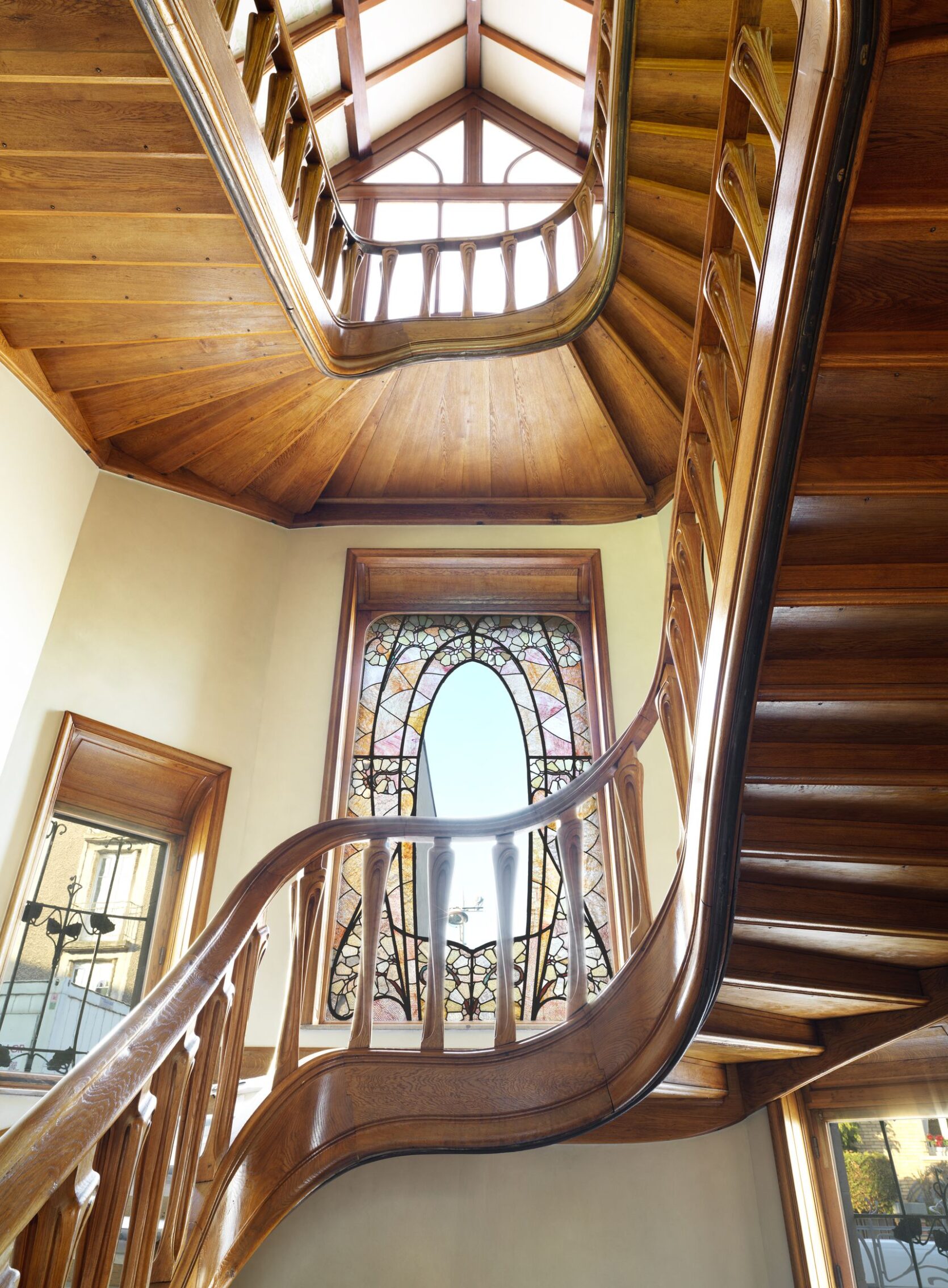
THIS MAKES ME WANT TO CRY. I cannot be the only person who goes completely bonkers when looking at a curved wooden staircase and this one is SO, SO, SO GOOD. Look at the way the balusters are curved inwards a little! Look at how even the bottom of the stairs have been finished with care! This home is called Villa Majorelle and it was built in 1902 as a dual residence and showroom for Louis Majorelle, who was a super cool furniture maker at the time. This dude was pioneering WFH abooooout 120 years ahead of the curve while living with the world’s most beautiful staircase, guys. I’M INTO IT.
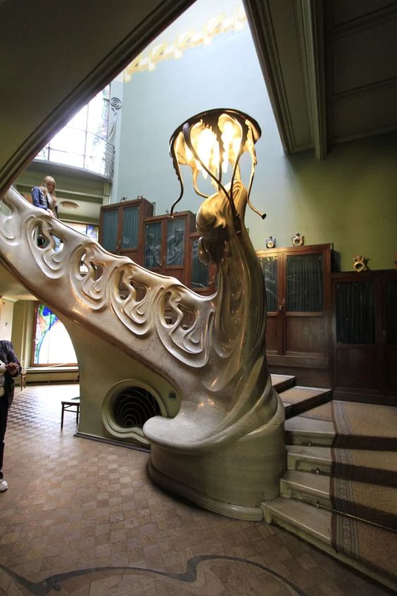
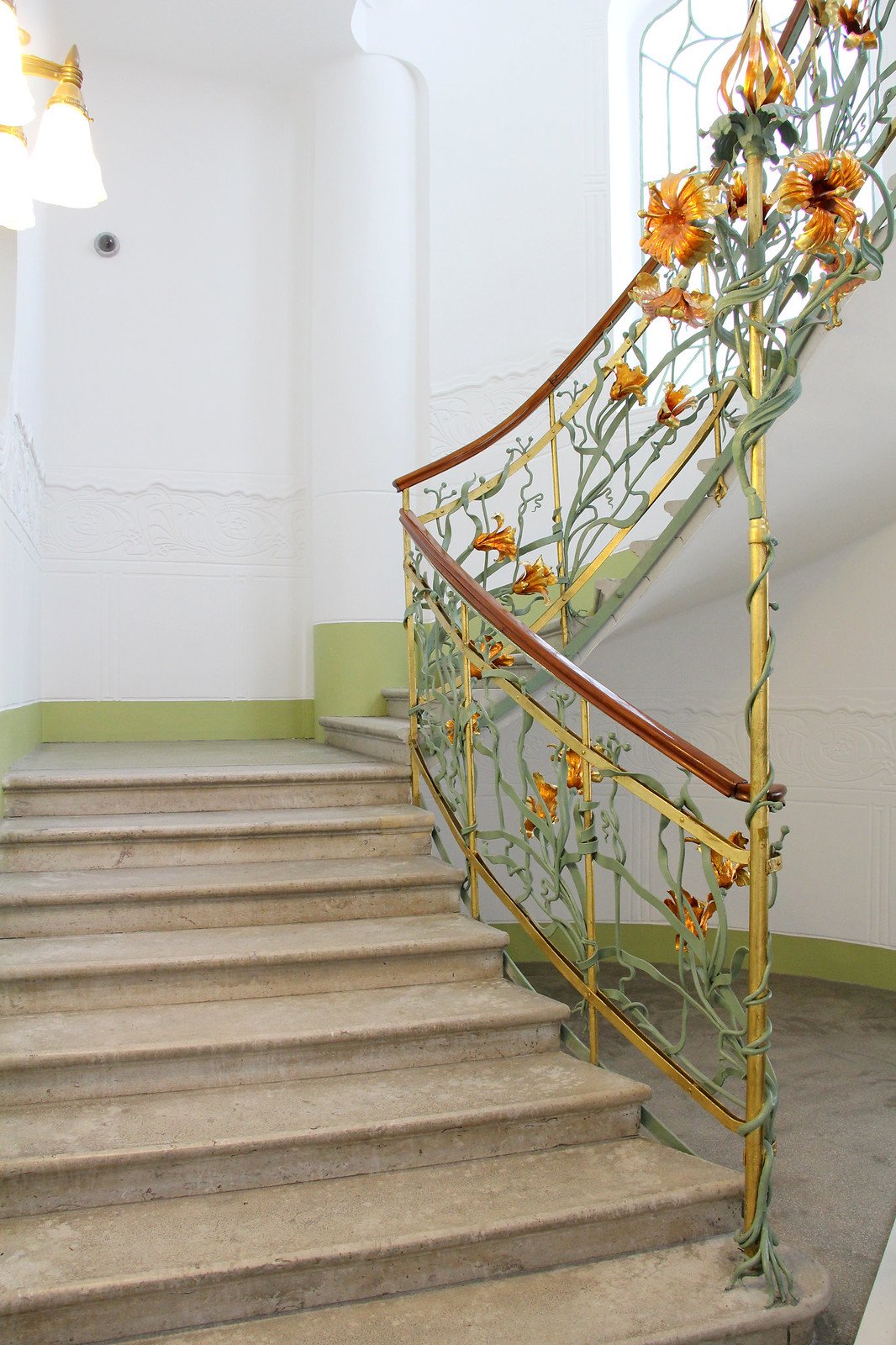
WHO NEEDS A NEWEL POST? I’d like a newel art installation, PLEASE. I’ve always been partial to the building on the left – it’s the Gorky Museum now – because the architect was TWENTY SIX when he built it and everyone was like, “uh, this is nice, but it doesn’t really work as a house and it makes no sense.” But look at it now, baby!!! Iconic. The theme of this staircase is ~ocean~ (God, I love architecture with a theme!!!) and that’s a Medusa x Jellyfish lamp at the bottom. (Collab of the century, I think.)
The stairway on the right is so dreamy, too. (It’s like a tole chandelier come to life!) These stairs are located in the Reök Palace in Hungary and if you have 3 minutes to spare, I cannot recommend this quick little video tour enough. (When I broke my back in late 2020, I was pretty justifiably freaking out because I couldn’t move my legs. My doctors doped me up to get me to calm down, but they should have just played that video on repeat. Emotional Xanax, if you will. It’s SO soothing.)
Fireplaces
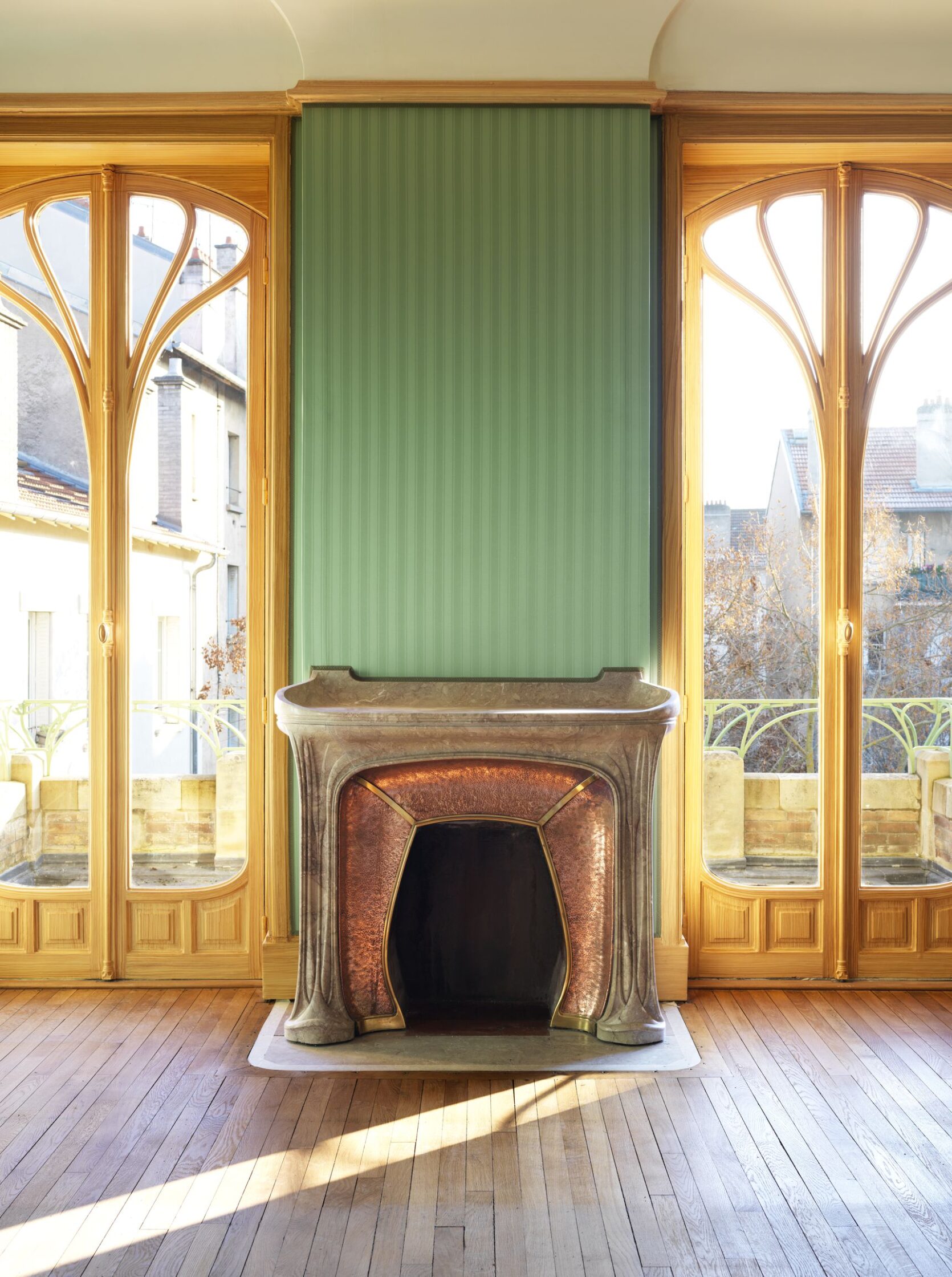
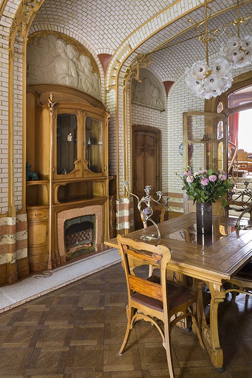
We’ve seen these houses before!!! (Any guesses before I remind you?)
This room on the left is in the Villa Majorelle – yeah, the showroom/house combo – and it actually feels kind of livable and modern, right? It’s still a little out there, but it doesn’t feel as tied to the period as some of the other spaces we’ve looked at. Like, I could see someone designing something inspired by this in a 2022 renovation, couldn’t you? The fireplace is so whimsical without being childish or over the top – SUCH a great balance.
And yeah, the space on the right *is* still in the Horta Museum. That tiling just gets more and more astonishing and impressive, doesn’t it? Check out that built in, though – that little fireplace at the bottom is SO SPECIAL. I love how the stone surround is also used in that stripe around the lower perimeter of the room – it all just feels so cohesive and thought-out and bespoke and AHHHH!!! JUST WONDERFUL. (Let’s all seriously go to Brussels after we check out that affordable hotel in Mexico City.)
Carved Woods
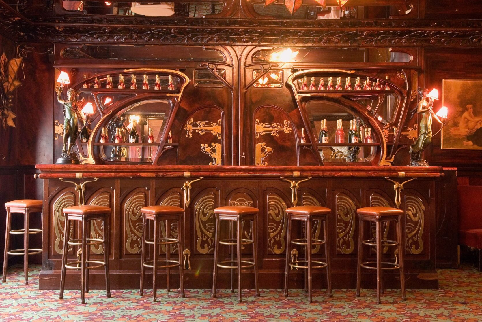
Last but not least, I just really wanted to show you two of these SUBLIME examples of woodcarving and classic Art Nouveau shapes. This shot is from Maxim’s in Paris (fun fact: Wolfgang Puck worked here!) and in the mid-1900s, it was the most famous restaurant in the world. Today, there’s a little museum upstairs with an even bigger collection of furniture from the late 1890s-early 1910s, too. (And if you’re in the mood to live vicariously through others, the photos on the TripAdvisor page are enviable.)
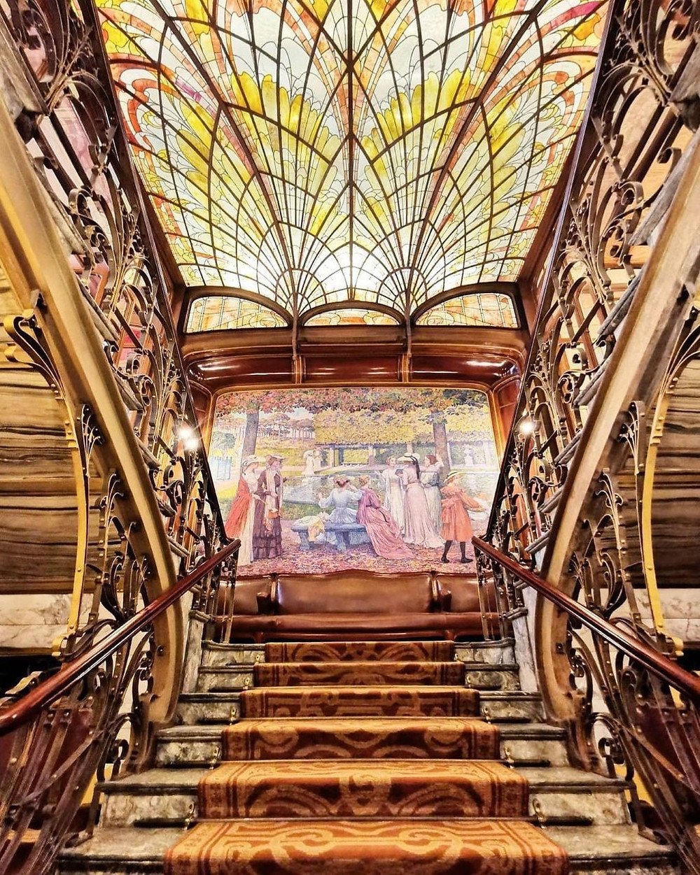
And now, I gotta leave you with ONE MORE from my boy Horta. This is Hotel Solvay and it kinda has a little bit of everything we talked about, you know? It’s currently a UNESCO heritage site (along with my favorite, Hotel Tassel!) and it actually just started accepting visitors twice per week, which is AWESOME. At the time of its construction, the owner of this home was incredibly wealthy. He gave Horta total design freedom, so my favorite architect went pretty HAM on the creative process – he created everything from the doorbells (!!!) to the furniture – and the whole place is decked out with like, tropical woods and onyx and some of the most incredible marble flooring I’ve ever seen in my LIFE. If you click through on that earlier link, you can actually take a Matterport tour of part of the home (I will confirm that it’s WAY better than taking Matterport tours of 400 square foot teardowns in LA).
THIS CONCLUDES YOUR WORLD TOUR FOR TODAY. I said this to Em on a call last week, but I’ll say it again here: I still can’t believe I get to play show-and-tell every week on a professional level. (And to be clear, I am fully aware that I am also approaching the nuances and intricacies of architectural discussion with about as much knowledge as a kindergartner participating in show-and-tell!!!) Hope you liked ogling with me – let’s do it again sometime??? xx
PS. This video is visually awesome for all you Gaudi fans. I’ve been to Barcelona and will concede that he does live up to the hype. And if I haven’t fried your brain, this video is awesome if you’re interested in the engineering behind Sagrada Familia. HAVE A GOOD WEDNESDAY!
THIS POST WAS ORIGINALLY PUBLISHED HERE.


