Whoever thought wall-to-wall carpet in a bathroom was a good idea, was well, I don’t know what they could possibly have been thinking. This bathroom bummed them out more than any other – a room I actually never even saw because guests didn’t really go downstairs. Once they decided to renovate and give it a grown-up look, Priscilla (the designer) took the style/architecture of the house (Tudor revival) and designed this to be a budget/modern version that worked well in that style. She did an incredible job – I had almost nothing to do with it except the “I love it’ product approvals and styling the photos. Everything was affordable and ready-made with no major hiccups. But I’ll let Priscilla take it away.
Hi everyone, Priscilla here! I’ve been a long-time reader of the blog and was so excited to get the chance to work on another project with Emily. We originally met via Rejuvenation (I used to work in-store design there) and was leaving to go back to school when she was looking for help on the Portland Project. When she reached out at the start of the pandemic about her best friend’s basement, it was an easy yes. Today I’m excited to share with you the bathroom remodel and get into all the ins and outs of the design process for this space.
THE PROJECT
The house is a 3-story, 1930s Tudor in SW Portland. The top 2 floors have a ton of charm with a lot of the original character intact. The basement, however, was another story. It had gone through a pretty rough renovation in the 70s. Think Graceland cabin but with asbestos tile and carpet in the bathroom (why was this ever a thing?).
Like so many families during the pandemic, the clients were looking for more usable space. While the goal of the renovation was to make the basement more functional for the whole family, they also wanted to carve out a dedicated room for their teen son. During the initial space planning process, we came up with the idea of minimizing the bathroom into the old laundry room footprint. By downsizing the bath, it opened up the space to add in the bedroom they needed.
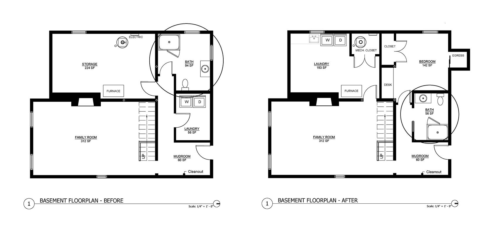
Cavernous and choppy, the original bath was tucked in a back corner of the basement down a hallway. It felt weirdly inaccessible and disconnected from the family room. By reconfiguring the original layout, it provided privacy for the new bedroom and allowed the bathroom to be more centrally located in the space. Double win!
THE DESIGN PROCESS
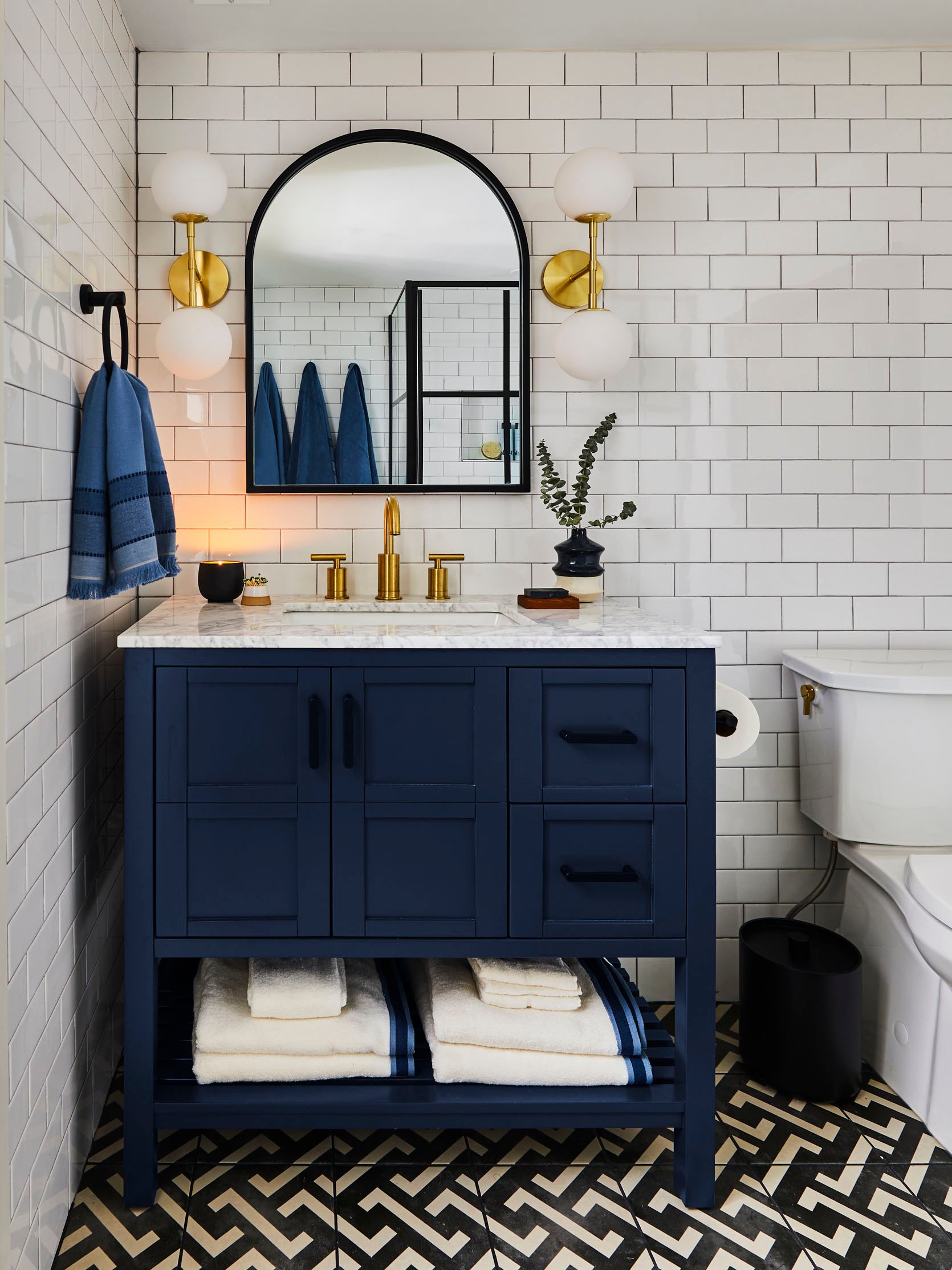
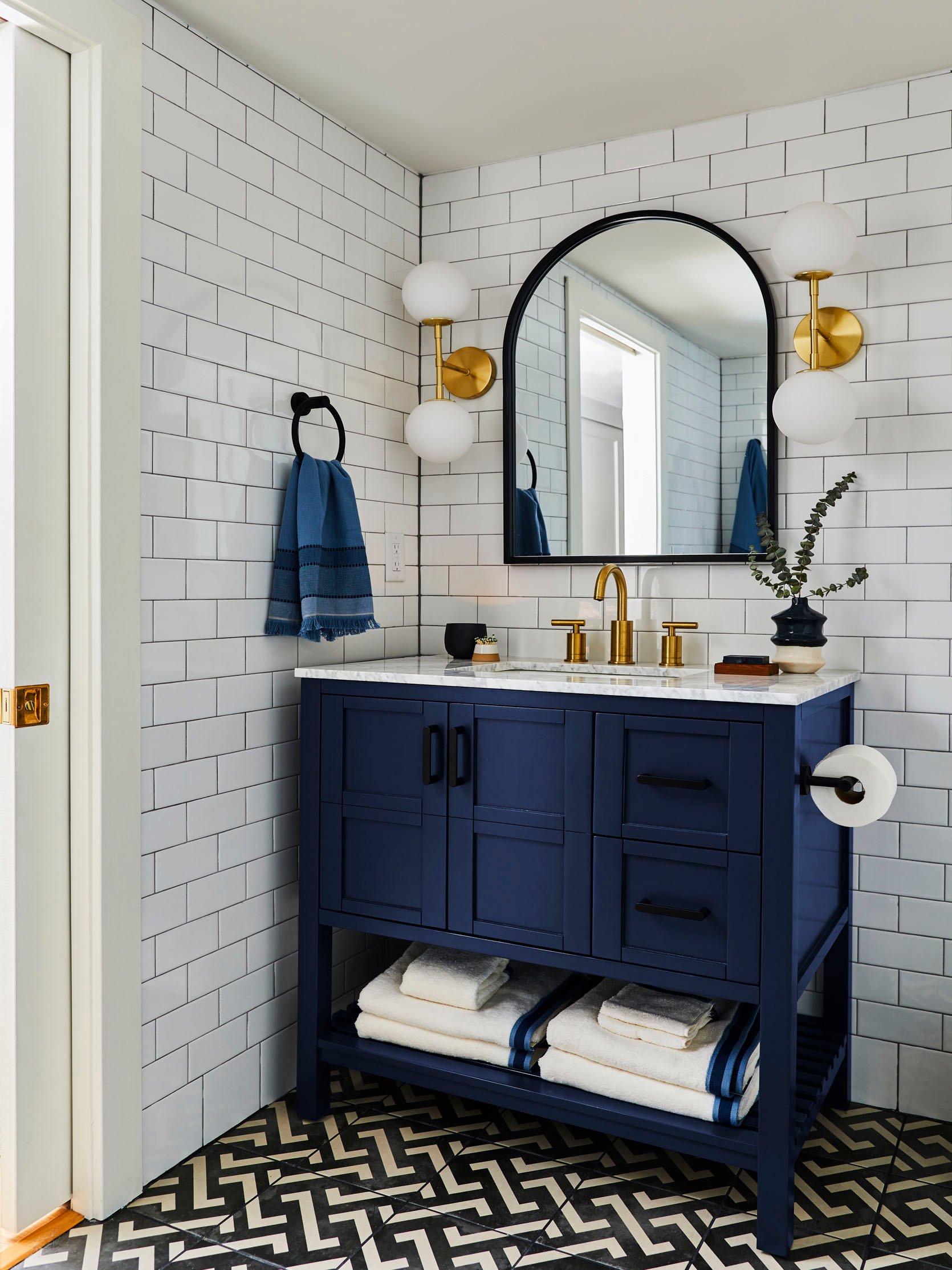
Wall Sconces | Mirror | Faucet | Vanity | Towel Ring
Basements can often be tricky to design, with a lot of mechanical systems overhead and height limitations. This basement was no exception and had a lot of budget-consuming, un-fun tasks that took priority, like waterproofing (we live in Portland, after all), floor leveling, and duct moving. This meant we needed to get creative with the finishes in each space.
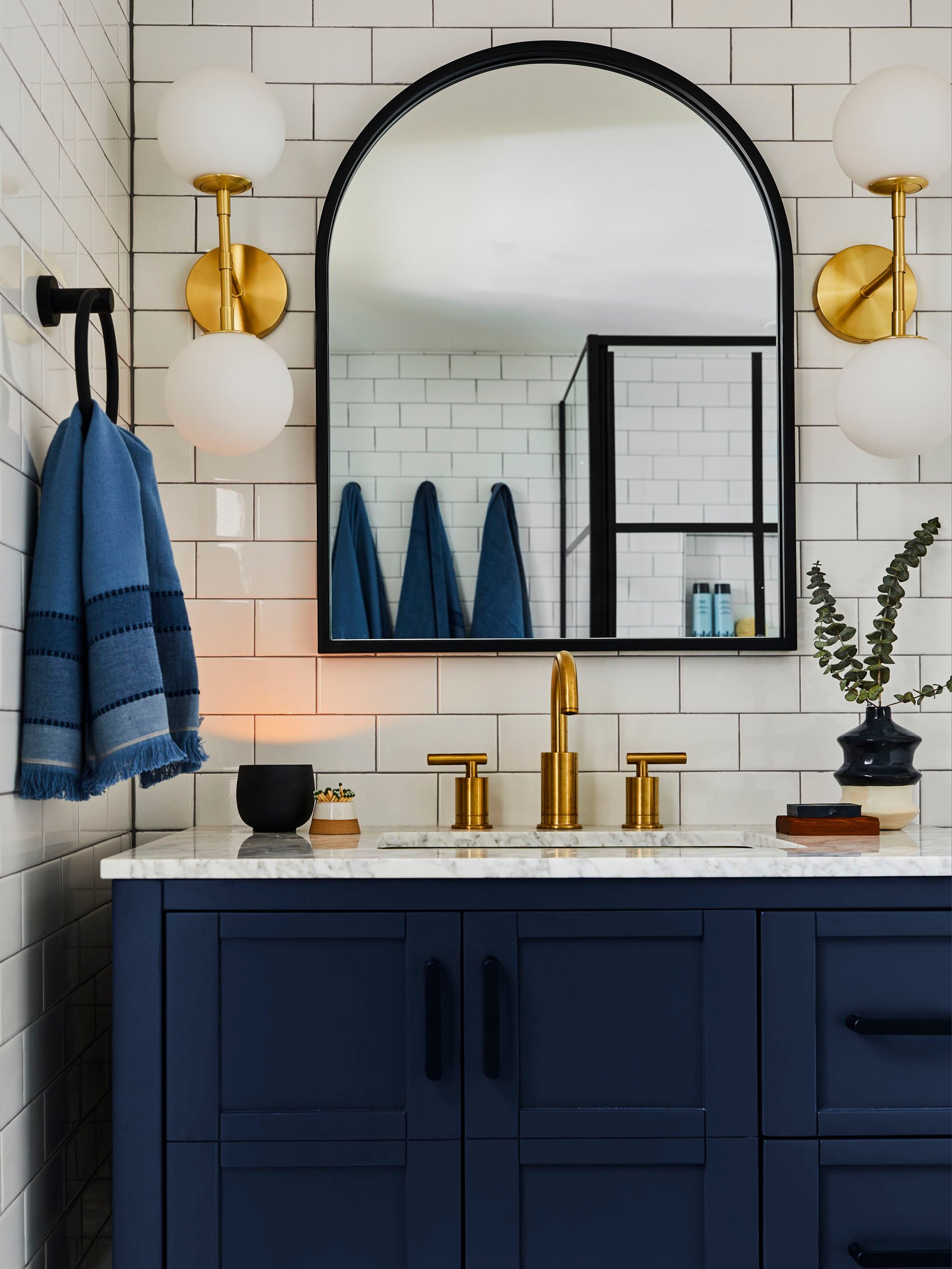
Cabinet Hardware | Hand Towel | Vase | Soap Tray | Match Holder (similar)
With a limited budget, we wanted to find materials that felt high-end without the price tag. Nodding to historic elements while incorporating contemporary details, our goal was to create a bathroom pretty enough for guests, but durable for a teen boy. Our color palette for all the basement spaces was either blue or green (always and forever blue and green for me). Playing off the green mudroom outside the bathroom door, we wanted to contrast it by pulling in soothing blues and neutrals for the bathroom.
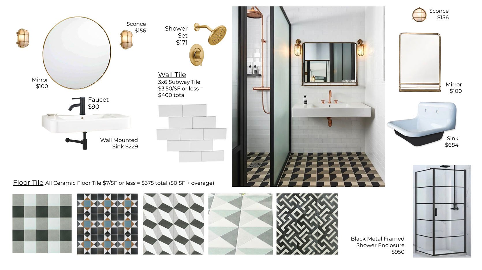
We played with a lot of different options to get the right balance between pattern, white space, and metal finishes. Below are some of the early mood boards and inspiration pics we pulled from. Initial ideas ranged from more nautical/youthful to simple/clean to more traditional. Once we landed on doing wood trim in the mudroom, it helped push us toward fully tiling out the bathroom so the finishes had variety as you moved through the basement.
*Disclaimer on prices: We were designing this at the beginning of the pandemic so pricing is, sadly, different now.
Option 1: Graphic, Playful, Nautical

Option 2: Classic, Simple, Clean Lines
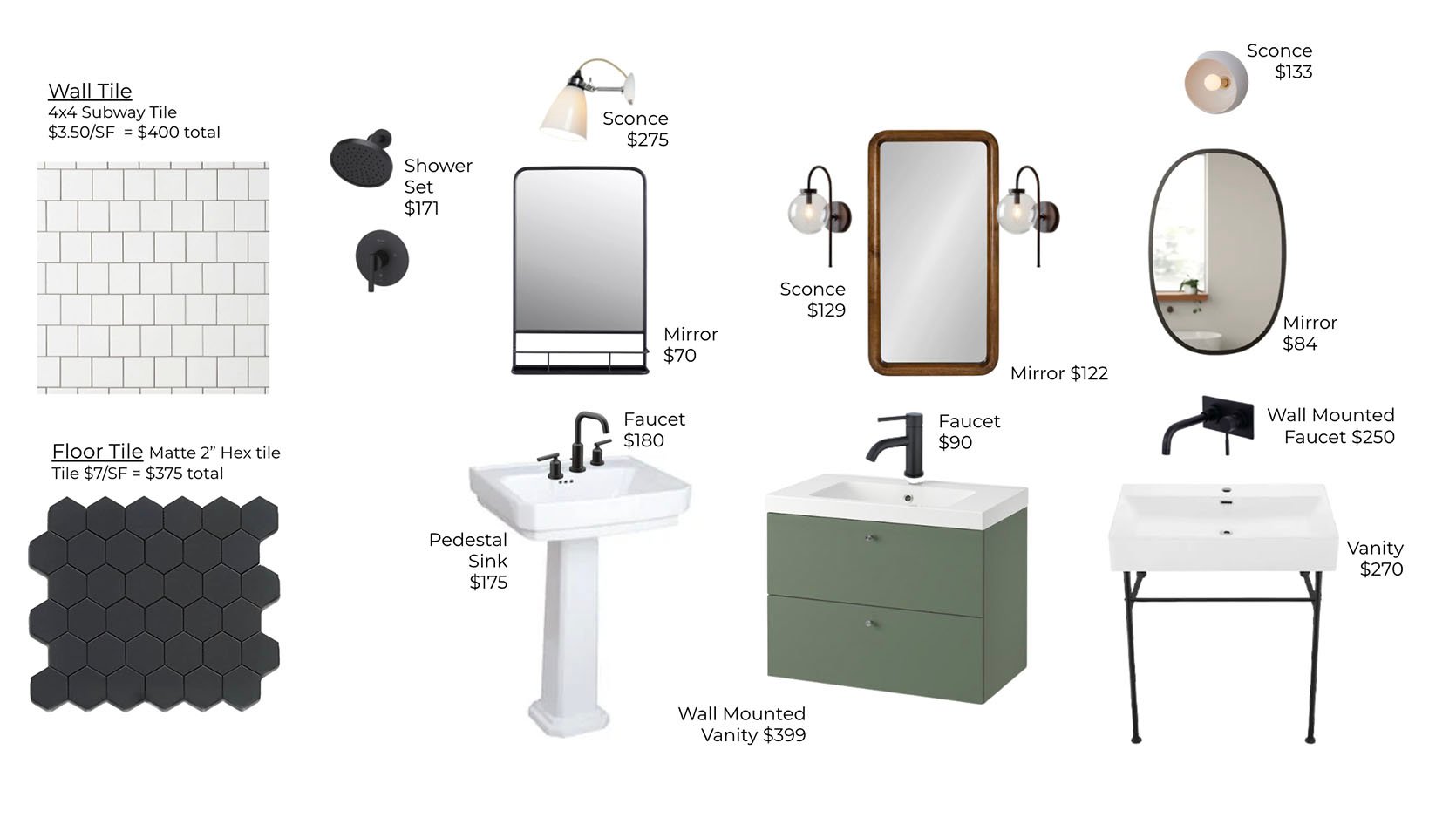
Option 3: Traditional, Tudor
TILE
With no natural light in the space, the idea was to bring in energy with a graphic floor tile. Something to draw your eye down and help distract from the low ceilings. The pattern and strong lines of the tile helped create movement which gave the room a more expansive and open feeling. Utilizing the vertical space on the wall and installing floor-to-ceiling subway tile also helped to give the illusion of a taller ceiling above. The choice of a shiny tile (instead of a more matte option) was intentional to reflect light and create as much warmth as possible.
Floor Tile (sold out-similar) | Wall Tile | Baseboard Tile | Toilet Paper Holder | Bath Towels
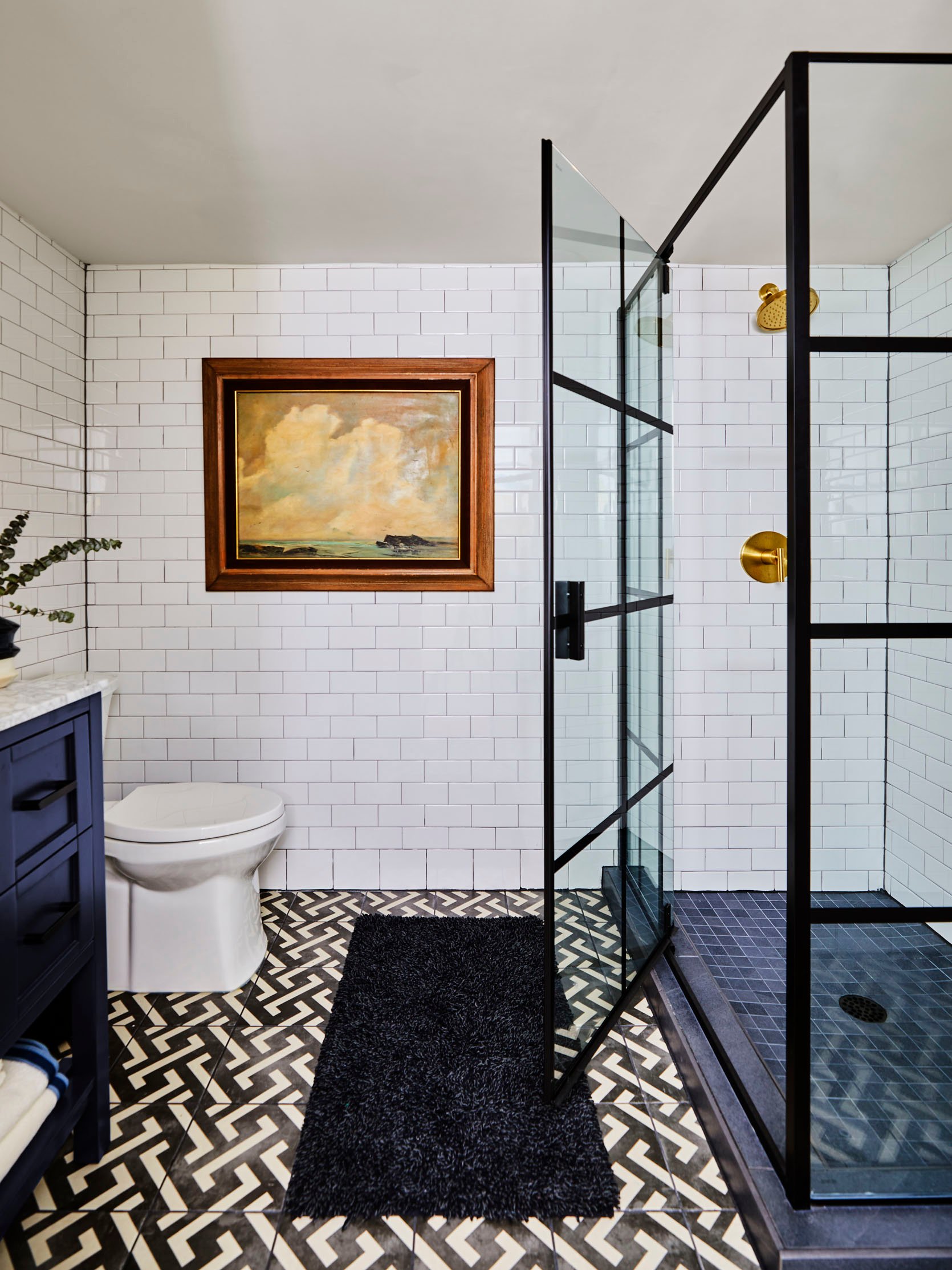
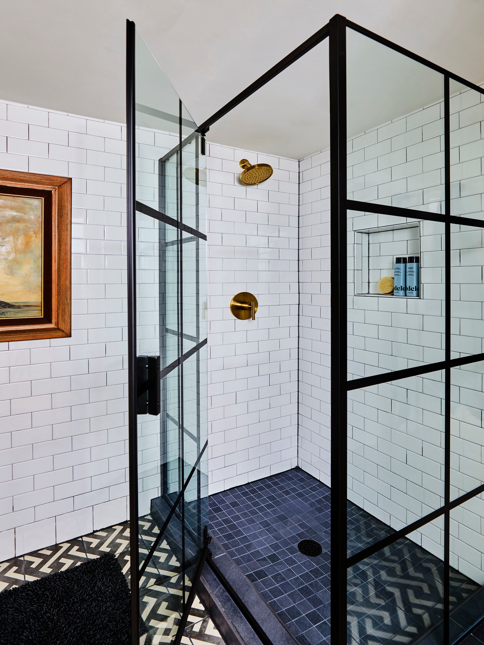
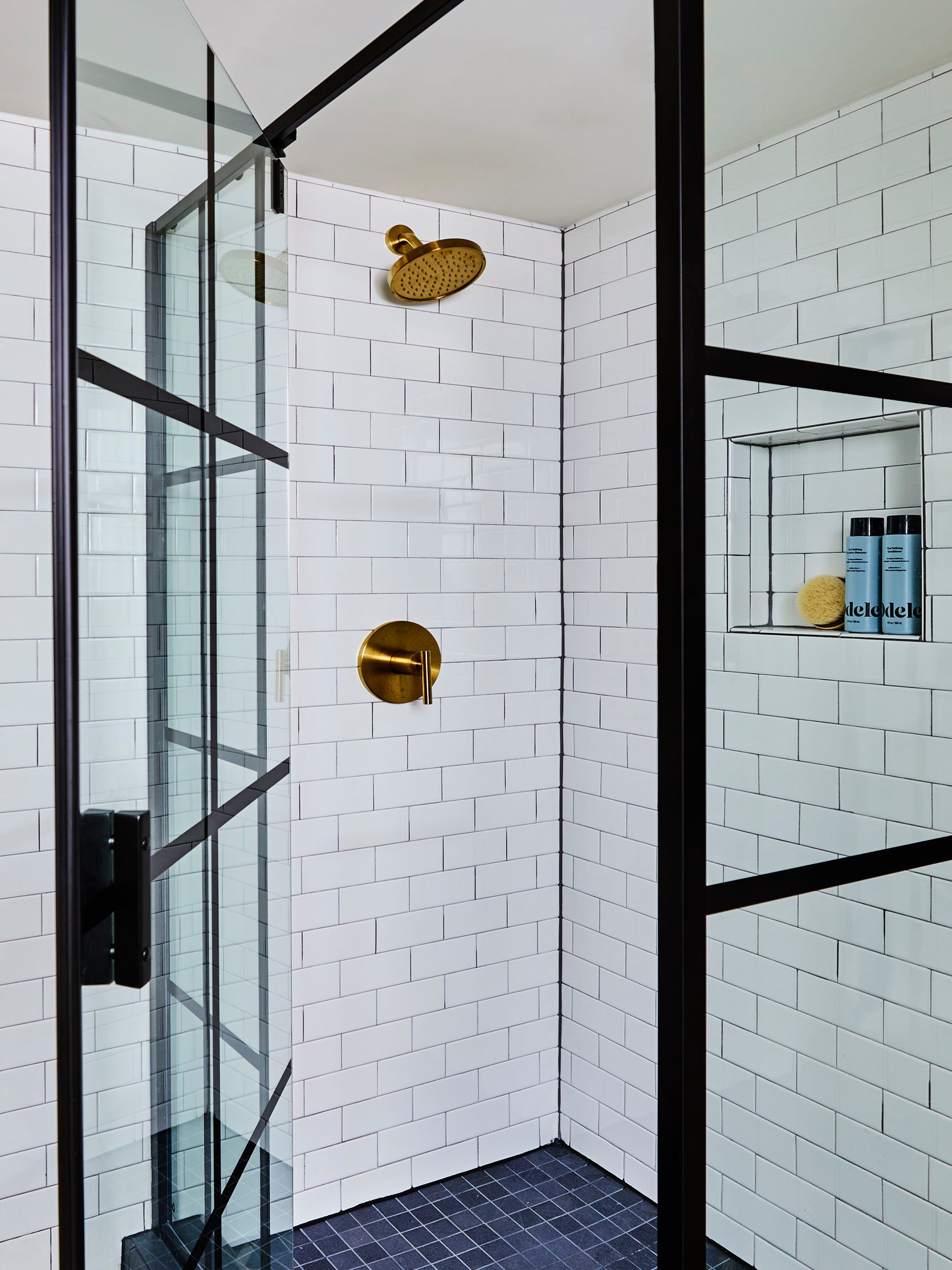
Shower Enclosure | Shower Floor Tile | Curb Tile | Shower Plumbing Fixture
FIXTURES
Part of our cost-saving strategy was to go with ready-made fixtures instead of doing the custom route. We picked a deep navy vanity that came with a Carrera marble top and had much-needed storage…both open and closed. The clients wanted a glass shower so we found this fun enclosure that felt higher end, but less than custom glass would be. We debated between matte black or brass on the plumbing. In the end, we decided to go the brass route just to have those extra pops of warmth. Trying to find low-cost brass plumbing that doesn’t look cheap can be super challenging. We sampled a variety but liked the look of the Pfister Contempra collection the best. I think the key to a good, affordable brass is to stay away from the tones that have a lot of green in them. (They look the cheapest IMO). If you’re designing a teen or kid’s bathroom (or sharing with one), do yourself a favor and install a self-cleaning toilet. We were joking (but not) that it’s the highlight of the space. It’s Kohler’s self-cleaning model and really keeps the bowl super tidy and fresh smelling. Seriously, life-changing:)
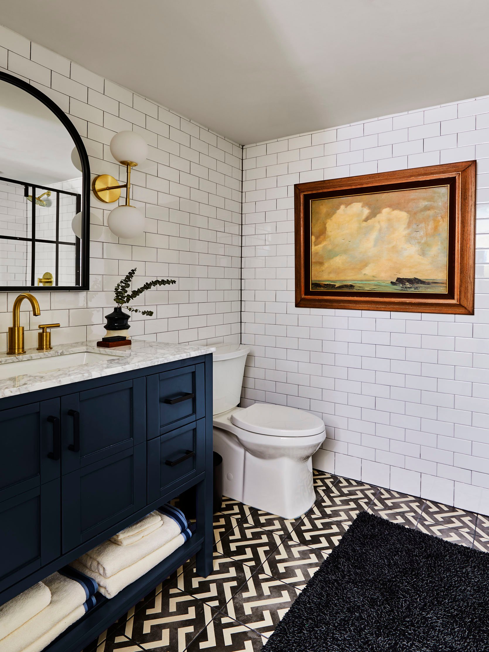
Toilet | Bath Mat | Landscape Painting (vintage)
DECOR
As a nod to the Tudor style, we picked an arched mirror that we found at Target. After trying a couple of different shapes, when we held this one up, it was the clear winner. You can’t go wrong with a classic arch. The client knew she wanted double globe sconces (they give off such great, even light). We sourced these ones from Anthropologie and loved the matte shades and subtle brass finish. The decor developed organically. I found this amazing landscape at Artifact (a fun vintage shop) in Portland. The pop of wood and soothing colors along with Emily’s styling magic pulled it all together.
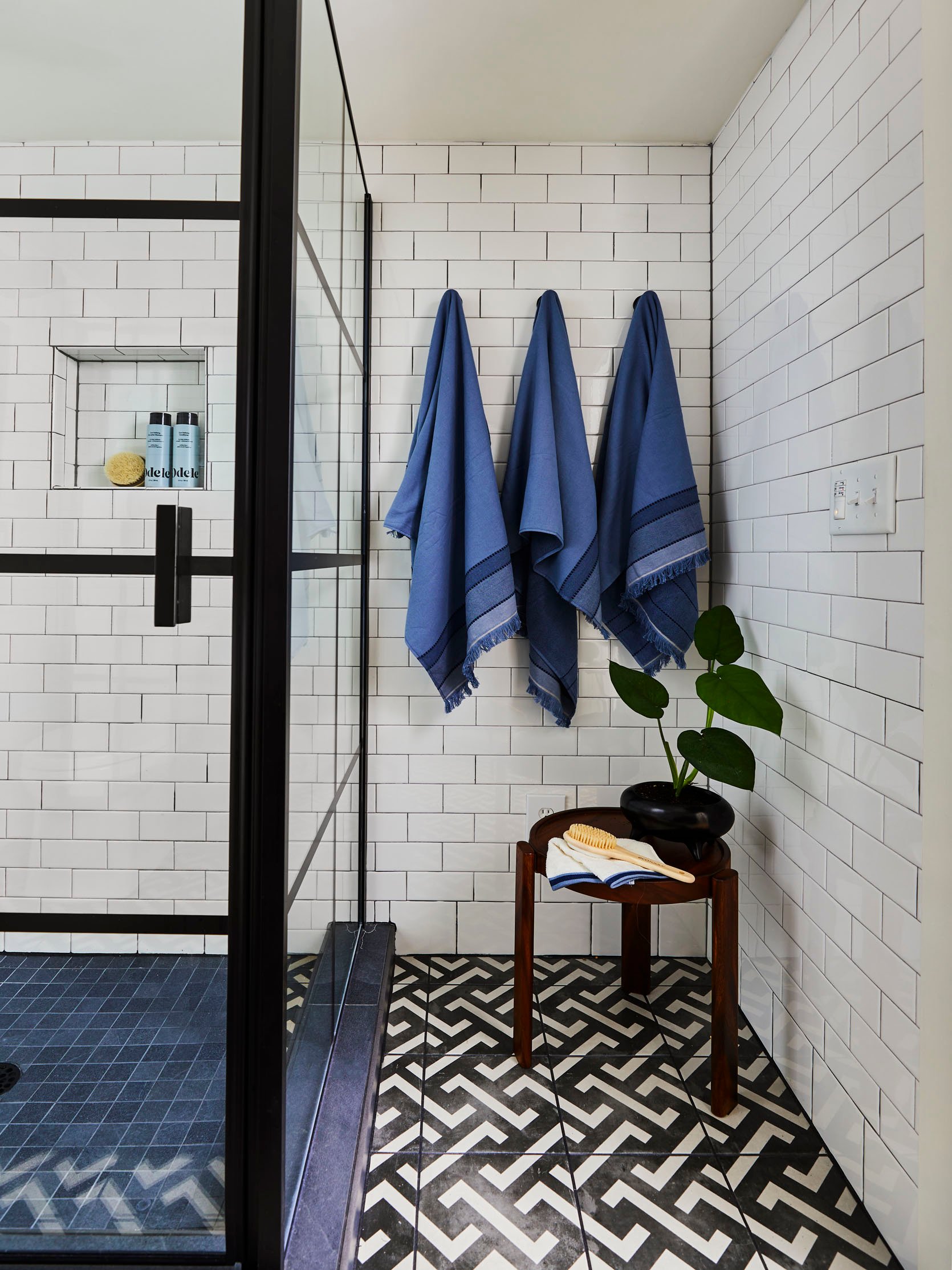
Hooks | Bath Towels | Side Table (sold out)
I hope you enjoyed all the details and behind-the-scenes decisions that went into this space. I’d love to hear your thoughts in the comments. Til next time, lovelies…
*Design by Priscilla Frost
**Styled by Emily Henderson
***Photos by Sara Ligorria-Tramp
THIS POST WAS ORIGINALLY PUBLISHED HERE.


