We bought this house for the property. The vibe. The space. It was magical, and the potential was so easy to visualize. We had plans to remodel the house first, then tackle the yard in phase 2 or 3, but some areas are getting fast-tracked so that we can spend time out there this summer and fall (and because the construction and rain turned it into an absolute mud pit and ruined the hardscape/landscape, so, yeah…). I’ve decided to prioritize the “kitchen patio,” with the hopes of enjoying it by midsummer. But my brain space is tapped out with the renovation/river house/book/blog, so I reached out to Yardzen to see if partnering on this smaller area would be a good fit for them — and frankly, I was very curious if a digital design would even work for a large property with more of a traditional vibe like ours. But they were excited to dive in, and I literally can’t wait to show you what it’s going to look like. Be prepared to be blown away. Let’s start back almost 3 years ago — that’s right, a year BEFORE the pandemic, when we first fell in love with the property.
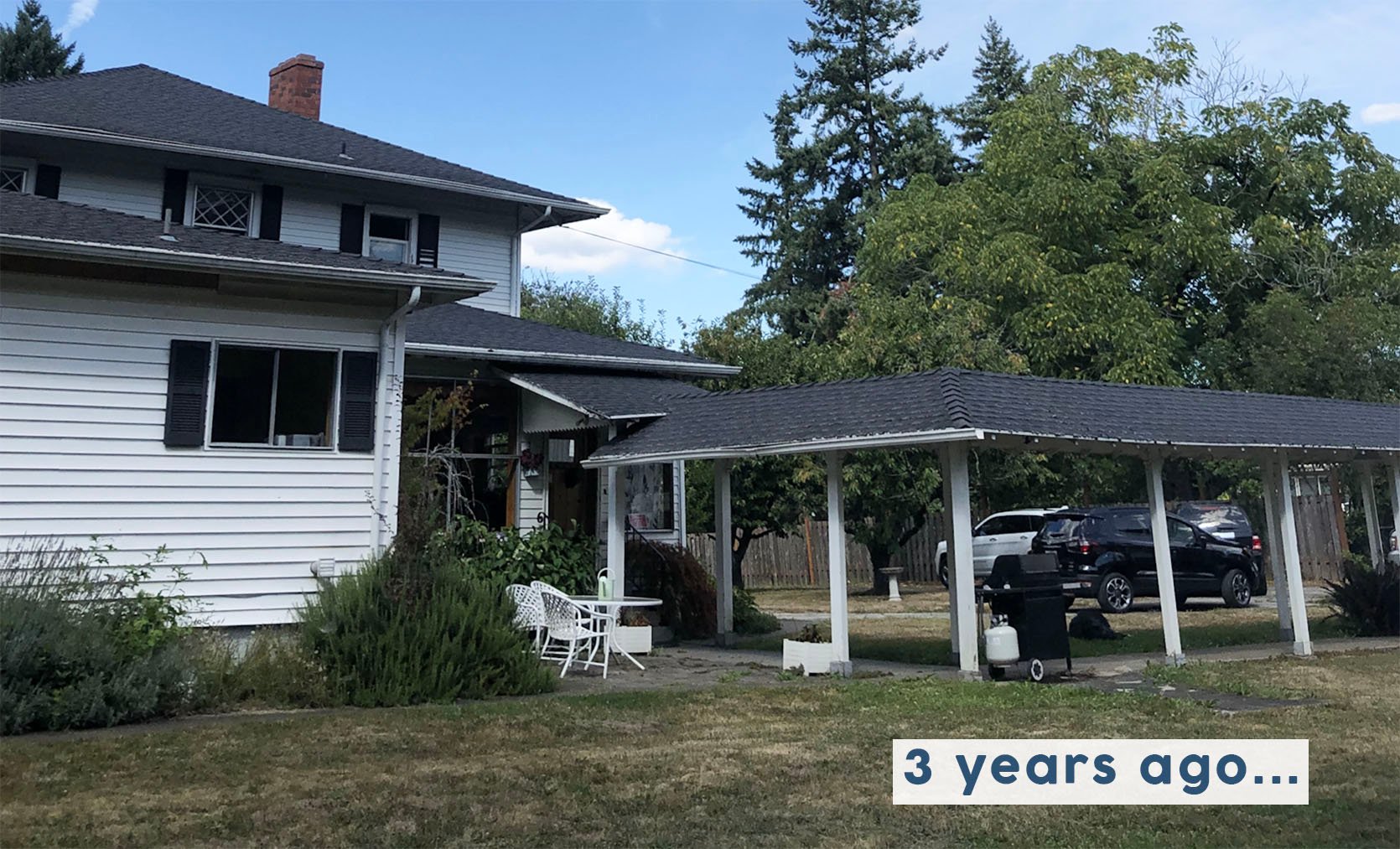
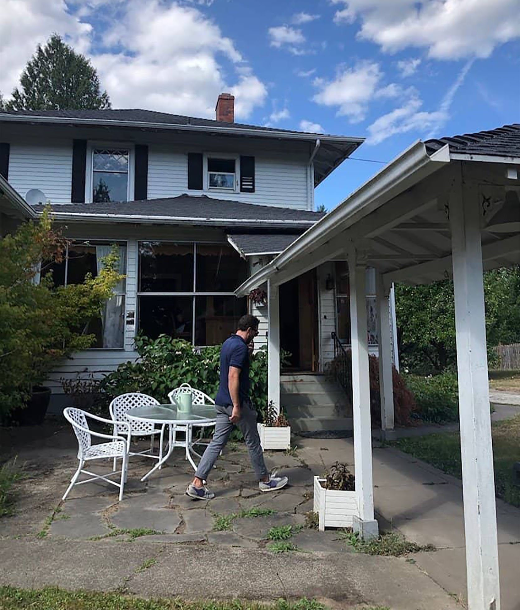
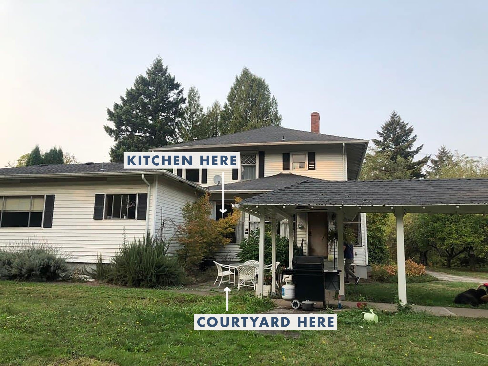
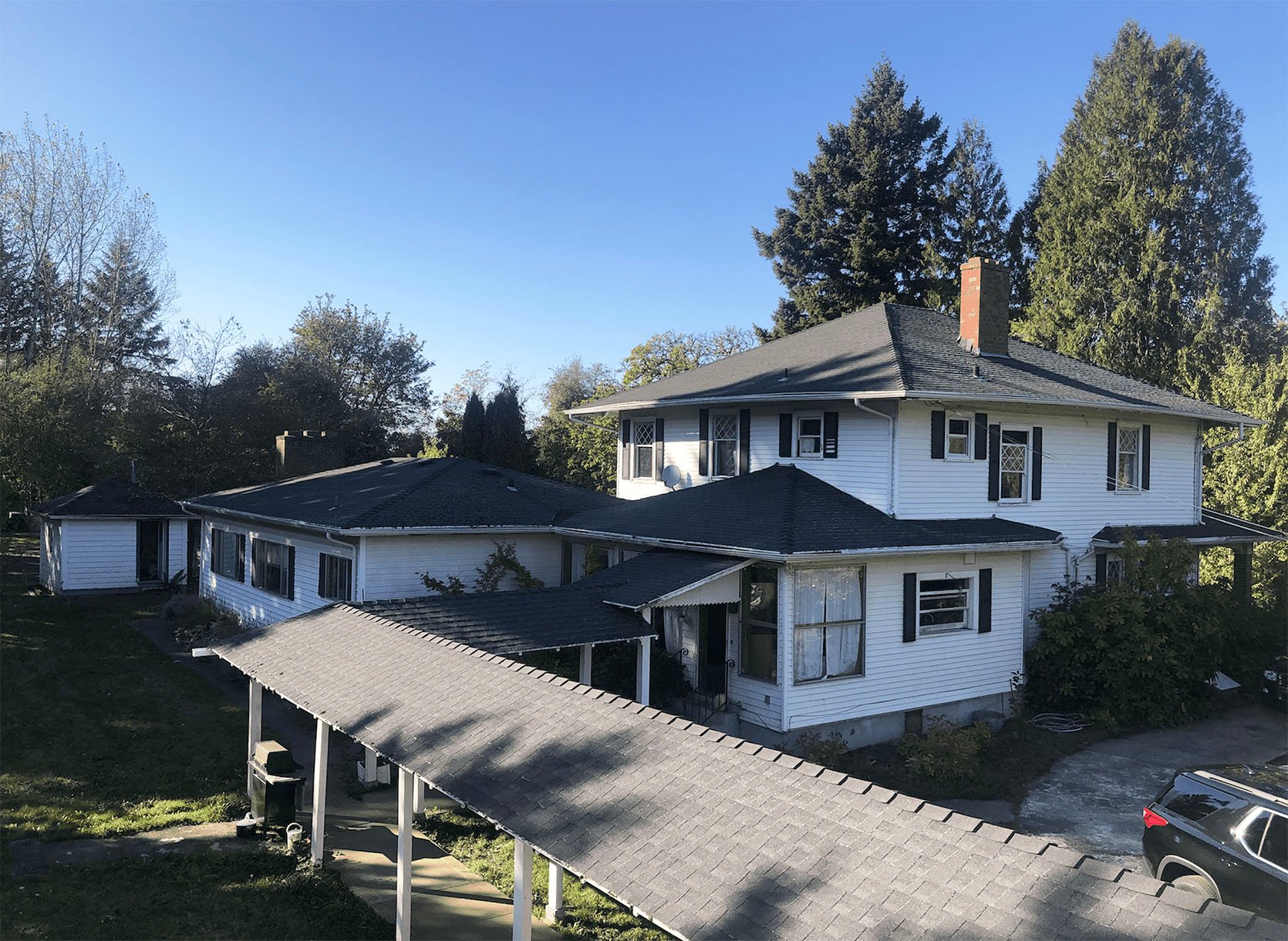
This patio area is right outside the kitchen, and it gets the only afternoon/evening shade on the property, thus it’s likely where we’ll grill and eat dinner while the kids are playing in the yard. The back porch in the summer gets hot, horizontal, western sunlight (we are planting a few trees to combat this), making it less enjoyable to chill…we think. Hard to know until you live there. There will likely be two long picnic tables under the oak tree by the someday-redone sports court, for bigger groups, but this is more for us and possibly another family to enjoy. It’s a sweet little area that feels charming and intimate.
My biggest doubts and questions about working with a digital landscape design team were:
- Can Yardzen do a more traditional/lived-in look? We wanted a more custom/special hardscape plan. Will they get the vibe?
– Answer: You’ll see for yourself below. 🙂 - Will Yardzen know what plants are native to and will thrive in the PNW?
– Answer: Yes. Their design team has a lot of regional knowledge thanks to their on-staff horticulturalists and their plant database. They also have local contractors throughout the United States who help with plant selection. - What happens after you have the plan? How do you execute it?
– Answer: You can do it yourself or hire your own team, but Yardzen also has a really wide network of vetted contractors throughout the United States who will install their designs (including ours — which I’ll tell you about after we finish the project, with a hopefully glowing recommendation). - Can Yardzen do a full property? For instance, would they do the full 3 acres?
– Answer: They really specialize in functional outdoor spaces for front yards and backyards. For the homestead/farm part of our property, we’ve hired Studio Campo to help figure out the meadowscaping, the paddock, etc., with more local hands-on to the design.
So, I’ll bring you along the process of working with Yardzen, a step-by-step of how you’d get your vision (and the details) across through a virtual platform.
STEP 1: TAKE SOME BASIC MEASUREMENTS, VIDEOS, AND PHOTOS TO UPLOAD
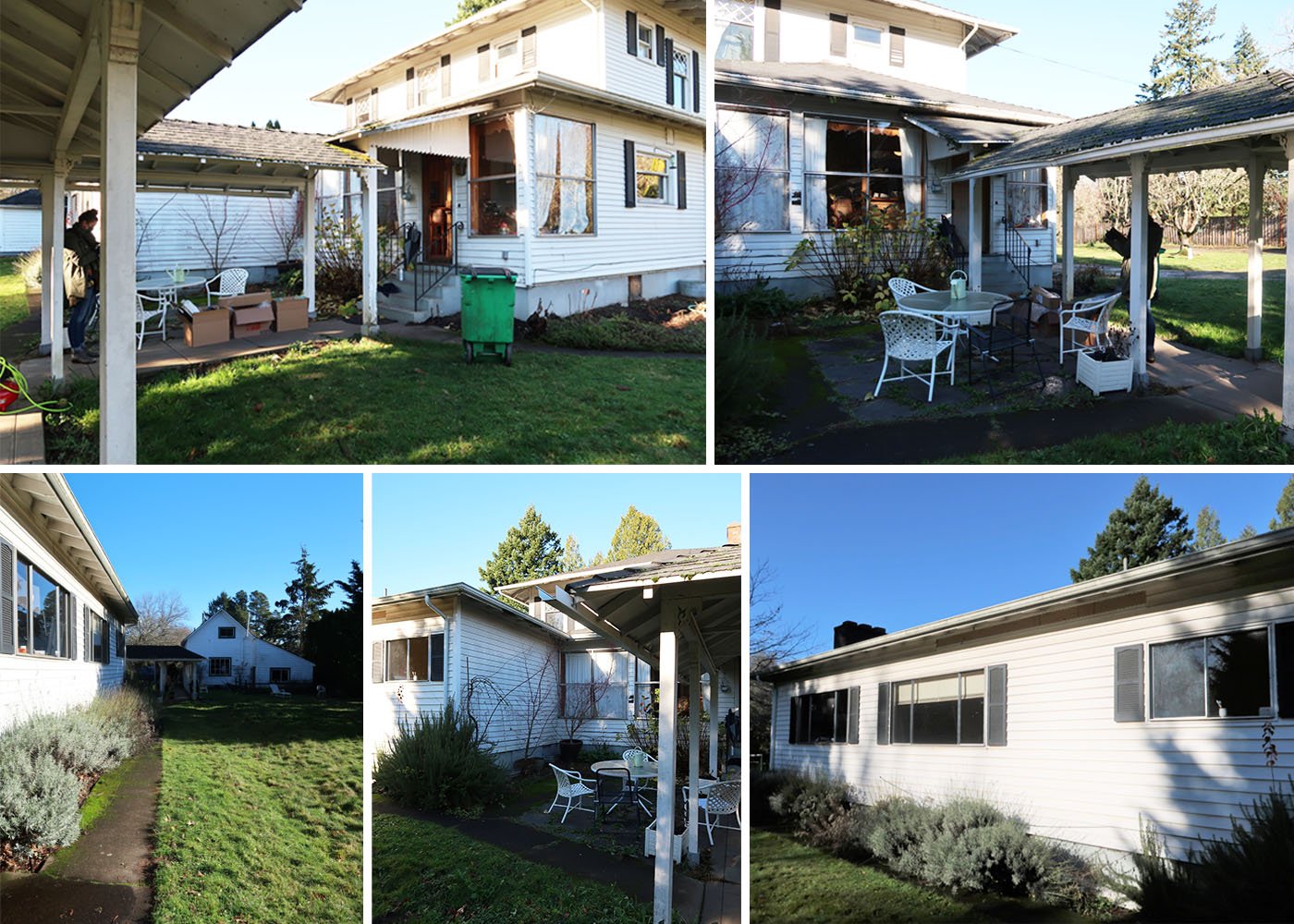
The measurements were easy. I was scared that I was going to need fancy site measurements, but I did it all with a measuring tape. I used my iPhone for photos.
STEP 2: TAKE THE ONLINE QUIZ
I took the quiz, and it was FAR more fun than I had predicted. I thought that I would have to know a lot of technical stuff, but it was more about choosing pictures that I liked — landscaped backyards, design elements, types of plants, etc. It was actually really fun. It gets less fun when you talk budget (per usual), and you should be prepared for the fact that landscape design is more expensive than you think it’s going to be (mostly due to the time and labor involved). But they have a post to help you understand the cost. Here’s an idea of what the quiz looks like:
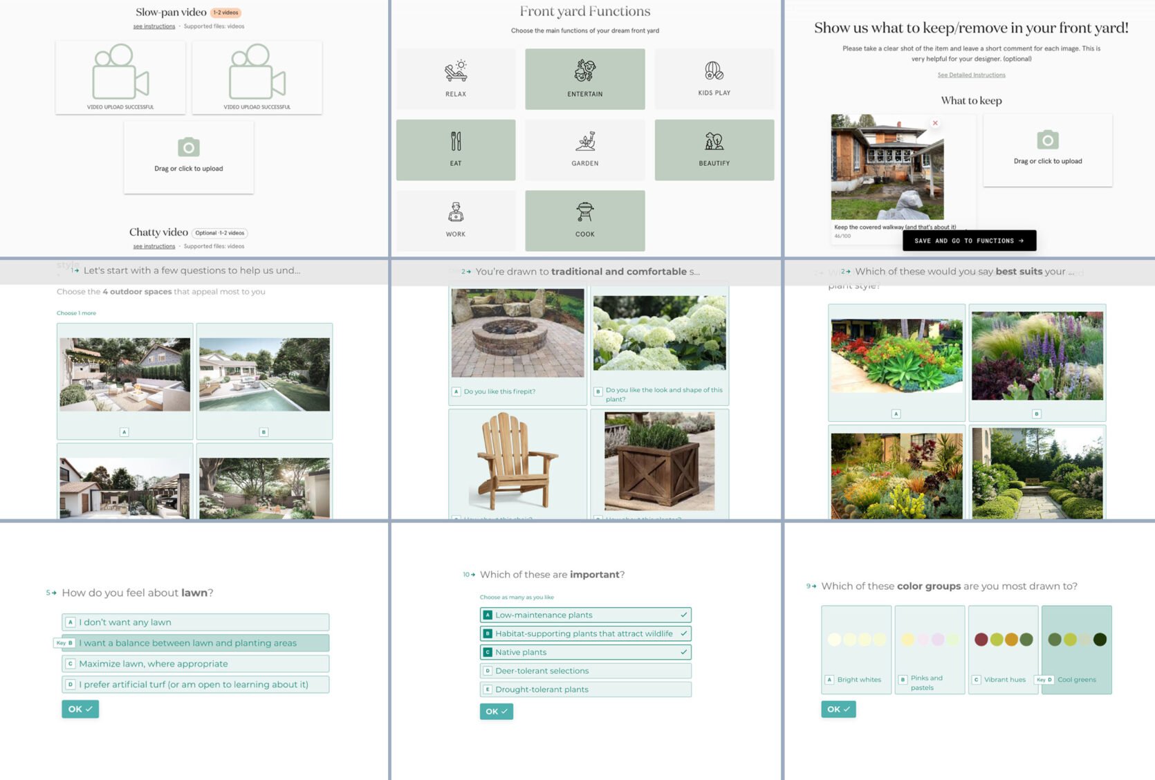
These are honestly the same questions someone in person would ask as well. It’s like a style diagnostic — which you know I love. So I submitted everything, and after a few weeks, we got the first version, and we couldn’t believe it. There were things we wanted to change, but our level of excitement was high just seeing Version #1, which I’m going to show you today.
YARDZEN DIGITAL VERSION #1: THE KITCHEN PATIO
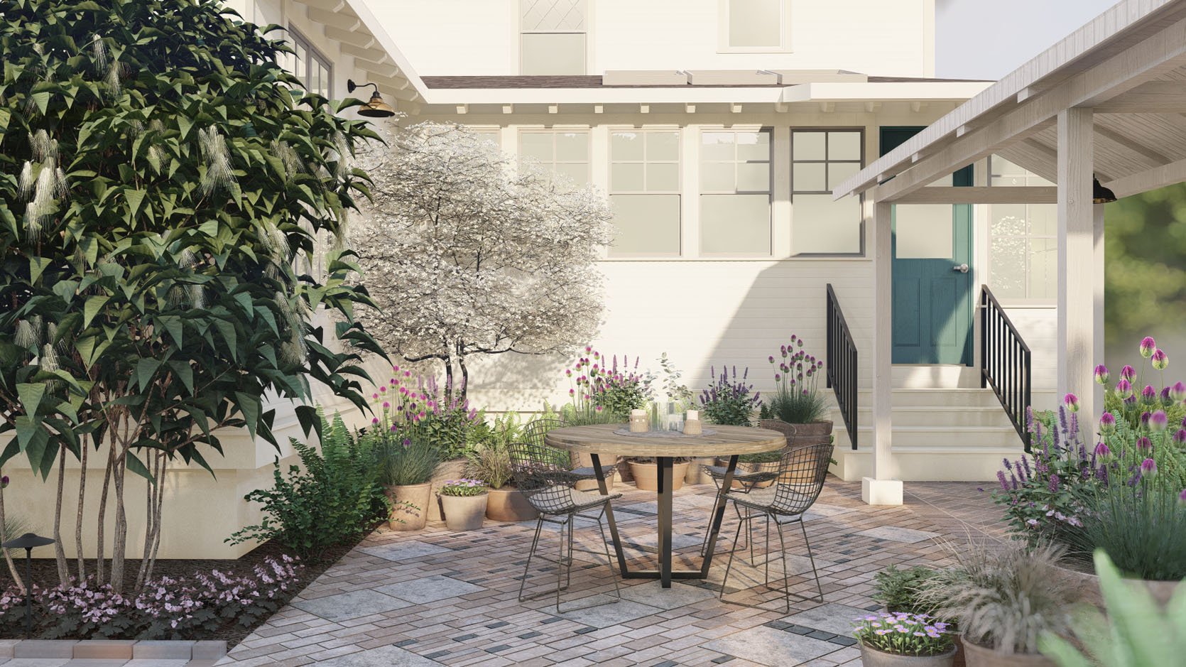
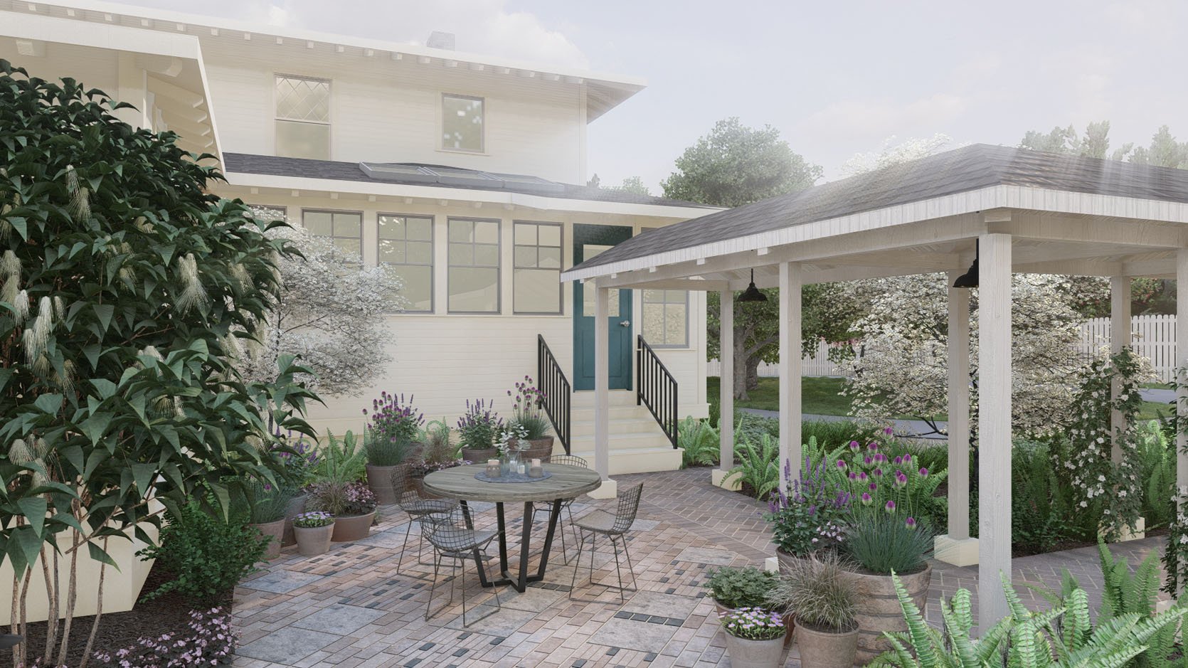
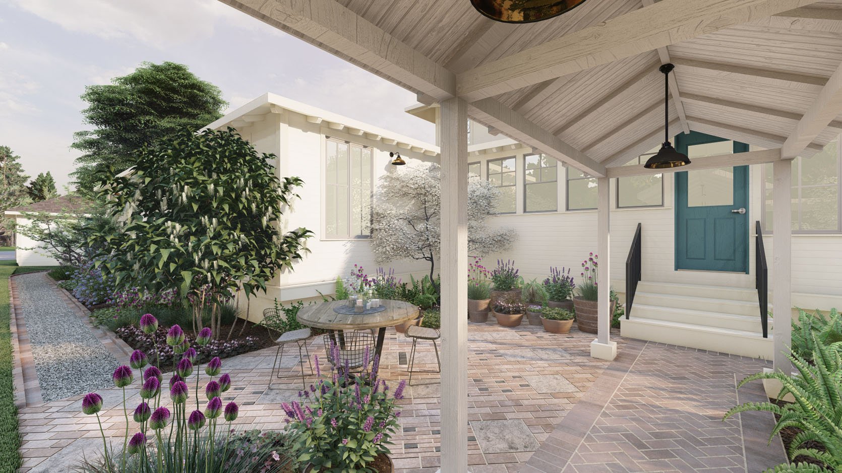
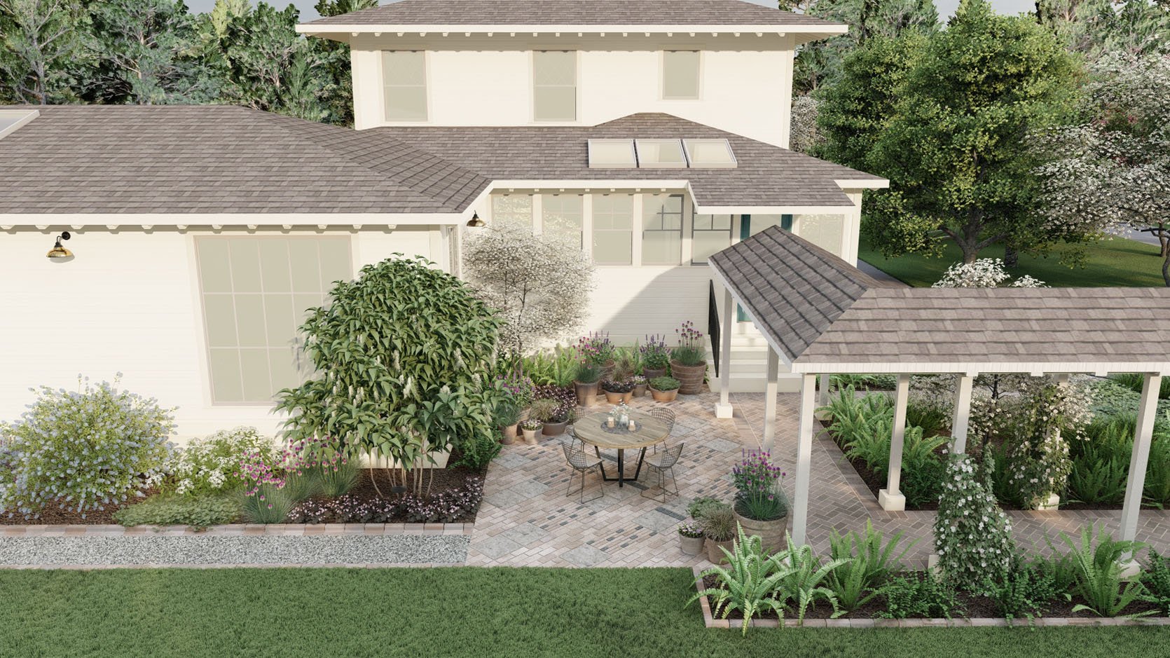
This rendering absolutely blew us away — I almost cried. It was a much-needed dopamine hit during a very long renovation (that we are grateful for but…OOF). To see this visual, to know that someday we are going to be able to enjoy the beautiful version of this home that we are putting so much hard work and resources into…was overwhelming in the best way. I almost cried thinking our mud pit was someday going to look like the Yardzen renderings. Thank you, Kevin (Yardzen’s Design Director).
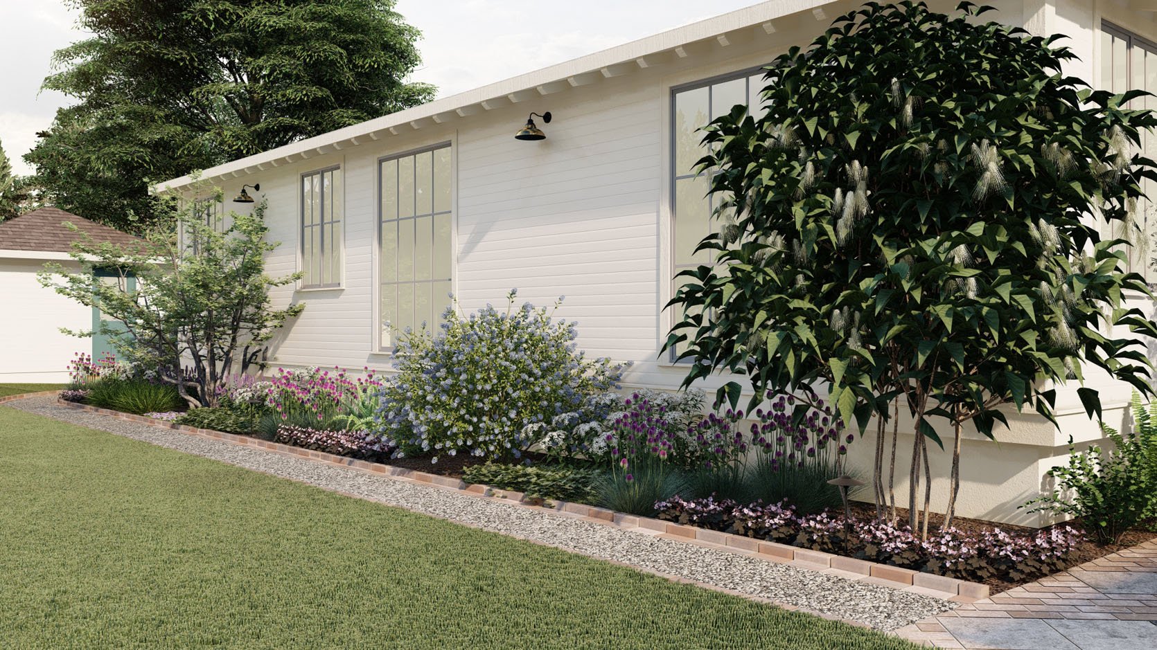
WHAT WE LOVED: The variety of the plants along this wall and how it really softened the space.
OUR NOTES: I think I said that I love purple at some point, but I really just meant the deep, dark purple leaves of some shrubs, not purple flowers. I also wanted a more delicate tree on the corner (I loved the other one at the far end) with less dense leaves.
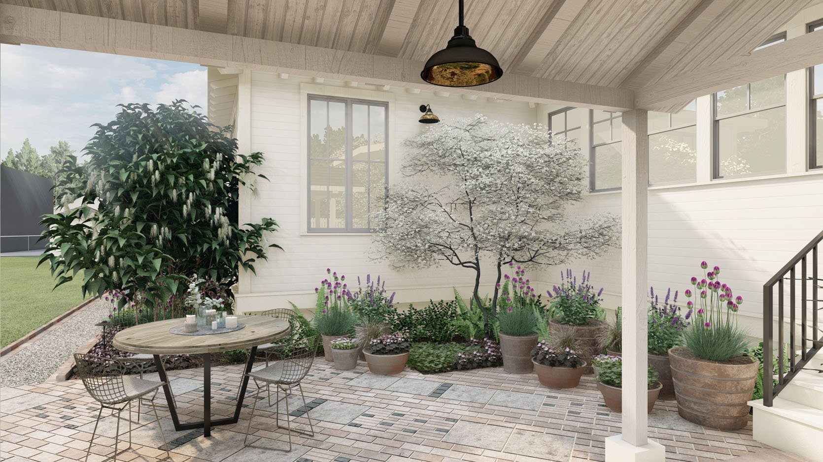
WHAT WE LOVED: I loved the blossoming tree in the corner.
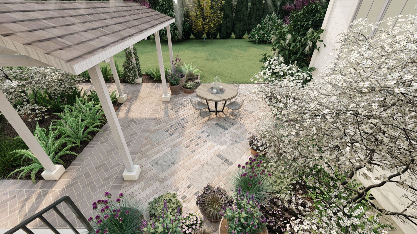
OUR NOTES: We want to nix having dirt around the house in the patio area and have more space for us to grill. Since we don’t know where the barbecue is going to live, we want more flexibility. Additionally, with all the rain and having a white house, it’s recommended to have as much hardscape as possible along the sides of the house. We also want fewer potted plants, just to keep it simpler and cleaner (but I can see us adding more).
WHAT WE LOVED: We loved the idea of the more random brick pattern with mixed materials (some aged, some reclaimed). It was inspired by a photo we showed them that we are OBSESSED WITH of Ulla Johnson’s backyard (see below).
THE BRICK PATTERN INSPIRATION
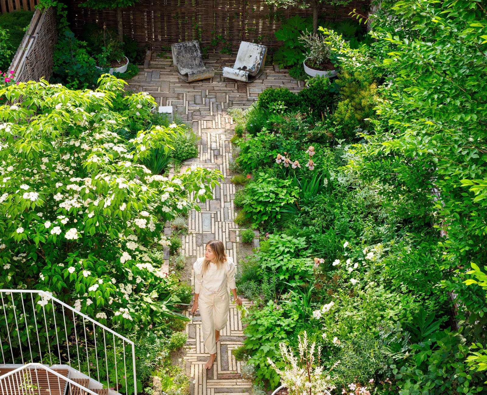
Once again I found myself obsessed with a creative design risk that someone else took and wanted to do our version of it, but also once again, I’m chickening out. When we saw the brick pattern laid out in the renderings, we realized that it was too contemporary for this house, and we actually want something far more classic (e.g., herringbone or a basket weave). We are going to play with borders, but mixing materials and doing a random pattern felt wrong to us after seeing it. Of course, you have to realize that renderings don’t show age and the texture of materials as well as in real life (which is why you need to order and always reference real samples of materials).
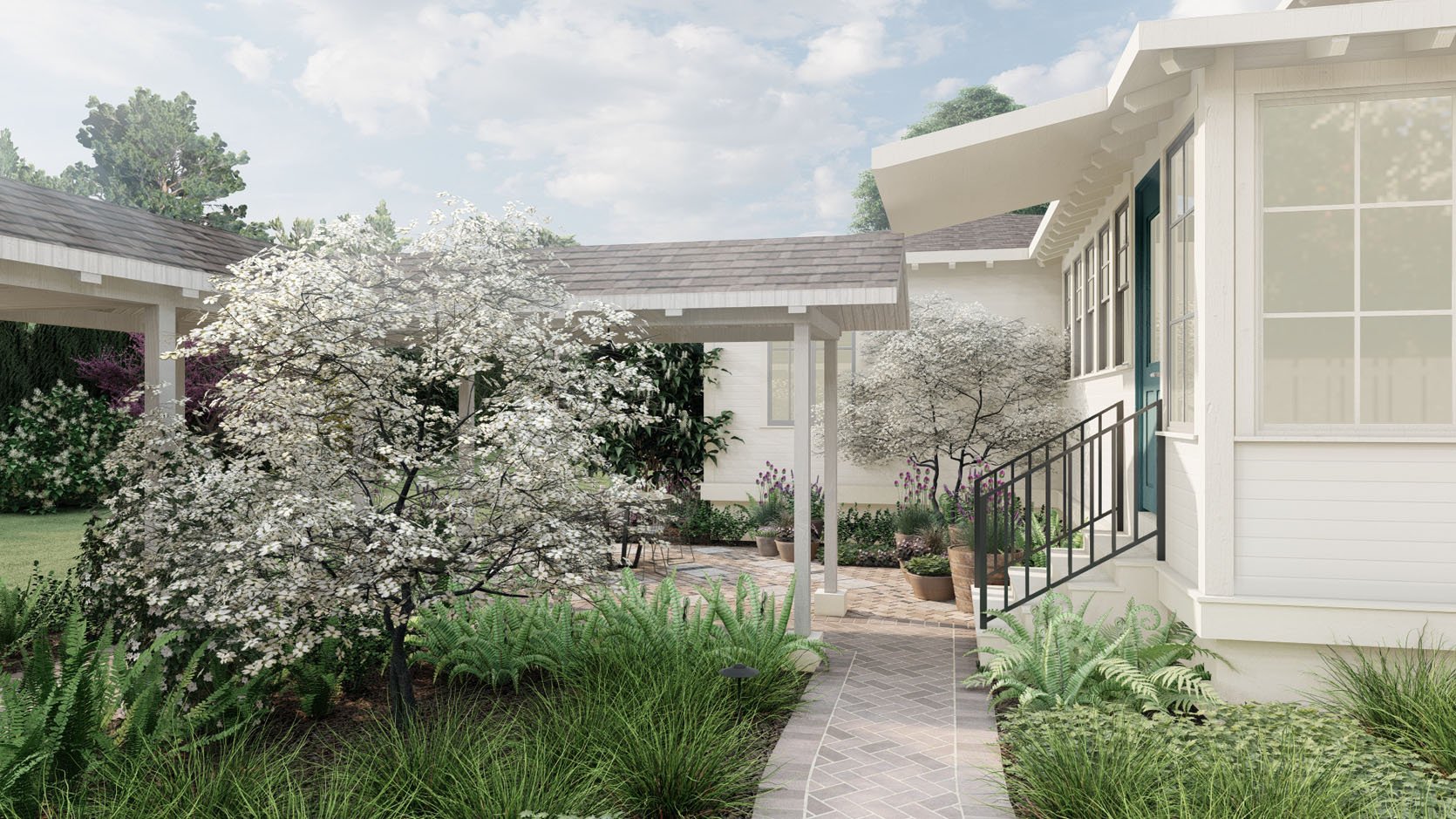
THE ROOFLINE/COVERED PATH PROBLEM

WHAT WE LOVED: The anchoring blossoming tree, the simple grasses, and the ferns — the whole vibe feels natural, simple, and unfussy.
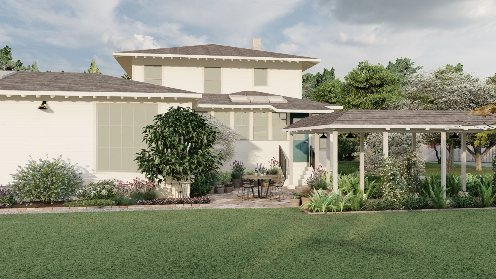
OUR NOTES: Well, after seeing the rendering, it’s becoming increasingly important to figure out the pathway/stairs/roofline awkwardness situation. I thought that Yardzen could design the patio while we figure it out, but it’s affecting the design too much. Essentially the kitchen windows (and cabinetry) were designed with the door moved over, and we didn’t really catch that by moving it, it would no longer line up with the stairs and the covered pathway. Meanwhile, the original overhang was rotted, so it was demo’d months ago for safety. Then we realized that by putting up a new overhang, we were going to lose a lot of light in the kitchen — and that’s a big “no thank you” from us. So the question then became, “Where should the stairs stop?” Do we want to have a landing on the right? It’s a lot.
Here it is IRL:
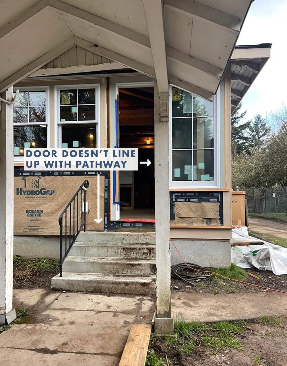
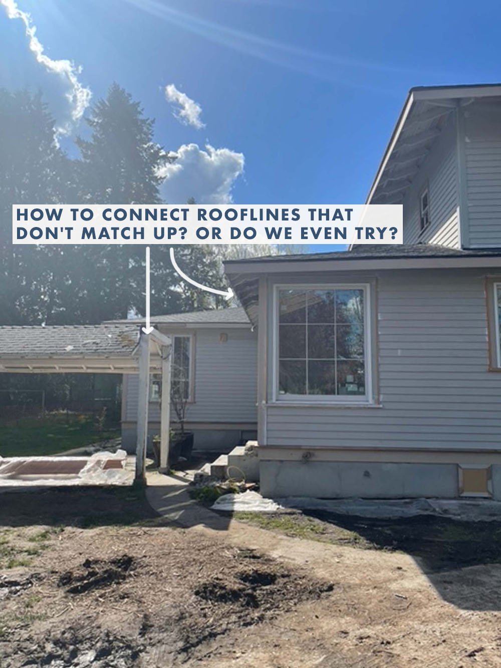
This doorway/pathway issue wasn’t Yardzen’s problem, really. We (ARCIFORM and I) need to tackle it from an interior/exterior perspective. We’ve since come up with a much simpler solution that I’ll show you next week. But I wanted to flag that and explain it, in case you were wondering what was going on — it’s awkward, and we are on it.
WHAT WE LOVED: The mix of the pebble with the brick border, with the herringbone.
OUR NOTES: We are worried about the tripping hazard of the brick against the lawn so are going to set that down into the soil or flip the brick.
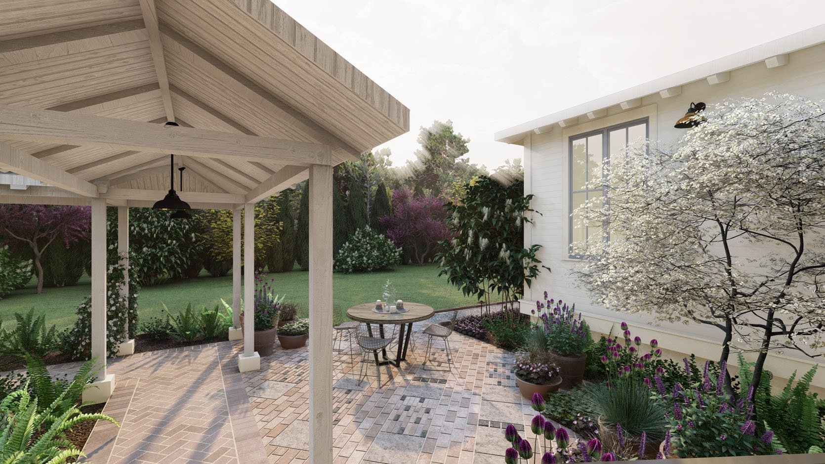
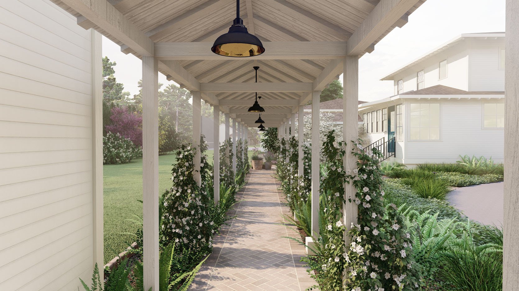
THE PLANT PATHWAYS
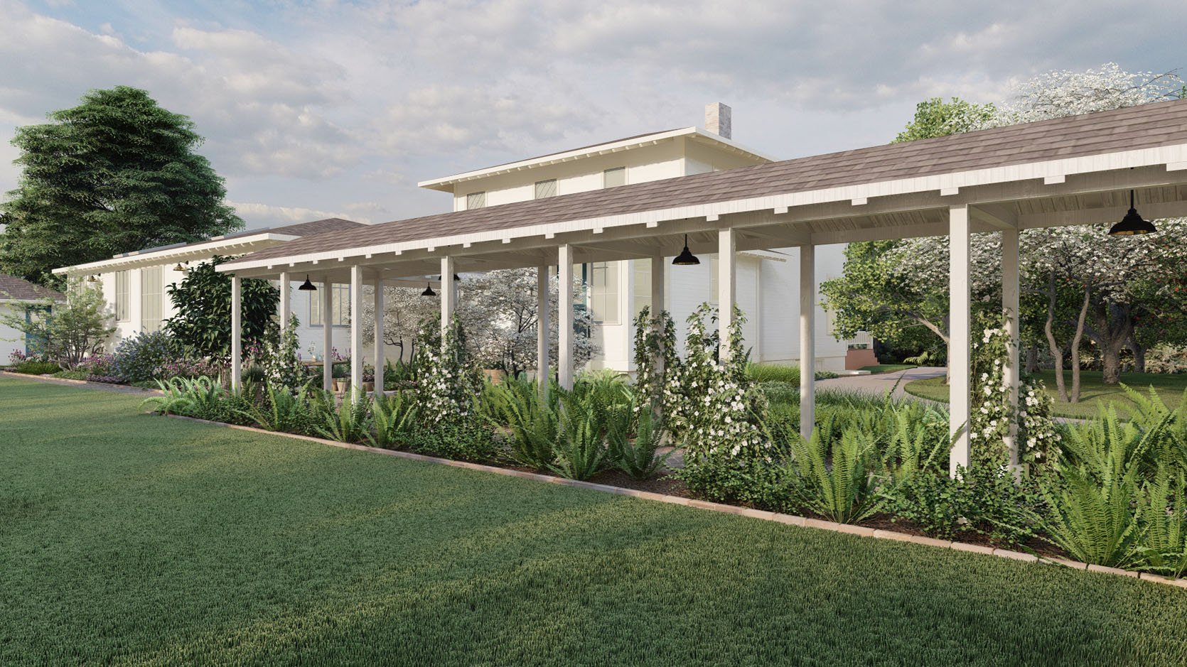
WHAT WE LOVE: The mix of the ferns and the climbers. It is going to be SO DREAMY.
OUR NOTES: Switch to a pink flower instead of white (as long as they are green year-round). 🙂
WHY TWO DIFFERENT PATHWAY MATERIALS?
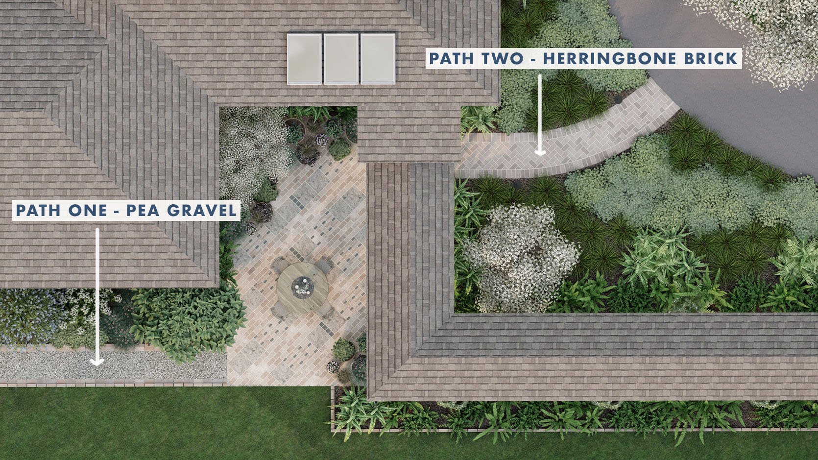
The reason that we are switching from the brick to a pea gravel path alongside the house is because the gravel element/material will be used throughout the property – in both patio areas and pathways (and larger gravel for the two-lane driveway). We love the herringbone aged brick for the kitchen patio. It’s going to be so classic, elevated, and gorgeous. But we’re not using it everywhere because A. It’s expensive both in materials and labor and B. We love the more rustic/casual vibe of the pea gravel (especially as The reason that we are switching from the brick to a pea gravel path alongside the house is because the gravel element/material will be used throughout the property, in both patio areas and pathways (and larger gravel for the two-lane driveway). We love the herringbone aged brick for the kitchen patio. It’s going to be so classic, elevated, and gorgeous. But we’re not using it everywhere because a) it’s expensive, both in materials and labor, and b) we love the more rustic/casual vibe of the pea gravel (especially as we get closer to the alpacas and chickens). It’s so easy to take this property to the next level and make it like a fancy estate, but the experience that we want for our family is more casual and farm-y (which fits our budget better). So we’ll save money and get the vibe that we want.

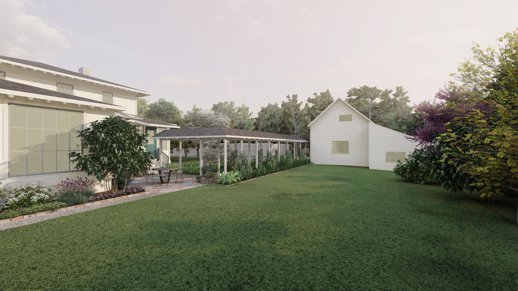
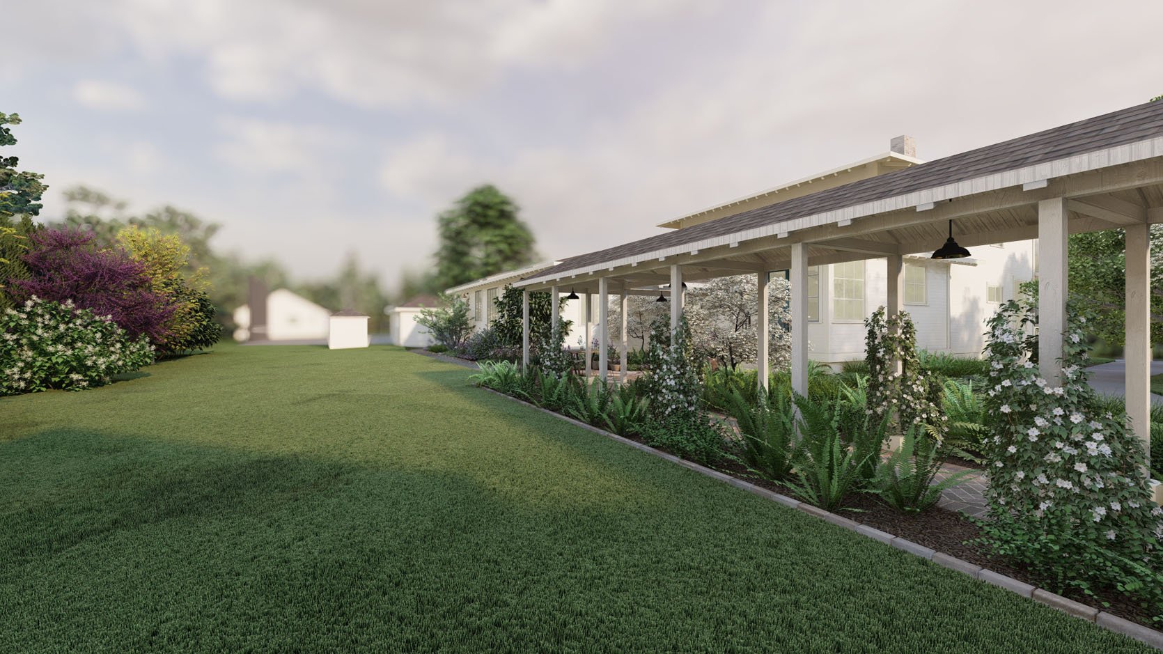
Right now we are focusing on the area around the kitchen and the covered path, but I’m sure we’ll plant along the other older house as well.
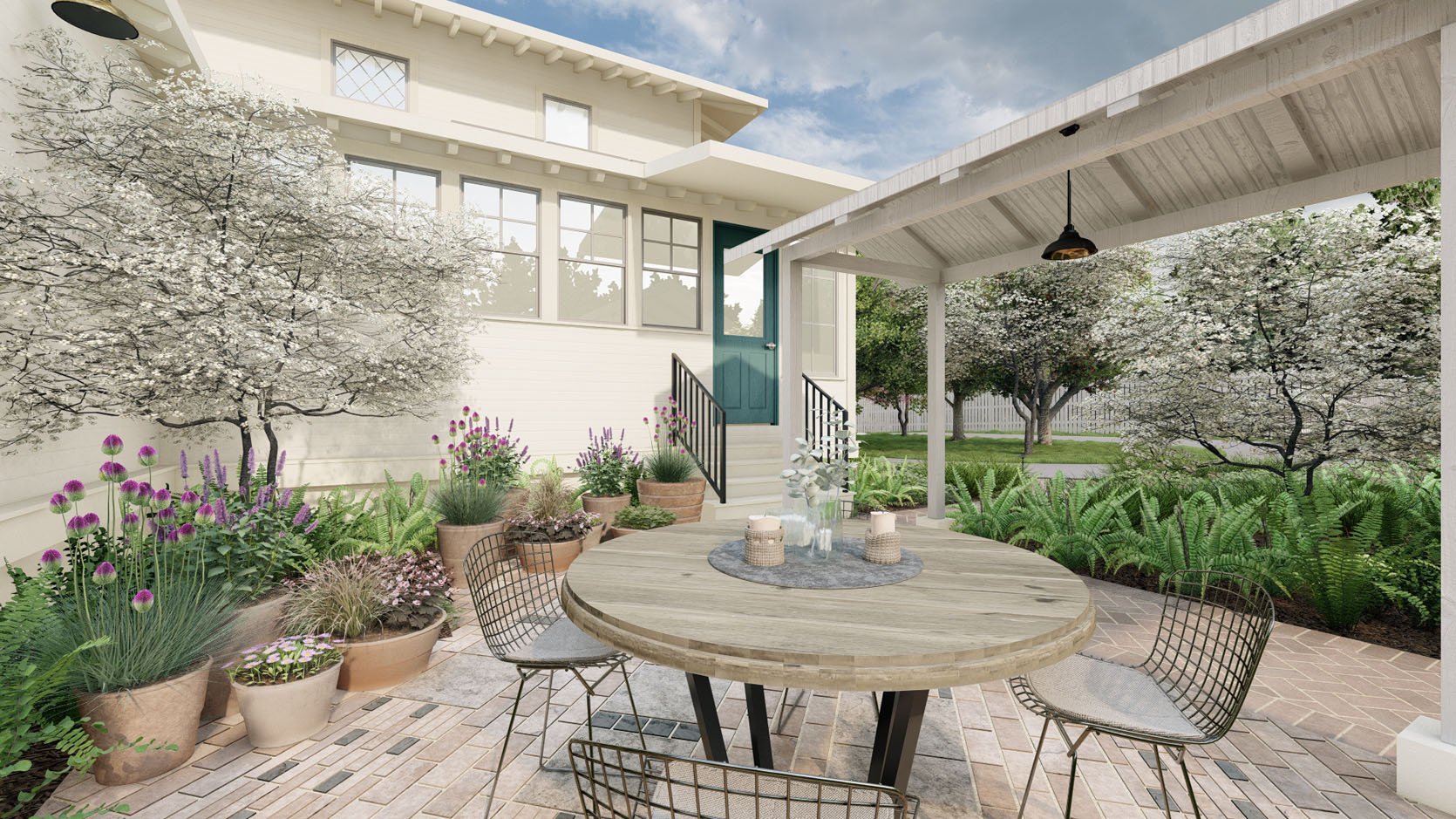
BACK TO THE HANG AREA
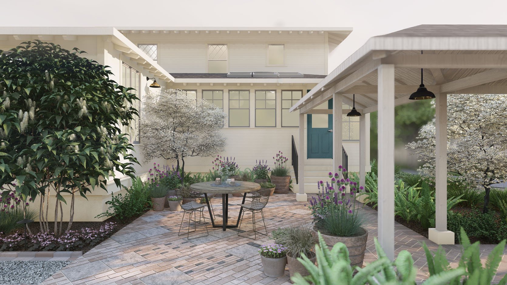
WHAT WE LOVED: The intimacy and sense of a room that they created with the plants. The vibe is SO GOOD.
OUR NOTES: Fewer potted plants, just to keep it cleaner and simpler. So instead, we pitched them some window boxes — a look we’ve both loved but never had before (besides on the castle playhouse), although we are nervous about them staying maintained when it’s hot in the summer. Yardzen thinks it would be a lovely place to put an herb garden, which we agree with, so stay tuned on that.
OUR NOTES: More classic furniture — thinking about this table or this table, and these chairs or these chairs (but we might go rectangular – still TBD).
WAIT…WHERE IS YOUR BARBECUE?
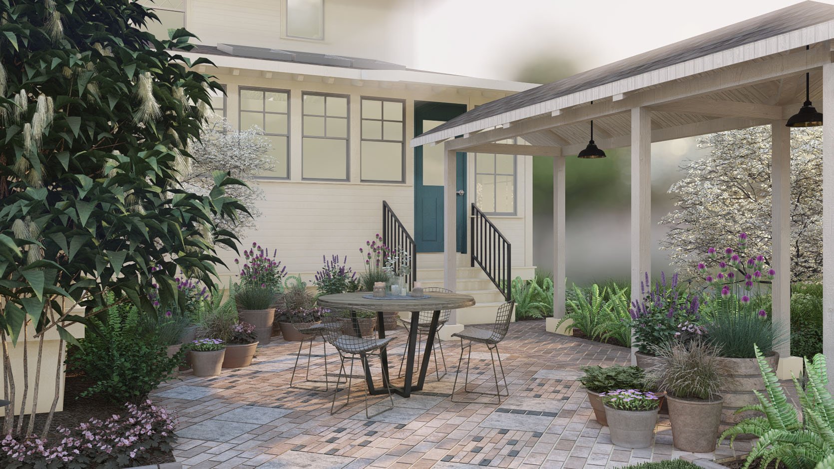
In case you are wondering where the barbecue is going and why we didn’t plumb it for natural gas, here are our thoughts:
1. A barbecue against a house would likely stain the white exterior walls.a
2. We think in the list of priorities a huge outdoor kitchen isn’t necessary, when the kitchen is right there (would be different if it were a hike to get the ketchup).
3. By not plumbing, we can float a barbecue in the patio (so as not to soot up the walls), and then we have flexibility on where to put it. I didn’t want Yardzen to design around a floating barbecue, so we left it off.
We decided not to hard-plumb it in, since we don’t know where it’s going to go and also because we are limiting our natural gas consumption. So we’ll continue to use a propane barbecue until the electric ones start getting better (they are slowly coming, y’all). Mostly we just want flexibility for now and to save money by not building a big outdoor kitchen that we might not use or need. Now, once we live in the property, we might find that we want an outdoor covered kitchen somewhere near the sports court, and so that might be something we consider, but without living there and knowing what we’ll truly use (versus what is just fun/fancy to have), we are not pulling any triggers.
PLAYING WITH PLANT HEIGHT AND SCALE
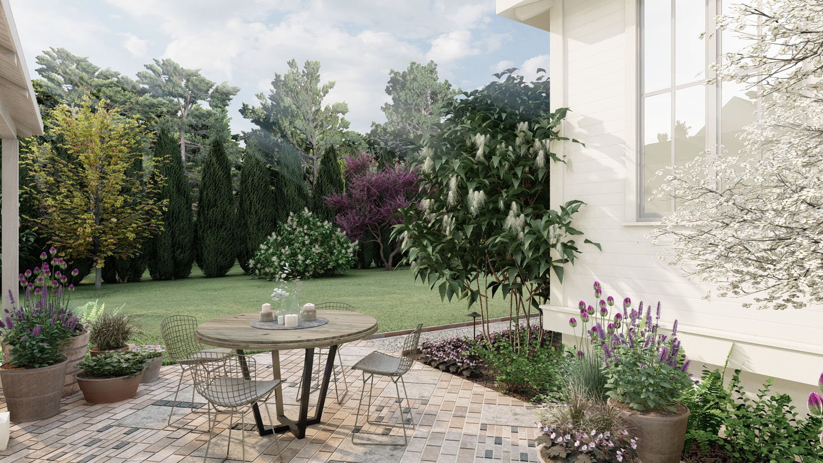
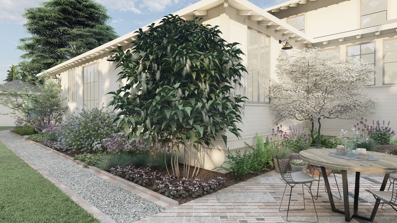
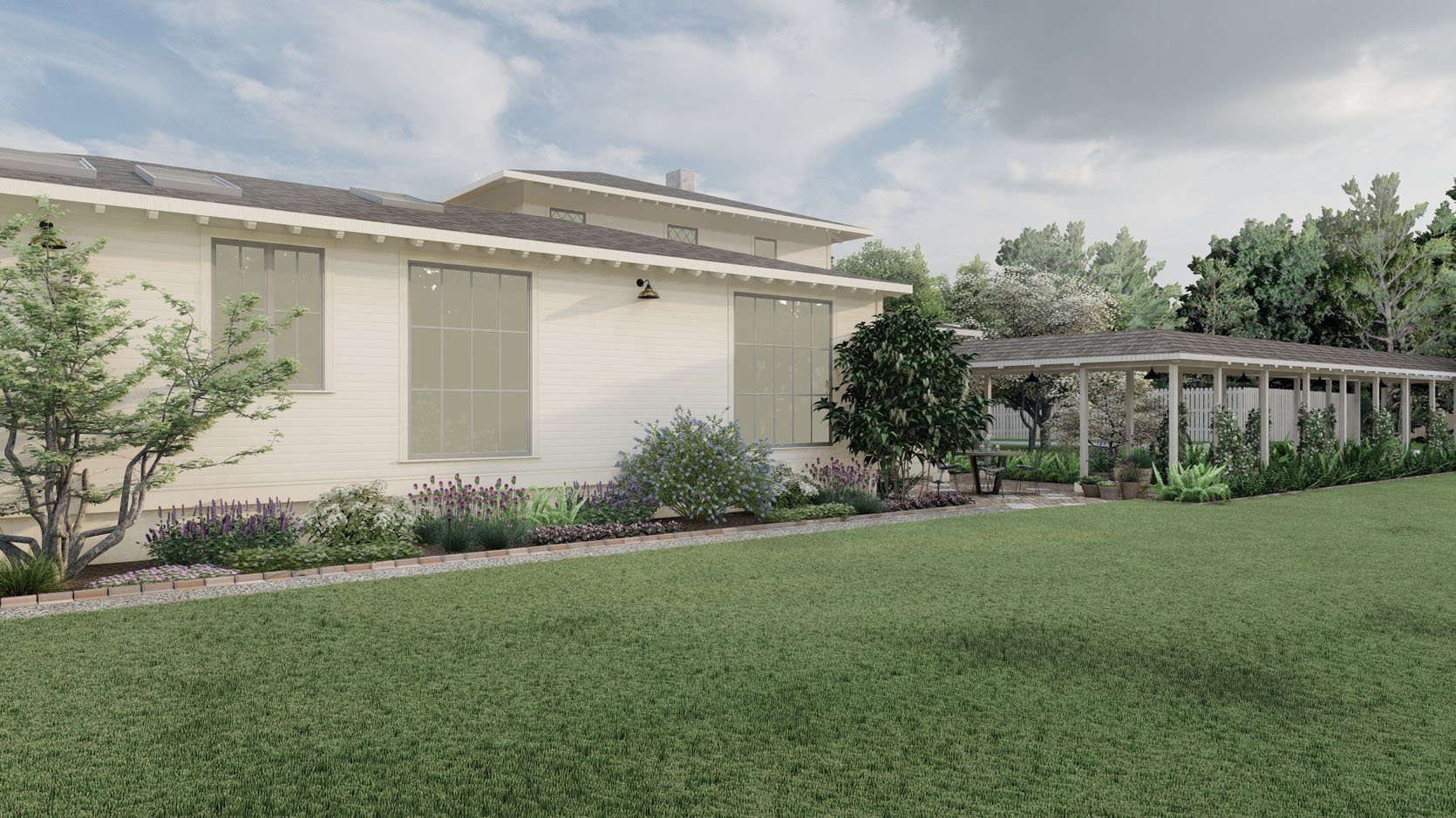
WHAT WE LOVED: I liked the “random” heights of the plantings along the south side of the house (the exterior wall) with a nice up and down cadence.
OUR NOTES: We’d love more medium shrubs to break up the white and soften the lines of the large windows (which are so dreamy).
I can’t tell you how pleased we were with Version #1 of the design. Seeing the Yardzen renderings really solidified some ideas and challenged others — both an important part of the design process. The whole experience has been an absolute total joy and a fun relief from waiting for drywall to dry.

SO WHAT HAPPENS NEXT?
My Yardzen designer is finishing up implementing our notes into the final round of renderings, and our landscape contractor is finishing up another job before they jump on ours. We are working with a local design/build team that has worked with Yardzen a lot, and once we have the final plan, it will get implemented.
As you can see, the Yardzen team did an incredible job on Version #1. I’m very excited to see and publish post #2. So as a recap, here is what they are tweaking:
1. A solution to the off-center covered pathway and stairs (we’ve already sent them our ideas now that we figured it all out).
2. A more classic brick pattern for the patio floor. Something timeless, but still special.
3. Fewer potted plants, adding window boxes instead.
4. Tweak the variety, color, and style of the trees and plants along the side of the house.
The biggest takeaway for me is knowing the value of having a Yardzen designer take over the creative process, using their design expertise to create an accurate visualization for us — FROM AFAR. It can so clearly help any client, and it gives you the confidence that what you are doing is the right thing (or not). And mostly, it can add a burst of hope and joy into what is often an expensive and laborious renovation process. Actually seeing the potential in renderings, not just trying to imagine it, is magical. I can’t WAIT to see and show you the final version.
THIS POST WAS ORIGINALLY PUBLISHED HERE.


