My book comes out tomorrow (EEK Preorder here if you want! EEK! And come to a book signing this Thursday in New York!! I’m very nervous). It was a long process and 2 years ago, mid “fantasy-writing-mode,” when I thought I could somehow fit 900 pages of design information into this book, I reached out to all of my favorite (and famous) designers and surveyed them on their best design advice. My goal was to include their answers in the book, crediting them and even creating cute charts, infographics, and illustrated design data. However, this whole concept got cut due to the eventual lack of space. Thank goodness I have a blog to share it all. We have the information because these great designers took the time to fill out the questionnaire, so today we have a pretty epic post for you – a curated list of their biggest design mistakes to avoid. Be sure to follow them if you don’t, too 🙂
Biggest Mistakes: Lighting
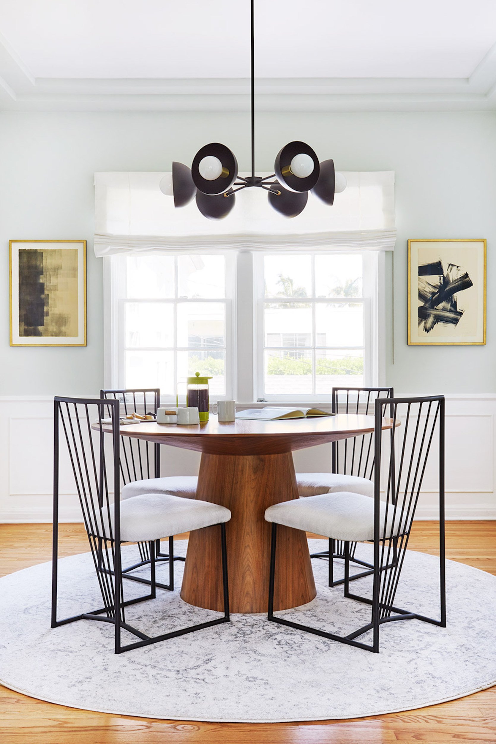
Make sure to have a lighting grid and ensure you have enough lighting sources to illuminate a room during various intervals of the day. – Mikel Welch
Do not decide on exact placement for statement fixtures in great rooms BEFORE furniture is truly placed. Leave the wiring behind the ceiling drywall and then drill and pull it through once furniture is in place. – Brian Patrick Flynn
I think one big mistake when it comes to lighting is doing recessed cans everywhere. It feels builder grade. – Heidi Caillier
A common hardwired lighting mistake I have seen is fixtures not hung at the right location. i.e. with sconces, you should always consider what’s going around them like mirrors and draperies. – Ginny Macdonald
I literally lose my mind every time I encounter a room with no overhead light. Please please please give us light on the ceiling, every single time. – Megan Hopp
A common lighting mistake I’ve seen is having them too high, or having too many! You don’t want to hit your head on it, but a dining room pendant ought to hang about eye-level. I generally don’t like recessed lighting, unless it’s in new construction. Even then, a central light fixture with lamps around the room is always going to be a nicer ambiance than a bunch of can lights up above. – Daniel Kanter
Lining up the pendants and the can lighting in the kitchen is hard. You usually pick the locations prior to cabinets going in and if you don’t account for where the upper cabinets will be, your lights will all be wrong. Mark the cabinets out on the floor and use a laser to figure out where your lights should be. – Jasmine Roth
Lighting is so worth a splurge to me. It’s painful to see a brand new expensive room with the cheapest, trendiest lights from the hardware store. Always include your lighting in your mood board and never let it be an afterthought. – Elsie Larson
Make sure your kitchen has plenty of lighting! Install ceiling cans if your sconces and pendants don’t provide enough illumination. You’ll be glad you did when you catch the hair hiding in the mousse you made for your mother-in-law, before you serve it to her! – Anne Sage
A common mistake I see is over lighting a room. LED lights are SO MUCH BRIGHTER than incandescent. You do not need as many. – Carly Waters
Make sure you measure your heights/drops very carefully. Make sure the scale is right for the room – it’s common for people to undersize fixtures. Confirm the size of your junction box. Some fixtures require a smaller junction box and you end up with a big hole to cover in the wall. – Victoria Sass
Biggest Mistakes: Laying Out The Kitchen
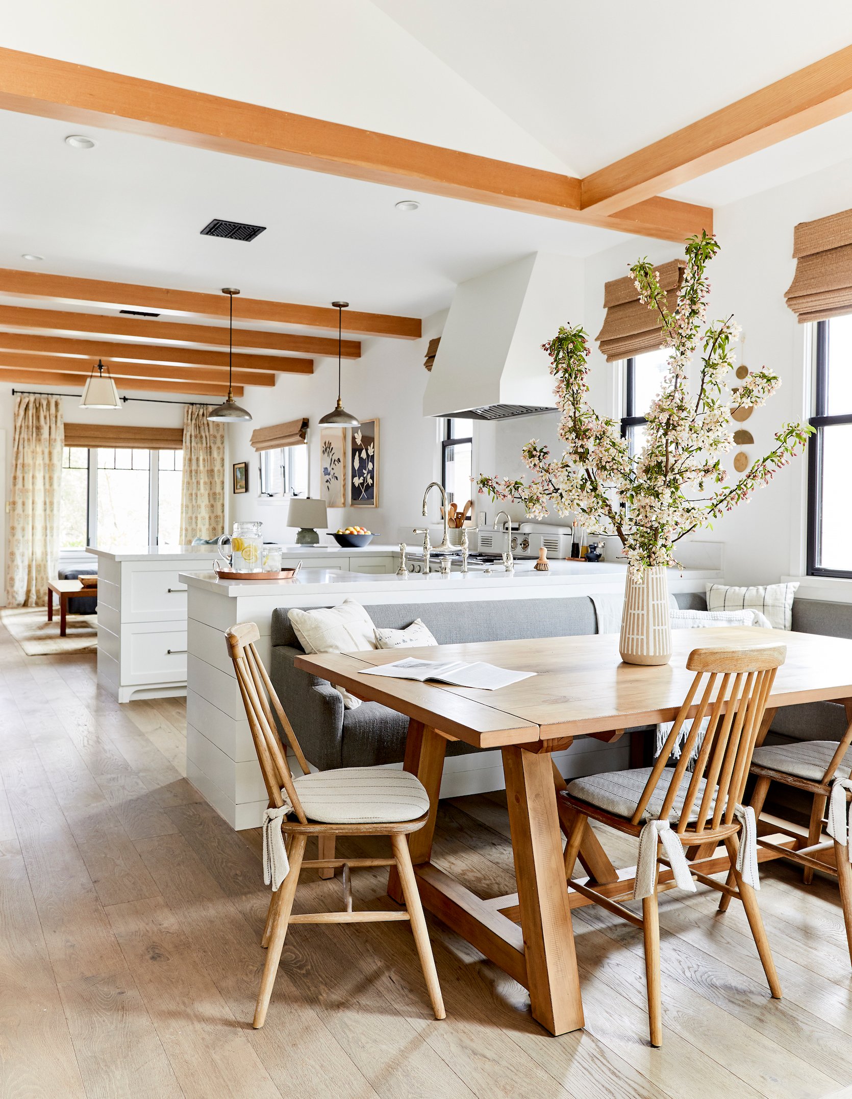
As annoying as it may be, I like to know what larger appliances I’ll be working with before designing the kitchen. The biggest mistake is thinking all appliance options are “standard” and forgoing measurements. Chances are you will find an appliance that you love, but doesn’t quite fit your “standard” measurements. Measure the appliance first, so you can get what you really want and not be a victim of “basic kitchen syndrome.” – Mikel Welch
Adding too many statement elements into a kitchen results in the look being too busy and so therefore I usually decide on ONE element that should stand out more than the others and let the remaining elements support it visually. – Brian Patrick Flynn
I find a common mistake to be not considering where everything should live and what needs to actually be stored. Kitchens are the most functional room in the home and cabinetry should be laid out for functionality and efficiency. I always recommend taking a lot of time up front to consider all of the details and every item you’ll want to store in your new kitchen. – Laura Hodges
Really consider your main appliance locations. Functionality is key in a kitchen. You want to make sure the main 3 are in a triangle together (sink, fridge, and range) but also consider how you use the kitchen. Make sure your fridge opens in a direction that you can grab something and then pivot to use it for example. You don’t want to have to squeeze past your fridge door ten times a day. –Melanie Burstin
Never put your kitchen sink in a corner. It is bad for flow and functionality. – Shelly Lynch-Sparks
One of the biggest kitchen design mistakes is worrying too much about resale. Design it for you and your family, period. There’s no sense in guessing what a mystery future owner might want.- Daniel Kanter
I can tell you the mistake I’ve made a few times and really really regretted – forgetting to build in trash pullouts. If you have a brand new kitchen, but then have to find a spot for a trashcan and recycling bin…in my opinion that’s a FAIL. – Jasmine Roth
If possible, don’t put your dishwasher in a corner. It might look good in theory, but once everything is in place, you’ll realize when the dishwasher is open (if the handles don’t hit, which can be a whole additional problem) it will be blocking cabinets that you need to open to put dishes away. – Jasmine Roth
Save yourself so much trouble – don’t install wood flooring in the kitchen. Luxury vinyl plank has come such a long way, as has wood-look tile. With a sink, dishwasher, and fridge, at some point in the life cycle of your kitchen, you will experience a leak. Ripping out flooring from under cabinetry and appliances is a nightmare. – Laurie March
Biggest Mistakes: Cabinetry
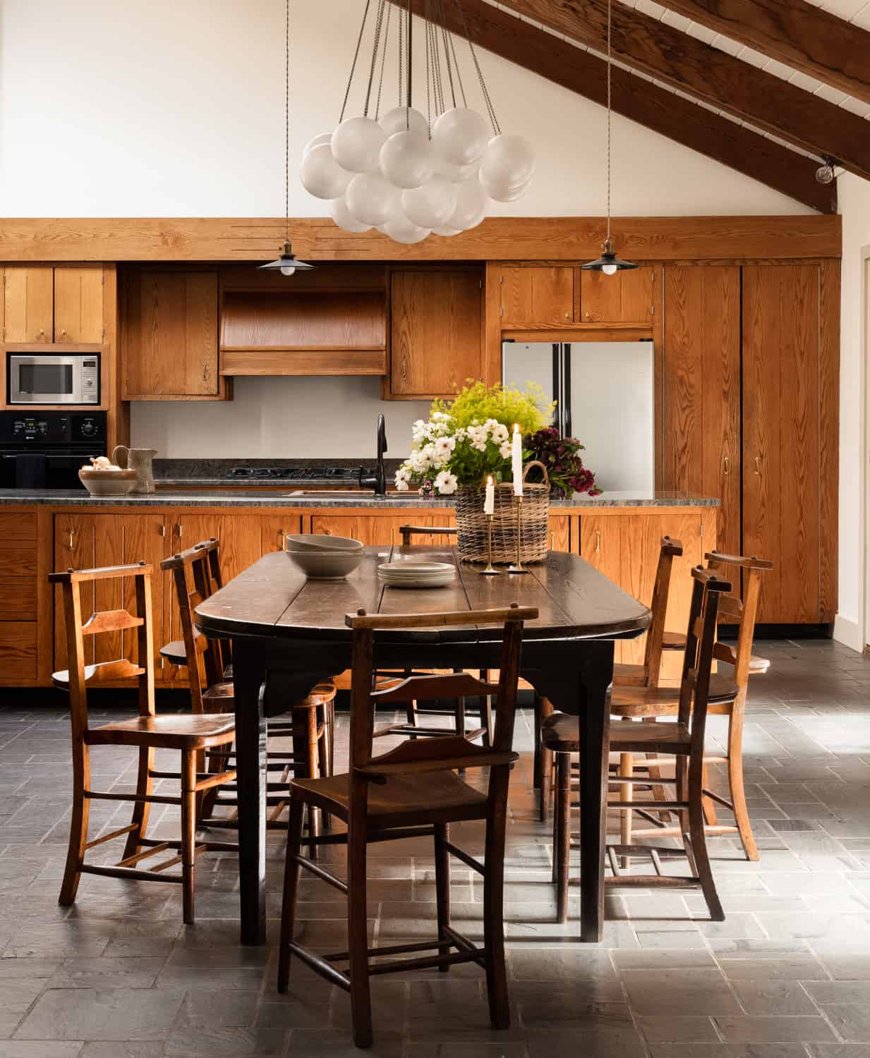
One thing I’m not sure is recognized as a mistake but is something that irritates me beyond belief is when cabinetry just stops a few inches from the ceiling leaving a little gap to cast shadows and collect dust. It’s something contractors do all the time and is so easily remedied by a trim piece. It’s common because it’s easier to make your cabinets fully level if you float them off the ceiling but I hate that it leaves a useless, dark space above. – Orlando Soria
Too many cabinets and not enough drawers – Heidi Caillier
Never never leave a gap between your cabinets and your ceiling. Even if you have to fill it with a trim piece, build it out all the way to the ceiling height. – Rosa Beltran
The biggest mistake people make when designing cabinetry is going with anything that is too trendy or popular from a certain time. They’ll become timestamped quickly and feel less special. I’m a firm believer in navy blue cabinetry, walnut cabinetry, or anything painted in a new neutral such as sage green or blue-grey. – Brian Patrick Flynn
I think the most common mistake is scale and balance when it comes to kitchen cabinetry. You must take into consideration the heights of the ceiling, width of the room, etc. to make sure the cabinet depths and heights are proportionate to the rest of the kitchen. Another common mistake is forgetting about small add on’s such as hidden trash/recycle cans, specialty roll-out pot lids cabinets, built-in Lazy Susan’s, electronic ports (location, location, location), etc. These tend to be afterthoughts that can make you have buyer’s remorse in the end when you have to head to The Container Store and make unnecessary purchases. – Mikel Welch
The biggest mistake I’ve seen is not fully contemplating functionality. You want to think in excruciating detail about what you want to store and where. Are you a big baker? A wine connoisseur? Need a large pantry to feed a big family? Those storage decisions will make or break the functionality of your kitchen. – Erin Hiemstra
Many people opt for replacing just the cabinet fronts as opposed to replacing the cabinets entirely. While this will definitely cut down on upfront costs, refaced cabinets don’t last as long. We always advise clients to think about the long term, and whether it’s more important to cut down on immediate costs, or to get the most out of their renovation over time. There isn’t really a right or wrong answer – it’s more about balancing needs and expectations so there aren’t any surprises down the line. – Terri Lee
Think about what will be going into the cabinets as you’re designing them. This will help guide you on the best size for each cabinet. On that note, be sure to make sure you think about “closed” storage space. Open and floating shelves look great but you don’t want to forget that you’ll want to high some cookware items behind cabinets too.- Haley Weidenbaum
Functionally, not enough drawers. Aesthetically, getting too swayed by trends and forgetting what house you’re in! In the last few years, we’ve seen a profusion of beautiful, high-end kitchens that feel very influenced by classic British kitchens exemplified by companies like deVOL. Classic shaker style cabinetry is versatile and works nicely in a lot of spaces, but it has to feel related to its context. That kind of kitchen just doesn’t feel right in a modern house or one with a more distinct style. – Daniel Kanter
People often design cabinets, where the doors open, and you pull out pantry inserts from inside that. Just skip the doors! A modern kitchen should be 80% drawers, 20% cabinets, with dedicated spaces for your small appliances, like air fryers, mixers, and dehydrators – to live. – Laurie March
The corner cabinet with the rotating lazy Susan inside is the biggest mistake ever! People think that they’re maximizing storage space when they install them, but it’s actually a real pain to crouch in the corner and find things in there. It ends up being the cabinet where Tupperware goes to die. – Anne Sage
Forgetting to run the cabinets all the way to the ceiling if your ceilings are taller than 8 feet. People (and designers) can often overlook the small details – like whether a corner cabinet will hit the drawer pull on the adjacent drawer (whoops learned that lesson the hard way). I think people also neglect to think about how cabinets will hold up/how easy they will be to keep clean. – Carly Waters
Biggest Mistakes: Windows And Window Treatments
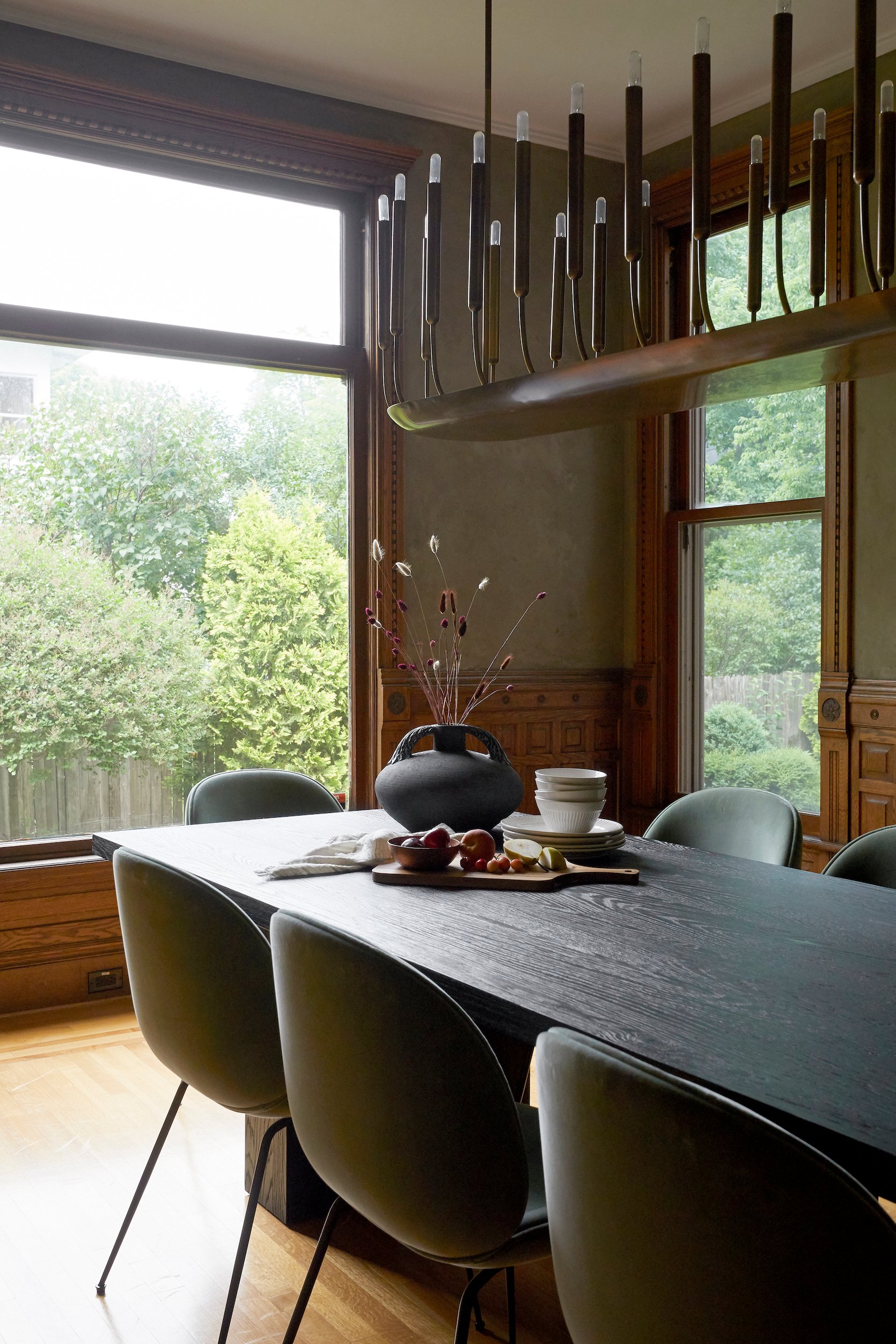
I think people install windows sometimes without thinking about how they’ll be covered by window treatments. Like a crescent window super high in a bedroom. How do you cover that in a way that isn’t ugly? I haven’t found a solution for that. – Orlando Soria
Do not install vinyl windows in old homes. It breaks my heart. Do quality windows! – Heidi Caillier
Be aware of the domino effect. If you replace one window, you should replace them all or it’ll look patchy. – Ginny Macdonald
Consider your furniture layout when deciding window locations. You can avoid awkward walls that won’t fit furniture this way. You can see if the window treatment would end up taking over an entire wall and be an impractical use of space. Also, make sure you are matching the exterior of the house. Exterior window symmetry is really important so balancing these two interior and exterior needs will lead to successful placement. – Melanie Burstin
When selecting and placing windows on the side of a home, ensure that you are taking the neighbors into context. Often a high clerestory window is a better option in these locations, which allows light in and maintains privacy. – Jenny Guggenheim
Curved windows are not the easiest to cover so if you have a choice in the matter don’t put curved or rounded windows in rooms that must have window coverings. For example, a great room or living room that is meant to be flooded with light with grand windows but privacy is not of great concern is a perfect opportunity for curved or round windows. – Haley Weidenbaum
When it comes to windows, bigger is better. Everyone likes natural light – there is hardly a negative to more large windows. – Megan Hopp
Fenestration matters! Keep window styles consistent across the house, and sizing that feels intentional. My area is full of side-hall style houses, and the bathroom often ends up in the street-facing room above the front door. The window in this room should be the same size as the adjacent windows on the same level, but SO MANY people reduce the size of this window dramatically when renovating the bathroom. It completely ruins the facade of a house and has negligible functional benefit. – Daniel Kanter
Ohhhh, I’ve been waiting for this question! The biggest mistakes I’ve made with windows are 1) buying wood-clad windows and then painting them white. I should have just bought white extruded windows for a fraction of the price (never mind the time and labor to paint them) and they would have had zero maintenance. We put curtains and shades in front of them anyway, right? 2) using custom windows when I could have used standard. For new construction or for a renovation, if you can use standard window sizes it’s much less. Talk to your contractor about framing “standard size window openings” so you can save some $$$. – Jasmine Roth
When you have wood windows that are stained on the interior, make sure to get an extra container of your stain color so that you can touch up after the paint crew comes through. And make sure the caulking matches the windows! Nothing ruins a trimless, foxy, black window like white caulk. – Laurie March
Installing windows that are too small. I’ve never walked into a room and said- wow, that window is too big. – Carly Waters
Be thinking about window treatments as you are choosing the windows – are you going to have motorized shades? You’ll need to design a cavity to house the mechanism. Do your windows open inward and does that impact your plans for drapery, etc? Do you have the appropriate space above and around the window for the type of window treatment you want? If you want inset window treatments, are your window casings deep enough to accommodate? – Victoria Sass
Biggest Mistakes: Plumbing And Electric
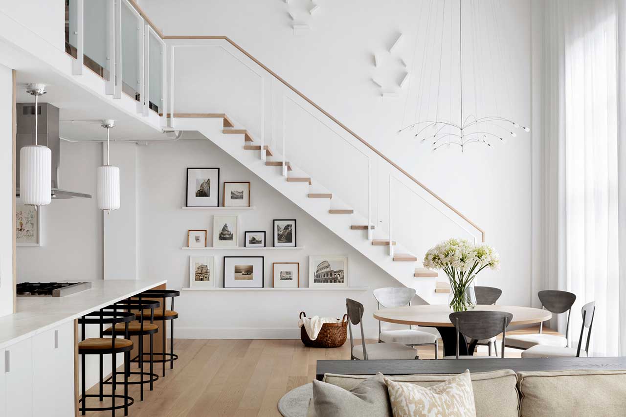
Make sure that what is behind the walls is in good working order, i.e. plumbing, electrical, venting. Now, of course, fixtures, fittings and finishes can become expensive quickly, but those are choices, the rough-in quality in my world is none negotiable. – Anne De Wolf
The most common plumbing mistake non-designers make when designing a bathroom is not paying attention to where the infrastructure is. One needs to vent a toilet with a 3″ stack and this is often overlooked when placing the toilet. Also paying attention to where the drain is and how that will get from point A to point B – especially when working on second floor bathrooms. This can lead to plumbing runs not having the “grade” in order to drain and/or having issues with clogs and backups. It can also lead to unsightly soffits or work on the floor below. – Josh Salinger
I have two! 1) they rough in the sink too high. Everything looks too low during the rough-in stage and people second-guess themselves. 2) Placement of the shower valve! If it’s possible to plumb away from the showerhead, I love that solution because you can turn the shower on without getting all wet! – Daniel Kanter
A common mistake I see is one that I’ve also made. When renovating a bathroom, just like left and right-handed golf clubs, tubs have to be ordered with the drain on the left or the right. If you order the wrong tub, you’ll have to send it back and wait for the correct one and TRUST ME, that’s not fun! – Jasmine Roth
Everyone wants a rain head shower but NOT every plumbing system can accommodate one! Especially in old homes, the existing pipes are narrow and won’t supply the water pressure necessary for a true rain head experience. – Anne Sage
Biggest Mistakes: Colors And Patterns
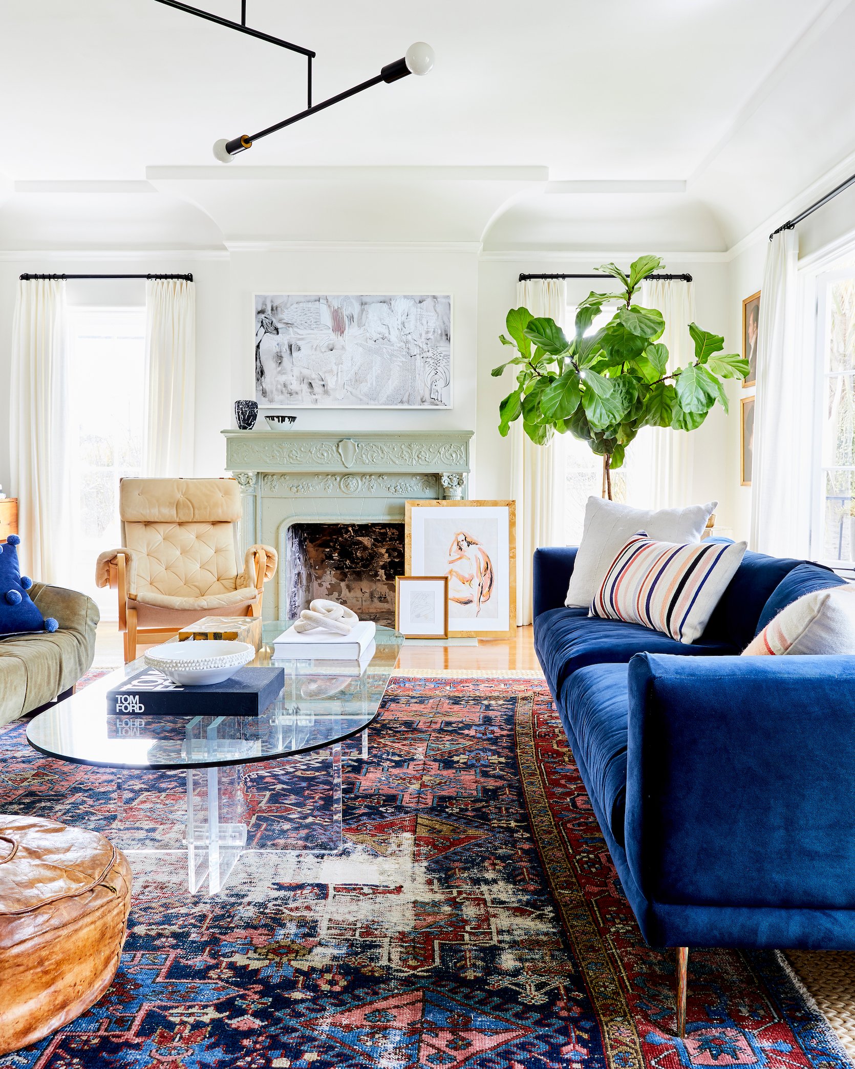
A lot of rooms have too much white. Rooms need to have depth and warmth and it’s difficult to achieve that when the walls and ceilings and trim are all stark white. – Corre Marie
The number one color mistake I see is people using colors that are too saturated. I always tell people to think of the color they like then take the saturation down 50% (basically add 50% gray to it). Usually, that ends up getting you a color that feels pretty but not too sickeningly saturated. – Orlando Soria
Tile design is the biggest selection that can make a bathroom feel dated. Unless you know that you’ll love it for a very long time and are not planning to move anytime soon, I suggest selecting tile colors and patterns that are either based on a timeless and classic style or are easily modified to feel different with an updated paint color. – Laura Hodges
Doing anything too trendy will date your space. If your furniture is “millennial pink” or whatever the popular new color is it won’t stand the test of time because you can tell immediately by looking at it when the chair was probably purchased. – Emma Beryl Kemper
I think people can feel timid about color and or pattern and as such end up often doing things halfway. A color, but something muted that isn’t really the shade that inspired them in the first place or a pattern, but something on a smaller scale or used in a smaller way. In the end, you get these sort of false starts or half-baked ideas and your design falls flat. The real kicker is that it can then turn people off because of a less than ideal outcome, where had they done what they really wanted in the first place chances are they would have loved it.- Megan Hopp
Scale is important! A large room with a very small scale pattern wallpaper can feel overwhelming.- Molly Torres Portnof
Relying completely on paint. There’s nothing worse than a room with rust orange walls but everything in it is black or gray. It’s so sad. – Daniel Kanter
The biggest color mistake I see is using a gray paint for the walls that has too much blue in it. Nothing can make a house feel cheap and cold faster than a blue-hued gray on the walls. – Jasmine Roth
Mixing patterns of the same scale is a common mistake. Mix patterns to your heart’s content, just make sure they’re contrasting in size so that your eyes can digest them. Otherwise, you’re just creating visual noise. – Anne Sage
Thank you to all the designers who took the time to fill out the survey and dropped us this wisdom. While I wish my book was peppered with this specific information, just know that it’s full of a lot more – and more to come on the blog, too. Follow them! And if you want to buy the book and meet me IRL, come to the book signing this Thursday in New York if you are around. I’d love to say hi and likely tell you inappropriately personal things about my life 🙂
Opener Image Credit: Design by Heidi Caillier | Photo by Haris Kenjar
THIS POST WAS ORIGINALLY PUBLISHED HERE.


