Hi friends, Priscilla, here again, to share the final Tudor basement reveal! This time we’re taking a tour of the teen bedroom Emily and I collaborated on. It’s part of a larger basement remodel (see mudroom, bathroom, and living room posts here). The client is Emily’s best friend Robyn, and her family. They are super lovely, very down-to-earth, and outdoorsy (very Portland in the best way:). So it was not surprising that their 12-year-old son, J, wanted a look that highlighted his love of mountain biking and the Pacific Northwest for his new room. These nods to the outdoors became a jumping-off point for the theme and colors in the space. Never having worked on a teen room before, I felt a little nervous about making it feel youthful enough. Emily was great at steering us toward bold patterns and prints that felt fun and age-appropriate. Ready to get into all the details?
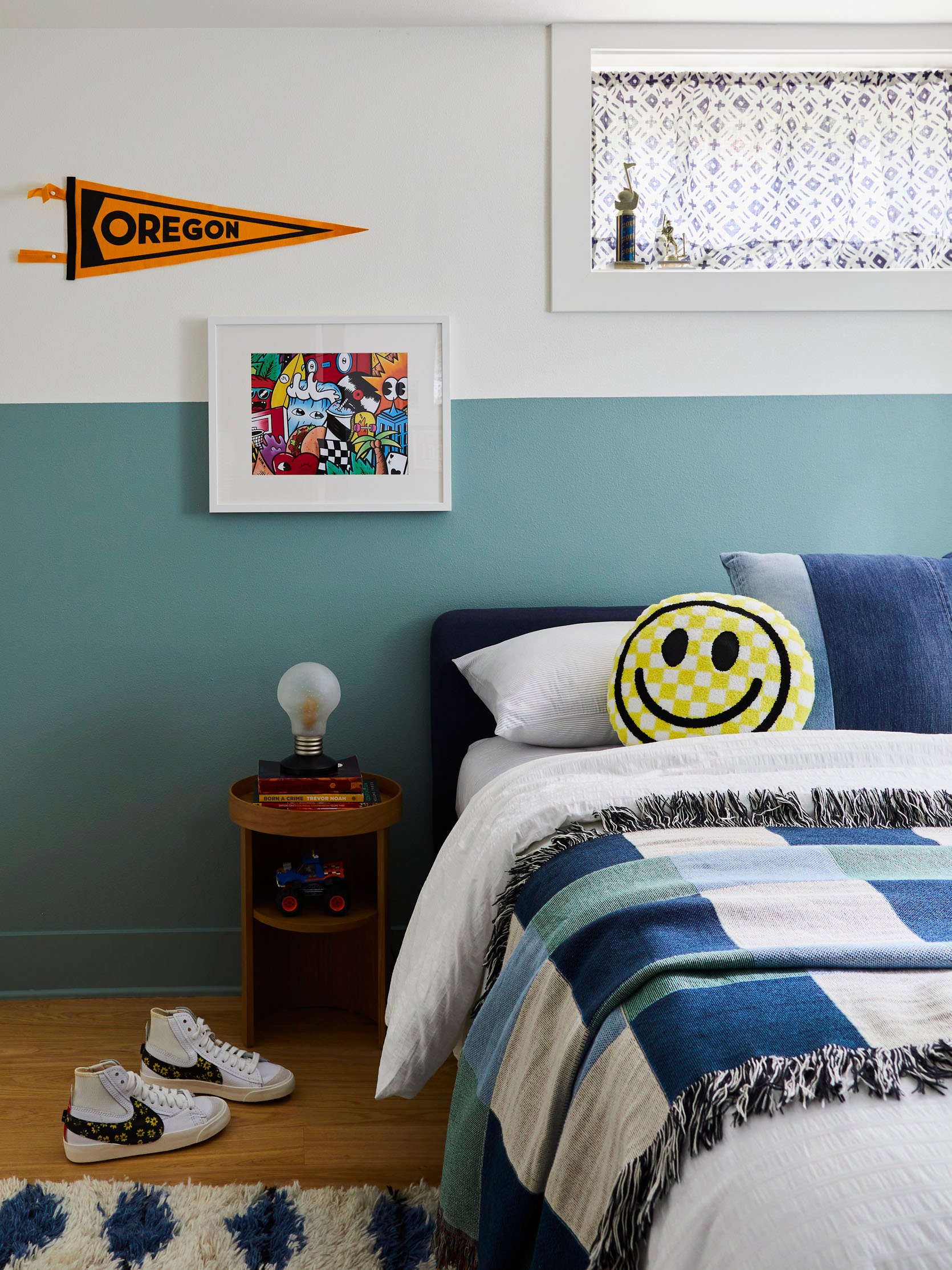
Bed | Round Nightstand | Vintage Light Bulb Lamp | Blanket (similar) | Oregon Pennant | Graffiti Artwork | Curtain Fabric
REMODEL
Remodeling a basement in the Pacific Northwest often involves waterproofing the exterior. That was the first step in the process of addressing the moisture issues the clients had been dealing with. Our contractor JP Macy, also installed a sump pump in the closet to ensure that water would be pumped out to the storm drain and not leak into the space during a heavy rain. Step 2 – change the floorplan. The room was originally a carpeted bathroom. This initial footprint was too large to be a bathroom and too small to be the bedroom we needed, so we had to borrow some square footage. The adjacent storage room had plenty of space, easily allowing us to carve out an ample closet and built-in desk for J’s new room. To ensure the space was up to code, JP installed an egress window for some natural light. Once permitting went through, we had a bedroom! After a little door shuffling, the final layout was so much more functional for how the clients wanted to move through and use each space.
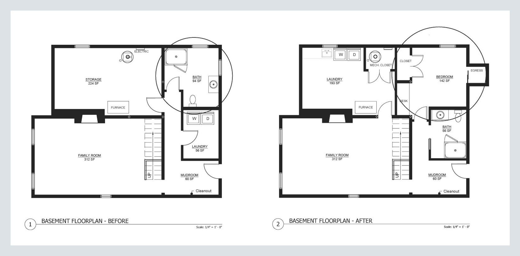
If you wanna see the full finished basement so you can get a better sense of the floorplan, watch this video (just wait for the ad to play!) 🙂
PAINT
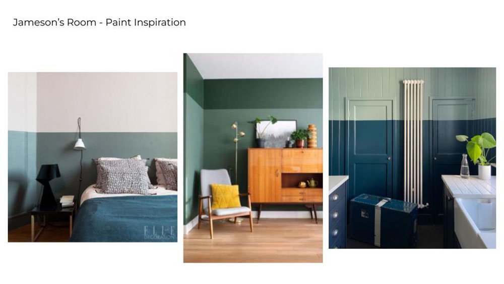
J has a fun sense of style and was up for going bold on the colors throughout his room. We initially wanted to do a color block design on the walls. The color blocking originally started out as a two-tone idea (see below for the inspo), but once we got some samples in the space, it felt like there was too much going on. Scaling it back to one color and lowering the line somewhat ended up being the look that felt right. J was drawn to the blue/green hues and picked out a really fun color…Sherwin Williams Jasper Stone. It reads more blue in person but has enough green to feel tonal with the overall basement color scheme. This is such a fun and affordable way to add a ton of personality to a room.
When thinking of who to hire to paint the space, Renee from Some Kinda Landscape immediately came to mind. She worked in visual display at Rejuvenation and Anthropologie and is amazing at tricky painting techniques. I knew she would make the effort to get a perfect line (guys, painting an even, level line over a textured wall isn’t easy). If you’re in the Pacific Northwest and need a room refresh, I can’t recommend her enough!
For anyone interested in DIY-ing this project, here are Renee’s tips for getting a crisp line:
- Invest in a good laser level with a suction mount, something like this.
- Use a quality painter’s tape (like FrogTape) in long strips…about the length of your arm.
- Make sure you really press the tape down to get out air bubbles (especially important on textures like orange peel).
- Once your tape is in place, roll the paint on, making sure to cover the tape but not go above it. A small foam roller works well for this.
- Let the paint fully dry before removing the tape. Like 24 hrs minimum.
- Touch up any unevenness with a small art brush.
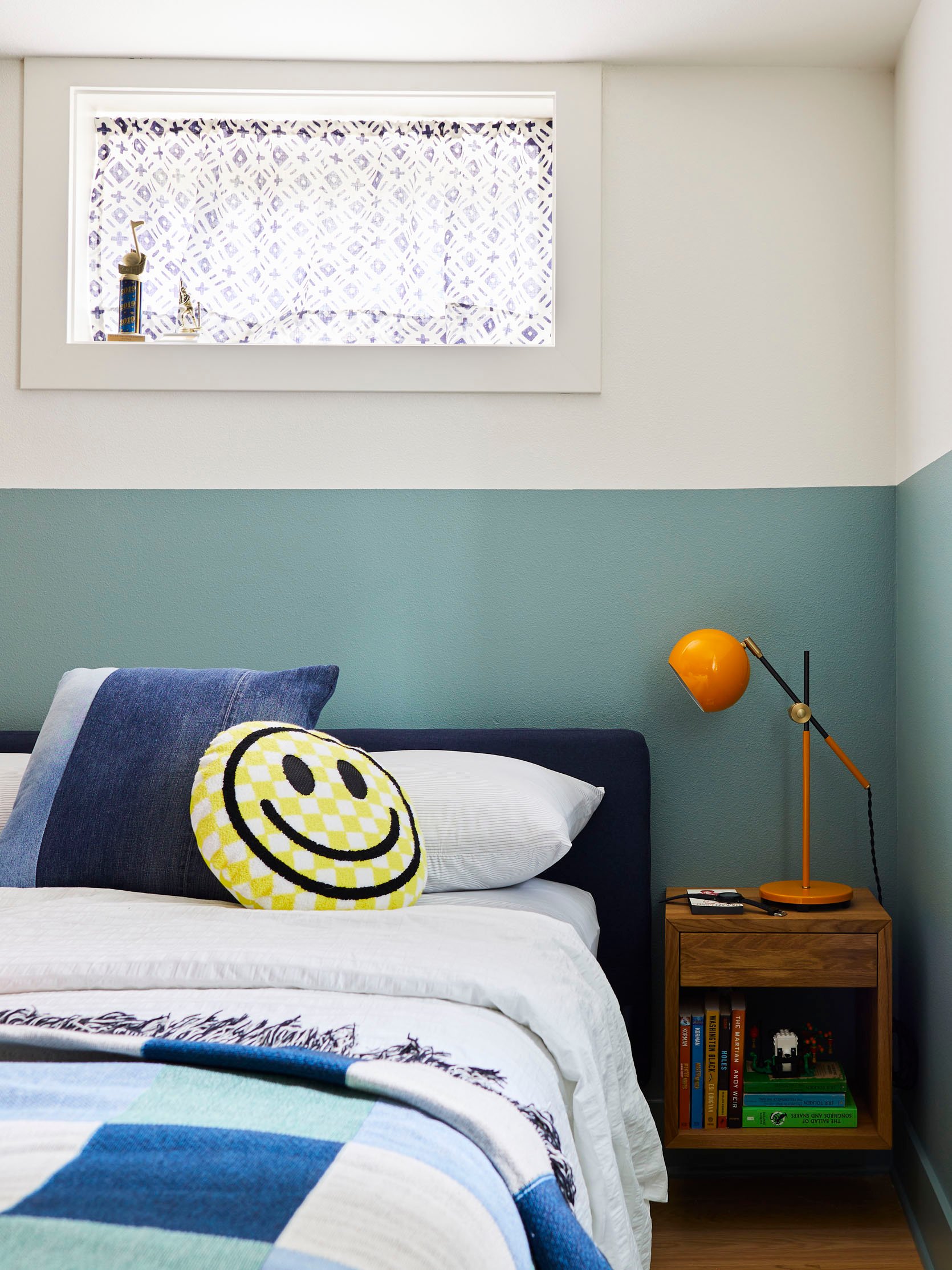
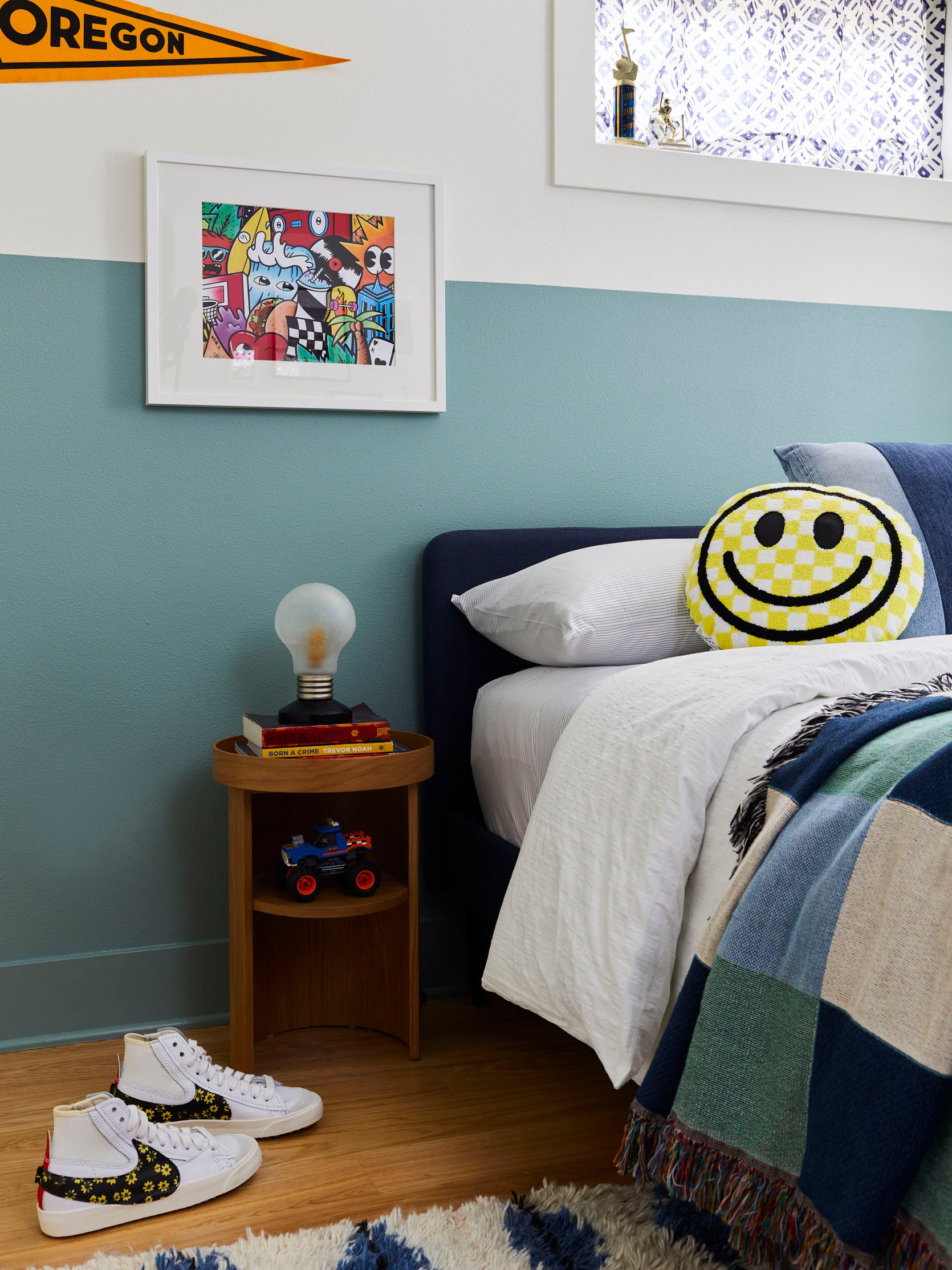
Happy Face Pillow | Denim Pillow (similar) | Sheet Set | Duvet Cover | Yellow Task Lamp | Square Nightstand
DECOR/COLOR PALETTE
To make the room feel taller, we tried to keep the furniture lower and slimmer in profile. We chose warm wood tones to bring in some visual warmth (and to offset the gray Portland days), as well as help ground all the color and pattern. By using a variety of shapes in the furniture and decor we hoped to make the space feel a little more dynamic and youthful. Like having one nightstand be round and the other square. The color scheme was blue & green with pops of yellow, orange, and red to bring some energy and provide contrast. The yellow–yorange Schoolhouse lamp against the wall paint may be my favorite element…love that color combo!
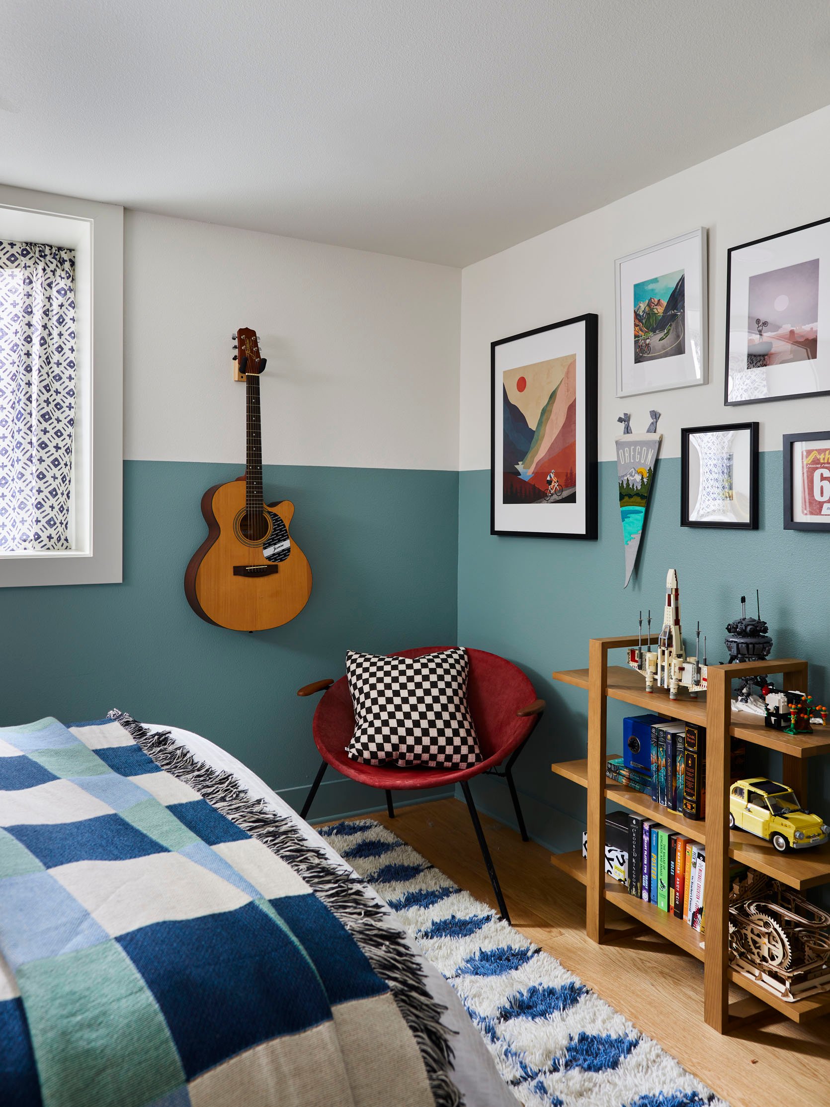
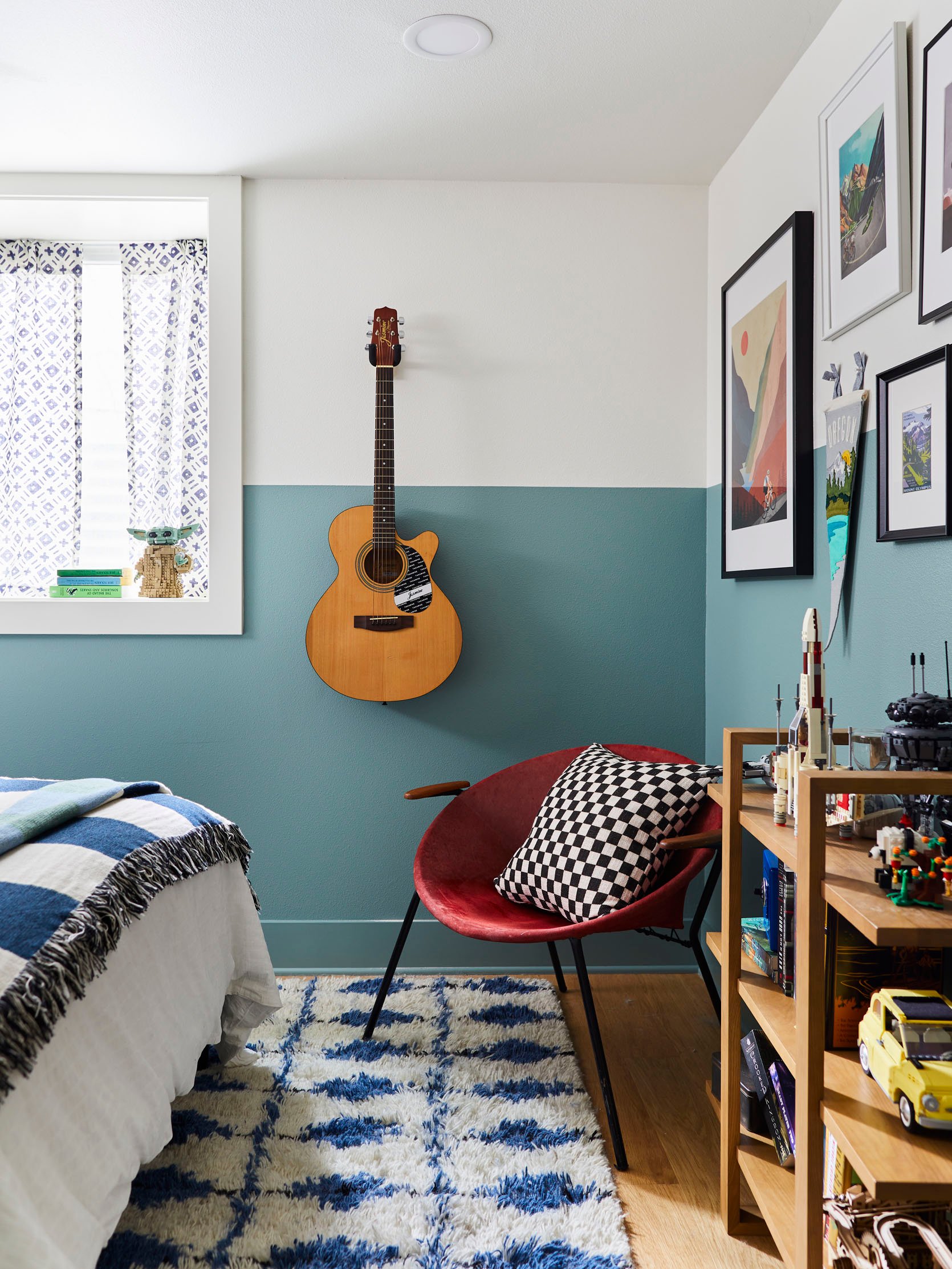
Vintage Hoop Chair (similar) | Bookcase | Check Pillow | Rug
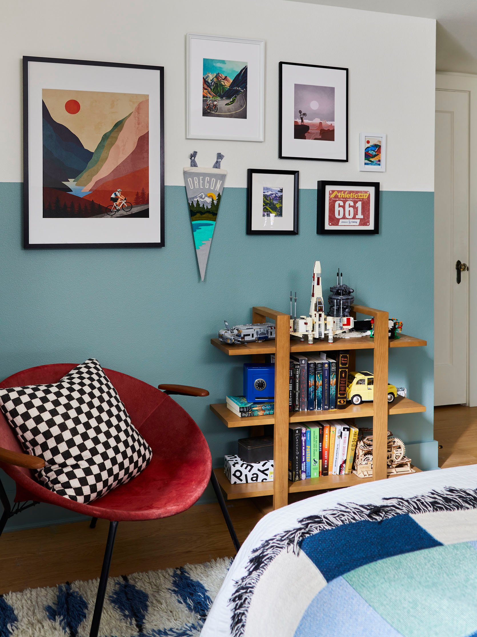
Artwork (Set of 3) | Mountain Bike Print
Functionality in a teen room is all about controlling clutter. J had a lot of smaller items he wanted to display so we tried to fit in as many surfaces as possible. Though space was tight, we were able to get in 2 nightstands, a built-in desk, and shelves to showcase his collections. The bookcase was originally going to be wall-mounted, but we ended up liking it next to the chair. With the wall freed up, we used the space to hang up J’s guitar and create this fun art wall.
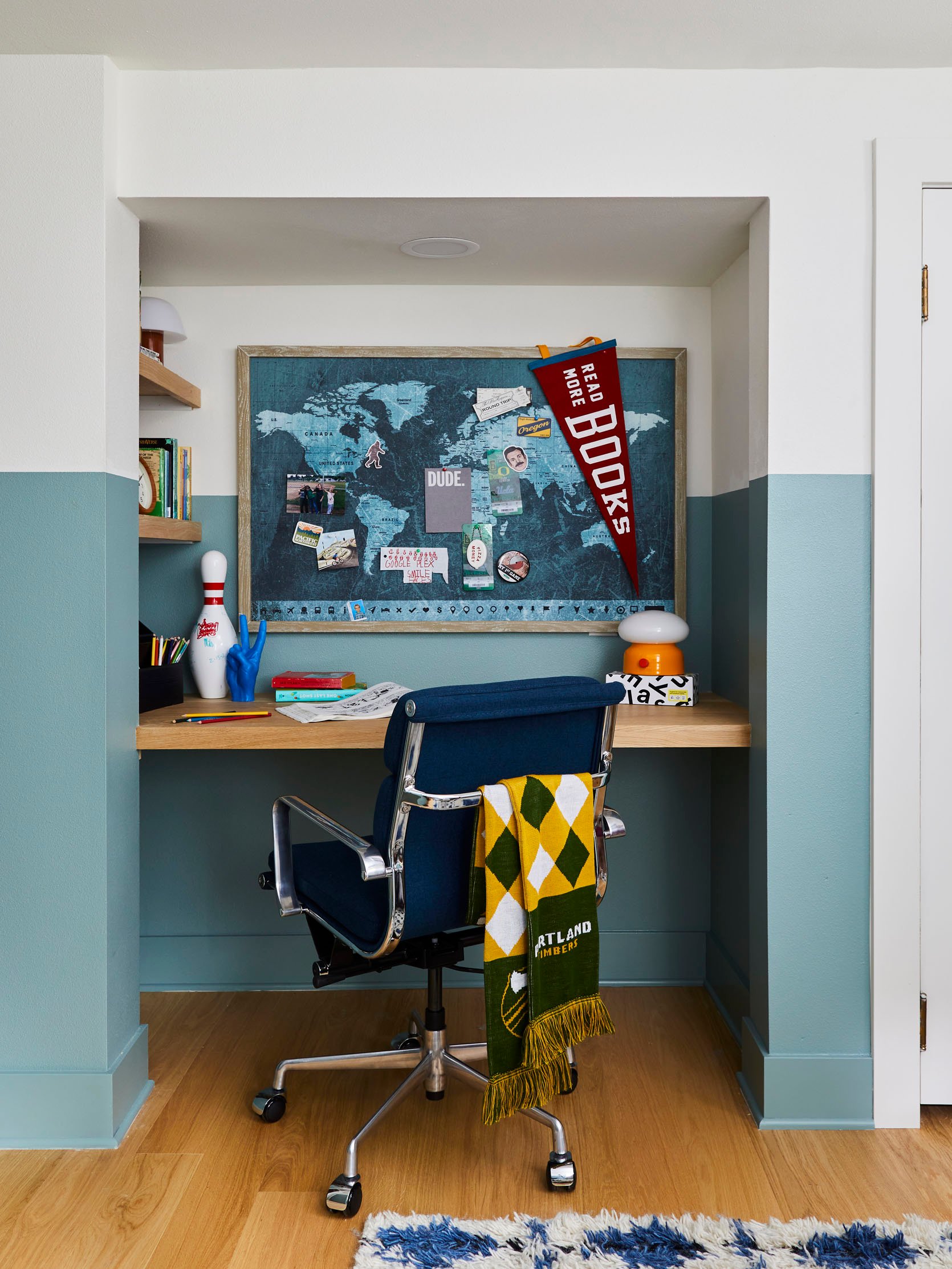
Chair | Pinboard (similar) | Tieg Lamp | PRead More Books Pennant
The built-in desk and shelving were done in white oak planks and finished with a matte wax. We wanted the space to feel bright and happy so we kept all the wood tones on the lighter side and introduced some variations throughout. By using a variety of white oak, red oak, and birch woods, the bedroom has a warm Scandi-vibe but with a little more depth.
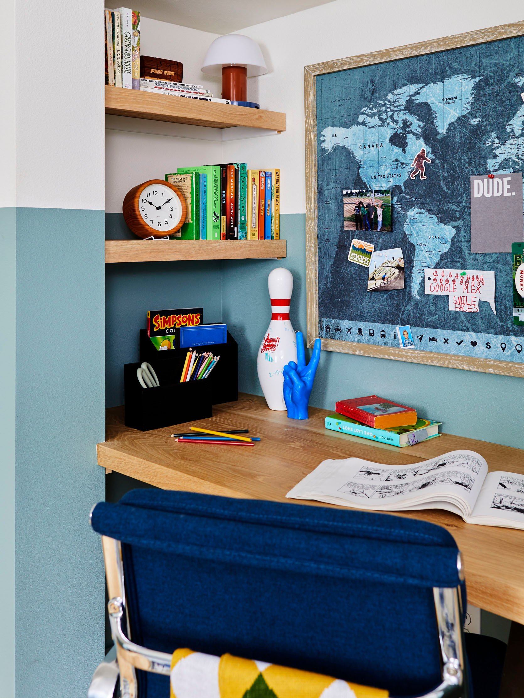
Mini Lamp | Clock | Black Organizer | Hand Candle
The paint line wrapped the whole space including this fun nook which made the room feel larger and more cohesive. Artwork and shelving were intentionally placed off-set from the paint line or intersecting it. This helped keep your eye moving around the room and made the decor feel whimsical. (HOT TIP: When doing a built-in desk don’t forget to add in holes for your cables in an out-of-the-way place. Cord creep is real, folks:)).
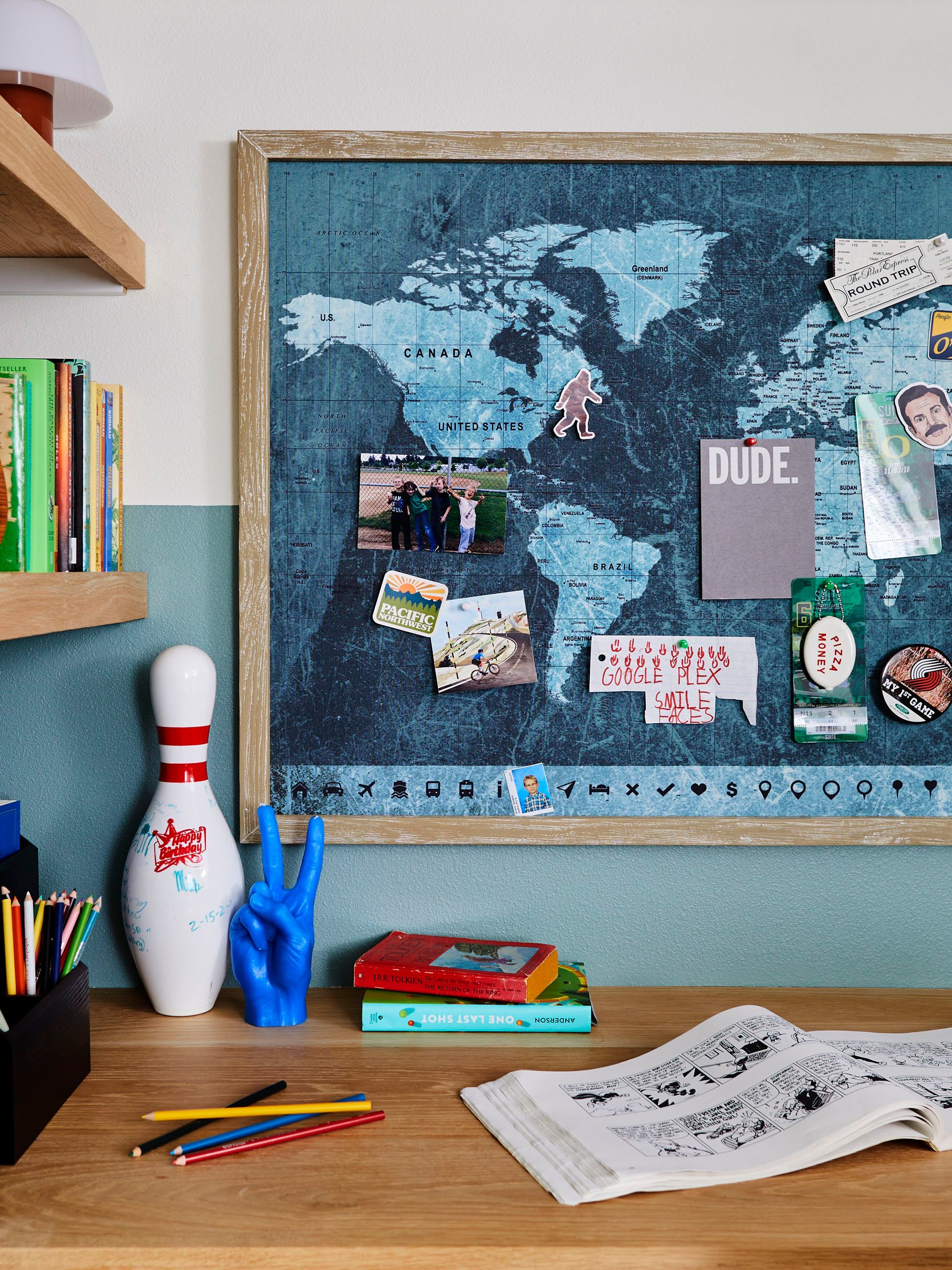
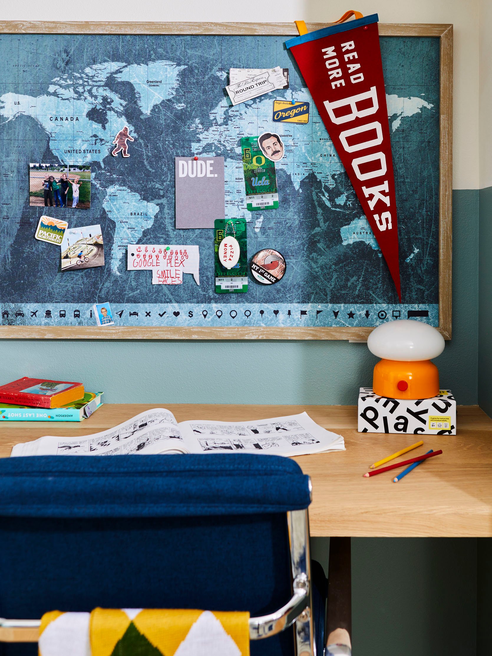
It was a blast designing and installing this bedroom. The space feels really fun and playful. I hope you enjoyed reading about it and got some ideas if you’re tackling a teen room in the future. Chat me up in the comments if you have any questions. Talk soon xx.
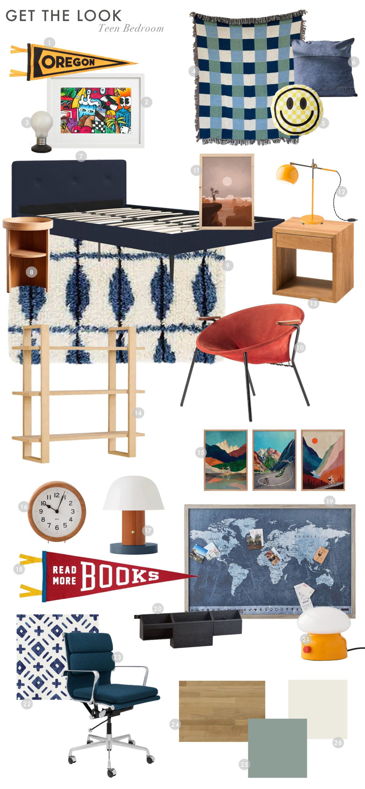
1. Oregon Pennant | 2. Graffiti Artwork | 3. Vintage Lightbulb Lamp | 4. Blanket (similar) | 5. Happy Face Pillow | 6. Denim Pillow (similar) | 7. Upholstered Bed | 8. Round Nightstand | 9. Rug | 10. Vintage Hoop Chair (similar) | 11. Utah Bike Print | 12. Yellow Task Lamp | 13. Square Nightstand | 14. Bookcase | 15. Set of Three Cycling Art Prints | 16. Clock | 17. Mini Lamp | 18. Read More Books Pennant | 19. Pinboard (similar) | 20. Desk Organizer | 21. Tieg Lamp | 22. Minted Plus Fabric | 23. Desk Chair | 24. Kahrs Tapa Engineered Wood Floors | 25. Green Paint: Sherwin-Williams Jasper Stone | 26. White Paint: Sherwin-Williams Alabaster
*Design by Pricilla Frost and Emily Henderson
**Styled by Emily Henderson
***Photography by Sara Ligorria-Tramp
THIS POST WAS ORIGINALLY PUBLISHED HERE.


