This is a fun piece I wrote for Cup of Jo to promote my book before it came out. Naturally (and to no one’s surprise), I overwrote it. Ha. So this is the extended version with a bunch of beautiful photos from the book. Enjoy!
After years of documenting my design projects on the internet for the world to watch, criticize, and hopefully enjoy, in 2018 I found myself once again crying in the shower (as working moms do), extremely frustrated with the home renovation/remodeling process. I wished so badly that there was a book full of beautiful rooms and real life anecdotes to help educate and support me through this inevitably very stressful process. I was so sick of feeling dumb, being mansplained by my contractor, and doubting my every decision. I had so much of the information and had been writing about it for years on the blog, but I wanted it all (plus more) to be in ONE BOOK. I pitched the book the next day and four short (!!) years later it’s here now, in the world. While the world changed dramatically since that tearful shower day (2020 was like, “HA I’ll give you something to cry about”) the information in this book has become even more and more relevant as so many people, trapped indoors, wanted to make their homes a little bit better. The New Design Rules, is a guidebook through the renovation and decoration process, from my perspective, with my personal mistakes and anecdotes and filled with 330 pages of gorgeous photos from 28 different creative homes in every style. It’s full of everything from “kitchen design rules”, “bathroom makes to avoid”, “how high should you really hang art” to “how do you make a builder grade home have charm?” My goal was to help people learn the rules of design so they can creatively break them, thus making a choice, not a mistake. So that’s my pitch for the book and it’s not just for those of us privileged enough to be able to remodel – it’s for those who love to decorate, style, or DIY (or just stare at pretty photos like what you’ll see in this post). I hope you enjoy and more importantly learn something to help you in your next design project and shed less shower tears 🙂
Avoid “Builder Grade” Everything (Here’s How To Add Some Charm)
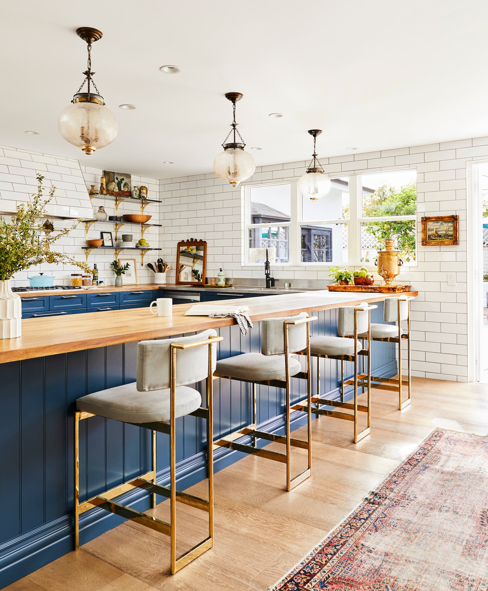
You are NOT alone if you live in a builder-grade house. Have hope that there are ways to add the charm that might be missing. This kitchen by Corre Marie (which I don’t think was builder-grade), shows great examples of what you could to do add charm with simple materials and some high-impact choices. The lines of it are simple – U-shaped shaker cabinetry with butcher block top, painted in a bold color that packs a huge punch (and is totally doable to do in an affordable way). The subway tile is affordable and classic but adds so much old-world character. The shelf brackets, pendants, and rug are design elements that are easy ways to swap out for more one-of-a-kind antique pieces like these. Heck, how she hung a painting and leaned that mirror on the tile creates so much interest. And interest = charm, even if it is added after the house is built.
Avoid The “Too Small Rug”
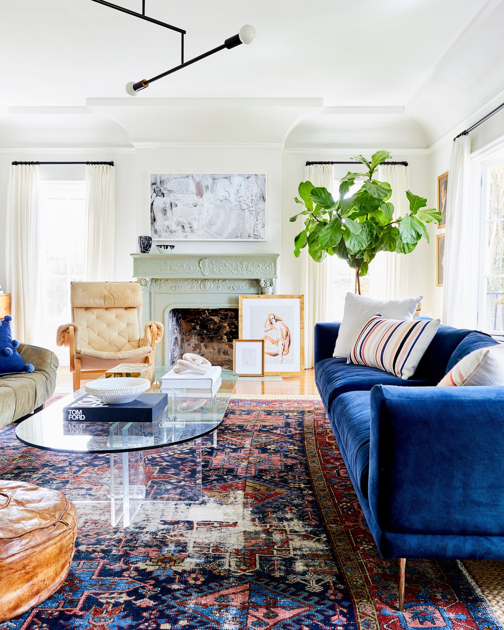
The “too small rug” is such a common mistake to make – you aren’t alone. But it’s very noticeable and can throw off the whole room. In this living room, Dee Murphy not only followed the rules (by having at least the front two legs of all the furniture on the rug) but she layered the vintage rug OVER a simpler sisal rug to ground the conversation area even more. Good move. We wrote more about living room rules here and I also did a super dated but still fun video about rug size here.
Don’t Chase Every Trend When It Comes To Permanent Finishes
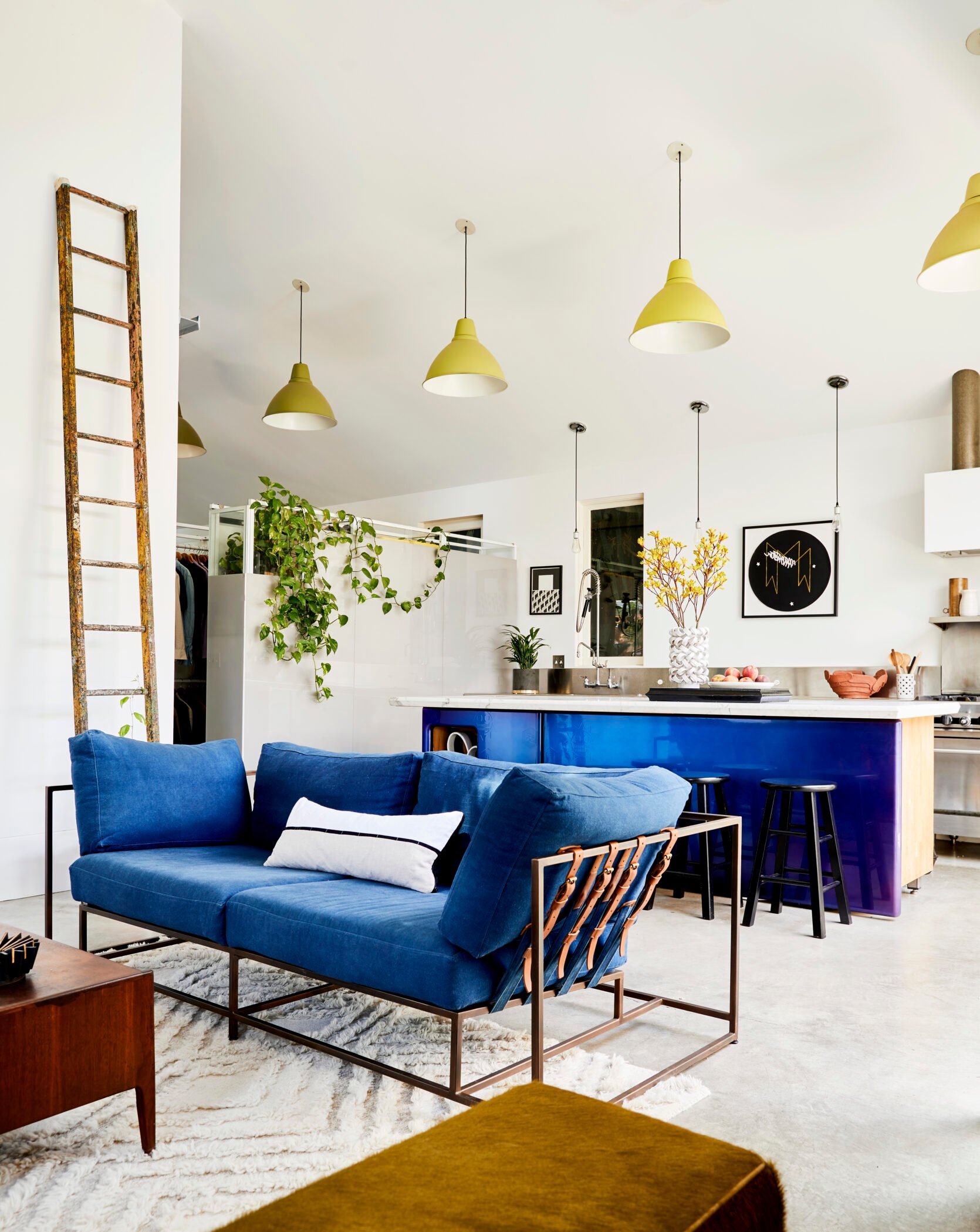
You can absolutely still follow new stylish design ideas and bring them into your home, but it’s safest to do what Ben Mendansky did with the light fixtures here. Y’all, he ombre’d the yellow from light to dark. Yes, take risks! Just be really, really careful leaning hard into trends in your permanent finishes like tile, flooring, windows, or architectural details. If you feel nervous as I often do, then think about taking your risks in lighting, furniture, and decor (elements that don’t require demo and hiring out to change).
Don’t Have Too Much Furniture, Even If You Have The Space
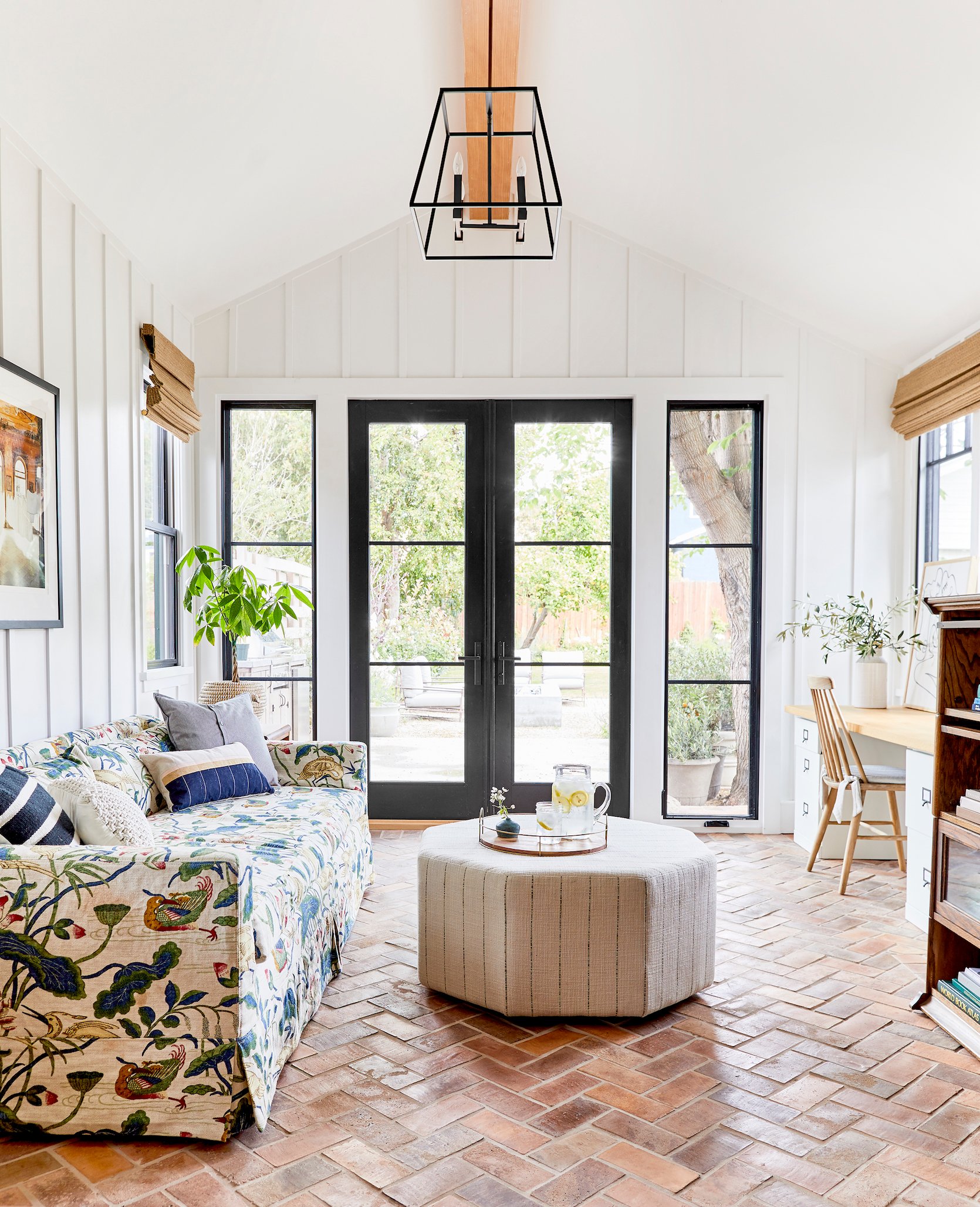
It’s easy to clutter up a space (I used to have hoarding tendencies so I get it) but remember that there is something really lovely about negative space and having less. YES, you want enough furniture for a space to function and to seat everyone properly, but a room like Rosa Beltran‘s gorgeous den has enough with the sofa – and having less really showed off the other elements she DID have – i.e. that incredible floral pattern and that herringbone brick floor.
Don’t Strip Out Character In Vintage Homes
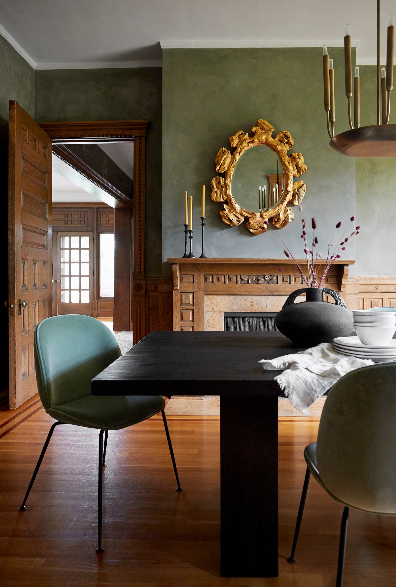
For those of us lucky enough to live in older, vintage homes, you might be tempted to start fresh if you are remodeling (and you might not have the gorgeous original paneling that Victoria Sass did – lucky lady). Maybe some elements feel really basic (like a white brick fireplace) or a little awkward (like unnecessary broom closets or niches). But think HARD about removing them. Like people, sometimes those awkward moments, age spots, and quirks are what you’ll come to love about your home because they are unique to YOU. And demo-ing something old and high quality just for the sake of “new” and “better” is hard on the planet, so really think about it before you do 🙂
Know Your Fixtures Before You Chose The Height Placement
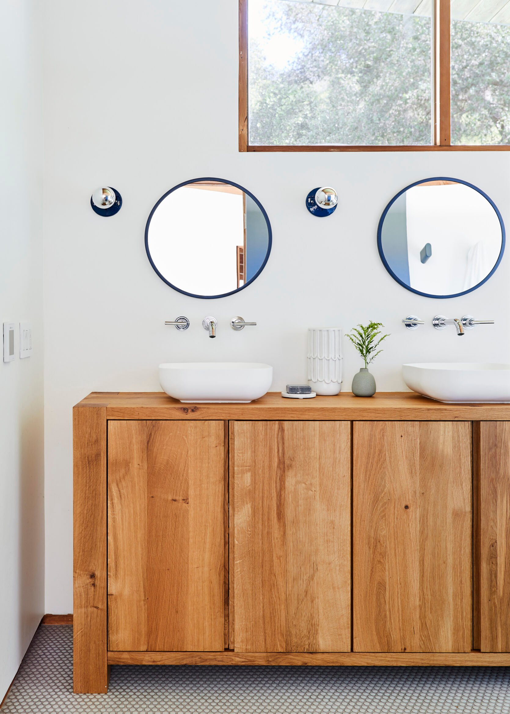
Hopefully, you only have to learn this once (or if you read the book – avoid this and other mistakes altogether). If you are doing a larger remodel you might be redoing the electrical and plumbing, and the new plan for what is “inside the walls” happens early on in the process. You might think “two sconces there” and “a wall mount faucet here” is good enough, but the specifics of the fixture often will change the height and location. For instance, if Christa Martin had not wanted a vessel sink in the bathroom above, then her wall mount faucets would have been way too high for an under-mount sink, or if she had wanted sconces where the stems curved up 10 inches then that junction box would have had to move down (or the sconce changed). Even if you don’t have the exact specs, just know the style of the fixture to get as close as possible to avoid breaking through fresh drywall.
Don’t Hang Curtains Too High Off The Floor
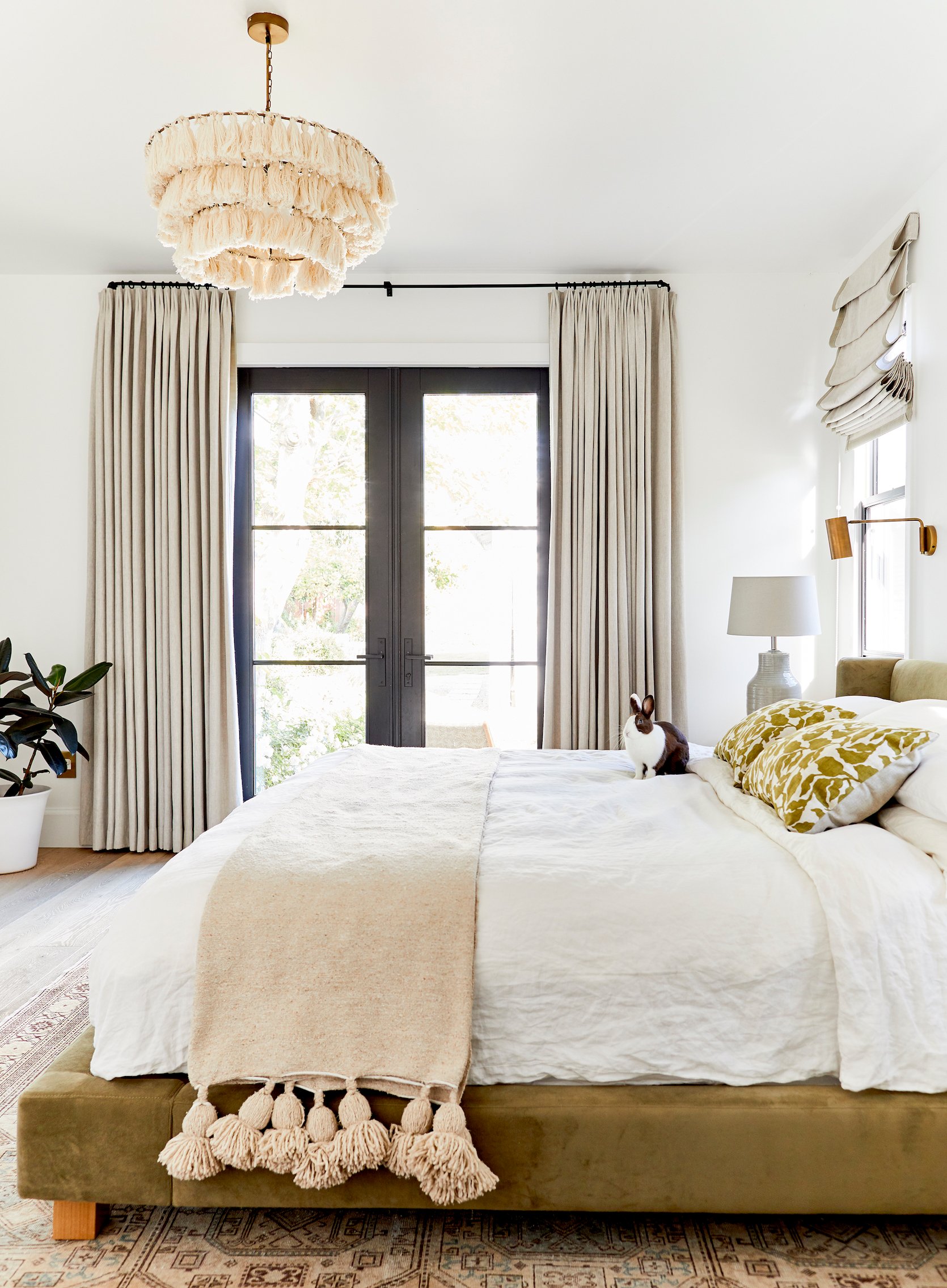
High water curtains can make a room look a little silly, but most big box stores only stock certain length readymade curtains (84″ is almost ALWAYS too short, FYI). Always size up (90-96″ usually works for 8-9′ ceilings) so it hangs long enough to touch or almost touch the floor. You can hang the rod near the ceiling (or halfway between window and ceiling like in this case, not at the top of the window), but always try to get as close to the floor as you can. We have a fun graph and more photos in this post. Also, please note THERE IS A BUNNY ON THE BED!!!!!
Don’t Demo Your Room/Home Without A Plan
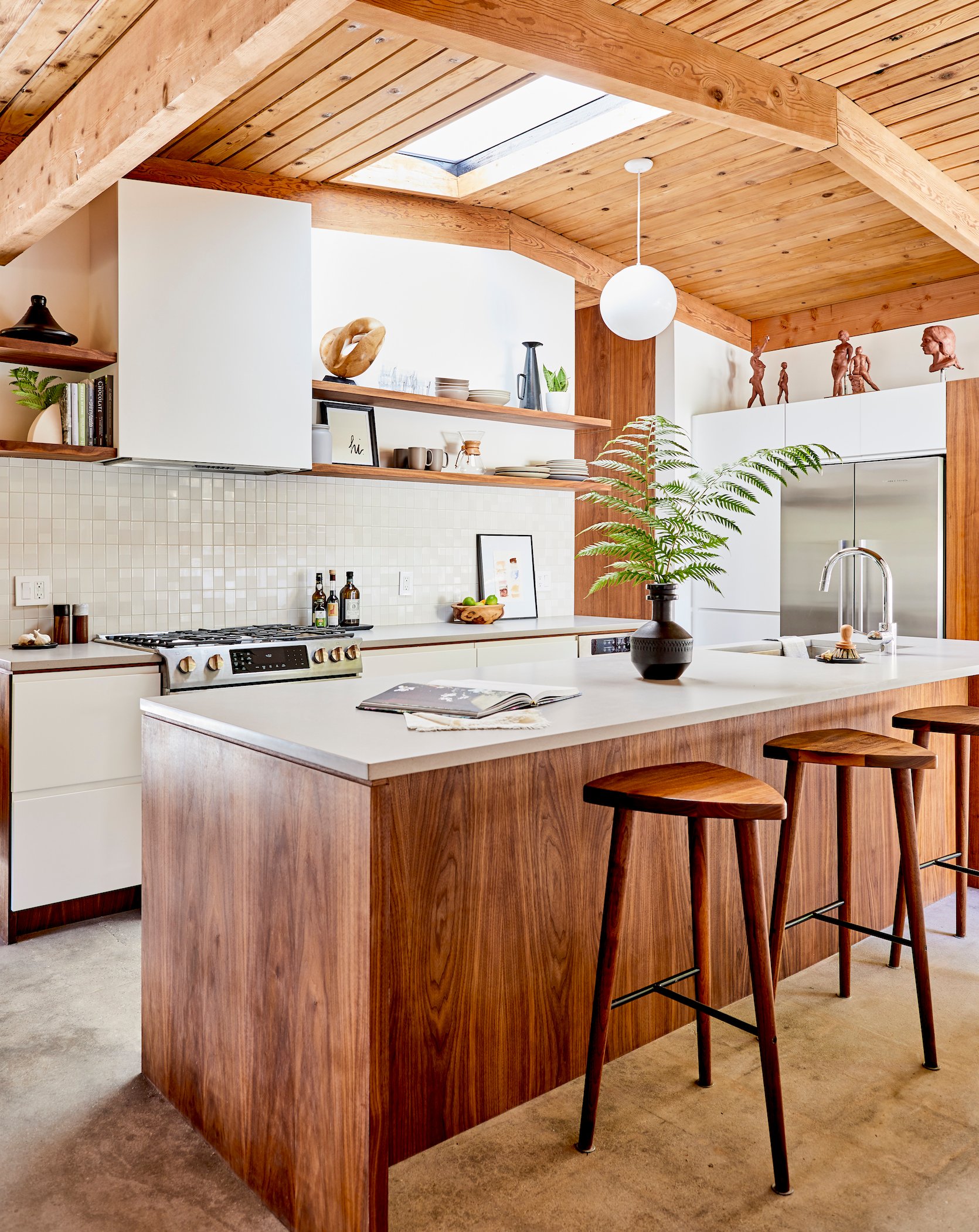
This is just a general warning that the remodeling process has a lot of moving parts and is full of delays that are out of your control. If you don’t have a team in place, a fairly solid plan, permits, and even materials ordered before you demo you might end up living in construction for much, much longer. Sometimes your contractor will have to do exploratory work to figure out what is load-bearing, etc, but before you make your home or room totally unlivable, have your players in place and a general plan. I’m in the middle of a renovation right now and trust me, your patience will be tried over and over and over 🙂 At the end of it all, you might have a kitchen like this one by Christa Martin, but try to do as much prep work at the beginning as possible.
Vary The Art Configuration On Each Wall
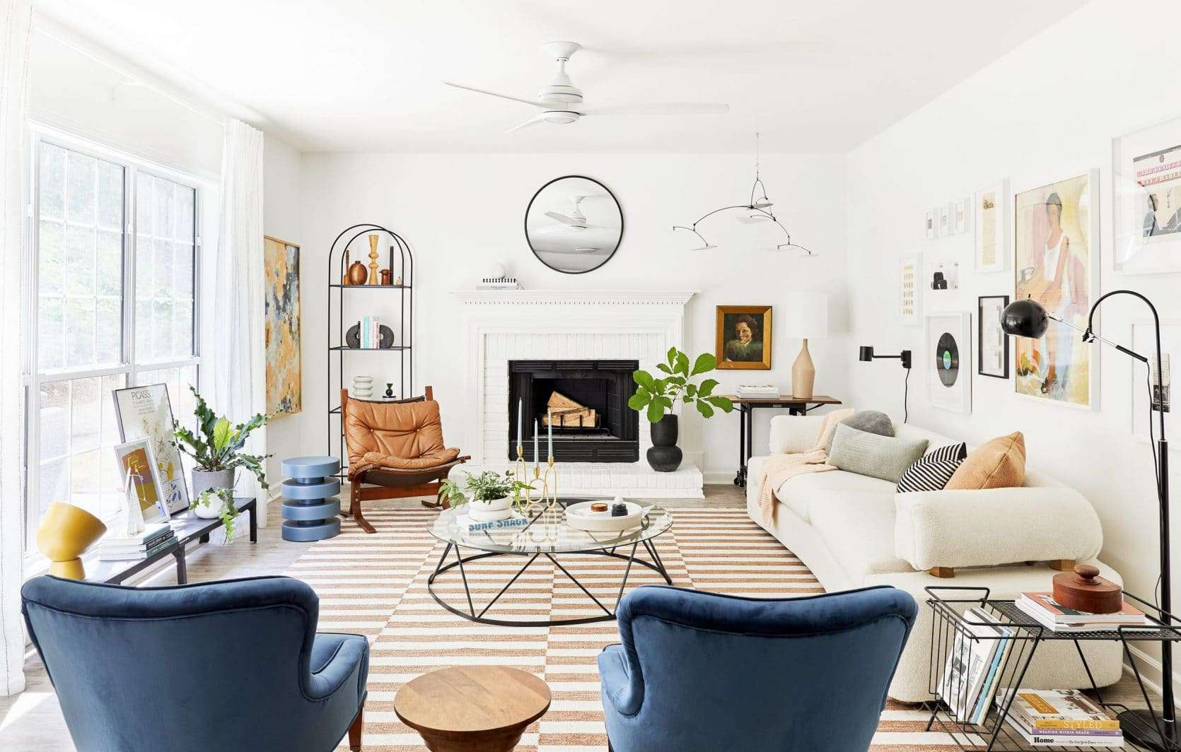
This is a great styling tip/formula that I’ve used in almost every room (including this one that my EHD team did in Atlanta). What you want to avoid is every wall having one similar piece of art, hung at the same height. Instead think about doing what we did here – mixing a gallery wall, mirror, shelves, leaning art, diptychs, or one large-scale piece of art. Even if you like a more minimal simple design (which I do) you want to vary the mediums or scale of the art so it doesn’t feel redundant and to give each piece its own power and moment.
Don’t Overlook What You May Already Have
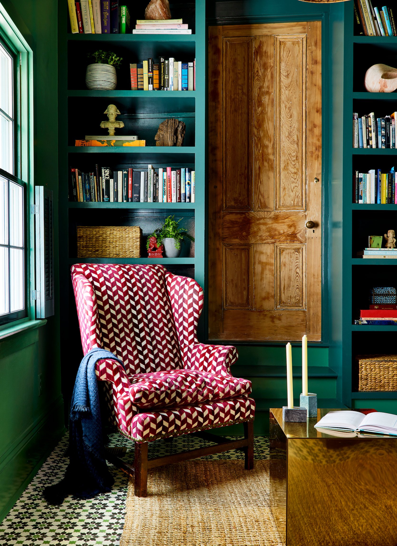
I think in this world of everything at our fingertips (hello, internet shopping) it’s tempting to get rid of something old and replace it with the newer, younger (and likely cheaper) version. But before you do, look at your previously loved pieces with new eyes. If you love the shape and style but not the color or fabric you could do what Sara Ruffin Costello did and reupholster a vintage wingback in that insane statement patterned fabric. If the above room tempts you a bit, know that the rest of her incredible home in New Orleans is peppered through the book and knocks me down every time I see her creativity. That green paint, the floor tile, the door! She is incredible.
Listen, you will make mistakes in the renovation or decoration process, we all do. It’s part of the creative process. But, I hope this book can help you avoid as many as possible and unleash your creativity. And if you love the type of design info in this post and if the photos of these homes sparked joy in your design gut, then I hope you’ll like the book because It’s full of 330 pages of it 🙂
Opening Image Credits: Design by Corbett Tuck | Styled by Velinda Hellen, Erik Kenneth Staalberg, Emily Edith Bowser, and Julie Rose | Photo by Sara Ligorria-Tramp
THIS POST WAS ORIGINALLY PUBLISHED HERE.


