Color. Texture. Pattern. Shape. They’re the earth, air, fire, and water of design – you kiiiinda need all four if you want your home to feel balanced, collected, and finished. Today, I’m breaking down four classic EHD vignettes – you know, explaining why they work – while also sharing a few of my favorite now-on-sale pieces, so you can capture the same look and feel in your own home. READY TO GET STARTED?
Shape
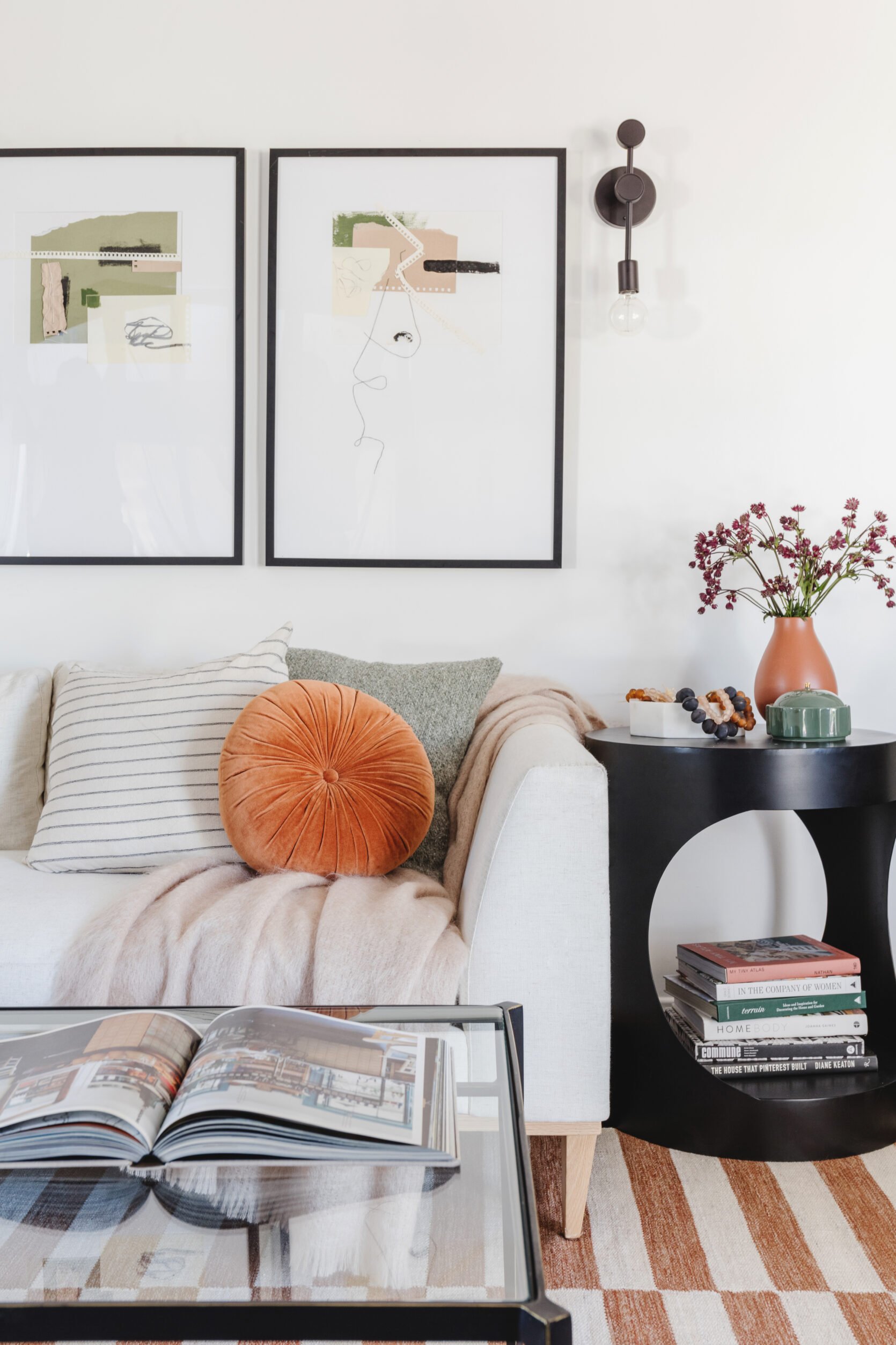
Let’s kick this off by really breaking down the elements in this vignette, yeah?
Shape: OH MY. That graphic side table is kiiiinda the star of the show, don’t you think? It’s bold, but not overwhelming. I love how the round pillow breaks up the corner of this sofa while speaking to the circular opening, too – it makes this living room feel a lot more intentional and thoughtful.
Color: A little goes a long way here! Look again – the main furniture and decor pieces in this shot are all totally neutral (though honestly, I think I could make a pretty compelling argument that rust and sage can be neutral, too!). Spreading your shades around evenly is key as well as having that color pop a little – see how the terra-cotta color is peppered in on the tabletop, the sofa, in the books, in the rug AND adds that color depth? It feels balanced, finished, and fun.
Texture: Glass, metal, wood, ceramics, mohair (that throw is SO luxe, and also linked below – it’s worth it, even when it’s not on sale, IMO), linen, boucle…it all just looks so great when it’s layered together, you know? Even if color really isn’t your thing, having lots of textures will add visual interest and warmth!
Pattern: YOU CAN’T GO WRONG WITH A BROKEN STRIPE. This is my favorite print for those who are a little wary of entering the whole “mix-and-match” pattern arena – just pop in a thin stripe, like Bowser did above, and you’re golden. High-end pattern mixing, NO STRESS REQUIRED.
To that end, here are 9 of my favorite shaped pieces – from decor to furniture, so there’s something for every price point! – that’ll really make your room sing. All pieces in this post are from Lulu & Georgia, because they’re (a.) an awesome resource for all things home and (b.) a brand who chose to kick off their Memorial Day sale early, which means that I got to spend some time last week perusing and searching for the best deals to pass on to you. 🙂 LET’S SHOP NOW, yeah?
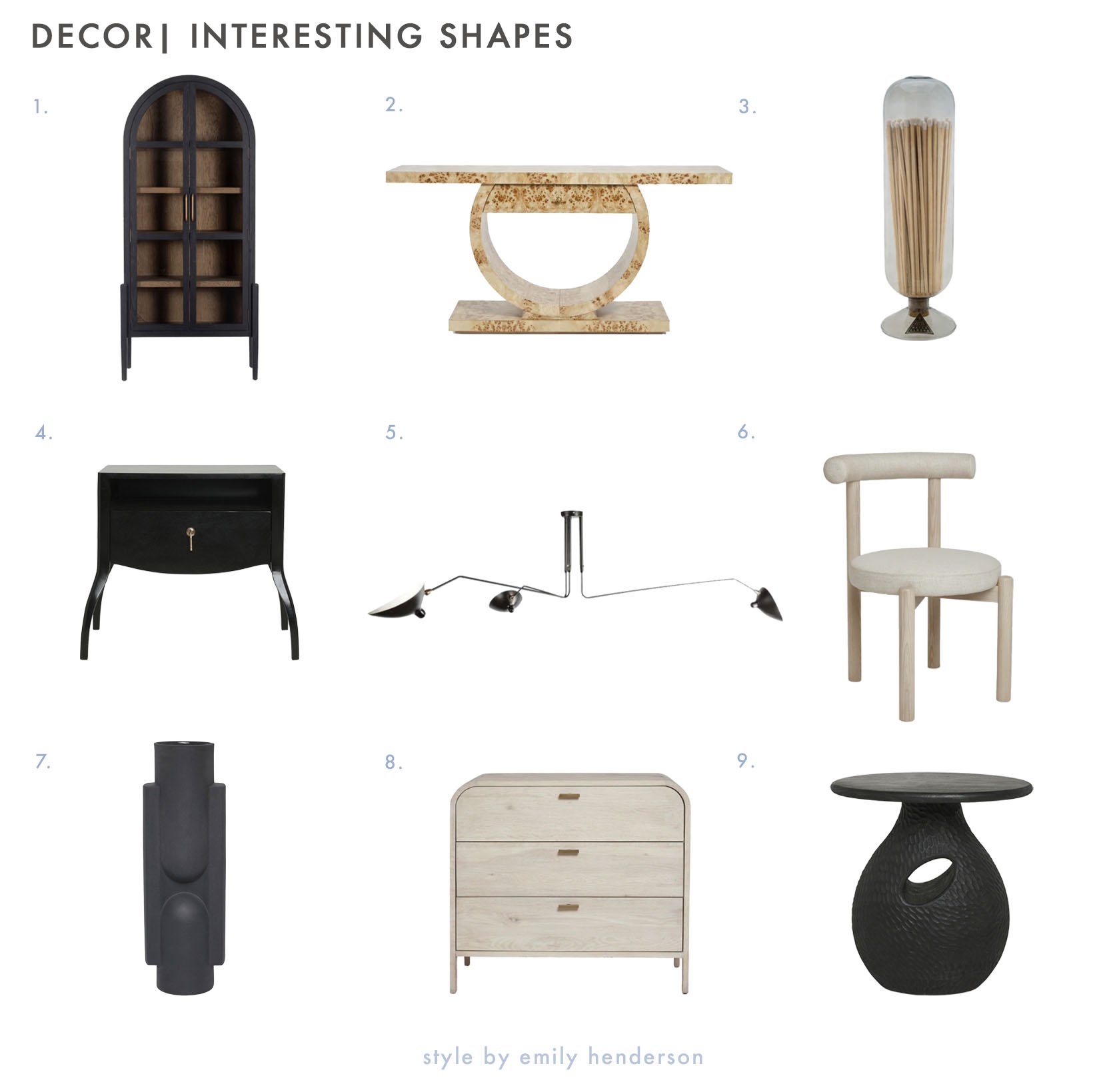
- Apolline Curio Cabinet: Timeless, classic, and a little more impactful than your standard rectangle-shaped cabinet.
- Chloe Burl Wood Console Table: SHOWSTOPPER. Burl is the perfect wood for this piece – the shape draws you in, and the burl keeps you staring.
- Match Cloche: I’m buying this for myself today! There’s something fun and unexpected about the scale of a fireplace cloche, don’t you think?
- Anabella Nightstand: It’s a bestseller for a reason! Those splayed legs infuse this classic nightstand with a LOT of character.
- Jimema Chandelier: This Mouille-style fixture can edge up your space while drawing your eye upwards. (Check out Lea’s basement for more styling inspiration!)
- Dame Dining Chair: These are VERY on-trend, but the neutral finish will keep them feeling relevant for years to come.
- Light + Ladder Kala Vase: Light + Ladder is one of my favorite makers right now – she really embodies the whole “own less, own well” idea and she’s made it her mission to good design accessible for all. BIG FAN.
- Brooke 3-Drawer Dresser: I mean…y’all have seen my dresser. You know how I feel about a waterfall edge! This one’s high-impact without sacrificing storage.
- Corso Side Table: Total chameleon – an organic modern shape that could also play well in rooms that lean a little more space-age or postmodern.
Color
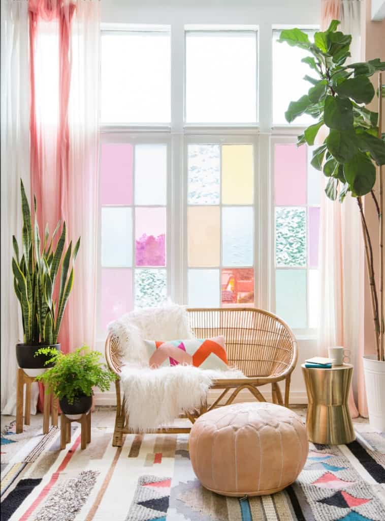
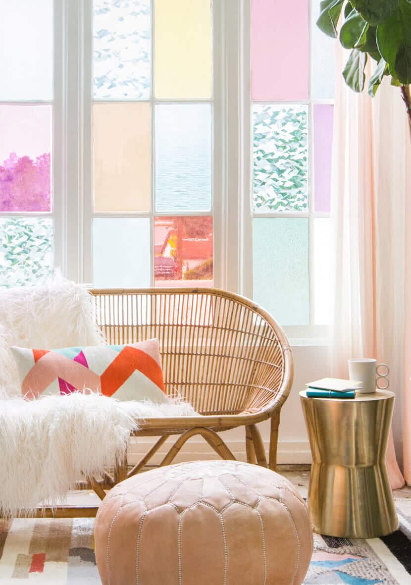
As EHD’s resident fan of color (or at least like, loud color – the other gals are a little more discerning with their preferred palettes :)), I wanted to break down one of my all-time favorite vignettes next… (PS. Anyone else also start reading the blog around this time? This was one of the first reveals I saw!)
Color: When it comes to jumping-off points, those windows are a freakin’ DREAM. Take a peek at their palette, throw in a rug with hits of pink and blue to ground the space, grab a blush pouf, add a graphic pillow with a pop of orange, and hang some soft pastel sheers to bring it all together – DONE.
Texture: Mixing metallics, rattan, and leather is one of my all-time favorite combinations – it’s a little luxe and glam without being too over-the-top. (I think it’s one of Em’s favorite combos, too, judging by Birdie’s OG nursery – I’m filled with throwbacks today, y’all!)
Pattern: When you’re working with this much color, it’s okay to take it easy on the pattern! A rug and one accent pillow is more than enough to keep your eye moving through the space.
Shape: And, well, I mean…what here doesn’t have a cool shape? When you have a big statement piece of architecture – like these traditional gridded windows, aka straight line central – it’s kind of fun to play up the contrast by leaning into curvier, non-traditional pieces.
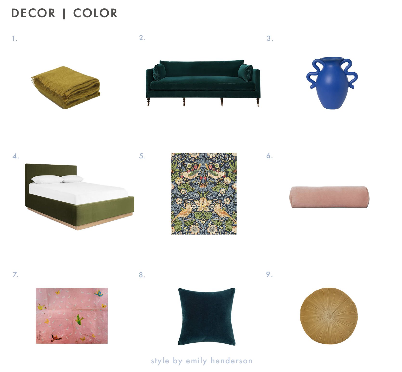
- Aimee Mohair Throw: This is the mohair throw from above – I love it in this chartreuse-y mustard, but it comes in a ton of saturated color options.
- Fabienne Sofa: This rich color punches up a classic shape.
- Calabria Vase: When you have a vessel that makes this much of a statement, you can keep the rest of your decor simple.
- Lockwood Bed: Classic bed, beautiful velvet. What else could you need? (Maybe some style inspiration? See how Julie styled out this same bed right here!)
- Morris & Co. Strawberry Thief Wallpaper: If it’s good enough for Sara, it’s MORE than good enough for me. (And if you’re a fellow design nerd, I wrote about Strawberry Thief’s history right here!)
- Sabine Velvet Bolster Pillow: It’s a great (and affordable!) pick to flank both ends of a sofa, but I love it as a lumbar on a bed. Perfect finishing touch AND lots of colors available.
- Feathers’ Wall Art: If this color palette seems familiar, it’s because we just reviewed it above!!! Here’s your jumping off point.
- Charlotte Velvet Pillow: This navy is SO deep and luxe. You should see it in the light – it’s really simple and special.
- Monroe Velvet Round Pillow: You saw this styled out above, too. Great scale, great feel, and holds up well over time. Highly recommend.
Texture
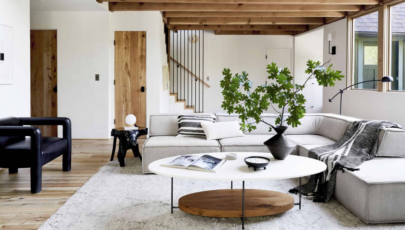
The Mountain House is a veritable masterclass on texture. If you’re also a lover of a neutral interior, being intentional the materials in your home will be key to keeping your place from feeling flat and boring. Let’s break it down real quick, yeah?
Texture: A leather chair, lacquered teak end table, plush rug, thick blanket, and 3-material coffee table keep your eyes bouncing around this space. It feels dynamic and exciting, even without a ton of stuff. There aren’t a ton of repeating textures in this room, either – every piece gets its own chance to shine.
Pattern: Still, a few quiet patterns keep things interesting. The striped throw and pillow echo the staircase in the rear, and the Moroccan-style rug adds some really quiet movement.
Shape: Outside of the rug, everything in this shot has a little bit of a special twist: the low, clean-lined 1970s sofa paired with the gnarled and organic table; the chunky postmodern chair; the curved floor lamp and geometric vessels. If those are still a little too out-there for ya, never fear – an oval coffee table is also a great way to bring a fresher, more unexpected shape into your home.
Color: There’s something to be said for such a tight and refined color palette, you know? Sometimes, a few well-arranged branch clippings in an exciting vessel is the only finishing touch you need to make your place sing.
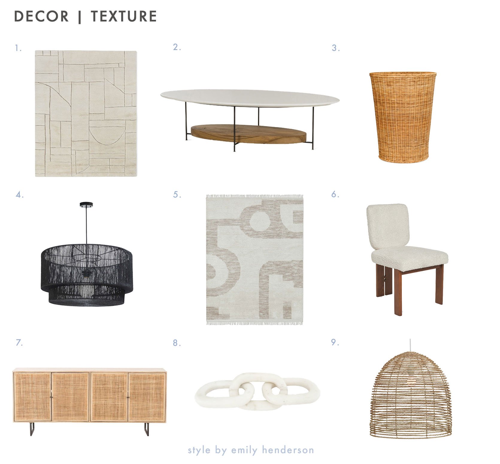
- Maleena Rug: The carved linework on this one makes for an INCREDIBLE high-low texture. (The styled shots on the site are stunning!)
- Thomas Bina Olivia Coffee Table: I mean…this is the iconic EHD coffee table, guys. It deserves the hype.
- Dacey Hamper: Laundry’s a little easier when you’re tossing your clothes in something this chic.
- Sayan Pendant Light: The design impact:price ratio on this is already great – grabbing it on sale is a total steal.
- Nomad Rug: Élan Byrd’s entire collection is a slam dunk. This rug is a standout to me, though – it’s calming, modern, and the hand-knotted wool texture is even better in person.
- Sydney Dining Chair (Set Of 2): Ash wood AND boucle on one chair – what more can you ask for?
- Hannah Sideboard: This natural cane sideboard just feels warm, don’t you think? (It also comes with black exterior paneling, if you’re looking for something with a bit more visual weight.)
- Almarine Chain Décor: What can I say – I’m a sucker for a good chain 🙂 This one’s marble (chic!) and the price tag blew me away – it was about 25% of what I had anticipated.
- Beehive Pendant Light: So fresh, breezy, light, and relaxed. If your style leans coastal or organic, this is a great option.
Pattern
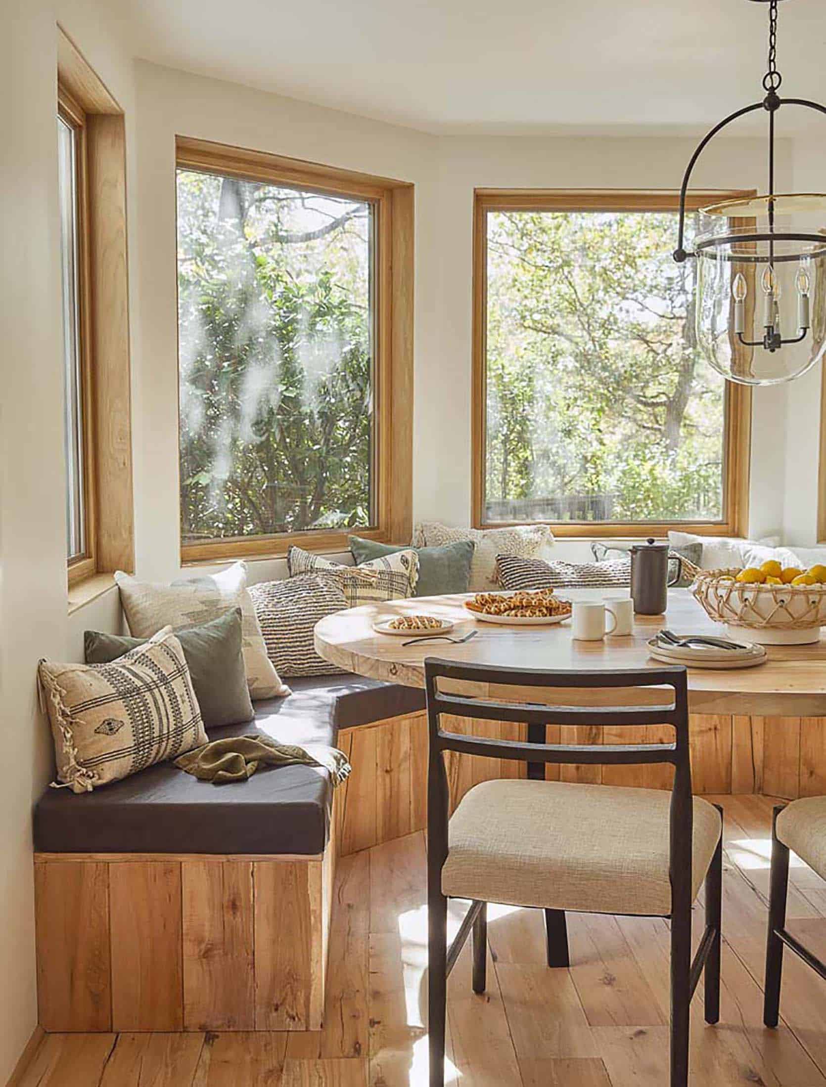
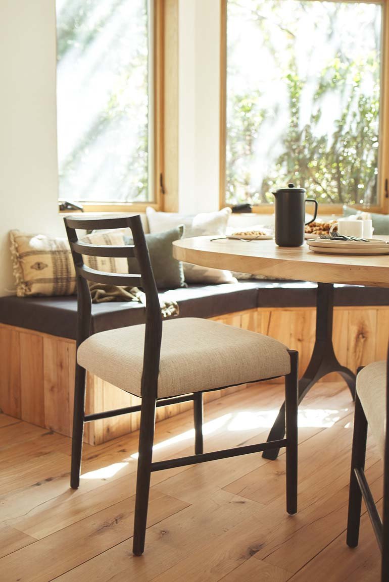
Last – but certainly not least! – we gotta take a second to talk about pattern (another favorite of mine!). I know that pattern mixing can be a little (or, uh, a lot) intimidating, so let’s take a harder look at what makes this work.
Pattern: First – and this may be my most helpful tip – it’s okay to repeat patterns if the scale of the piece is different! Example A: Take a peek at that striped lumbar in the front. Now, take a peek at the fifth pillow back – it’s the same pattern, just with a different shape (square vs. lumbar) and a different orientation (horizontal instead of vertical). If you’re still feeling nervous, you can check out Jess’ masterful explanation of how to mixing and match pattern right here.
Shape: Decor-wise, we’re pretty square here (just different sizes). Our variation is coming from the furniture – check out that wishbone leg on the dining table, the gentle slope of the chair back, and the curve of the light fixture. Even the dimension of the window seat provides some interesting shapes and visual interest, which is neat.
Color: When in doubt, pull your palette from nature! You ever notice how most windows are blown out in interior shots, but how these windows *aren’t* blown out? It’s so we can see the harmony between the inside and outside – there’s something really serene about “bringing the outdoors in” in such a doable way, you know?
Texture: I mean, glass. Metal. WOOD FOR DAYS. The leather bench cushion, the woven pillows, the ceramics on the table – it’s so balanced and lovely.
Ready for our final roundup?
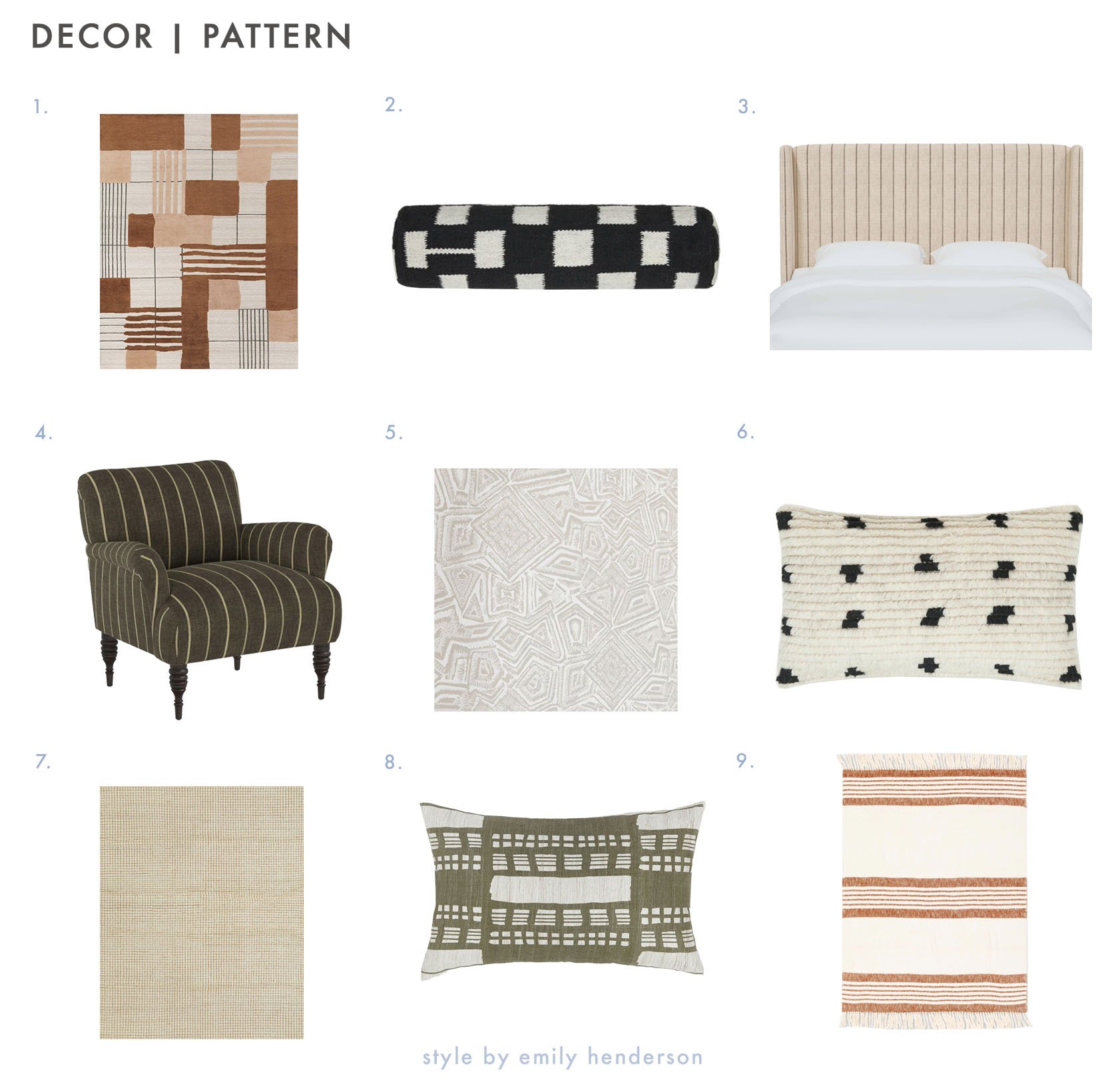
- Benita Rug: Julie recently pulled this rug for an upcoming EHD reveal – stay tuned to see if it made the final cut! 🙂
- Irregular Checkerboard Bolster Pillow: The irregular pattern here puts a fresh spin on a classic motif. (Sarah Sherman Samuel is the master of the checkerboard, y’all.)
- Adara Headboard: A clean pinstripe makes a great backdrop for some calm, neutral bedding and some sweet layered pillows.
- Vyolet Accent Chair: A dreamy blend of traditionally masculine (the dark stripe) and feminine (the sweet shape) design elements. HUGE FAN. (Plus, check out those cute turned legs!!!)
- Malou Wallpaper: This little swatch doesn’t do it justice – this is a GREAT wallpaper for those looking to bring in movement without a ton of color. (I say this as someone who spends way too much time looking at/writing about wallpaper.)
- Irregular Dots Pillow: A texture AND pattern home run – this pillow is warm and special.
- Uma Rug: One of the reviews said it best: “A perfectly neutral non-neutral.” I love the taupe for quiet impact, but it comes in a black grid too (you know, if you’re looking for some more “umph” :)).
- Stonewalk Pillow: Another gem from the Élan Byrd collection! When mixing and matching pillows, you can’t go wrong with 2 solid pieces and a patterned lumbar.
- Elulia Throw: A classic stripe in a works-anywhere color? SIGN ME UP. This throw is versatile, comfortable, and the other piece I’ll personally be grabbing from the sale today.
ALRIGHT, GANG. Today was a mix of my two favorite things: writing about sales (your girl loves a deal – pulling together our holiday sale round up posts is one of my favorite parts of my job!) AND writing about why things work. I had a lot of fun combining the two, but what say you??? Any interest in more in-depth product roundups like this, or should we just keep it to the big sale list posts? (I can take your feedback, I promise!) LET’S CHAT ABOUT IT, PLEASE. xx
Opening Image Credit: via Lulu And Georgia
THIS POST WAS ORIGINALLY PUBLISHED HERE.


