Whenever a project by Kirsten Blazek (principal designer and founder of A1000XBetter) comes across our desks, I know I am about to see a design that will stay etched in my brain for a while. In fact, pick any past project by AXB and you will see a design that is intentional, practical, and yet dripping with charm and personality. It’s her unique style and bold design choices that always keep you guessing and wanting more. Today’s guesthouse tour is no exception and once again I had the distinct pleasure of picking her brain about each detail. Get ready for some expert design wisdom and a heavy dose of her eclectic soulful style.
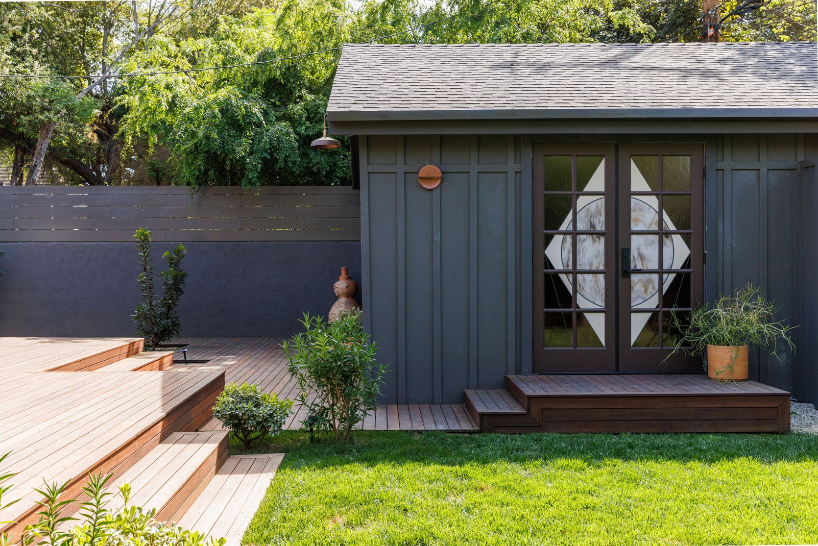
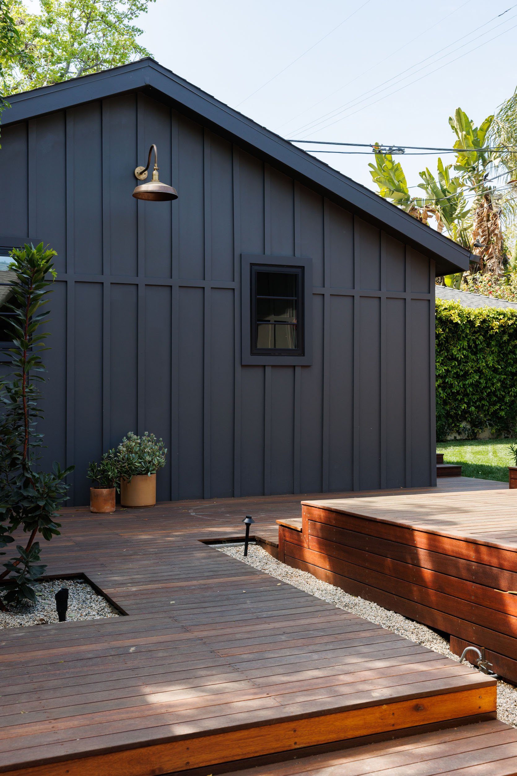
The guesthouse, formerly the garage, underwent a gut renovation that transformed the space into an inviting hangout area for the whole family and guests to enjoy. Just looking at the exterior, you can already see Kirsten’s signature style coming through. The bold paint color makes a statement right off the bat and is complemented with copper-colored sconces and those incredible doors that I just had to learn more about.
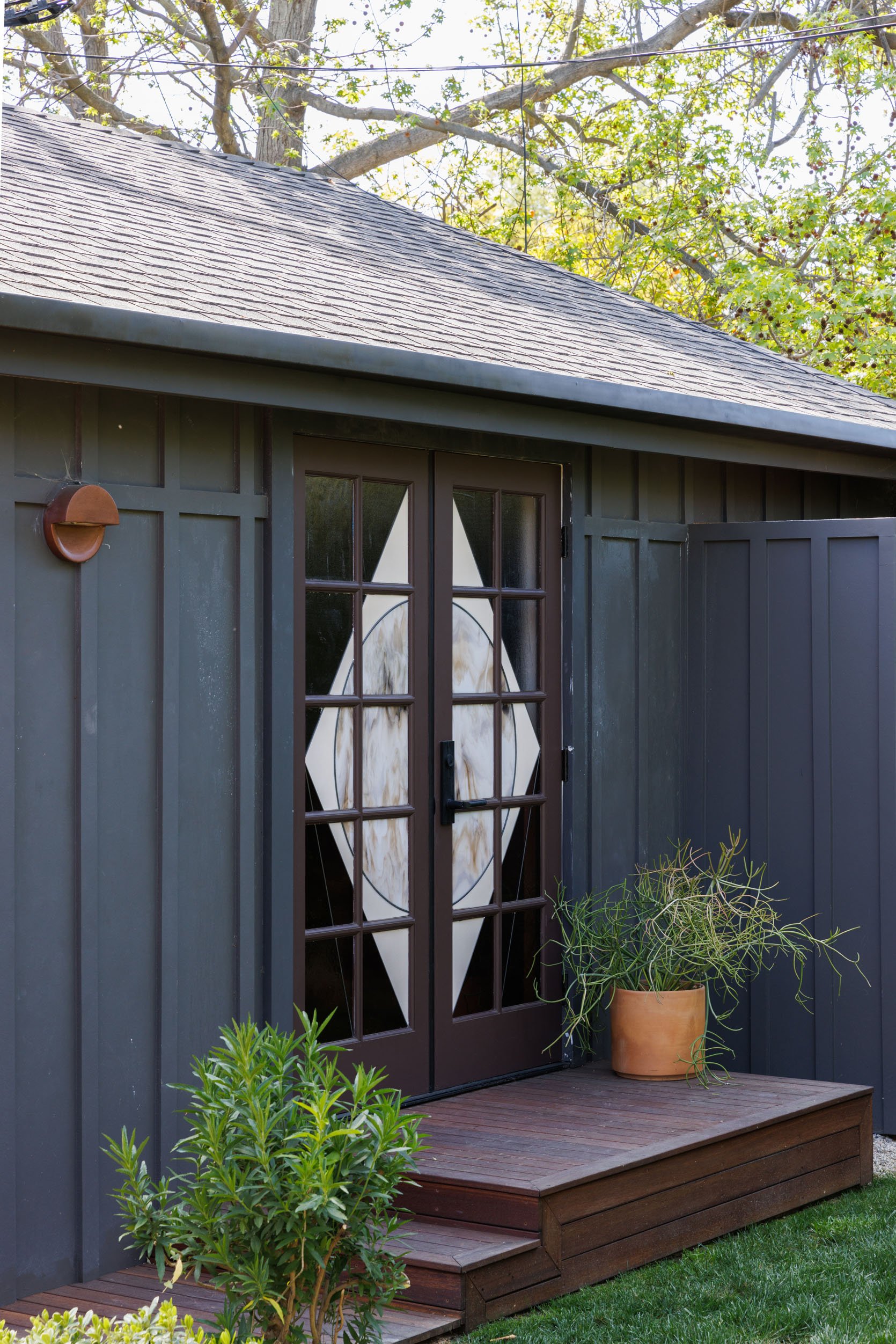
Where are the exterior doors from? Are they stained glass? Are they custom?
The exterior doors were something that I felt strongly needed to be a special moment so I commissioned David Schneid a local LA-based stain glass artist) to come up with the design. I wanted to incorporate the moon into the design and we selected colors that were cohesive with the overall color schemes for both the guesthouse and the main house.
We’ve been noticing more commissioned stained glass pieces popping up on our radar (take Bri of Designlovefest‘s new stained glass window in her upstate New York home for example). It’s not for every style home but when it works, it’s a fantastic way to add a personal unique feature to your home.
If you have seen any of Kirsten’s projects, you know that she works with wallpaper frequently and masterfully. So anytime I see a design of hers I expect a wallpaper moment that instantly elevates the space. The wallpaper here does not disappoint but as many of us know, choosing and installing wallpaper is not for the faint of heart so I had to ask:
How do you go about choosing wallpaper? Do you choose the wallpaper first and then select furniture and decor? Or vice versa?
Wallpaper is my all-time favorite design element to add layering and interest to a room – the right wallpaper can really elevate any space. Often, I will start the design process around a specific wallpaper I have in mind. I love black and white wallpaper, as it tends to act as a neutral palette against any colors in a space. I think it is important to think about what you want to achieve with the wallpaper you choose. Is the wallpaper going to make a statement and serve as the most significant design choice in the room, or is simply a pretty backdrop to the rest of the furnishings? If the wallpaper is the statement piece in a room, don’t be afraid to go bold. If it’s acting as a complementary backdrop to the space, find a paper that is interesting but doesn’t overwhelm the furnishings. Always keep your color story in mind when picking out wallpaper.
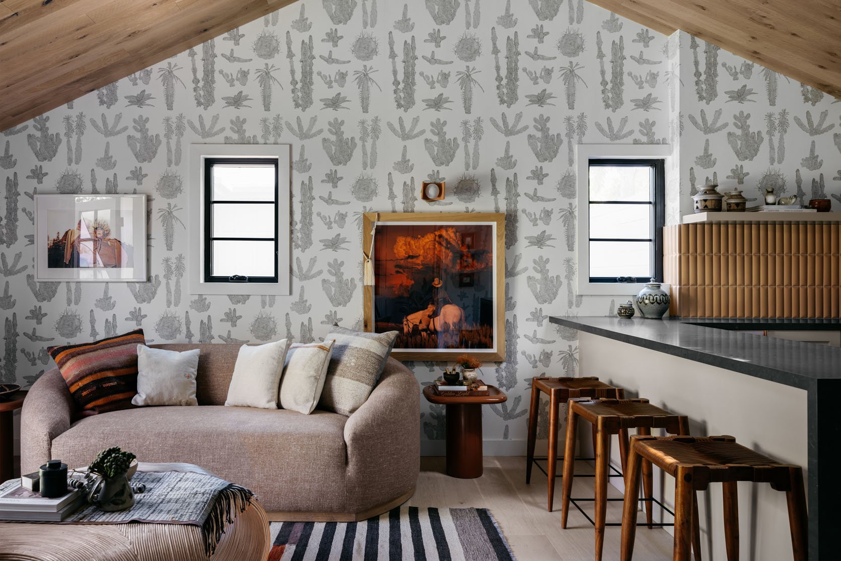
In this space specifically, the wallpaper works well because it’s both neutral and playful. The white and gray colors don’t overwhelm the space, but the cactus and plant pattern speaks to the eclectic Southwestern rustic vibe that Kirsten is going for. The youthful pattern complements the design and the colors keep it from overpowering the rest of the space.
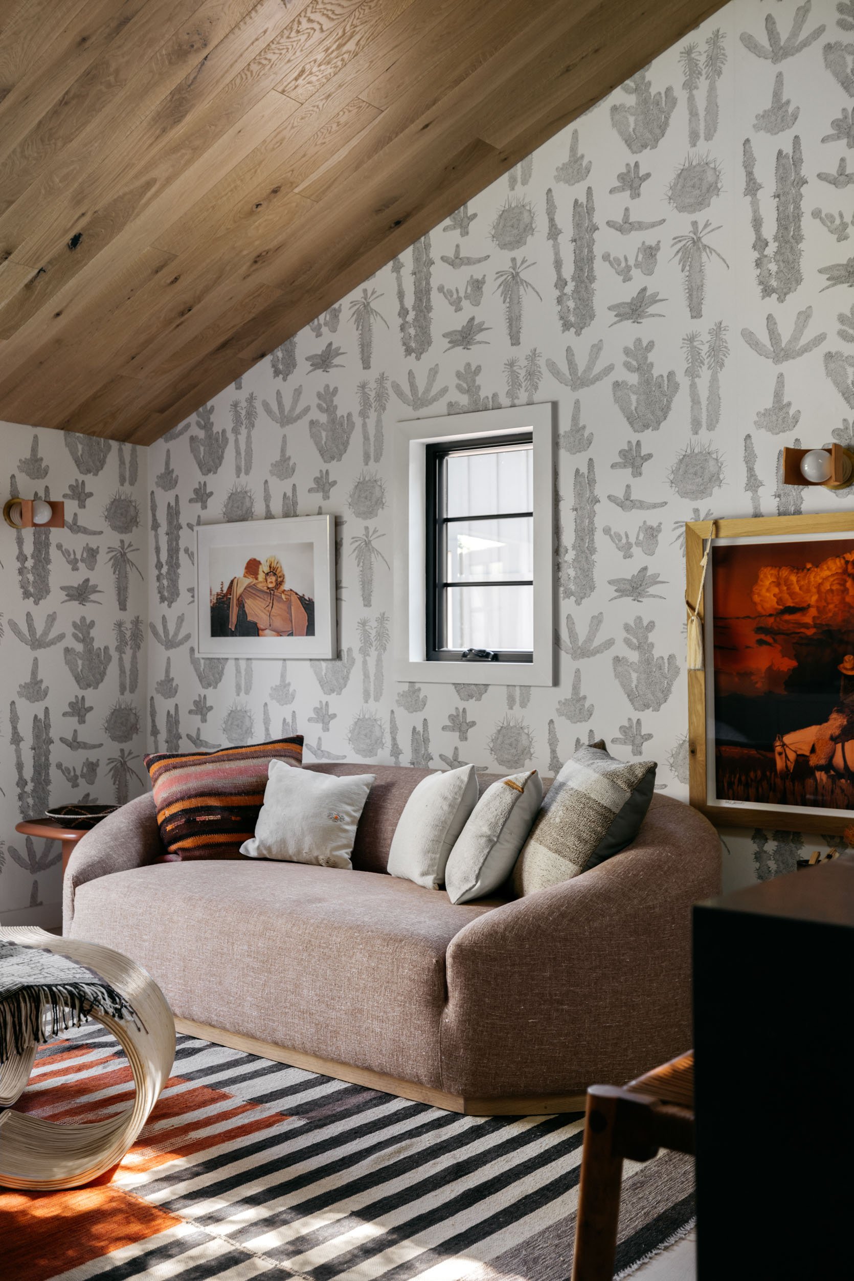
Kirsten’s signature Southwestern-inspired style is creatively showcased through art, wallpaper, and pattern and is met with modern shapes that create an organic feel. See how every element here brings something new but plays within a strict color palette? The art is bold and bright, the wallpaper is neutral yet playful, the decor is patterned and colorful, the furniture is round and textured, and all these are tied together through the color palette. It’s a prime example of how she mixes textures and patterns in a way that comes across as unexpected but effortless.
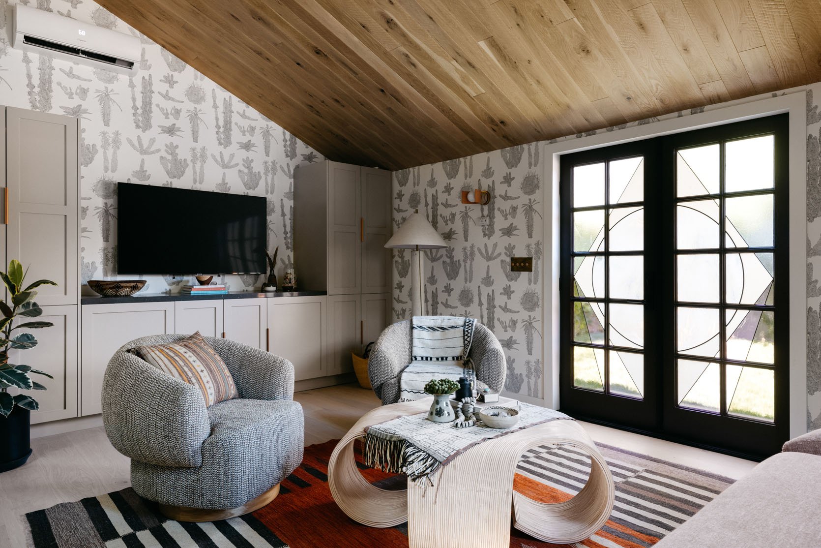
What’s your advice on mixing patterns and textures?
I would say to trust your instinct and don’t always follow the rules when it comes to mixing patterns and textures. That being said, there are some loose guidelines to follow. For example, the colors should complement each other and the rest of the space. Too much of one pattern or texture is never good. Try mixing a more geometrical pattern with something with a softer feel. Don’t forget about neutrals – they can really help ground the entire collection.
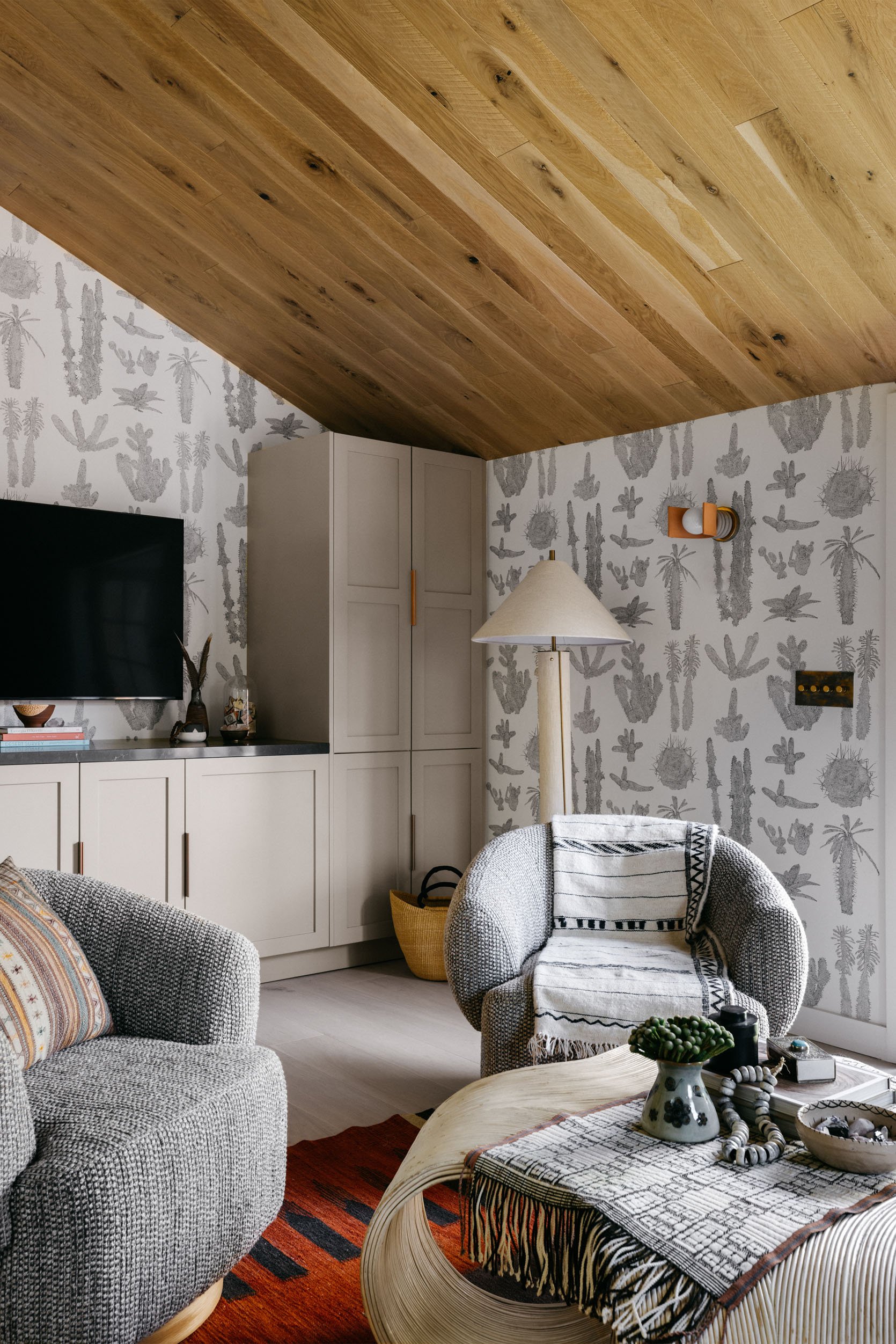
Though this space has so many decor pieces to look at and admire, your eye is drawn to the ceiling almost immediately. Some may think it’s a simple wood ceiling and leave it at that, but something about the rich color and texture makes it special. I am so drawn to the rustic, natural look of it so I had to ask Kirsten more about it:
Can you tell us about the amazing wood ceiling?
I wanted the guesthouse to feel just as finished as a main home and I thought of the ways I could truly make it feel rich and layered. I decided to clad the pitched ceiling in this lovely oak cladding from Resawn Timber. It really helped elevate the guesthouse and added a cozy, rustic element to the space.
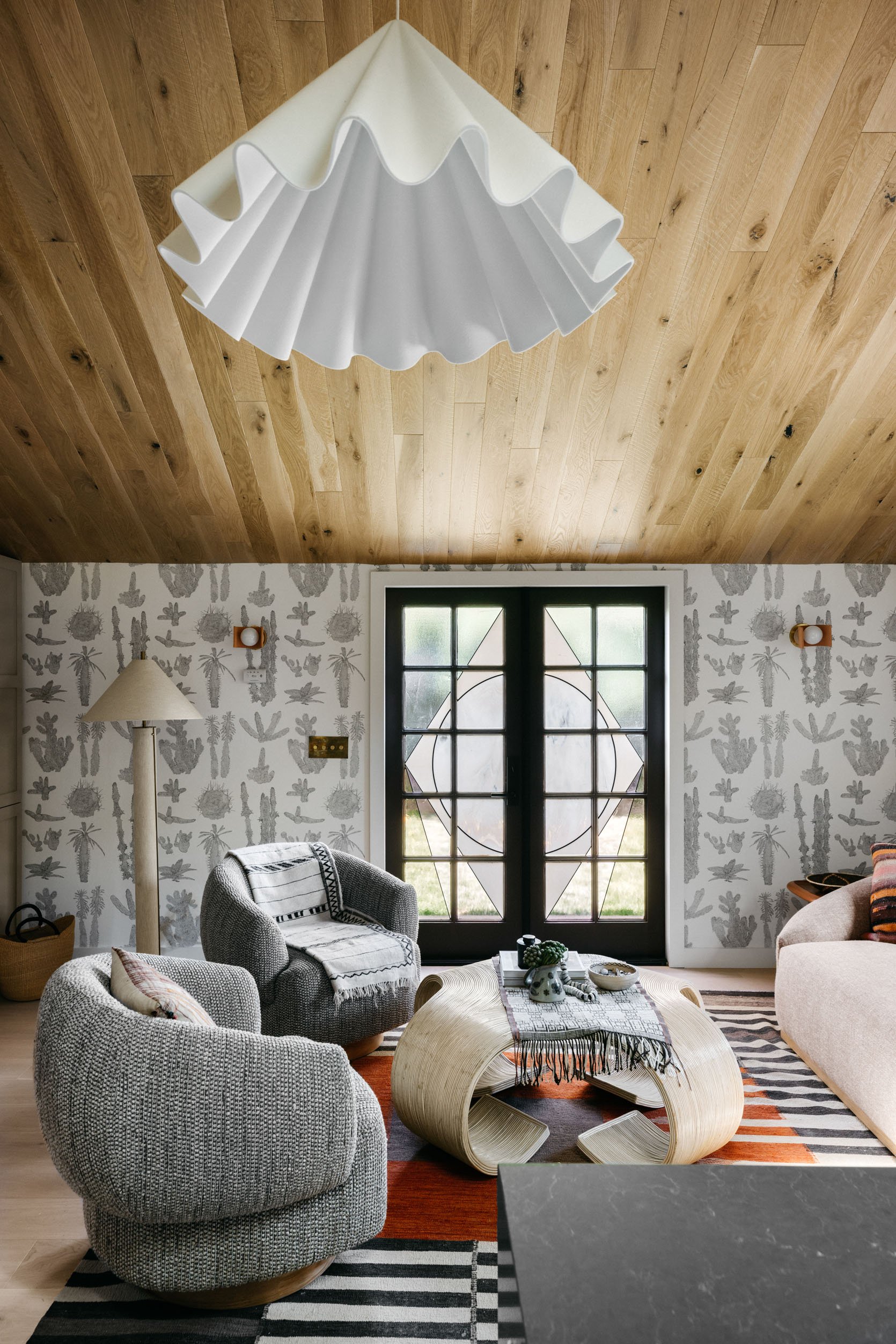
Let’s pause for a second just to admire some of the decor here. That pendant, for one, stopped me in my tracks. It’s one of the more modern, stand out pieces here that juxtaposes all of the earth tones and vintage elements. Then there is the vintage coffee table that grounds the space with its organic texture and neutral tone, paired with the chunky side chairs that add even more texture. (P.S. The coffee table is a prime example of a trend that Caitlin is writing about as we speak..so stay tuned on that :)). The mini bulb sconces bring in a playfulness that contrasts the very grand pendant light. It’s all about mixing and matching different styles in a way that is intentional, a trick that Kirsten is clearly an expert at.
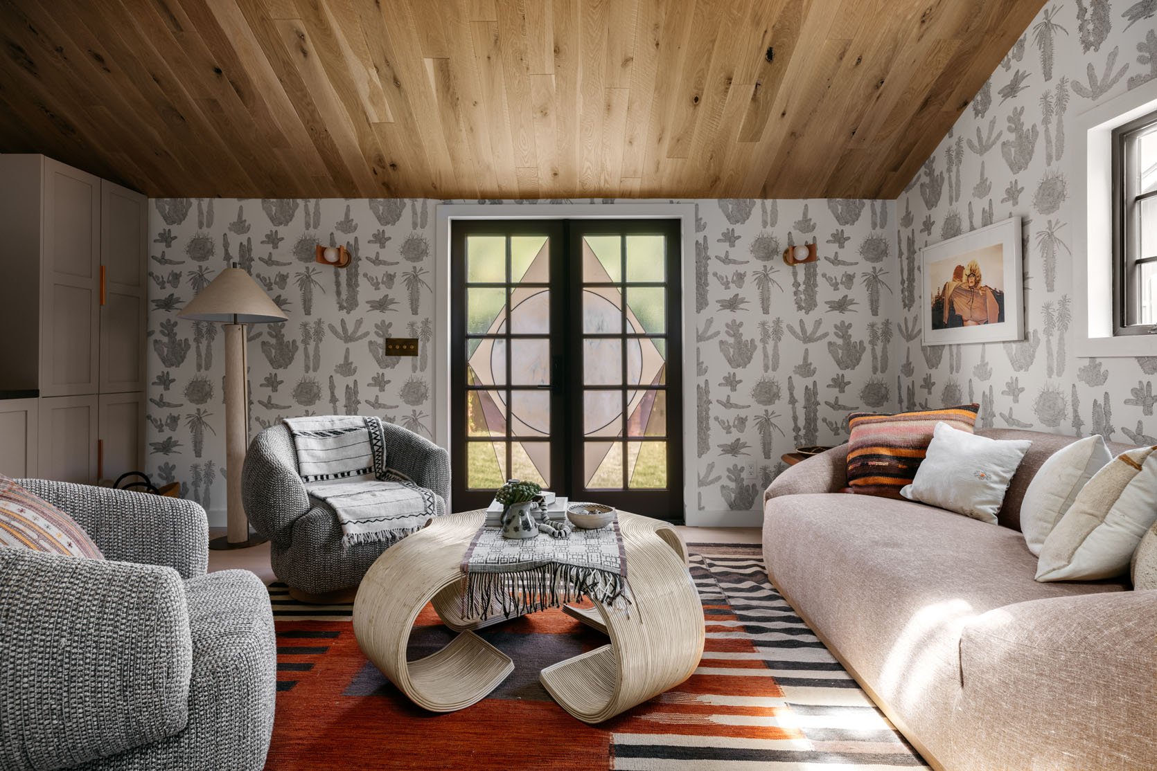
Is there a bed or bedroom in this guesthouse or is it strictly a hang space?
I’m a mother to teenagers, so I specifically furnished the space with my kids in mind. I wanted them to have a space to hang out with their friends, and as needed, be the perfect spot for entertaining guests. Fortunately, there’s room for a bed, and the space can easily be converted to accommodate guests.
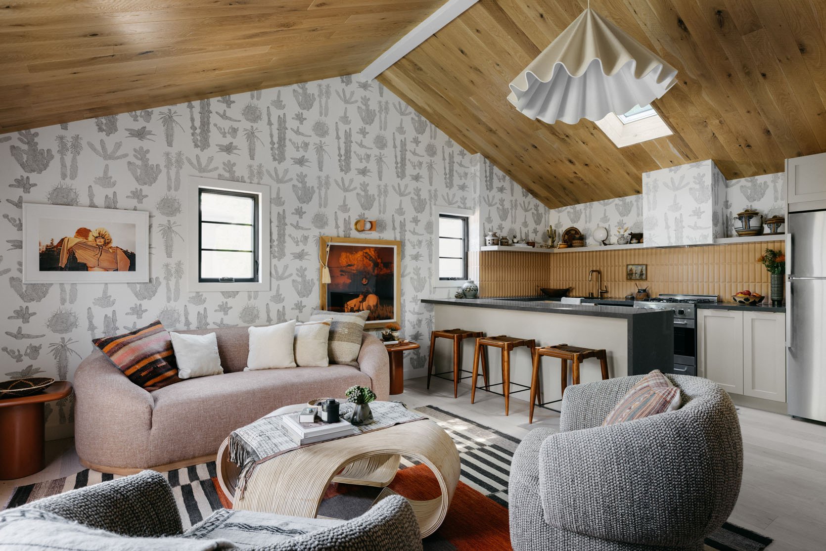
Unexpected places to hang art is one of our favorite topics around here, so when I saw the low hanging art under the sconce, I was immediately intrigued. Sometimes art is hung low for practical reasons (needing a stud for example) but it’s also a great way to create visual interest.
We love all the art placement! Was the low hanging art purely an aesthetic choice?
Yes and no. I typically love hanging art lower than one would expect and I had a large print by one of my favorite artists, Mark Maggiori, and this was the only wall big enough for this piece. I had sconces installed from Virginia Sin and I chose to display the art below the sconces.
Speaking of unexpected art placement, if you look closely in the kitchen you’ll see another art placement that Emily loves and recently wrote about here. It’s hanging art over tile! It sounds scary I know, but you can use command strips or even a drill bit and it’s pretty low risk but high reward. It looks cool and is a budget-friendly way to refresh a space.
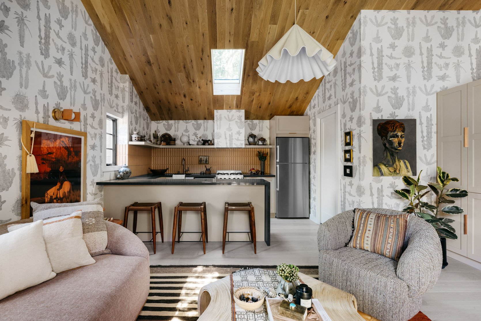
Was there a reason you chose different tones of wood for the ceiling and flooring?
I prefer not to match woods. I truly feel that too much of one thing is never good, so I chose a very neutral, almost white wide-plank oak for the floor and a richer and more rustic knotted wood cladding for the ceiling.
Indeed, too much of one type of wood could feel overbearing and the different tones actually forces your eye up, making the room feel taller and bigger.
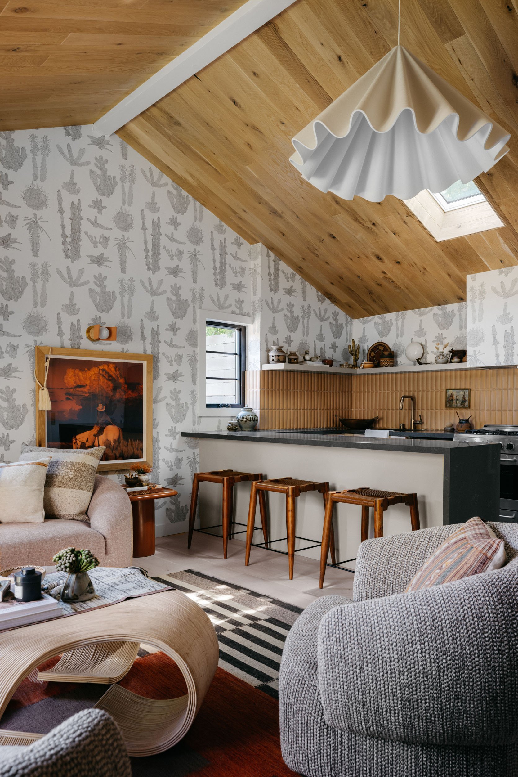
We can spot a Velux skylight from a mile away, and were so happy to see one here. You’ve heard it here again and again but truly, nothing compares to a skylight when it comes to adding natural light. We always say if you are renovating and have the ability to add a skylight, then honey, you should absolutely add that skylight.
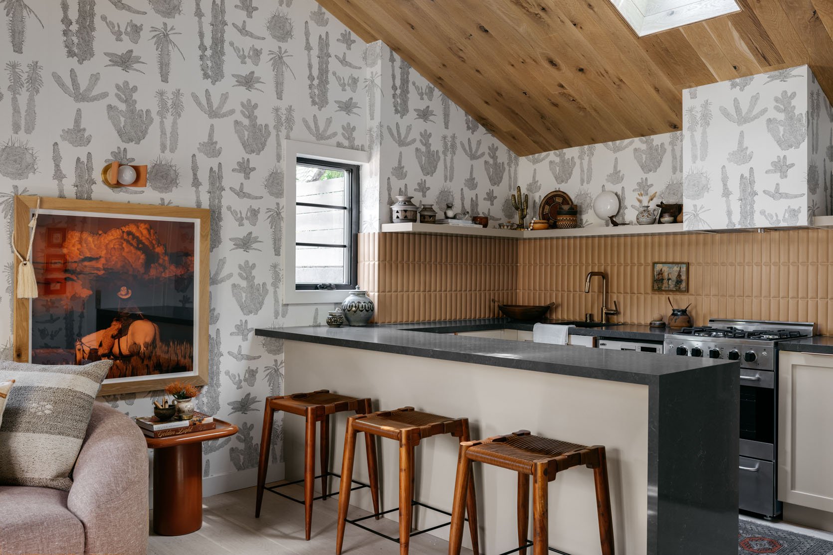
Another design choice that is certainly worth mentioning is the backsplash tile. I love that she used tile to break up the wallpaper and add yet another texture and color. It’s a similar tone as the ceiling so it’s pleasing to the eye, and if you look closely you’ll see that the tile isn’t flat but has a rounded, bubbled shape. This creates even more movement and adds a layer of softness. This is a tile trend that’s been happening overseas and is finally making its mark in the US.
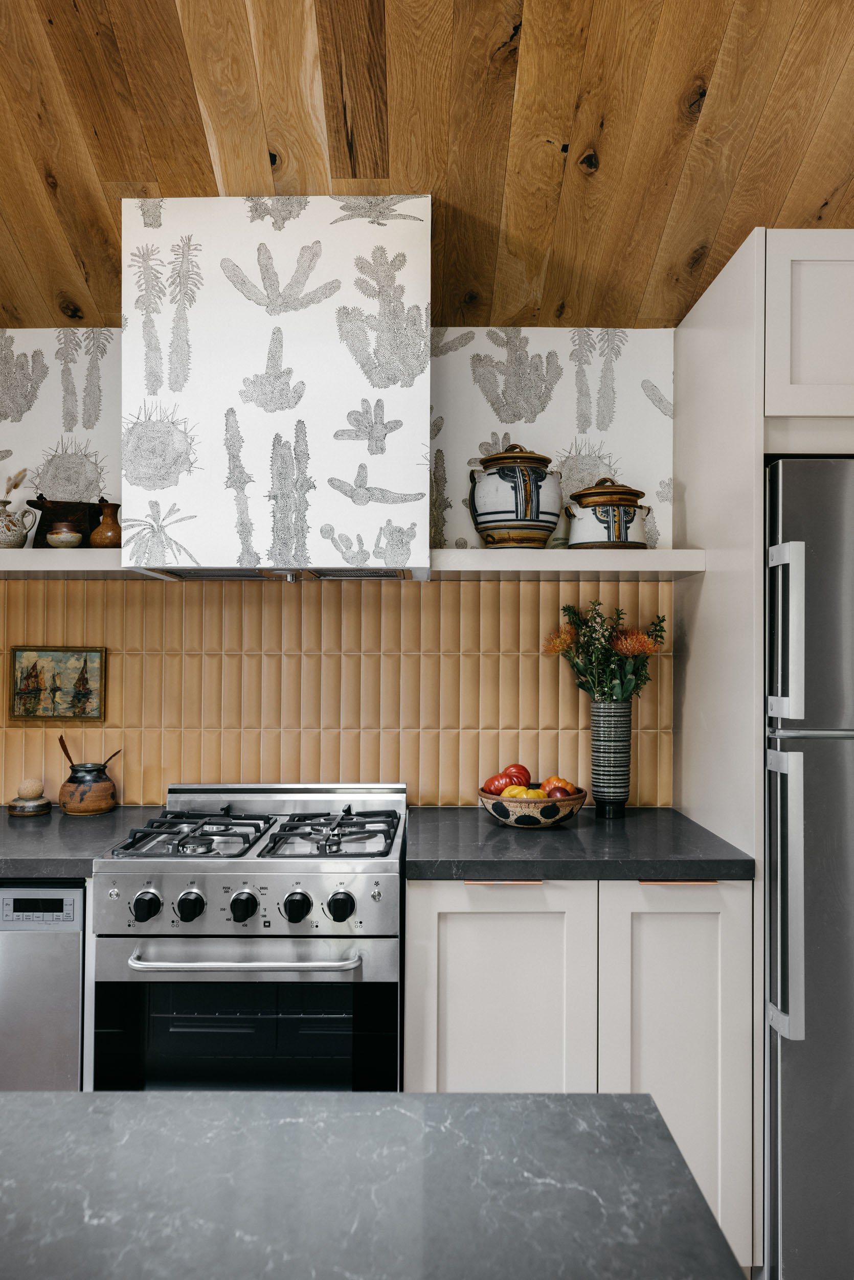
We love that you wallpapered your hood! Were there any additional precautions you had to take installing since it was over the stove?
We didn’t take any extra precautions but we did install a powerful ventilation system. I knew that the guest house kitchen was not going to be used on a daily basis, so we decided to install the wallpaper on the hood.
As Kirsten said, this kitchen isn’t intended to be used daily, so the wallpaper isn’t a huge risk factor here. If you are thinking about wallpapering a hood in your kitchen that you do use every day, we advise checking the safety and durability of the wallpaper first.
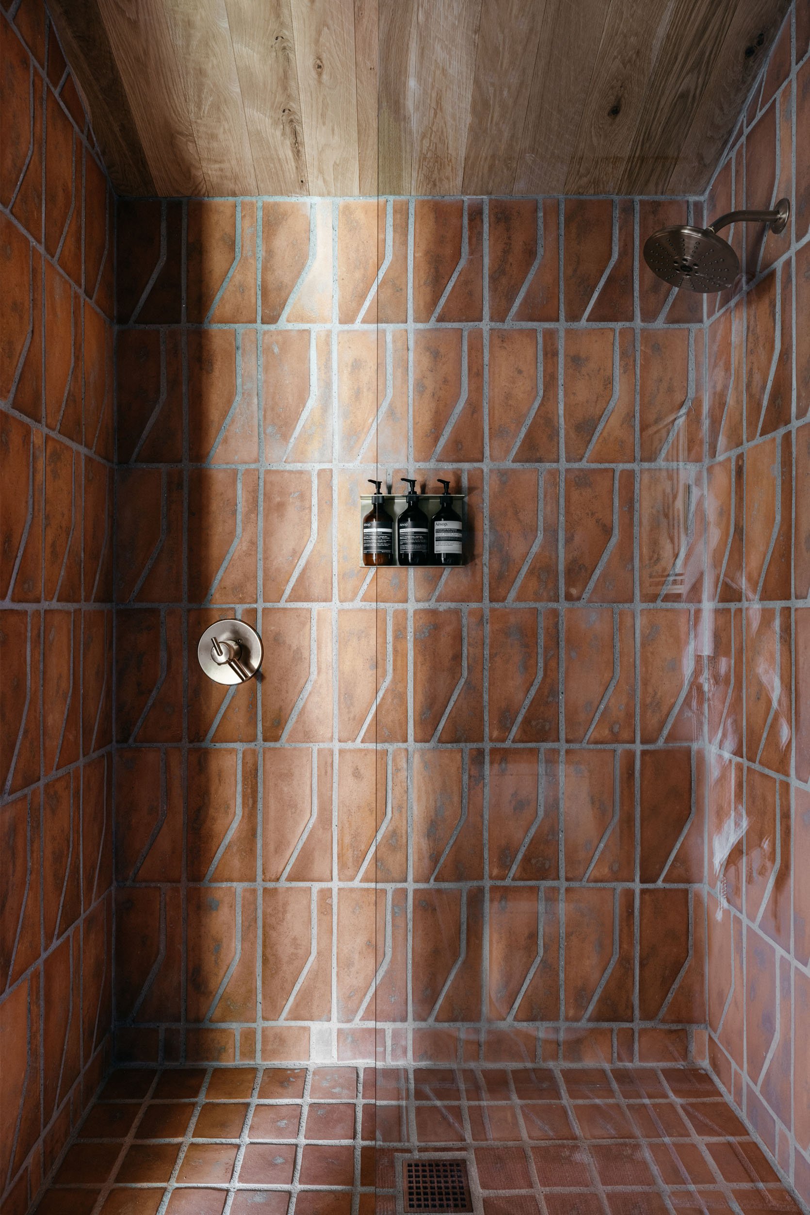
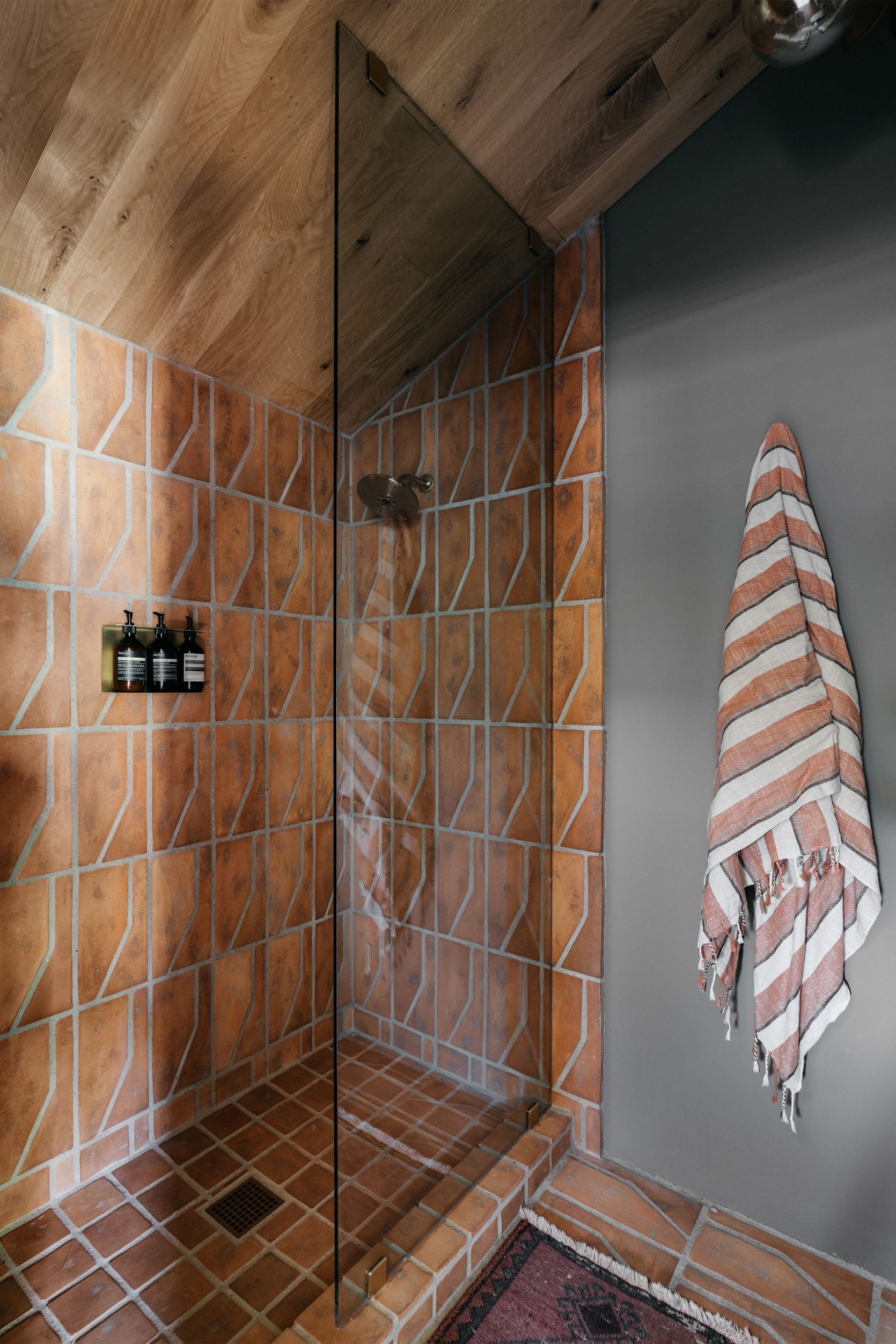
We’ve been seeing that awesome style of tile more and more. Do you think it’s about to be a trend?
Regarding the bathroom tile, I do think that it is an earthy organic look that we will start seeing more of. However, this works better in homes located in the West and Southwest of America, as opposed to the East coast, where it may feel out of place.
I love the bathroom paint color! What color is it? How did you go about selecting a color that mixes so well with the amazing tile?
I chose this Cotto Terracotta tile from Zia Tile for the shower walls and bathroom floor – I love the warm, natural element and the color is serene and calming. There’s no natural light in the bathroom, so I chose to embrace the darkness of the space and I selected a dark green paint color. This shade of paint complements the orange tile so beautifully and brings out an earthy, relaxed vibe to the bathroom.
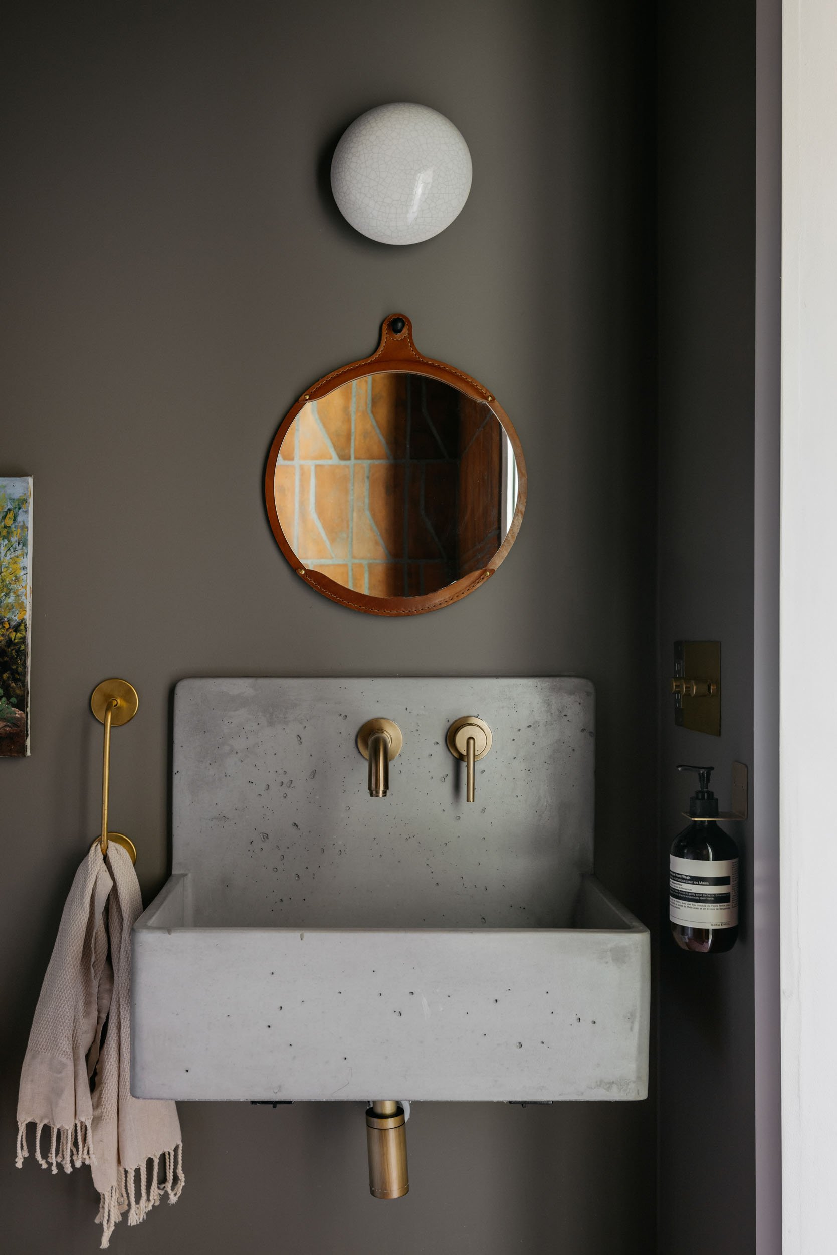
The bathroom mirror is awesome as well. Where is that from?
The bathroom mirror is from Lostine Home – we needed a small mirror because of the size of the wall-mounted apron sink and I loved how the color of the leather-wrapped frame looked with the tile.
Lastly, I have to note how much she did with this small bathroom. There isn’t a ton of wall space so she hung the towel bar vertically (genius) and since there isn’t a lot of counter space she chose to hang the soap dispenser on the wall as well. It gives off a very cool restaurant vibe that is actually very attainable. I am obsessed with these two tricks and want to copy them immediately in my tiny bathroom.
So, now that you’ve virtually toured the space, I’m curious what is your favorite part?? I can name 100 things I love so I want to know what tickles your design brain most. Sound off in the comments below and don’t forget to follow Kirsten for more eclectic and inspiring designs.
*Design by Kirsten Blazek
**Photos by Alex Zarour of Virtually Here Studios
THIS POST WAS ORIGINALLY PUBLISHED HERE.


