A question we get A LOT is how to combine different styles with a partner. Honestly, it can be tricky but completely doable. I mean, it was the whole basis of Em’s HGTV show, Secrets From a Stylist, right? It’s about finding the style connections (shapes, colors, materials, etc.), incorporating both styles with pieces that have those connections, and of course, some good ole fashion compromise and understanding. That’s precisely what Glennon Doyle and Abby Wambach did when designing their new family home in Southern California and were starting from scratch. Well, first I should say that this house was half designed when they bought it (go read the AD article for the scoop) but luckily they loved the cozy vibe that designer, Katie Lester, had already established. Personally, I think that was a MASSIVE blessing given that decision fatigue is very real (just ask anyone that has gone through any kind of renovation). But here’s the deal, it sounds like Glennon has much more of a love for colorful interiors than Abby. Abby even said that had it been up to her initially, she likely would have gone for way less color. Sounds tricky, right?? What do you do when one partner wants color and the other doesn’t? Well, I’m going to walk you through how Katie and Glennon (who was mostly in charge of the decisions) made this cozy home both colorful yet calm and airy so that everyone was happy.
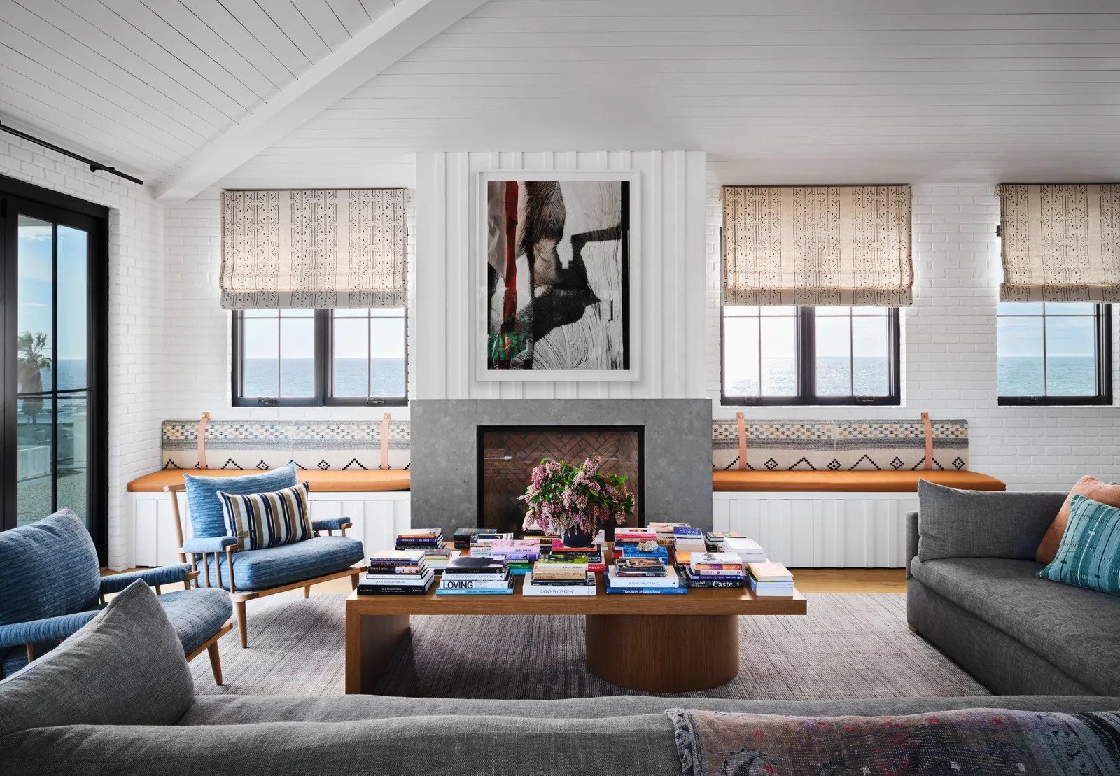
I’m sure when you look at this photo you aren’t thinking “whoa, this is a wildly colorful room!” BUT, at the same time, it doesn’t feel like a totally white/neutral “California causal” living room either. Here’s why. First off, the room has a lot of texture and pattern which automatically makes it feel more alive. You have the brick walls, mixed with the paneling, mixed with the stone, and all of the fabric patterns. Then within those fabrics, you have that saturated indigo, hints of deep purples, reds, yellows, and other tones of blue. Also, those warm camel brown bench cushions do such an incredible job of livening up the room. Lastly, never underestimate the power of books and how they are an easy and sneaky way to bring color and personality into a room. Take the books out you have a pretty room. But with the books in? You have a personalized room.
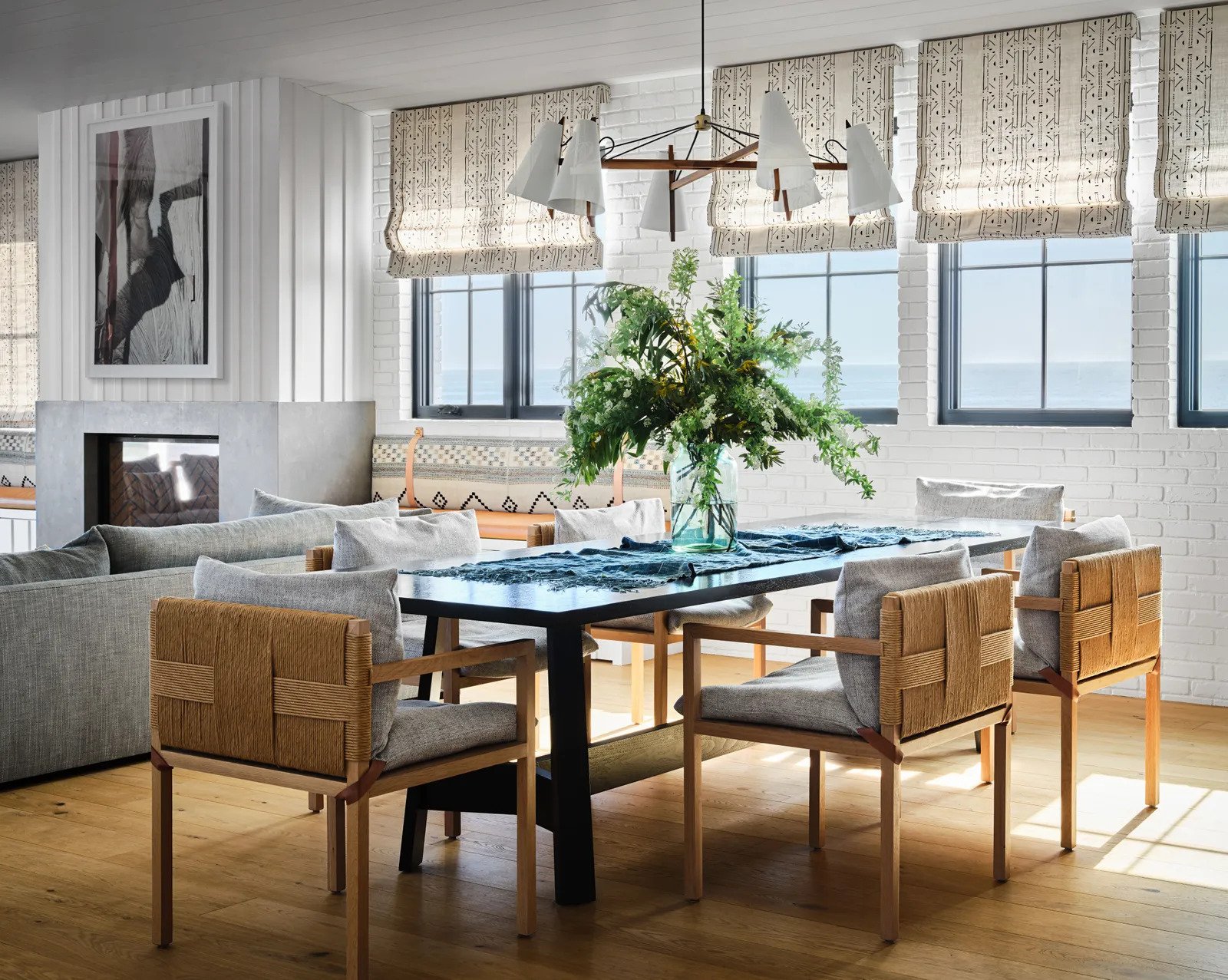
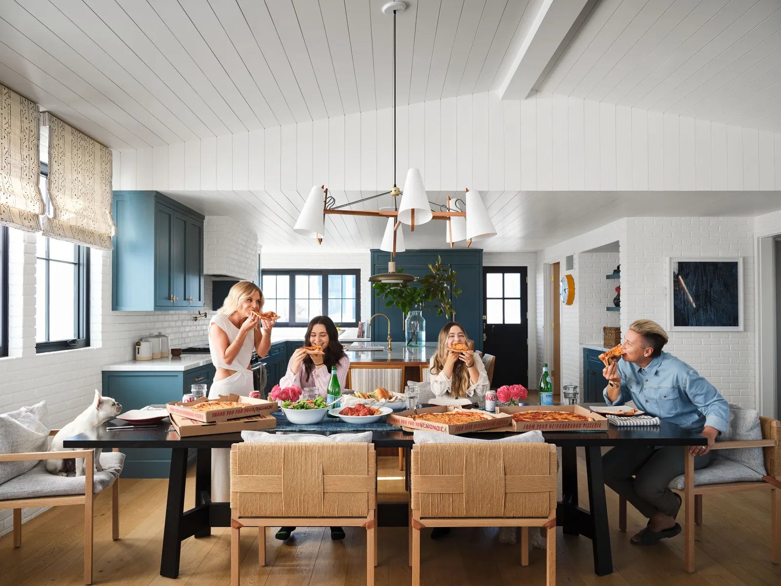
Moving over to the dining area, the colors are classically neutral but baby do we have some texture! The chandelier, those woven chair backs and leather cushion straps, the black table to contrast and ground the space…all help to make the open concept plan feel warm but not too colorful because…
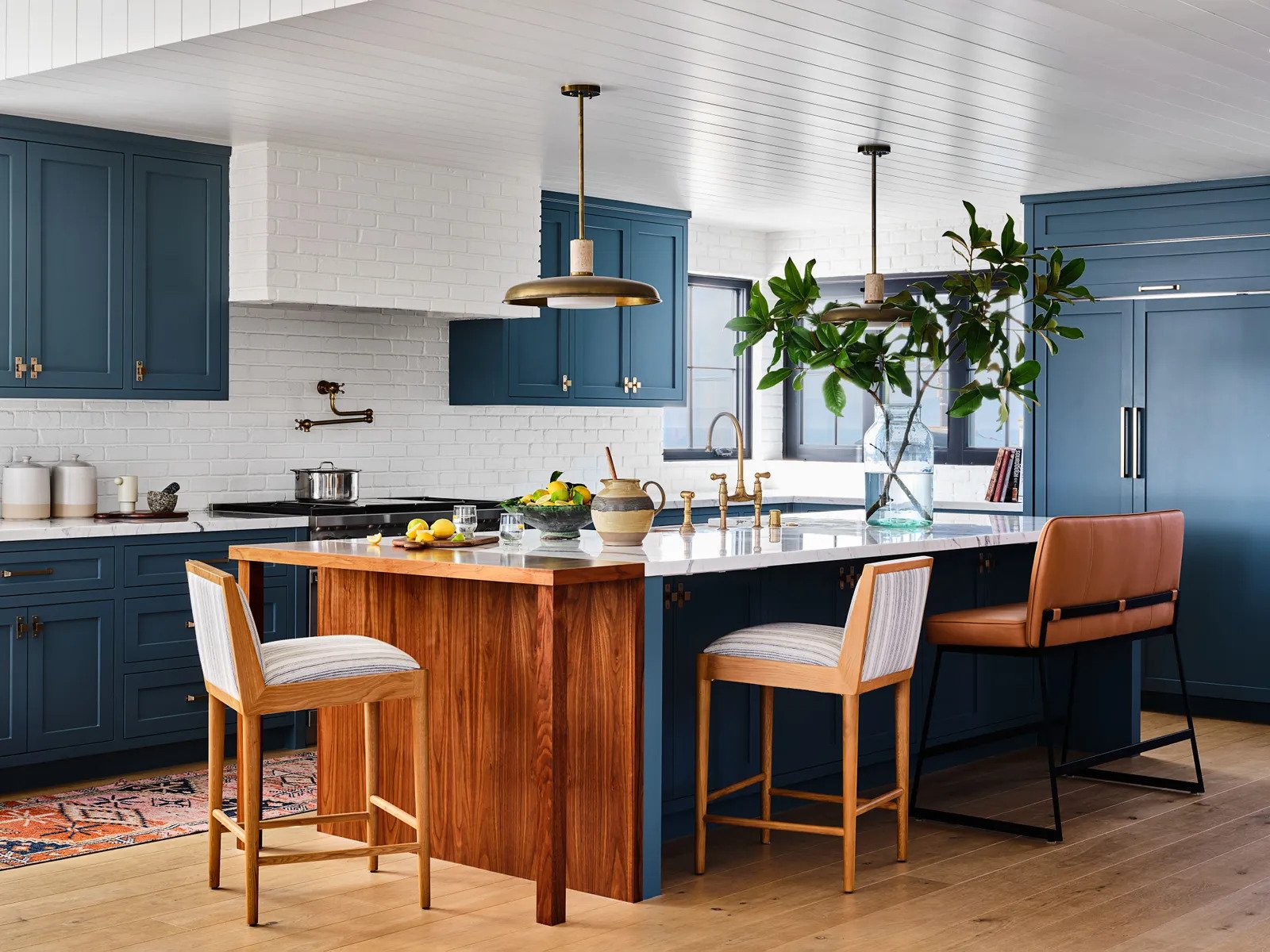
Y’all the kitchen is a beautiful bright blue. If you ask us (and DEFINITELY Emily), blue is a neutral in our book. So incorporating blue is a total no-brainer if there’s a couple that’s on different ends of the color-loving spectrum. Plus this blue, in particular, is so cheerful. Then by adding that beautiful warm-toned wood extension off the end of the island, brass pendants, and brass hardware it’s an irresistibly welcoming space. It feels both well designed but really approachable. That was their goal for the whole house and they achieve it.
Please note the mix of patterned counter stools and a solid leather cabinet bench. I think I’m into it! Also, note that they are all upholstered and have backs which is an EHD requirement for ideal comfort when sitting for a while. This kitchen was made for hanging out in:)
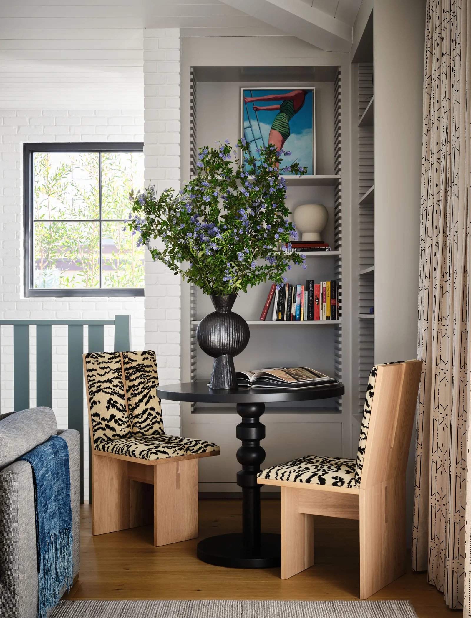
Now we are cookin with some “conversation piece” gas. The first things that catch your eye are those vintage chairs because A. the shape is amazing and B. they have that fun and unexpected leopard print fabric. Then for me, my eyes go right to those notched bookcases. GAH, I love them and they remind me of the CB x Lawson-Fenning bookcase that I have not been able to get out of my head. To finish it off, you see the modern and graphic pedestal table that helps make this house more “cool eclectic” than “California cool”. Oh, and see that colorful railing to your left??
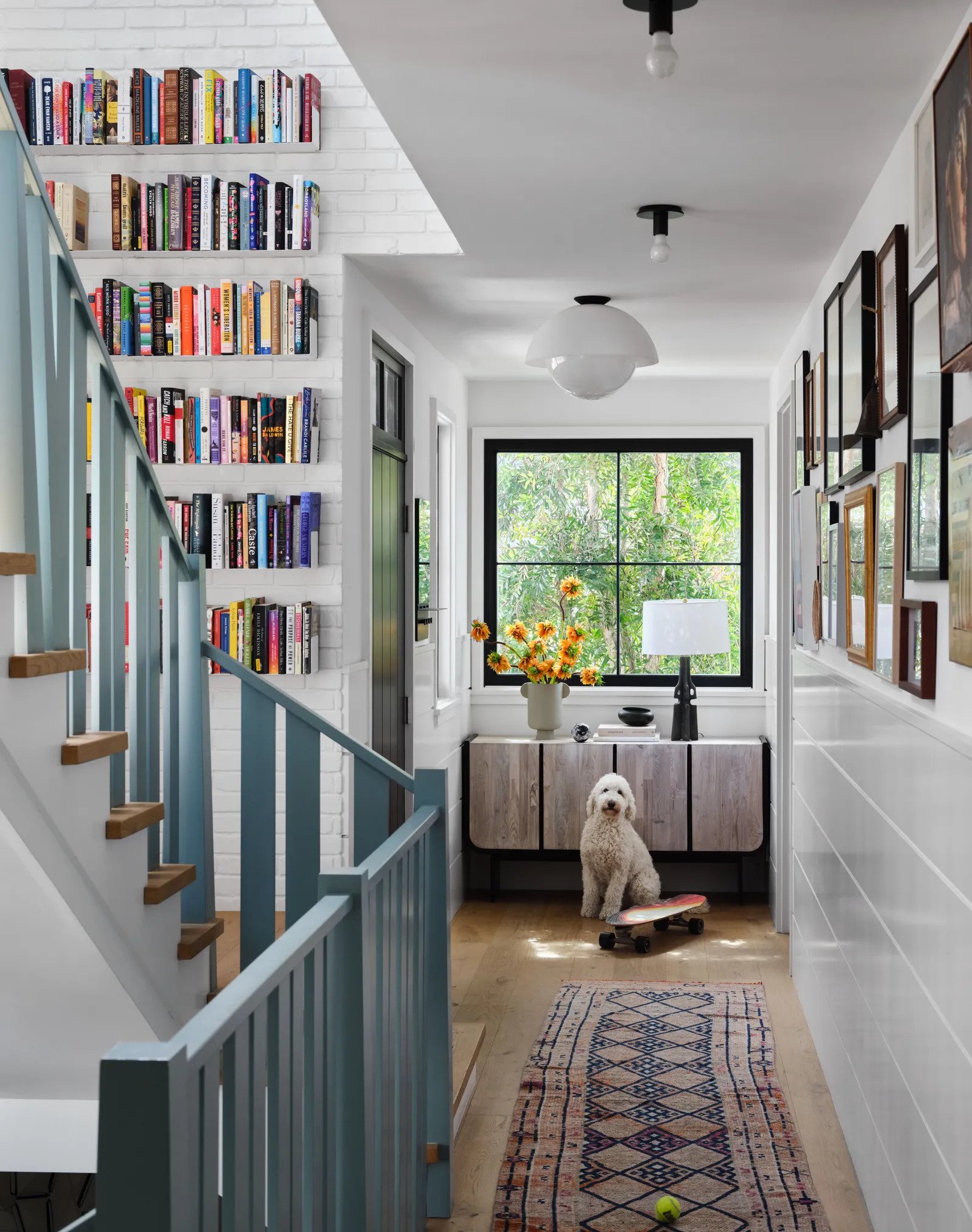
Yikes, I ADORE that railing color choice. It’s subtle but so impactful! The railing equivalent to “I’m not a regular mom, I’m a cool mom”. This may feel like a design risk but what an easy way to bring in a subtle color that will make your home feel so cozy and unique. A perfect compromise for a colorful moment that doesn’t scream “color”. Plus, again you have more books and a beautiful muted toned runner to add color in a way that feels decorative and not permanent (so less scary to the color averse if you are trying to ease them into it).
Oh, and I love a gallery wall and all of those different toned frames add a ton of dimension. Also notice that they carried the paneling throughout the house but varied the scale and orientation.
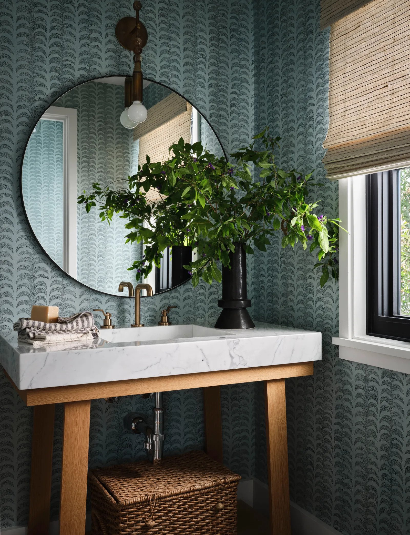
As you are about to see they really leaned into highly patterned wallpaper that’s colorful but doesn’t feel super saturated. If you can’t tell that’s how I think they balanced their differing love of color in their interiors. I don’t look at this very cute powder bath and think this is an overwhelming color. I think the wallpaper (by EHD fav Rebecca Atwood) is the perfect amount of color that’s still calming, with a pattern that’s playful but not too visually overstimulating. It’s also balanced by that beautiful warm wood vanity base, a simple white marble counter, a modern sconce, and a natural woven roman shade and floor basket.
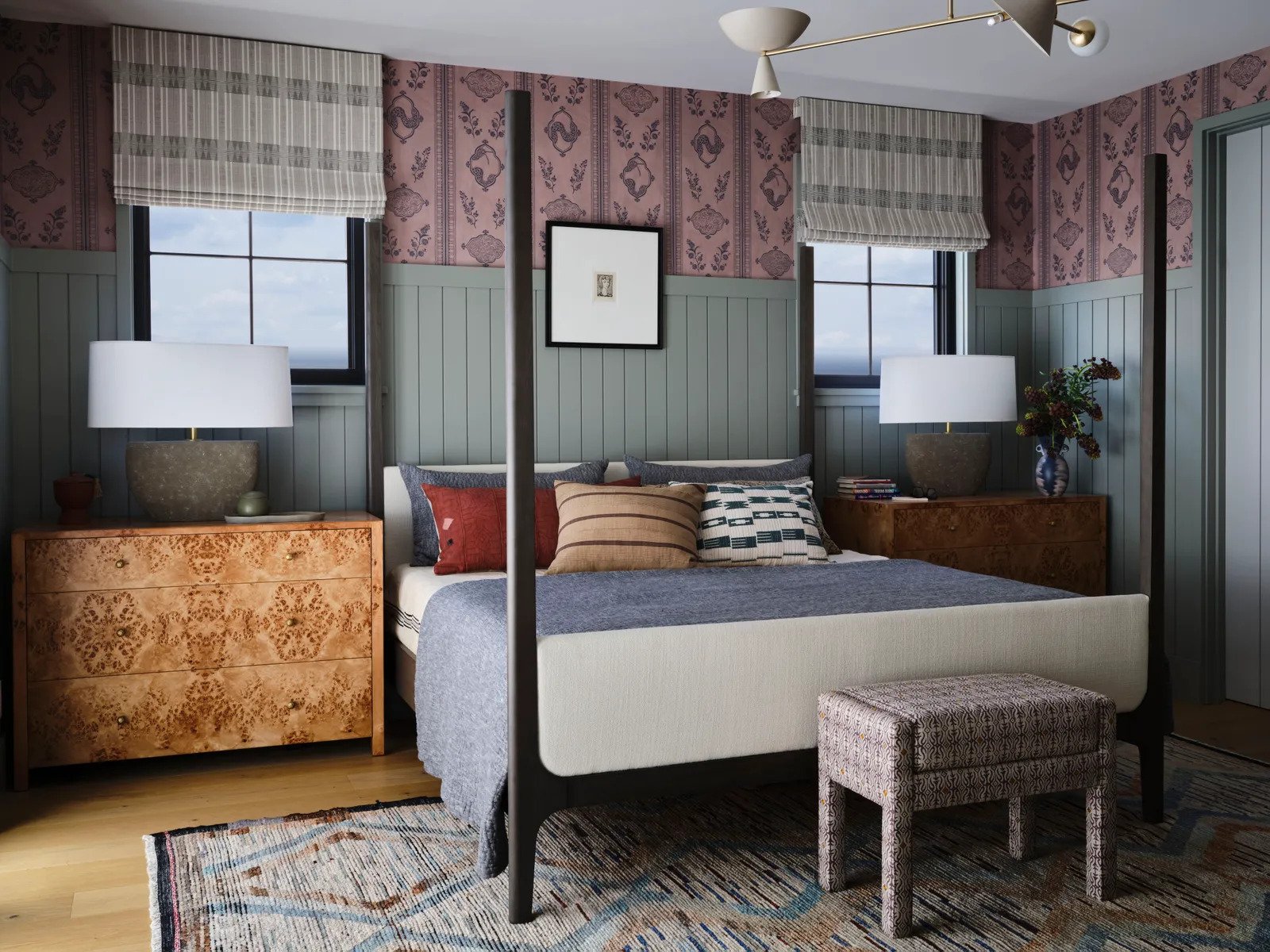
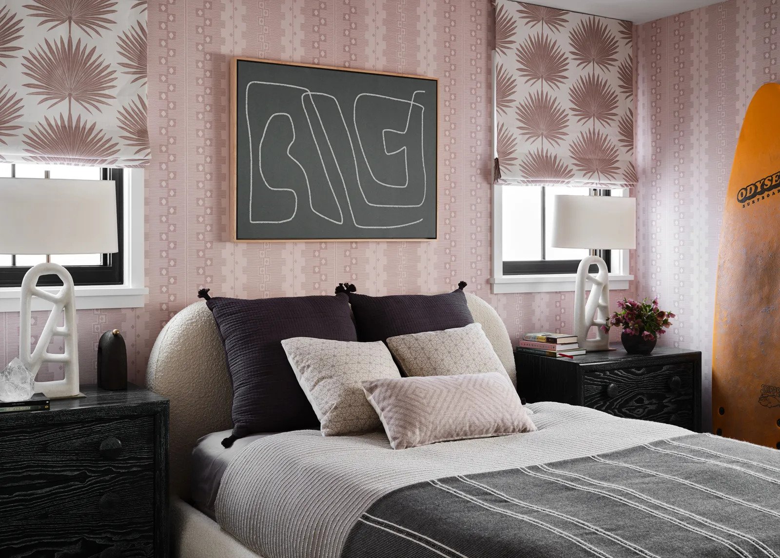
Moving onto the primary bedroom. I really love this room. It captures the love of color and pattern but also feels like a very calming space because of the more muted tones. The choice of the tall chair rail with the pink and purple wallpaper at the top was a great way to add in a fun wallpaper but have it not take over the space. Imagine if the walls were floor-to-ceiling wallpaper…not as calming right? What I also love are those burlwood nightstand dressers! They add so much warmth and with their natural pattern, balance out the wallpaper. Are you wondering why the roman shade pattern and wallpaper pattern work right next to each other? Different pattern scales! The wallpaper is a larger scale and the roman shades are medium. That’s the secret to mixing patterns. Just mix up the scales. Lastly, the bed, bedding, and chandelier are incredible.
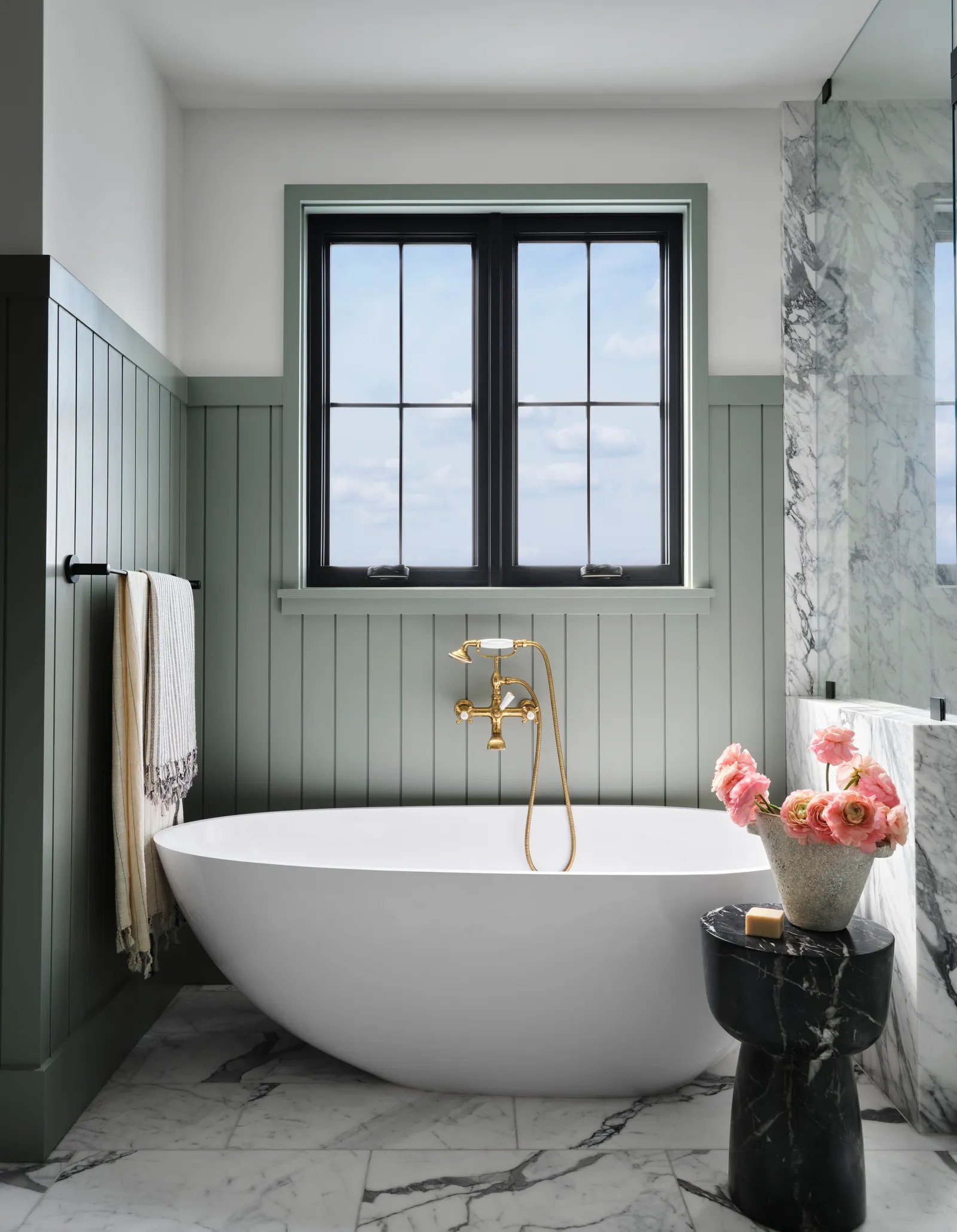
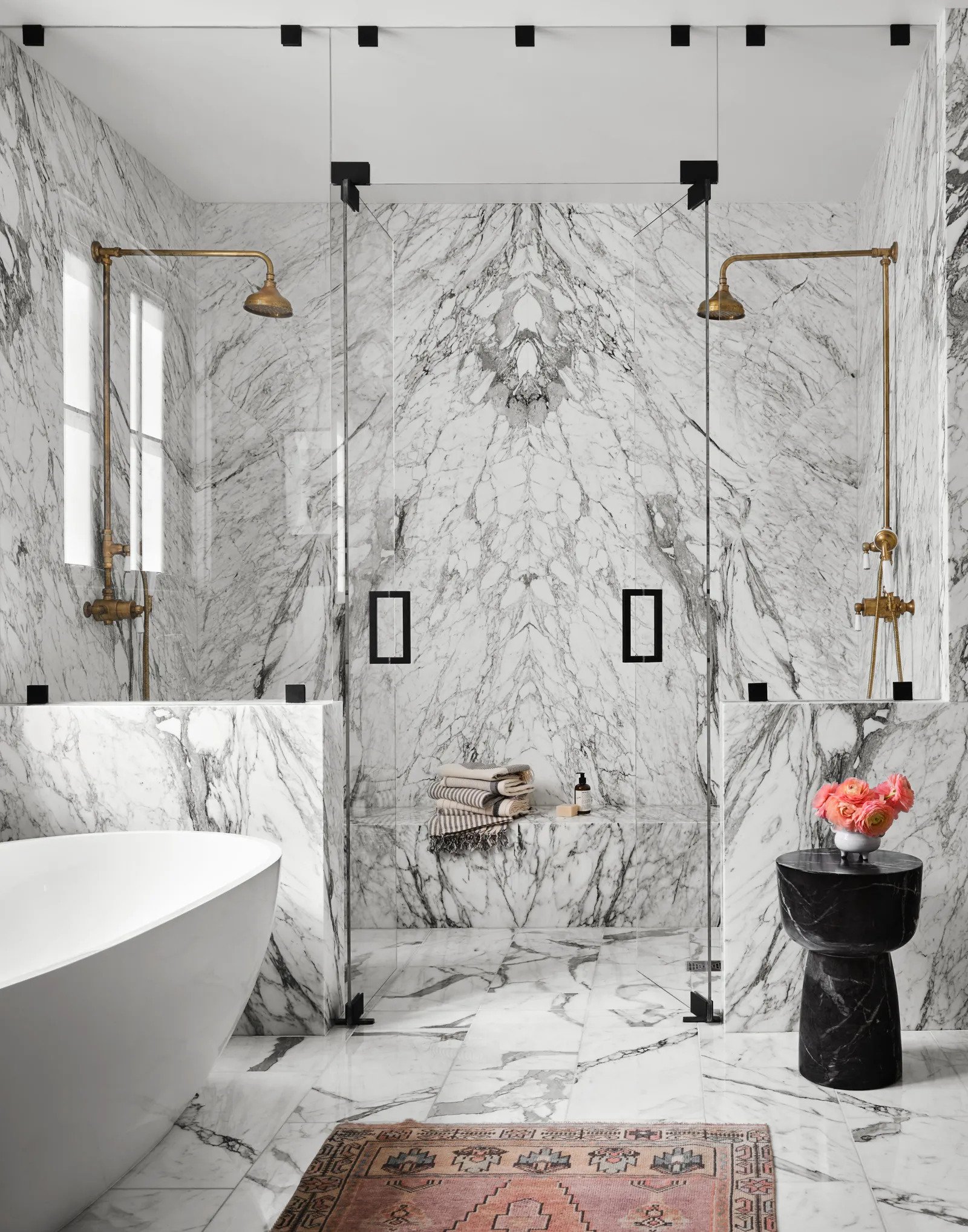
Their primary bathroom is definitely on the more neutral side but I think that’s ideal for this kind of space. They carried the paneling from the bedroom which nicely ties those two rooms together but then went ham on the white marble. I love the large slabs of book-matched marble on the walls and that extra-long bench! Then on the floor, you can see they chose marble tiles. This is a great way to still have marble floors but in a more cost-effective way since large slabs are pricey. I also love that the shower it totally enclosed. Both Emily and Brian are big on a fully enclosed shower as opposed to the large open-air style that’s been super popular. They like to stay warm and that other style can bring in a lot of cold air. This one is a marriage of the two! It’s large and almost looks like an open-air shower but isn’t.
This is one of their daughter’s bedrooms and that bed is so pretty! I love the contrast of delicate pieces (wallpaper, shade fabric, bed, pillows) with the more graphic ones (art, side tables, lamps, blankets). Perfect for a teenager to grow into and then a great potential guest room. The surfboard makes it even cooler.
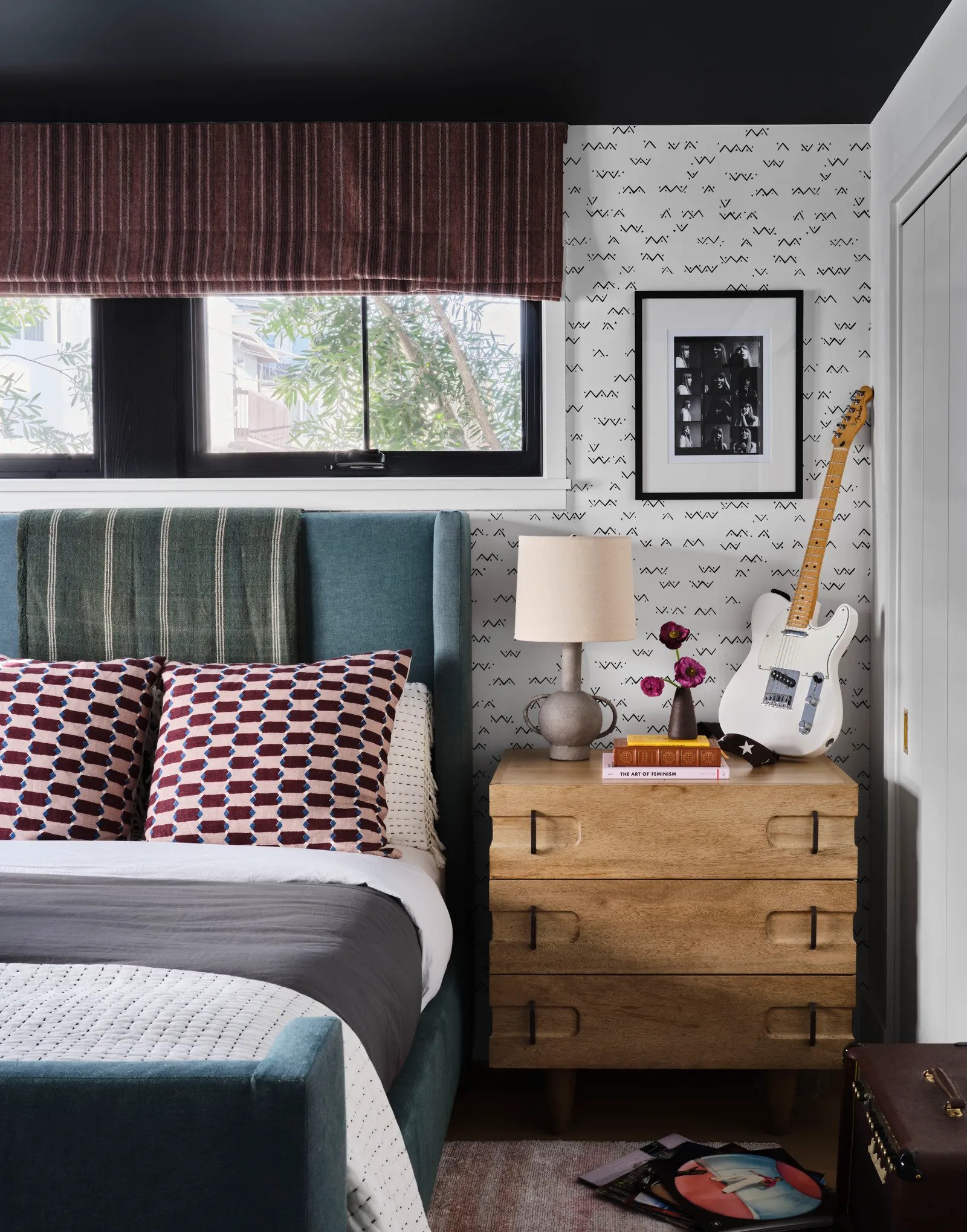
Another dream teenage room! The color palette is similar to the rest of the home but through fabric and pattern choices feels a bit more fun and youthful. I love those pink and maroon pillows and that roman shade fabric is my favorite in that whole house. Please also note that the ceiling is painted black. I can’t get enough. Maybe this is my favorite room?
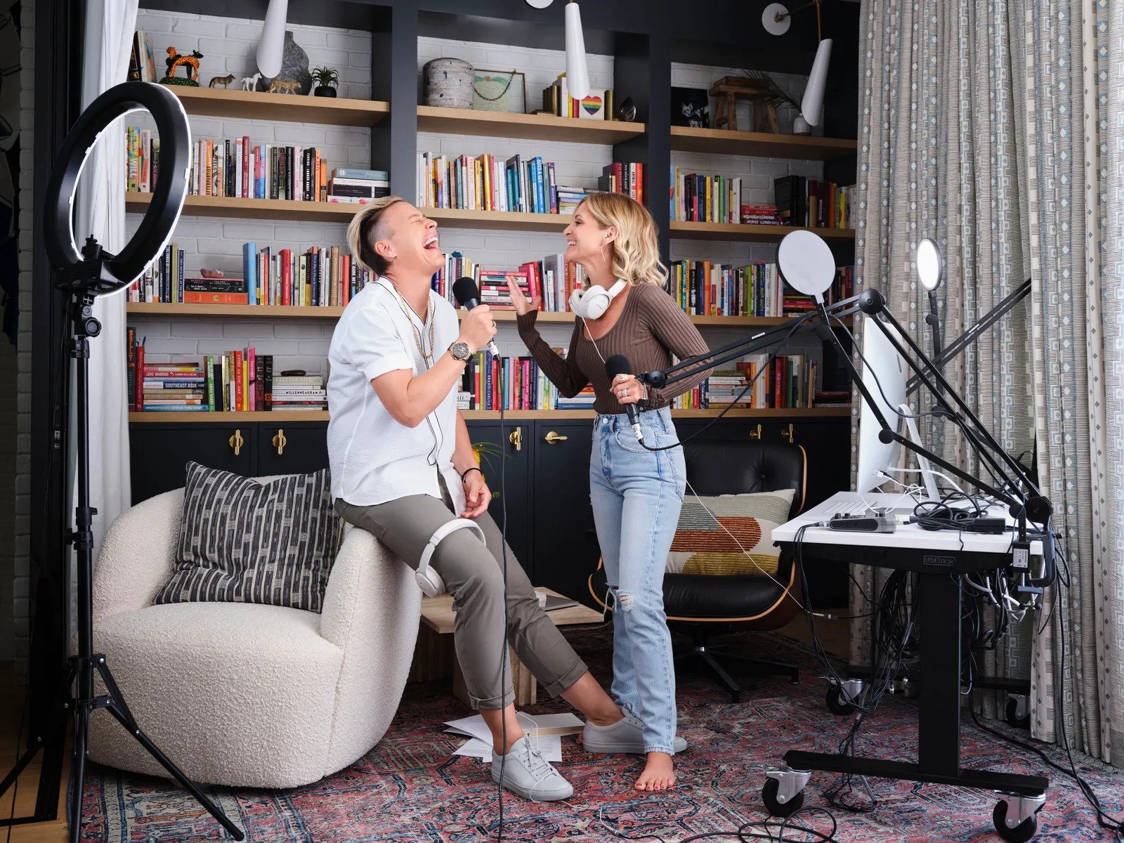
While not all of us need a podcast studio in our homes, a lot of us can relate to needing an office. This space looks like it would be a dream to work in. That built-in bookcase is incredible and I love the two-toned wood paired with those beautiful sconces and cool brass knobs. I mostly love all of the books and collectibles that really make it personal to them. However, those awesome chairs and travertine side table don’t hurt either:)
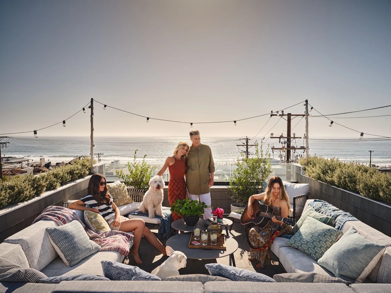
So as you can clearly see this is a home that is filled with love, family, happy but muted colors, and A LOT of great patterns that all make it the cozy, welcoming, lived-in home they were hoping for. The view also helps:)
So do you have a favorite room? Any tips on designing with a partner with a different style? Let chat xx
Love you, mean it.
*Design by Kate Lester
**Styled by Amy Chin
***Photos by Douglas Friedman
****via Architectural Digest
THIS POST WAS ORIGINALLY PUBLISHED HERE.
