A few months ago, I started what I am now calling my design identity crisis. I am usually drawn to vintage, moody, old-world, dark academia inspired interiors. My whole living and dining room design is based on that fact. But what happens when there are neutral, minimalist interiors that stir something in me, making me reconsider the deep moody green walls in my apartment?? It seems I am being confronted by my attraction to two opposing styles, causing me to rethink my whole design aesthetic.
It all started when my fiancé Rocky and I were looking for bedroom inspiration. We were both very drawn to an aesthetic we’ve been calling “Monastery chic” and through searching for that inspiration Rocky came across wabi sabi design. I had heard of wabi sabi before but had never researched what it really is. Rocky is a quarter Japanese so he resonated with this ancient philosophy right away, and when he showed me photos I was immediately hooked. We both share an admiration for Japanese art and culture so learning more about wabi sabi felt natural. Pretty quickly, our research into it turned into a deep appreciation and desire for a wabi sabi-inspired home (and life).
The kick is our current design aesthetic is quite the opposite. We have dark green walls, a huge gallery wall, books stacked from floor to ceiling, and collected items on every surface. In short, we aren’t minimalists. We both like decorating with a lot of things. But when wabi sabi crossed our radar we both felt extremely drawn to the philosophy, style, and practice of it.
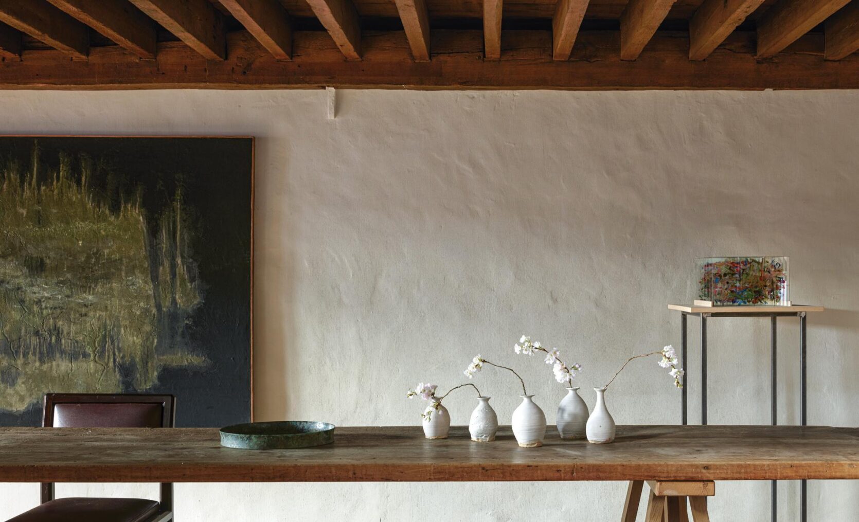
After some introspection, we came to the conclusion that we can’t scrap everything we already have and replace it with a wabi-sabi design. In fact, that would go against a lot of the tenants of the philosophy itself. Instead, we realized we can have a mindful wabi-sabi mindset, apply it to parts of our home, and still accept the things we already have in our home.
If you want to learn more about the history of wabi sabi as we did, just know you will have to practice patience because its history is hard to track down. According to Wabi Sabi – The Japanese Art Of Impermanence (a book I highly recommend on the subject), “wabi sabi as a product of the Zen mind, can find its earliest roots in Zen’s forerunner, Taoism” but the exact time it popped up is nearly impossible to pinpoint. The closest timeline is during the Song Dynasty (960-1279) which is when art started to show some of the ideals of wabi sabi. But no matter the exact timeline, there is no doubt that it has influenced art and design for centuries.
Speaking from an American, English-speaking point of view, wabi sabi can be an elusive, mysterious concept because it has no clear translation. Again, it’s ironic because the whole idea is to embrace imperfection. So with that in mind, I can tell you that wabi roughly translates to “things that are fresh and simple” and sabi is defined as “things whose beauty stems from age” but the truth is, those are imperfect translations.
From a design perspective, one definition of wabi sabi is “a Japanese aesthetic concept that finds beauty and serenity in objects, landscapes, designs, etc., that are simple, imperfect, and impermanent.” This definition is easy to comprehend but can be hard to put into practice. Can we find beauty in anything and call it wabi sabi? Maybe, but the trick I’ve found is knowing that it might look slightly different to everyone. It’s an idea, not a tangible thing you can point to. You can look at a room or photo and feel like it’s wabi sabi-inspired but it might be hard to articulate why. Of course there are certain elements that speak to it, but they are not uniquely wabi sabi in nature. There is no rule book on how to achieve a wabi sabi design because the point is to create something unique, personal, tranquil, and imperfect.
But don’t worry, we don’t have to guess or go at it blindly. To guide us, there are 7 principles of wabi sabi:
1. Kanso – Simplicity
2. Funkinsei -Asymmetry
3. Shibumi – Beauty In The Understated
4. Shizen – Naturalness
5. Yugen – Subtle Grace
6. Datsuzoku – Freedom from habits
7. Seijaku – Tranquility
To apply these terms to design isn’t futile, it just might take thoughtful practice. Like I said, a key pillar of wabi sabi is embracing imperfection so if you want to attempt this style, there won’t be a perfect “How To” to get you there. So am I attempting to do the impossible by providing tips on how to get this look in your home? Yeah, pretty much. But since I am trying to apply it in my own home and life, I’m willing to share a few things I’ve found useful.
1. Go For Textured Walls
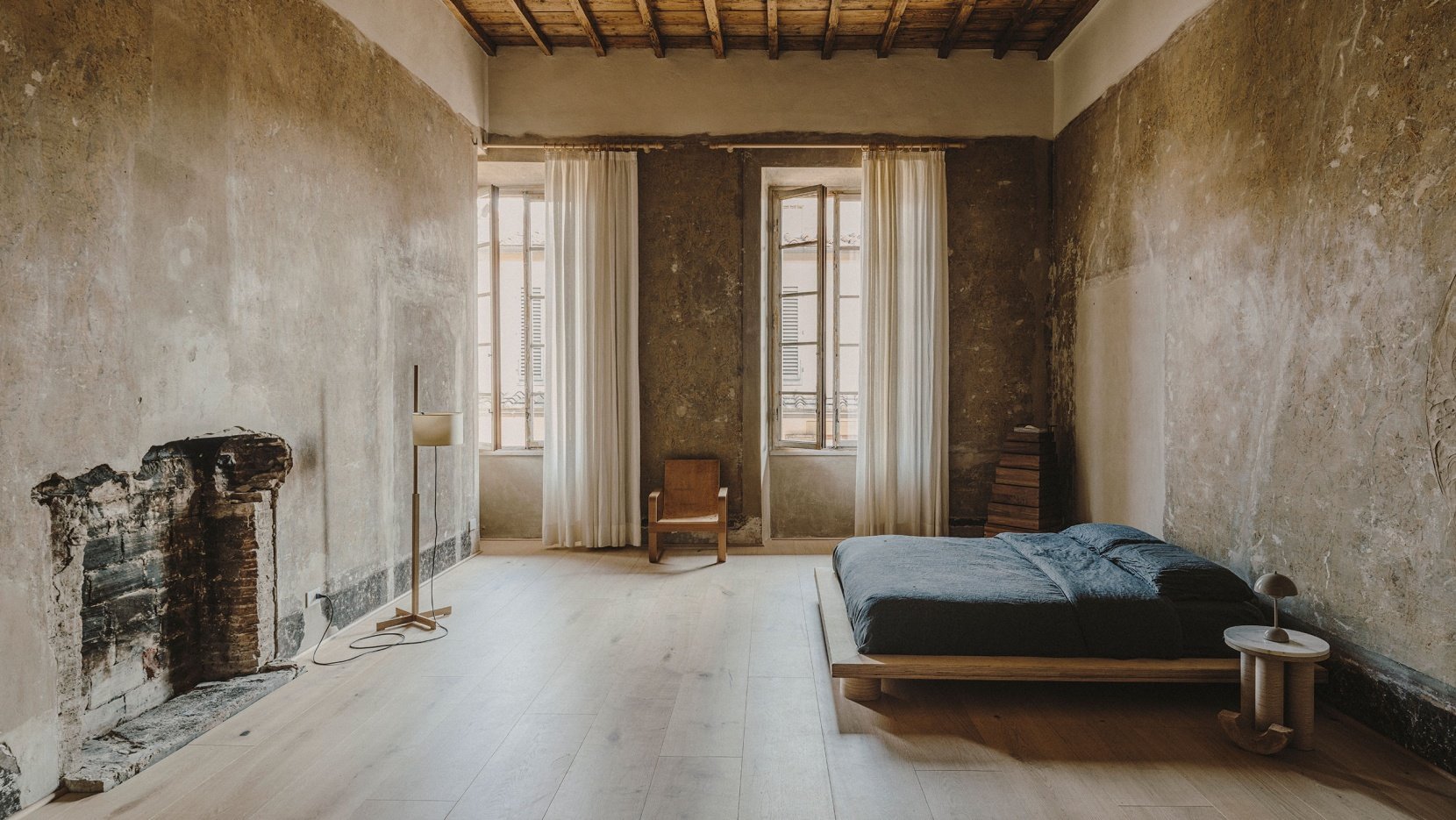
Step one is live in a very very old building, preferably an old abandoned castle if you can swing it.
Oh wait, your not Axel Vervdoodt?? Okay then, well, you can also use different wall finishes to add texture to your walls. Limewash, heavy plaster, basic plaster, or Venetian plaster can create an aged, imperfect look.
Highlighting anything old or aging is common (and necessary) with a wabi sabi-inspired design. Have peeling walls? Wabi-sabi will have you embracing them! The point is to accept what you have and find the beauty in it. Instead of trying to erase naturally aging elements in your home, try embracing them (as long as it’s safe of course). In our apartment, we have peeling paint and instead of hating it I am learning to embrace the natural deterioration that happens to all things.
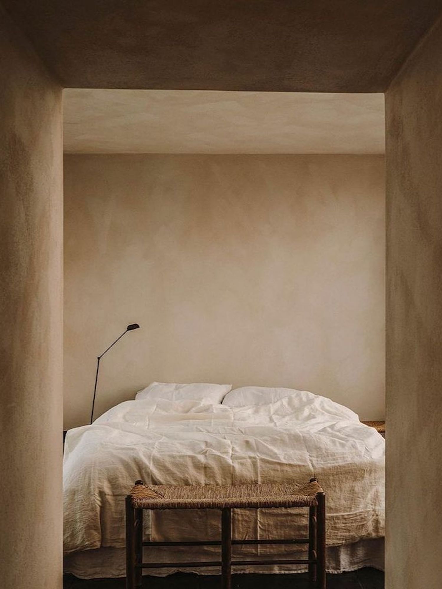
Limewash walls are a staple of modern wabi sabi design because it can make plain, uniform walls look textured and antiquated. A rough, uneven surface is welcome in wabi sabi design and actually preferred over a smooth surface. This is a trick I am excited to try in my own home and will report back on how it goes 🙂
2. Find Naturally Tarnished Objects And Furniture
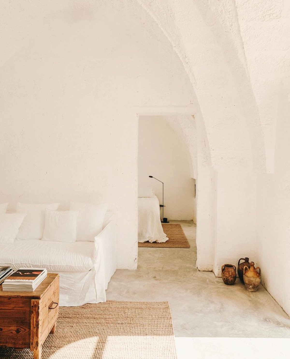
Wabi sabi is about impermanence. Nothing stays the same forever so a key component is holding on to objects that have meaning and admiring signs of natural age. Wabi sabi will teach you to hold on to your things for as long as possible instead of replacing them with something new.
If you are going for a wabi sabi-inspired design, avoid shiny, uniform objects and instead look out for naturally aged, organic decor pieces that show the passing of time. A cracked pot or tarnished vase is beautiful, and finding these used objects to decorate your home is also sustainable and good for our earth.
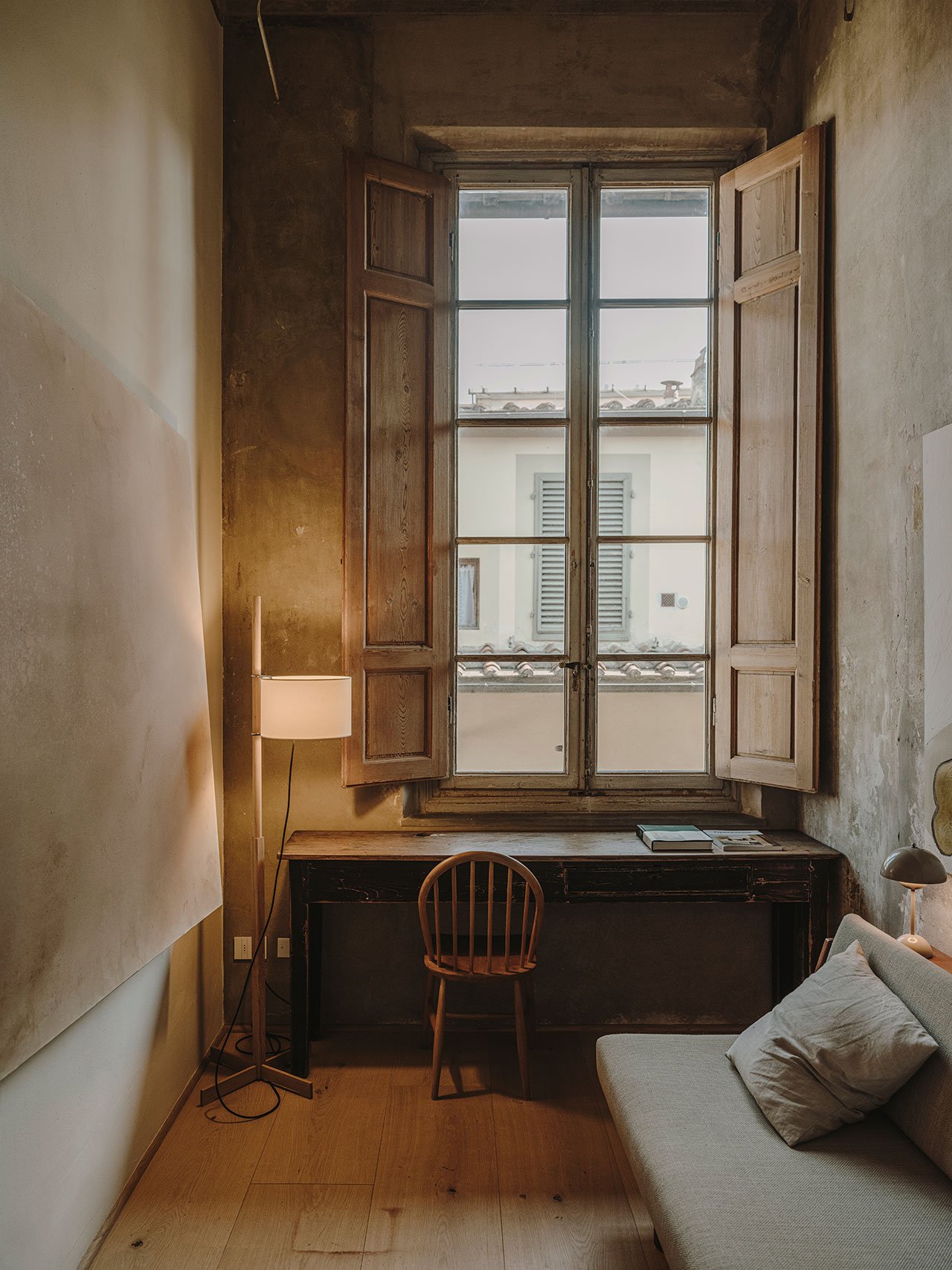
Natural wear and tear is meant to be shown according to wabi sabi philosophy. So to achieve the look you should opt for organic materials that show age over time. Wood, clay, brick, and stone will age imperfectly and gracefully. I write this from my wood dining table that I bought used from Facebook Marketplace. It’s over 100 years old and has some new cup rings that I am not proud of but if I had to choose my favorite piece of furniture this would be it. The flaws and age make it unique and (you guessed it) imperfect.
3. Embrace Simplicity
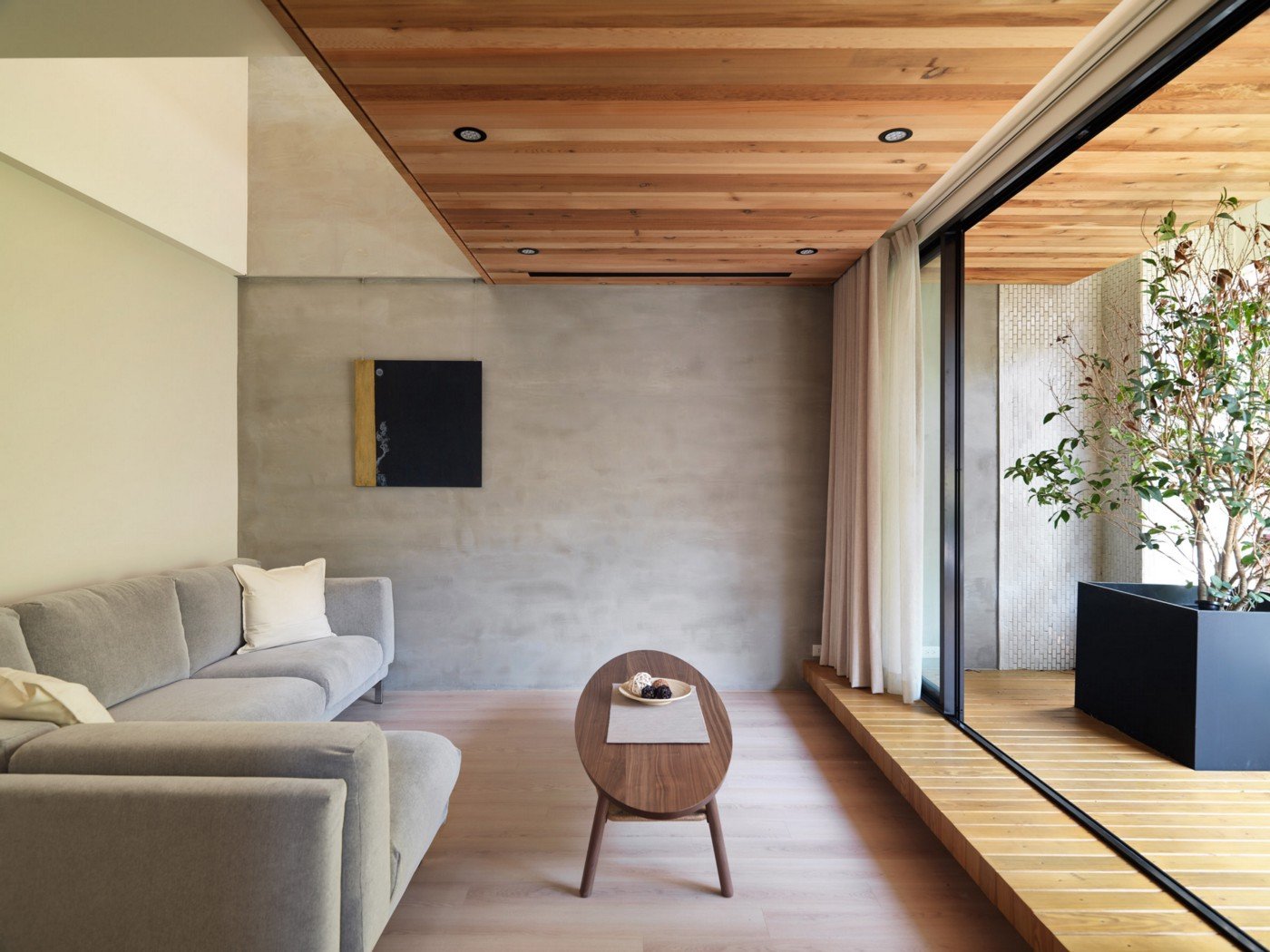
As someone who loves ~things~, this is a hard pill to swallow. But to truly achieve the wabi sabi aesthetic, you need to let go of clutter and rid your home of anything that is not significant or useful to you. Wabi sabi teaches us to detach from material things and focus on tranquility. Unfortunately, there is nothing tranquil about busy or cluttered surfaces (she says to herself).
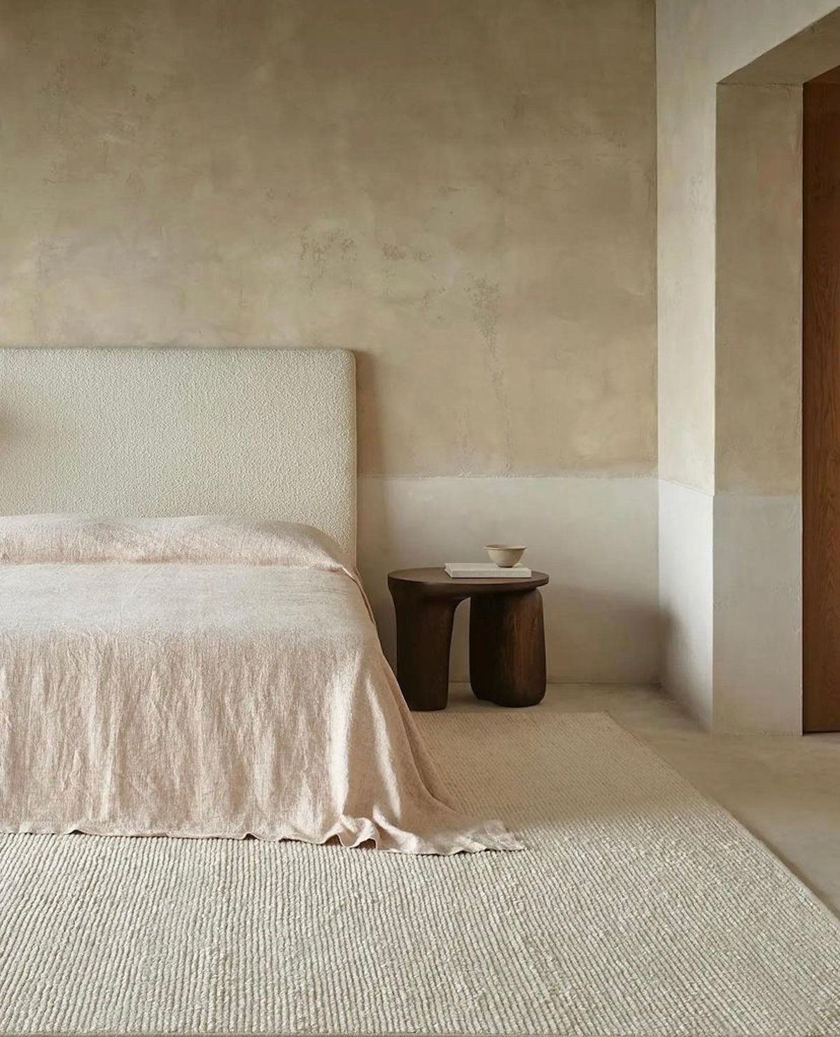
To embrace wabi sabi you are not required to get rid of all things and live like a monk. Instead, look at what you do have and consider its purpose or importance to you. If it’s useful or meaningful you don’t have to give it up. The point of the simplicity component is to create a sense of peace with your surroundings, which can be hard to do if there is clutter around you.
4. Opt For Earthy, Muted Colors
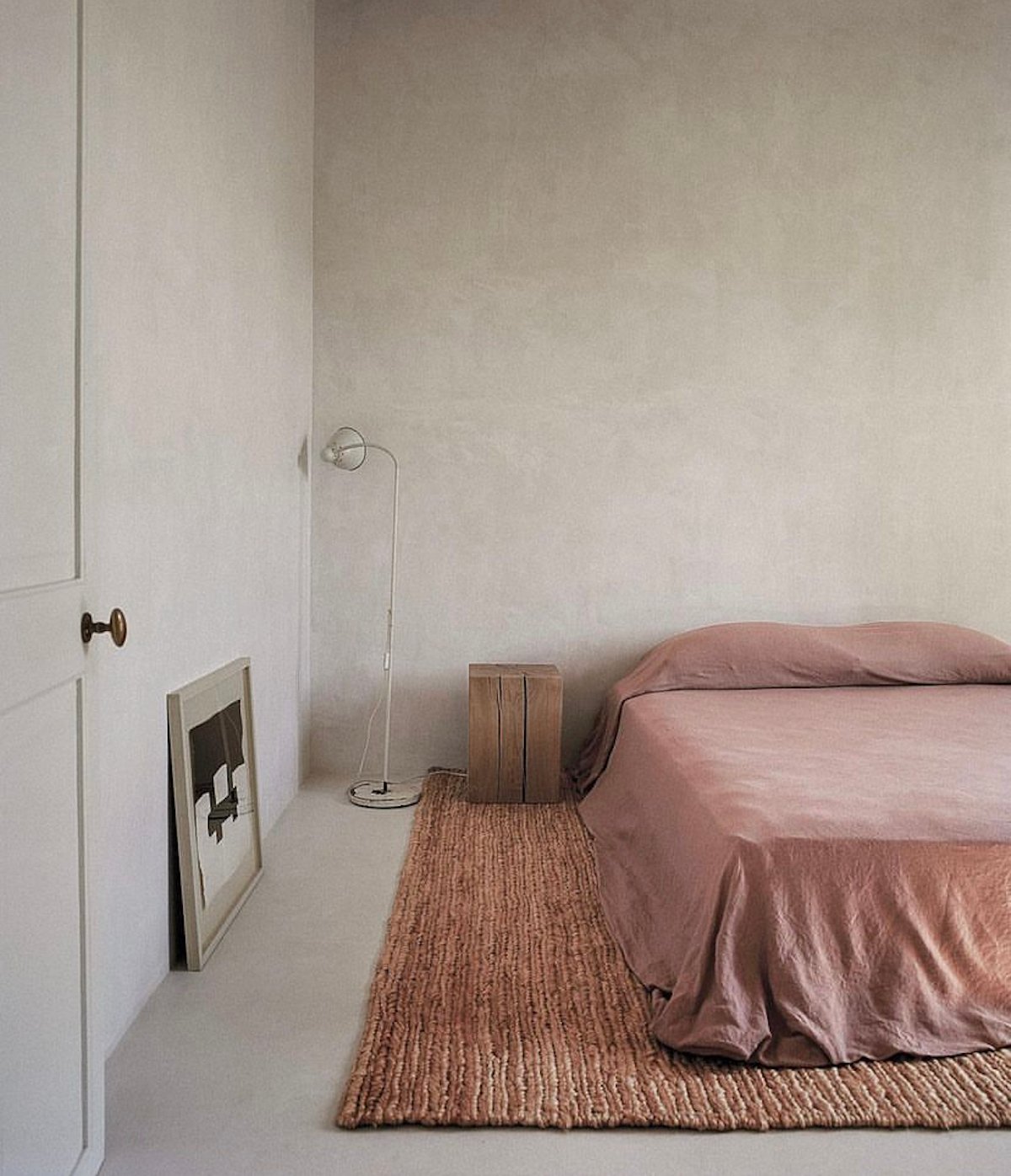
Color (or lack thereof) is highly effective in creating peaceful surroundings. Avoid highly saturated colors if you want a wabi sabi look, and instead opt for muted colors you would find in nature.
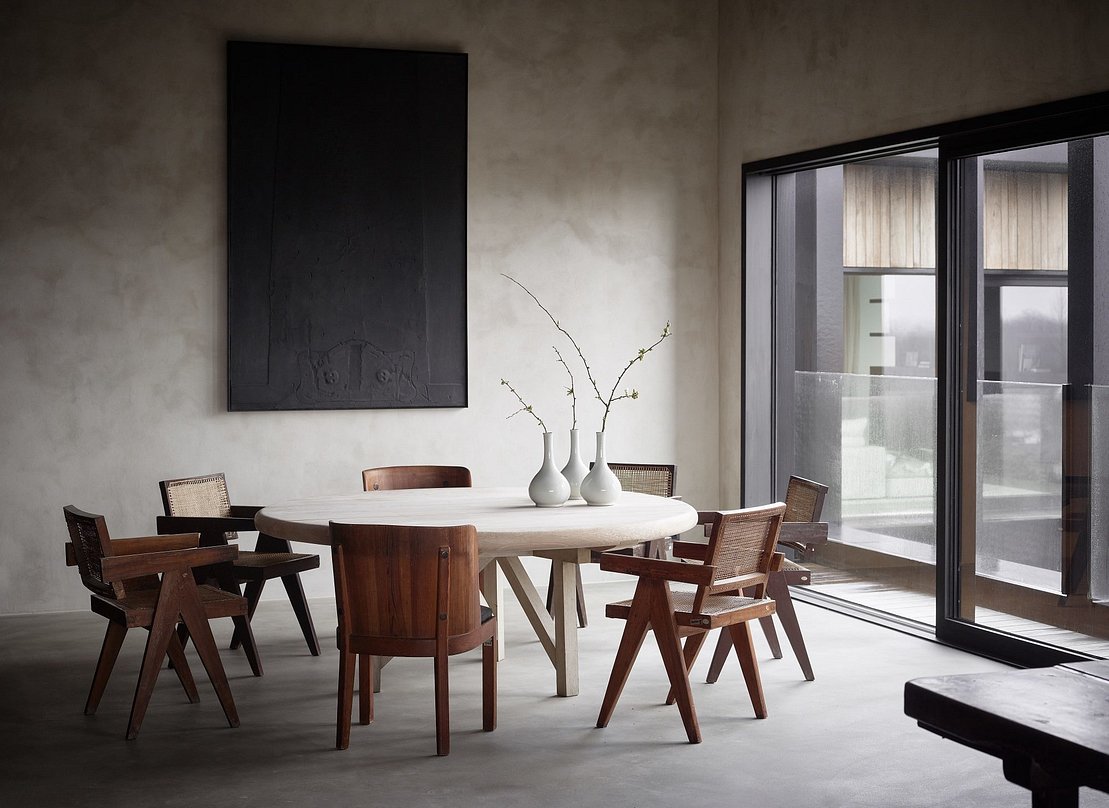
One main quality of this aesthetic is an austere look and feeling. This is where a light moodiness comes into play (and likely where my main attraction to it comes from). Despite many wabi sabi interiors being neutral and minimal, the color palettes associated with this style are often a shade darker than most neutral rooms. Gray, brown, light brown, white, and even black are often present in this style. The darker tones create a lived-in, austere vibe as opposed to a warm, comfortable vibe. This is not to say that wabi sabi interiors can’t be inviting, but they are often a bit rougher around the edges.
5. Lean Into Asymmetry
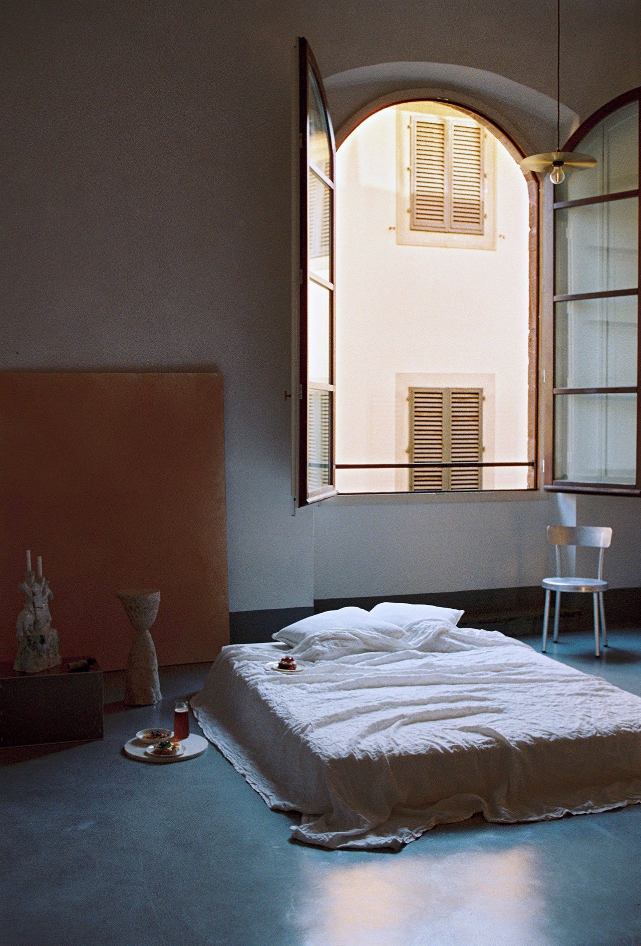
Anything too uniform disrupts the nature of wabi sabi. The point is to embrace imperfections so if a room has all of the above elements but feels very symmetrical, then it won’t be perceived as wabi sabi. In my home, I plan to apply this by having one nightstand instead of two, hanging a small piece of art off-center, and embracing our fiddle leaf tree that has sadly lost 90% of her leaves.
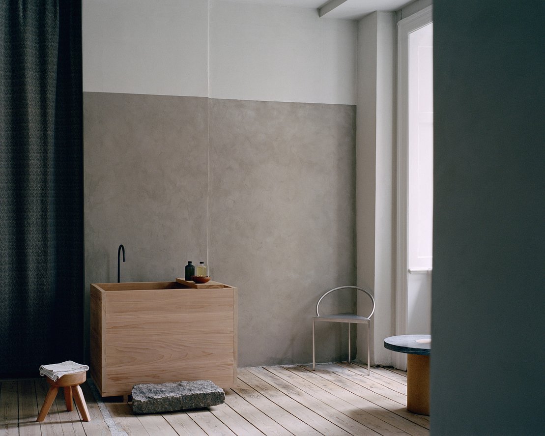
Another way to incorporate asymmetrical lines is with furniture placement. You can arrange your furniture with uneven space in between each piece and this will create an unbalanced yet pleasing look. In the above bathroom, the stool and sink are closer together and the chair is farther away in the corner. This creates asymmetry without doing anything permanent to your floorplan or walls.
As I said before, this is not meant to be a perfect “How To” on wabi sabi design but if you are looking for small ways to incorporate it in your home, I hope these 5 tips help. If you want to learn more about the subject, I loved pouring over this book, and I hear this is another great resource on living the wabi sabi-inspired lifestyle.
Thanks for coming along this journey with me, and bearing witness as I unpacked my feelings about this ancient, beautiful, simple yet intoxicating design aesthetic. I may not have articulated it perfectly but that is, dare I say, a great lesson in wabi sabi. xx
Opener Image Credit: Design by Axel Vervoodt | Photo by Jake Curtis
THIS POST WAS ORIGINALLY PUBLISHED HERE.


