Welcome to round two of our design “rule breakers” series. Last time, Emily wrote about bathrooms and it was pretty freaking inspiring to see the designers from her book really show off the real visual benefits of saying “Rules? Who needs ’em?!” And look, while I will never not love looking crazy cool bathrooms and kitchens, ya girl is a renter and will be for the foreseeable future. So my decor is really the only thing I can truly “break some rules with” without breaking the rules of my lease. The whole idea of Em’s book is to teach you the rules/lingo and then show you how to make informed design decisions (and maybe break some rules) to make your house unique to you. So let’s go over some of our favorite (and easy-breezy) ways you can let your inner design rebel out. Shall we? The first one might hurt your brain…
Too Small Rug
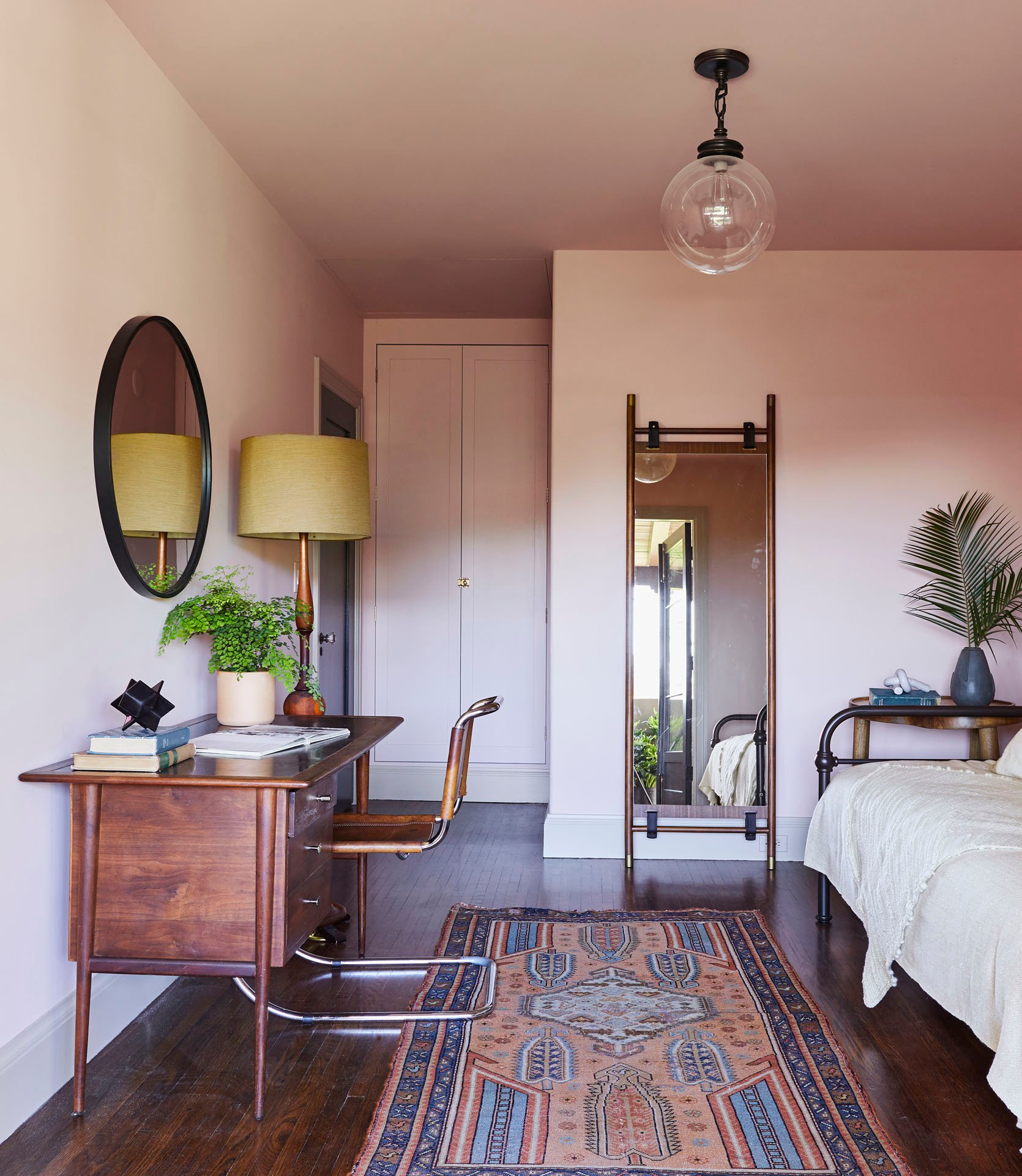
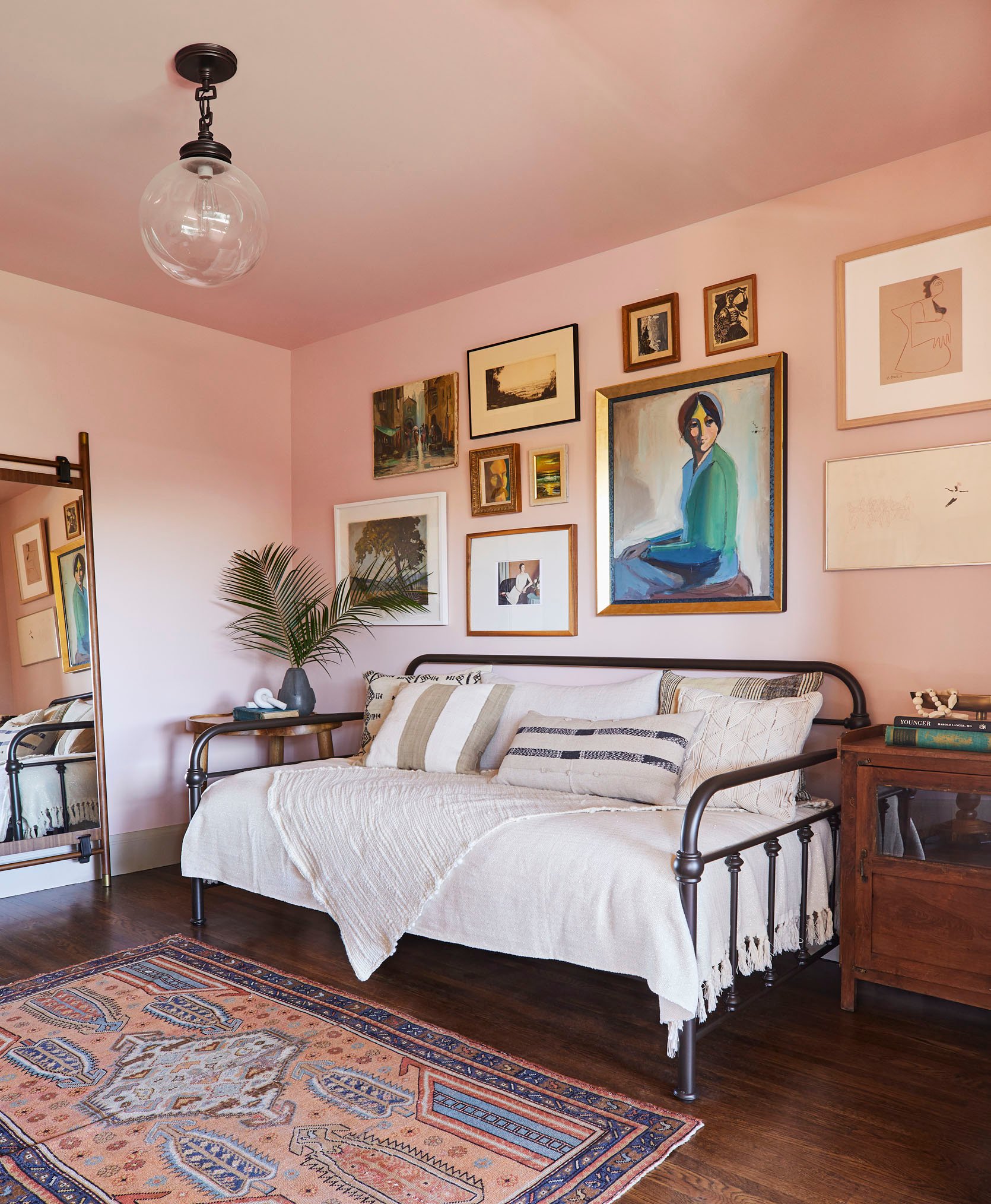
GASP! I know. We have written ad nauseam about “the right” rug size for every room and we still stand by our rules. Most of the time a rug that is too small for a room looks like an accident and not an intentional decision. But as we have also stated, rules are meant to be broken if you can nail them. So above we have a room designed by William Hunter Collective and styled by the ole EHD alum styling team, Velinda, Erik, Emily Bowser, and Julie. While I don’t know the exact reason behind this rug choice I have some ideas. But before I do that here is the general rule when it comes to choosing a rug size for a bedroom from our Bedroom Rules post:
RULE: Ideally your rug should have at least 24″ on all three sides of your bed. Our typical sizing rules are: for a Twin go for a 5’x8′, a Full 6’x9′, a Queen 8’x10′, and a King 9’x12′.
As you can probably tell this rug does not follow that rule. Now, first off this isn’t just a bedroom which I think is important to point out. It’s a guest room/office. So a large plush, soft-under-your-feet rug would be a nightmare to have under an office chair. This rug is also heavily patterned so if it were a lot bigger it might overwhelm the space and compete with the gallery wall. The size actually helps to create a divide between the bed and desk zones. Basically, it just works!
Also, this stunner is vintage which also makes it prime rule-breaking material. Let’s talk more about that…
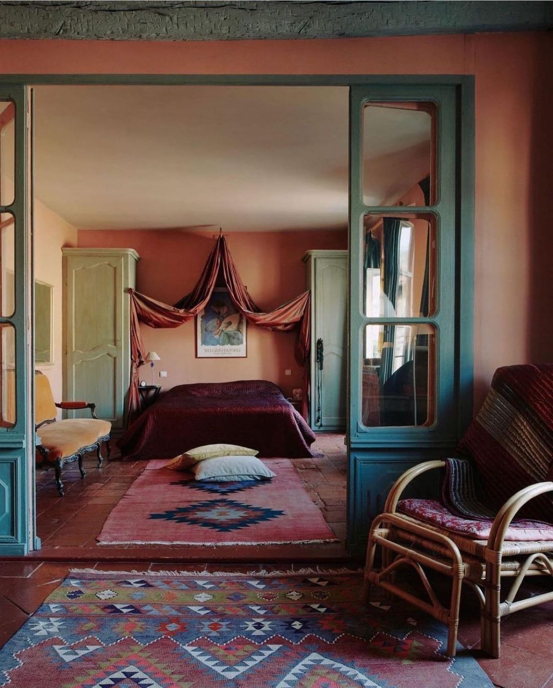
In this bedroom (not in the book), you don’t have the same need to zone out different areas in the same room like the one before. Instead, they were like “we don’t care if this rug is too small OR that it’s running vertically not horizontal. It looks cool!” I think this really works because of the relaxed style of the room and also because the rugs are vintage. I feel like there’s an unspoken rule that when it comes to vintage rugs the rules do really apply. They’re the cool kids that do what they want.
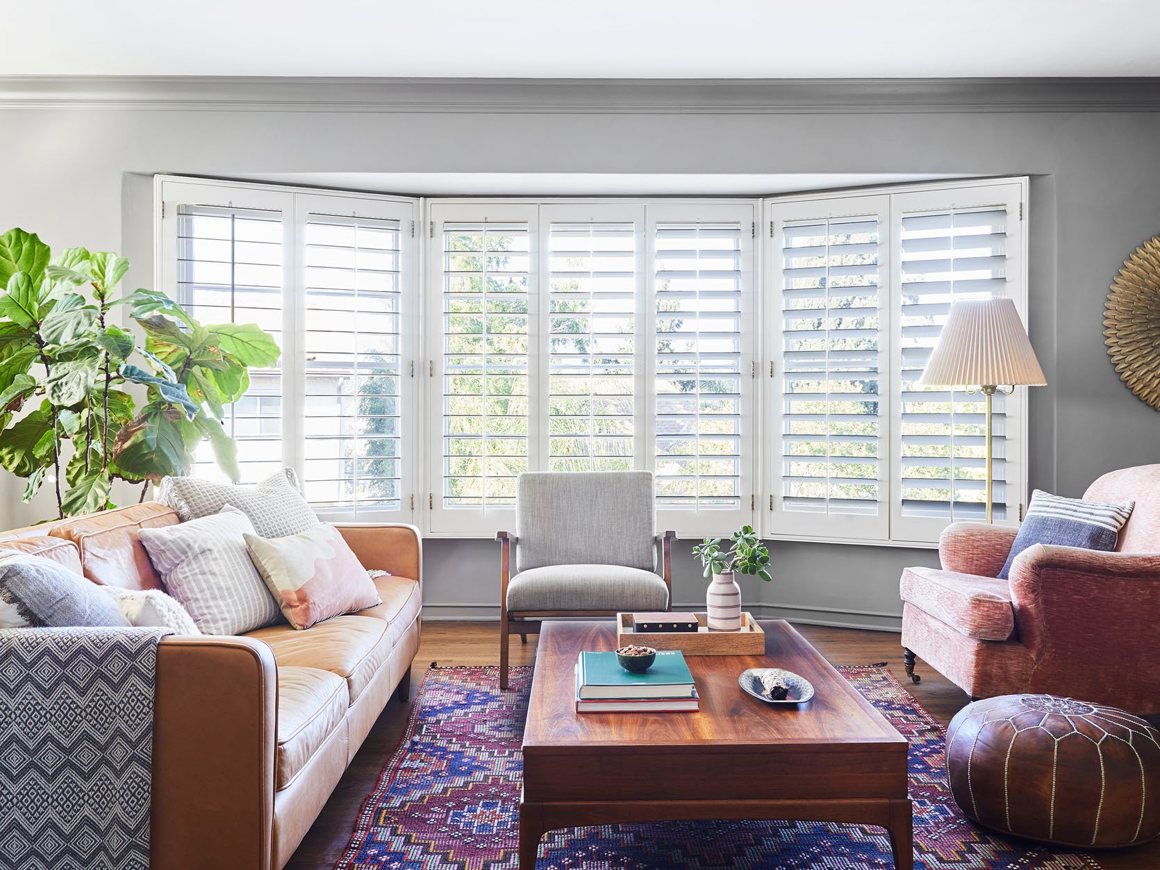
Now to end this WILD topic, let’s touch on living room rugs. Here’s our rule…
RULE: Your area rug should be large enough for at least the front legs of the sofa and all chairs to rest on top of it.
Again, this rule is a great way to make your living room look and feel great. However, it’s not the only option, Take a look at Allison Pierce’s living room rug. It’s not large enough to fit under all the front legs of all the pieces of furniture BUT it works. Why? Well, it does go under the front legs of that gray side chair and then it gets real close to the sofa and pink accent chair’s legs but still leaves a couple of inches for breathing room. If you like this “almost touch the sofa legs” look we highly recommend leaving that tiny bit of space (but not too much) because if the rug butts up against the legs it’s going to look like you chose a rug that was too small instead of it looking like an intentional design choice. Embrace some negative floor space.
Huge Sectional In Small Room
I’m sure you’ve heard a hundred times that you shouldn’t put big furniture in a small room. “DON’T OVERWHELM THE SAPCE” they say. So it may seem counter-intuitive to put a big sectional in a small living room, right? But there’s a way to do it so it looks and feels more intentional and “custom”.
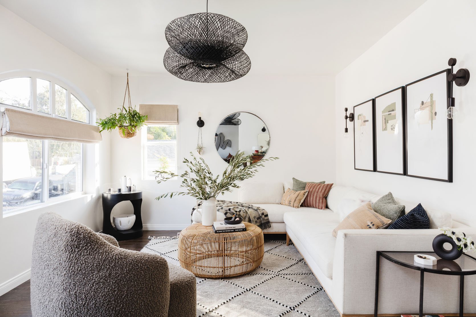
Take Emily Bower’s living room that she styled for a shoot last year. In her actual, everyday setup she has a non-sectional sofa and it looks awesome because she designed it and she’s a professional. But when we saw this cream beauty we realized that if you choose a sectional that nicely fits in a corner against two walls, and you don’t fill the rest of the space with a ton of other pieces, it looks like it was made for the space. Plus it’s more seating for guests (and two beds if needed for sleepovers:)).
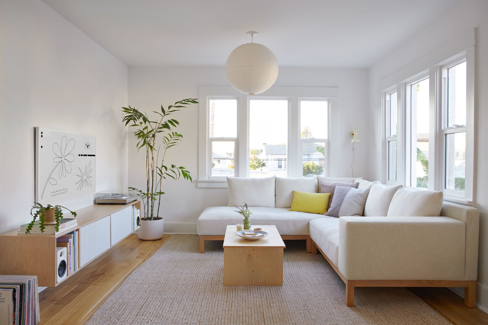
Mel also chose a sectional for her new living room but her’s was custom because she’s a girl after my own heart. Now, choosing a light-colored fabric isn’t “a rule” but it does help a sectional in a small space look and feel airier. But hey! Maybe a deep blue velvet sectional in your small living room is exactly what it needs. Just make sure that you have it pushed into a corner out of the way of any pathways so that it looks really intentional. Can you tell we can’t get enough of “intentional” design?? Or saying it?? 😉
“Too Many” Statement Pieces
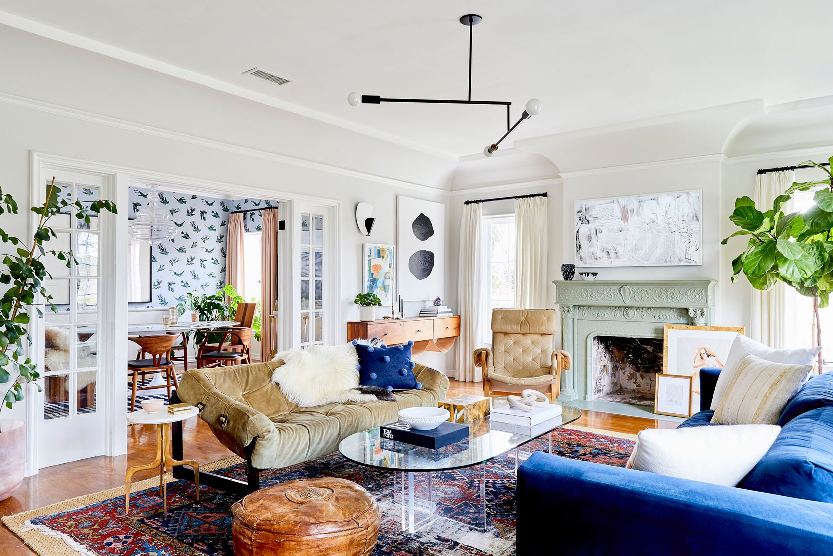
I know, I know. We are BIG on saying to not have every piece in a room be a statement piece. Because if you want your space to feel balanced and interesting (and you don’t have a ton of experience) it’s a pretty good rule of thumb. But then you see a room like Dee Murphy’s living room and you start to rethink everything. I mean look at each piece…they are all “statement” or “conversation” pieces. However, they do balance with each other. First off, I think having white walls and white curtains was a great choice since they are really some of the largest “pieces” and the foundation of the room. Then she used color sparingly but with impact. I’m talking about the saturated blue in the sofa, pom throw pillow, and parts of the rug. Everything else is fairly neutral in color but super-rich in shape and texture! I also love how she spaced out green with the two trees (notice the variation in leaf size) and that beautiful mint fireplace mantle. The last thing I’ll say is how perfect that lucite and glass coffee table is. It’s super cool, unexpected in this space, and since it’s clear it feels weightless. Basically, a solid coffee table could have made the whole space feel too visually heavy. This one is a quiet statement that lets the other gals shine.
Art Placement
Boy, do we love talking about “unexpected” places to hang art. I mean it’s fun and soooo easy. But when it comes to gallery walls we do have a no-fail formula. But let’s look at what Scott Horne did for his gallery wall…
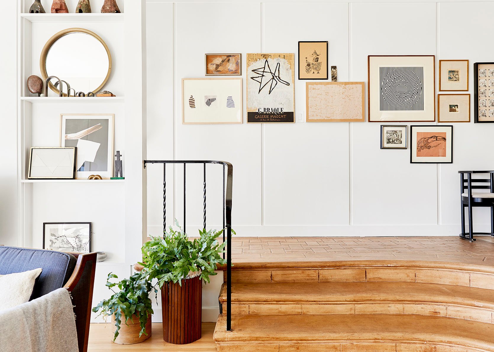
I will never forget seeing the photo for the first time. I was shook! I loved it so damn much and could not get over it. I have since calmed down (barely) and am excited to talk about why it sparked all that joy. First, I love that 90% of the art is aligned on an imaginary line. Almost like they are sitting on a shelf but not…because they are nailed into the wall. Then smaller pieces are filled in to make the top have varied heights which makes it cool and interesting. But Scott did not stop there. Those bottom two, “out of line” pieces really make it for me. They somehow make the whole collection seem so much wider but really it’s just two extra medium to small pieces. It just looks cool and is a configuration I hadn’t thought of. I’m pretty inspired to get creative with any future gallery walls!
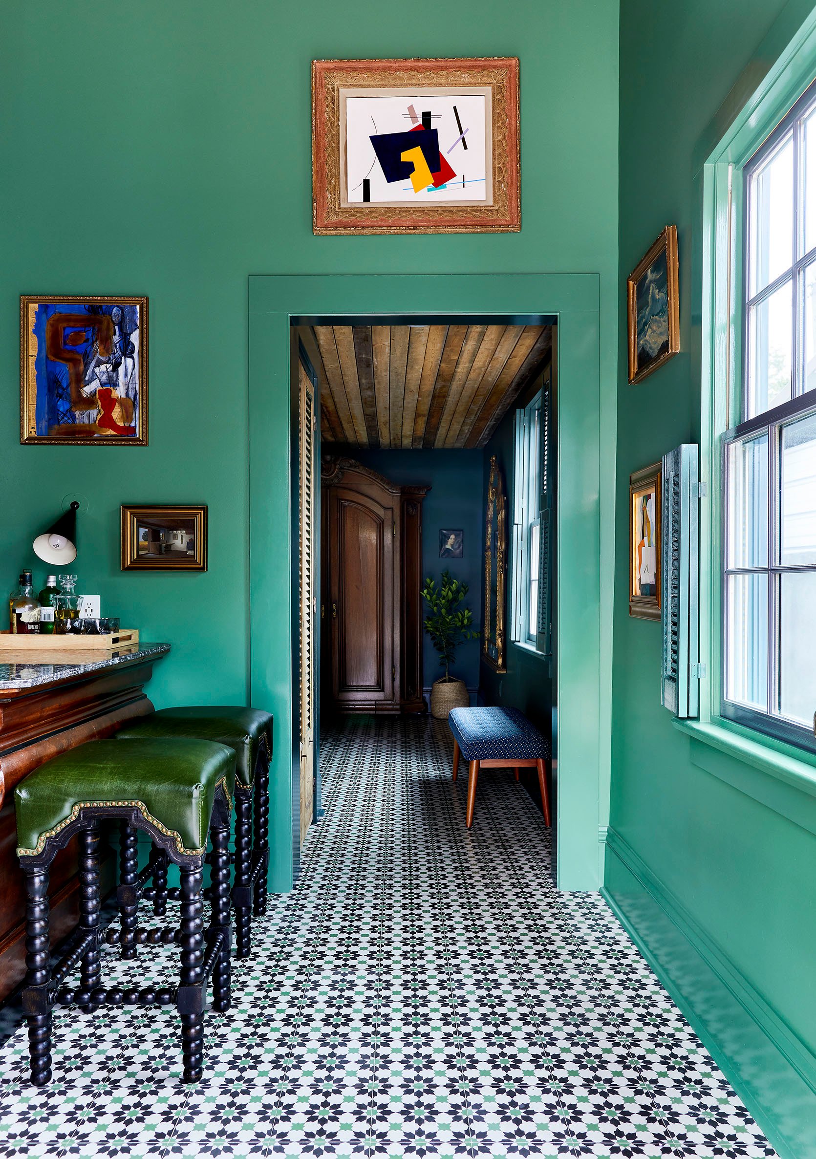
This next one isn’t about a gallery wall and it’s the opposite of the under-the-window art placement (another personal favorite of mine). It’s a reminder that art can, and maybe should, go literally anywhere…even over a doorway. This may not be the first time you’ve seen this but I know I don’t see it a lot and that’s a shame. It’s such a cool spot, especially if you have tall ceilings! But if you don’t and have shorter ceilings, how cute would a little mini art piece above a door be?! Point is, try new things when it comes to art. Command strips exist for a reason, so test things out then make your holes:) Decorating should be fun.
Non-Matching Pendants
I know but hear us out.
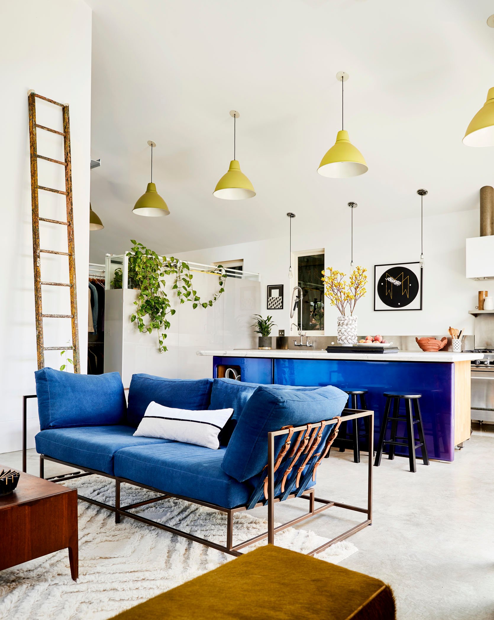
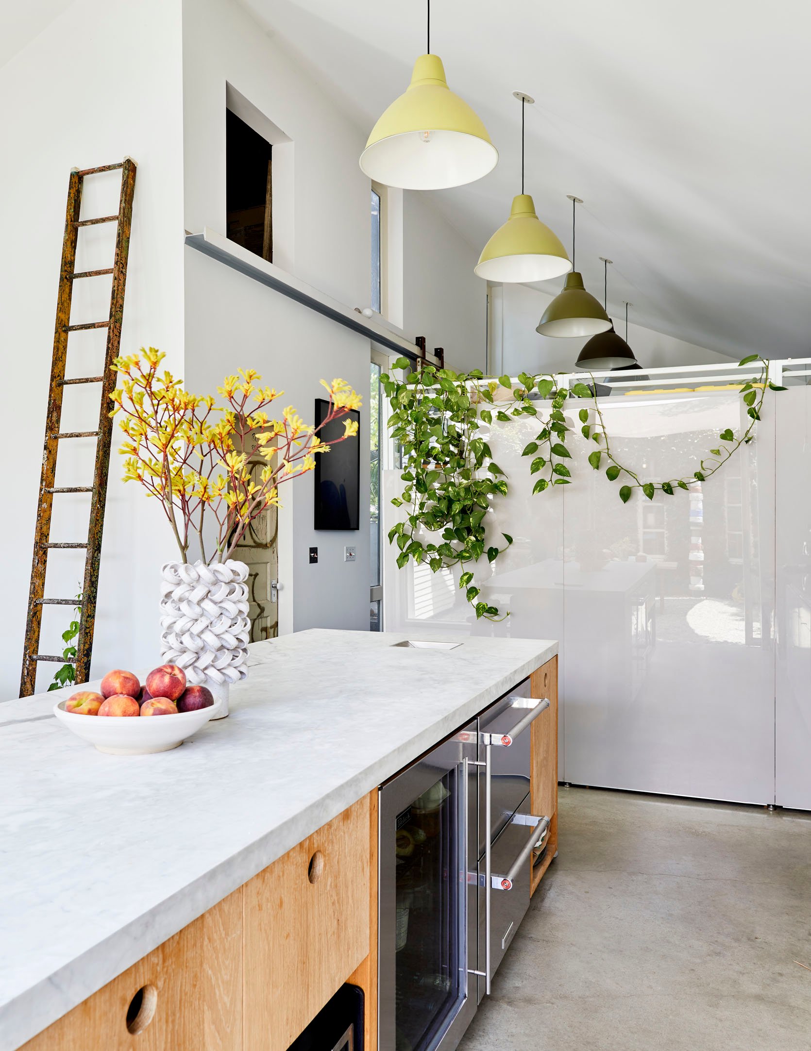
This concept was definitely something I hadn’t really thought of before. But why do pendants need to match? Well, they don’t! Now, the ones above do match in shape but the colors are ombre’d. Get outta here Ben! This is a very easy way to have some fun. But if you wanted to hang two totally different pendants next to each other we say, yes. We do recommend that they have some materials or colors in common if the shapes really don’t talk to each other. But for the final time, if they don’t match at all in any way but you love them and think they work, GO FOR IT.
Hope this was a fun read that has your creative juices flowing. Sometimes all we need are some different ideas to get our minds thinking differently. Happy Thursday!
Love you, mean it.
Opening Image Credit: Design and Home of Scott Horne | Styled by Velinda Hellen & Erik Kenneth Staalberg | Photo by Sara Ligorria-Tramp
THIS POST WAS ORIGINALLY PUBLISHED HERE.


