Jenny Han once wrote, “Everything good, everything magical happens between the months of June and August.” As a true blue Gemini (my birthday is actually today if you can believe it) I couldn’t agree more. Summer is where it is at. It’s the only time of year that you’ll see me happily chopping veggies for a summer salad and humming to myself as if I am in a silly little rom-com. For me, summer is, against all odds, the one time of year I really enjoy being in the kitchen. It’s truly magic because any other time of year I actually avoid being in the kitchen at all costs, hating the act of even turning on the stove to make an over-easy egg. But since summer is officially here, I am in the kitchen more (hold for applause) and it really got me thinking…How can I enjoy this time more and potentially learn to enjoy cooking once fall is around the corner? The answer I found is simple. I need my kitchen to look better. You know the saying “look good feel good”? Well, surely if my kitchen looked a little prettier, I’d feel good about spending more time in there, and in turn, become an amazing cook overnight. It’s SCIENCE.
As a renter, I am nowhere near renovating territory, but the goal is to make the kitchen look better, not perfect. I (and you!) can style and decorate a kitchen so it looks good despite dated tile and overhead lighting that is unfortunately here to stay. How you ask?? That’s what past EHD projects are here for, so we can study and learn from the best. So are you ready for some styling tricks that are guaranteed to make your kitchen look better? Me. too. Let’s get into it.
SWAP: Use A Rug Instead Of A Mat
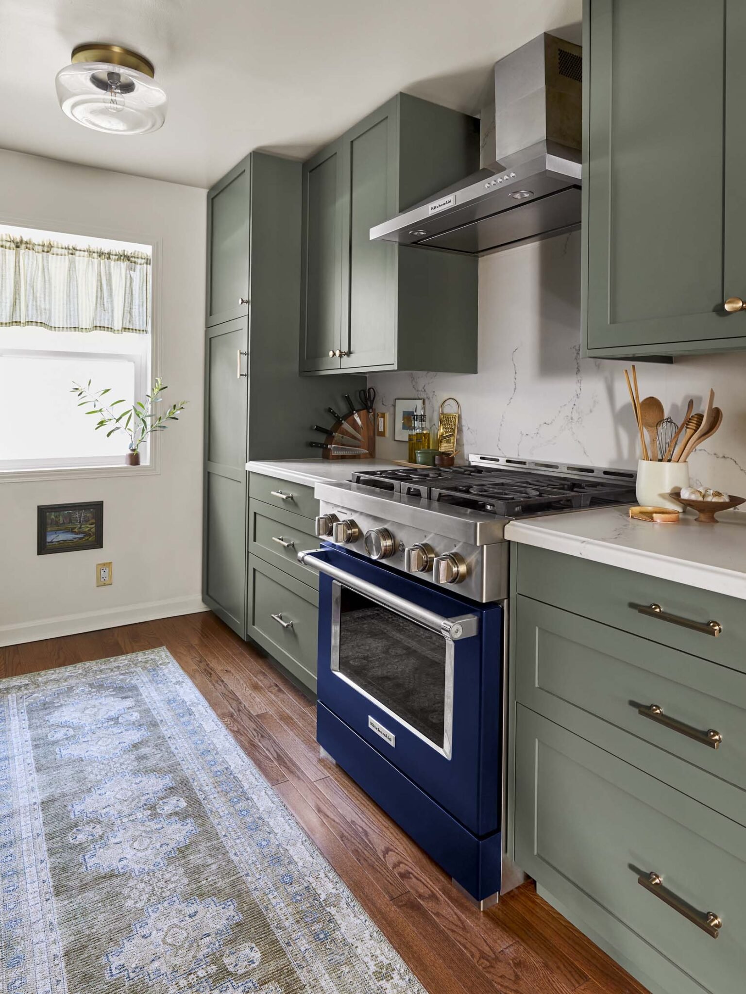
I remember when I finally got the right rug for my living room. It instantly changed the look and feel of the room and made it feel more complete. Do you mind if I say that rugs are like a good pair of shoes?? Because just like shoes can make an outfit, a rug can really pull together a room. So, while a waterproof kitchen mat totally works, you can replace that mat with a durable rug and just like that your kitchen has a new pair of shiny shoes!
The kitchen gets a lot of traffic and life teaches you that spills do in fact happen, so you should opt for a forgiving color and pattern. We suggest vintage Persian rugs because they have a perfect, worn-in look which can help hide stains and general wear and tear. There are also really great non-vintage options like this one that can eliminate the fear of total destruction and make your kitchen look (you guessed it) so much better. Rug tape is also key so that you can keep the rug from sliding around, and a rug pad underneath will make your feet feel like they are stepping on a soft buttery cloud (which is much deserved when washing dishes).
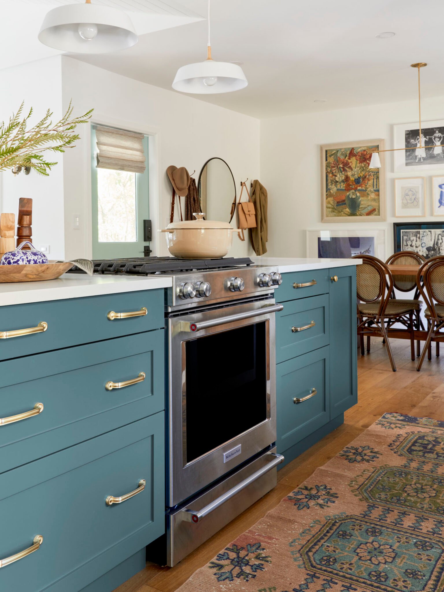
I love the above kitchen by Velinda Hellen Design for so many reasons and that rug choice is one of them. They chose a rug that incorporates the cabinet colors and other accent colors that pulls in the decor from the rest of the room. If you have colored cabinets, adding a rug is a nice way to accent that color to make them pop even more.
Here are some great vintage-inspired options but for real vintage rugs head here.
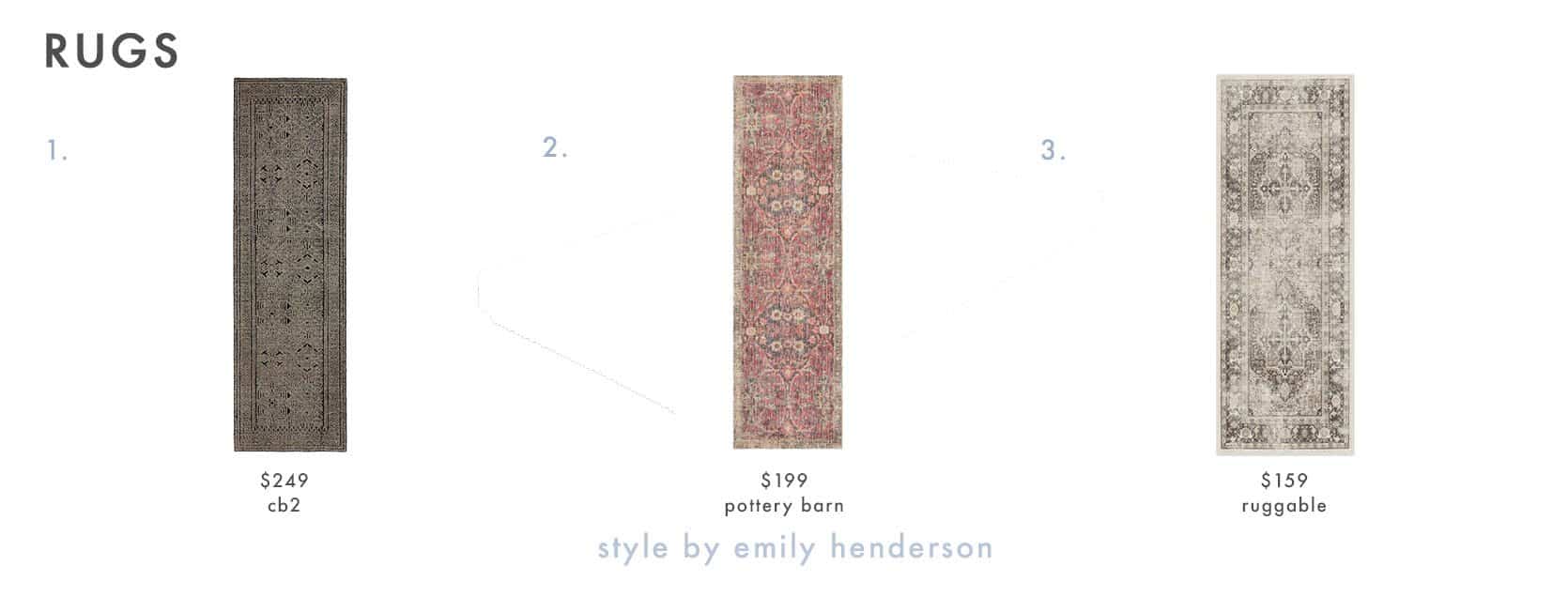
1. Hand-knotted Brown Rug | 2. Julianne Hand Tufted Rug | 3. Kamran Hazel Rug
SWAP: Replace Your Regular Fruit Bowl With A Footed Bowl
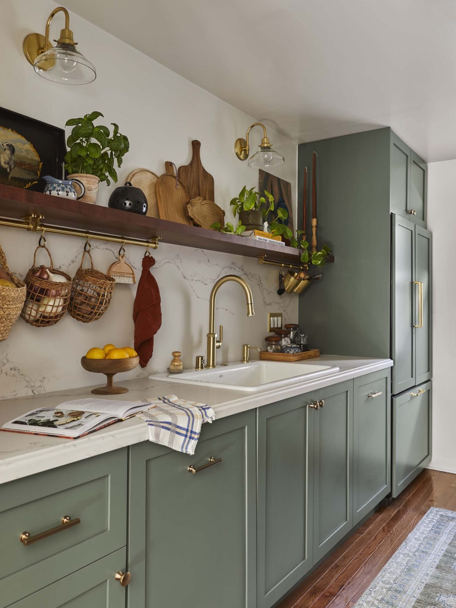
If you have the space for a fruit bowl on your kitchen counter, it’s a great way to add color and depth (I love using lemons and oranges). A low bowl is still cute and will get the job done, but we highly suggest a footed bowl because it will add height and a more interesting shape. A regular bowl can sometimes look like a bowl that’s been left on the counter for unknown reasons until you see the fruit in it, whereas a footed bowl always looks intentional. In the above kitchen, Sara went with a wooden footed bowl which adds height, texture, and warmth. A triple whammy!
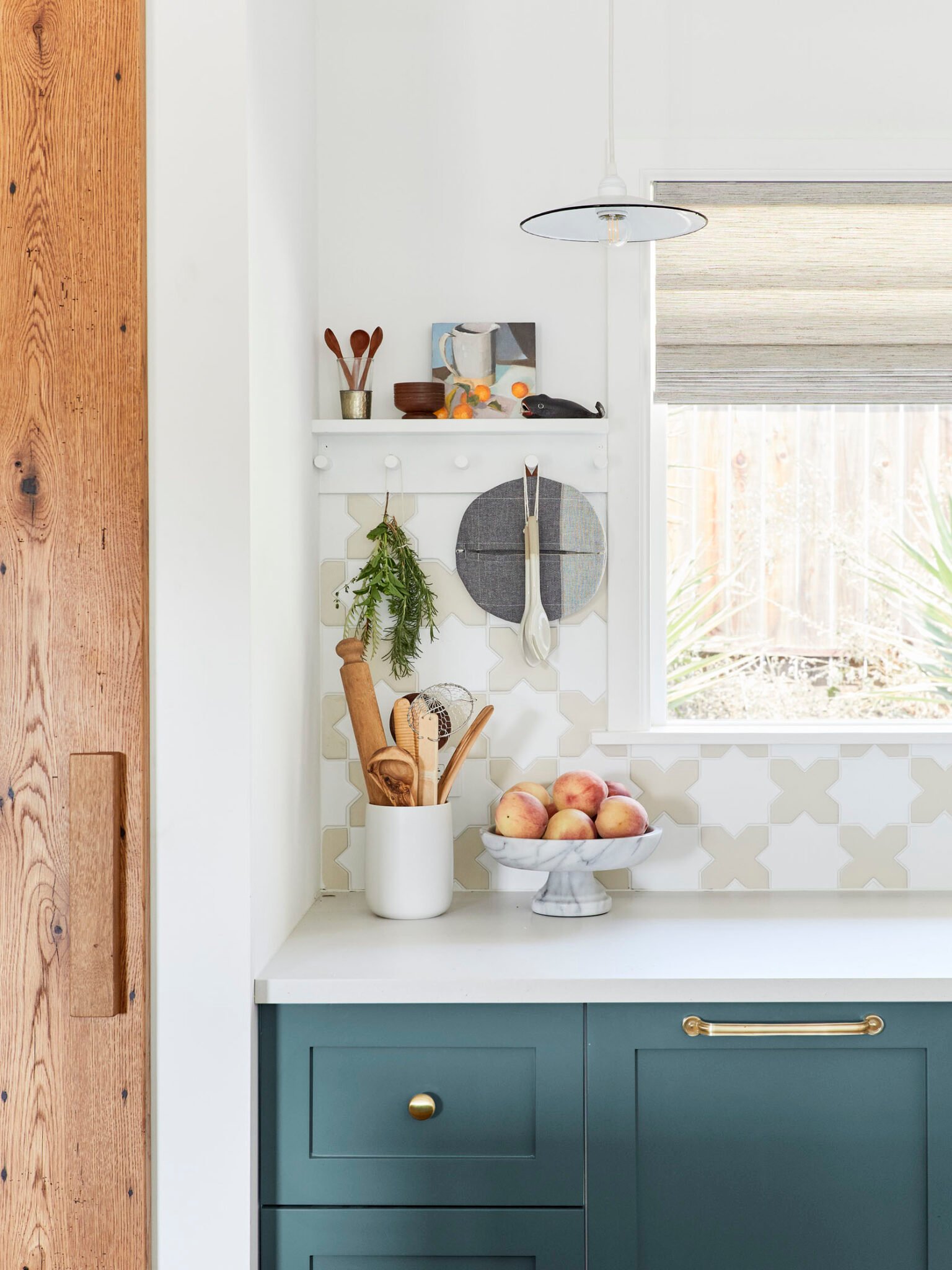
I’ll award bonus points if you go with a marble-footed bowl like the one in the above kitchen designed by Velinda Hellen Design. Indeed, the great thing about these bowls is there are so many sizes, shapes, and textures to choose from. Here are some of our favorites:
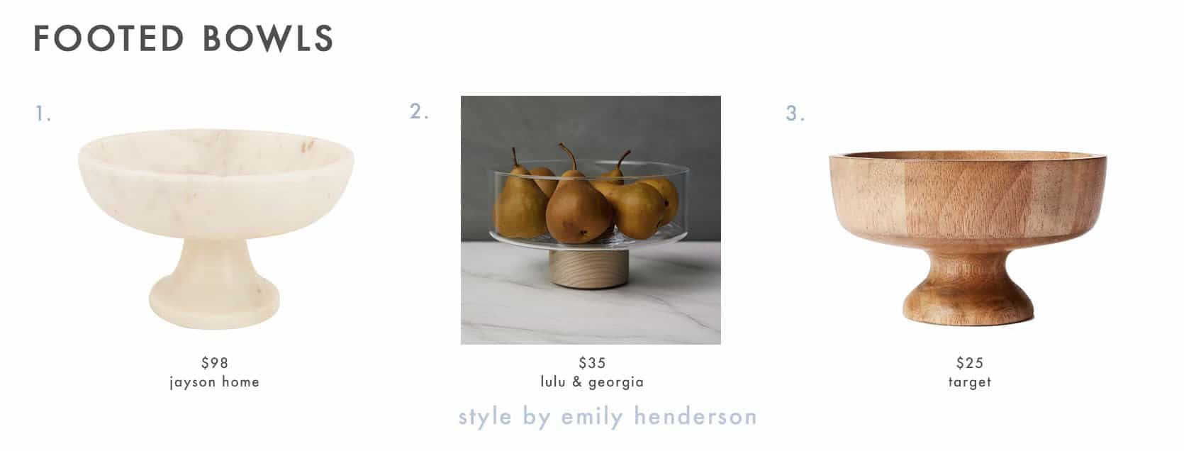
1. Corbin Footed Bowl | 2. Lotta Pedestal Bowl | 3. 10.1oz Rubberwood Pedestal Serving Bowl
BONUS TIP: Don’t Forget To Style The Space Above Your Cabinets
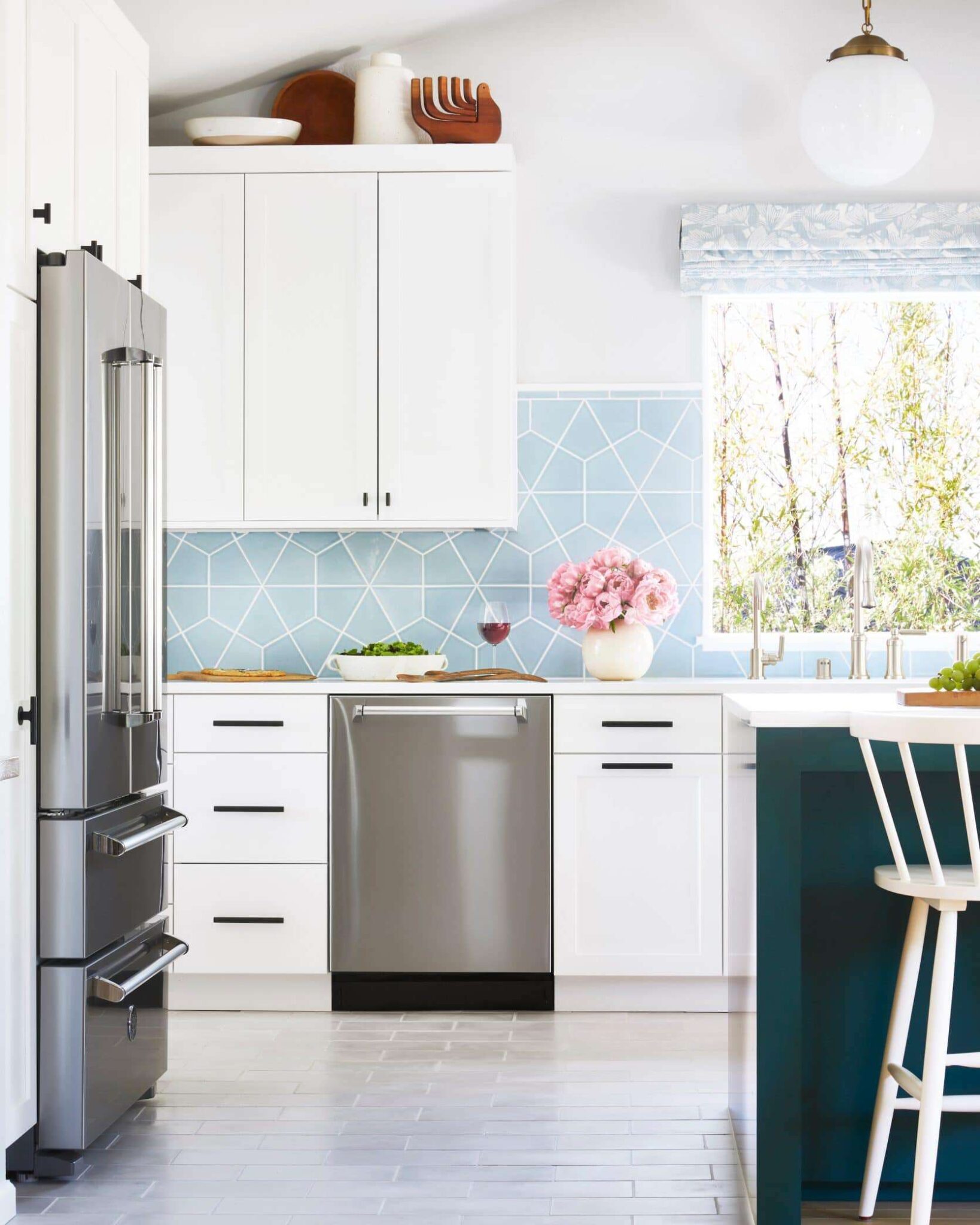
Last year, Mallory blew all of our minds by posing the very brave question “what do you do with the space above your kitchen cabinets?” It is a space that is oft forgotten about but it can be a great place to display collections, art, beautiful bowls, books, plants, you name it. I have definitely noticed that my kitchen gets the least amount of styling attention but in reality, there are so many fun ways to (say it with me) style, play, every day in your kitchen. If you have less counter space but an ample amount of space above your cabinets, don’t skip this styling hack.
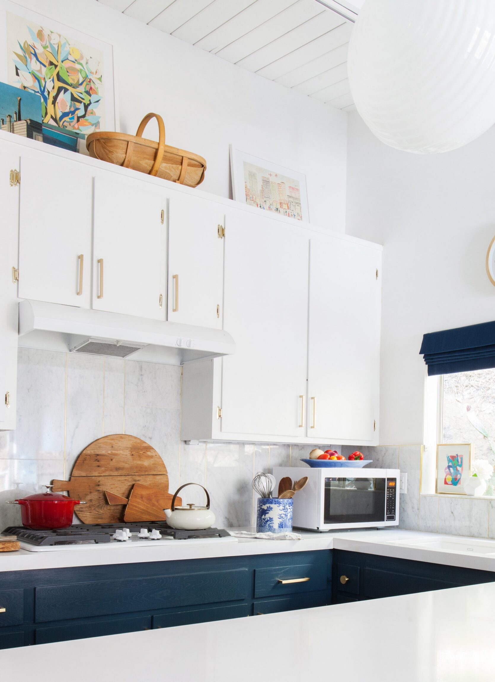
Another great thing about above the cabinet styling is it will draw your eye up and make your kitchen look bigger. It can also simply act as storage space if you put a wicker or wooden basket up there like Emily did in her Glendale kitchen. That’s what we like to call style and function, my friends.
SWAP: Hang A Mirror In Place Of Art
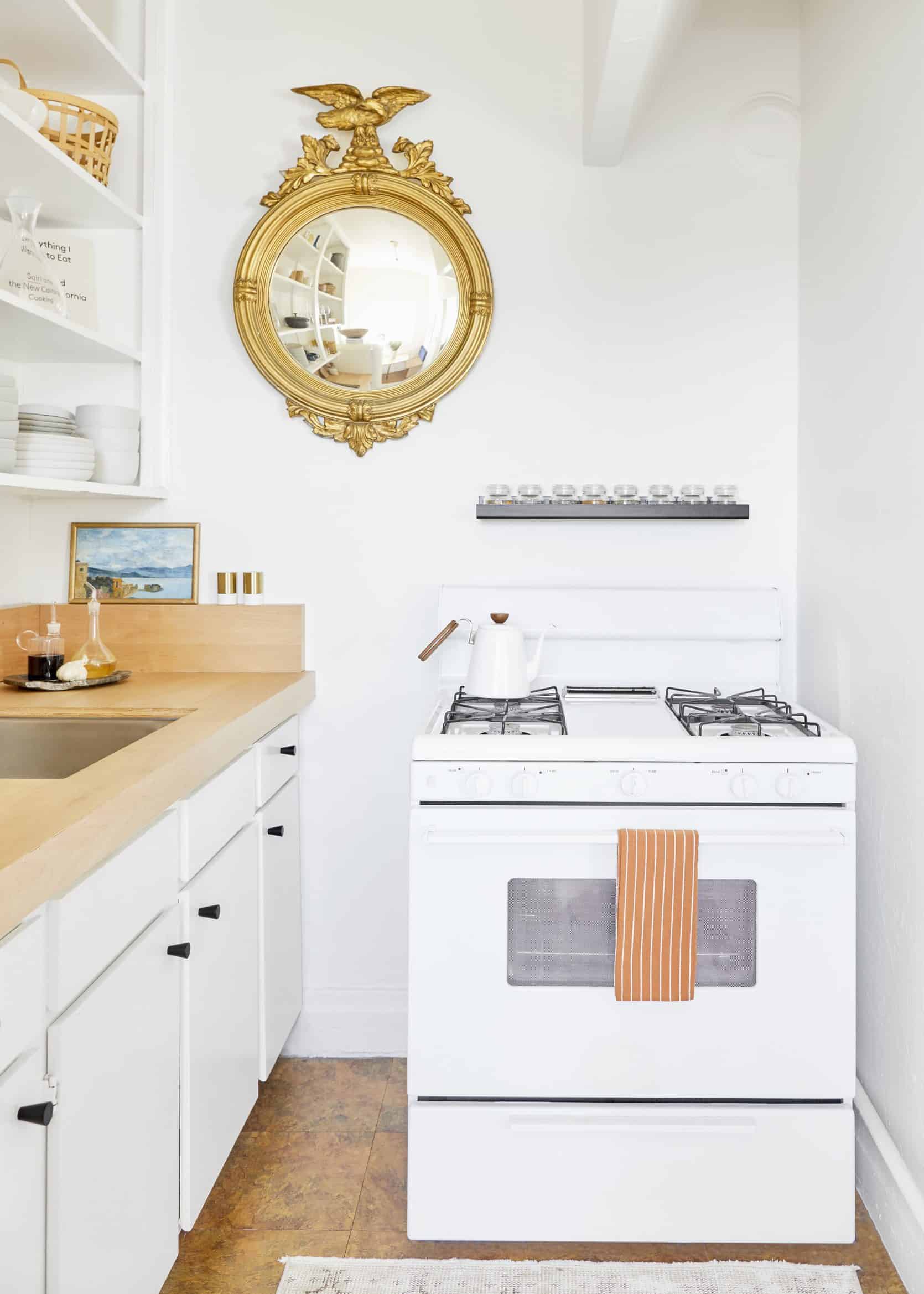
You probably know by now that you shouldn’t skip art in the kitchen. In fact, one of Emily’s favorite unexpected styling hacks is to hang art over a tile backsplash (you can learn more about that here). But if you want to change it up a bit or if you simply have a killer wall mirror you want to display, why not hang it in the kitchen? It’s unexpected and can help a darker kitchen feel brighter or make a small kitchen seem bigger.
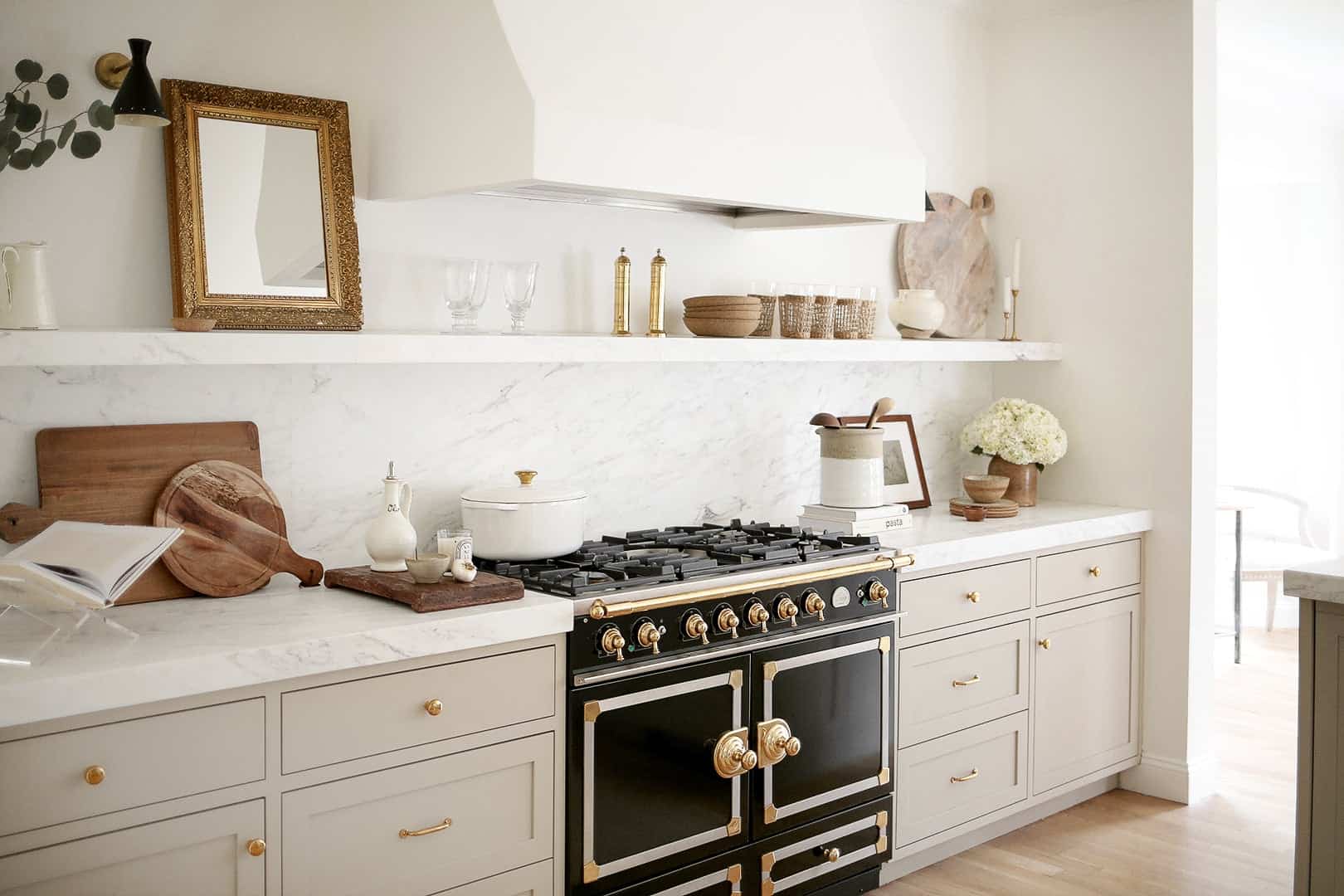
We love a leaning art moment and lo and behold, a leaning mirror looks just as good (if not better). If you want to try the mirror look here are some great picks:
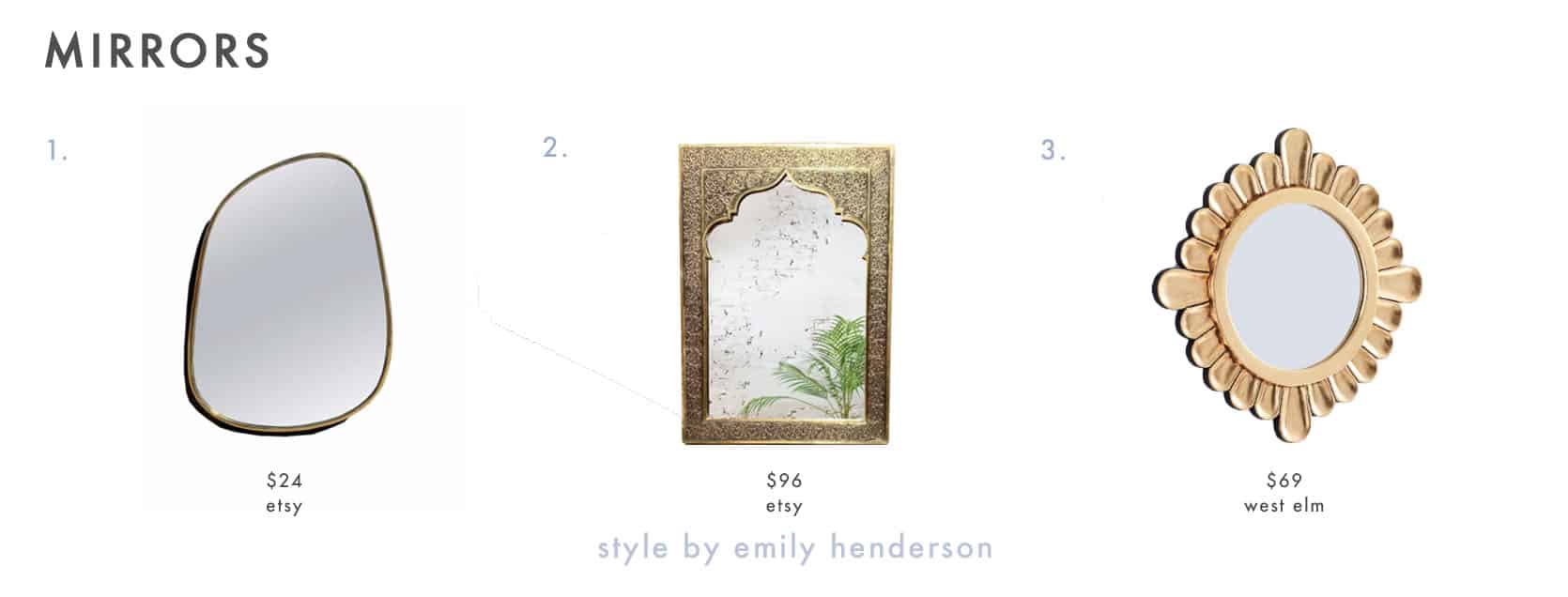
1. Asymmetrical Mirror | 2. Moroccan Mirror | 3. Peruvian Wall Mirror
BONUS TIP: Use A Tray For Everyday Cooking Items
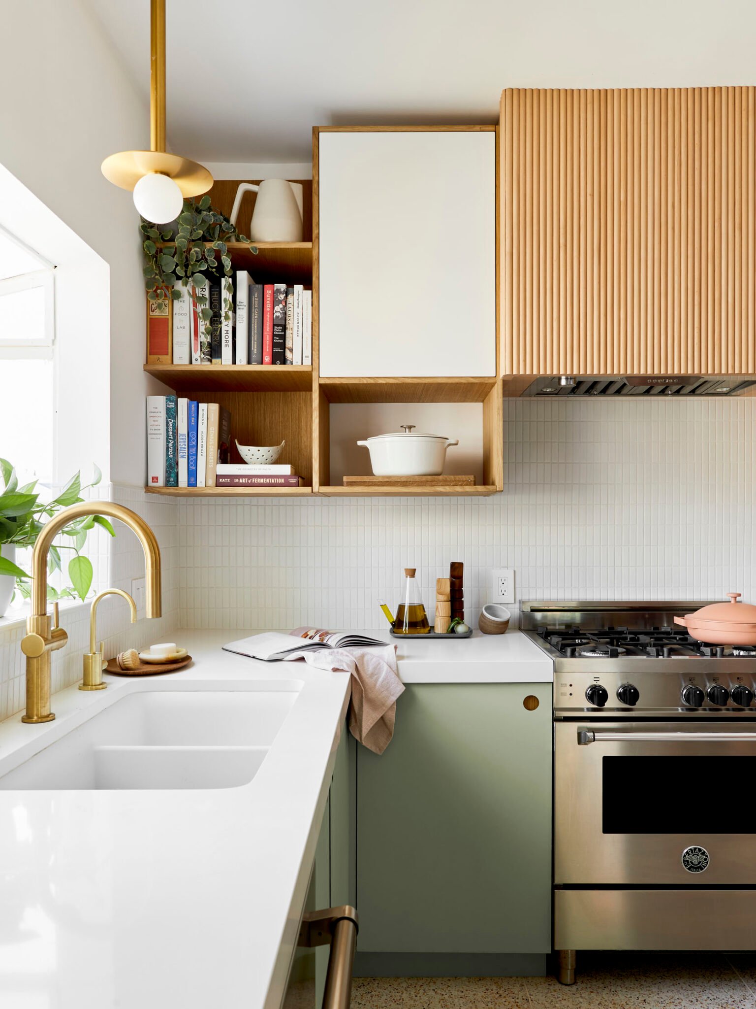
We are big advocates for trays in every room. Have a coffee table? Put a tray on it! Your dresser is looking a little dull? Put a tray on it! Similarly, if you want your kitchen counter to look nicer and spark some joy, a tray can really help get you there. Minimalists might disagree, but we like having our olive oil, salt, and pepper out because they are used so often. This can appear messy and cluttered but a tray can make it look styled and intentional. Another trick? Put your olive oil in a clear glass decanter and watch magic happen before your eyes as your kitchen counters look instantly more chic.
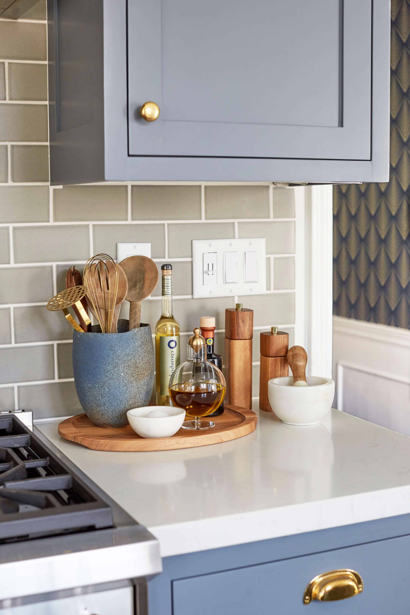
Again, a tray can make everyday items look styled and sophisticated. If each of the above items were simply placed on the counter near each other someone might think “hey, how about putting some stuff away??”. But with a tray in place, it is clear that those items are exactly where they should be. Also, how incredible is that oil decanter? I am drooling.
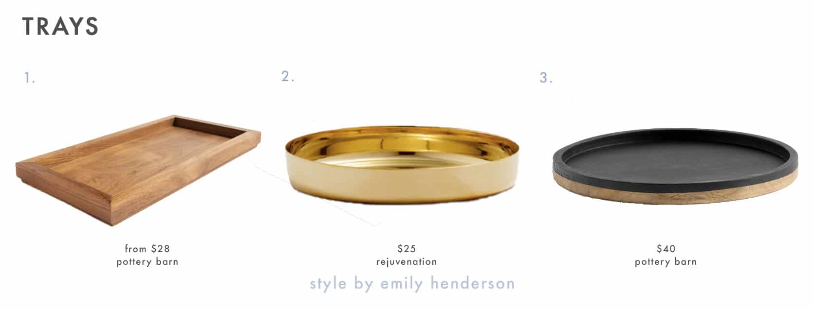
If you are looking for a pretty tray, here are some great ones:
SWAP: Add Greenery With Fresh Herbs Instead Of Cut Flowers
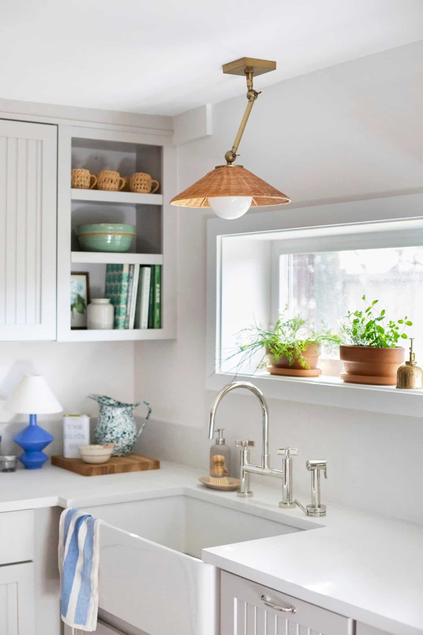
Plants will liven up any room but in the kitchen specifically, fresh herbal plants add a hint of greenery and are very useful to have on hand. Having a mini indoor garden of fresh herbs will make your kitchen feel good too. Imagine this: you are making a homemade pesto sauce and you simply pluck from your fresh basil plant to create the delicious concoction?? That’s heaven.
SWAP: Ditch Always Using Your Overhead Lights And Get A Cute Lamp
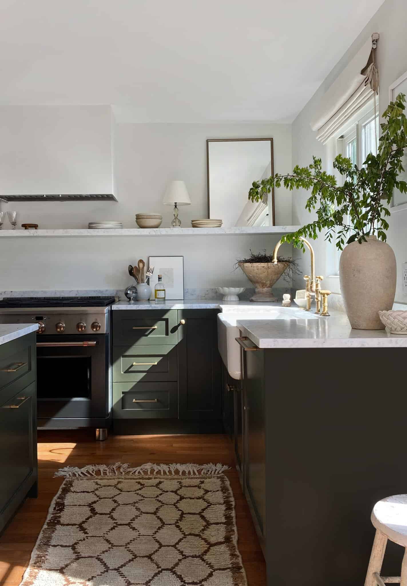
Remember when I alluded that I have very dated ceiling lighting in my kitchen that is unfortunately here to stay? Well cat’s fully out of the bag because it’s true. We have very aggressive looking track lighting that I am not the biggest fan of. So it goes. What I did to mitigate this was add a cute lamp to distract and it really did help with the look and overall feel. The track lighting is harsh and bright but our lamp gives off a calmer, more subtle light which I love. A lamp is a cute accessory and can help soften the light in the room if that’s what you are going for.
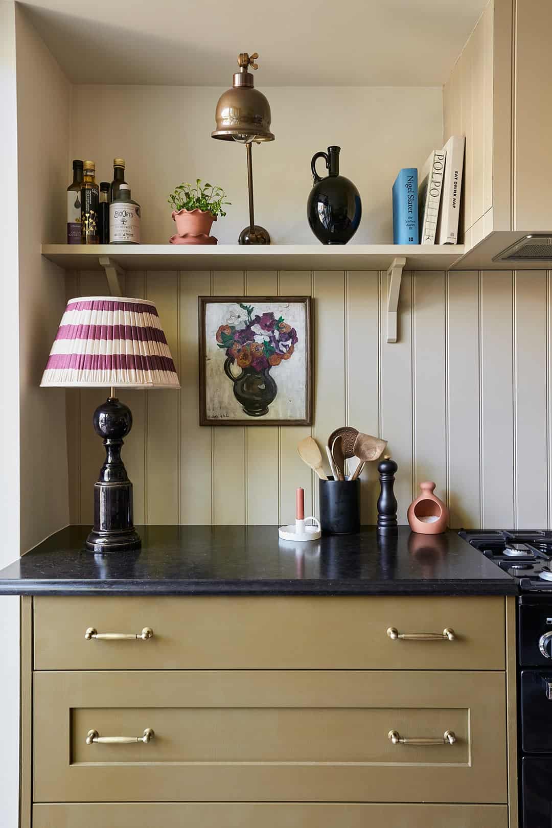
How great is that lamp?? If that shot doesn’t make the case for lamps in the kitchen I don’t know what will.
Here are some lovely options:
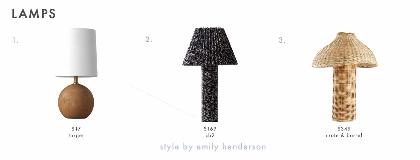
1. Polyresin Mini Table Lamp with Circle Base | 2. Scrunch Table Lamp | 3. Seta Wicker Table Lamp
BONUS TIP: Create Some Open Shelving
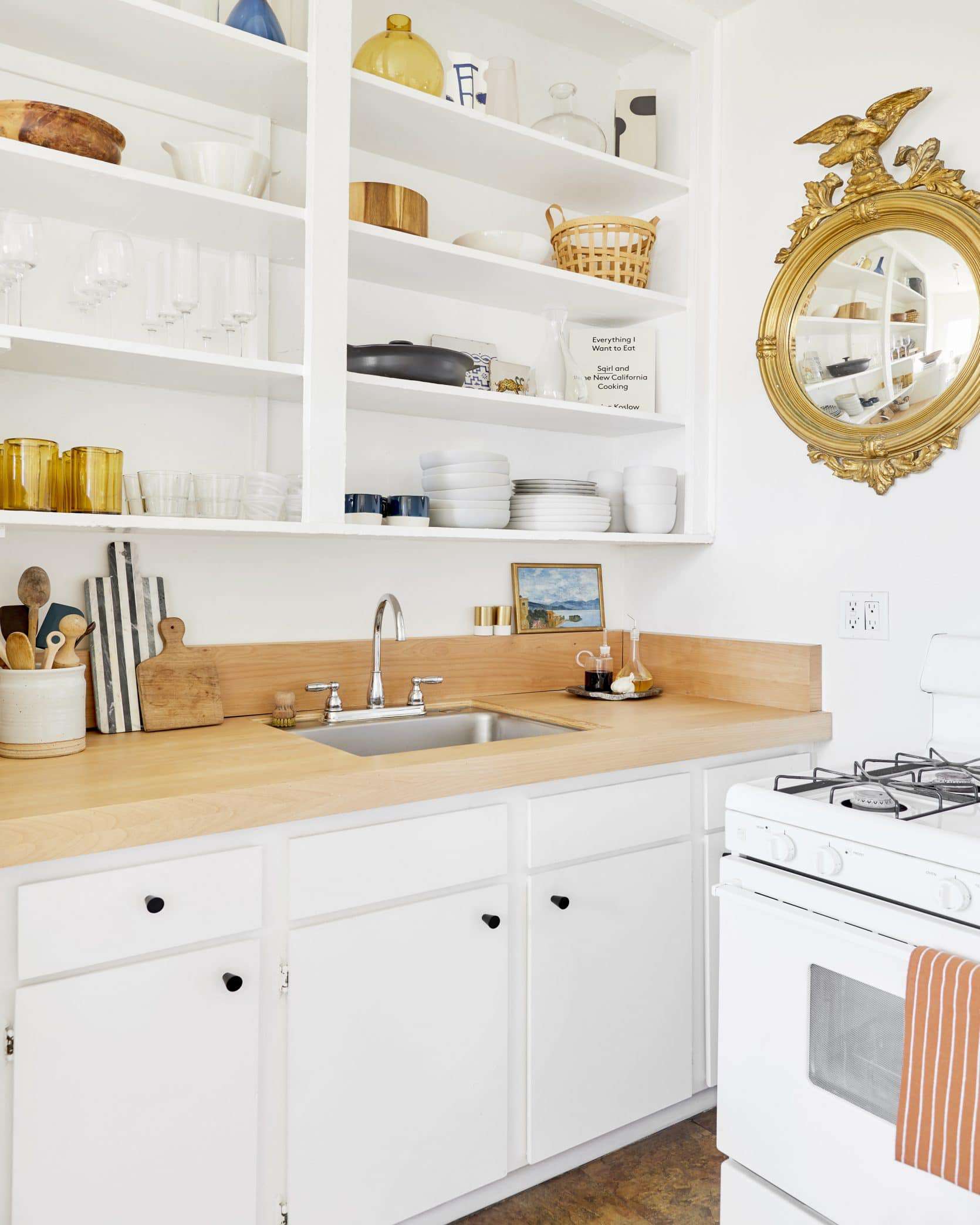
I will likely never stop talking about this hack by Jess. She took the cabinets off in her rental kitchen to create some open shelving. It’s so innovative and is something pretty much anyone can do which is why it’s my favorite trick. All you need to do is take off the hinges, sand and paint over the holes and what you’ll end up with is a place to display all your pretty cups, bowls, and even tiny pieces of art. It’s low risk and will give your kitchen a custom look for so much less.
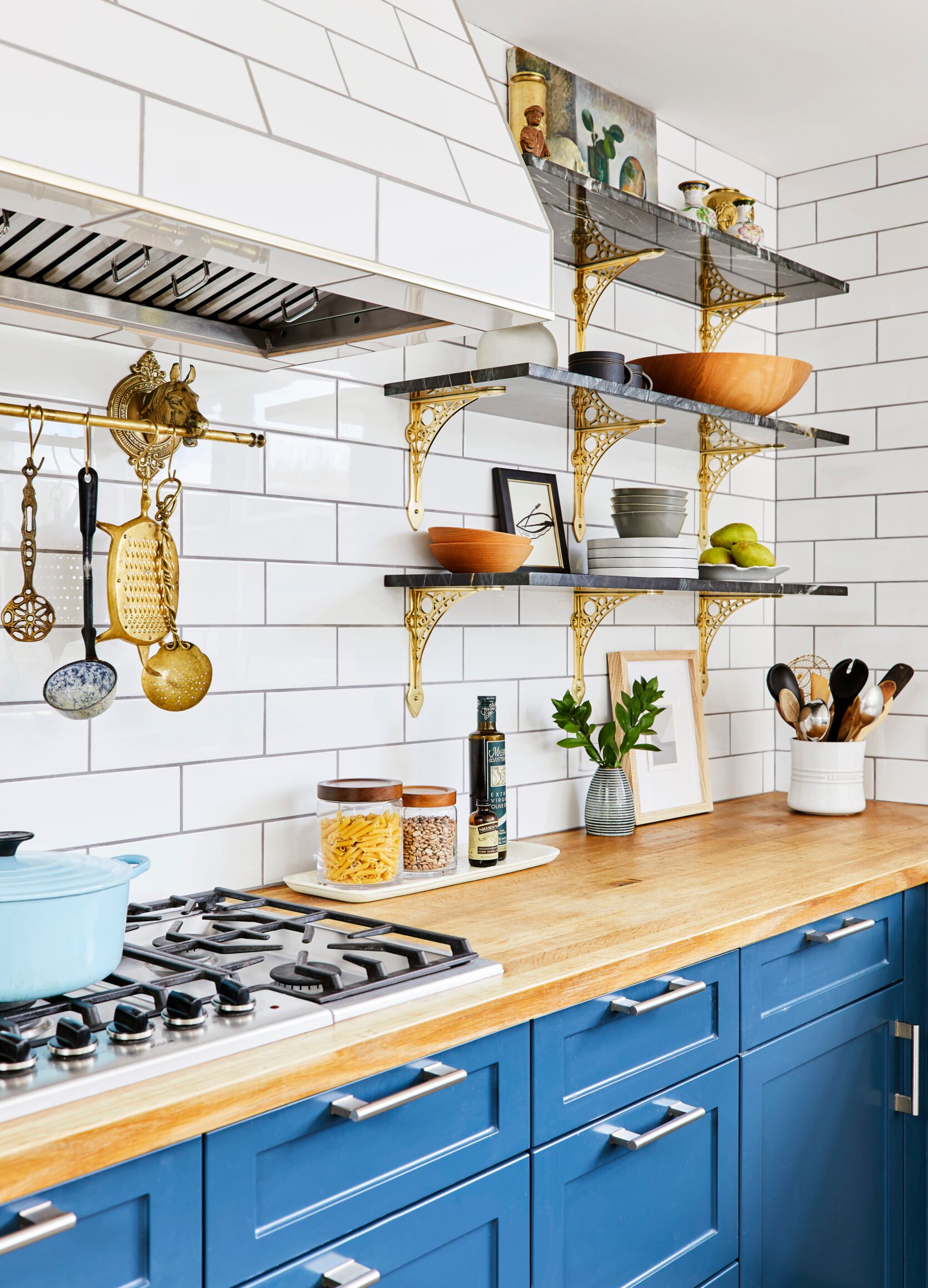
If you want to keep your closed cabinet space because your dishes aren’t all display-worthy (same here) then you can always consider adding a few ready-made shelves. In general, it’s nice to have a mix of open and closed storage because it can make the space feel more airy and create visual interest.
Here are some shelving options we love:
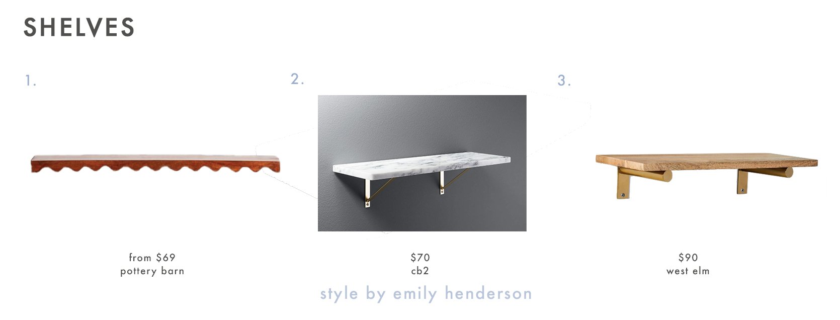
1. Luciana Wavy Wall Shelf | 2. Marble Wall-Mounted Shelf | 3. Linear Raw Mango Wood Shelf 2FT
9. Treat Yourself With New Hand Towels
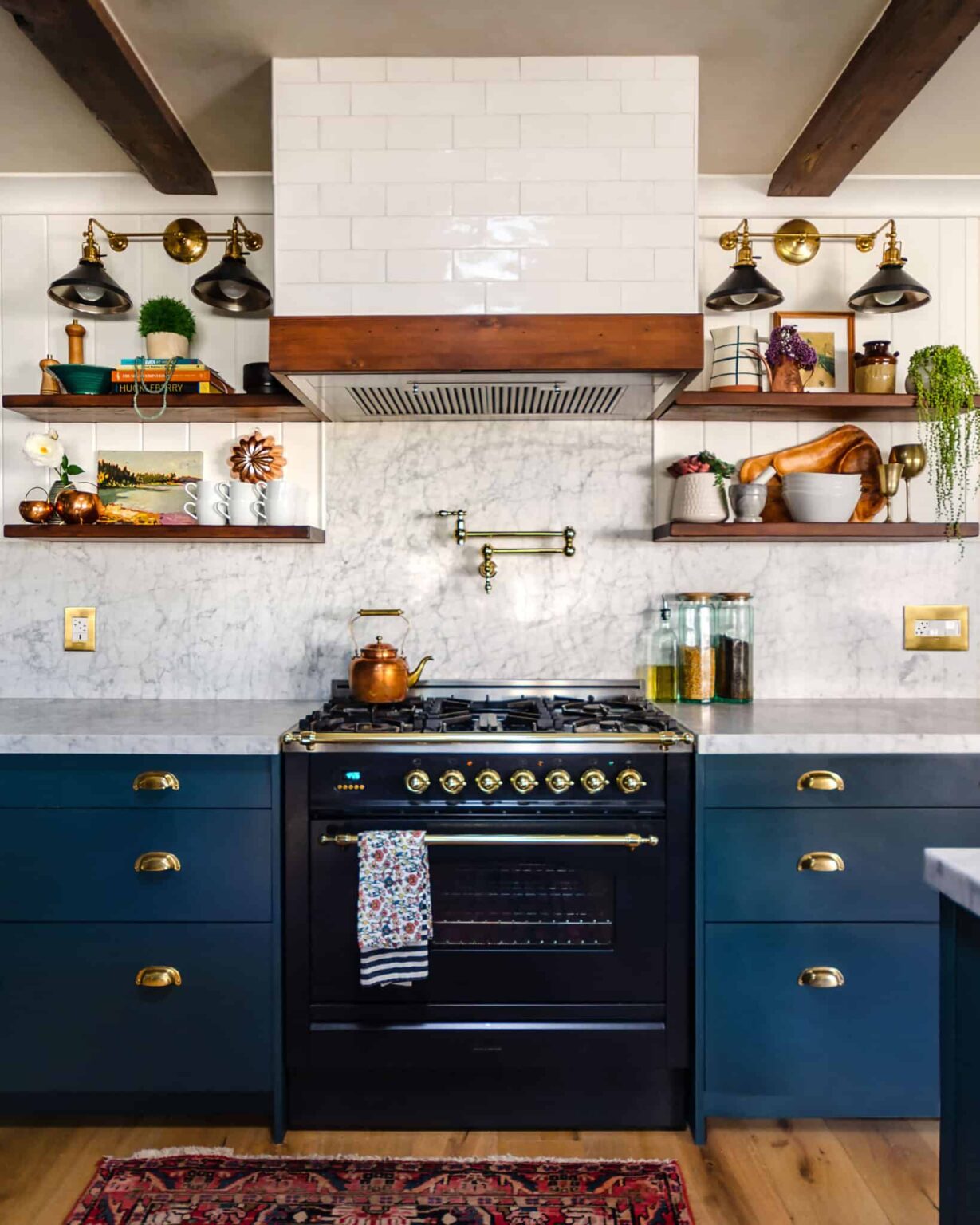
At the very least, if you just want to make a small but effective difference in your kitchen new hand towels can do wonders. Is your kitchen feeling a little bland? Get some colorful floral towels like the above kitchen to bring in some pattern and a pop of color. If your current towels are a little dingy and sad (same here) replacing them with fresh new ones might just spark a newfound love for washing and drying dishes (ha!). And old hand towles are great cleaning rags so dont throw them away! Here are some fun options:
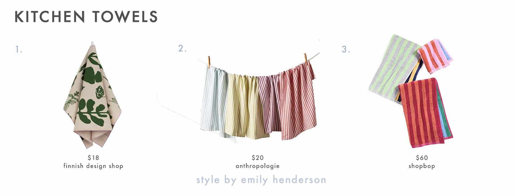
1. Pienet Elokuun Varjot Kitchen Towel | 2. Baker Stripe Dish Towels, Set of 4 | 3. Dusen Dusen Set of Striped Hand Towels and Washcloth
Now that’s a wrap ladies and gentlemen. I am off to go chop some veggies, throw them in a bowl, and call it a salad. I hope you now feel confident and prepared to make your kitchen look not just better, but feel GOOD. Because honey, you deserve it not only this summer but all the seasons to come. Happy Monday! xx
Opener Image Credit: Design by Velinda Hellen Design | Lead Designers: Grace De Asis & Julie Rose Styling by Emily Bowser | Photo by Sara Ligorria Tramp
THIS POST WAS ORIGINALLY PUBLISHED HERE.


