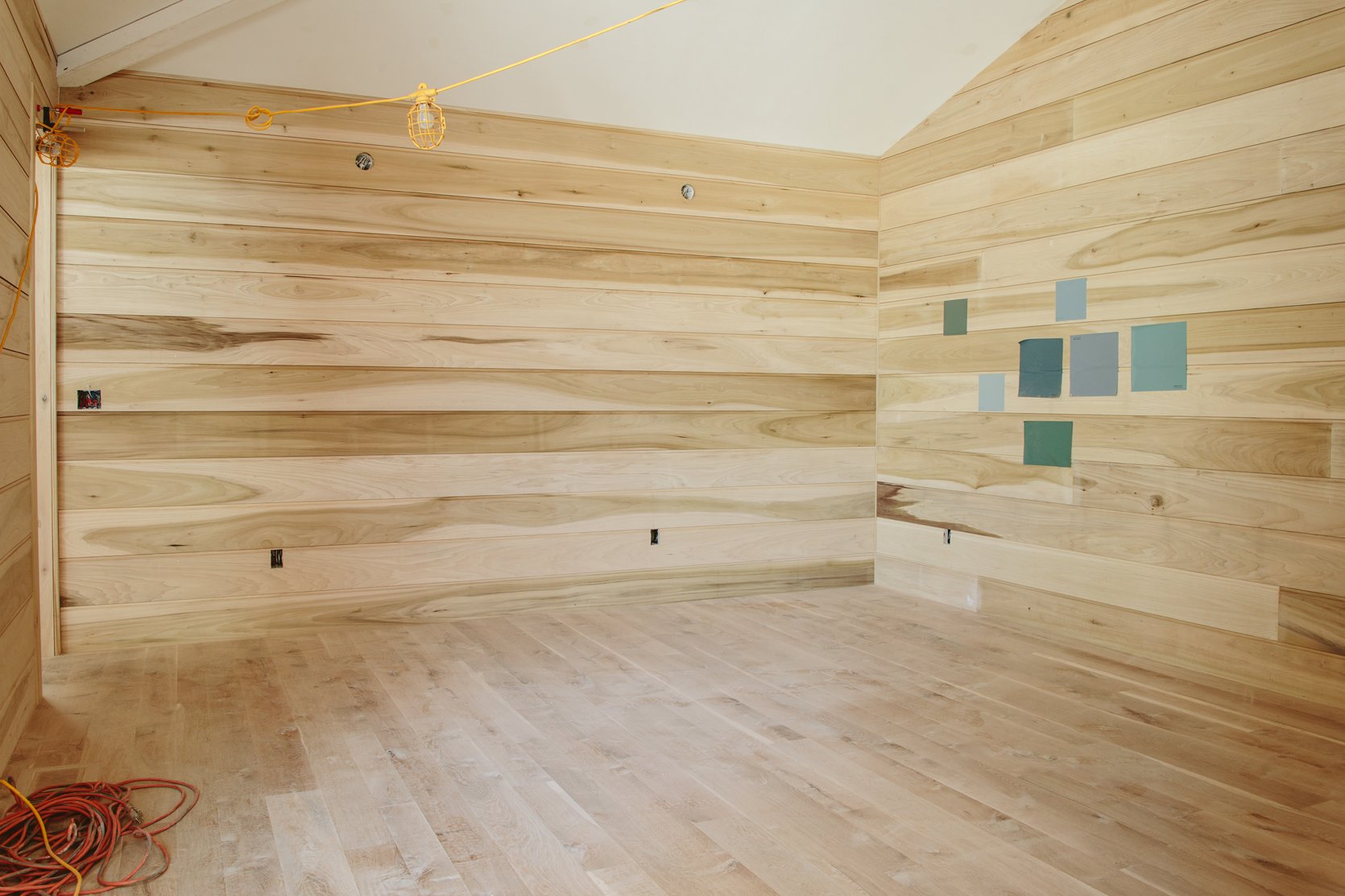
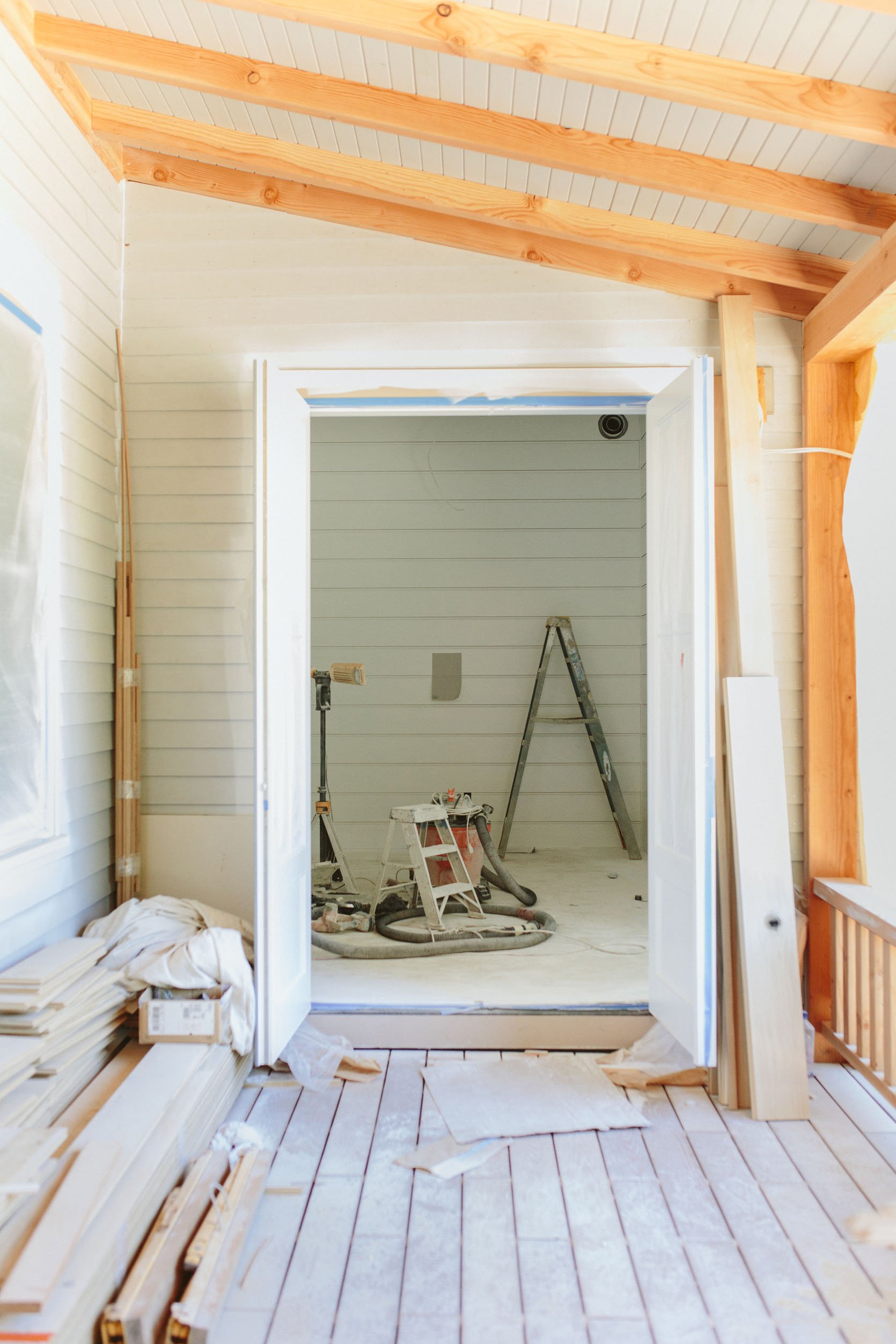
Thank goodness I’m not trying to bag new design clients right now. I really should blog more about all the design decisions that I’ve totally nailed and had zero hesitation on, but what’s the fun in that? Having to pretend to be great the first time at everything would just be exhausting so I’m glad we have this safe space to really go through the process. I have my strengths, but they lie more in instinct than bold fast decisions. But my instincts tend to be safe at this stage which both protects and annoys me. Luckily the permanence of paint is less threatening than say, tile or flooring, and over the years I have gotten much better at it so I’m trusting myself more. Plus the whole large paint sticker sample thing is extremely helpful. I’m trying HARD to go outside my “50 shades of blue” comfort zone and create a palette that is cohesive, vibe-y, and works with the overall art direction of the house (Scandinavian shaker farmhouse) while also creating the mood that we want in each room. This room is the most challenging – The media/TV/family room and here is what you need to know about it before we get into the color:
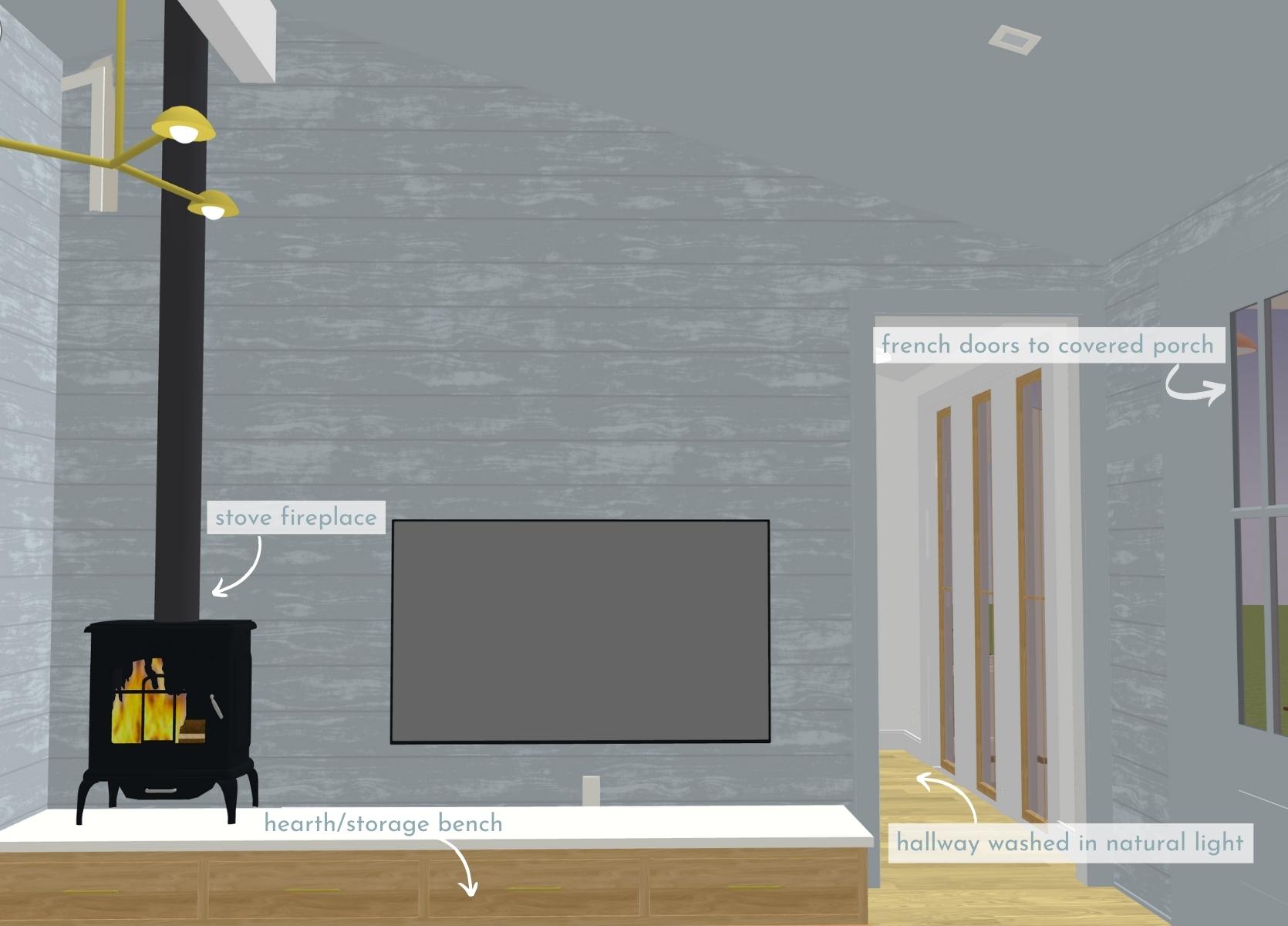
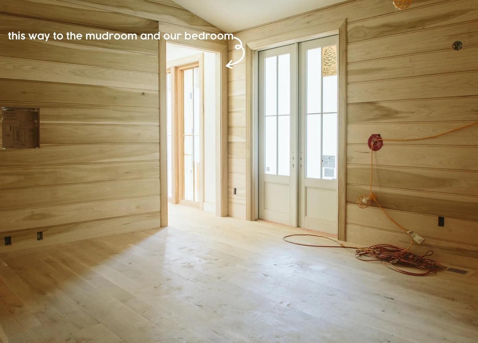
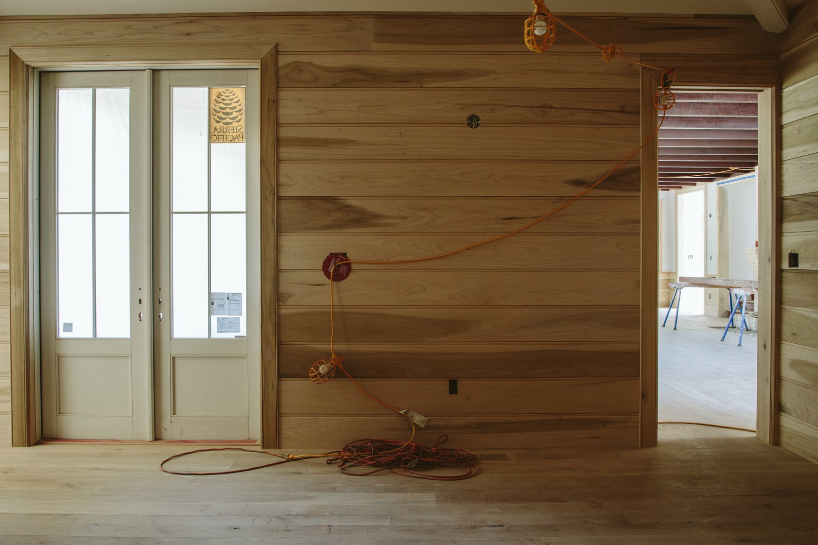
- The only sources of natural light are few and indirect – the french doors to the covered back porch and the hallway with windows and skylights (and TBH I wish we had put a door there so when we are watching TV we wouldn’t have that light source – window treatments might be happening).
- We wanted this room to feel dark and cozy and put it in the interior of the house on purpose – with barely an external wall.
- We didn’t put skylights in here because the function of the room is movie watching and cuddling – we envision our winters being cozied up in here. But as I’m writing this I’m wondering…should we put skylights in here with room darkening shades so daytime can be more pleasant with nighttime feeling cozy? We vaulted the ceilings and I don’t think we have any HVAC up there…stay tuned…
- There will be a stove fireplace in the corner on a low hearth/storage bench underneath the TV.
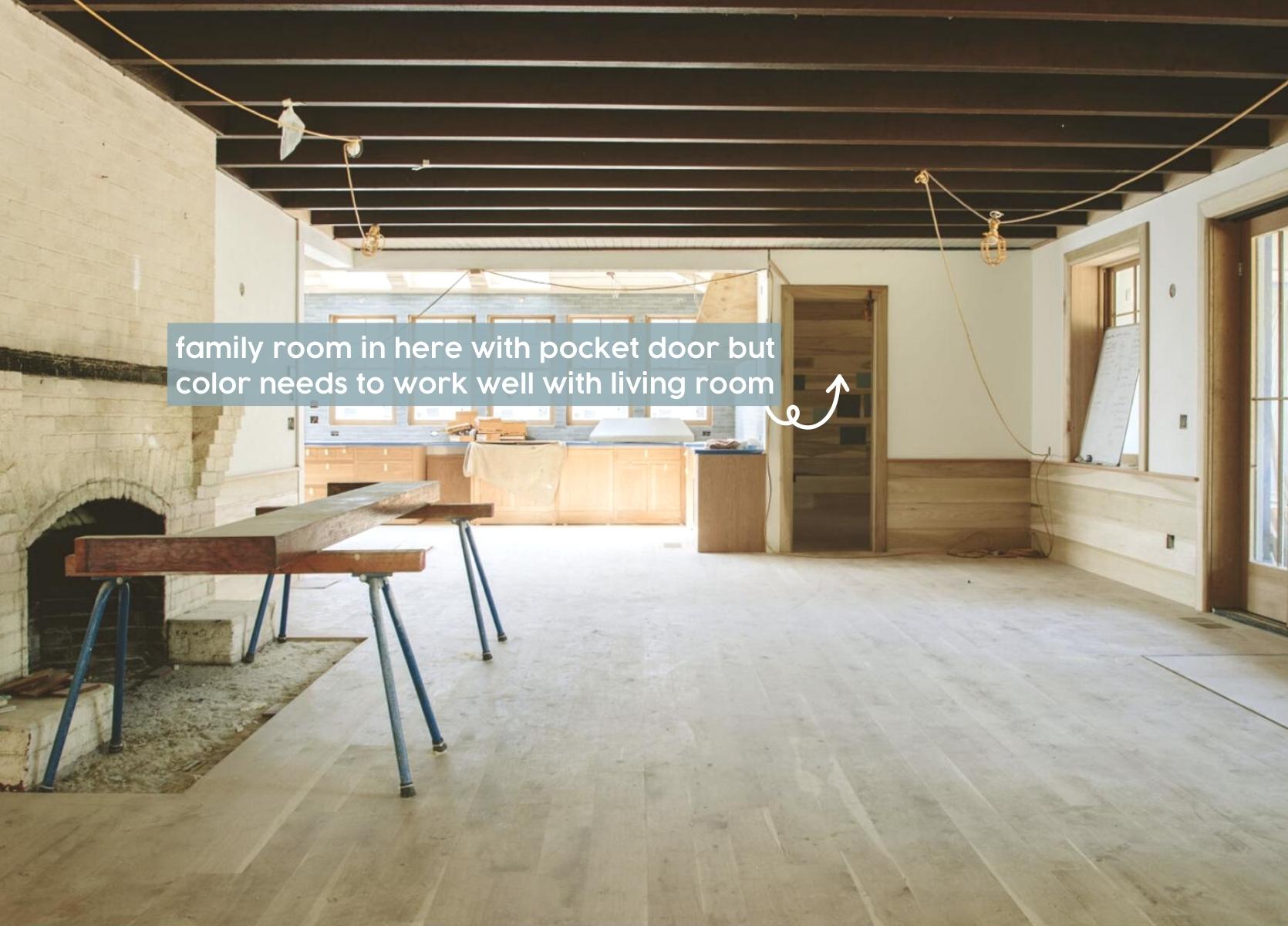
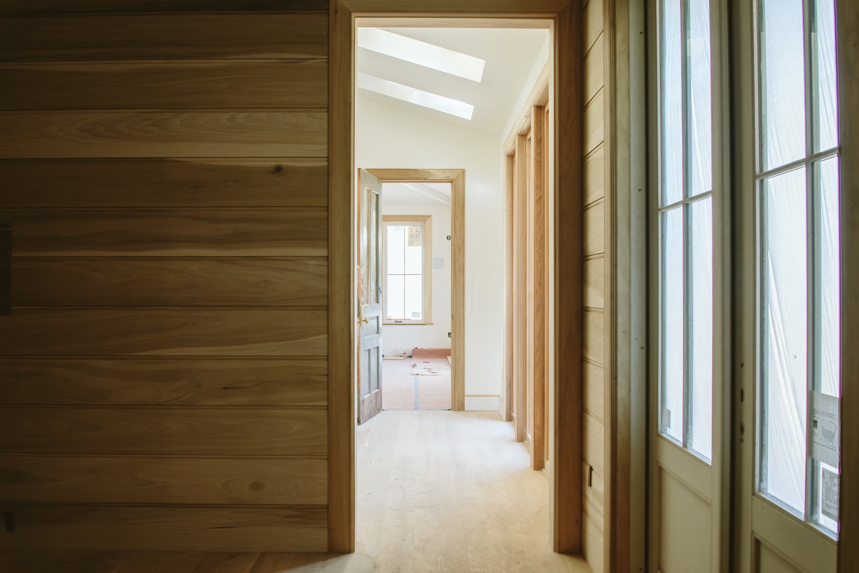
- We will NOT keep the paneling natural wood no matter how pretty it looks here – the reasons are: 1. Poplar is paint grain and doesn’t stain well, 2. To stain it we’d have to go very dark to reduce the high contrast green tones in the grain, and 3. Dark stained wood would be more of a “cabin” vibe than a farmhouse one. If we could go back in time would we have chosen white oak for the walls? Maybe, but it would be much more expensive in material and in installation (it’s harder to work with, literally). Ultimately we think that the farmhouse vibe is better painted than stained, but it’s hard to see it as wood, I agree, then paint it (I wish we had used primed paneling but we couldn’t because it’s a custom run).
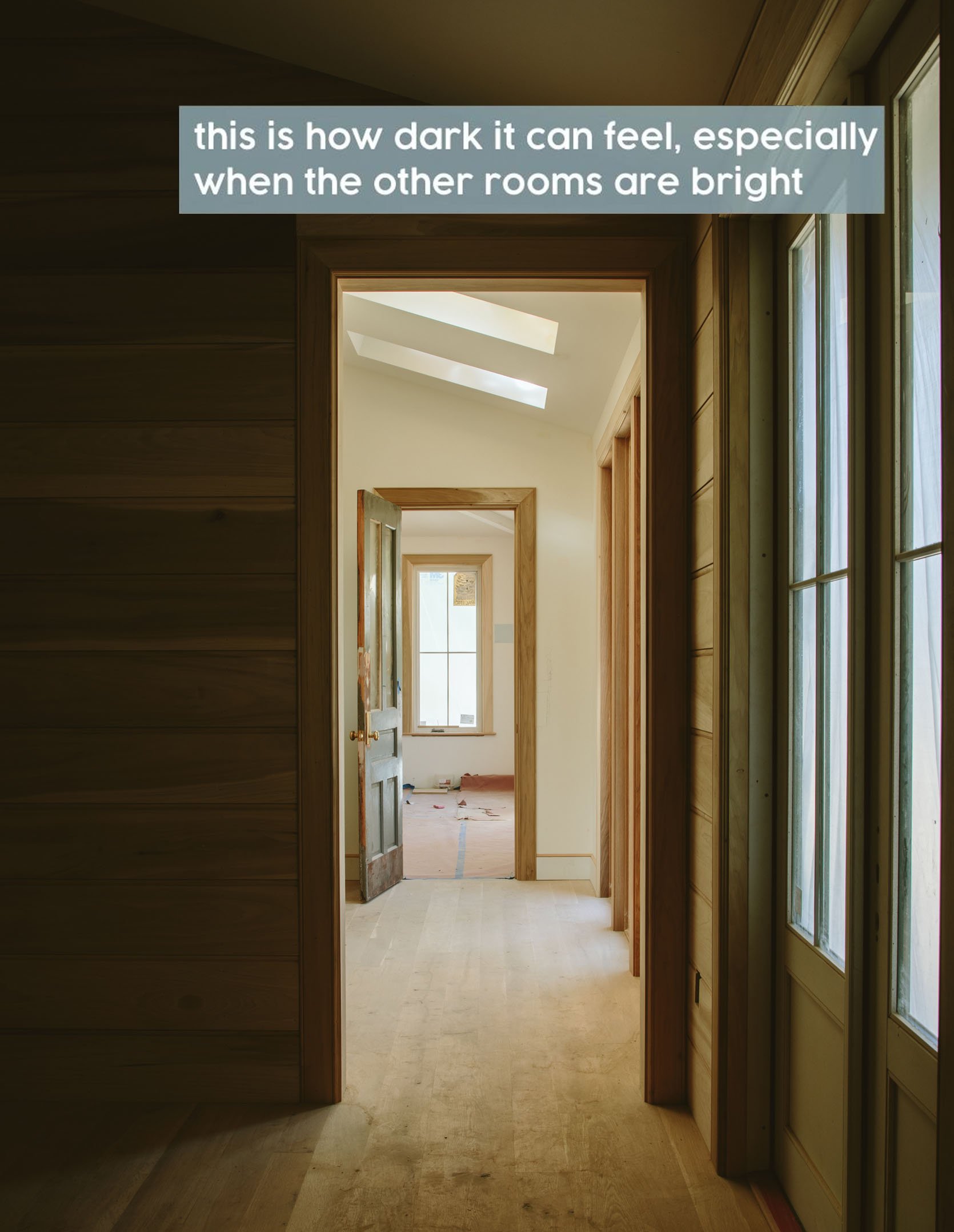
- This room is not a corner or self-contained media room – it is a pass-through room which makes it trickier, IMO. We want the feeling of it to be dark but do we really want to go from a light room, through a really dark room to get into another brightly lit room? Would that feel weird? I think so. I think dark rooms work better when they are more self-contained, or have a ton of natural light…but honestly, I’m NOT an expert in dark rooms so I feel hesitant to suggest anything.
Other things you should know – We already have our cuddly sectional which we are obsessed with. Here she is:

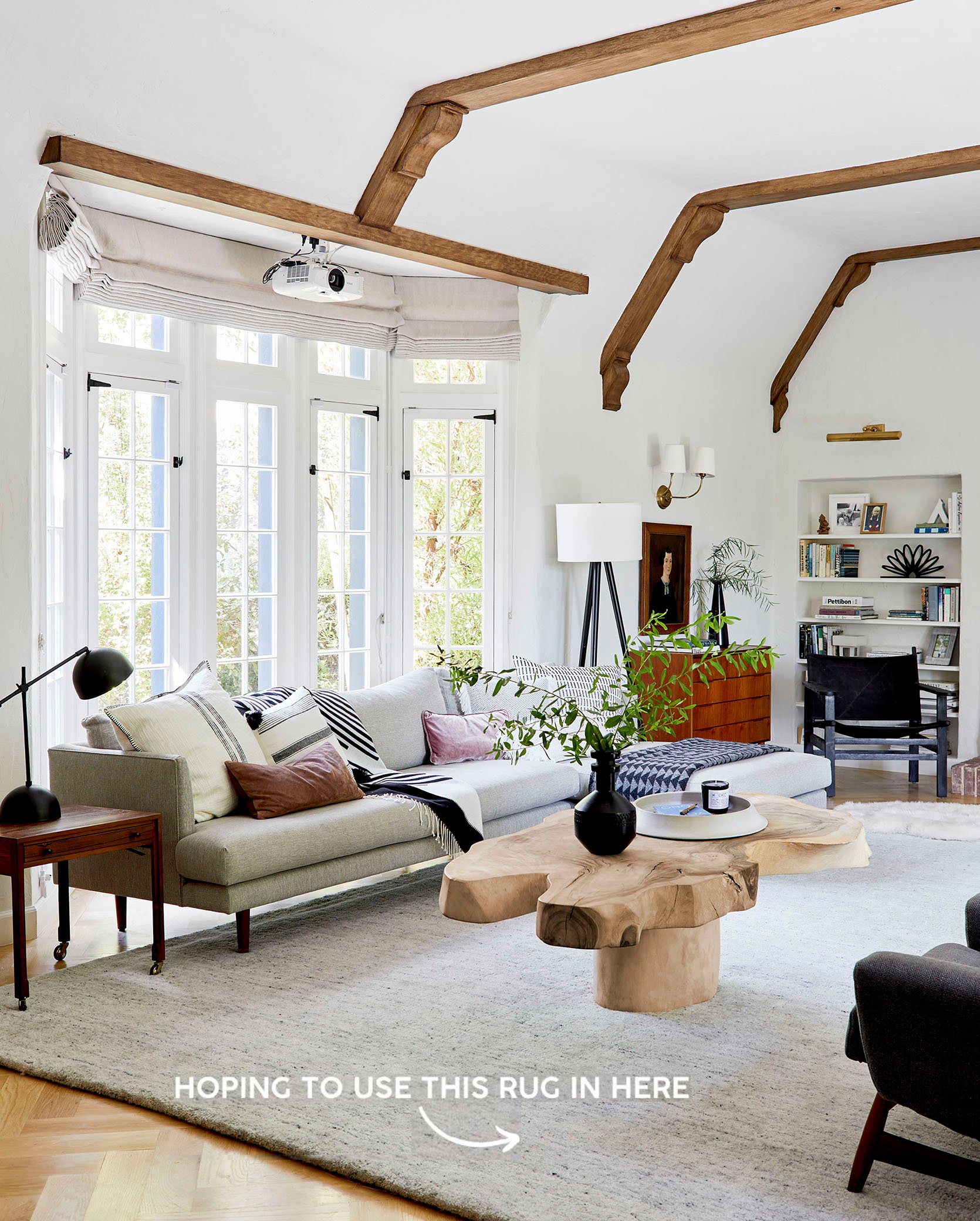
We do not have a rug yet but I’m hoping to use the rug from our former living room since it’s not big enough for our new living room:
The Zena wood floors here won’t be this light – they are already sealed and covered but my goodness they are GORGEOUS and a lot richer than the dust-covered floor here.
So my first instinct was to do a warm pink/purple/mauve color. Something to contrast with the sofa, draw you in from the living room and feel so cozy. Brian nixed that pretty quickly but I think it’s because I didn’t show him the right tones. My bad. I now realize the colors I presented were either too pink or too brown.
The Decision: Round 1 – Blues And Greens
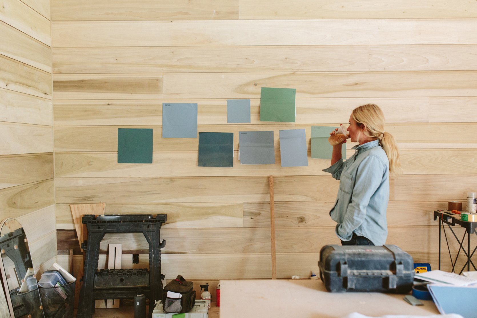
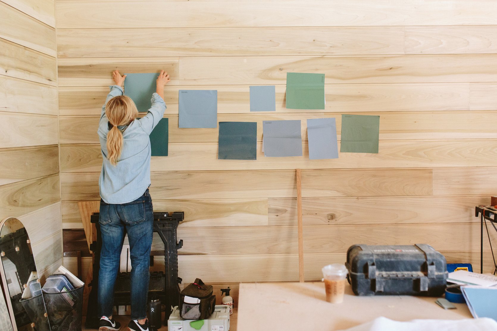
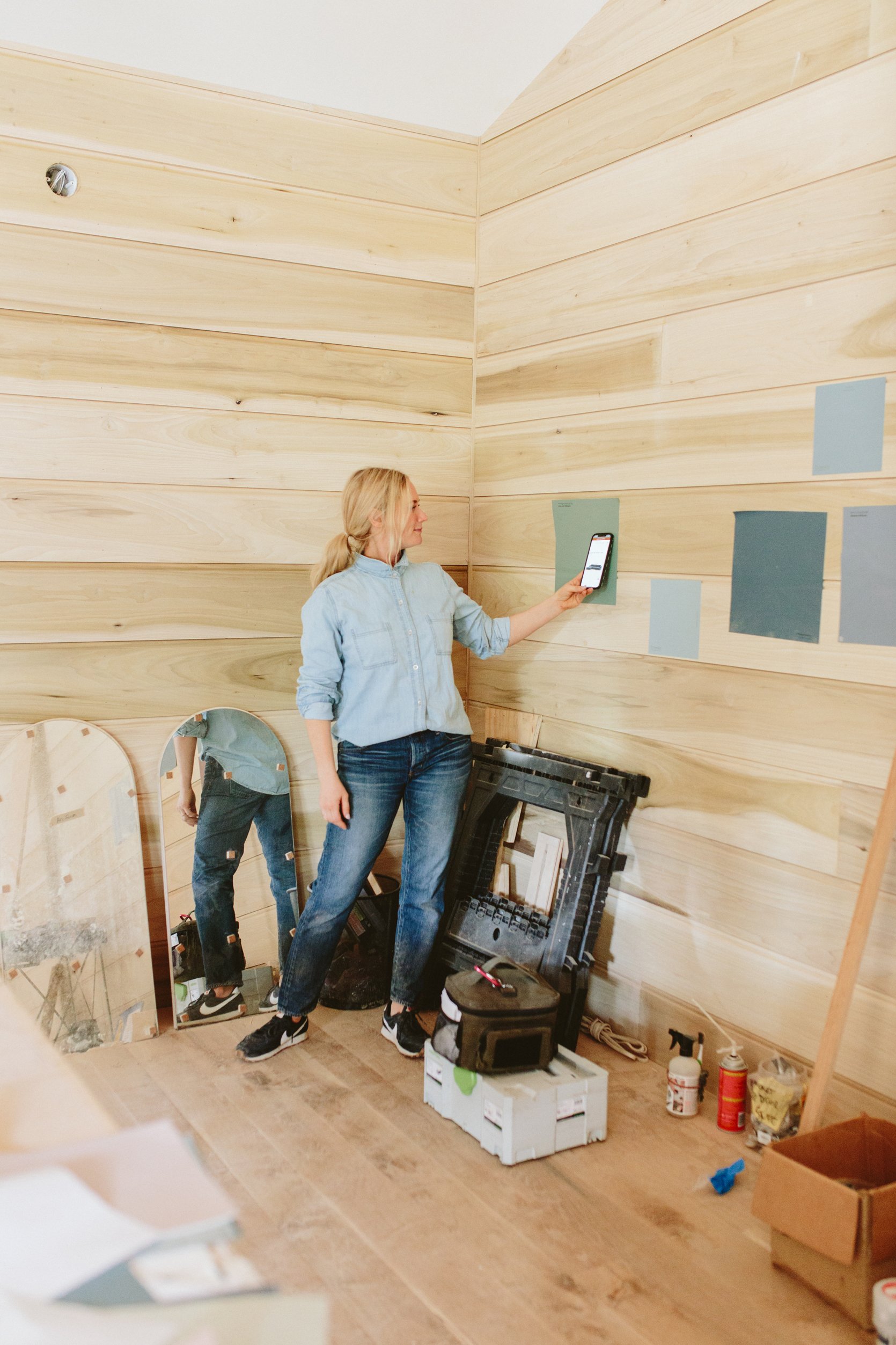
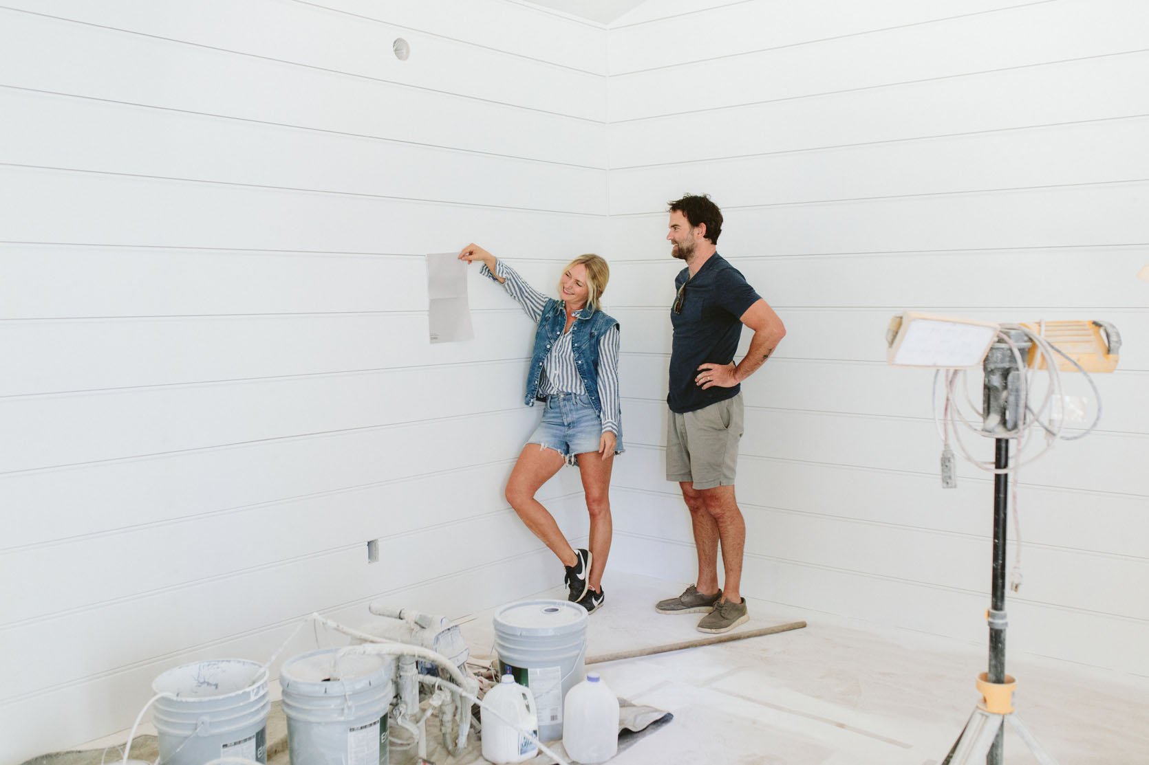
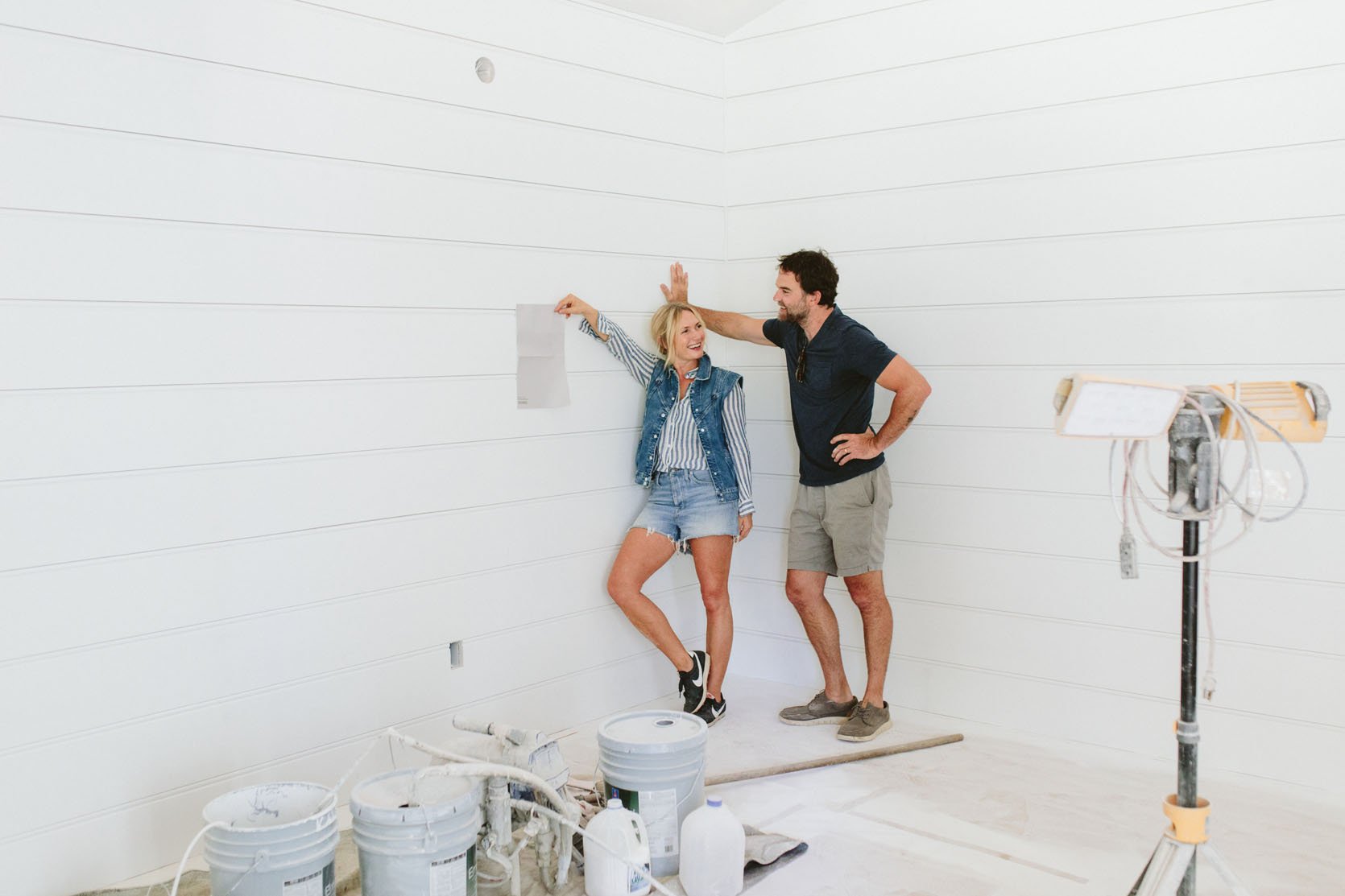
A few days before we left for a month we had to make all the downstairs paint color decisions. Most of them I thought were “easy” but this one stumped me. So I called in Anne and Stephyn (ARCIFORM), and of course, Brian and Sarah. After staring at like 30 options we narrowed it down to these blue and green worlds. Of course, like a real pro, I had lost my fabric swatch of our sectional so as you can see below I held up the phone with the photo of the sectional to the swatch to see what worked.
We all decided that Privileged Green would be it (despite its name). It’s a medium-tone green that has some blue in it but is decidedly green (remember that we have blue tile in the kitchen so when staring at it from the living room you likely don’t want to see two different shades of blue).
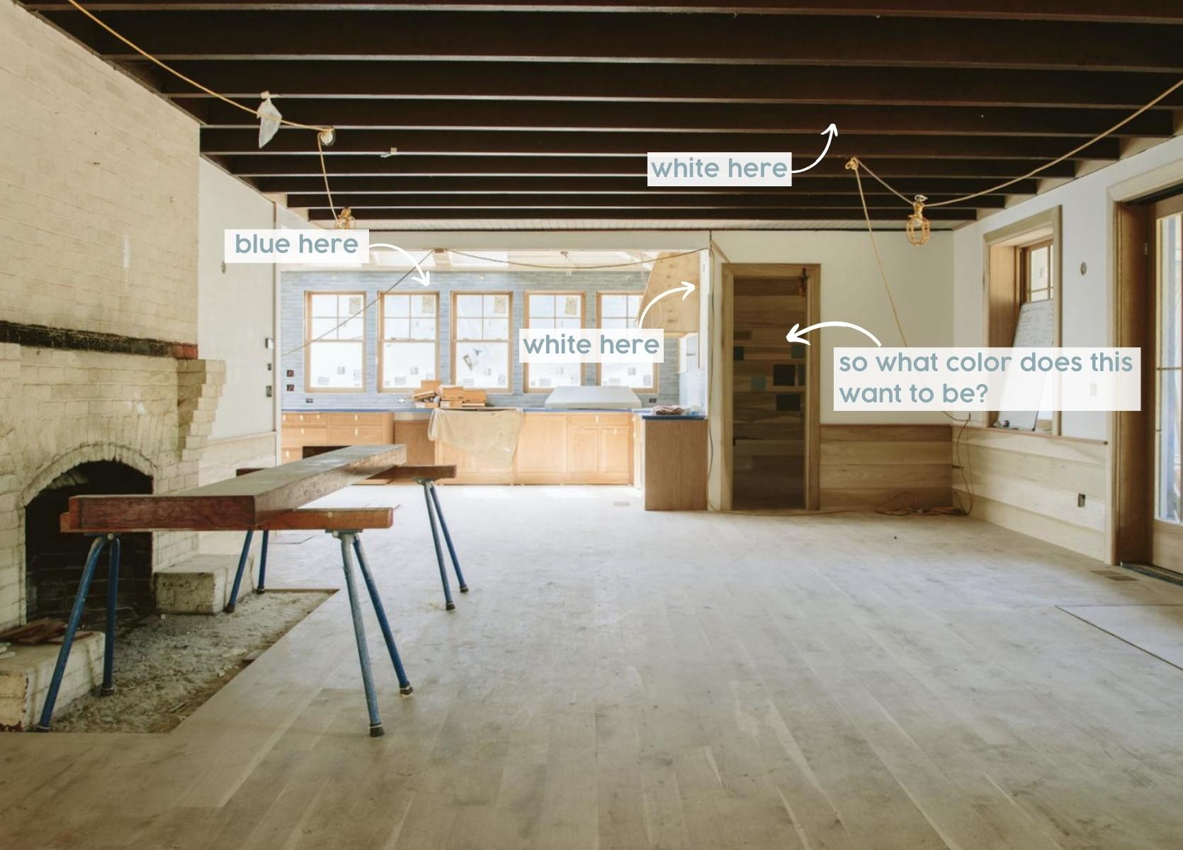
I wasn’t fully on board with Privilege Green, but everyone else felt EXTREMELY strong about it. Fine. But also maybe they were just done choosing paint colors. Maybe they have a better gauge of “what’s important in life”. Maybe they were hot and hangry. My hesitations were that it went very dark without natural light and that most of our artwork, light in color and framed in glass, would really contrast and reflect, negating the cozy and calmness of it all. A wall of oil seascapes or mountainscapes? Sure! But that’s not what we have (but could if we weren’t so starved for wall space in this house). We have mostly modern art. I also feared that while I love green, I don’t know if an all blue/green room sounded as good to me in this otherwise really light/airy home with one “cozier” room. I don’t know…I just didn’t feel GREAT about that color in that room, despite really liking the color in a different home.
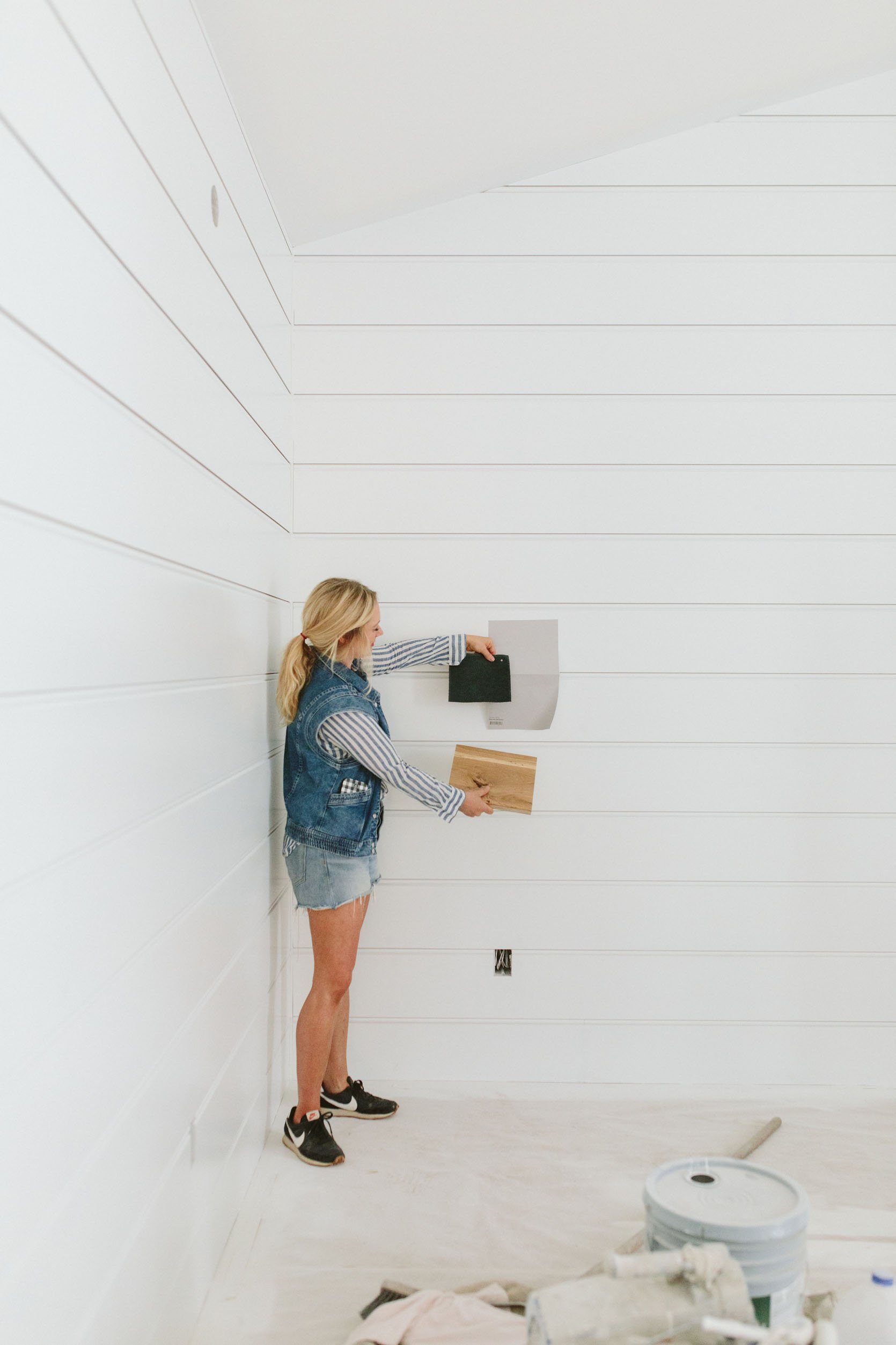
The paint prep work for the house is going into week three and therefore I had more time to decide and then question my decisions. When we got back in town I went immediately to the house and now primed I felt even more sure that a dark green in the middle of these two well-lit rooms would feel jarring and off. I immediately ordered a bunch of larger sticker samples of mauves, but this time less pink and more gray. We have been told over and over “no gray paint” in Portland because well, the PNW can be dreary enough during “the great long dark”, so I think originally I really strayed away from anything close to gray. But I found a few that were so warm and cozy in the gray/mauve worlds and I started to feel hopeful.
You see I LOVE a warm tone mixed with our cool blues. And I really didn’t want 50 shades of blue or gray. So I ordered the samples and headed over with a lot of hope that A. I was right and B. Brian would passionately agree.
I held up the paint sample and at first it was a fast but not hard “NO”. Brian kindly asked, “is it kinda gray and dreary”, which I had been expecting. I responded, relating to his fear, “I would think that too!” and then I gave him my pitch. It’s warm and cozy and actually pretty light, but when in a dark room it goes medium toned in such a good way. It contrasts so well with the blue of the sofa and the kitchen, and yet isn’t “pink” or “purple”. It’s a complex color with a lot of pigments so the color changes all day (I love this in a paint color while also unpredictable, FYI). It feels more like a Scandinavian pastel tone – a neutral that you can just float through. Sure enough within 5 minutes, he said “No. You’re right. That’s good!!” Just like that! I think he could tell that I had been thinking about it for months and felt really really strongly about this color. He was very ready to put it to bed. I of course brought some other options, too, but Ponder by Sherwin-Williams was the real winner.
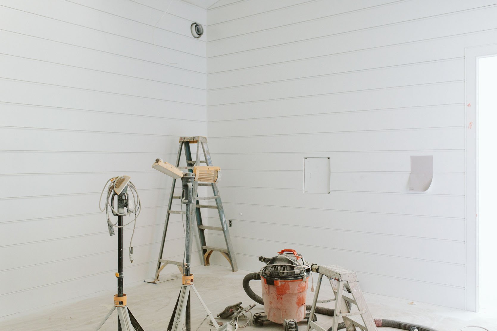
It’s so hard for the colors to be properly represented here because it had no real natural light (Kaitlin, our photographer, does such a good job). The sofa fabric isn’t quite that dark (I think the velvet sucked the light a bit), and the gray is a bit darker.
We went around the room and took photos of it on every wall, trying to make sure it felt good. Again, it’s hard to understand but this room is void of a lot of natural light so the color looks light here, but check it out from the living room…
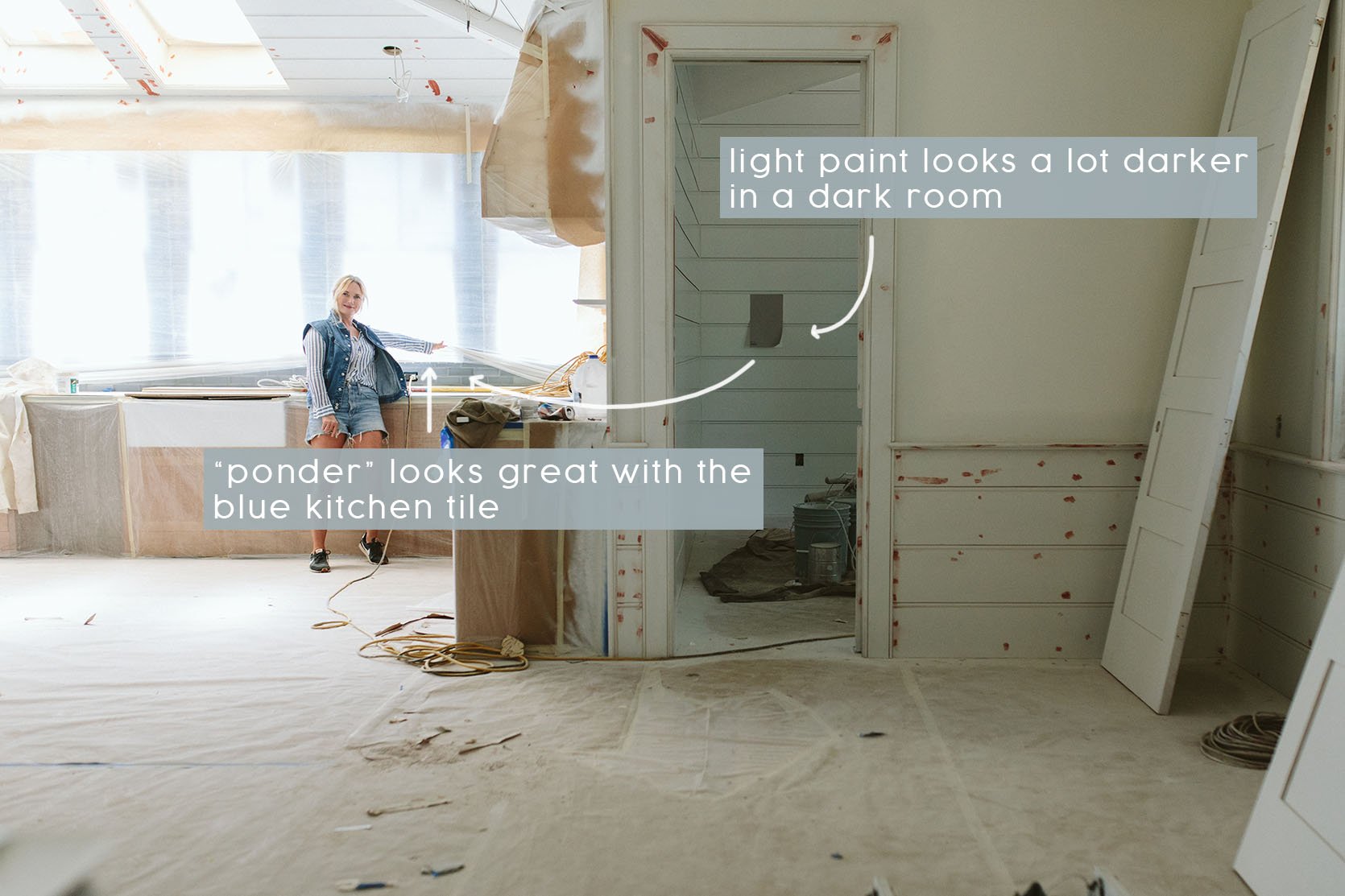
See? There you can see how it actually goes pretty darn dark in there. It draws you in but isn’t just this dark void.
Lastly, I wanted to see how it looked if we had the french doors open to the back porch. When we have the darker green paint swatch hanging there I thought it felt weird to have such an indoor/outdoor situation into a dark room. But let me be clear, this is a personal preference and can ABSOLUTELY look great and I’ve witnessed it myself. I just want the house to flow a bit more from room to room, whereas some people want each room to be its own experience (which I love, just not for me). It’s like how some boutique hotels really create a different vibe and color palette for each space so when you walk in and you really get a sense of excitement and wonder. I love that, but again just not for this house. It’s honestly starting to feel like we are getting there – we have 10 different paint colors that draw you into different rooms and help create a really good vibe, but they all as of now are really feeling good together. And if I’m wrong about this whole “light Scandinavian farmhouse in the PNW” thing, I can always add more paint and go darker.
*Photos unless otherwise noted by Kaitlin Green
THIS POST WAS ORIGINALLY PUBLISHED HERE.