This little bathroom will be seen by the most actual human people IRL and yet it’s the one I’ve thought about the least (which is fine, I have other fish to fry). It’s right off the mudroom and family room with easy access to the backyard (through the french doors off the family room) so it will be the bathroom the kids come in to use when playing outside. I wanted it to feel utilitarian but not boring with a side of “experience,” as you do. Here we go.
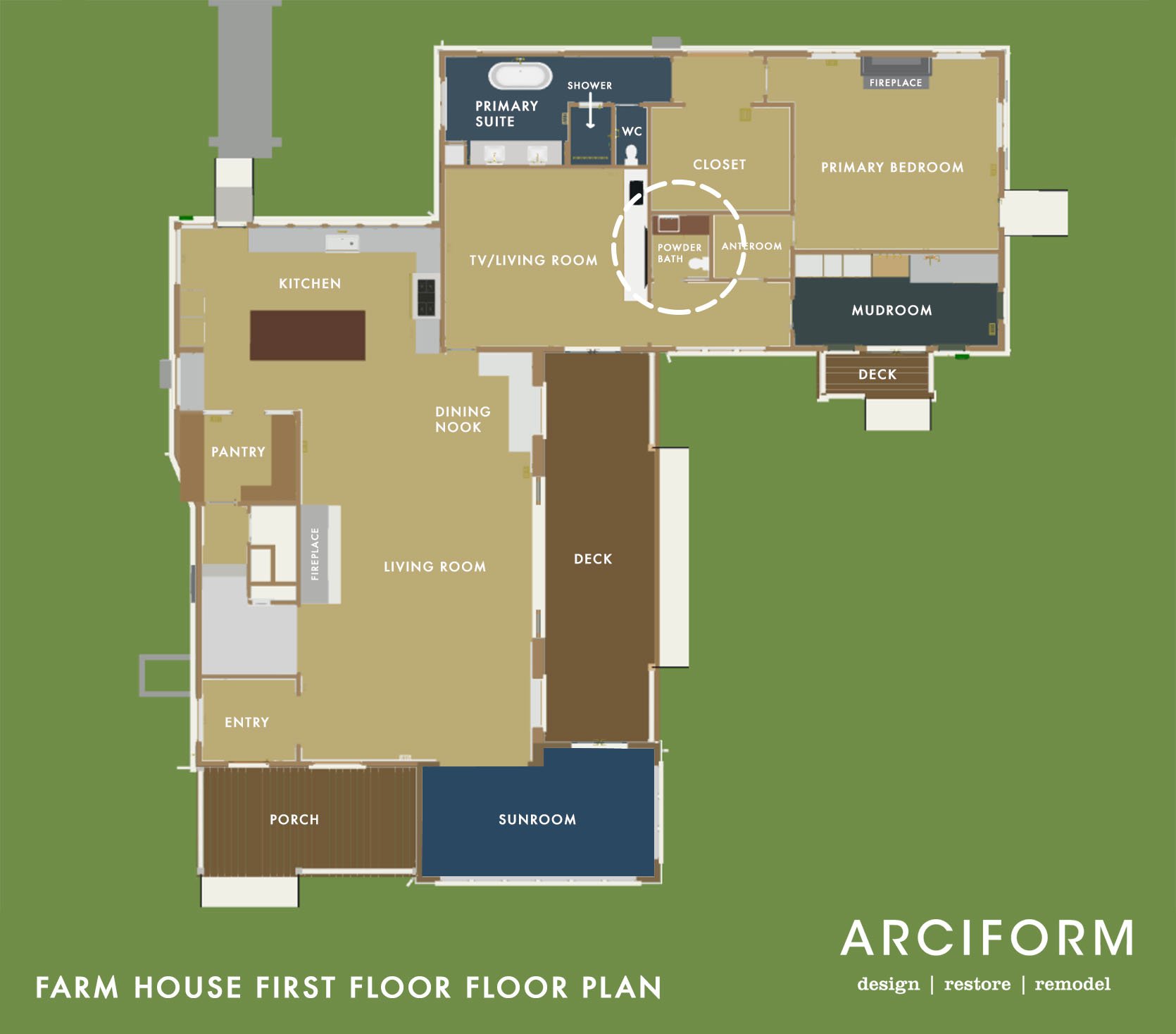
Here you can see where it is in the house. I remember that a lot of you wanted it to be easier to access or in a more obvious location (for guests), but so far all our guests have made it to the toilet in time:) But seriously we don’t really host a lot of strangers (if any) so most people who come over are close friends or family so we are all good. But admittedly, if we were building a house from scratch we would put it in an obvious, more central area.
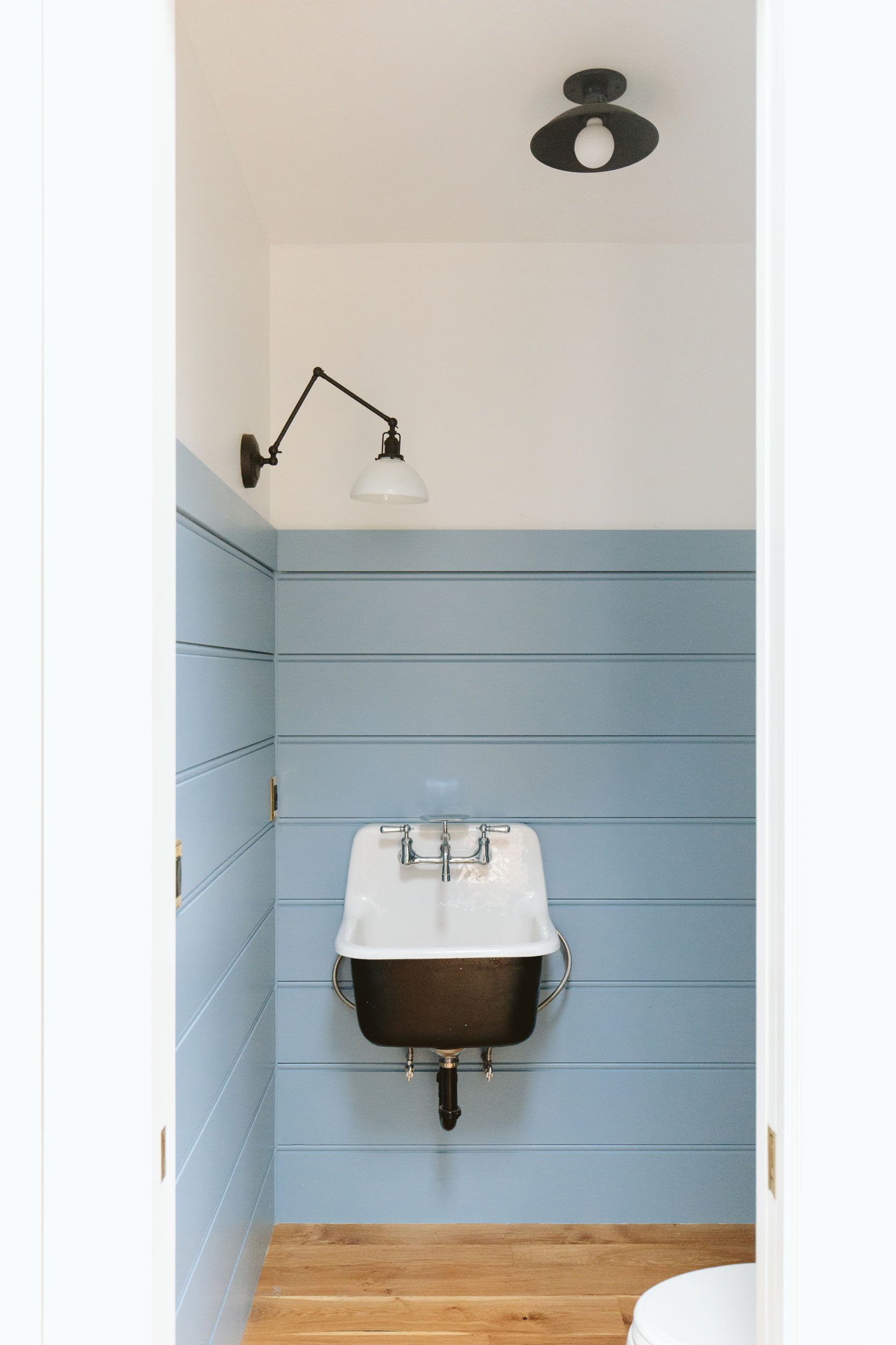
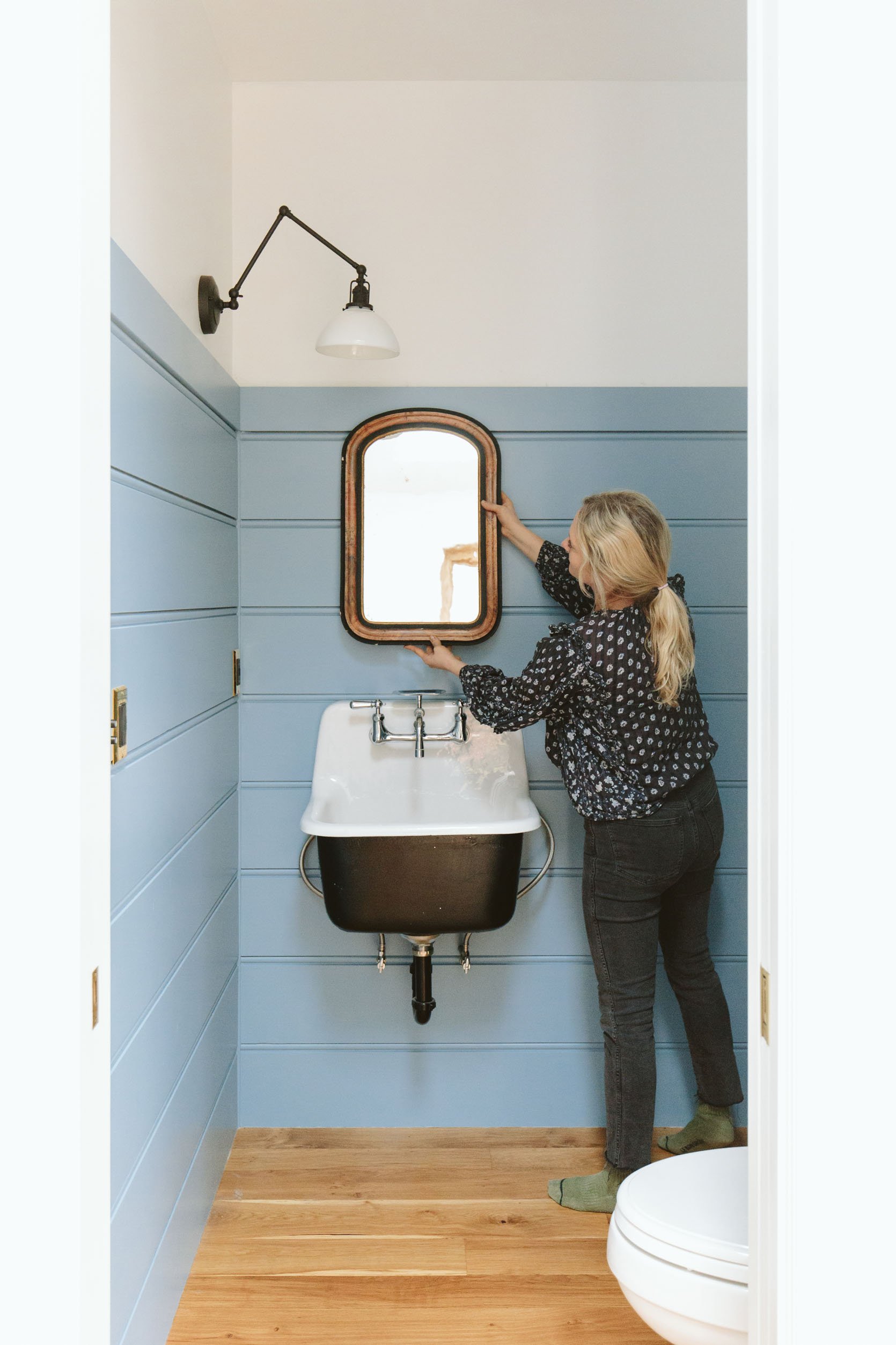
I never really finalized the design of this room before we moved in so this is where we are at. As you can see we paneled the walls with the same millwork as the family room/living room but stopped around 6′. I thought it was odd that the top piece is shorter and not the same full piece, but I was reminded that we did that because it’s actually a trim piece that is getting shaker pegs. There is this fun little game that you play a year or two into any remodel or renovation where you don’t remember why or who made a design choice, but someone did and so there it is. I’m not being snarky, this happens all the time and it’s usually my choice that I’m like, “huh, ok we’ll work with past Emily’s choice.” That’s all to say that it’s not a big deal at all and once we put in the shaker pegs it will give that shorter flat stock trim piece some purpose.
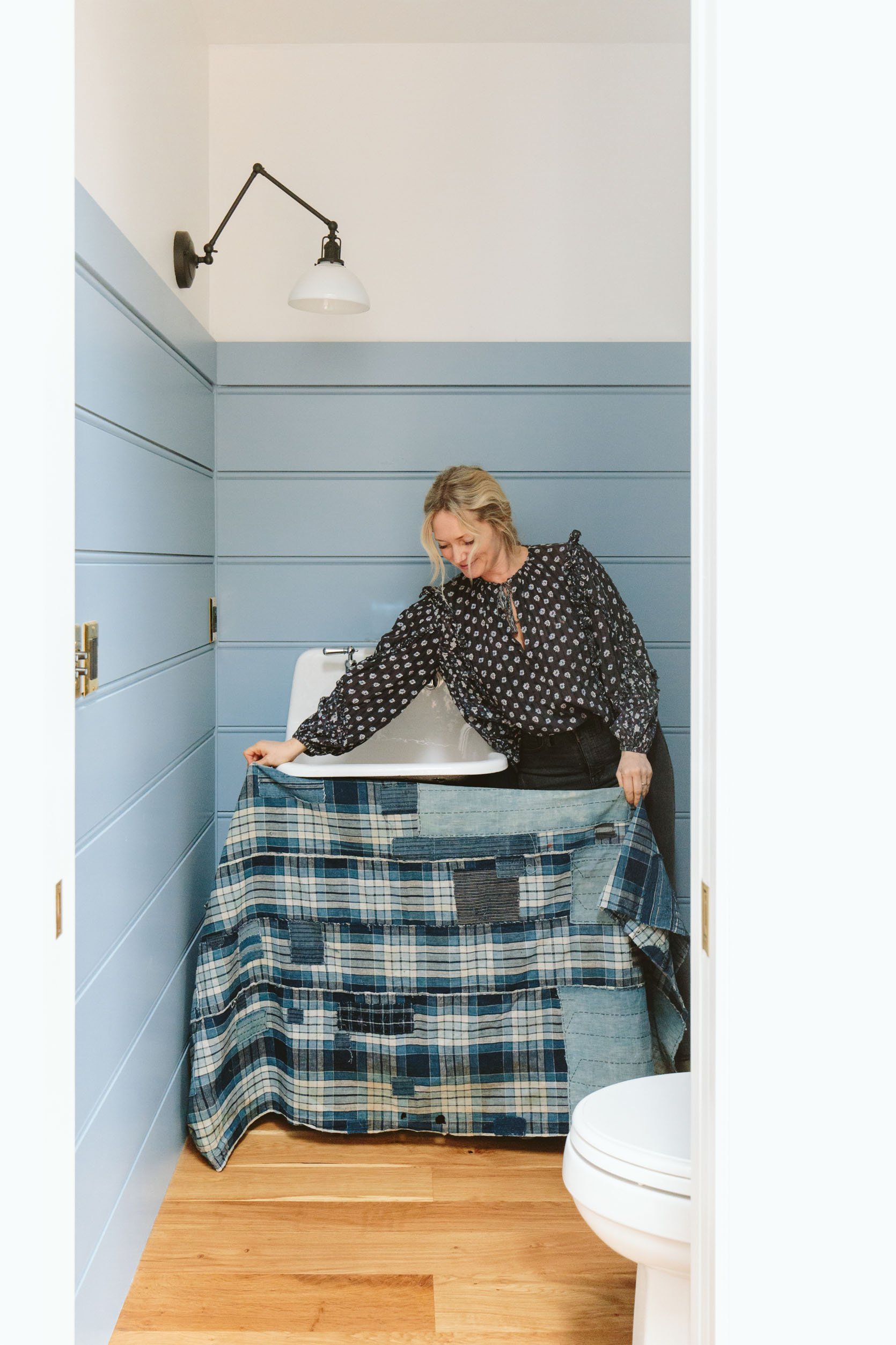
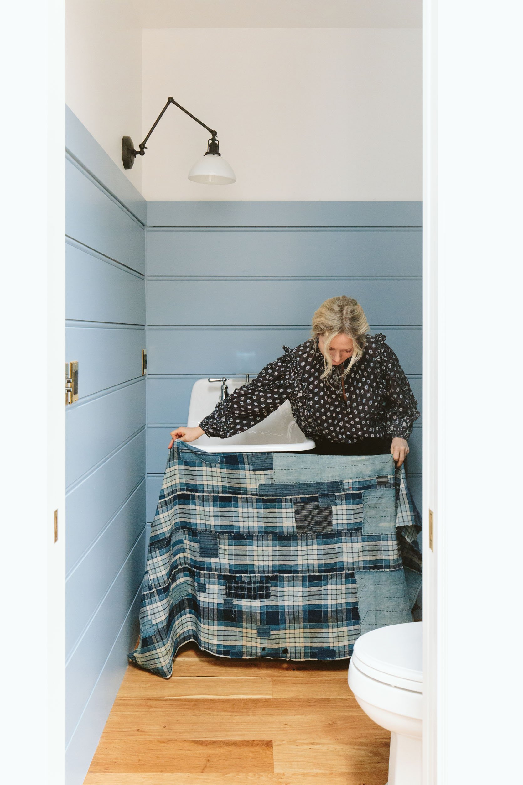
The sink is a hanging utilitarian farm sink from Rejuvenation (the faucet comes with it), set off-center because I wanted the asymmetry (with a direct site line with the door open).
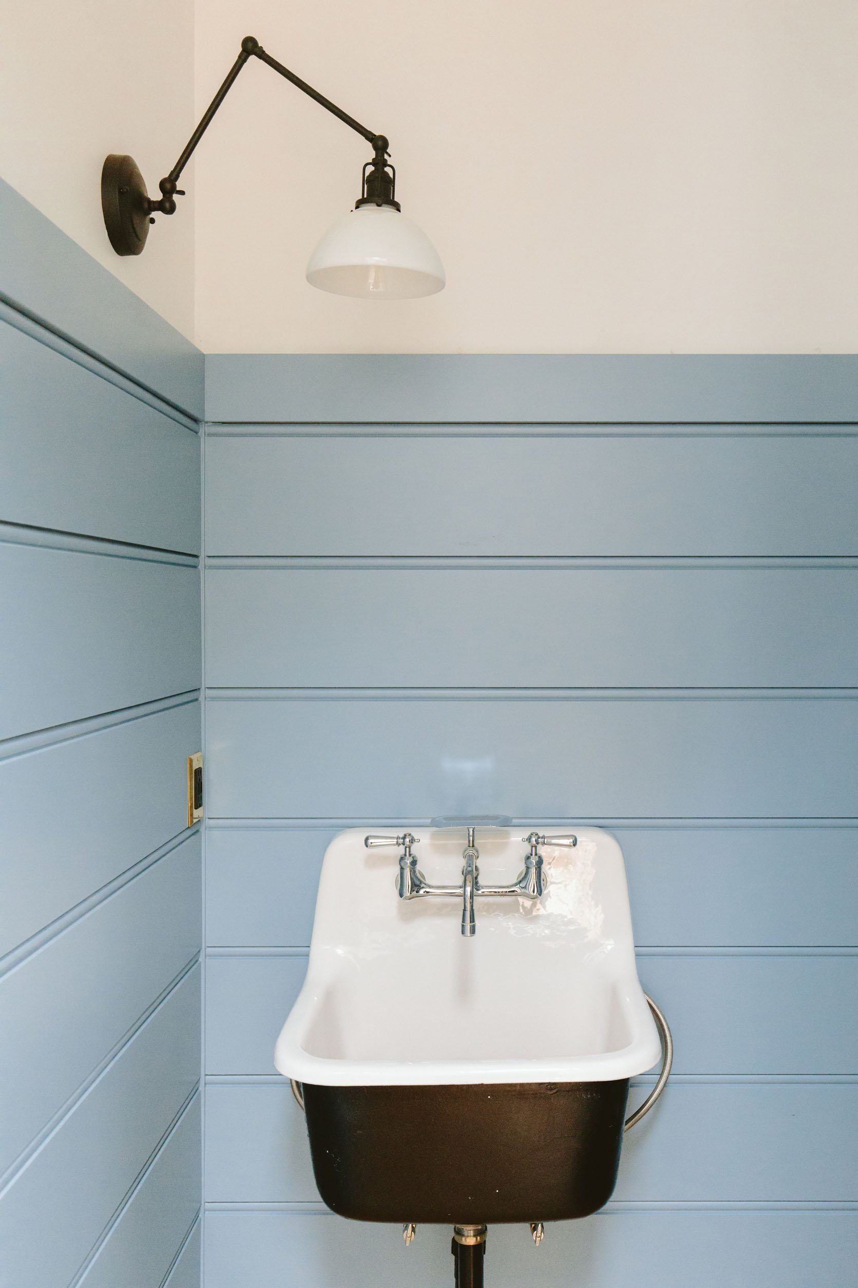
The sconce was also selected to be quirky and just on one side (balanced out by a lamp or plant on the vanity). Speaking of…
This wall is going to have a custom vanity that I’m designing with a local maker, Nate from Dinihanian Design. We are doing a piece that will look like a table, which has “legs” with a wood apron. Then on the underside, we’ll put a curtain. At first, I designed this to have drawers and be a whole custom cabinet situation, but for cost reasons, we are reducing the scope of it (y’all white oak is a fortune these days). And it will be a darker stain to pop off the floor. Besides, we don’t need storage in here.
We have a lot left to do and here’s what we are thinking:
1. Paint the blue. It’s Favorite Jeans by Sherwin-Williams and I want it moodier. So with that said, something exciting happened this week (which you’ll see at the end). I’m IN LOVE.
2. Wallpaper above the paneling. I had one picked out that you’ll see below, but nothing is final. I want to choose the rest of the papers that would be near this room first.
3. Pick a mirror. As you can see below we have some options but I’m going to keep vintage shopping.
4. Accessories and art. I’m thinking this is the perfect room to showcase my collection of vintage animal portraits, but we’ll see.
The Mirror
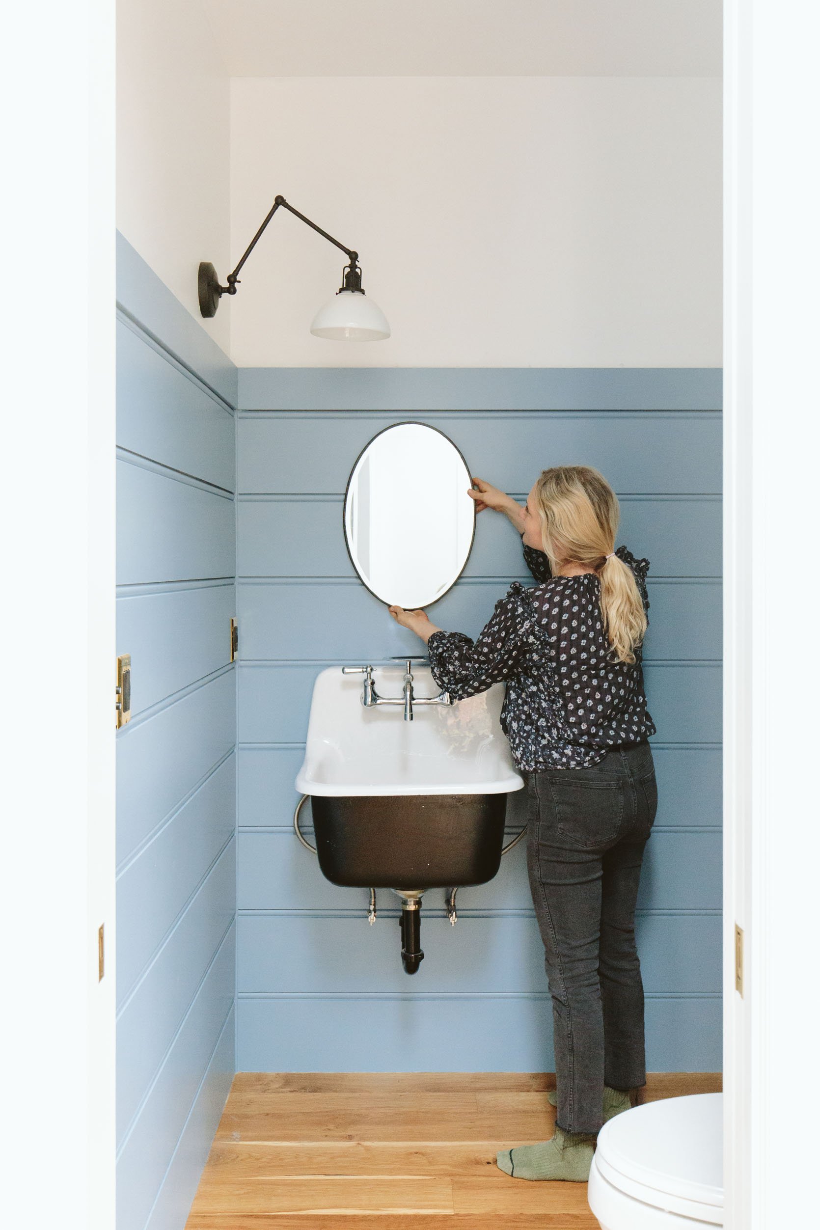
I went to our inventory and grabbed a few mirrors (one you’ve seen before). I actually really love the simplicity of this oval with the thin black frame (but not making any decisions until other things are in place).
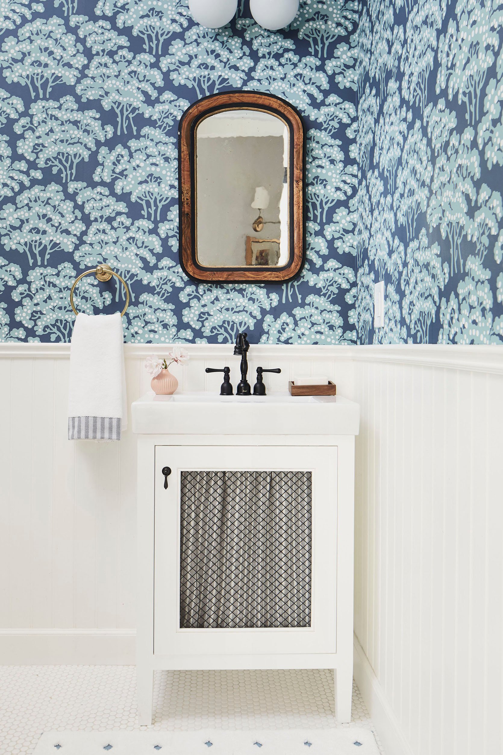
This is the one that I’m likely going to hang in our kid’s bathroom, but I like it here, too!!! Looks like I’ll need to take a shopping day to find some new mirrors 🙂 Remember this one in here?
The Wallpaper
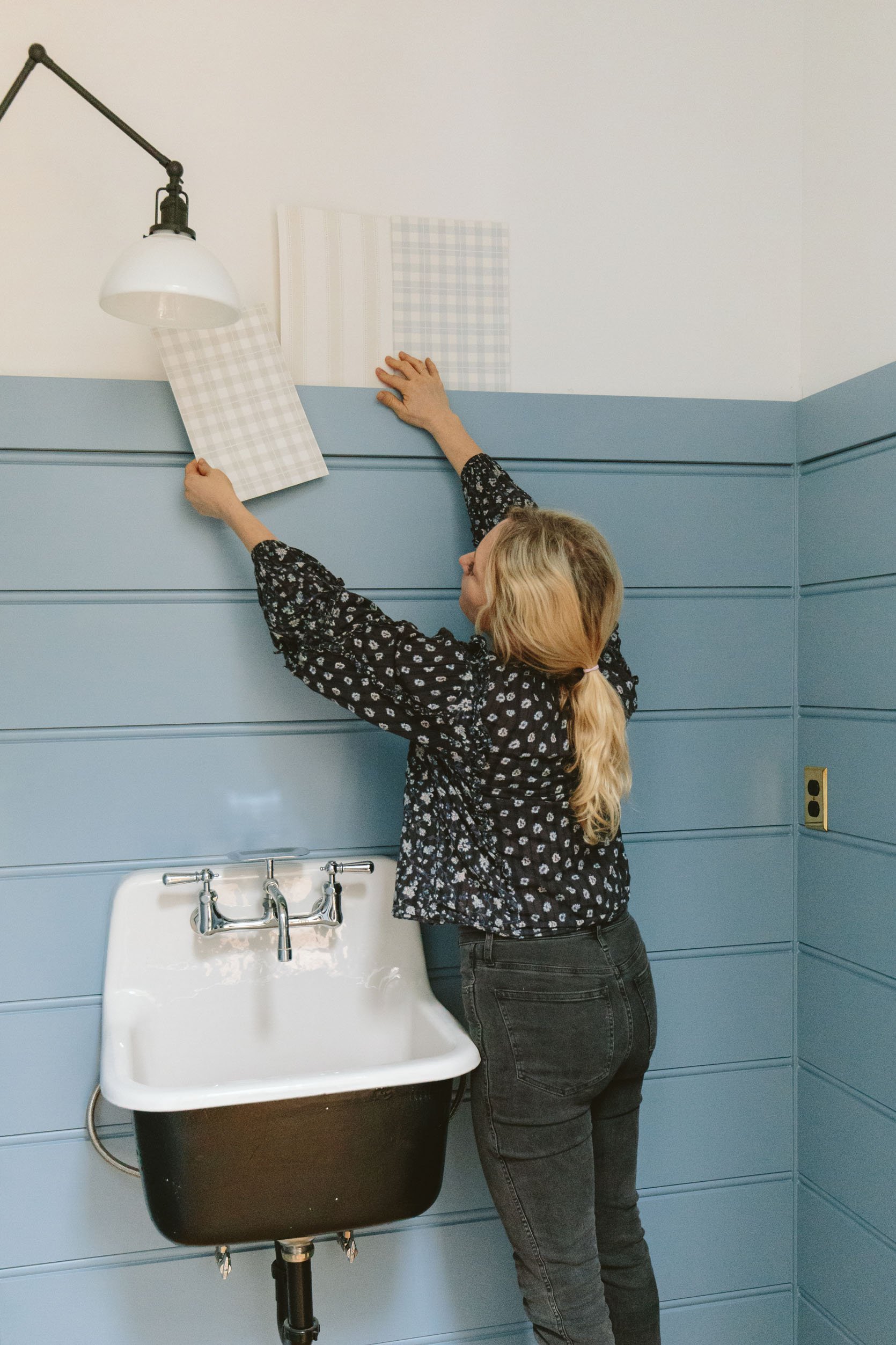
We are going to wallpaper in here as well. I’m still ordering more samples (I have more from Kelly Ventura coming that I’m excited about). I loved the idea of those plaids but I think they are too sweet (not quite pulling at my gut like I usually prefer).
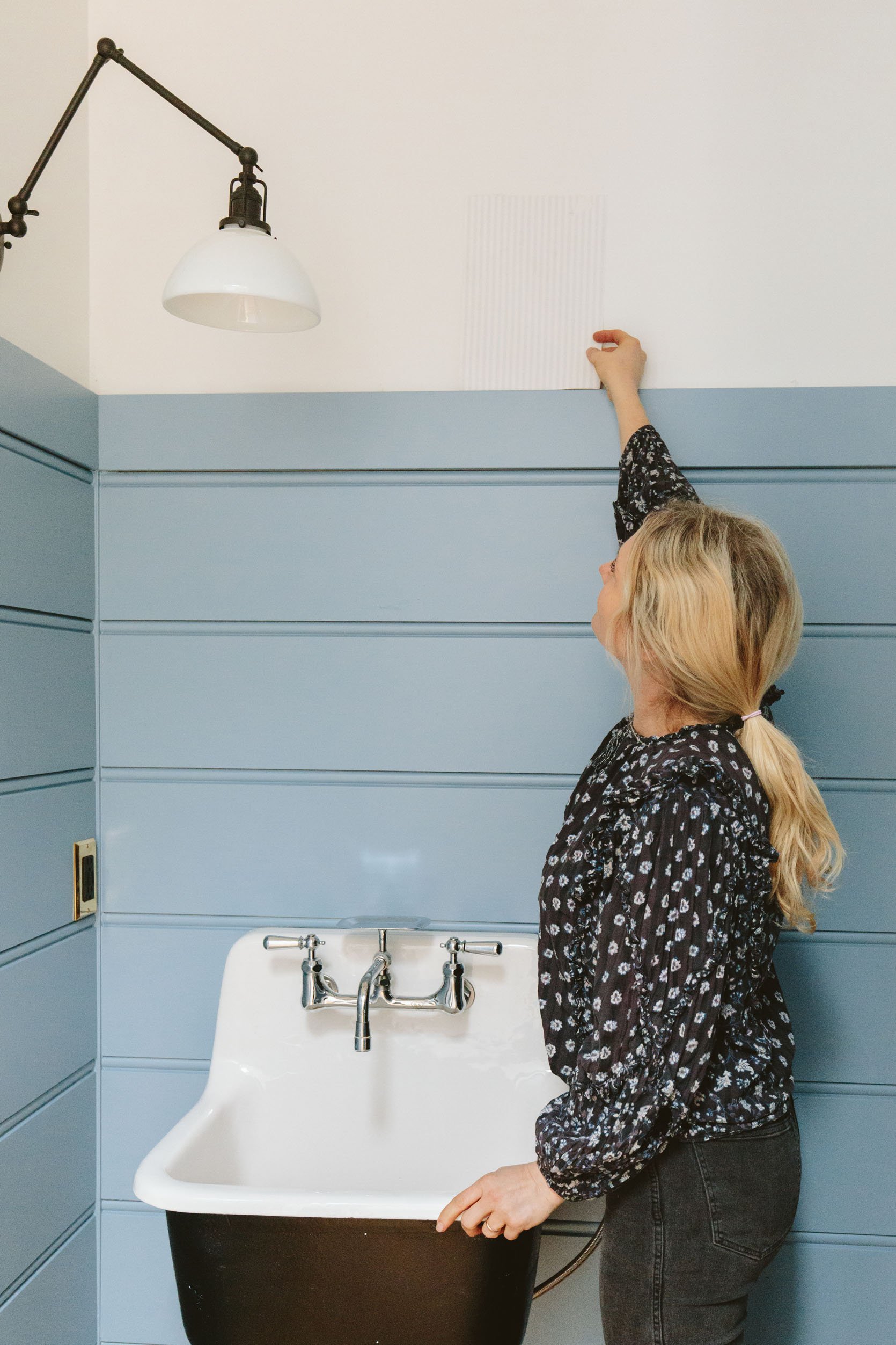
Originally when I was going to do a plaid curtain I wanted this ticking stripe wallpaper, but since I’ve chosen the plaid for the washer/dryer which is really close to this room I’m going in a different direction (I think, hold me to nothing these days).
See? That curtain with the ticking stripe wallpaper above the paneling would look pretty darn cute! Shoot, maybe I should put this here instead of the washer/dryer since many of you said you don’t think I should do a curtain anyway!
The Hanging Shaker Cabinet
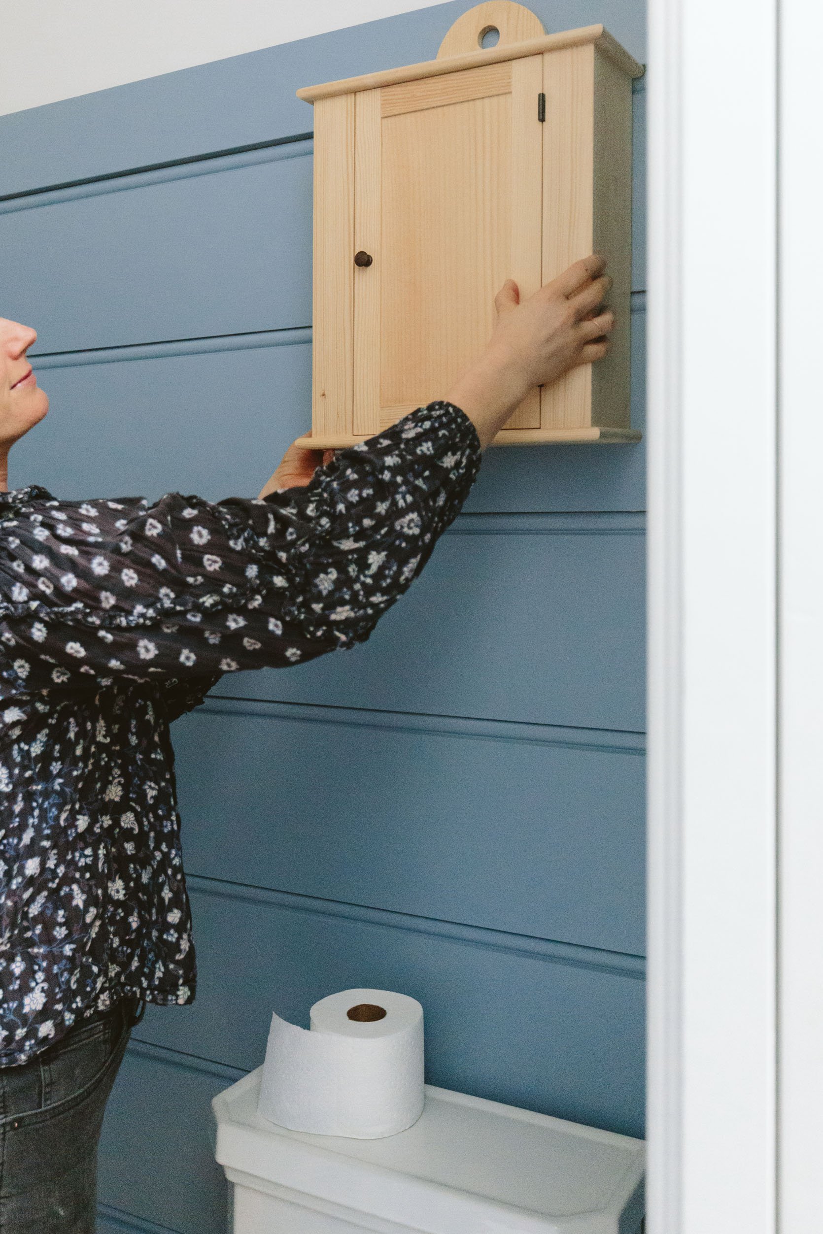
Once we get our pegs in (which went in after this shoot) we are going to paint this cabinet and hang it from a peg (mostly to look cute). Also, this photo reminds me that I need a TP holder…
I was going to just post this with it being blue but I got a little bug up my butt to just finalize this room more quickly and I wanted to change the color to something less bright and more moody. I’m so obsessed with the Artistic Taupe (also by Sherwin-Willliams) color that’s in our upstairs guest room…
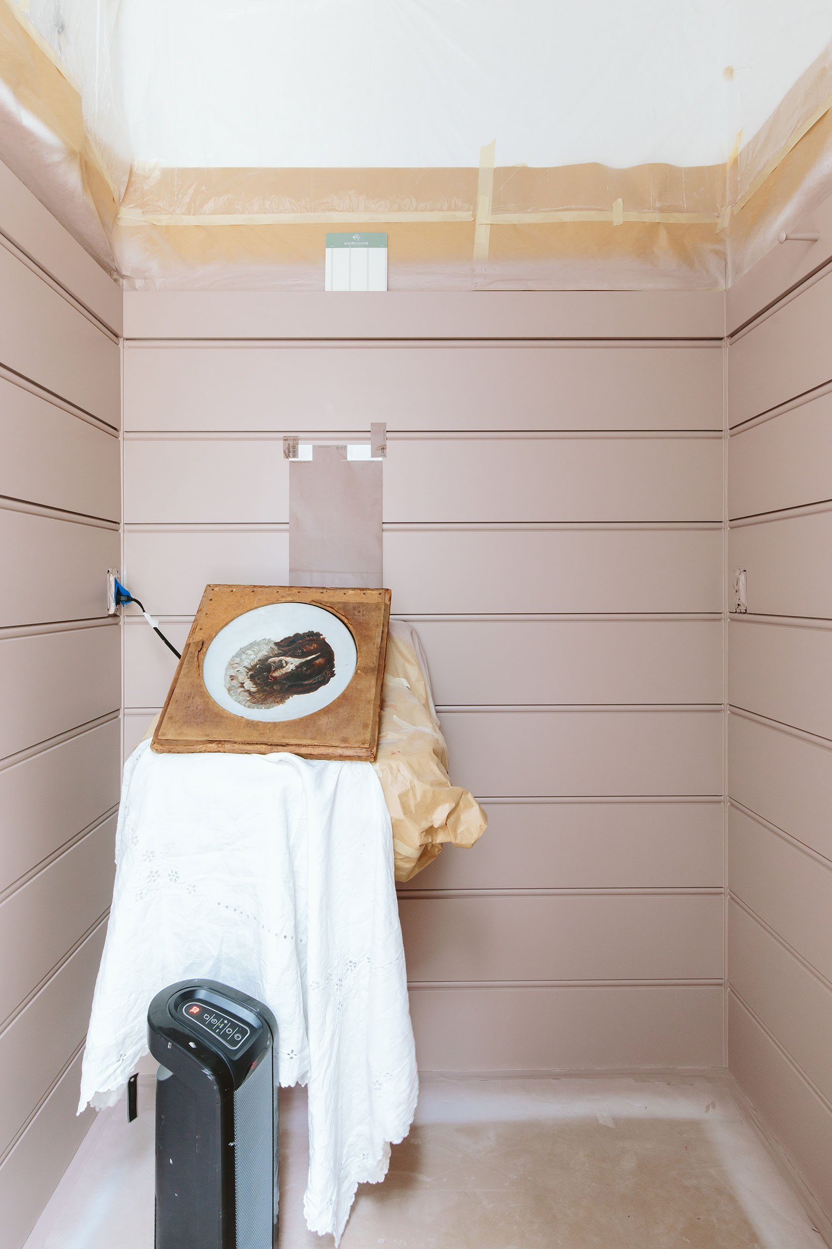
So that’s what happened yesterday. Kinda. After they painted this first color which is GORGEOUS (Glamour by Sherwin-Williams) I decided to go one shade darker on that same color stick and do Cocoa Berry (Also SW). Y’all it’s SO PRETTY. Here you can see the potential wallpaper (that white swatch with a thin gray stripe) and the leather pet portrait represents the tone of the custom vanity table (obviously), while that tablecloth represents what we might put as the skirt/curtain. I’m SO HAPPY with this color choice, the tones are perfect. Sure it’s “pink” but with a lot of warmth to it (it goes brown) making it less PINK and more soothing. Our guest room is in the lighter version of this color so I felt very very confident knowing that I love the tone. The big question (which was painfully debated here) was the level of darkness – which shade of color on that same stick. After Kaitlin left yesterday he sprayed the darker color (the sample you see on the wall) so next time you see it it will be even richer.
So that’s where we are at with this little bathroom. I’m so much more excited about it this color than the blue that felt like the wrong tone for this house (it’s a really happy color, though). Y’all I’m learning a LOT about color and happy you are on this journey with me 🙂 I’m going room by room slowly, dialing in the color and getting closer and closer to nailing it each time. Another big box checked. THANK GOODNESS. xx
* Unless Otherwise Noted, Photos by Kaitlin Green
THIS POST WAS ORIGINALLY PUBLISHED HERE.
