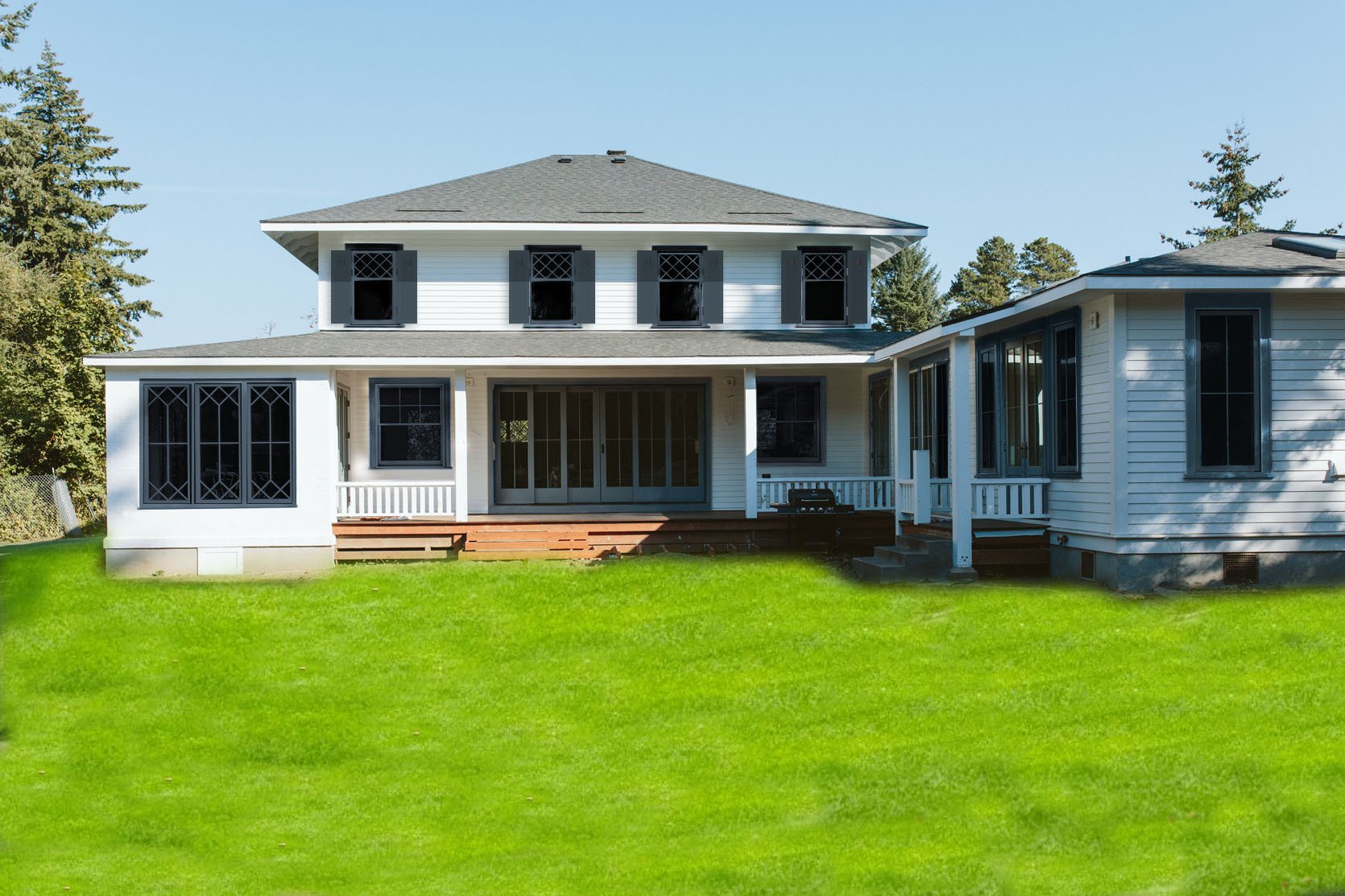
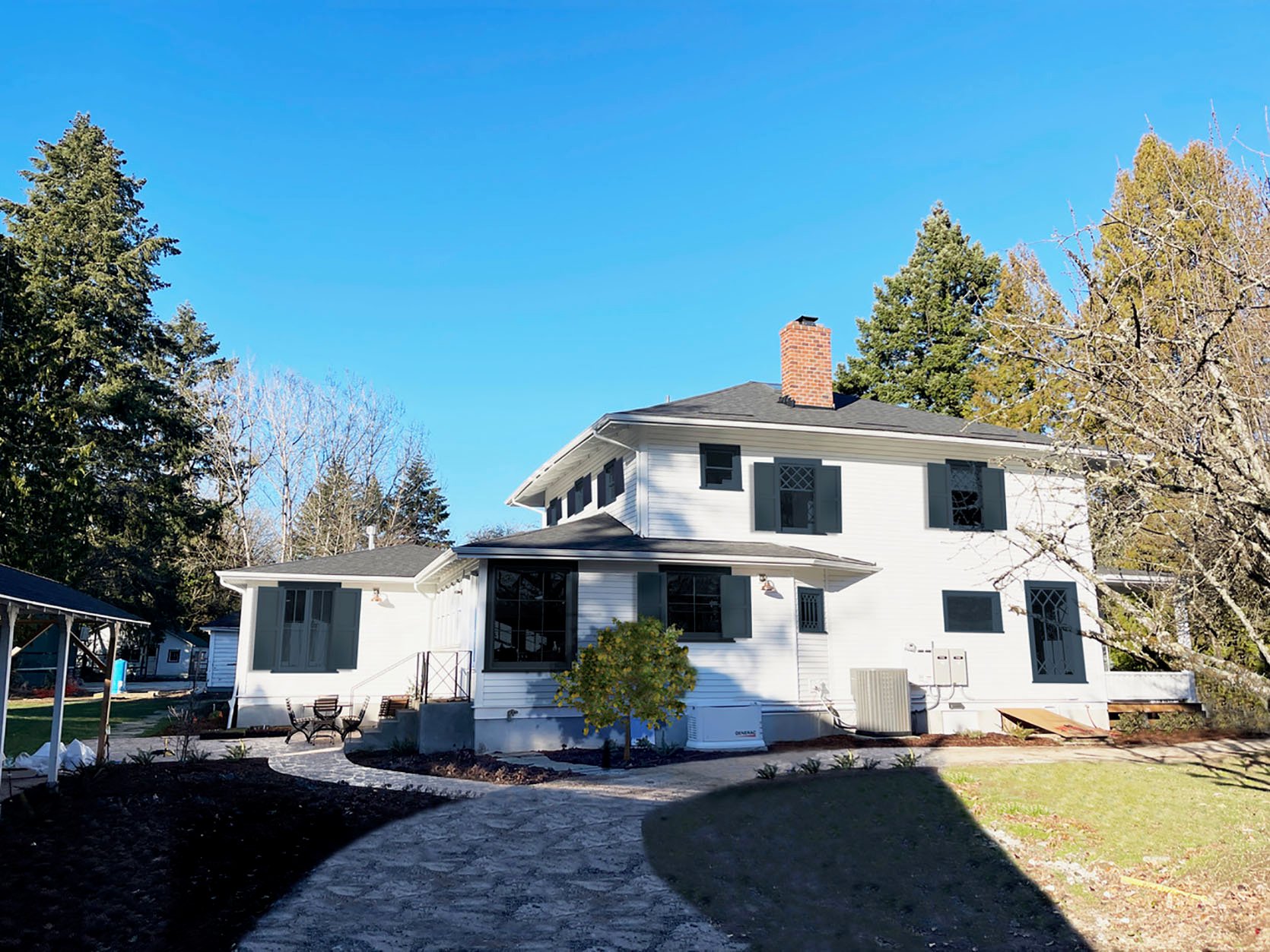
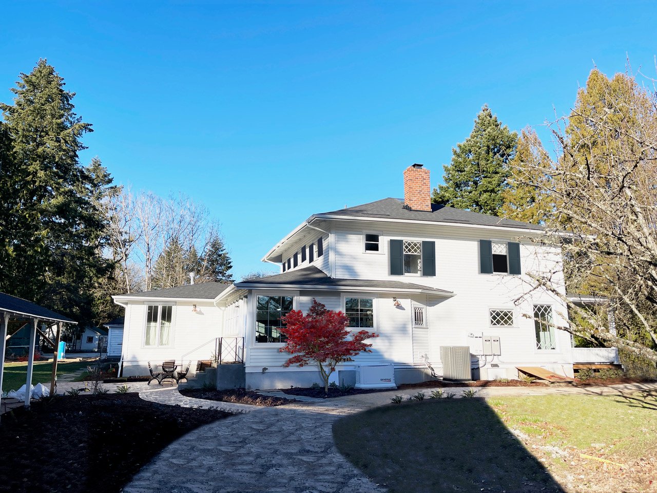
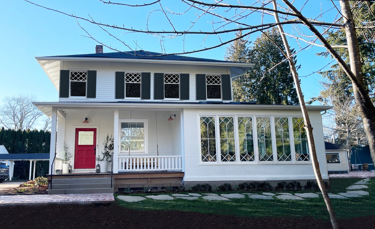
In this week’s episode of ‘fixing our remodeling regrets’, we take it to the exterior where I’m just not feeling like I should about the house (and no, it’s not just the mud). The color of the body, Pure White by Sherwin-Williams, is perfect and lovely. We then chose Online by Sherwin-Williams as the trim color because it looked really good with the Sierra Pacific Windows steel blue aluminum clad doors – similar undertones but lighter. Great. Done. The color never felt totally ‘happy’ enough for me, but it looked really good with the blue doors, copper accents, and white (in the sun), and decisions had to be made FAST. I figured the ‘Online’ trim would recede and the future shutters would be the contrast or color that I wanted. And listen this color is extra gray when it’s gray outside (which is very frequent) and far bluer when it’s sunny. We chose it when it was sunny 🙂 But that wasn’t the biggest issue.
We want shutters, and as I started researching shutters for the first time I quickly realized there is a specific formula that I prefer: white house + white trim + white window sashes + contrasting shutters/doors. Sometimes the trim/windows color is the same as the shutters (and the muntins of the window) to give it more of a monochromatic look which I thought was very cool. Around the time of shutter contemplation, a month or so ago when I was starting to break down all my reno regrets, a reader reached out (hi Misty!) and said that she was a pro photoshopping graphic designer available to be hired to help should I need it. I’m pretty sure she could sense my frustration and had been there before as a remodeler herself. I know there are a lot of good graphic designers out there, but having an invested reader helping felt like a nice alignment. So I hired her to photoshop some options so if/when we repaint we feel REALLY GOOD about it. The question wasn’t just the window trim color it was also which window should get shutters. So today through some photoshop magic, I’ll show you a bunch of options (and what we’ve narrowed it down to).
Option A: White Window Sashes + White Trim + No Shutters
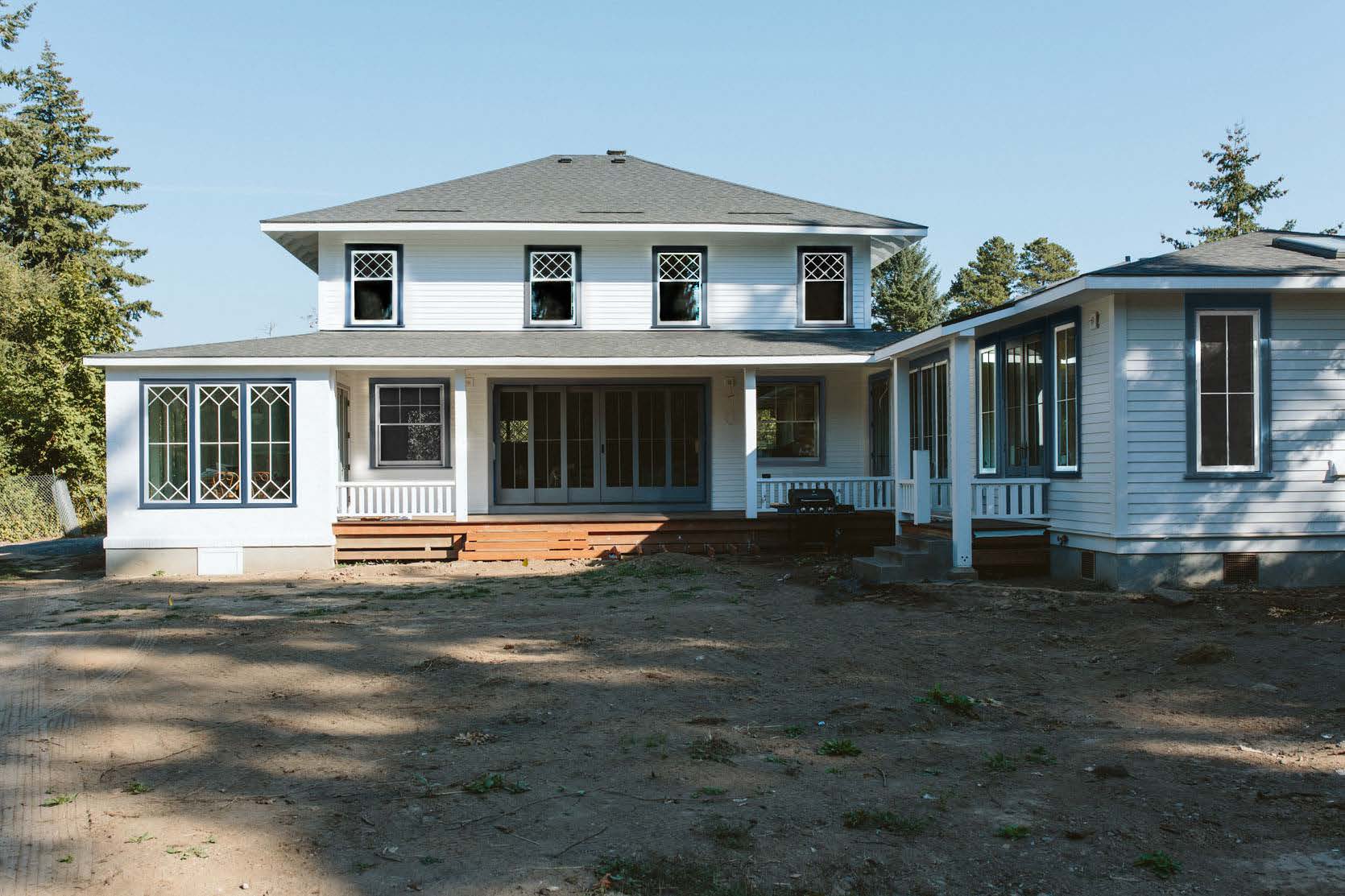
Admittedly this is pretty boring without the shutters, although once landscaping grows in I think it could be really pretty and classic. What you can’t see here are the copper Rejuvenation lights and of course a lot of pink, green, and coppery-toned trees and plants that have yet to be planted. Oh and don’t get too excited – the GREEN GRASS IS PHOTOSHOPPED. I think even Misty was sick of looking at the mud so at one point she threw in the green which really did it for me (are there any glasses I can put on to help transcribe mud to grass??). Regardless, the white on white was a real hard no for Brian and I kinda agreed.
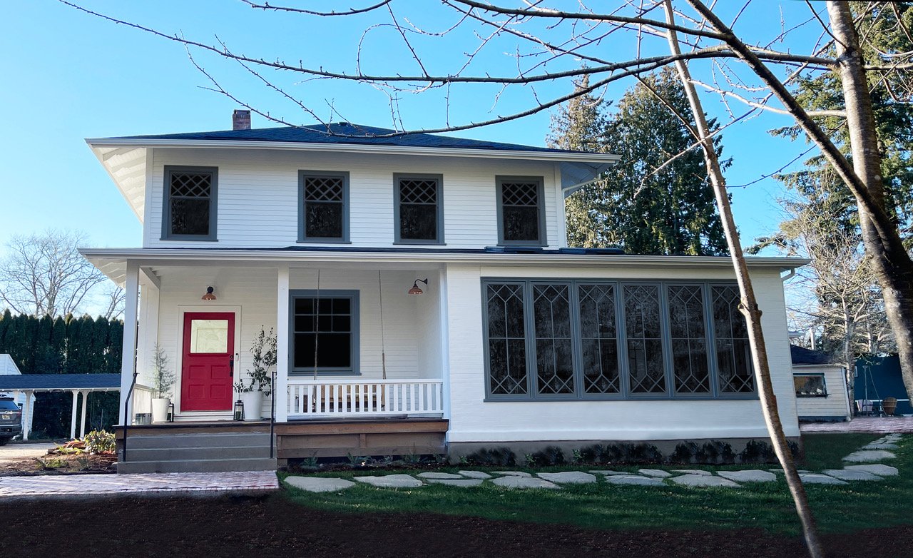
There are days when the red door on this white house is too much for me, TBH, but that’s an easy fix. I actually think that when the upstairs window treatments are open the diamond pattern of the windows really pops more when the trim is white. However I still wasn’t convinced, Brian wasn’t into it, and this time around I have to feel REALLY REALLY good about it. I love the sunroom windows without the gray trim color – which is actually how it was planned but the painters messed up and painted it, and we decided to live with it. As you can see the profile of the trim is smaller and was never intended to be painted gray.
Option B: White Window Sashes + Blue trim + No Shutters
For a brief 2 days, a shutter salesperson told us that we couldn’t do shutters on some of the windows upstairs based on the photos. So just in case, in the interim, I asked Misty to photoshop this option: blue trim, white window sashes, with no shutters. Meanwhile, I measured the top windows – specifically the two on the right and left sides of the house that seemed too close to the edges. The window sashes (without the trim) are 36″ wide, which would require the shutters to be 18″ each. We have a solid 19″ to the edges of the house so we are fine – tight but fine. I did NOT like this version without shutters. But what if we add shutters???
Option C: White Window Sashes + Blue Trim + Blue Shutters
Brian was curious about this option and felt like exploring all options was important this time around (without a painting crew waiting for my decision). So in this option, we keep the window sashes white, then paint the window trim and the shutters blue. We thought this would totally work, but this was a hard and fast no for both of us – it looks so busy!! Your eye doesn’t know what to look at – Trim! Diamond windows! Shutters! Doors! Now I want to be clear – some houses can handle a lot of busyness on the outside and I have dreams of doing a Victorian house in a billion fun colors, but that’s not the intent for this house. I have to admit that I would not have known how much I didn’t like this until it was photoshopped. It sounded like a good idea (and I think we even tried it in the chief architect renderings once and liked it). But no, it’s too busy.
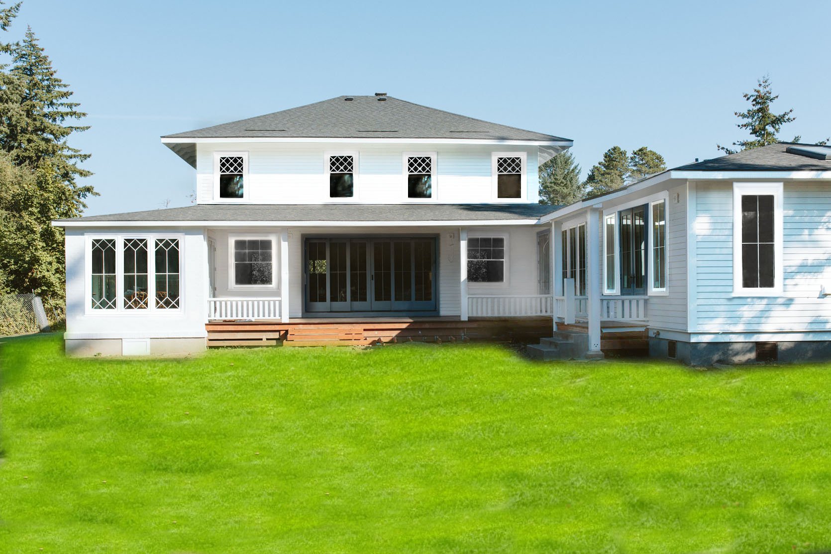
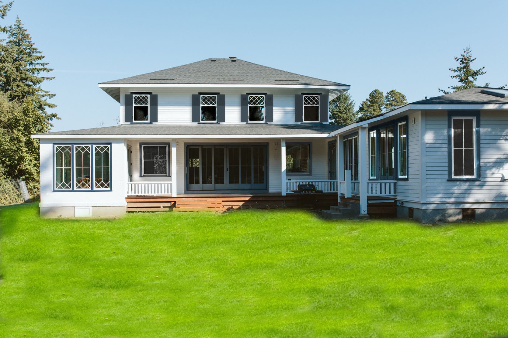
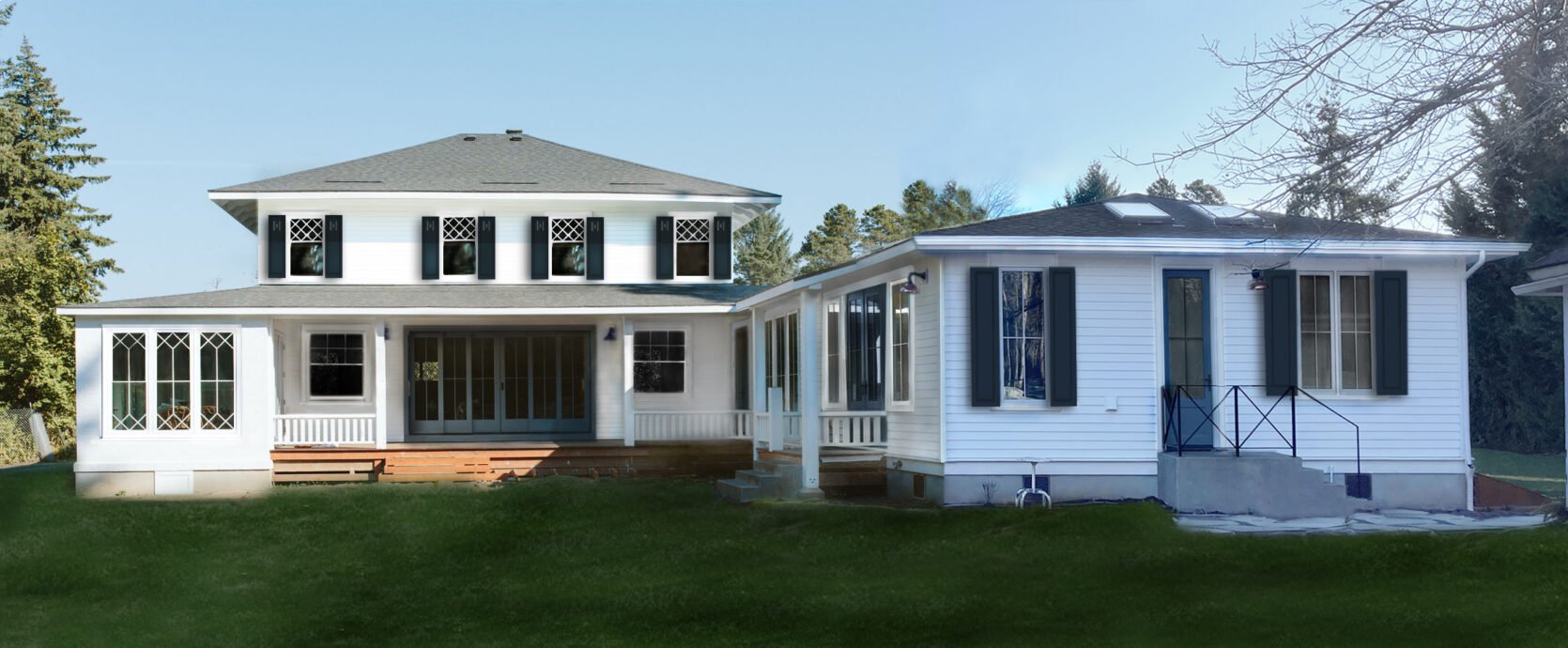
Option D: Blue Sashes + Blue Trim + Blue Shutters
When I first saw this monochromatic look I was like ‘OOOOHHHHH’, but I think for the wrong reasons. I thought it looked cool and a new take on the farmhouse exterior style. Brian and my brother Ken were both hard no’s thinking it was too trendy and didn’t want that for our house. I wasn’t going to fight for it, but I was surprised at how much I liked it. I actually thought that maybe it could be two different dark colors so not quite as monochromatic. I think I am just responding to feeling like a basic middle-aged lady with a big fancy house and wanting it to feel younger and cooler (!!), which is obviously pathetic and dumb to write, but I know I’m not alone in feeling like my house doesn’t really look like ‘me’ 🙂 So I asked Misty to do a few different views of the house to really make sure this wasn’t the direction we should go:
Pretty darn intense. But what if the red door was changed? There is still something that I liked about it, but I think it’s just that it’s strangely graphic, easy for your eye to ‘get’, and it has style to it. This brought up the dark house debate: whether or not dark houses will be dated in 20 years, but ultimately we decided that in the right setting it is soooo appropriate and classic, but no, a house like this with a wrap-around porch is probably meant to be more classic. Or maybe without the shutters it would look better. I also want to be clear that painting the actual sashes of the windows (the grid with the diamond) is more challenging so having them white is FAR easier and less expensive.
Option D + A Porch Shutter
In this one, you can see Misty added shutters on the bottom window (which I really liked as a feature). Here are a few more angles in this monochromatic look so you have all the information:
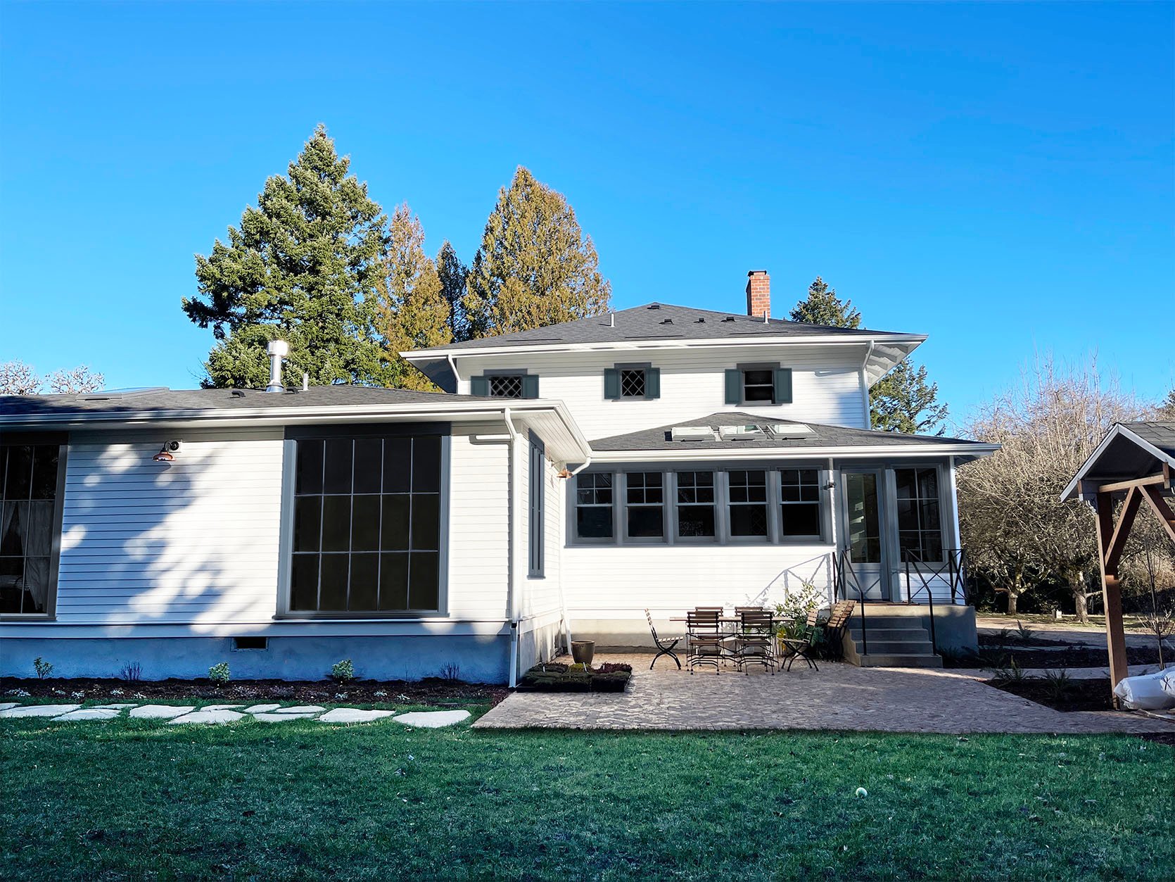
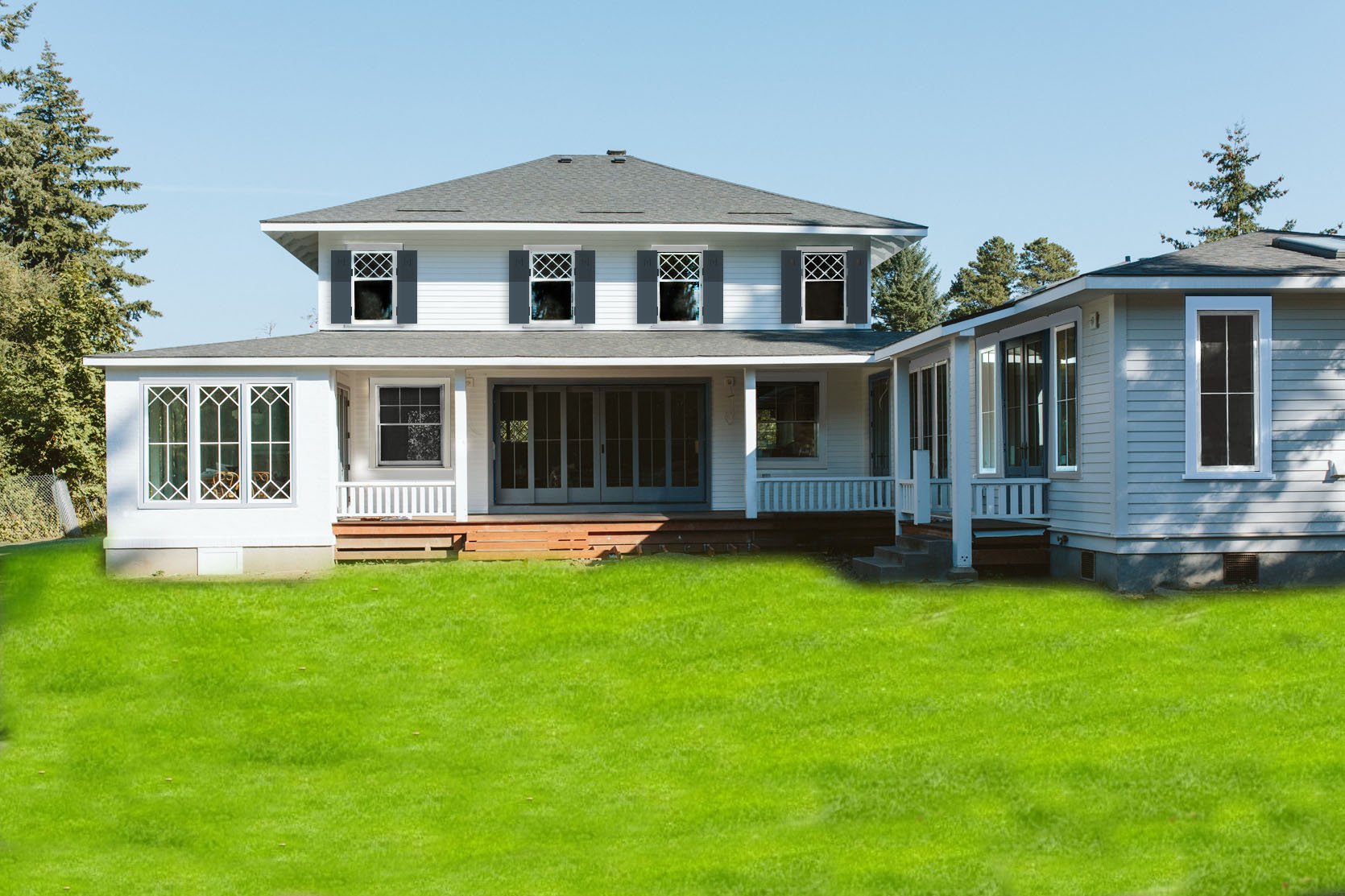
This is the kitchen patio side, which I think looks cool, actually, but that could be because there is no landscaping yet so the blue and white really pop (right now because of the lack of trees/bushes growing in every angle of the house looks so unfinished).
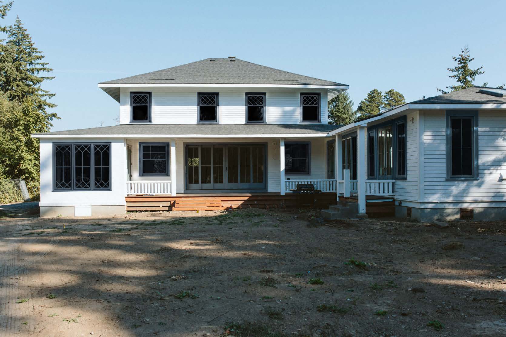
This side of the house is the most problematic (and publicly seen) for me and always has been. Here’s why: you can see all the mechanical aspects (heat pump, electrical panels, generator – all will be covered eventually but very exposed now) and this side also highlights a lot of window awkwardness (mixing old + new with the older windows oddly placed). BTW the odd placement doesn’t bother ME, but people sure love to call it out. I actually find it super charming that they aren’t perfectly aligned but boy are people on social media upset :).
Option E: Blue Sashes + Blue Trim + No Shutters
Misty also sent through this option without shutters, which is also fun to see and perhaps better. It’s still not what we decided on but I wanted to show you because it’s just so illuminating to see all the variations.
It’s definitely less intense and busy than the monochromatic + shutters look. Are you still following? This is getting complicated. OH, and we have a big cherry tree coming from the front porch area which I’m very excited about (and the grass and bushes are photoshopped – they aren’t in yet).
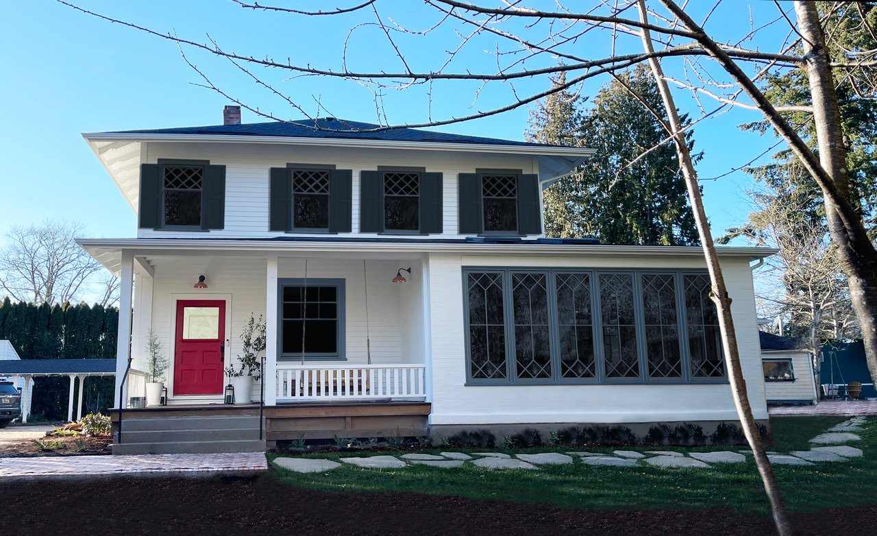
Option F: White Sashes + White Trim + Blue Shutters
OK NOW HERE WE GO. When Brian and I both saw this we were like ‘ooh, pretty!’. It feels super classic and still fresh. Is it young and cool? Nah, not really, but it’s timeless and appropriate and with styling, furniture, and landscaping I think it will still look fresh. After seeing this, I wanted to take a more pulled-back photo for Misty to see the mudroom/bedroom and potentially put shutters there.
Option G: White Sashes + White Trim + Blue Shutters On Both Floors
That looks SO PRETTY to us. I almost want to add more shutters on the windows flanking the big scenic doors but those would definitely hit the exterior sconces. It feels fresh and bright, pulled together, and hopefully not regrettable. Ok, let’s say that the white + blue shutters combination was our winner, does it work on all sides of the house?
Option G: Other angles Of The House + Shutter Debate
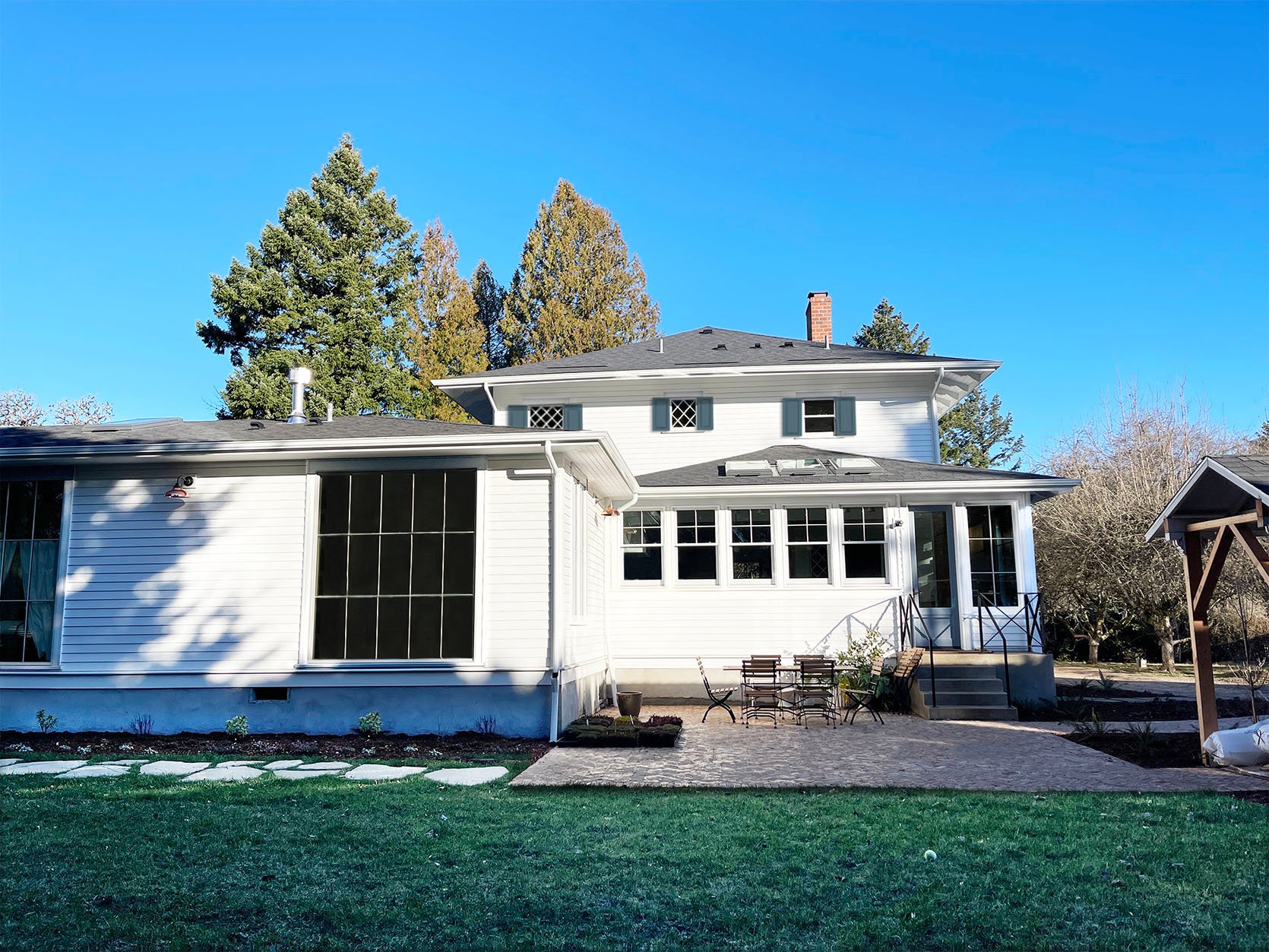
The kitchen side of the house allows for shutters on top, but not in the kitchen windows. You might think that it looks a little plain, but what you don’t know is that we are adding two large potted trees on the patio, a big striped umbrella, string lights, trees and bushes along the side of the house, etc. It’s going to be styled out a lot so the white-on-white window situation will just be a nice background.
But what about the shutters on the second floor? This is HARD. I think they are cute, but are they dinky? The one on the far left is a bedroom window and the rest of them will have shutters, but you won’t see them at the same time. The other two are pretty small – both bathroom windows. We could save money and not do any of these, but will this side look unfinished?
Option G: East Side/Problematic Angle

Look how happy our problematic side looks now! I like the shutters on the bottom left large window by the brick patio and the ones on the second floor. But then the ones on the first floor without shutters look unfinished and yet shutters don’t really work on them (especially that big one on the bottom left – the other three could maybe handle them). So I reached out to Misty again and asked for these options:
- Only put shutters on top of larger “bedroom” windows (this is the more traditional way to do it – just bedrooms).
- Put shutters on top of larger windows + smaller upstairs windows (except that tiny one), but none on the bottom.
- Shutter all windows possible.
We don’t have to make this call today, but very soon. I’m hoping that any and all experienced shutter people will help weigh in. I’m a shutter newbie and they aren’t cheap so I don’t want to put some up that we eventually take down. Before we go let’s look at the front Porch entrance:
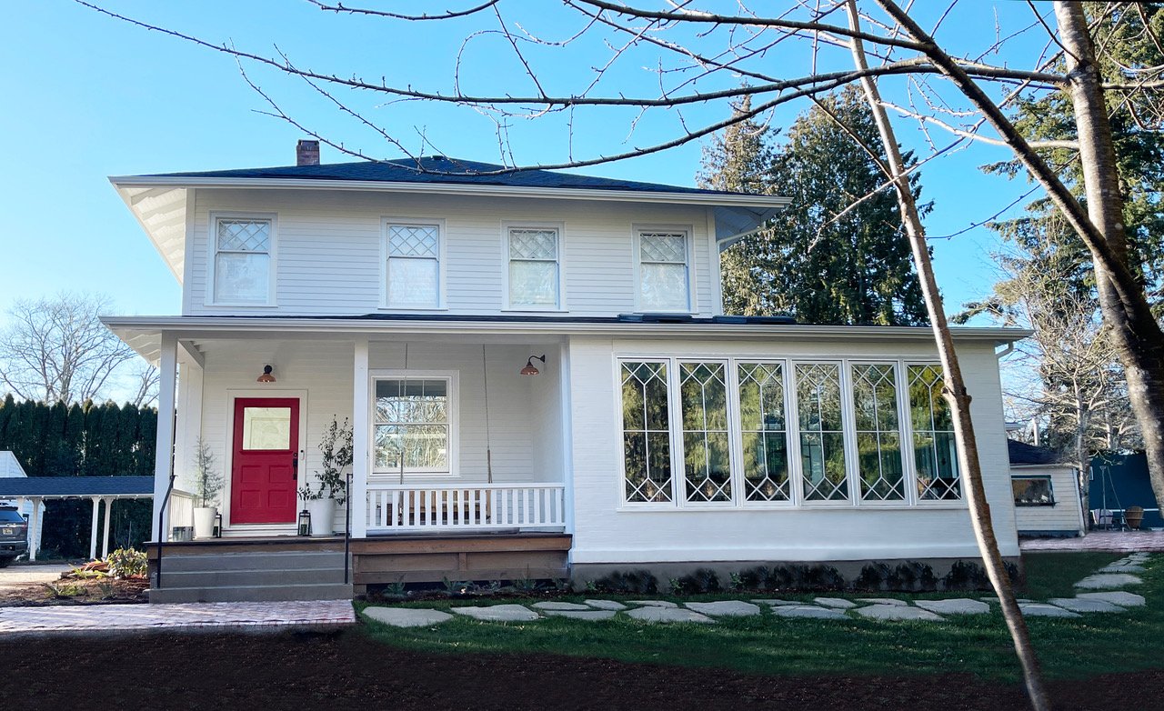
Option G: Front Porch/Entrance Without Shutter
It looks good but could be better…
Option G: Front Porch/Entrance With Shutter
Now that looks like a nice happy lady. I love the shutters on the window on the front porch. The red + blue + white is feeling really strong, so rethinking the red door but definitely going to wait a bit.
What’s up next? So we feel pretty darn confident that we want to paint the gray window trim the same white as the body of the house (Pure White by Sherwin-Williams). We are good there. But what I still feel needs a solid rethinking is what exact shade of blue (or green? pink? blush? black?) the shutters should be. Misty (our graphic designer) did them this round to match the doors as I asked. But I’m hoping to do my favorite thing and really EXHAUST ALL OPTIONS (something I didn’t do actually during this process the first time around). I think I under-thought it (I was also feeling overwhelmed/alone and depressed, so not in my best design self). Now that I feel excited again (!!) I think my old instincts will kick in and it will turn out GREAT.
Let me know in the comments what colors you want to see as the shutters (knowing that the blue aluminum-clad doors can’t change, but the red door can). I want to try Dutch Tile Blue which feels happier and a powder blue. I also want to see what a rosey-toned door would look like (blush and blue forever, no?) But what else??
THIS POST WAS ORIGINALLY PUBLISHED HERE.
