When a home and a homeowner(s) find their perfect match, you can tell. There’s a visible energy that both are there to care for and protect each other. I think this is especially true with old homes. And look, sometimes an old home is too far gone – too many homeowners before either weren’t able to properly care for it while others made quick, trendy fixes that simply didn’t pay respect to the original structure. Today we have a happy story. A story of a young family who was in love with their wonderful 1910 craftsman, wanting to preserve as much of it as possible while needing to update for modern living.
When I was pitched this project by the incredible Jamie Haller (remember this craftsman she and her husband restored?) I was blown away. In that previous post, I called them the “soul keepers” and baby, that title remains intact. As we move through this home you will not only get to soak up an almost endless pool of vintage details but see how with careful and thoughtful design choices, old and new can beautifully coexist. I think that if you love this “happy moody” style there are some key elements you can incorporate into your home. But first, let’s hear how it all began and the biggest challenges Jamie faced.
What was the conversation about the color palette and style with your client? Did they have a style they said they specifically wanted or did they just want you to lean into the style of the home and run with it?
Jamie: “The direction was to embrace the authenticity of the home and create a modern and functional space that inspired them.”
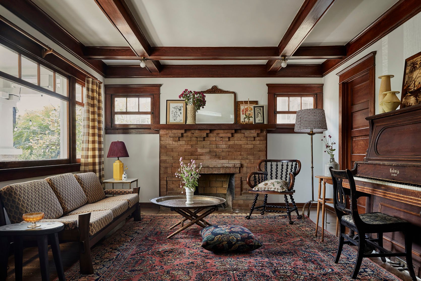
Ah, the magic words for a historic home-loving designer, right? But before we get into the more extensive parts of the renovation let’s have some fun dissecting why the living and dining rooms are so special and why they nail the “happy moody” style.
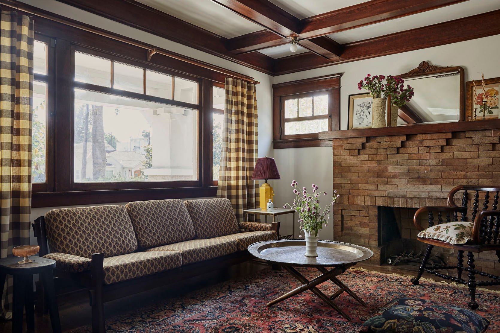
First, let’s take about the choice of white paint. Jamie was told by the homeowner that they wanted to keep it a warmer shade which was absolutely the right call. It works with the dark warm woods in the room and makes it feel brighter but still cozy. Then to bring in that depth, it’s all about the patterns. Notice the scales all vary, bouncing your eye around but all are in darker moody tones so they don’t feel too overwhelming.
HOT TIP: Adding a bright decor piece that works with your established darker color palette, like that yellow table lamp with the burgundy shade, will help to bring out those colors elsewhere making everything pop a little more.
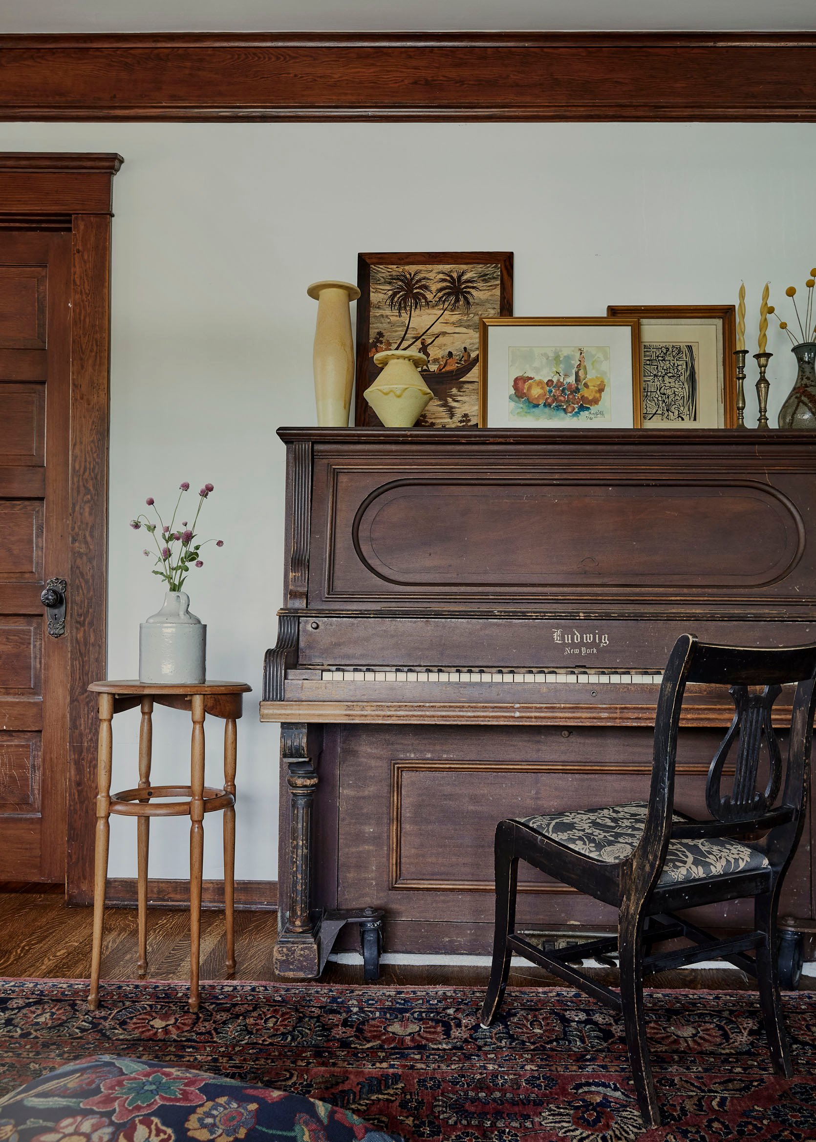
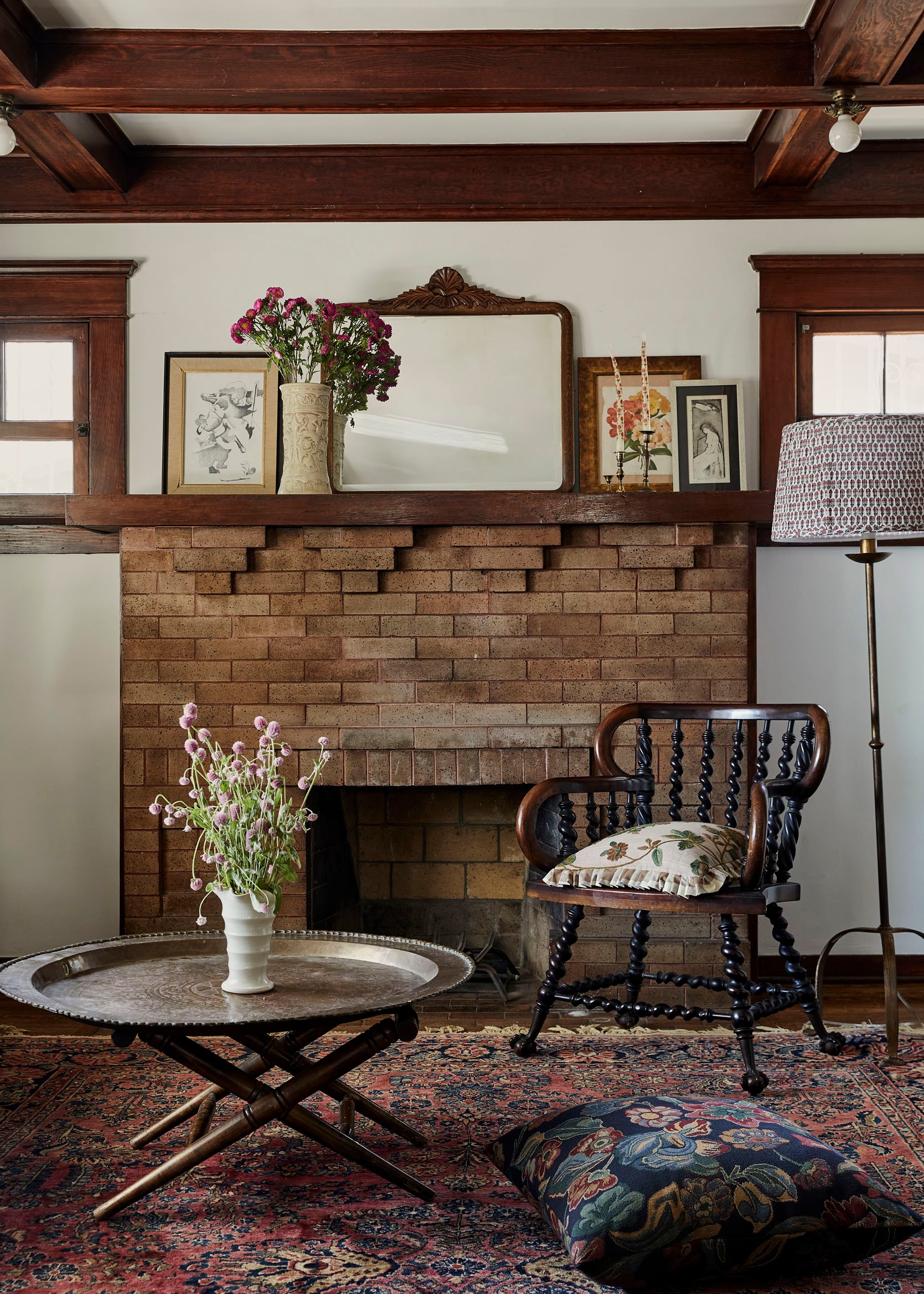
Another pillar of this look is vintage decor and florals. When vintage pieces have decorative elements in darker metals and wood tones it adds a cool playfulness. And of course florals, whether in textiles, art, or actual real flowers, also add a needed energy/joyfulness for a moody space.
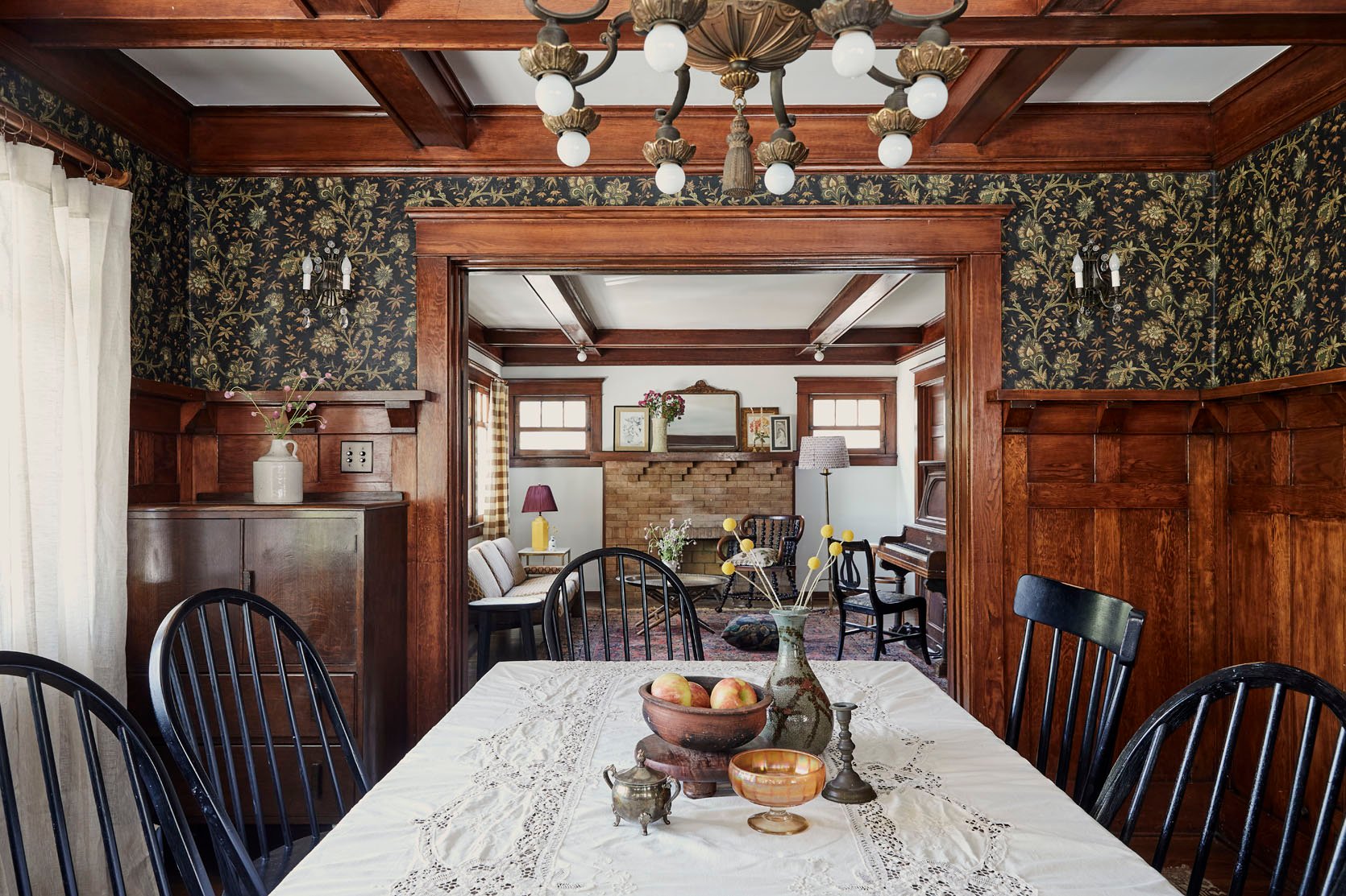
Speaking of florals, this wallpaper by House of Hackney was a really important element to Jamie because it was meant to be a connector to the kitchen in terms of style and colors. She presented a few wallpapers in connection with a kitchen palette and this was the one they all decided on.
Clearly, a beautiful choice. What I also love is the use of a light (but not bright white) linen curtain and a vintage warm white tablecloth. It gently lightens the space to keep the vibe cozy and not too dark.
Chandelier (vintage)
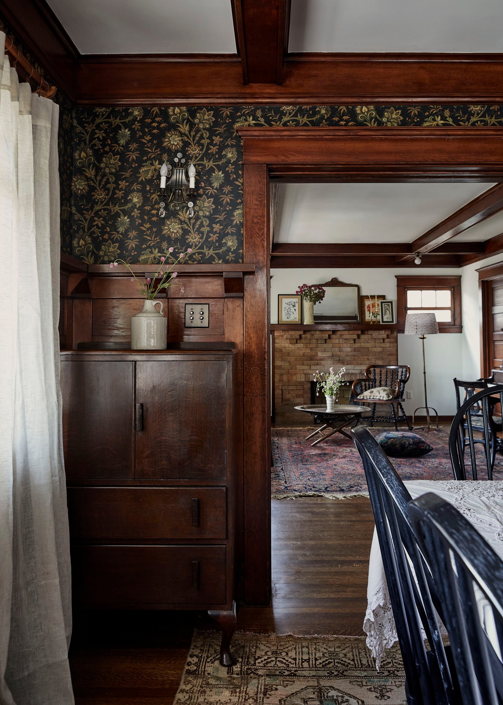
Here’s a better view of how the light linens highlight the light tones in the rug and the wallpaper. And what is always important to remember when designing a vintage space is to still incorporate modern decor pieces to help visual balance. They also just add an inherent freshness. You can see that in action with those modern vases that have been placed on the back built-in. Contrast is always important:)
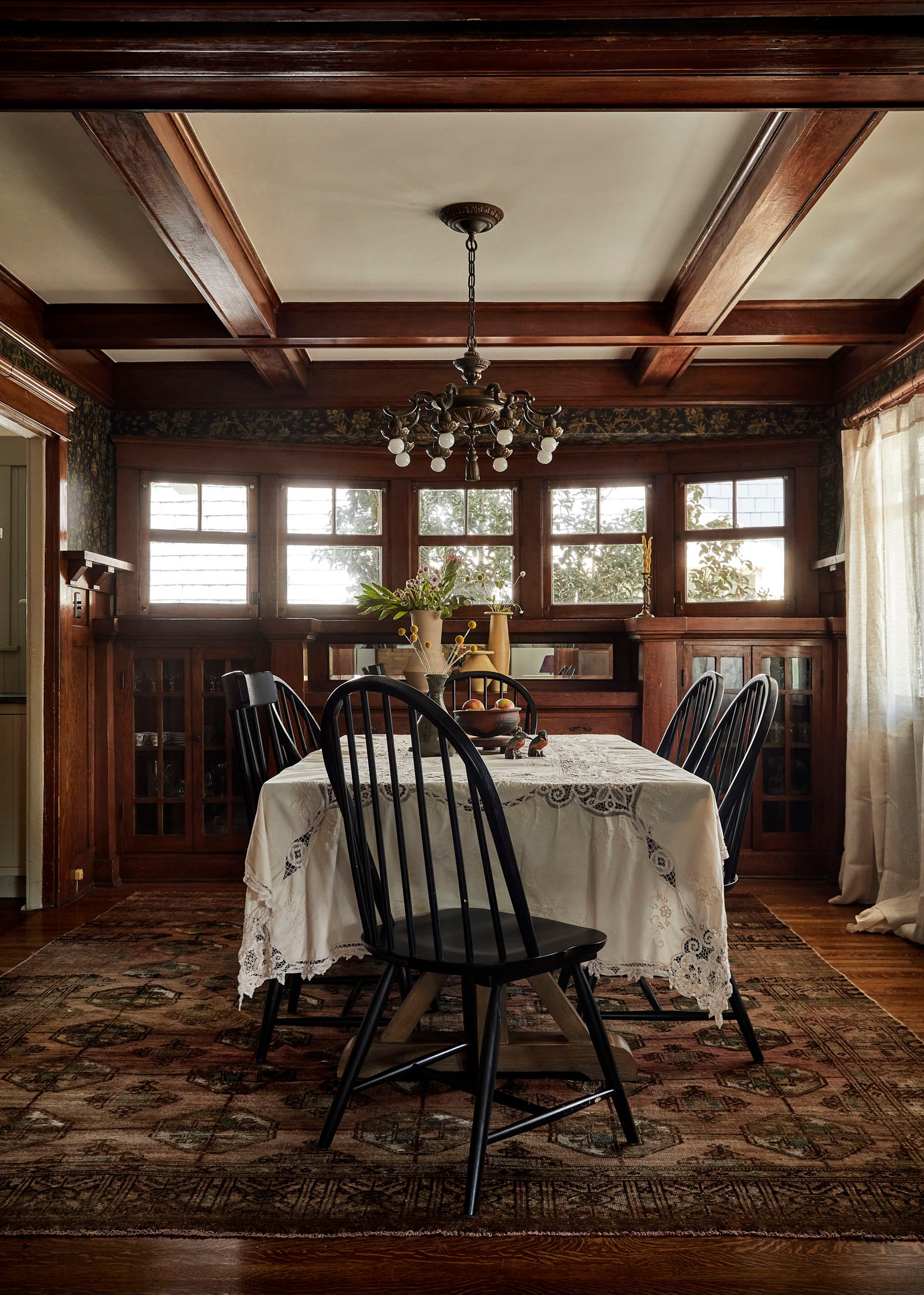
I had to include this shot because just look at all that original woodwork. It’s so stunning!!
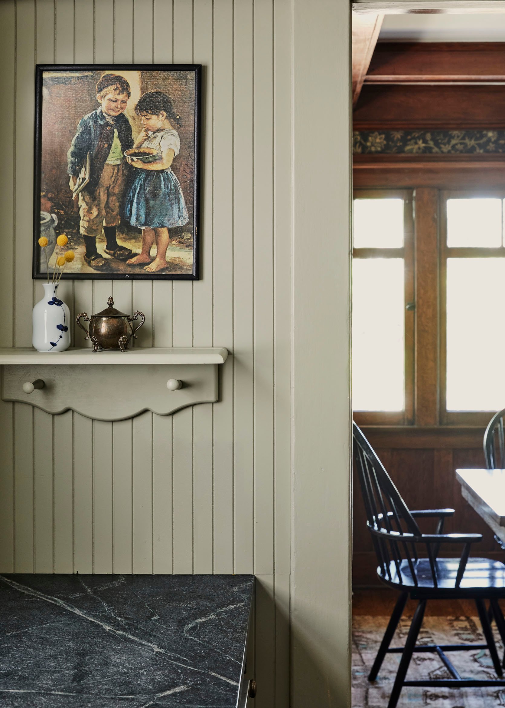
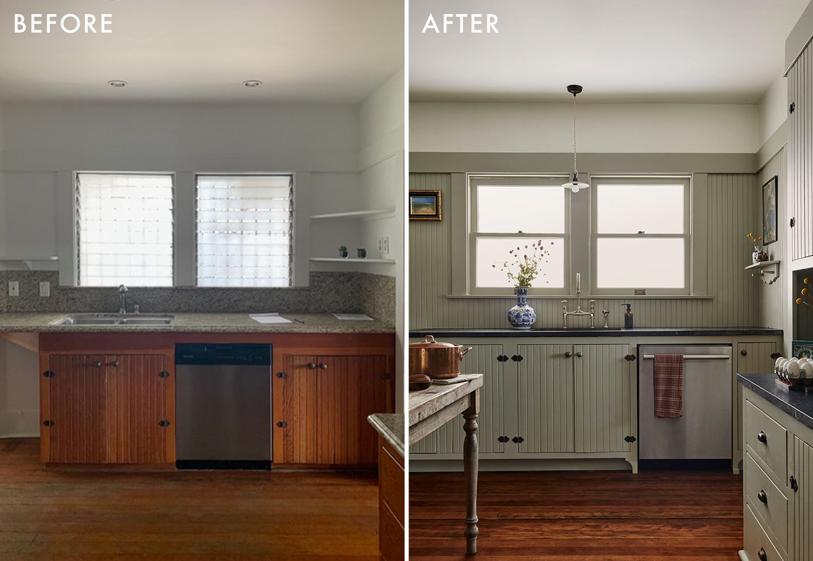
But now it’s time to talk about this home’s beautiful kitchen renovation…
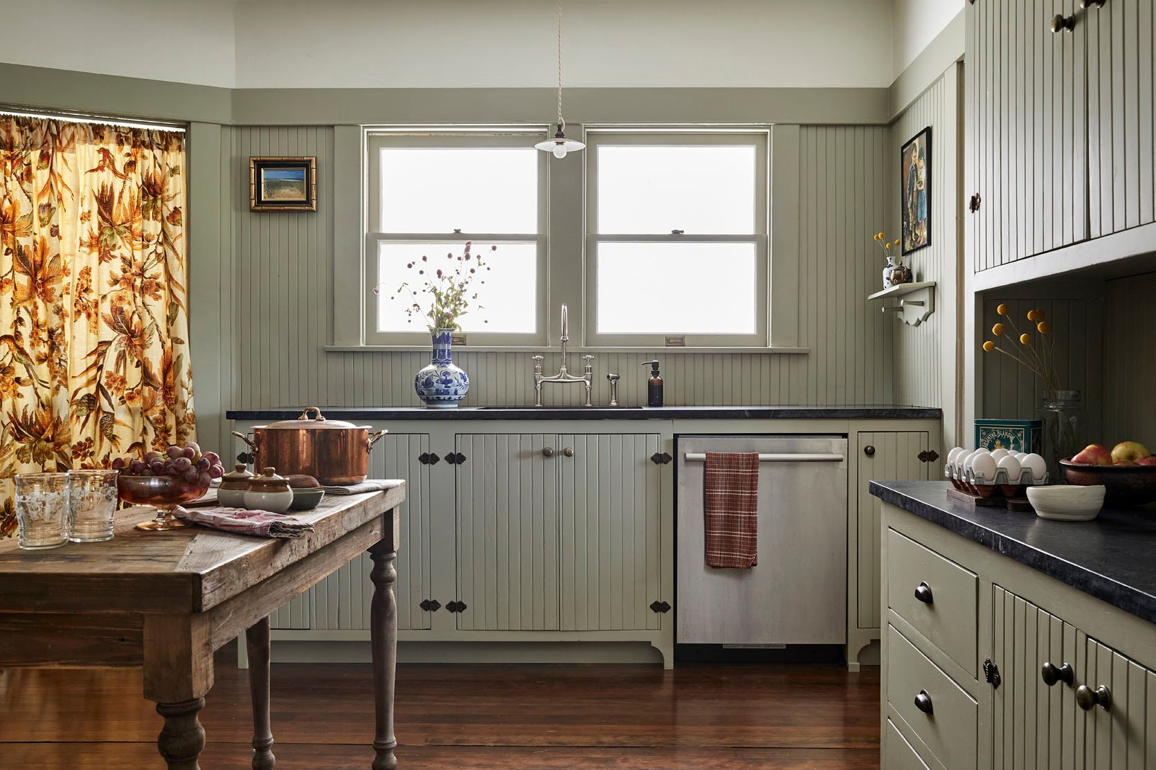
Cabinet Color | Pendant | Faucet | Countertop Material (soapstone)
Jamie: “For the kitchen, there were a couple of original cabinets in the room, and we knew we wanted to use that as a North Star. I also wanted there to be a color relationship between the dining room and kitchen. I wanted the glimpse of the kitchen at the dining table to have a connection to a wallpaper we would use in there. I wanted the home to tell a story as you went room to room.”
The original cabinetry she spoke of is that large built-in. Its specialness remained intact because of all the love and care that was put into it. Jamie explained what it took to bring this beauty back to life:
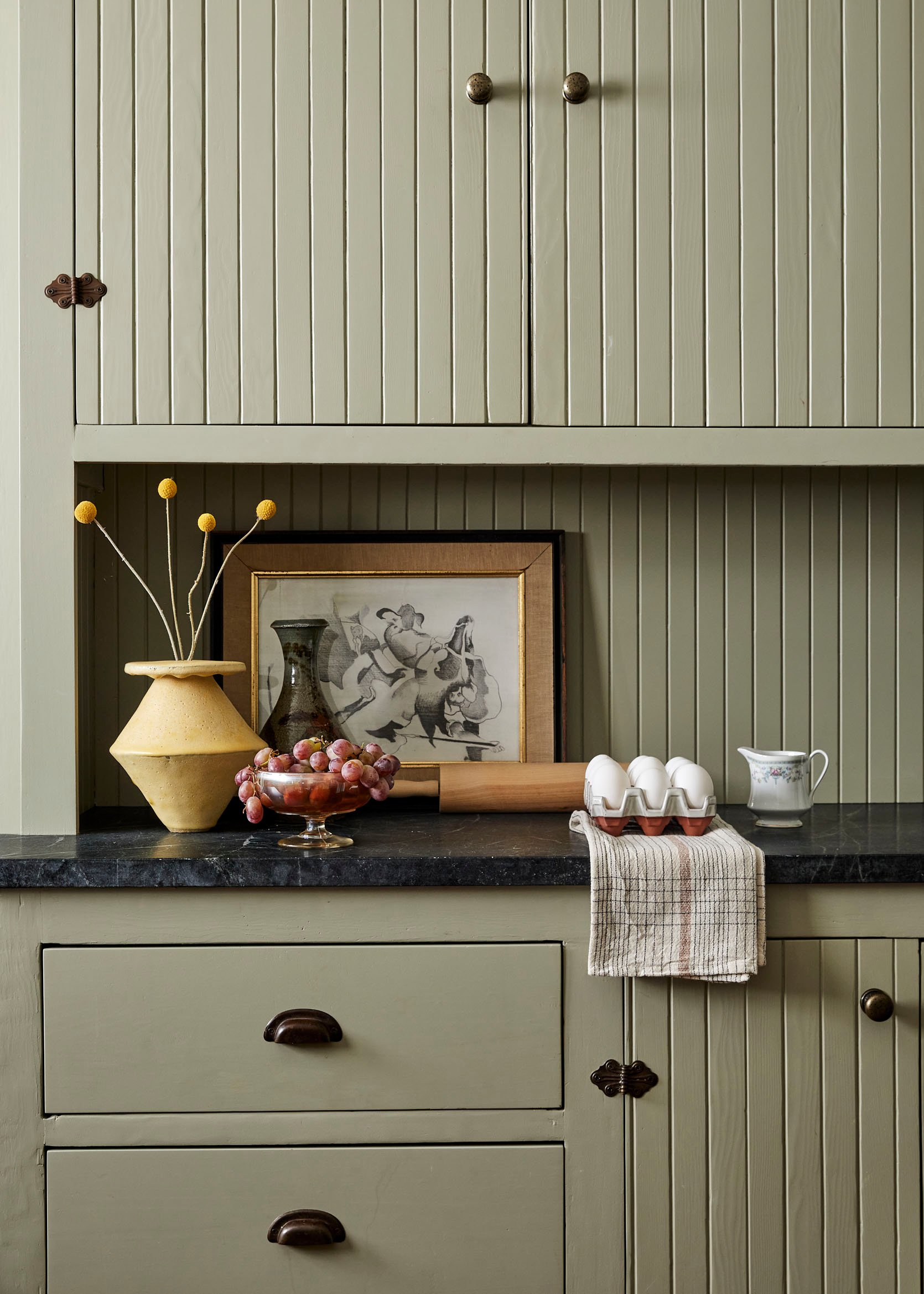
Jamie: “The kitchen had a few original cabinets in the space, however the only one worth keeping was the large built-in armoire. It was a little low and we had the box drawers rebuilt so they had a smooth and soft close. So many times it’s the heavy clunky drawers that kill a vintage piece. We corrected that here. We also added stone and wainscot to the piece to tie it into the kitchen flow.”
This would be my dream for my kitchen cabinets. I love the way they look but they are so heavy, overpainted, and hard to open. While this is not an affordable thing to do, if you have a vintage home and can afford to do this, it will only extend the kitchen’s longevity.
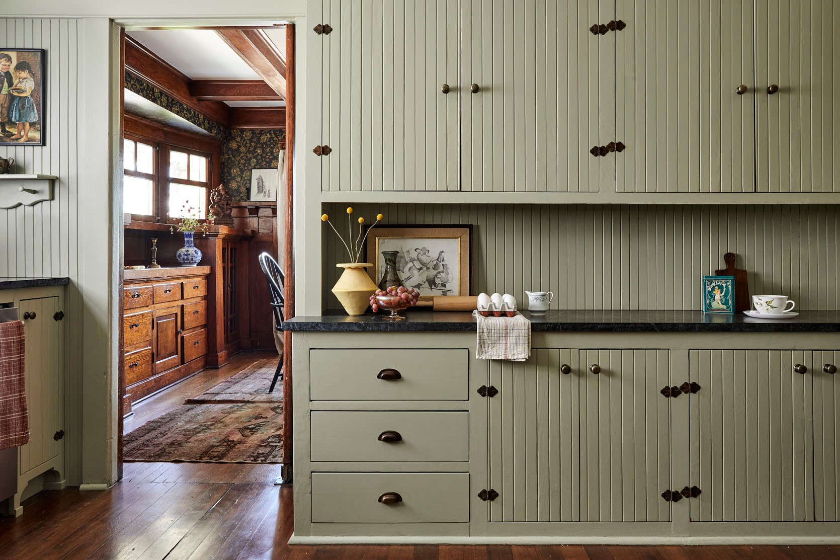
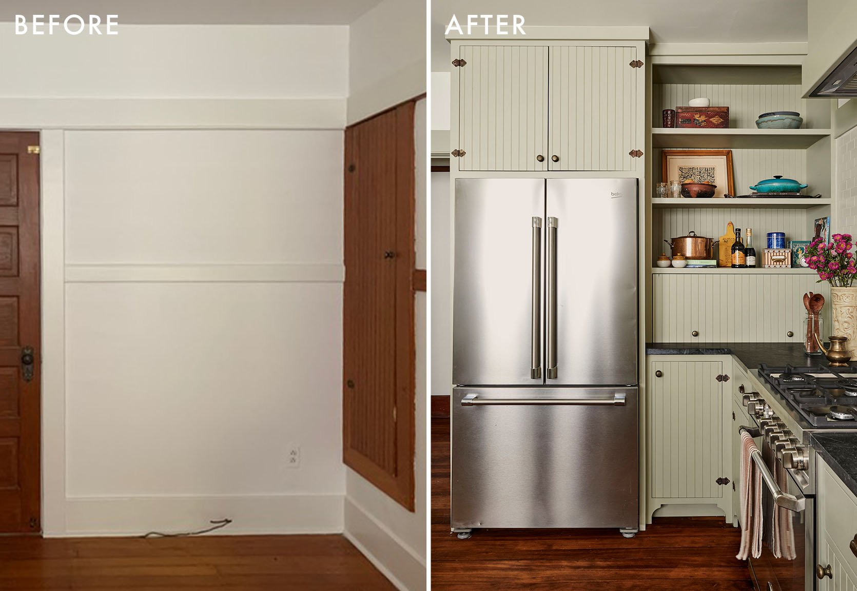
But wait, the other cabinets aren’t original too? NOPE! The time and care that went into this project makes my heart so happy. Here’s how she made the new cabinets look cohesive:
Jamie: “We did reuse the original doors from the cabinets we decided to not keep. We recut them into new doors in a new box configuration at the sink. We essentially remade new boxes for an improved layout, used all the doors and original pieces we could, and then fabricated matching doors as needed. You can’t really tell the difference between the old and new at this point.”
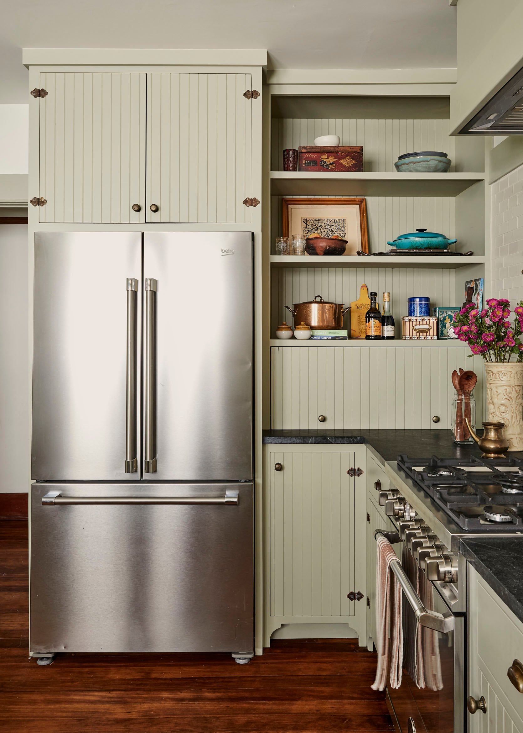
One thing I was curious about was if they talked about integrating the appliances, mainly the fridge and dishwasher. It’s no secret that it’s a VERY popular thing to do when getting to renovate a kitchen. But Jamie had a case against it and I agree:
Jamie: “There is something beautiful and industrial about seeing the stainless steel in such a painted and paneled room, I liked having the appliances be present and not hidden.”
I also wanted to know more about those sweet toe kicks. Creating a thoughtful toe kick is such an impactful way to bring character and uniqueness. I was curious why Jamie decided against matching the base of the built-in with the new cabinets. Here’s what she said:
Jamie: “I wanted something playful incorporated into the space so incorporating the beautiful toe kick was a way to add femininity to the space. The shape balanced out the utilitarian feel of the tongue and groove.”
That’s such a good point! Those curves are a beautiful contrast to all of the straight lines in the space.
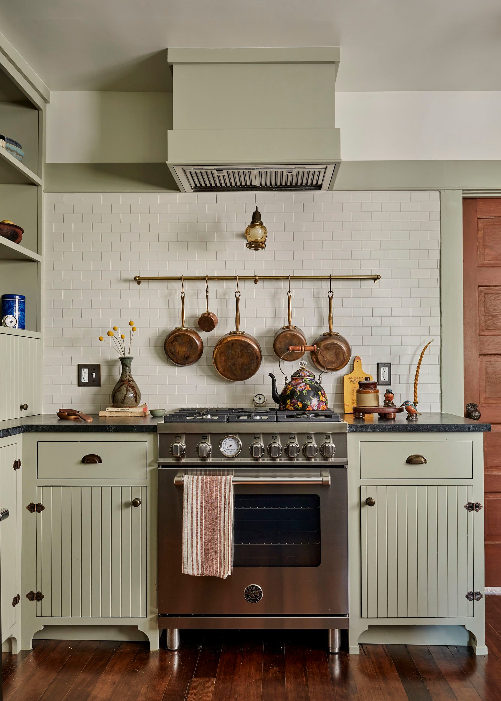
Fun fact about that sconce – From Jamie: “We looked at probably 100 sconces for over the stove before landing on this one. It was actually a combination of two different sconces, both vintage from the era of the home. You would not believe how many months we discussed this sconce. It’s a good thing sourcing vintage lights is one of my favorite things to do.”
Knobs (similar)
You can also see how she incorporated some other curves with that little peg rail shelf and original hardware (well, as much of the original as possible). This is when having a client that cares about a vintage home restoration as much as you do comes in handy…
Jamie: “Half of the hardware was there, original, and half were matched. We had a few knobs and some beautiful butterfly hinges. My client actually took it as her project to source almost identical hardware. I think there were many nights of eBay deep dives involved.”
Well, those late nights most definitely paid off. Now let’s talk about the bathroom.
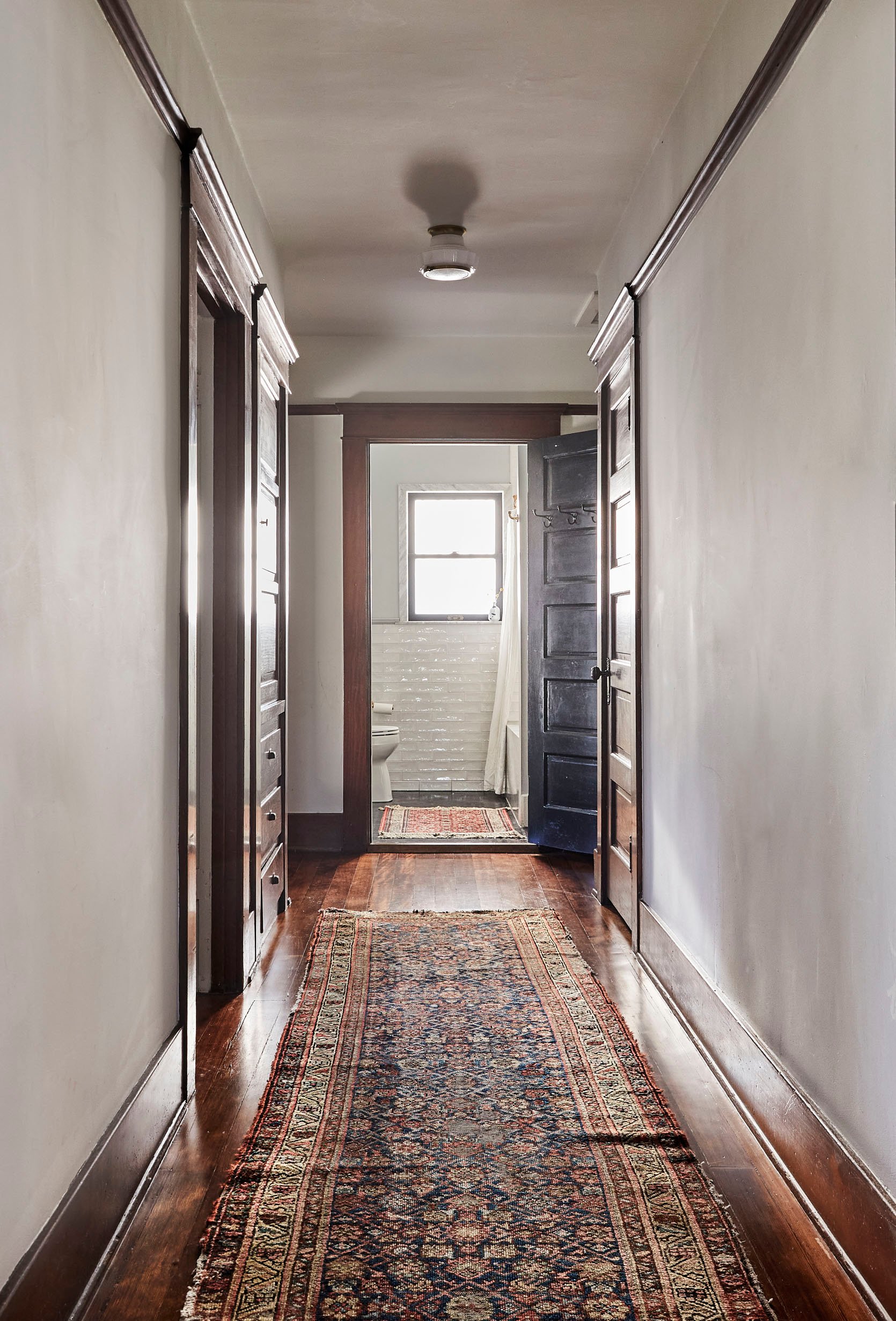
So I don’t know the state it was in pre-renovation but I can guarantee a masterful upgrade. Now that you’ve had a sneak peek let’s dive on in…
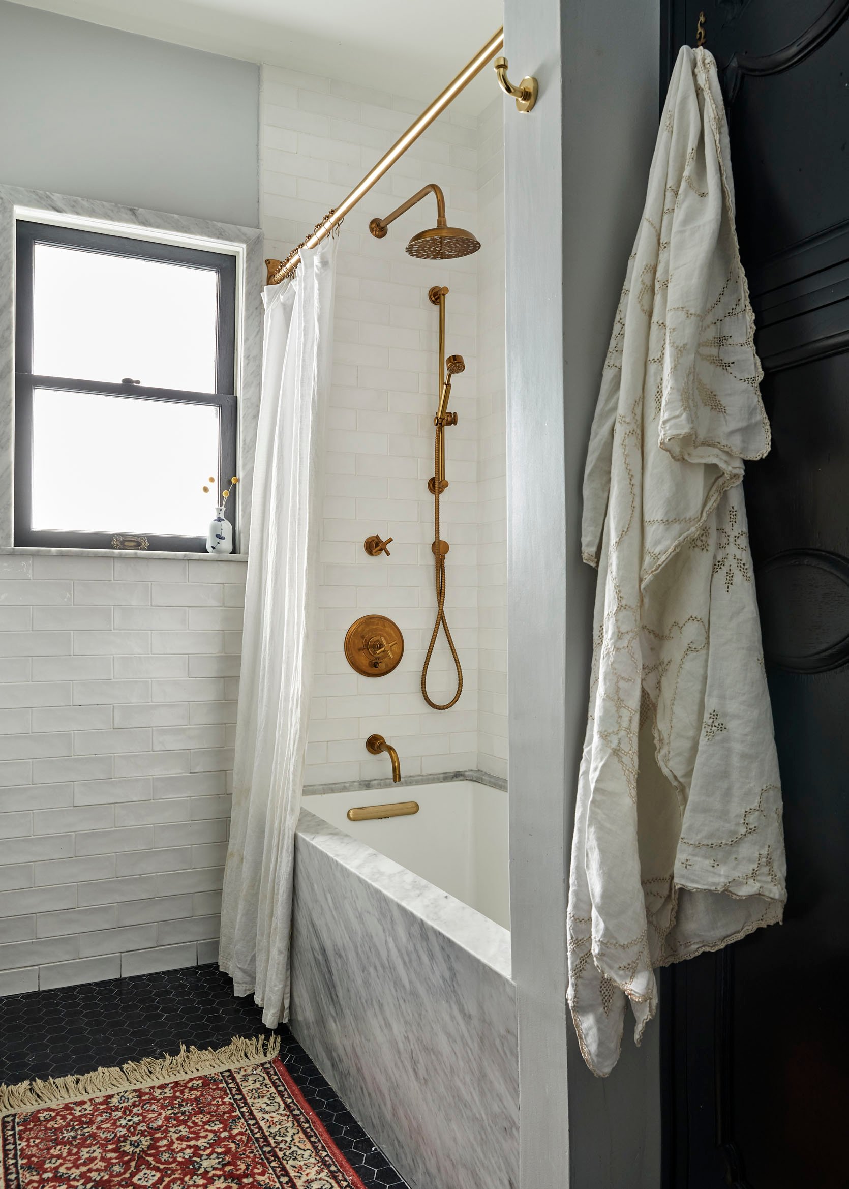
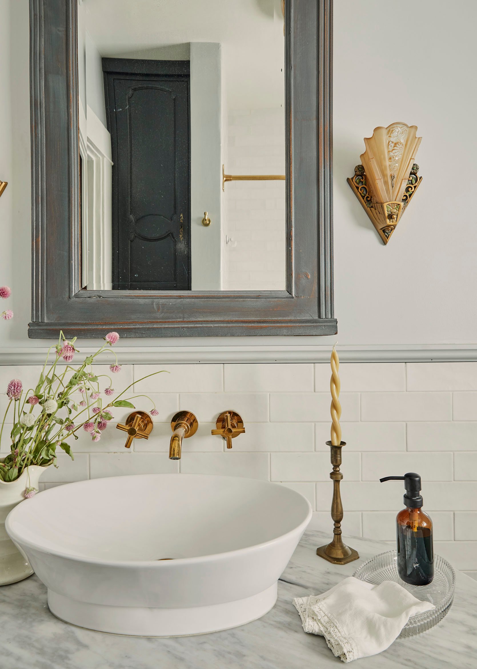
As Sara and Bowser will agree, the white subway and black hex tile mix is a classic. However, this white subway tile is a little extra special given that it has that beautiful tumbled look we all love. Also, the small scale size of the black hex makes it feel more original and vintage.
However, what I really wanted to talk about with Jamie was the marble window trim. While technically on trend, this is a modern use of a classic material – meaning it’s going to age beautifully with this home. When I asked why they decided to go for it this was her answer:
Jamie: “It was a solution to a problem. The window extended into the shower area a bit and the marble was used as a casing and sill so that it wouldn’t be damaged by water overspray. It came out so pretty and I ended up loving the detail.”
What a gift!! While I don’t know the cost of doing a stone trim, if you have excess pieces from a counter or want to buy offcuts from a stone yard, I think it’s worth asking. Such a pretty detail.
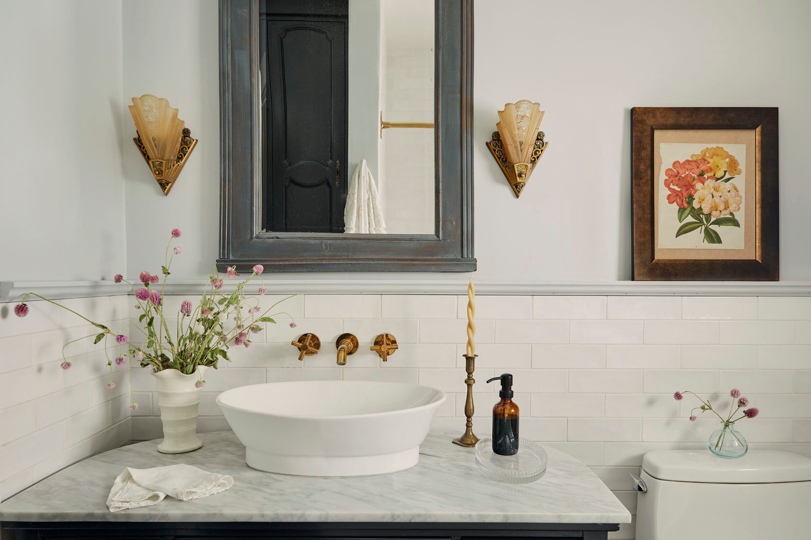
Another pretty detail? This vintage vanity.
From Jamie: “We wanted to use a vintage piece of furniture for the bathroom vanity. There is a beautiful curved shape to this one. It was a 1960’s secretary. Not of the era, but beautiful lines are beautiful lines.”
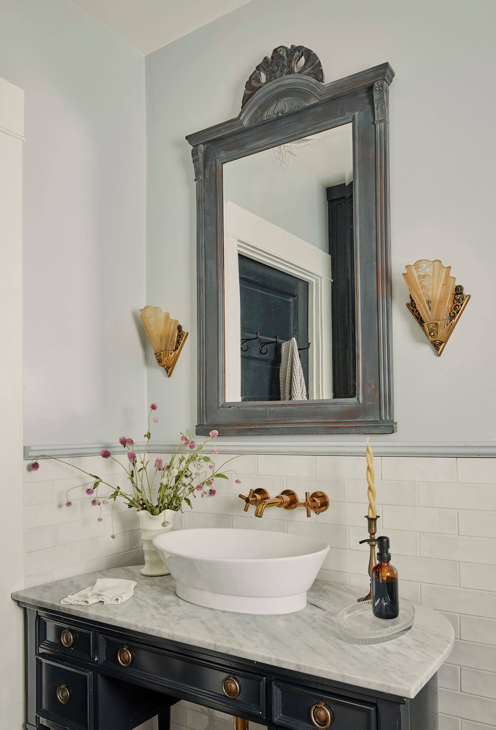
If you know us, we are very ok with mixing vintage eras if it feels right and this vanity feels right in here. All the vintage touches in this bathroom make it impossible not to love.
Bed | Velvet Curtains | Linen Curtains | Shams (no longer available)
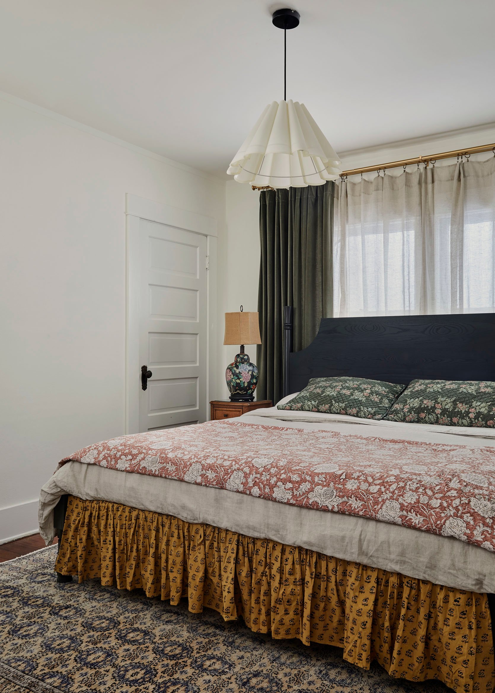
To finish off this wonderful home tour, we have this wonderful bedroom. I believe this room just got a decor upgrade but man is it a good one and there are a lot of great style tips to grab!
I think this room is a great example of “happy moody”. The walls are light and soft while the furniture is dark and the textiles are colorful but a little muted. Then for added “happiness” there are florals galore!
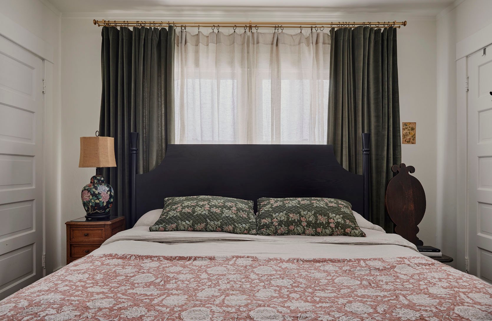
As someone who also mixed vintage nightstands in a bedroom design, I love the playful shapes and how they are both dark but not the same color (ps I’m in LOVE with that chair). Then mixed with the black wood bed, your eye is able to bounce around the different dark tones and shapes without getting visually overwhelmed.
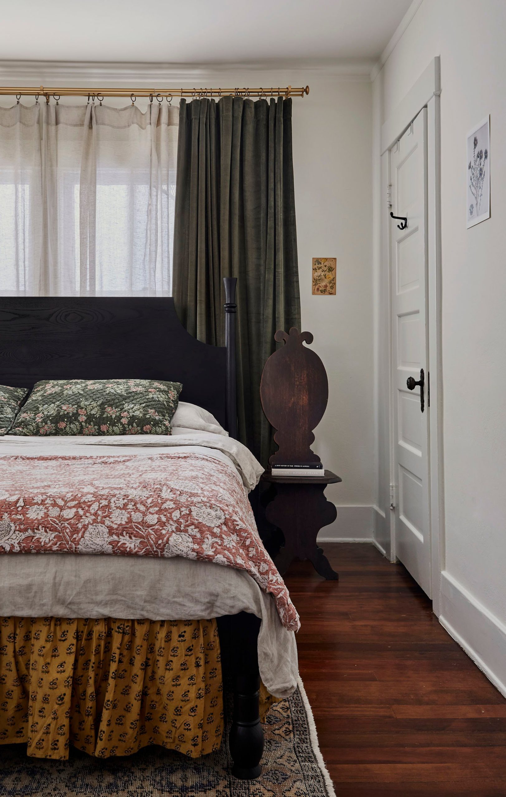
For the linens, this color palette is so pretty and the pattern scales all vary perfectly. They also work so well together because that solid light duvet keeps the patterns from touching which also gives your eye a chance to take it all in. As for the rug, choosing this one that hones in on the neutral colors of the room as well as ties in the green of the curtain makes the whole space feel wonderfully grounded.
In case you couldn’t tell, I love this home and how Jamie cared so deeply for it through her thoughtful design. When I asked if there were any specific challenges on this project this is what she said:
Jamie: “It went pretty smoothly. I would say that old homes aren’t straightforward. Figuring out which elevation of the wall to use where those cabinets and closets were was tricky. Communicating the slightly complicated cabinet design, using old original doors as material isn’t what cabinet makers are used to so it can be challenging to get people to work outside of their comfort zones. But they killed it! They did an amazing job and it was also refreshing to know we reused so much of what was original in the home.”
They completely killed it and goes to show how much time and expertise goes into a kitchen restoration like this. I hope all of your design tanks are full for today and if “Happy Moody” is your design style and you were needing some inspiration I also hope this helped! If you don’t already follow Jamie you are missing out. Before I leave you here are some before and afters of the kitchen:)
In case you were also wondering what was that small door on the right used for…
Jamie: “There was some storage of various depths along that wall, some extremely deep, think an overly deep boom closet, and some extremely shallow. There is a hall closet on the other side of the wall, as well as an office. Some of the space was given back to the hall closet so it wouldn’t be dead space.”
Ok, now I’m done:)
Love you, mean it.
*Design by Jamie Haller
**Photos by Jenna Peffley
THIS POST WAS ORIGINALLY PUBLISHED HERE.
