Today, we have for you a makeover for a friend who likes to play it safe and ran out of design steam – both reactions I have felt in the past (that have spawned regret). Kaitlin Green is our photographer in Portland who I’ve become close with so when Article reached out for another makeover, we were brainstorming about empty room candidates on set and she raised her hand REALLY, REALLY HIGH. She and her family had recently remodeled but ran out of steam/resources on the basement so it was a fresh empty white box with old furniture and no design direction. I knew that they had good taste and would hand over some creative freedoms (mostly :)). Plus I could easily relate to their situation – two kids, busy jobs, needing a media room that was kid/dog-friendly that they would actually like to hang out in. I got you, Kaitlin. I got you.
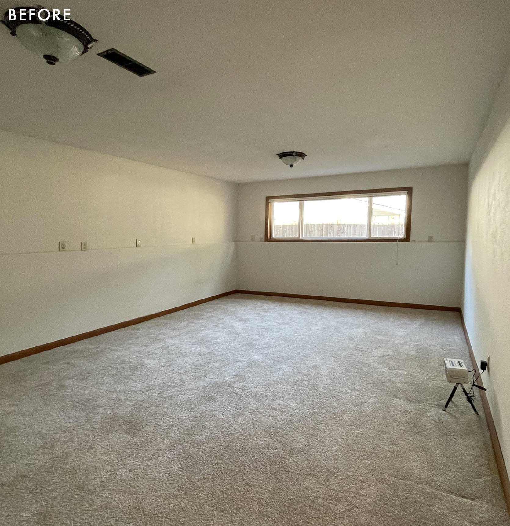
Here it is before they remodeled and added the wood flooring. It has one east-facing window, but otherwise just a box with a foundation that came up half the wall.
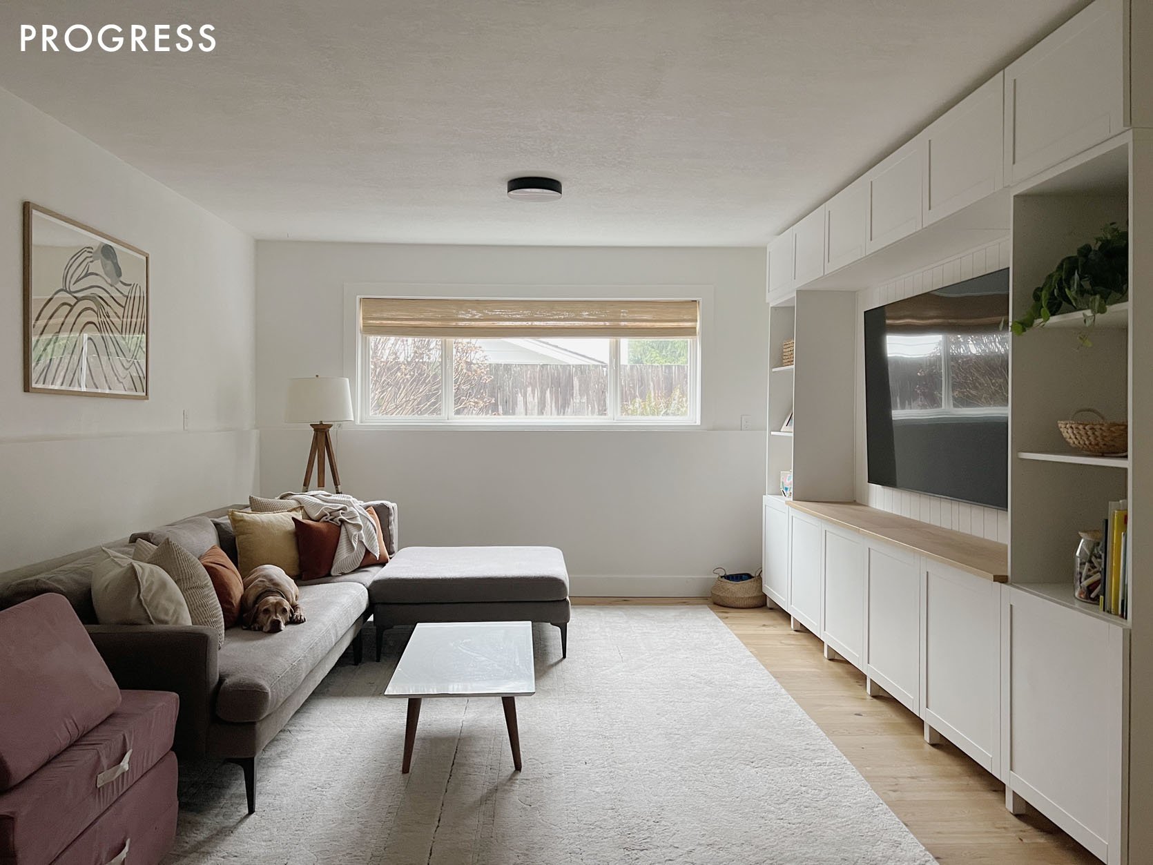
Before I met them they put their old sofa downstairs and had this IKEA cabinetry put in.
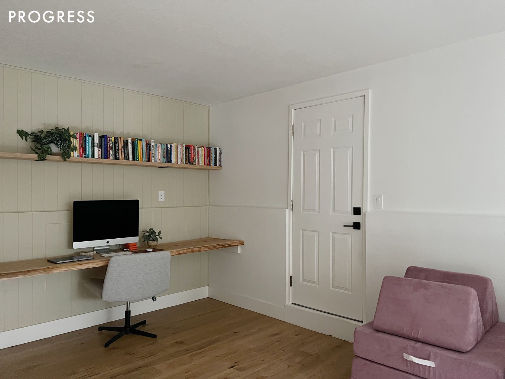
They had installed the desk and shelf, and it’s where Kaitlin did all of her editing after the kids went down (she would also watch Love is Blind on a laptop next to her monitor where she edits). In other words, this room was used mostly for TV/movie watching with the kids and editing for her – AKA all dark room compatible activities.
On Handing Over The Reins
We had six weeks to do this project and the “before” was totally fine, obviously, but if given the opportunity to have a design brain and more resources on the room she was happy to hand over the reins. Well, kinda. Listen, it’s still their house and after a year of renovating while having a baby (and a 4-year-old), they were kinda done taking big design swings and generally liked to play it safe because they really really didn’t want to do something they would have to undo. They were scared. And of course, I can relate to that. But it’s a basement and you have a designer volunteering their experience to make it not just better, but potentially great! Let me do my thing! That was my spiel, anyway.
The Paneling
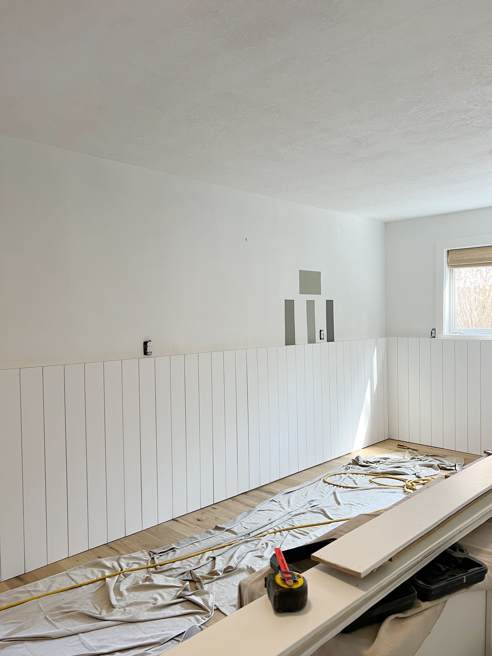
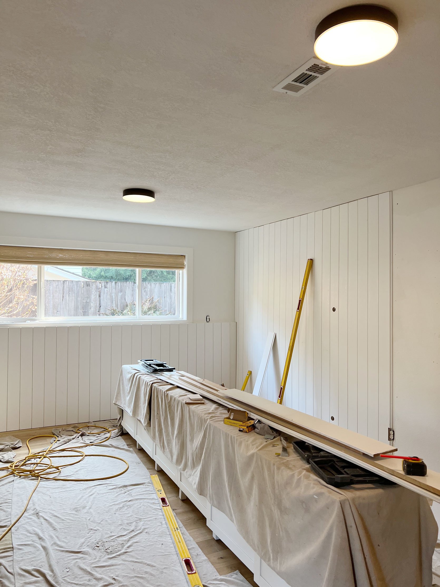
We knew we could just paint the drywall, but felt more confident that installing paneling would take it next level (and we were right). We reached out to Metrie to partner on the paneling – it’s a simple 1×6 V groove and it took two days to install (and cost around $3000 for installation, $900 to paint, plus $2k in traded materials). And yes, EHD covers these labor costs if it’s a sponsored makeover to make sure that we create beautiful backdrops for partnerships and not force people to pay for design elements they might not have done outside of a partnered makeover. Again, we had only about six weeks from beginning to reveal, which sounds fast (and it is) but y’all Article ships FAST. So it was actually totally doable.
I had a deal with Kaitlin that she would be my design assistant on this one and I tasked her with creating product boards of Article pieces that would physically fit in the basement and obviously be their preference (instead of me guessing). She sent through two boards for me to choose from:
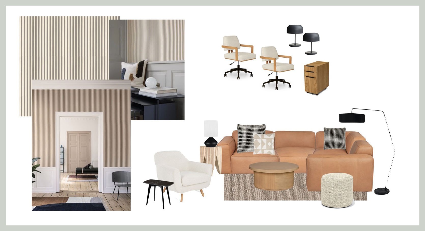
Sectional | Grid Pillow | Geometric Pillow | Coffee Table | Pouf | Floor Lamp | Light Wood Side Table | Table Lamp | Accent Chair | Black Marble Side Table | Office Chair | File Cabinet | All Black Table Lamp
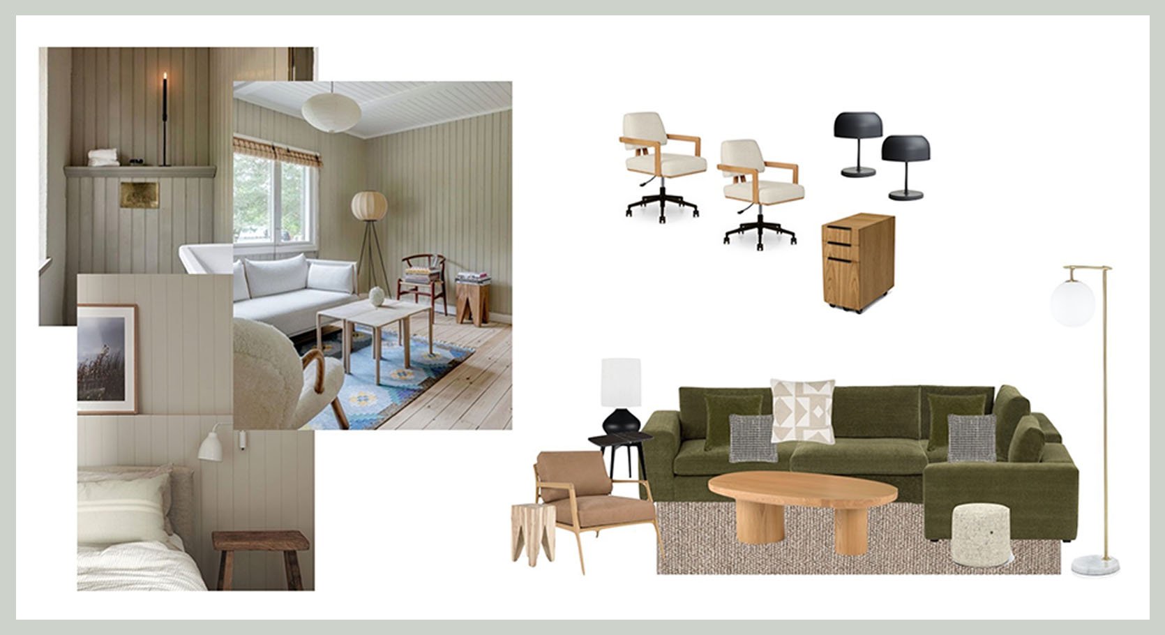
Sectional | Grid Pillow | Geometric Pillow | Black Marble Side Table | Table Lamp | Coffee Table | Rug | Pouf | Accent Chair | Wood Side Table | Floor Lamp | Office Chair | File Cabinet | All Black Table Lamp
They were both great, but I had a strong preference based on my personal experience. Last summer I myself got this Article sectional at the Mountain House right when it launched and couldn’t believe how comfortable, soft, cozy, and beautiful it was – all the things. I said to Kaitlin (and I quote), “As your friend I’m going to insist that you get the Beta in green, not the leather. I can’t let you not get this sectional”. We all love the look of leather and it of course wears well, but no, it’s just not as cozy as a velvety corduroy. I think she was initially bummed to not have the beauty of the leather but likely relieved to have someone with sofa experience literally INSIST on one thing over another. Let’s just say their whole family knows we made the right choice.
THE REVEAL!!!!
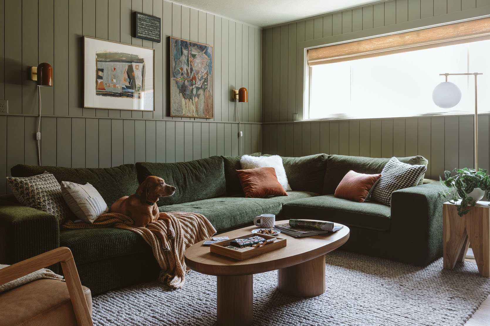
My friends, I am happy to report that my pushiness totally paid off and this room SINGS – in such a low, cozy, baritone kinda way. You walk down into the basement and with the sectional and the walls being monochromatic, the vibe is so strong, mellow, and extremely good.
The Beta Sectional
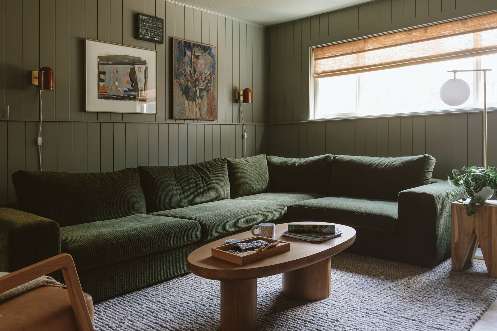
Sectional | Sconces | Coffee Table | Rug | Side Table | Floor Lamp
There are days when I’m jealous this isn’t the sectional in our living room and I wonder if I’m going to regret my choice – that’s how much I love this sectional. Is Article paying for this post and makeover? Yes, but if I There are days when I’m jealous this isn’t the sectional in our living room and I wonder if I’m going to regret my choice – that’s how much I love this sectional. Is Article paying for this post and makeover? Yes, but if I didn’t love it so much I would tell you my thoughts and show you the pretty photos. The reason that I’m harping on this so much is that buying what looks like comfortable and good-looking sofas online is so scary because you truly can’t trust the quality/look and comfort without experiencing your own butt on the cushions. So I will hereby swear on my children that this is one of if not the best cozy sectionals I have ever owned and sat on. The cushions are filled with some magic powder/foam that has give but remains in shape with the right amount of bounceback. Granted that we’ve only had ours for less than a year (and Kaitlin less than a month), so I can’t speak to longevity here. But having owned other Article furniture (remember this from the Glendale house?) for years, I have enough experience in the quality they bring to their offerings that I can extend that confidence to this sectional, too. Oh and the comfort is at 100%.
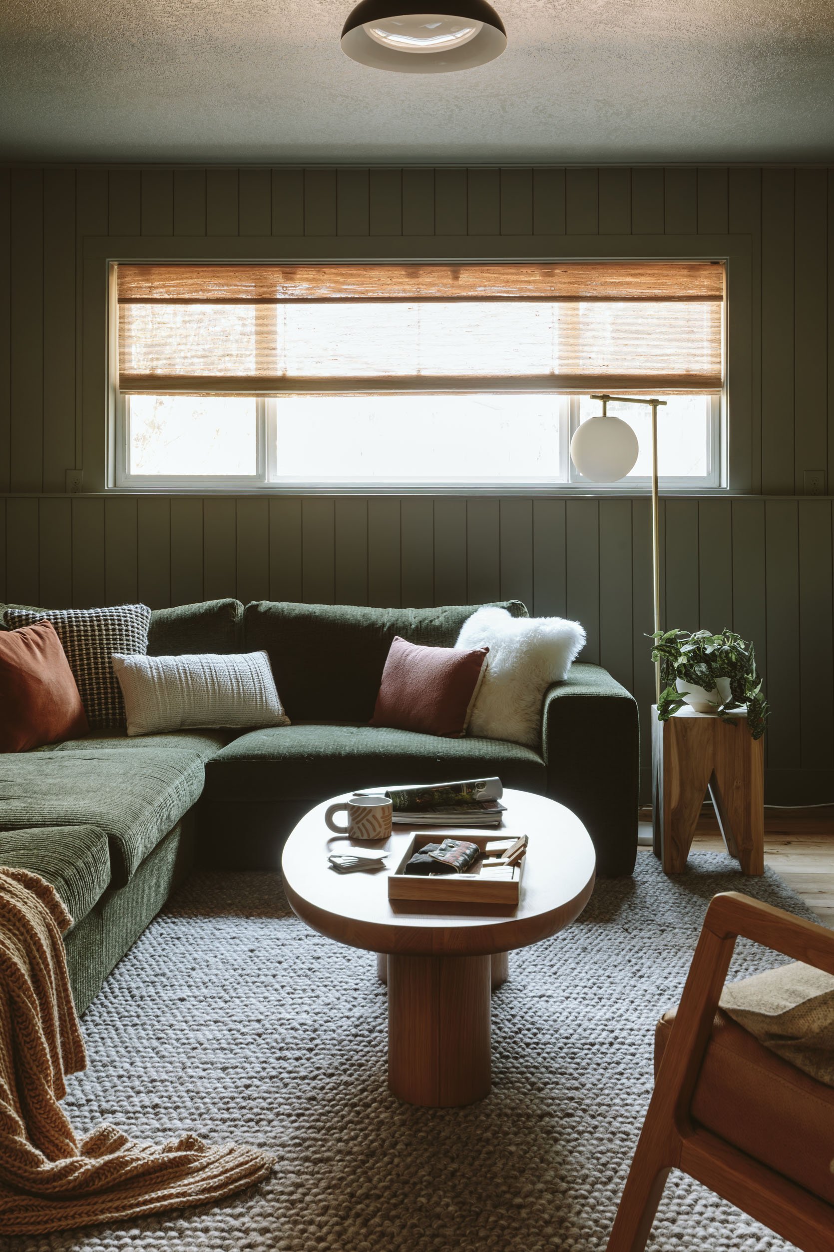
The shape/style is great for a low 70s-style sectional, for sure, and might not work in every living room should you want it more formal or sculptural (that was my conundrum). But what makes it more special than other 70s-style sofas IMHO is the wide whale corduroy fabric that reflects the light so beautifully (same as in the mountain house – it looks ethereal when the natural light hits it). It’s far prettier and more high-end than what a linen would look like. So with the corduroy, you get a slight pattern (tiny tonal stripe), texture (varying heights of velvet), a fabric that reflects the light, AND the softness of mother-loving velvet!!!!! I’ve been trying to find a good corduroy for other pieces of furniture ever since we got this sofa (in blue) at the mountain house. It’s obviously going to make a comeback.
Another feature of this sectional is that it’s completely modular. The set up here is comprised of a few different pieces from the Beta collection to create the perfect configuration for this corner. I love that you can order pre-built options or go a la carte and order pieces individually to make your ideal lounge-worthy piece.
I want to get to the rest of the Article elements but first the other star of the room…
The Dark Green Moody Paint Color
On Convincing My Friend (And Myself) To Trust Me Despite Having Made Paint Mistakes This Year…
After a year of paint fumbles in my own home, and subsequent repainting of those rooms, I was nervous, not fully trusting my own eye as I tried to pick the right color. Kaitlin has been along this paint mistake journey with me, shooting the house weekly, and has watched my extreme frustration as we have repainted many rooms. So I think neither of us 100% trusted me, which is why we really belabored this “not as safe” darker color choice.
We knew that the color we picked needed to work effortlessly with the sofa color, so we basically brought a sofa cushion to the paint store and held it up against as many different greens as possible. We were open to other colors as long as it looked good with our star piece of furniture. That was non-negotiable. This is, AGAIN, why I believe in choosing the paint color last (should you be able to which often you can’t in a renovation) – there aren’t a million fabrics but there are so many paint colors that work with fabrics. So I tend to choose the furniture/decor first and then hone in on the exact shade of paint after. And so we did.
On Finding The Right Color/Tone
We came home with 3-4 that we felt OK about. But the fluorescent lights of the store, next to the extreme natural lights of the store windows was just not going to be accurate. You have to, I repeat HAVE TO try the color in your own room.
A quick anecdote about that – the Still Water dark blue/green that I chose for the family room looks rather bright teal in a brightly lit room. Even with the lights on it looks different. So we practically chose it in the dark with a lamp on because that’s when/how we were going to be in that room.
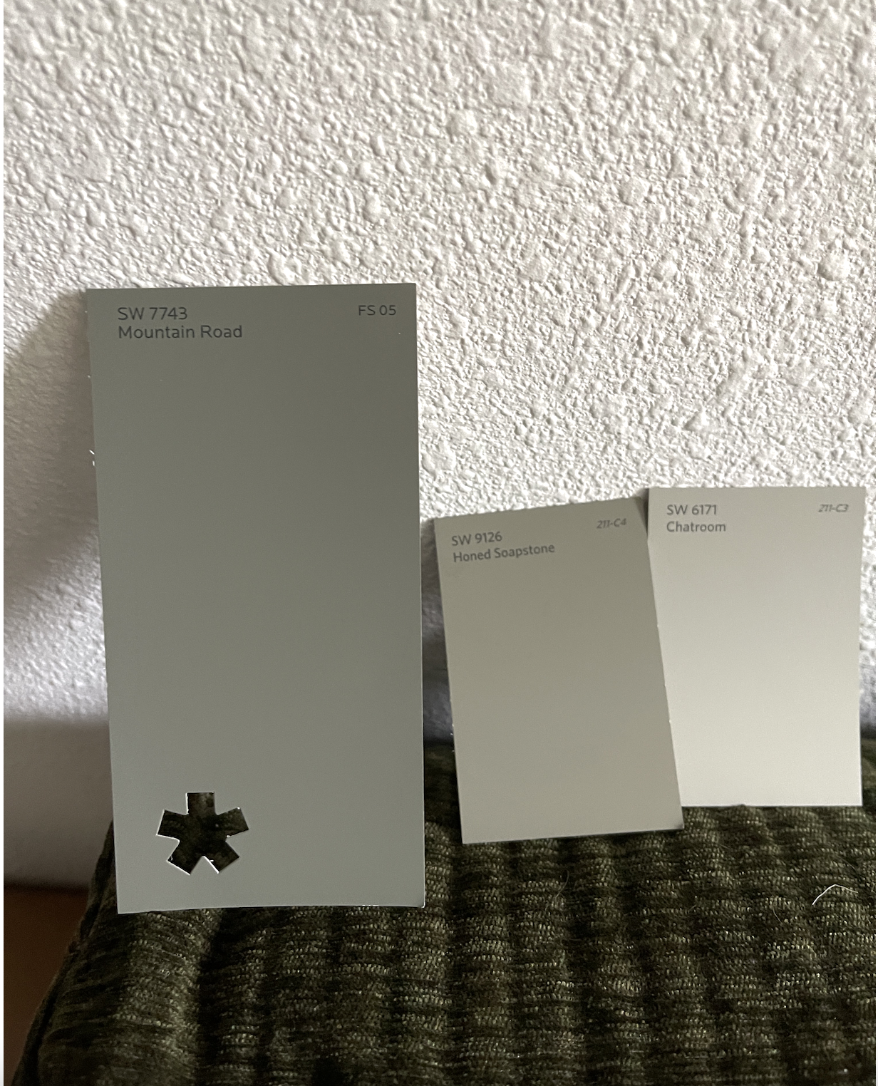
We loved the tone of Mountain Road with the sofa and in the space but they were SO NERVOUS, and so was I. Because of their hesitation, I made the safe call – let’s just paint the paneling white. The room looked fine in white, the green sectional would pop. White it would be!!!
Just as I was texting Kaitlin to confirm our safe color choice, she texted, “Corey and want to go dark. We promise. Let’s do dark”. I pushed back with a lot of, ‘”Are you sures?? Are you going to hate me if I’m wrong and it doesn’t look good? There are no guarantees with any paint color that once you get it on all four walls that you’ll love it”. They assured me that they knew the risk they were taking and that they agreed that this room would be a missed opportunity going white. I can’t wait to show you the rest of their house – they have great taste and a distinct Scandi + PWN vibe. We all felt as good about it as we could. We ordered the paint and I went on vacation.
So that’s the chapter of my memoir titled “The Journey to Get Myself and a Friend to Trust My Risky Paint Suggestion After a Year of Paint Missteps and Self-Doubt,” with the subtitle, “Why Making Mistakes, Analyzing the Hell Out of Them and Honing Your Eye Can Make You So Much Better at Your Job”. Alt title could be, “How Emily Got Her Paint Groove Back”.
Y’all, We NAILED This Paint Color
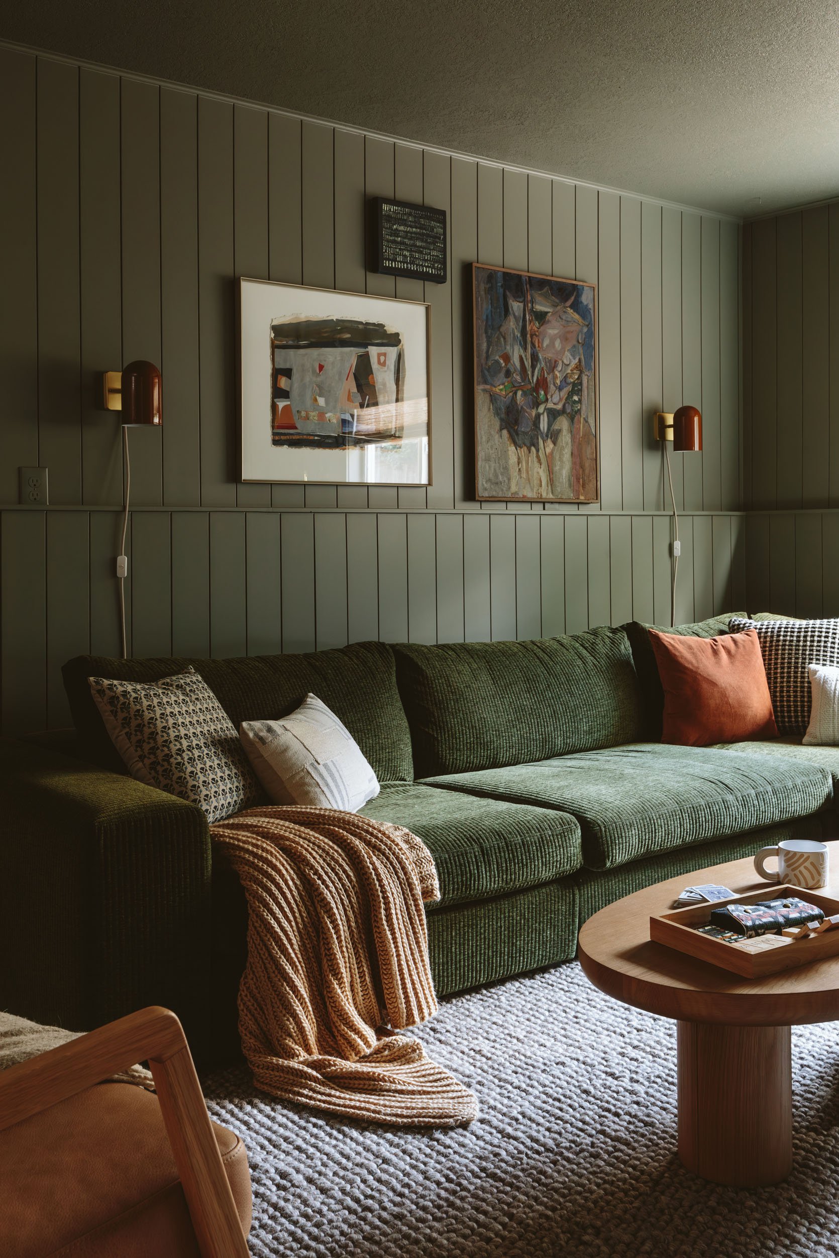
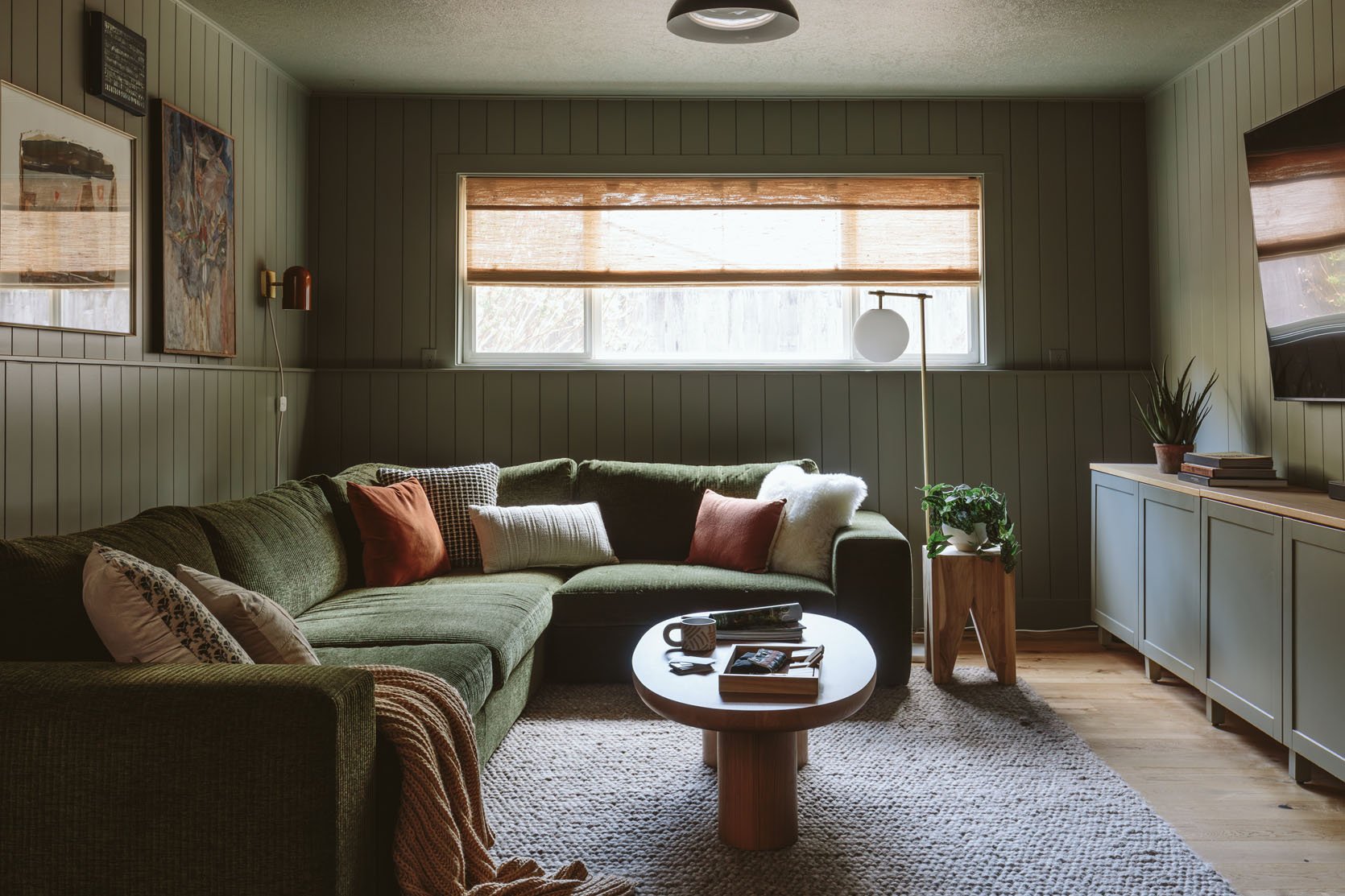
It’s just so pretty and with all that furniture??!!!!! It’s so good! You walk down into the basement and my goodness it’s so cozy and inviting. If I didn’t get grossed out by words like “delicious” I would use that word. It’s such a vibe. We brought in 100% Article furniture (they even had some pieces already) and with the help of some accessorizing, we pulled this room together. Remember one of the best things about Article is their speedy delivery – often within just a week or two and that was the only way we were going to get this done in time.
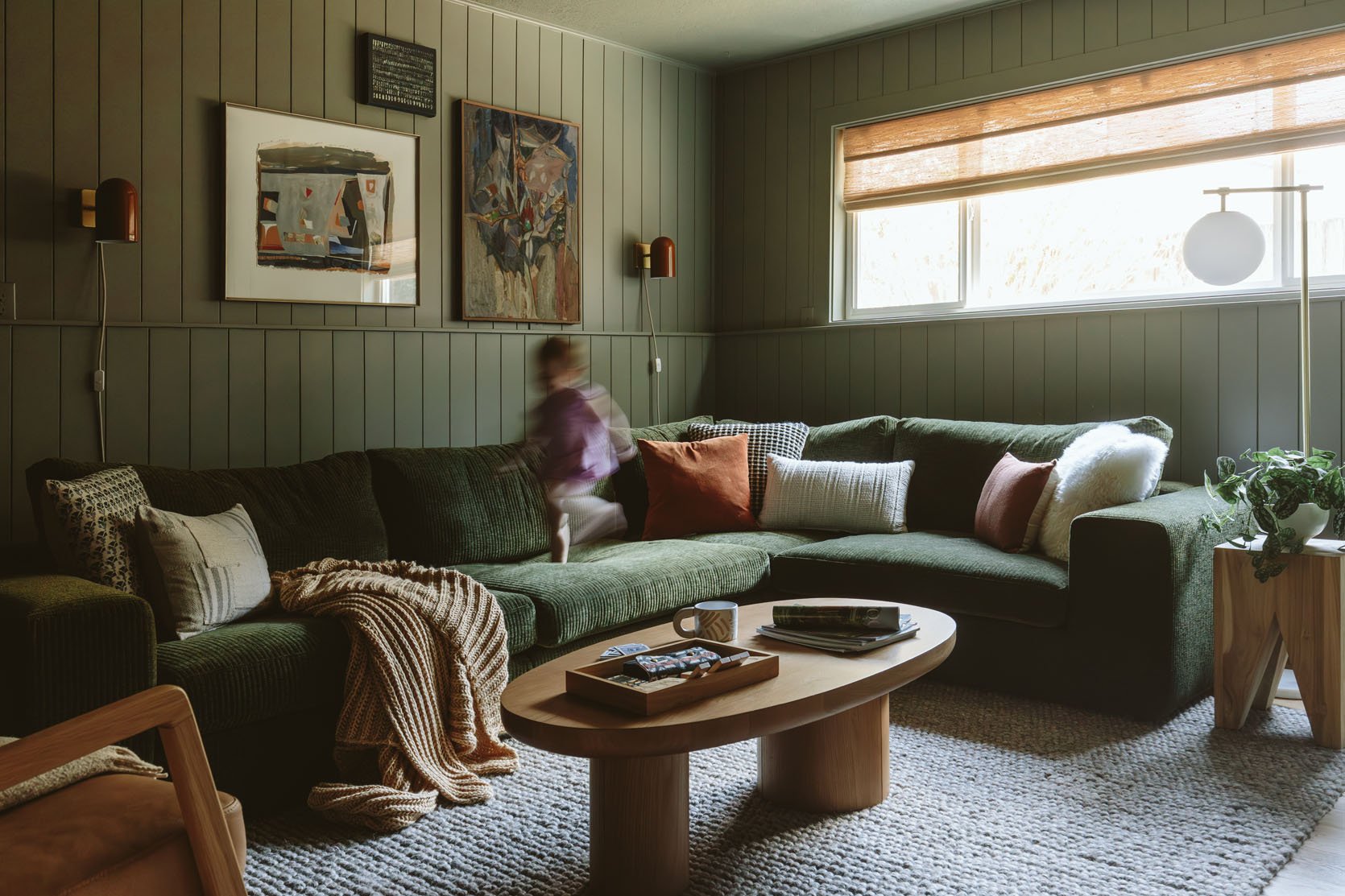
Throw Blanket | Far Right Pillows: Jaipur Floral Block Pillow + Gray and Ivory Patchwork Lumbar Pillow | Middle Pillows: Velvet Throw Pillow + Black/White Grid Pillow + Oversized Textural Woven Throw Pillow | Left Pillows: Oblong Boucle Color Blocked Throw Pillow + Sheepskin Pillow
Little almost 2-year-old Mara showing us the scale on the sectional 🙂 We went with a new favorite color palette of mine: Mostly green + some brown/earthy tones. It’s like a forest! And my goodness it works – especially for a cozy PNW basement.
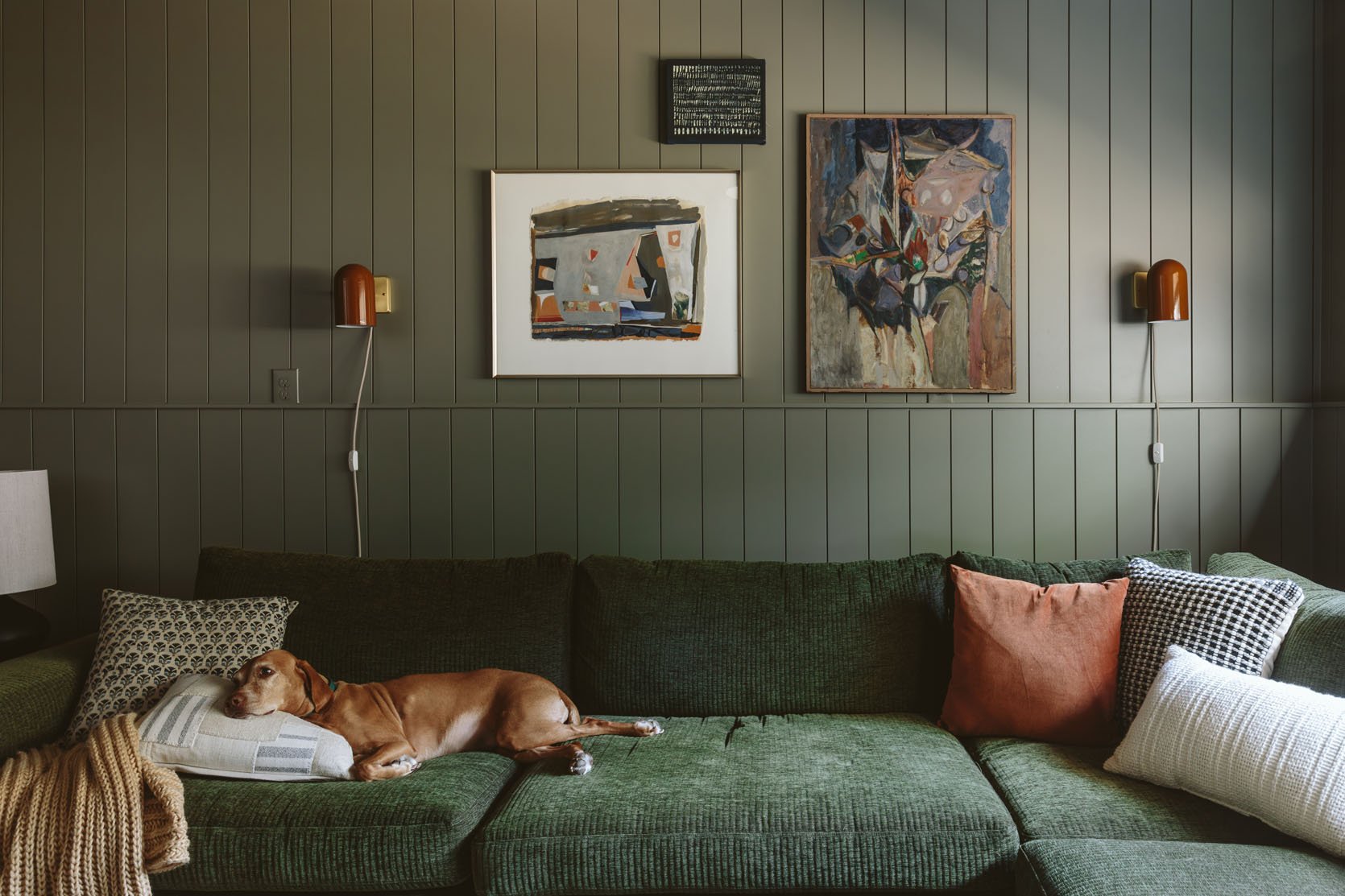
I bought all the vintage art at Urbanite and at the Rose City Flea last year. They work pretty darn well in here, especially in combination with those Schoolhouse sconces. Also, Remi is doing a great job of showing how deep the sofa is – she is a decent-sized dog 🙂
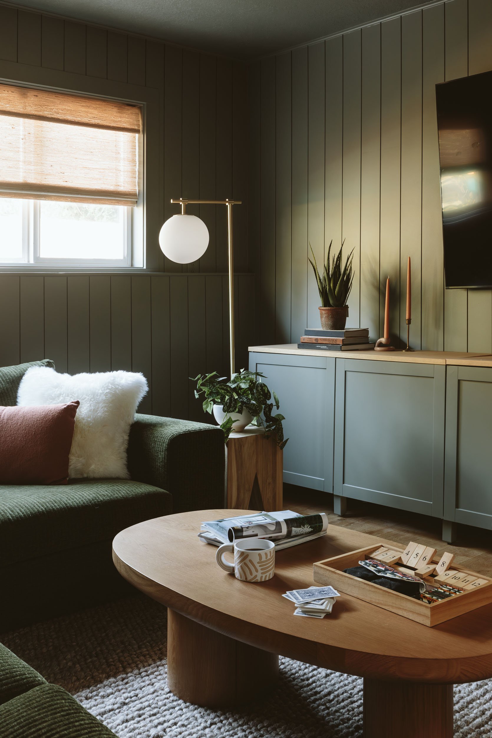
The coffee table is a lovely and chunky one that is perfectly in scale with the sectional (should you just want to replicate it). Also, that wood tone perfectly warms up the space so it doesn’t go too dark. Plus it brings in the Scandi part of their aesthetic. Not to mention, rounded sturdy coffee tables are my preference with young kids:) We also hired our painter to paint the credenza fronts, and Kaitlin/Corey took off the sides and top because they were essentially empty. Wow, what a difference it made to have it just be a credenza and not a full “media unit”.
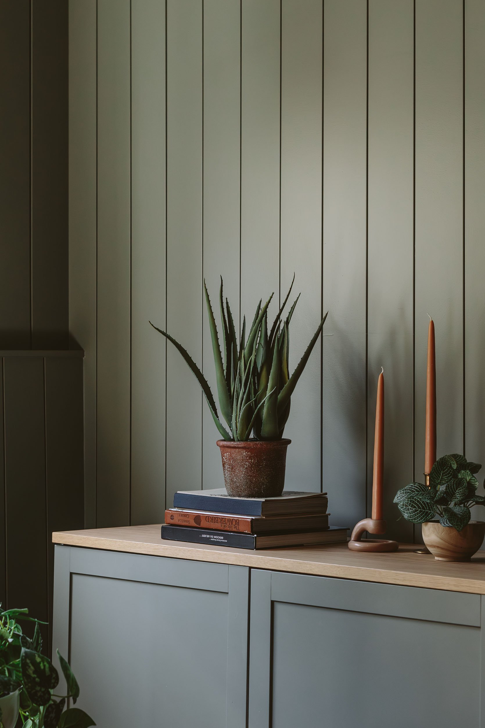
Faux Aloe Plant | Ceramic Candlestick Holder
I’m not big in the faux plant world (but understand the desire to not kill real plants), but that faux aloe is so good (we have the same one on top of our closet that looks VERY real).
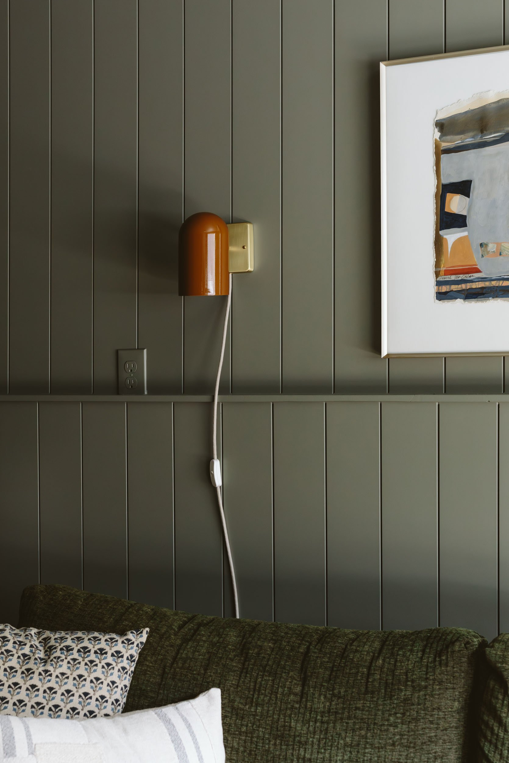
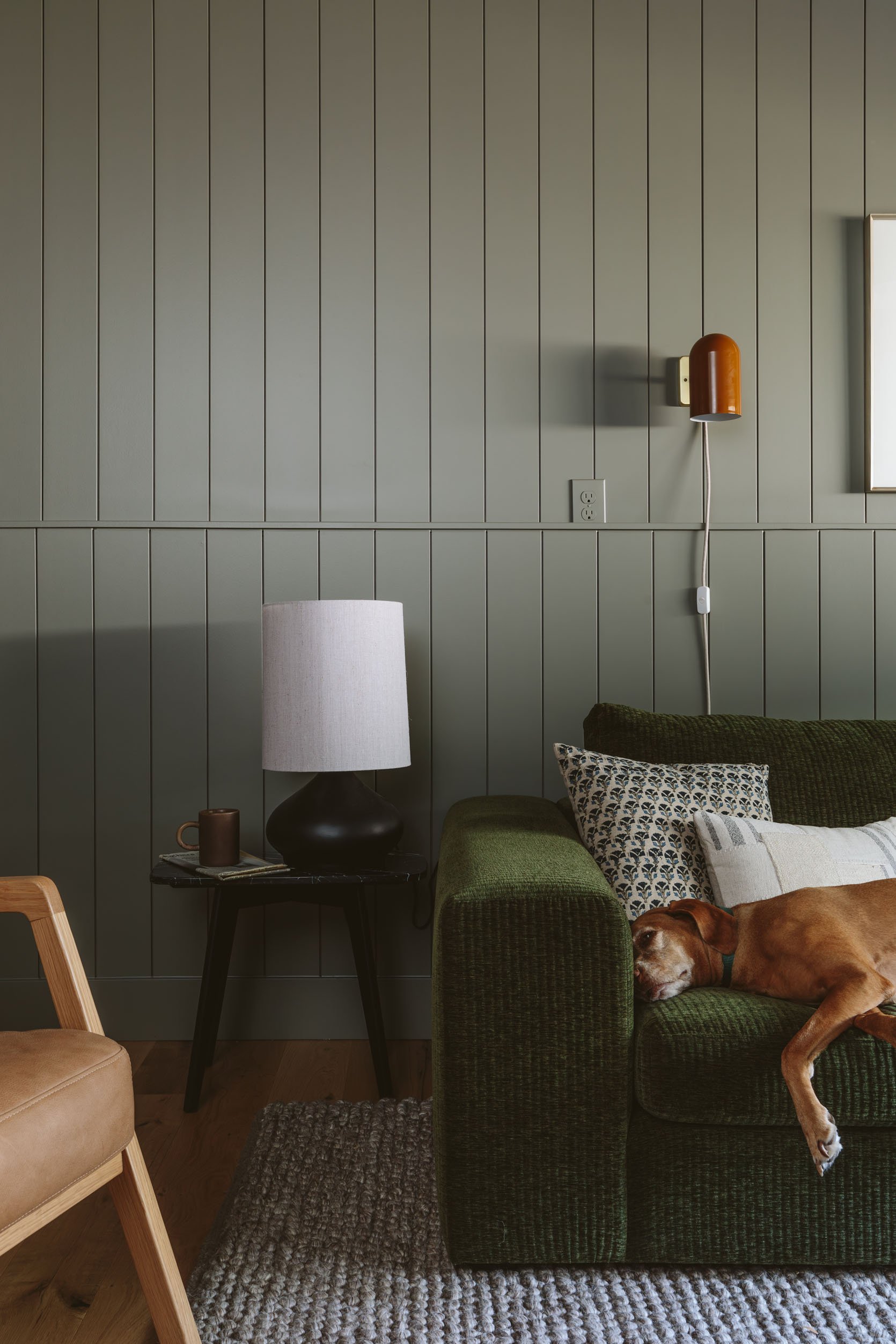
Sconce | Side Table | Table Lamp
The black side table and lamp are also from Article – don’t sleep on their decor pieces because these are so good. Perfect accents to help keep the space feeling modern and fresh. Since there wasn’t room for a lamp on the far side of the sectional we added these sconces from Schoolhouse which you can also aim upwards or diagonally (and with a low wattage bulb they wash the walls in a very lovely way).
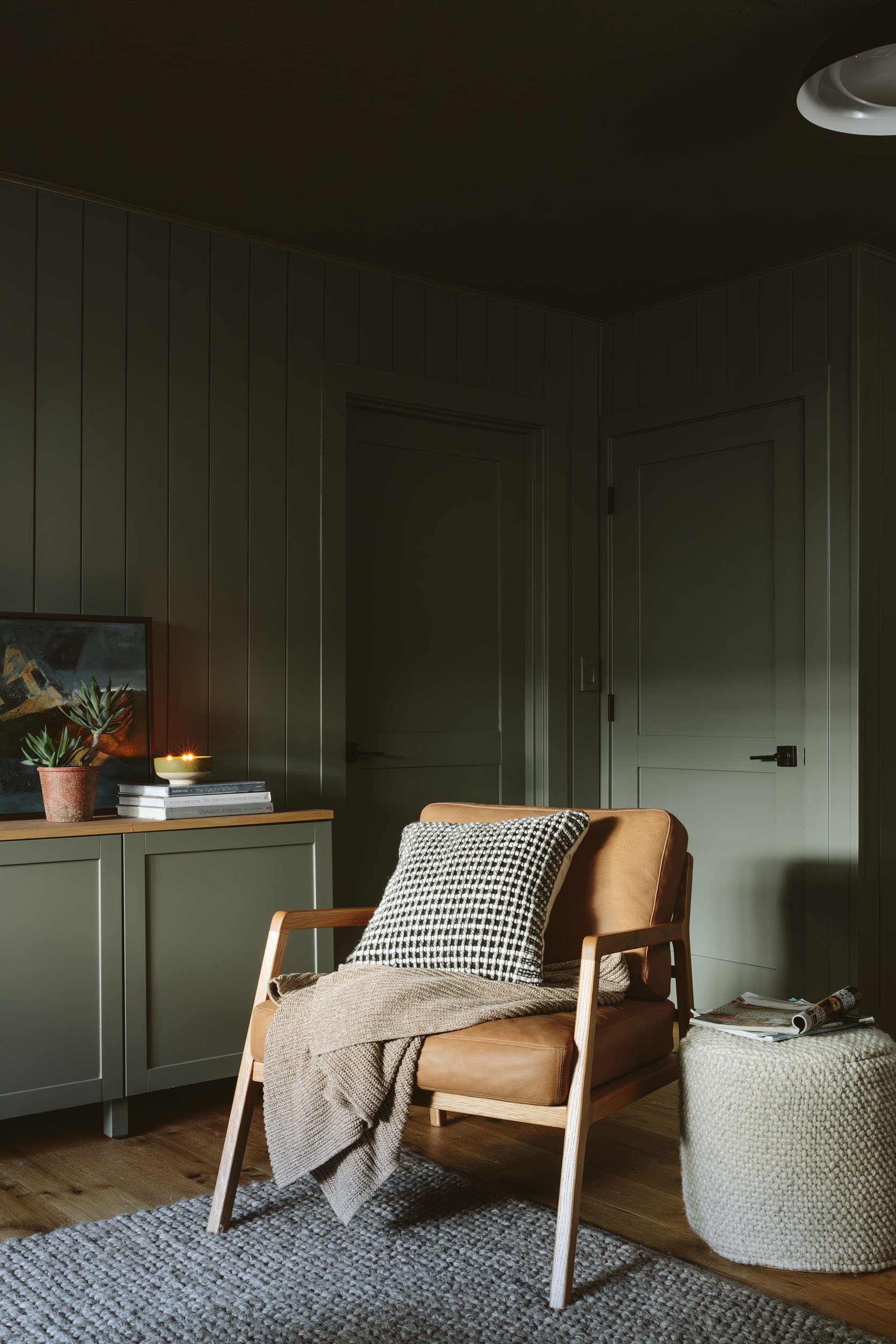
Faux Succulent | Candle | Chair | Pillow | Throw Blanket | Pouf
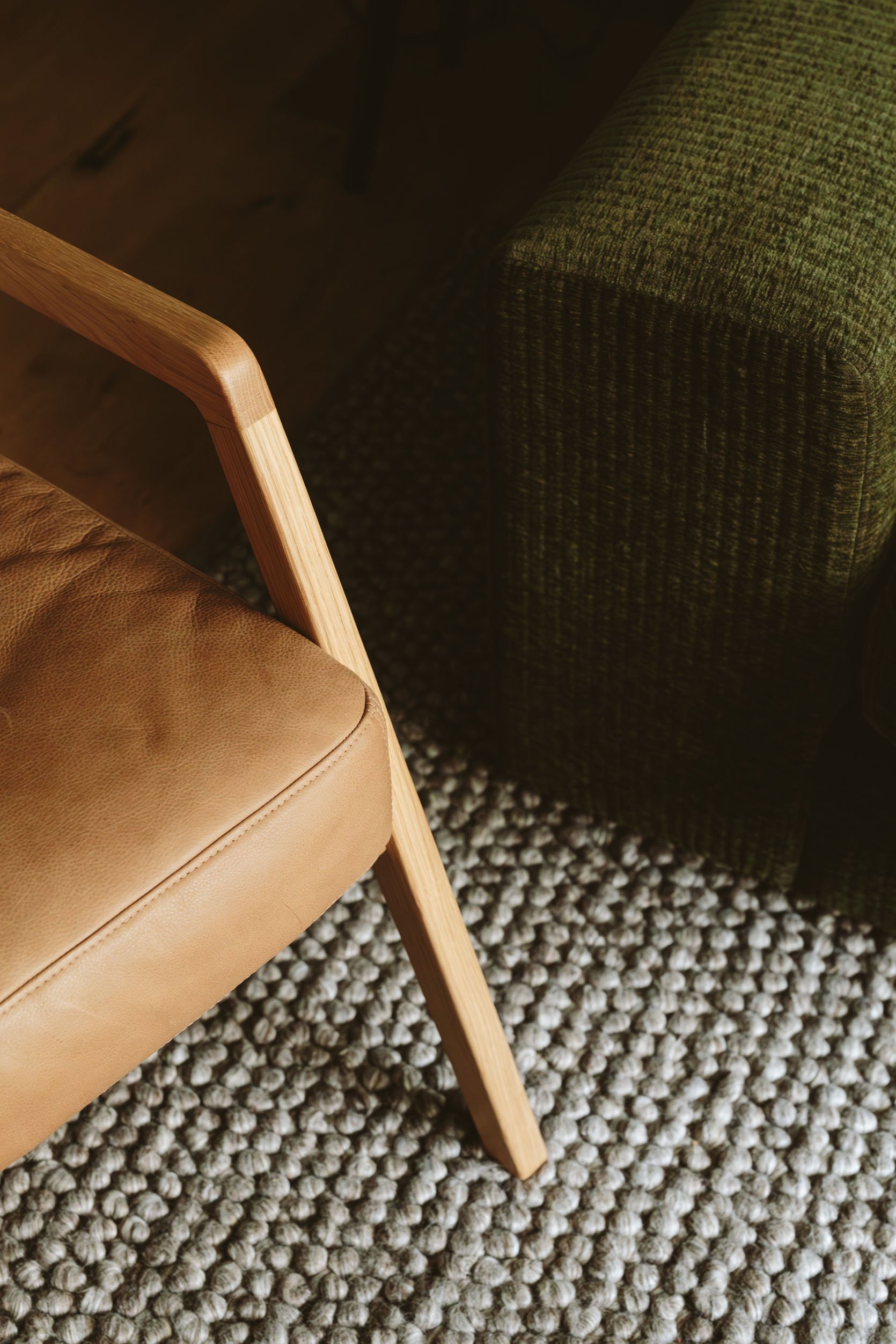
Lastly, Kaitlin got her leather wish in the form of a chair – the Denman chair and pouf from Article. Wonderfully proportioned, perfectly ergonomic (the back has the perfect support for a casual but not too loungey lean) and that caramel leather is extremely buttery.
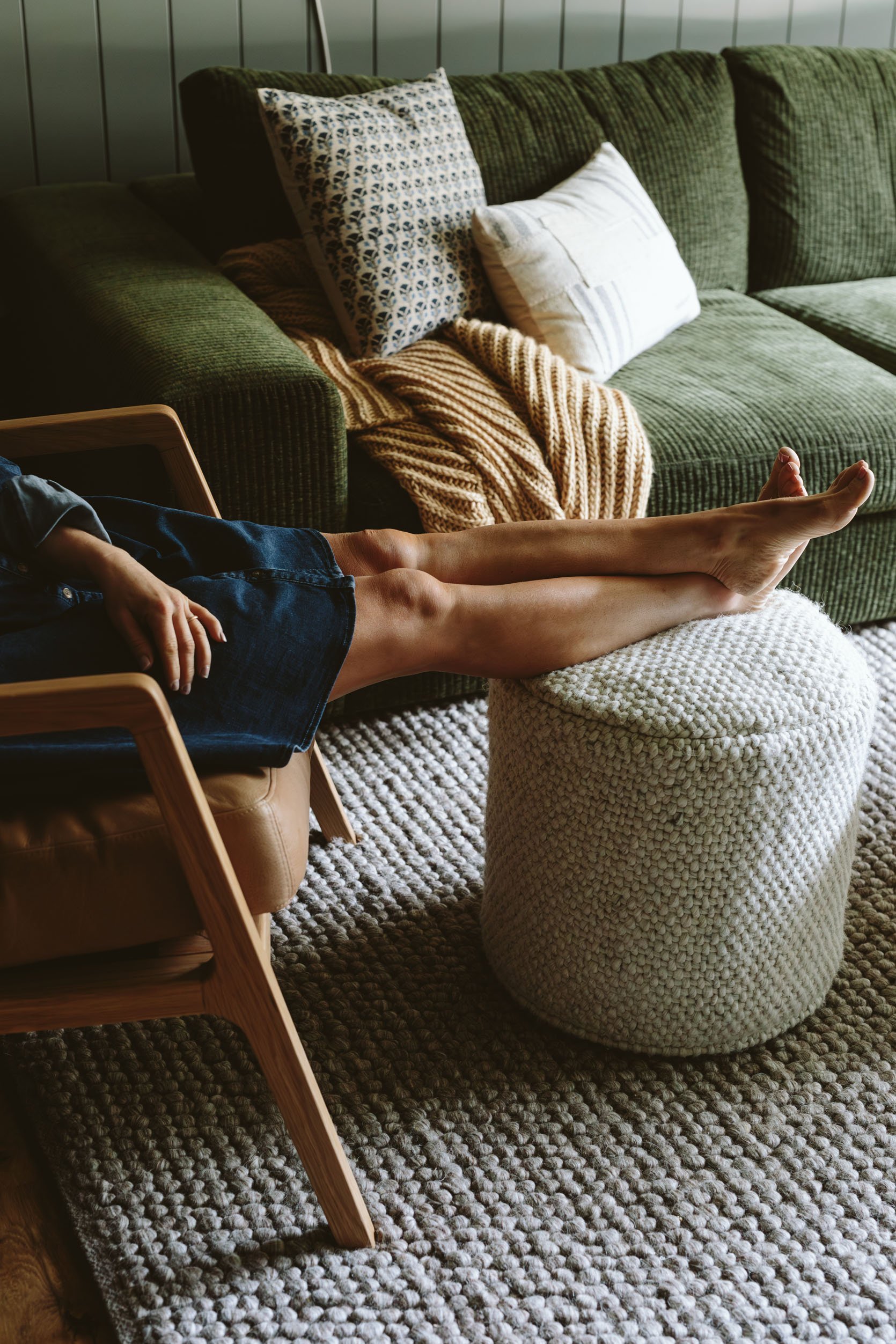
I even matched my spray tan to the color palette 🙂 The rug is nubby and super soft (and might take a while to stop shedding, FYI like most looped wool rugs). That texture really brings the cozy vibe home in a big way. I also love that while the rug and ottoman are similar in texture, the pattern scales are different so the contrast is minimal (easy on the eyes) but not boring at all. While Article does sell some pretty pillows we supplemented with pillows from Target and World Market to give an extra cozy eclectic feel.
The Office/Editing Zone
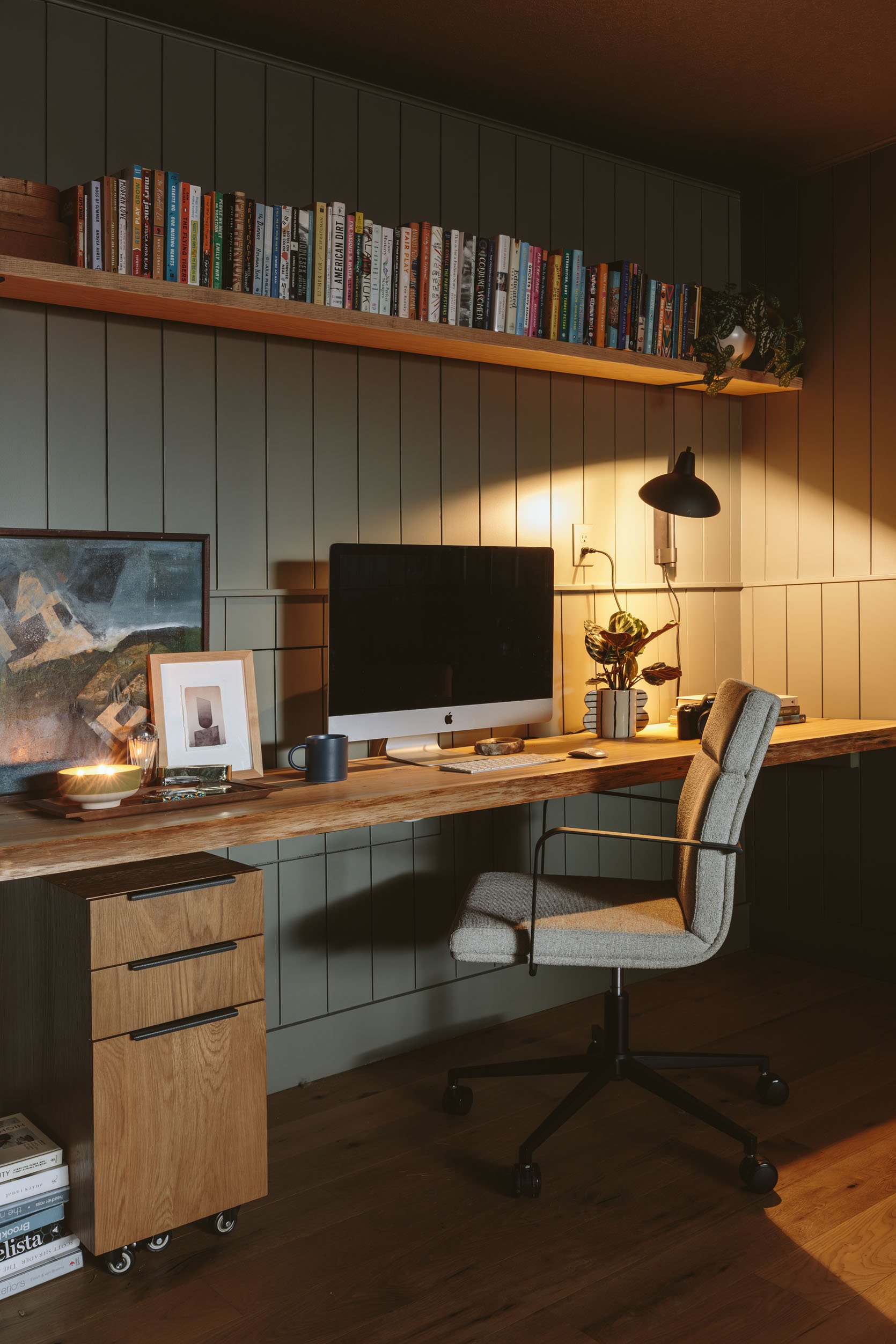
File Cabinet | Office Chair | Planter | Sconce
On this side of the room we styled out the desk and shelves a bit, but mostly just added a few Article pieces that Kaitlin needed – the chair, lamp, and filing cabinet all served their purposes beautifully. Pretty, functional, and reasonably priced office furniture isn’t easy to come by so I was so excited to see these awesome pieces as options. The striped pot is from a local maker named A Handbuilt Ceramics and the painting was a $35 score from Stars (the local wonderful antique mall).
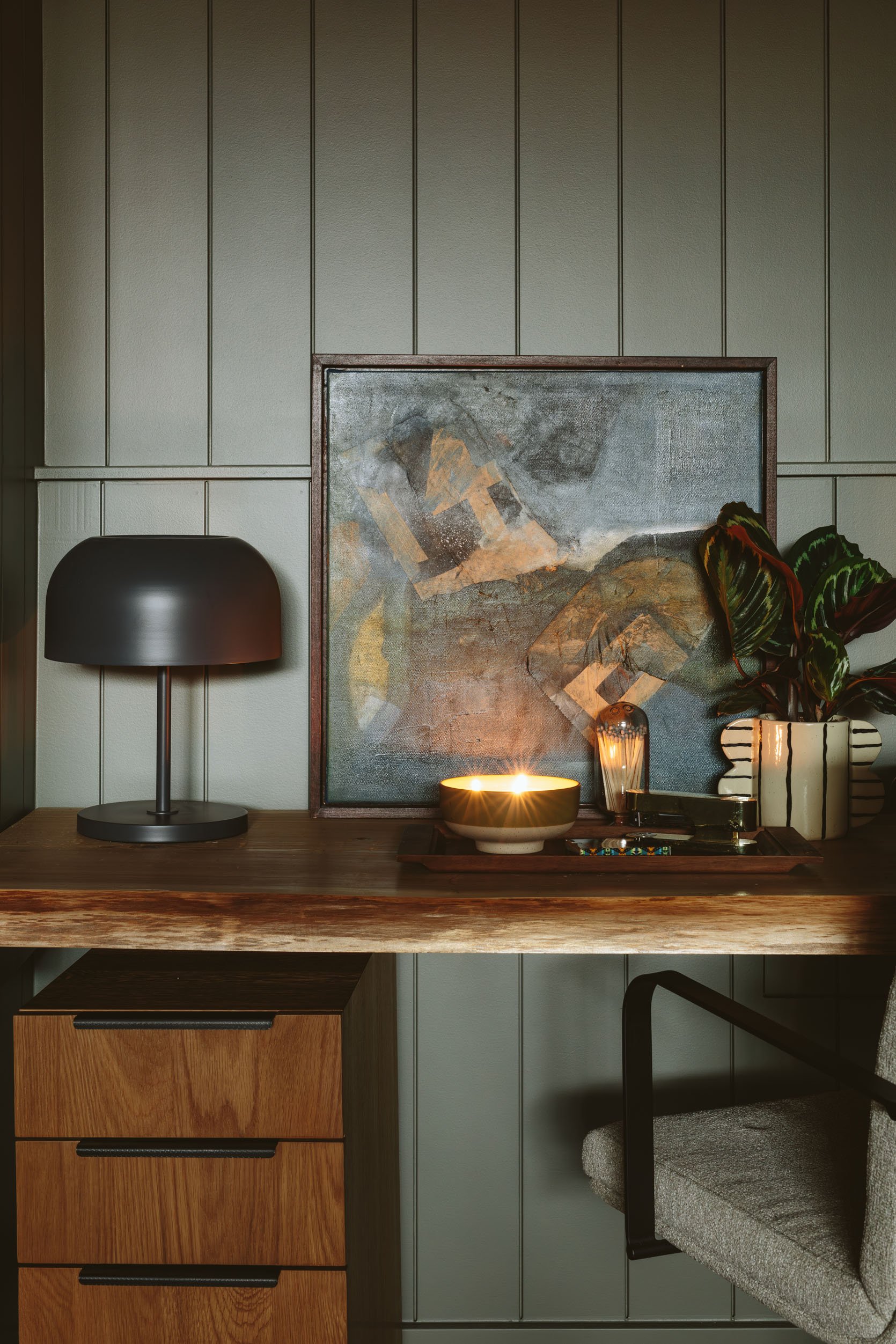
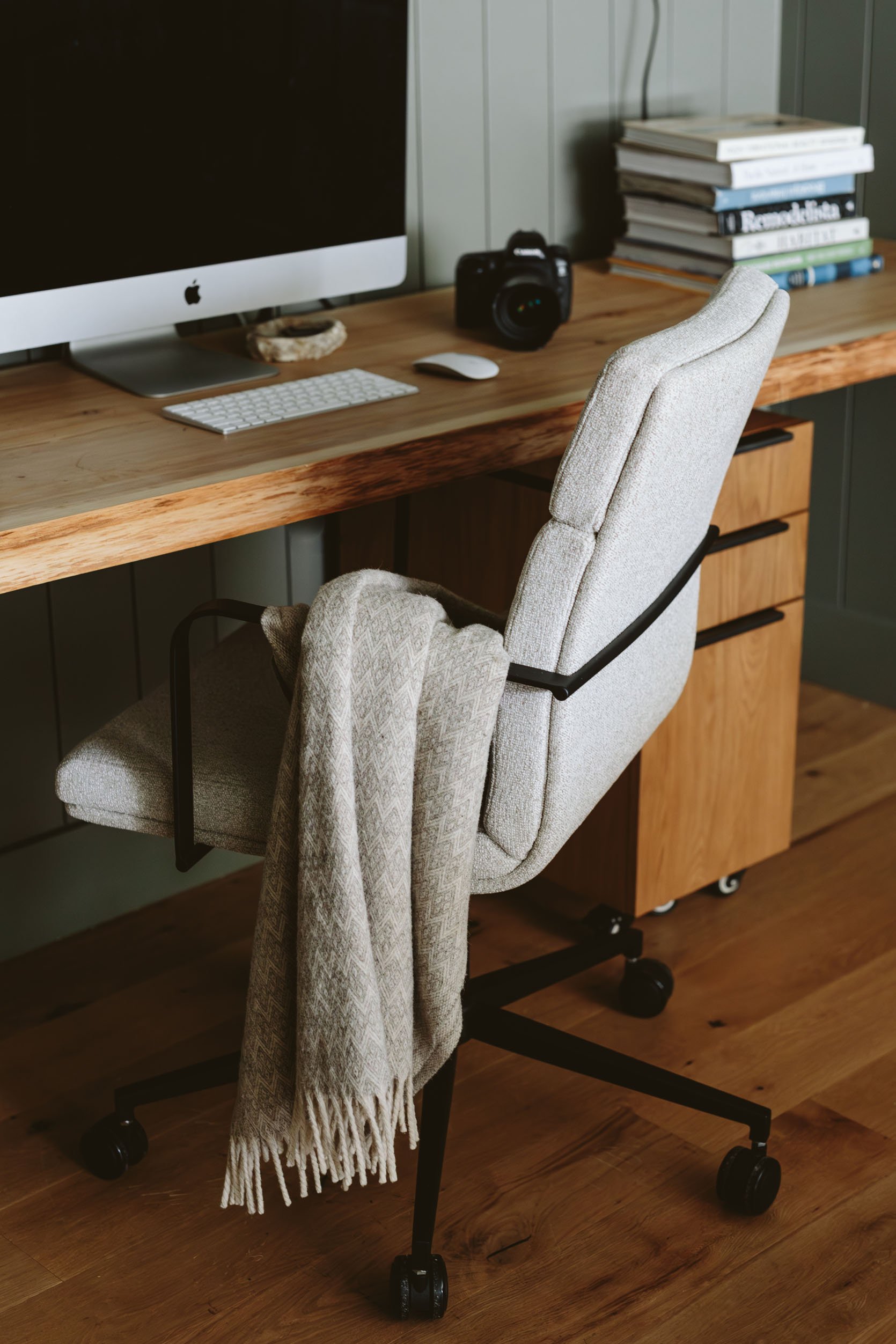
Table Lamp | Candle | Match Cloche
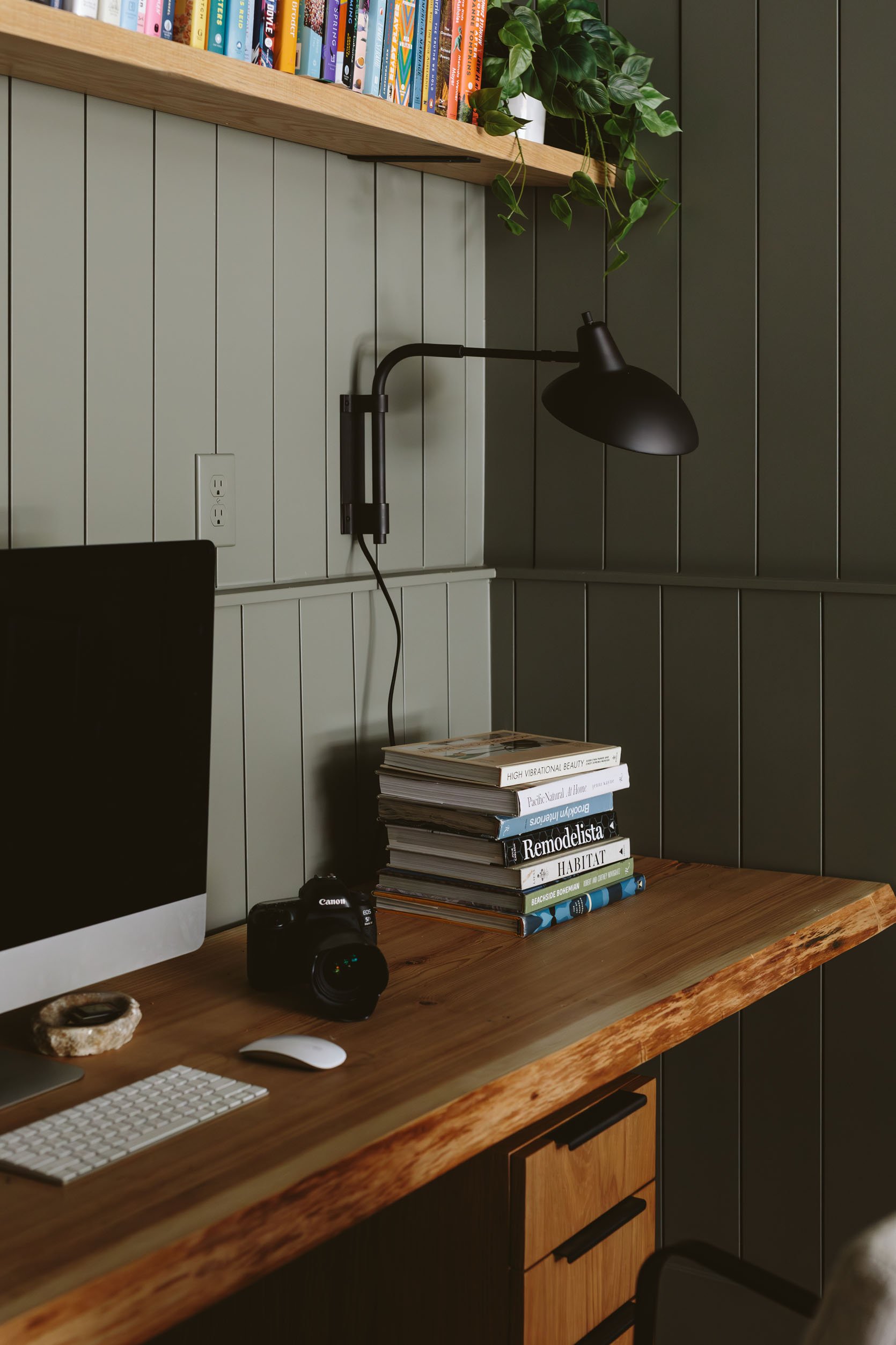
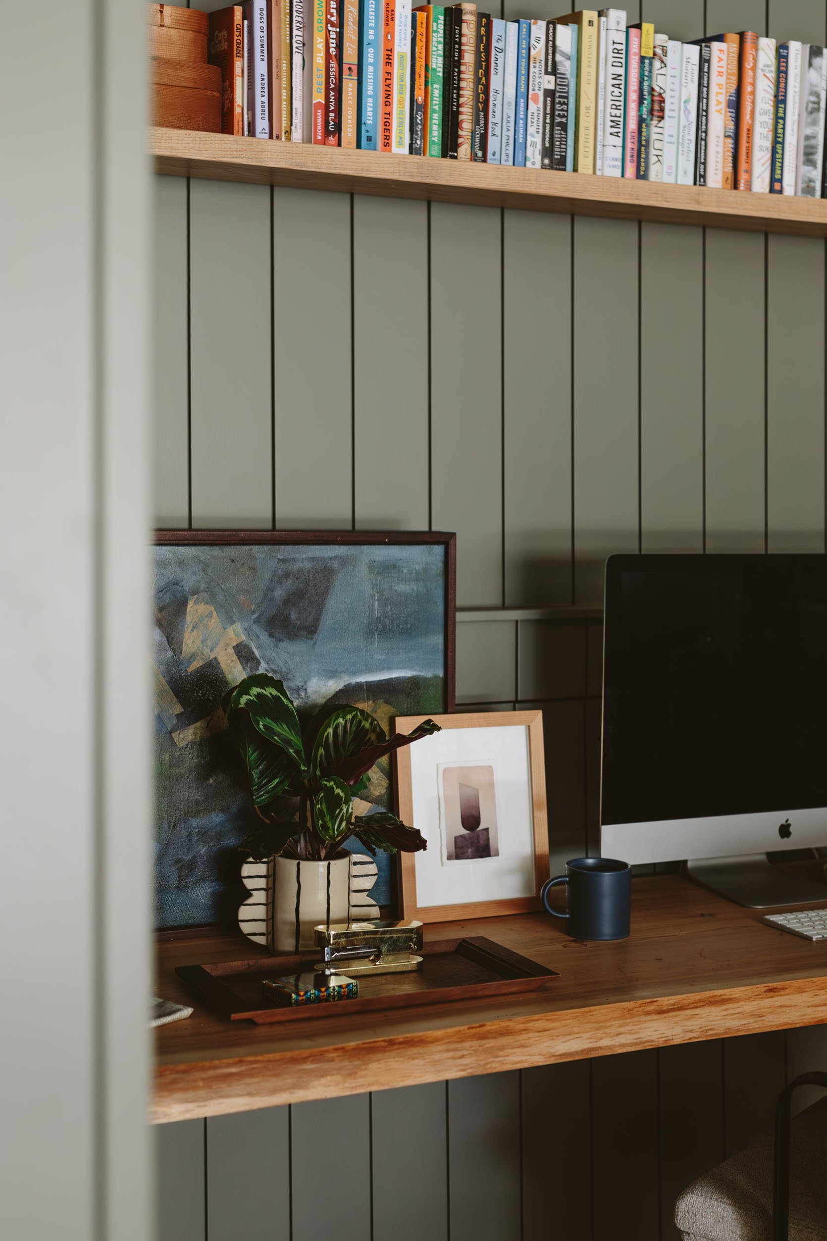
I had the Rejuvenation sconce in my storage awaiting its debut in our home, but it looked so good that I brought it over (I might need to snag it back) and hung it on the wall. I love it because it can also be aimed to wash the wall in a way that provides a lovely ambiance.

And there we have it! I was honestly super nervous about getting this done in time, with all the stuff we have going on at the farm, but with the help of Kaitlin and my PNW team (Gretchen and Emily M), it turned out soooo wonderfully.
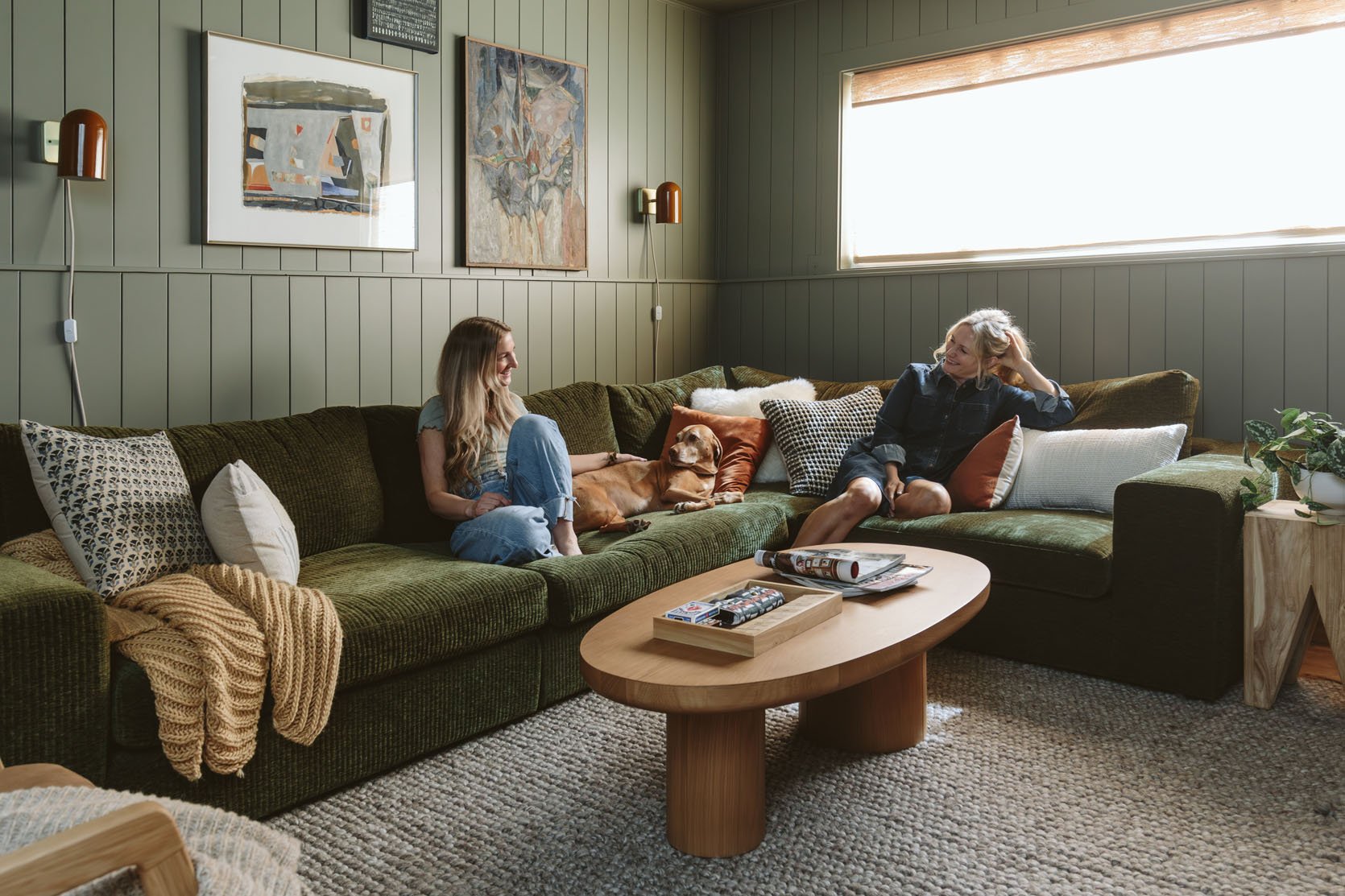
I’m also extremely happy to report that Corey, Kaitlin’s husband who also couldn’t be happier with this room, so I’m a total hero over there. They have promised delicious lattes forever. I’m so glad/grateful that it turned out well, not just for the partnership or for the photos, but when you are in there it’s genuinely a lovely, cozy, pulled-together basement family room that any family would feel lucky to have.
Thank you Article for partnering on this. They really are such a great resource if you’re in the market for quality furniture at great prices that ships quickly. Which is basically everyone, right? Shopping with them is always so easy and a delight. All designs and words are our own. Please ask any questions about them in the comments. xx
*Design and Styled by Emily Henderson
**Photos by Kaitlin Green
***Contractor: Don Lunan Construction
THIS POST WAS ORIGINALLY PUBLISHED HERE.


