2023 marks the seventh year of me working in this industry so I think it’s fair to say that I’ve seen my share of furniture companies wonderfully evolve while still maintaining their style and ethos…and others, sadly not. Article is one that I am consistently impressed by and even more so recently. Y’all if you haven’t been on their site lately might I suggest you take a scroll. Every product still looks like a classic, is made with high-quality materials, oozes comfort, and is fairly priced… and to my complete delight, they are playing with even more fun shapes and pretty materials. There are so many pieces that are just cool (but not in an overly trendy way). So when Article reached out about doing a sponsored post together for their Memorial Day sale, I was pumped. Not only because we get to give a lucky reader a $2000 Article gift card again (YES, I KNOW!!) but we get to show you how you can build a truly beautiful and eclectic room that will stand the test of time, with just their products. Article has been an EHD go-to for yeeears because it’s a brand we love and can always count on. I mean did you see the basement makeover Emily just did?? Plus, the customer service is ridiculously good and the delivery times are fast.
So to make this post both fun and helpful we thought we’d show you how to build a room around a classic “anchor piece” or “staring piece”. All of the anchor pieces are on sale (exciting!). Should you want to purchase any of them, you’ll know how to build a stylish room around each one. Oh and to enter for the $2000 gift card, all you have to do is check out their site and leave a comment here with the piece that you’d love to bring home. Let’s start with the living room!
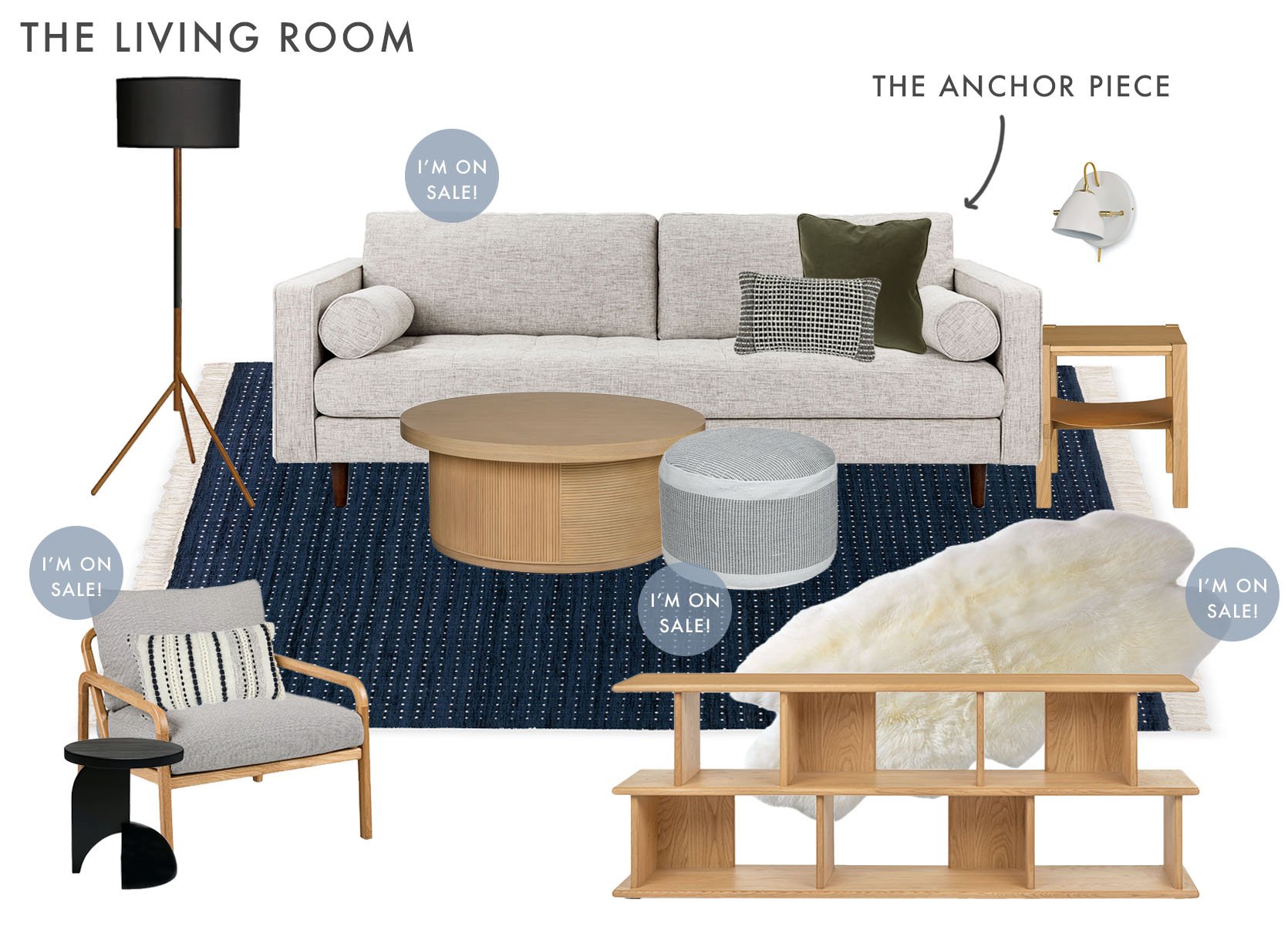
Sofa | Green Pillow | Grid Lumbar Pillow | Wood Coffee Table | Gray Pouf | Rug | Sheepskin | Floor Lamp | Sconce | Side Table with Leather Shelf | Accent Chair | Striped Lumbar Pillow | Black Side Table | Media Console
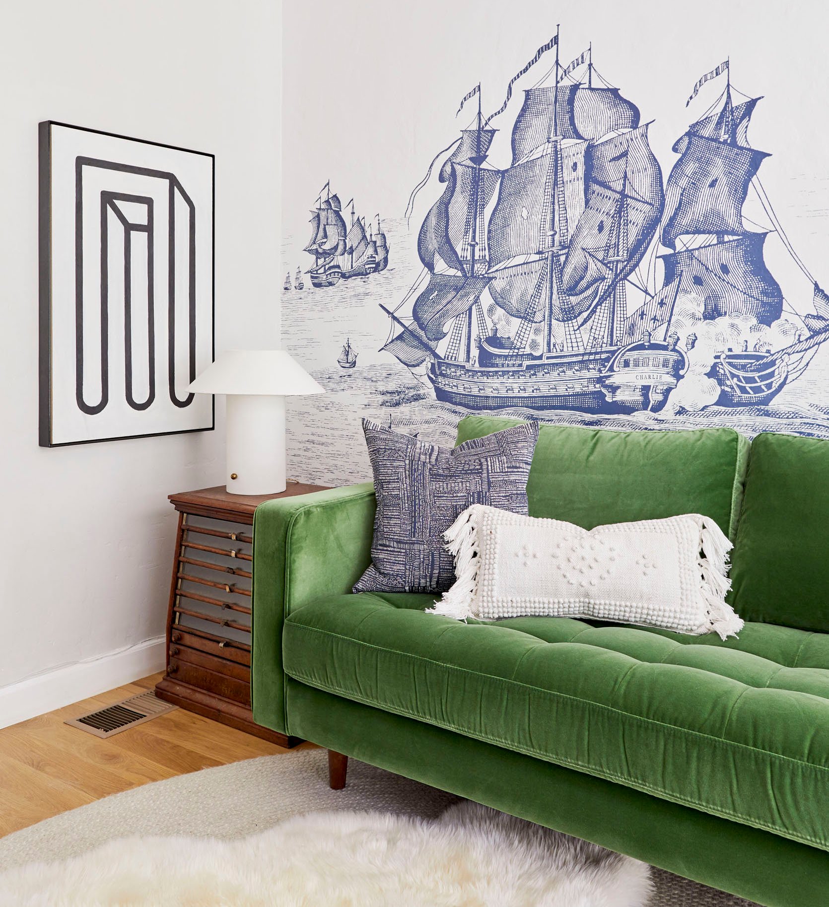
Ah, the heart of the home (well aside from the kitchen of course:)). I wanted to start with the famous Sven Sofa. We are big ole fans of this modern MCM-style sofa. Sara has literally owned three (seen here, here, and here), Emily had one in her LA house, and one of my best friends has had her eyes set on the leather one for years, although I think the sectional version would look great in her space:) But enough about us and more about this sofa. It’s got personality without taking over the whole room – meaning it’s super versatile. This is great since it gives you so much room to play with lots of different styles and colors. I decided to keep things pretty neutral in color and focus more on shapes and light patterns. As I am looking at it now I realized I worked in triangles. By that I mean that most of the elements are spaced out, making it all look balanced (at least to me, ha). For example, all of the upholstered pieces are different tones of gray yet none of them look drab. The sofa has clean, structured lines, the pouf is lightly patterned and round, and the accent chair has a beautiful and interesting wood frame. There is also a good balance of round and squared-off shapes as well as a variety of wood tones.
So while technically “neutral,” I still wanted the room to have visual depth. An easy way to do that was to choose a dark rug and this one is SO pretty. The color is rich but the pattern and fringe make it feel a little playful and fun. After the rug was selected I went with that incredible black side table, that beautiful floor lamp, and pillows that had dark tones. I also feel that the leather shelf on the other side table brings some extra depth to that side. Speaking of that side table, how good is it? Secret: It’s actually a nightstand. Shhh, no one will ever know! And that media console???? Article is killing it! And yes my love of nesting coffee tables knows no limit:)
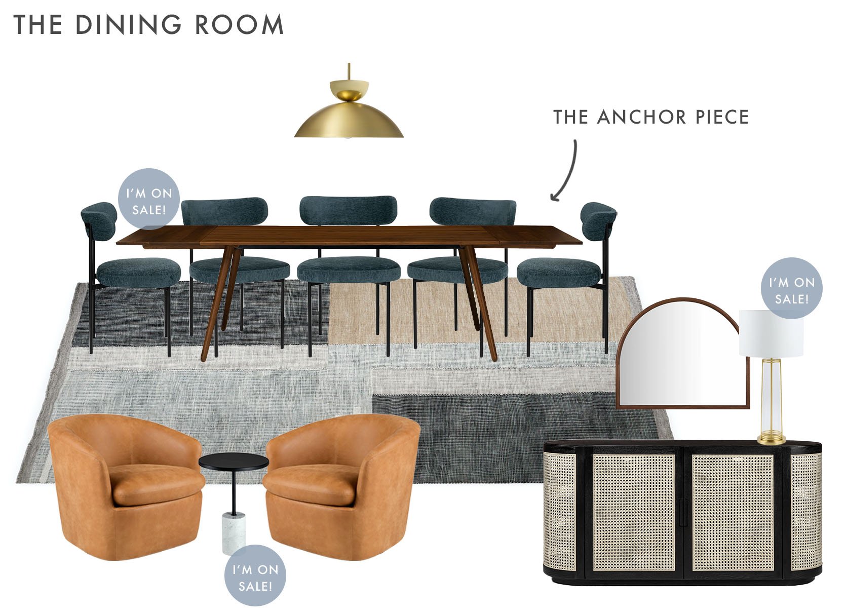
Dining Table | Dining Chair | Brass Pendant | Rug | Accent Chair | Side Table | Sideboard | Mirror | Table Lamp
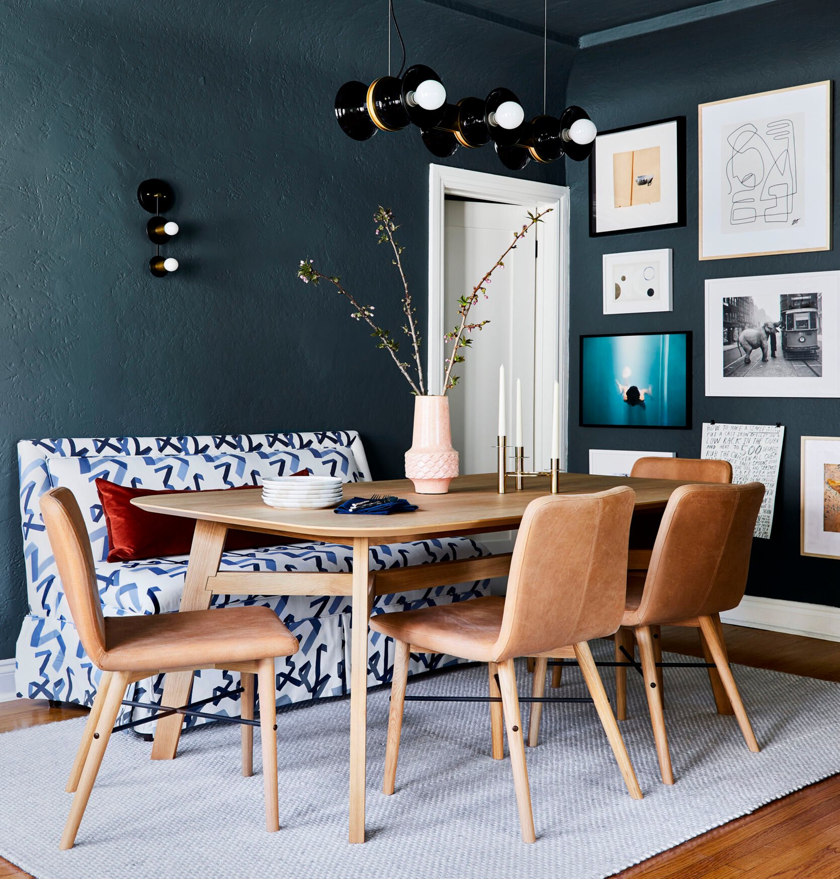
Moving onto the dining room. I chose this dining table as the anchor piece because not only is it super versatile style-wise but it’s also extendable! It’s nice to have a furniture piece that can be upgraded to have multiple seating options. Now, while I love the MCM look, I didn’t want to lean into it too much hence the contemporary dining chairs. They have a 2023 feel which is a nice style contrast to the table, and the dark tones of the chairs and table work really well together. And who doesn’t love a comfy upholstered chair?! Another bonus is that the dark blue colorway hides accidental food mishaps, win-win!
Moving to the floor, I wanted to add a little pattern. I think this rug is SO good. The pattern is subtle but cool, and the rug has a low pile so it’s great for a dining room where food and drinks are consumed (and sometimes spill). Pattern is important to any room (no matter how small) but so is texture! That’s where this beautiful sideboard comes in to save the day. The chunkiness perfectly balances out all the legs of the dining table and chairs. In addition, the rattan adds such beautiful visual interest and depth (and actual storage). It also helps the overall design from leaning too dark.
Speaking of that, you know this room needed a little luxury: Enter the brass pendant and gold table lamp. They add just enough sparkle without the space feeling too glam. The final element in this sideboard vignette is the wall mirror. The shape is so great and the wood tone speaks to the dining table. Mirrors almost always make a room feel bigger too which is an added bonus.
Now, not every dining room has room for a seating area, but I figured this room could be whatever I wanted and stuck one in! The warmth of those swivel leather chairs really makes the space pop in the best way and the side table’s black top pulls in the dining chairs and sideboard. What’s not to love??
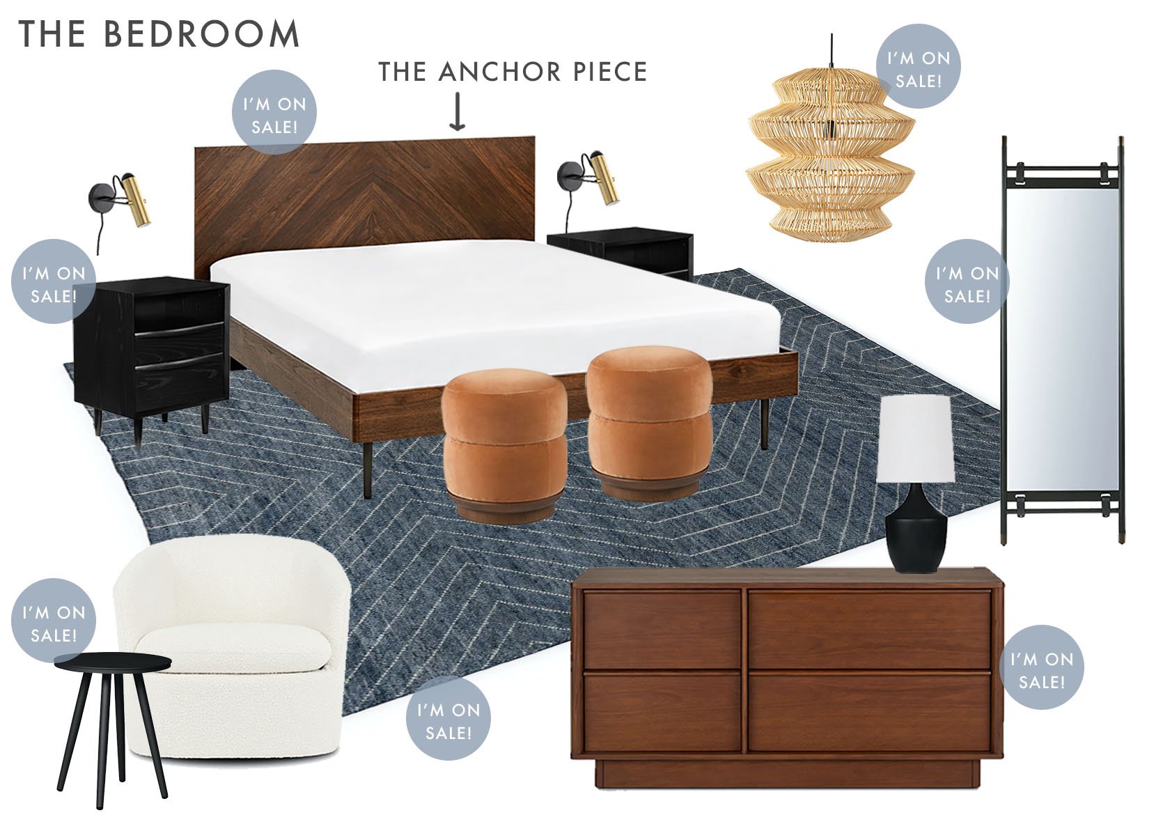
Bed | Nightstand | Sconce | Pouf | Rug | Pendant | Floor Mirror | Dresser | Table Lamp | Accent Chair | Side Table
Every time I start to write about a new room design in this post I think, “Oooo I really like this one!” That’s mostly a compliment to Article and their furniture:)
So starting out with our anchor piece: The Bed. Simple, classic, and the wood grain is so pretty. It’s really interesting how deeply I’ve fallen in love with dark walnut. The richness just makes my heart feel full so this bed and dresser were no-brainers. Also that dresser is so beautiful. Wow wow!
In order to maintain that rich depth, I went with those pretty black nightstands. Look at all that storage! And since I went with black nightstands, I wanted to choose decor that had that same richness. For lighting, I chose sconces with a black accent (and don’t take up any nightstand real estate) and a black table lamp that would likely go across the room. I also added a tall beautiful black floor mirror and a black side table for the reading/lounge chair. For a liiittle color, I went with yet another beautiful rug with a subtle but impactful pattern as well as those incredible rust velvet poufs! Then lastly for texture and lightness, I chose that very cool rattan pendant and awesome ivory bouclé chair. Overall this is a rich but calm space that I would happily sleep in:) Would you??
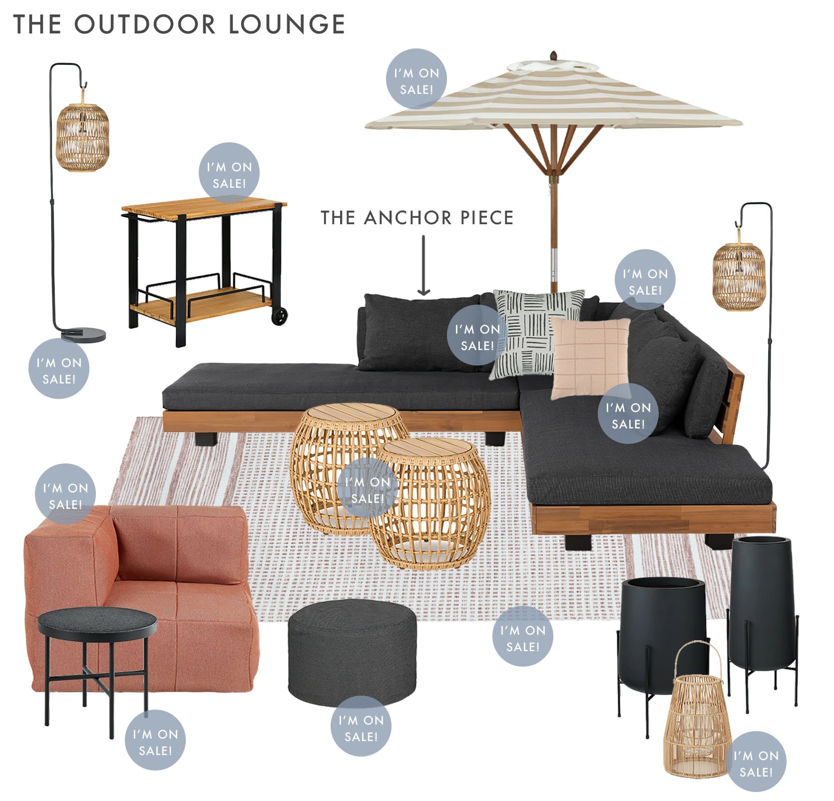
Sectional | Black and White Pillow | Light Clay Pillow | Umbrella | Pink and White Rug | Rattan Ottoman | Rattan Lantern Set | Bar Cart | Modular Corner Seat | Side Table | Soft Pouf | Tall Planter | Medium Planter | Floor Rattan Lantern
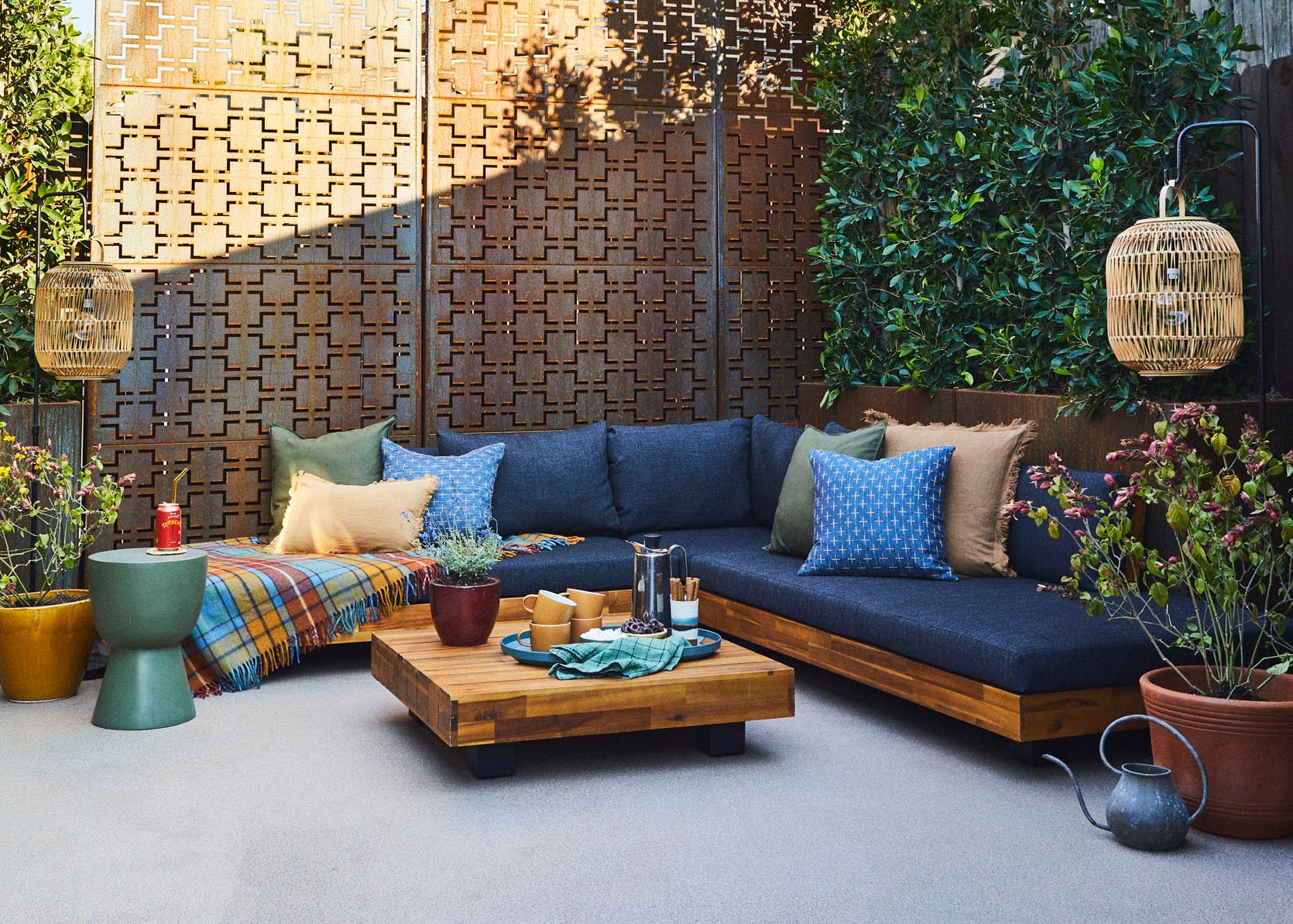
Our final Article look is, of course, an outdoor one. I personally have this table and LOVE it so much. But if you want a real example of what outdoor Article furniture can do check out Emily Bowser’s back house’s back patio. It’s such a special space! And the exact outdoor sectional she used is on sale people!! This is not a drill! Naturally, it had to be my anchor piece. Plus when you compare Bowser’s design and mine above it only proves how versatile this piece is.
Article had lots of pattern and texture options which made me extremely happy. Look at all the rattan lanterns, the double ottoman, the pillows, the umbrella, the rugs! They all make for a very happy design don’t you think? But given that the sectional’s cushions are a dark charcoal, I wanted to make sure that dark tone was evenly sprinkled throughout the space. That of course creates balance but also grounds the design. I must stop and give a special shoutout to the clay-colored modular corner seat. It’s such pretty color while still being relatively neutral and brings the whole space to a new level. If I had that chair I would live in it. No question. Especially if it’s as comfortable as the other outdoor Article chairs I’ve sat in.
So who’s excited about the $2k gift card now??? Article really is a near one-stop shop for modern, quality furniture that’s also nice on the wallet (with most products getting to you FAST). We really appreciate Article sponsoring this post, not only so I could flex my design skills (jk jk) but also to give one of our readers a truly awesome opportunity to make their home more beautiful. As a reminder, to enter for the $2000 gift card, just check out their site and leave a comment here with the piece that you’d love to bring home. But also their Memorial Day Sale is gooood so don’t miss your chance for a great deal if you’re in the market. And if you need an extra bit of motivation, EHD readers are also being offered an extra deal of $50 off their first purchase of $200 or more until May 29. Click here to have the discount apply automatically at checkout.
Love you, mean it.
Opening Image Credits: Photo by Sara Ligorria-Tramp | From: A Quick Update: The Changes I’ve Made to My LA Living Room
THIS POST WAS ORIGINALLY PUBLISHED HERE.


