It’s been a while since I last wrote a blog post, but you know what they say about riding a bike…it might be a little wobbly.
Today, for your viewing eyeballs, I have the quaint little makeover of my mom and dad’s primary bedroom and bathroom. It’s really more of a refresh since we had an almost non-existent budget to work with and very strong attachments to many of the existing pieces. Let’s start with the befores, shall we?
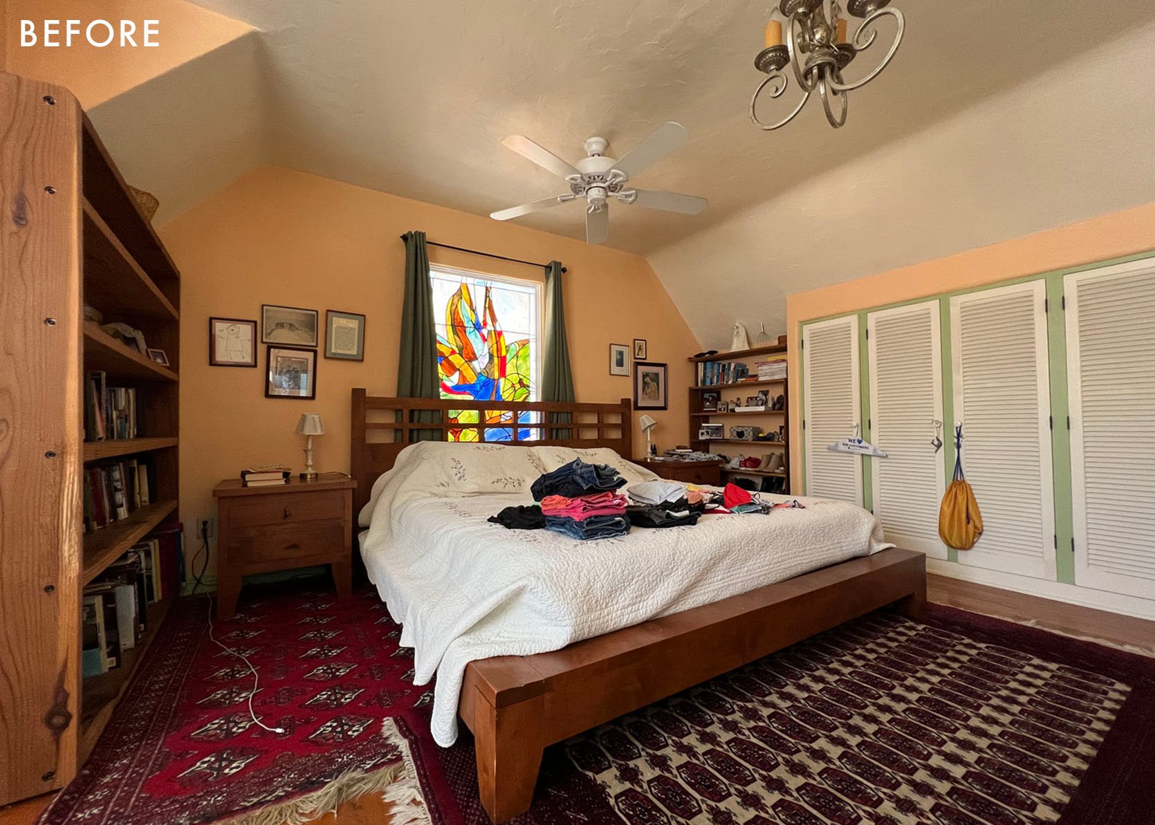
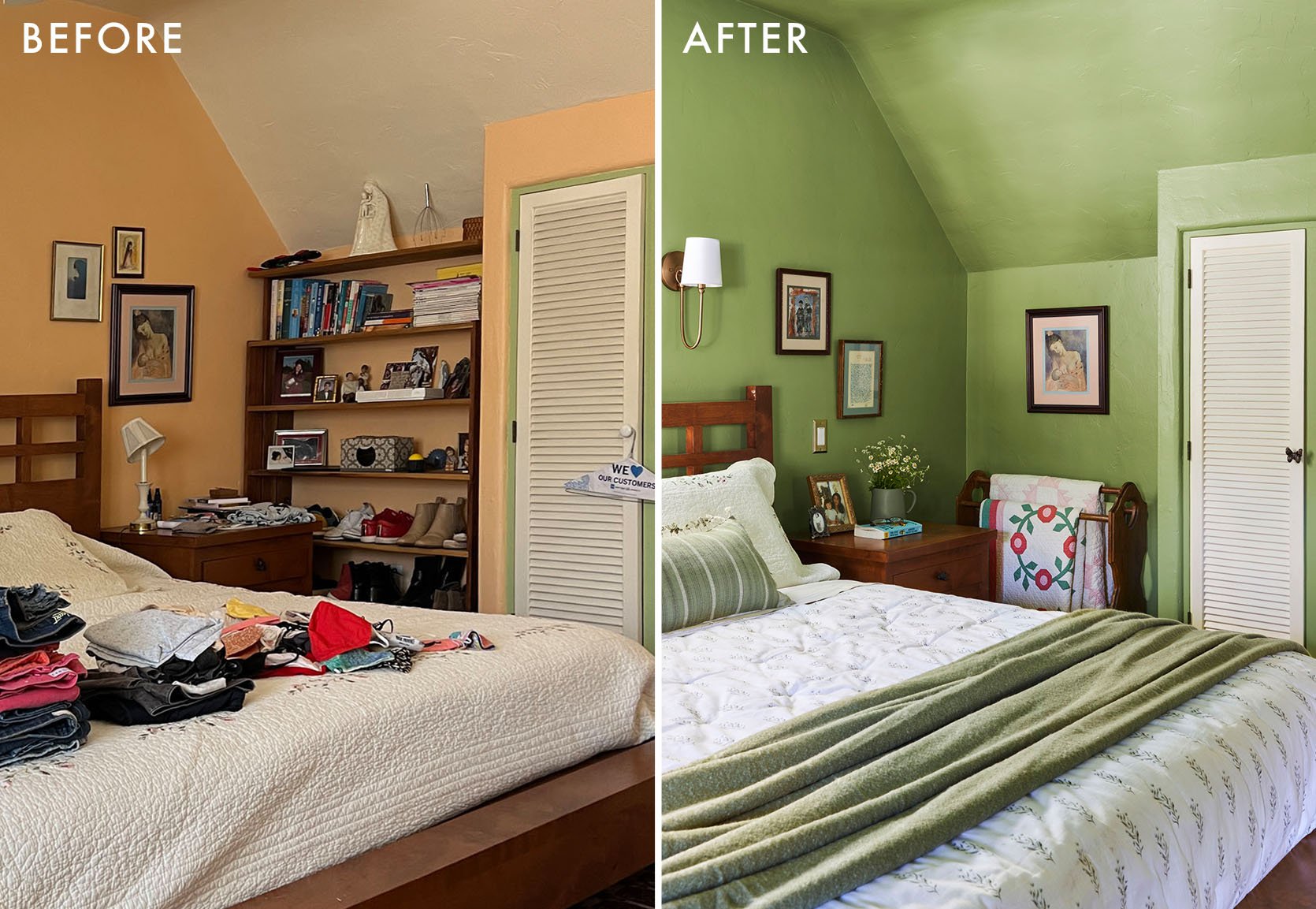
Please, ignore the clean laundry all over the bed. I took these photos for my own reference, not realizing it would be the last time I saw the bedroom before my dad emptied it all out to refinish the floors on a whim. He did the refinishing himself, and it turned out beautifully.
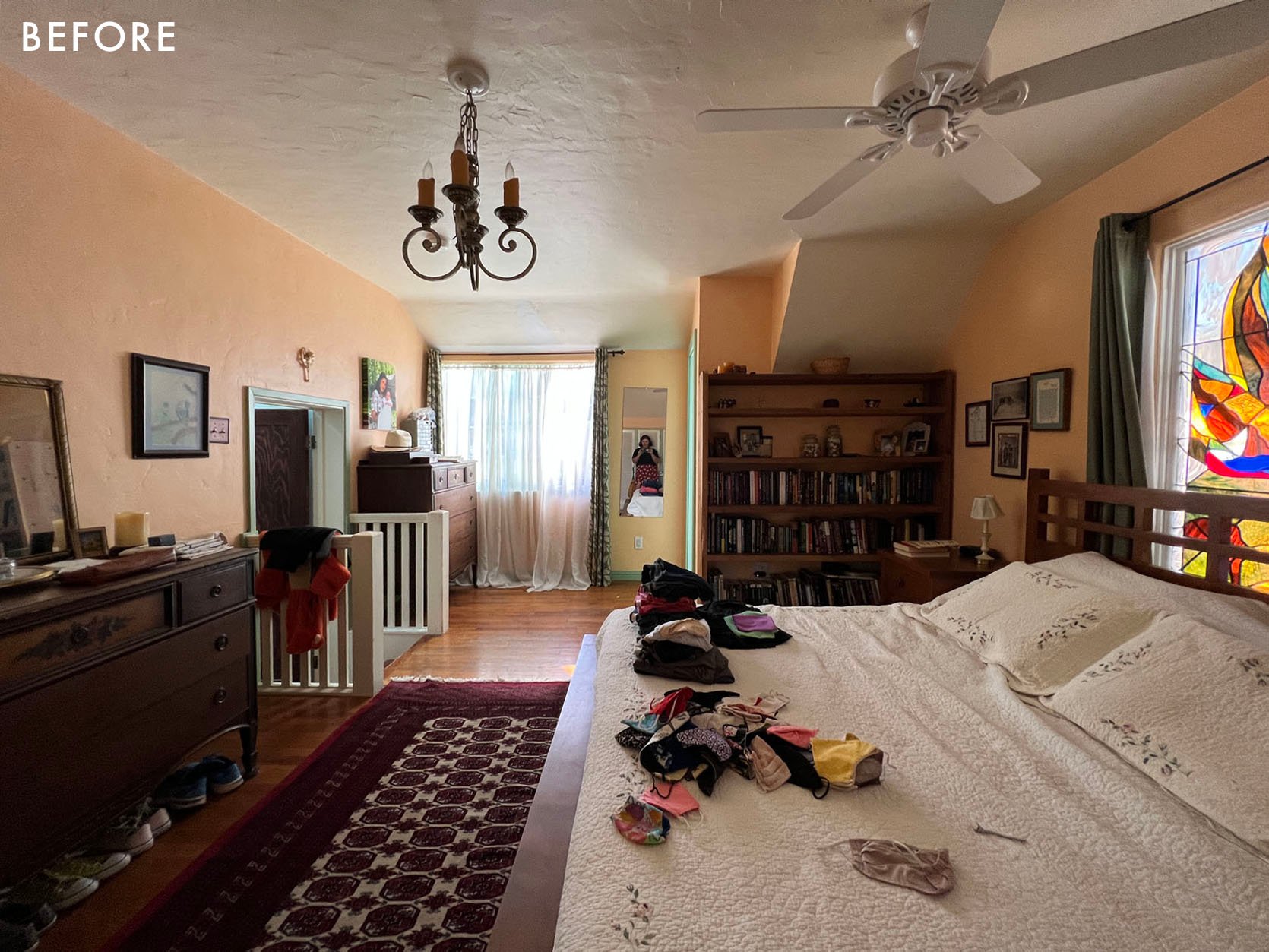
The room is on the second floor of their Spanish Colonial home, facing northeast – which means it gets beautiful morning light, and then progressively darker through the day. It was painted three different colors (peach walls, green trim, white ceiling, and closet doors), and had a bit of a hodgepodge of styles going on.
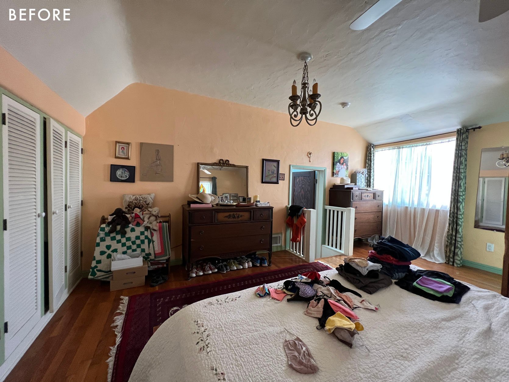
It was a little cottage, a little Spanish, and a little Craftsman. So going into this refresh, I wanted the space to feel more cohesive. I also wanted the space to feel warm, relaxing, and very much like my parents. I didn’t want to make the same mistakes I made with their living room, so from the start, they were very involved with every decision. And I took a few design L’s in order to stay true to their wishes.
“You really want to keep the fan instead of adding a beautiful light fixture?”
You got it.
“Dad already installed the bedside sconces, and they’re extremely high and close together?”
I will cringe every time I see them, but as long as y’all are happy.
“You want to use the white Ikea shades that you already bought and installed without consulting me?”
…*deep heavy breathing*
All of that being said, I’ll still find the finished result pretty darn charming.
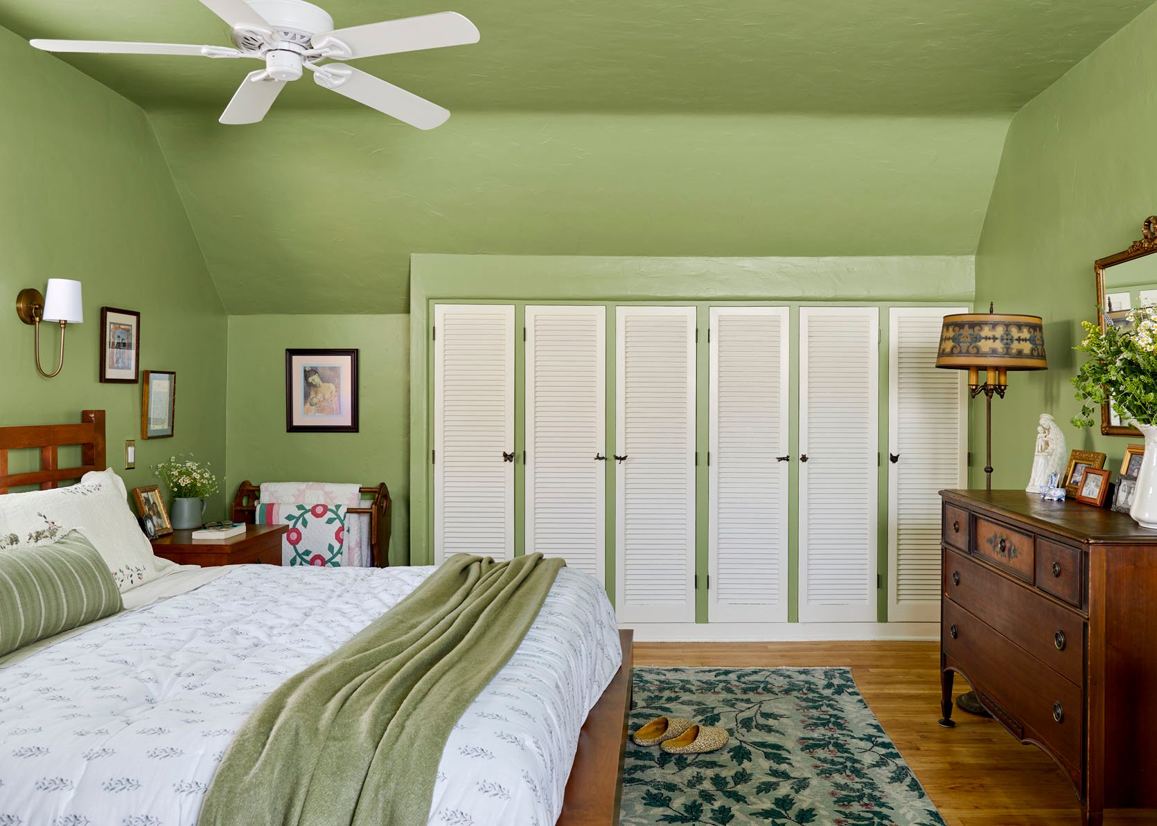
Warm, relaxing, and still filled with “Ana and Eric” personality. My parents were pretty hyped on the idea of painting the room green when we first started chatting about big impact-low budget ways to really make the room feel new. They’ve never been ones to shy away from color. The design WIN here was convincing my dad that the green paint color needed to go all the way up the ceiling, rather than keeping the ceiling white. The room just has so many angles and lines, I felt that separating the walls and ceiling would make the room feel more chaotic. The color is Sherwin William’s Cucuzza Verde in eggshell, and we accented it with Sherwin William’s Classical White on the closet doors and window trim. It’s a warm creamy white, that doesn’t feel stark against the yellow-green of the walls.
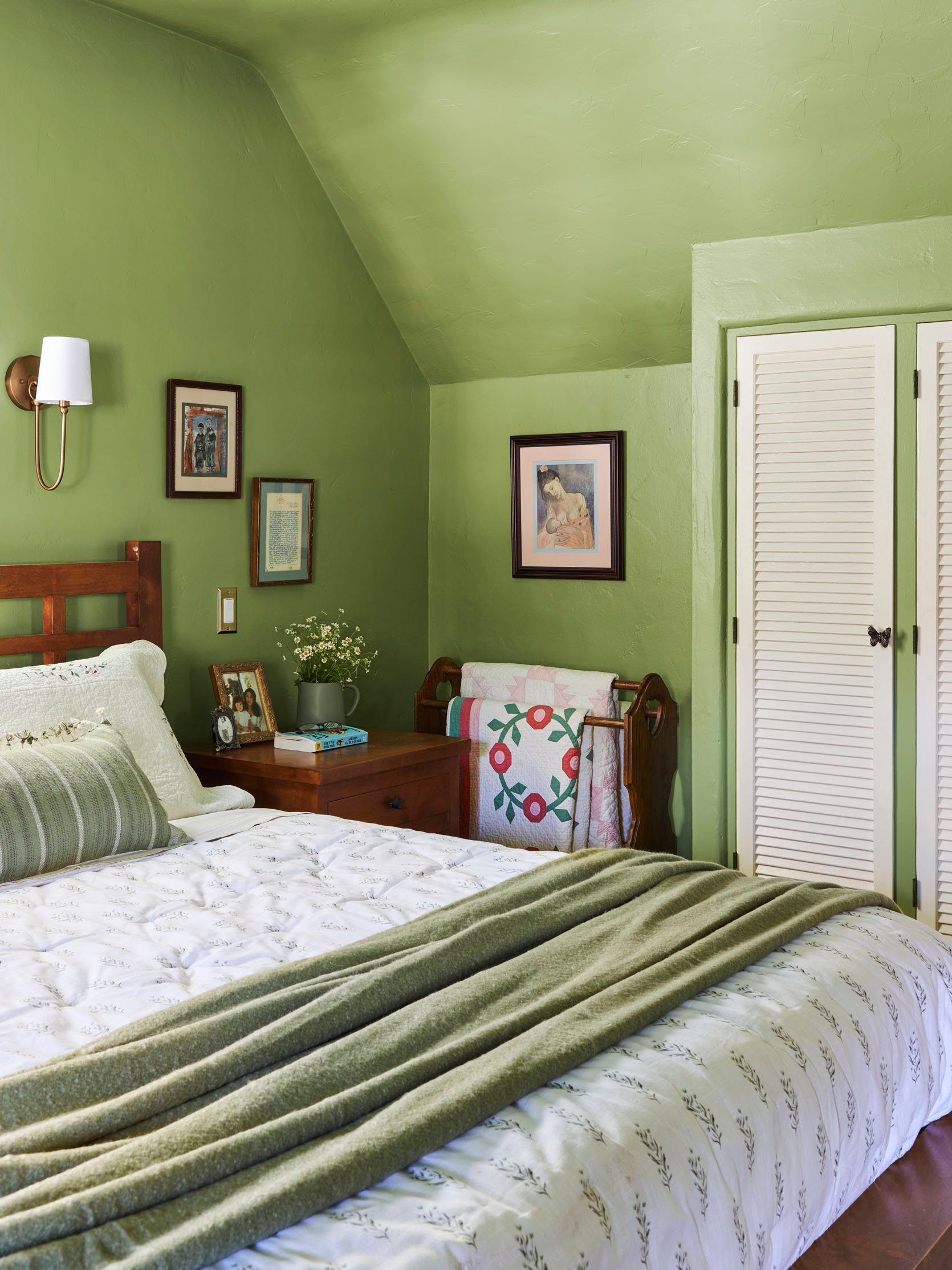
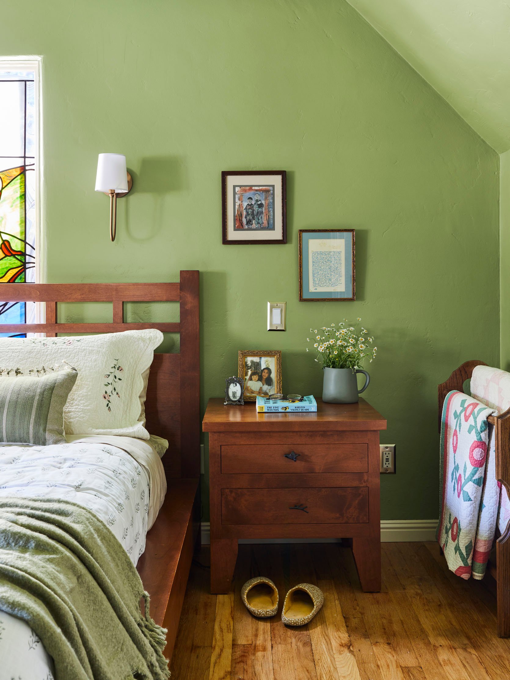
My parents were adamant about keeping all the art and furniture they previously had in the room but were open to reinterpreting where it went. I’ve seen these pieces on their walls since I was a kid, and each one is super special to them. This is my mom’s side of the bed, and where she used to have a bookshelf that wasn’t quite full enough, she now has her heirloom quilts (including the one currently on their bed!) and one of her favorite paintings of a “Madonna and Child”.
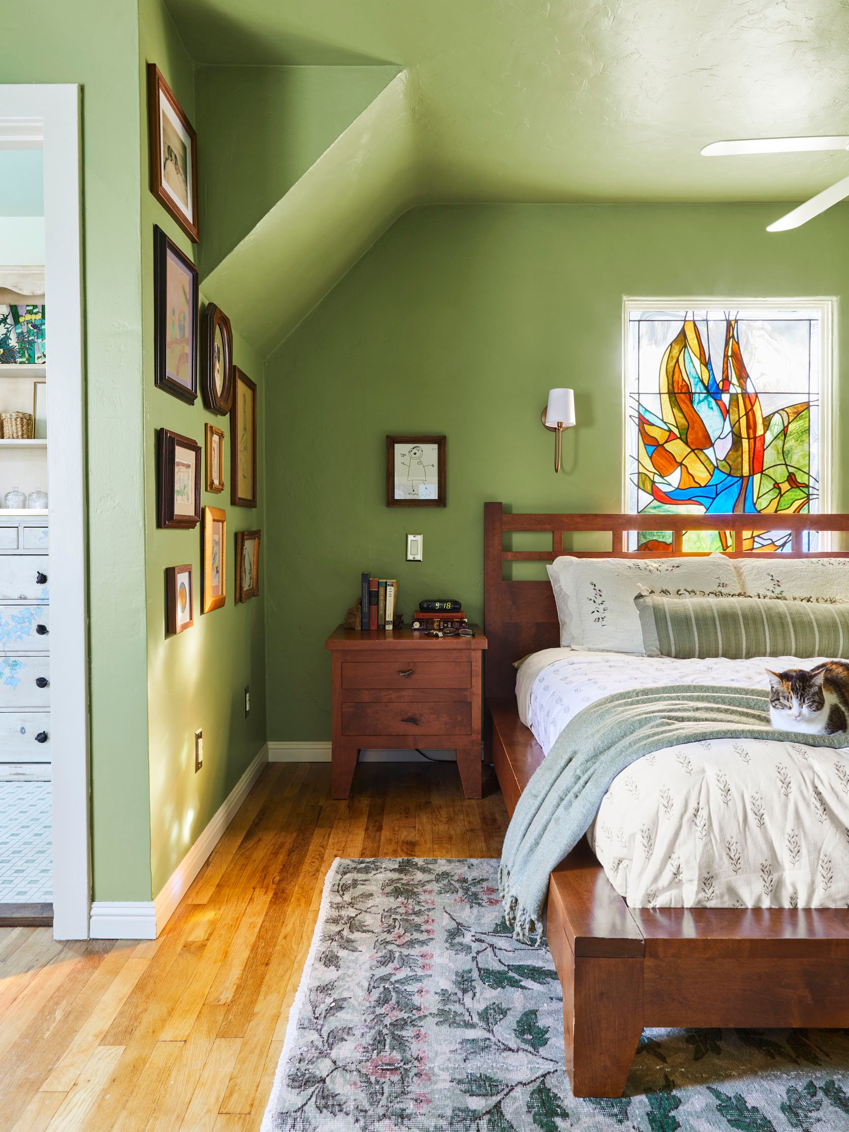
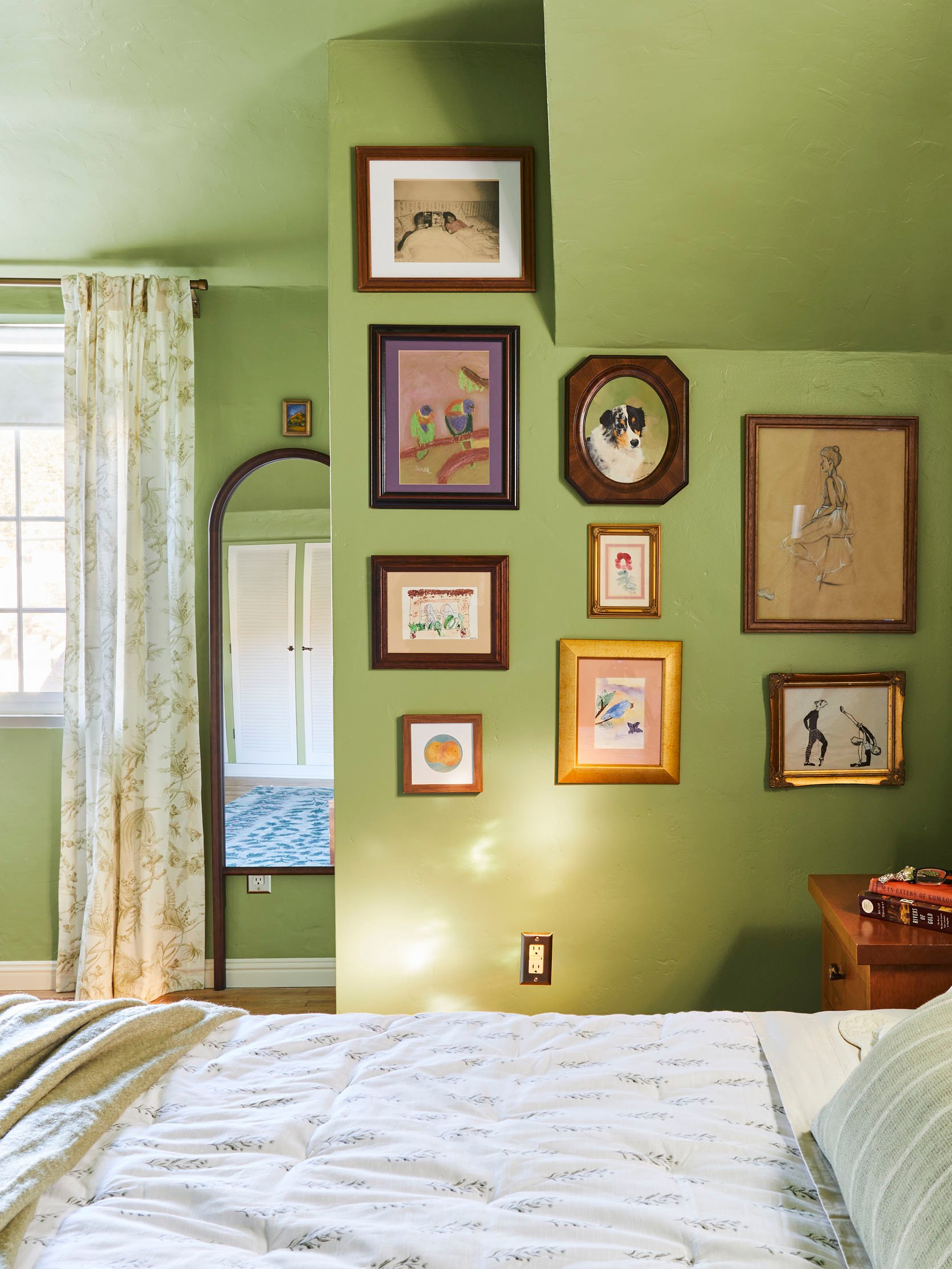
My dad’s side of the bed also used to be filled with a bookcase, only his was overflowing and had recently become a favorite scratching post of their adopted-during-quarantine cat siblings. It didn’t take much convincing to have him move all those books to the office, and instead fill his wall with family-created art. A super personal gallery wall consisting of embroidery by his sister, a painting by his niece, and other pieces by me and my brother.
I also want to call out that beautiful stained glass window behind the bed – my dad made it! Just like the big glass tree triptych in their living room (and their front door, which I need to get a good pic of just in case). I had originally thought that we would install a window treatment either over or around it, but my parents insisted that they like waking up to the natural light every morning. That and the fact that my dad installed the sconces we picked out together very high and close to the window. They are very well-installed sconces and are not moving again.
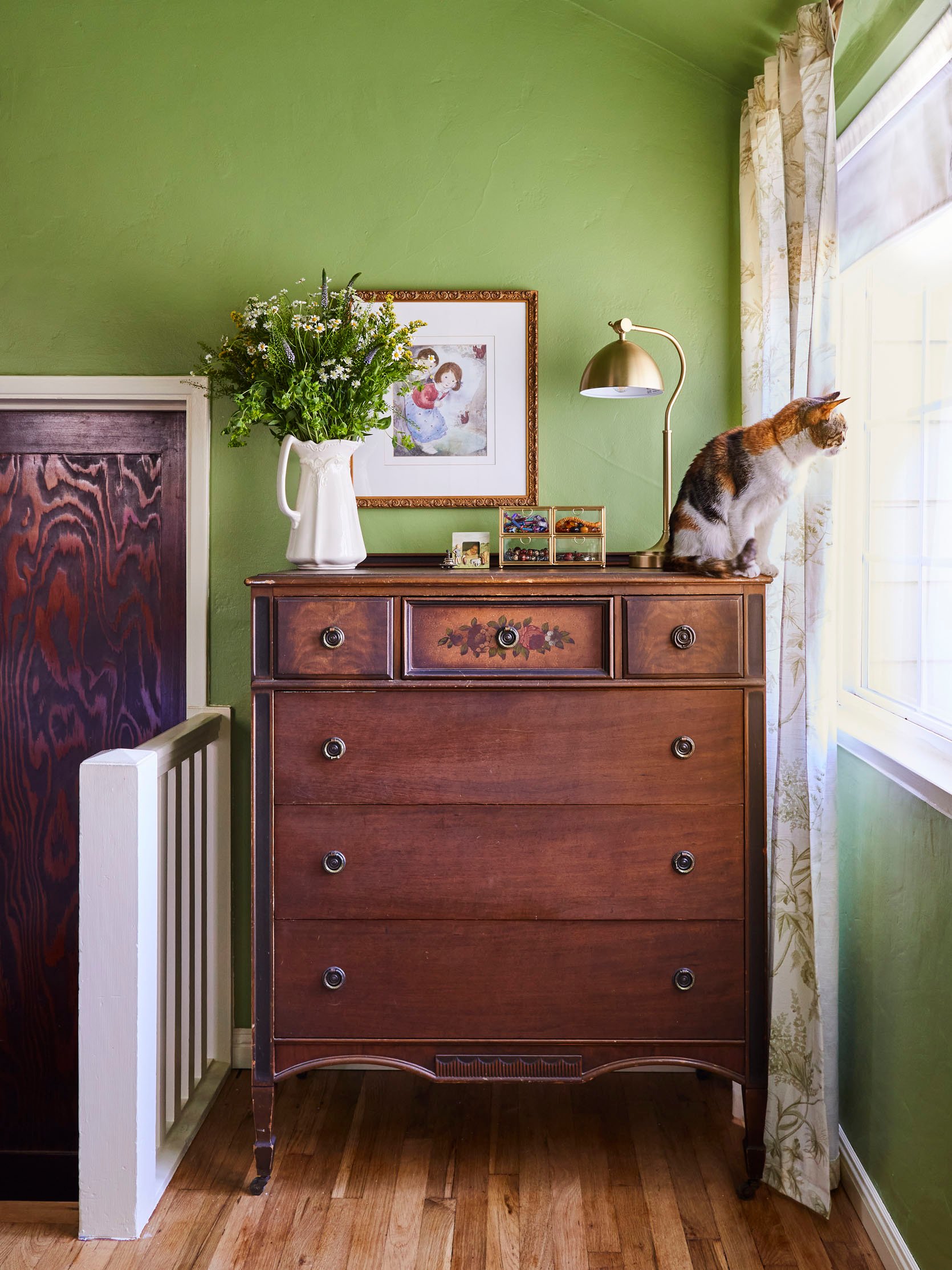
Table Lamp | Vintage Clear Glass Jewelry Box Organizer
I’m actually in love with these matching vintage tallboy and lowboy(?) dressers they own. My mom had always had this gray, plastic jewelry organizer sitting on the tallboy for as long as I could remember. I decided it was time for an update, and got her a gold and glass one instead. We decided to put this cute art piece over the dresser, instead of the large printed canvas portrait that used to be there, and it really brought together the whimsy cottage vibes that my mom likes. It was a gift from my aunt, who hand-colored the hair to match my brother’s and my hair color so that it looked like a watercolor of us.
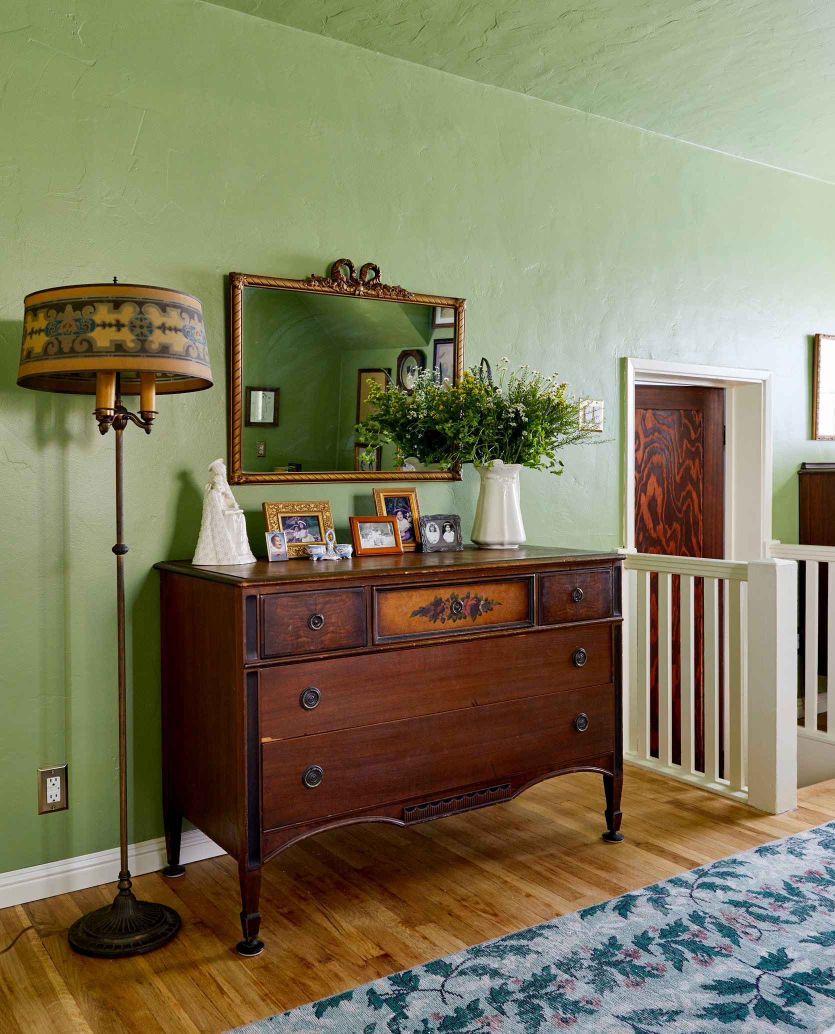
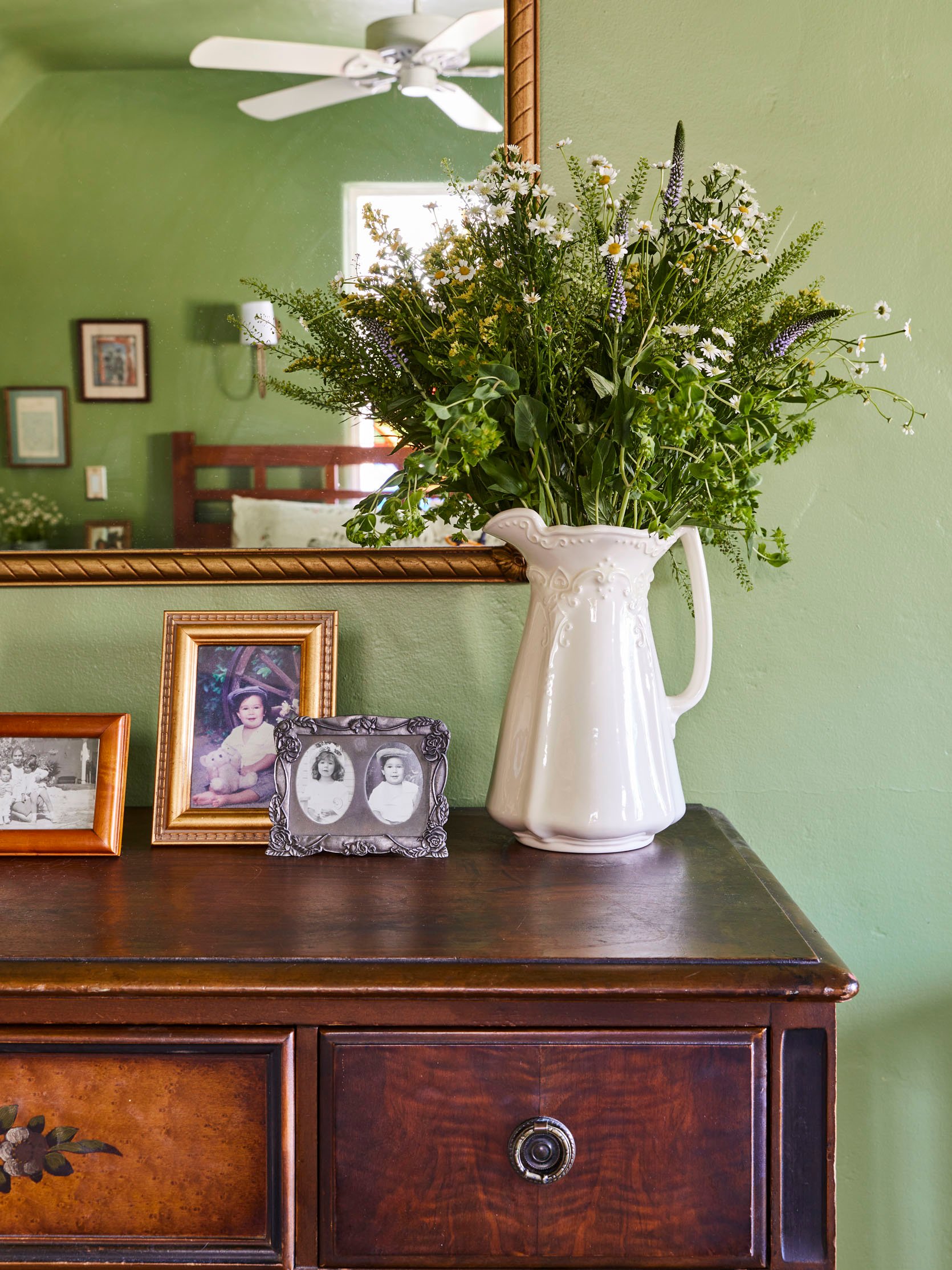
The vintage mirror over the low dresser used to just lean against the wall, so we decided it was finally time it got hung. Which gave us room to display some more picture frames on the surface instead. And that vintage lamp had been living in a corner of the guest bedroom downstairs for years. They’ve always had it and always wanted to put it somewhere more prominent. Right next to the dresser felt like the perfect display spot, while also being practical.
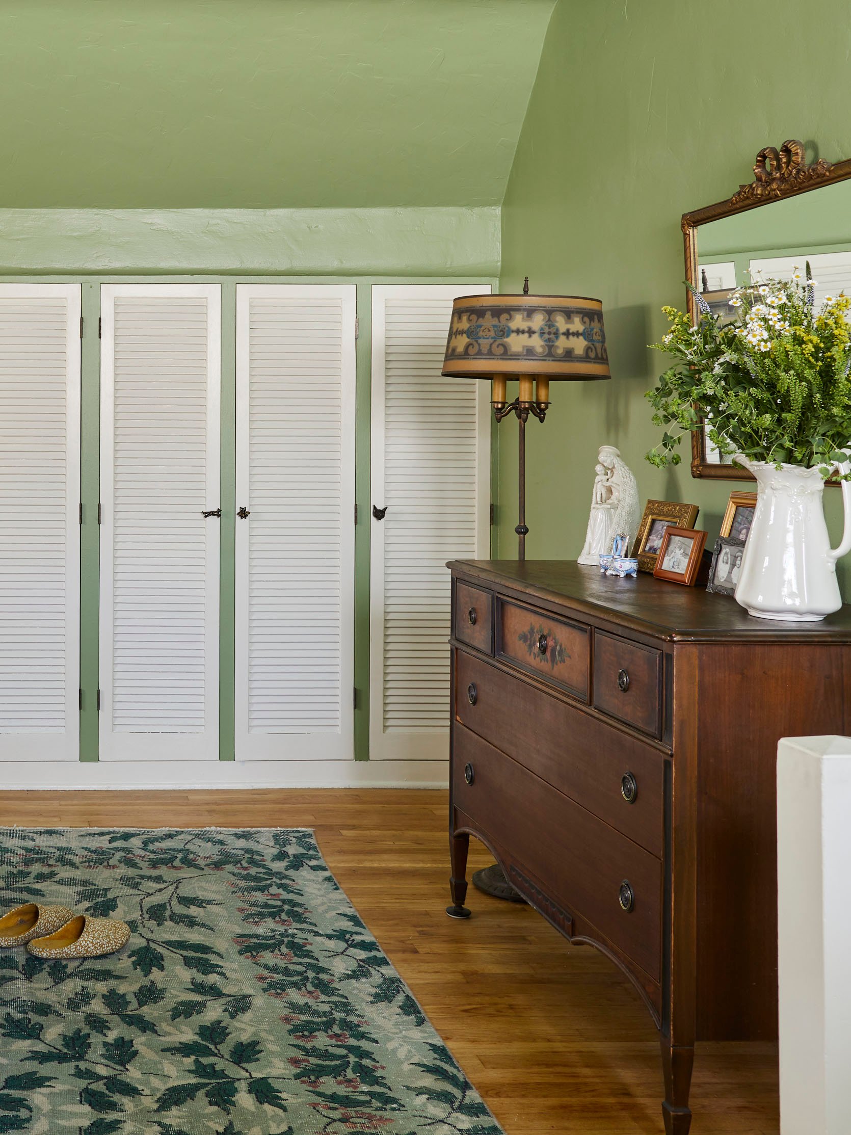
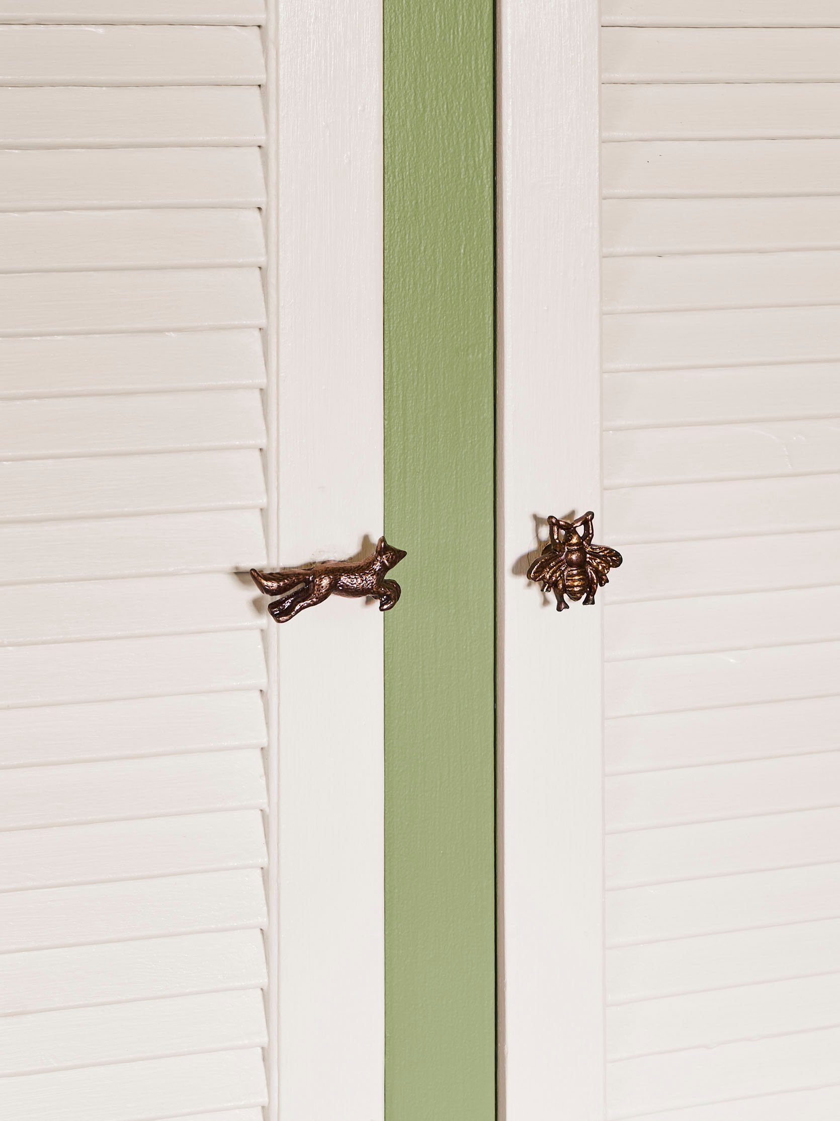
If you looked carefully, you may have noticed that the knobs on my parent’s nightstands were little birds on branches. These are the kinds of whimsical things that my parents adore, so I decided to keep that theme going with their closet. I found these beautiful brass knobs from a seller on Etsy, and ordered a different forest animal for each closet door. We ended up going for a kind of woodsy theme in the bedroom, which tied in really beautifully with the vintage rug we brought in. It was something I had bought years ago with the hopes of using it in my bedroom, only to discover it was too large. I couldn’t bring myself to cut it down, and just hoarded it knowing one day it would find the perfect home. Now it has.
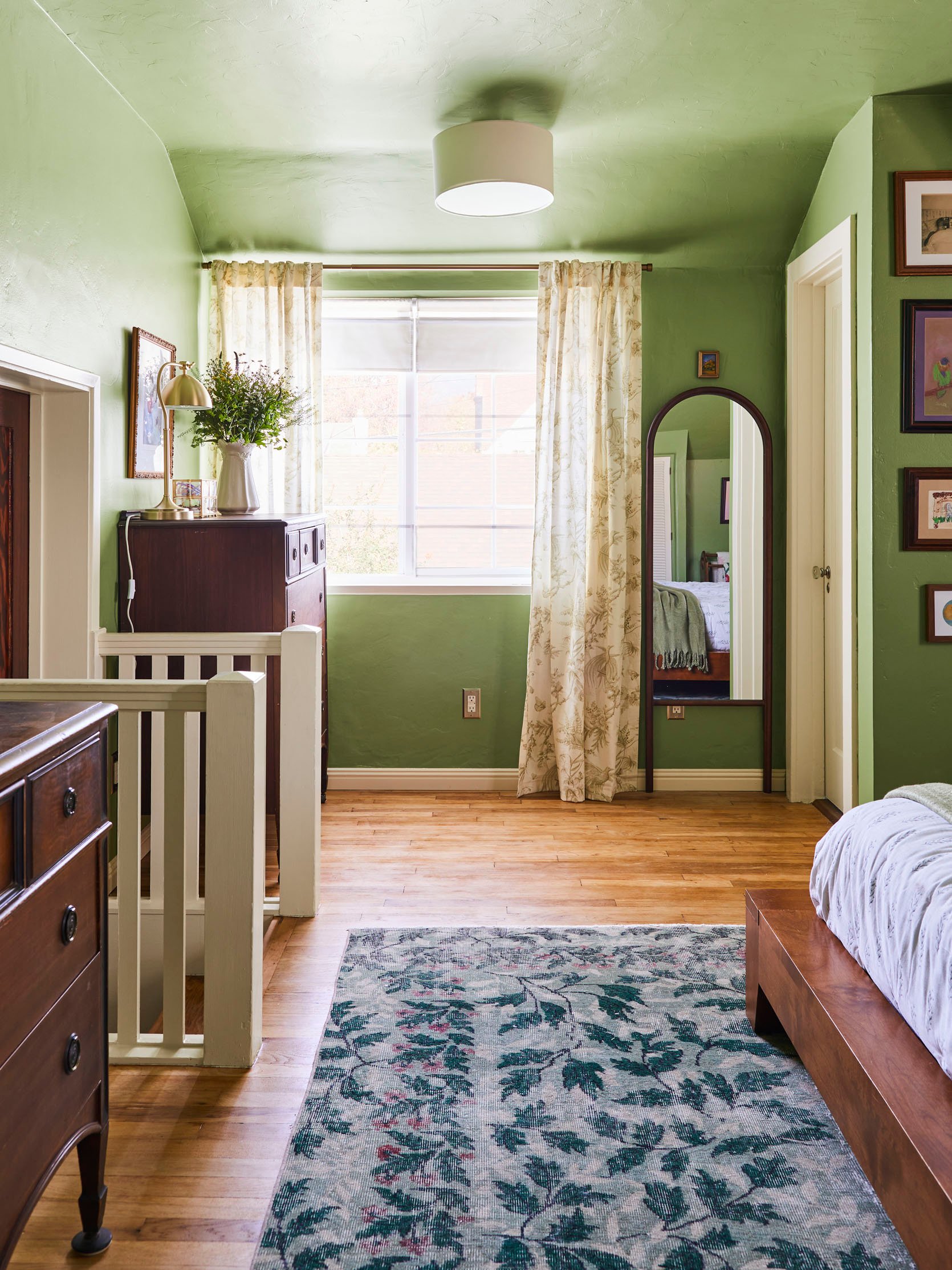
Curtains | Curtain Rod | Roman Shades | Floor Mirror | Flushmount
Continuing with that woodland theme, I found on-theme drapes covered in little taupe birds on branches. My parents had already installed stark white IKEA roman shades recently, and really loved them. I couldn’t convince them otherwise. But they were still open to keeping drapery on either side of the windows. So we installed a brass curtain rod over the window and added these mainly for aesthetic reasons. They already had a wall mirror in the original room layout, but it was unframed and unattractive. So I sourced this wood arched floor mirror to put there instead, which tied in with the darker wood tones throughout the rest of the room. And a simple linen and brass ceiling light brings that whole corner together.
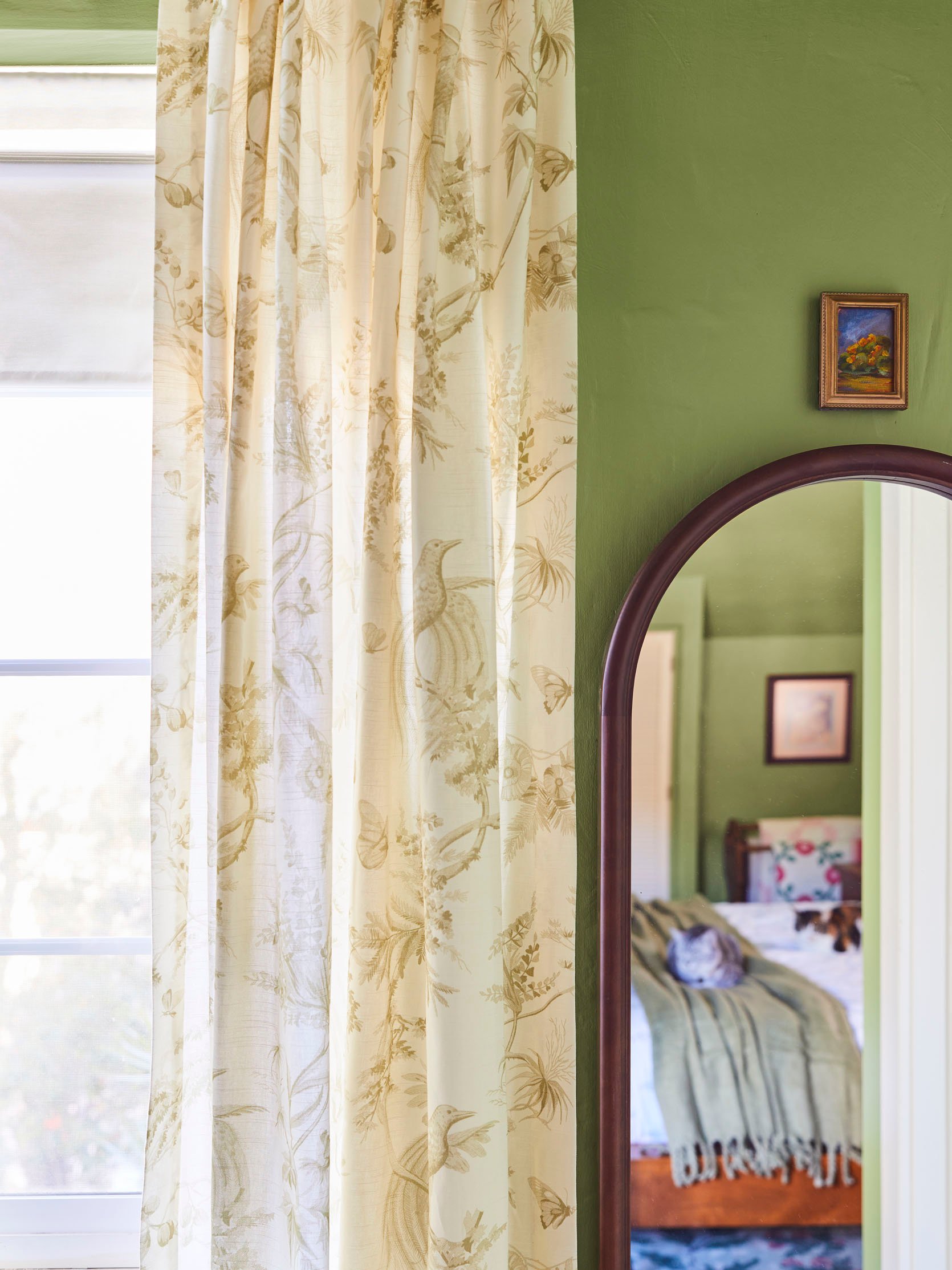
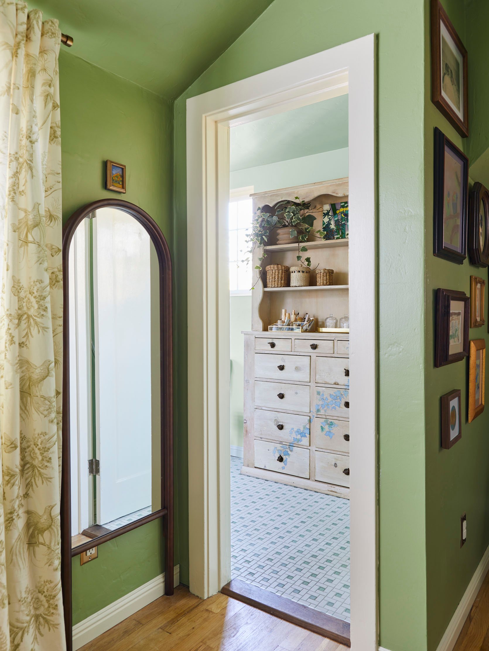
It was my mom’s suggestion to hang that tiny painting over the mirror and I could not have been more excited/proud. I must truly be her daughter, and she must truly love small paintings in weird places as much as I do. And from here you can peek into the next room we’re going to visit – the primary bath. Shall we?
The primary bath was renovated originally by my dad several years back (they’ve lived in this home since 2000), and mostly without input from my mom while she was away over the summer. This isn’t to say it was BAD, just not quite what she had envisioned. And while we weren’t going to be getting to start from scratch, we were definitely going to take it in a direction that tied it in with the primary a bit more.
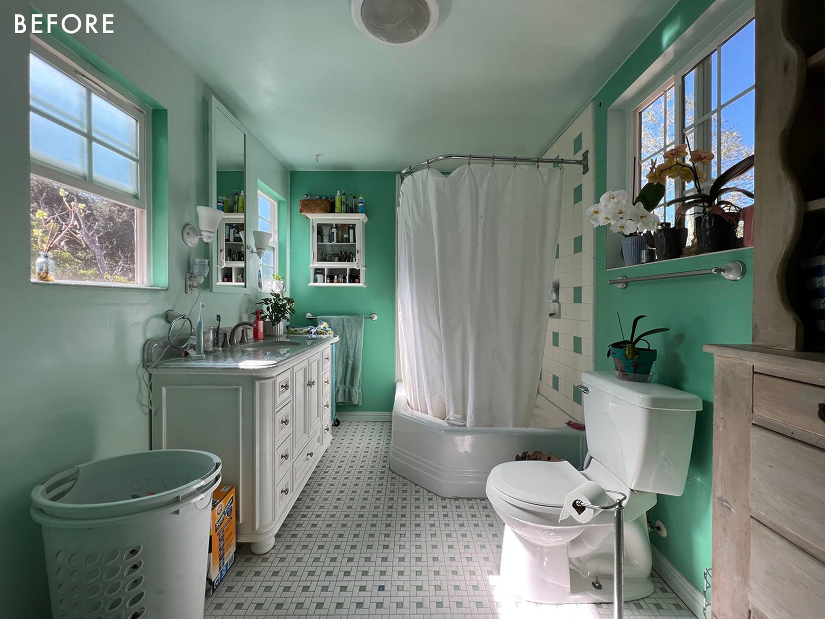
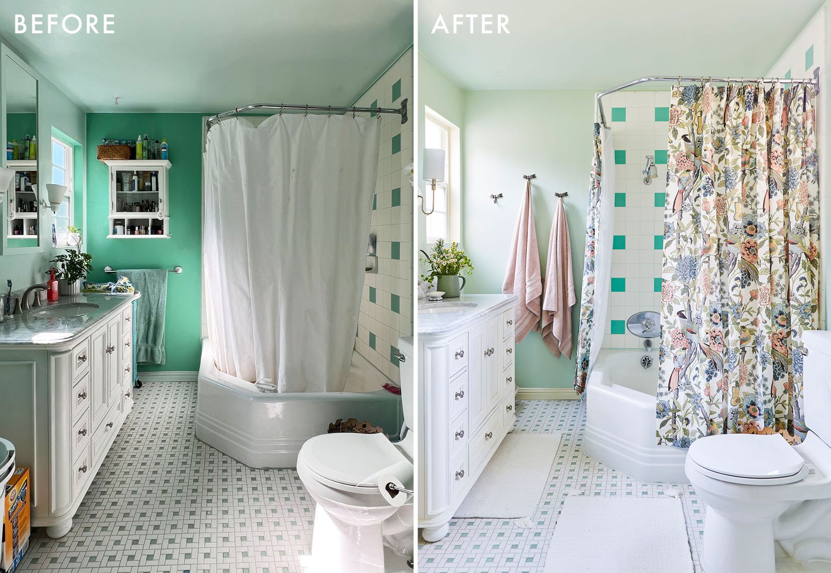
Here’s where we started – kind of a 50s meets Craftsman style, with bright teal walls that almost, but not quite, matched the glass tiles my dad installed. The vanity was fairly new, an amazing Reformation Home piece they found used on Craigslist. So the things we could change were the paint, lighting, and accessories.
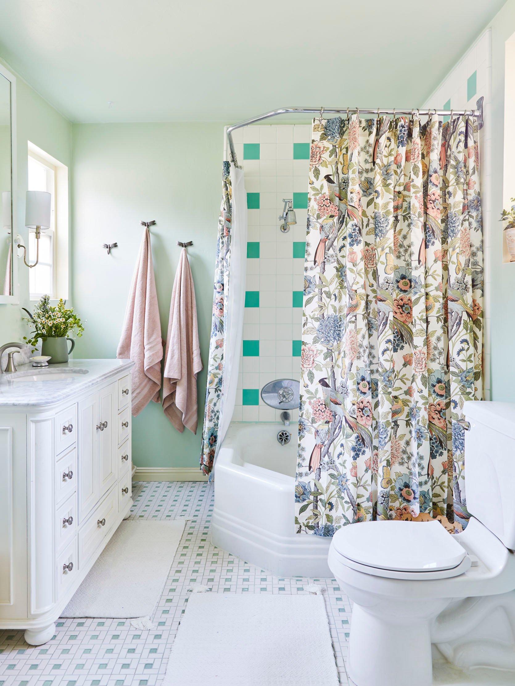
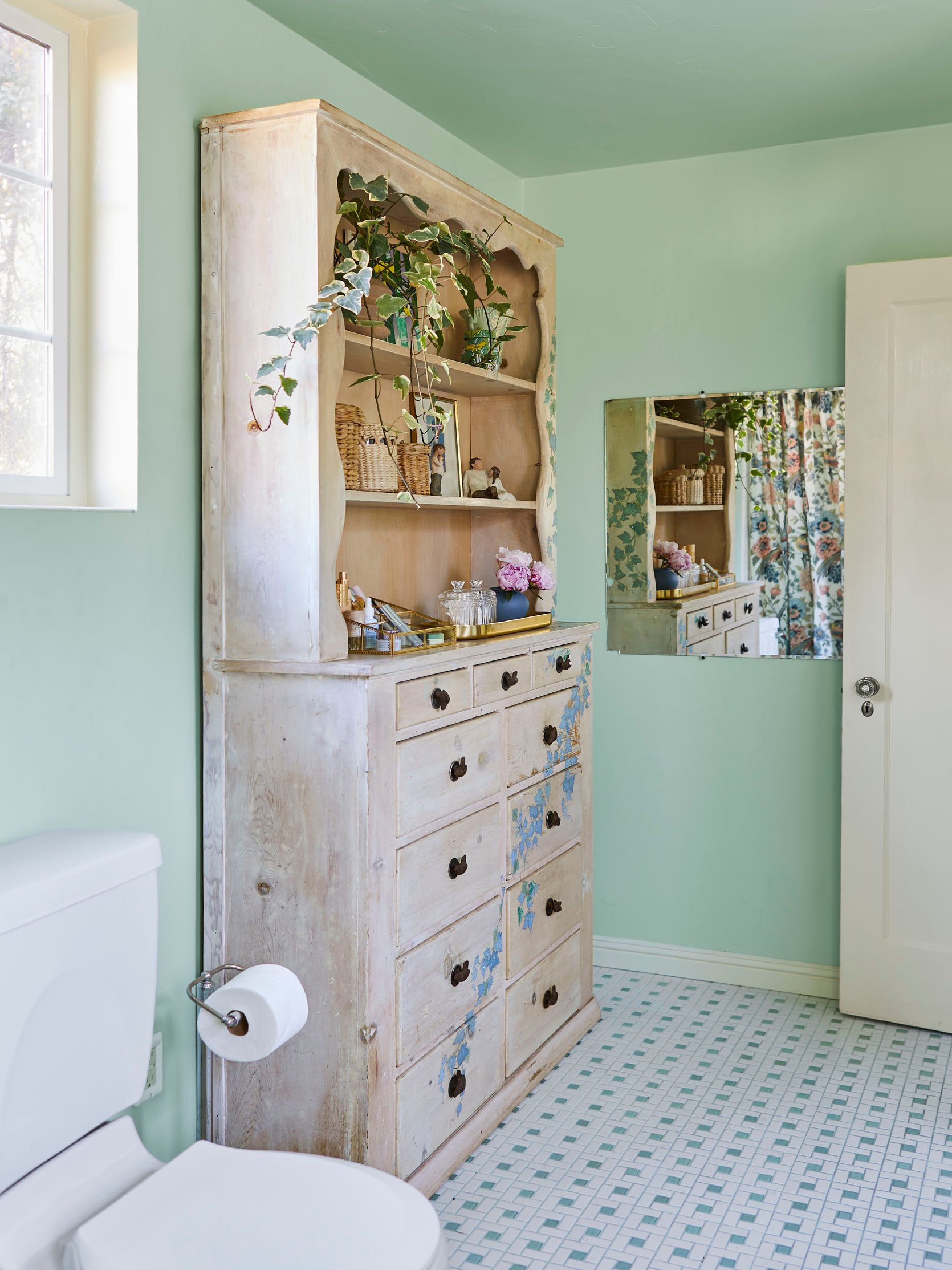
Welcome to their new-ish bathroom. A lighter, brighter, and cleaner version of its former self. We carefully selected a paint color that truly complemented the floor tiles – Sherwin William’s Topiary Tint, which brought a really beautiful calm to the space. The trim is the same Sherwin William’s Classical White as the bedroom, so that the door and trim that touched between the two spaces seamlessly flowed into one another.
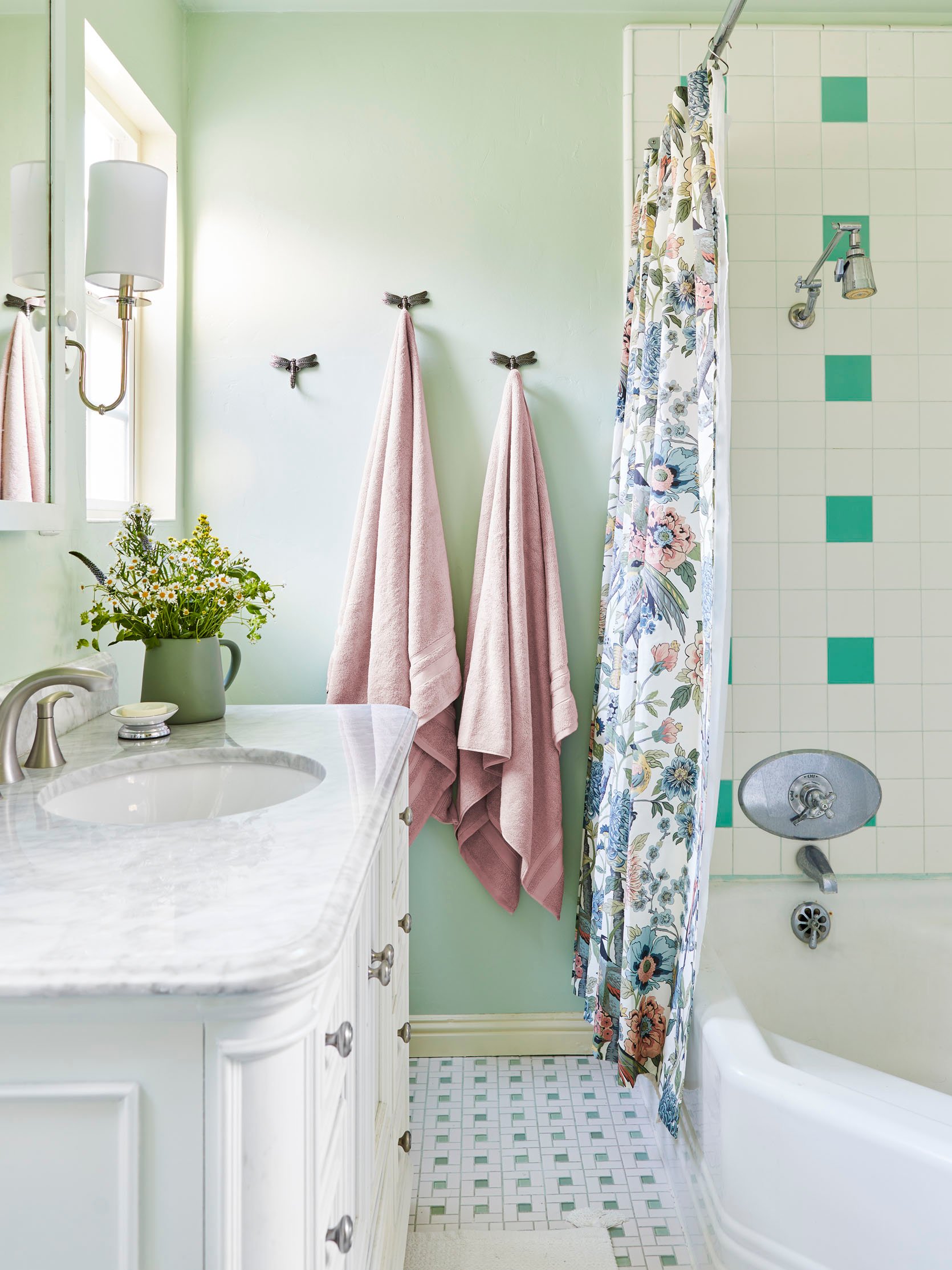
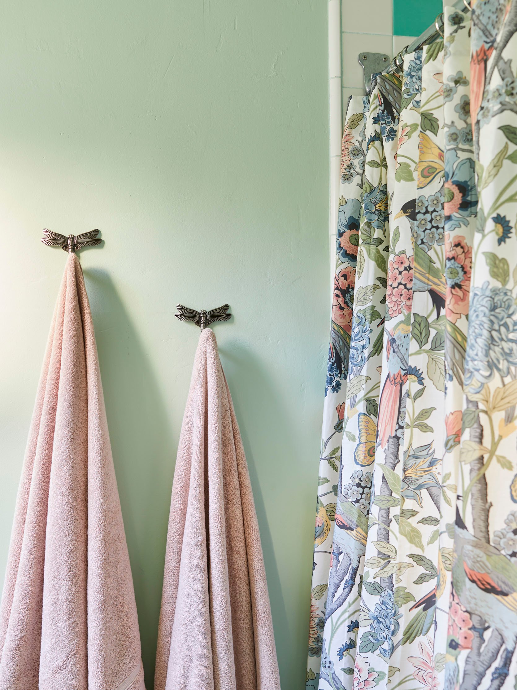
Dragonfly Wall Hooks | Shower Curtain
To keep that woodland theme going between the two rooms, I found these silver dragonfly wall hooks, which we installed as towel hooks next to the shower. And the floral and bird shower curtains tie in both with the bathroom color scheme and the birds sprinkled throughout both rooms.
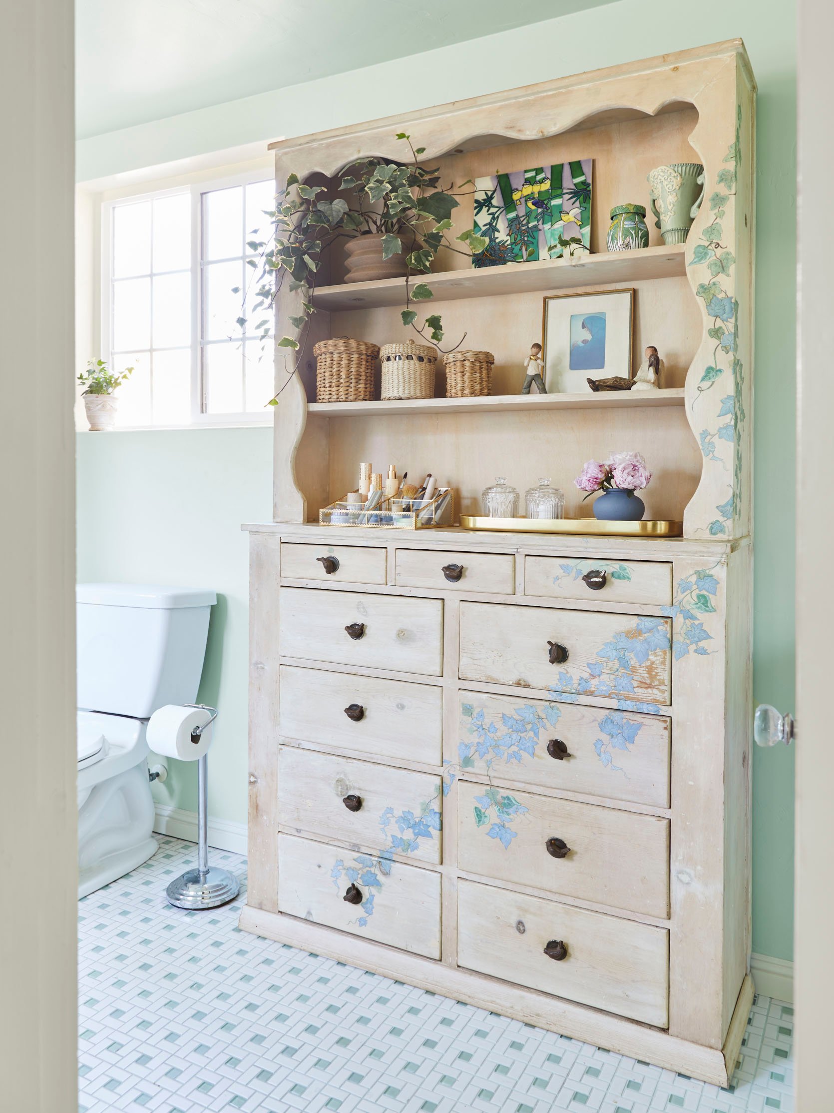
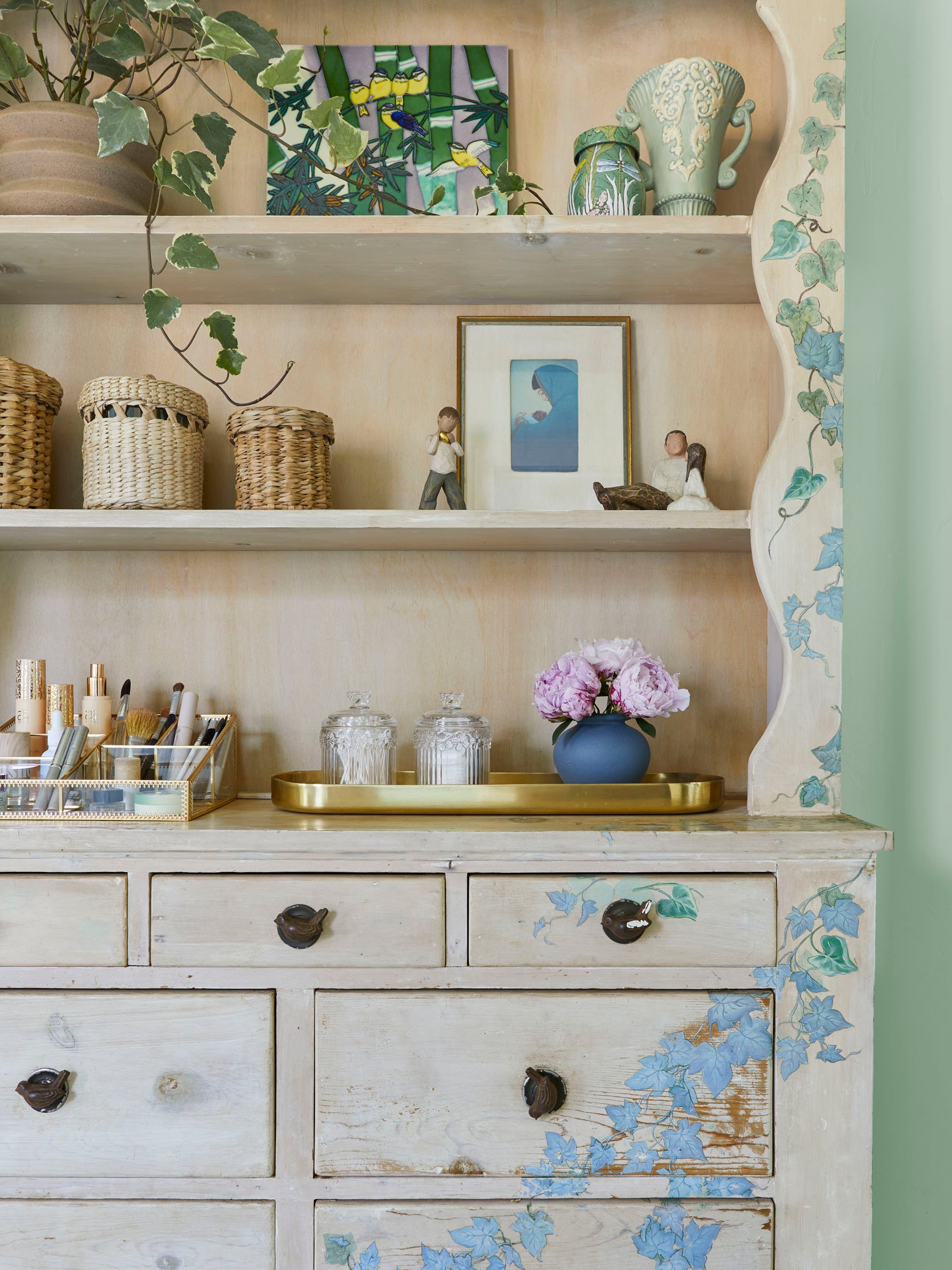
“MORE BIRDS” my mother screamed, in a fit of bird-fueled hysteria. She didn’t, that would have been terrifying. But there are more birds. This piece fits perfectly in their bathroom and is really where I took a lot of inspiration for both rooms from. It’s a vintage piece my late aunt whitewashed and decoupaged while she was living with my parents. When she passed away, my mom kept it and moved it in here. Please note the bird knobs. It’s a really sentimental piece, and also very kitsch in the best way. I organized my mom’s make-up into this glass and gold organizer, which matches the one on her tall boy (directly opposite this piece, in the bedroom).
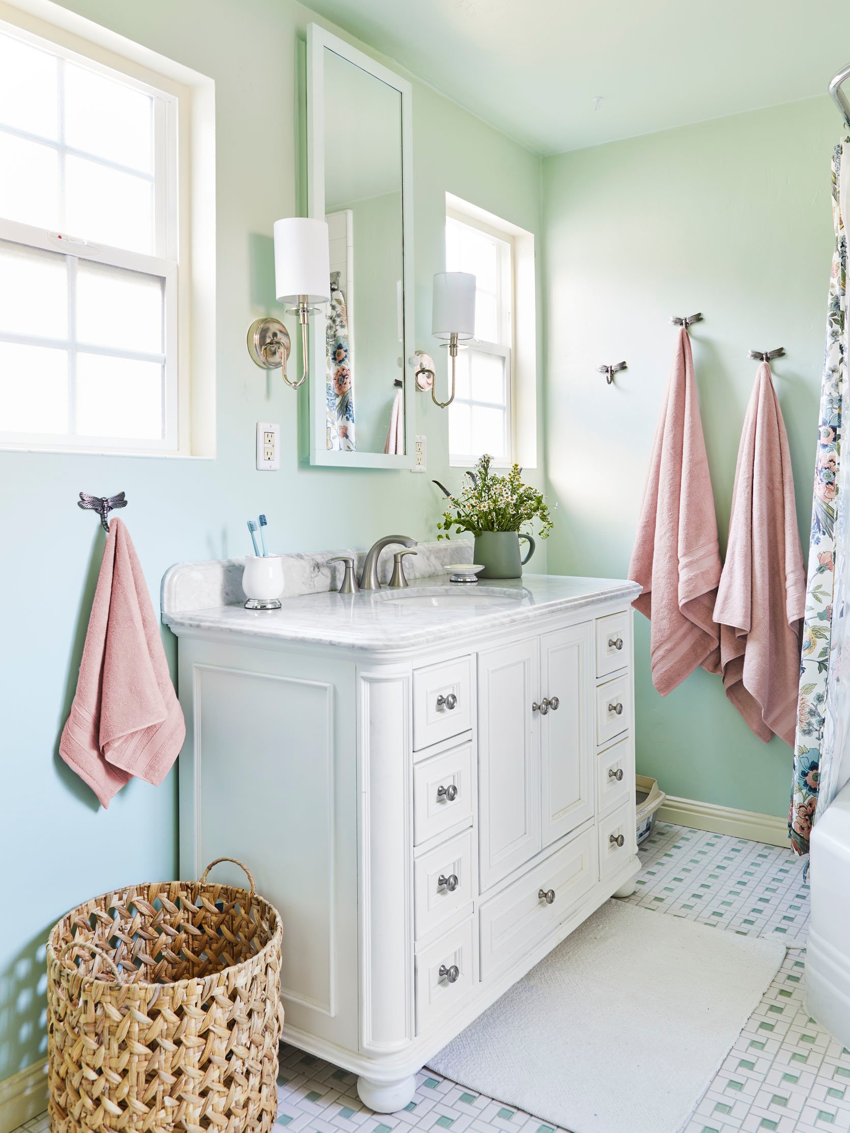
First person to spot the litter box wins a cat! Actually, if you spotted it that probably means you already have at least two of your own. Yes, the litter box lives in their bathroom. This is reality. But it’s nicely hidden in the corner! We swapped out the previously installed wall sconces with these more elegant ones, and added another dragonfly towel hook next to the sink. Small changes for big impact.
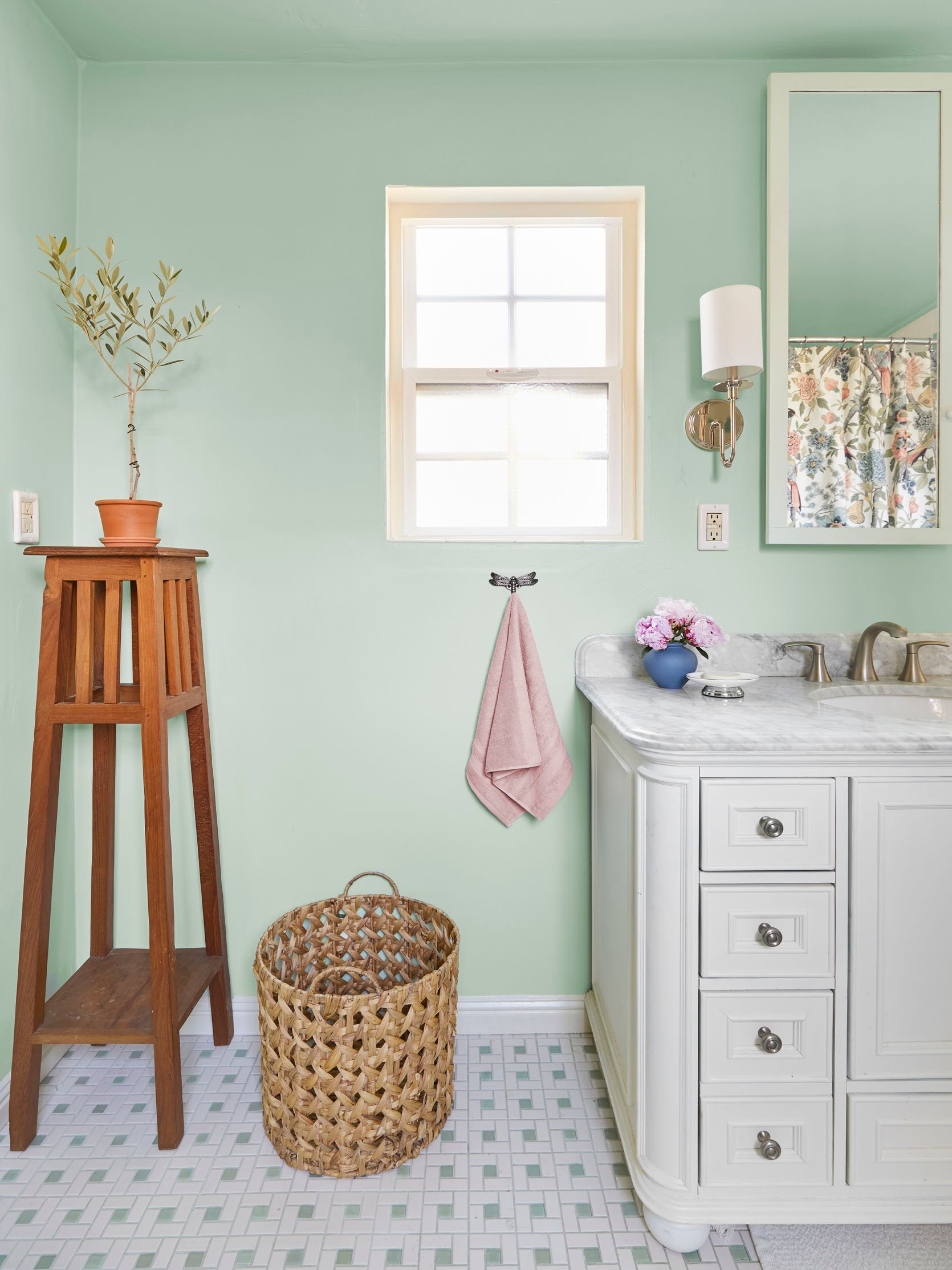
And there you have it folks – a quick bedroom and bathroom refresh that make all the difference. Some new wall paint, some new light fixtures, and a reorganizing of art are really the three biggest changes we made. But of course, it’s all about the details – the heirloom quilts, the family art, the vintage pieces sourced over years. My parents are really wonderful collectors, and I think these two rooms truly represent that. They just needed a little help bringing it all together in a cohesive way.
*Design and Photos by Sara Ligorria-Tramp
THIS POST WAS ORIGINALLY PUBLISHED HERE.


