Move over 2023 Pantone Color of the Year, because I’ve got something better for you EHDers. A color so rich and with so much depth that it *literally* can save nearly any color palette that feels incomplete. “Wait…remind me what the Pantone Color of the Year is, Arlyn,” you may be mentally prompting me. Ah yes, I, too, had to look it up because frankly, Viva Magenta (the actual COTY) isn’t that memorable.
Presenting…Arlyn’s Color of the Year: Mulberry. Or if we want to get fancy with it, Ebullient Mulberry…Merry Mulberry…Cozy Mulb…let’s just keep things simple, shall we, because I’m not good at the color naming game. It’s like a raspberry and a blackberry had a berry baby; or more simply, it’s just the color of an actual mulberry fruit, but I don’t know about yours, but my supermarket doesn’t make those readily available so it’s hard to imagine.
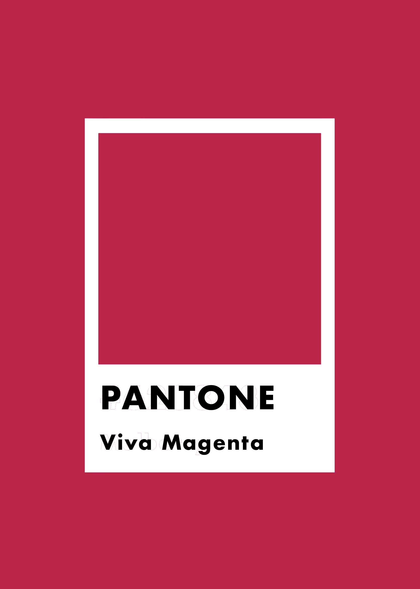
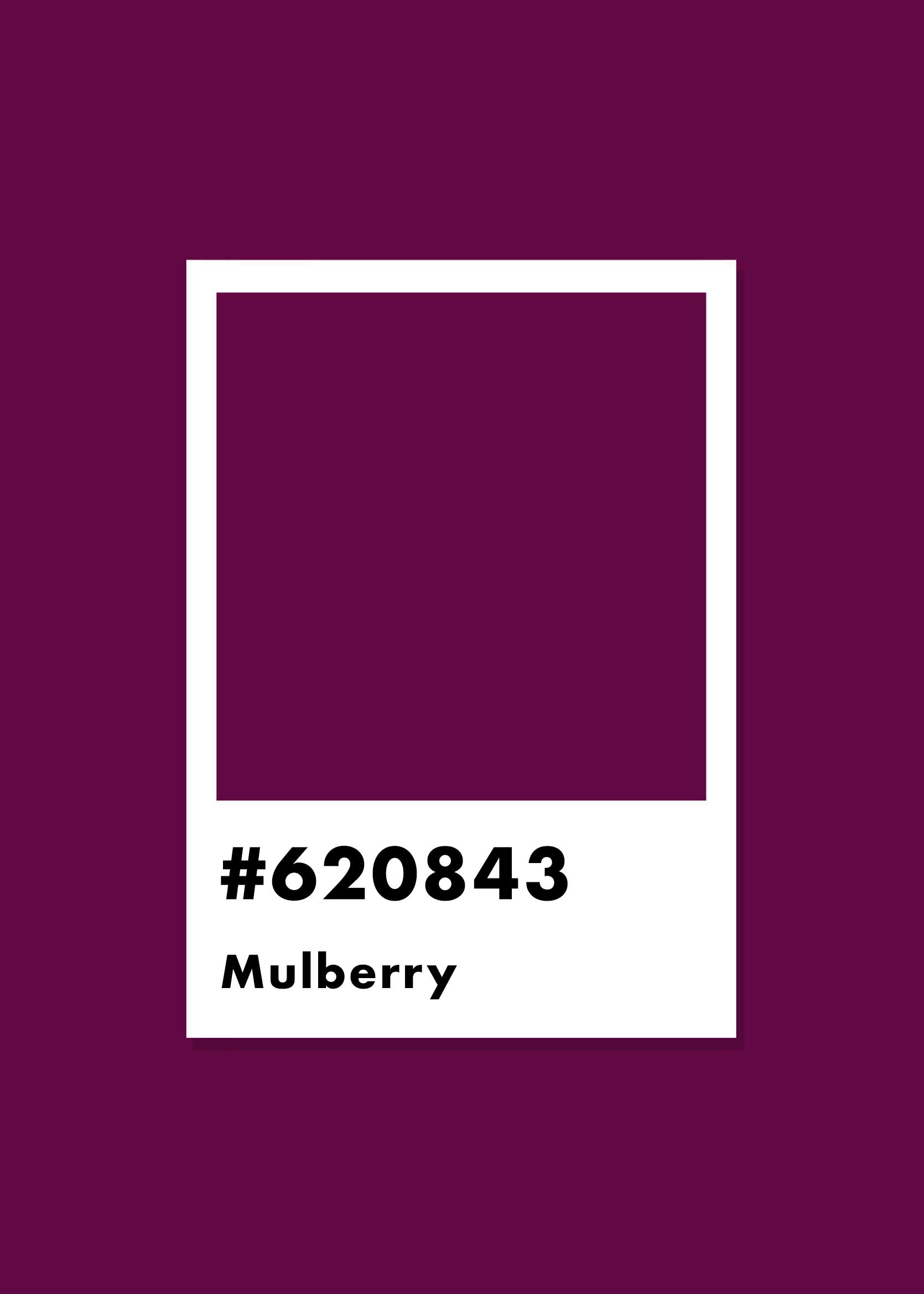
If we take a look at mulberry next to the official COTY, sure, it’s not *that* different from Viva Magenta. Except for a color nerd like me, it is. It’s like mayonnaise and Miracle Whip. Long-grain rice and riced cauliflower. Whitney Houston vs. someone singing a cover of Whitney Houston. Close but absolutely no cigar. If you were hoping to bite into a mulberry pie and it ended up being cranberry, your mouth would be surprised at the tartness. Similar in theory, sure, but far from the same thing. It’s hard to replicate the jammy goodness of authentic mulberry.
Color nuance is hugely important. Alter the undertone of a shade just slightly, and it completely changes the vibe. For example, a green with blue undertones is soothing, quiet, and sleepy while a green with yellow undertones is lively, verdant, and energized. Energized ≠ quiet.
So, why do I think mulberry is actually the sleeper hit of the design world currently, and how can you make it work in your own home? Let’s get into it.
The Velvet of the Color World
This post actually started with me culling together 10 color palettes that were a bit unexpected for anyone tired of the same ol’, same ol’. While I was writing, though, I noticed something that hadn’t been super obvious to me at first. As I took a break and sat on the stoop of my front porch, bubble wand in hand to entertain my toddler, I grabbed my phone and sent Jess a nearly out-of-breath voice note. “Mulberry! It’s always been Mulberry!” was a summary of my thoughts. There it was, in nearly every photo I had plucked from the internet, from different designers, from different countries.
It worked with blue, it melded with orange and red, it danced with yellow and green and aqua. Mulberry seemed to add a je ne sais quoi to each room that made them all feel well-rounded, rooted, and not too precise. The color is just red enough to balance warm shades, but just purple enough to be a surprising partner to cooler, analogous tones. It has just enough black to bring down a room that’s overly sweet, and punchy enough to shake up anything too neutral or monochrome. Honestly, it’s a finishing touch secret weapon and I can’t believe I’m only just becoming aware of it. The next part of my design life can begin now, armed with the powerful sangria-esque hue.
To me, mulberry adds the same necessary richness to a room that a mahogany or walnut vintage wood piece brings or even a bit of velvet. It’s all about visual balance and subtle complexity and depth. It’s the kind of color that touches your soul in an almost nostalgic way, reminiscent of popsicle-stained tongues from childhood on a hot summer afternoon.
I may have abandoned my initial concept I pitched to Jess, but I didn’t jilt all the beautiful photos I was going to use as examples. Just a slight pivot, so I can walk you through how mulberry works in rooms of all different styles and colors.
Let’s See Mulberry in Action
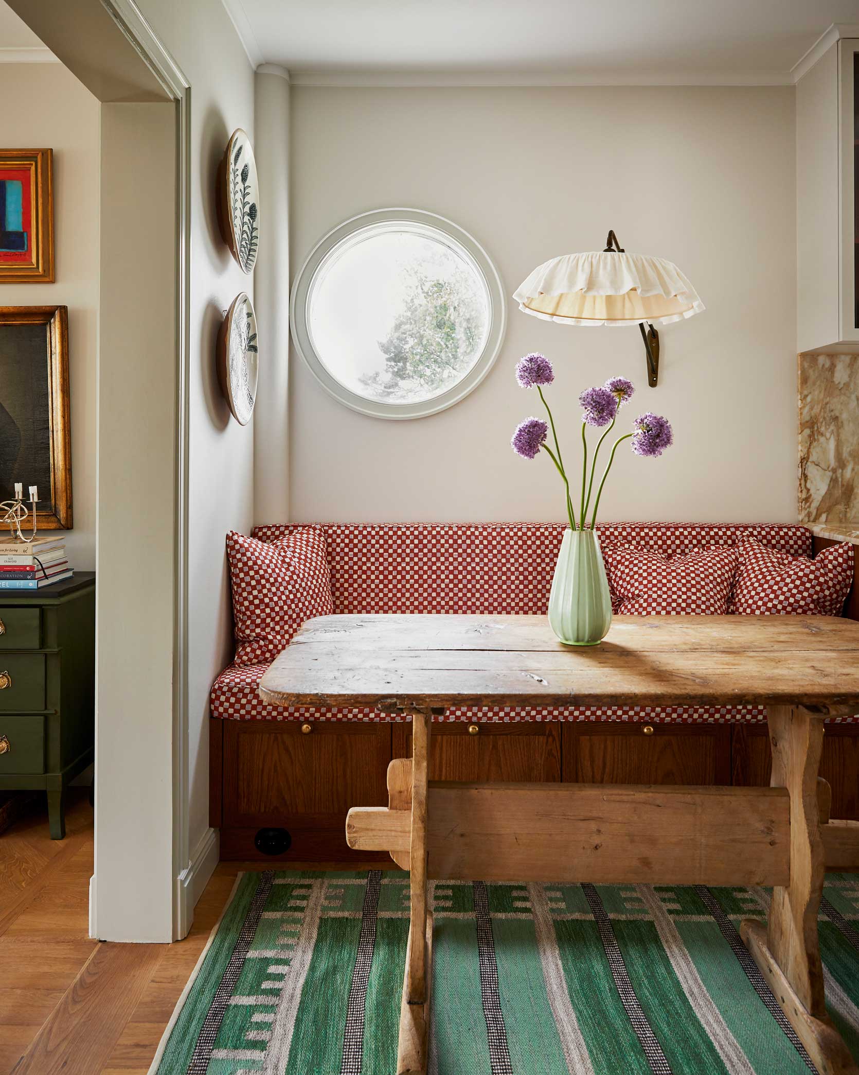

First up, we have this unthinkably charming breakfast nook by Inuti Design. The oyster walls and mix of wood tones allow for a bit of play with the palette so that there’s plenty of color without feeling colorful. The fabric on the bench—a textile by the homeowner Cathy Nordström—is the star, with its mulberry and lilac checkerboard pattern. I love how it tangos with the red-toned wood of the built-in base and also works as a complementary shade to the mint and Kelly green happening in most of the other pieces. Without the fruity hue, sure, it would have been a lovely space, but the weight of it gives the whole space a presence that probably couldn’t be replicated with another color.


Here’s a fun one: take your hand and cover that mushroom stool in this living room by Dabito for just a moment. Try to envision the room without it. Go on…that’s a nice spot energized by the drama of orange but toned down by the fact that it’s fairly monochrome (and sage green overhead and underfoot). Now, take your hand away. POW! A jolt of the unexpected. It’s easy to think maybe it doesn’t go with the existing color scheme, but it’s actually genius. The mulberry, as an offshoot of the warm earth tones, bridges the gap between the coolness of the mossy green. It exists both in a red space and a blue space that makes shakes the room out of the seriousness going this bold can sometimes create.
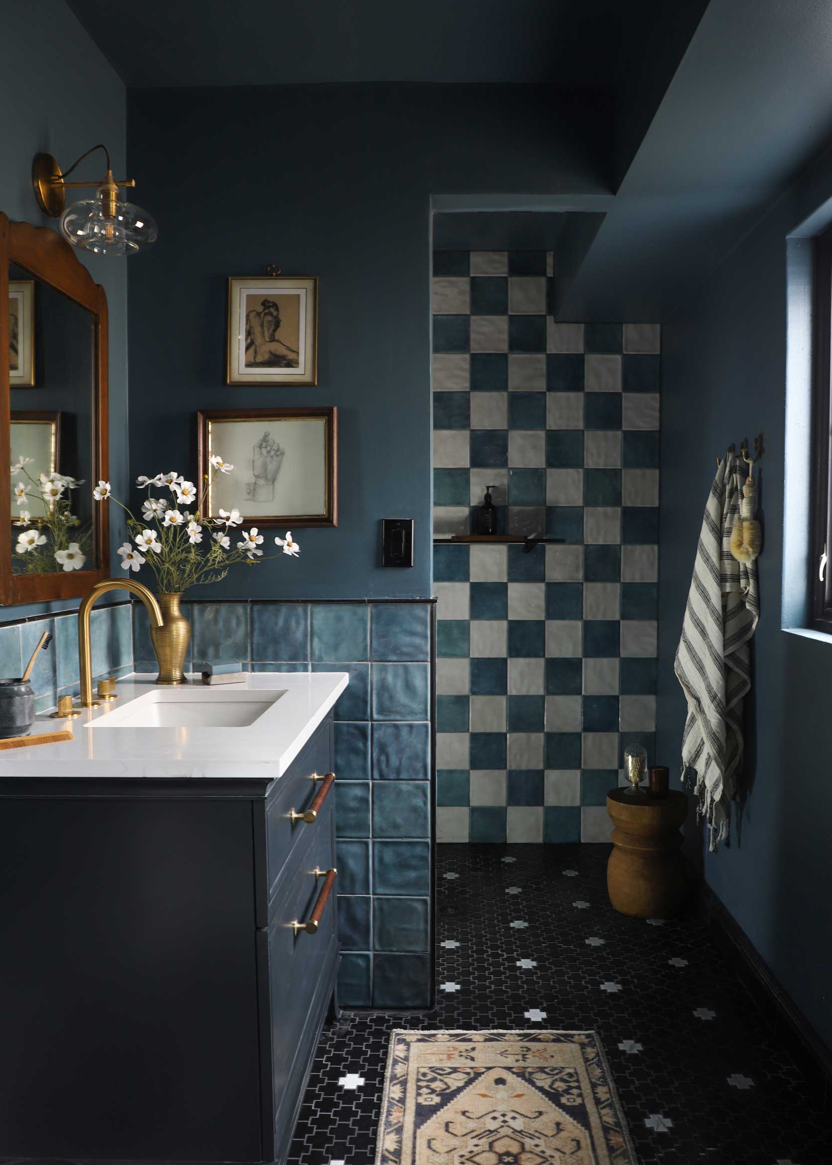
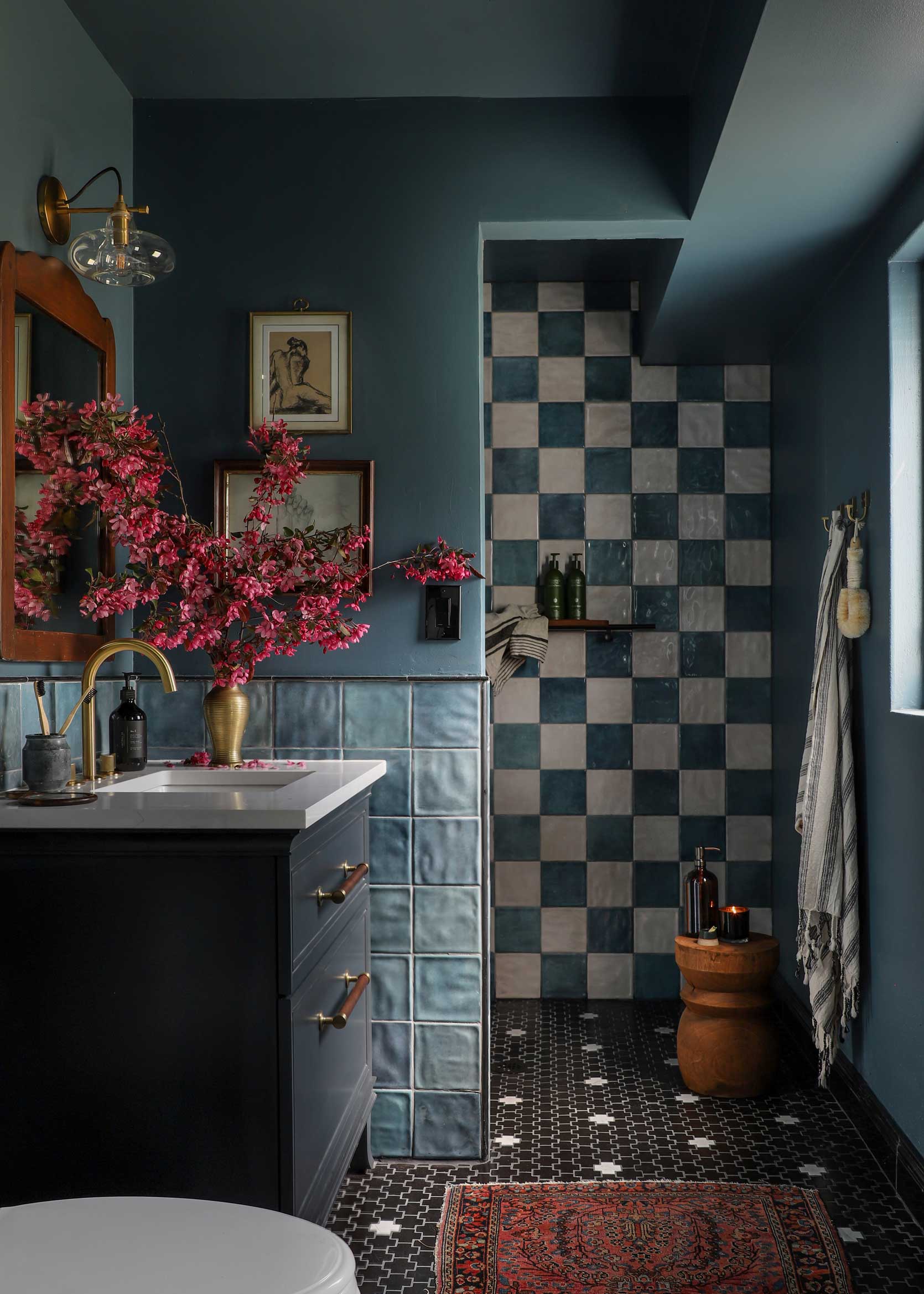

When I first asked Jenni Yolo of I Spy DIY if I could use the photo of her bathroom for this post, she sent me two images and it turned out to be the perfect use case. That first image, with its cream rug and white flowers, is so pretty. It’s calm yet dripping in drama. But the next image, the one with the burgundy rug and the fuchsia blossoms is magic. The subtlety of her palette is more noticeable. Obviously, the lighting is a bit warmer in the second photo, so the walls and shower tile lean a bit greener, but regardless, things come to life with the addition of mulberry-esque details.
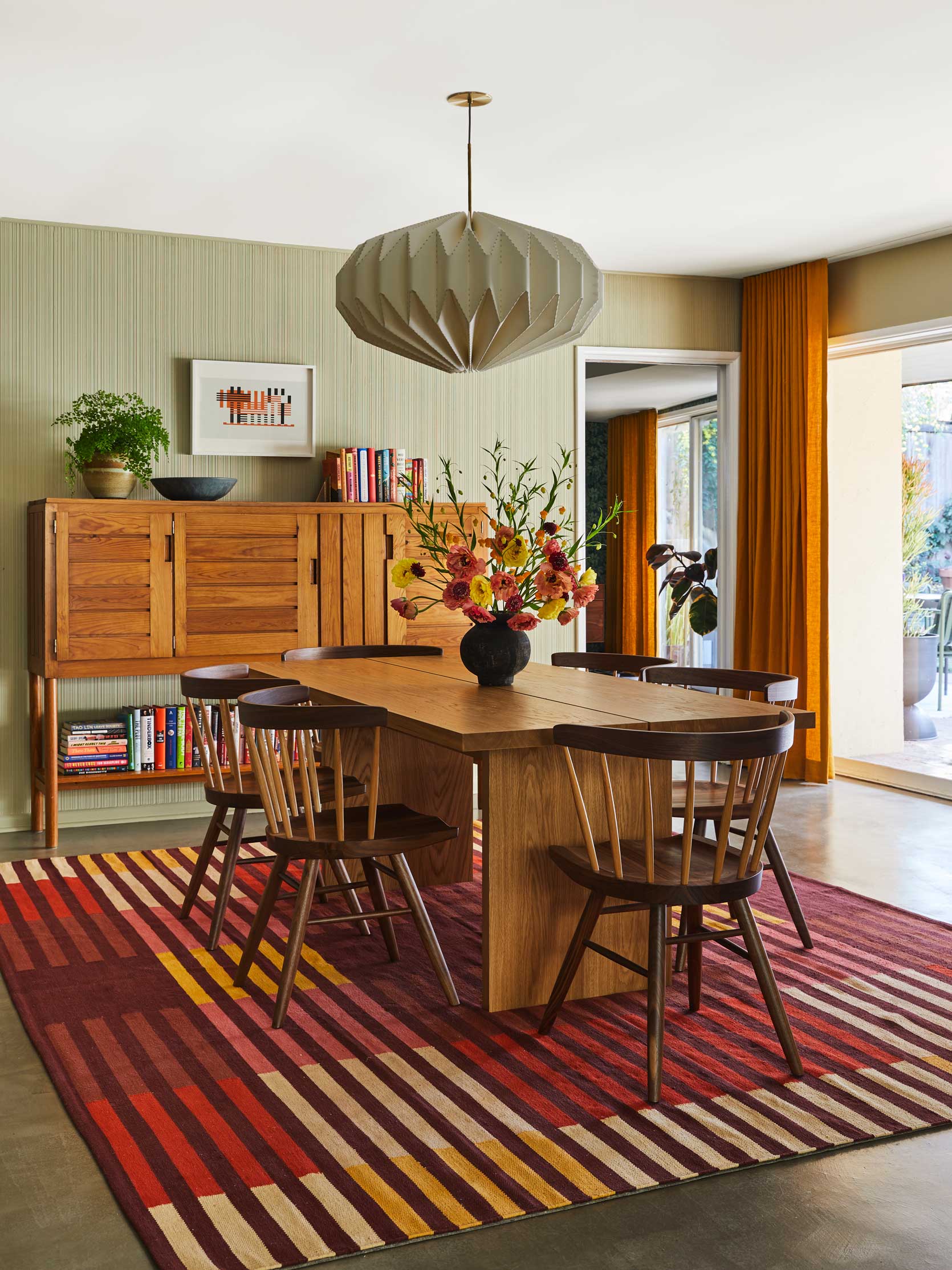

By now, you may have noticed a throughline. Designers love balancing light greens and poppy oranges with raisin-y mulberry. Here, it makes an appearance in the rug and it’s all the room needs to take a palette of mint and marigold to a whole other level. To my eye, it also does a wonderful job of balancing the golden oak cabinet and the deep walnut or wenge dining chairs. Had the rug just been cream, ochre, red and pink, I’m not sure there would have been enough to steady the vibrant oranges, but Sarah Zachary knew what she was doing.
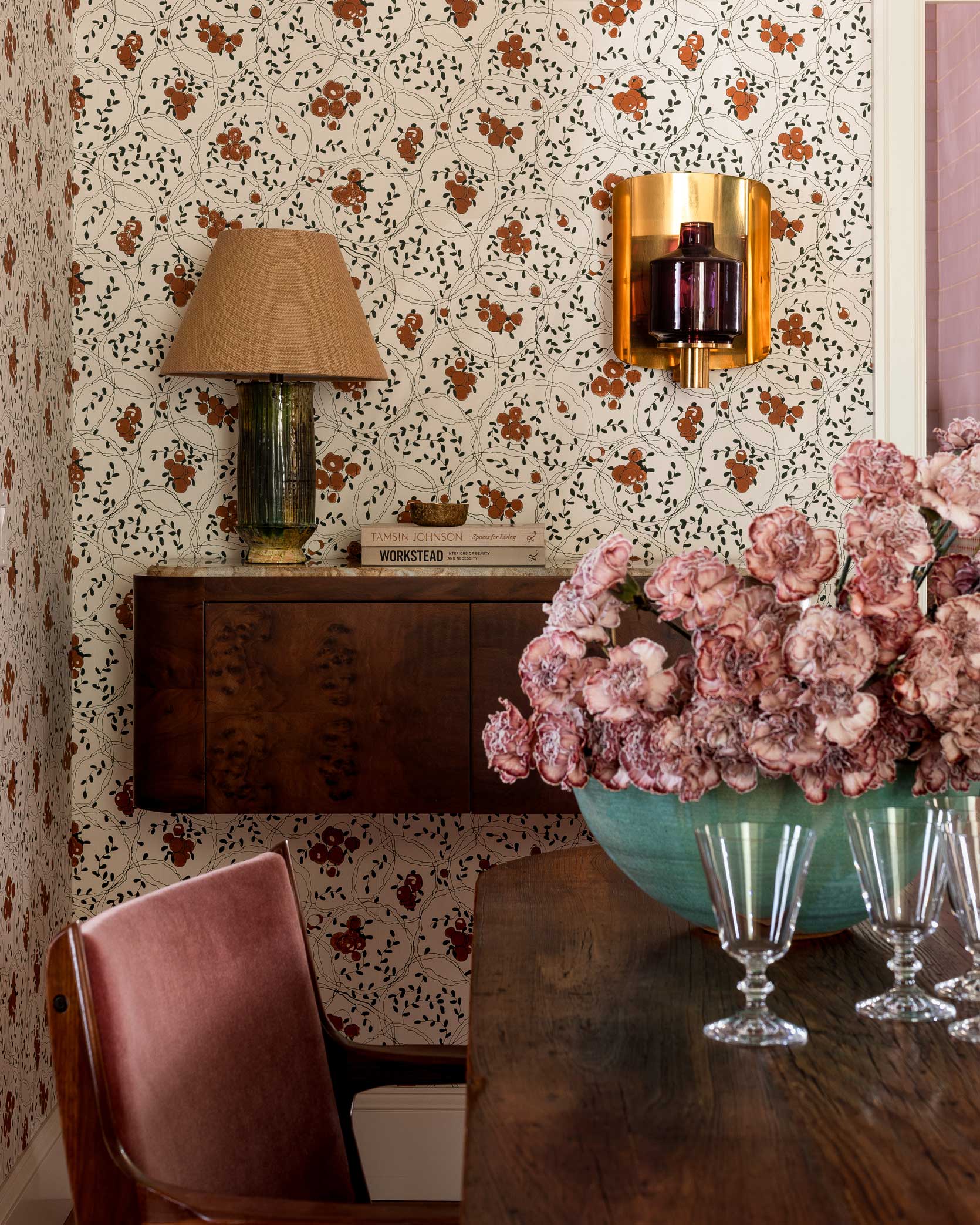

At an initial glance, you might miss the mulberry moment here, but the sleeper hit by Heidi Caillier is pulling its weight without you even realizing it. If you do another “finger over the mulberry to see the difference” exercise, what you have without the sconce is definitely sweet. Timeless. Inviting. But just that touch of an effervescent merlot gives the room some edge. I love how it plays off the traditional wallpaper, and above all, I’m smitten with it in tandem with burlwood. I’m saying it now: mulberry and burlwood together are like a design elixir that can’t go wrong.
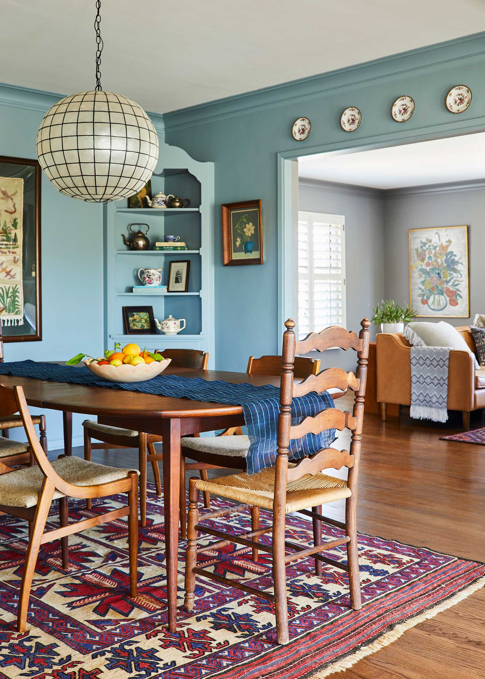

I have loved this image Sara shot for Emily’s second book from the moment I saw it on her computer screen. I’m not much of a tea drinker, but boy would I love an invite over to Allison Pierce’s home for some Earl Grey and a cranberry scone. The design is just cottage-y enough to scratch my itch for English interiors but cleaned up enough to seem livable and uncluttered. But…let’s get back to the matter at hand.
The truth is, there is no mulberry in this photo, but the way the blue and red of the rug come together tricks my eye into thinking there is. It reads purple in some spots, which frankly, is the secret sauce of the entire design. I’ve tried to avoid repeating my use of the word balance throughout this article, but oh well: balance. If your safe space is blue and wood tones, I hope this room—heck, this whole post—inspires you to add in a touch of something else (::cough:: mulberry ::cough::) to round the whole thing out.
So, here we are. We’ve reached the end of my love letter to the color mulberry. As I sit and rethink the color palette in my new home, I find myself so drawn to it. There were many other photos I could have shown you to keep proving my point, but I have to imagine you catch my drift by now. The shade of purply red really is the great equalizing. It works in traditional spaces, modern designs, and all the in-betweens. I tend to prefer it used in moderation, just a sprinkle to keep it special, but hey, go all in if you’re so inclined (and please DM me a photo, if you do). I’ll be sure to keep you all posted on how I plan to pivot my existing furniture (plus some new finds) in the new place by shaking up my colors, and if this post is any clue, it’ll certainly include our new friend, mulberry.
Until next time. XOXO, your friend in design.
Opener Image Credit: Design by Allison Pierce | Photo by Sara Ligorria-Tramp | Styling by Velinda Hellen & Erik Staalberg
THIS POST WAS ORIGINALLY PUBLISHED HERE.


