I am what I like to call a “DIY-isher”. Most of my “DIY” projects have been with my dad but I have done some by myself like my balcony floor and new bench cabinet (not yet revealed but I LOVE it:)). Every time, once of course I’m in too deep, I curse the day I thought that project was a good idea. That is until it’s done and I feel like superwoman. Ha. So if you’re wondering whether or not I am pro DIYing, I am! There’s really nothing like making something with your own two hands (or four if you have a friend which I highly recommend:)). So today, I am bringing you some pretty special DIYs – ones that will undoubtedly have a HUGE impact in your home. While most of these are a little more involved, I, of course, made sure to include some beginner-friendly options too. Ready to be inspired? This way please…
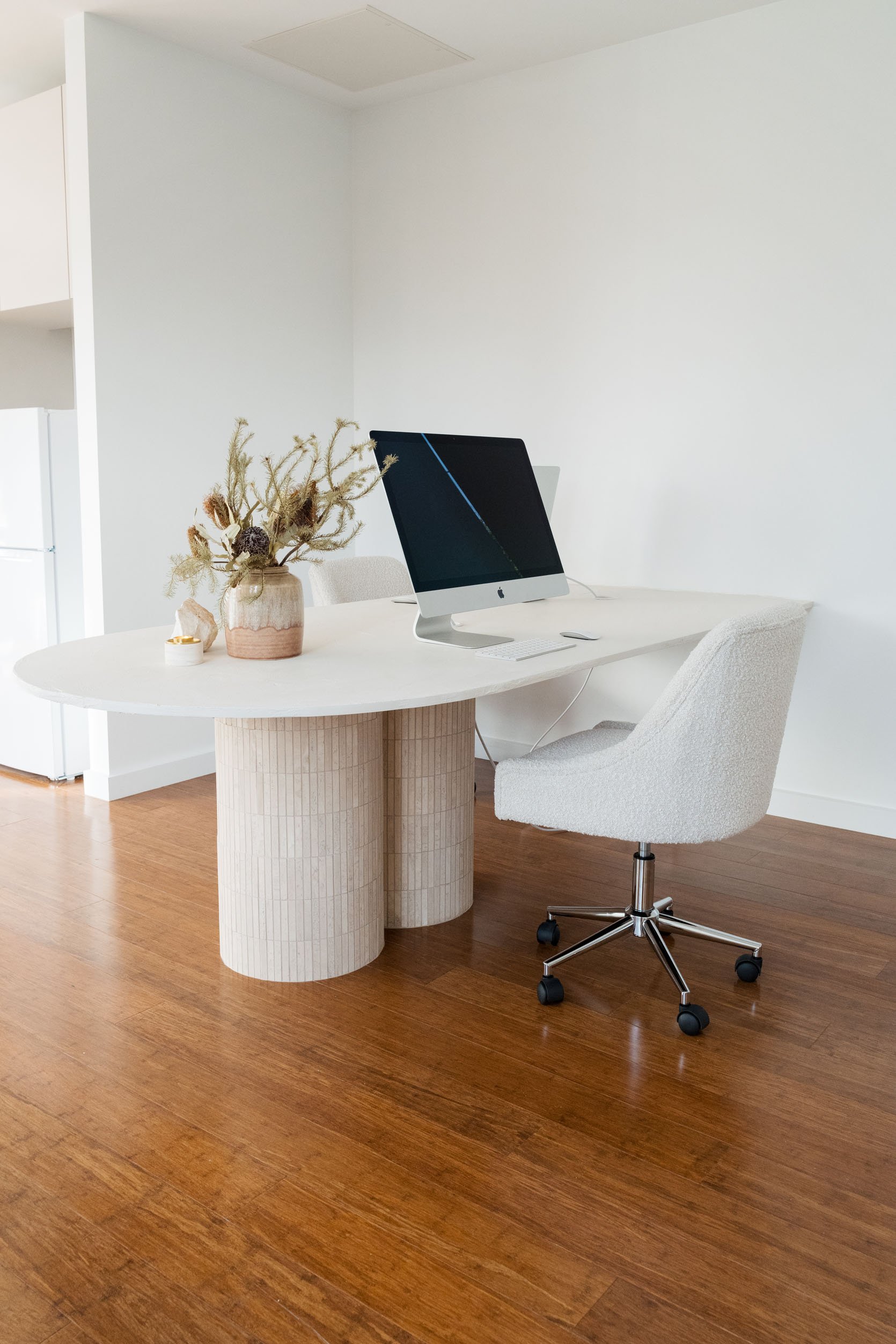
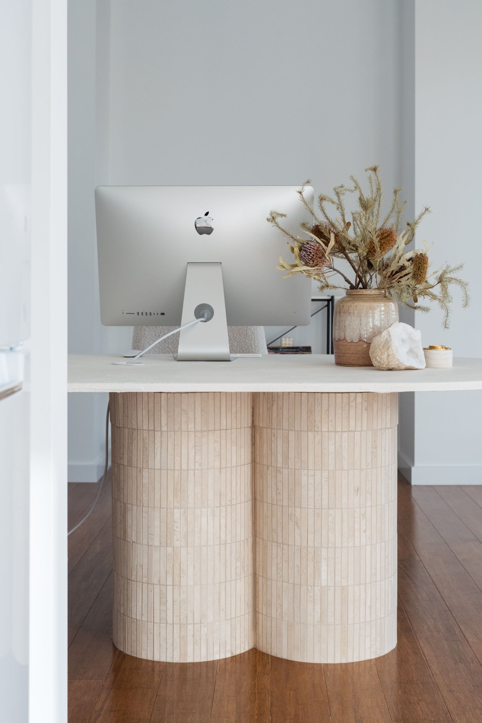
In need of a BEAUTIFUL desk/table??? When I saw this DIY pop-up on my Instagram from Gina Ciancio of Style Curator, I immediately saved it. As someone who has her “office” in her living room, I know that finding a desk that doesn’t immediately scream, “DESK!” is a challenge. I’m embarrassed to say that it wasn’t until I started writing this that I realized my desk and Gina’s DIY have a very similar aesthetic. What can I say, I have a type.
Now, I know this may look pretty intimidating if you don’t consider yourself a DIYer. However, Gina did an incredible job breaking it down – so with determination and a couple of power tools, baby, you’ve got this!
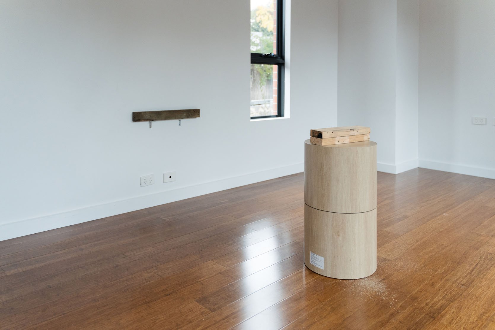
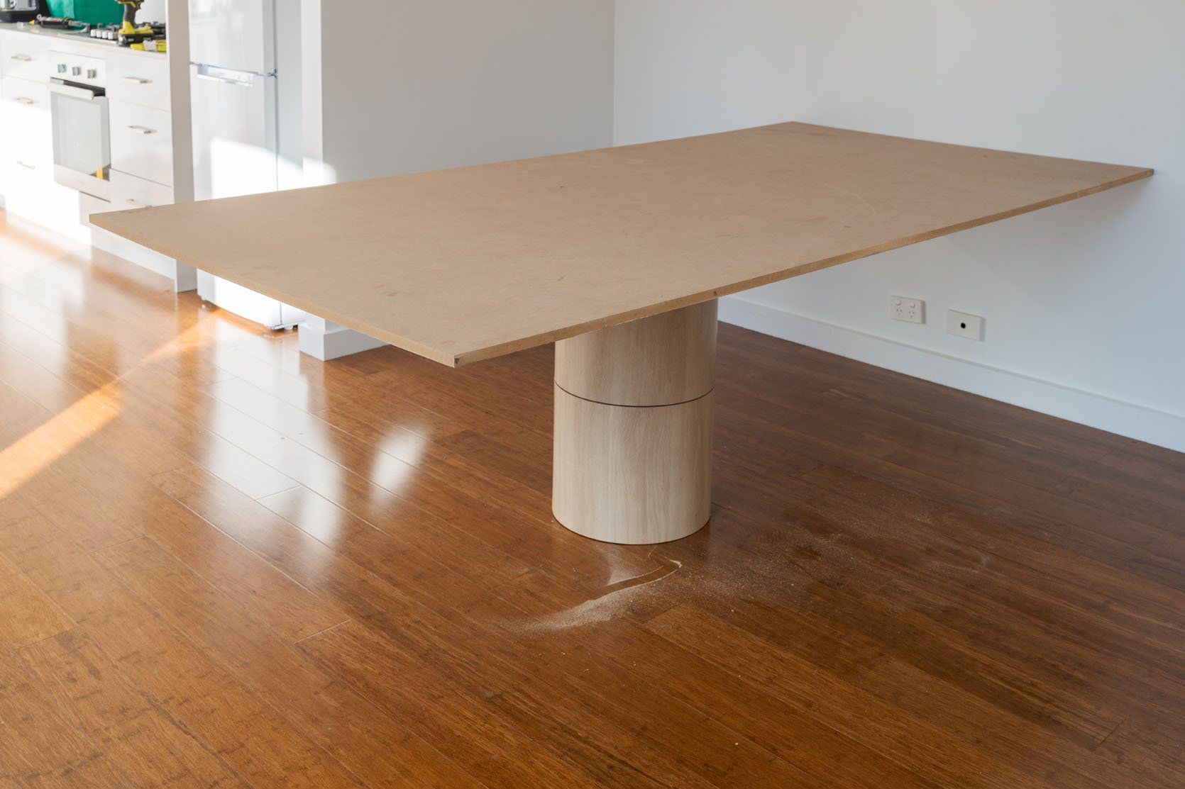
To start Gina found these round side tables at Kmart, bought four, then stacked and glued them. For those of you in the US, Kmart in Australia is more like Target here. It’s really good, while Target is…not as good. Hopefully, Australian Targets have gotten better since I was living there but they are NOT what they are here. Anyway! Those tables were the perfect bases to give Gina the pillar base she wanted.
Note the 2x4s they help make the table tall enough to be the height she needed. Then note the wall mount to secure the end of the MDF tabletop! Since she wanted the table to be flush with the wall and have more stability, creating a ledge for the end of the table to sit on top of was key.
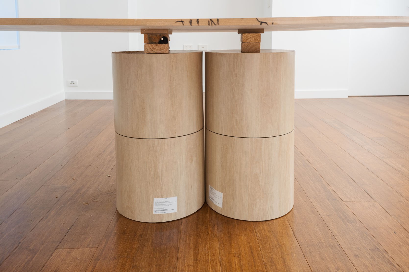
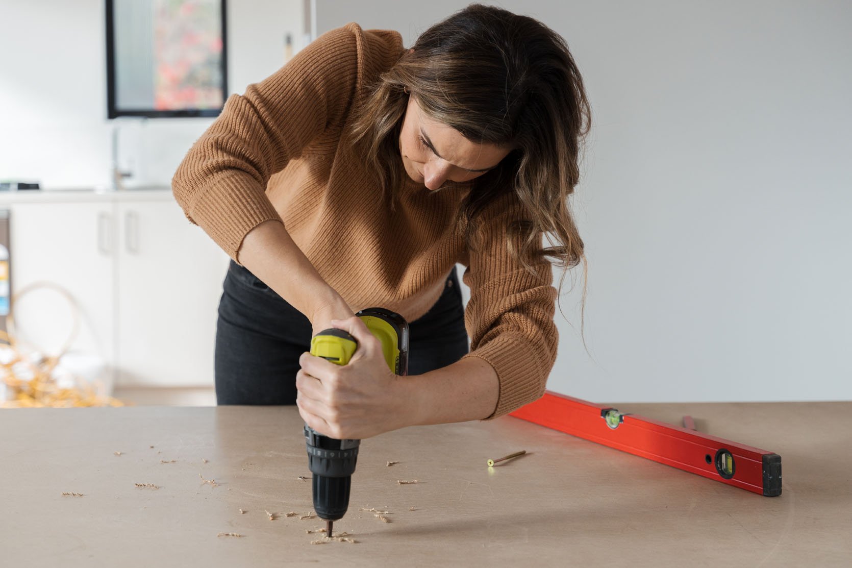
With the help of some screws and a power drill, everything is secure.
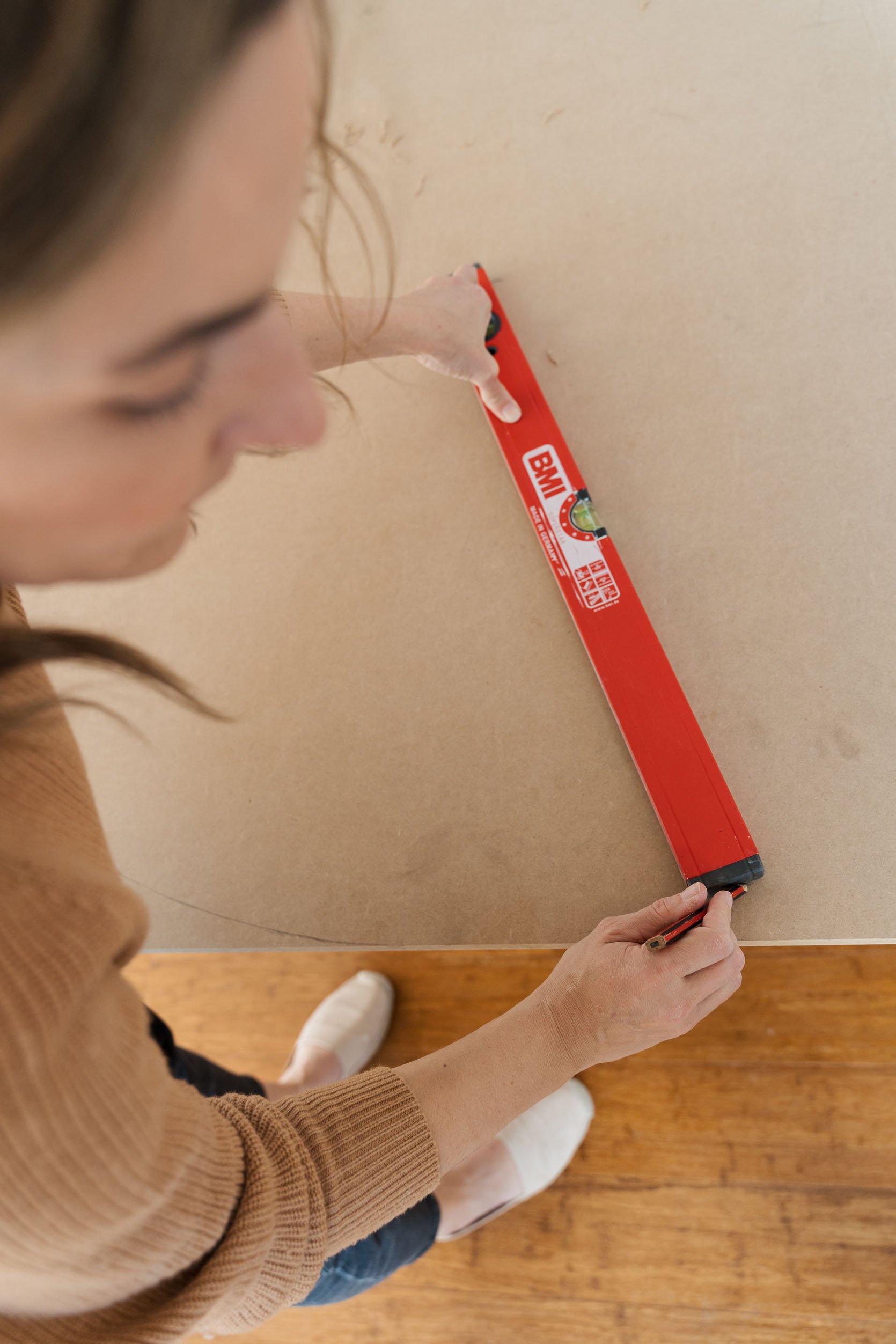
Then it’s time to trace your arch! You can use a ruler like she did, a string and pencil method, it’s up to you.
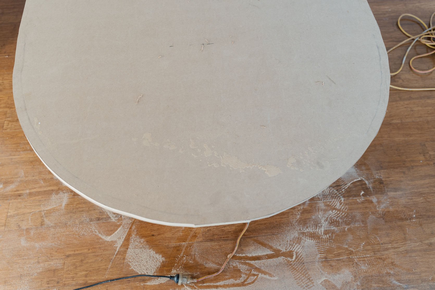
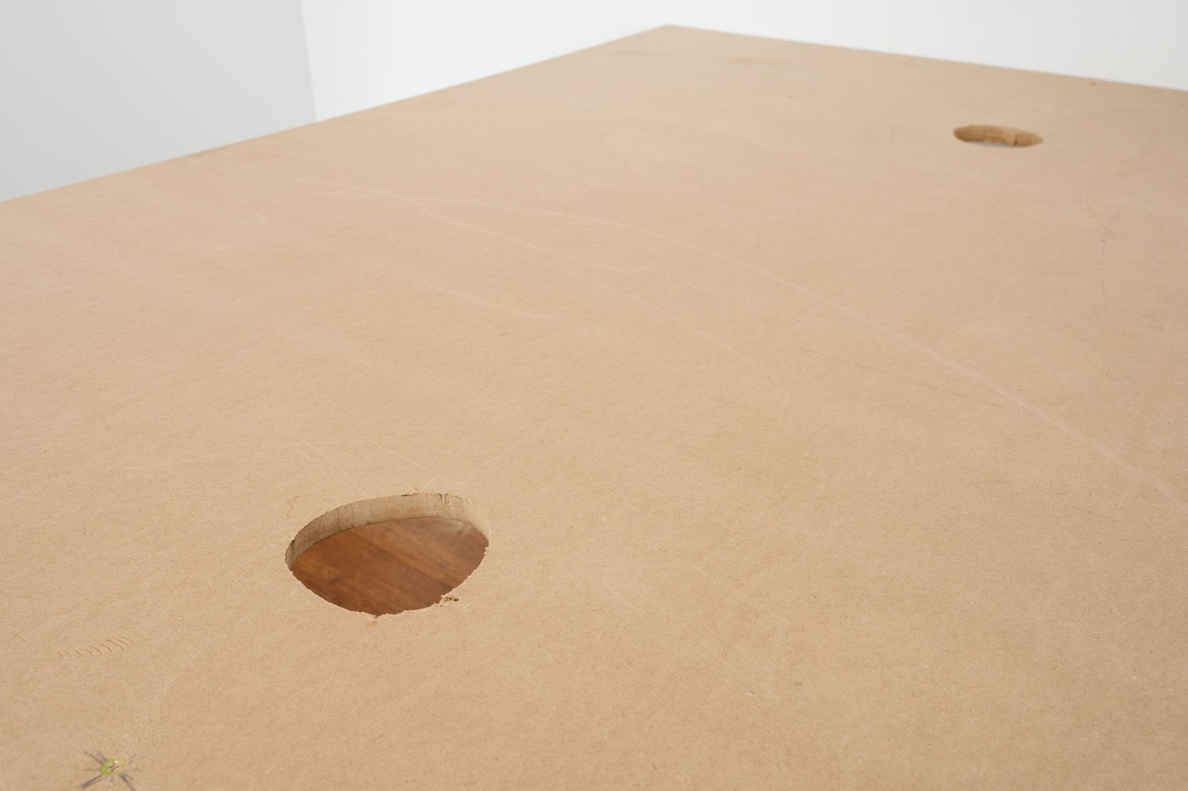
Now, it’s time to bust out your jigsaw to cut out your perfect arch and holes for your cords (a hole saw bit for your drill will also make this easier). I have this jig saw and it’s very user-friendly. An eclectic sander may also help out with smoothing those edges but not necessary since you are about to get those hands dirty:)
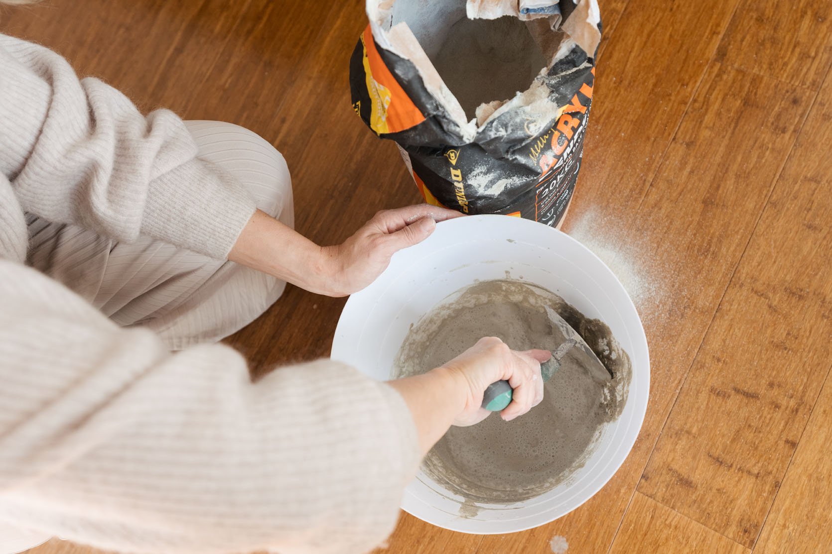
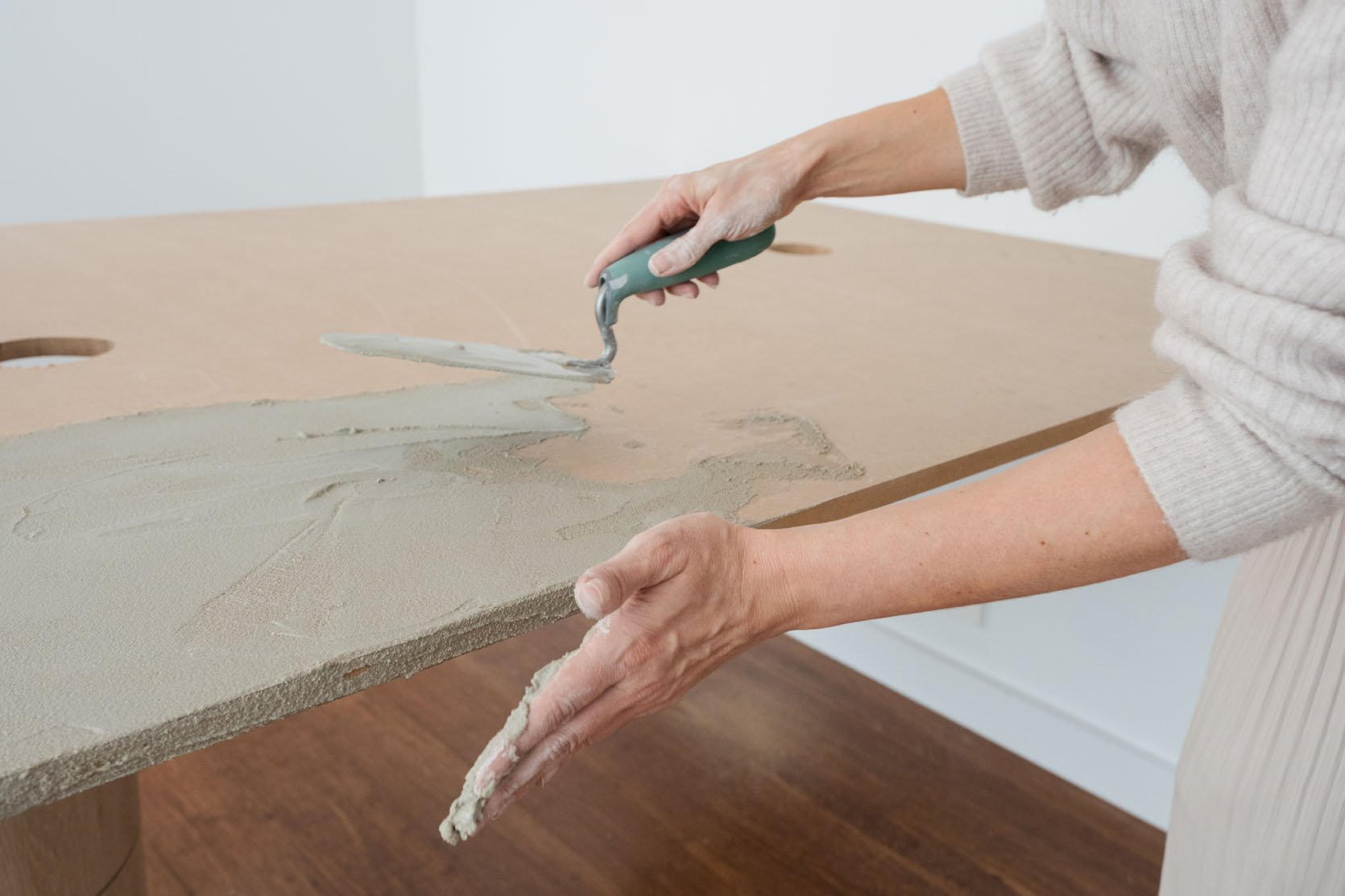
After some trial and error, Gina used primer and feather finish to give that organic concrete look.
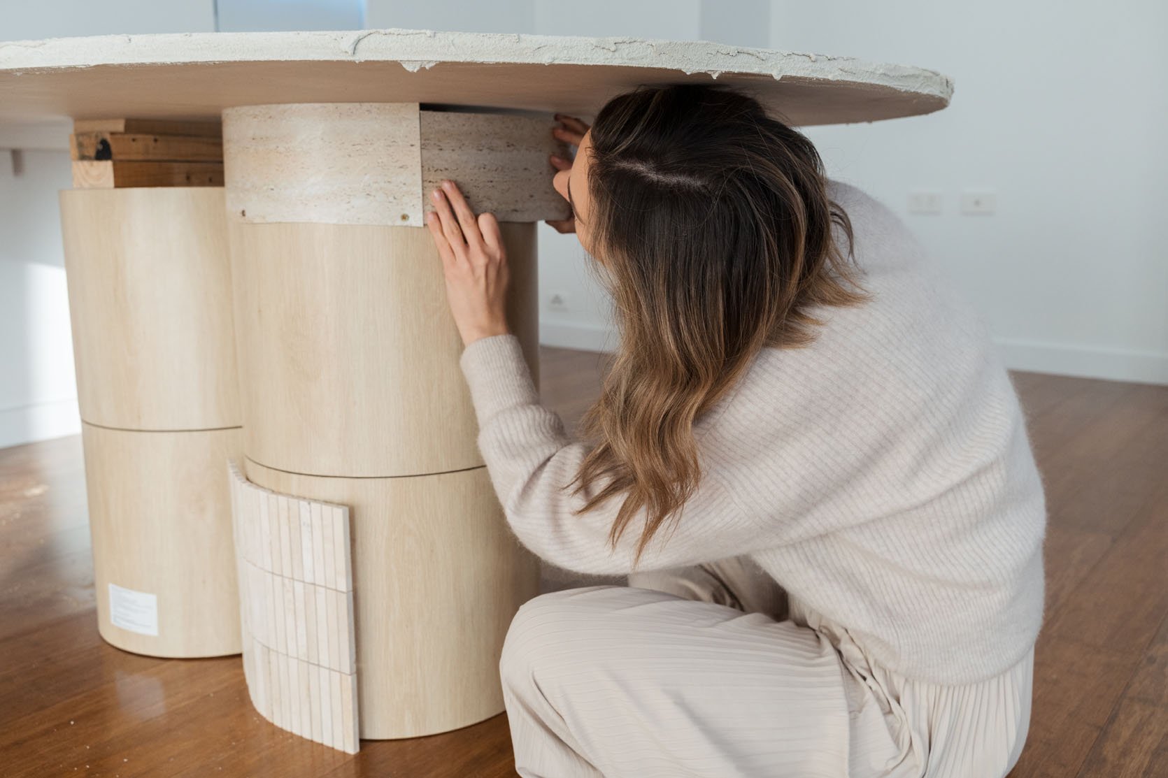
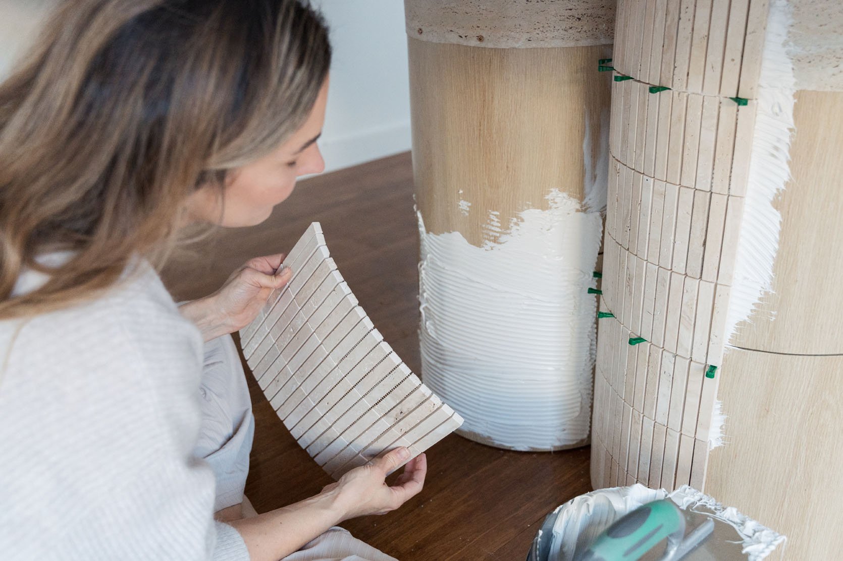
Then how smart is this?! Since Gina didn’t have a tile cutter (like most of us), and her sheets of tile didn’t perfectly work with the height of the base, she used a travertine tile-like adhesive (like this one) to bridge the gap! Since it’s under the table you can hardly see it but it makes everything look beautiful and finished.
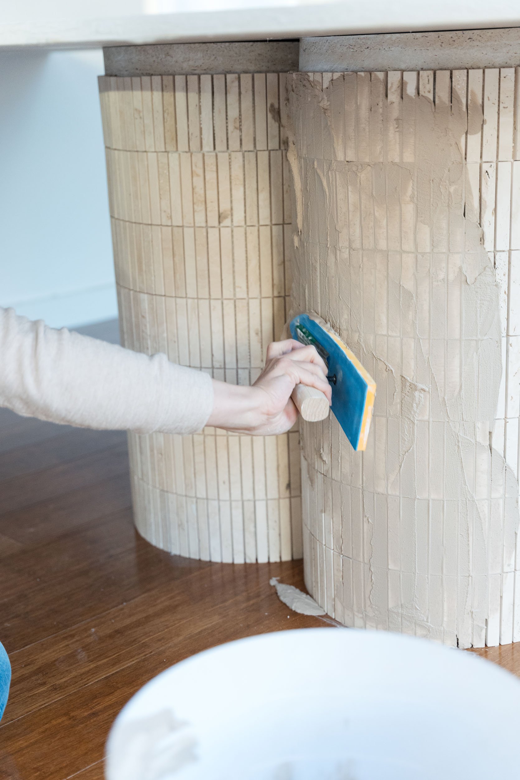
For the tiling process details, head to Gina’s post, but she makes it seem very doable! I think using tile sheets is key. Waaay less labor.
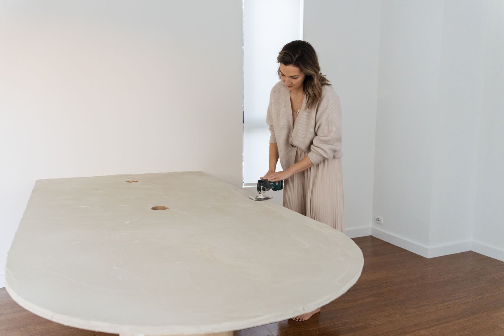
She then sanded the tabletop, painted it to her desired color, grouted between the tiled pillars as well as the space between the wall and the tabletop, then boom! A truly special and custom desk that cost a fraction of what something similar on the market would cost. Again, Gina’s post goes into more detail but I can’t thank her enough for letting me share this project with you on our site:)
Ok, so this beauty is very organic and neutral but if you love color this idea could totally still work! Just pick a colorful tile and a tabletop color that looks pretty with it. Or if you want to splurge a little, you could get a real piece of wood for the top. The sky’s the limit!
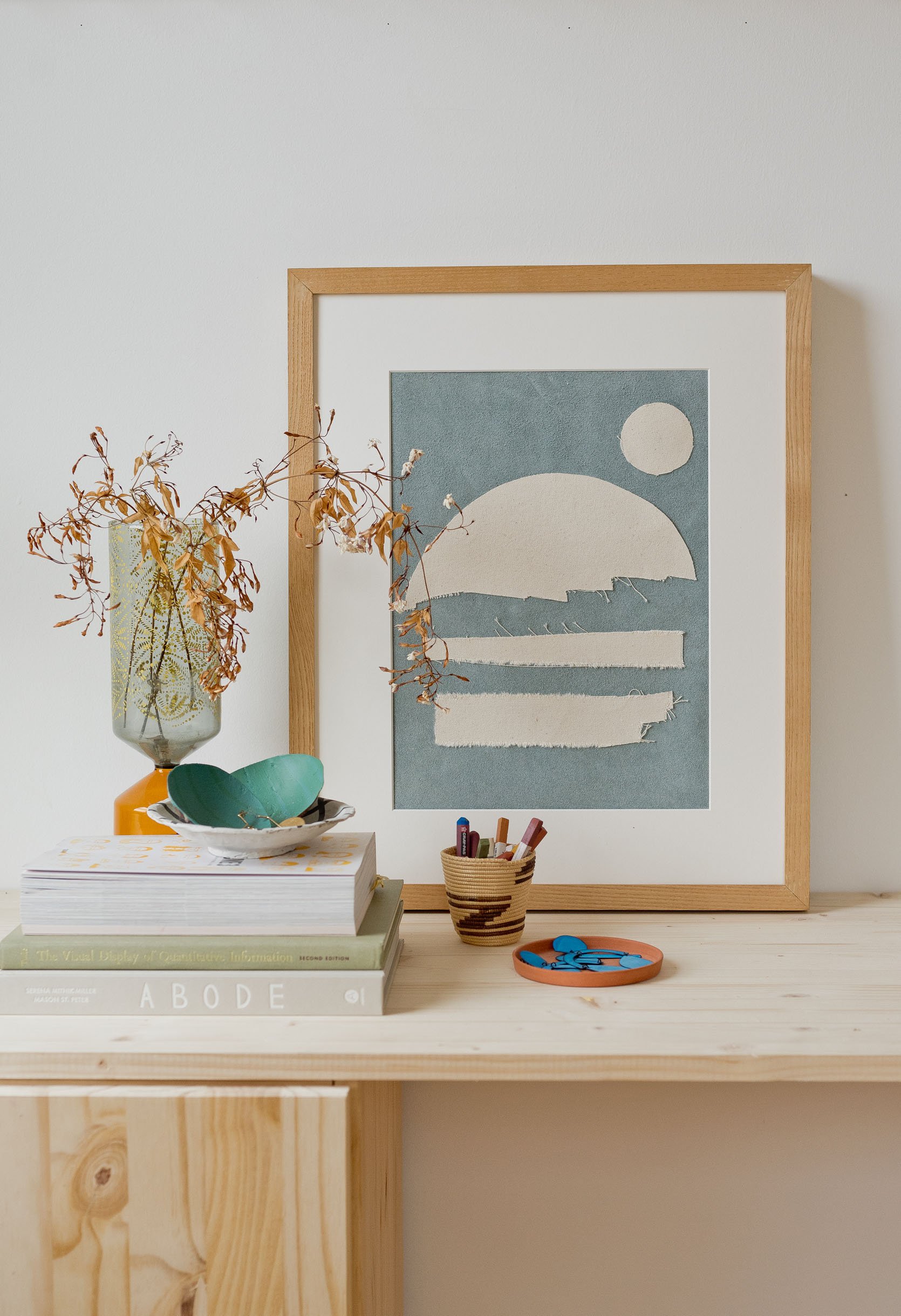
Ok, here’s a DIY that’s a little easier and requires zero tools! I promise anyone can do this one and you could even do it this weekend if you wanted.
We all know how expensive art can be. I think we’ve said it 109845738 times. And for good, handmade art, it’s absolutely understandable why it cost $$$. However, not all of us have that money, priced fairly or not. Enter this canvas scrape collage art by the very talented Brittni Mehlhoff of Paper & Stitch. She is no stranger to our DIY roundups because they are impossible not to love.
All you need are canvas (or fabric) scraps, some glue OR no-sew tape and an iron. See! Not hard or expensive! Brittni only spent $7.
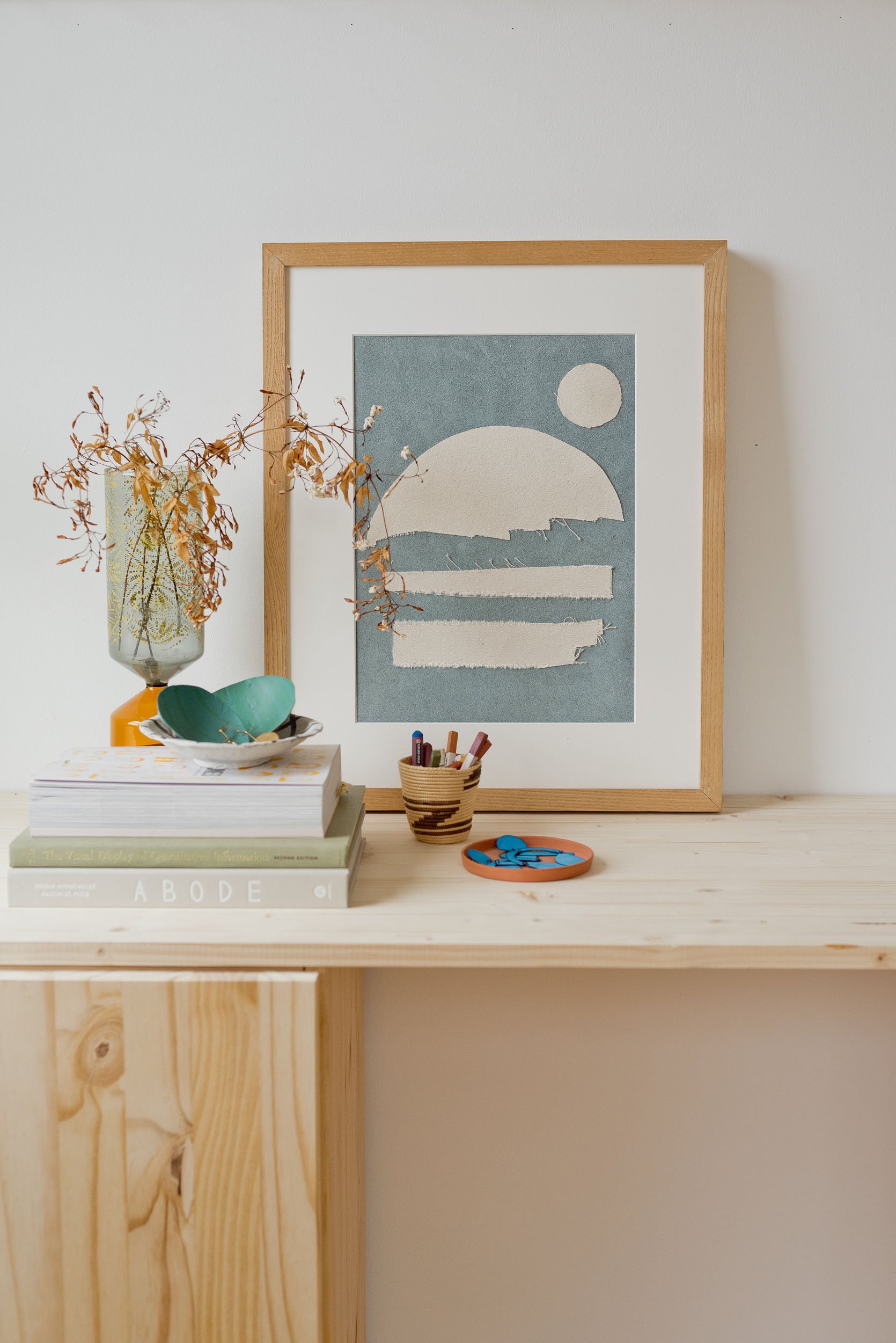
First, you want to figure out the size you want and if you want to use a mat like she did. Brittni decided to paint her background canvas that pretty blue color (optional) for some contrast. Then she cut her other, nonpainted scrap pieces into the shapes she wanted and then simply attached them with no-sew tape and an iron. She does warn if you want to use fabric glue instead to make sure to not let it soak through the fabric. If you are handy with a needle, you could also attach these pieces with thread which would add more pretty texture. Choose your own adventure:)
All that’s left is placing your masterpiece in your frame and deciding where it should go!
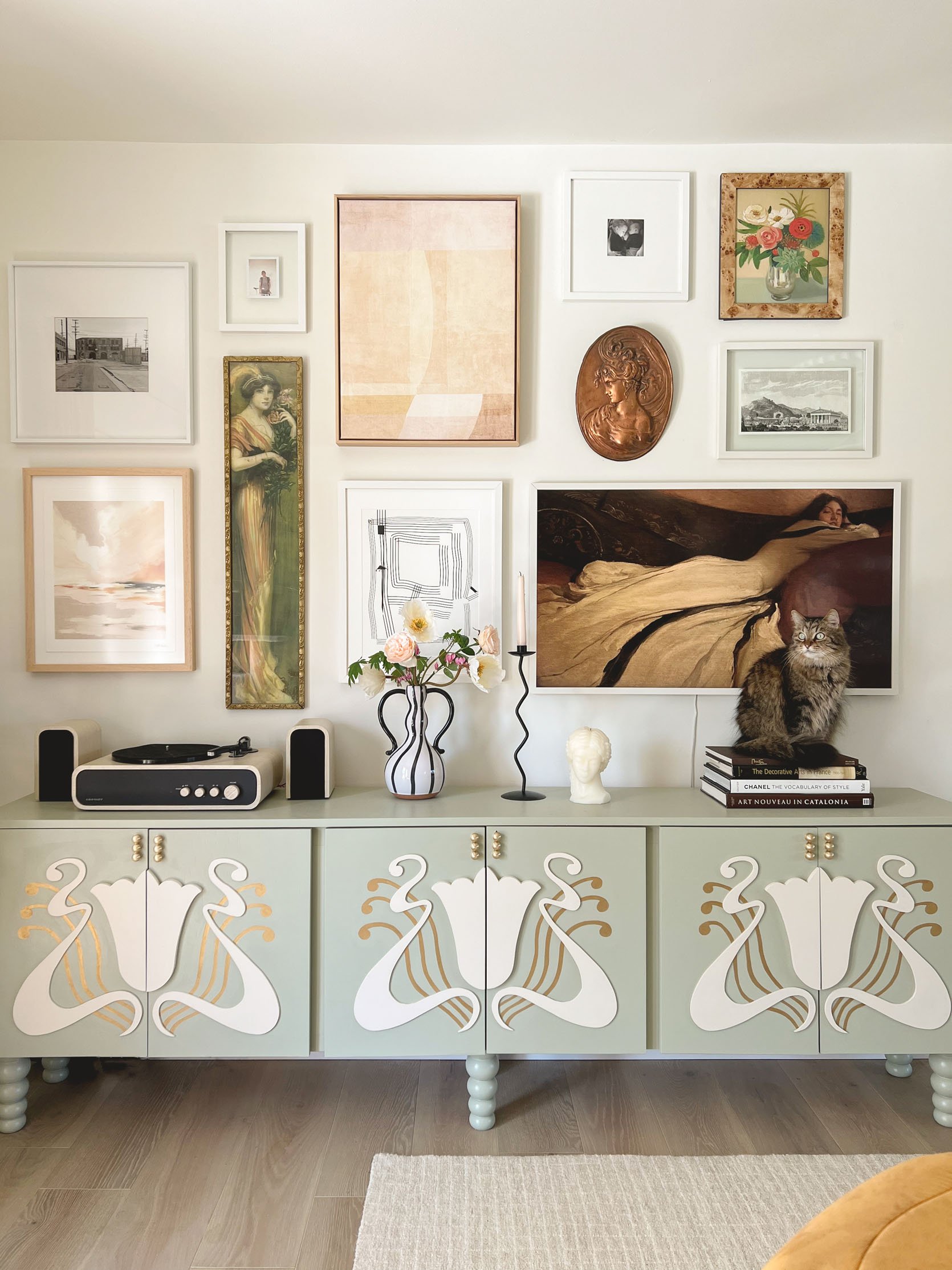
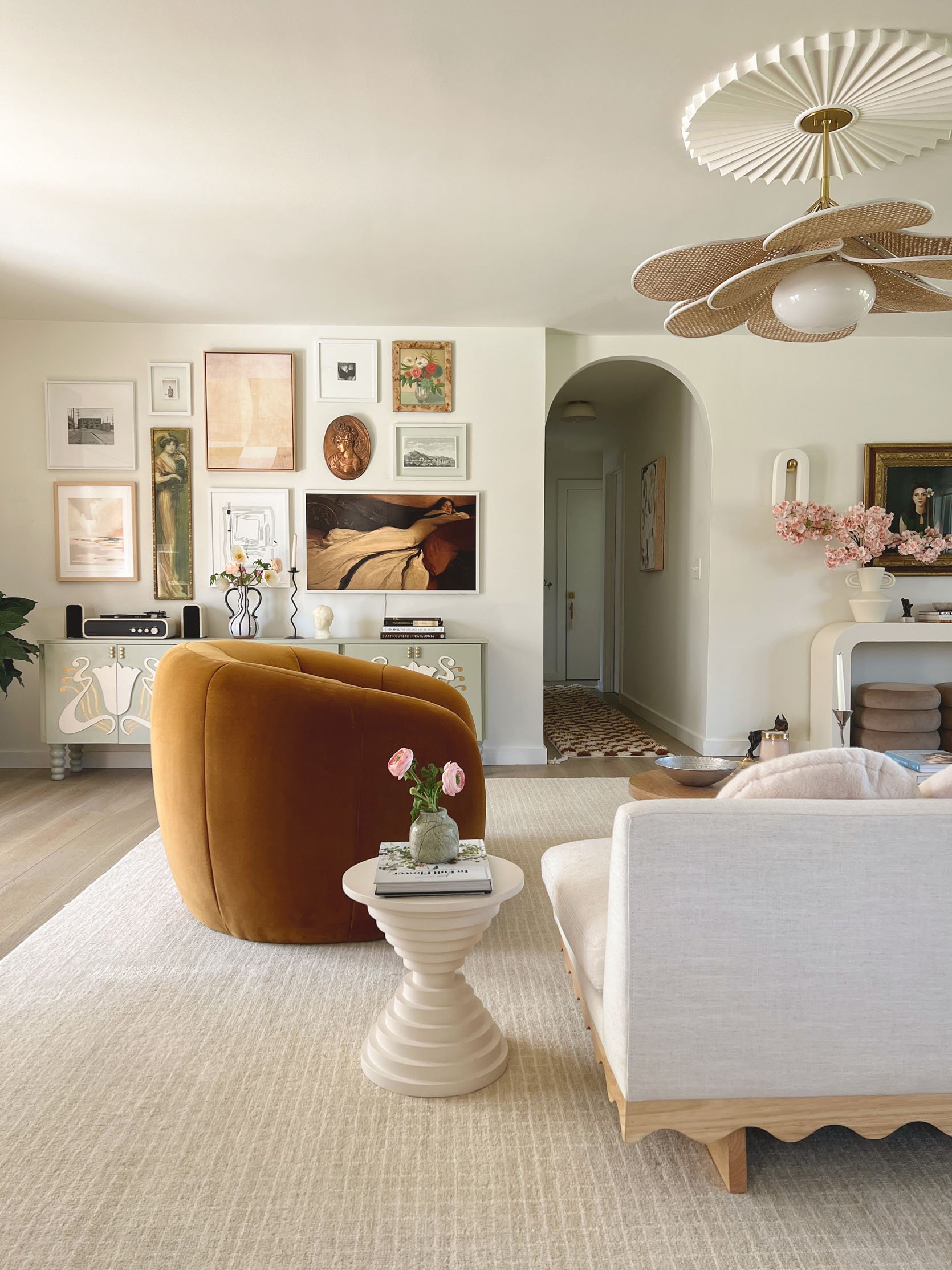
Ok, ok, this one is pretty advanced but LOOK AT IT!! How could I not include this crazy special, one-of-a-kind credenza?? If you somehow don’t know or have yet to follow Brit Arnesen of Brit Dot Design then your day just got A LOT better. She is fearlessly creative, SO talented, and her designs only evoke joy. With this project, I am going to spare you with me trying to give a step-by-step as building a credenza is pretty involved unless you already know what you’re doing (or are really handy). So for those who do want to tackle a full-on cabinet, I included some process photos, but for those who are not able don’t worry, I’m going to talk through an alternative:)
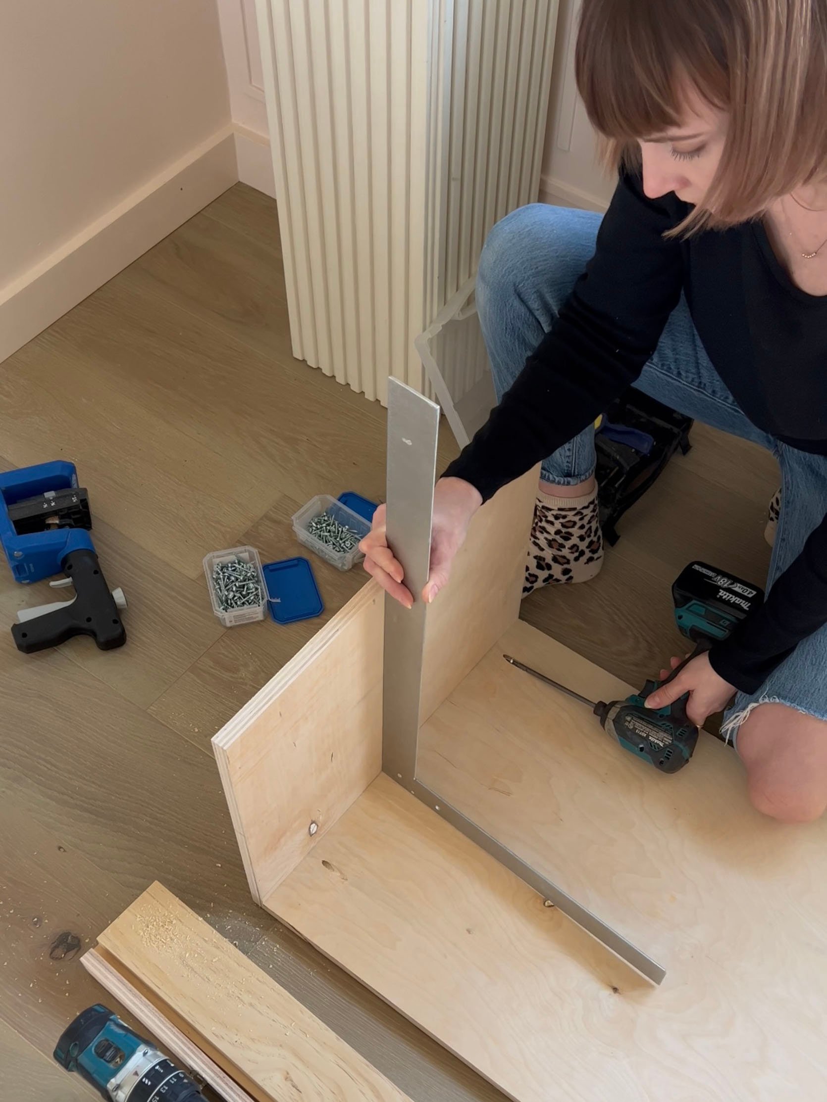
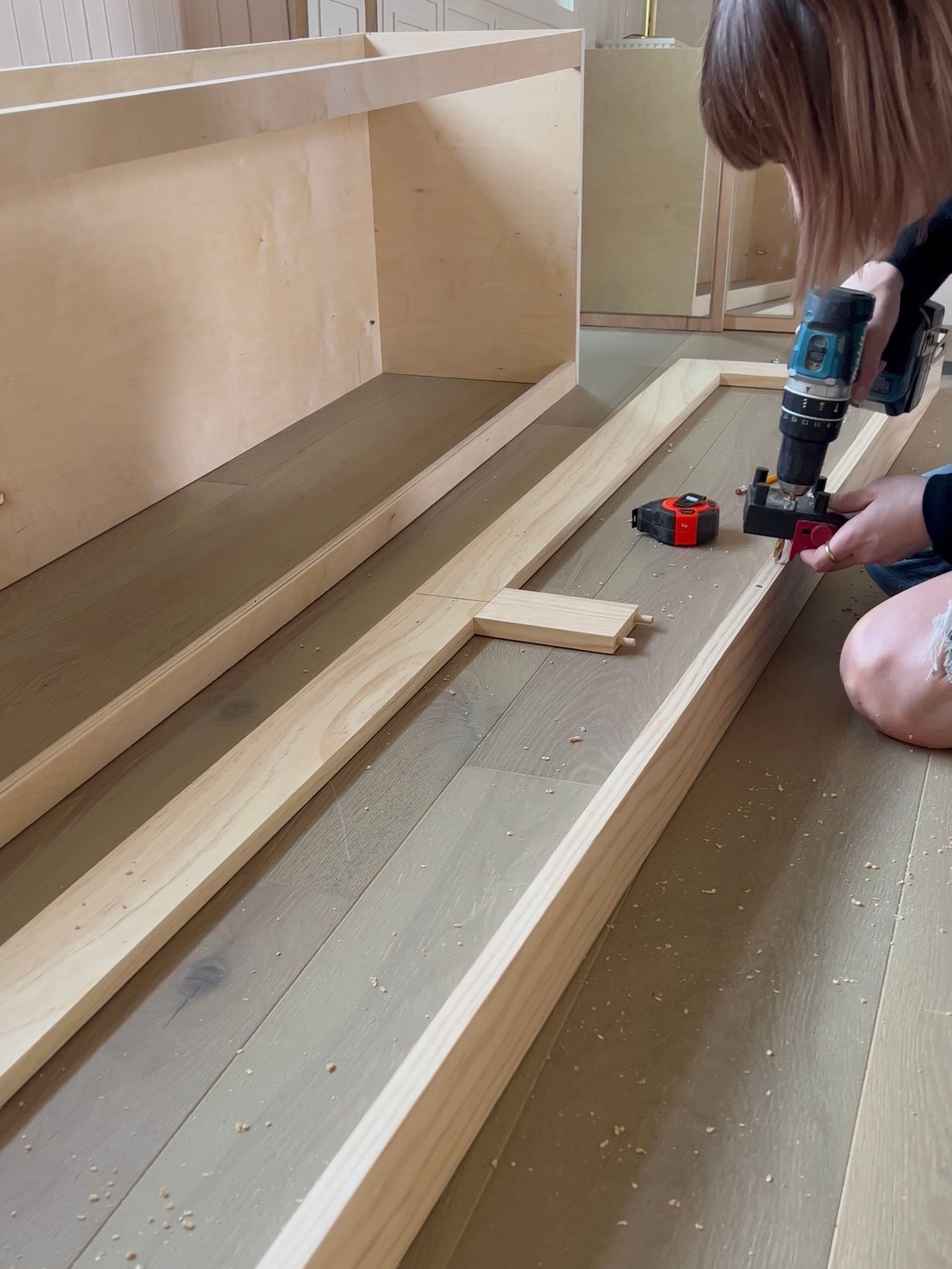
Impressed? Me too. This is the origin story:
“I’d been wanting a larger cabinet for the extra storage and also to fill the space a bit better under the gallery wall where it was going to sit. I knew I wouldn’t be able to find anything big enough within my price range, so I decided to build one. I spent $70 on the legs, which I found on Etsy, and the knobs were $30 on Amazon. I bought two pieces of plywood for around $130. The paint, Olive Sprig by Pittsburgh Paint, was $10 or so for two samples (my 9-year-old daughter actually picked out the color) and the Rub ‘n Buff in Gold Leaf was around $7. In all, it cost around $250 for the supplies I didn’t already have on hand.”
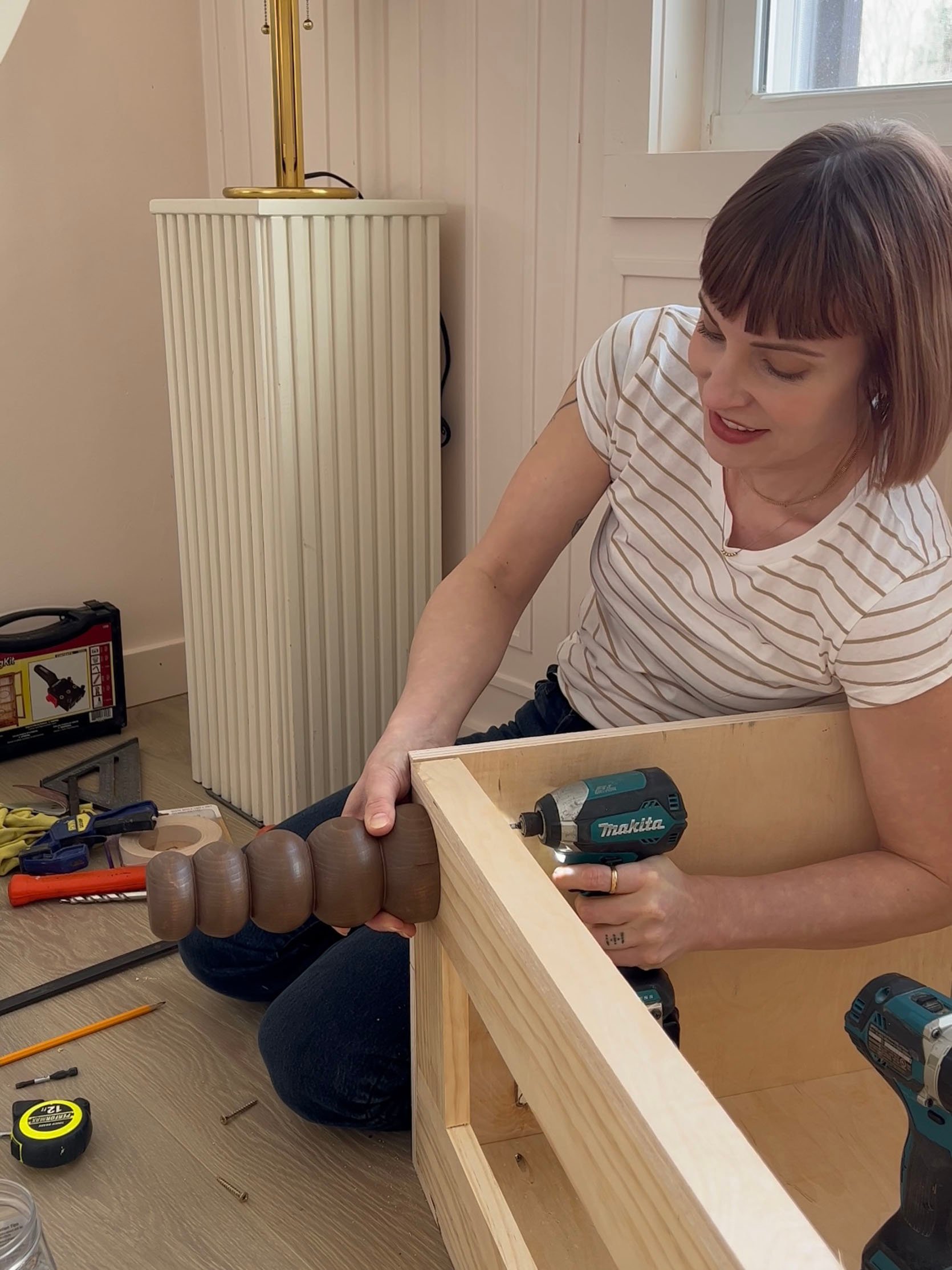
I love that she chose fun legs (similar to these). If that was all she did (plus some cool hardware) this credenza would have been great.
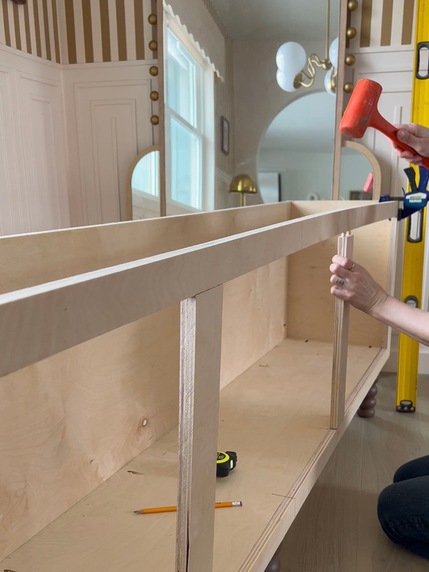
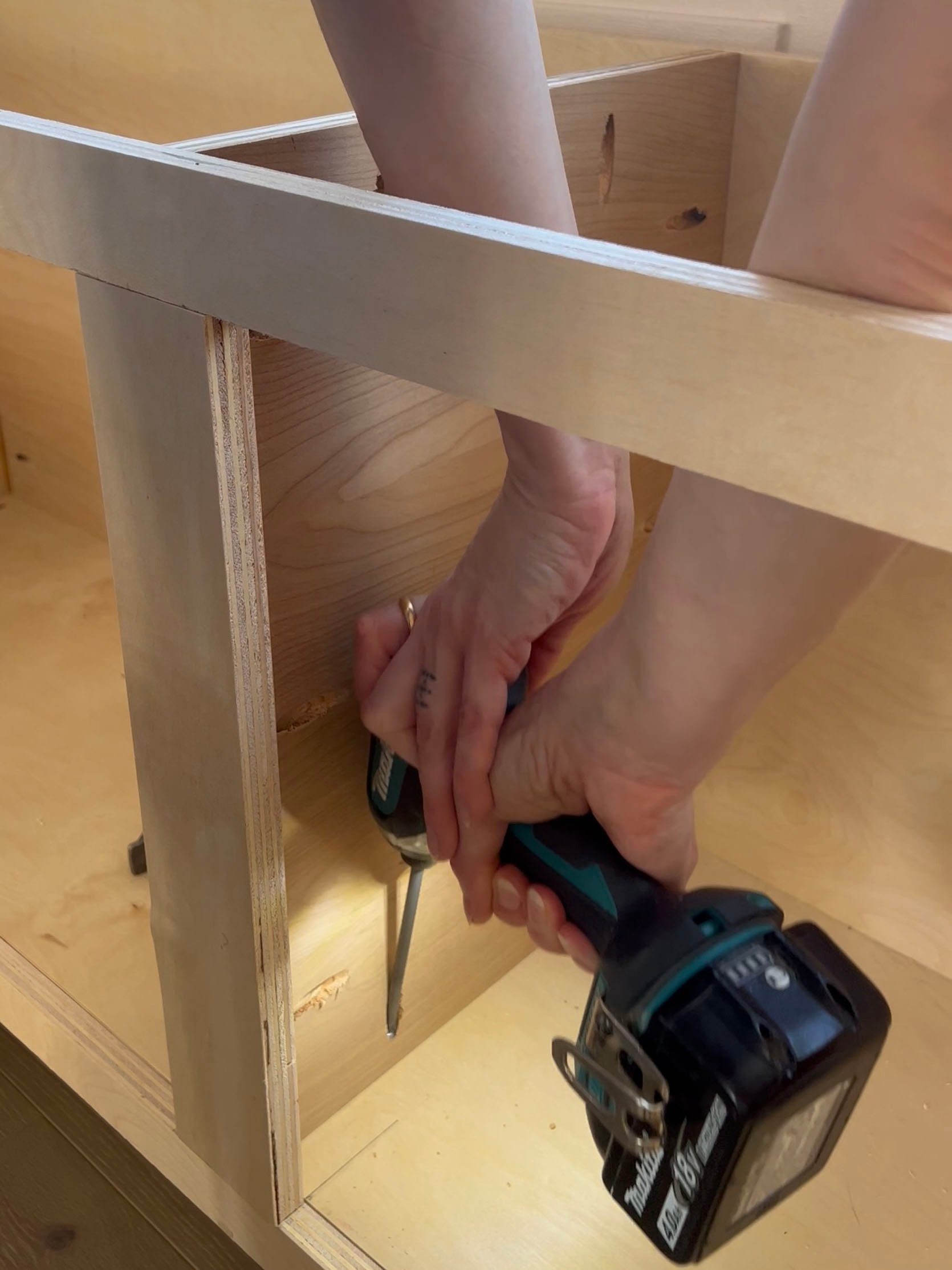
But because Brit constantly outdoes herself, she designs a 3D “pattern” on her cabinet’s doors and it knocks everything out of the park.
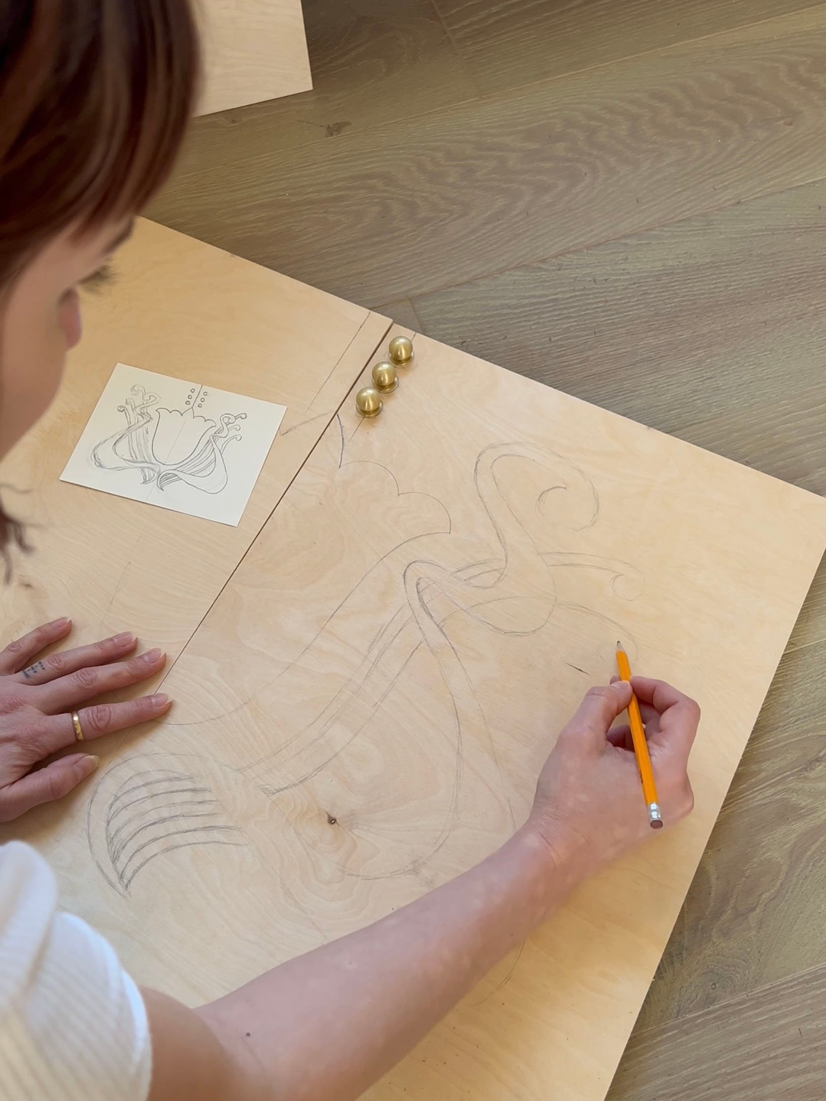
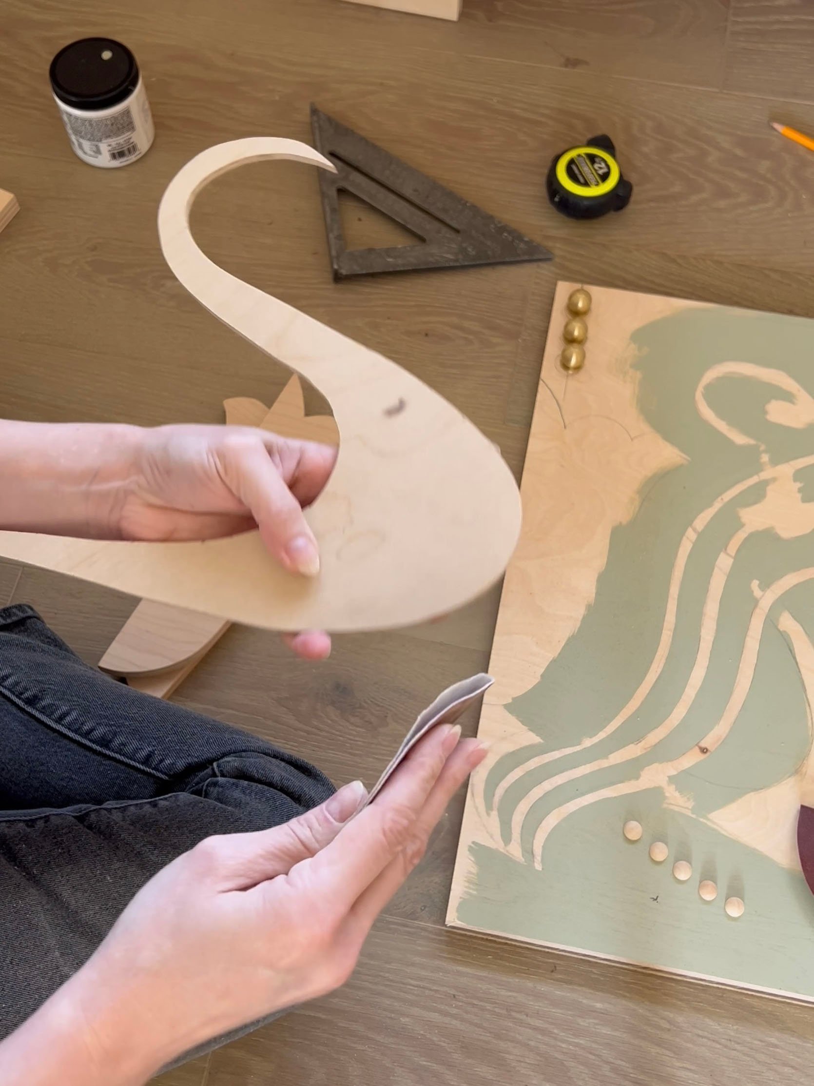
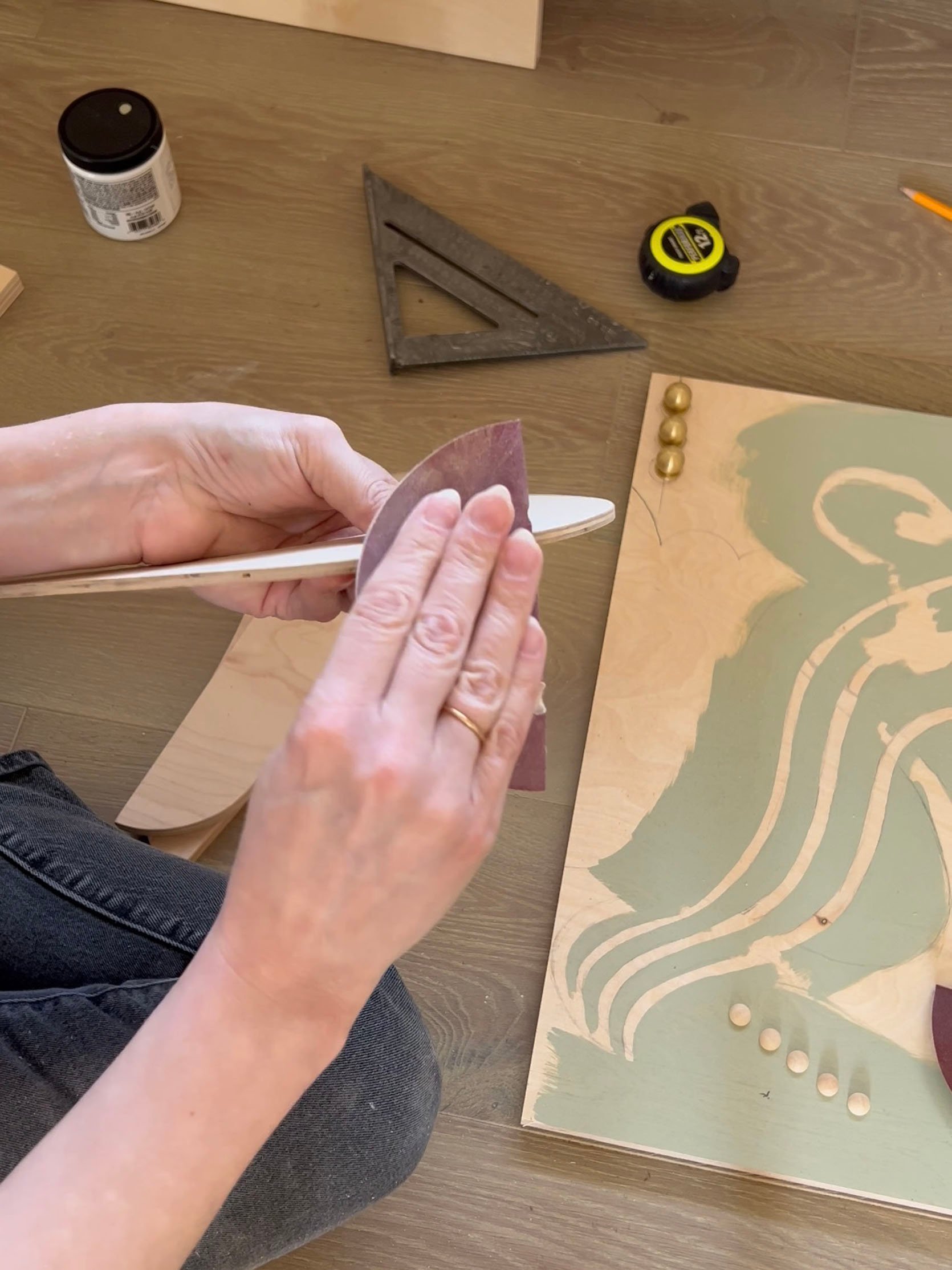
So like most, if not all DIY projects, Brit did had to pivot with the design:
“This project involved a lot of trial and error, changing my mind, and adapting as things didn’t go as expected. Initially, I’d wanted to give the cabinet a two-toned wood look; but when some of the 1/4” overlay pieces splintered during cutting, I had to change course. One thing led to another from that point and I ended up with no natural wood at all! I almost gave up on the idea of the overlays altogether for that reason, but figured out a way to make them work instead. I’m actually really surprised (and relieved) I pulled it off!”
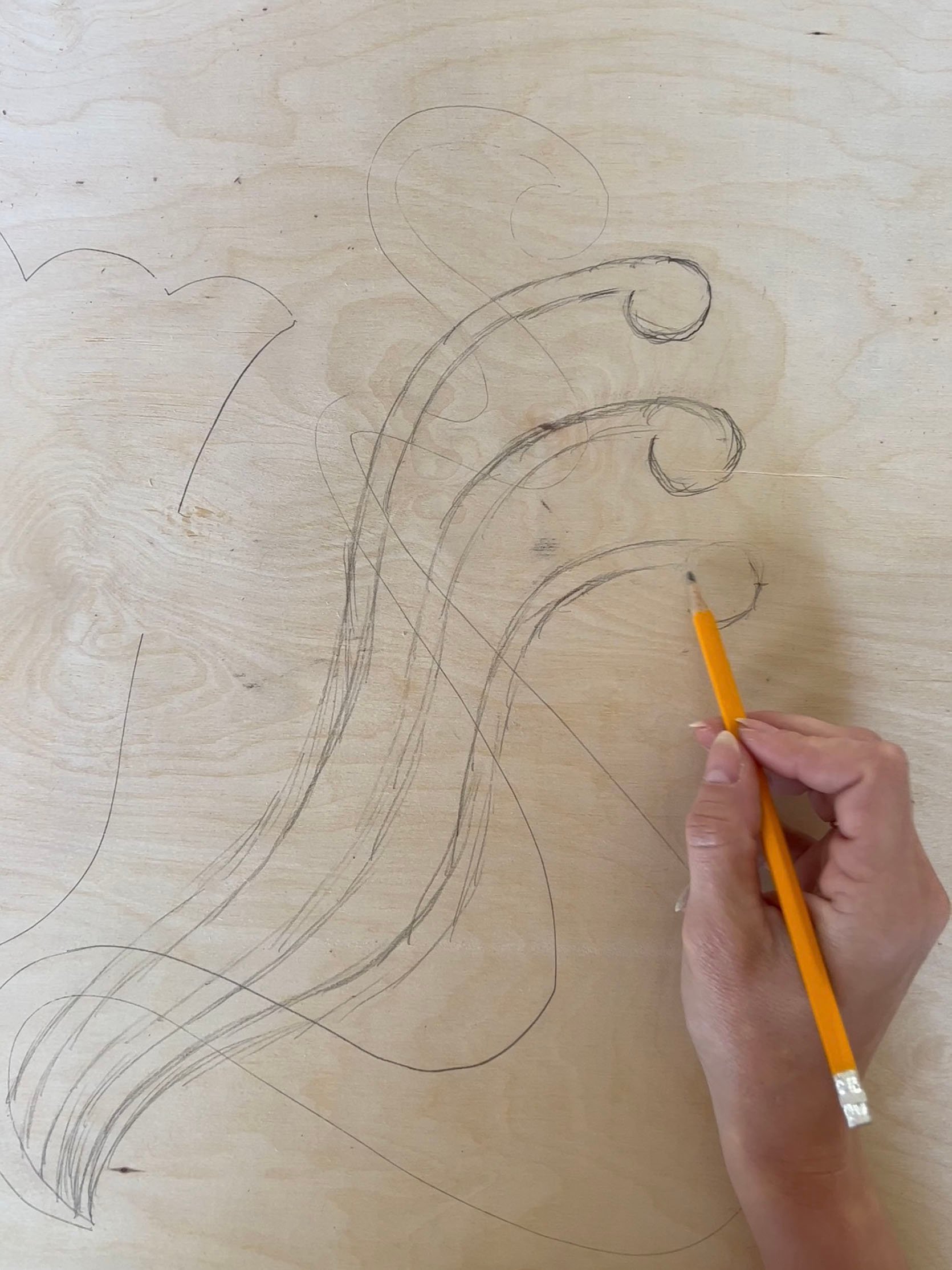
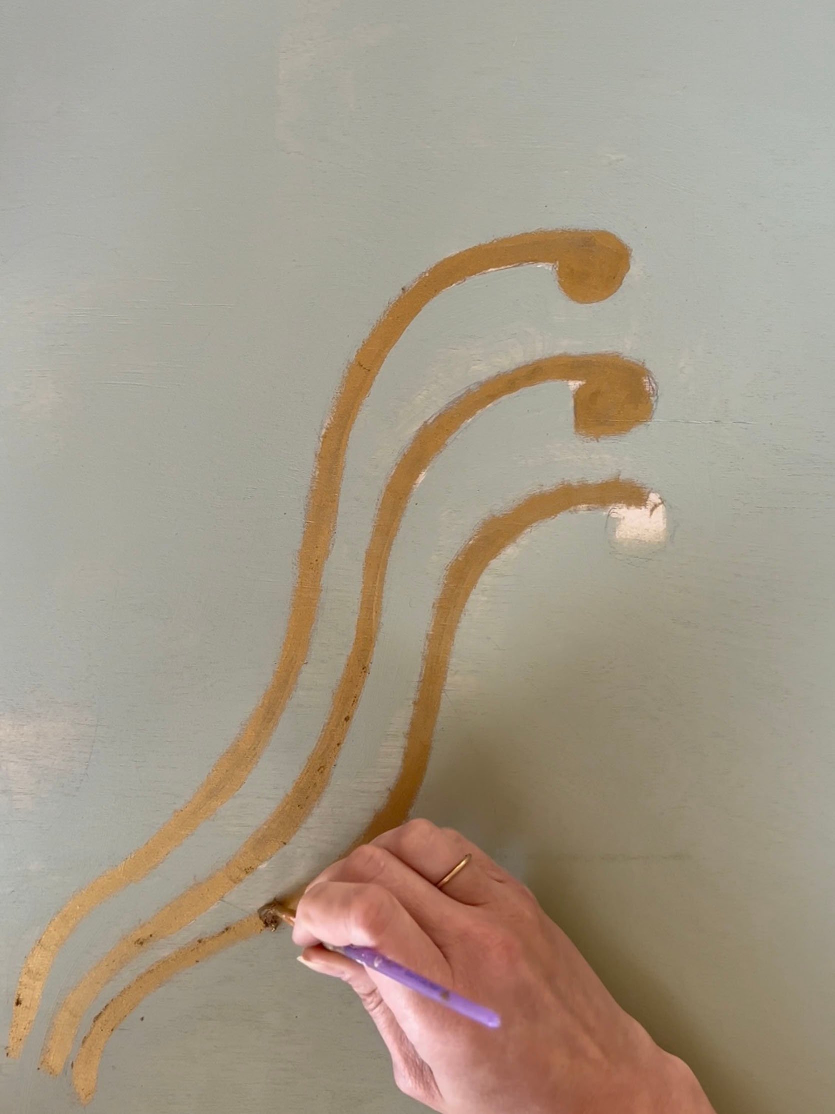
I’m so glad she stuck with the overlay because it really adds that “something extra special” for me.
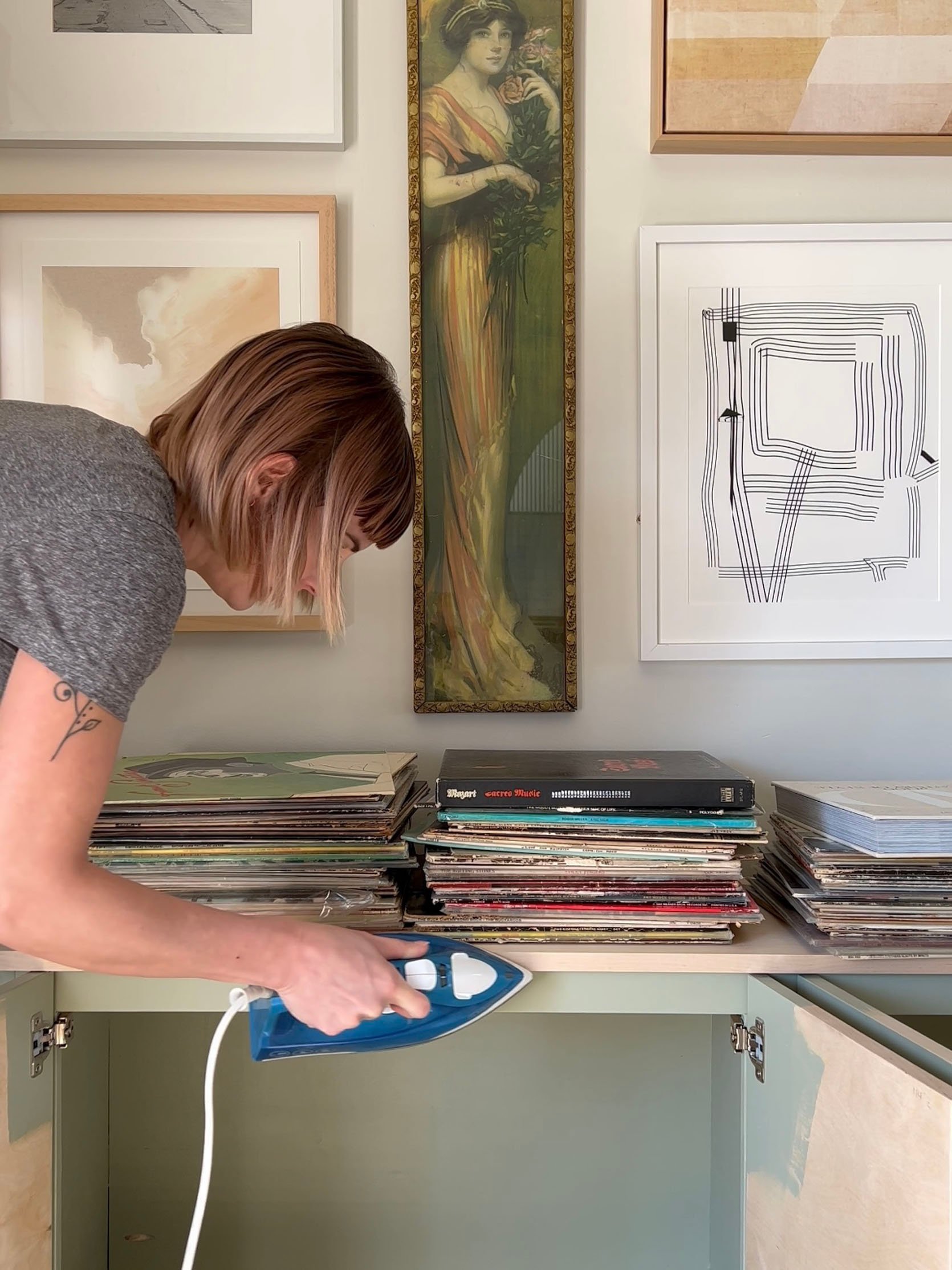
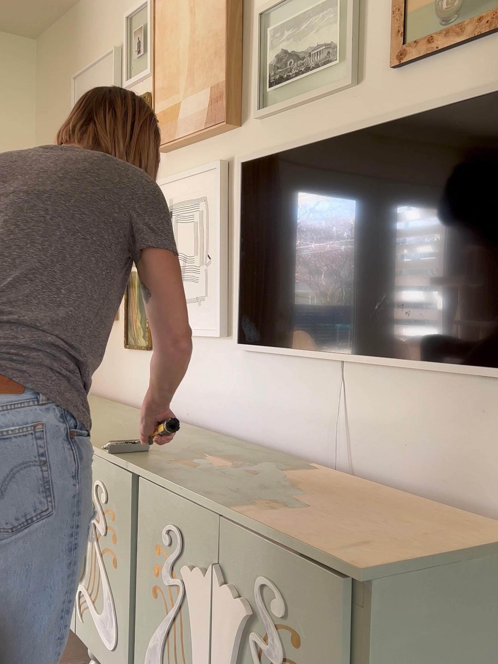
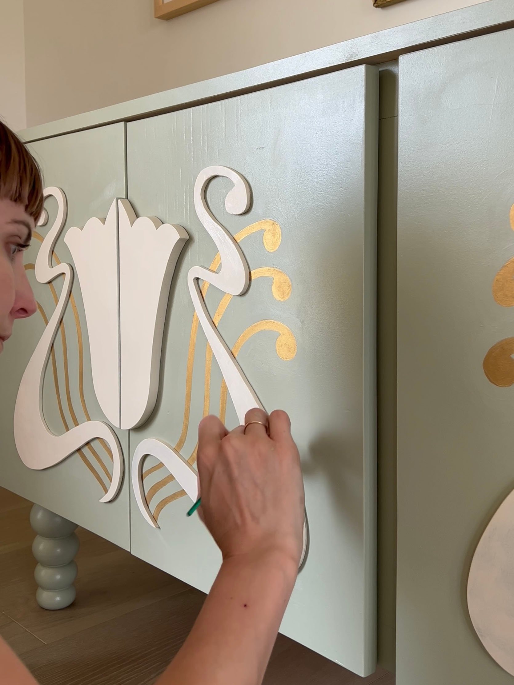
Now again, if building a whole credenza really isn’t in your wheelhouse but you’ve also fallen in love with the project I have an idea. I think you could get an already build credenza like the BESTA from IKEA, add those cute legs, paint it using this IKEA painting guide, then add your own original design! If you want to design an overlay then you will need a jigsaw but clearly, it will pay off in the end. Don’t give up!
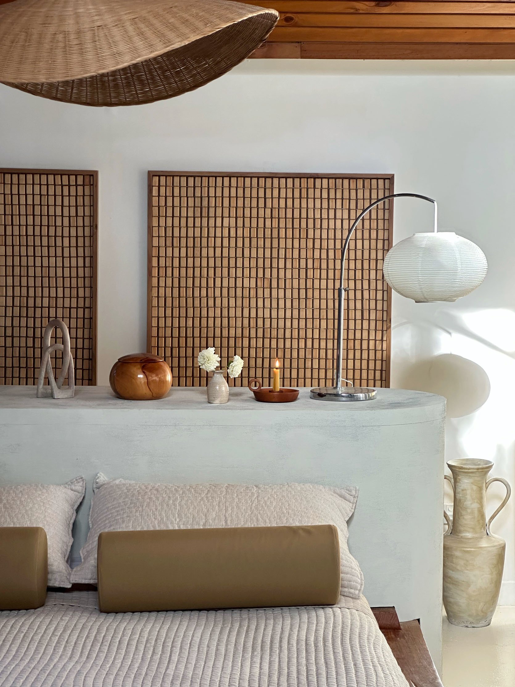
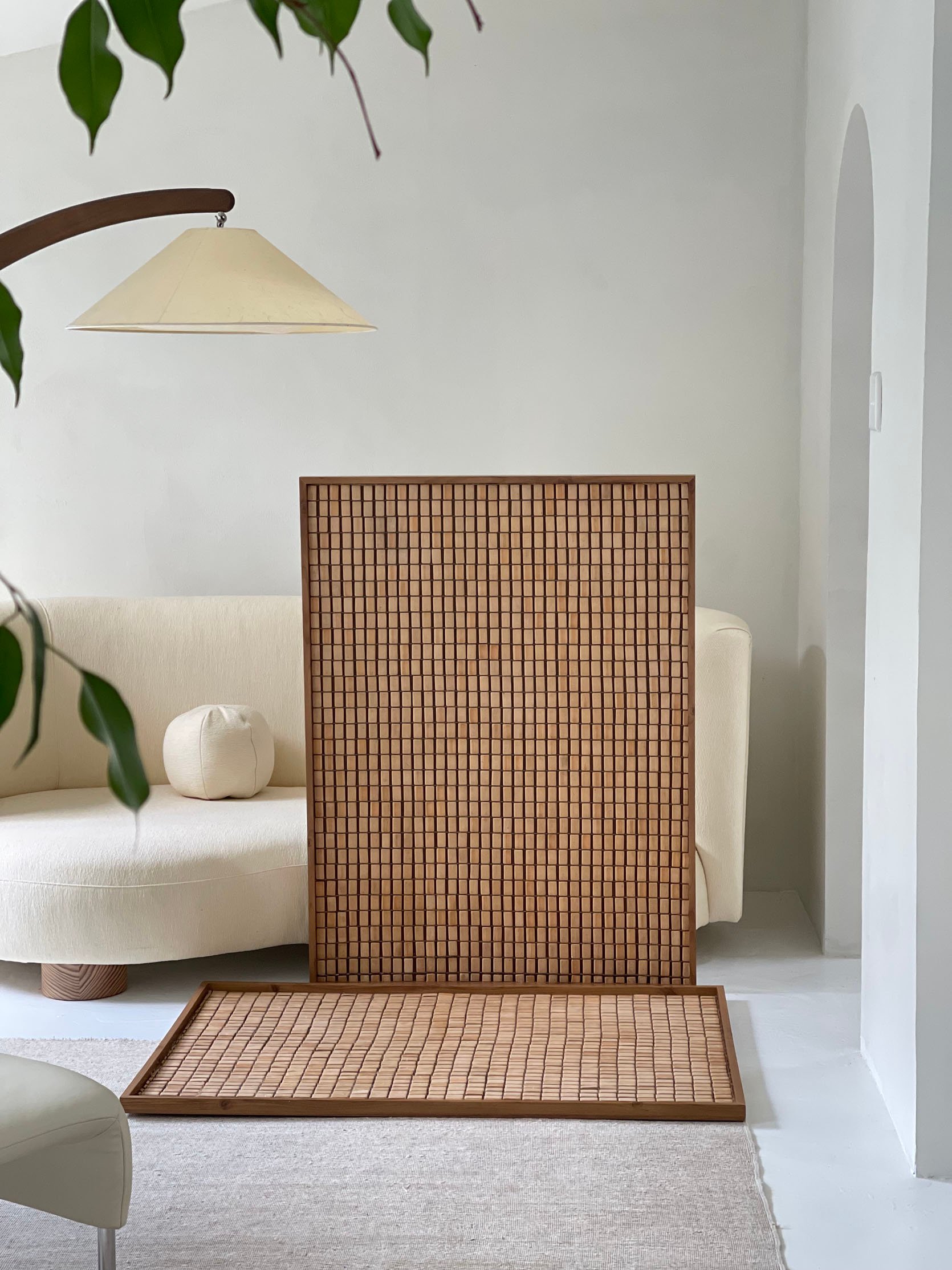
Following Erena Te Paa‘s account is like stepping into a beautiful mediation. If there’s a neutral-toned world that I’d want to live in it would be hers. Her DIYs are impossibly beautiful and chic and this one is no expectation. In terms of difficulty, I would say this is beginner/novice. It’s clearly more involved than the canvas art but doesn’t require power tools:)
This large piece of art is simply a second-hand bamboo mat attached to the back side of a picture frame! Check out her video to get a visual step-by-step. Here is a list of materials she used:
- Back-side of an existing picture frame or alternatively a floating-style picture frame
- Pair of heavy-duty snips
- Bamboo floor mat – I purchased mine secondhand but you can also try searching these on Amazon – or alternatively try searching Bamboo bath mat or Bamboo placemat for a smaller version
- Clear-dry wood glue
- Heavy-duty wall mounting tape
Erena did also say that “sometimes the back side of a readymade art print has a recessed back which is what I used to lie the mat in. I did need to remove the hanging hardware first.” Finding new uses for used things is something I am trying a bit of in my own house so this gave me a huge boost of confidence to try!
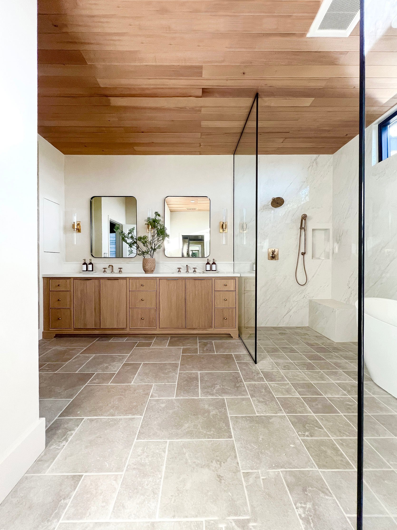
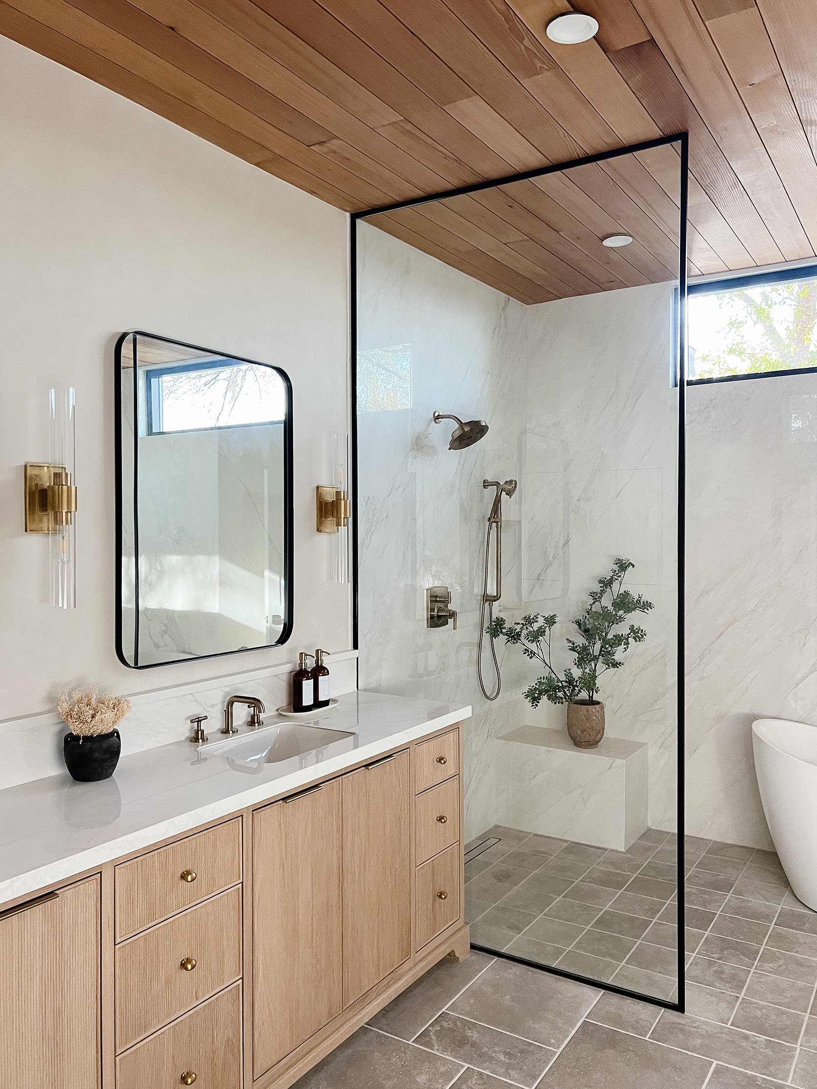
So if you’ve been on the internet (or maybe my specific algorithm), limewash has EXPLODED! I thought it was popular a few years ago but that was nothing compared to it now. FYI I am not against it. In fact, I love it too. In the right space, it’s so beautiful. But if you read this post, you know that there is a similar but different “paint” option that gives you a similar effect. Enter Roman clay. When I wrote my closet post, Lisa of LHK Interiors, graciously emailed me to chat about her experience and to give me some tips. Honestly, they are all so helpful that I’m going to give them all to you verbatim! But before we get into those, when I asked her why Roman clay over limewash she said, “I chose Roman clay over limewash because the person at Portola Paints told me it’s more forgiving than limewash.” That was the vibe I got when I went there too:) Essentially, it’s probably better for DIYers. Ok, now for all her tips:
- First tip: DIY IT! It’s so expensive to outsource Roman clay because it is a lot of labor. For my bathroom and bedroom, I was quoted $7500 for my bedroom and $3000 for my bathroom. Hence, I decided to do it again.
- Roman clay is a budget-friendly way to add depth and dimension to any space and it really is so fun to do unless you have really high ceilings I would say source it out.
- Apply Roman Clay in small amounts using a spackle knife or putty knife. A plastic knife will give you a smoother finish.
- Start at one top corner and go straight across the wall. Or sometimes I would start in a 3×3 square and keep moving across and up and down. You always want to keep a wet edge where you finish and keep pulling the clay as thin as possible. A little goes a long way.
- I discovered sadly when I used a metal knife with my light-colored paint it left dark streaks on the wall. When I switched to a plastic knife it solved that. You can buy these spackle knives in any hardware store.
- The first coat will look CRAZY! You MUST trust the process because you’ll totally be doubting yourself or if you’re my husband, call a painter to fix what your wife did.
- Use sweeping motions when applying, going in different directions. I did a lot of motion from left to right, up down, u shape, upside U. There really is no wrong way – just play! The more you vary your strokes the more texture and depth the end result will be. Just don’t stop until you reach the end of the wall.
- Once you start applying Roman Clay on the wall you cannot stop. If you stop the remaining half of the wall will be a different color and you’ll see a line where you stopped. So when you’re getting ready to start make sure you have enough time to go across the entire area in one shot. Do not go back and try to touch up an area that’s already dry because the new Roman clay you add will be a different color.
- The hardest part about applying it was cutting into the corner where the wall meet. Sometimes there would be gaps where the clay couldn’t reach so I would apply the color in my finger and blend it in. I would also suggest buying a corner sanding sponge (like this one) because the inner corner will be a bit rough to get smooth.
- I ended up doing three coats of Roman clay, sanding in between each coat to achieve the desired look I wanted.
- Since the main walls in the bathroom had Roman clay I wanted the trim to blend in with the walls. I took the Roman clay and had it color-matched at the paint store and it blended in perfectly.
After reading her tips it made me feel much more confident…despite still needing to choose a color (long story). These were her parting words:
“After you’ve lived in your space for a while if you ever get anything on your wall, I discovered you can just sand off any marks that are made from everyday living, fingerprints, or even pencil/crayon marks from kids.
Roman clay honestly is probably my favorite wall treatment! I’d apply it on all the walls in my home – it’s such a vibe. Once you do it, you will love it! Trust me! The labor will be worth it. It goes by much faster than you’d expect.”
The Most Budget-Friendly Limewash
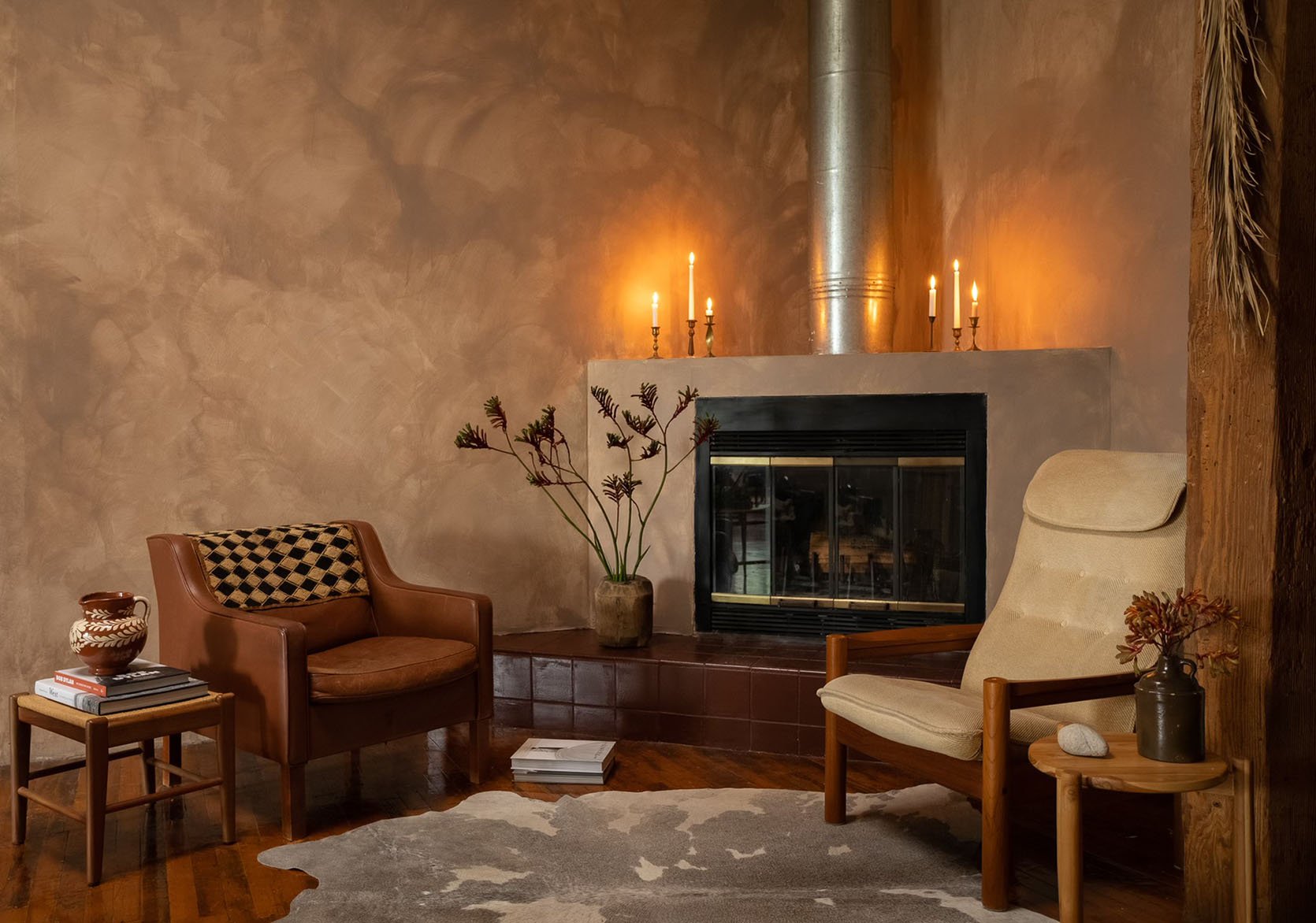
Just as I was prepping this post, I got an email from the talented and wonderful Bronte Lovelis (remember her amazing loft!?) about how she basically made her own limewash for $10. I’ll let her talk about it…
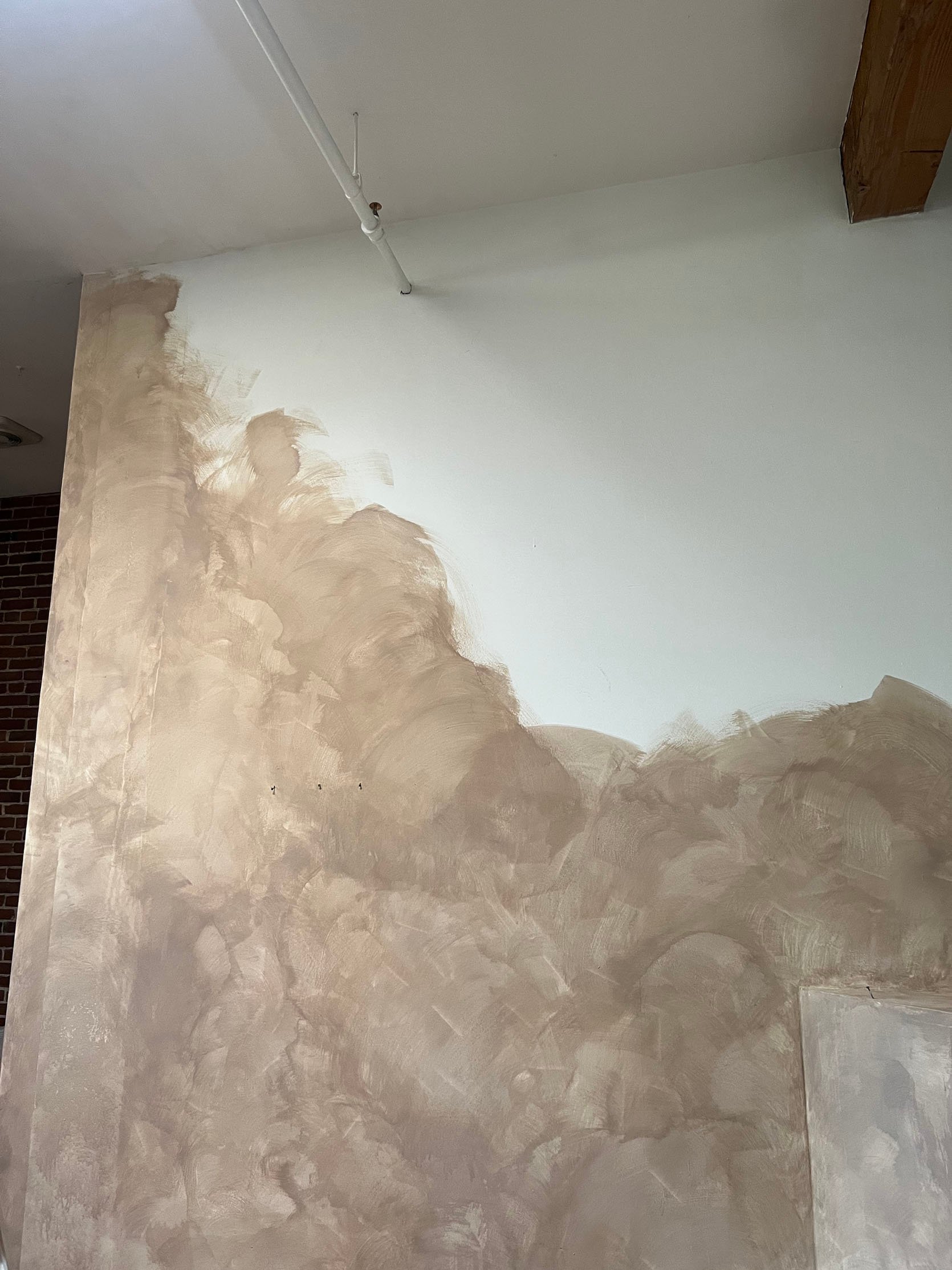
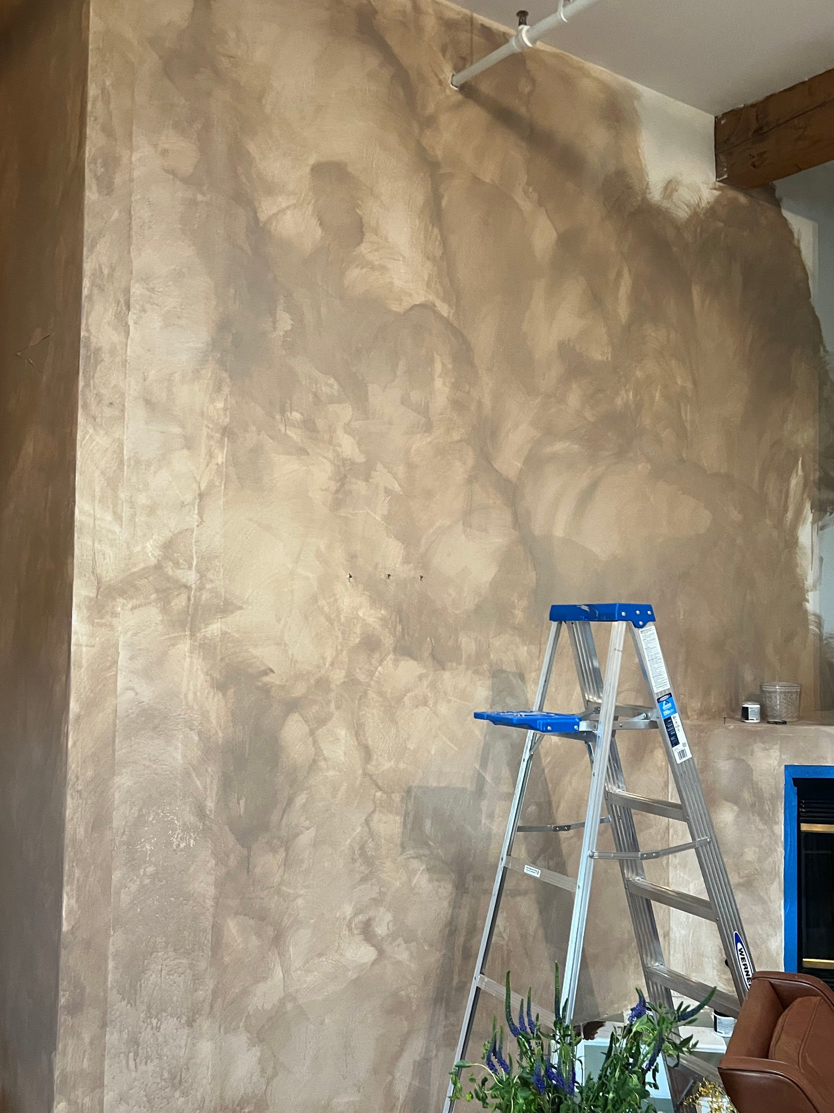
“I figured there had to be a DIY for this. I went to Home Depot to see what I could find. I ended up buying a $6 paint sample and decided to try mixing it with water to give my walls that limewash look. I experimented with different ratios and found the best was about 80% water and 20% paint. I’m super happy with how it came out. My open space finally feels cozy like I‘ve always wanted. This also has to be the cheapest DIY I’ve ever done! Literally under $10!”
I think it turned out so great! It definitely has more visible movement than a classic limewash paint or Roman clay so that’s the only thing to note if you want to try it yourself. But for $10 how can you beat it?!
Ok! That’s it for today. I really hope this sparked a little project for you because it’s almost annoying how rewarded completing a DIY project is. I also want to thank the six amazing designers that allowed me to share their incredible projects. Nothing but inspiration when it comes to you all. Have a great (and potentially project-filled) weekend!
For a few (read: A LOT) more DIY ideas head here and here!
Opening Image Credit: Design and Photo by Brit Arnesen of Brit Dot Design
THIS POST WAS ORIGINALLY PUBLISHED HERE.


