I’ve said this before and I’ll say it again – “comfortable” living rooms are the hardest rooms to nail. Give me a bedroom any day (symmetrical design with a singular purpose) or a formal “meant to be pretty” living room – that’s fine! But a comfortable, practical, usable, and yet beautiful everyday living room is a challenge. Then add in five doorways, two focal points, and needing it to be a pass-through space, and you have yourself a recipe for marriage counseling because you will be arranging re-arranging for years to come (Brian got to flex his guns and good attitude on today’s video:)). Of course, some houses are easier – you walk into an entry, and on your left or right is a contained room, with 2-3 uninterrupted walls so you can throw a sofa + two chairs and call it done, knowing you have a separate family room. But not this lovely lady – she is HARD. So let’s recap my needs/wants (which are all pretty intuitive, but here they are for the readers in the back):
- Comfortable where almost every chair is desired.
- Not overly eclectic – on the simpler side (ha). I love eclectic design in photos, but for our real life which is really busy here, I want my eye to be able to settle easily in the room and not be overstimulated.
- The good news is that we don’t need to watch TV or necessarily need storage in here either. We are lucky that it’s big – but long is always a challenge and big living rooms are harder to design.
When We Moved In
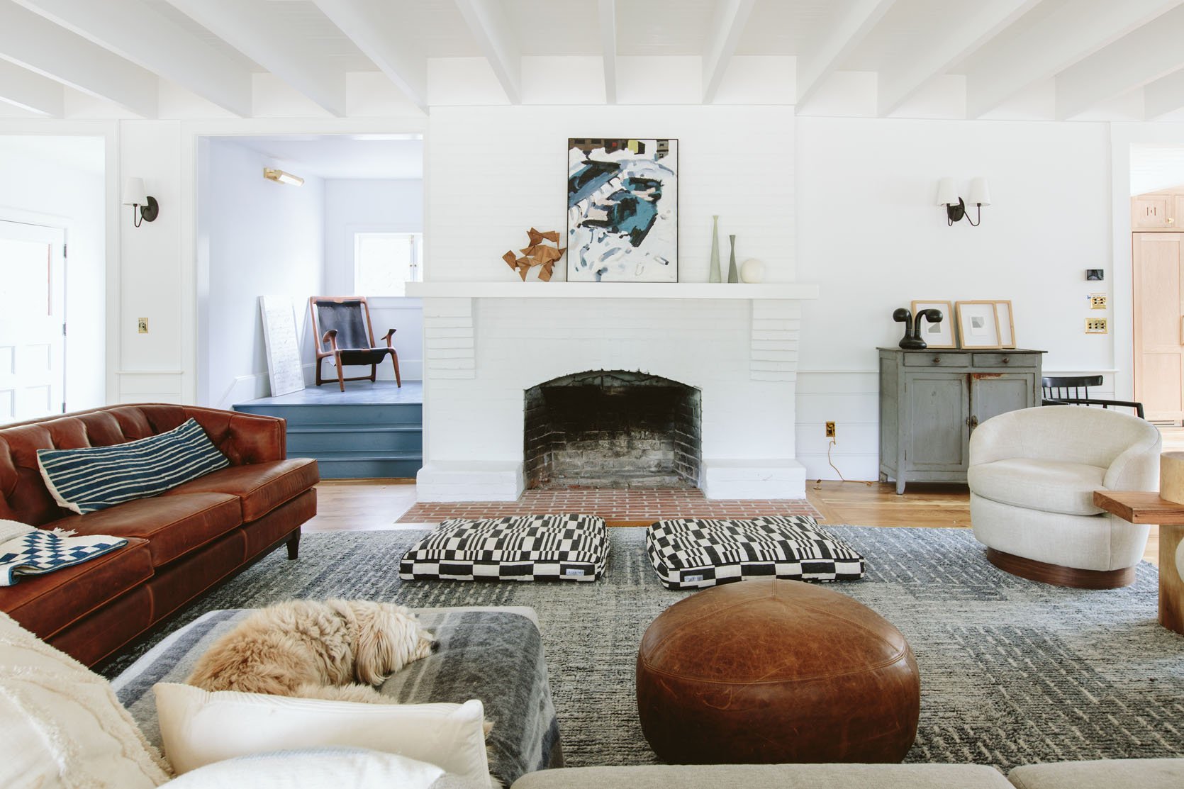

We had that awesome Rejuvenation leather sofa and two swivel chairs (which weren’t the right scale tbh) and the Article sectional + pouf (no longer available). Throw in some random throws, an IKEA lamp, a table, and an awesome rug from Loloi and it was a good placeholder for a while as we figured out how we wanted to live in here. I liked some things about it, but y’all I could NOT find the long sofa of my dreams – as you now know from my earlier post. So far, there are 110+ sofas (not sectionals) out there that I liked enough to commit to. I searched on every vintage platform for two years, then as the shoot was approaching three months out I was like, “You need to commit” so I went to the big box options but then nothing could get here in time! I almost purchased like six vintage sectionals that would have shipped from across the country or world (so expensive), and then I would have to choose the fabric (unknown, and so expensive), then reupholstering (all around $5k), and most importantly the not knowing if they would actually be comfortable – all the unknowns made me feel super averse to risking it. I even thought about custom-making one. You’ll see what decision I made, below, but that’s all to say that there was and will never be one clear layout for this room which made purchasing the sofa very challenging.
A More Eclectic Version


Here we tried two more eclectic chairs which I liked in a way, but ultimately I really liked how we had it over Christmas where there was a sofa facing AWAY from the kitchen. It made your eye go straight over the back of the sofa and stare at the beautiful kitchen tile which is so stunning. Not sure that makes sense (and sorry there isn’t a proper photo) but imagine a sofa where the chaise and the vintage chair are above. It strangely made the room feel more separate in a really good way (which I hadn’t predicted). So we tried the leather sofa there, but because the dark brown island is right behind it visually, it didn’t work.
So I enlisted a strong hot man (Brian) and a videographer (Michael) to shoot a video where we in real time figure out our layout. We had a lot of players involved (meaning furniture pieces) because I’m a collector of beautiful things (and I have another house to furnish eventually on the property so I feel ok about buying, playing, and moving to another space should it not work).
The Players
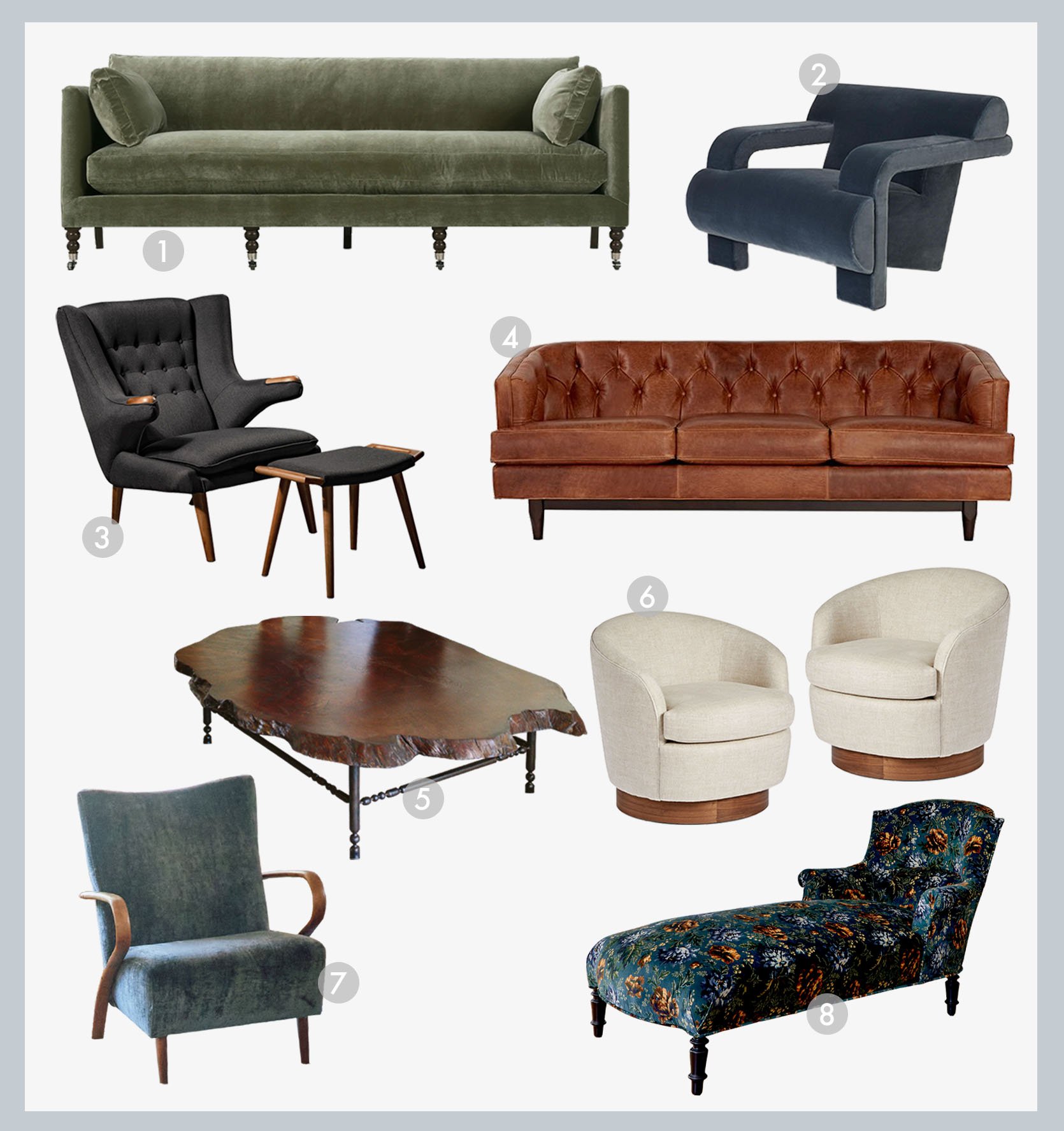
1. Green Lulu and Georgia Sofa | 2. Soho Home Accent Chair | 3. Vintage Papa Bear Chair (similar) | 4. Rejuvenation Leather Sofa | 5. Our Custom Coffee Table | 6. Two Rejuvenation Swivel Chairs | 7. Brian’s Favorite Vintage Chair | 8. Vintage Chaise From Jayson Home
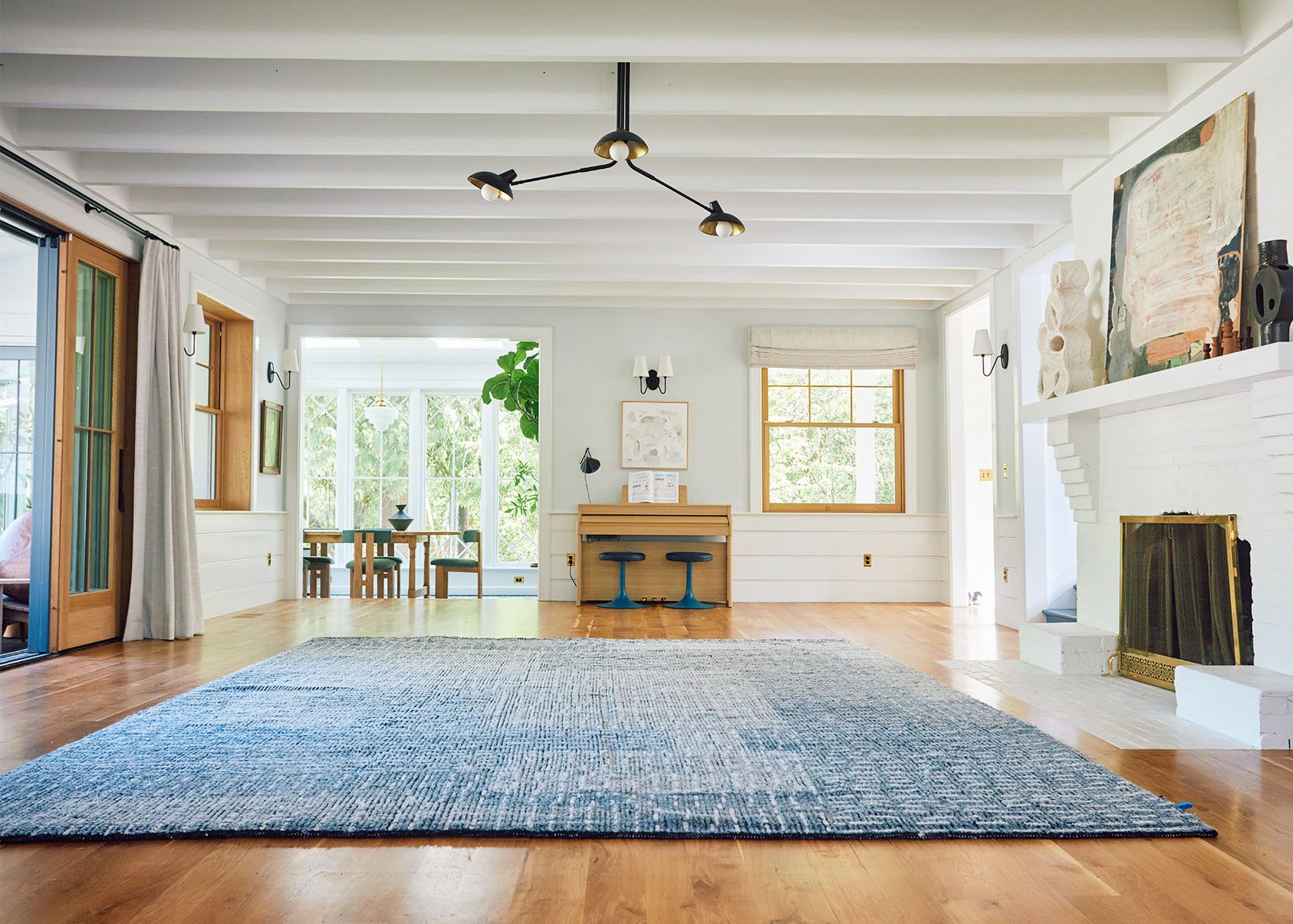
The rug is Amber Interiors for Loloi, the green dining chairs are Crate and Barrel, and don’t forget the cutest piano benches ever from Schoolhouse. All the lighting is, of course, Rejuvenation (chandelier, sunroom pendants, double sconce, and single sconce) and the window treatments are Decorview.
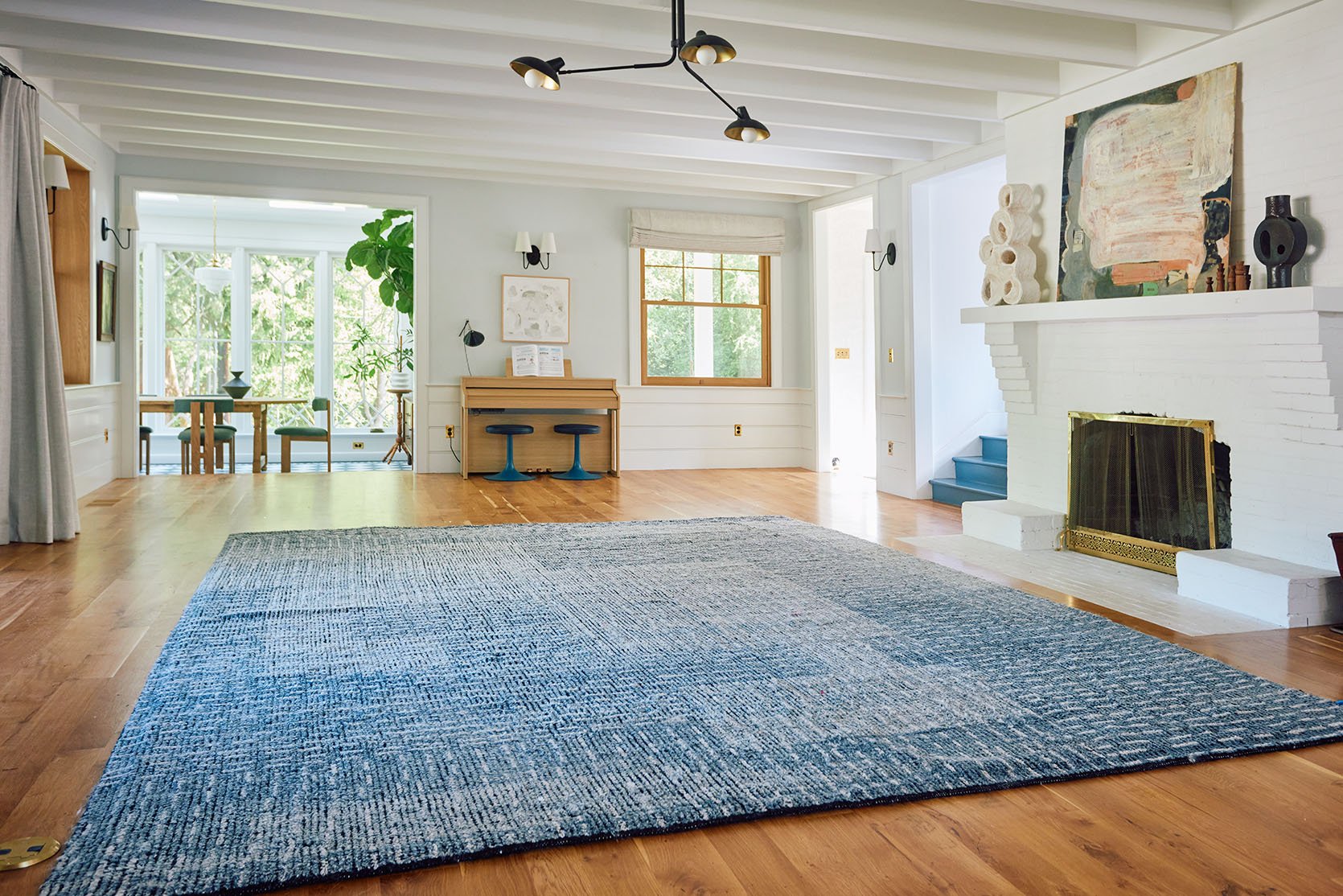
Ok, so we started with a blank slate (almost) and removed all options (out on the deck). Our video producer, Michael snapped photos as we went (we didn’t have time to set up a tripod of each version) so you get an idea, but you really should just watch this video:
To see the full (more detailed) video head to my YouTube!
Layout #1: Two Matching Sofa + Two Matching Accent Chairs
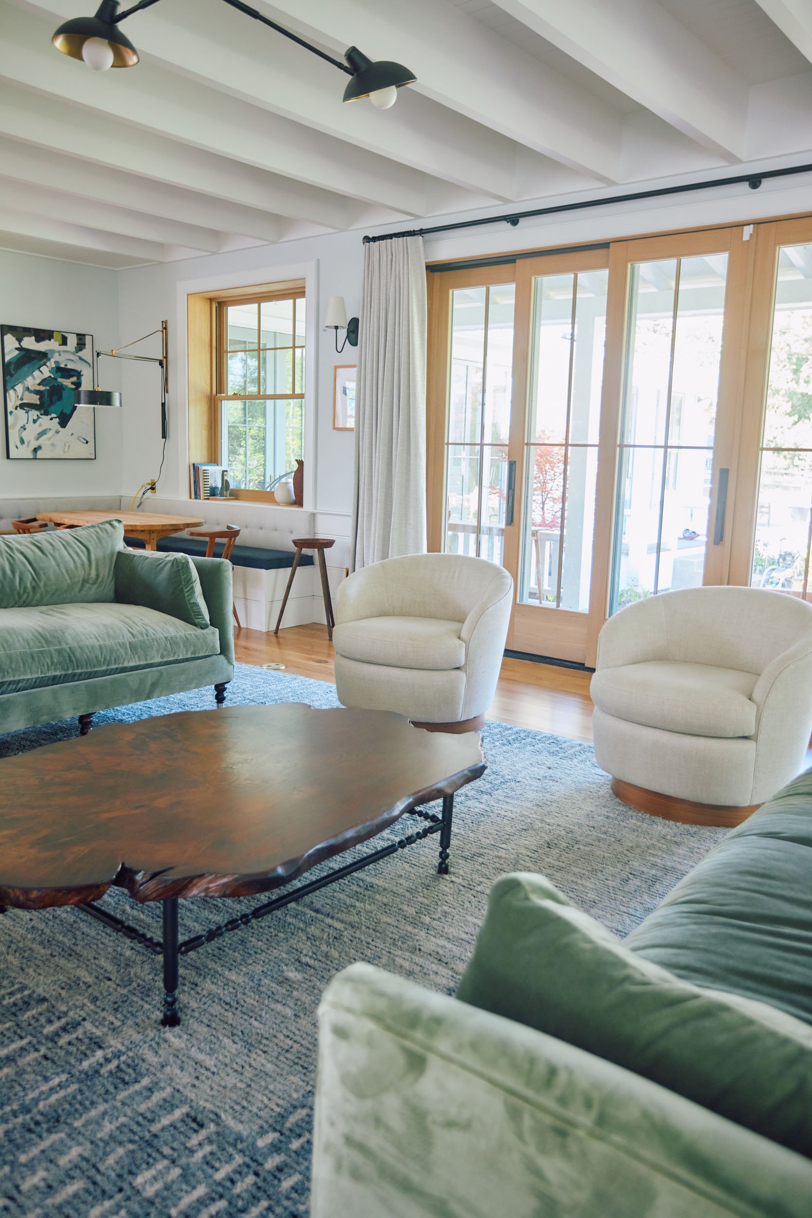

Two Green Lulu and Georgia Sofas | Two Rejuvenation Swivel Chairs
If I’m being honest, I really like this simplicity. In the video, you’ll get Brian’s reaction and I don’t disagree with him, but this sure is calm and cohesive. And styling can go FAR. But yes, this is super safe and looks too matchy (almost like it was staged). Ah, but look at that coffee table🙂


Layout #2: Two Matching (Perpendicular) + Two Matching Accent Chairs
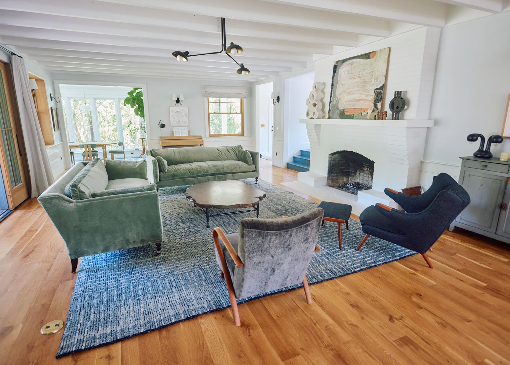
Two Green Lulu and Georgia Sofas | Vintage Papa Bear Chair (similar) | Brian’s Favorite Vintage Chair
Hmmm. The perpendicular sofas could work, but not these sofas. Their arms were high so it really cut off the conversation. The chairs were ok, but not awesome.

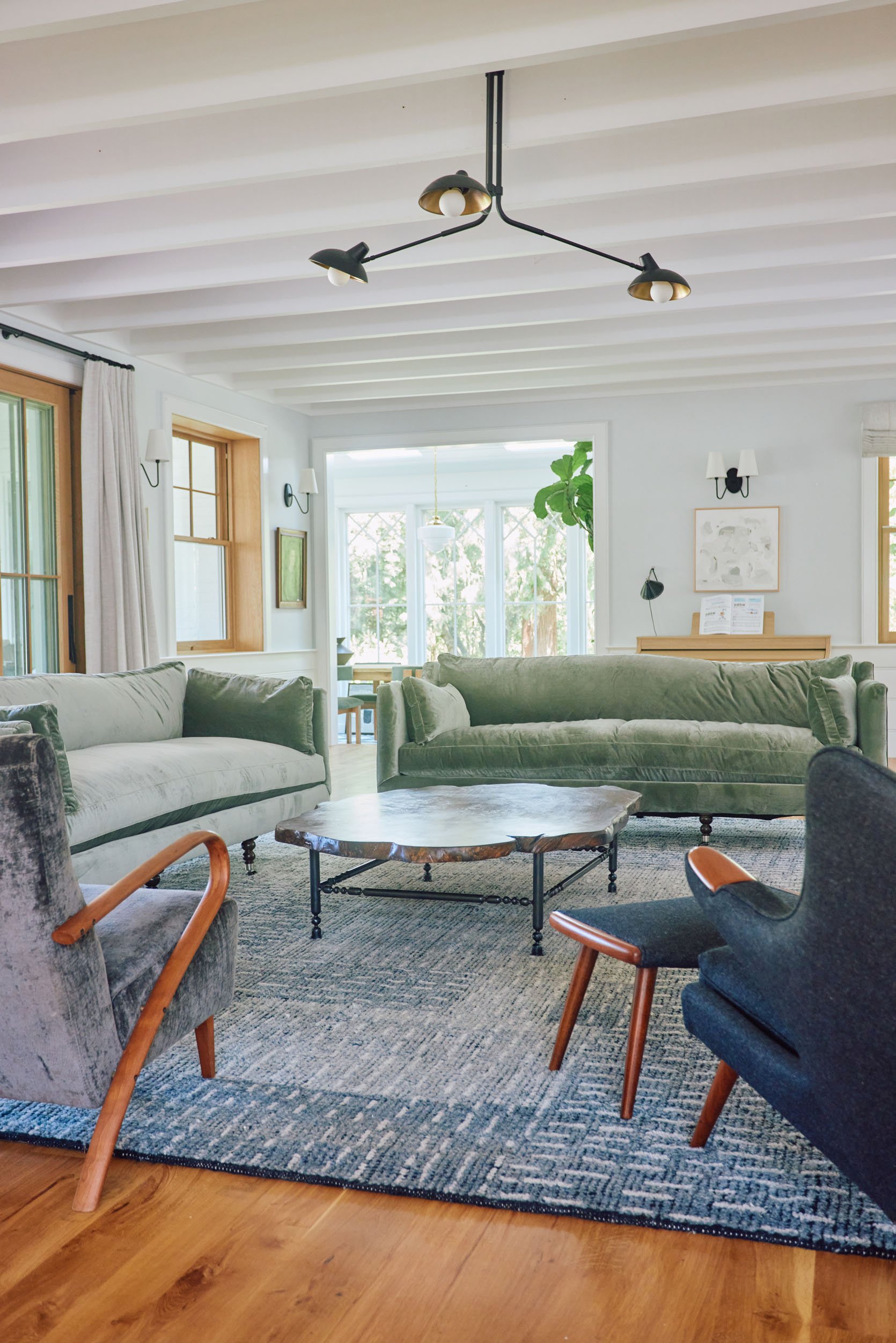
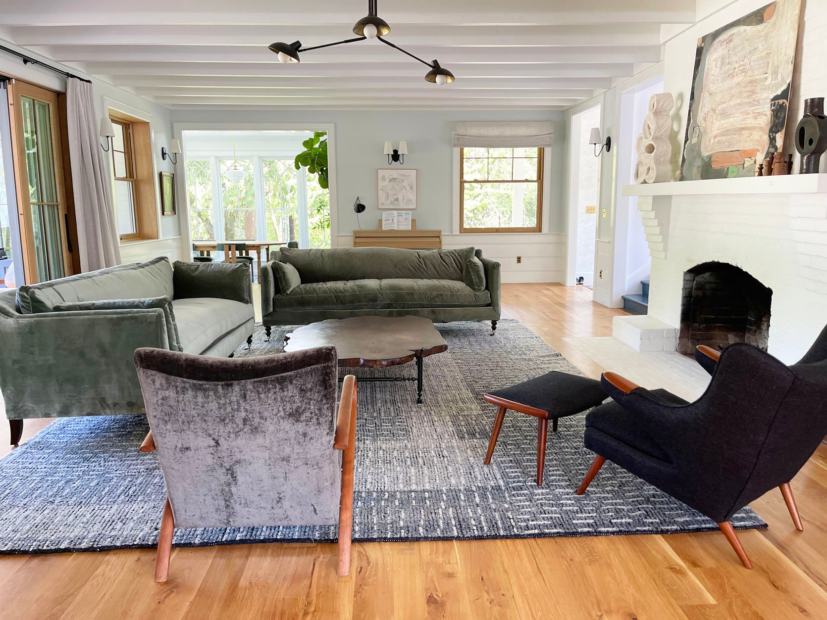
Layout #3: Two Non-Matching Sofa + Two Non-Matching Accent Chairs
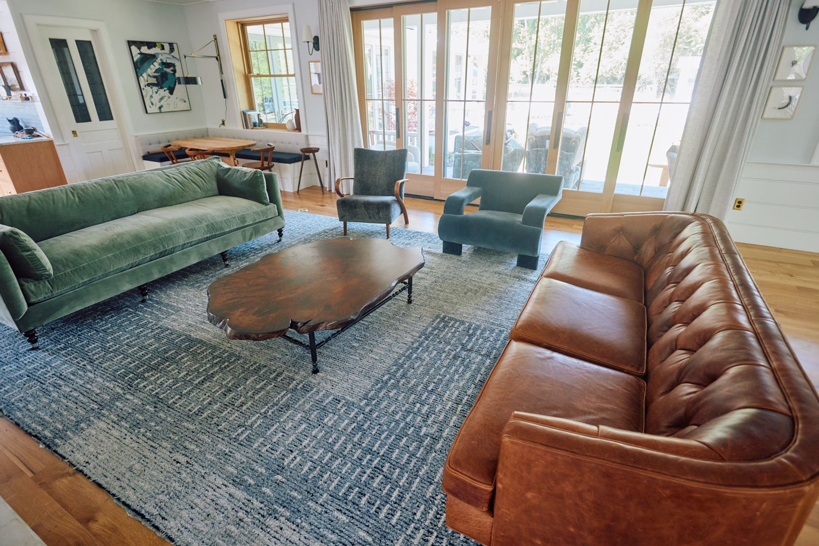
Green Lulu and Georgia Sofa | Rejuvenation Leather Sofa | Brian’s Favorite Vintage Chair | Soho Home Accent Chair
I had high, high hopes for this one, but it wasn’t a love connection. I love the Soho Home chair with the leather sofa so much. I don’t know, it just felt a little messy?

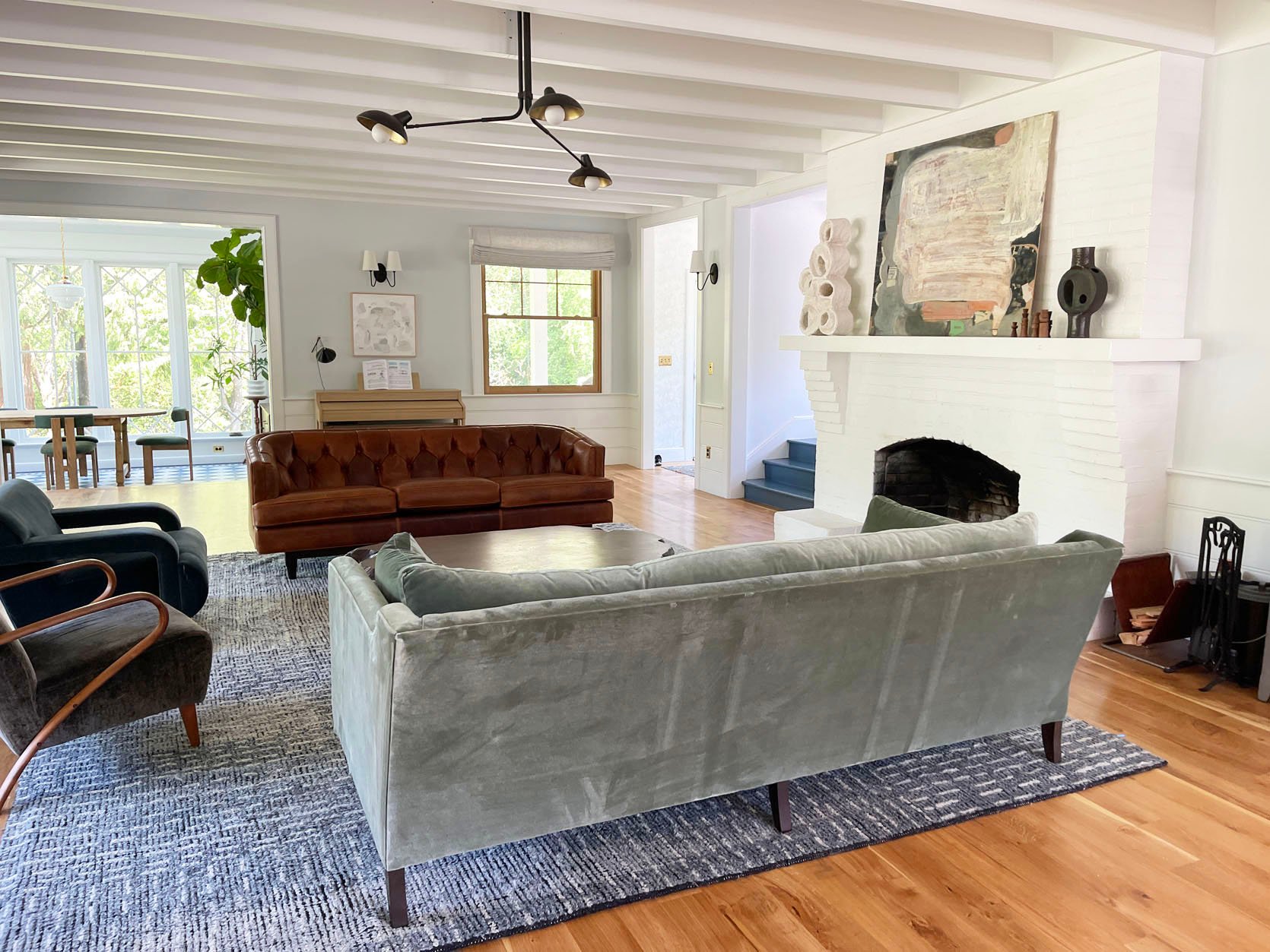
Layout #4: Two Matching Sofas + 1 Big Chair + 1 Accent Chair?
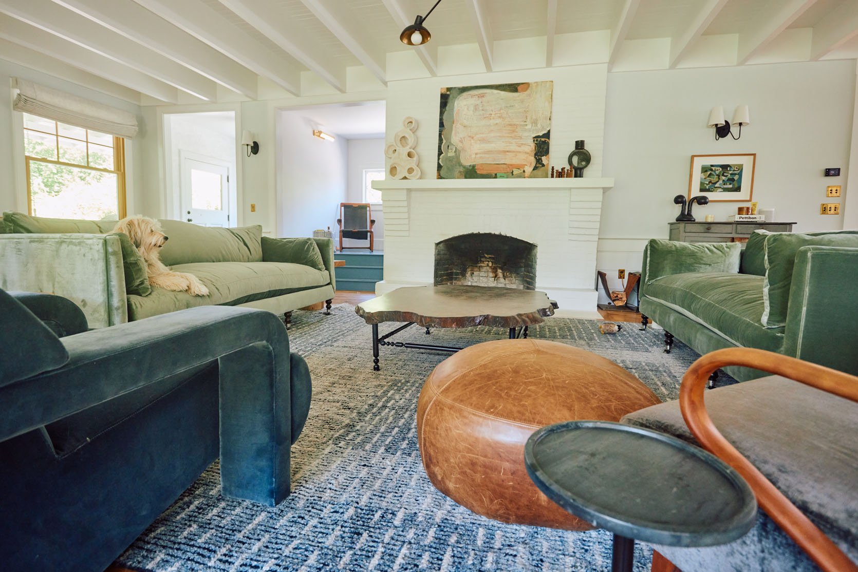
Two Green Lulu and Georgia Sofas | Soho Home Accent Chair | Brian’s Favorite Vintage Chair
So we tried this again and I really really really like the two sofas facing each other. The rest of the decor is not dialed in obviously (and I’m unsure if the sofas on the rug are ideal, which is not ideal). But it was just so cozy, inviting, comfortable, and had that simplicity that I desired. Again, you have to watch the video to fully get it – we focused on video content for this project so the photos don’t really represent the space.
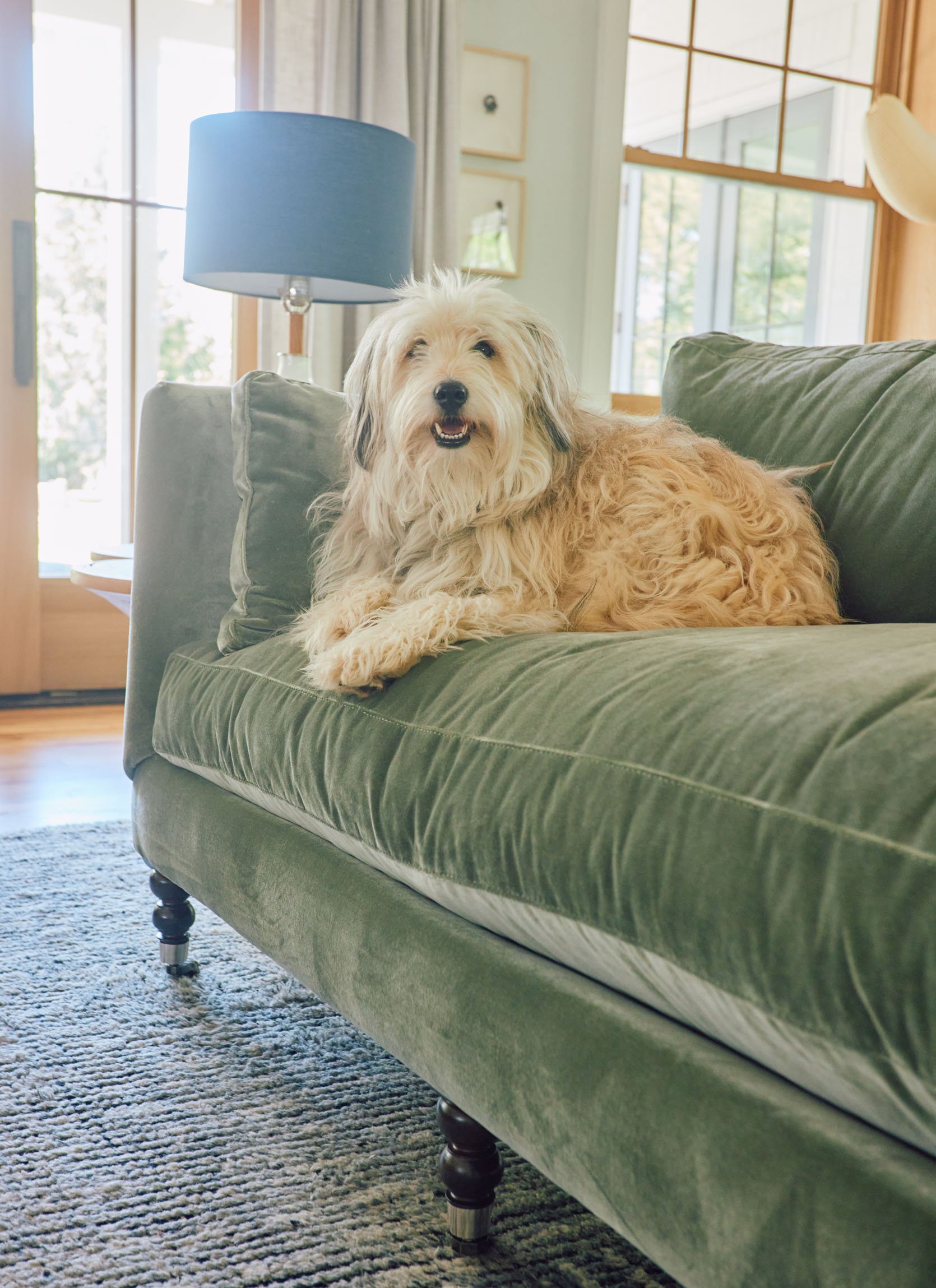
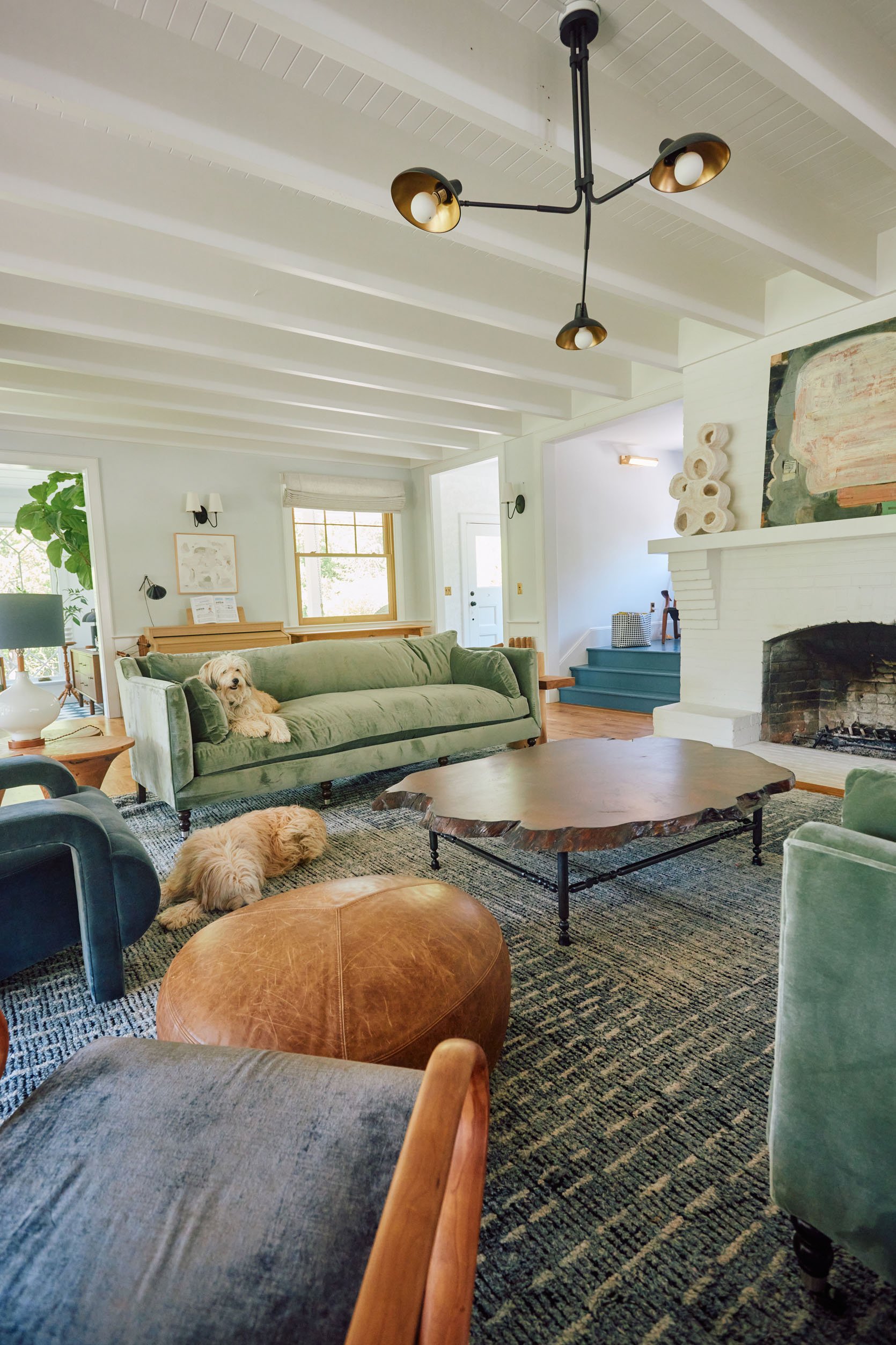
I know I’m leaving you hanging (me, too). In the video, you’ll see what we decided (for now!) and I’ll have an update soon for you on how it turned out. Still a huge WIP and while I love the sofas + coffee table combo, now I’m unsure of other things in the room. We shot this room for Real Simple last Tuesday (June 5th) and I’m writing this post on Saturday (June 2nd) so by the time you read this so much will have been decided, including art, accessories, window treatments, etc. I can’t show you everything as I promised to keep some things secret til the magazine issue comes out, so STAY TUNED!!!
Resources:
Lighting and Outlets: Rejuvenation
Wood Flooring: Oregon White Oak by Zena Flooring
Windows and Doors: White oak, Aspen Casement by Sierra Pacific Windows
Window Treatments: Decorview
Skylights: Velux
Wall Color: Mantra by Sherwin-Williams
Paneling Color: Extra White by Sherwin-Williams
*Video by Michael Raines
THIS POST WAS ORIGINALLY PUBLISHED HERE.


