It’s been six years since we did our deep dive into the OG “Effortless California Casual” style trend. In 2017, it was truly all the rage! It was impossible to not want to dive into that cool, neutral-toned bohemian world. Every photo looked like there was probably a little bit of sand on the ground because the beach was literally or hypothetically a mere few steps away. Guaranteed was also a piece of driftwood carefully placed on a coffee table or shelf. But now the sea breeze has somewhat settled on that version and its chic, more refined friend has entered the chat…and they are dominating.
Now this isn’t to say the old style is “out” because it’s still undeniably beautiful…but it’s been very fun seeing it evolve as every style does. So what’s changed?? Well, the same elements of neutral tones, lots of wood, and hits of black still ring true. But now, we’re seeing less boho and more classic. Replace driftwood with refined woods and cloud-like seating with structured sofas. Mainly, there’s overall visual warmth that wasn’t as apparent with those bright white walls of yore. Ok, this is starting to sound like I’m trying to write an Irish poem so I’ll stop because baby, we’re talking about west coast/Mediterranean-inspired style. Let’s start with a pretty crucial and standout element…
Limewash Walls
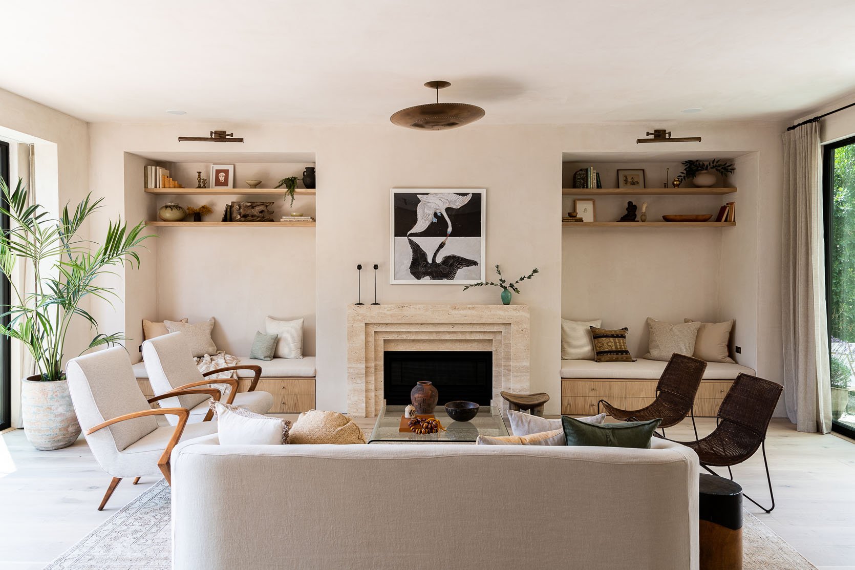
You can’t throw a rock these days without hitting a house donned with at least some limewash paint. And I get why. IT’S BEAUTIFUL! I’m even considering it for a small room in my apartment. But not just any color works with this style, it’s gotta be a light neutral. The goal is to have walls that look “natural” and to give an effortless movement to the space.
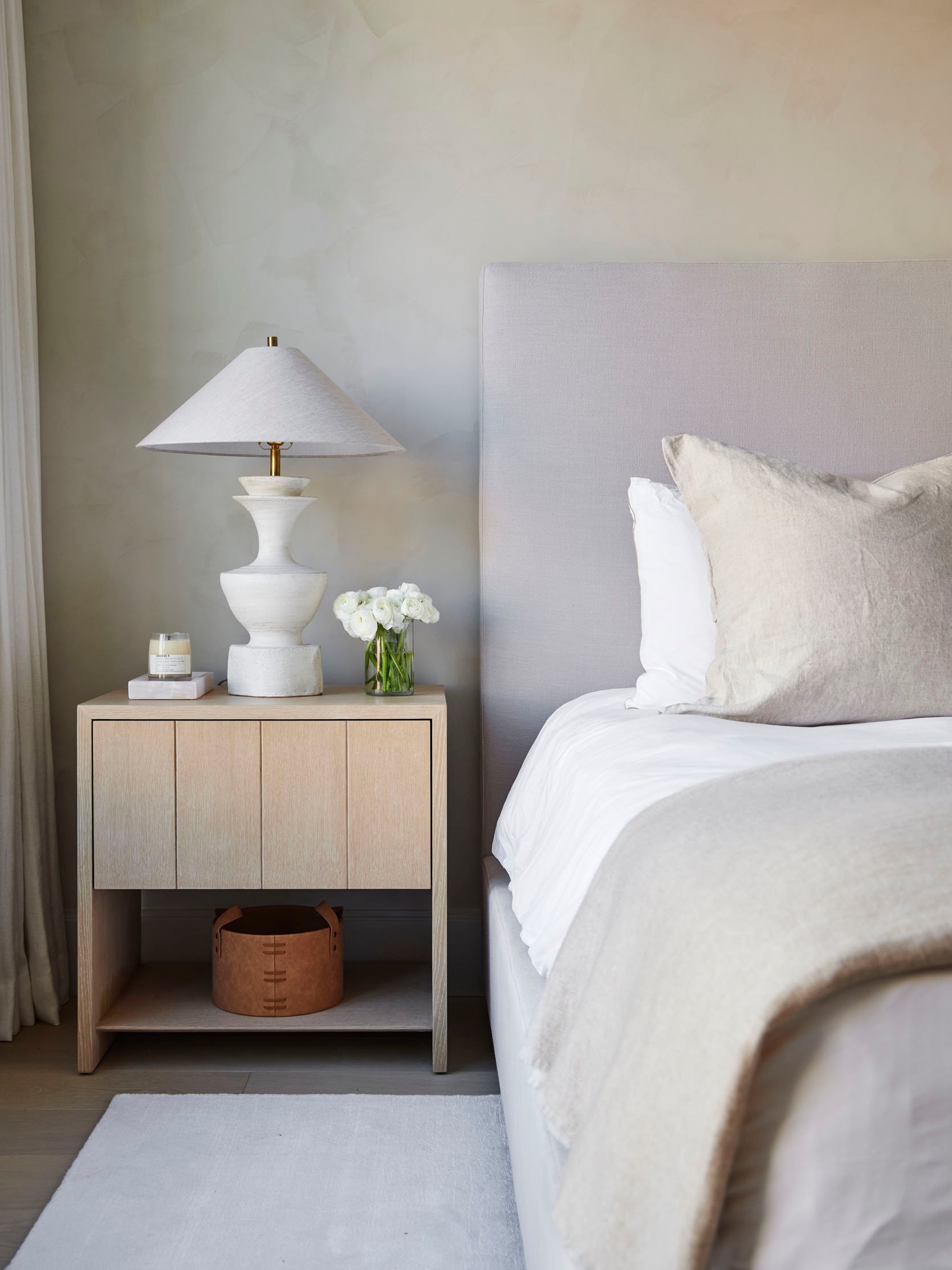
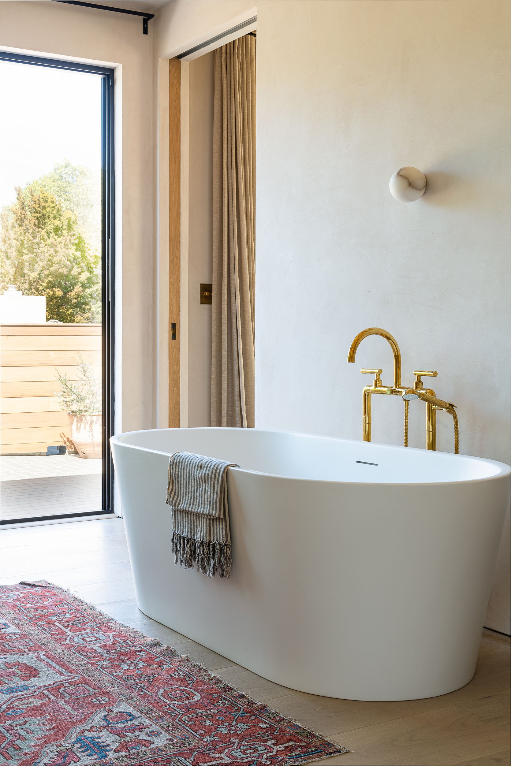
Imagine if these wall were covered in normal, flat paint. They would still be pretty but they would feel um “less organic”?? They also add a velvety softness that is so soothing to look at. No wonder the world can’t get enough of the stuff. But in terms of this style/trend, I think it’s a significant difference. In 2017, it was all about BRIGHT WHITE walls but in 2023, the soft tans and beiges are king.
You may feel like this style leans a bit Japandi and you’re not wrong. I think it’s heavily influenced. But to me, it’s a bit more layered and cozier. But if you love Japandi, I have a feeling you are going to love this style. It’s just a hunch:)
Refined Wood
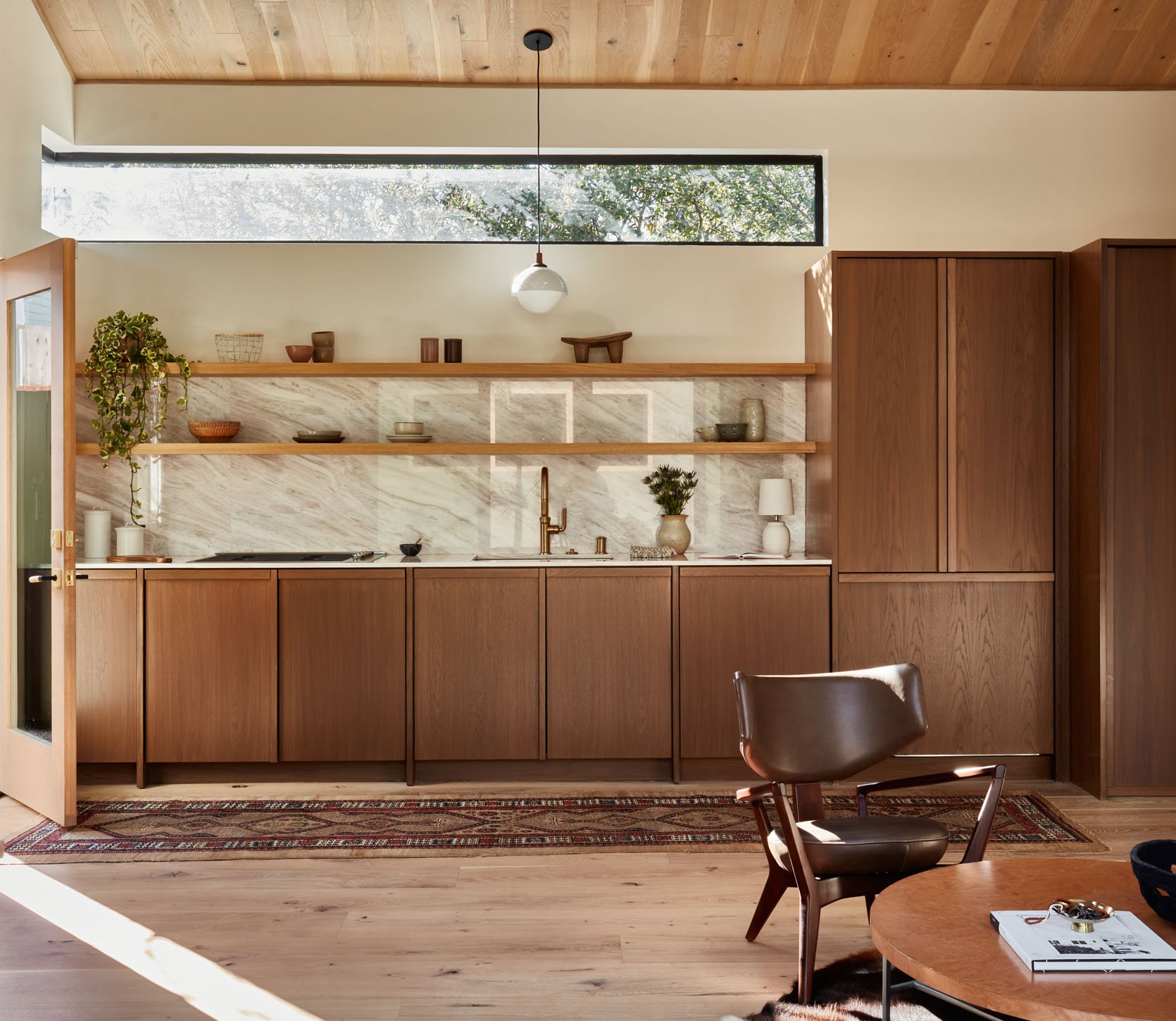
When I was looking at those old 2017 photos, naturally imperfect, yet very cool, wood was the look. But I also noticed that wood in general was used more as an accent as opposed to now where tends to be the statement. The color white was so crucial to the style that even cabinets were painted white over staying natural. But today, beautifully refined wood, whether it be cabinetry, shelving, wall treatments, or furniture are A HUGE component of getting this style right.
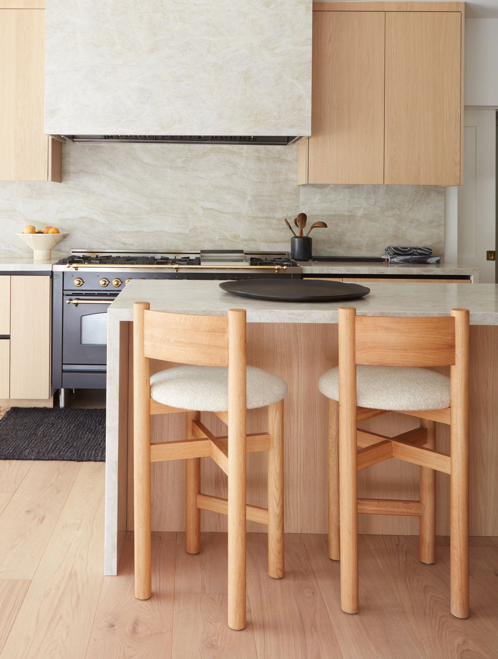
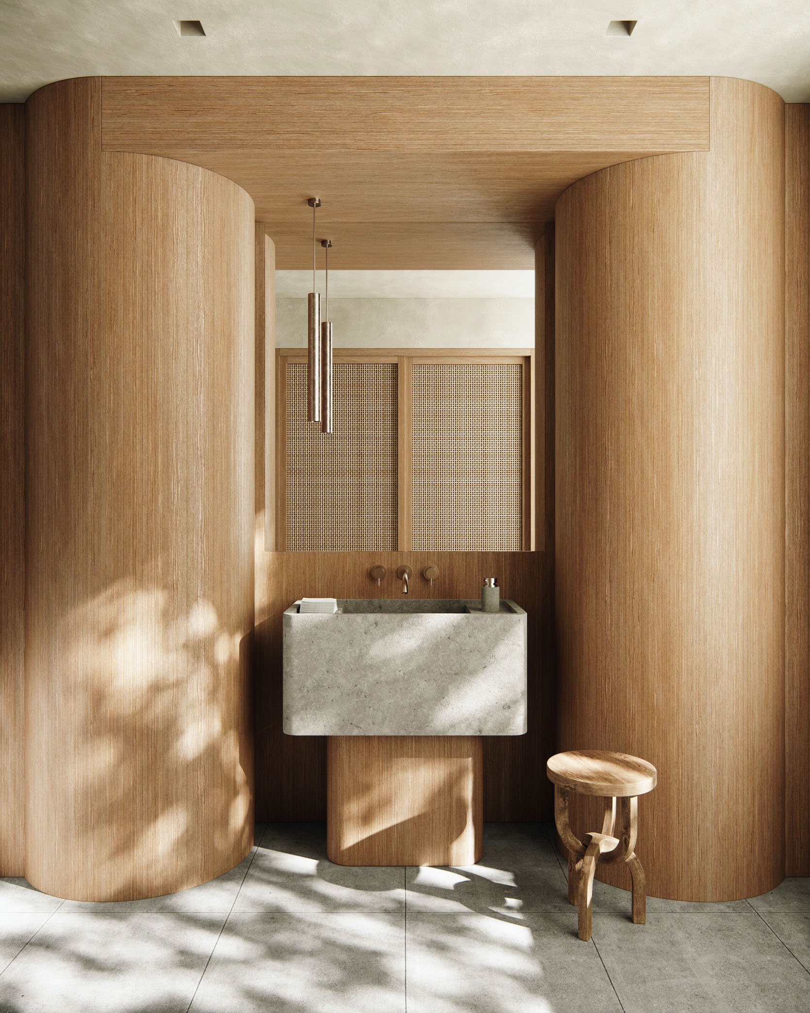
There tends to not be a tone of detailing in the wood. Cabinet fronts are almost exclusively flat and smooth. Gotta keep it simple but visually bold (like those ridiculously beautiful columns in that bathroom above)!
Slated And Fluted Wood Details
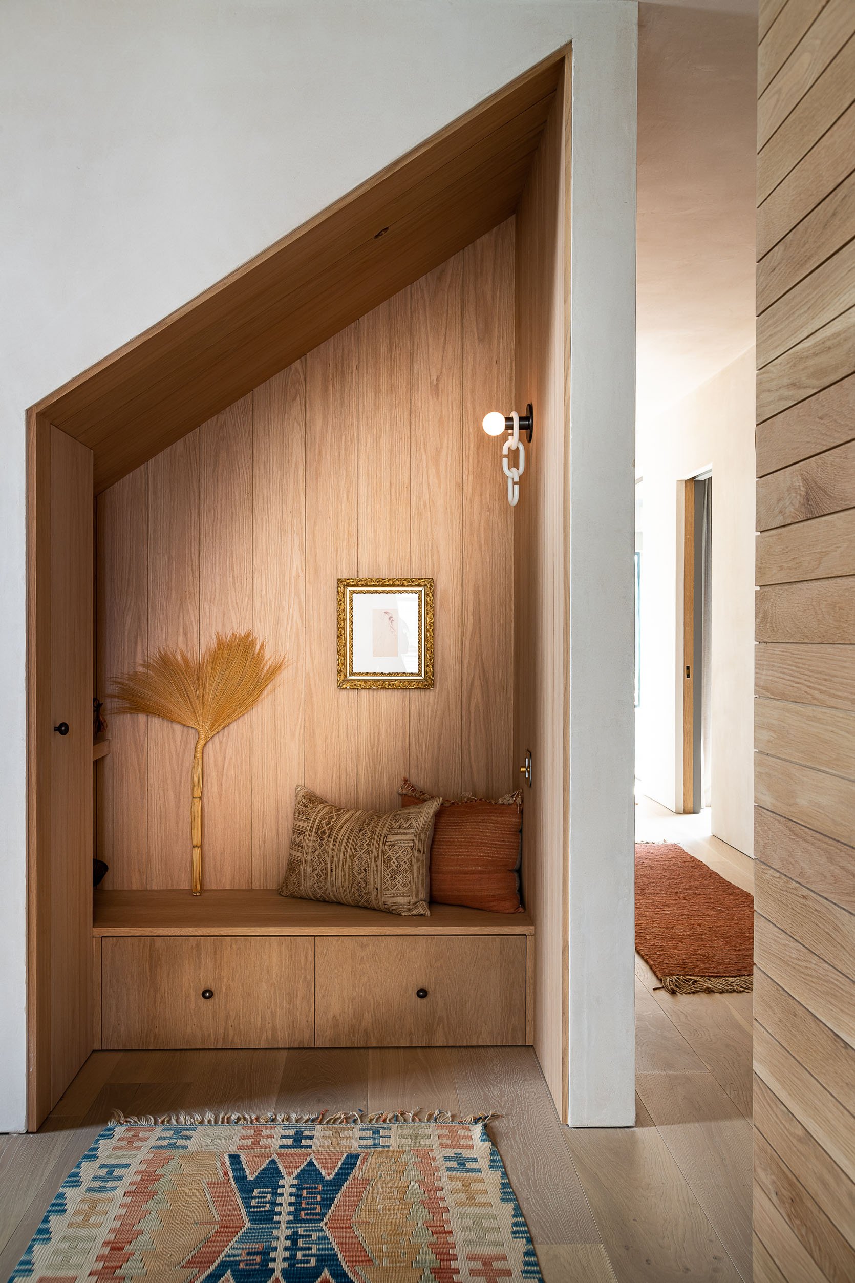
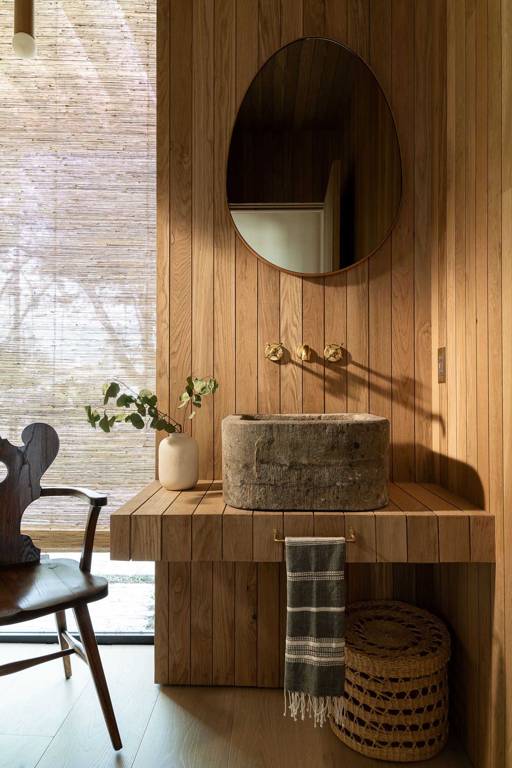
Ok ok, refined doesn’t mean boring. Wood slat paneling (and fluting, which I’ll get into in a minute) is all over this style. I mean, look how impactful yet calming it is. Of course, you have to make sure you use a matte finish and light/medium warmth is always to good bet. I truly can’t get over how much I love that entry nook (?) in the photo on the left. The wood tone, the width of the panels, and those micro knobs (I’ll get to those later) are all perfect. Rob Diaz knows this style in and out.
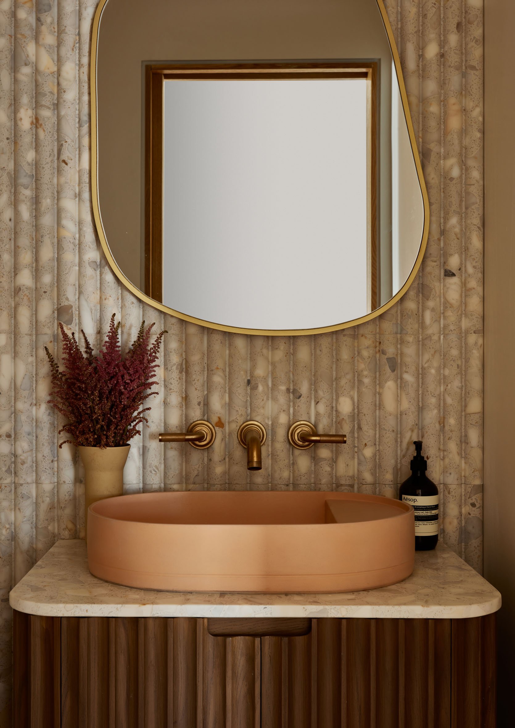

Wood slat paneling’s fancy cousin, fluting, is also a heavy hitter in this style. A 1000x Better decide to double down on this detail in both the wall and the vanity making for an undoubtedly sick bathroom. Of course, all of those neutral tones, natural elements, and perfectly placed Aesop soap bottle really make this a “Refined California Casual” space when it could have easily gone hyper-modern with slightly different materials. Also, I’m kidding about the soap…but your bathroom may not be complete without it;)
Now, for that stunning hallway shot designed by Stewart-Schafer, the fluted built-in mixed with those reclaimed beams, and perfect wood-framed doorways make me want to rethink my whole home. I do want to point out that this beautiful home isn’t really a “Refined California Casual” style home. They played with color and pattern and is much more European-inspired overall. I just couldn’t help myself and had to use this photo:)
Travertine
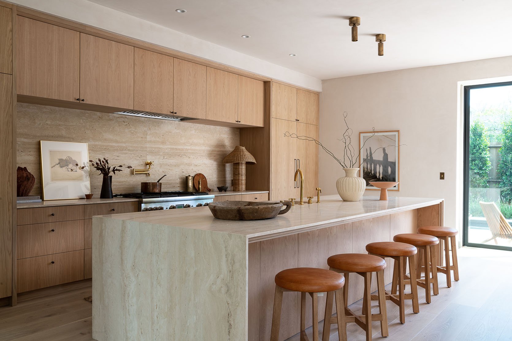
Ah yes, the cool girl stone! Oh, you didn’t know that the “cool girl” aesthetic included a travertine coffee table?? Well, now you do. But I promise if you don’t identify as a “cool girl,” (I definitely don’t ha) I promise this stone is still for you. It’s warm, looks like it came straight from the earth’s core, and costs about half of what marble costs. Win/win if you ask me.
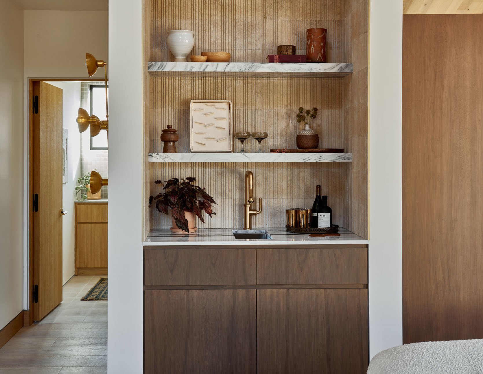
You don’t just have to use travertine in slabs for permanent elements. Look at the tiles above and the beautiful texture they add to the space. A small but special moment that is organic and natural.
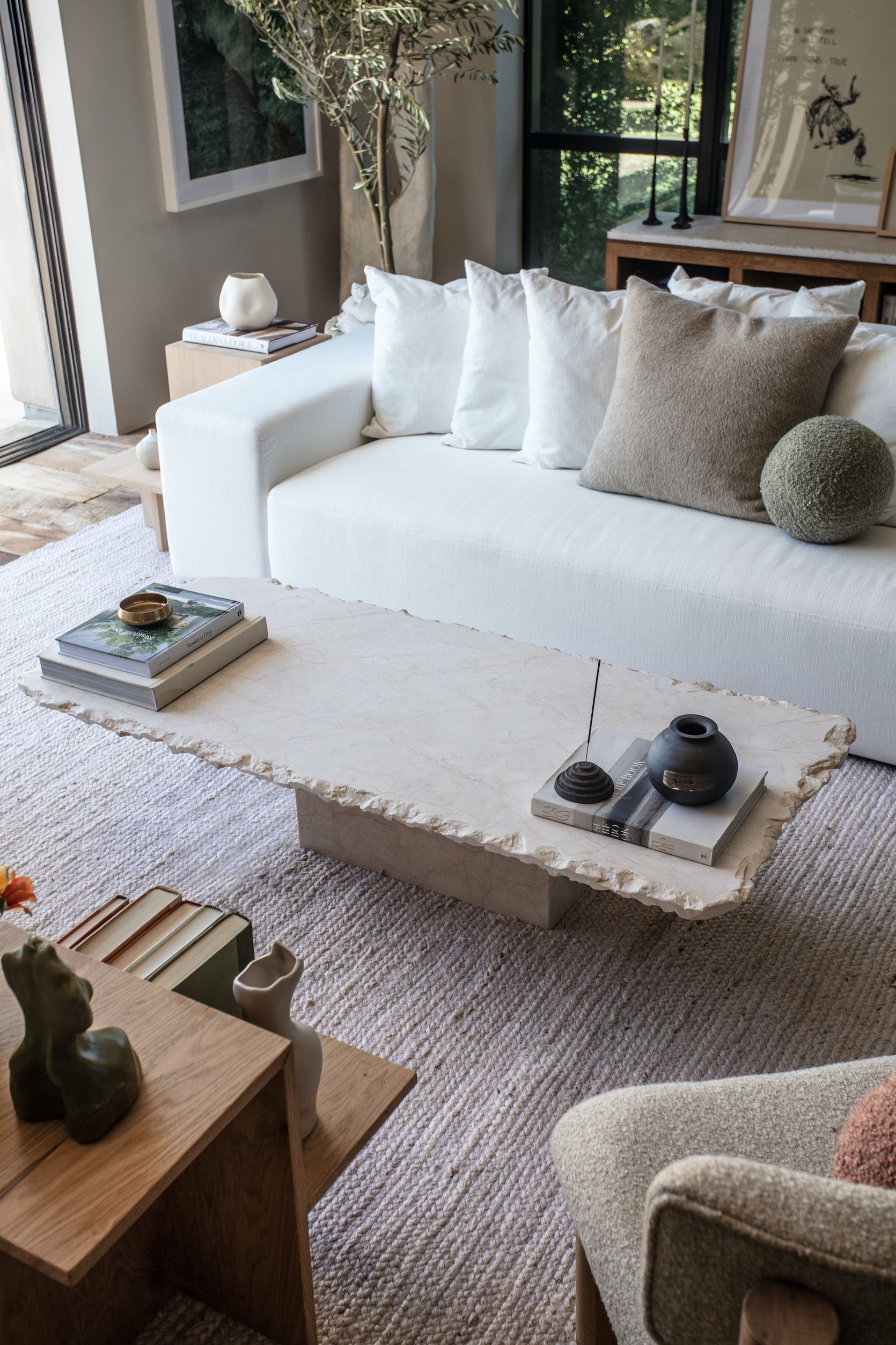
But maybe you are more into the coffee table version of incorporating travertine. We can all be cool girls:) Well, this beautiful coffee table from House of Leon is a beautiful option. It’s not inexpensive but given how special it is and that raw edge, it’s a forever piece (maybe just when the kids get a bit older so bumping into it is less hospital-inducing:))
Marble With A Lot of Movement
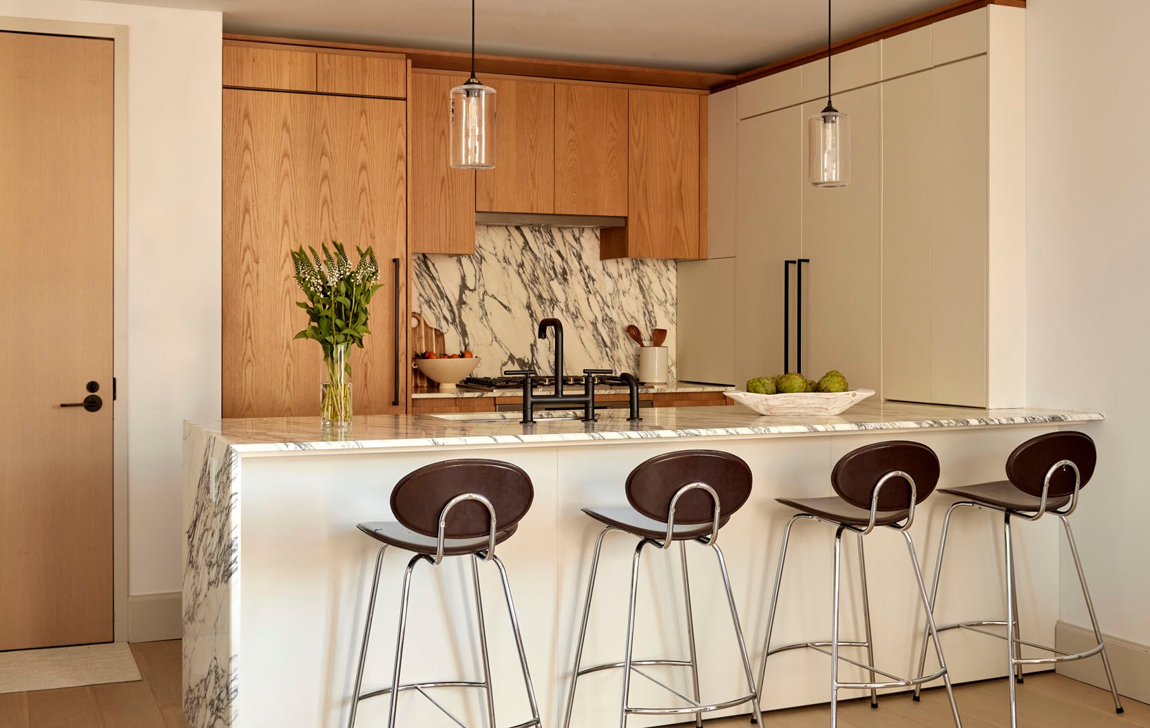
Now just because marble is more expensive than travertine doesn’t mean it isn’t as important to this style if it’s within your budget. That white statement marble is another element that takes this new version of California Casual away from the more boho look. It definitely makes it feel more “refined/elevated”.

This bathroom by Sarah Sherman Samuel is nothing if not a showstopper. That elegant marble, the natural matte vanity, terra cotta tiles, stop it!
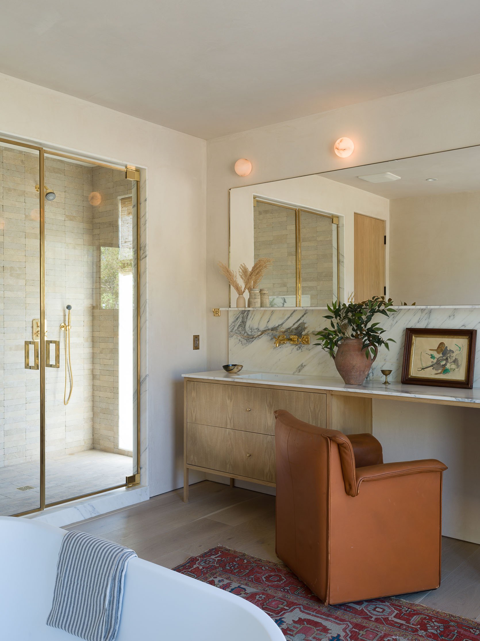
I really love how the marble in this bathroom is still a statement but a slightly quieter one. This bathroom also has those gorgeous limewash walls, simple, flat front cabinetry as well as micro knobs and aged metals:) Wanna guess what we’re going to talk about next???
Structured Seating

Did you guess furniture? Thought so:)
The new style of furniture is still light and textured but less “cool but falling apart” neutral vintage pieces or cloud-like seating. They are now chunky and structured which I honestly prefer. I’ve only heard complaints that the cloud sofas never hold their shape and can easily look messy.

See what I mean?! There’s just more structure and dare I say, refinement:)
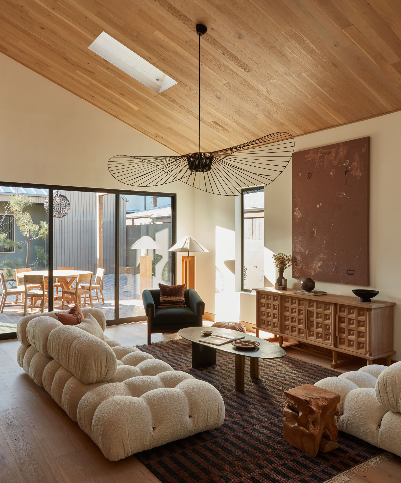
This doesn’t exclude them from having some fun personality. While that Insta-famous sofa’s comfort is controversial, I love that Crate and Barrel media cabinet! Vintage-inspired and designed with Athena Calderone whose Amagansett home is another perfect example of this style.
Also notice the depth in dark, warmer neutrals that make me fall for this style over its former version. Do you agree??
Decor Details

OOOk now let’s talk micro knobs. If you look back at these photos you’ll notice them in a handful because nothing says “refined” than tiny small ball knobs, amirite? They let the wood of the cabinet fronts be the star while adding the perfect amount of visual interest. I adore them. A small detail that makes a big impact.
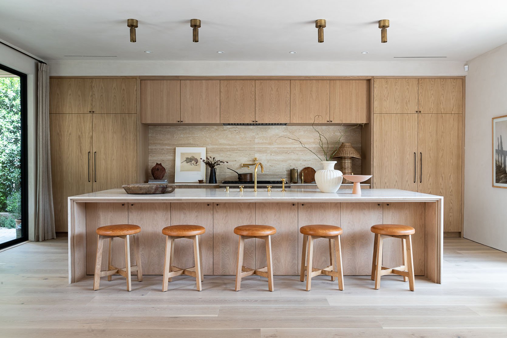
Another decor element you may have noticed is the use of aged brass and/or bronze fixtures, both plumbing and lighting. Using those materials adds instant soul and for the lights, there are extra points if you use vintage French Mid-century modern pieces:)

And this last one definitely leans more Japani but those simple, yet perfect wood inside frames make for the prettiest “permanent” detail. It adds dimension and warmth and is really something to consider if you want to try to achieve this style at home:)
So that’s it from me! There are some other clear heavyweight designers for the style like Amber Lewis (duh) and Jake Arnold who have really helped to make this style wildly popular. I am a huge fan even if I like a little more color in my own home. Why? Because this “rebrand” of California Casual is undeniably beautiful and nearly washes a sense of peace as you look at an example of it. While this style may change again in another six years, much like the original it will still stay timeless. No question. Thoughts???
Love you, mean it.
Opening Image Credits: Design by 1000xBetter | Photo by Michael P.H. Clifford
THIS POST WAS ORIGINALLY PUBLISHED HERE.


