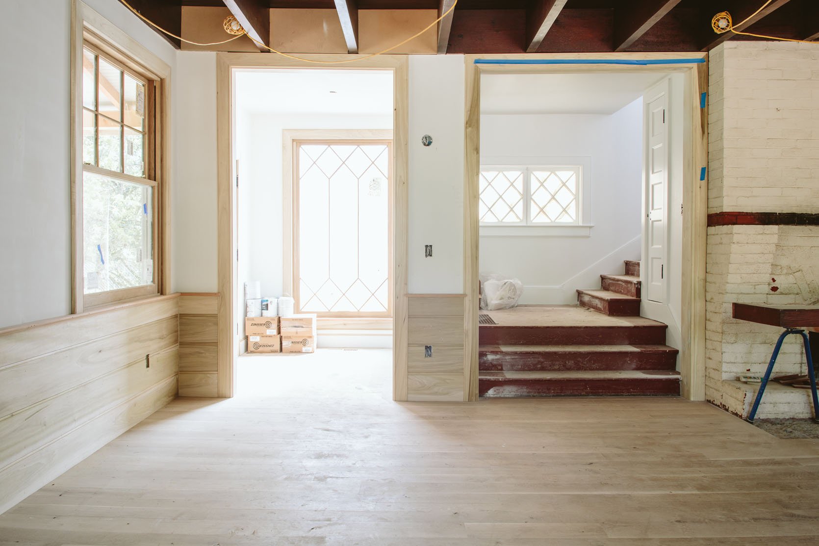
This coming Monday we are revealing the entryway to you (first round reveal, at least), a sweet little room that sets the tone for the house. Before we show you the reveal we wanted to give you a recap of where we started, why we did what we did, and where we landed on things before the final layer. We don’t come in and out of this door as much, but it was a great opportunity to be a welcoming little vestibule. However, it wasn’t always so bright and airy, no siree. Here’s where we started:
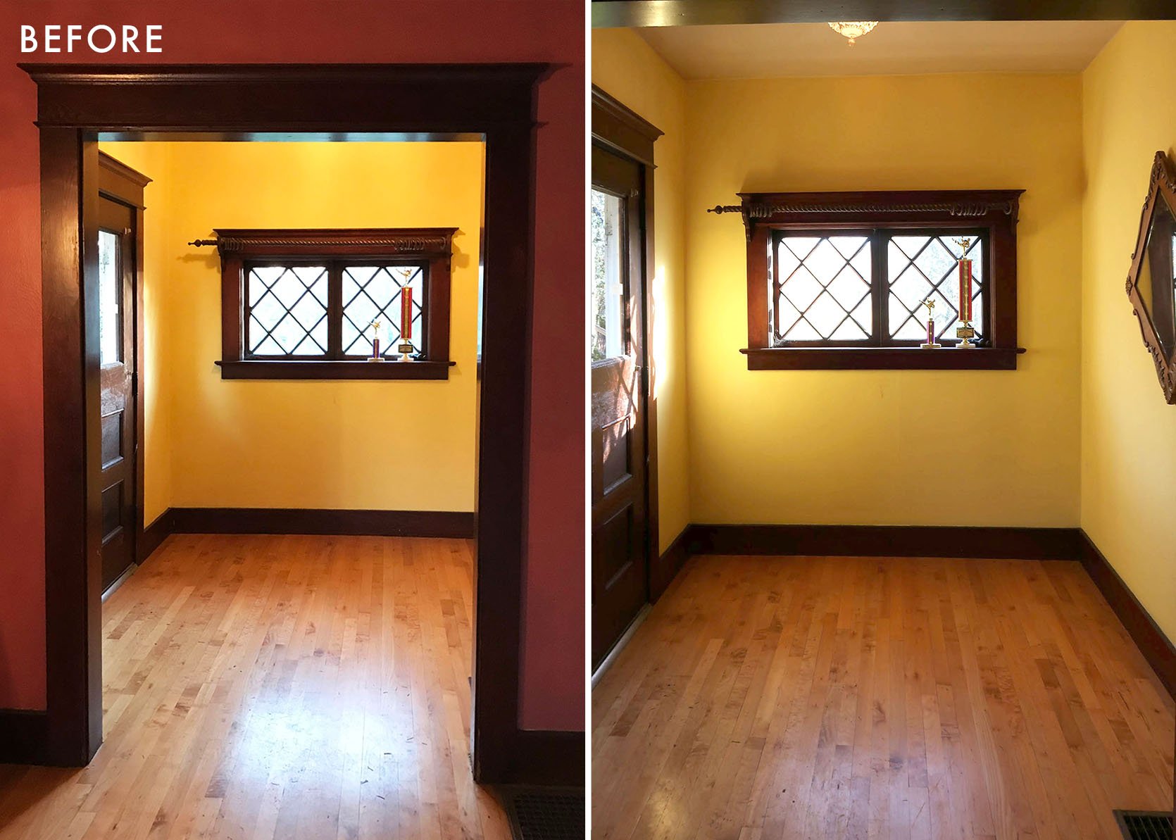
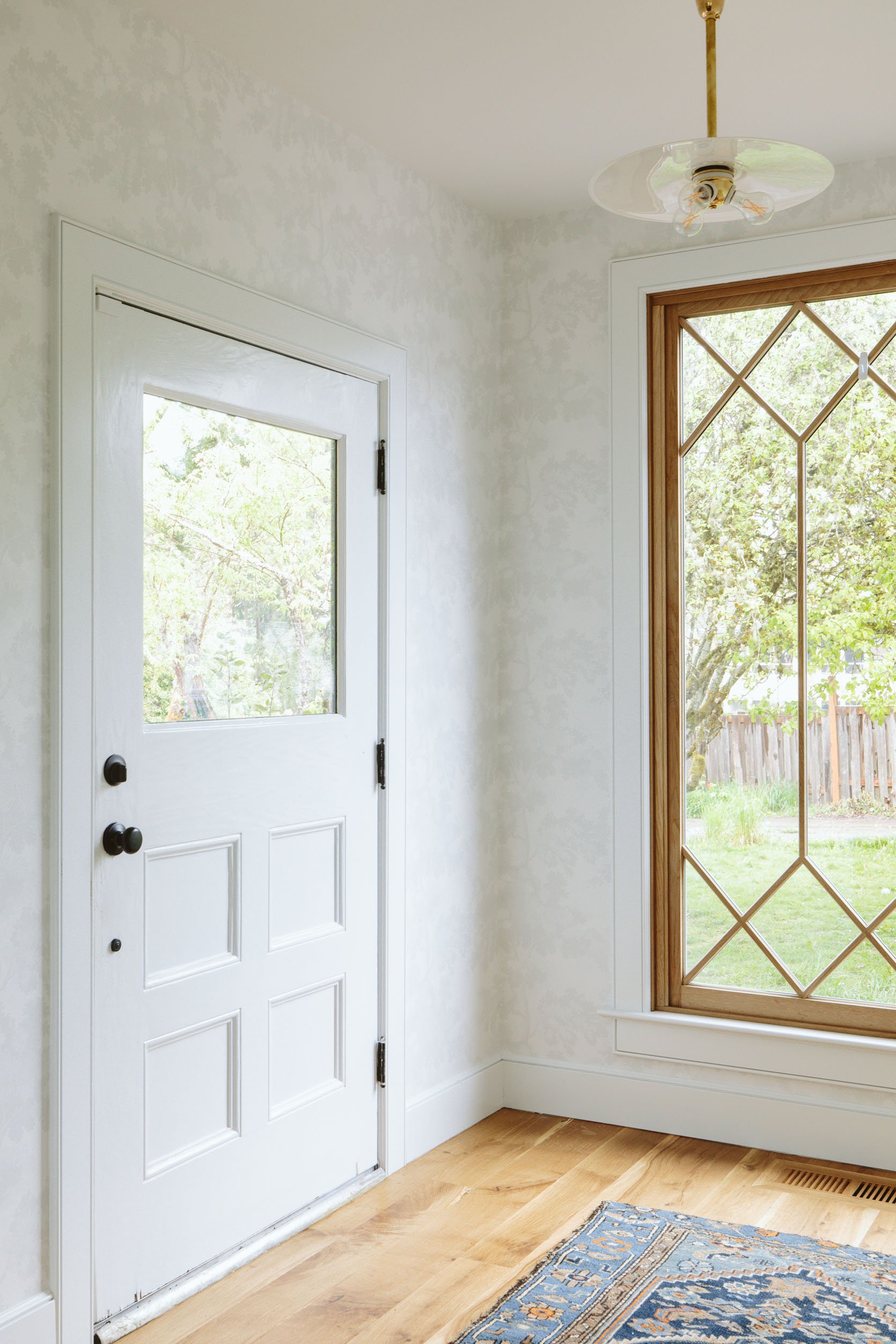
It was a great space, pretty big for an entry (8’x7′ or so), and had a really pretty door and window. We wanted to bring more natural light into the living room so we ended up repurposing that window into the upstairs guest bathroom so we could install a much bigger one.

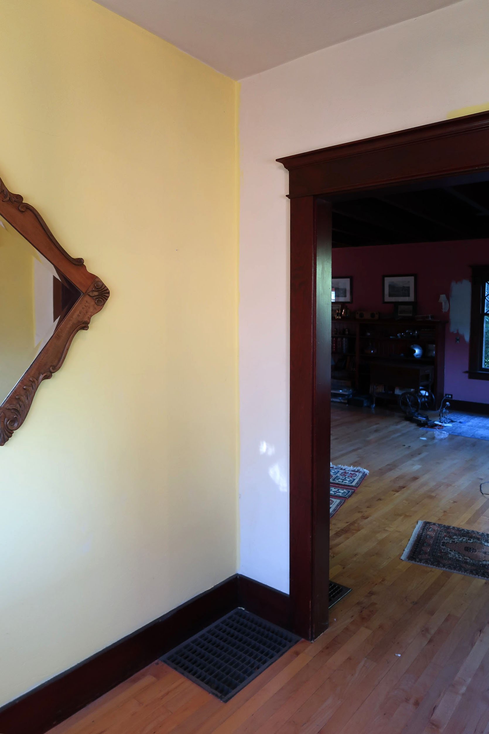

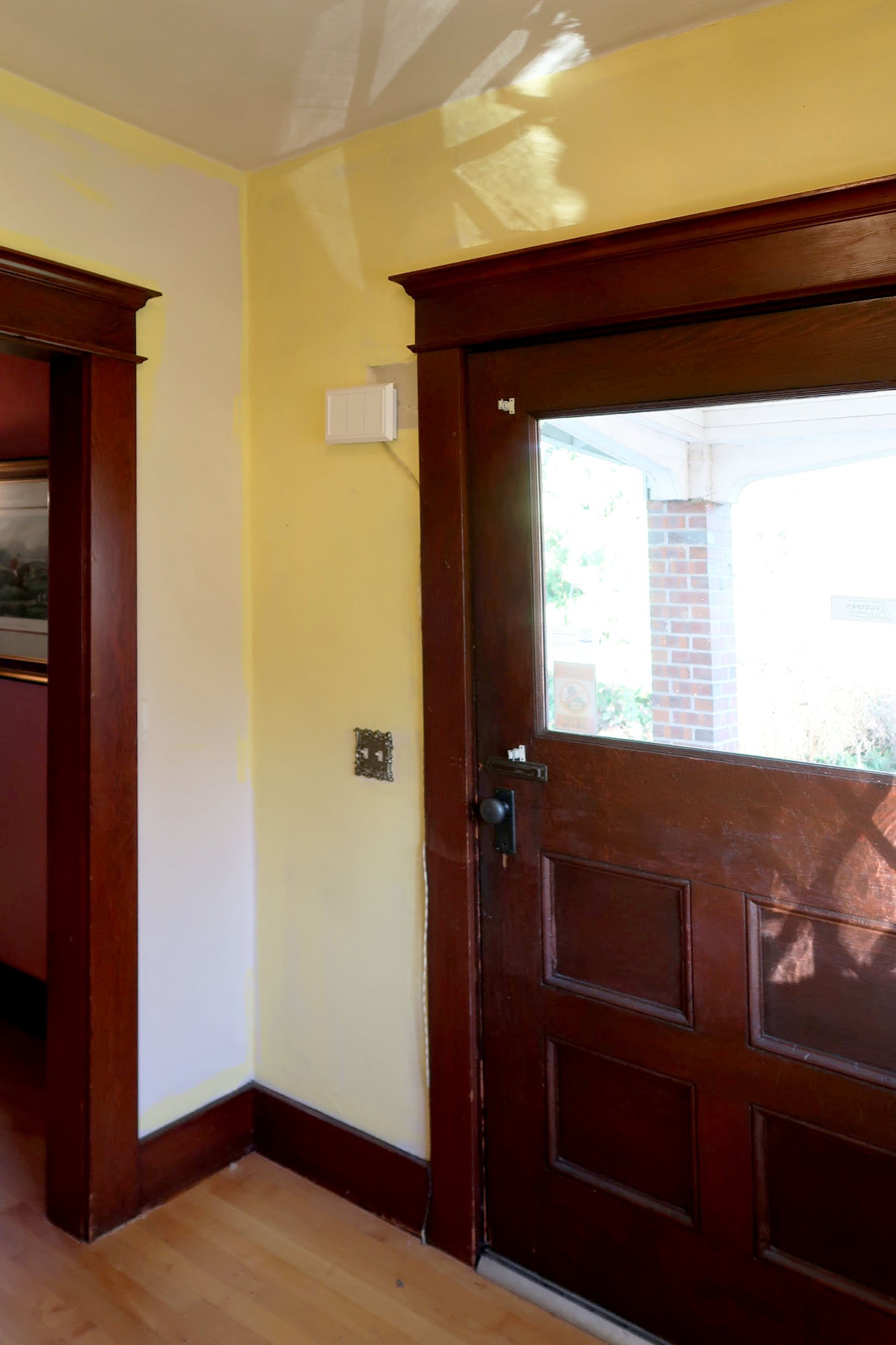
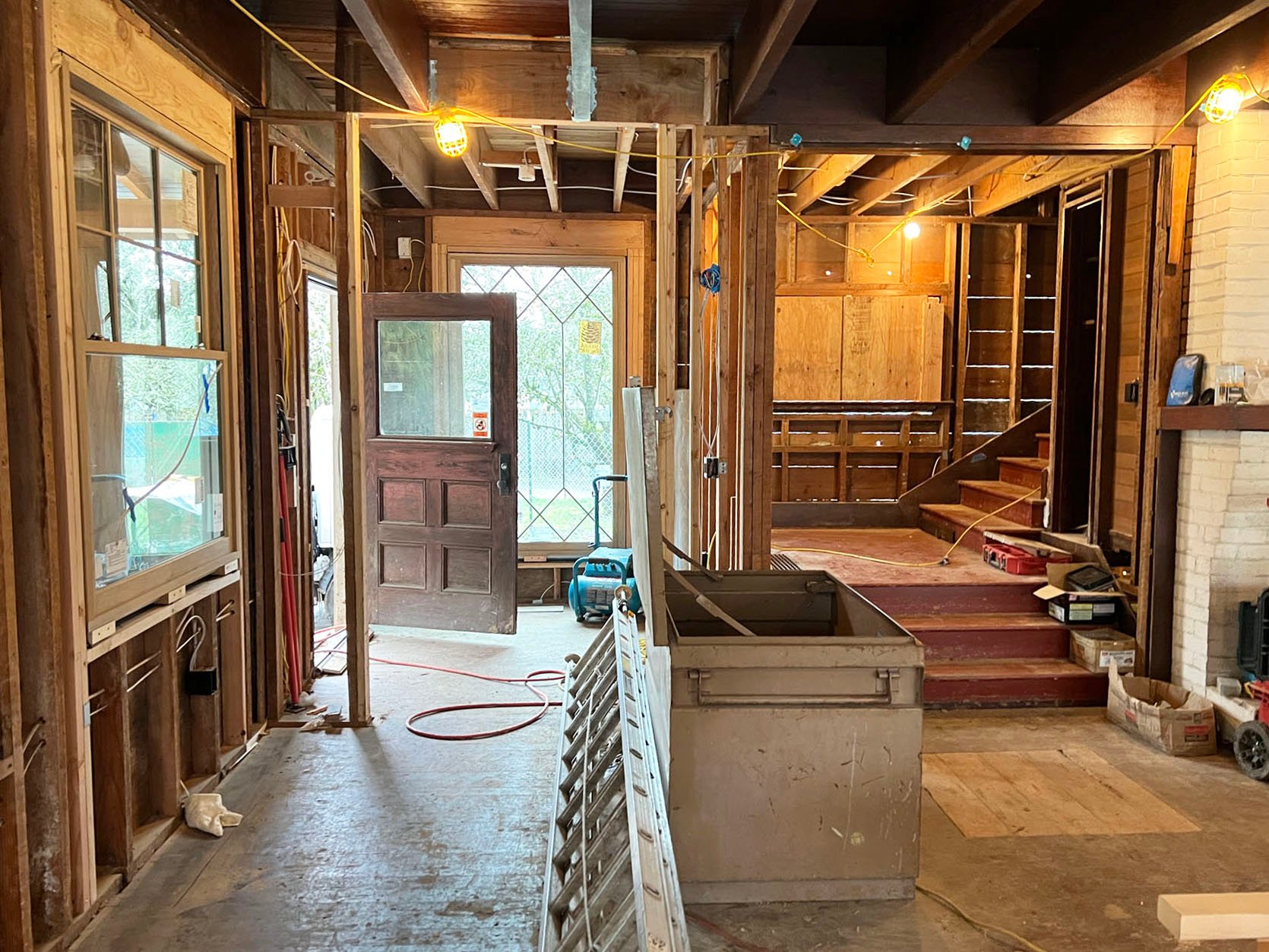
As you can see the living room was dark, and this entryway leads right into it. The paint color would need to change. The trim ended up being replaced because we renovated the whole house and the style of the trim changed. And the flooring, which was not original (a ’90s update), was not what we wanted and not in great shape.
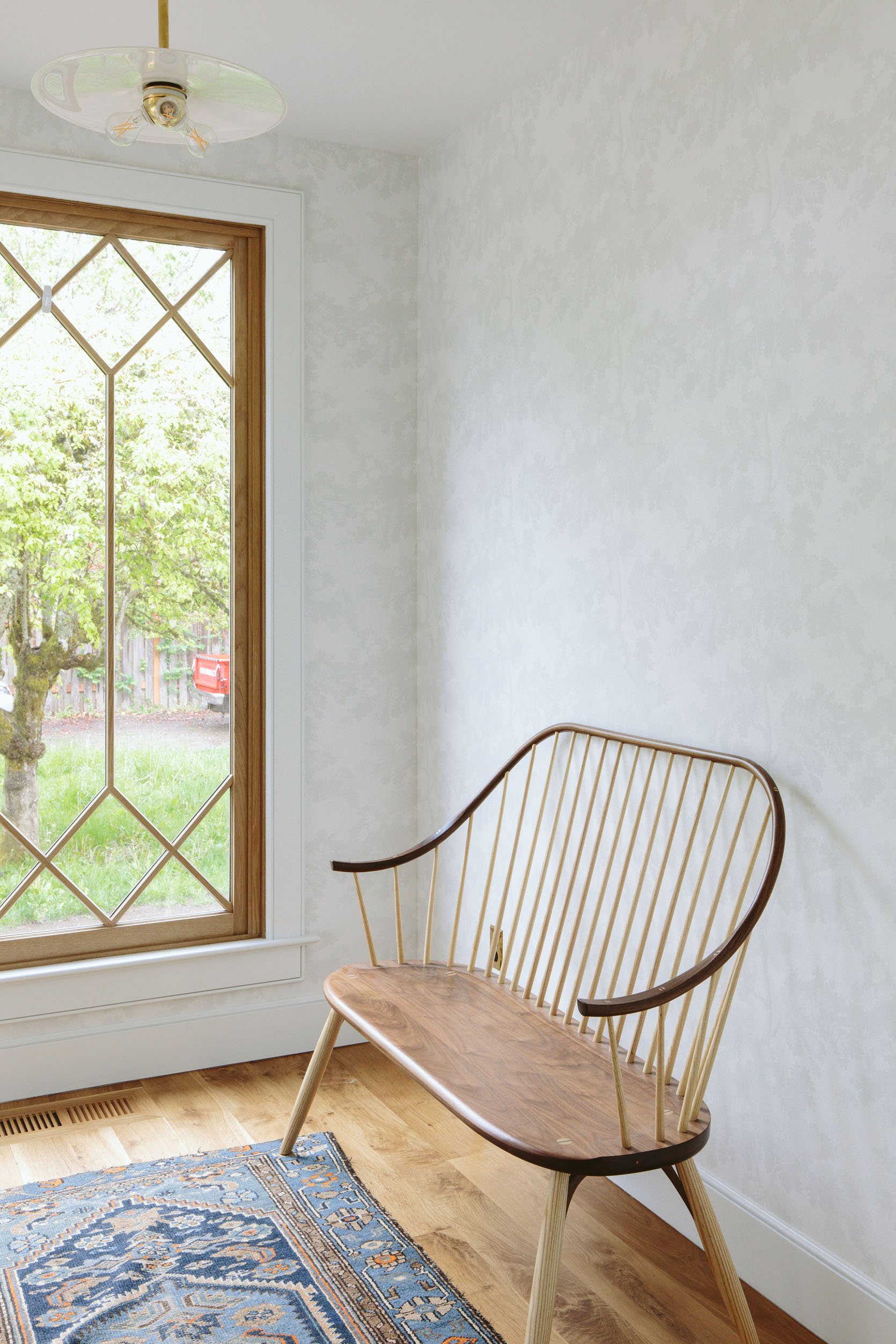
We worked with Sierra Pacific to design this window that married the original diamond pattern design that remains upstairs and throughout some other areas (pantry) with the more traditional and simple grid pattern of the double hungs in the living room and kitchen. It’s unbelievably gorgeous and brought so much light into the living room like we had hoped it would.
Originally, we were going to put a wall of closets in here but that was before I realized that we likely weren’t going to go in and out of here too much so we need as much storage. We still need to add a coat rack for guests, but we just don’t need it on a daily basis.

We go in and out of the kitchen door and the mudroom door far more, so this room just needed to function as a welcome for guests. I think my FedEx dude sees this door more than anyone else 🙂
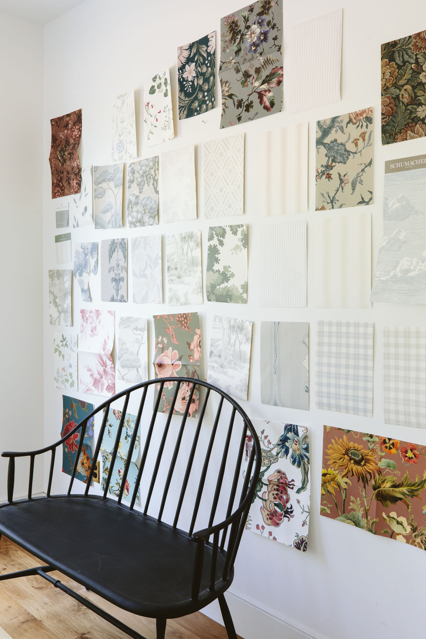
As you might remember, we stared for hours and hours and HOURS at wallpaper samples for this room, over the course of six months. I really wanted to stick to this calming Scandinavian farmhouse vibe, despite loving color and pattern so much. I love so many of these, a lot, but living long-term with one is a different story.
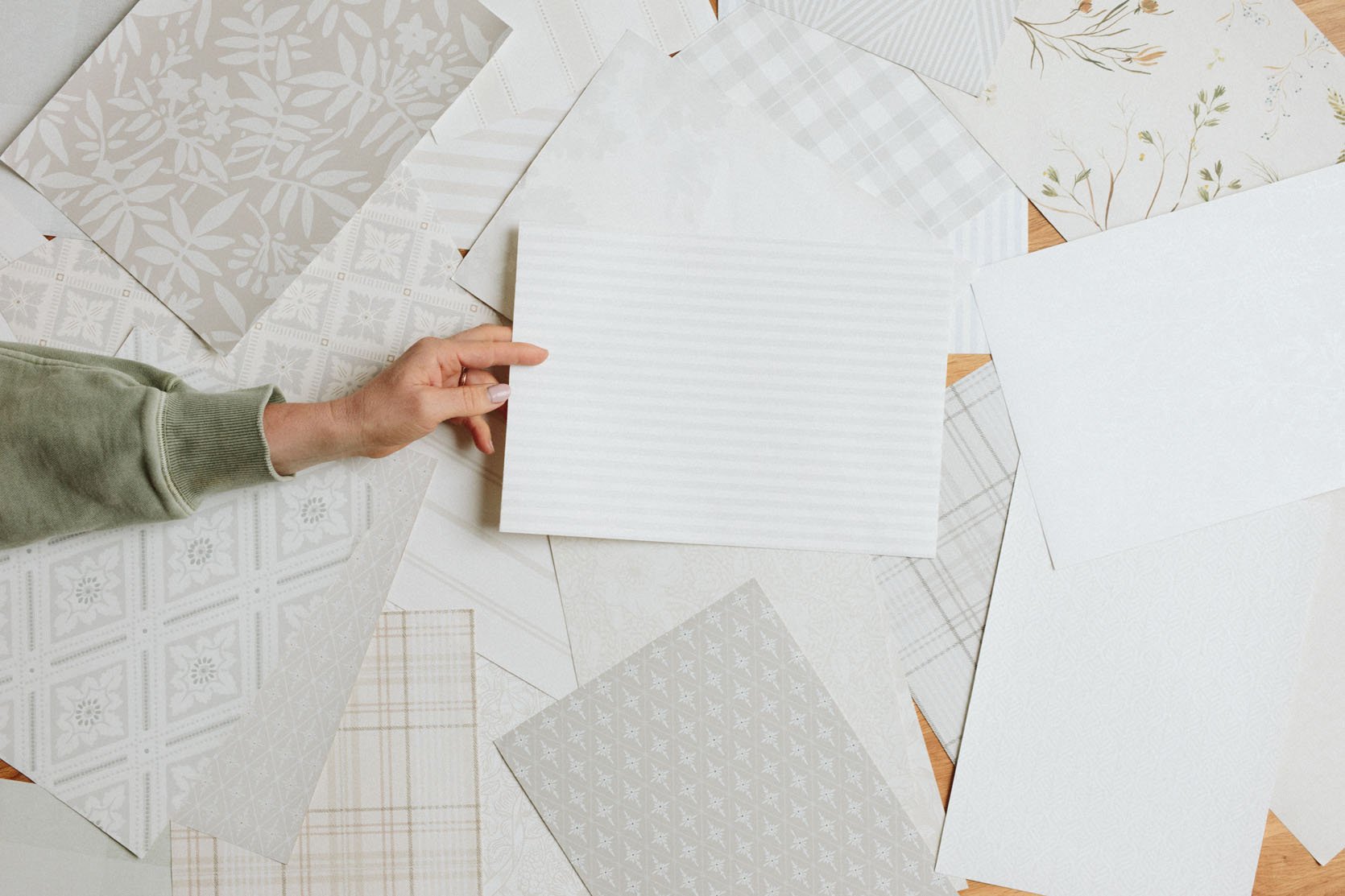
I ultimately decided to go more neutral (which I know that many of you were confused/disappointed by) but I continue to be so happy about it in person. I suppose I’ve reached the point in my career and with this blog where I’m choosing what I want to live with over what I know will look good on camera – because admittedly this paper pattern barely reads in photos.
It’s just really pretty and calm in person and has allowed me to layer on a lot of art (in a fun way which you’ll see in the reveal!). Will I someday wish I had gone bolder with the wallpaper? Maybe! But here we are now and I’m super into it. Oh, and I’m not convinced that the door will stay white but it is for now, FYI.
The Bench

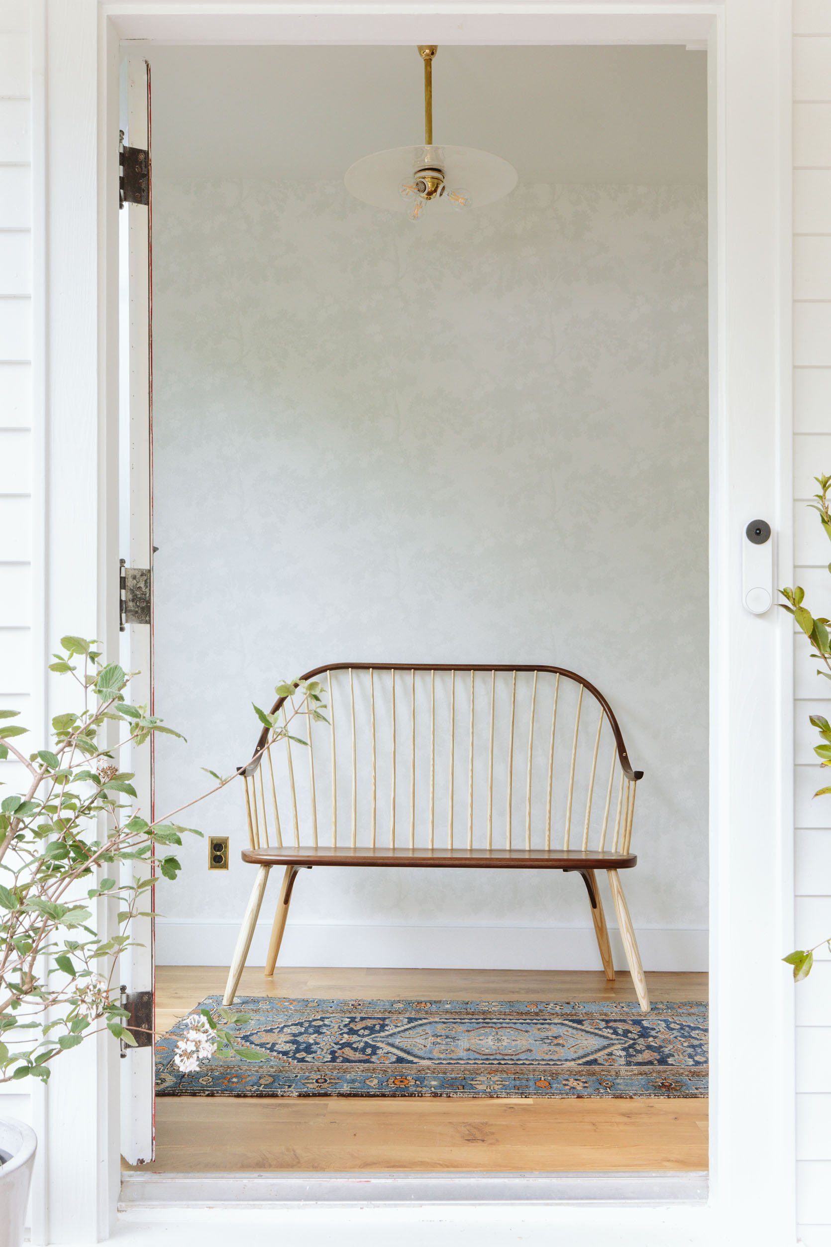
The only furniture that this space needed was either a console table or a bench. I was open to both but mostly wanted the piece to be super special. I had this outdoor Rejuvenation bench for a long time which looked pretty darn good, but when Thos. Moser said they would partner on this wood spindle bench I screamed, “YES”. It’s the world’s most beautiful bench, with two tones of wood, the most beautiful joinery, and a better scale for the entry (a foot longer than the black one).


Black Bench | Two-Toned Wood Bench
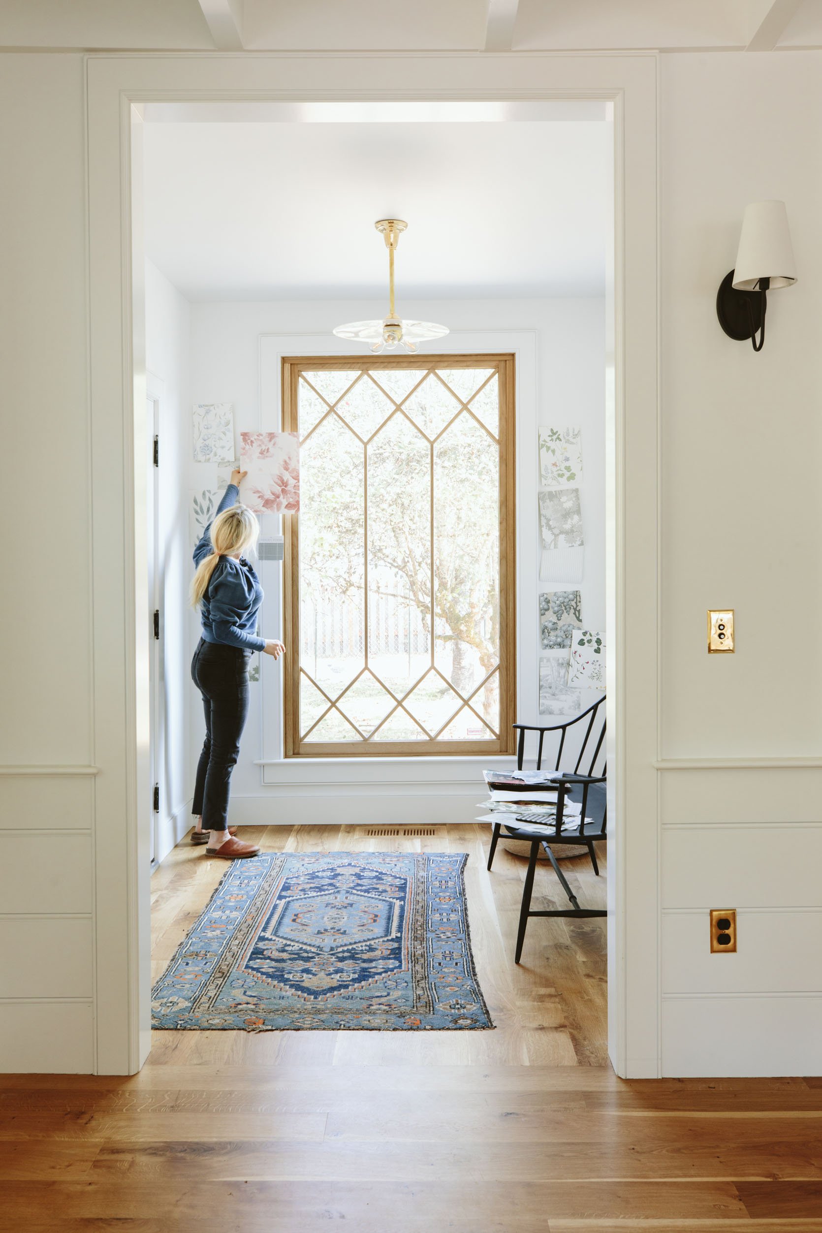
I’ve had that vintage rug forever and want to blow it up to a 12’x15′ and put it in the living room – it’s perfection. And the light fixture is an antique that I got from Rejuvenation’sVintage Department. It’s a simple milk glass disc with a triple bulb brass fitter on an unlacquered brass stem. It’s made for this space because of how it interacts (or doesn’t interact) with the window. I wanted it paired back and simple, letting the pattern of the window shine.
How To Hang A Gallery Wall Of Art On Wallpaper??
The reason I went quiet on the wallpaper was because this is one of the few walls in the house that I felt could handle a gallery wall (and no there are no rules on an entry just having a mirror). I have a lot of fun art that was feeling odd in other places or was competing too much with the art that I already had there. It’s my opinion, however, that busy art on busy/bold paper would be too much for me in this home. So I chose to keep the backdrop quiet and let the art be more eclectic and colorful.
But I know myself enough to know that I love to switch up art, especially a gallery wall A LOT. Another one of my talents is putting holes in the wall. So this wallpaper created quite a challenge for me – you can’t just willy-nilly throw holes inside wallpaper, y’all.
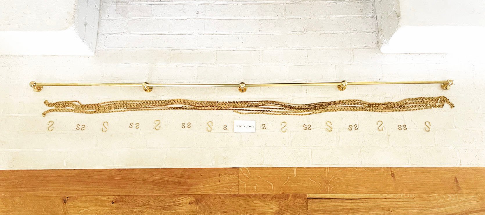
So I found this art rail from Pepe & Carols and decided that I’d hang that, which would allow me to switch up the art on the chains. This allowed for ultimate flexibility and I thought would be such a pretty architectural detail. I chose the 72″ length which came with 17 feet of chain and then ordered 5 of the large S hooks and 14 of the small S hooks.
So here’s a sneak peek into the art that we hung – via a really bad iPhone shot by me.
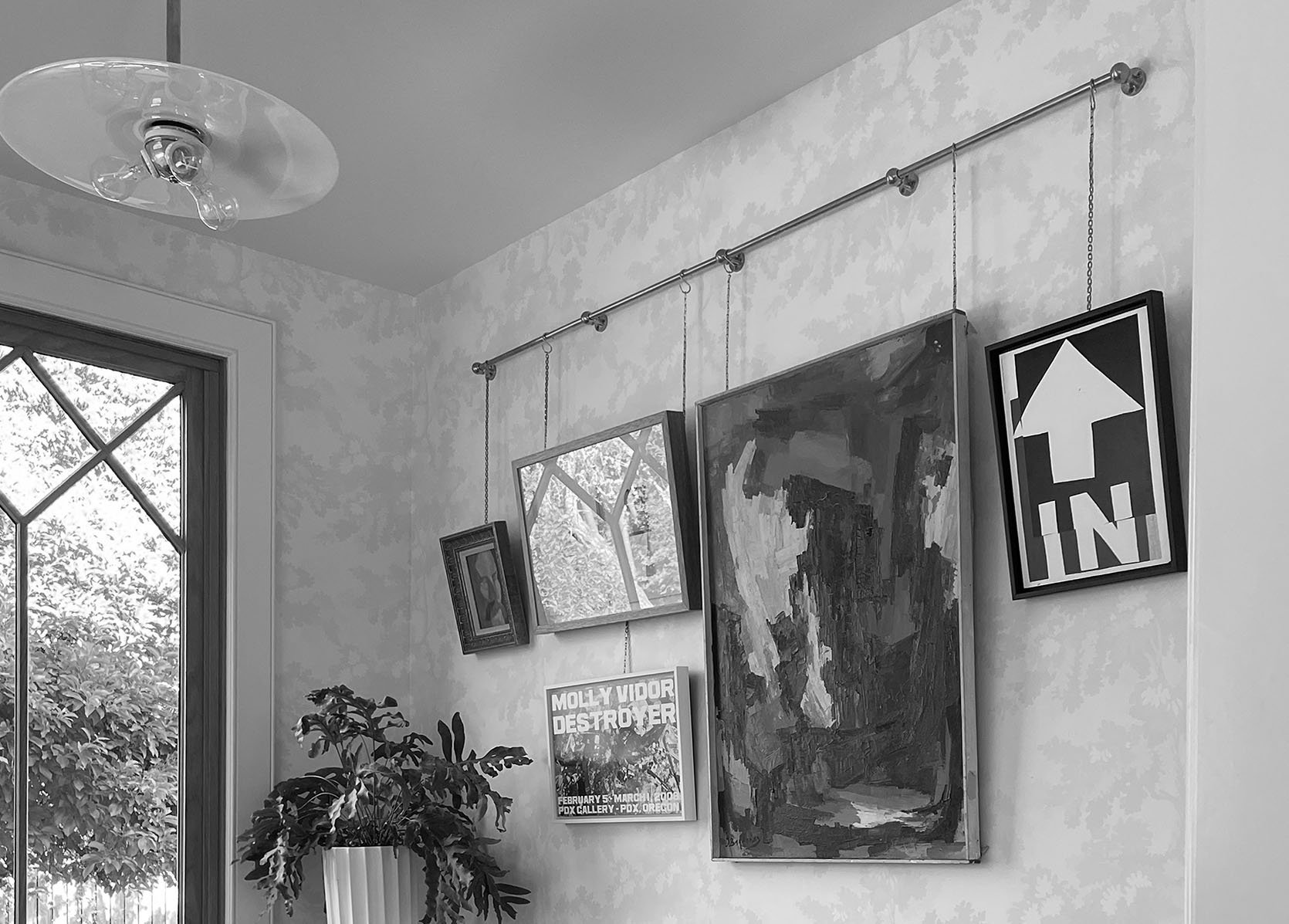
Since this room is so small I can’t give you a better sneak peek without giving the whole space away, so you’ll have to come back Monday to see how it all turned out and how I feel about it. 🙂
Resources:
Floors: Oregon White Oak by Zena Flooring
Wall and Interior Door Color: Extra White by Sherwin-Williams
Wallpaper: Scalamandre Raphael Sandberg Wallpaper in White
Windows: White Oak Sierra Pacific Windows
Black Bench: Rejuvenation
Wood Bench: Thos. Moser
Light: Rejuvenation
Art Rail: Pepe & Carols
Opening Image Credit: Photo by Kaitlin Green | From: The Case For The Quiet Neutral Wallpapers
THIS POST WAS ORIGINALLY PUBLISHED HERE.
