With almost zero desire/intention to change this dining nook corner for the living room reveal, it already has a whole new personality (don’t mind the secret family room in the background, we can’t show you til the magazine comes out!). In case you missed it, I revealed the first iteration of the dining nook a while back and we have loved it. Then two things happened: 1. My friend Max Humphrey needed his pillows back to use them for promoting his Sunbrella + Pindler line and 2. The blue stools that were intended for the piano (and looked SO CUTE) were left floating since we moved the piano upstairs (I loved them down here). So the weekend before the big shoot I put them here at the nook and despite loving the vintage chairs I had, it was a quick and solid, “OH MY GOODNESS, YESSSS!” by the entire family. Then the styling took off in a new direction…and well…I’ll show you 🙂
Dining Nook Version #1 – All Sunbrella And Vintage Chairs
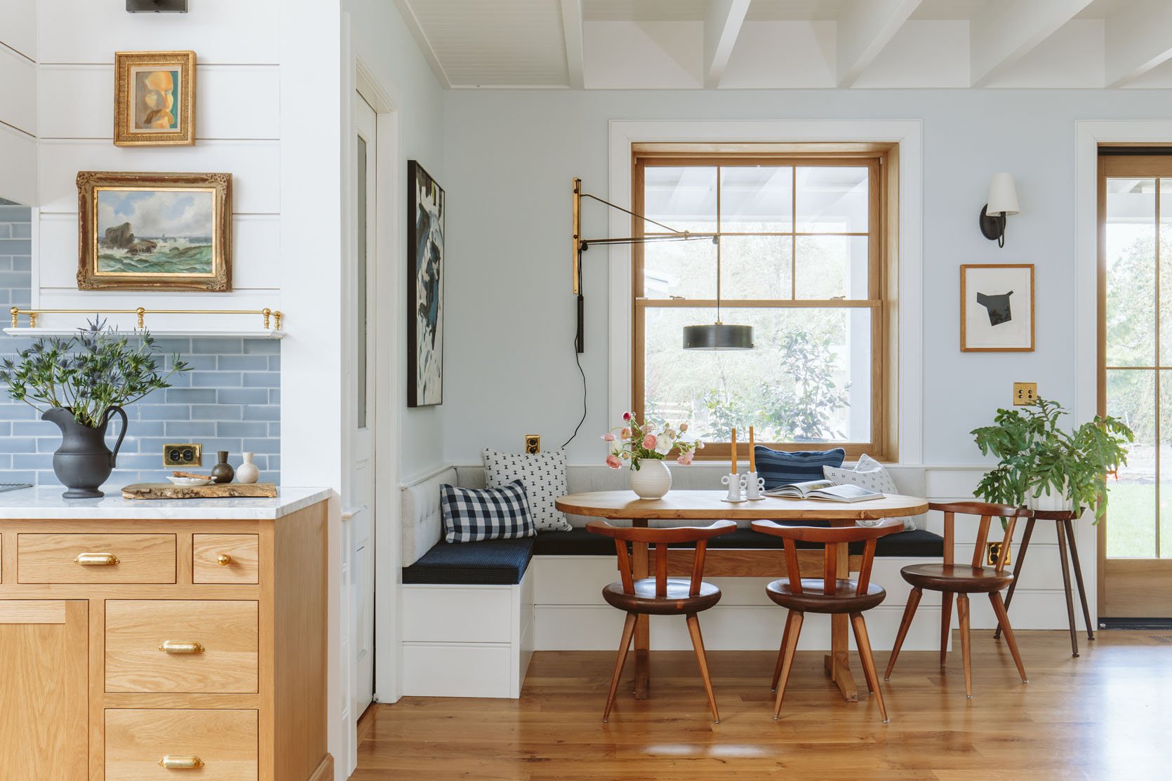
Left Art (vintage) | Right Art | Pillow Fabrics | Cushion Fabric | Large Sconce (vintage) | Small Sconce | Swithplates | Table (custom) | Chairs (vintage) | Candlestick Holders | Vase (similar) | Plantstand (vintage)
I genuinely love this version – it’s the more tame version of me but still with a lot of interest and fun. We had zero complaints and it just worked so well for our family.
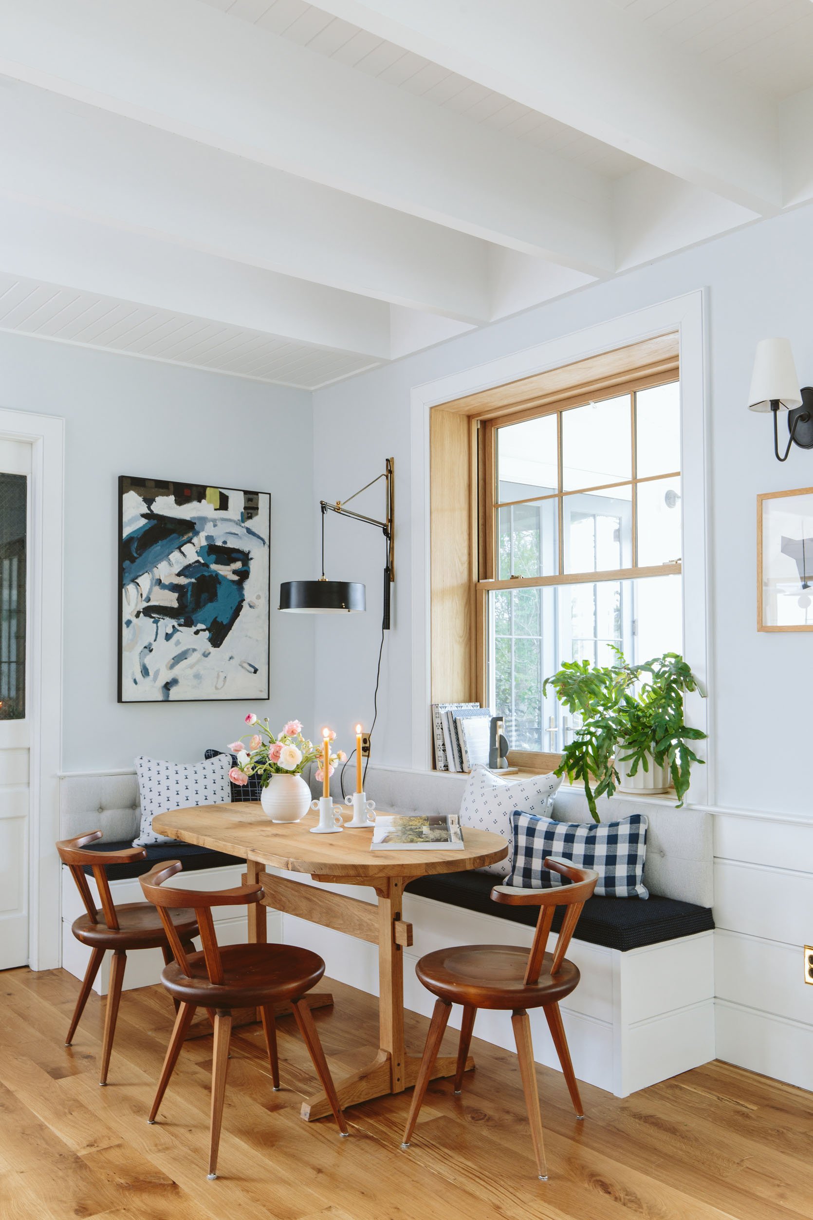
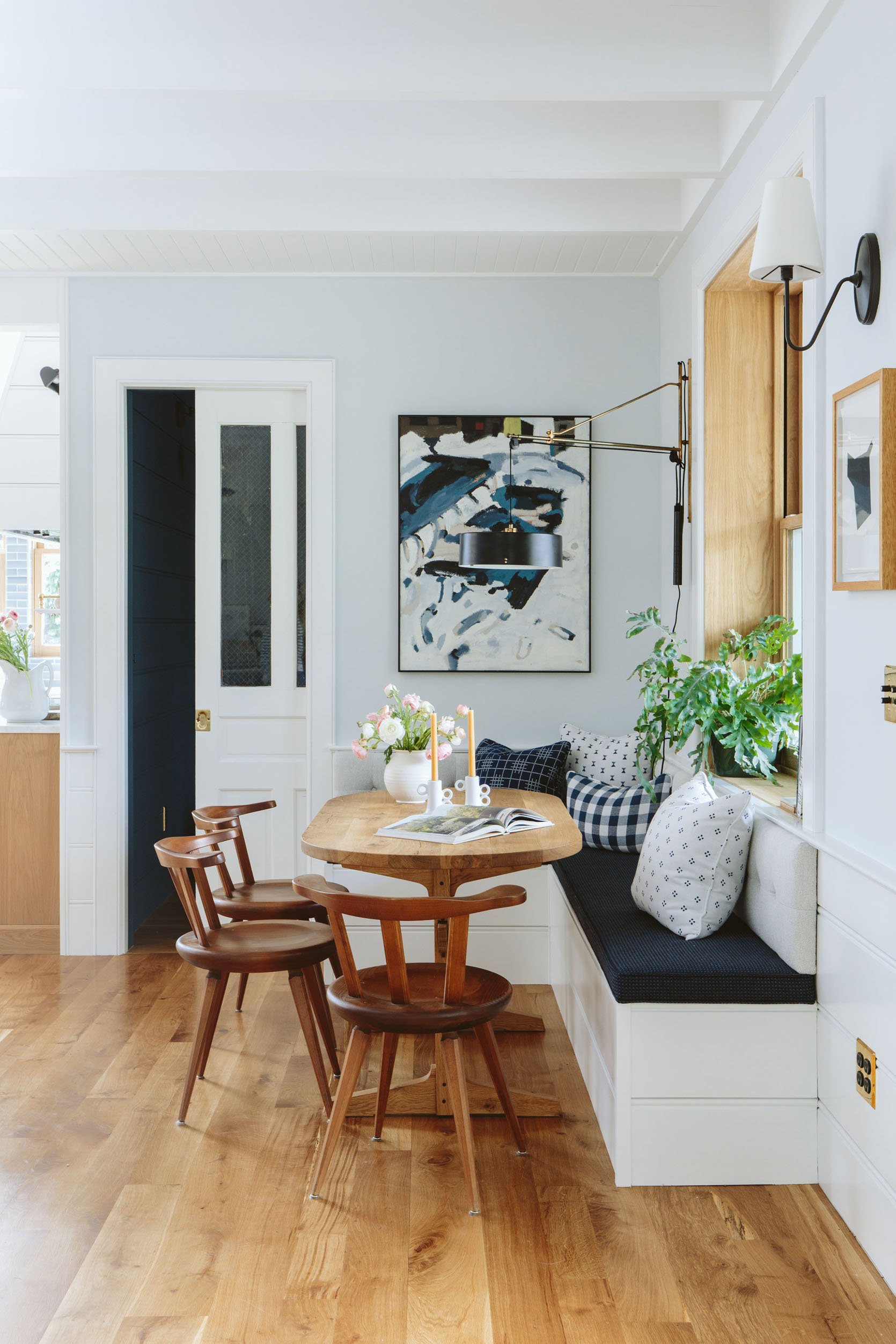
When we shot this I really checked a box – dining nook, DONE.
And Yet…My Eclectic Side Came To Play…
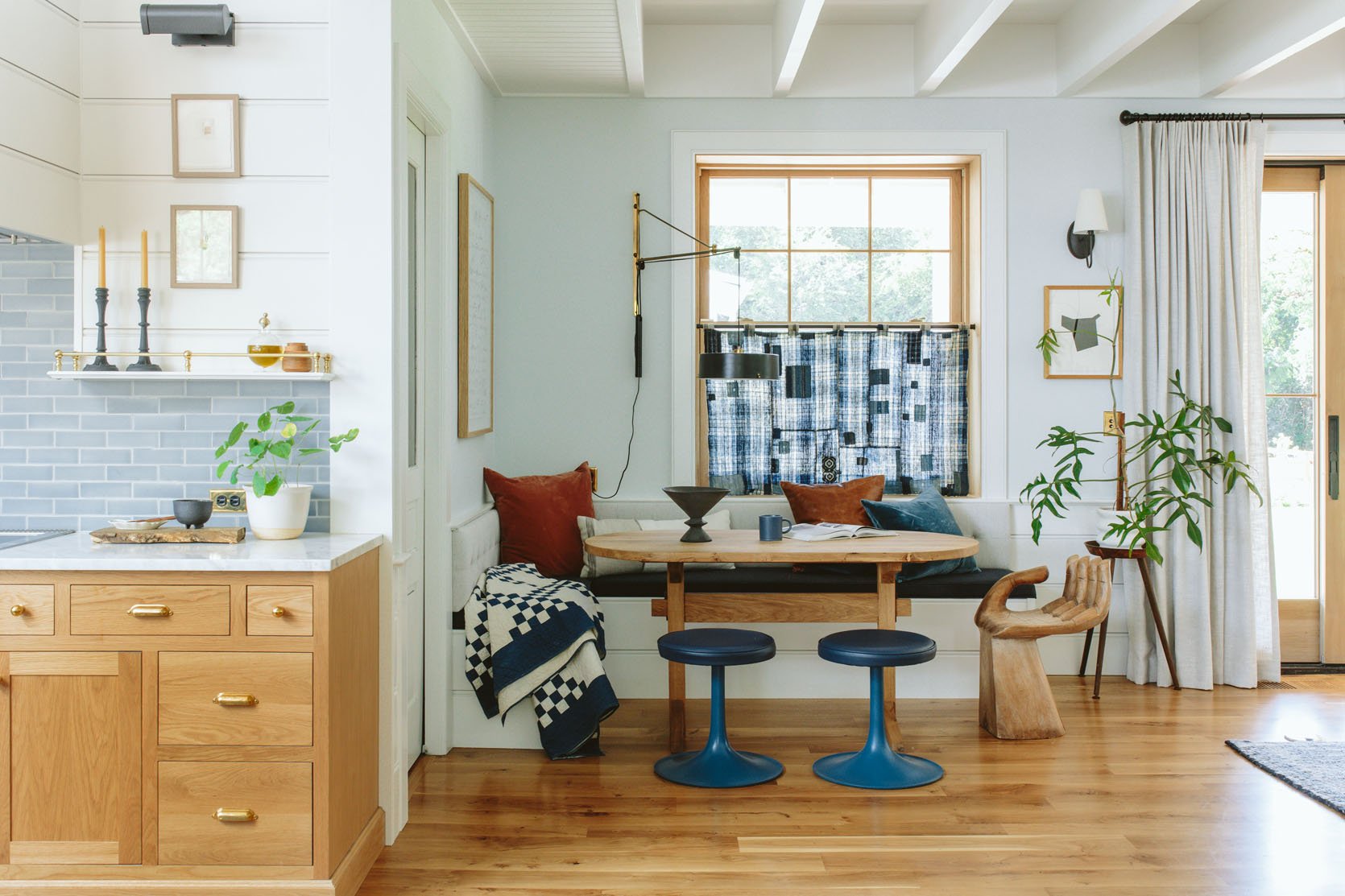
Left Art (vintage) | Right Art | Blush Velvet Pillow | Lumbar Pillow | Leather Pillow | Blue Velvet Pillow | Cushion Fabric | Large Sconce (vintage) | Small Sconce | Swithplates | Table (custom) | Stools | Hand Chair (vintage) | Black Vase (similar) | Coffee Cup | Plantstand (vintage)
OK, KIDS HERE WE GO. It’s just so fun. Here’s why I love it – The stools really open up the space more (not that it needed it, but it is nice to not have the backs visually) and more importantly it shows off the table base joinery which we LOVE. Then once I had the stools there we needed something on the end and who doesn’t want to put their rump in Emily HANDerson (bonus points for commenters who know the reference and who named it that). I bought that hand chair over 10 years ago at Round Top Texas for $200 and she has been with me in every home since.
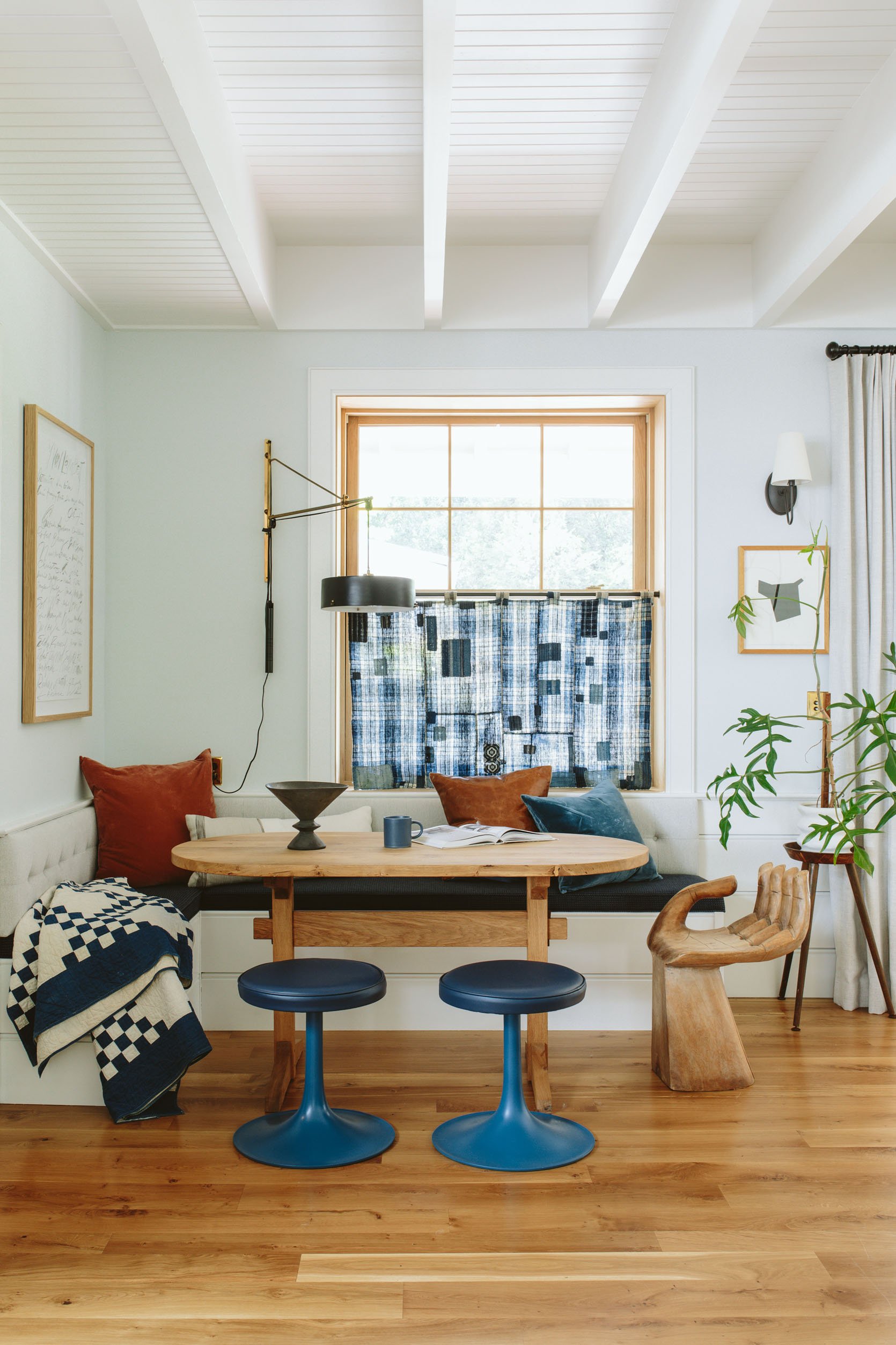
Obviously, a few other things changed – The Japanese Boro Fabric panel obviously really becomes a focal point and I think looks so awesome with the modern stools and the antique Irish chain quilt. I ended up putting the other art over the mantel and because the Boro plaid was so strong, I put my quiet and large framed Cy Twombly lithograph here instead. These pillows weren’t super curated and I still want to tweak them but I love them a lot. I am a bit concerned about these velvet pillows there so I want to make a few Sunbrella pillows (I finally got some of my own yardage of Max’s line) and then buy a larger leather pillow for the corner (I love how that leather looks in there with the blue and white – classic EHD). And then I went back to my crazy plant that I LOVE (and won’t stop growing tall instead of out, help!).
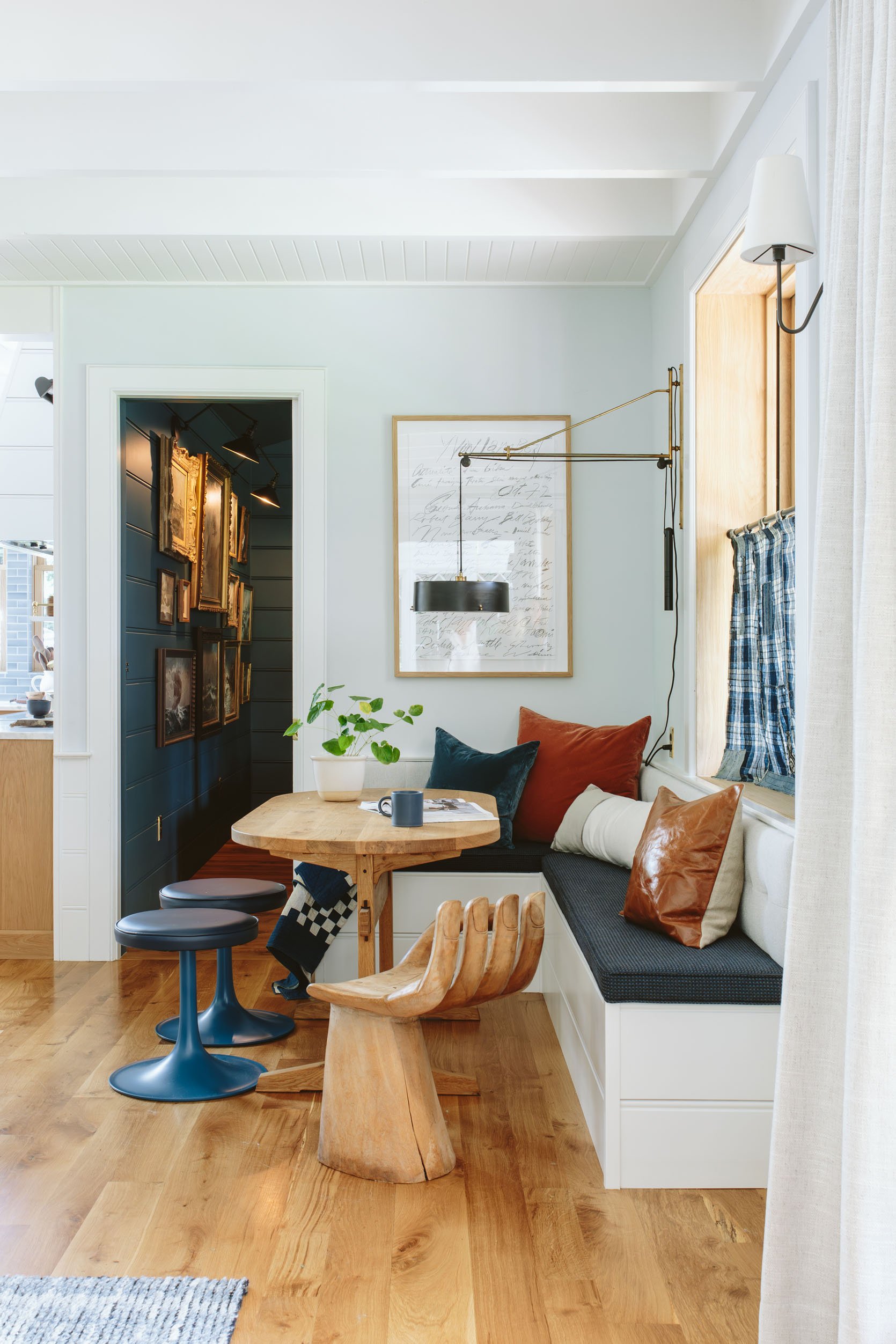
Right now I’m loving this version, but I also loved the other!!! It’s a real Sophie’s choice!
How The Whole Room Works Together
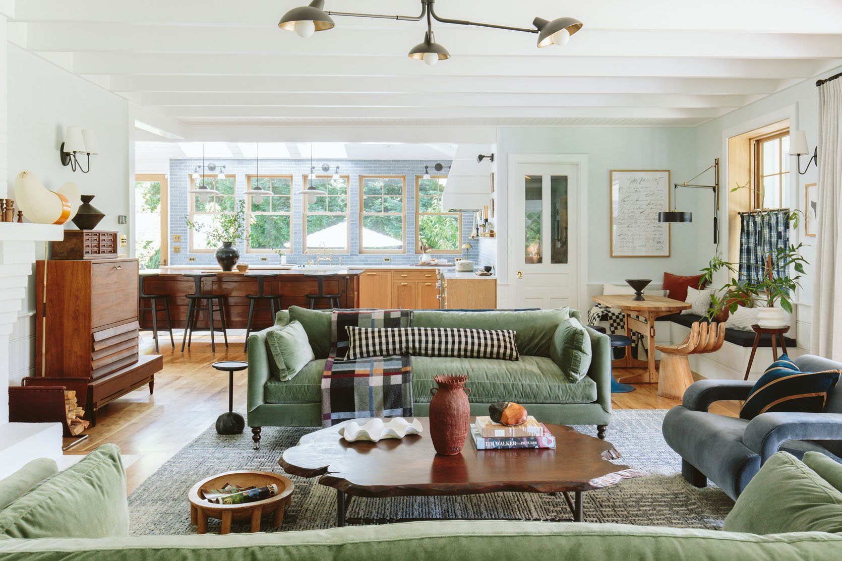
So as you can see it’s back in that corner of the opened living room and works pretty darn well if you ask me.
Round One Or Round Two????

I honestly love them both. Here are some initial thoughts:
I like the kitchen art in round one more – we actually had to steal the seascape for our seascape wall so that’s why I restyled it. I put these two Marianne Puls pieces there in round two which I like, but don’t hold the space with the same impact.
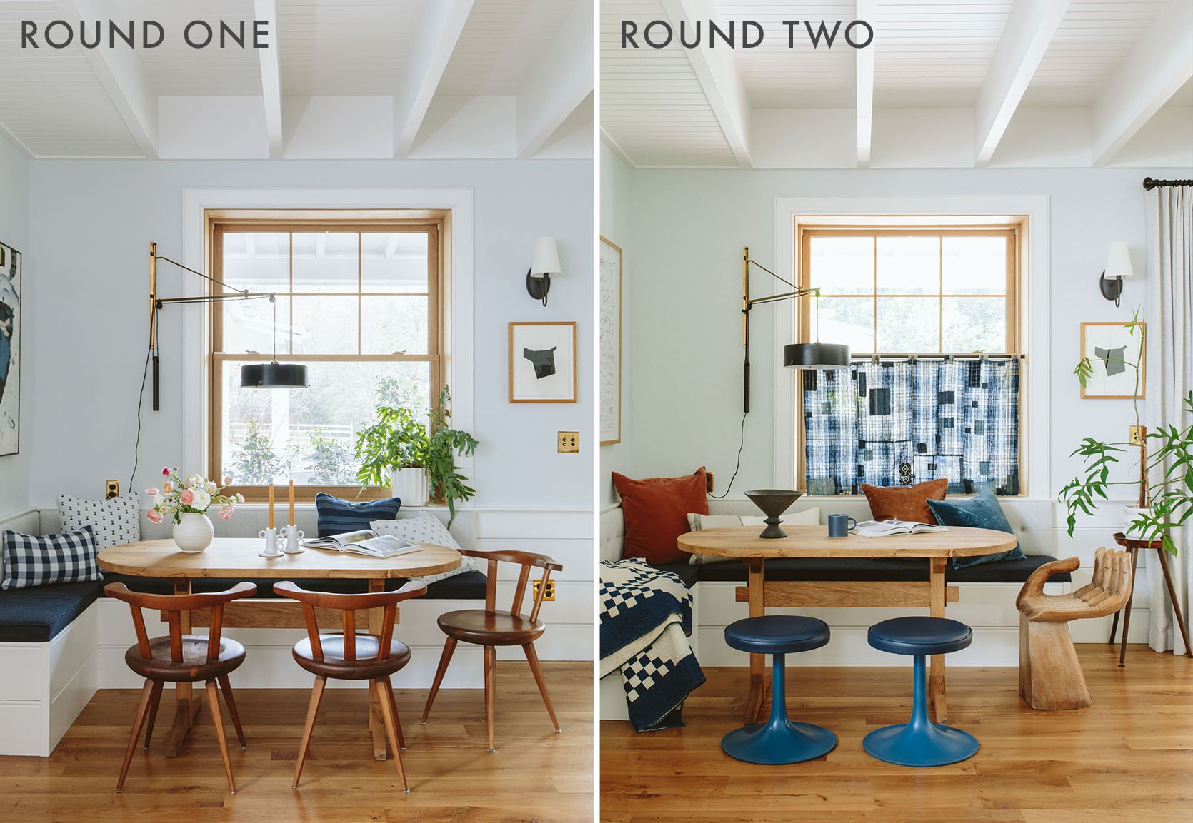
I like the light on the table in round one more (obviously) which is blocked by the Boro fabric in round two. BTW we totally open those to the sides and it’s really easy. I also love where the wall lamp is in round one versus round two (but that’s just a styling thing, we didn’t move it).
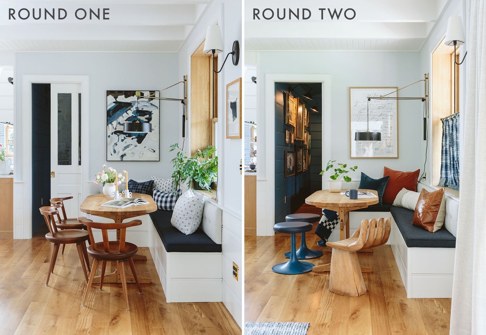
Here it is just clear to me that they are both super me and I love them equally. Round one is simply more curated and more perfectly designed, whereas round two is more young, fun, and eclectic. Since I don’t have Max’s pillows anymore I can’t even go back to round one if I want (unless I make them:)), but I do want to protect those gorgeous Rejuvenation velvet pillows and not keep them near my children with marinara, so I’ll likely merge the two. I’m thinking the stools, HANDerson but with some Sunbrella pillows and a leather pillow.
Genuinely curious which you prefer. You can’t offend me (well you can, but not about this). Round One or Round Two????
Resources:
Seat Cushion Fabric: Sunbrella (Back Cushion + Seat Cushion – similar)
Bench Seat: ARCIFORM
Upholstery: Raleigh Hills Upholstery
Table: Dinihanian Design Build
Lighting and Outlets: Rejuvenation
Wood Flooring: Oregon White Oak by Zena Flooring
Windows and Doors: White oak, Aspen Casement by Sierra Pacific Windows
Art Framing: Limitless Creations
Wall Color: Mantra by Sherwin-Williams
Paneling Color: Extra White by Sherwin-Williams
*Design by Emily Henderson and ARCIFORM
*Photos by Kaitlin Green
THIS POST WAS ORIGINALLY PUBLISHED HERE.


