Attention, attention! The EHD universe cannot get enough color palettes to use for dated and tired kitchen cabinets! I’m back yet again (and fair warning, this won’t be the last post in this series) with moodboards full of products in very specific color pairings for cherry cabinets. This whole thing first started when I walked you through my cherry rental kitchen refresh plan, where some of you asked me to tackle honey oak next. That post blew UP, so we decided to go back to my original design pain point and dream up some more options for anyone with a similar cabinet hardship.
Just as in the previous post, all the inspiration photos require a bit of imagination. As you can probably imagine, there is not a wealth of beautiful cherry cabinet kitchens out on the internet to build this post around. I dug up spaces with darker, warm-toned wood that could easily still work within the space if it leaned redder. In some cases, I piecemealed a color scheme based on a few images since I prefer a more robust marriage of hues.
For the moodboards, as a reminder, what you see isn’t necessarily me saying “GET THESE PRODUCTS” but rather a visual jumping-off point for you to pull your own inspiration. There’s a barstool on every board, but that just represents the color of a piece of furniture you might have in your space. Maybe the exact tile doesn’t make sense in your kitchen, but you can use it as a muse for say, what color to paint beadboard you add instead. You’re all creatively-minded people, right? You’ve got this!
Before looking over some quick rules, I also want to say that floors and countertops (of course) play an enormous role in how any of these would render out. If you’re looking to refresh your kitchen but keep your cabinetry intact for now, perhaps you have the budget to update an old Formica or tile surface with white or gray quartz. If not, there are so many DIY fixes you can try (like painting old granite or covering your counters with contact paper). The same applies to floors.
7 Things To Consider When Revamping That Heavy Cherry Kitchen
- Balance the cherry with a tone of red somewhere else in the space. Think on a dining chair seat fabric, window covering or rug, a piece of furniture, or plates on a shelf.
- Simplify the palette (keep the table and chairs the same color if you have an eat-in kitchen, or pick the same color barstools for an island as any shelving you may add if you take down uppers, for instance).
- Lighten the load of the cherry with another wood tone. If your space is small, opt for a cooler-toned neutral wood like a white oak. If you get good natural light and your kitchen isn’t closing in on you, you can push the boundaries with a rich wood such as walnut.
- Pick a hardware finish that’s anything but brushed nickel to keep it from going too “landlord” in vibe. Think polished nickel, chrome, unlacquered brass, polished brass, and even oil-rubbed bronze.
- Change the focal point. An interesting backsplash like a hand-glazed tile, a statement floor, fun pattern via your textiles, etc.
- Speaking of floors: If you can and have the option/budget, the right floors against cherry cabinetry would make ALL the difference. Avoid gray-washed or yellow-toned woods, or any tile or vinyl that feels dated.
- Match your appliances as best you can so your eye has to make sense of fewer variances.
Alright, let’s get into some color chat, shall we?
Color Palette to Try: Greige, Taupe, Cream & Chrome
The Inspiration:
There’s A LOT of color in this post, so I wanted to start with the easiest to swallow if you’re color-averse. Because cherry cabinets range in just how red they are, this one works regardless of whether your wood leans more subtly brownish-red (what I call “Mystic Pizza Julia Roberts”) or cherry Coke red-red (“Pretty Woman Julia Roberts”). While the inspiration photo above of a bathroom by Blanc Marine Intérieurs is a far cry from any cherry kitchen you’ve ever seen, I felt it was still a good representation of how charming and welcoming sticking with warm, natural neutrals could feel.
The Moodboard:
The key here is a mix of beige, greige, cream (not white) and taupe. I picked a creamy, interesting backsplash tile whose tone is mirrored in the Roman shade and lighting fixture. A greige on the walls and in the seating feels a bit updated and modern (same with the polished nickel hardware), while the darker but still neutral rug and walnut shelving grounds the lighter picks so it’s not too much contrast with the cherry.

1. Celine 4″ Hexagon Glossy Porcelain Floor & Wall Tile in White | 2. Cornforth White by Farrow & Ball | 3. Walnut Floating Shelf | 4. Signature Hardware Strasbourg 1-3/4 Inch Diameter Bar Cabinet Knob in Polished Nickel | 5. Signature Hardware Strasbourg 3-3/4 Inch Center to Center Bar Cabinet Pull in Polished Nickel | 6. Totora Oak Pendant Light | 7. Copley Upholstered Barstool – Project 62 | 8. Naira Handwoven Jute Runner | 9. Rustic Americana Roman Shades
Color Palette To Try: Sage, Burgundy, Natural Wood & Brass
The Inspiration:

For anyone following my own kitchen, you may recognize this palette (sort of…mine has the addition of blue). Red and green are complementary colors, so per the laws of the color universe, this just works. For me, though, it’s important to adjust the shade and pigmentation of both shades.
For anyone considering adding a Carrera-type stone, the bathroom above by Gachot Studios (shared through Jenna Chused’s profile) may be just the thing to get you to go through with it because WOW is it beautiful and makes me almost want a cherry-toned vanity like that. Anna Eleri posted a kitchen by one of my all-time favorites Ashe Leandro and while I’d be lying if I didn’t say that (superimposed??) duck didn’t play a part in drawing me to the image, I do think the space shows how lovely and timeless a cherry cabinet situation could feel if paired with the right elements.
And of course, this kitchen by Meet West Studio that I shared in my original kitchen post. What a triumph of marrying warm wood cabinets, a terra-cotta floor, a mahogany vintage island, and a gorgeous sage moment from the countertops up.
The Moodboard:
A chalky yet cream sage tile and paint is the perfect companion here, and a rich, deep burgundy in just a small moment like a curtain fabric is the balance you need to make the red cabinetry feel intentional. Blonde wood and soft matte brass work hard to modernize the cherry.

1. Vernici 2″x10″ Italian Subway Wall Tile | 2. SW 6177 Softened Green by Sherwin-Williams | 3. 5″ Sidra Brass Cabinet Pull – Thin Profile | 4. Pleso Solid Brass Round Cabinet Knob | 5. Hattchet 3 Piece Tiered Shelf | 6. Agnes 2.25″ Pendant – Natural Brass | 7. Rus Light Oak Counter Stool | 8. Athena Reversible Persian Rug | 9. Cotton Blend Striped Room Darkening Thermal Grommet Curtain Panels (Set of 2)
Color Palette To Try: Olive, Ochre, Blonde Wood, Cream & Brass
The Inspiration:
Here’s a situation in which I had to mentally stretch just a bit to create a color palette but I kind of love where it landed, tbh. Another take on red and green, but this time, we go with a green that has more yellow undertones (olive) combined with an orangey-goldish ochre. That first photo from Clever (a design by GRT Architects) really sold me on the buttery walls, the burgundy tiled island, and the ochre and white checkerboard floors (and you might miss it but there’s an olive bowl in the shelving that rounded out the combo for me). In the honey oak palettes post, I leaned on crisp white to lighten the load of the wood, but here, I actually don’t love a bright white with the cherry. I much prefer a non-yellow cream as a neutral like they used here.
I pulled this second shot of the seating corner by Nicola Harding & Co to show how the colors can work together to give modern or traditional/cottage-y vibes. It’s all in the textile and hardware choices.
The Moodboard:
As I mentioned, the previous board used a green with blue undertones, but here, we go yellow for a very different aesthetic. It’s super important to make sure whatever cream colors you bring in here do not turn yellow in the light of your space or else everything will look overly tea-stained and old. I picked a floral print curtain for some playfulness but I’d also love a simple, solid natural linen shade or cafe curtain if this isn’t your look. Again, we stick with balancing the cherry with more of a white oak in other wood furniture or finishes.

1. Reine 3″ x 12″ Ceramic Tile in Castle Moss Green | 2. Like Buttah by Clare | 3. Wall Shelf – Natural Oak Oiled | 4. Williamsburg Collection 3 in. (76 mm) Polished Brass Cabinet Door and Drawer Cup Pull (10-Pack) | 5. Williamsburg 1-1/4 in. Diameter Polished Brass Cabinet Knob (10-Pack) | 6. Danish Minimalist Cone Iron Acrylic 1-Light Pendant Light | 7. Latte Sarno Counter Stool in Eggshell | 8. Plaid Wool Rug – Tawny | 9. Amber Lewis for Anthropologie Rowena Curtain
Color Palette To Try: Dusty Blue, Walnut & Cream
The Inspiration:
On to blues, but specifically dusty, moodier blues with gray undertones. I first saw this color combo on Caroline Winkler’s Lazy Girl $500 kitchen makeover over on YouTube and loved it but knew it was a bit darker than I wanted in my own space. And because I couldn’t find a photo of it on Instagram, I dug around for some more inspo to show you how it could look here. Designer Anna Eleri went for a lighter French blue on the walls of a dining nook with a cherry-toned table and chairs and it feels happy, friendly, but storied. Heidi Caillier’s kitchen uses a slightly greener-toned slate but I included it to show you how powerful it could be if you really jump into the deep end here. And the sweet bathroom, also by Anna Eleri, reminded me how much I like some gray moments with cherry cabinets (like a gray and white marbled checkerboard floor, perhaps, or even a gray stone countertop!).
The Moodboard:
I’m really feeling this board, but I know in my own home, it just isn’t what I’m going for (though that bird fabric just might turn me…). Don’t let that stop you, though! Someone bring this to life, invite me over for afternoon tea and I’ll bring the plum torte to share. Isn’t that how this feels to you? Like the ideal space to sit and shovel jammy stone fruit desserts into your mouth. I went with a more ornate look for the fixtures like the milk glass shade pendant and the brass kitchen rail, but the walnut barstool and the small vertical offset tile stack on the backsplash keep things a bit more contemporary. At first, I didn’t love how the rug and the window covering fabric looked next to each other, but I trusted in my gut that IRL, they’d play nice (they just compete a bit here overlapping like that). As for paint color, the choice is yours how intense you want to go (a monochrome look would be nice if you prefer a more saturated design scheme) but I kept it light and airy with a perfect milky white.
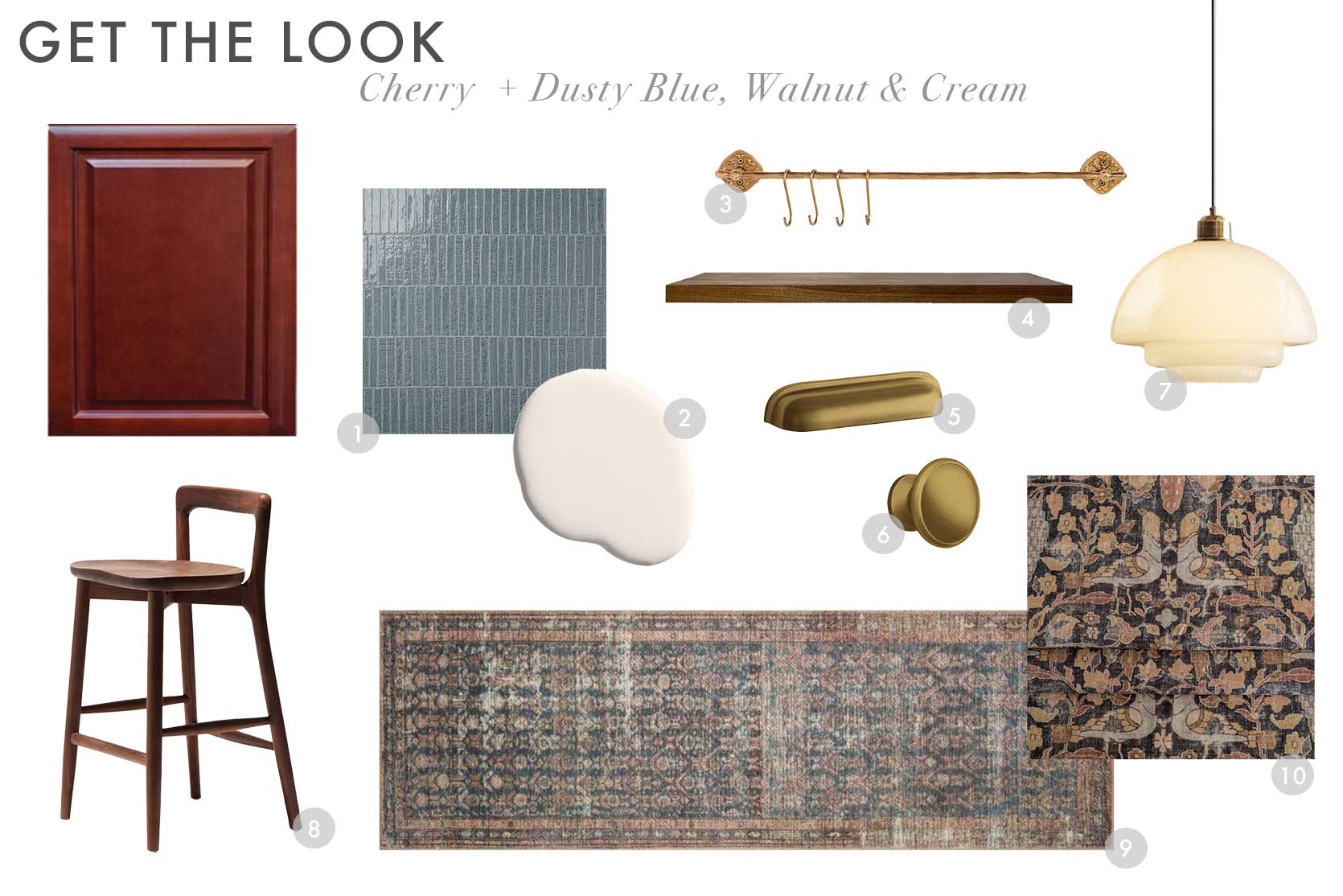
1. Wabi Sabi River Blue 1.5×9 Glossy Ceramic Tile | 2. Morning Ritual by Backdrop | 3. Stella Kitchen Rail Bar | 4. Walnut Floating Shelf | 5. Mercer Bin Pulls | 6. Mercer Cabinet Knobs | 7. Modern Milk Glass Pendant Lights – Rowan | 8. Jackson Counter and Bar Stool | 9. Amber Lewis x Loloi Billie Ocean / Brick Area Rug | 10. Kalida Fabric, Walnut
Color Palette To Try: Salmon, Teal, Black & Silver
The Inspiration:
Please do me a favor before reading and click the arrow on the image above until you get to the seventh photo of the wavy marble sink basin and the pink-y plaster walls. Are you there? Okay, let’s continue (I couldn’t get it to default to that in the carousel…sorry).
This palette was a bit of a wild card (as is the one below) and I almost didn’t include it but hopefully, it services someone here! Some reader at some point during all these kitchen posts of mine mentioned using a salmon-y pink as a complement to the cherry cabinet (or maybe it was honey oak, but either way, I made it work). I can see this palette being incredibly dreamy in a kitchen with warm, equally dreamy sunlight. It’s giving “golden hour” and I’m INTO IT! I plucked the rest of the palette from the tile used by Heidi Caillier but I shifted it to be a bit more on the teal end of the spectrum because I wanted to see how that would render out.
The Moodboard:
I was itching to try something with more pattern for a backsplash and stumbled upon this that isn’t exactly teal but isn’t really slate either. The paint color is peach-meets-salmon-meets-plaster-meets-sunset and it could be great in the right space. I own this rug and it’s so, so good in real life and has a mix of pinks, teal, blue, yellow and red which helps to make the rest of the choices here feel a bit more worldly. And because I used brass in the hardware of nearly every other moodboard, I went with a polished nickel here (it has a warmer undertone than chrome), but gold would be just as beautiful.

1. Casablanca 5″ x 5″ Matte Ceramic Tile in Gaza | 2. Portofino by Portola Paints 3. Sherice Floating Shelf | 4. Solid Brass 1 3/8″ in Polished Nickel | 5. 4″ Centers Pull in Polished Nickel | 6. Luca Small 13″ Conical Pendant, Matte Black | 7. Kody Stool (Set of 2) | 8. Chris Loves Julia x Loloi Jules Oriental Machine Made Polyester Indoor Area Rug in Terracotta/Beige/Black | 9. Conway Stripe Fabric, Parchment
Color Palette To Try: Mauve, Mustard, Emerald & Brass
The Inspiration:

Alright, I’ve asked you to be creative all along, and this last palette (bonus number 6 because I was feeling frisky) is no exception. I could not find an actual inspiration photo, but I was standing in my kitchen the other day and thought “Wait…what if I go purple, instead?” This is a thought out of absolute left field because #1: I don’t normally like purple, and #2: this completely upends my initial design choices.
But anyway, I have always loved purple, mustard and red together in my wardrobe, and figured…what the hell. How might it pan out in a kitchen design? I grabbed a photo of my kitchen and did a crude Photoshop overlay with a dusty purple wall, cream backsplash, mustard checkerboard floor and emerald dining cabinet. It’s definitely a look, but I think it works! I’m likely not going this route, but I needed to see it before ruling it out. Thoughts?
The Moodboard:
There’s a lot going on here, and maybe the emerald doesn’t even belong, but…I kind of think it does? A neutral-ish rug, curtain fabric and backsplash set the stage for all the other elements, especially that mauve paint (find one with red undertones rather than blue). Brass hardware plays off the warmth of the cherry cabinets, mustard floor, and camel leather dining chair.

1. Marin 2.5″ x 5″ Ceramic Wall Tile in Sand Dollar | 2. Sanctuary AF-620 by Benjamin Moore | 3. 24″ Brookside Rail System, 1 Cups & 3 S-Hooks – Aged Brass | 4. Mercer Drawer Pulls | 5. Sunrise and Off White Checker Peel & Stick Tile Sticker | 6. Siena Stripe Linen, Buff | 7. Crawford 7″ Glass Flush Mount | 8. Kelsey Leather Chair, Walnut Stain | 9. Evet Rug | 10. Arnika Dining Cabinet
Phew…there you are. SIX color palettes to try in your kitchen if you have cherry cabinets, wish you didn’t, but don’t have the time, energy, will, or budget to do a reno (or even paint them). I’m having so much fun with this and keep surprisingly myself with the color combos I’m finding and cooking up. I really REALLY hope this is helpful content and my explanations guide you to take my moodboards and make them work in one way or another for your own homes.
I’d love to hear from any and all of you in the comments…thoughts, other tips, other requests…give it to me.
Stay tuned for espresso cabinets next!
See ya!
Your friend in design, Arlyn.
Opening Image Credits: Design by Meet West | Photo by Rett Peek
THIS POST WAS ORIGINALLY PUBLISHED HERE.
