Here we are, day one of March, and if you’re like me your mantel is still looking lackluster post-holiday season when it was draped in garland and twinkle lights. Or maybe you’ve never really loved how your fireplace mantle has been decorated and this is the year you are finally going to figure out. In case you’re new to this “Fix it Friday” series we’ve tackled bedding, entryways, and color palettes. The whole idea is that you don’t need to toss out everything you own to love your home, or in this case your mantel, a whole lot more. A little decor can really change your mood, I promise!
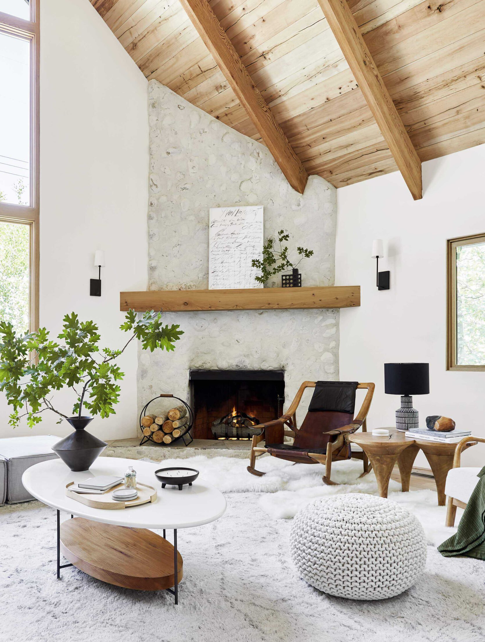
I think what’s important to remember is that you don’t need to fill your mantel up with a ton of decor pieces unless that’s the look you want. Like most things in good design, it’s all about scale! Take the mountain house fireplace above. The large piece of art with that cool, graphic vase with large branches looks amazing! That’s just two things. Now, I don’t want to discount that pretty log holder and the two scones flanking the mantel. Those also make the whole look complete. It feels visually balanced with a hit of black in each section, giving a bit of depth to an otherwise light and neutral fireplace.

Or see how simple the Portland Project living room’s mantel is?? That grid of art makes such a pretty and quiet statement, doesn’t it? Then I love how those candlestick holders with light blue candlesticks (to add interest and talk to the art) look. It brings a little drama to the mantel while also talking to all of the black in the room.


photo by mark weinberg, from: rugs usa launch
But with Em’s farmhouse living room’s mantel, she wanted to go more eclectic, obviously:) The photo on the left is from the original farmhouse shoot. Notice the balance. On the far left is a tall but delicate plant in a wood (popsicle stick) planter. Then she added a trio of leaning art, all in different sizes and mediums. And finally on the left is a visually heavy black vase that’s more of a medium height with those cute little wooden objects at the end. It feels balanced to your eye because the left and right have opposite visual weights at contrasting heights. One is tall and thin while the other plays with shorter heights and chunkier pieces. Then the woods are evenly dispersed in fun different forms.
Then on the right was from the Rugs USA shoot where the very talented Getty Rene restyled the whole thing. She used more of the height but still played with visual weight! The mirror on the left is definitely the heavier piece, while that vase and branches are lighter but taller! Then the mix of materials in between is so great but don’t look at all cluttered (well, neither versions do:)).


I think a HUGE lesson is that perfect symmetry in mantel styling is not the answer, at least not to us (except when flanking sconces and grid art:)). For example, avoid having the same-sized candlestick holders on either end of your mantel. Look if you love that wonderful! But otherwise, mix up those heights and visual weights. Sara’s fireplace is another great example of how to do that.
Now, let’s get into these reader mantels and I promise some have TVs above or next to fireplaces:)
No More Itsy Bitsy

First off, what a beautiful fireplace and home! This reader said their style was “colorful modern – hence the rug.” Great! The first issue that I think is contributing to them not loving the styling is the candles. While cute and I’m sure smell wonderful, they are too small, are all roughly the same size, and placed equidistantly. Let’s shake things up and play with some bigger pieces! But before I get into my suggestions, those sconces are awesome and must stay:)

Mirror | Herman Miller: A Way of Living Book | Chair: 500 Designs That Matter Book | Dipped Rust Brown Taper Candles (Set of 2) | Tira Wood Taper Holders | Blue Vase | Storage Basket
Here we are! First things first, I think swapping out the wood-framed mirror with a more modern and sleek option is the way to go. Those sconces are pretty chic and a metal framed mirror with a cool shape like this one will instantly feel more cohesive as well as talk to the fireplace screen. Next, they need a taller vase and since they love color I loved this blue one. Their rug has such an awesome pattern so I think choosing one that has a complementary color in a cool texture, as opposed to a competing pattern, is the way to go. Then placed near the vase, I love the idea of adding in fun MCM wood candlestick holders. Choosing a fun shape will make the mantel more interesting. And since they love color, these clay-toned candlesticks are awesome! They contrast the blue and play off the other warm tones in the room. Then finally, I love their plant! But I think that plant could be sitting on a couple of books to make it more of a statement on the other side of the mantle from the vase and candlesticks:). My only tip when using books on mantels is to make sure they aren’t too thin. Design books are usually perfect since they range from medium thick to thick thick (like the chair book)! To finish it off and add that last touch of warm, I love the idea of adding a woven basket for firewood but it can easily be used for pillows and blankets if they prefer:)
In Need Of Cozy

Another beaut that needs a good dose of cozy. This was what the reader said in their email – “This is a TV room where we hang out sometimes—it is not a high-traffic room. Probably bc it isn’t cozy, but I would love it to be! Not sure whether to put some art on the walls or have things lean on the mantle.” Ok, let’s dive in.

Now, I’m not sure what all of the black boxes are but I think that removing the two on the right since they don’t look plugged in is a great start and a perfect place for some cozy pillows (bonus points for a cushion which would likely need to be custom made). I was thinking something along the lines of what Emily did in her first LA home. Staying on the hearth/actual fireplace area, adding in some fun fireplace andirons with firewood (whether you light a fire) would also add some cozy (I do see you have a young kid or kids so obviously do what’s safest for them). Then, to the left of the fireplace, you can add a woven basket for wood or more pillows and blankets! Plus it adds visual warmth:)

Extra Large Blue Art | Handdrawn Art | Fireplace Andirons | Black Vase | Woven Basket | Chambray Pillow | Cream Woven Pillow | Lumbar Pillow | Ball Pillow
For the actual mantel, staying with the blues, creams, woods, and blacks (a very EHD color palette) would definitely suit the “Spanish/Mediterranean style” they also mentioned in their email! Plus it would work with the colors of the rug they have too. I adore these two pieces of art and think they are perfect for leaning on the left side with your cool wood piece. Then on the right, I want them to go big with a vase and large leafy branches. It looks like the mantel is fairly thin so I tried to find pieces that weren’t too deep. Hope this helps!
Waiting in the 80s

Not only was this reader the first to submit but I could tell they are probably a big EHD fan because of some of the wonderful pieces they have (cough:: the Katie Gong knot ::cough). But it wasn’t the full reason I chose them. I feel like this fireplace setup with the built-ins flanking the fireplace is fairly common. Hopefully, this can help lots of you! Here was their email – “Attached is my submission for Fix it Friday mantle edition. We have this huge mantle that is very difficult to style due to the size and height and large fireplace. We’d love to redo this wall entirely but that is not in the budget. Our style is colorful and modern and leans a little mid-century, my husband collects Paul McCobb furniture, but without trying to make our 80s-built suburban house, ie this wall, not too out of place. Would love y’all’s help!! If you have any suggestions on color to paint the fireplace let me know as well :)”
Yes, you read that right. They have THE DREAM husband. Collecting Paul McCobb furniture is wildly cool and made me definitely lean towards modern, midcentury modern in my recs.

First, let’s address the big elephant above the cabinetry…all that open space! I feel for them because deciding how to go about decorating an area like this isn’t easy. First, I would take everything off and start fresh. I’m sure all of those pieces can be repurposed elsewhere in the house and/or some can be incorporated into the shelves. I looked to Em’s primary closet for inspo and after consulting Em we both think it’s a good idea. Adding in a large plant like this and placing it on of the sides would be great and hopefully not too much to keep up with. If they are great with plants add a slightly smaller one so it has a buddy and will look great! I chose complementary planters that have different shapes for interest. Next up is the art. I chose two pretty large pieces that in theory would be neutral enough to not take away from the rest of the room but textured/colorful enough to visually hold up to the fireplace. I’ve been the white one in person and it’s stunning! I know the other is even more expensive so it can be used more as inspiration!

Large Cream Planter | Large Blue Planter | Neutral Cream Art | Colorful Art | Wood Arch Decor Ceramic Curved Sculpture | Black Metal Box | MCM Candle Holders | Natural Wood Knot Decor | Fireplace Paint Color | Metal Handles


The shelves, of course, are the next big ticket item. As of now, I think why this reader isn’t happy is because there’s just a bit too much happening and not enough of a consistent color palette. I’m not suggesting to only have books that fall within three colors or turning them around to all be beige, no! But take a look at Sara’s bookshelves. They don’t all perfectly match but there’s just a bit more color cohesion. I also think paring the books back just a little and playing more with orientation like stacking a few with an object on top would make a world of difference. I added a handful of MCM-inspired decor pieces in case they wanted to add in some new pieces:)

This shelving unit was the “styled to sell” version so it was shot more pared back than normal but it shows some fun styling configurations!

Lastly, this reader asked about a fireplace color. Sadly, it’s impossible to recommend a paint color without testing it in the space but I think something along the lines of what Emily used in her bedroom would be awesome. It’s moody and modern without going too dark. Something like this would be so pretty! Oh, and I don’t want to forget that switching out the hardware to something more modern like these would also be an effective and affordable switch:)
20 Years Is Long Enough!

When you get an email like this you have to help! – “I don’t really have a design style other than simple, casual, and/or traditional. I have struggled with this area for 20 years and have never loved it. This space is right off the kitchen and is the main TV-watching area.”
20 years is too long so here we go!

Botanical I Print | Botanical II Print | Battery Operated Wall Sconces (Set of 2) | Over the Mantel Mirror | Modern Log Basket | Curvature Marble Taper Candle Holder | Habitat: The Field Guide to Decorating Book | Decorative Box | Kelly Wearstler: Synchronicity Book | Live Beautiful Book | The New Design Rules: How to Decorate and Renovate, from Start to Finish Book
I think some simple additions will change the game here! First things first, let’s get a mirror over the mantel. It’s easy, beautiful, and will make the space feel bigger. I love the shape of this one because it’s simple but not the norm. Then flanking that wonderful mirror with these battery-operated elegant sconces will really frame the area in a simple but classic way (plus no junction box needed!!). Then in terms of what should go on the mantel, I say let’s keep it real easy. Getting a candlestick holder (with some white candles) like this marble one is the way to go. It’s an interesting shape but in a classic material. But then you need to balance out the whole wall. By adding in two large prints, stacked on top of each other, like these on the left of the fireplace would be great. Just make sure to go larger. We don’t want bitsy art, OK!? Then throw a nice leather wood or blanket holder under the art for some warmth and we’re almost done.

But we can’t leave out that little cabinet! Since there’s a TV above it, any decor must stay low so as to not block the precious device. They currently have some books/magazines but replacing those with thicker books that have more visual weight and interest would be nice. Take Arlyn’s credenza we styled for a shoot, those thicker books make all the difference, don’t they? Just make sure to treat them like all of your other decor. The ones I chose have a neutral color palette and a mix of color and pattern. Books are art too! Then add a box like this great black one on top of one stack and you’re set.
As always, I hope this was helpful and let me know what you’d like next time!
Love you, mean it.
Opening Image Credits: Photo by Kaitlin Green | From: Farmhouse Primary Bedroom Reveal
THIS POST WAS ORIGINALLY PUBLISHED HERE.
