I know I’m about to make a bold statement here but we’re amongst friends, right? I can be bold? I’m really quite smitten with a new style for me and claiming it’s the new Modern Farmhouse. Now, I’m not saying it’s so trendy that it *is* replacing the ever-popular shiplap-clad suburban favorite, but what I am implying is that it *should* steal its crown.
Before I tell you what it’s called, let me back up just a minute (mostly, I’m buying myself time…you’ll see why):
An inconvenient thing happens when you’re as obsessed with interior design as most of us around these parts: you fall in love with many styles. I say inconvenient because well…I only have one place to live and a wild mish-mash of styles in the same 1,500 square feet of my home isn’t my vibe. Can you imagine me explaining my design inspiration to any guests who ask: “I was going for the perfect marriage of English grandmother who lived in the mid-century—in a cottage in the country—who time traveled to modern-day Milan who also really loved color but liked things soothing and peaceful but also was after a touch of Victorian baby.” Maybe someone could make that work, but not me.
Now, as someone who is design polyamorous, I often make the mental jump to hypothetically decorating my rooms every time I fall in love with a new aesthetic. And I’m at it again but dare I say, I think this one has the potential to really stick for me in my current stage of life as a mother, homebody, writer, and wanna-be-entertainer. Except, here’s the thing…it doesn’t quite have a name and I’m not entirely sure what to call the style.
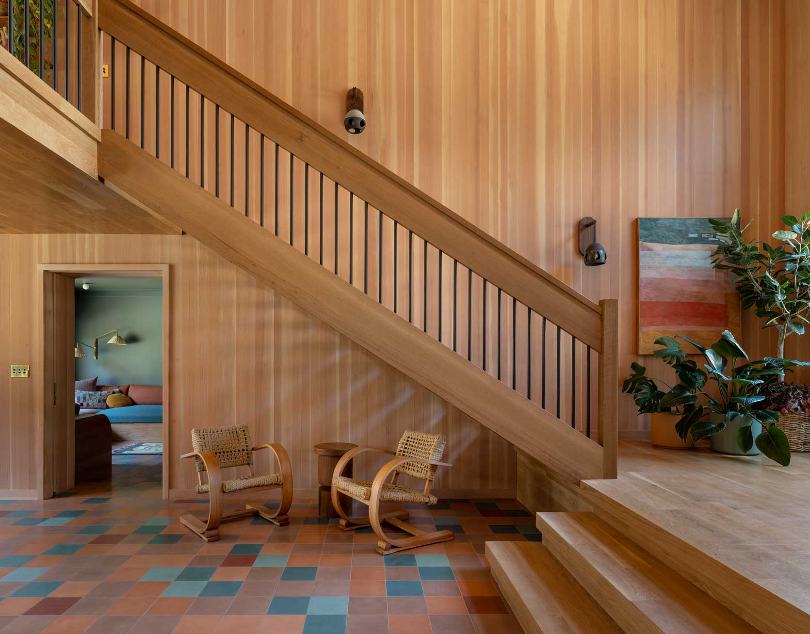
This project by Jessica Helgerson Interior Design (photography by Aaron Leitz) is a beautiful representation of this style I think is about to come to the forefront of design. It’s so rich, warm, and lasting. It doesn’t feel like “fast home fashion”…but rather that it’ll be a time capsule (in a good way) for decades to come.

This “new” Modern Farmhouse is one part mid-century modern but without the retro vibes; one part contemporary without being trendy. It’s just the right amount of colorful, interesting, and eclectic while also being calm and welcoming. It’s not overly precious (a.k.a family-friendly) and feels like a beach vacation but without the heavy-handed coastal or weathered look. It places you in Melbourne, Australia, but also maybe Copenhagen but also the Pacific Northwest, with just a hint of “Is it IKEA?” Maybe a name for this look already exists, but I haven’t quite found it yet, so for the sake of this article, I’m going to call it….drumroll please… Warm Modern Beach Bungalow (or WMBB for short).
If you know anything about my personal design aesthetic, I’m not sure you’d leap this being where my head is going. Perhaps it’s in response to the overload of cottage core/English country with lots of muted colors we’ve all been seeing everywhere. You can’t swipe a thumb on a social media account without getting smacked in the eyeballs with the design style. While I do still find it so beautiful and charming, I’m ready for a palate cleanser of sorts, and perhaps this is it. Plus, if the unexpected red theory taught us anything, people are ready and open to receive…gasp…primary colors.
I. Am. Here. For. It.


Rather than keep flapping my proverbial lips, why don’t I get into some specifics? Here, I’m going to break down the five key elements that make up the Warm Modern Beach Bungalow aesthetic, and why the look has captivated me so thoroughly.
#1: Neutral Wood Paneling on the Walls & Ceiling (& Everywhere)
White painted shiplap is to Modern Farmhouse what natural, neutral wood paneling is to Warm Modern Beach Bungalow. It’s the crux of this style. There’s wood, and there’s lots of it. It’s up, it’s down, it’s side to side. And I’m not talking about the kind of wood paneling that was the darling of ’60s and ’70s tract homes (goodness, no). This isn’t heavy but rather light yet warm. It’s not blonde wood as we see regularly used in Scandinavian styles or even casual California aesthetics, but it’s not as deep as walnut like you might have found in mid-century modern homes. A lot of the photos I earmarked have wood with either slight red or yellow undertones, leading me to believe it’s oak, but the stain is neutral enough that it won’t feel like a time capsule of a specific era.
The downside of a style rich in wood surfaces is, of course, it’s not easy or inexpensive to change if you’re looking for something fresh down the line. It’s not friendly to the gallery wall lover (the holes!), either, and while yes, I said this style is family-friendly, I shudder to think what would happen with a toddler and a rogue marker.
Regardless of these limitations, it’s undeniably beautiful and inviting. Take, for instance, the above photo (slide 1) from The Design Files. This is a bit darker and more “cabin” than “beach” to me, but it holds the essence of WMBB, nicely. Wood, vast expanse of windows, contemporary upholstery, simple color blocks. I can just envision myself doing a stack of puzzles with my daughter on that coffee table, watching the birds fly around outside, not at all worried about a roaring flame right next to us and my girl’s curious little fingers. 🙂
Another Australian beauty above by architecture firm Clare Cousins. It feels so peaceful to me. Simplicity without starkness. Even a littering of toys on the floor probably couldn’t shake the stillness in here, and boy what I wouldn’t give for that kind of visual peace.
Can’t you just feel that dusty, kind of annoying grit of having sand stuck between your toes looking at this image from Inside Out Magazine? But in all seriousness, that is the worst, and this beautiful home is the opposite of that. But the wood wrapping this dining nook imparts a gravitas that a paint color or wallpaper could never.
This is either a look loved by Australians (I know Aussie readers are out there…any truth to this?) or editors of The Design Files have the same crush I do because it’s so often found in their gorgeous home features. This one isn’t quite WMBB but the paneling throughout makes the place feel like it’s glowy, and that, at the very least, puts the “warm” in warm modern beach bungalow.
#2: Bold, Primary Colors
You heard it here early (not first, because I know other people have talked about it): primary colors are having a huge moment. And no, I’m not just talking about red. Clear, bright, saturated blue, and yellow are also powerful primaries making a name for themselves in this century. In warm modern beach bungalow, they’re typically balanced by white or wood. In a digital world dominated by images of rooms absolutely sprouting with pattern, WMBB’s penchant for being able to deliver life and personality without all the hullabaloo is very attractive to me right now.
This kitchen by Mel Architect has reached the far corners of the internet and also my heart and soul, and I don’t think it would have had the impact it has had in design circles if it weren’t for that red door, beam, and accents. It’s like a siren call: draws you in and makes it hard to release oneself from its alluring grasp.
Okay, I’ll admit this room—from Nina Freudenberger’s book Bibliostyle—is way more mid-century modern than the modern WMBB is going for, and especially Mondrian-esque in its color story (the first slide). But I’m sharing it because hopefully you can take a step back, look at it, and it’ll do for you what it did for me: make me smile. There is a swift punch you get with the use of solid, bold colors, rather than a ton of pattern, and I’m really, really starting to dig it.
Between the amount of white and the concrete floors, I may jump to call this a bit cold, but the sharp red and blue in the art and furniture leave it more in the happy, friendly camp for me. Plus, the wood railing does a lot in a subtle way for balancing all the contemporary materials.
I am very fond lately of the creamy, butteriness of a color like this, especially as a backdrop to a deeper yellow and some pops of blue. I think it only works well (and doesn’t read “depressing accounting office”) when the natural light is warm and abundant.
It doesn’t have to be super potent, either. Solid red and (maybe it’s pink?) yellow pillows do a lot for a mostly neutral room.
#3: Subtle Styling
As much as I love the highly decorative rooms of the English cottage style that encompasses half (or more) of my saved folder on Instagram, they feel like they’re magnets for dust. This warm modern beach bungalow vibe feels so clean (and easy to clean). Like nary a dust bunny exists in any corner, or under any furniture. Wiping down surfaces would only require moving a vase or two, rather than 12 objects, 6 wicker baskets, and 4 decorative brooms hanging from the peg rails. It elicits simplicity but a strong sense of style all at the same time, a heavy weight carried by #1 and #2 (abundant wood paneling and the strategic use of primary colors…for anyone skimming or not paying attention).
It’s not easy to pull off a contemporary kitchen that also feels approachable, friendly, and rooted, but this one, by Mel Wilson, absolutely does (in fact the whole home, minus a rug or two, tbh, feels very warm modern beach bungalow and I wish I could move in straight away).
There’s barely anything “styling” this photo (though I’m sure a lot more went into it than meets the eye, of course). It’s a large plant in a simple planter, two baskets, a rug, and some (perfectly placed) toys, and it doesn’t need anything else. It doesn’t need a cushion in a patterned fabric. It doesn’t need a gallery wall. It doesn’t need stacks of coffee table books with candelabras on top. It feels like a breath of fresh air in how little it needs.
#4: Floor-to-Ceiling Shelving
Any style that consistently has books as a key component of its design is one that will always make me very happy. Considering I still have at least 10 boxes in my garage full of books from when I moved last year (I have nowhere to store them in the new place), I dream of a day when I can implement Project Floor to Ceiling Shelving in a home. And omg…a ladder? CAN YOU IMAGINE? I love having books of all sorts (yup, even including my toddler’s board books) as part of the life of every space.
I love the openness of this built-in shelving unit. And while yes, the shelving-unit-with-no-back is decidedly a mid-century modern design move, it also has a place in warm modern beach bungalow because well, the “modern” in WMBB is birthed from MCM.
An important thing to note is that the books have to feel actually collected by the homeowner. Not just pretty spines used for the sake of stacking to throw a vase atop (as I have been guilty of doing plenty of times for a pretty photo). The cookbooks need splashes of marinara between the pages; the paperbacks need spines bent so many times, that the title is almost not readable. And the trophy books that take pride of place cover-out (rather than spine-out) need to mean something.
The shelves don’t even necessarily have to be all-encompassing. They can even be a sliver like in this sweet family-friendly nook of a home in east London by Emil Eve Architects.
And boy do I love bookshelves that just have books on them. No trinkets, no boxes, no styling hacks. Just books, and lots of them like the ones in this room from a home featured in Domino.
#5: Built-In Storage or Reading Nooks
This point here is an offshoot of the bookshelves, but it seems to be paramount to a warm modern beach bungalow. I suppose it also goes hand in hand with the wood paneling from point #1, but it’s different enough to include as its own key element.
When you have books and books and more books everywhere, you of course need an amazing book bunker to read them all. I could see my daughter climbing up in here and reading stacks of Eric Carle for hours. Is this not every kid’s (and adult’s) dream space? The chandelier Studio Shamshiri used here doesn’t exactly peg WMBB but…that’s not her style anyway and likely not her intention.
Houses built up into the hillsides of LA’s Silver Lake neighborhood aren’t really what I like to call family-oriented (no backyard, steep driveways and stairs up to the front door) but in this living room above, with it’s paneling-backed shelves and ledge, I can picture a very cool family gathered on that sectional. You know, the kind of family that would be cast in CW drama, but this is the home of the nice yet stylish kid that knows all the other kids are making a huge mistake not involving actual adults in their predicaments (but for real, where are all the freaking adults in those shows and why are they always the worst people?!?).
Another spot to lean back and read a book perhaps? Is this whole style crush of mine revolving around the fact that maybe I just want a quiet place to read a friggin’ book without my phone buzzing or my husband asking me something or my daughter running to me to kiss a boo-boo (no please, don’t EVER let that stop). But all my personal things aside, these custom details make these homes feel so special and unique to the people living in them. To me, at least.
In summary: Clean – check. Warm and friendly – check. Some color but not enough to overwhelm the senses – check. It’s kind of everything I never thought I’d want for myself, as a lover of maximalism, but sometimes even the bakery owner tires of cake, you know? It really feels like the style of home I could happily live at peace in while exploring my love of other aesthetics safely and without fear of becoming cloying.
Thoughts? Questions? Concerns? Leave them at the door, please…I can’t be bothered in my new wood-clad, primary-colored reading nook. 😉 (Kidding, I’d love to know your thoughts, and you know our comment section is waiting to hear from you.)
Until next time…
Opening image credits: Design by Jessica Helgerson Interior Design | Photo by Aaron Leitz
THIS POST WAS ORIGINALLY PUBLISHED HERE.
