When I was talking to Mal and Gretch about this stunning home I’m about to show you, they joked that it was like the dark side of the California casual style. We all laughed but then I thought, “That’s actually pretty spot on!” It’s organic and textured with a lot of cool vintage pottery. It has that same earthy vibe that a traditional California Casual home has…just darker:) Now, this isn’t the first time we’ve talked about the gaining popularity of darker woods. Kitchens have been the room where this “trend” has really taken off but the ever-talented, Kirsten Blazek of A 1000x Better, shows how unbelievably modern yet soft this richer-toned wood can be and how it can be used in other types of spaces. Fun fact! This is her bestie’s home:) Oh and if you haven’t picked up her new book, A 1000 X Better: A Rebel by Design, which is not only perfect as a decor piece but has so many great tips on how to design more sustainably! Ok, but back to this home. Let’s get into why this dark wood works so beautifully.
Clean Lines Mixed With A LOT Of Wood Grain
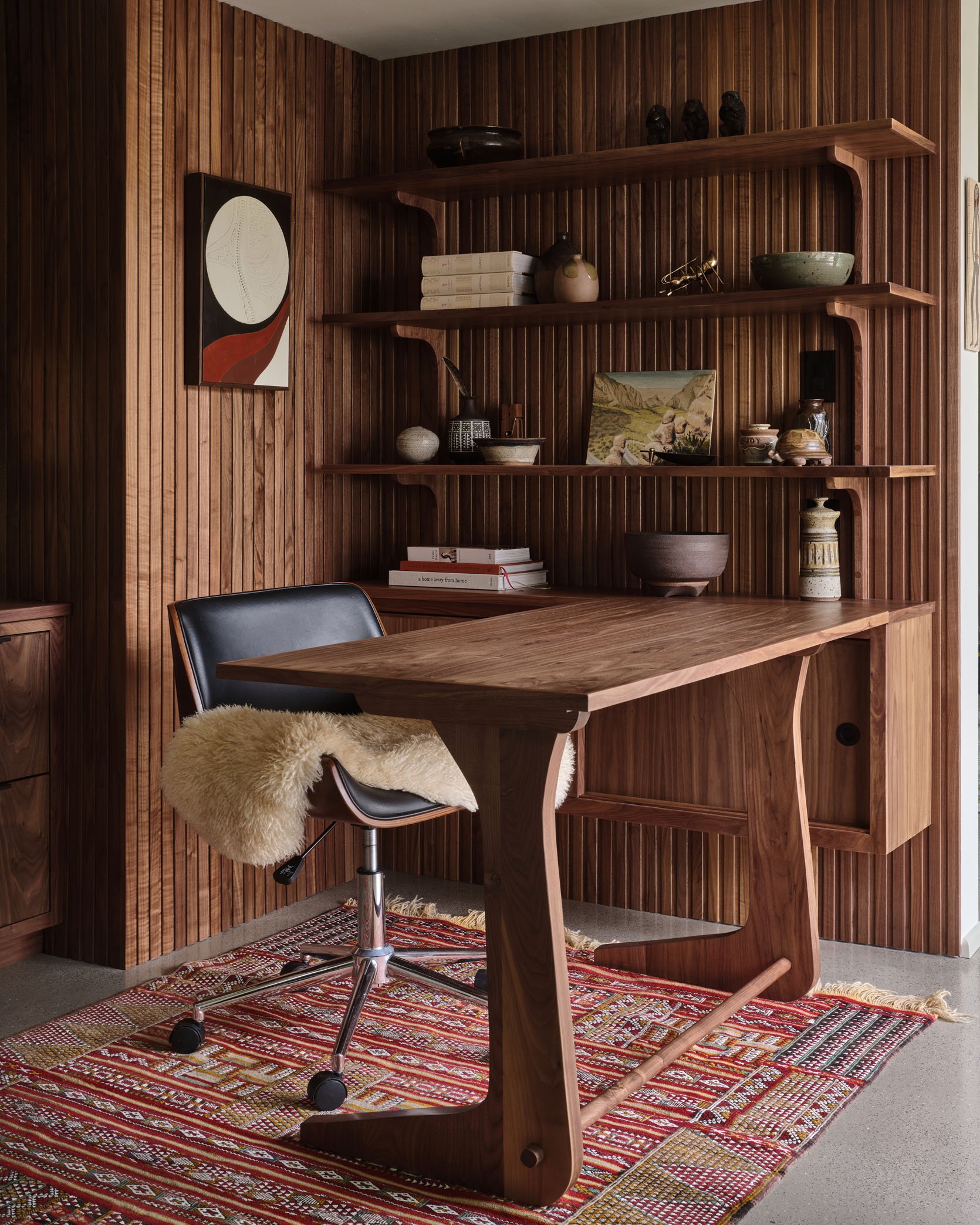
My god this shot is beautiful! So when you lean into using a lot of lines in a design you want to be careful it doesn’t feel too modern or too trendy (unless that’s the look you want). What Kirsten did here to offset that was not only to bring in large custom pieces with some 70s-inspired curves but to choose wood with a grain that had the most beautiful movement.

I could stare at it for days! This wood-on-wood custom millwork is absolutely jaw-dropping. Also note that most of the decor pieces are darker, with only a few contrasting pieces, to let your eye be at ease and take in all of the elements.
Repetitive Shapes

Another awesome design choice she made was using the same shape and style of the desk base as the shelf brackets.

Intentionally repeating elements, like shapes, in any design is great but here it helps to nail the vintage design style and steers it far away from “trend”. These are also a perfect contrast/break from the lines on the walls.
Letting In Some Light

Another way I feel this space works so well is that we have a couple of walls without cladding or heavy dark wood. It helps give the room a little bit of airiness/negative space. This also gives it that more casual vibe that the “California Casual” style is all about.
Mixing Materials

We love some material variety and this green tile and terrazzo flooring are the dream duo for this 70s design. That rich green square tile (controversial due to grout lines, I know) is so good my heart hurts. It’s moody, goes beautifully with walnut wood (it’s nature indoors!), and bounces the light around so the whole space feels a bit lighter.
Also, please note the choice to have a pony wall to not only expose the wood paneling on the back wall but it’s the perfect framed moment for that piece of art and wildly cool pendant for an awesome view from the office.

Speaking of lighting, even the mirror scones have a touch of wood. Refined yet organic and so good.
Organic Decor

As I hinted at before, another great way to enhance the moody vibe is to choose decor pieces that have a textured, darker color palette. And for this design, it made even more sense to lean hard into MCM pottery and textured oil paintings since that was the time period these spaces were inspired by!
P.S. That slated pocket door is perfection.

I just went to an incredible flea market with the best MCM ceramics so I picked up a couple of pieces for myself. They can work with any style and visually add soul to a room. I might be biased:) I mean look at how cool this brown ceramic disc looks above the laundry room sink! Because it’s tone on tone with the wood it’s like a special surprise that adds instant depth.

Here the other view from the laundry room:)
A Hint Of Whimsy

Another great way to balance out a heavily linear design is to add some bold whimsy. I love that she chose this, at first, unassuming pretty foliage wallpaper. But then you see the eyes! It’s so fun and unexpected as well as adds a beautiful contrast in style to the wood. I also love that it’s on the ceiling too:)
I am a forever fan of Kirsten and hope y’all are inspired by her, her book (got get it!), and feel more confident in using darker woods if you’ve been thinking about it.
Love you, mean it.
*Design by A 1000x Better
**Photos by Michael P.H. Clifford
THIS POST WAS ORIGINALLY PUBLISHED HERE.
