The other month my dear friend asked if I could help her with her vanity/bathroom area. It wasn’t bad but it was feeling a little lifeless. She lives in a rental so obviously there was only so much we could do and the budget also had a limit:) And let me tell you, it never ceases to amaze me what some elbow grease, a fresh coat of paint, and a few new decor pieces can do to a room. She’s so happy now! So when I was thinking about the next “Fix it Friday” prompt I was already in the bathroom refresh mindset. And truly the bathroom is a place I don’t think we realize how much time we spend in. It makes a WORLD of difference if you feel at ease and maybe even a little pampered by your surroundings. But just to be clear, this post is all about working with what you have in terms of hard materials. No one is going to be asked to retile! So before I help out some real-life readers with their “in need” bathrooms, I have a few pretty incredible examples from other designers who refreshed instead of remodeled…
First up is our very own EHD alum, Sara Ligorria Tramp, and the refresh she gave to her parents’ bathroom. As you can see all of the tile, fixtures, and vanity didn’t get touched. But a lighter green paint color, new sconces, a new shower curtain, and some general decluttering made this bathroom look BRAND NEW!! How happy yet peaceful does this space feel now?


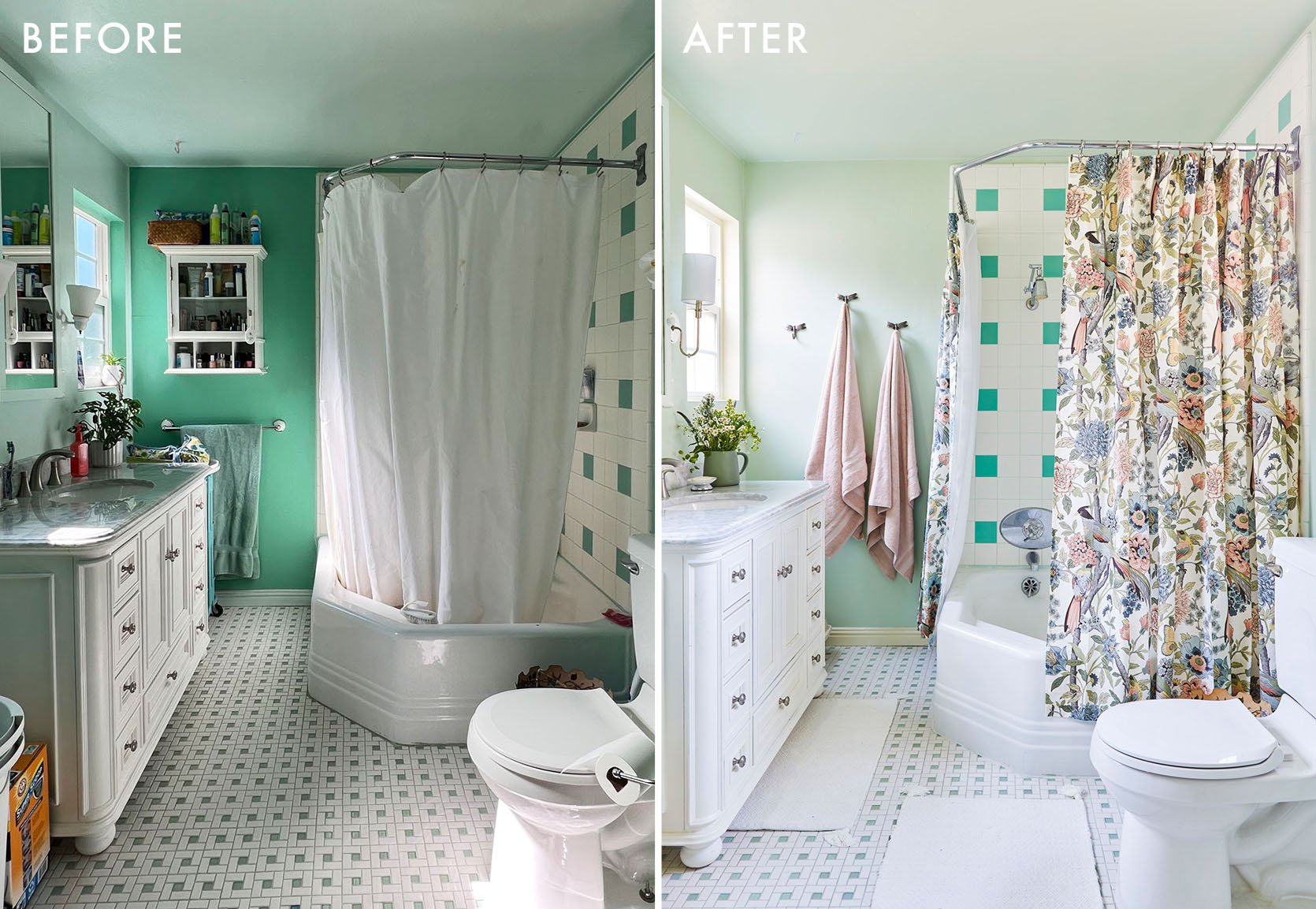
Then designer/homeowner, Alison Pierce, decided to embrace her amazing colorful vintage tiles and lean in hard! It may seem counterintuitive to go bolder in an already bold space, but matching the color intensity of these tiles lowered the contrast making the overall design easier on the eyes. Look, both of these beautiful bathrooms definitely still pack a visual punch but in the best and most balanced way.
But sadly not all of us have amazing vintage tile to play off of so here are some general NO DEMO things you can do to make your bathroom feel a bit better/updated and more cohesive:
- DECLUTTER/get rid of what you don’t use (if you just do this I promise you’ll feel better)
- Consider some closed storage to quiet the visual chaos
- Paint or wallpaper the walls
- Paint or restain your cabinets
- Change out hardware (pulls, knobs, towel rings, towel bars, hooks, etc)
- Hang shelves
- Get a new rug
- Get new towels
- Change the lighting
- Switch out your vanity mirror (if possible)
- Get a new faucet (but maybe have a pro install that one:))
- Hang some art (yes, your bathroom deserves pretty stuff too!)
- Good smells are important so get a candle or diffuser you love

As I said, these are just some ideas! Julie (above!) and Mallory also designed incredible rental bathrooms if you want to get even more inspired. So while you don’t need to do a lot to make a big difference, here are some readers submitted bathrooms, in need of some love, that I am going to try to give helpful advice to. Let’s go!
An Early ’00s Neutral Upgrade
Let’s start on the easier side, shall we? There is a near-perfect bathroom under some of these slightly outdated design elements. But also it’s pretty beautiful as is. Regardless, this reader wants a refresh so that is what she’s going to get. Here’s what she asked for:
“I saw the post about a bathroom refresh! Would love to update this and make it more my style, but don’t know where to start! I feel like it needs a paint refresh (cabinets and walls), lighting change +/- mirrors, and maybe wallpaper?”
Not a problem!

Now I think if she just swapped the mirrors and lights for something a little less…ornate and gave the walls a happier creamy white color, she could call it a day! But obviously, I wanted to give her “a few more” suggestions because this is what I love to do:)
Some new hardware and towel ring (in the same metal finish) would also really change the feel. Swapping in a bigger tray on the vanity will look more intentional. Her other vanity decor pieces are cute so those can stay! And while I totally get having your more colorful things on a vanity like hairbrushes and toothpaste bottles, if those can easily be tucked away in a top drawer that will help to keep the color palette more consistent and calmer to the eye. But look, NO judgment! Not everything needs to be “aesthetic” 24/7 because life comes first. However, this is a design blog so it’s just a little suggestion.

Man, that tub looks amazing! However, this area could use just a little design love. Let’s first get some art (one large piece or a little gallery) or floating shelves on that empty wall. Then let’s give some new styling life to the ledge. I really love the pieces I found and can’t wait for you all to see. And while new towels aren’t necessary, with the color palette I chose below, I think something a little softer in tone would look pretty nice. The tub tray and cute laundry baskets stay!

Wall Paint | Towels | Towel Ring | Vanity Light | Vanity Mirror | Wall Art | Vase | Vanity Tray | Vintage-Inspired Runner | Bath Mat (Simply Taupe) | Glass Canisters | Candle | Cabinet Hardware | Towel Bar
Here it is! As always, any wall color I choose is a general suggestion. Always test out paint colors in the space to see how they actually look in person. But I do think a creamy white (one that contrasts enough with the white on the cabinets) would look so pretty. Sometimes those taupey greys can weigh down a room when it’s on the walls. I also decided to go with a paint color instead of wallpaper because the floors already have so much pattern with the darker marbling that I think a wallpaper might compete too much. Then I chose a simple but classic vanity mirror option (under $150 each!) that will immediately make the space look and feel more elevated. The lights on the other hand are more expensive but the opal glass shades are STUNNING and are pieces you keep forever even if you move. I decided to go with a matte black finish instead of brass because A. I didn’t know if the different brass finishes (mirror and light fixture) would work together and B. peppering black around the space will make it look a little more grounded and balanced. And because I chose black for the lights, I decided the towel ring, towel bar, and cabinet hardware should also be matte black. Speaking of hardware, I just love these knurled pulls and knobs! Modern, elegant, and fun. Then to finish off the vanity side of the bathroom, I LOVE that wooden tray from H&M which seems a bit bigger than the one that’s there and also keeps a dark tone to the countertop to balance out all the matte black. I am a big ole fan of a long runner in front of a double sink. This one from CB2 is vintage-inspired, the colors are beautiful and forgiving, and the fringe gives it a little extra personality.
Onto the tub side, I chose this big art piece from Target that works so perfectly with the other colors in the space. Then on the ledge, I do think a vase with a bit more of an interesting shape with a big branch or two would be sooooo pretty! I love this vase/jug so much because the texture is so good and those curves are to die for. Plus it’s 14″ tall so its got some good height on it. Then I think if some of those products in the tray they have could be decanted into canisters like these it would be a real chef’s kiss. I think choosing glass for those nice contrasts with the terra cotta of the vase. Oh, and a candle is a MUST and why not have it also be a beautiful piece of art? I have this candle and love it! 10/10. And finally, since we’re here, I think a lighter bath mat (this light taupe tone is kinda perfect) would look so pretty and those light green waffle towels that Emily AND Arlyn have are a nicer color with the overall design…plus the texture is beautiful too:)
Giving Power To The Powder Bath
We always think having a little “fun” with your powder bathroom design is the way to go and this reader already had their eyes set on dark blue but was second-guessing her ideas…
“My home’s powder bathroom urgently needs design attention, and I would love your help! The sticking point for me is how to bring color into a small room with no natural light. I tested Benjamin Moore’s Van Deusen Blue on the walls. I love the color, but I grew concerned that it was too dark for a space without a window. The style of the house is NW modern. Our budget is about 2 thousand dollars for a new mirror, light fixture, hardware, small storage solution, and decor. Please let me know if you have any questions. Thank you for your consideration!”
Actually going dark in an already dark space is something we almost always recommend so it’s a big YES to the dark blue walls. Wanna see what else I’m thinking.


Aside from the paint, mirror, light, and some hardware there’s not much else they need. Just a few more decor pieces and maybe a new faucet if they felt like switching things up. I definitely leaned into the modern PWN style they said they have so here we go!

Blue Paint | Wall Art | Trash Bin | Vanity Light | Vanity Mirror | Toliet Paper Holder | Brass Faucet | Soap Dispenser | Wall Cabinet | Design Book | Candle | Glass Match Cloche | Bath Mat | Hand Towel | Towel Ring
Modern PNW to me translates often to darker tones and midcentury modern design. And since Schoolhouse is a PNW company (Portland) I went there first and found the prettiest light fixture (amongst other things)! I love it so much but since I don’t have the bathroom measurements I’m hoping that this light/mirror combo works together. I think a little overlap would be so sick. Oh and how good is that Target mirror? Only $70! And staying with the vanity, if they want I do love the idea of mixing metals and bringing in a little brass faucet. Then I went with matte black for the towel ring and toilet paper holder (which are only $16 each, WILD) to blend into the blue walls a bit. But of course, I wanted to bring in a little color and texture so that waffle hand towel adds such a fun but cool pop, and how amazing is that bath mat?! I love that it’s a brighter blue than the walls and has a pattern, adding some dimension and a tonal vibe. And is it even a PNW room if something isn’t dark green? That little trash can is so cute and has the prettiest tone.
Ok, back to the walls. Let’s start over the toilet with the piece of art by Jordan Sullivan. I love his work so much and this photograph brings in so much movement and a beautiful, happy, contrasting color. It livens the whole design up. It’s not cheap but it’s a limited-run print and so special. The reader also asked for some storage and I found this awesome wall cabinet from ferm Living. It’s simple but detailed and very slim so I think it will work perfectly hung on the wall across from the toilet. And finally, I couldn’t not have something to put on top of the cabinet. That’s what the candle, matches, and book are for. The candle can sit on top of the book to one side and the match cloche can sit on the cabinet next to the book. I think that will look very cute but have fun and play around!
P.S. We are over $100 under budget:)
The Grain Is REAL
When I first saw this bathroom I thought two things, 1. “Wow, that’s a LOT of grain” and 2. I really like those mouldings.” And if you know me then you know I love wood but this wood would require something special. Here’s what the reader sent in:
“Hello!! We are trying to update our early 2000s built home. This is our master bedroom. I like a clean, classic look. Any help would be greatly appreciated!!”
Ok! Sweet and simple and something I think I can handle:)

The first order of business is the wood grain. I do love some grain, but given the intensity and the amount in this one space, I think that if the reader is up for it they should consider stripping and restaining all of this wood a really dark tone, masking a lot of the grain. That way they don’t have to cover that beautiful wood with paint and it saves them lots of money by not replacing them. I definitely don’t want to downplay the hours that this would take and that it would potentially drive them to curse my name every day until the end of time. BUT after they are done they will have stunning cabinets. Worth it?? Then if they were up for spending some money, honing those countertops would make them look nicer and more expensive.
Not let’s talk walls. I think they should go for a white like Alabaster by Sherwin-Williams – bright with a hint of warmth so the room doesn’t feel too stark. Then those lights really need to be updated and that ceiling fan also could really use a modern makeover.

The countertop could use some cute styling but I do love the plants in the shower! Oh, but all of the switchplate covers and hooks need to be updated, and let’s see if I can find a solution for the towel rings. Much to do so let’s get to it…

White Paint | Gel Wood Stain | Lightswitch Cover | Outlet Cover | Vanity Light | Pitcher | Hand Soap Dispenser | Ceiling Fan | Tray | White Vase | Candle | Towel Holder | Hand Towel | Runner | Hook
Clean and pretty classic, right? So the biggest changes would be the wall color suggestion and the darker stain on the wood cabinets and trim. But switching up those old sconces with these stunning ones would be amazing! Just would want the reader to make sure they were long enough. And keep things golden, those switchplates need some love…or not. Get rid of them! These are all of our favorites so do with that what you will:) Another fun item I had to swap was that outdated ceiling fan! This one is simple, pretty, and has a brass detail to tie everything together. A super great thing about this bathroom is that the countertop is huge! That leaves room for almost any size of tray and I really love this beauty from Target. Then I chose that white vase and pretty candle. But since the countertop is so long I think that tall pitcher will look so great in the left corner.
For some reason, I really wanted to keep the metals consistent in this bathroom so that very elegant towel holder, switchplates, and hook are all from Rejuvenation. Lastly, we have the textiles. I wanted to keep it super simple but really textured and the combo of these two I think looks great together and mesh really well with the space.
Ok guys, it’s the freakin weekend now so I hope that this post inspired you a little to start to tackle a big or even small home project. And as always thank you to everyone that submitted!!
Love you, mean it.
Opening Images Credits: Home of Allison Pierce | Styling by Velinda Hellen & Erik Staalberg | Photos by Sara Ligorria-Tramp for EHD | From: The No-Reno House That Looks Completely Renovated
THIS POST WAS ORIGINALLY PUBLISHED HERE.
