I can’t believe it’s been a year and a half since I last talked to you about my kitchen! Honestly, what is time anymore? 2020 feels both like it was 30 seconds ago and that it was 30 years ago. I’m pretty sure this is the longest design project I’ve ever worked on. Four. Full. Years. But it’s done and I could not be more relieved/excited/happy!
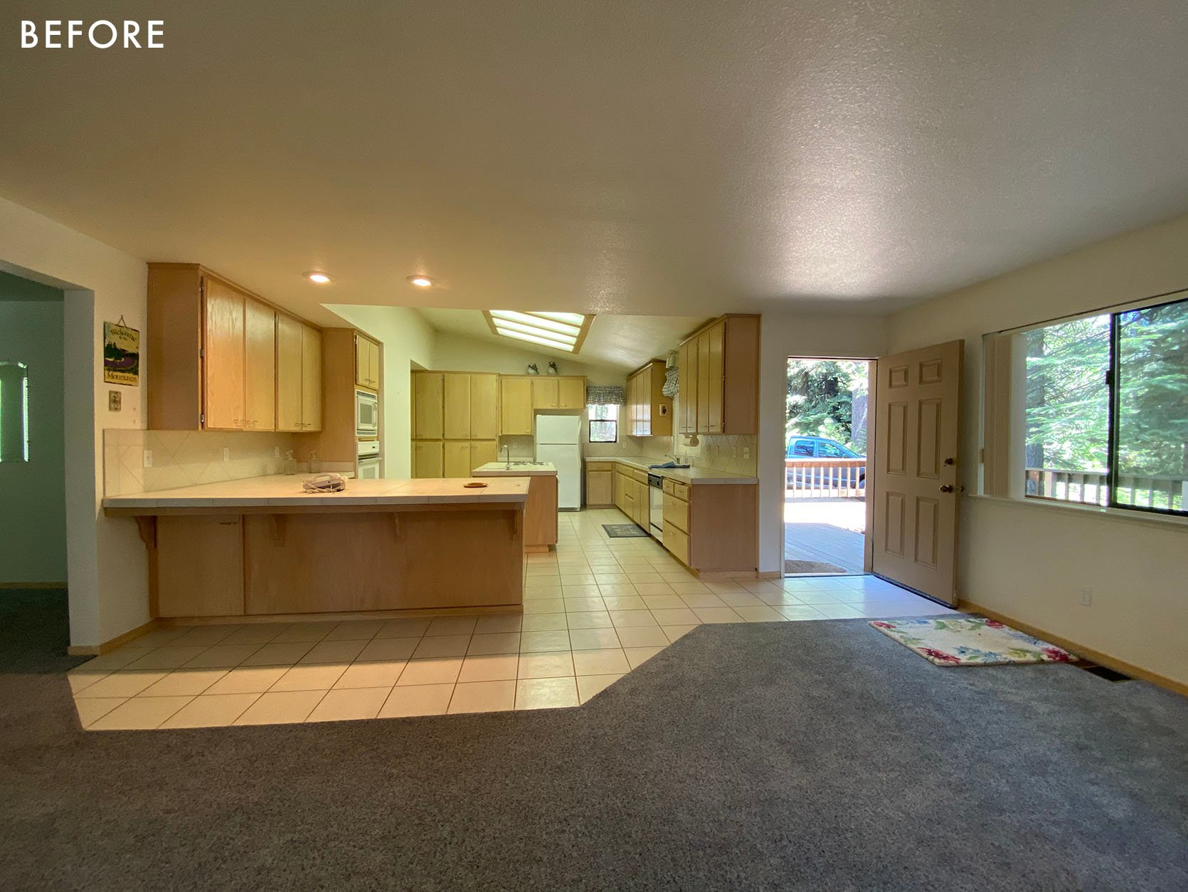
The kitchen as it looks today has lived in my head since the moment I first toured the house, almost exactly four years ago (August 2020). I was EXTREMELY lucky in that Londo Lodge was the first house I ever looked at, the first house I ever put an offer on, and the first house I was lucky enough to snag. And the kitchen was really what sold me on the house. The space was large, dated but well-designed, and located at the center of the house. It was obvious from the home’s layout that the family who built this home really saw themselves as kitchen gatherers – my type of people (unless I’m in there trying to cook, in which case, GET OUT!). The layout of the room was really nice. It was spacious, grand, and filled with practical storage. Too much storage, to be honest (which is why I knocked out a wall of upper cabinets in favor of more windows looking out onto the forest).
So why did I change it?
Mostly because the kitchen as it was doesn’t go with the style overlay I have planned for the house. The home is pretty much a 90s contemporary box – very simple, efficiently built, but not a lot of artistry, no millwork or details anywhere. I really want this house to feel more like the little cabin in Yosemite where I was raised, which was a 1929 craftsman bungalow. So my goal is to combine Craftsman and Cape Cod elements with some rustic cabin accents to create a home that feels older, more historic, and overall just more romantic. The old kitchen didn’t really go with that vibe. So from the moment I saw it I had an idea in mind for what I wanted to do.
Now, before I get into what I did to transform the kitchen, I want to show you what I did to make it work as-is for the first three years I owned the home. I’m extremely lucky I got to do this renovation and would not have been able to afford it without getting a ton of it sponsored. So I get that a huge renovation like this is not a possibility for everyone. As you can see from the photos, styling can make a HUGE difference to how a space feels. So for those of you out there who aren’t in a position to take on a renovation, just know that there’s a ton you can do by removing dated accessories and adding in objects that update the space. The updates I made midway are probably a full blog post to themselves, but I wanted to share these images to encourage those of you out there (most people, including me if I weren’t a content creator who could attract sponsors) who can’t afford to gut their homes – creativity and a little elbow grease goes a long way!


Oh, and for the record because I get this comment every time I post about my old kitchen, the thing on the ceiling is NOT a skylight. It’s a terrible, depressing 90s fluorescent light. So no, I did not remove a skylight to build my new kitchen. I actually tried to add one but I couldn’t find a sponsor for that (maybe someday when I redo the roof!). Okay, onto what I did!

Like a lot of people, I’ve had a thing for Nancy Meyers kitchens for a long time. I love that they are cozy and aspirational at the same time. The goal with this house is to build my dream home, so I definitely wanted the kitchen to feel grand and high-end without feeling pretentious. This is a “cabin” after all, it should feel cozy and down to earth. The goal with renovations at this house is to do them well and do them once, so I decided to go very classic and traditional with my design – I definitely didn’t want to do a trendy kitchen that I needed to renovate in five years. Or even ten years. I want this to last a long time.

Bertazzoni Range | Bertazzoni Hood | Range’s Gold Decor Set | Cabinet Color | Backsplash Tile | Brass Cabinet Handles
The first sponsor that came on board to help with the kitchen was Bertazzoni. I have worked with them numerous times and I love their appliances so I was elated to have their pieces in my home. I decided to base the color palette of the room on the range, Bertazzoni’s Heritage Range (Color: Avorio). I color matched the range with Timeless by Clare Paint to make the range feel integrated with the cabinetry. But I didn’t want the room to be completely devoid of color, so I brought in a faint gray/green/blue in the tile (backsplash is Chain Homme in Mist by Fireclay). Something that’s a little hard to tell from the photos is how warm the room is. Timeless and Avorio are basically a “bone” color. Not bright white, more muted and warm.

Ceiling Paint Color | Trim, Windows, and Door Color | Door and Windows | Door Handles/Keyless Entry
The inspiration for the backsplash color was the pretty pine trees outside, some of which have really beautiful silvery accents at the tips of the needles (these are called “Silver Tips”). I wanted the kitchen to feel neutral and relaxing but not boring and this color really did the trick. I also added that color on the ceiling, using Clare Paint’s “Rain Check.”

Bertazzoni Refrigerator Column | Bertazzoni Freezer Column | Bertazzoni Wine Cellar Column | Bertazzoni Column Metal Handles
The refrigeration wall is one of my favorite elements in the room. I knew from the get-go I wanted to move the refrigerator and I wanted the whole wall to feel like cabinetry, so I opted for Bertazzoni’s panel-ready columns. I trimmed them out to look like a big armoire and I really love the result. To match the range, I added large-scale Bertazzoni Heritage Handles to the refrigeration wall (which includes 24” Freezer, Wine Fridge, and Refrigerator from left to right).

Pendants Over Peninsula | Cabinetry | Cabinet Rings
To keep the refrigeration wall flush I installed a large custom-built china hutch at the same depth. I love the way the whole thing looks and this is one of my favorite vignettes in the room. One thing I may change eventually is the cabinet depth. While it’s great to have the 24” depth to maximize storage, shelving this deep can be a bit impractical because it’s hard to reach all the way to the back to grab things. So I may eventually add a false wall to the back of these cabinets to make them shallower. Or I may leave them the same. They’re a bit hard to style but the depth actually serves a very practical purpose when it comes to renting my house out on Airbnb.
Originally, I’d planned on having these cabinets lock, filled with pretty dishes and my favorite pottery pieces. But that ended up being out of my budget, so what I’ve done with styling is put all the most delicate things in the hardest-to-reach spots. I’m hoping this deters people from using and breaking my favorite stuff while allowing me to have the hutch styled the way I want. So far it’s worked but when you rent your house out to strangers you kind of have to be ready for them to break stuff so I’m just considering that a cost of doing business. I’d love to share all my beautiful dishware with the world, but judging by the fact that guests have already broken/damaged a decent number of things I think you kind of have to assume people are not going to be gentle with your stuff and act accordingly. I want to be generous and share but I also don’t want to be furious when people aren’t careful with things I love. It’s all about balance!


Picture Light | Art | Stools | Wood Flooring (in Smoke)
Another one of my favorite details is the beautiful antique painting I installed on the side of the china hutch. I did this because I don’t love looking at the side of a cabinet and wanted to do something intentional to make the spot a focal point rather than an eyesore. I found the art on Etsy and it was definitely a splurge. It cost $500 and that expense came at a time where I was REALLY running out of money for the project. I’ll do a budget breakdown at some point, either here or in my newsletter, but the overall budget for this kitchen was over $200K (I haven’t finished the tally yet), I put in a bit more than $100K, so I am definitely still digging myself out of a financial hole. Why did I spend $500 I didn’t have on art? Because I knew it would totally define the space. Not only was it in my minty color palette, it speaks to the majestic pines outside the windows. I’m still broke from doing this, but I don’t regret buying the painting at all. I built a frame for it out of scrap wood from a wood flooring project, installed it on the side of the cabinet, and added an art light.
The painting was made in 1923 by Sano Gofu, a Japanese artist born in 1883 and while it is one of a kind, you can find similar works on the Sakura Antiques Etsy shop.
For some reason, it felt a little awkward to just have a painting over drawers, so I decided to disguise the top drawer as an art ledge, which I think really helps ground the painting and make it look like it belongs there. There’s also the added benefit that it feels sort of like the drawer is a secret because it has no hardware on it. And I love any sort of playful hidden design elements like this (someday I want a secret bookcase door).

Countertop | Stone Fabricator | Floor Tile


Coffee Maker | Microwave | Mixer
Another favorite corner is the coffee cabinet. I added this cabinet for a few reasons. Firstly, I wanted the three windows to be centered on the sink and there were two extra feet of room on the left. Second, I wanted a place to hide the coffee maker because for as large as this kitchen is, there isn’t a ton of counter space that lends itself to appliances. There’s a huge amount of counter space, but almost all of it is in front of a window or part of an island/peninsula (which would be a weird place to put an appliance). I also loved the idea of a cute little coffee station. Because the look I was going for was historic and traditional (and because I hate looking at them) I decided to do my classic trick of putting the microwave in a cabinet. This is such an easy design hack, I’ve done it in most of the kitchens I’ve ever designed. If an appliance isn’t decorative and pretty like the range, I don’t want to look at it!

There’s so many white/cool tones in the room, so I wanted the island to be a wood finish. I looked into all sorts of ready-made options that were way too expensive but ended up hiring Justin Swaby, the carpenter contractor from my HGTV show “Build Me Up” (and longtime friend) to build a custom island. I designed the island using Sketchup and we made a lot of last-minute changes on-site to elevate it and save money on lumber. For example, I’d originally wanted 4” solid white oak legs, but we ended up doing poplar instead because it was cheaper. And instead of doing solid legs, we fused four planks together. The wood is currently a little green but will desaturate overtime to a more neutral color.


Faucet (in Vibrant Brushed Moderne Brass) | Island Sink | Flushmount
Overall, I really like the way the island came out and it means a lot to me that a longtime friend and collaborator made it for me. Justin also jumped in at the last minute to finish up what the original contractor left unfinished (that’s a story for another day but the original contractor ended up abandoning the job, leaving me to finish it alone for six months until Justin came up to help and get it done). One thing I’m on the fence about is the island styling. Part of me thinks it’s a bit busy. And another part of me thinks it gives the type of “real” that makes Nancy Meyers’ kitchens feel really cozy. If you look at the kitchens in her movies, there’s a LOT going on in the backgrounds. For example, Google the kitchen from “It’s Complicated.” There’s stuff EVERYWHERE. So I’m hoping my island gives a little bit of that “Hey, a person lives a full life here and uses this stuff!” comfort we get looking at kitchens in Nancy Meyers movies.

Faucet (in Vibrant Brushed Moderne Brass) | Beverage Faucet (in Vibrant Brushed Moderne Brass) | Counter Sink | Shade Fabric | Brushed Brass Decorative Wall Hooks | Dining Room Chandelier | Dining Table | Dining Chairs
By the time I got to the window treatments, I’d fully run out of cash. So I asked my mom to help me make a DIY “camp shade” for each of the windows and doors. I actually had these all over the house before I got my glamorous Romans and drapes from Everhem (highly recommended btw I love them). These roller shades are not the easiest to use – you have to roll them up by hand and then tie them back with the straps up top. But because of where this room is, I actually don’t close them at night. They’re mostly for if I leave for long periods and I want to close up the house for insulation. I’ll do a how-to on these soon, they’re pretty easy to make if you have a sewing machine (or a mom who does). And I think they make a great temporary (or permanent depending on how high/accessible the window is) window treatment that looks a lot more chic than those paper blinds people normally use as a stopgap. These windows cost about $20 a piece to cover which is a lot more affordable than custom Romans, which would be around $1500 per window (if you read this blog I’m sure you know by now custom window treatments are not cheap).


Pendant Lights | Sconces | Washable Rugs | Bertazzoni Dishwasher | Bertazzoni Metal Handle
One thing that makes me laugh when I look at the photos of this room is how many lights I put in. In person, you don’t question it at all, it just seems really luxe that there’s all these beautiful fixtures everywhere. In photos though it can look a little busy. I decided when I bought this house that I didn’t want recessed lights anywhere. Controversial opinion: I’m over recessed lights. I think in most cases they are installed in unattractive patterns and the light they provide is very top-down and unflattering. I’d much prefer an attractive small flush mount to a recessed light. But I did want to make sure there was adequate lighting for food prep, so I installed six sconces, eight ceiling pendants, and one cute flush mount. I’m happy with the results as much as I know it looks like I went wild at the lighting store.
Honestly, there are about a million tangents I could go on about this kitchen: Why is there a new door? What happened to my pizza oven/fireplace idea? How did I make the beam that divides the two rooms? Why do I hate recessed lights, who hurt me? Who did all the custom millwork on the sides of the cabinets (me)? Why didn’t I put quartz on the island? Why is that wine fridge so huge? What happened to the contractor? How’d a kitchen cost that much money when so much of it was sponsored? What am I regretting already? And so on. But I think I’ll have to come back another day to explore those (or like I said, perhaps explore them in my newsletter, which you should totally read by the way) because, remember, this was a four-year project and there are literally too many stories to fit into one post without your eyes glazing over as you slowly start to question why you let yourself get sucked into this never-ending rant.
I guess the sentiment I’d like to leave you with is this. I’m very lucky to have gotten to do this project. But I also had to scrimp and save for four years and am currently broke from doing it. It also doesn’t match the rest of my house. Over time, I plan to swap out all the windows and doors to match the new, traditional ones I put in the kitchen, but that will likely take me years to do as I save up and replace them one by one. So you might walk into my house and be like “Wait why is this kitchen a 1929 traditional kitchen and the adjoining room is updated 90s contemporary?” And you’d have a point. Updating your home is messy and can sometimes lead to things feeling disjointed while you save to do the next project.
Most people can’t just do everything at once, if they get to do it at all. And my opinion about all that is that I’d rather save up and spend a lot on something I consider permanent than do something cheaper that won’t age as well. I said no to a few potential cabinet sponsors because I wanted cabinets I could paint by hand. I wanted the texture of the brush strokes and the ability to change them whenever I wanted (and to touch them up given this kitchen is getting a lot of use). Home makeovers often look a lot different than what we see online. Which can sometimes be frustrating to people at home because it makes them feel like their projects are taking forever while everyone else’s are flying by.
If I’m honest, I would have loved it if I could have afforded to do this renovation sooner. And I would have loved it if the renovation itself hadn’t taken a full year, which drove me further into debt because all those months of construction meant I couldn’t rent the house out to help pay for the renovations. Real talk, one of the reasons this project took so long is I kept running out of money. I’d have to stop and wait to save up then start again. And I think this is true for a lot of people. So if you’re stuck in the middle of a four-year (or more, I’ve heard stories!) renovation you’re not alone. At the end of the day having the agency to renovate is a privilege in itself, which is something I tried to remind myself of every time I got frustrated and sick of the project.
The length, complexity, and challenges of this project led to an epiphany for me about the type of content I personally share online and on Instagram. Basically, it’s the job of content creators to make things look fun and enjoyable. We love the type of video where a person walks into a room and snaps and the whole thing transforms. But as fun as all that is to watch, it can become a disservice in that it makes things look a lot easier than they really are. This renovation made me realize that I’d actually bought into the “this is quick and easy!” I’d personally been responsible for promoting. And that has made me a bit more thoughtful about how I present this type of design project online. I want people to have fun and enjoy watching the process, but I don’t want to add to the frustrations people may be having about A. Not being able to afford a renovation in the first place or B. How long their renovation is taking. It’s a hard balance to find as a content creator so I’m trying to find the middle ground between misrepresenting the ease of this type of renovation and being a drag to readers because I am too explicit about the hurdles I had to overcome to get the job done. Overall, I think the kitchen project has helped me be a bit more honest about the hiccups and setbacks that can happen in a renovation like this. I hope that brings comfort to people dealing with the same logistical and financial worries I’ve been struggling with since the start of the pandemic (I know WOMP WOMP we don’t wanna hear that word anymore, but so many people are still struggling).

All that being said, I could not be happier this project is over. I’m actually at the house today working on a few maintenance projects to keep it fresh for my Airbnb guests (installing a new TV, yard work, planning a bedroom makeover, deep cleaning the deck furniture, and so on). I’m glad I have this glamorous Nancy Meyers kitchen now. And I’m even more glad the four years of planning stress and one full year of manual labor that led to it is finally over.
Now, a shameless plug! Would you like to come to my house and use my new fancy kitchen? You can rent it on Airbnb! There are limited slots available for summer but fall is more open as I’ve just released those dates and that is a lovely time to visit Yosemite. Come on over and live your Nancy Meyers dreams!
*Design by Orlando Soira (me!)
**Photos by Sara Ligorria-Tramp
THIS POST WAS ORIGINALLY PUBLISHED HERE.
