Man, it’s good to be back! It’s been a little over two months since the last Fix It Friday but that all ends right here, right now. To be honest, I wasn’t coming up with any prompts I really loved or thought were super helpful. Then I thought, “Wait, just do a wild card!” Ask the people what they need. So that’s what we have here today, pretty easy fixes that don’t require you to start from scratch. We’ve got a couple of dining areas, an office, a bathroom, and to finish it off a quick-fire curtain debacle. I think this might be a regular prompt because as you will see it’s a pretty fun one. Let’s just jump right in…
Dining Room With A LACK Of Drama
This reader needed some help making their dining room feel better and simply, more “finished”. Here are their exact words and requests:
“What do I do to make this dining room look finished? Rug (8×10)/Curtains? Artwork!!? Color? Not a fan of a gallery wall, what would you recommend? Any advice is welcome. Thank you!”
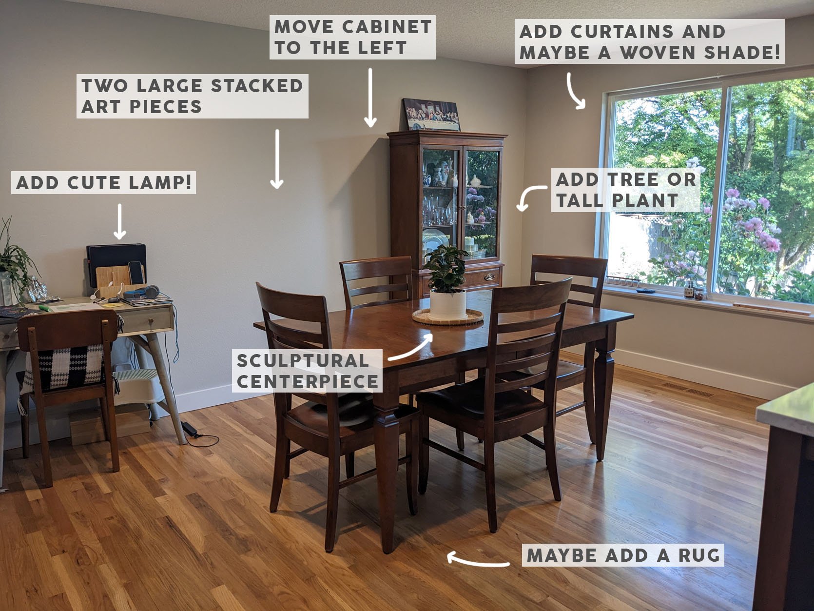
They didn’t give a budget so I tried to keep it on the more affordable side just in case:) But the exciting news is that with this space a little will go a long way. All the furniture stays, great! But let’s move that china cabinet closer to the desk leaving room for either a real or faux plant or tree in the corner. Then to finish off the window side of the room, I really think curtains would add a much-needed softness to the room, plus add more elegance and warmth. Don’t forget to hang the rod high! Here’s our guide for all things hanging curtains. But to really warm it up with texture, if it’s in the budget, layering in a medium-toned woven Roman shade would look so pretty. Ok, back to the desk/cabinet wall. Since the reader isn’t a big gallery wall lover (I’ll try not to take that personally! just kidding:)), stacking two larger pieces on top of each other in between the cabinet and desk will add a calm but high-impact art moment this room could use. Then to add a little ambiance and bring in the woven Roman shade, getting a woven design lamp is not only beautiful, it’s practical! Finally, I think a rug is optional and very much up to the reader’s preference. Some love having a dining rug while others really don’t. Given the pattern on the pillow on the desk chair, I thought our Oregon Plaid rug would bring in some great pattern and a little color. Lastly, I think the dining table’s centerpiece could be a little more visually impactful (but still functional). So a slightly modern, large footed bowl would look awesome and finish it all off beautifully. Come see what specific pieces I’m thinking of…

Table Lamp | Art (top) | Art (bottom) | Rug | Linen Curtains | Woven Shade | Curtain Rod | Faux Tree | Footed Bowl Centerpiece
This is the vision! It’s calming, works with the darker woods, and the sage desk color. Those curtains are the same affordable ones that Caitlin put in her living room (and RAVED about). I personally love a French return rod and I think a black color will balance best with the existing dark tones. The woven shades seem to be super customizable too! The two art pieces come in a ton of sizes, have multiple delivery options (even a digital download), and the colors really pick up on the desk color and have just enough blue to work with the rug. The lamp is so cute and affordable (plus adds a hint of glam with the brass details). The footed bowl is just modern enough to add freshness but doesn’t look too out of place and that tree is a faux option but a real one is equally as wonder…if they can keep it alive:) Onto the next!
Embracing The Quirk…Even If Involves Seashells
This reader has a bathroom that is FULL of personality and charm (some of it love, some of it less so). I’ll let you read their incredibly charming email to get an idea of what the pain points are:
“For the upcoming Fix-It Friday, perhaps you can help this blah bathroom? It is my 1910s home’s “primary” bathroom, used by myself and two teenagers. Most of what is in the room is original–the seashell tiles, the subway wall tiles, the mud-set and perpetually grimy-looking floor tile, the clawfoot tub, the stained glass window, and the medicine cabinet with the broken mirror (did I mention one of those teens is in that phase of sudden growth where he is not sure where his body ends and the wall begins? I am getting this fixed lol). I DESPISE the seashell tiles but respect their game and have tried to neutralize them with the dark green wall paint and the pink line art. Not original is the beige ceiling light/exhaust and the above-medicine-cabinet vanity lighting. We’re pressed a bit for storage in here even though we are not a family that uses a lot of grooming products.
So, WWJD? My thoughts so far are to swap out the vanity light (I kinda like this? Which is leaning into the pink but maybe this old house wants something more classic/classy? But I’m not sure I am classic/classy?) and do something not so depressing with the ceiling light/exhaust. (Since this room has a window I don’t by code have to exhaust to the outside, so a fan could work.) Maybe swap out the outlet covers for something more chic? More clever options for storage or for corralling the things that are just going to always stay out? The gingham shower curtain is a new addition that I like but maybe I should have been bolder? (My taste in patterns runs geometric.) My budget is about $750 if I stagger purchases over time.”


There’s so much to love but if you read the email there are some pain points. Let’s start with the main medicine cabinet and light. If you look at the photo below there’s another wooden medicine cabinet in a darker stain that I think is so pretty and would love her to try to match if possible. That will help bring a little more consistency with the varied wood tones where each tone has a designated feature. Now, I really love the idea of the pink vanity light she linked in her email but I’m really not sure if it will sit above the cabinet in a way that will totally work. I can’t tell where the junction box sits. If it’s high enough where there is space between the top of the cabinet and where the bottom of the light sits lowest then great! Otherwise, I have another idea below.
Aside from that it seems that a few other cosmetic changes could make a big impact – A colorful bath mat, black metal outlet covers, hanging the art a little higher, or replacing it with something more graphic are all options. Oh, and I say keep the shower curtain! It’s very cute:)

I did really struggle to find a decent storage solution with the photos I was sent. But also, it just might be one of those cool old bathrooms that simply doesn’t have the space or layout for good storage. I have one idea I’ll show you below…

Ceiling Light | Black Metal Outlet Covers | Toothbrush Holder | Wall Art | Teak Wood 2 Tier Basket Stand | Bath Mat | Vanity Light
Ok, here’s the whole thing. Now, I have almost no experience in exhaust ceiling fans/lights. This beautiful big flush mount I found is likely not going to work. Just didn’t want to suggest an exhaust fan and not have any idea what I was recommending. But for things I can confidently recommend, art! I do really like the pieces that I was sent (sorry, one didn’t make it into this post). But I do feel that the scale of the art in the photo above is too similar to the scale of the seashell border. I think trying a large-scale abstract pattern like in this piece might feel better, visually. I also like the idea of a thin black frame to tie in with the other black elements. But the piece they have works great but should be raised a bit if it stays:) Ok, back to lighting. If you flipped this vanity light so that the bulbs were at the top, it would sit nicely on the medicine cabinet (as the current one does) but it looks cleaner and modern, yet has an MCM “vintage” feel. Measuring is key though before ordering! Just because something looks like it’s going to fit doesn’t mean it will. Then if the vanity light is a matte black, let’s change all of the outlet covers to a metal matte black. Simple, chic, and doesn’t compete with the wall paint. A bath mat is a must and this one looks like it could work great. It’s not too busy but does have some pattern for a little life. And finally, my only storage solution was this 2-shelf teak basket stand to go under the console sink. It won’t solve all of your problems but will hopefully help a little!
Adding That “Final Layer” To A SWEET Dining Nook
This kitchen/house was impossible not to include which you’ll see in a second. I truly don’t really think they even need help but I know more than anyone, having someone to bounce ideas off of even if you have a good plan is CRUCIAL to the process. So I am here to *hopefully* be that person for this reader. For this one, we are going to look at the space before we get into what they asked for in their email.

Yes, I know, SO DREAMY.


And it only gets better!

Their living room for reference. Incredible!

This dining room is SO fun and is the room next to the kitchen. Again, they know what they are doing! But here’s the email:
“So this is my kitchen breakfast nook. I’ve been stuck on how to handle window treatments, lighting, and just generally making my breakfast nook more layered and cozy. We have a dining room but honestly, this is where everyone tends to congregate, so I want it to feel much more layered, cozy, and fun. We’re not afraid of color or quirk (I very much resonate with this version of Emily’s dining nook) but I also still want it to generally fit in the vibe of our Spanish revival home. Me, my husband and our five year old live here but we have people over all the time, so I want this to feel like a space that everyone can pile into.
Here are the current issues:
- Bench: The bench that our contractor built isn’t deep enough and it’s the wrong height. I’d like to put in a new built-in bench and am wondering if it should wrap around all three walls or just be a lower and deeper version of the current one. However, if it wraps equally on both sides, it could only be 46″ long because it would have to stop before the window on the left. I sketched out the space below.
- Overhead light: I’d like to swap out the light fixture for something that hangs and is maybe more of a statement? Like this is huge but maybe could be a cool statement?
- Window treatments: I’d like to figure out how to bring in some color/pattern/softness via upholstery on the window seat and/or window treatments. I havent been able to add pillows to the bench because the bench isn’t deep enough and the molding of the stained glass window molding cuts into your back. The stained glass window is curved so no idea how/whether to do a treatment there or just on the other window on the left side.
- Table + chairs: Table is fine but I’d also be fine getting rid of it – if we did a wrap-around bench would an oval table be better? Chairs definitely need to go – they’re uncomfortable outcasts from my previous apartment’s outdoor space.
- Molding color: The molding around the stained glass window is white and the molding around the side window is blue. Should I paint them to match one another and if so what color?
- Inspo: These spaces feel very cozy and layered. I think we’d want that vibe but with more of a hit of modern quirk. I also added two pictures below of other rooms in our house to give you a sense of our style.

I could hear myself (aka real design paralysis) in this email so I wanted to help! To start, if they have the budget absolutely do a wrap-around bunch and have it stop at the same point on both walls (before the window on the side wall). That should leave them with plenty of seating plus the adding dining chairs. But, of course, when they have it designed, map out the number of seats to make sure they are happy with it:) I’ll get into how to make it fun and cozy in a second. For the light, I LOVE the pendant they linked. I am a huge oversized light fixture lover when it’s done intentionally like this. Plus it will absolutely add warmth to the space. I would then skip a window treatment on the stained glass window but if they wanted to put a Roman shade on the other window that would totally work. As for the trim color question, I would either keep them different or have them both be white. Maybe that’s a later decision once they see everything else in there! And finally, if they do a wraparound bench, an oval table would be ideal and maximize all the seats.


When I was thinking about the bench, Lea’s stunning custom bench came to mind. Of course, they have different needs, but the striped back and velvet seat is such a fun but not overwhelming combo! Since they are also worried about the trim digging into their backs, making a low (sturdy) back cushion would easily solve that issue (even if it covers the bottom of the stained glass window trim) and then they could layer fun pillows in front of it!
Here’s what I’m envisioning…

Wicker Pendant | Dining Table | Black Dining Chair | Leather Dining Chair | White Centerpiece | Abstract Pillow | Sea Green Pillow | Blue Italian Velvet Pillow | Yellow Velvet Round Pillow
For the bench seat cushion, I would go for a warmer rust color. That way it warms up the kitchen which is pretty cool-toned and also works nicely with their purple dining room. Then for the pillows, I would keep them pretty solid if they go for something like the striped back cushion. I noticed in the living room they aren’t afraid of fun pillows, so that light rust one is SO playful but also extremely cool. From there they can easily layer in other great colors in multiple fabrics for that inviting, cozy feel. I do think adding one minty-toned one is a good idea to bring in the kitchen cabinet color. And yes, look how great the pendant looks (not sure how to scale that is, ha!). I went with a darker wooden oval table to add visual depth to the nook and to have a different vibe than the dining room. I then chose two different chairs based on the vibe they want! Remember that the backsplash has that bold black-and-white pattern so bringing in a couple of black wooden chairs might balance that all out beautifully. However, if they want to keep it light, I really love that wood and leather chair. Looks comfortable and as Emily has pointed out, young kids have a hard time with dining chairs that have arms. Lastly, can you tell I love a big white footed bowl as a centerpiece?? 🙂
An Artist’s Office
I was stunned when this incredible artist, Alyssa Zack, whose work I love and admire asked me for design help! But look, we all could use a fresh set of eyes on a space we’ve been looking at for far too long. Here are Alyssa’s design issues:
“I have this weird pass-through room to the backyard that I use as my office/studio. It obviously needs to be functional but I would also really like it to be cuter! My budget is around $800 and would ideally like to work with existing bookshelves, desk, and the large utility storage drawers. I do have the wall pops Chris Loves Julia floor tiles that I was thinking of using on the floors. The room is about 9.5 x 10 ft.


Here are my initial thoughts that will hopefully spark some additional creativity from Alyssa:) First, let’s start with the color palette. I wasn’t sure which Chris Loves Julia floor tiles she has (I guess in the product board below) but whether she covers her current tiles or not, I think this palette will work beautifully. Please take a look at the Instagram photos below:
Since this is a pass-through room, I think keeping it light and warm could be a good move. A warm blushy sand would be so so pretty and not too overwhelming when she’s trying to create. Now, I also love the idea of playing with a maroon trim of sorts. Putting it a bit below the ceiling makes it feel a little less formal but adds a little something extra to the room. But a completely blush room where she also paints the existing bookcases also sounds pretty awesome. I mean with a fresh coat of paint and a little reorganization, those bookshelves will look brand new.


Aside from the new paint, adding in a great new rug, replacing the outlet covers, getting a new chair, and putting up even more wall storage (is there ever enough in an office?) she is pretty set!

Brass Outlet Covers | Wall Shelves | Blue Spray Paint | Removeable Floor Tiles | Rug | Office Chair
Here is the overall vibe. Again, since she’s an artist I consider this board more as a jumping-off point for her to run with. That’s the kind of blush tone I’m envisioning. Soft, not too pink, not too tan. Then aside from maybe a maroon accent, giving new life to her small rolling cart with a cool light blue is another easy opportunity for a pop of color that won’t take over the room. Those floor tiles might be the ones she has and if they are I’m a big fan! But a rug to protect those tiles and add some texture isn’t a bad idea. And while I’m partial I love this rug from our first collection (did you see Alexandra Gater use it in one of her reveals?) I really do think it would look so good in there. Now, she totally might be happy with her current desk chair, this one is a little more elevated:) Oh, and how could I forget about adding that cute shelf above the large utility storage cart (which is awesome)? While she could use some more closed storage to help with less visual chaos, that wall is asking for some shelves. She could fill it with practical things or style it out with pretty things and plants. And now that I’m thinking, I’m wondering if she could add simple wooden doors to her bookcases if she would prefer to have less happening visually in there. Just an idea:)
Go check out her work if you haven’t already!
Quick Fire Curtains Solution
This one is going to be a quick fire because my heart really went out to this reader and we’re not sure we have a perfect solution (yes, I consulted Arlyn). Here’s the email from the reader:
“My design dilemma revolves around curtains and troubling angles. My husband and I moved into our new home about six weeks ago. We’re super lucky that pretty much all of our furniture and decor fit seamlessly. But the curtains situation has me stumped.
We have two living areas in our new house with big beautiful, tall windows on our back wall. I quickly (read impulsively) bought a curtain rod and curtains to hang up. Unfortunately, I did not notice that the ruling is sloped quite a bit on one side leaving me stumped. Thoughts?”


As you can see, this is VERY tricky. When I asked Arlyn this is what she said, “Umm I think because there are so many all over, lower them all below the transoms to be even across both rooms.” I agree with her even though that may not be the perfect solution since the rod on the angled ceiling side will be slightly covering the half-circle window. I also understand if the reader wants to cover the transom windows.

Another option, that still doesn’t solve the transom window issue, is to get Roman shades for all of the lowers and not have to deal with any rod covering anything. I think this one could be a group discussion to help this reader! Let’s talk window treatments!
Well, that’s it for today! Hope this was both fun and helpful (especially to the readers who have rooms in this post:)) Happy Friday and see ya tomorrow.
Love you, mean it.
THIS POST WAS ORIGINALLY PUBLISHED HERE.
