This post has been so satisfying to write because seeing all these pretty rooms together, after years of designing and styling (and crying and smiling), makes me so proud of our home. Seeing them all together in different yet beautiful colors really does create a story of me and my family. I was lucky enough to have Sherwin-Williams as our paint partner for our home, with a huge inventory of gorgeous trustworthy colors in an extremely high-quality formula. It’s such a happy house, full of way more color than I predicted (thank goodness) and we aren’t even done yet 🙂 Just so you know, for the exterior we used their Emerald® Rain Refresh Exterior Acrylic Latex and for the interior, Emerald® Interior Acrylic Latex. I love them both so much. So let’s see them all together and talk through why I chose them and how I feel about them after 2 years of living here.
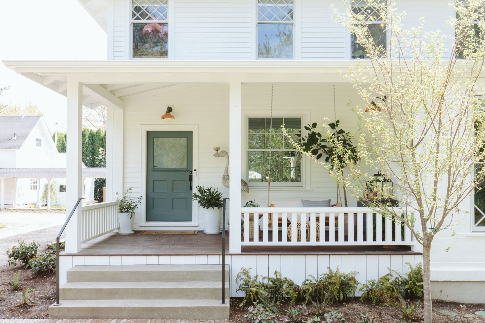
For the exterior, I wanted a bright happy white and while honestly probably many of them could have worked, I love how Pure White SW 7005 pops (especially now that the landscaping is totally grown in – I need new photos!). It just feels really happy and nearly impossible for a color to not look good against it. I love how the copper and blue of the doors all pop against it and that it feels really really happy.

This white just feels like a really clean white, very little to no pigment in it and therefore works perfect with my color palette and style (which is more airy and fresh than subtle and moody).


At one point Brian all but begged for a red door (we had one in LA and loved it). I was pretty drained from decision fatigue at that point (and I love red TBH) so I got excited and we went for it. But once it was painted it felt too bold for us, just too much to be the first thing you saw as you drove up. The red color, Poinsettia SW 6594 is EXCELLENT for a poppy piece of furniture, but once we repainted the color Mountain Pass SW 9655 (Emerald® Designer Edition™ in semigloss) we felt like it was WAY more us. (Although the red was really fun during Christmas :))

The room that I struggle with the most in the house is the living room because the white paint color that we chose is too cool for a room that doesn’t get a lot of natural light. This is my mistake. We chose it when the walls and windows were covered in brown paper but I should have done more research! Now, I love it in the kitchen, sunroom, mudroom and our bathroom – all of those rooms have a ton of natural light and it feels so bright and happy. And when it snowed outside last year this room was so gorgeous I wanted to cry. But on a normal day the indirect low light makes the white paint read too cold (it has a lot of blue in which I didn’t catch or notice, again my fault). This is the last time I make a mistake on white paint and seems like not a huge deal but since it’s so much millwork that has to be sprayed, it’s extremely expensive and disruptive to repaint (probably $5-10k). And since the living room is so open to the sunroom, kitchen, entry and up the stairs we’ve got ourselves a bit of a problem – do you repaint everything a new white ($$$$$$) OR do you paint the LR a complementary white or color and hope it transitions nicely? TBD.


For now, we painted the drywall using Emerald® Designer Edition™ Interior Latex in flat, (which is far less expensive to paint than wood) a light blue/gray/green called Mantra SW 9631 from the Designer Color Collection and it adds such a nice tone that works with everything we have. Sometimes it looks light blue, sometimes Robin’s egg, sometimes gray. Definitely check in on your lighting during multiple times of the day and on multiple walls. I love the designer series because the paint colors are super nuanced (and I love the confidence knowing that it’s been vetted by a designer).


We painted our original (but very very worn/beaten) stairs Smoky Blue SW 7604 and it’s really happy. It’s bright enough to feel colorful without going too bold.


Here you can see the Extra White SW 7006 work so well! The greens and blues pop perfectly! It’s just a matter of the right light and this room gets so much indirect light (3 walls of windows and 2 skylights).

I know that Slate Tile SW 7624 and Smoky Blue SW 7604 look similar but they ARE NOT the same, lol. Slate Tile has more green in it, but they are close. I love this color and would use it over and over again. It feels moody and really pulls you in, which we wanted for this intentionally darker space.


After first painting this room a pretty gray color that just didn’t work, I obsessed over making sure this color was perfect with the sofa and vibe, and I’m happy to say it is. This color, Still Water SW 6223 (Emerald® Interior Acrylic Latex in satin) is a very very dark teal, and in this room (that is really dark with only one indirect light source) it has the perfect amount of undertones to still read as a color (not just sucking the light and reading black). But fair warning, in a room with a lot of natural light this color will look VERY bold and more like a bright but dark Teal. It’s moody in here because it’s dark with low light. But I wouldn’t put it in a larger bright room unless you want a really saturated and bold colorful room.


I do love this combination of colors – Still Water SW 6223 to Extra White SW 7006 to Cocoa Berry SW 9078 (and I like how the wallpaper in the bathroom talks to the family room color!). We accidentally painted the door a matte (not satin) Still Water otherwise I think it would read even bolder.

Oh I LOVE this color. Cocoa Berry SW 9078 (Emerald Int in satin) is a really really warm dark mauve that feels so calming and complementary to all the blues we have in the house. I’m so happy we added this color to our overall palette because as you’ll see below our guest room is a beautiful blush color and I recently used Glamour SW 6031 which are all on the same color strip (from the Sherwin-Williams color fandeck). I love them all so much.


Dew Drop SW 9641 was the first paint color that we saw and I gasped in delight. It is SUCH a pretty light blue/green that is so subtle but doesn’t read as a pastel at all. It picked up all the tones of the tile and complemented the wood so well. It feels fresh, bright, and airy. I wouldn’t put this color in a room without a lot of natural light because it might look flat. I find that lighter colors like this need the natural light to bring out the pigment.

Speaking of pigment! Debonair SW 9139 (Emerald® in both flat and satin) has so much pigment that at night (or in winter) it feels like the coziest room in the house – I LOVE IT. It’s happy but moody. But during the bright northern summer this room gets so much natural light that it can be too bold, the light pulling out the pigment. So there are 2-3 hours during the day that I wish I could snap my fingers and have it be painted Eventide SW 9643 or Evergreen Fog SW 9130 (both recently painted at the River House and I’m OBSESSED with them). I’m not sure I’m going to repaint because I like it at times so much! But I will say that the lesson I learned is to check the LRV (light reflectivity value) of each color. This one is 34 (100 being the most reflective). The way they define this is that if it has a high LRV then it reflects the light a lot, therefore you see the light more not necessarily the pigment within the color. Since this has a lower LRV you see the pigment a lot more when there is light. I’m not sure if that makes sense but here’s how I would put it: my advice is to paint dark rooms medium/dark and light rooms medium/light. This room, while we wanted it to feel cozy is simply too naturally bright to handle a color this med/dark, aka the color pops too much when the lights on it. Evergreen Fog, LRV score of “30” similar to Debonair, is in my bro’s family room and while it looks pretty neutral on the paint deck, in his brightly lit family room it reads VERY green (and perfect, so beautiful I could scream).
So low LRV + lots of natural light = your eye sees more colorful pigment and therefore reads as more of a bright color and high LRV + low light = less pigment and perhaps a flatter color (like Extra White in the living room). The lower the LRV the more of its color you’ll see when a lot of light hits it. So if you WANT to bring out more of its color put it in a bright room go low, but if you want it to be more subtle, less bold/saturated (like Still Water) put it in a low lit room. I’m GREAT with vintage, but boy am I still learning about the undertones of paint.

We painted our fireplace Big Dipper SW 9645 (which I’ve used before). This is an almost black that would definitely read as black in a low light situation, but is such a pretty dark navy with a lot of green in it here. We love it.


In our well-lit closet and bathroom the Extra White SW 7006 (Emerald® Urethane Trim Enamel in semigloss) looks great (but I’m sure Pure White SW 7005 would have as well). Goes to show you how whites are so different with different lights and with different accent colors (like this tile).
The Kids’ Rooms + Landing Doors – Upward SW 6239 (Doors) | Extra White SW 7006 (Walls, Ceiling, Trim)


Upstairs we painted all the doors of the landing and kids’ room in Upward SW 6239 – a really light, almost periwinkle, happy blue. It’s happy and pretty, closer to a pastel than we normally go but everyone is into it!


We matched the white paint in the kids’ bath to the white tile that is a lot warmer than the Extra White. So this is called Shell White SW 8917 (Emerald Urethane Trim Enamel in semigloss and satin) and it’s only slightly warm, but did the trick! This room is getting wallpapered soon so stay tuned:)

Maybe my favorite color in the house and I’m not alone. This room is so warm and cozy, and yet bright and airy. I want to paint every room this color (or a blue and green version of this color). As a reference, this has a LRV of 44, so it’s pretty in the middle and in here reads more of a pink than it would in a darker room (where it might read more neutral).


This house really taught me my strengths and weaknesses which I’m sooooo grateful for because as a creative you won’t stop messing up (or if you do it means you aren’t taking risks), but we hope to get closer and closer to making all the right decisions every single time. A huge thanks to Sherwin-Williams for being the best paint partner with the best colors for our home. We feel so lucky to have worked with a brand whose quality is high and colors run so deep.
*Design by Emily Henderson and ARCIFORM
**Styled by Emily Henderson
***Photos by Kaitlin Green
THIS POST WAS ORIGINALLY PUBLISHED HERE.