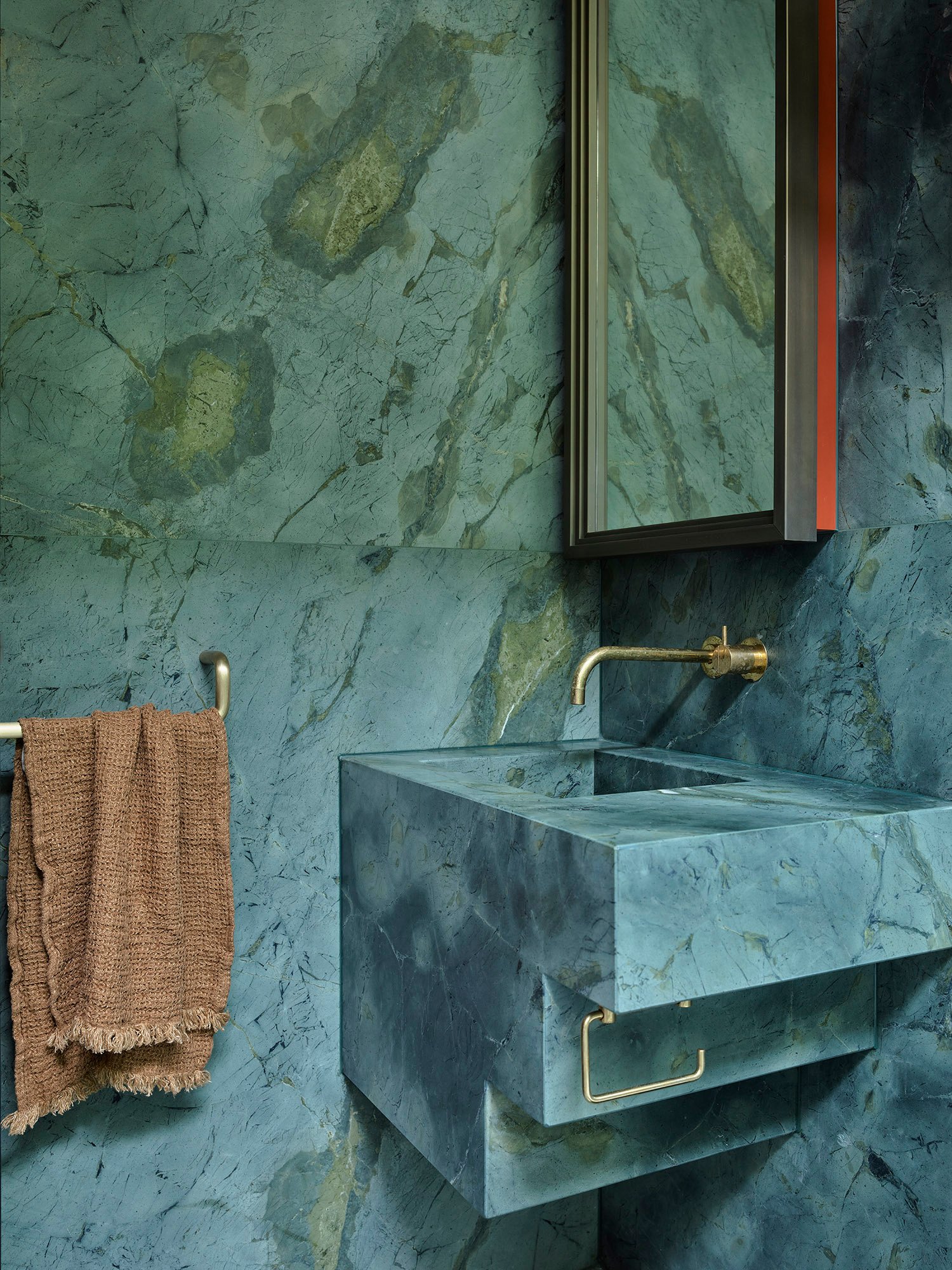
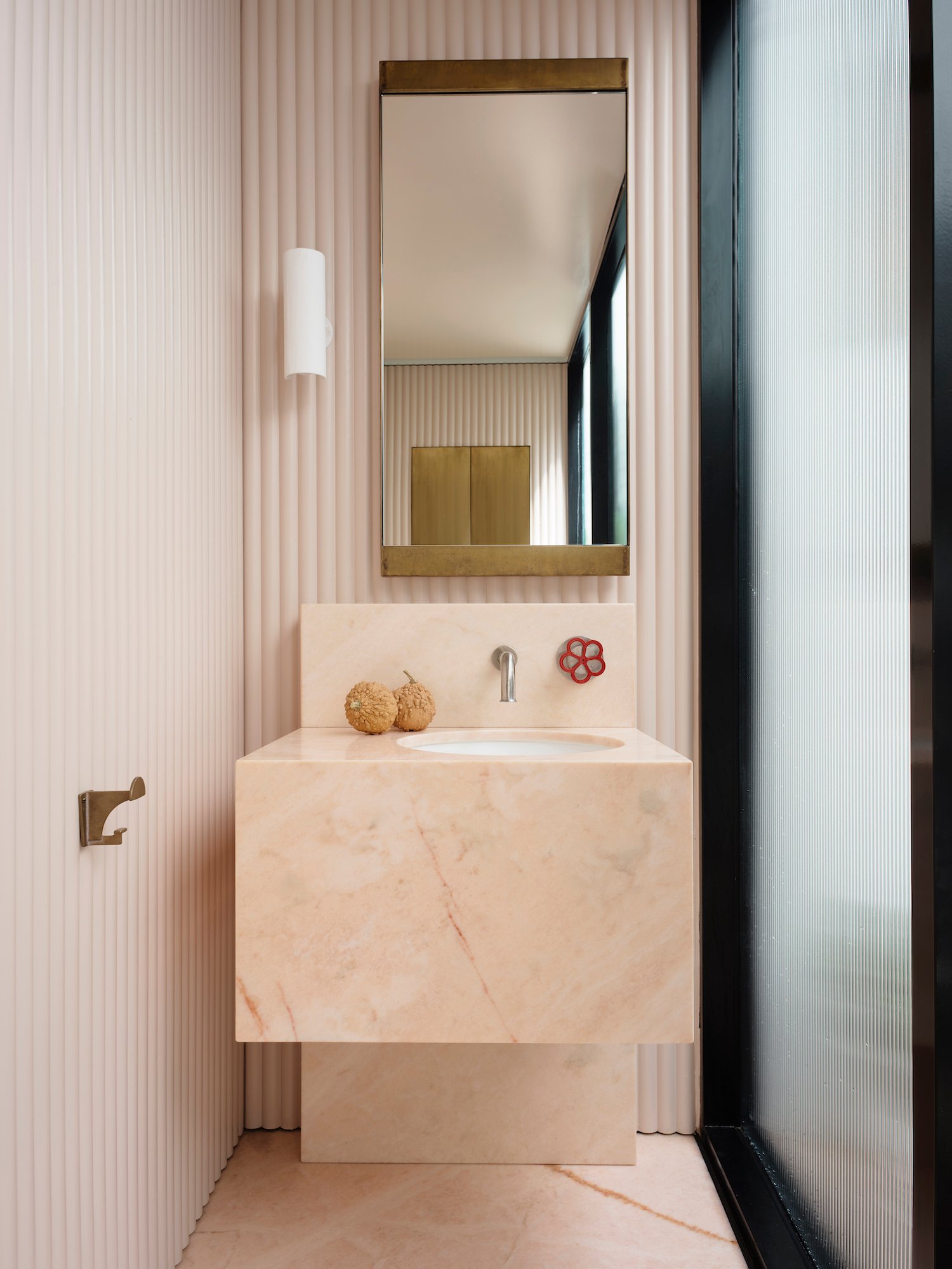
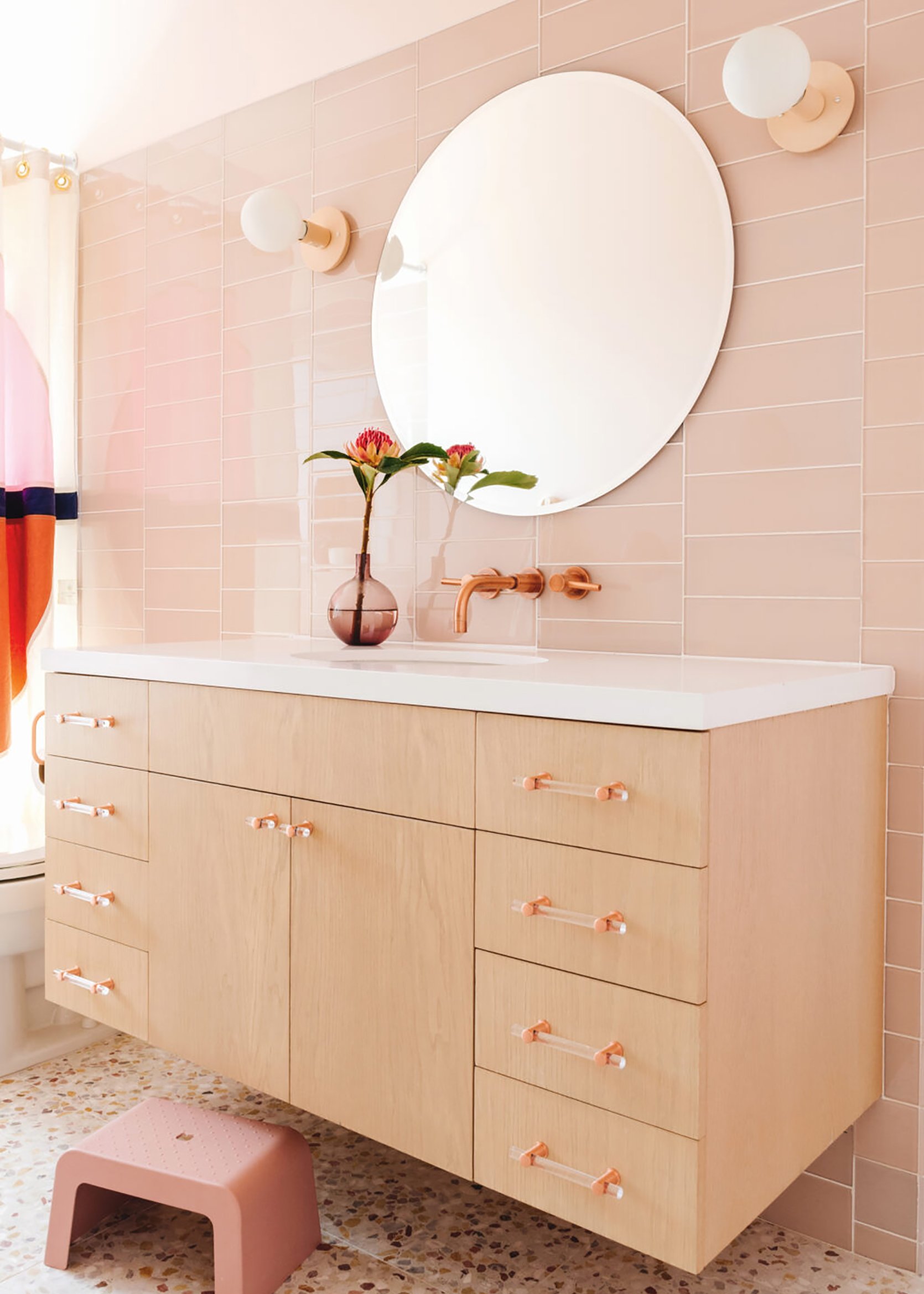
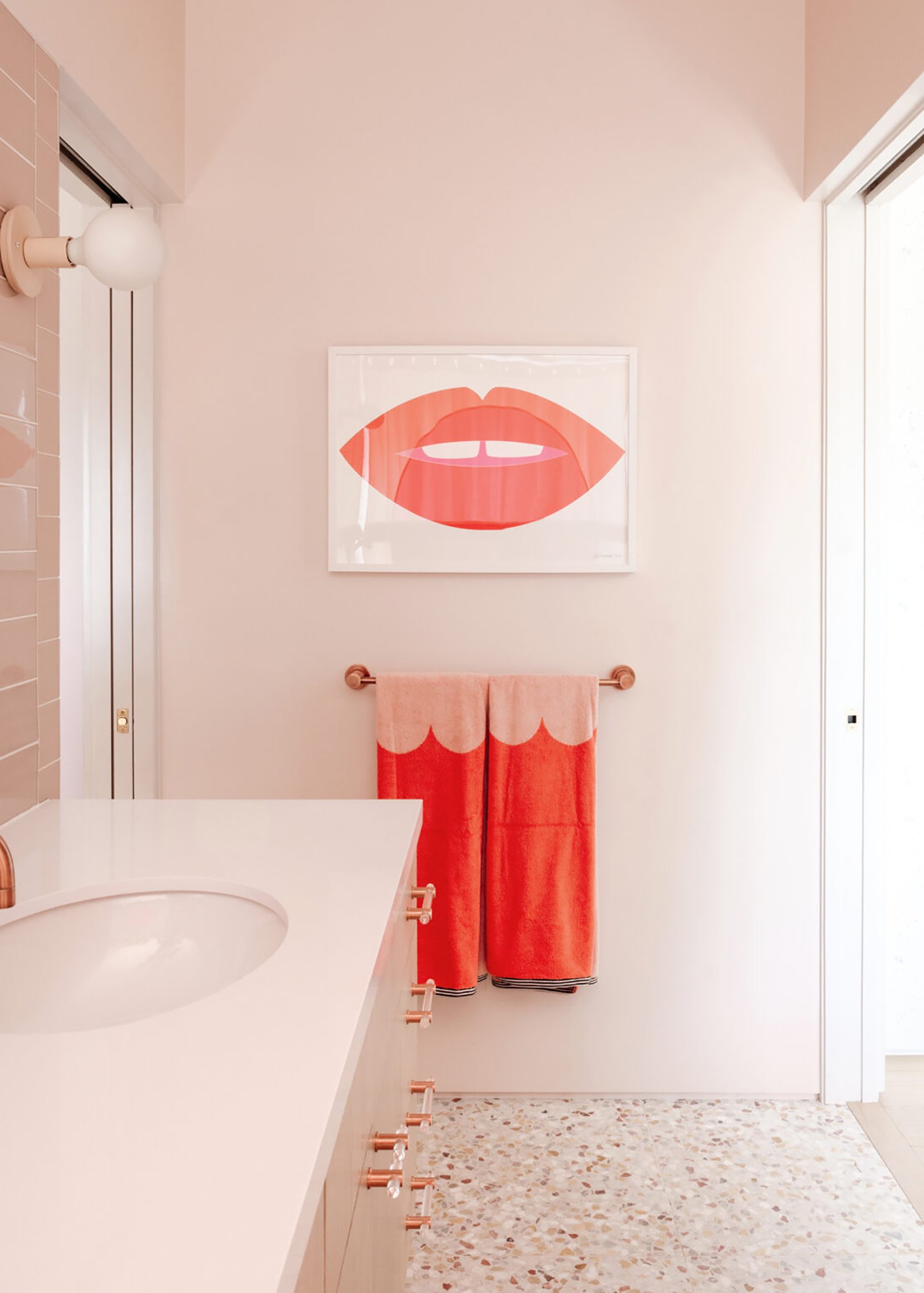
Hi folks and welcome to our 2022 bathroom trends predictions part II. Last week we dove headfirst into the non-renovation, renter-friendly trends so today we are focusing on all things renovation. As a renter myself, I was frankly surprised at how much these reno-based trends excited and inspired me. If nothing else, these emerging trends remind me that interior design is always shifting according to the world around us and that is a beautiful thing. I don’t think I need to remind you that a lot has happened in the past two years and a lot of the trends you are about to see are a reflection of that. So with everything happening right now, let’s escape with these 8 bathroom trends, shall we? Here we go.
Asymmetrical Sink Placement
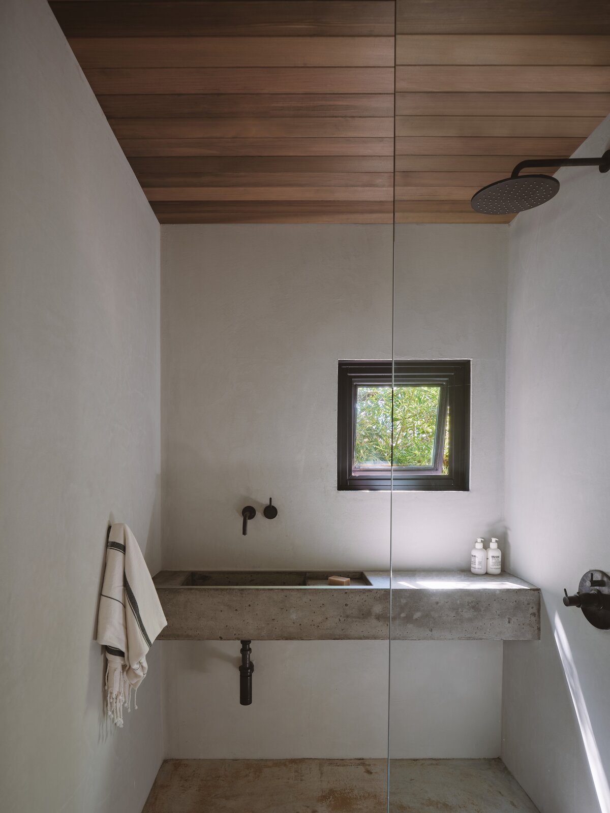
Functionally speaking, an off-centered sink allows for more counter space so you can display your daily skincare products and simply have more space to get ready. As someone who has a single pedestal sink with no counter, I can say that having that extra space would be a dream (you have no idea how often my products fall to the floor while I am getting ready). You can also use that space to style a tray or opt for a decorative object like a stand-alone lamp (which happens to be one of our renter-friendly trends).
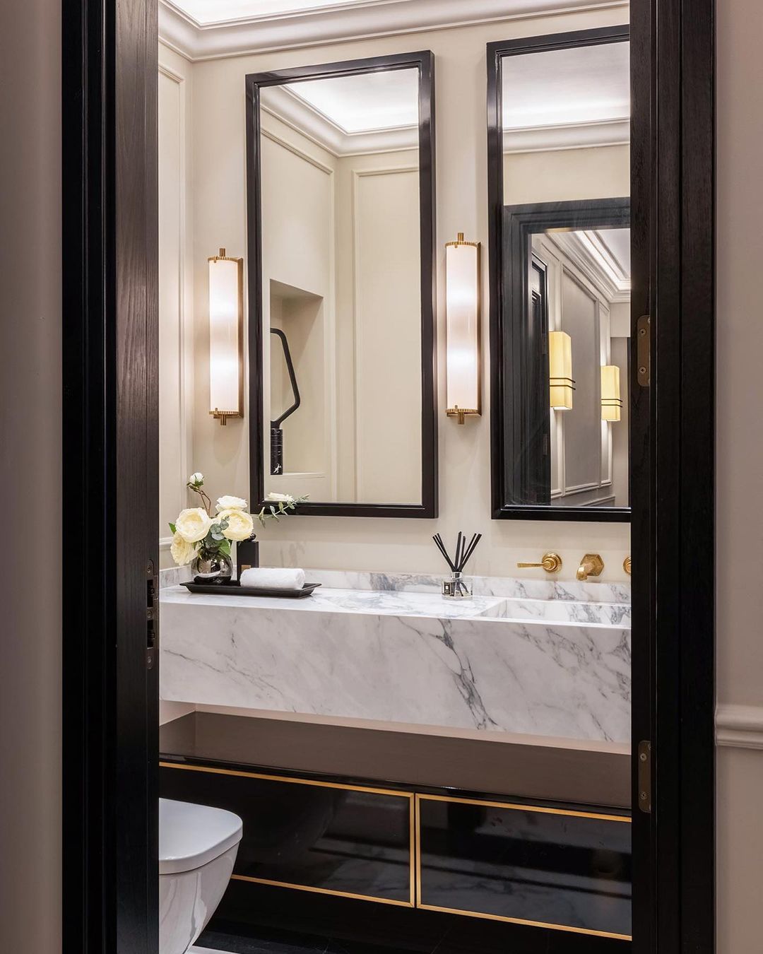
When it comes to renovating, one of the things we try to emphasize is designing for you or your family’s needs. If you think about who will be using which rooms and for what purpose, it will help you make the best design decisions. For example, this sink placement is really great for guest bathrooms or single-person bathrooms but may not be the best if it’s a shared bathroom where two sinks would be more applicable.
As far as aesthetics go, the asymmetrical sink placement looks interesting and fresh. In these smaller bathrooms, it helps allow for more counter space on one side (so important in a small bathroom) and it creates visual interest. For example, the mirrors are placed directly above the sink, creating an off-centered look. To counterbalance this, a sconce can be used to take up that extra wall space, creating a “rule of thirds” like composition.
The 2022 Version Terrazzo Tile
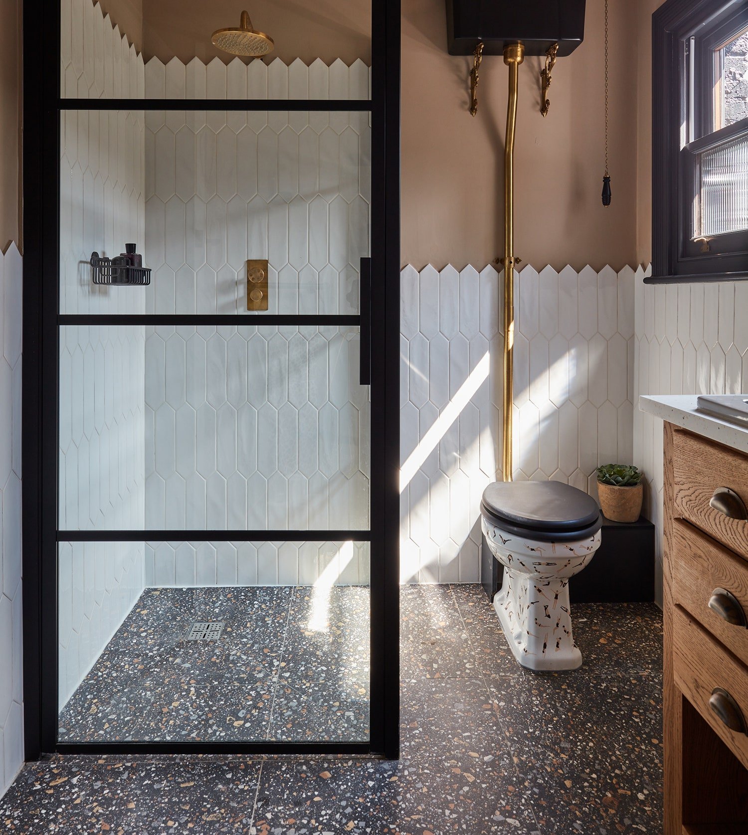
I was hesitant about this one at first, but the more I saw it show up on my feed, the more I realized it is just the tile trend we need in 2022. It’s undeniably playful, versatile, and sustainable which makes its resurgence in the design world a welcomed treat. When we are all craving color and pattern, terrazzo tile is the vessel that can work with modern, minimal styles while still adding that extra special detail.
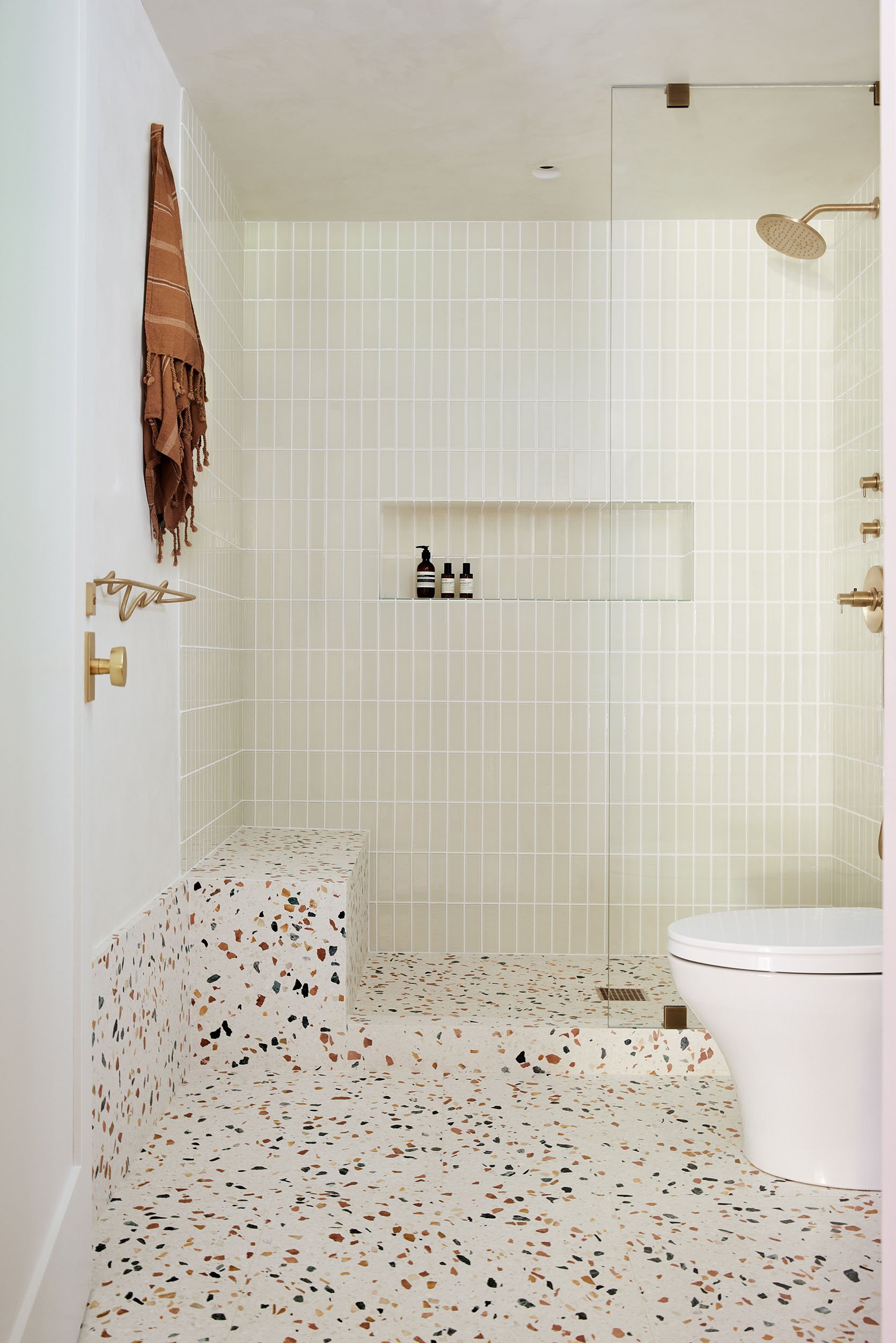
What I love about this trend, and the above bathroom in particular, is how the terrazzo adds a playful element but the overall design can remain calm and relaxing. Designer Laura of Lorla Studio was inspired by minimalist Scandinavian aesthetic so she wanted to keep the bathroom neutral and calm. The soft color palette and minimal fixtures help execute this vision.
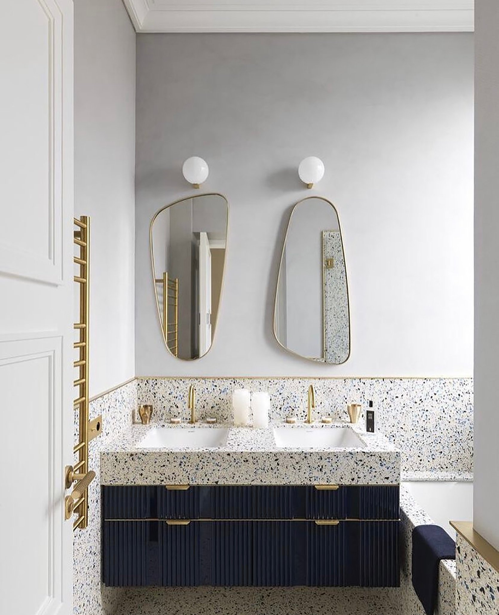
This mid-century luxe bathroom aesthetic pairs perfectly with the exciting terrazzo tile. The brass finishes and dark navy cabinets complement the speckled terrazzo, creating a perfect fusion of playful and sophisticated.
I actually talked about this bathroom in the previous bathroom trend post, but I think it’s worth noting that the terrazzo tile brings it to a whole other level. I mentioned this bathroom nails the monochrome look and a part of that is due to the multicolor tile. The key to making monochrome work is applying different tones of the same color. This helps break up the color so it’s not too visually heavy and the tile helps achieve this.
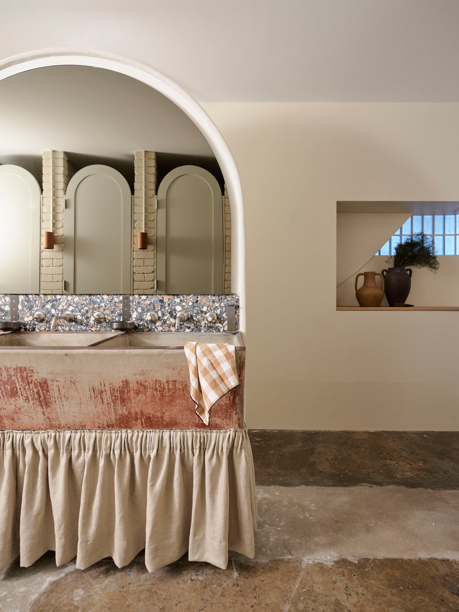
To wrap up the terrazzo trend, we have this gorgeous bathroom that marries organic stone materials with a sliver of multicolor terrazzo. I love that the terrazzo backsplash breaks up the earth tones to create a playful effect.
Built-In Vanities You Can Sit And Get Ready At
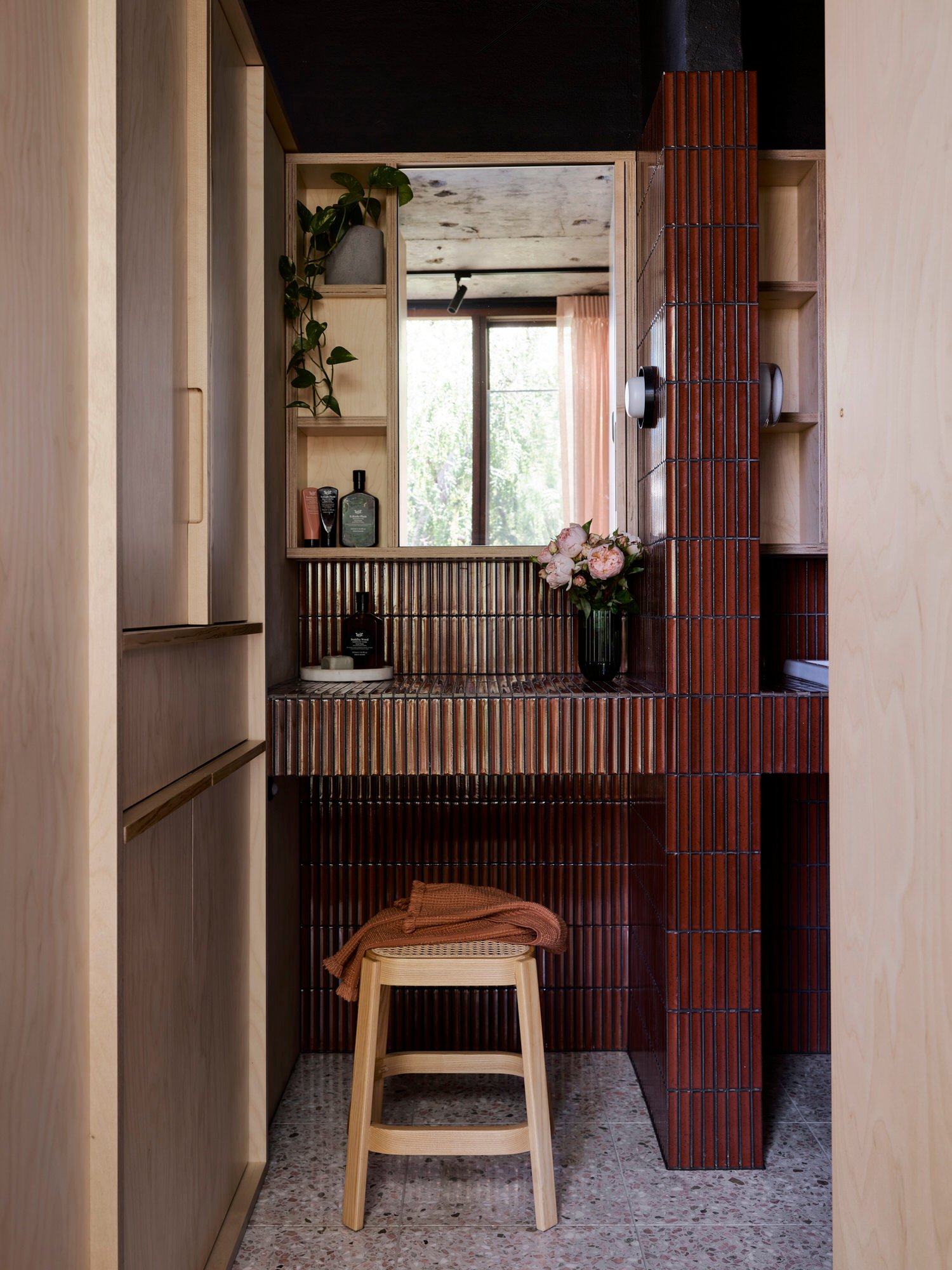
I tend to sit criss-cross applesauce in front of a floor mirror when I do my makeup because I find sitting is the most conducive to get getting my face ready for the day. It’s either that or I just really love sitting. In any case, I 100% understand why bathroom vanities are emerging in bathroom designs at the moment. I think the past two years of the pandemic has helped a lot of us slow down and that includes our morning or evening routines. If space allows, including a built-in vanity is functional and luxurious.
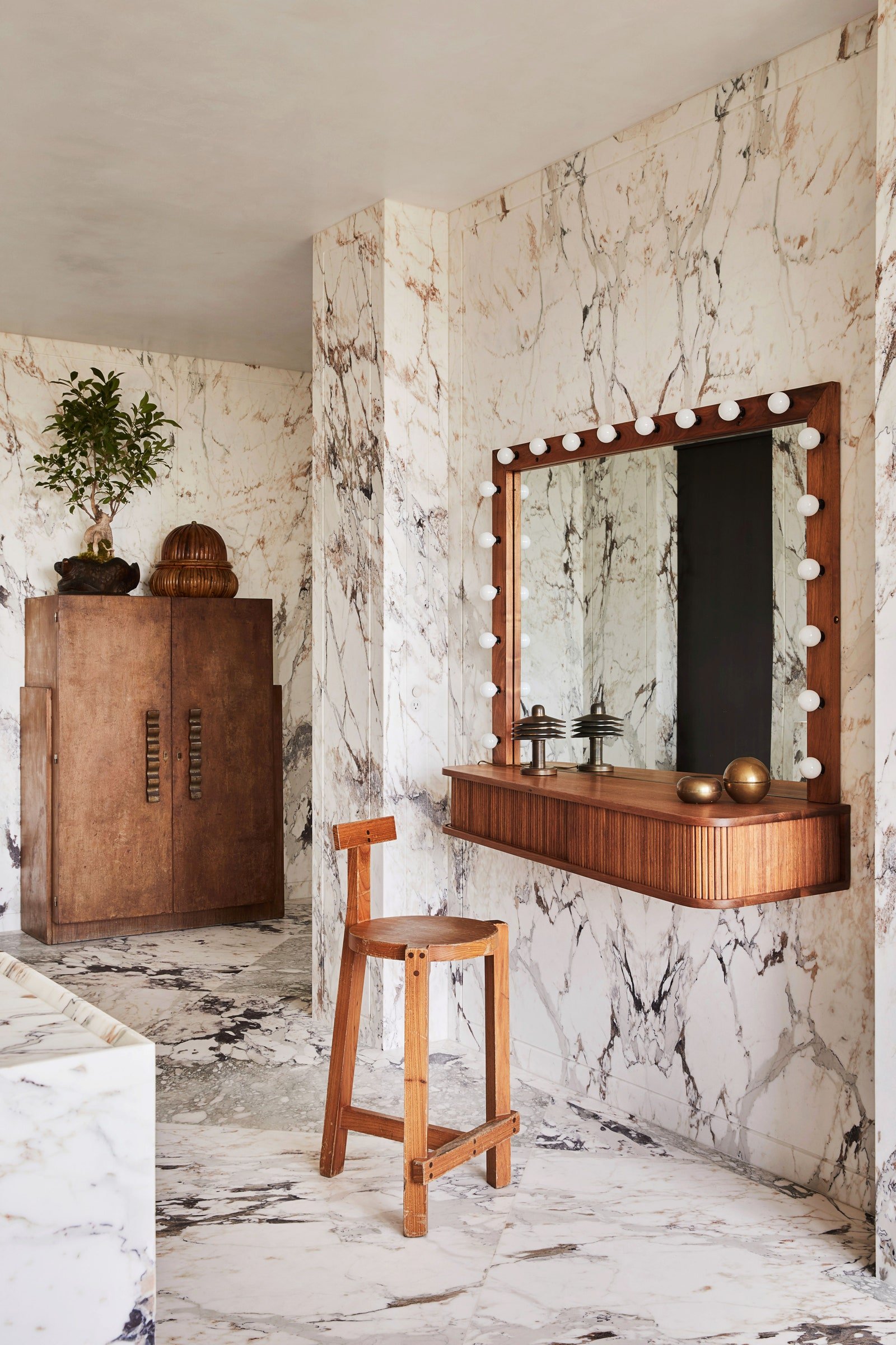
I’ll never forget this home tour. It blew everyone at EHD away for good reason. Among many other frankly shocking (but SO good) design decisions, this bathroom took up a lot of our headspace and gave us all heart eyes. The vanity here is not traditional but SO good. I love that they built it off the side of the wall instead of digging into the wall to create a nook. It’s an unexpected choice among many other unexpected choices that make this home tour so unique.
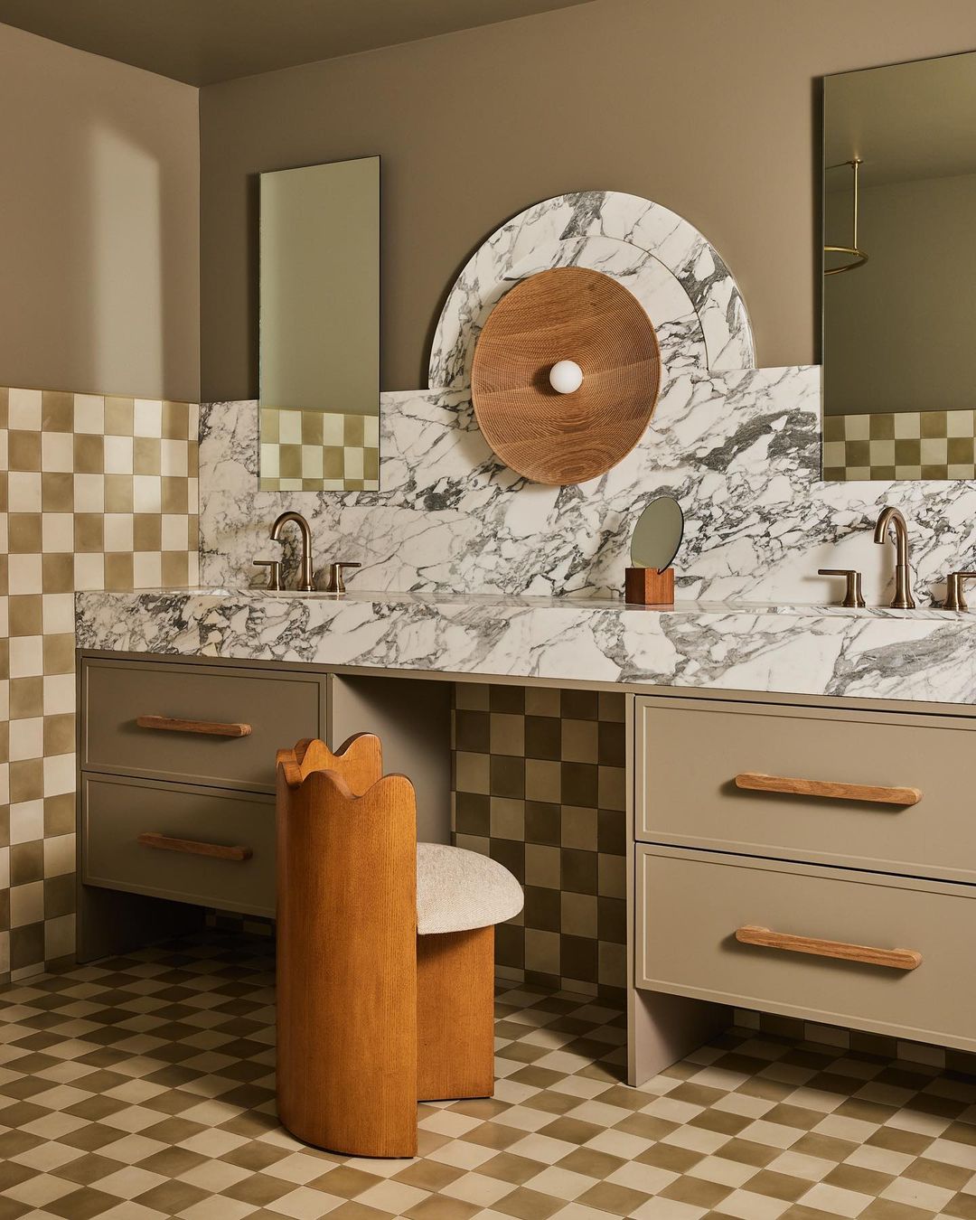
It’s hard for me to not talk exclusively about THAT CHAIR but I’ll use my best restraint. Sarah Sherman Samuel shared that she wanted this guest bathroom to feel like a boutique hotel this built-in vanity really drives that vision home. Oh, and we love that oversized bulb sconce something fierce.
The More Affordable Way To Use Marble
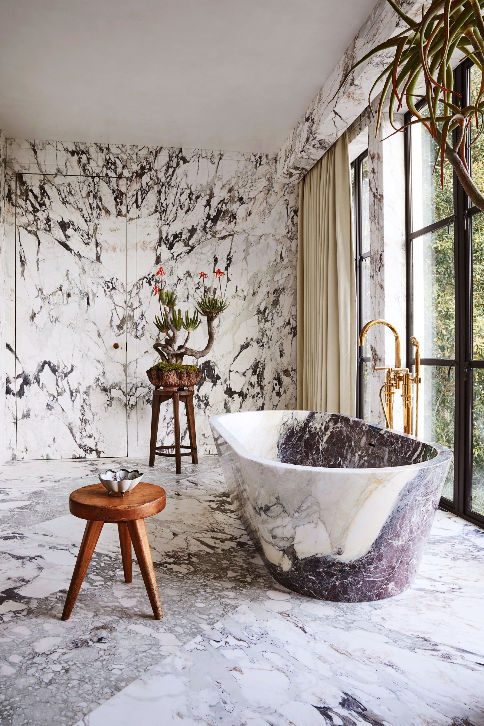
We are used to seeing large slabs of marble used for bathroom floors but what no one tells you is how much more expensive that can be. Finding the right single slab for a space is costly and the more expensive the stone, the more expensive the installation cost is. So the large format marble tiles are a little more affordable and they slightly break up the flow of the veins which can be a more exciting choice, especially in a large suite-like bathroom like the one above.
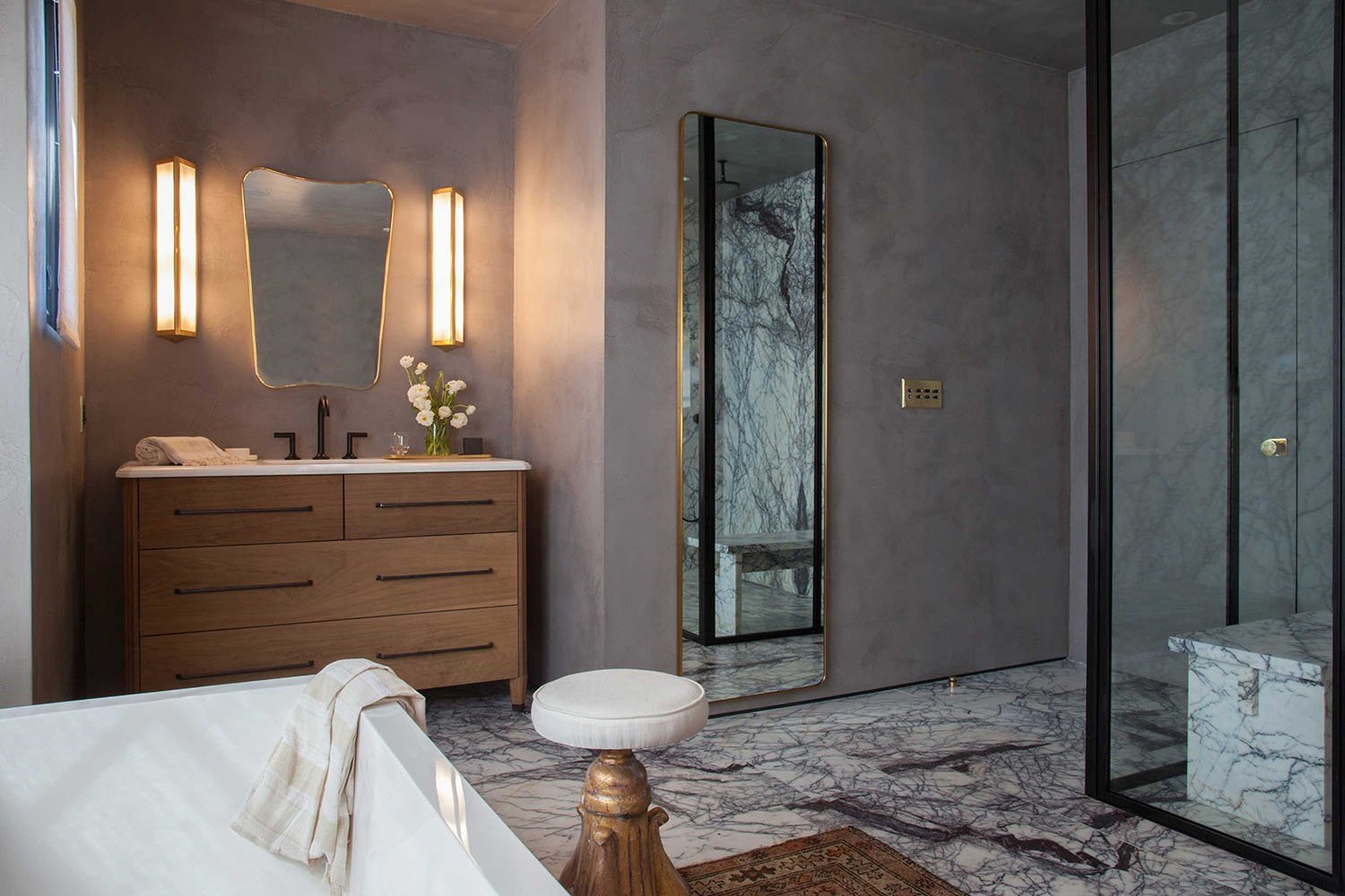
This bathroom by Studio Hus was designed 5 years ago, proving that this has been a slow-burning trend that is still going strong. I love that the flow of the marble is broken up so there are subtle nuances in every square.
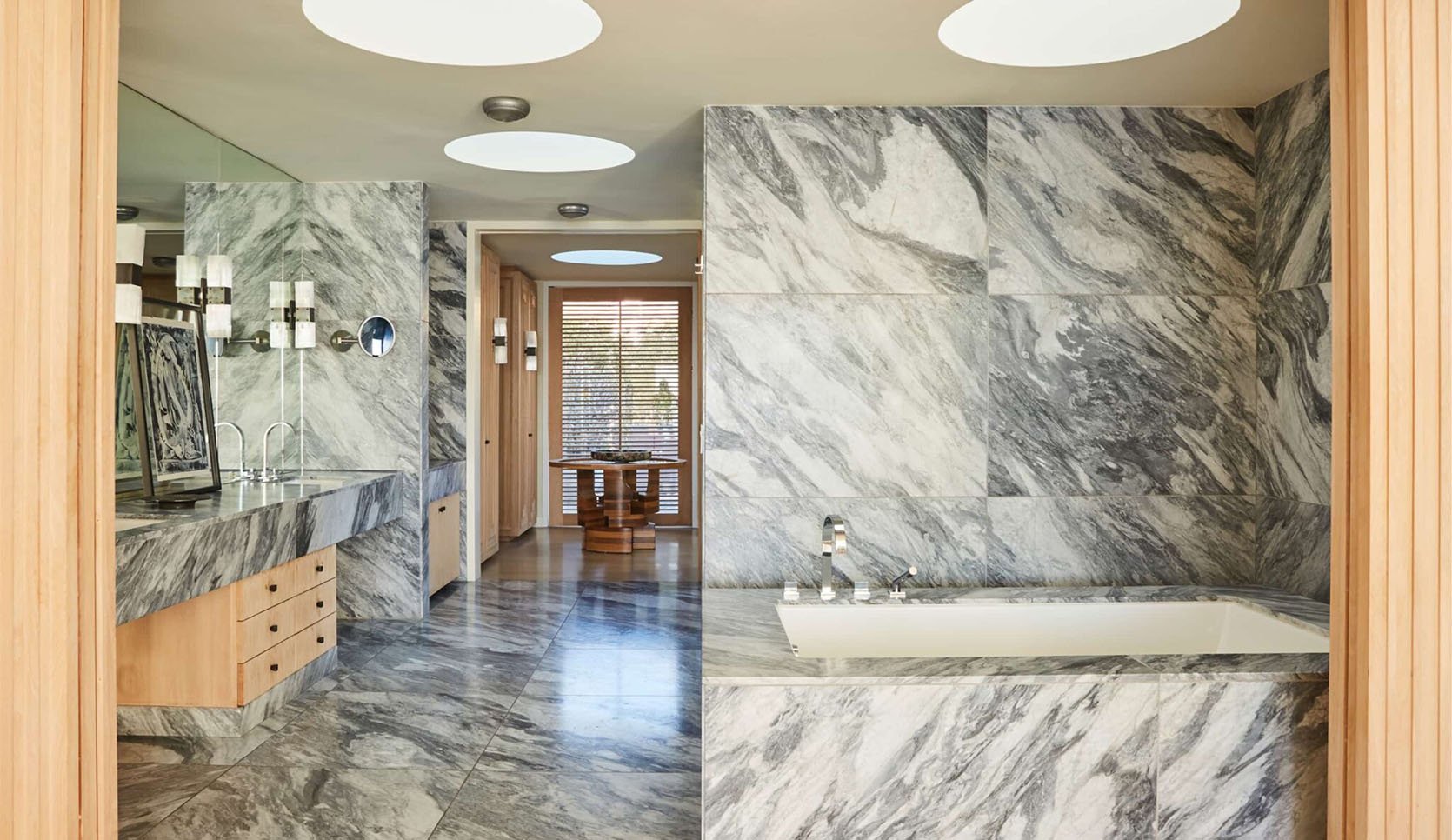
It should come as no surprise that this bathroom is designed by Kelly Wearstler, who I personally refer to as the queen of dramatic marble. Her choice to apply large-scale marble tiles from floor to ceiling makes this bathroom suite feel like a luxury spa.
Oddly Placed Sconces
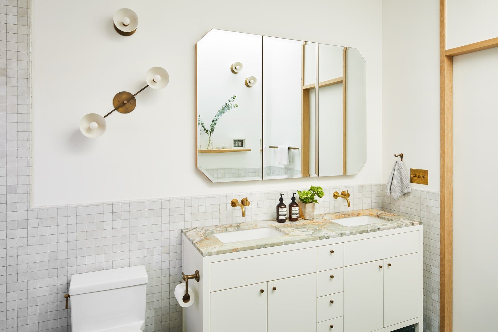
We can’t talk about bathroom trends without mentioning lighting and y’all, this lighting trend is showing up everywhere I look. I am fascinated and delighted by the unexpected lighting placement designers are having fun with and cannot wait to see more of it this year.
I love the stacking of these mix-matched sconces because it fills that extra wall space and creates a sculptural moment. This could have been done with art but the sconces make it more functional and unexpected.
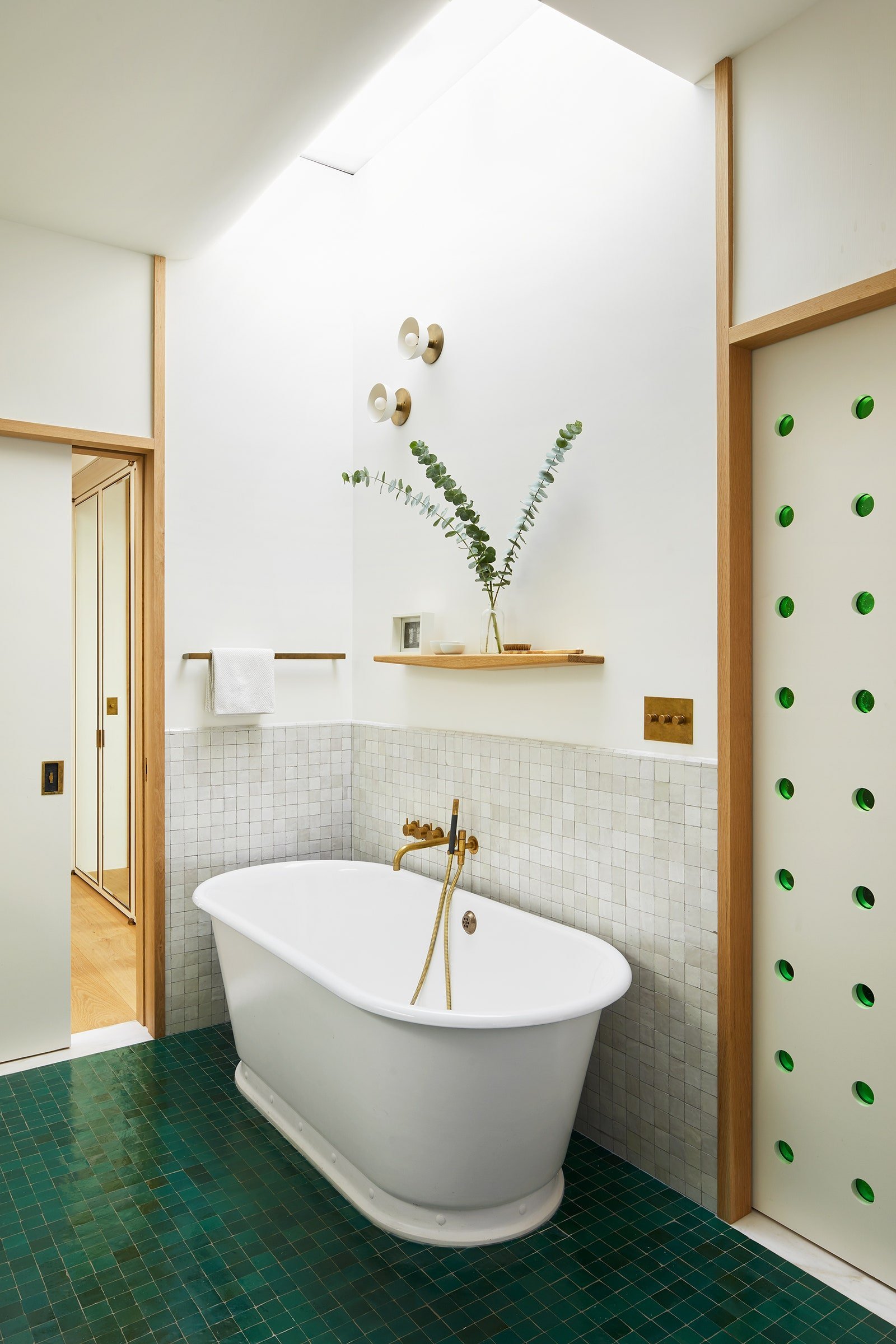
In the same bathroom, the two asymmetrical sconces above the tub serve the same purpose by being sculptural and functional. This bathroom is from a gut restoration of a 2,700-square-foot Brooklyn brownstone—originally built in 1899. The designers were focused on historic preservation and modernization, so while this bathroom feels more modern I think some of the charm stems from their focus on honoring the architecture.
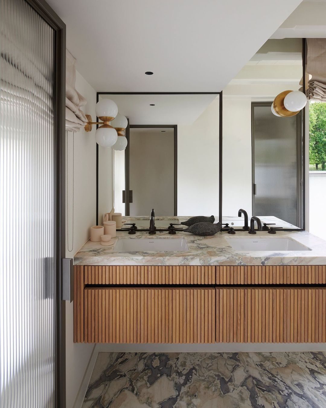
This double pendant-sconce magic in this bathroom by Framework Studio is wonderful. Another micro-trend we’ve been seeing is sconces on mirrors so it’s especially fun to see both play out here.
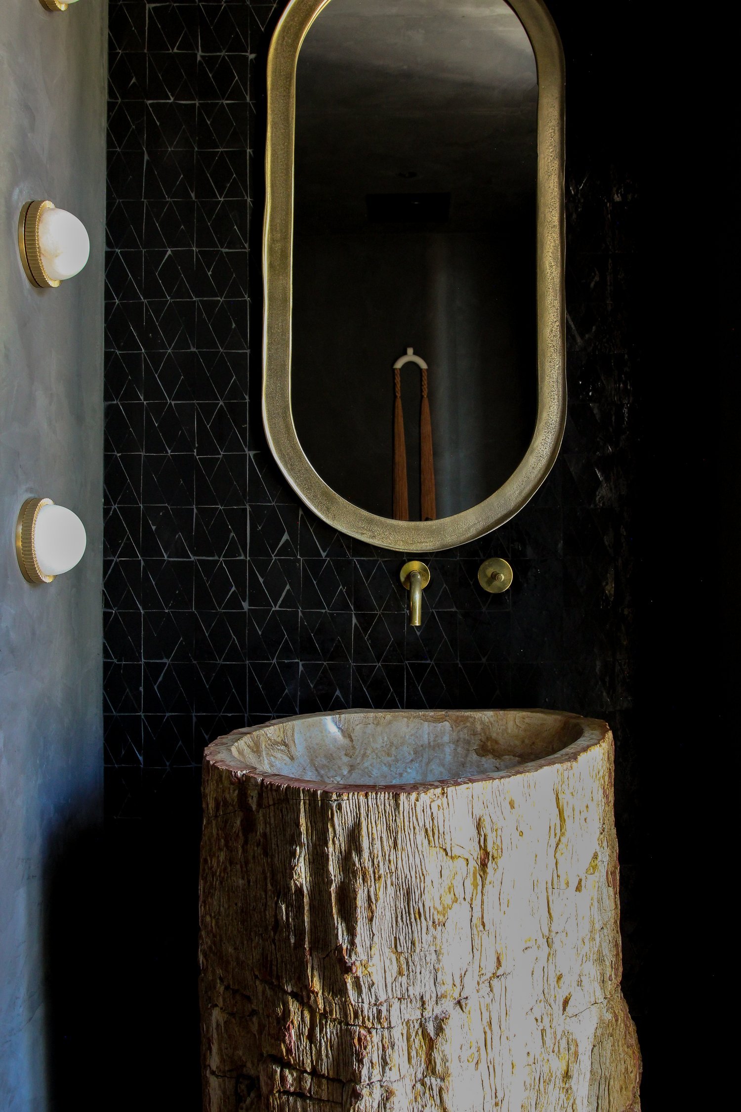
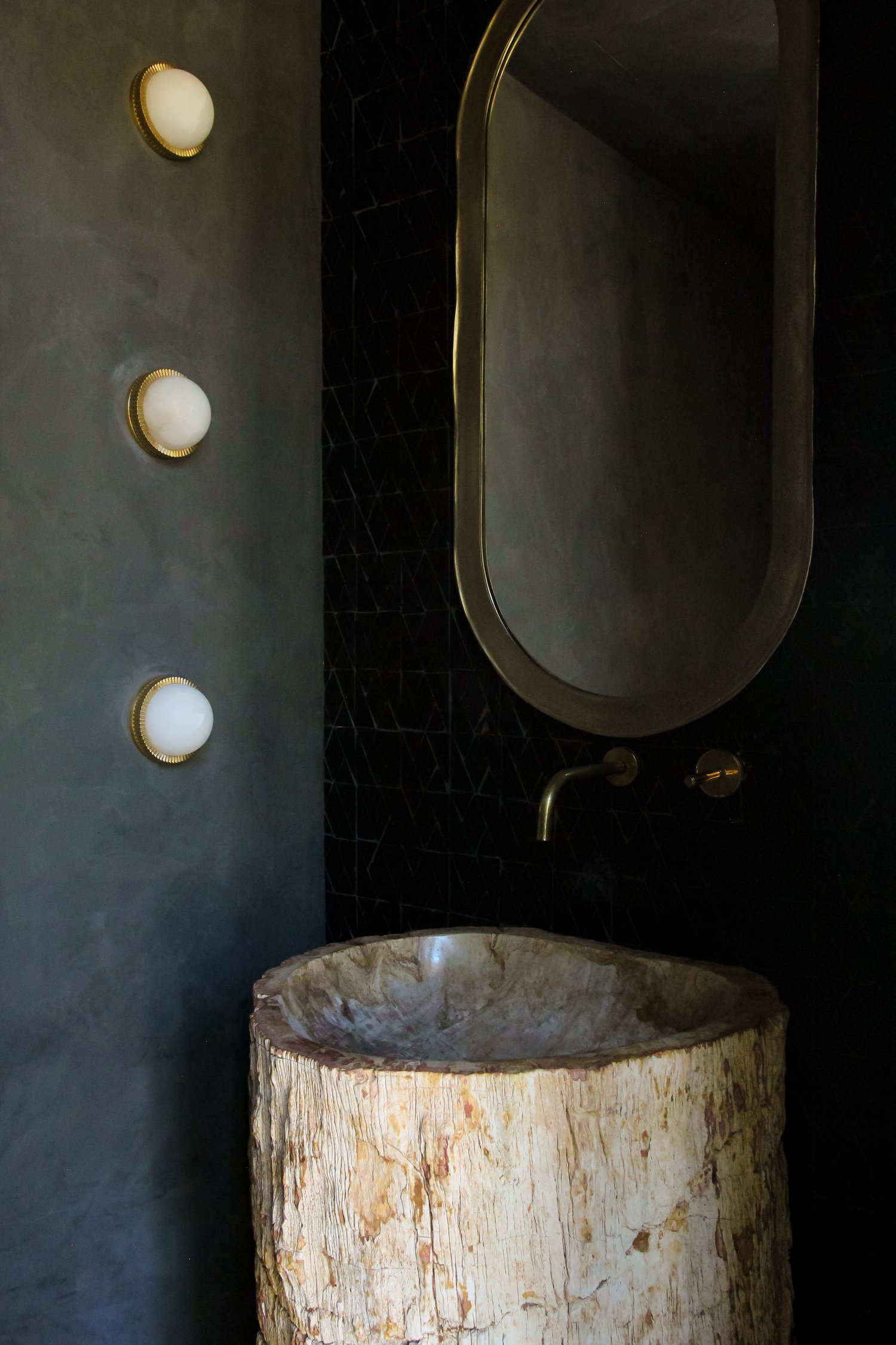
There is so much to love about this moody powder room by Homme Boys (like the Roman Clayed walls or that petrified wood sink) but the stacked bulb sconces are hard to beat. The sconces are from Hudson Valley Lighting, a retailer that is always ahead of the curve when it comes to lighting.
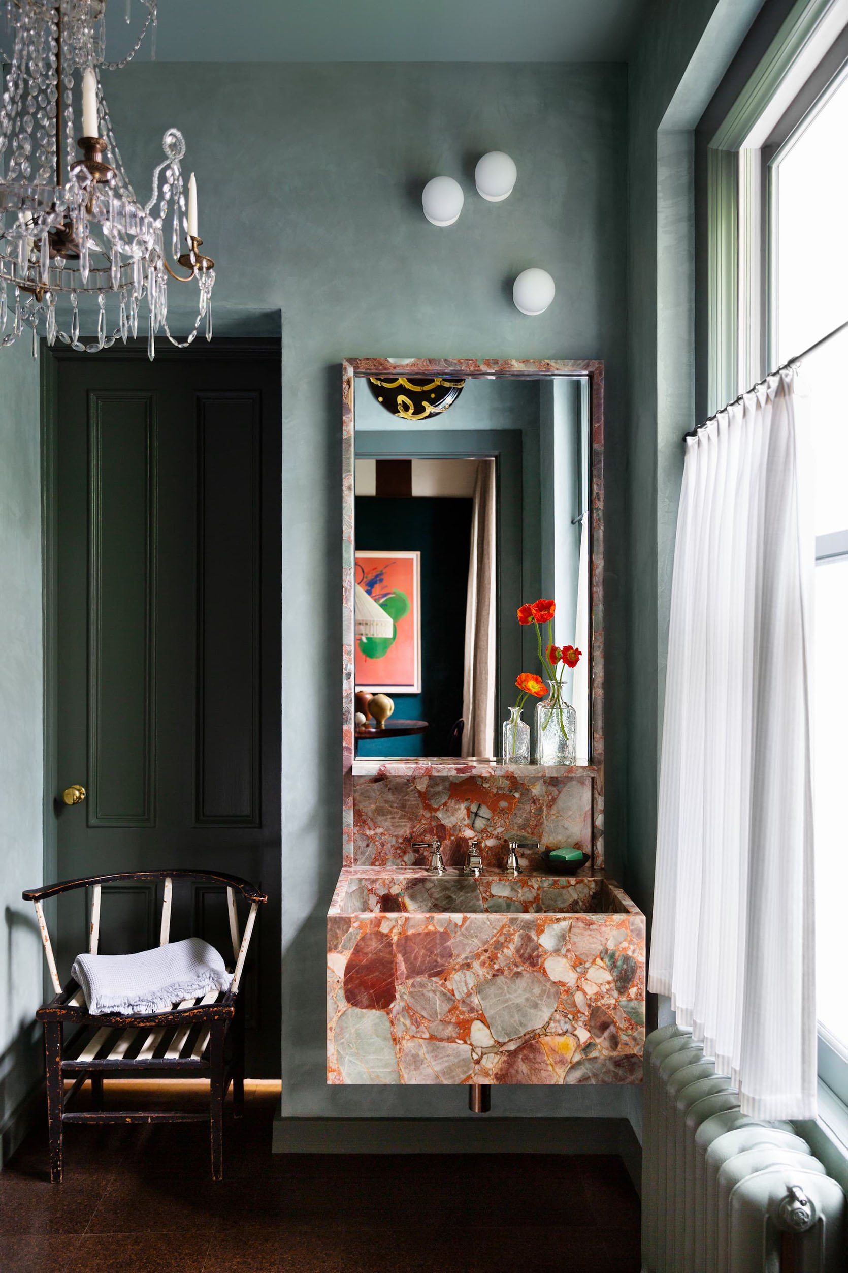
Okay, I rest my case. I can’t take my eyes off those three staggered sconces. It feels so artistic because the placement is perfectly odd and again, the asymmetry creates a special sculptural element. Can we/should we also talk about the chandelier and bulb light combination here??? I am stunned and positively delighted by the choice.
Exposed Shower Pipes
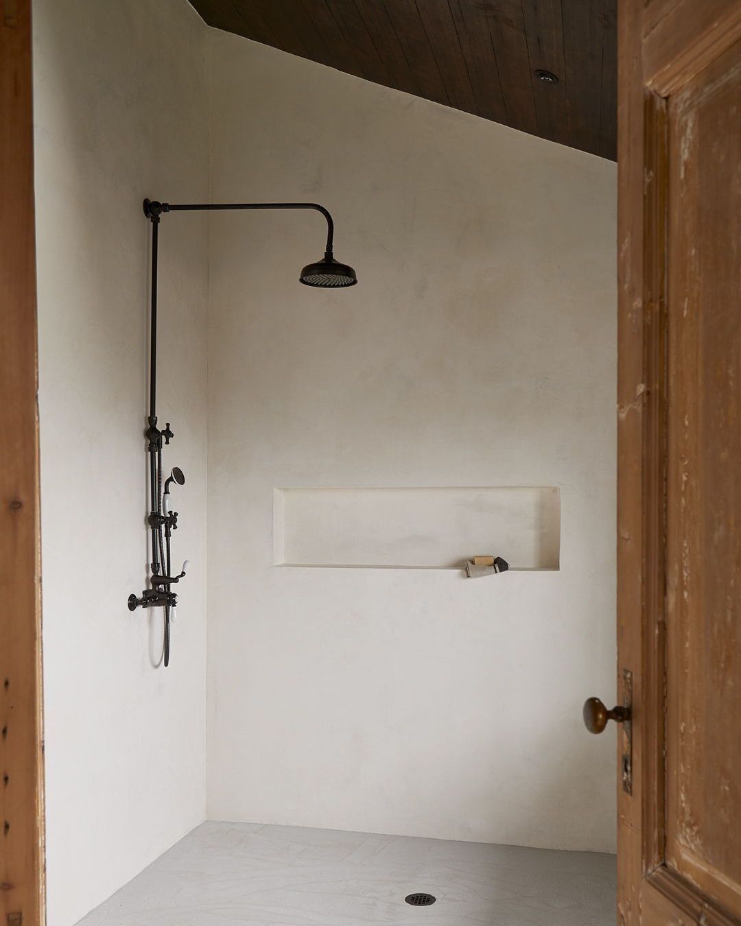
When Emily mentioned the exposed shower pipe trend in one of our meetings I started to see it everywhere and in the most surprising bathrooms. The above bathroom for example is incredibly minimal so the matte black pipes really stand out. With high-end spaces, the choice to opt for exposed pipes is really intriguing which is all the more reason to do it. It should also be noted that an exposed pipe is a lot cheaper than having to dig into the walls to install.
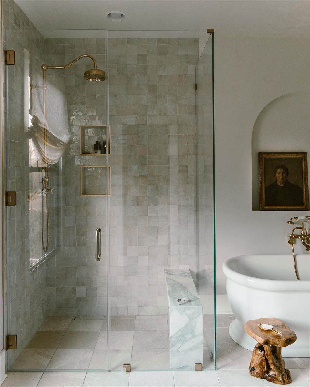
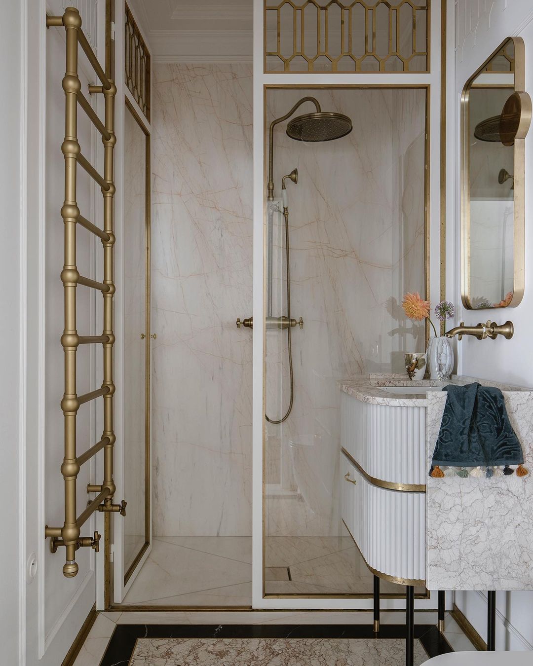
In this modern luxe bathroom, the shower pipes match all the brass elements so it feels less shocking and more cohesive. This brings so much more personality to the space while remaining modern and fresh.
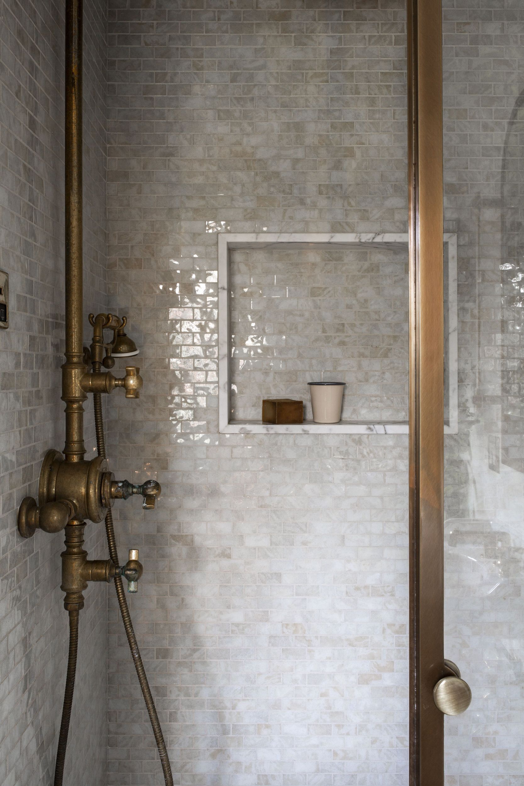
I’ll wrap up this trend with the above shower that blew me away. The modern staggered tiles paired with the vintage-inspired shower piping is a great way to combine styles and eras. It gives an industrial vintage look that feels very high-end and intentional.
Curved Backsplashes
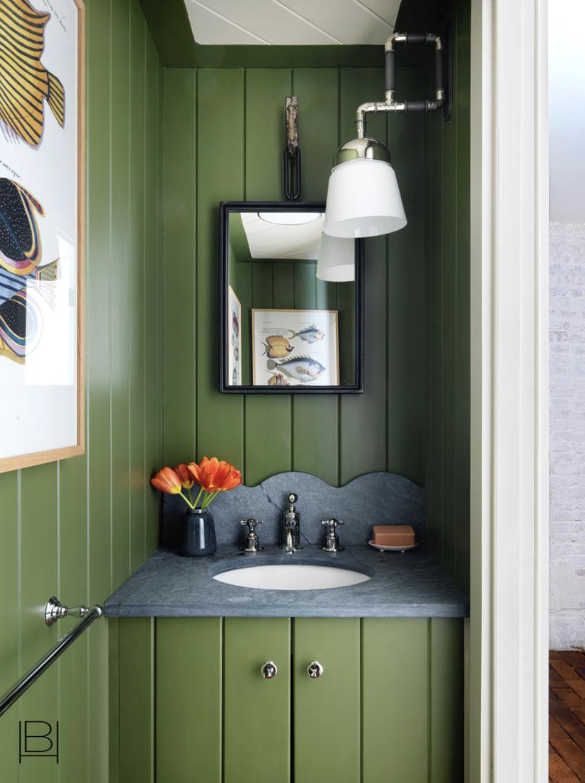
We don’t see a ton of traditional backsplashes nowadays but when we do they are often curved, scalloped, or arched. This scalloped number by Beata Hueman is undeniably fun which is a common theme among her designs. We love the scallop trend and predict it’ll stick around because we all are craving fun elements in our homes right now.
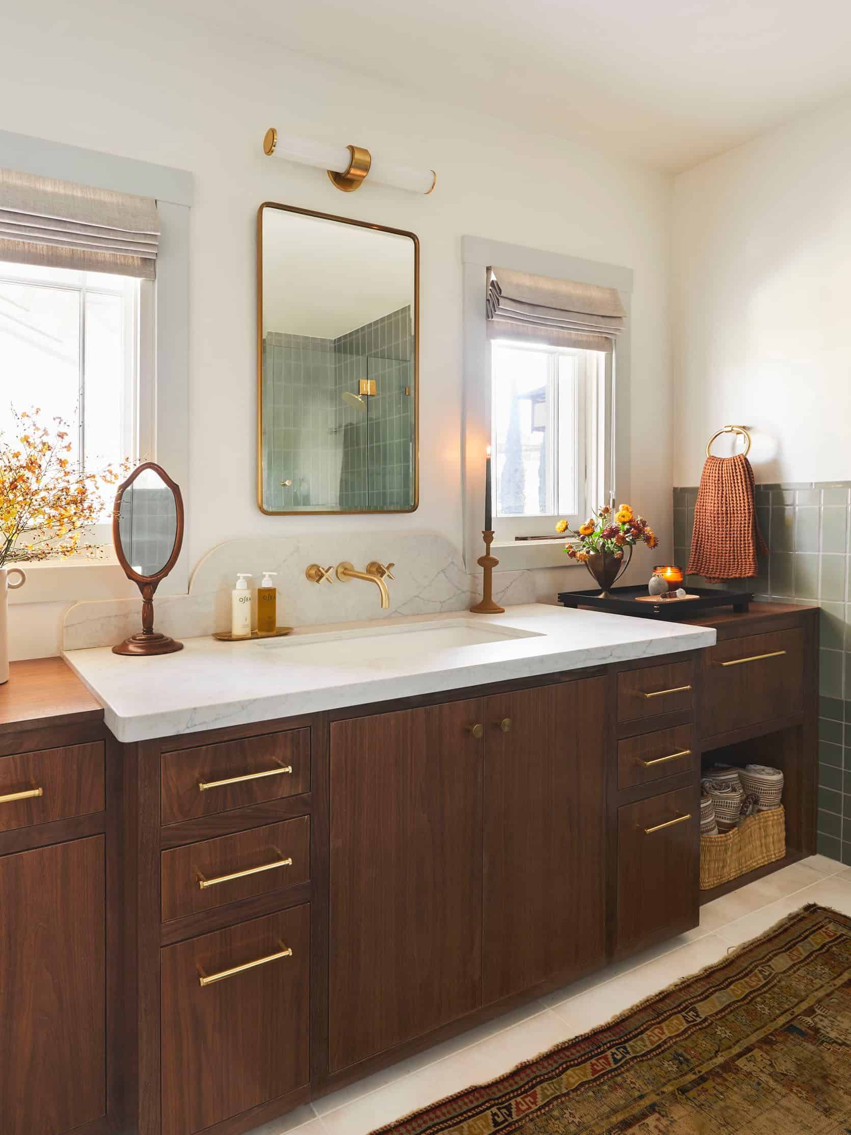
We love Julie’s application of the curved backslash in this modern traditional bathroom makeover. Julie said this about the choice: “The other vanity dilemma was how to make the wider, middle section feel purposeful since it overlapped with the two flanking windows. The solution was to create a beautiful two-tiered, curved backsplash moment using the Sereno Bianco from Vadara. This quartz stone is not only very user-friendly, it also has the most beautiful veining pattern in person making it one of our go-to quartz for our clients.” We’re obsessed.
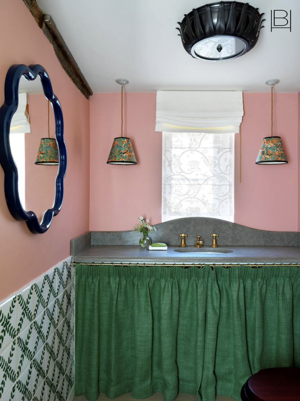
Here’s another backsplash by our gal Beata Heuman. We love how the curve of this backsplash flows over the window, bringing in an added layer of movement. The stone slab also breaks up the colorful decor elements, which adds a level of sophistication to this otherwise playful bathroom.
Corner Sinks
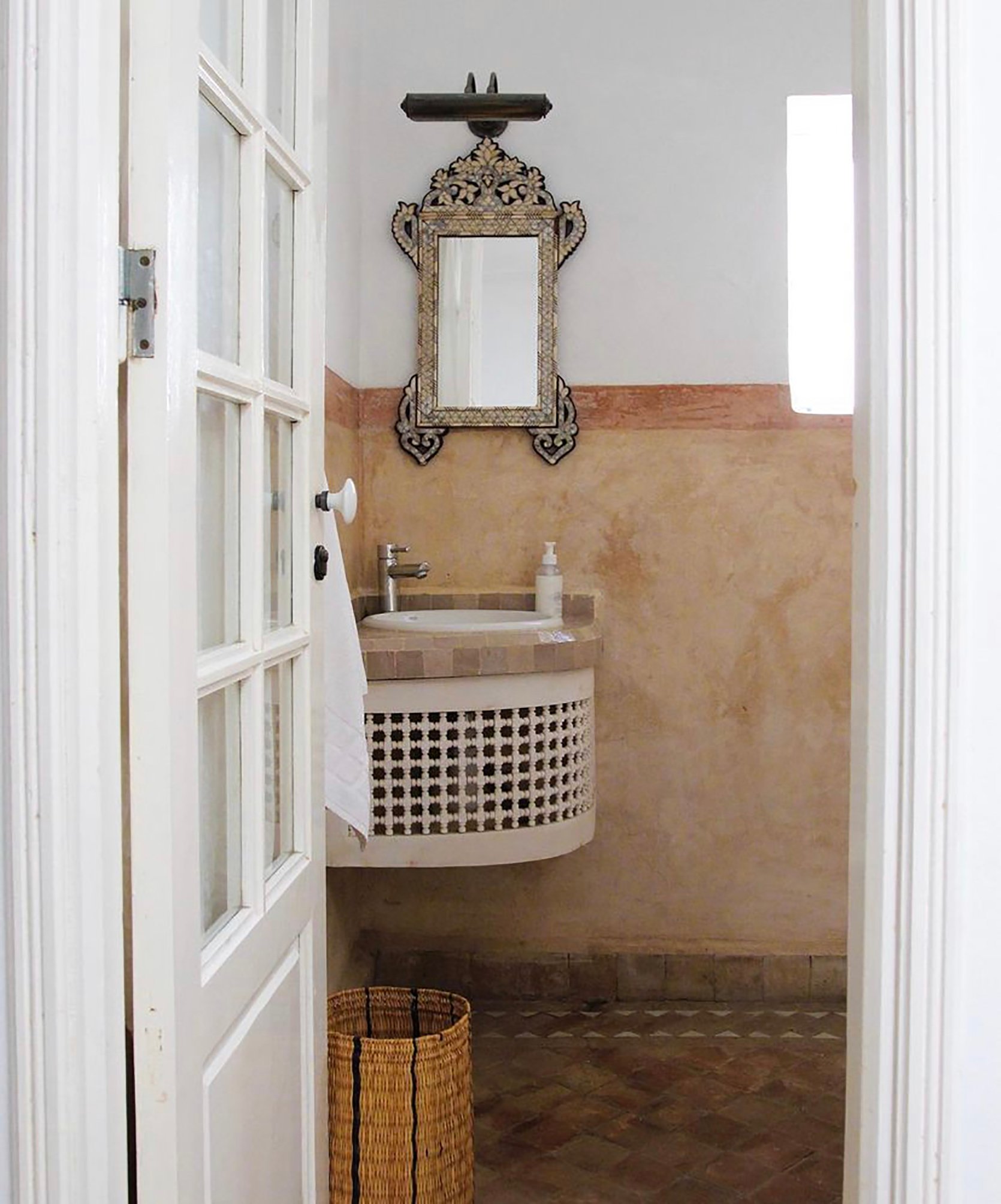
If you are renovating a small bathroom and are wondering where the sink will go, this trend is tailor-made for you. Corner sinks are not only space-saving, they add a certain vintage charm. It’s definitely ideal for a powder bathroom that doesn’t require a ton of storage, and man is it pretty.
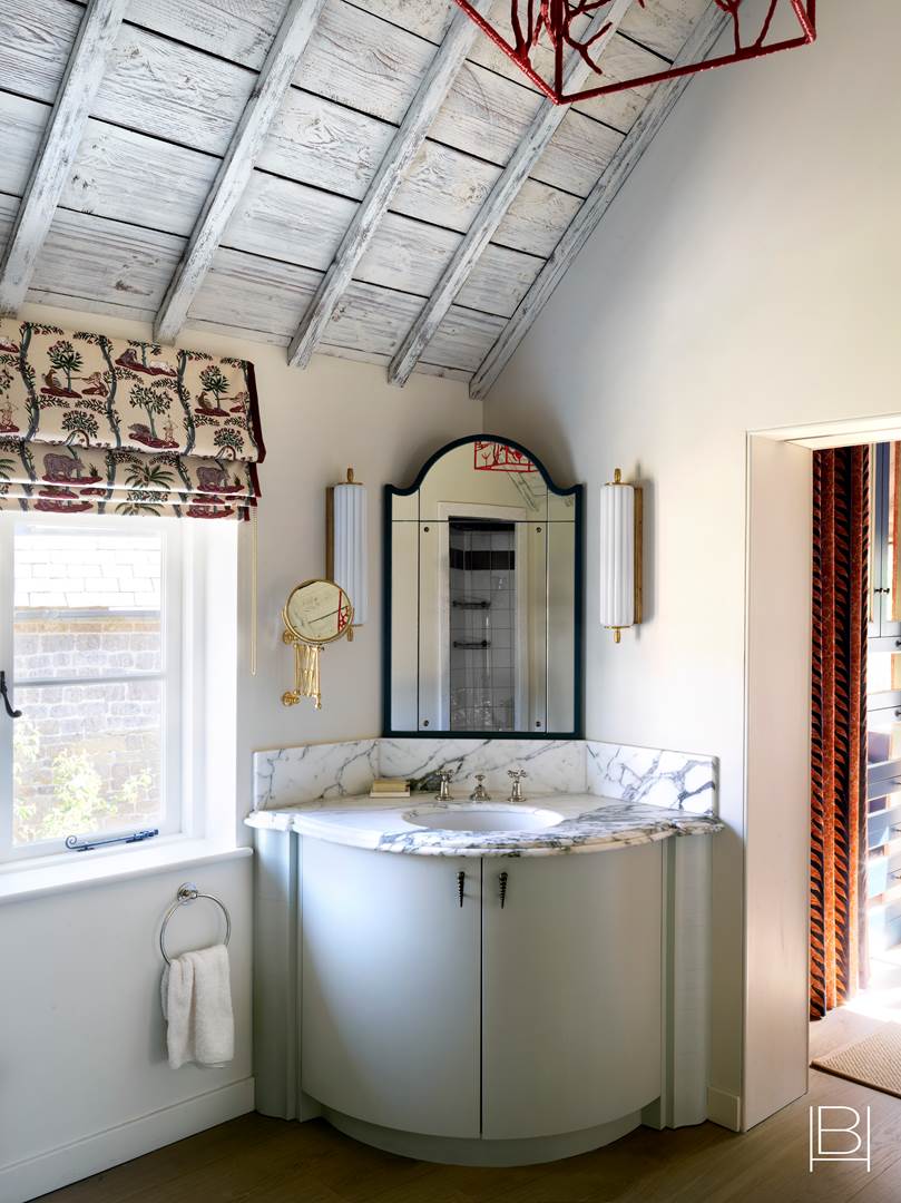
Beata Heuman flips the script by opting for this corner sink placement in a bathroom suite that (spoiler alert) has a whole other sink on the opposite side! I am never not in awe of her designs but this one left me speechless. So if you need permission to install a corner sink in a larger bathroom, this is undoubtedly it.
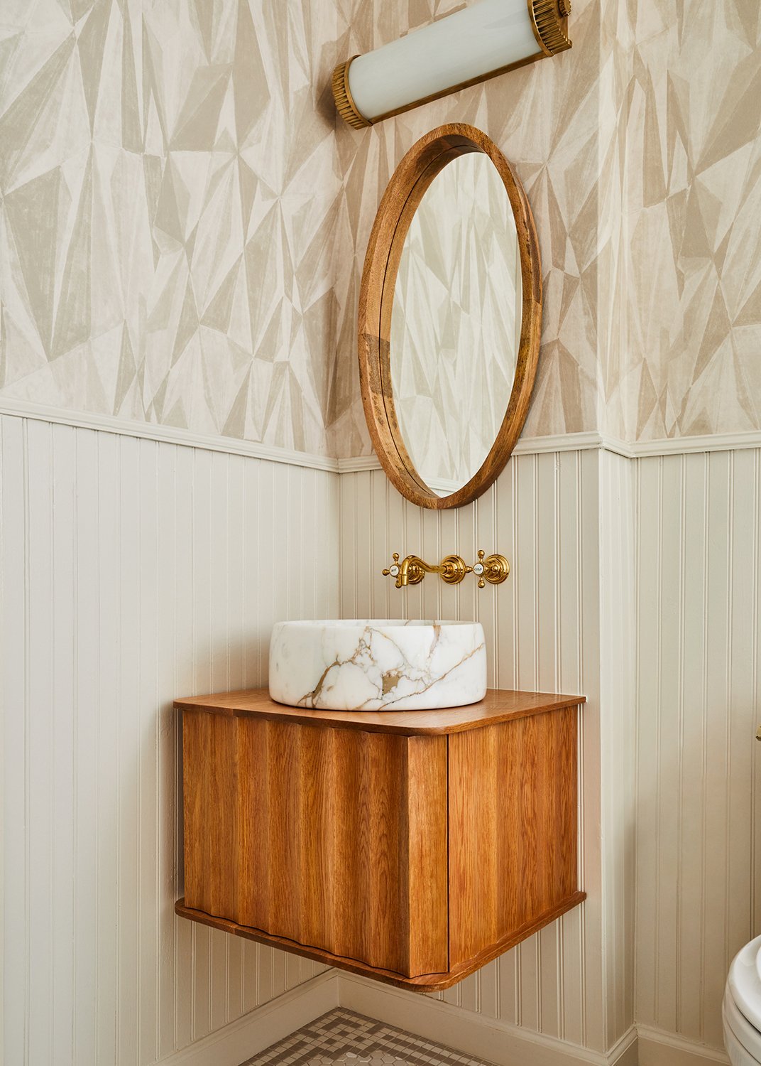
I leave you with this custom floating vanity by Sarah Sherman Samuel. It really is the perfect fit for this corner space and brings in a modern flair to this otherwise retro-inspired bathroom.
Okay my friends, this concludes our 2022 bathroom trends. I hope you enjoyed and let us know which trend (or trends) you love most down below. xx
Opener Image Credit: Design by Alexander & Co | Photo by Anson Smart | Styled by Claire Driscoll Delmar | Via Est Living
THIS POST WAS ORIGINALLY PUBLISHED HERE.

