If I had to rattle off a few of my favorite styling “moves” they’d be this: The open book on the coffee table (sculptural, yet horizontal), a footed bowl of pistachios (obviously), or maybe the casual throw breaking the line of the sofa base… but most of those are for photoshoots and don’t apply to life. But recently I was combing through the years of work (per my obsession with self-reflection), and I realized one thing I’ve always done that I do really think is worth pointing out – Stylists (including myself) put art in unexpected/weird places. It’s so easy, and it edges up a space instantly because there is something very irreverent about breaking the rules with your art placement. I’ve done it all over the houses I’ve styled and designed. And today I’m gonna show you how.
IN FRONT OF SHELVING
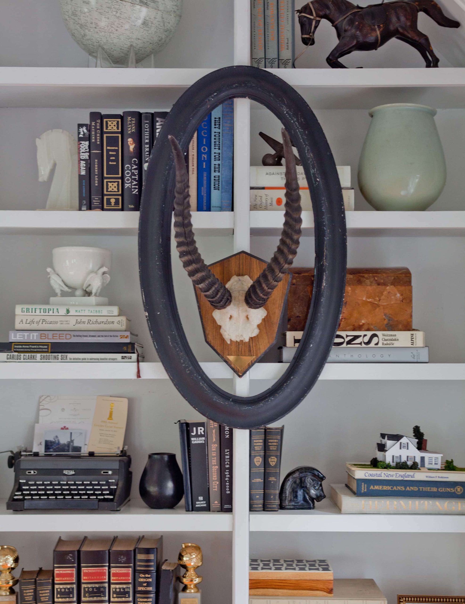
What I like about this, in particular, is the round shape breaking up the horizontal lines. It adds dimension, in a rebellious way. As I struggle with my own built-ins (which aren’t as cool, as they are so shallow) I recently threw up a painting on my shelving (for Christmas) and BOOM, I loved it.
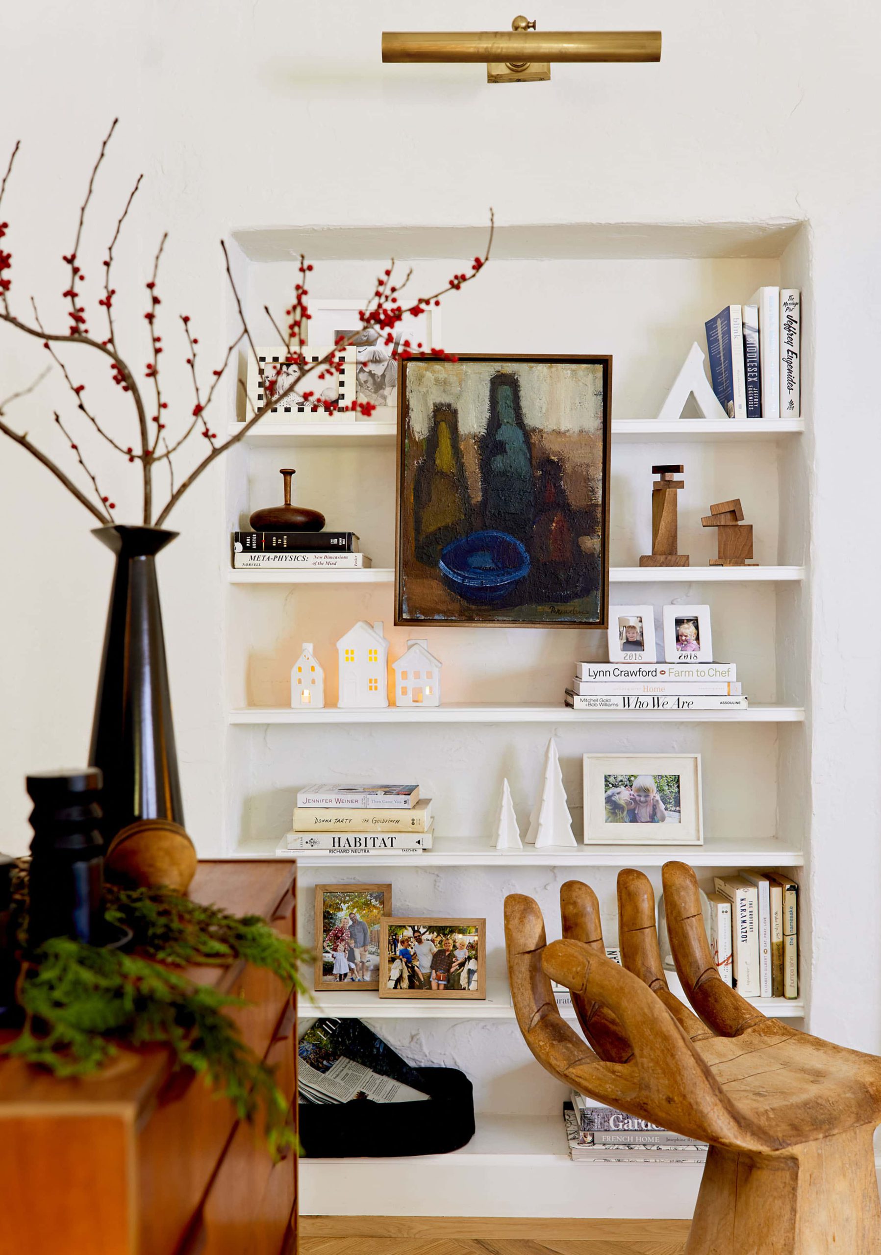
There is just a “please don’t tell me where I’m supposed to be. I’m cool hanging right here, thank you!” thing about it.
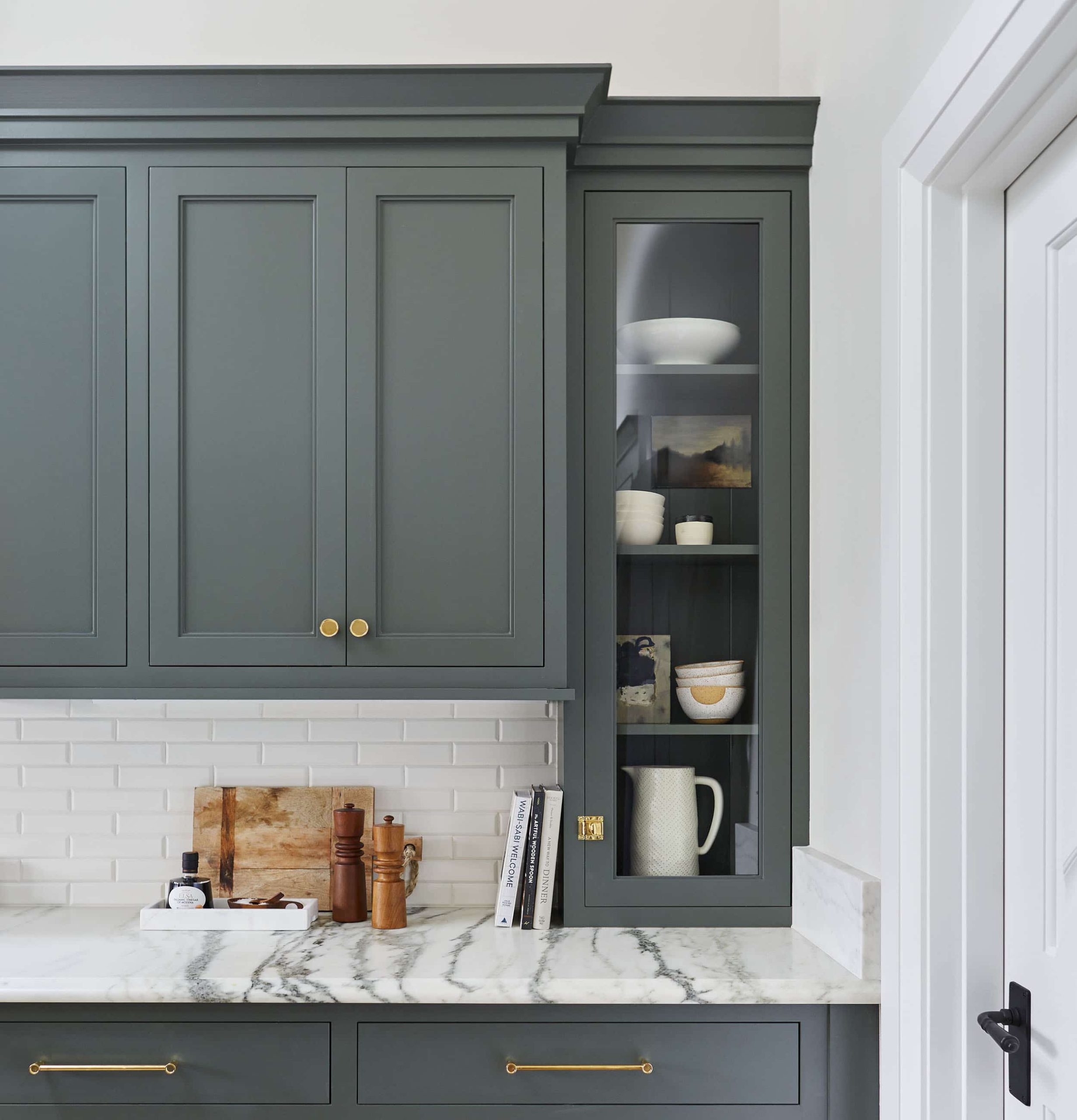
It can be little, and you can hang or lean, but what a nice secret surprise it is to open a cabinet and see a piece of art. This is best done in a glass cabinet so you don’t literally hide it, but you get it – a secret piece that just feels cool and unexpected.
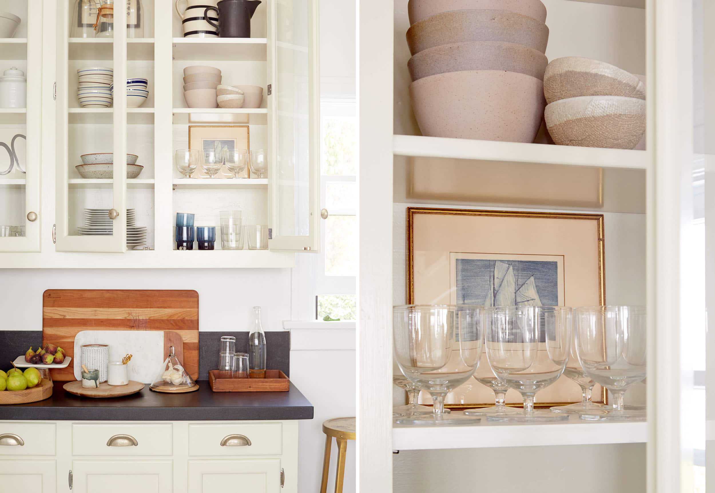
But there is more good news. There is another great place for “kitchen art” to be displayed and it’s not just behind a cabinet door.
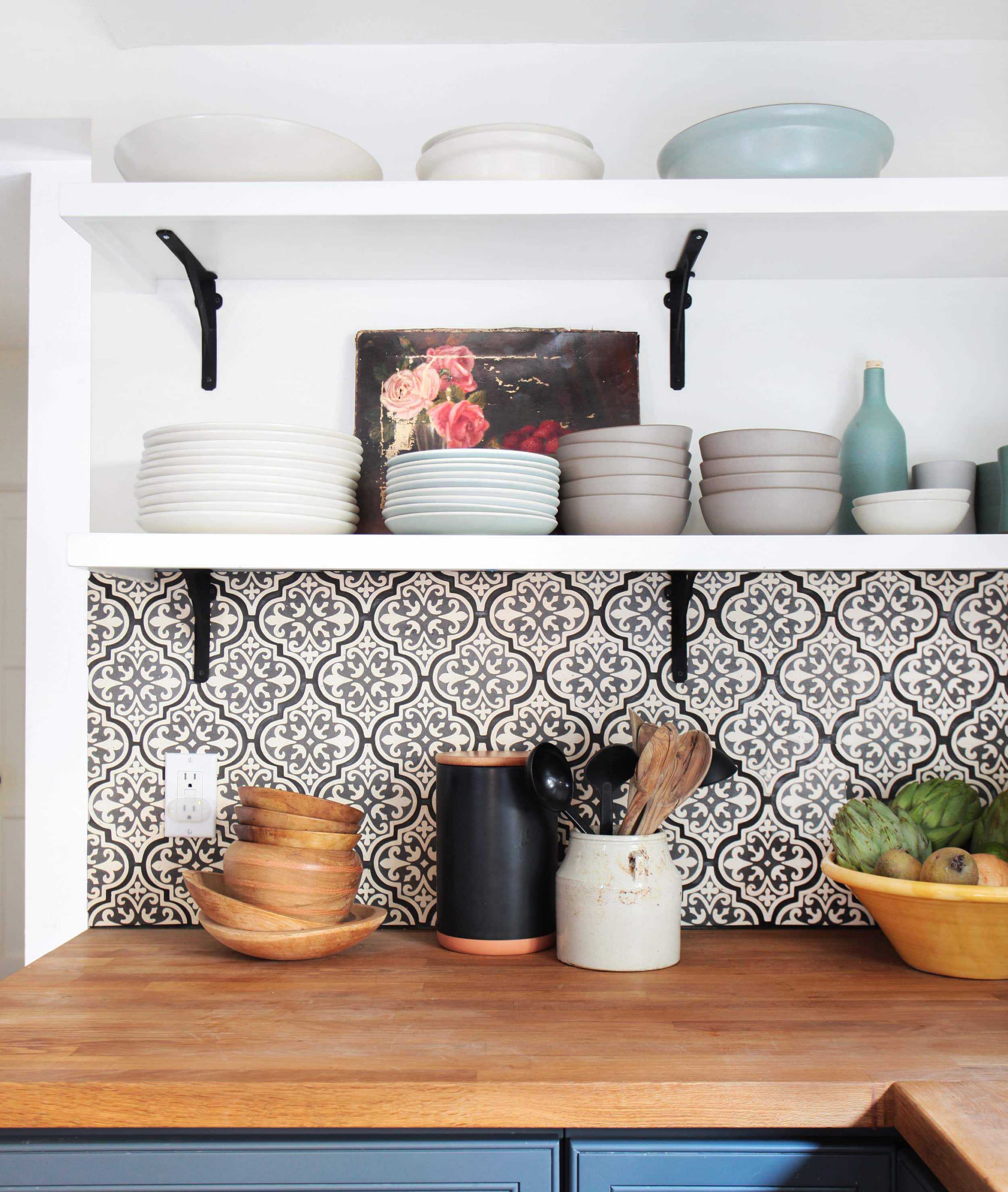
Nay, this art can also live on open shelving behind plates and bowls.
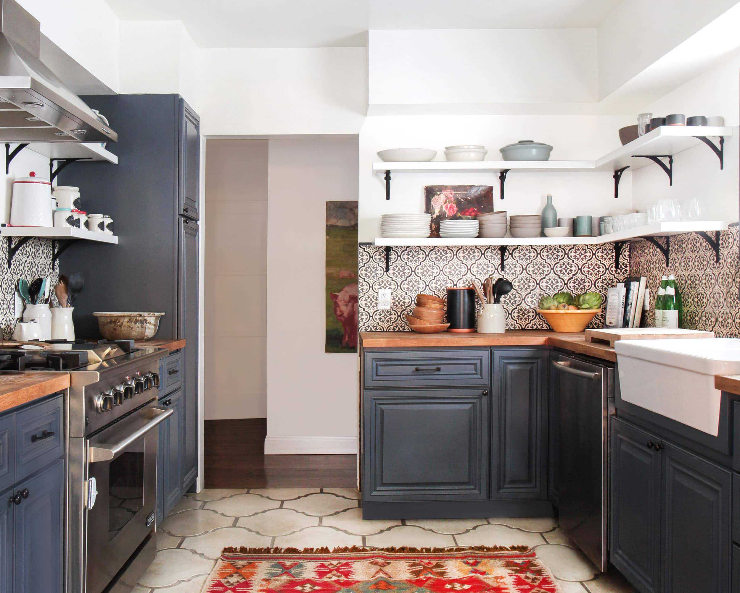
Now while this may seem obvious, people just don’t typically consider art for the kitchen and I think it’s a missed opportunity. Please try it, because it’s awesome and fun.
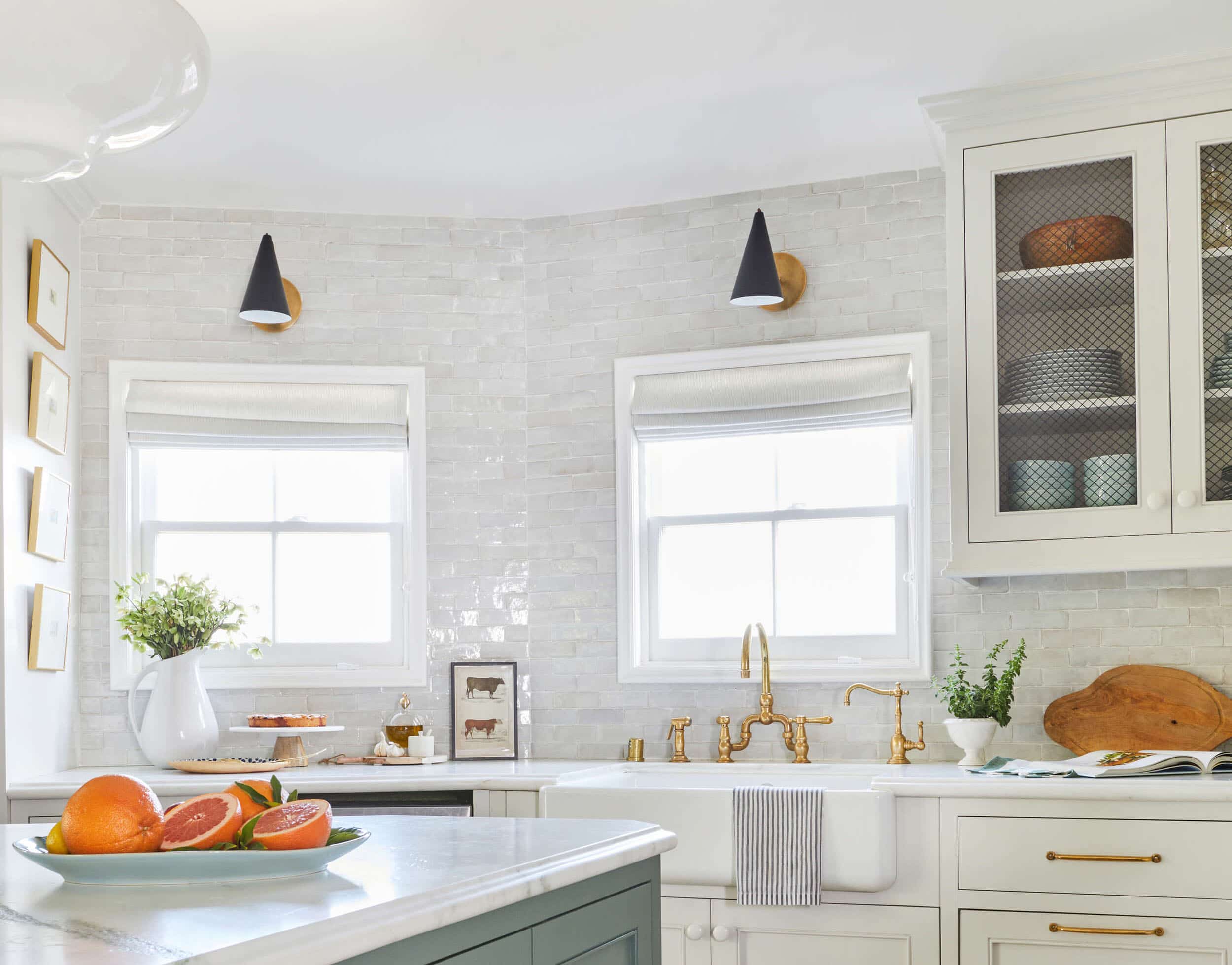
It’s true that I have too much art and not a lot of wall space. It’s also true that I have a lot of small art that is easy to pick up at the flea market, but hard to style on walls unless you are doing a big ‘ole gallery wall. So where do you put this art? In the kitchen and bathrooms of course 🙂
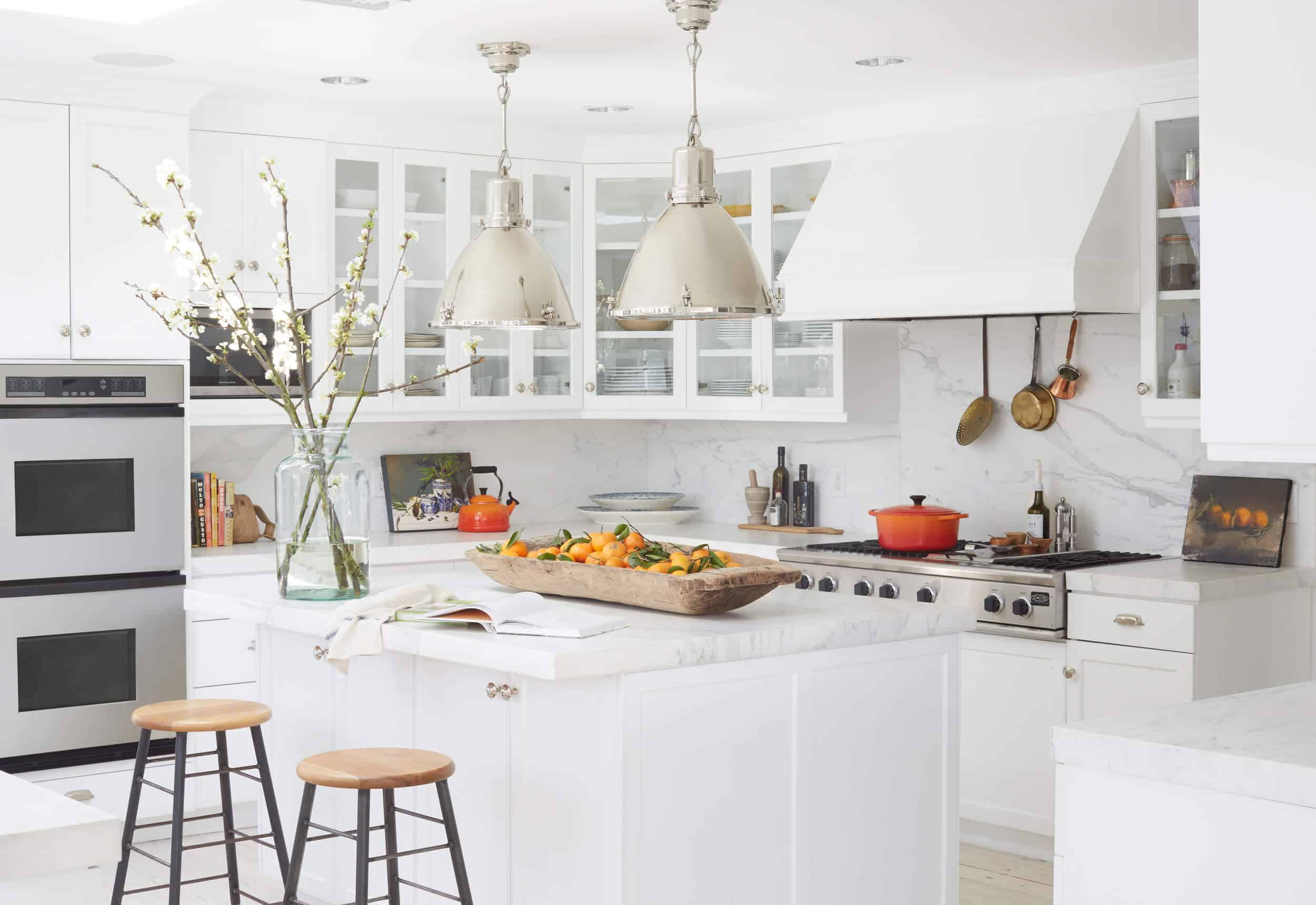
HOT TIP: Buy oranges, then commission a painter to paint a still life portrait of your oranges (like above), and then display said portrait on a kitchen counter so they can feel celebrated. (Another styling hack? Buy generic oranges then go outside and cut leaves that look like citrus leaves and gently place them in the most MASSIVE dough bowl so they look like you just picked them from your backyard orchard. True story.)
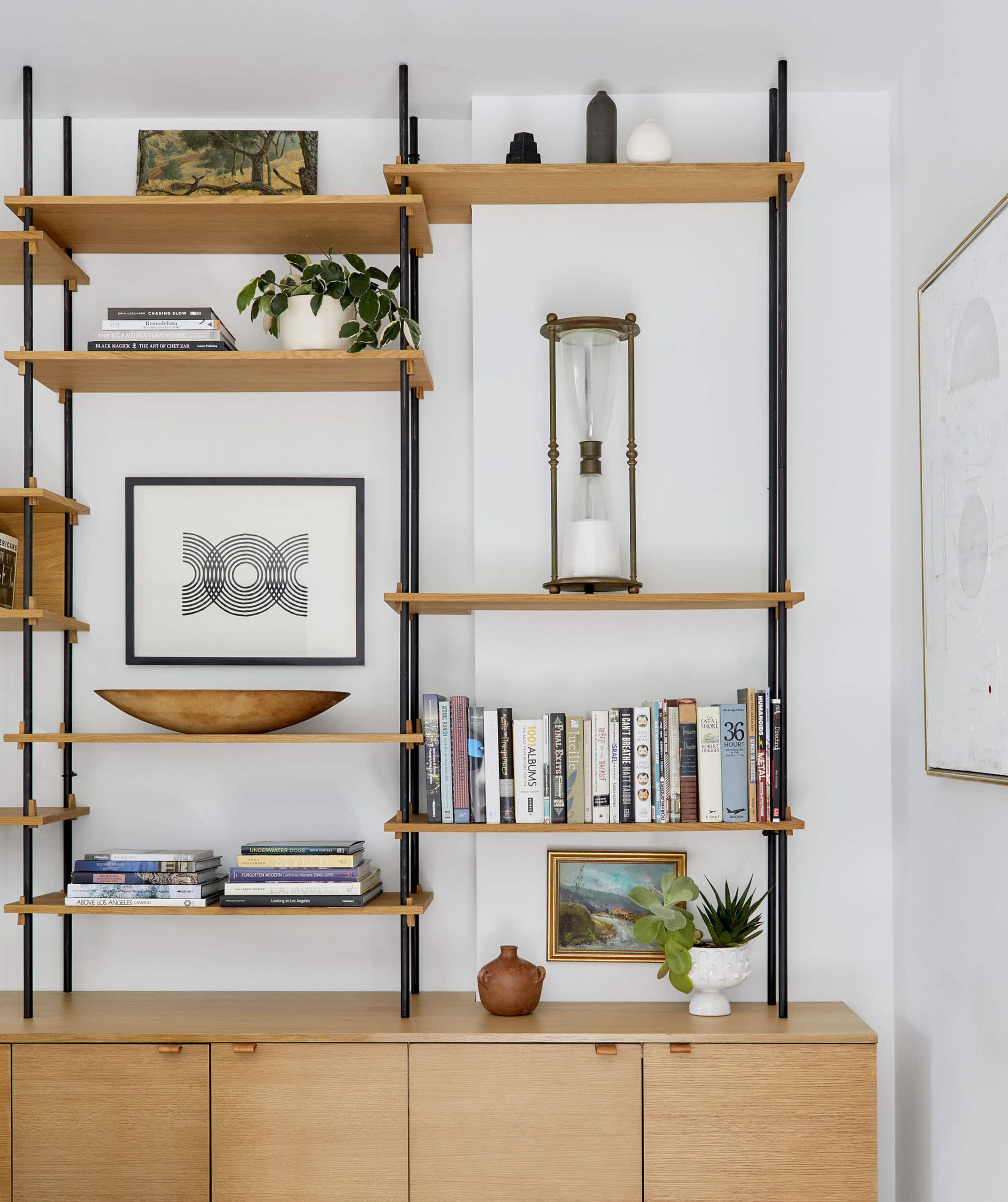
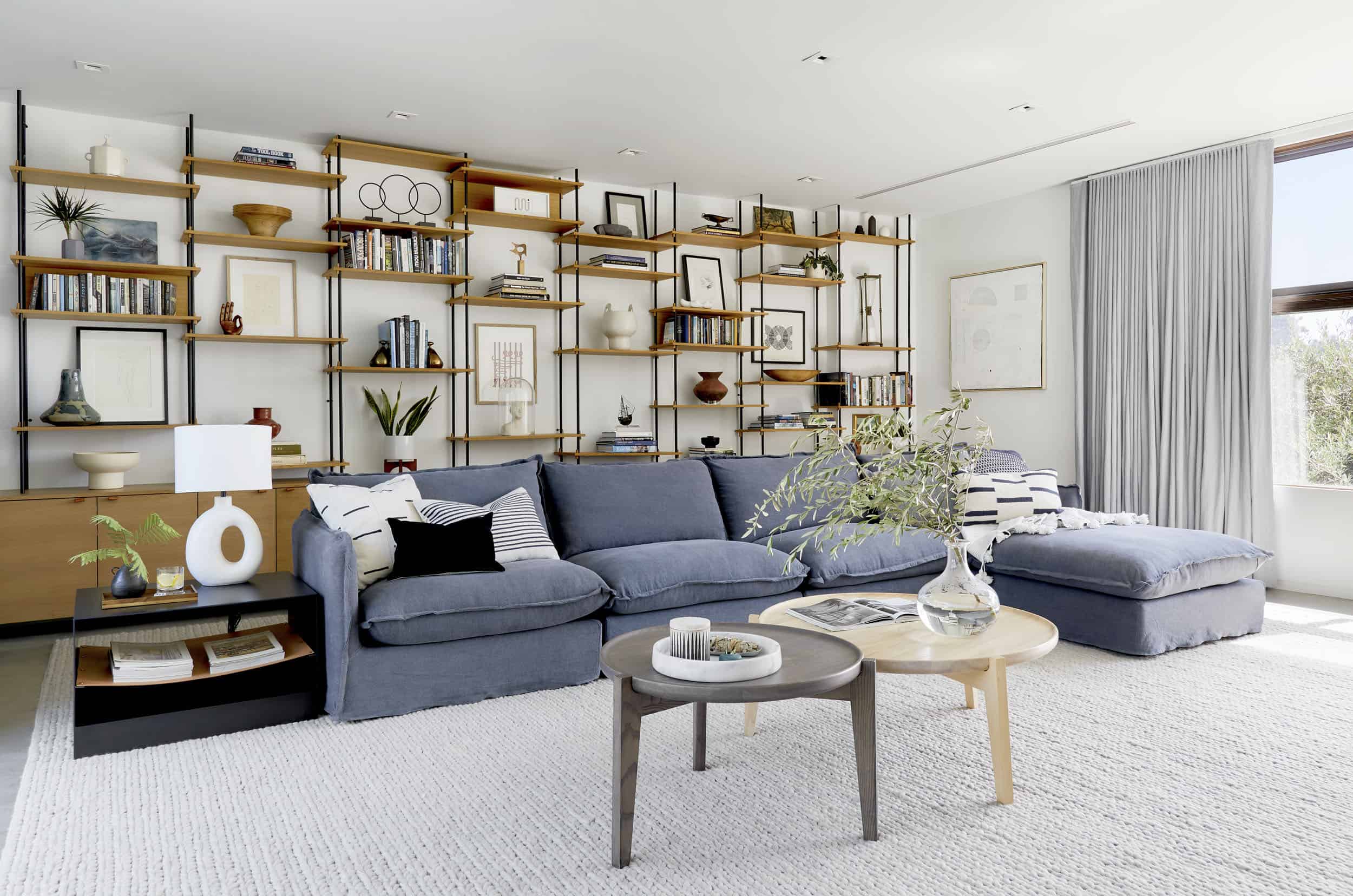
Bookshelves are often very hard to fill out, while not looking crazy busy. Corbett (my dear friend) was STUMPED on her selves (see above… and below). So my team came in and helped her by adding in art so that it didn’t look empty, nor busy. It’s graphic and takes up a lot of vertical space so you don’t have to fill it with tall books or sculptures.
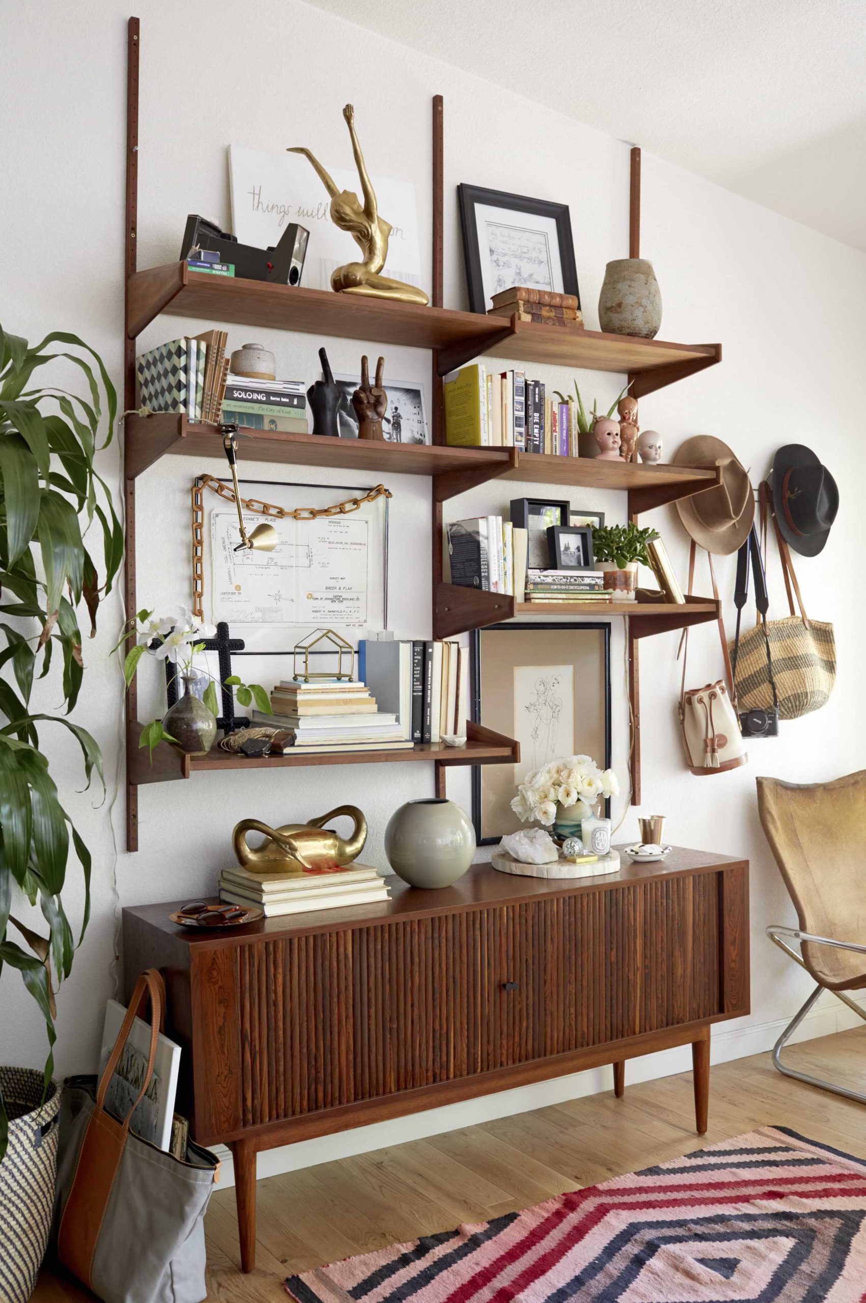
Sally Breer (above), stylist and designer, put those large pieces in those large gaps and we all said YES, when we shot the first book (STYLED) there.
But art in shelving isn’t too controversial… you know what is? Art that is almost on the ground. Art is technically supposed to be at eye level, and these next pieces certainly are not.
“TOO LOW”
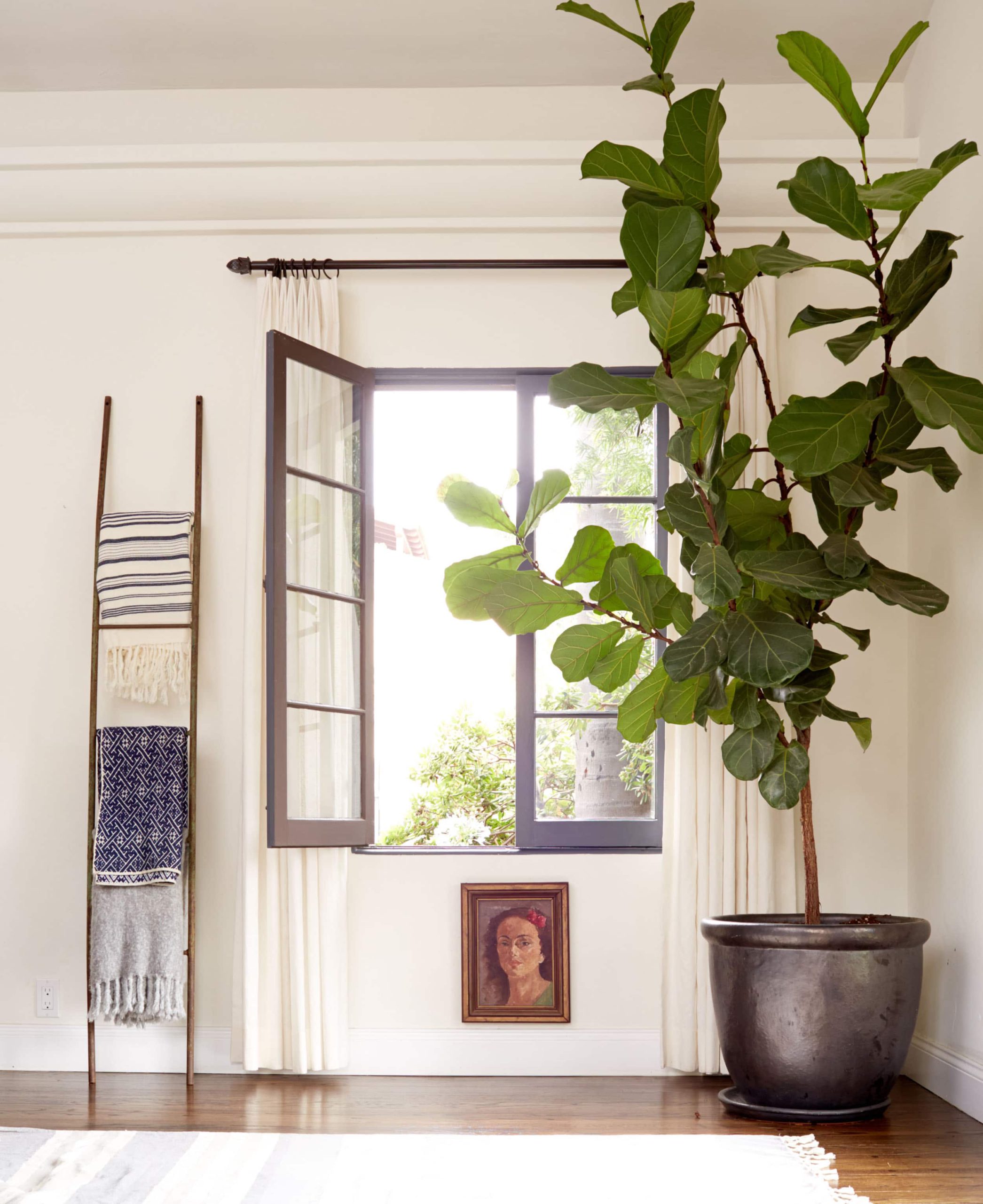
WHY NOT? That lady had to go somewhere and while I realize that it’s weird and breaks so many rules, that is a lot of what styling is about – less perfect design, more creative expression. You aren’t perfect, neither should your house be.
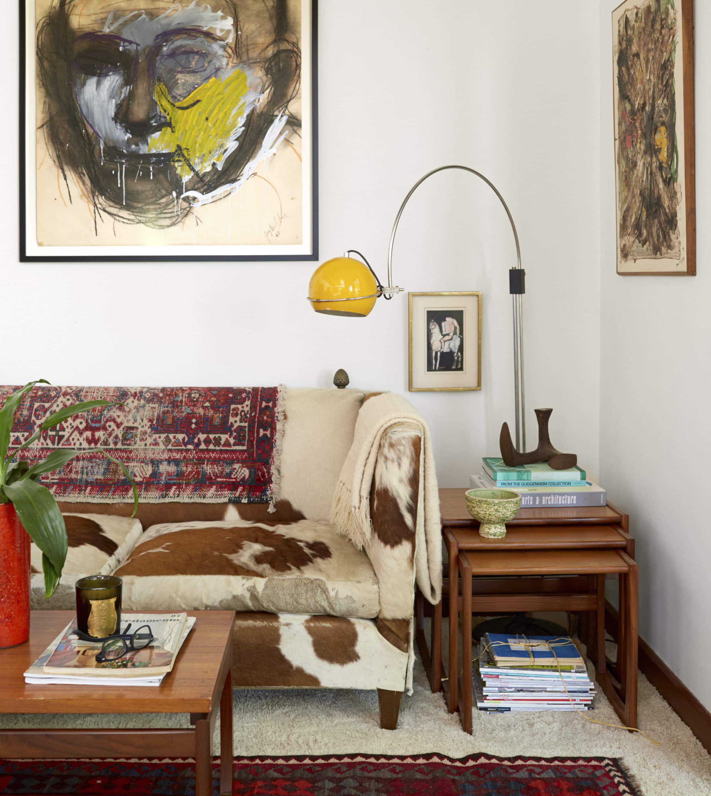
The big art on the wall is expected, sure, but then we styled the little one by the sofa to shake it up.
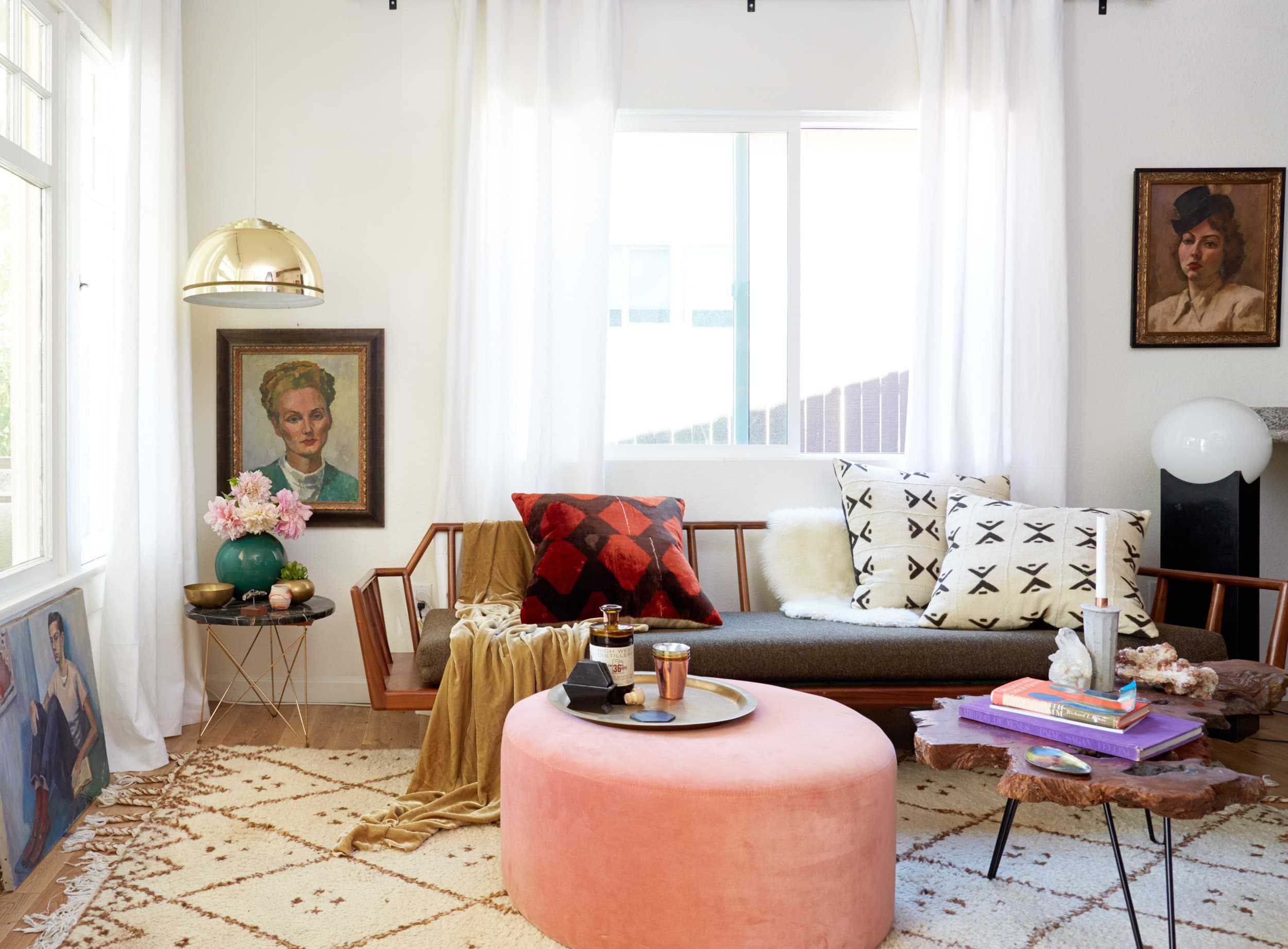
I don’t remember if I styled Sally’s art that way or if she did, but either way, you can see that the portrait is low to clear the light fixture, and there is another piece just sitting under the window.
Which brings me to…
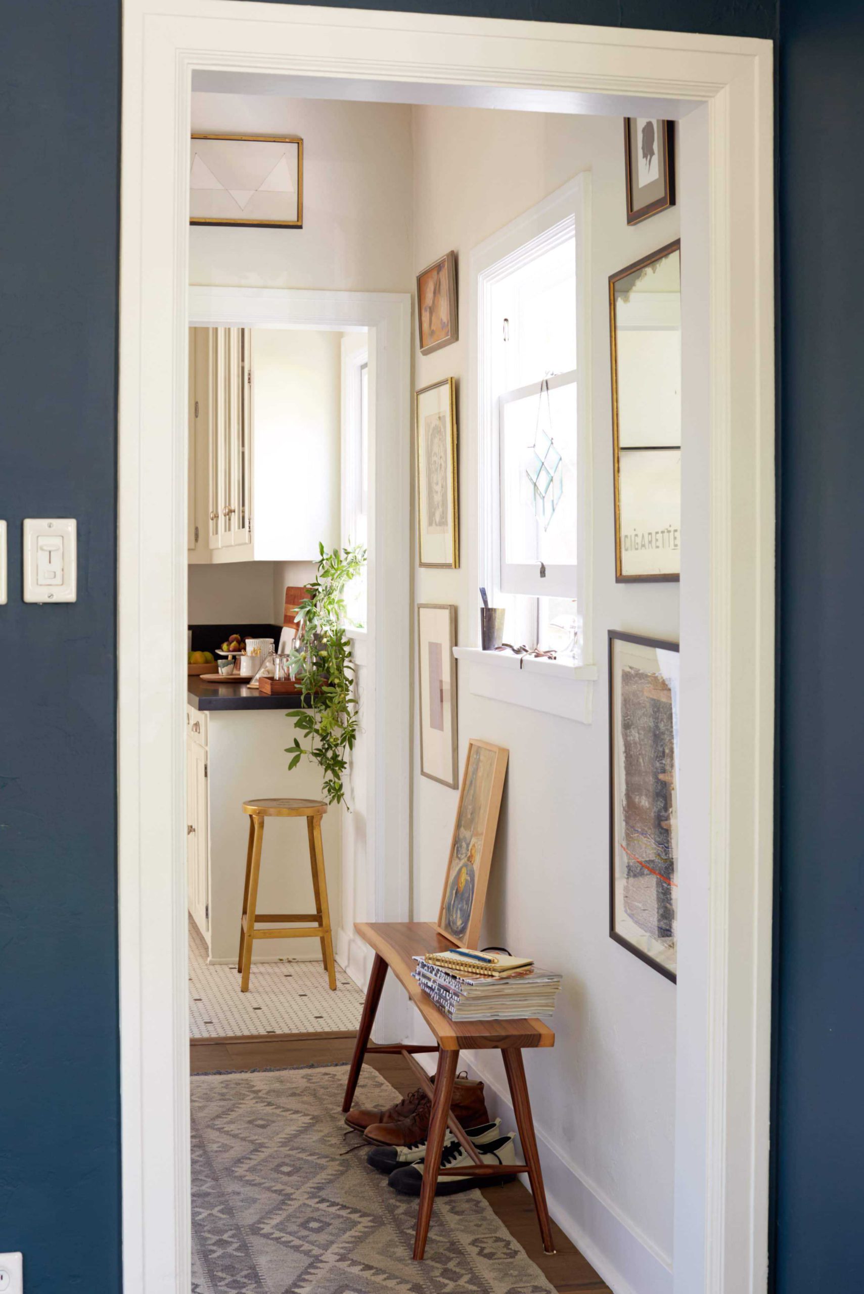
I used to only lean art. I was an “exclusive leaner” you could say, mostly out of commitment issues. It’s kinda a stylist thing – too much art, not decisive enough. But I like a mix leaning and hung art as you can see in the above and below.
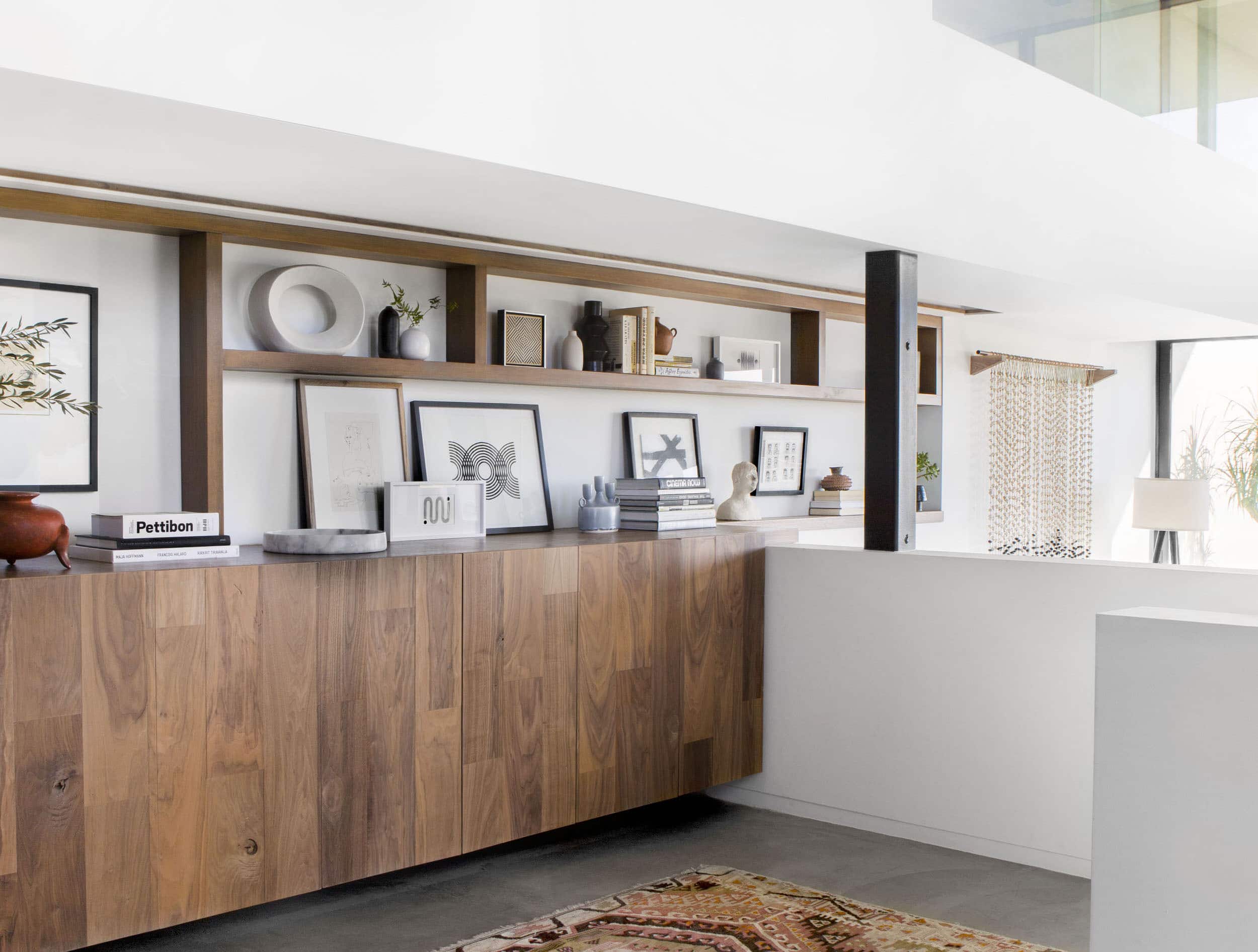
It obviously allows for flexibility as well as different heights and the ability to layer.
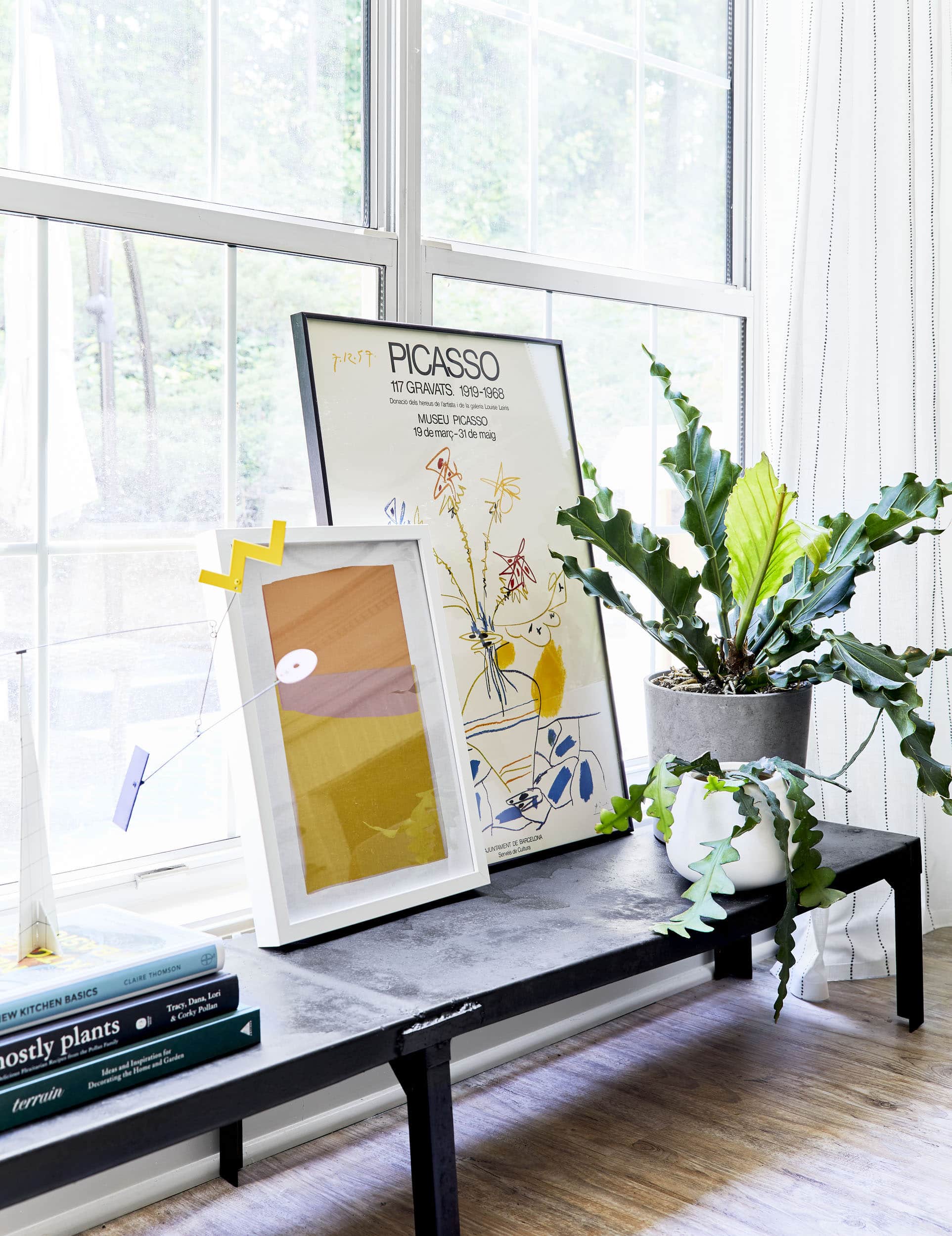
In Atlanta, we mixed both “the casual lean” and the “in front of a window” breaking TWO big art rules, but I personally think that it looks awesome. If your windows are big and you can sacrifice the light, then it’s absolutely ok to do (but keep it smaller and of course not super dark).
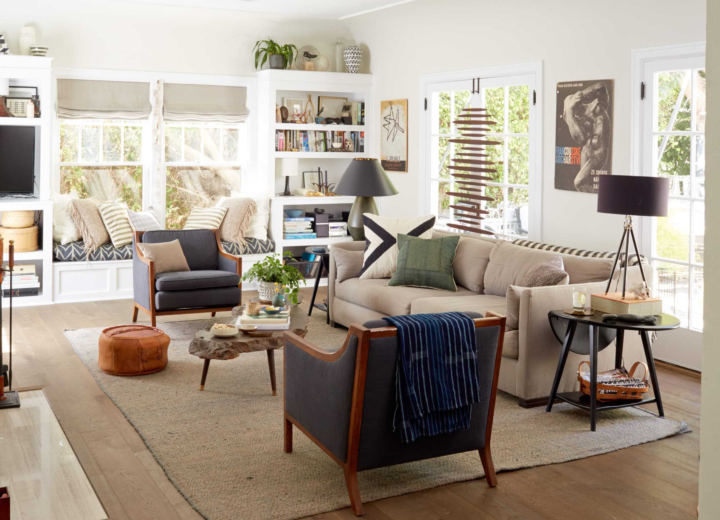
My stylist friend, Scott, hung a sculpture in front of his french doors on the latch, simply because he felt like it (and yes, before everyone in the comments asks, that’s a vintage wood piece). Use those types of feelings because if you don’t like it, you won’t get arrested and even better – you can simply take it down.
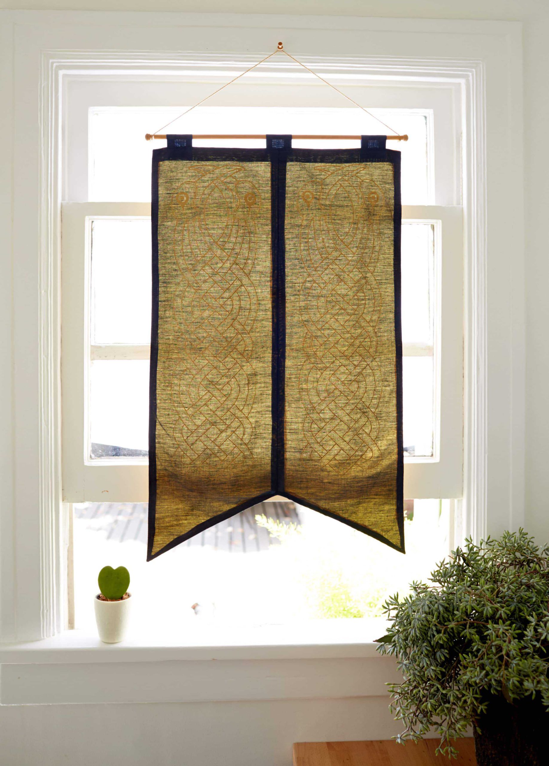
He also hung a pretty flag to block the sun in his office/desk area and it’s so much less expected than a window shade.
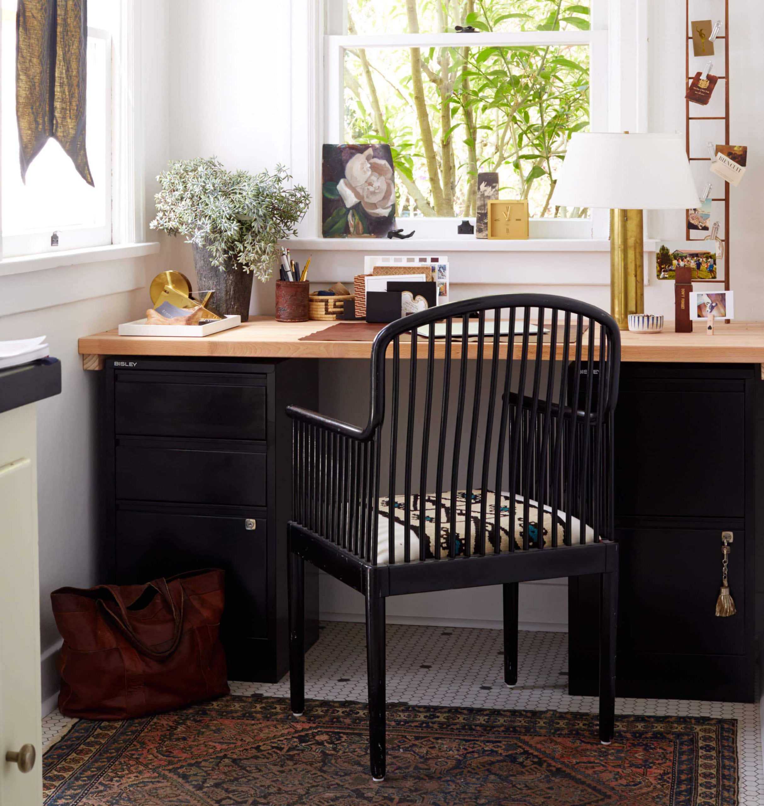
The “art in front of the window” is bold, indeed. But it’s a move that allows your eye to move around more and gives another place for your art to be showcased – especially when it’s in front of a desk, or at a sink windowsill.
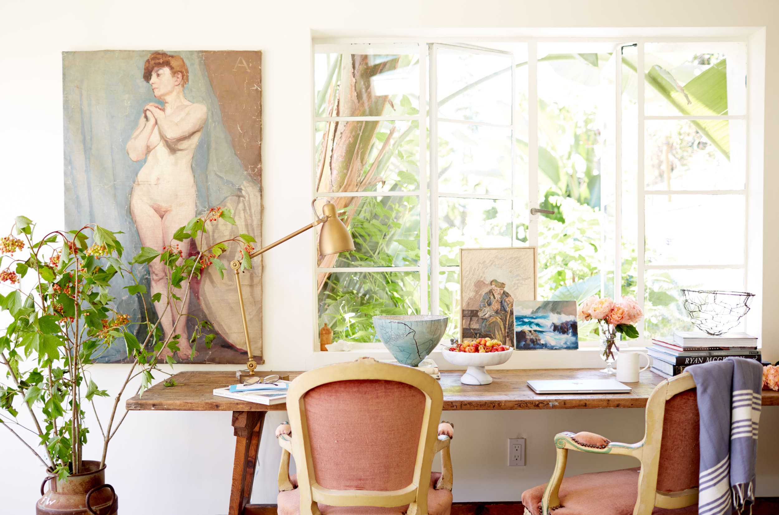
When I proposed this post I was met with a “do you have enough examples to make this a post?” and look at that. I did. Sometimes when I’m met with resistance on something and then I end up being right I like to yell, “WELL, WHO WON DESIGN STAR?” I’m OBVIOUSLY joking, my team is usually right. Plus, these moves wouldn’t have played out too well there, anyway…
Thoughts? Anywhere else you like to hang your art to prove how eccentric you are?
Opening Image Credits: Photo by Bethany Nauert | From: FDR Chic – A Dude’s Mix of Antique, Mid-Century and Bohemian Style
THIS POST WAS ORIGINALLY PUBLISHED HERE.


