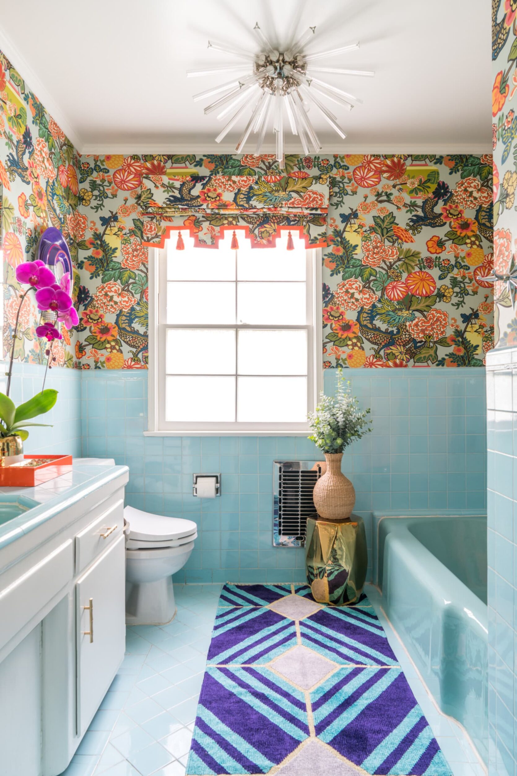
Welcome to my new favorite day of the week: TRIVIA TUESDAY. Today’s mission: we’re going to review 17 classic wallpaper and fabric patterns that I can all but guarantee you’ve seen before. The goal: one day you will offhandedly point at an Instagram post, film set, magazine spread, or some other form of media and you will be able to say, “oh, that? That’s (insert impressive knowledge of specific timeless pattern here).”
Let’s jump right in with a freebie, yeah? (And keep track of all the patterns you recognize – I want to know how many are familiar to you!)
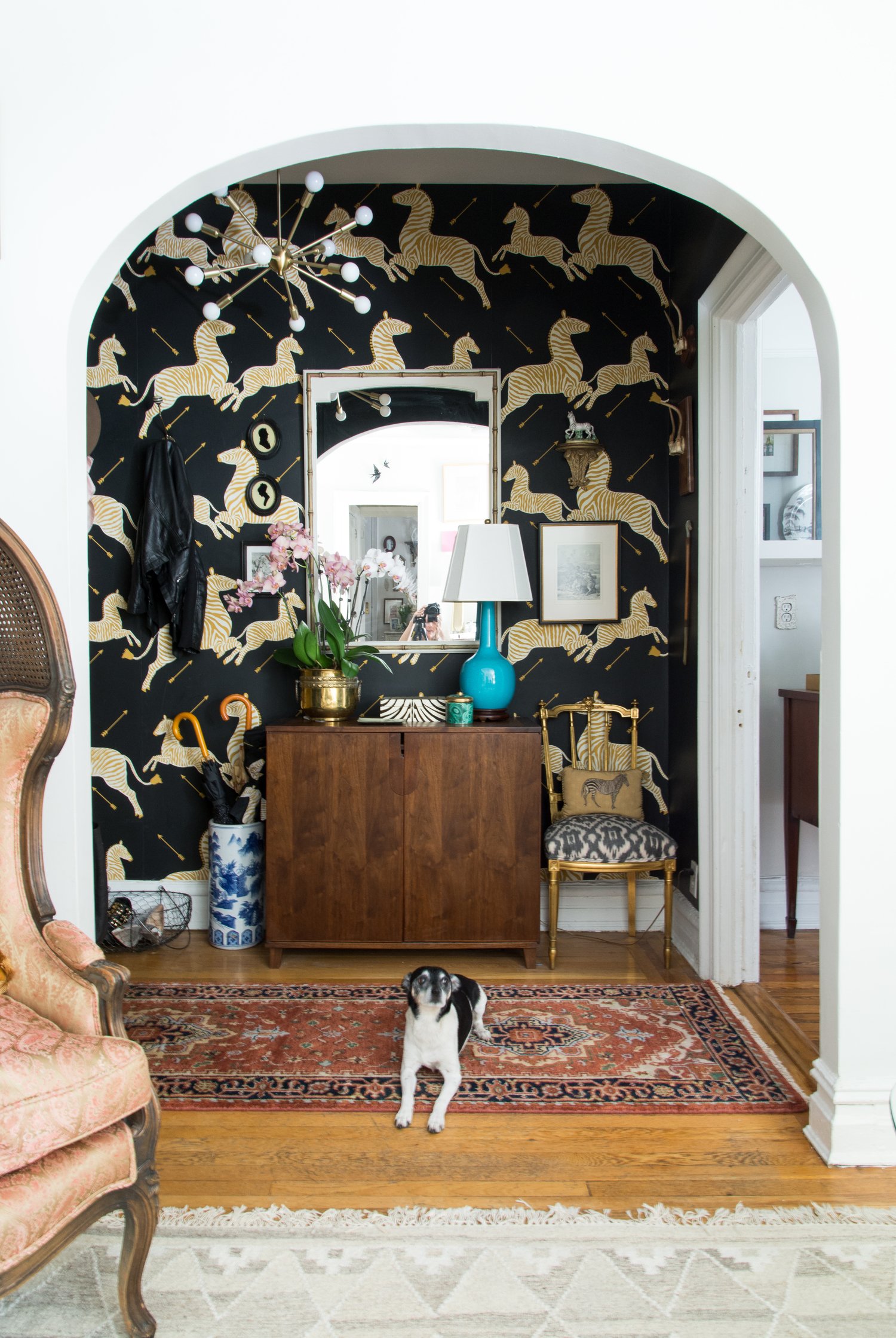
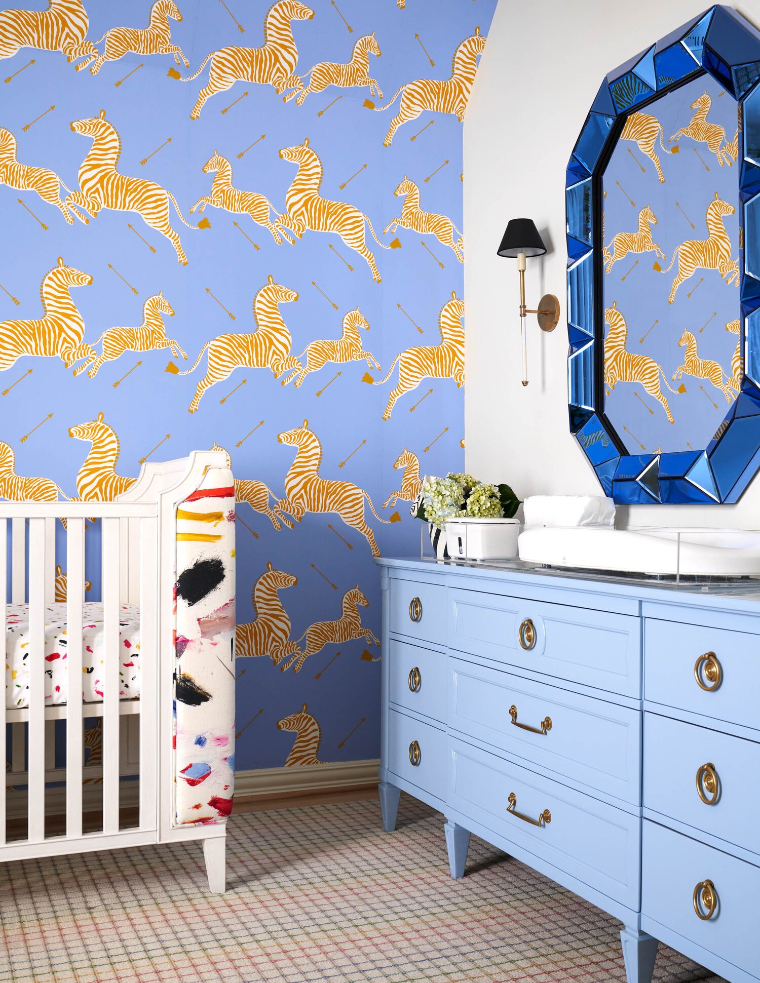
Zebras by Scalamandré
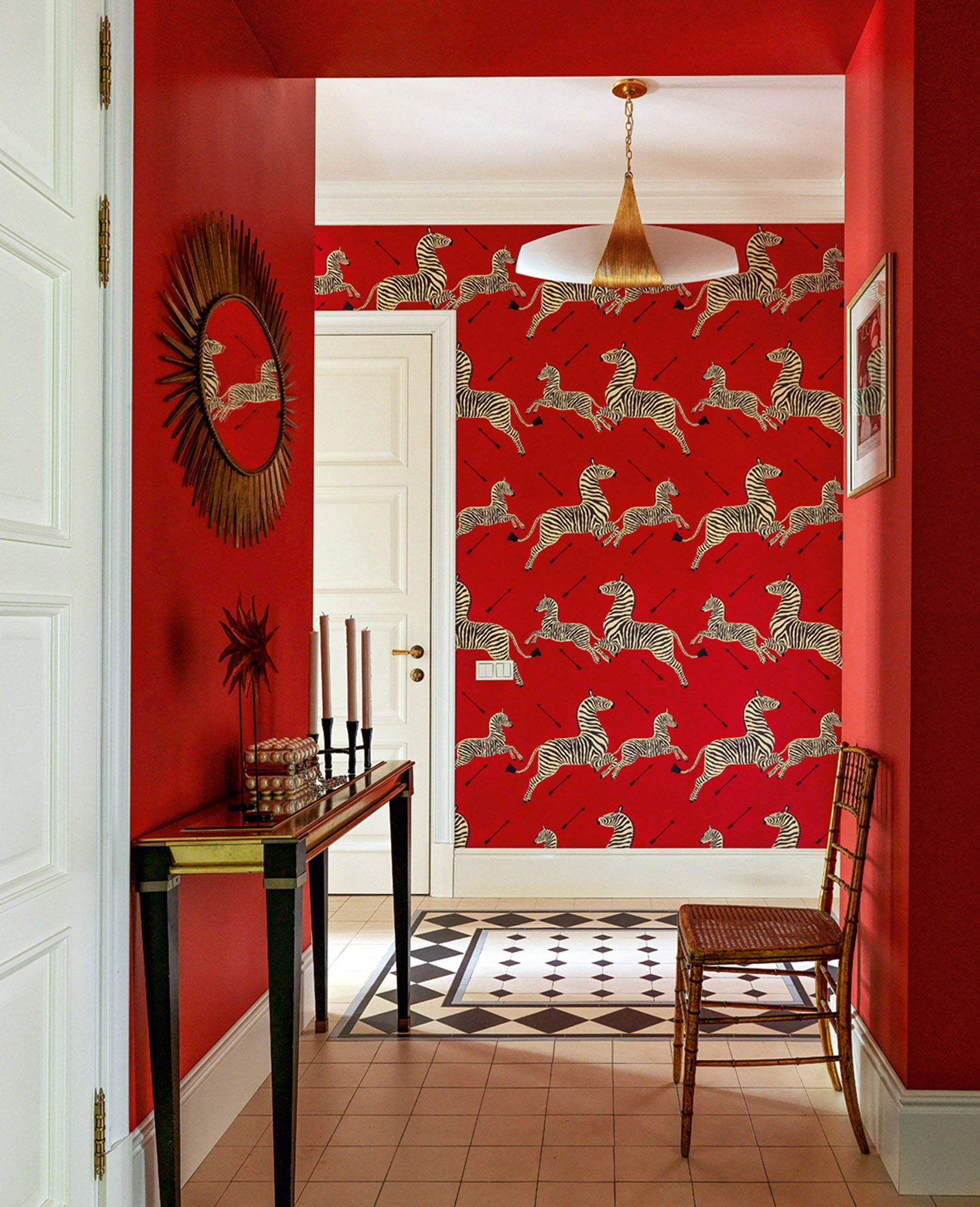
Try this scenario on for size: you’re a popular New York City restauranteur in the 1940s with a tiny budget, shoebox-sized establishment (The Times’ review, not mine), and big dreams of one day embarking on an African safari. That was the situation that Gino Circiello found himself in when he enlisted a friend to create a standout pattern to deck the walls of his eponymous restaurant, Gino, in 1945. The spaghetti-sauce red background, leaping zebras, and miniature arrows were an instant hallmark.
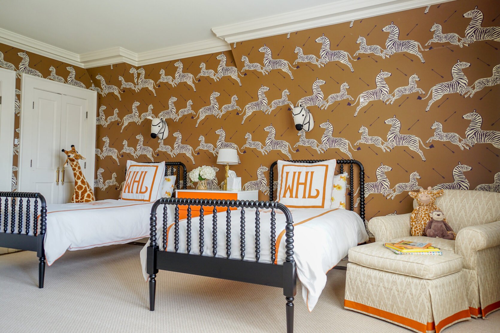
…until a fire ravaged Gino’s restaurant in the 1970s, that is. Gino then turned to the husband-and-wife team of Franco and Flora Scalamandré, who painstakingly redrew each Zebra and hand-cut each screen to create a spitting image of the original. And, well, the rest is history.
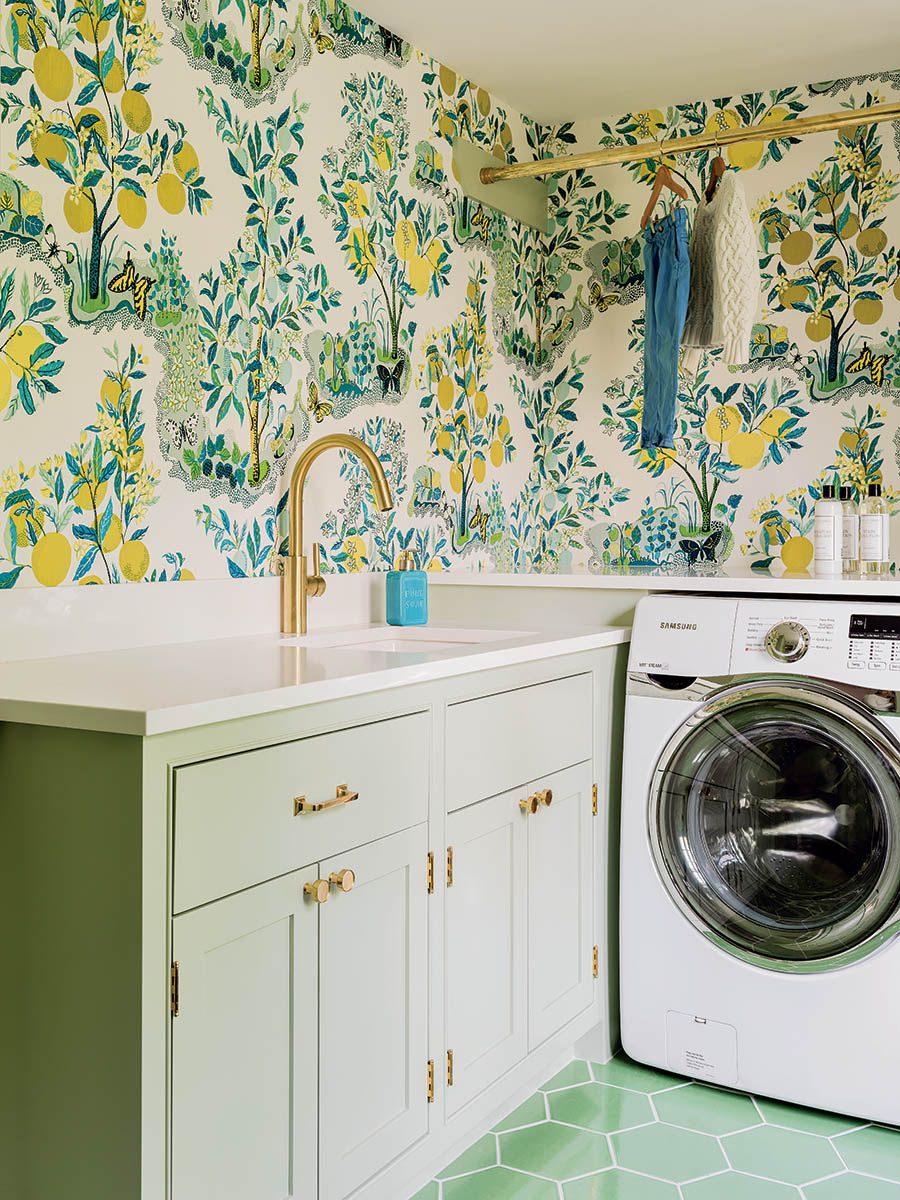
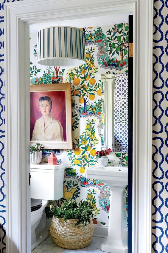
Citrus Garden by Schumacher
In the mid-1930s, architect and designer Josef Frank left his native Austria to escape a rising tide of anti-Semitism. He headed north to Sweden, his wife’s homeland, and spent the next two decades creating whimsical, charming, bright, hand-drawn textile prints (and furniture, and decor, and more – his output was unprecedented). Case in point: the cheery Citrus Garden, which was based on one of his illustrations from 1947.
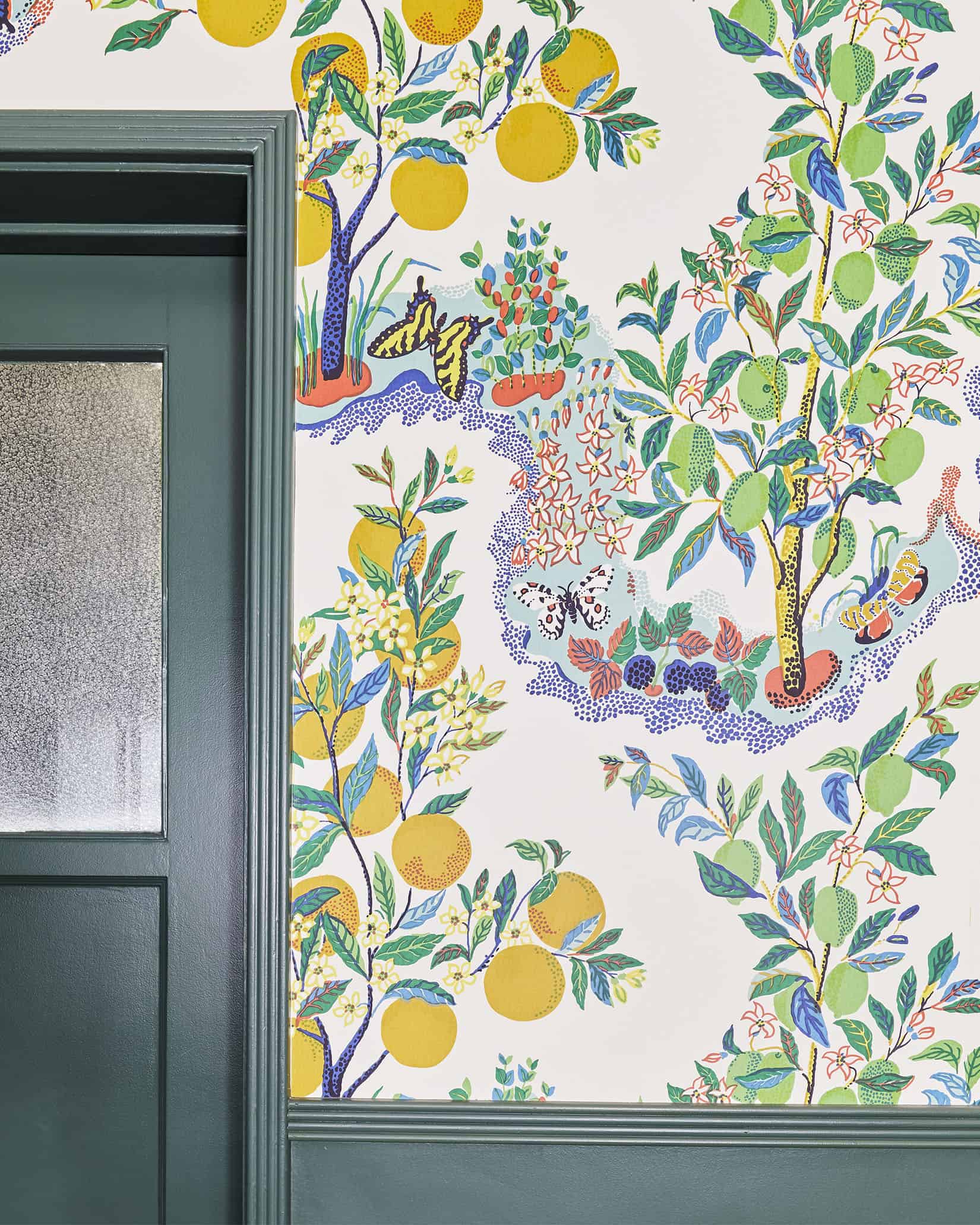
Josef was really passionate about accessible design – “the house is not a work of art, simply a place where one lives,” he wrote – so his designs make an ideal backdrop for those who love to mix, match, and curate their home slowly. Sara shot the above space for Em’s new book and the print is even better up close, don’t you think?
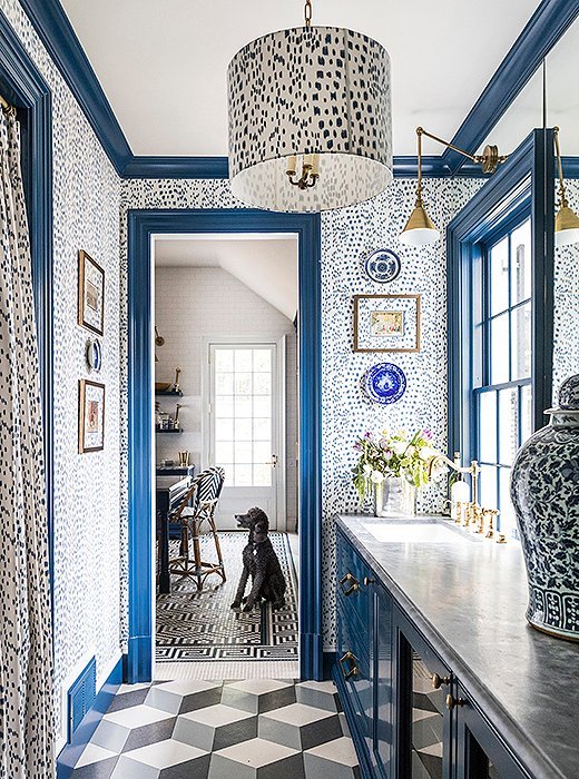
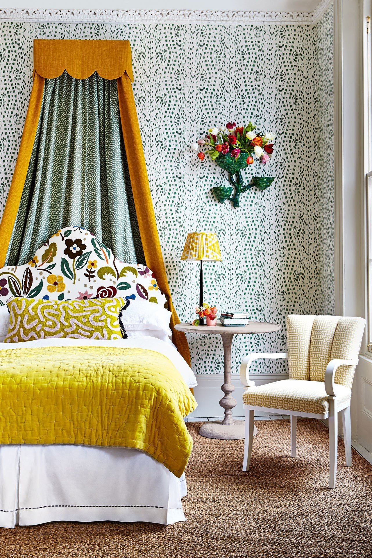
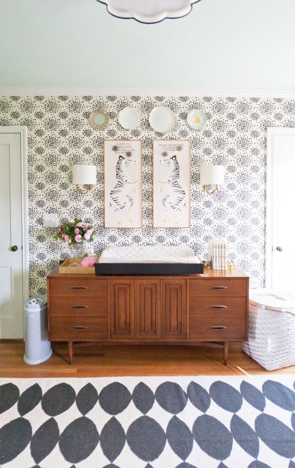
Les Touches by Brunschwig & Fils
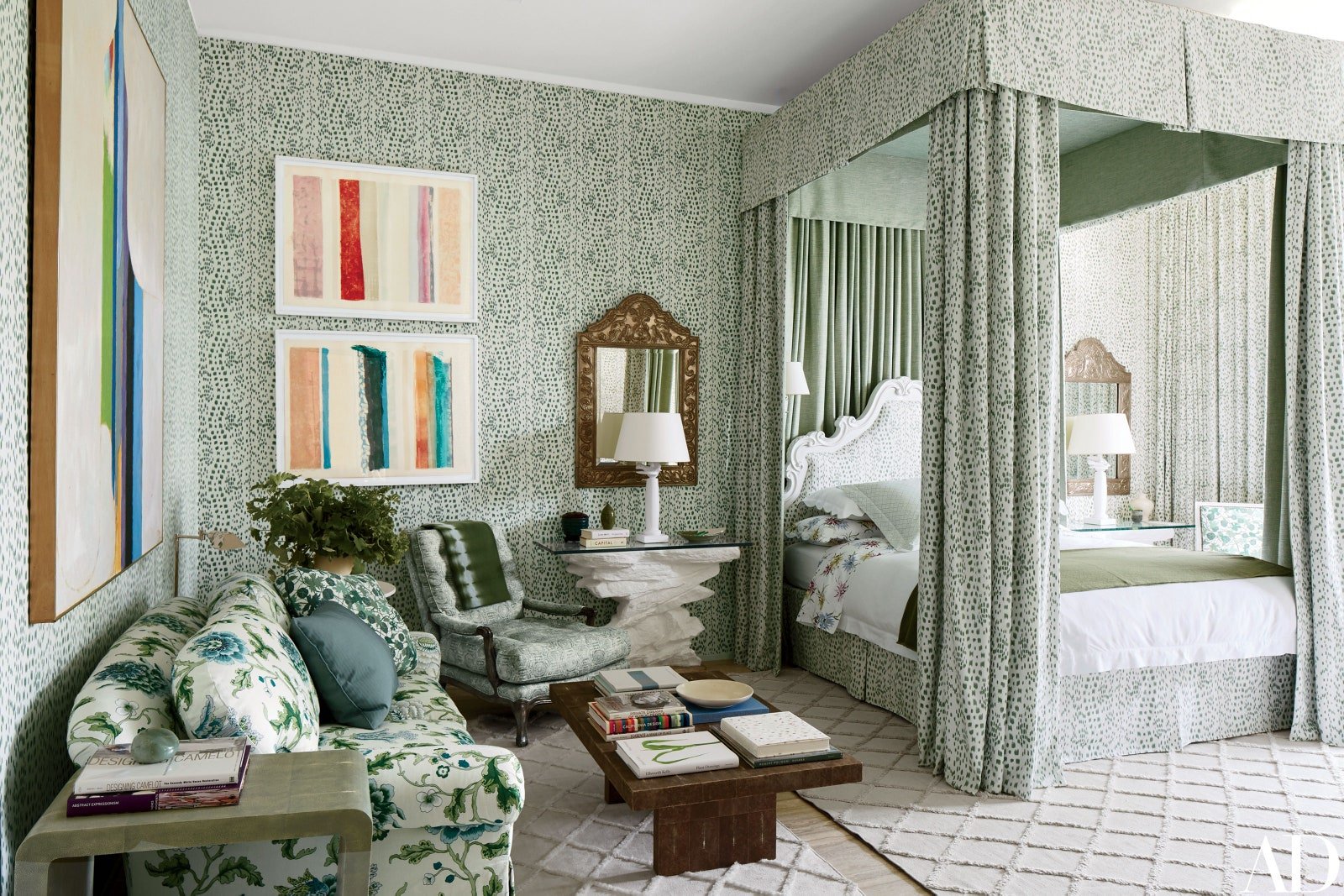
A decades-old pattern that feels ultra-current? SIGN ME UP. This animal-esque polka dot was developed from a set of post-WWII photographs and is now offered in 18 different colors. Michael S. Smith, the designer of the above room, offers this: “It’s like chic camouflage – Upper East Side camouflage.”
And he’s right. Les Touches plays well with others – it can read as a relaxed polka dot, a quiet floral, or as a punchy geometric print. Each roll, which is hand-screened in America on cotton backing (yes, that is as fancy as it sounds), is sure to stand the test of time.
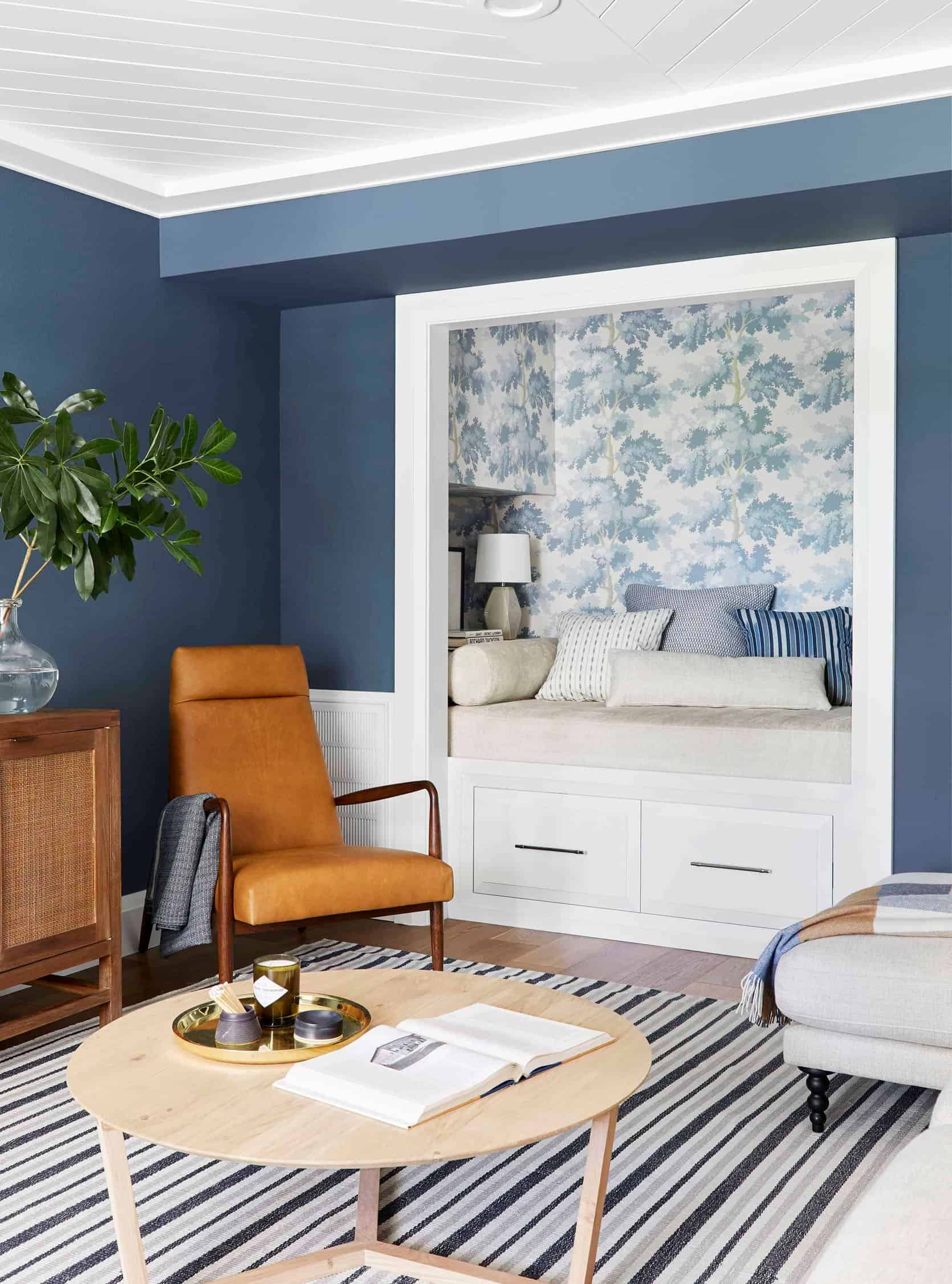
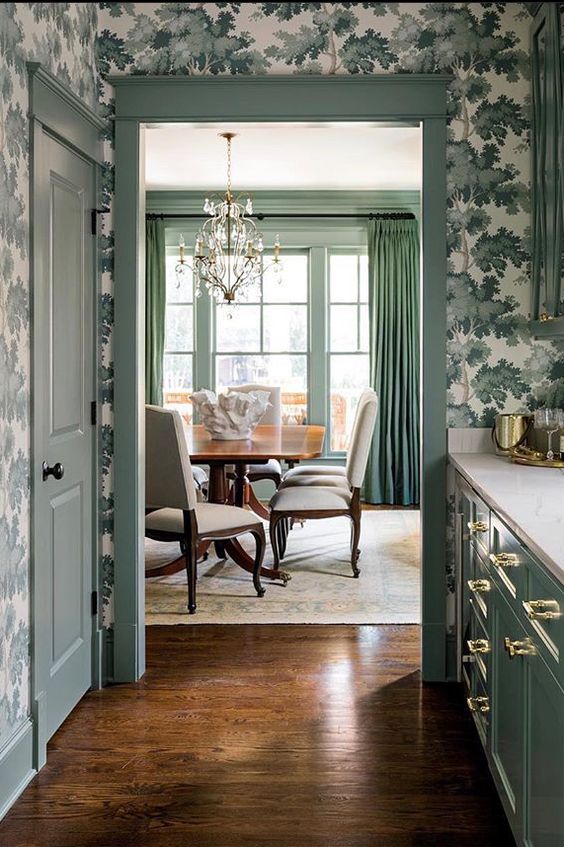
Raphael by Sandberg
An EHD favorite! Raphael had two very diverse inspirations: it’s 50% Central Park – a leafy haven in contrast to a bustling city – and 50% antique tapestry, where stylized leaves are often shown in fields of light and shade. It’s a quiet, easy-to-love pattern for those who may feel a little scared of committing to a permanent wall covering. (It looks great as an accent wall, too.)
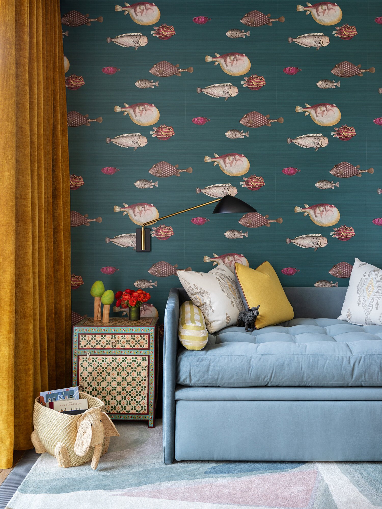
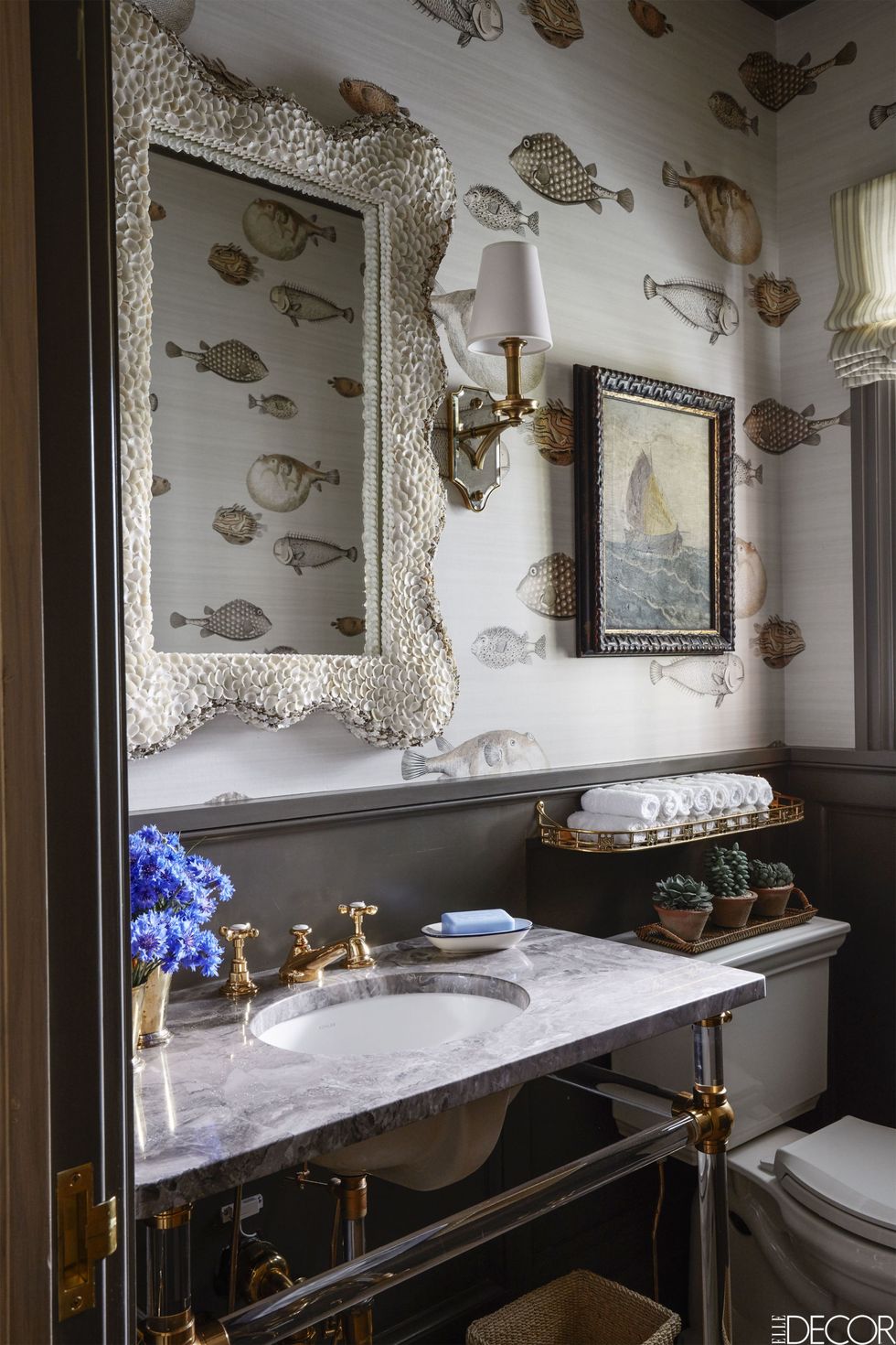
Acquario by Cole & Son
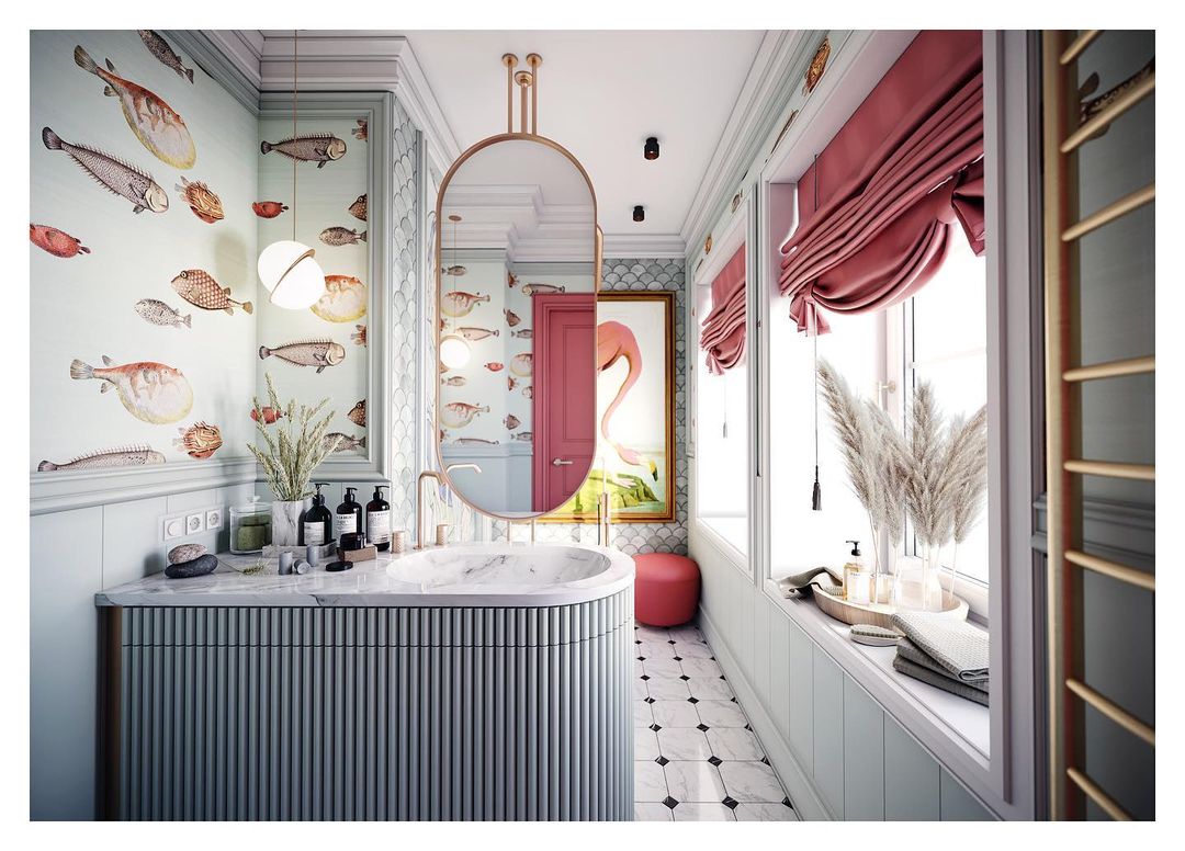
When a surrealist artist (or, uh, their estate, I guess) combines forces with a prolific wallpaper maker, GREAT THINGS HAPPEN. Piero Fornasetti used a ton of fish motifs in his early work – he was fascinated by how marine life was simultaneously so simple yet so mysterious – and MAN, do those motifs look great as a wallcovering.
Acquario is a great option for folks looking to balance a bit of whimsy with a timeless, refined color palette. We usually see this print in refined children’s rooms and bathrooms, but how great would one of these darker colors look in an office?
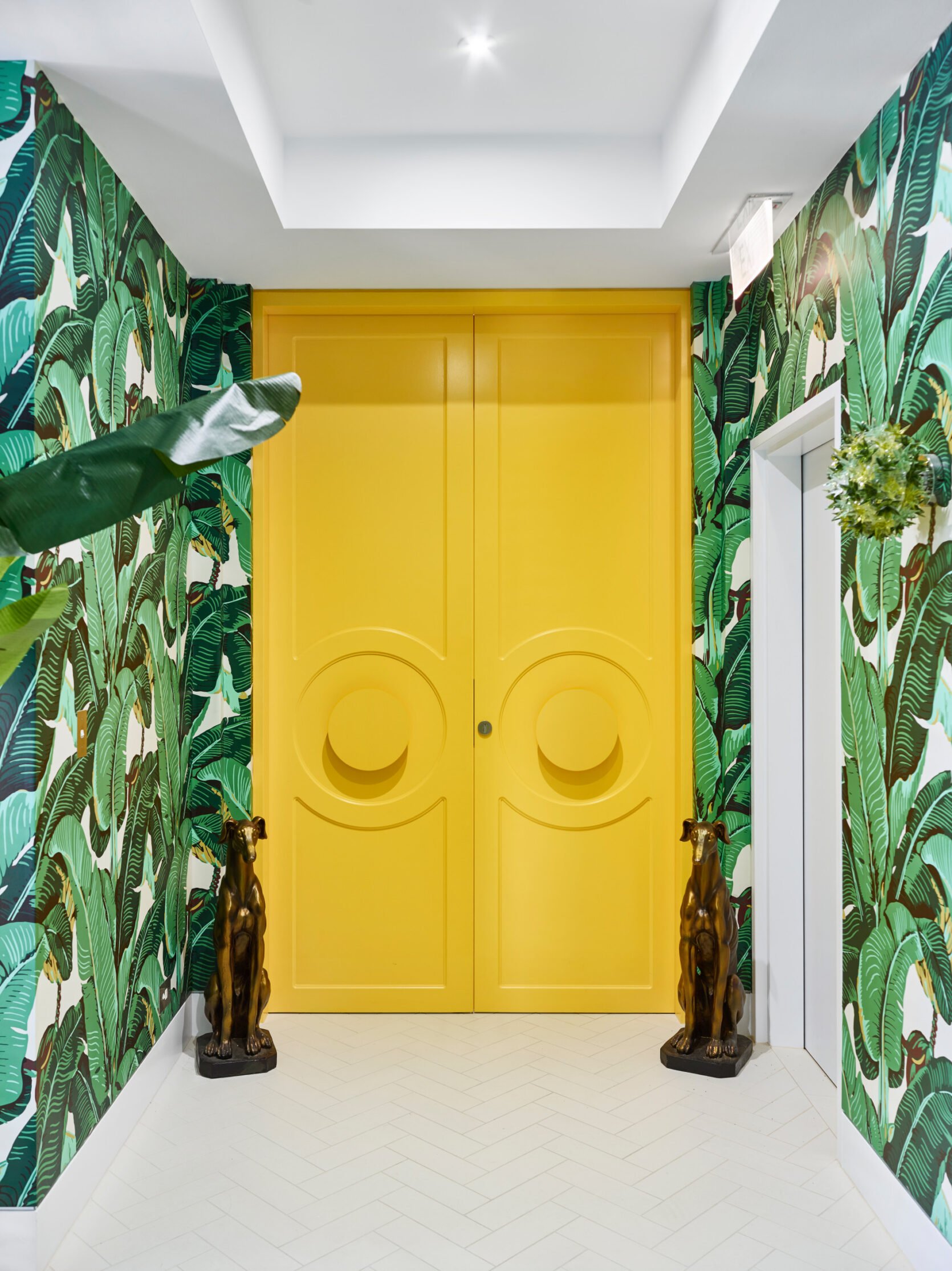
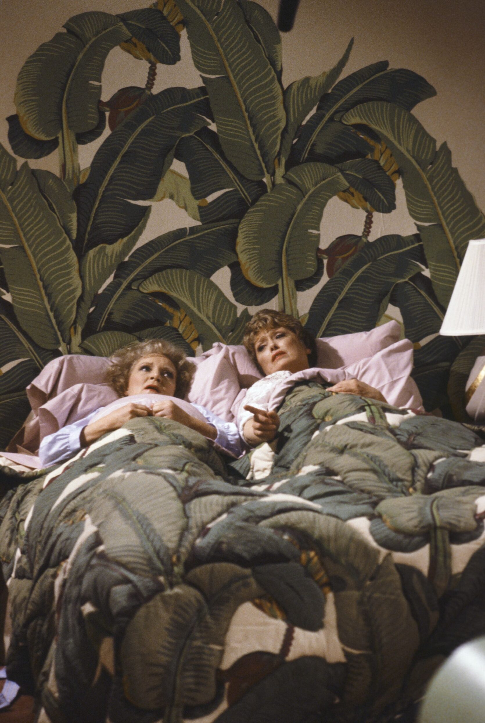
Martinique by CW Stockwell
Great story alert: In 1905, a pharmacist named Clifton Stockwell from Armstrong, Iowa moved to Los Angeles and started a wallpaper business. His daughter, Lucile, and her husband, Remy Chatain – both Parsons graduates – eventually joined the business and created this design after a vacation to the South Seas.
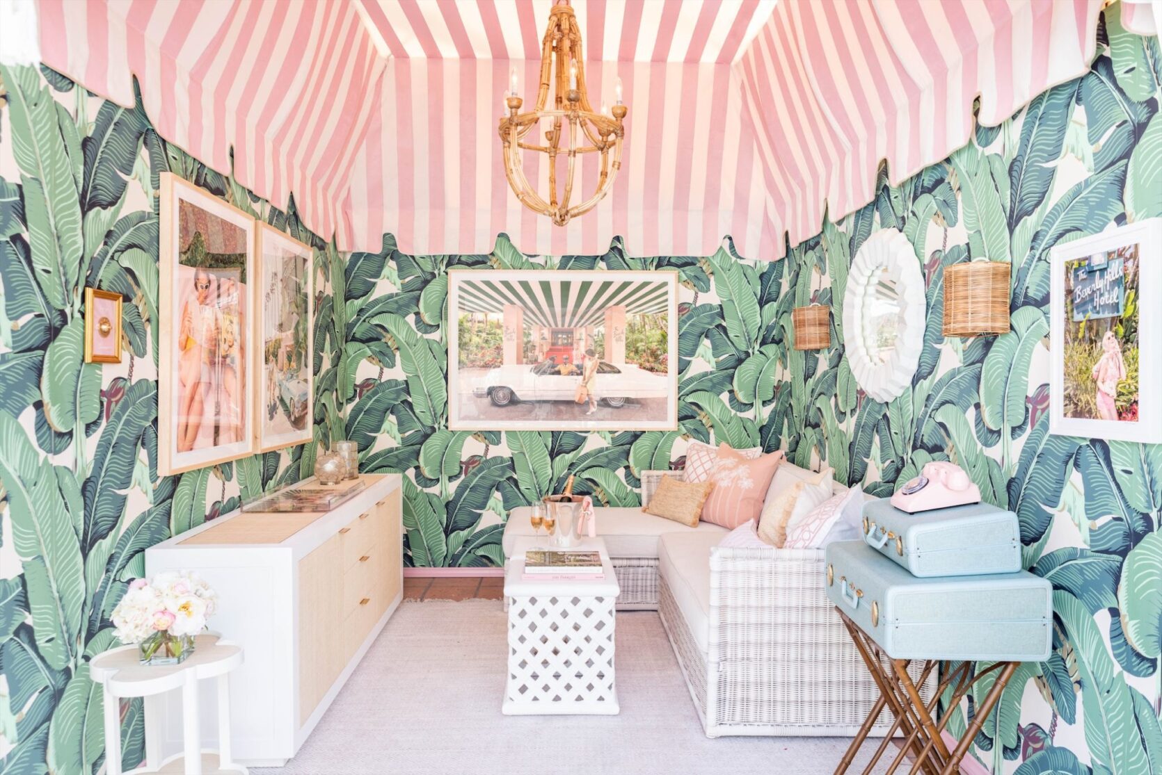
When fashion and interior designer Don Loper stumbled upon the CW Stockwell showroom in 1942, he knew he’d found the look he wanted for his Beverly Hills Hotel redesign. Don re-created the mural-style installation he’d seen in the showroom and expanded it to fit the corridors of the hotel…and that’s how a pharmacist from Iowa became responsible for one of our all-time favorite film and TV backdrops of the last century. FUN, RIGHT?
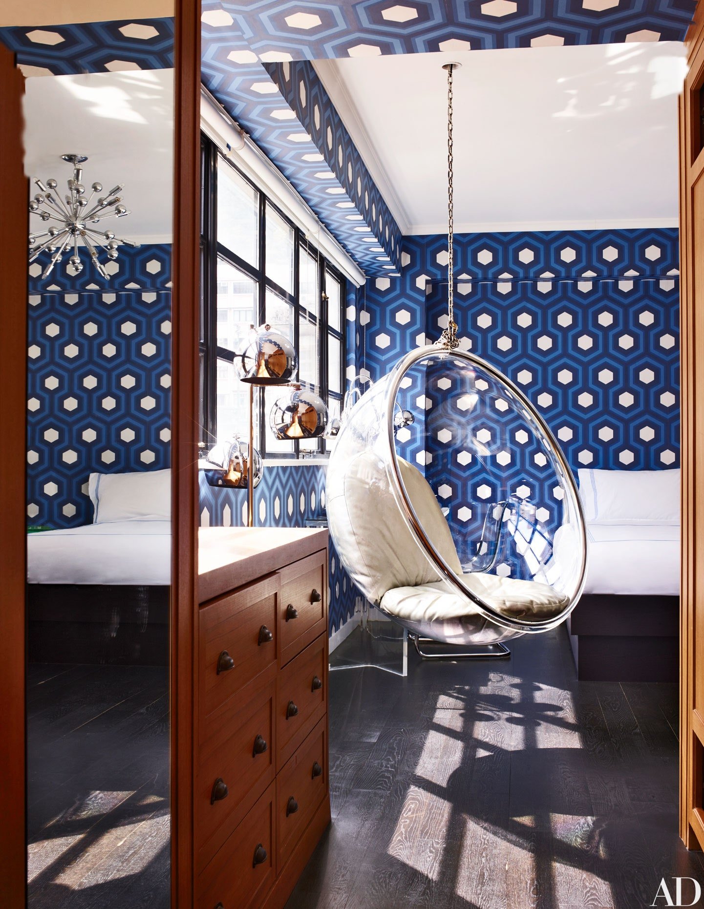
Hicks Hexagon by Cole & Son
Speaking of film backdrops – does this pattern ring a bell for anyone? Famed interior designer, David Hicks’ mod geometric patterns helped define 1960s style. His son, Ashley, worked with Cole & Son to bring a small, livable version (the edges on the print are slightly curved to be less stark!) to walls worldwide.
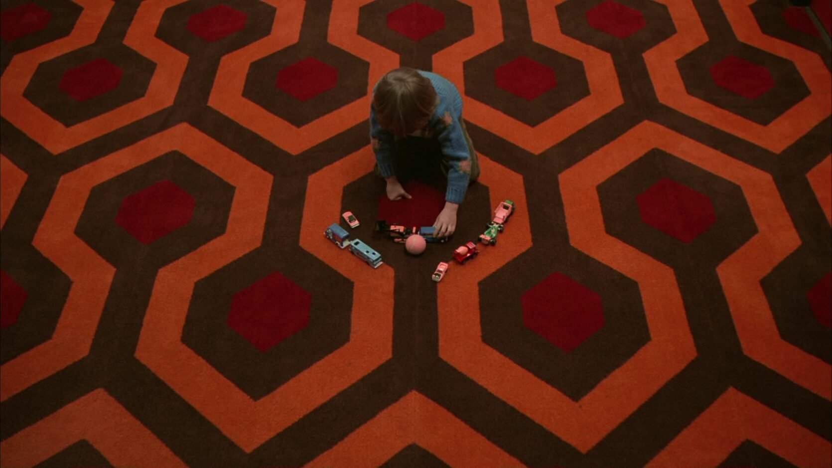
Oh. Yup – that’s why it looks familiar. The big, slightly-less-livable version played a starring role in The Shining. So, uh, feel free to namedrop the Hicks Hexagon next time you’re watching this movie, I guess?
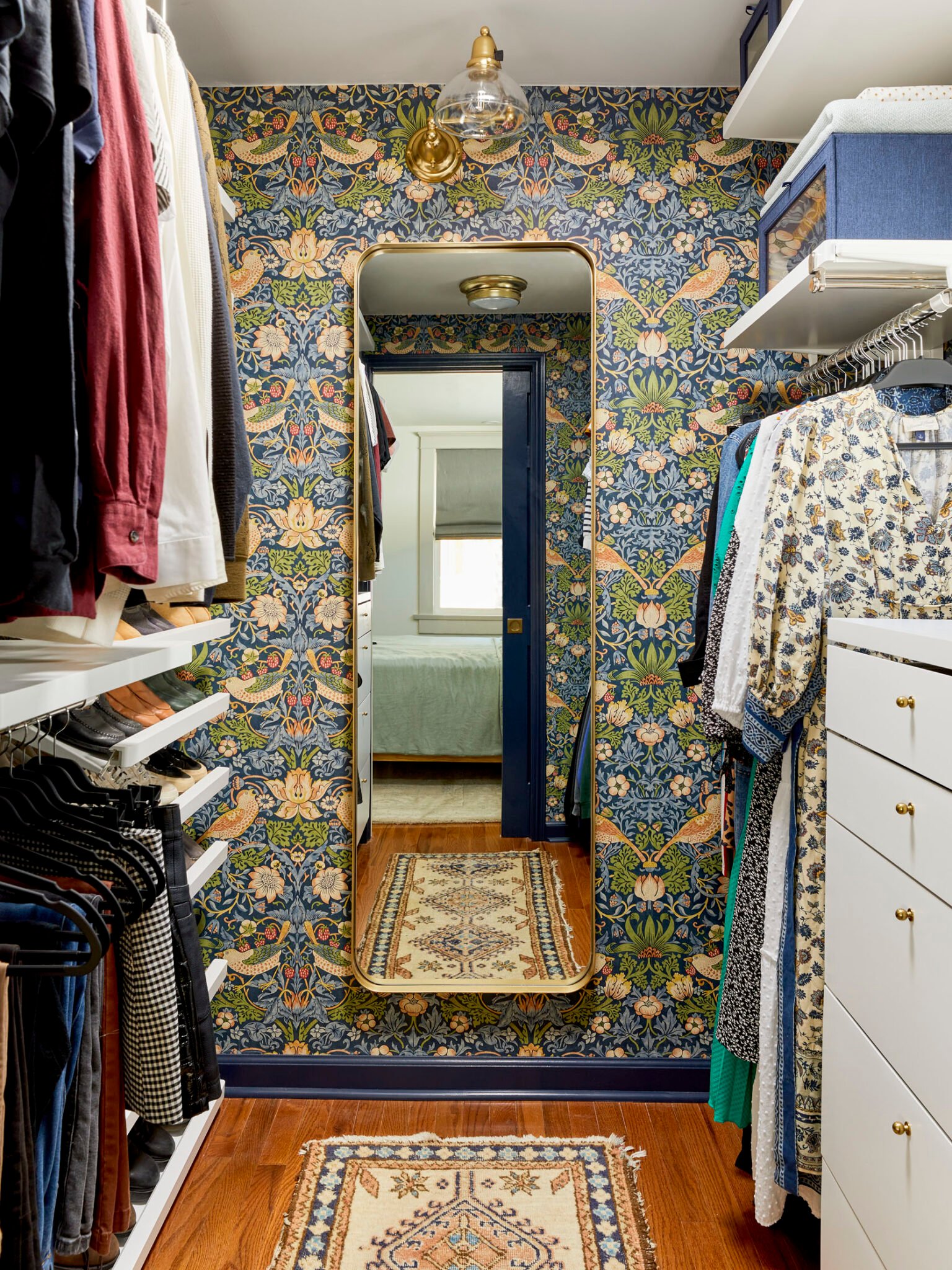
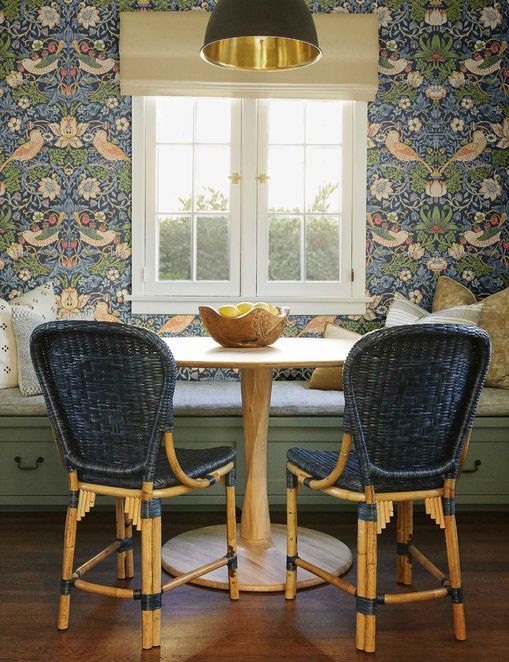
Strawberry Thief by Morris & Co.
Before it was an iconic wallcovering, Strawberry Thief started its life as a textile print in 1883. (And if you ever want to read about an interesting guy, google its designer, William Morris – a quick bio describes him as follows; “British textile designer, poet, artist, novelist, architectural conservationist, printer, translator and socialist activist…” – hello, jack of all trades!) You’ll be able to spot this one in the wild seeing as it’s, well, a bird stealing a strawberry. Aptly named. 10/10.
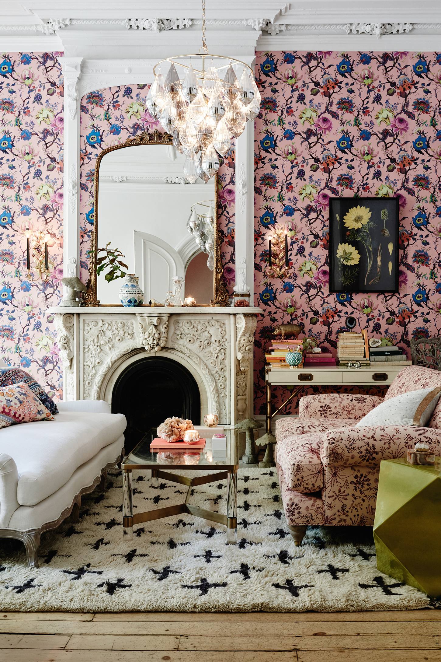
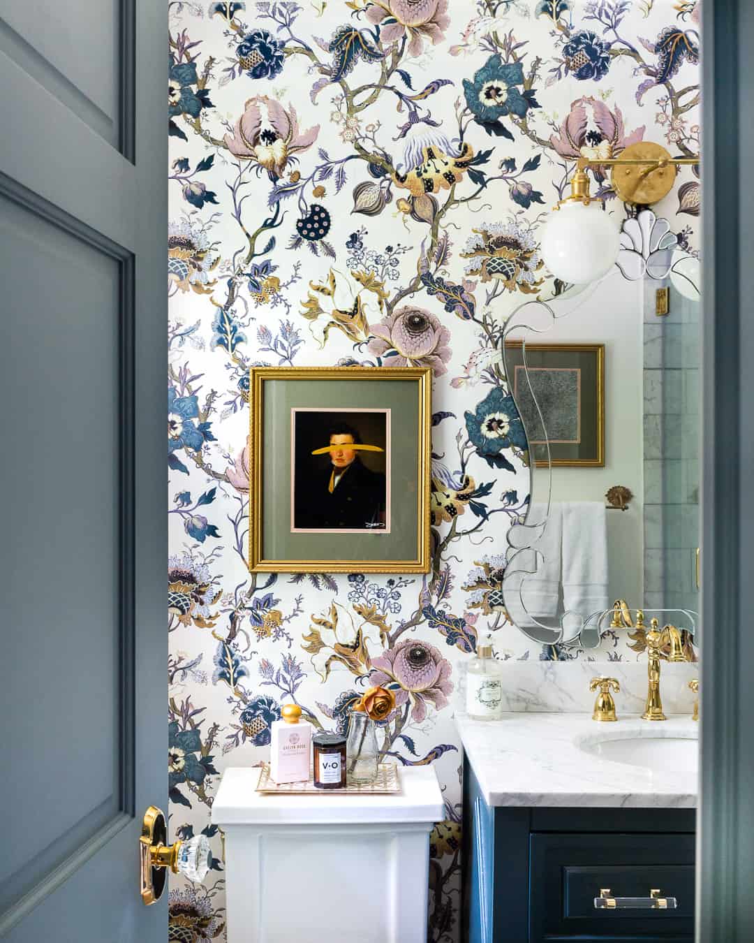
Artemis by House of Hackney
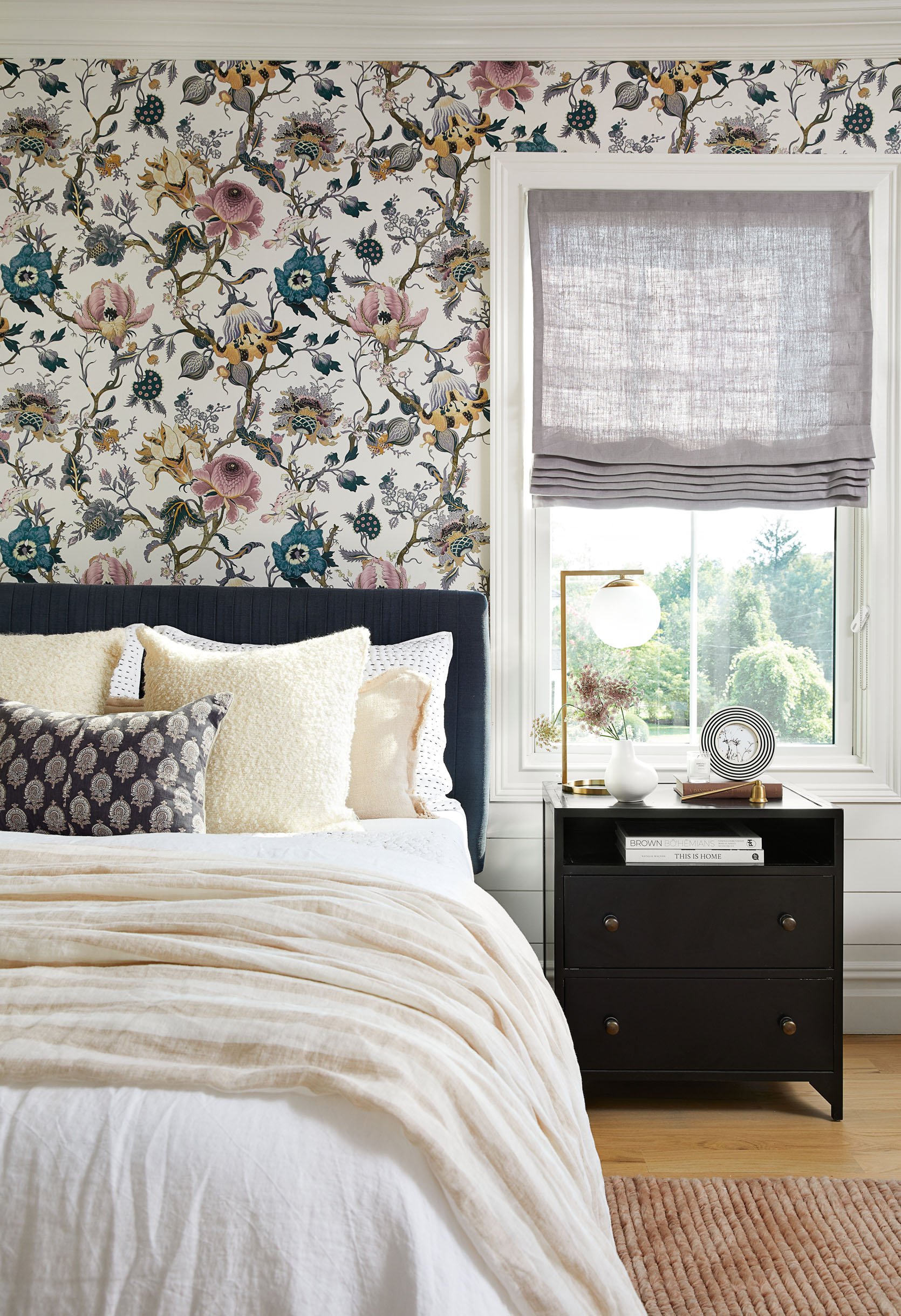
Annnnd here’s a print inspired by the work of William Morris (and also by Diana Vreeland’s 1955 ‘Garden in Hell’ room, where she told her designer that she wanted her living room to “look like a garden, but a garden in hell,” – a directive that is simultaneously impressive in its clarity and terrifying in its creativity). Artemis is an old-school motif with a little bit of bite.
The craziest part? House of Hackney launched in 2010. THIS MILLENNIUM! Classic patterns with ultra-modern interpretations – this is a total go-to pattern if you want to add a little edge to a traditional space.
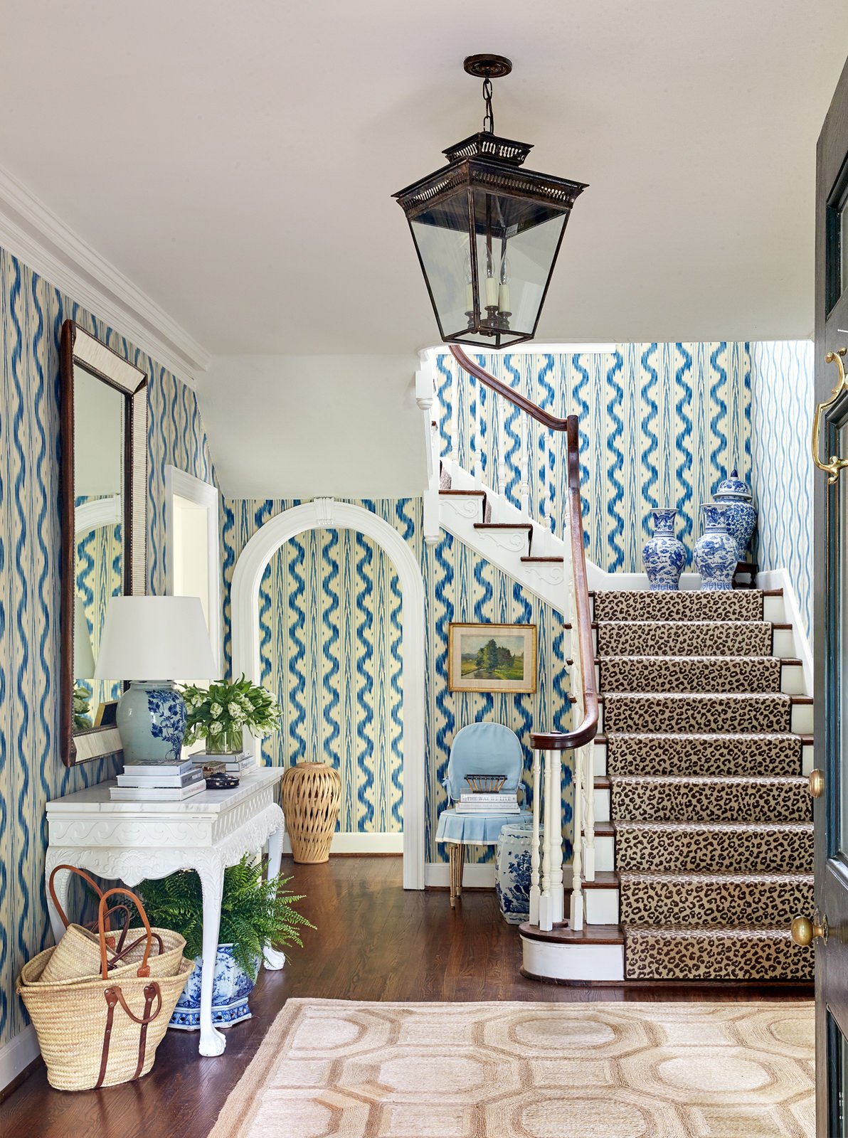
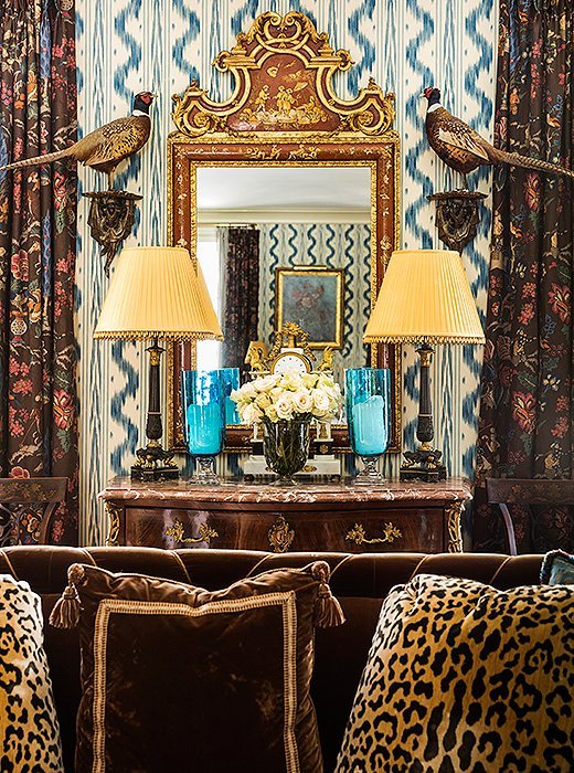
Toile de Nantes by Pierre Frey
Toile de Nantes was inspired by 18th century Ikat fabrics, but it was made famous after Estée Lauder chose the print for her Hamptons home in the 1970s. The pattern toes the line between beachy and regal, which is an incredible balance to strike.
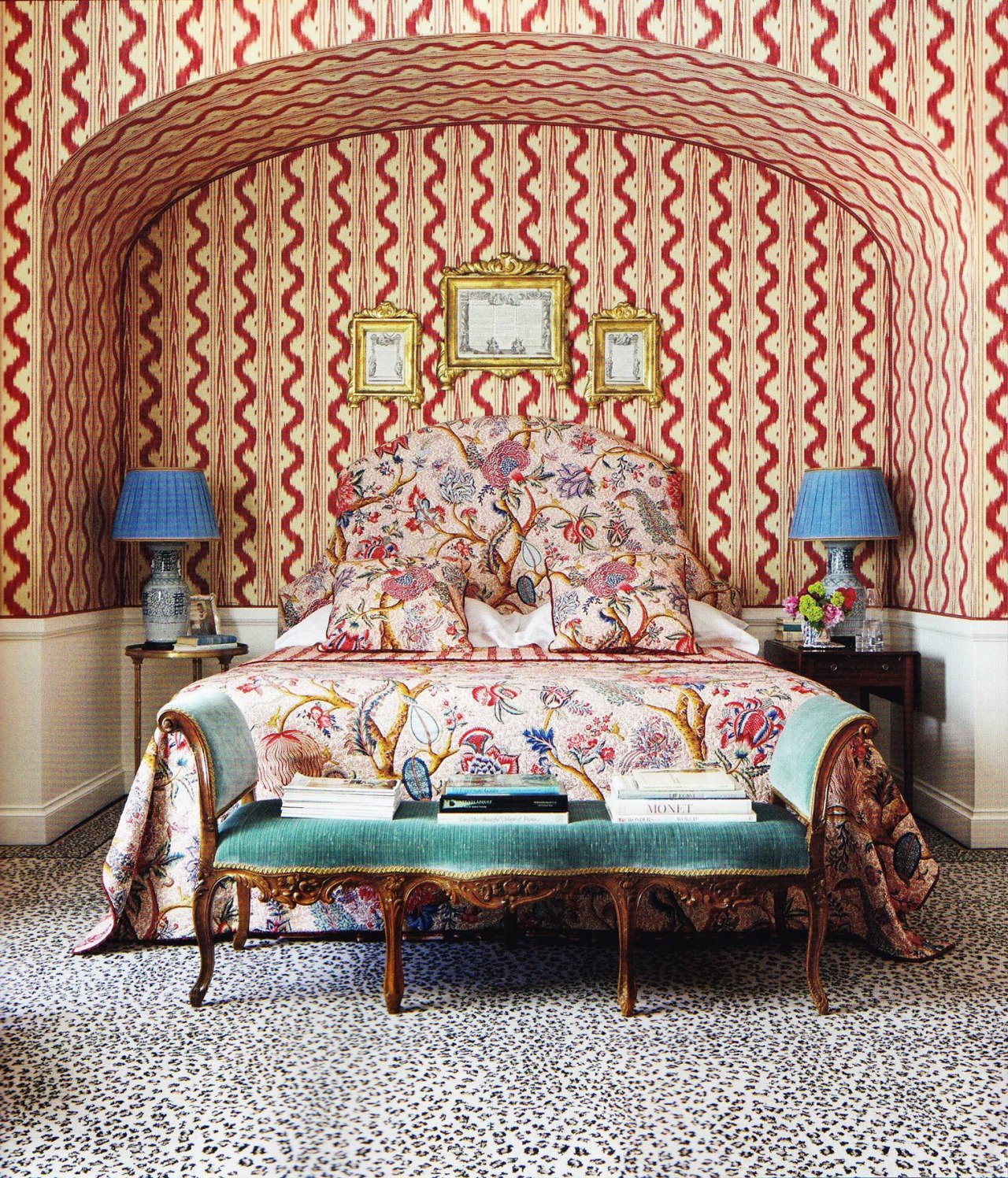
And if you’re a fan of the elevated mix-and-match…look no further. This one’s a winner that will still look chic in 50 years! (Have you also noticed that all three of these designers chose to style their Toile with big hits of leopard print?)
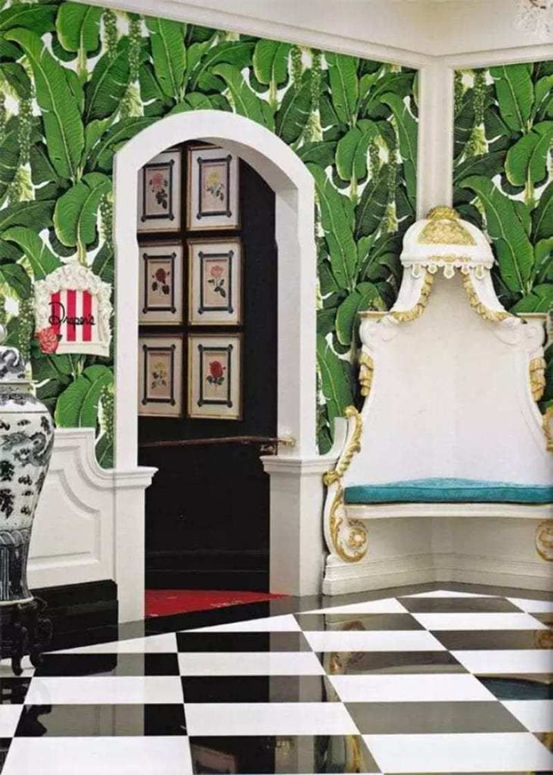
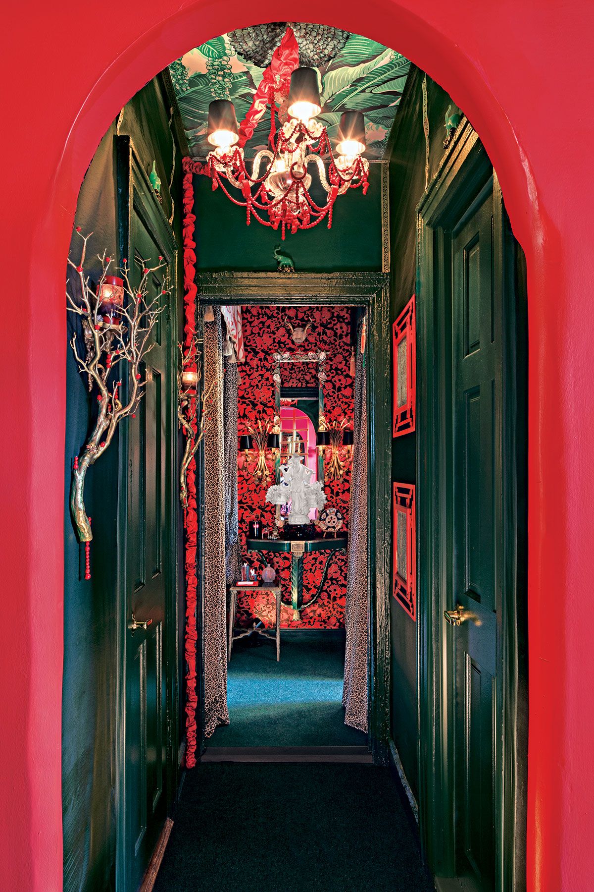
Brazilliance by Dorothy Draper
If you’re like, “hey, dummy, we already looked at banana palm wallpaper,” SIT TIGHT – this one is different! The key giveaway? The Brazilliance print also features clusters of trailing sea grapes. (Also, this one predates Martinique by about 5 years!)
Dorothy Draper originally designed this for the Arrowhead Springs Hotel – an A-list celebrity getaway just outside of LA that fell out of favor after the resort was used as a navy hospital in World War II – and the print made its way onto the walls of a bunch of other iconic properties. Saturated, glam, and anything but boring – what else can you ask for?
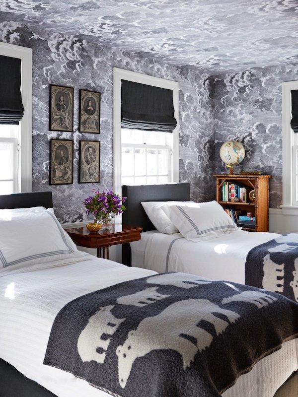
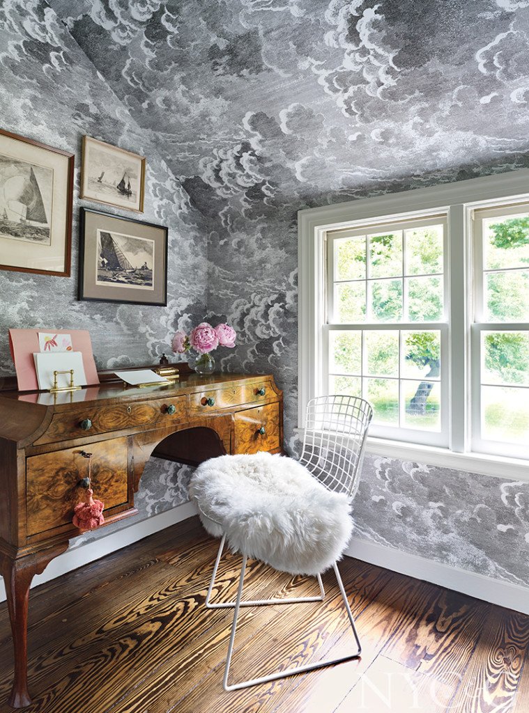
Nuvolette by Cole & Son
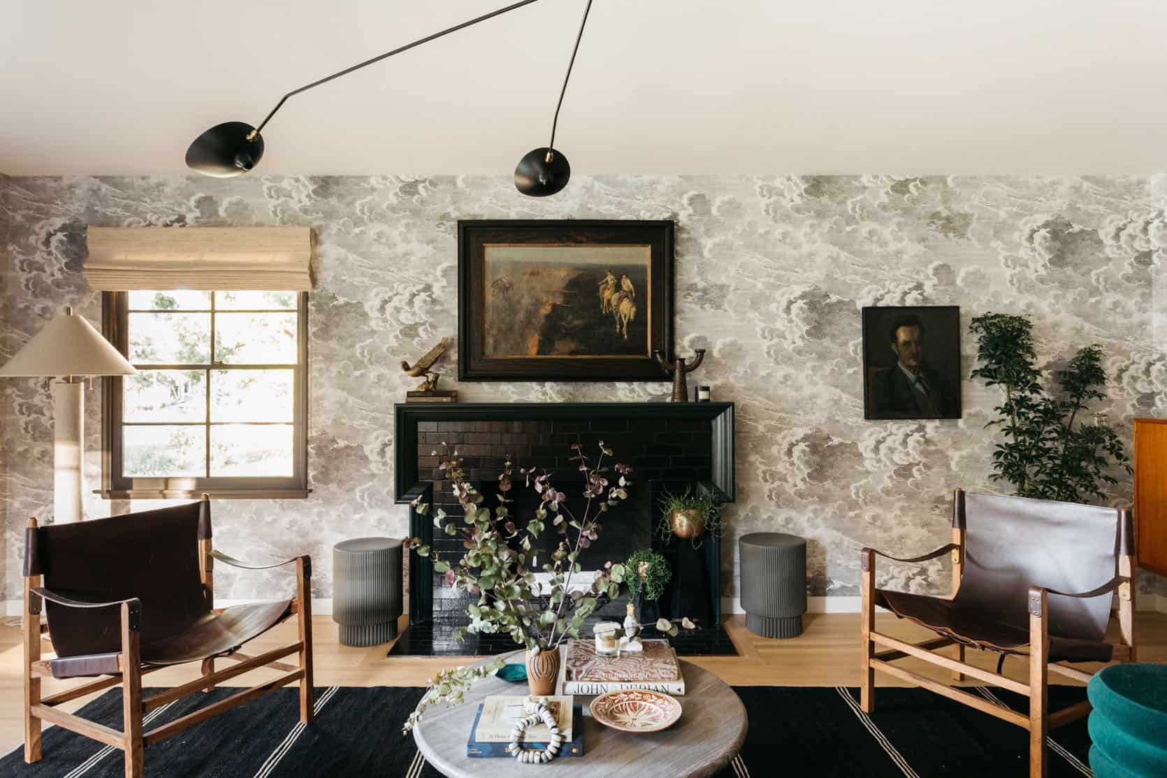
Oooooooh. Here’s one more from our favorite Italian surrealist, Fornasetti, and my favorite wallcovering maker, Cole & Son. (I have two of their wallpapers in my home and yes, I am very biased.) This print, Nuvolette, kinda speaks for itself, doesn’t it?
The detail on each cloud is incredible and the sense of movement this print brings to a space is pretty unprecedented. We see this pattern pop up time and time again in all kinds of room reveals – living rooms! Kitchens! Kid’s rooms! Bathrooms! – but it always feels fresh and refined.
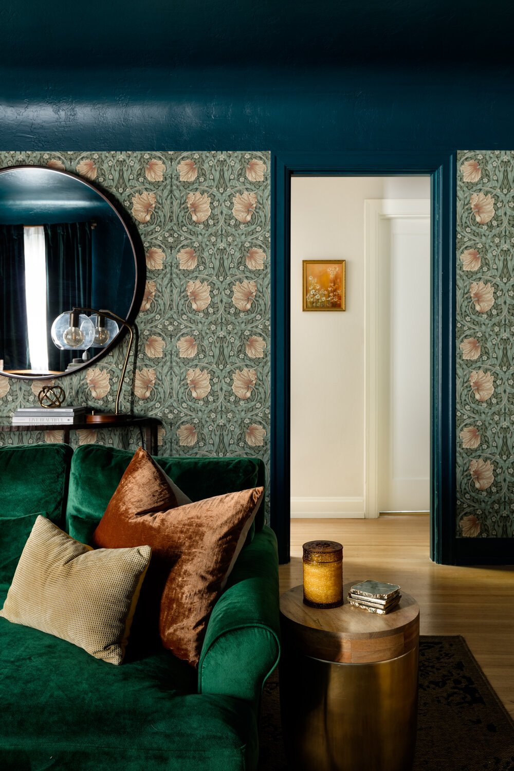
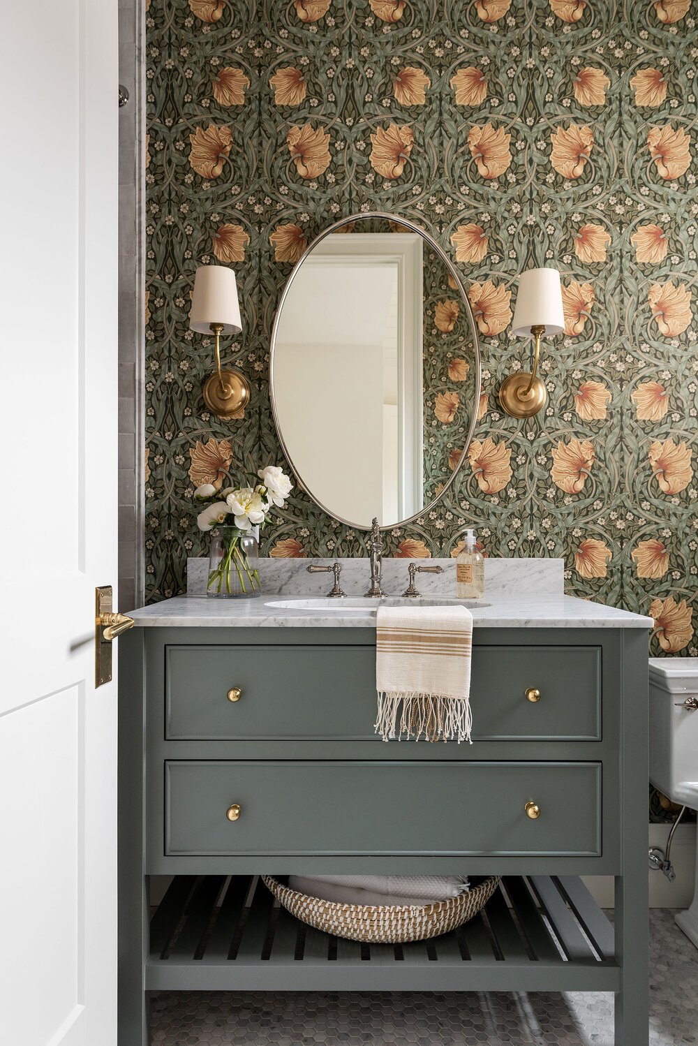
Pimpernel by Morris & Co.
One more from our multi-hyphenate William Morris! He designed this pattern in 1876 and used it in his own dining room at Kelmscott House, which is now a historic landmark. Pretty much every Morris & Co. wallpaper or textile is a classic, but this one gets extra marks for being so flexible – it can go dark and moody or light and airy, which is AWESOME.
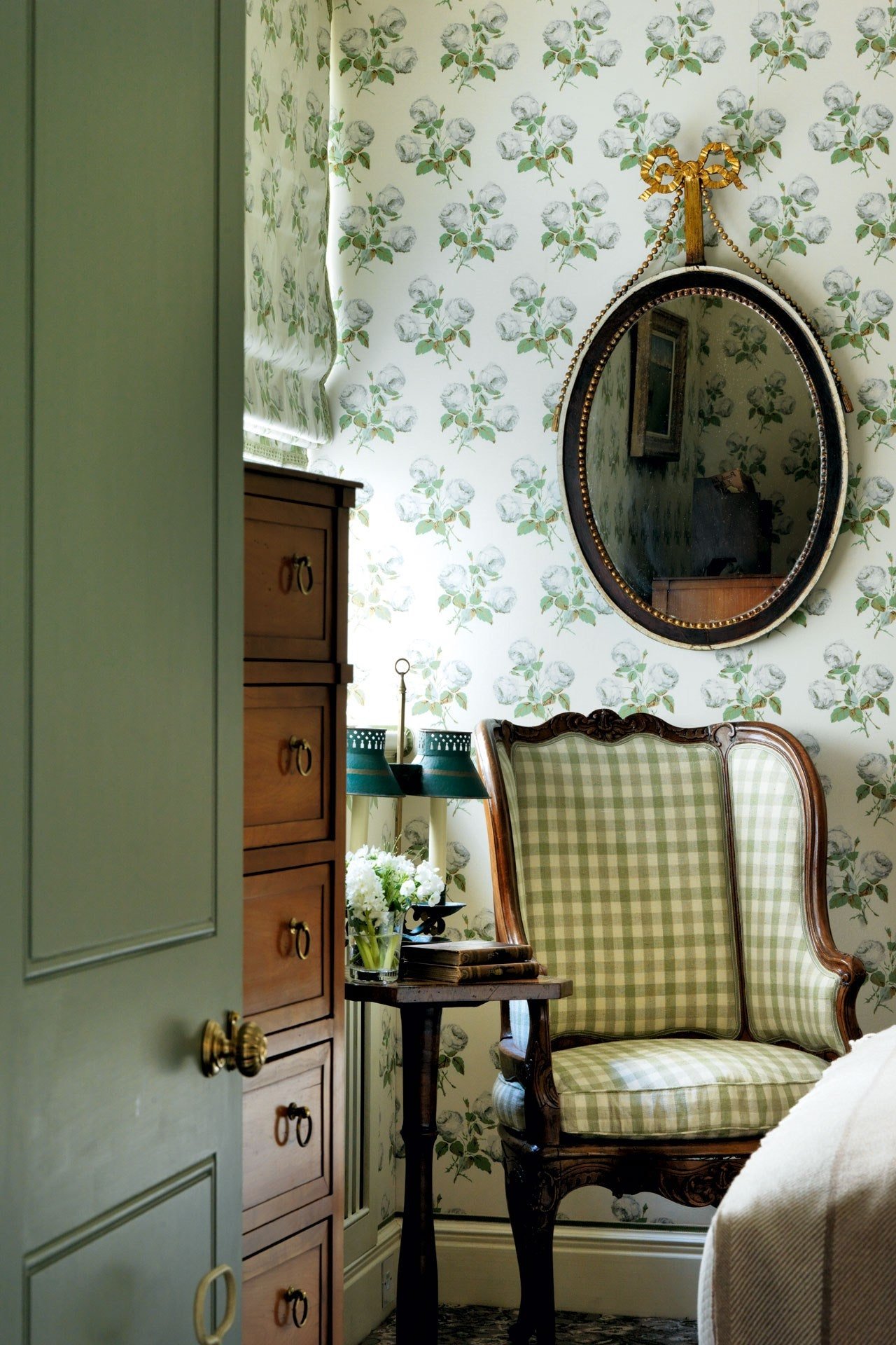
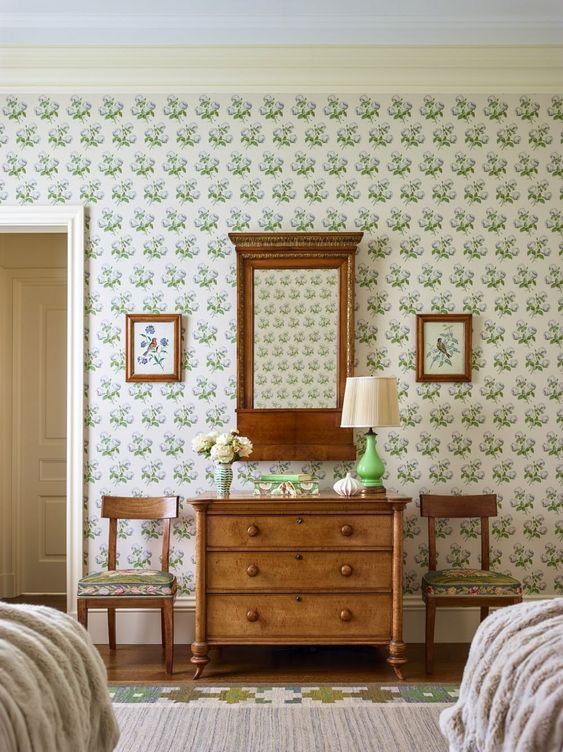
Bowood by Colefax and Fowler
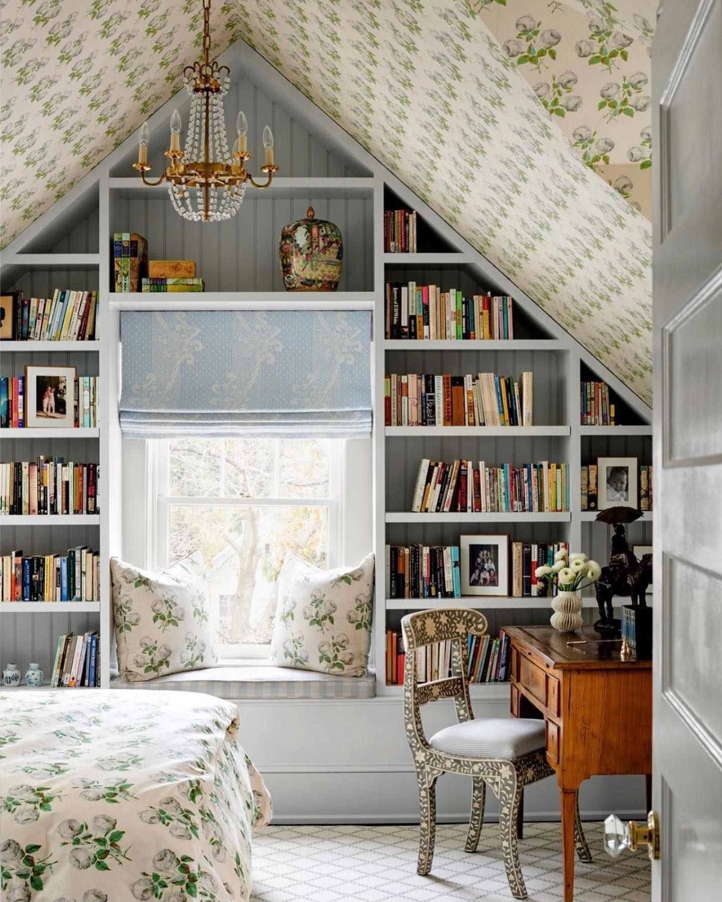
Another great origin story here: Bowood was based on a mid-1800s fabric fragment that decorator John Fowler discovered while staying at the Bowood Estate (hence the name – it’s not “boxwood,” as some folks assume!).
There are a lot of chintzes out there, but few have the longevity and recognition of Bowood. Remember that old saying “leaves of 3, let them be?” Well, it’s kind of like, “clusters of 3, must be Bowood by Colefax and Fowler.” (Less rhyme, less memorable, similar sentiment – this pattern has staying power.)
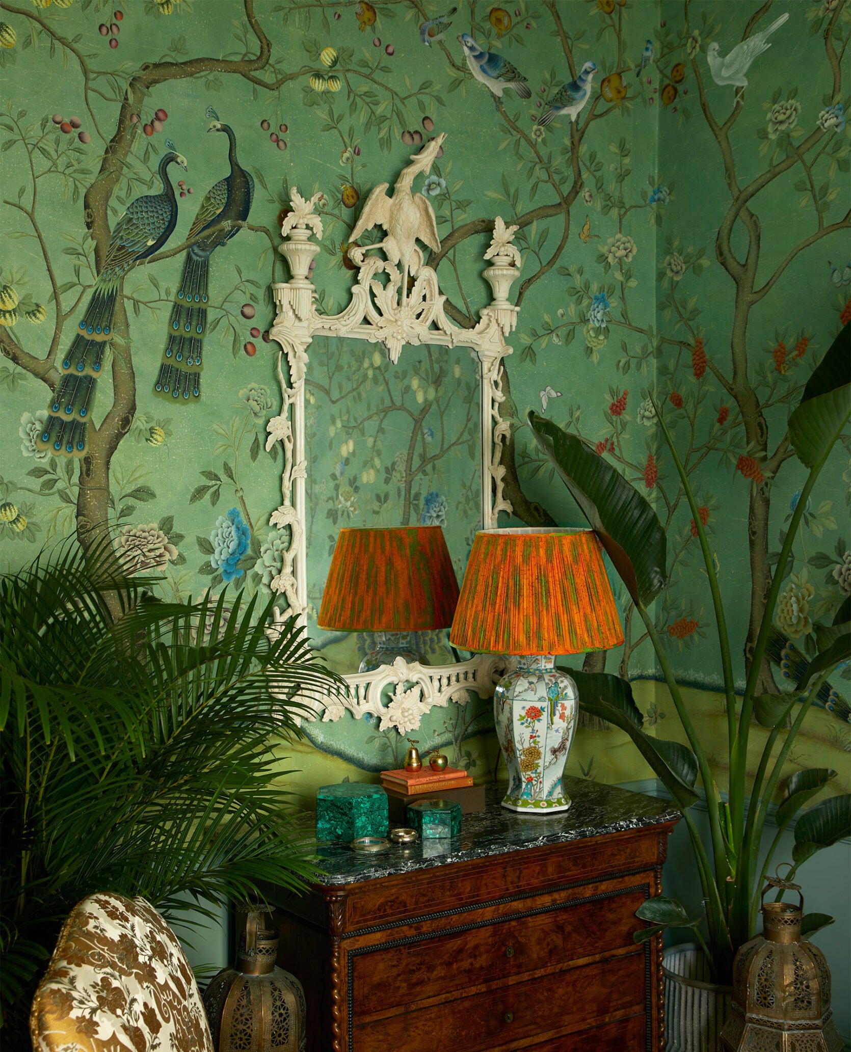
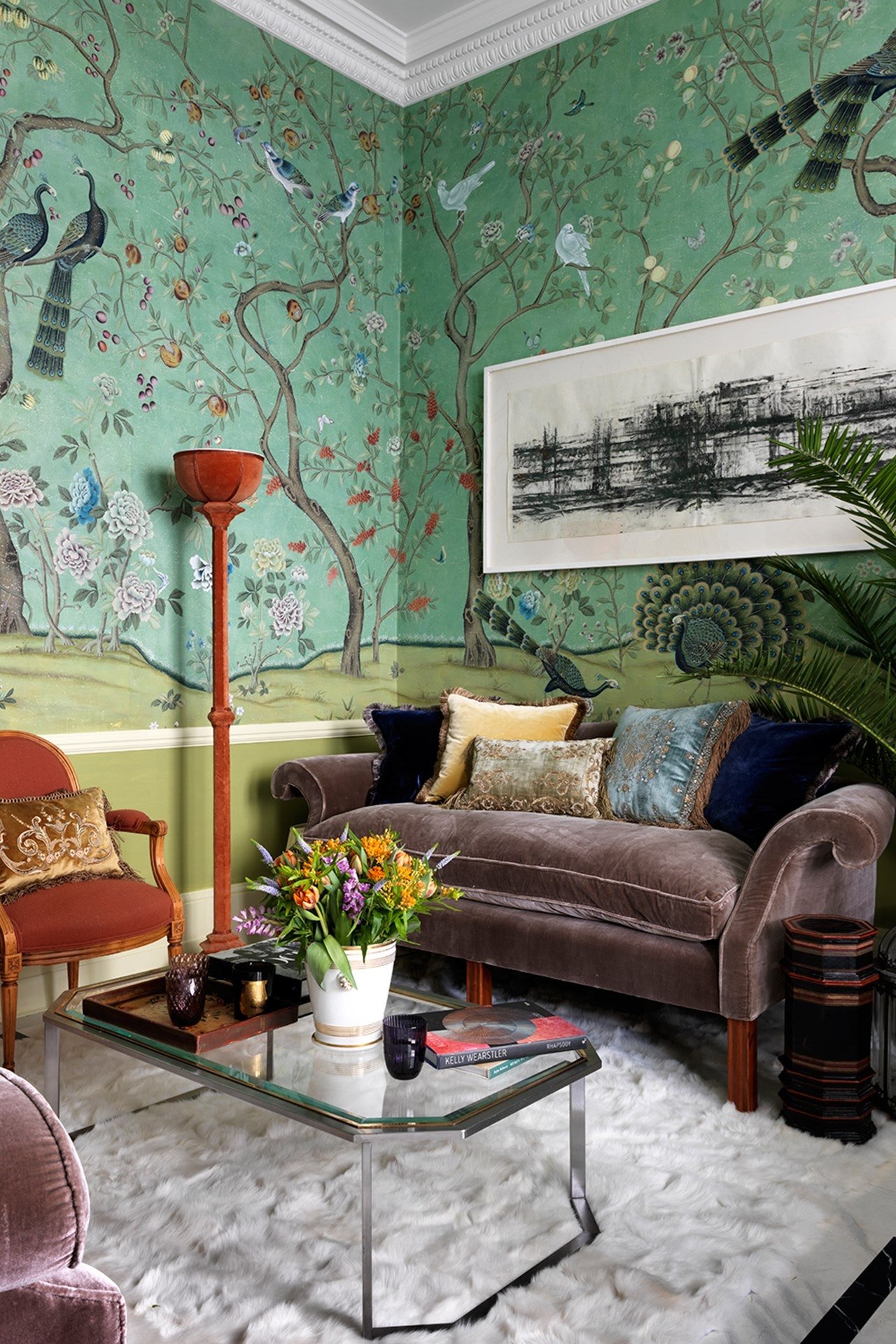
St Laurent by De Gournay
Let’s be clear: de Gournay has no shortage of stunning hand-painted wallpapers, but St Laurent is a liiiiittle extra special. This print, in particular, was inspired by a 1700s wallpaper in the Parisian home of Yves Saint Laurent. Next time you see a classic Chinoiserie wallcovering, see if you can spot the peacock – it may be St Laurent. 🙂
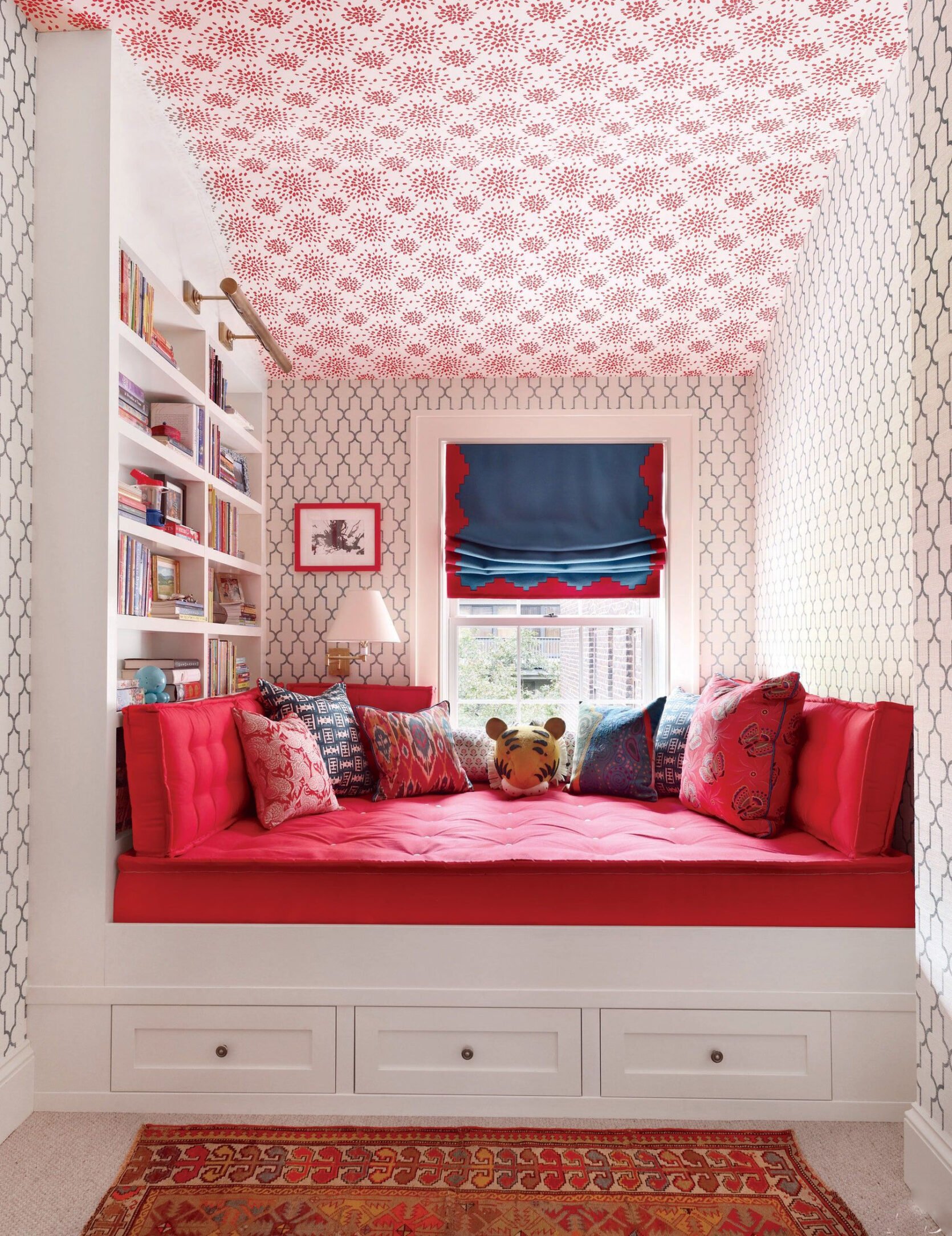
Fireworks by Hinson
HELLO, cute and playful! This one reminds me a lot of Les Touches (remember, the abstract-animal-dot one?), except it feels a little more pristine, organized, and buttoned-up. That tracks because Albert Hadley (the mastermind behind this print, in collaboration with Harry Hinson) also decorated spaces for Jackie O. (Clean, chic, simple, classic. It all makes sense.)
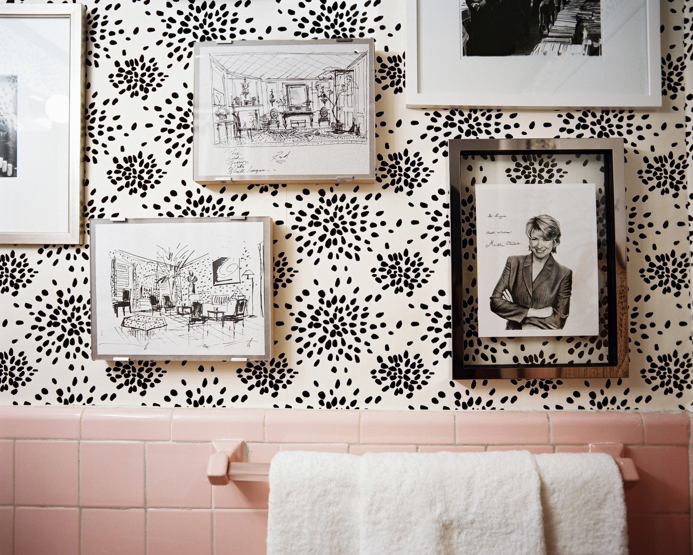
Finding wallpaper patterns that work with existing elements can be such a nightmare, but Fireworks is a great, goes-with-anything option. It comes in 6 different colors, too, so you’re sure to find one that works for your home and style.
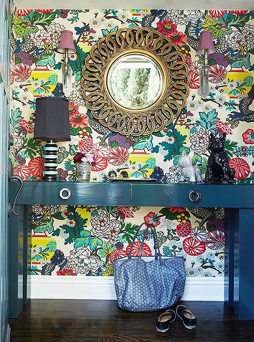
Chiang Mai Dragon by Schumacher
Oh man – every single color of this pattern is an absolute slam dunk. Chiang Mai Dragon is based on a 1920s Art Deco block print and it brings so much color, vibrancy, and life to each space it inhabits. This is another one of those use-anywhere patterns – it just goes, you know?
That’s it from me and my little ol’ noggin for our first-ever Trivia Tuesday and I gotta know – how many of these did you recognize? And even more importantly…which classic patterns am I missing? These were the 17 timeless options that came to my mind when I thought about classic textiles and wallcoverings, but I know there are SO MANY other goodies out there. Feel free to drop a link or a name (or even an involved anecdote!) if you’d like to share your own knowledge!!! See ya down there. xx
Opening Image Credit: Design by Jason Reeves of Highlander Mountain House | Photo by Maggie Braucher| via Remodelista
THIS POST WAS ORIGINALLY PUBLISHED HERE.

