Around this time last year, I was spiraling–shaking in my boots even–with the thought of revealing my very first makeover. I was and still am so proud of it, but sharing a creative project with the internet is bone-chilling. But what I didn’t know then, and what is perhaps even scarier now, is this lingering question “Does a room ever really feel finished?”
Recently, I ran into a friend who told me she saw my living and dining room all over Pinterest. She was so kind in her compliments about the design which I deeply appreciated. But being self-deprecating and unable to take a compliment, I had to tell her the photos she saw don’t exactly reflect our daily reality. The things that look good on camera are not always practical or even as good-looking in person. I guess I felt I needed to share this with her because photos on social media are deceiving and can make us feel bad about our own homes/lives. Uh oh, I think I just received my doctorate in Psychology?? My work here is done!! But in all seriousness, I look at my design every single day and I know that it’s not perfect. The baseboards have paint drips, a tangled mess of cords is clearly visible under the TV, and a gross lack of storage becomes a never-ending clutter issue. And that is honestly more than okay and it is normal (AKA inevitable) for a home to be imperfect. But does that stop me from thinking about new ideas for my “already-supposed-to-be-done” living and dining room? Not a chance (someone take away my doctorate quick!). And since I am not ready to get past the “pinning for inspiration” phase for my bedroom, I am seriously considering a few slight improvements for my beloved living and dining room.
So if you’ll be so kind and indulge me, here is what’s still on my mind about this design one year later:
SHOULD I PAINT THE CEILING?
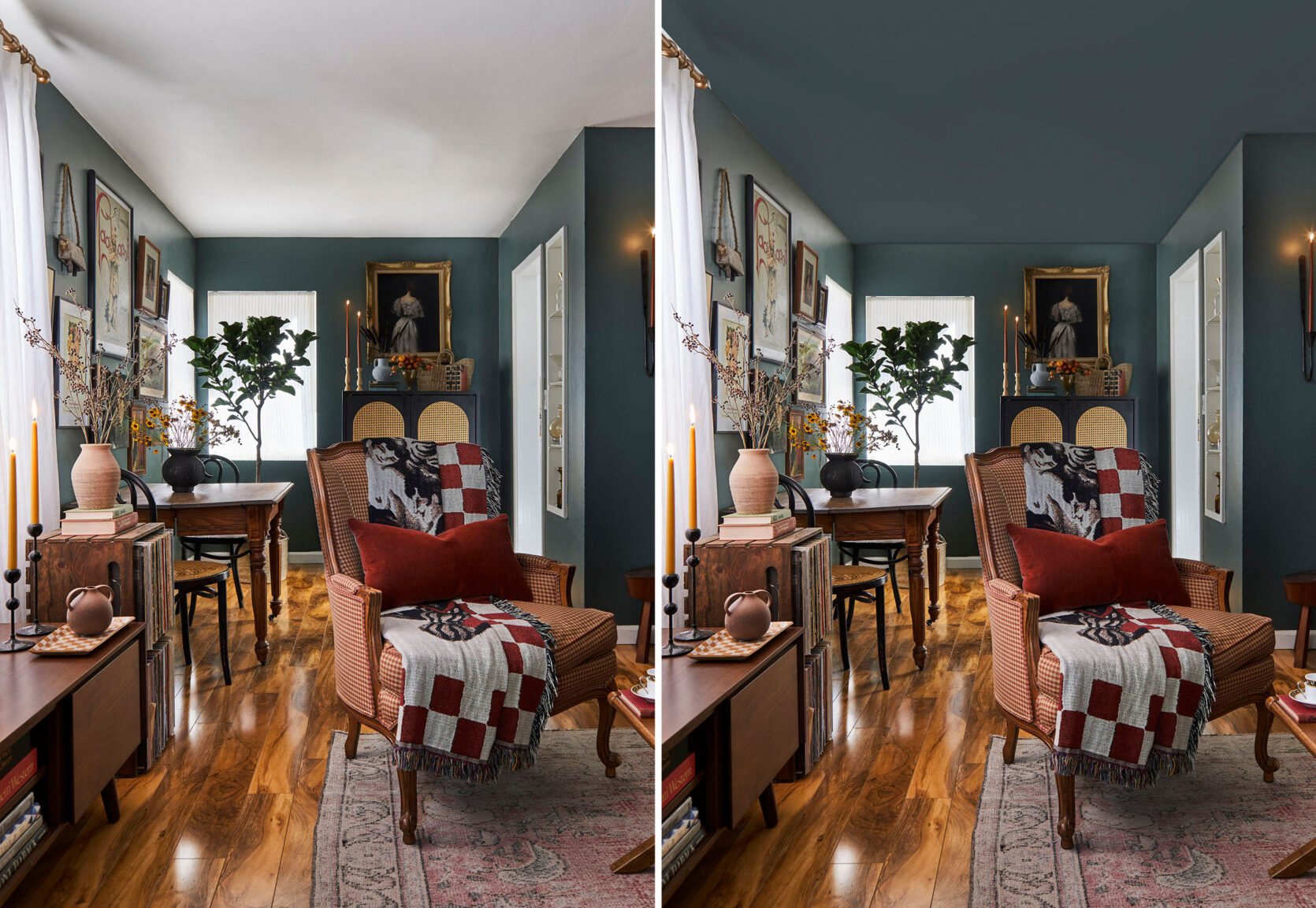
In my reveal post, I wrote about when Sara came to shoot she asked if I ever considered painting the ceiling. I didn’t at first but once she mentioned it it was like she unlocked a part of my brain that can’t let it go. I do love the way it looks now but wouldn’t a painted ceiling look even better??
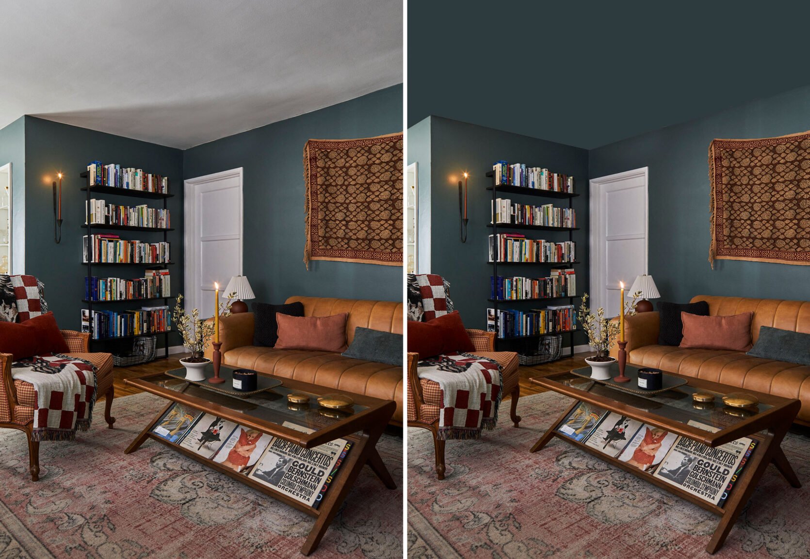
Guys. Even with my subpar photoshop skills, it looks so cozy. I think I just want to feel like I am being swallowed by this moody green color because I love it that much. It’s super exciting to think about but I remember some commenters said that the white ceiling actually pulls in the white accents like the baseboards, the bedroom door, and the white lampshade. I suppose I could paint the baseboards too so I wonder if that would help. Suggestions welcome!
Quick aside: people are always asking where the coffee table is from. I sourced it from Wayfair and it was sold out for a while but it looks like it’s finally back! It is a great coffee table and I highly recommend it if you are a magazine hoarder like me.
DO I WALLPAPER THIS NOOK?
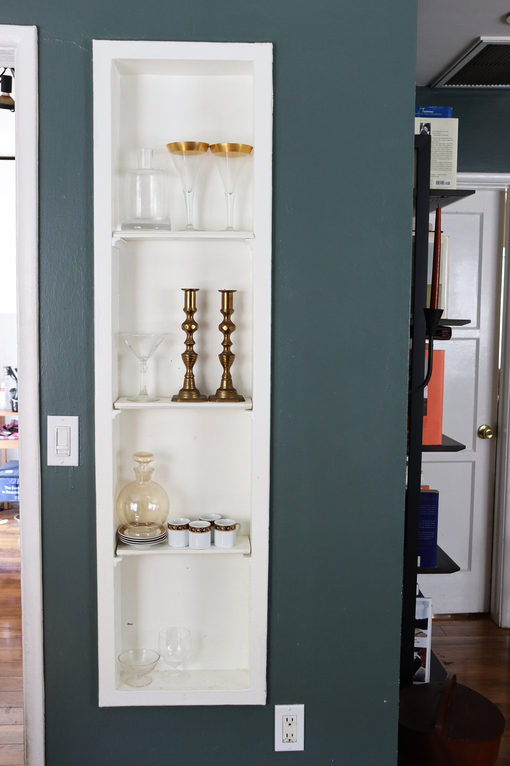
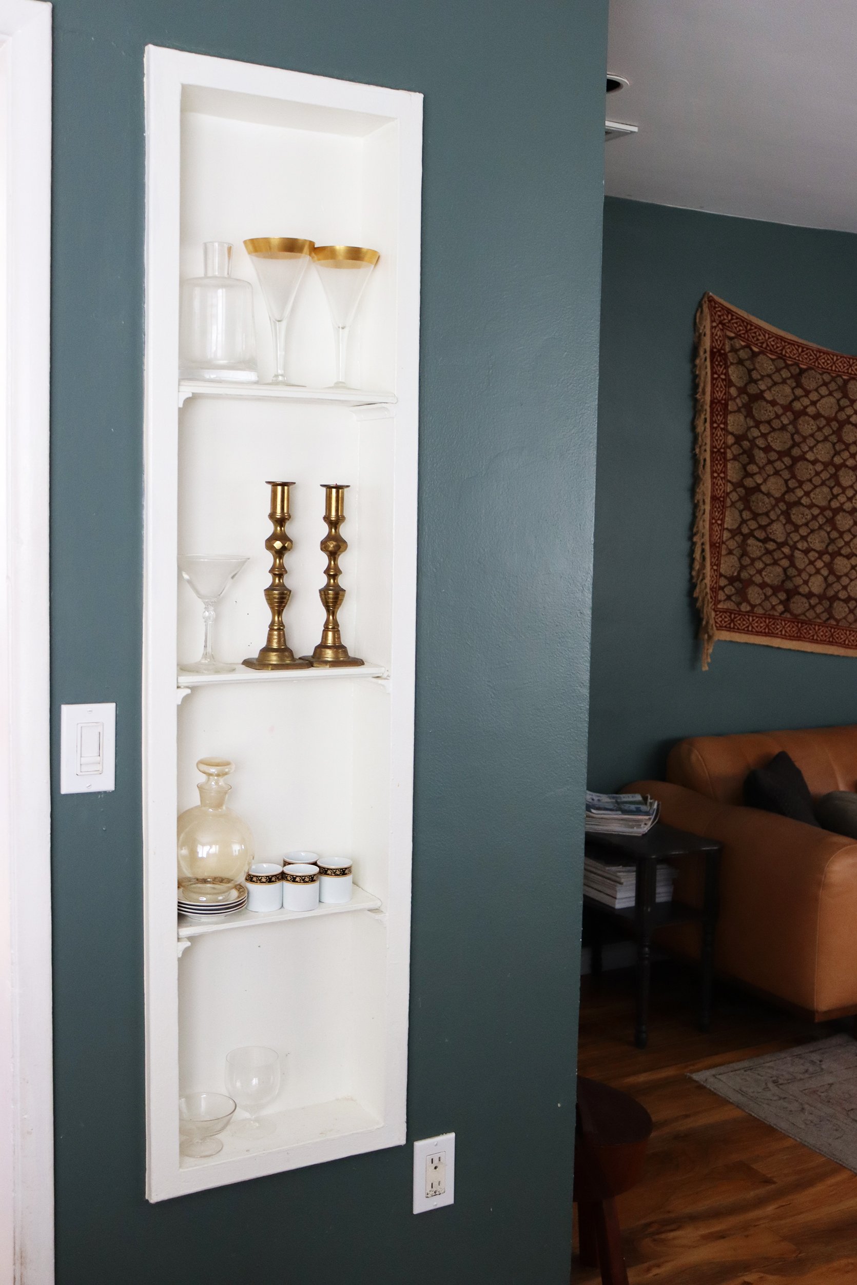
I’ve talked about adding more pattern here by putting wallpaper in this nook since the very beginning. It still haunts me that I didn’t do it for the reveal. Is it necessary?? No. Does it excite me to even think about it? Absolutely. And I think if I am still thinking about it a year later that might be a sign to give it a try. Here are some wallpapers I am thinking about:
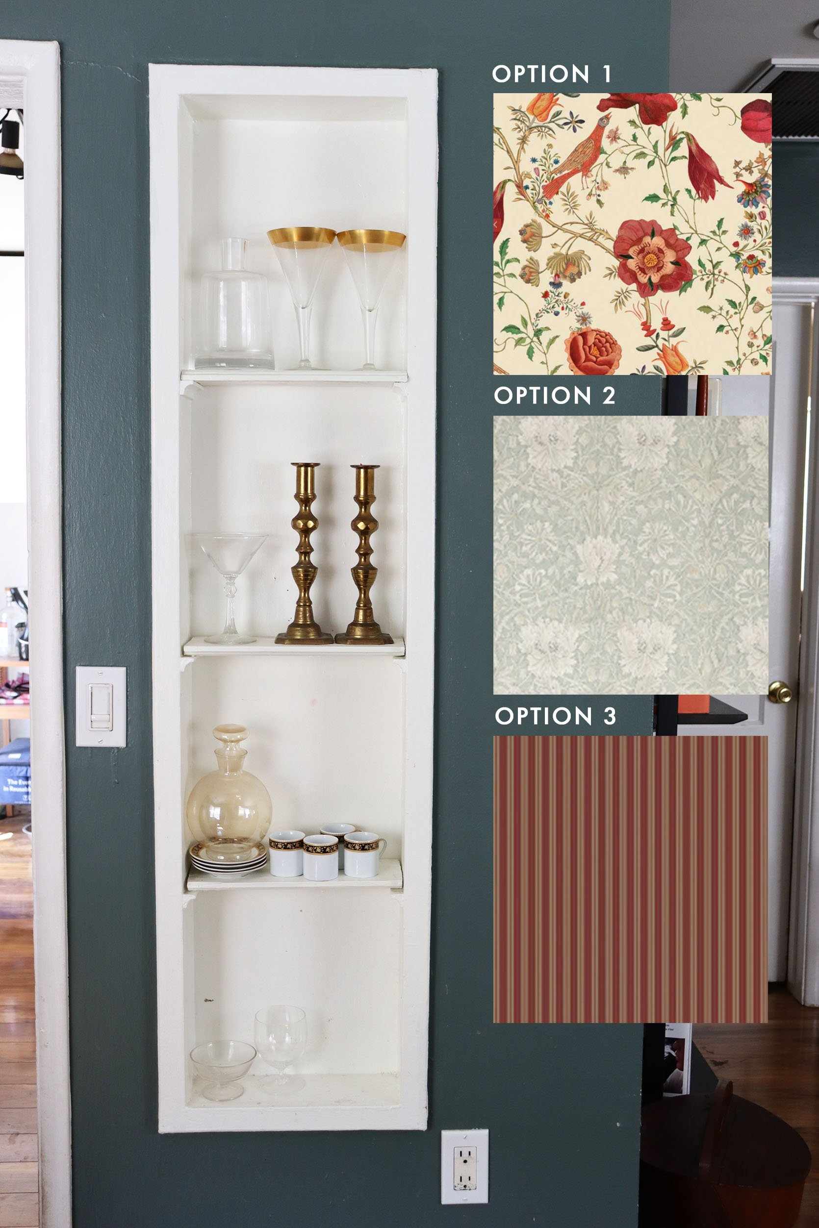
Option #1 | Option #2 | Option #3
I love how colorful and playful #1 is. It would add a lot of movement and would complement the Victorian style we already have going on. My only worry is it might be a little too busy, which leads me to #2. This one is calmer but still has the pattern and movement that I crave. #3 is sort of the in-between because it has the dark red which would really pop but the pattern is simple and classic. I am drawn to this one because it is the same color as our armchair but with a different pattern which I think could be really interesting.
My last caveat is that this might be more money/stress/labor than it is actually worth. Has anyone wallpapered a shelf like this before? It looks hard to do, but it would probably just require more planning and attention to detail than I am used to. Any tips?
DIY WALLPAPER IDEAS
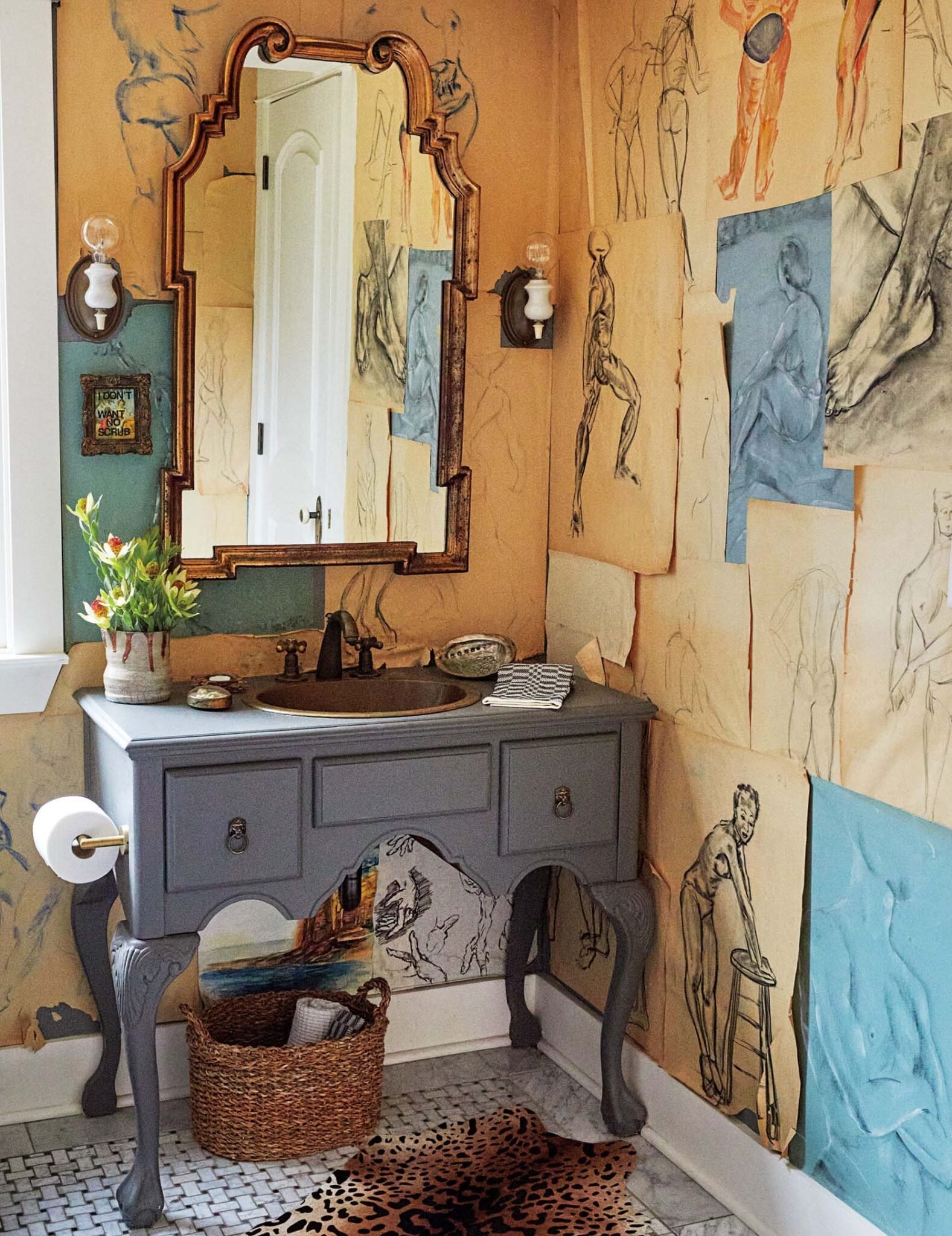
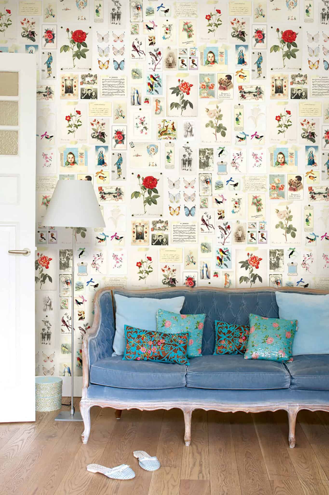
Another avenue I am considering is making my own “wallpaper” from vintage postcards or vintage drawings. I wrote about this idea here and almost forgot about it until this house tour. That DIY wallpaper by Pierce and Ward is unreal and it reminded me that I can totally find a vintage collection of something and make my own wallpaper. For some reason, it feels less scary than using real wallpaper. I would probably use double-sided tape or putty so it would be easily removable. Has anyone tried this??
IS IT TIME FOR NEW DINING CHAIRS? (The Answer is Yes…)
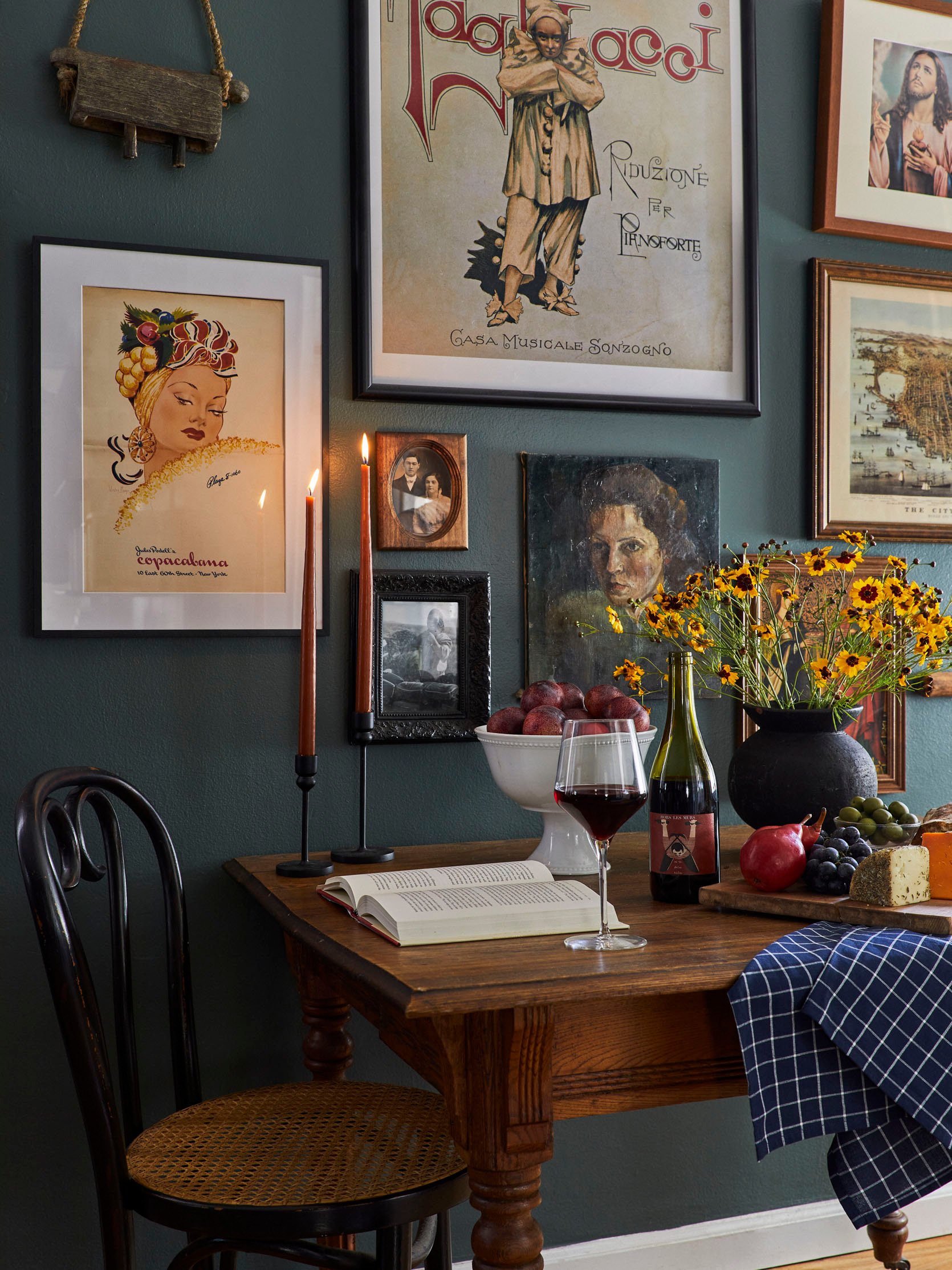
The dining area is the part of my design that I am most proud of. The gallery wall was so tough but what we ended up with makes me so happy every single day. The table is so dreamy and is like it was plucked from my vintage dreams and I love it paired with my vintage bentwood dining chairs. But the chairs…ahhh the chairs. They are beautiful but not practical and about a month after getting them this happened:
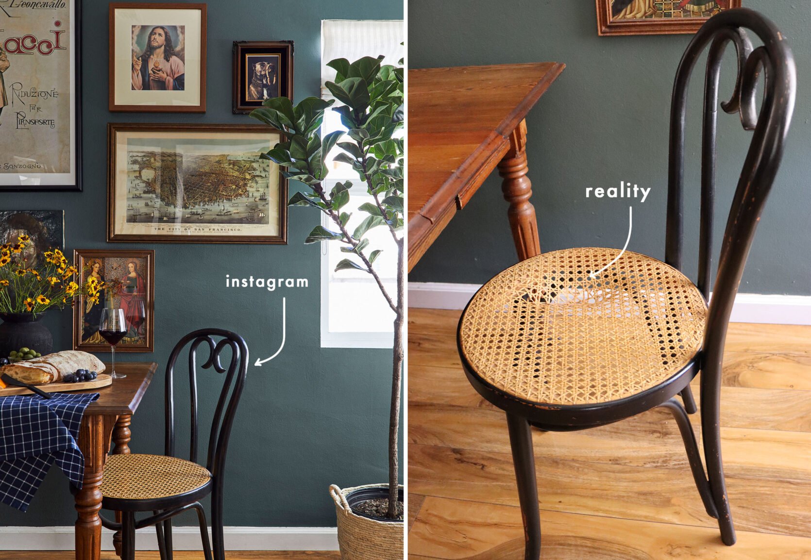
They are clearly not meant to be sat on by adult humans every day. I am sure the cane could be fixed but the wood is also very weak. They weigh less than 3 pounds each and are around 100 years old. We host our Sunday dinners here almost every weekend and it’s pretty humiliating having to pull out folding chairs because I am terrified a guest will sit on one and snap it in half. These chairs have become purely decorative which is not ideal for a dining experience. So one thing I really actually NEED to do for our safety and peace of mind is to find some new chairs. Here are some I am considering:
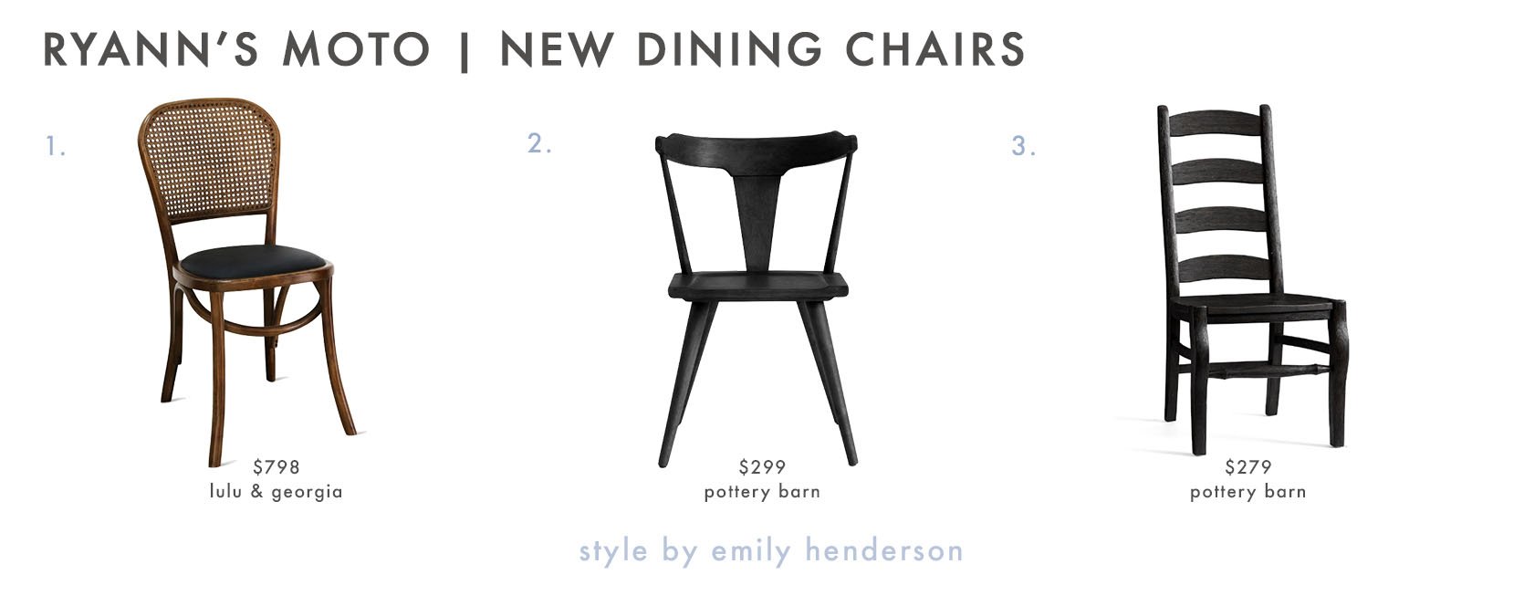
1. Brix Dining Chair (Set of 2) | 2. Westan Dining Chair | 3. Wynn Ladderback Dining Chair
I love how #1 has a similar look and feel to our current ones. #2 would bring in a more modern flair which I am not opposed to and I really like how wide the seat is (AKA I imagine it would feel like a chair fit for an adult). #3 is sort of a wild card but I find the really tall back intriguing and the shape is cool but maybe it’s too farmhouse-y? I don’t know why I feel like farmhouse isn’t far off from our current design even though farmhouse has never been a term I’ve used to describe this space…
My heart wants to consider vintage chairs but buying vintage chairs over the internet was what got us in this position in the first place. So unless I find some in person and can test their durability, I am going to do the responsible thing and buy new (in hopes they’ll last for a 100+ years).
SHOULD I REPLACE THE TAPESTRY OVER THE SOFA?

I love love love how the colors of this tapestry (read: rug I nailed to the wall) complement the color palette perfectly. We needed something that would tie in in the sofa, rug, and our red and tan plaid armchair which was a CHALLENGE but somehow I scored this from Chairish for like, $100. The problem is my husband thinks this tapestry reads too bohemian and thinks it confuses the overall style of the living room. I agree but it doesn’t bother me as much as it does him. I finally relented and said “fine, let’s replace it” but art that size costs double our rent. So I started researching DIY art ideas despite knowing DIY has never been my strong suit. For a hot second, I considered doing what Malcolm did in his dining room (wallpapering a large piece of plywood and hanging it like art) but truthfully I think that would fall flat in this space. SO NOW WHAT? Well, I reverted back to my go-to which is printing digital art and that’s when I saw this article. I’ll read anything that starts with the title “Free Art”. It is of course not free art but it does detail how you can download hi-res images from the New York Public Library digital collection. There are over 900,000 images from photography collections to cyanotype impressions. This intrigued me greatly and even though getting one of these printed in the size I would require would cost at least $150 and framing it would be another $150, that’s still cheaper than most art. So I of course took the bait and am eyeing quite a few including these:
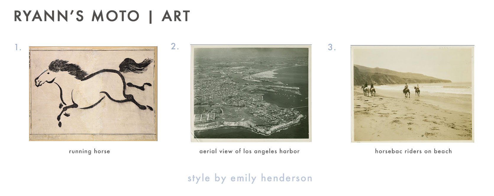
1. Running Horse | 2. Aerial View of Los Angeles Harbor | 3. Horseback Riders On Beach
For the sake of your time and mine, I am only including these 3 picks but there are about 100 I have already saved and could potentially choose from. And I believe art is highly personal so it’s a long process to select the right piece that speaks to me and my husband (and fits our style). To be continued!
So that is where I am at with this space that I still love to pieces and never ever want to leave. Does one ever get over their first makeover published on stylebyemilyhendersondesign.com? I am guessing not 🙂 I hope this little jaunt down memory lane wasn’t entirely self-serving and as always I would love to hear your thoughts down below. xx
**After Photos by Sara Ligorria-Tramp
THIS POST WAS ORIGINALLY PUBLISHED HERE.


