Earlier this week, Ryann and I were talking about post ideas and Ryann mentioned the idea of painted trim options. We then both remembered that Sara wrote an incredible post about her trim journey over two years ago when she was renovating. Why rewrite what has already been so perfectly written (personal story included!)?? So if you’ve been questioning what the heck to do with your trim then this is the post for you. Or if you just like riveting renovation stories, this is also for you. Enjoy!
I’d never had to make a decision about trim before in my life. At least, not until Mac and I bought our house. And to be totally honest, I had never really considered the trim in a room before. I’d painted a few apartment walls in the past, but I’d always taped off the trim. It’s just what I thought you did *shrugging emoji*. That all changed recently. Owning our own home meant we were finally able to do whatever we wanted, without being at the mercy of a landlord. Our ideas were only limited by our own determination to make them a reality (and I guess money, but BORING).
But as soon as the renovation got started in the front part of the house (before we had even moved in), it moved FAST. Like, having to make 1 million decisions every day fast. We only had about 5 weeks to get the house in good enough shape for us to move in, and we had decided to basically gut the place. Those days slipped by like too hot jello. Suddenly we were ready to paint the first rooms in the house (the living room, dining room, and front bedroom), and we had to make a decision real quick. SO… we went with white.
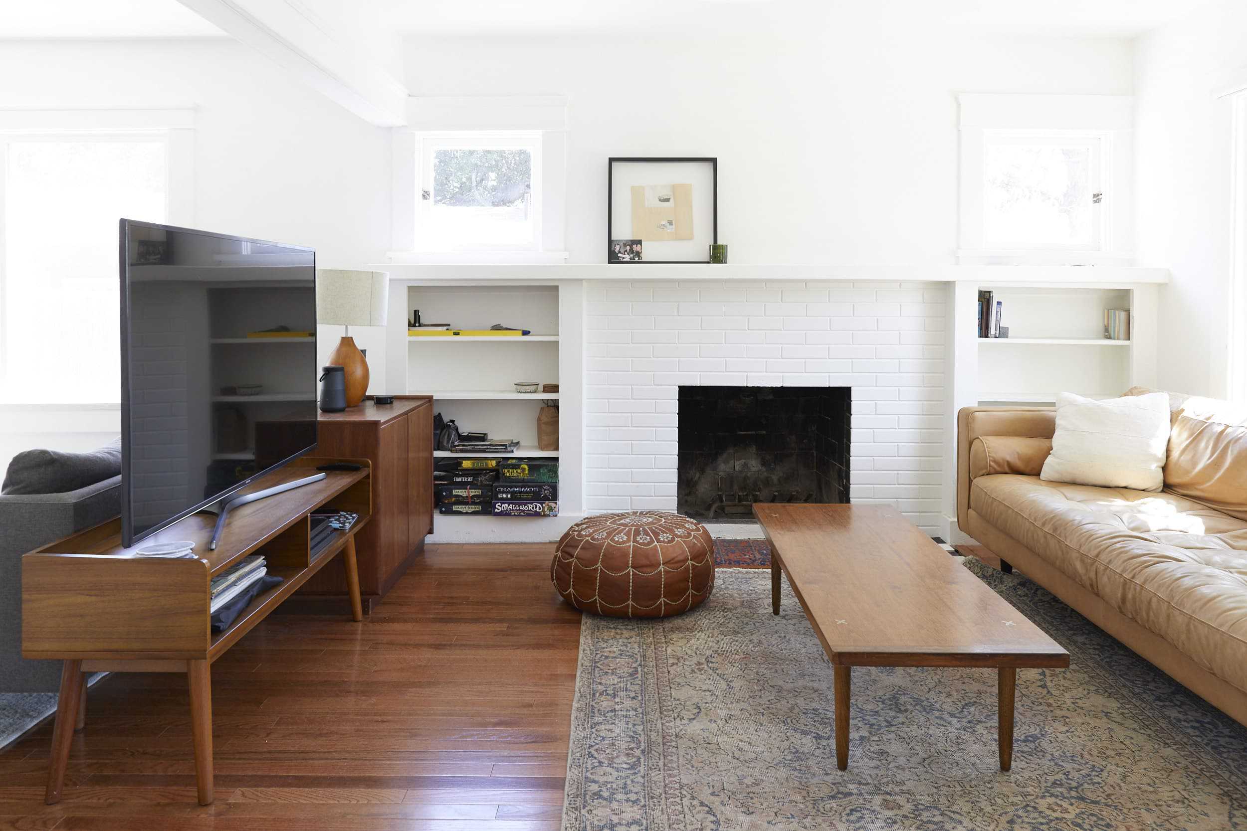
A lot of people had said to me “paint it white, live with it, see how you feel in a few months.” Which is good advice. And when my dad asked me what we were doing with the trim I quickly said “white, just the same thing all over… right?” White walls, white trim, white baseboards. I don’t regret it – those rooms feels so happy and bright. But once the initial renovation slowed down, we got to take time more time to think about how we wanted to rest of the house to look.
And we didn’t want the whole house to be white.
I started pinning all sorts of dark moody rooms. Maybe we’d do a black bathroom, with brass fixtures and green cabinets. A monochromatic gray kitchen, with lime washed walls and art ledges for vintage oil paintings. Or a deep navy library, with aged leather furniture and vintage sconces emitting a warm glow (a version of this is actually happening!!). Mac was on board, and even floated the idea of a dark accent wall in our master bedroom. I agreed and started pinning inspiration for that too. I’m a very decisive person. You don’t even have to use the (truly offensive) “gun to your head” metaphor with me. Just ask me a question and I’ll have an answer. And if I don’t know the answer, I’ll make one up on the spot. My decisions making process moves fast, and my fingers move faster often clicking “purchase,” “order,” or “send” before my emotions have a chance to even join the race.
But if I’m given too much time to think about something, I flip flop like a fish on a boat deck. I had done all this dark accent wall and moody room pinning way back in January of 2019 when we didn’t even have drywall up yet. The longer I had to think about it and the closer we got to actually painting, the more I nervous I got about my dark paint plans. Would it work in our home? I actually love a bright, airy room and the front part of our house was fine all white. Not to mention, our house is a bungalow craftsman. A style of home based on open floor plans, breezy airflow, and huge windows to let in all that California sunlight. It wasn’t a mysterious Victorian, begging for dramatic wallpaper and heavy drapes.
Finally, back at the start of January 2020, it was time to make some real decisions about how the TV room and master bedroom were going to look. I still really wanted to try something dark, but I was also sacred. I’m not a designer, so maybe making a super bold choice like an a dark room was a mistake. We compromised and decided to look for a dark-ish sage green to paint the TV room. But I was having all sorts of uncomfortable feelings about the dark accent wall I had agreed to in the master bedroom. In the end, I nixed the dark accent wall because it didn’t feel period to the home. Instead we talked about doing a medium gray all over. Secretly, I didn’t feel good about that either. If I was being really honest with myself, I didn’t want to wake up in dark room every day. I wanted to acquiesce badly, because I knew Mac didn’t want another white room. But something still didn’t sit right with me about the master bedroom, and so I was scouring Pinterest trying to understand what it was.
The more I stared at photos of rooms, the more I realized something about each room – the trim mattered. I was seeing that trim wasn’t just a “white” afterthought in a lot of the rooms I was pinning. The colors and treatments chosen for them were intentional and coordinated. It was kind of a breakthrough moment for me. A warm trim against white walls made a room feel traditional, a light wood trim gave off Scandi vibes, and a dark room with intentionally dark trim created drama.
That’s when the TV room went from being a dark-ish sage green to a dark, deep green. And the trim wasn’t going to stay white either. Nope, it was gonna follow the walls down this dark and twisted path.
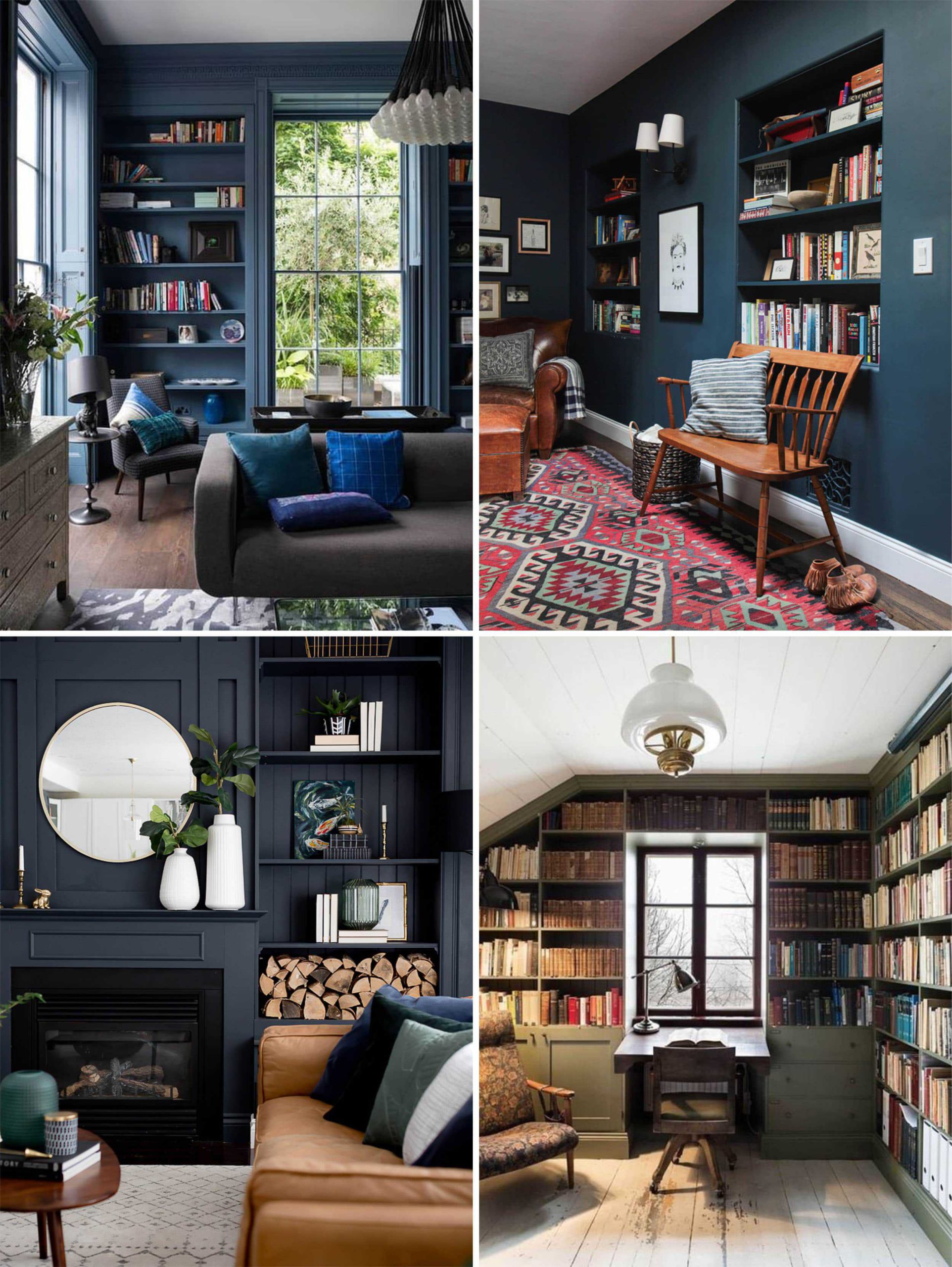
Meanwhile, the idea of light grey walls with white trim felt like it hit a more traditional note in the bedroom that brought me a lot of comfort.
We ended up choosing Sherwin William’s Rookwood Shutter Green for the TV room (a dark, almost black, green). Then we picked Heron Plume for the walls of the master (a soft warm gray), and Greek Villa (a creamy, warm white) for the trim. I was feeling really confident about our decisions and was ready to get paint.
The day before picking up paint I had a spiral moment in the office. I had taped up all the paint chips on my office wall, and I was suddenly washed in doubt about the decision to go gray on the walls. I don’t know what it was, but it was messing with my peaceful bedroom vision. I begged Julie to come into my office and stare at the paint chips with me. “I don’t know if I’m making a mistake going with a darker tone on the wall in the bedrooms… I don’t know why, but it feels a little too traditional maybe?” And then, in all her Julie genius she simply said, “why don’t you swap them? White on the walls, grey on the trim.” I could suddenly breathe again. Then I remembered this photo from her own bedroom inspiration.
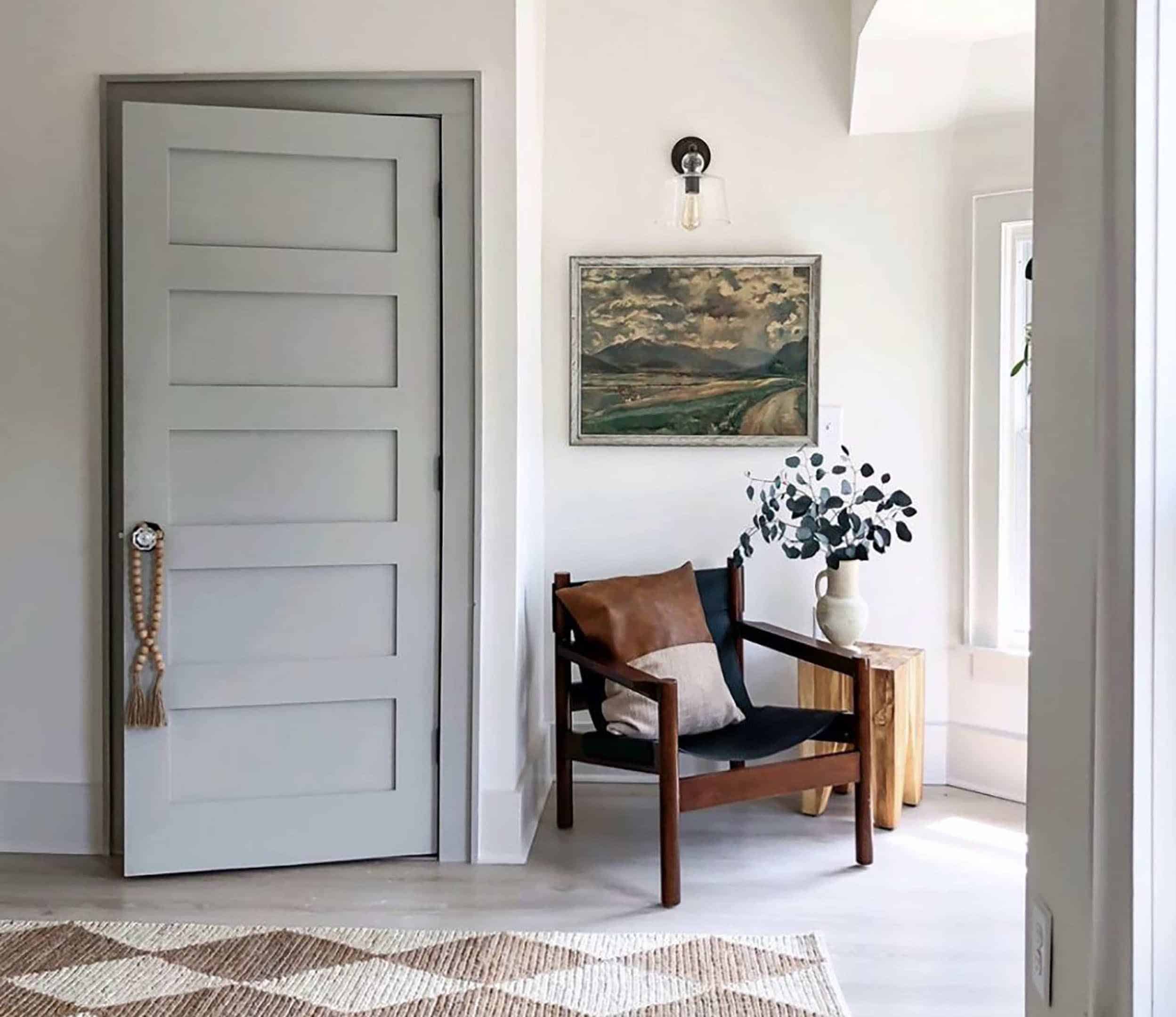
It sealed the deal for me. A creamy white wall to catch all that warm morning light, and subtle grey trim and pocket doors to give the room a bit more “life” than going all white. Paint order placed, decision made.
The white went up in the bedroom and I loved it. Still do. (SO much, in fact, that we’ve repainted the entire living room and dining room the same white. I hadn’t truly been happy with the white color I’d originally chosen back in January of last year – it felt just a touch too cool and sterile. As soon as I saw Greek Villa up on the bedroom walls I made the, admittedly INSANE, decision to repaint the entire living room and dining room. Luckily it was white on white, and didn’t take more than two coats.)
But then the first coat of Heron Plume trim went up in the bedroom… and the doubt came back fast. It was subtle. And I mean, subtle. I had wanted a soft contrast, nothing black or bright, but I wanted SOME contrast. And it just wasn’t enough for me. Heron Plume is a beautiful color, but it wasn’t giving me enough when up against my new romance with Greek Villa. I knew that switching trim colors at this point was going to slow us down and put the renovation behind schedule, but I also knew this was my only chance to switch paint colors. I didn’t have time to go back to Sherwin Williams and get new samples, so I rummaged through the samples I already had (I had brought home PLENTY when we were trying to choose the gray for the wall). Luckily I had a sample of Modern Gray – a darker, but still soft and warm gray that someone on Instagram had suggested. I brushed it on one section of door frame and knew it was the right choice. I immediately ordered new trim paint, and haven’t looked back since.
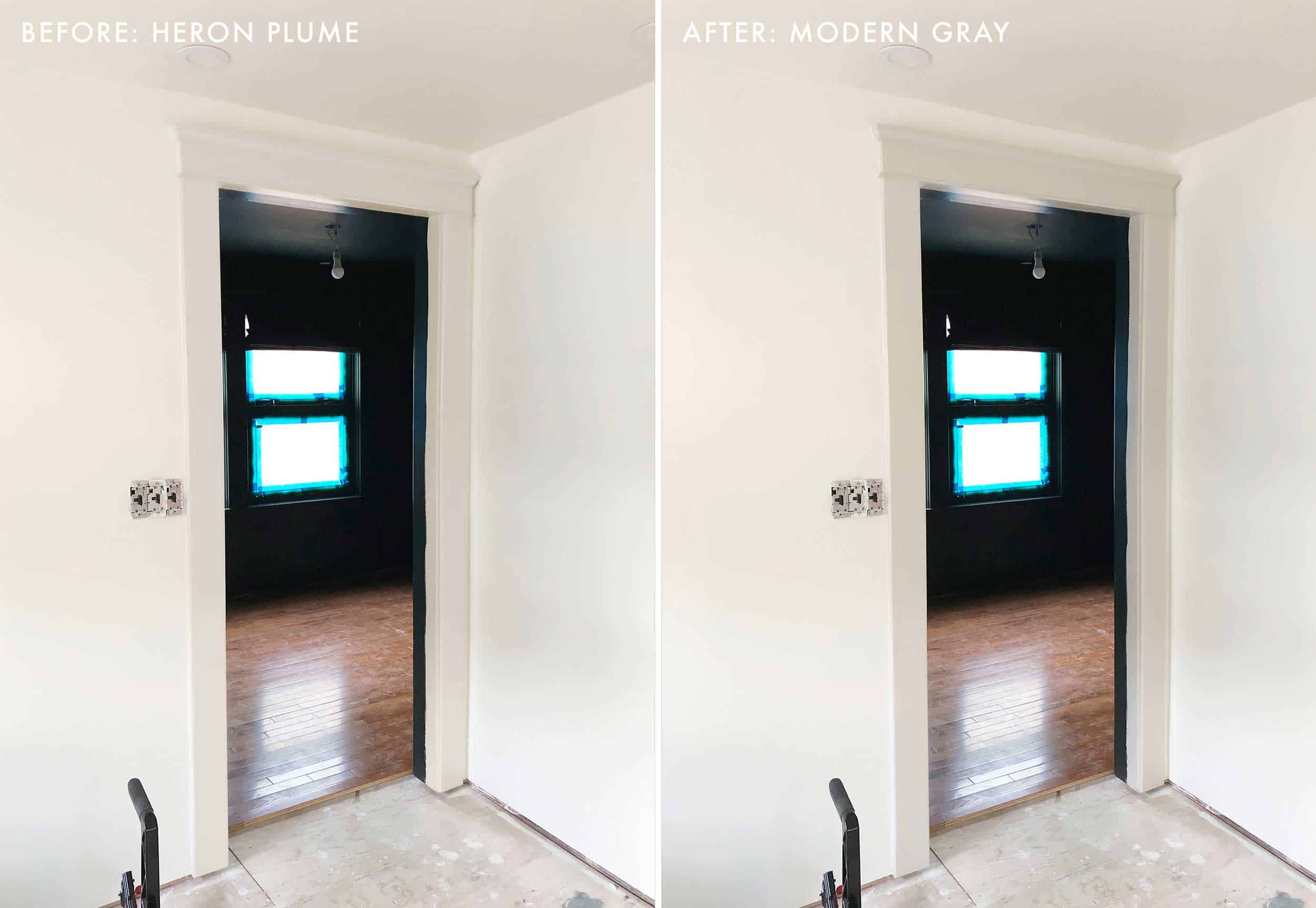
I (very stupidly), didn’t take a photo of the Heron Plume up. But I photoshopped a before and after comparison that feels pretty accurate. See, SUBTLE.
My story is one of pure insanity, I know. When you’re project managing your own renovation you do tend to feel a little (lot) crazy. But my gut hesitation led to some very quick decisions, and I’m relieved I made a change. See below for a badly taken iPhone photo that makes me actually very, very happy.
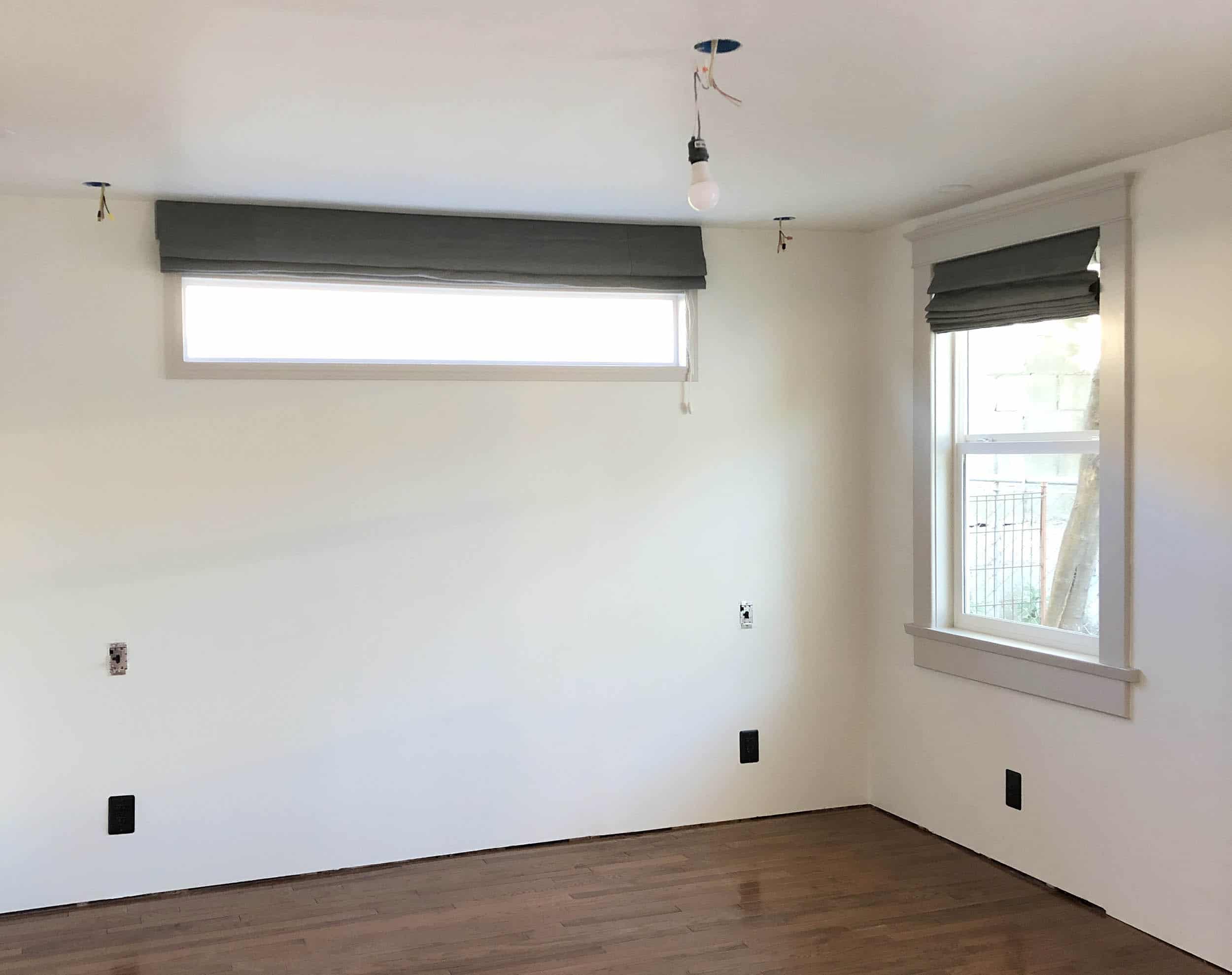
And now I’m truly #teamtrim. Trim can be a great way to bring in a little contrast, color, or mood to a room without making the walls yell. Plus, taking a risk with your trim can be a budget-friendly way to refresh a space. You really only need about 1 gallon of paint to cover the trim of a large room, while you could go through 3-5 gallons to cover the walls of a large room. And there are lots of different trim options to choose from. I found so many different variations while I was going through my mid-renovation crisis.
All The Ways To Trim
The “Light On Light”
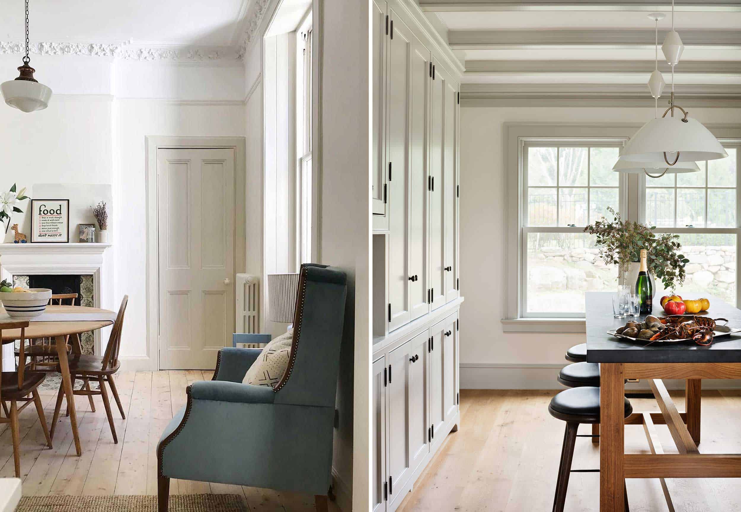
First up, you’ve got your traditional light walls next to light trim. This is the route we went with for our master bedroom and I think it’s a pretty classic approach to trim. Think of this style as the “highlight” of the trim world. It’s gently enhancing your doors and windows, like a 13-year-old desprately putting lemon juice on their hair at summer camp because their mom refused to pay for real highlights at the salon.
The “Light Wall, Dark Trim”
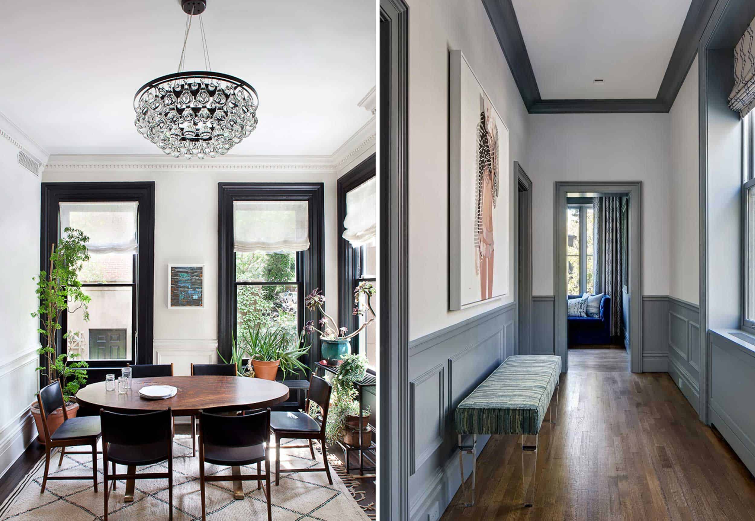
Next is the style that still goes for a light wall color, but gets some serious contrast from a darker trim. If you want a modern, graphic pop, this could be the style for you. You don’t have to go clean white and dark black, but there’s clearly nothing wrong with that classic combo.
The “Dark Wall, Light Trim”
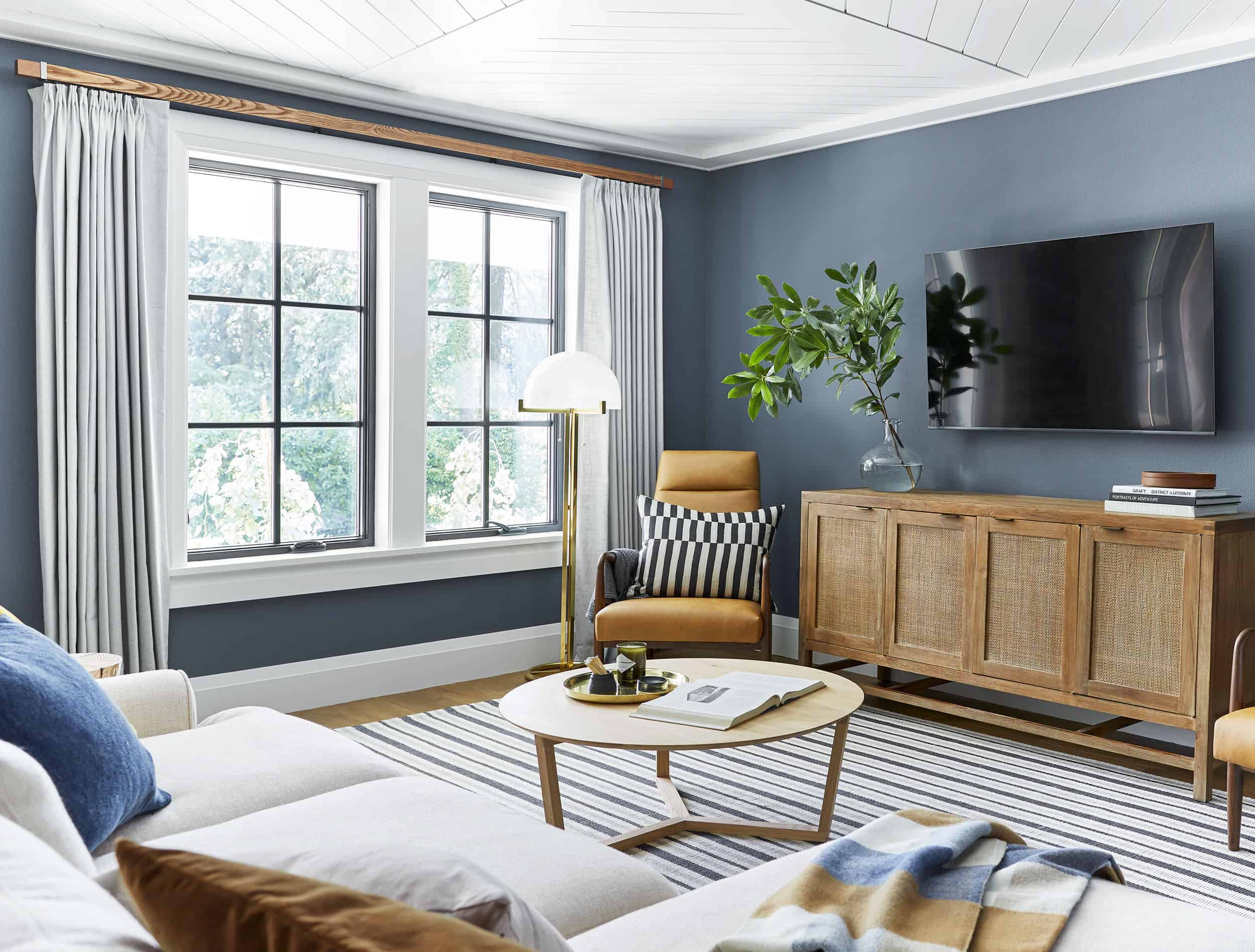
This is where I thought we were going in our TV room before we made a serious turn to dark and dramatic. It’s a nice way to add a touch of deep tone, without going full “dark side.” The light trim keeps things fresh and classic, while the walls do the major acting.
The “Light Monochrome”
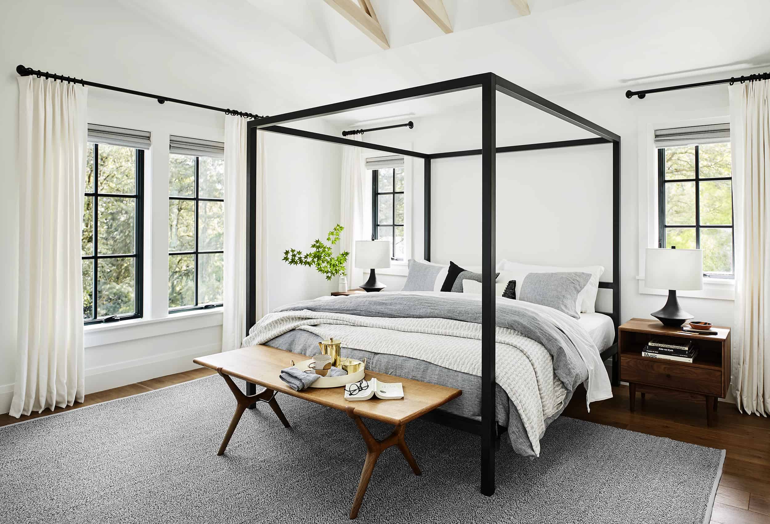
This is what we have going on in our living room and dining room, and I’m not mad at it. It’s an airy, light style that Em’s used several times (like in the Portland Master Bedroom). This is honestly the one style I see used most often, and it’s timeless.
The “Dark Monochrome”
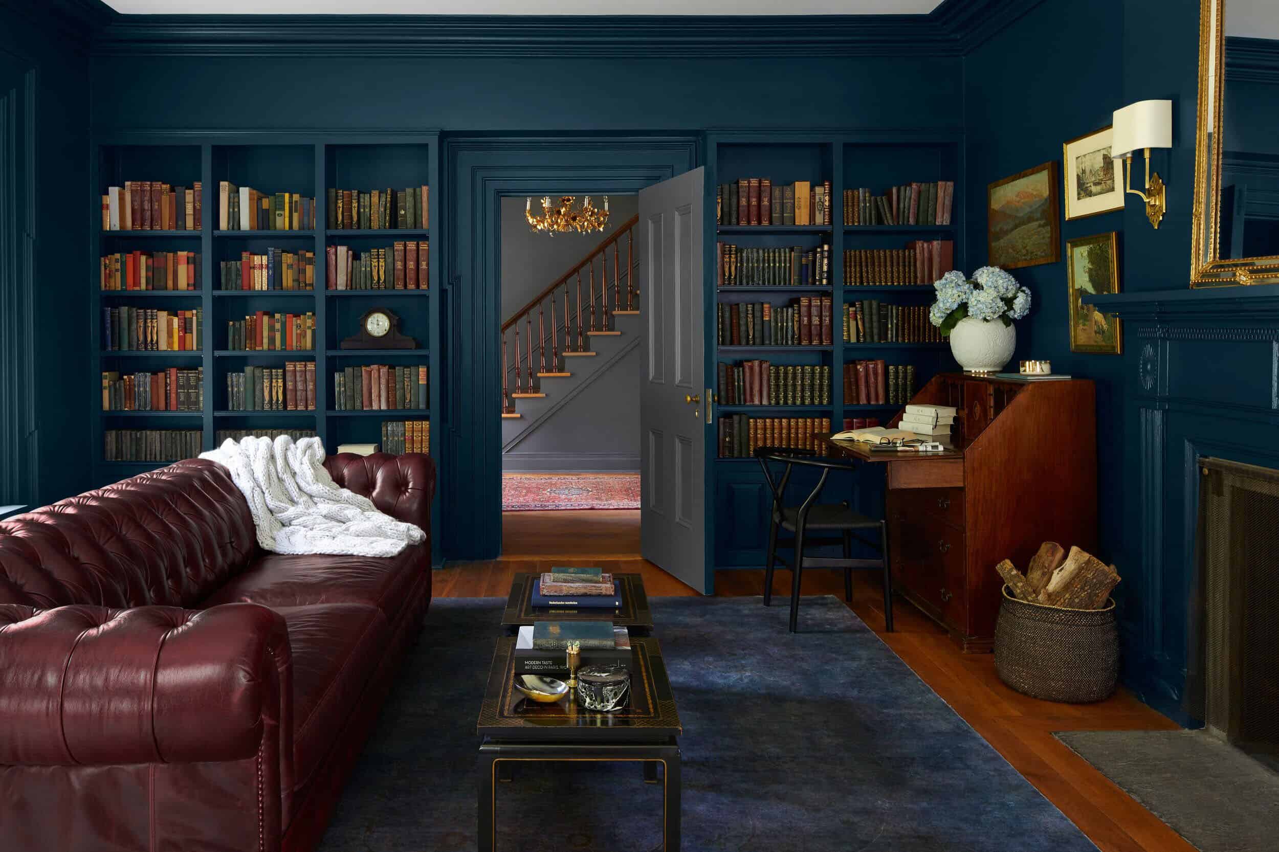
The true inspiration for our TV room! We’re going all dark, all the time. DRAMA. This is for the risk-takers, the bold leaders, or the people who make really fast decisions despite many people telling them “no.” My dad, brother, and a handful of friends all said, “Sara, no.” While I kept chanting “Sara, YES.” Followed by a legitimate spiral on Instastories the first day after painting (the spiral begins 14 slides from the end of that highlight), and the subsequent soothing of the internet assuring me to keep pushing forward with the dark color. Either because they really do think an all dark room is cool, or because it’s not their room and they just want to see what happens (I get that).
The “Subtle Two-Tone”
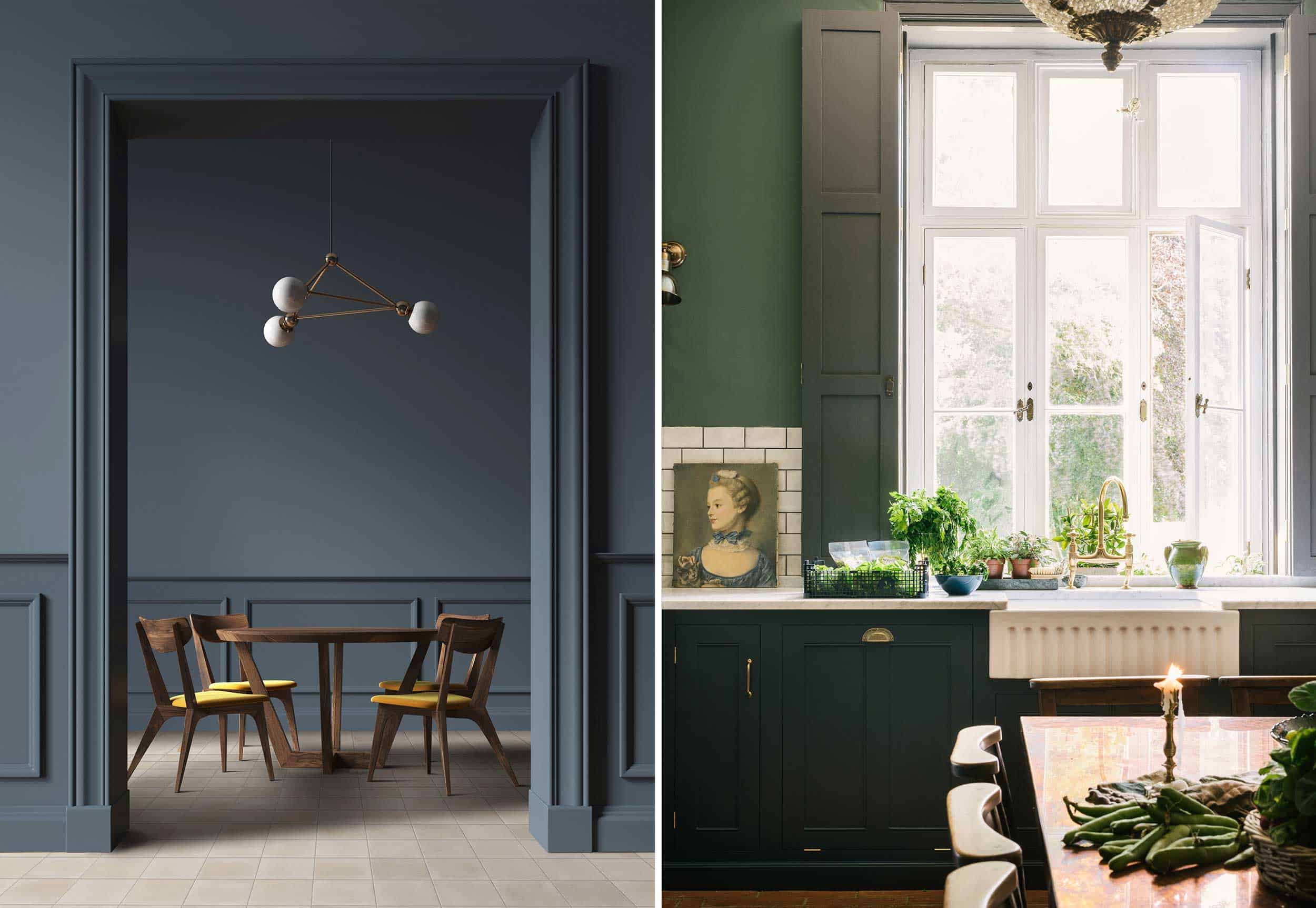
I came across this for the first time while doing research, and it’s stunning. I suppose it’s more than just the trim in these two photos, but it could easily be translated into some subtle two-tone trim action. With this style, you’re picking a wall color and trim color that are very similar, but just different enough that it’s noticeable for a deliberate gradient effect.
The “Wallpaper, Trim Meet-Cute”
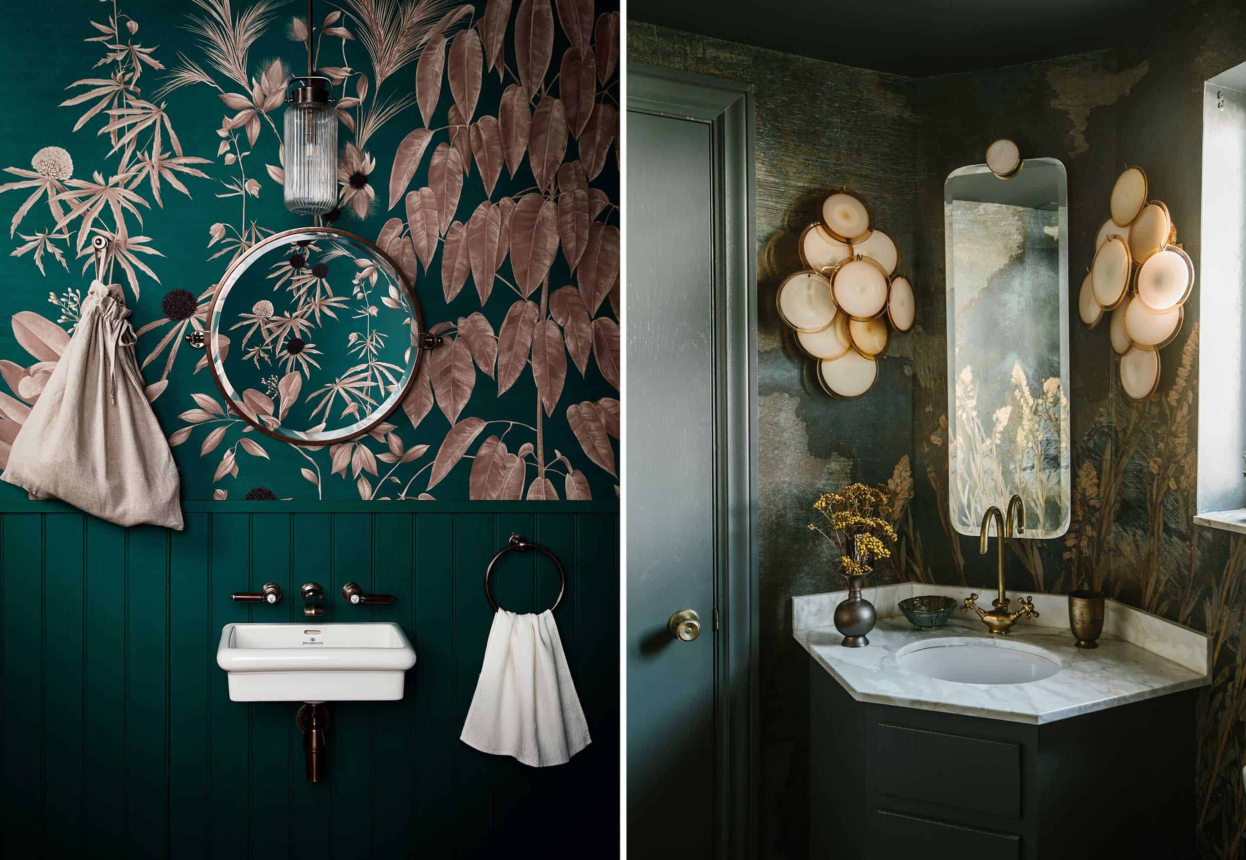
One day I will create the powder bathroom of my dreams using this technique. The trim color is sourced right from the wallpaper, to create a seamless transition, almost like the monochrome styles from above. But the pattern of the wallpaper brings a whole new flavor.
The “Statement Door”
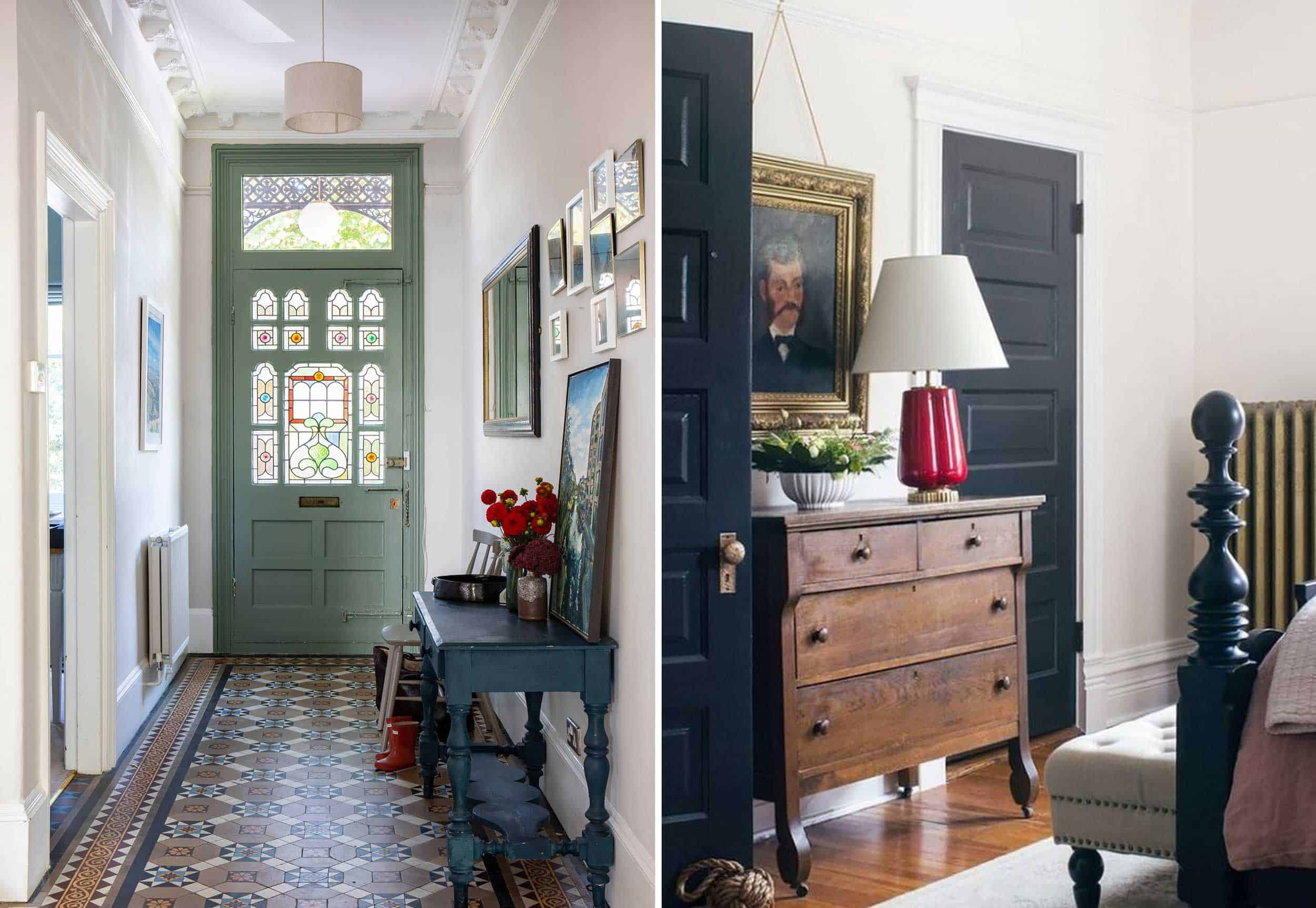
In our master bedroom, we’re treating our pocket doors just like our trim, for a mini-monochrome effect. But if you’re not ready to paint all the trim in your room (do it, take that risk), or you just want a pop of color, the statement door & trim is ready to elevate your space.
The “Au Naturel”
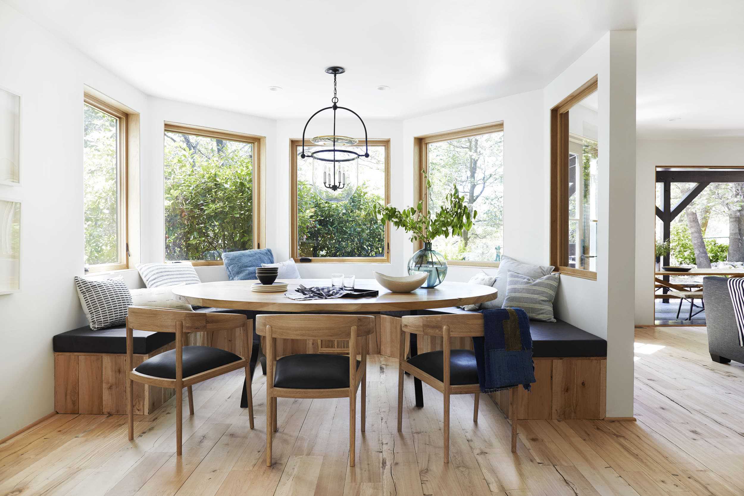
I grew up with unpainted wood trim and doors in my home, and love them. But Emily really took it to the next level when she chose to use light, unstained wood as the trim up in her mountain house. A light wood is reminiscent of modern, Scandi design, while a darker wood could go more cabin-y or traditional (like in my childhood bedroom).
Trim Tricks & Tips
Throughout this whole renovation, I’ve painted my fair share of trim, and I have just a few tips I’d like to leave with you with. Some of them may seem “common knowledge,” but to trim newbies they could be helpful:
- If you’re painting your trim, it’s worth taking some time to look it over and see if there is any old paint build-up that you could sand-down, using a putty knife to clean out build-up in tight corners, and seeing if there are any big nicks worth filling in with plaster before you paint. And if you do sand, make sure you vacuum up after your bad self. Doing so will give you the freshest, smoothest trim possible.
- For your walls, you’ll probably use a matte or eggshell finish, but for your doors and trim you should use a semi-gloss. Your window frames, doors, and door frames are more likely to get a whole lot more skin to skin than your walls, so having the ability to easily clean them is essential. We painted our entire fireplace mantle and built-in shelves with eggshell, and I immediately regretted it. Any dirt or dust didn’t wipe away and just got smudged into the paint more permanently. And our cats use that fireplace mantle like it’s their own private living room freeway. So we re-painted with a semi-gloss and it’s so much easier to keep clean. Whichever paint store you go to will have a good recommendation!
- Rollers for the walls, brushes for the trim. Brushes will allow you to get into all the cracks and crevices that rollers won’t, plus brushes will help you get a smoother finish with a semi-gloss paint.
- If you’re taping off walls, wait until your paint is completely dry and then use a straight razor to go along the edge of the tape before you pull it up. Otherwise, the dried paint that’s on the tape could end up pulling up sections of dried paint on your trim. I have made this mistake plenty. And if I’m being honest, I’m usually lazy enough that I usually make it several times before I finally cave and go get the box cutter.
If you’ve got more trim painting tips, I’m ready for them. We still have plenty more rooms to paint in our house over the next few years (the front bedroom, the master bathroom, the kitchen, the guest bathroom…). And has anyone painted their trim a bold color they love? Or tried the all dark monochrome (please, tell me I’m not alone).
If you want to see real-time progress check out my stories on Instagram. And, feel free to catch up on my entire home renovation series (you know, if you’re bored): Sara Buys A House Part I: Six Tips For First Time Home Buyers | Sara Buys A House Part II: The Renovation | The Designing Begins: A Floor Plan Design Agony | The Designing Continues: Time To Pick Furniture | The Final Design Plan | A Fireplace Design Agony | How Much It Really Costs To Work With A Designer: The Final Tally Of Sara’s Project | Sara’s Moody TV Room
Opening Photo Credits: Photo by Matthew Williams | via Country Living
THIS POST WAS ORIGINALLY PUBLISHED HERE.


