As you might know, the kids are now in separate rooms after 5 years of opting to share. With that comes a lot of new independence and asserting a sense of who they are (or want to be). It’s incredibly fun and also full of new challenges for me. After some initial immature pushback on my part last year I’ve taken the approach of back seat designer, letting them guide the process, tell me what they are into, and then definitely curating it along the way behind the scenes (so that there aren’t literal pokemon and Minecraft murals on all the walls). If you are wondering about my methods on such manipulation I wrote a whole post about it (and not going on Pinterest with them is my #1 piece of advice). Obviously, kids don’t need fully designed rooms, we surely never had them growing up. But due to my wonderful job of creating inspiration and avoiding pitfalls for others, our kids get the full treatment – to their benefit (and likely detriment :)). Today, you’ll see where we are at after two months of settling into Charie’s solo room. It’s definitely not done but headed in a good direction and he and I are both LOVING IT.
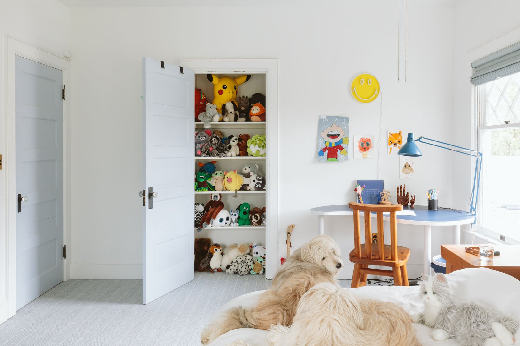
Charlie is nine and in that sweet age between being a snuggly little kid and wanting to be a teenager. He hasn’t been as forthcoming when it comes to his style as Birdie, but once I opened the door and showed him some ideas he came in with a lot of his own opinions. He mostly likes funky stuff – things that are unexpected, irreverent, that make you laugh (think fart jokes, for the walls), and make him feel like a big kid with a sense of humor (he has a GREAT affinity towards puns that is pretty impressive). He also wants a lot of graffiti-based prints so I’m doing a pretty strong redirect to “street art” (as you’ll see below). Also, that stuffie closet is not for stuffies – the shelves were just recently installed and he put all his stuffies in there, but obviously hoping to use it for more function (seasonal sports gear, games, nerf guns, etc).
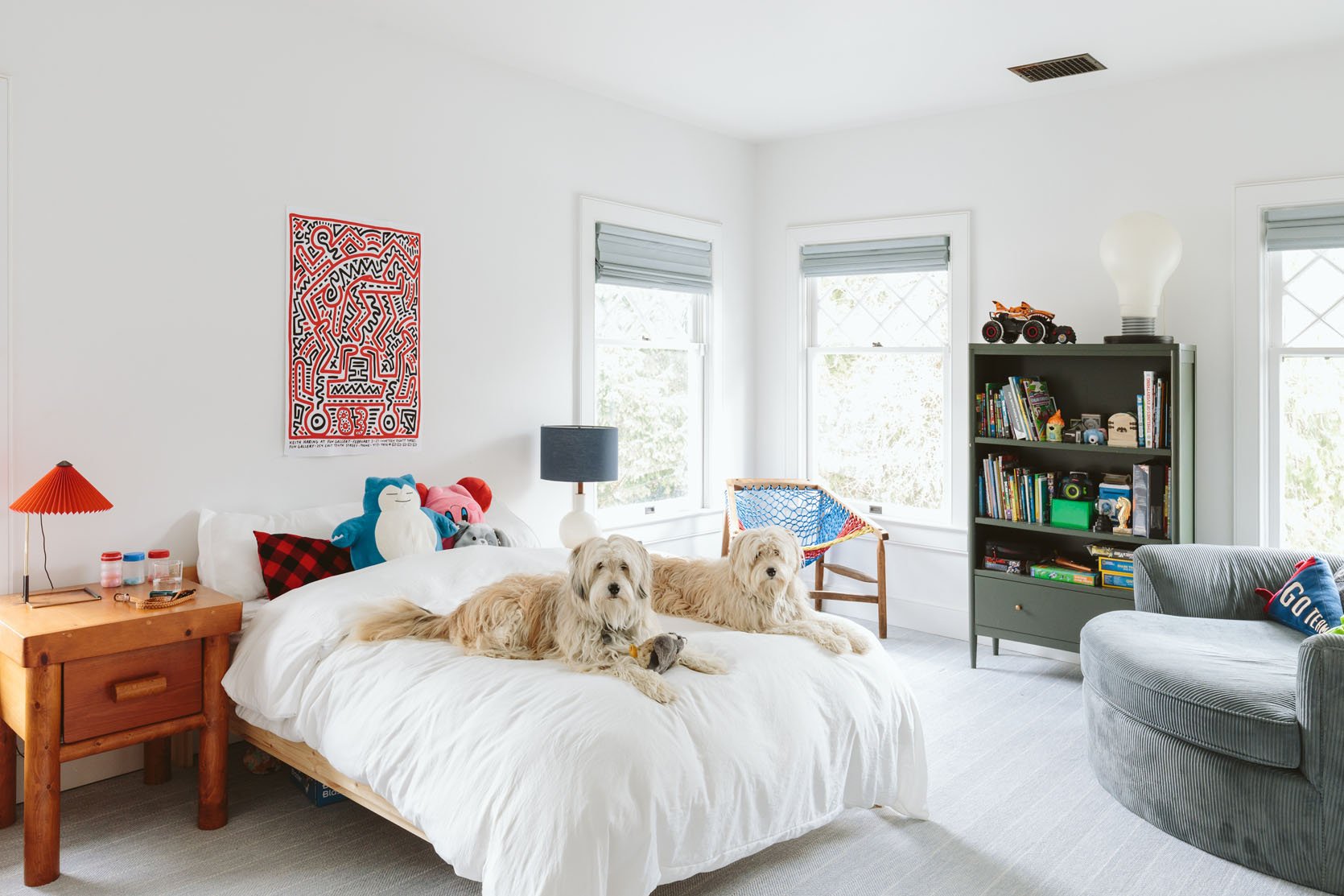
Wall Color | Roman Shades | Carpet
We centered his bed which might stay here, might not, and have yet to buy a more complete bed (it’s currently just on an Ikea frame). Part of me wants to design a bed that is wacko and so fun, while the other part of me wants to do something simple that can be easily styled around. I’m very tempted by this bed in pine green. I’m currently waiting for inspiration to strike or for the mental brain space to dedicate to it properly. I also can’t decide if I want to upgrade to a queen just in case we need extra guest space – the room can def handle it and it’s better for sleepovers. We’ve had the green bookshelf for years (same with the white lamp with blue shade from Schoolhouse) but almost everything else was found used in Portland.

Red Lamp | Side Table with Drawer (vintage) | Keith Haring Poster | Blue and White Lamp | Side Table
I have plans to paint or strip the vintage nightstand (left) and desk chair (which have such playful round lines and are SOLID wood – so heavy), but waiting to decide what direction I want to go in. The table on the right is an Ikea table that I got at a thrift store (and love).
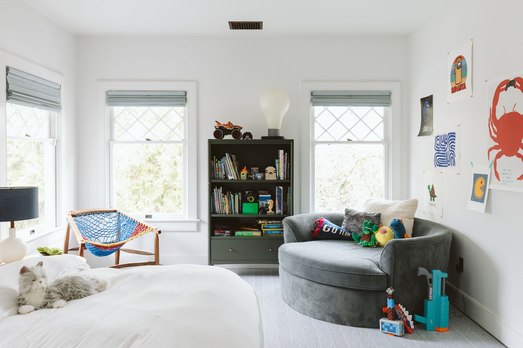
Net Chair (Made by Purl aka @total_nonsequitur | Green Bookcase | Light Bulb Lamp (similar option and smaller version) | Rounded Chair (thrifted)
Both those chairs are EPIC, with good stories. The one on the left was made by my new friend Purl (IG: @total_nonsequitur). I bought it from Urbanite, through another dealer I love (@thingspdx) but he makes them in all different colorways (he lived on a commune for 18 years where they made hammocks to support the community so he knows what he’s doing). Charlie and I were shopping on Mother’s Day and he picked it out and I said, “YES!!”. He loved that it looks like a basketball net and I loved it because it was unique/funky, so it was a win/win and in a lot of ways our jumping-off point. The massive round chair was a FB marketplace purchase. The guy selling it had it in a storage unit so he wouldn’t tell me how big it was nor measure it, but kept saying “really big”. I thought it was like a Satellite chair – something I’ve wanted forever and usually very expensive. And like a lot of FB marketplace purchases I bought it sight unseen – just hired a lugger to pick up in Vancouver and bring it to our house. Y’all it’s HUGE – like 6′ in diameter. It barely made it up the stairs and it’s not going anywhere. We all love it, but is this the right room for a 6′ round chair? Probably not (a huge basement TV room would be more appropriate) but he loves it so much and all four of us can snuggle/read in it. I need to style it right (which would include playful/soft pillows + stuffies). But it’s big enough for a kid to sleep on during a sleepover (which we’ve decided to opt out of these days except for special/important occasions because nobody sleeps, like at all, and we regret it every time).
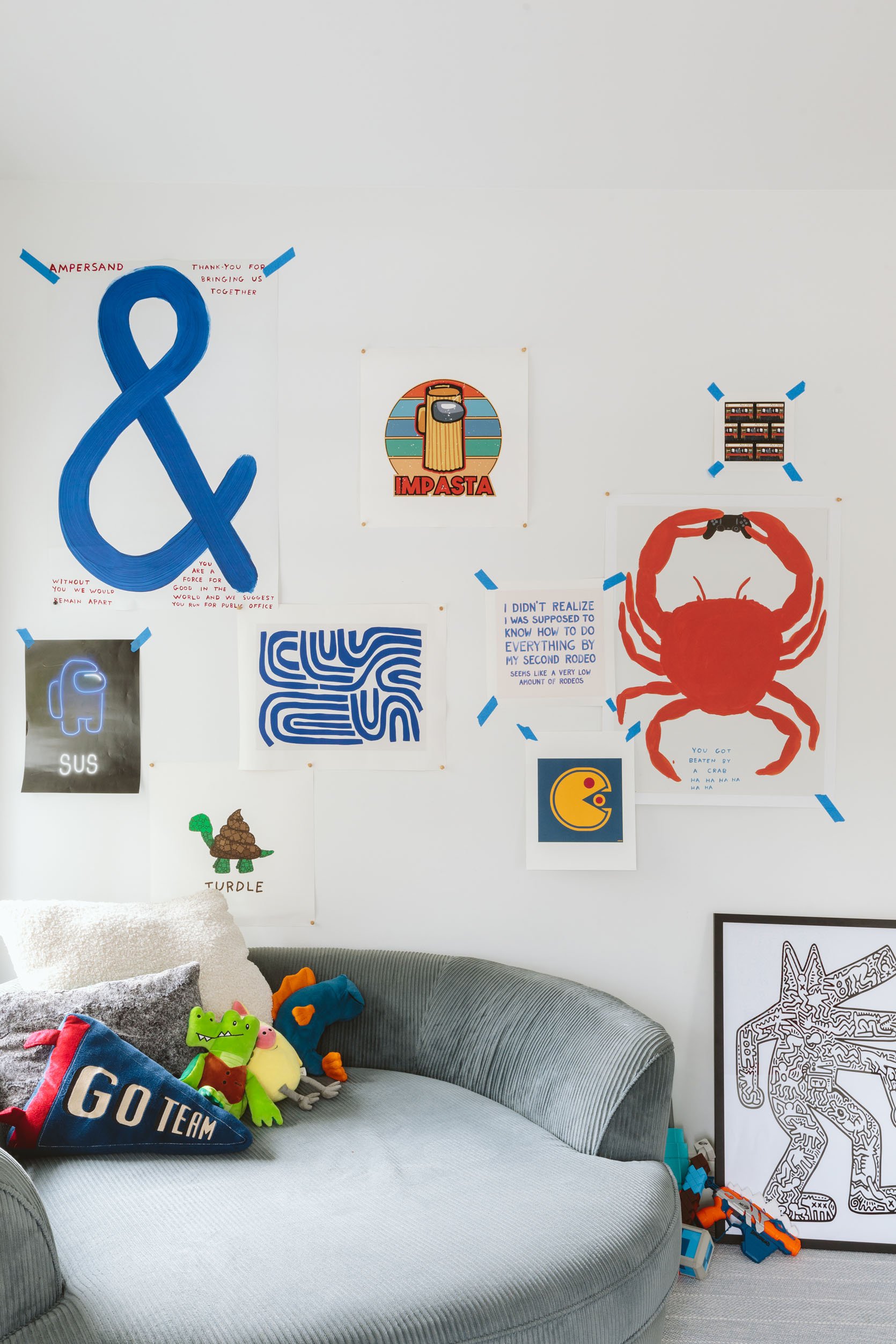
“&” Poster (David Shrigley) | Impasta Print | Sus Print | Turdle Print | Blue Lines Print | Pac Man Print | Second Rodeo Print | Mix Tape Print | Crab Print | Keith Haring Walking Dog Collage Figure
We were watching High School Musical: The Musical: The Series (which is a solid TV show that Bri and I even love a lot – it’s like a G-rated version of Glee) and Ricky (one of the characters) had a room full of posters like this. Charlie perked up and said, “I want that!!” and I loved the idea. They were all layered and haphazard which is a great vibe (and one that I’m tweaking). So I went on to Etsy and Society 6 and started pinning the ones that I loved. I made the mistake of googling “graffiti-inspired posters” with him and y’all it was mostly bad (think if Home Goods hired AI to create “graffiti” art), but once I shifted to David Shrigley and Keith Haring (which he learned about in art class at school) I was able to convince him to change. I am still looking for more graffiti-style art because he’s not satisfied, so I might reach out to my friend Timothy Goodman and see if he has any ideas 😉
Also, try to explain that rodeo print to children if they haven’t heard that phrase – it’s REALLY HARD.

Door Color | Desk (vintage) | Chair (vintage) | Smiley Face Neon Sign | Blue Light (vintage)
That desk was an expensive consignment shop purchase (shout out to PDX Hoot-N-Annie). It was $400 which I think is still overpriced, but Charlie was with me and LOVED IT. Then the more I thought about it the more I actually thought it was just so fun and perfect for him and that corner. I got it down to $350 (should be $125, but it is in perfect condition) and honestly, I LOVE the vibe. I got that smiley face neon sign from Urban Outfitters and Charlie hung it on his own – REALLY REALLY HIGH. But the more we hang his art around it the more I’m into the high art. When I asked him why he put it where he did he said, “the sun is really high, so …” and then it made total sense to me.


The desk is actually really big and spacious. And please note that he pulled my vintage wood hand sculptures from the prop room and put them on his desk!!! It was one of the first things that he really responded to (whereas Birdie wants almost everything in the prop room). It made me real happy. I got the blue lamp on Craigslist last year in Portland and the red lamp from Hay four years ago.
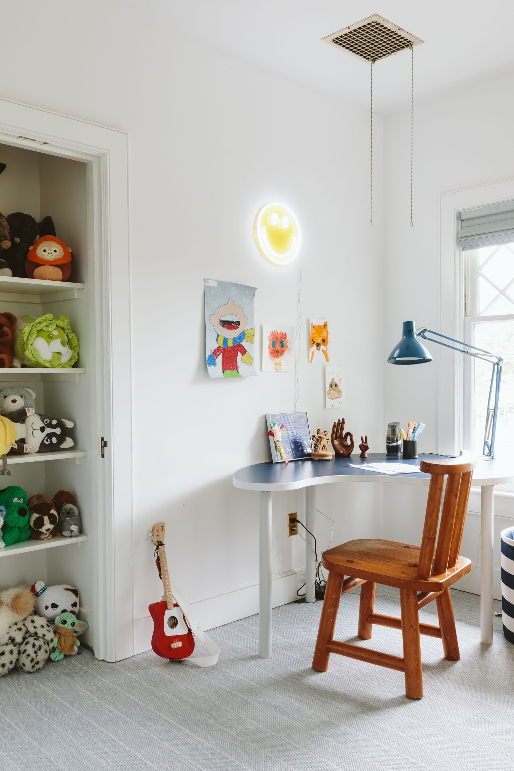
I can’t wait to fill that wall full of his art, or posters, or other things he loves. It should be a big old casual mashup. I’m not sure if I’m going to do a huge corkboard, masonite, or just tape to the wall but the vibe will be casual and something he can add to himself.
I have a few ideas I’m toying with – a simple stripe or spiral stripe mural throughout the room (and ceiling?), a fun mural on the ceiling, or using contact paper to create a pattern or graphics all over the walls. I think something extra special like that could make all the haphazardness feel even more fun. It’s all happening in the background so stay tuned… xx
Resources:
Window Treatments: Decorview
Carpet: Stark Carpet
Wall Color: Extra White by Sherwin-Williams
Door Color: Upward by Sherwin-Williams
Outlet Covers: Rejuvenation
*Photos by Kaitlin Green
THIS POST WAS ORIGINALLY PUBLISHED HERE.


