Remember when I moved from my beloved, charming 1920s Mediterranean apartment into a more contemporary stark-white walled townhouse, and then wrote an article about how nothing I already owned felt right in there?
Well, if you don’t remember, you can find that here. And if you do, I’m back with more. While I will say that my “it’s all a disaster!” mania has cooled off and things are starting to feel a bit more like home—the product of taking a deep breath and hanging some art—there are areas I know need work. My cool-toned blue sofa, for one, would be so much better in a warm tone like ochre, for instance. But pish-posh, that’s a different fish to fry for another day.
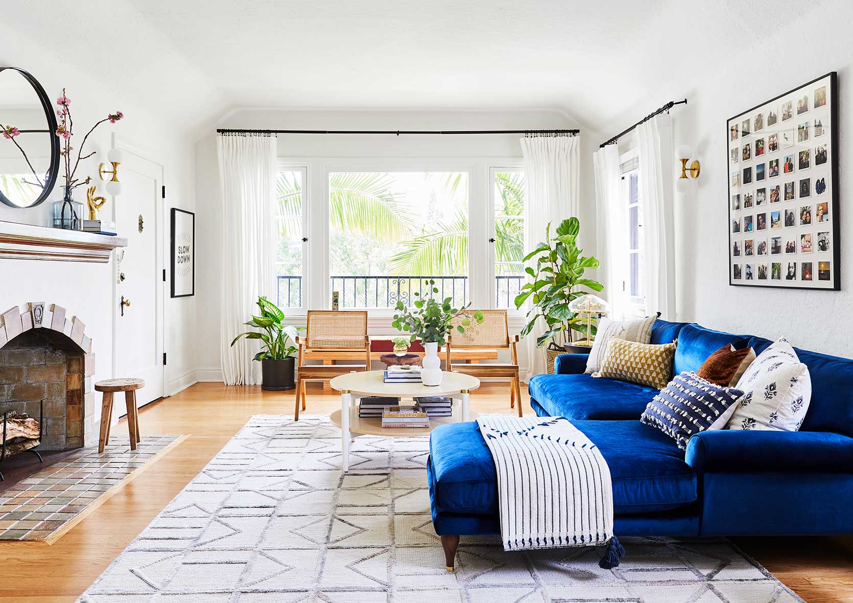
Today’s design discussion-slash-challenge happens to be what’s beyond my sofa: the curtains. The white, IKEA curtains that felt so pristine in my last home are suddenly as boring as a sack of all-purpose flour in their new spot. They framed my old second-floor picture window beautifully and added just the right amount of necessary softness to my plaster walls and White Dove walls (the perfect warm white, in my opinion). But these walls aren’t a glorious milky hue but rather a completely generic landlord-favorite Swiss Coffee. Suddenly, these curtains look tired. Perhaps they’ve also been waking at 3 am every morning to replace a baby’s pacifier. Such hard-working curtains, they are. And while that’s one totally plausible hypothesis, another is that…this room just needs something else.
If you were to take one tiny scroll through my saved folder of room images on Instagram or even Pinterest, you’d be correct to assume that I live for pattern and color. Except when you look at the first floor of my house, NOTHING IS PATTERNED and apart from my blue sofa, THERE IS NO COLOR. How did I get here?
In my hunt for a panacea or, at the very least, a design palette cleanse, I unearthed a bit of a trend I wanted to share that just might save my living room in its current state: the patterned curtain. I’m sure I don’t have to explain to you the absolute death grip the neutral window covering has had on the design world over the last decade (or…always?). Heck, most of the projects you see revealed around here play it safe with the ubiquitous white or flax linen panel and Roman shade.
There are, of course, a few reasons for this: they add just enough texture in a functional form (read: privacy) without fighting against or adding too much visual weight to a room’s design; they’re very easy to find at numerous price points; they’re classic; and, as mentioned, they’re a very safe choice for a usually very pricey item. Who wants to spend hundreds or even thousands on draperies in a floral pattern you might tire of before the spend seems worth it? I won’t even dignify that question with a response (no one, okay, that’s the answer).
But back to the “trend.” Interior design, in general, has really spread its wings in recent years on a mainstream level. People are wallpapering ceilings and painting everything in sight…I LOVE IT, so it’s no wonder I’ve been noticing far more designers and design content creators sidestep the white curtain for something in a rich solid hue, or, even better yet, a bold pattern.
The patterned window covering is everywhere right now, whether via just a subtle windowpane grid or a full-blown sprawling floral moment. And I can use several hundred words to tell you what that detail adds to a room scheme, but instead, let me show you.
First Up: The Solid Color Curtain
I know this is a post about patterned window textiles, but I kind of want to build up to it. Because, you know, drama and all. First, let’s start with some EHD baddies:
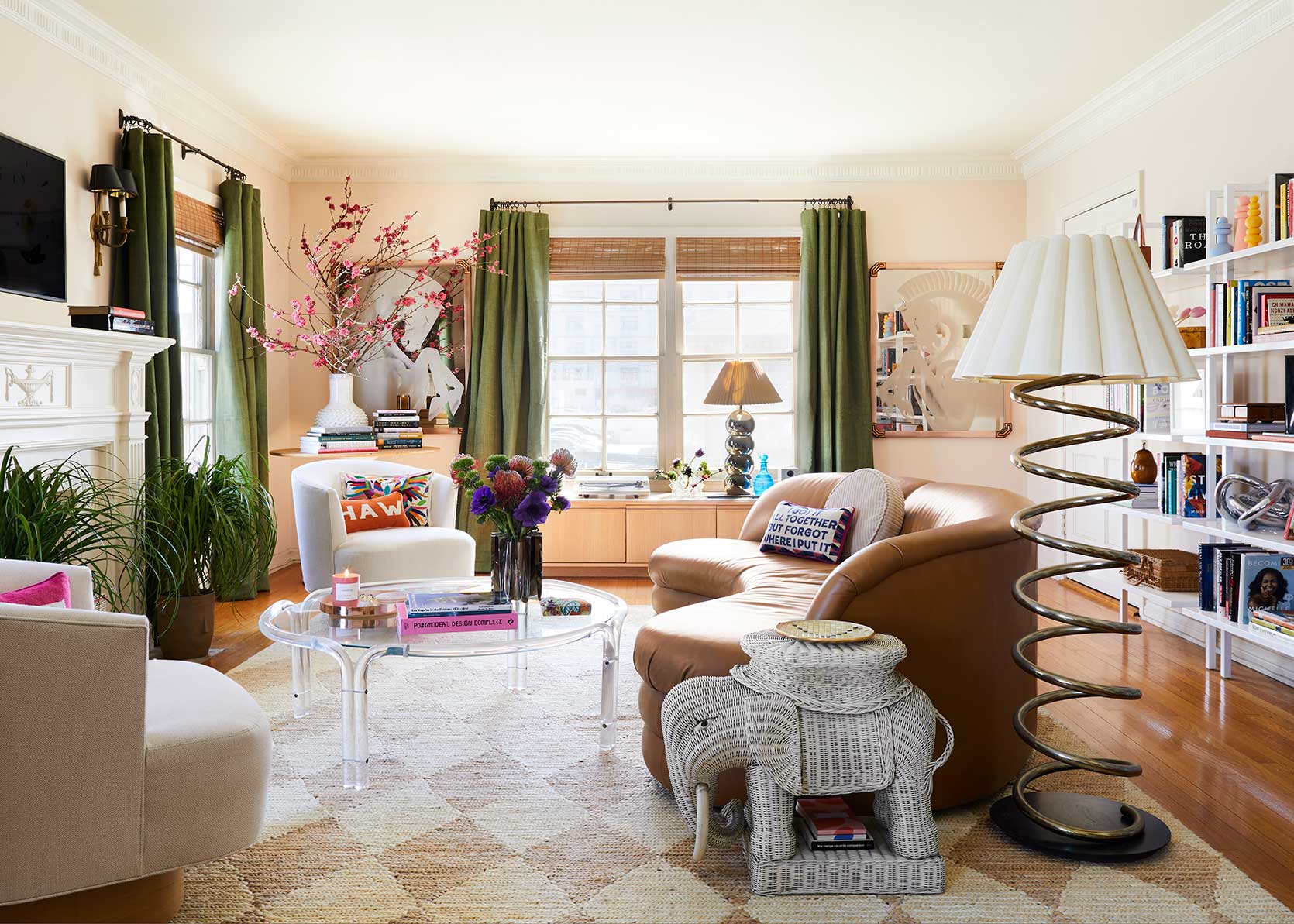
In Caitlin’s (long awaited) living room, the grass green panels are a key part of her color palette. Without them, the room would have been predominantly blushy peach and neutrals. Plus, they draw the eye to and from all her amazing vintage finds so perfectly.
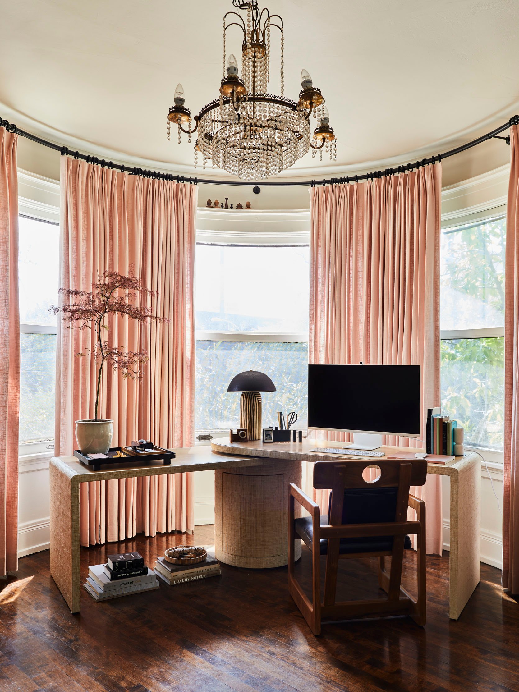
Isn’t this just so pretty?? I hope you all remember Jess’ office spruce up in her beautiful Old World apartment. The blush linen just glows against the turret window, a feat likely not able to be accomplished if she had gone for the subtly of white.
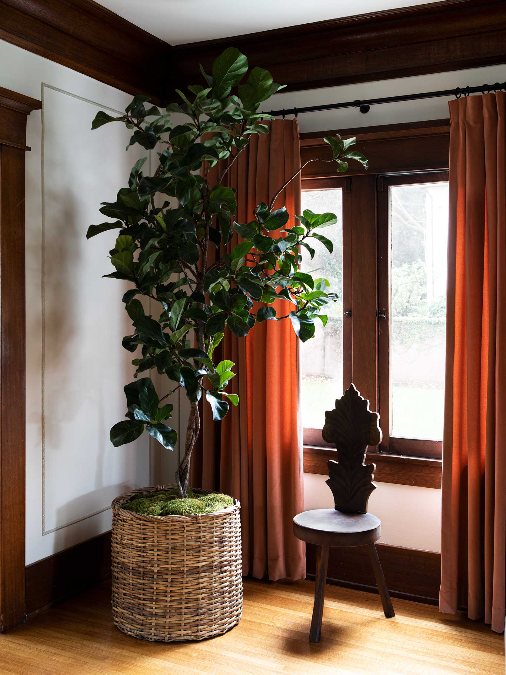
Moving on from our in-house friends is this vignette from Martha Mulholland. That whole home, actually, is so lovely and a testament to bold drapery. I personally think had she gone with beige or white panels in this room, it would have stolen the warmth of the window casing and woodwork. The rust makes them pop a bit more and leans into the character of the architecture.
Let’s Get Charmed By Some Prints
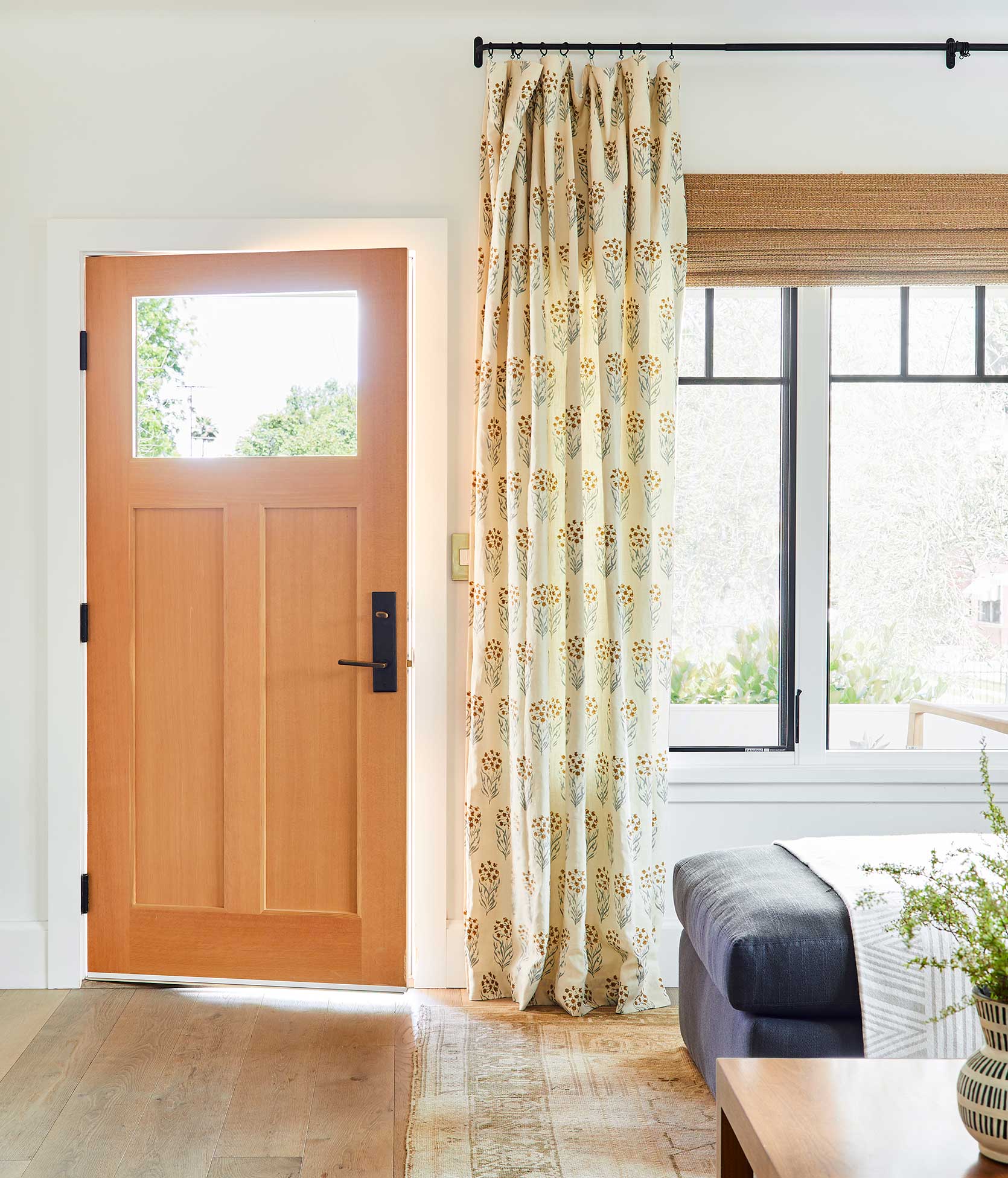
Behold, the photo I’ve had saved on my desktop for months that is possibly the most direct inspiration for what I want to do in my own living room. Shot for Emily’s second book, Rose Beltran’s block print curtains hit that perfect harmony between sweet, chic, interesting, and not overdone. I tried to hunt down this fabric but haven’t had much luck. Does anyone by chance know what it is?
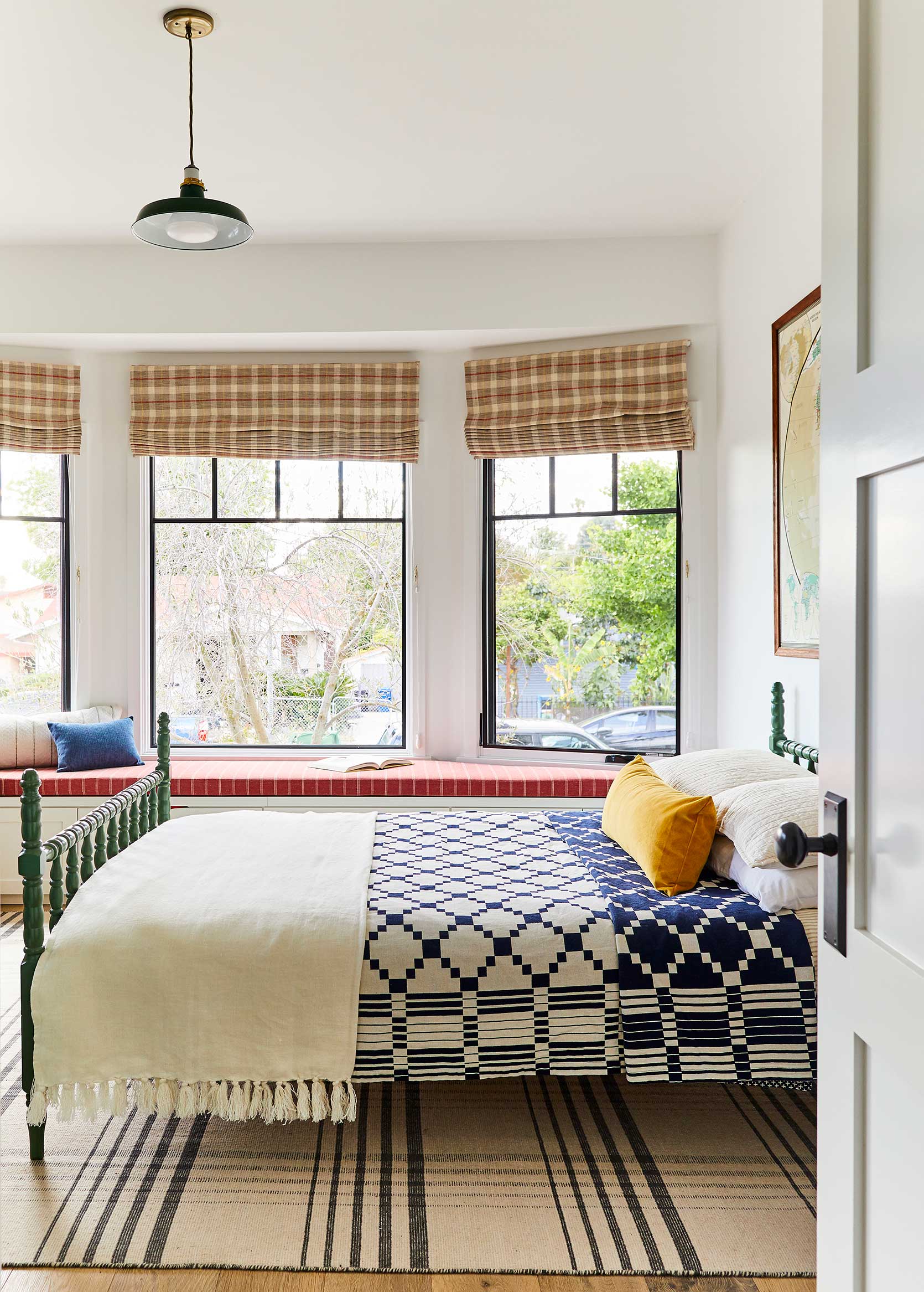
Here’s another room in that same home. Both have a modern yet cottage-y vibe, but I just think the plaid Romans here bring the fun and youthful design of the space up to balance everything else that’s low-slung (or the ceilings are really high, and even so, the point still stands). The patterned window covering is not just a design choice but also a tool.
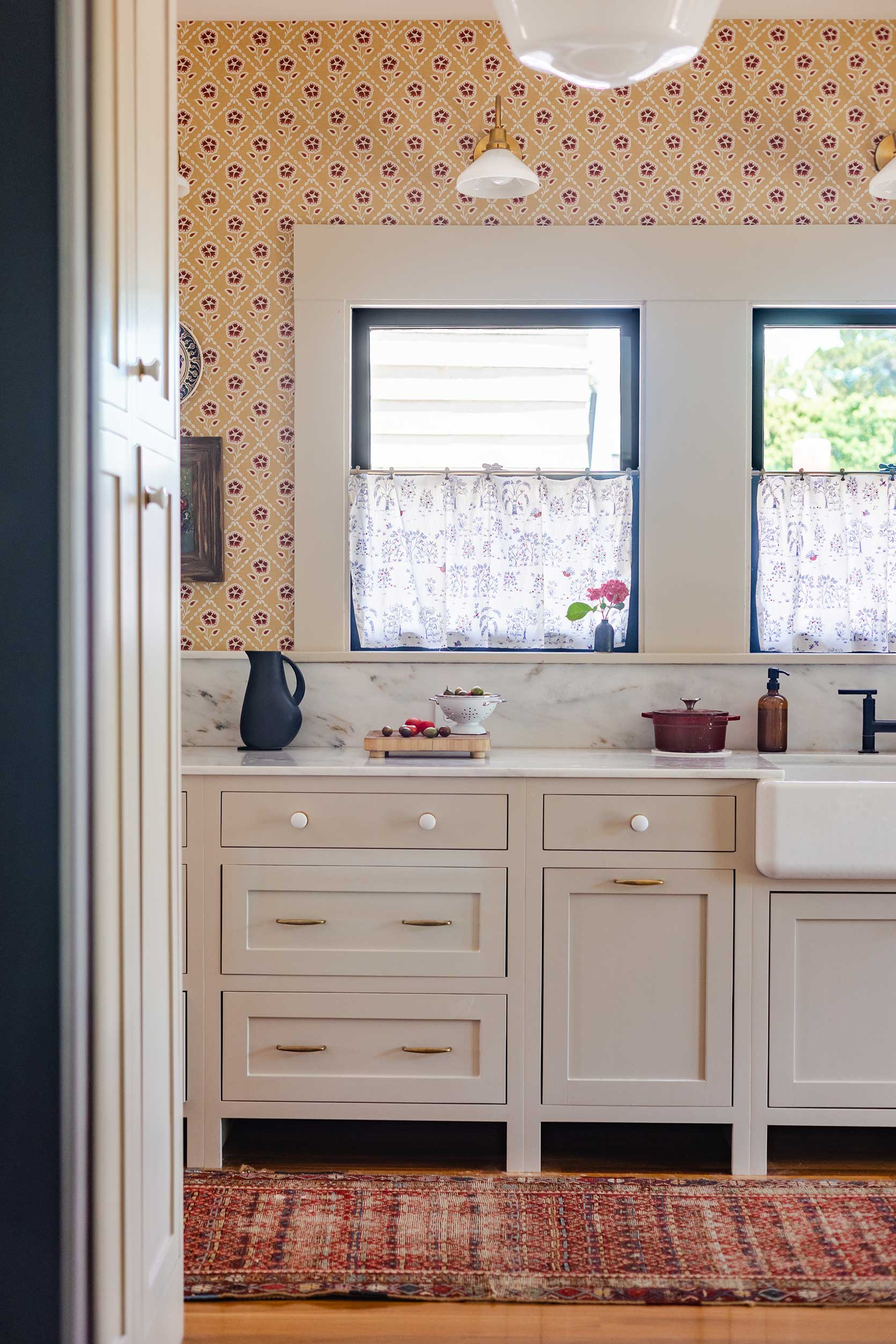
Many years ago, when I was a full-time EHD staffer, I ran a house tour of Ashley Goldman’s lovely craftsman in San Diego, and since then, I’ve enjoyed watching her update spaces like the kitchen while keeping to and respecting the era of the home. And man I love these little café curtains she did here. I like to play a game where I cover them up with my fingers and then reveal them back to myself to drive home my crush on all things print right now. The peppering of blue in the fabric is a great counterbalance to the oxblood in the rug, wallpaper, and cookware.
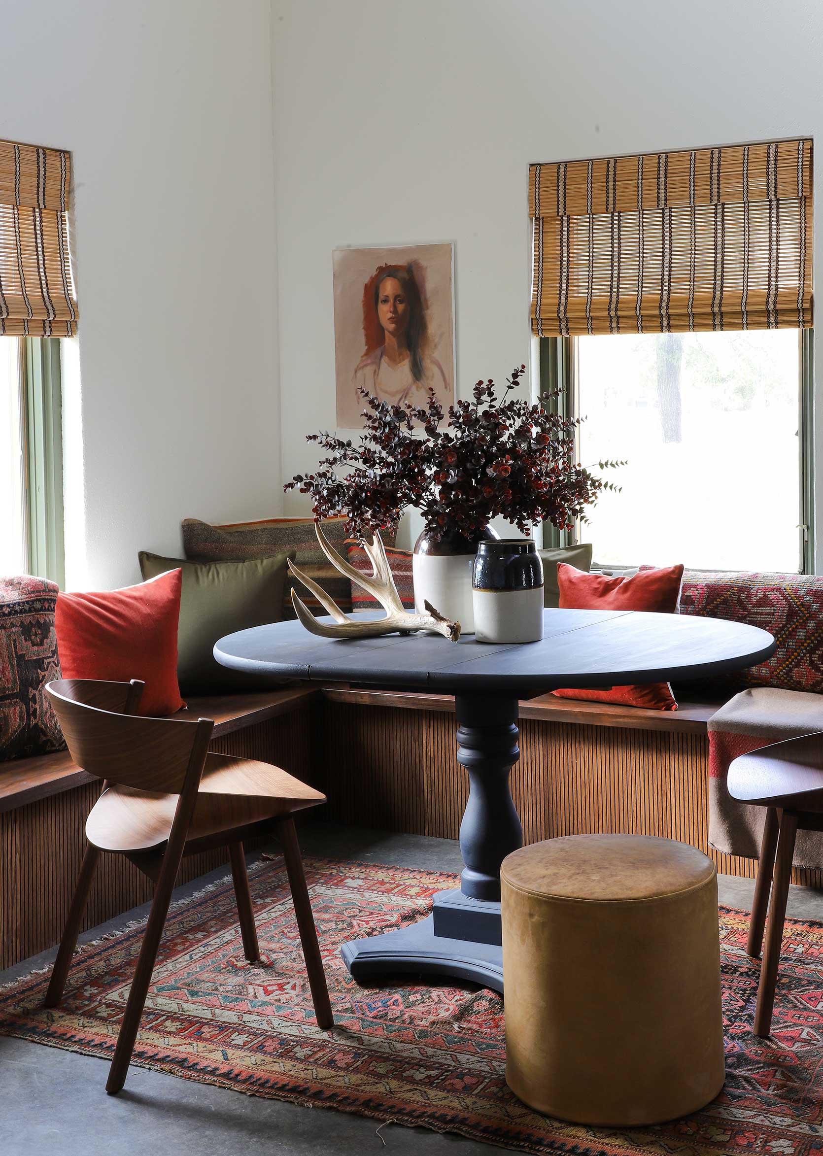
Hello striped bamboo shade! You see, not all pattern has to be like PATTERN!!! Even something like what Jenni Yolo picked for her dining nook with a simple black and white stripe is enough to add that touch of whimsy and cool.
It took me this many words to decide that the best way to describe going for a print on your curtains is like ordering the hot fudge sundae that comes with whipped cream, nuts, and a cherry, and then asking for the add-on of rainbow sprinkles, even though they’re not on the menu. The “rainbow sprinkle” is figurative here, of course, because only an animal would alter the perfect creation that is the HFS, but the attitude behind my analogy is what’s important.
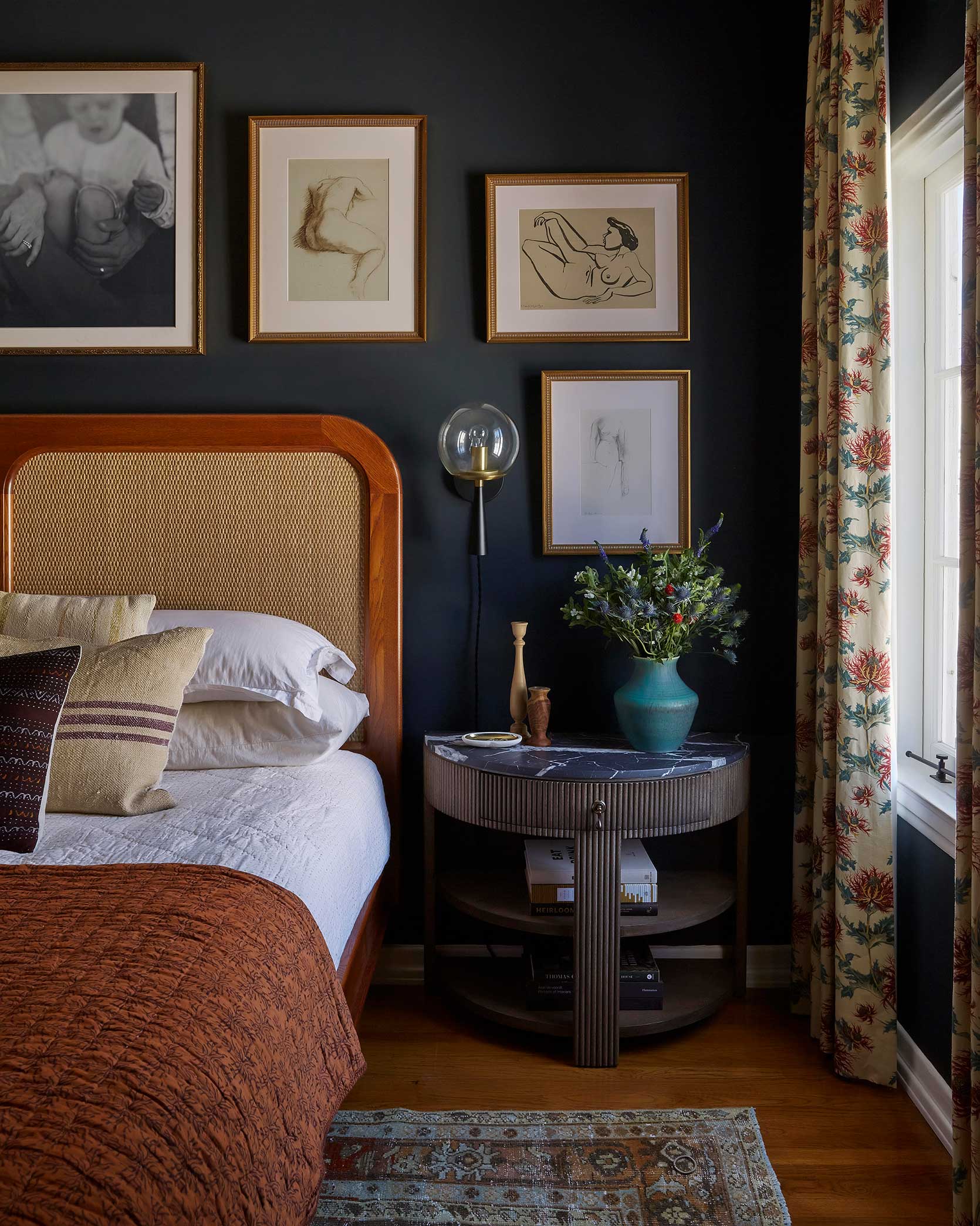
Rainbow. Freaking. Sprinkles. Dee Murphy could have easily gone the route of simple, neutral curtains. In fact, had I designed this room with all the same pieces, it’s probably what I would have done. Maaaybe I would have been bold enough to go for a tone-on-tone solid drapery but I would have never thought to pair that floral print with the vintage rug, but it works and it’s kind of a little design surprise. Some of my favorite rooms always have a moment of an unexpected choice. Something that doesn’t *super* match but works unexpectedly, and I think that’s what’s happening with these window treatments.
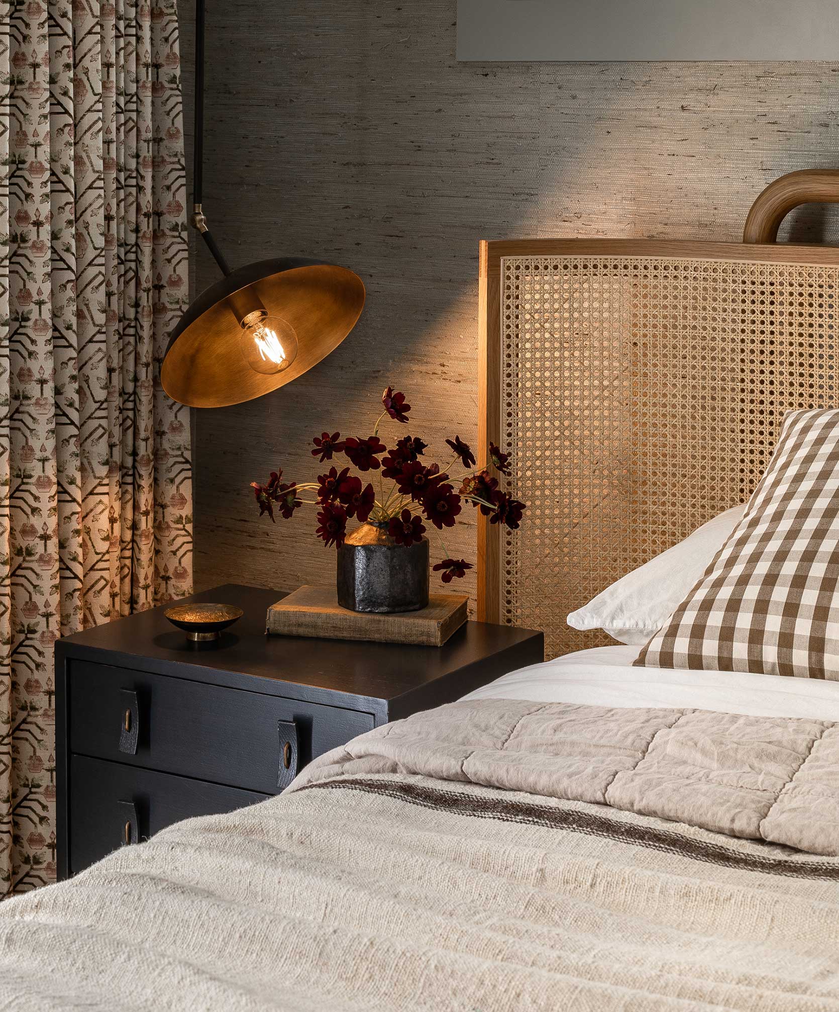
One of my favorite ways to introduce pattern in your curtains without it feeling scary is to stick to a very tight color palette like Heidi Caillier did in this bedroom. The gorgeous Zak+Fox fabric on the panels lives in the neutral, warm neutrals space as the bedding, wallpaper, and even furniture. That way, it’s pattern, but it’s more visual texture than a full-blown eye-catching graphic.
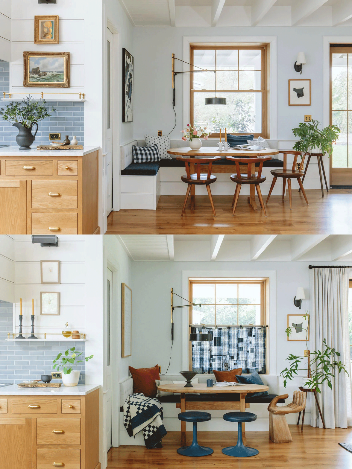
Now, let’s study Emily’s dining nook before and after she brought in her vintage Japanese Boro fabric cafe curtain. It’s obviously so lovely, but it takes on a whole new life with the magic of the textile, in my opinion. And yes, I know the “before” photo didn’t have any covering on the window, but I still think it’s a fair comparison for the point I’m writing about: pattern adds zest, life, and charm. Not every room or vignette calls for that, of course, but in the instance of what I’m working with in my space, it certainly does.
Some Quick & Dirty Advice
I can’t possibly guess the statistics of how many of you reading right now are all like “Yeah, duh, pattern is where it’s at” and how many are more “Sorry, you’re just not going to convince me and I’ll die with my white curtains,” but just in case there is a middle ground between those two stances, I wanted to offer some sure-fire ways to make printed window coverings work in your home if you’re interested in trying out the look.
First, go for timeless: Things like checks, plaid, stripes, smaller-scale block prints, and even certain florals are likely never going to be “out of style.” They’re classics for a reason and have an enduring quality to them stylistically, even in more daring colors.
Don’t spend a fortune: As much as I love to tell people to invest in quality when and where they can, there are a lot of great ready-made options available for pretty decent price points (when compared to custom drapery). Another tip is not to forget to dig around second-hand markets for printed curtains. I’ve seen some of the people I follow find absolute gems for almost nothing. Take the money you save and get them laundered and hemmed to the size you need.
Test things out if you’re nervous: Want to know a fun little trick? Flat sheets or even large tablecloths can double as window panels depending on the size. Now, I’m not saying hang your sheets forever, but if you happen to have a patterned sheet you like, clip it up to your curtain rod and live with it for a few weeks and then see how you feel.
Time For A Little DIY Planning
Now that I’ve helped you, it’s time to help myself. Being that I already have 10 of these IKEA panels and would rather not have to buy all new draperies, I had the idea of dying and block printing them myself, because I have excess time on my hands as a new mother, and what else would I do with that then spend hours hand stamping flowers? In all honestly, I love a mindless, repetitive project, and I think I’d feel pretty dang proud of my work once complete every time I looked up from the sofa.
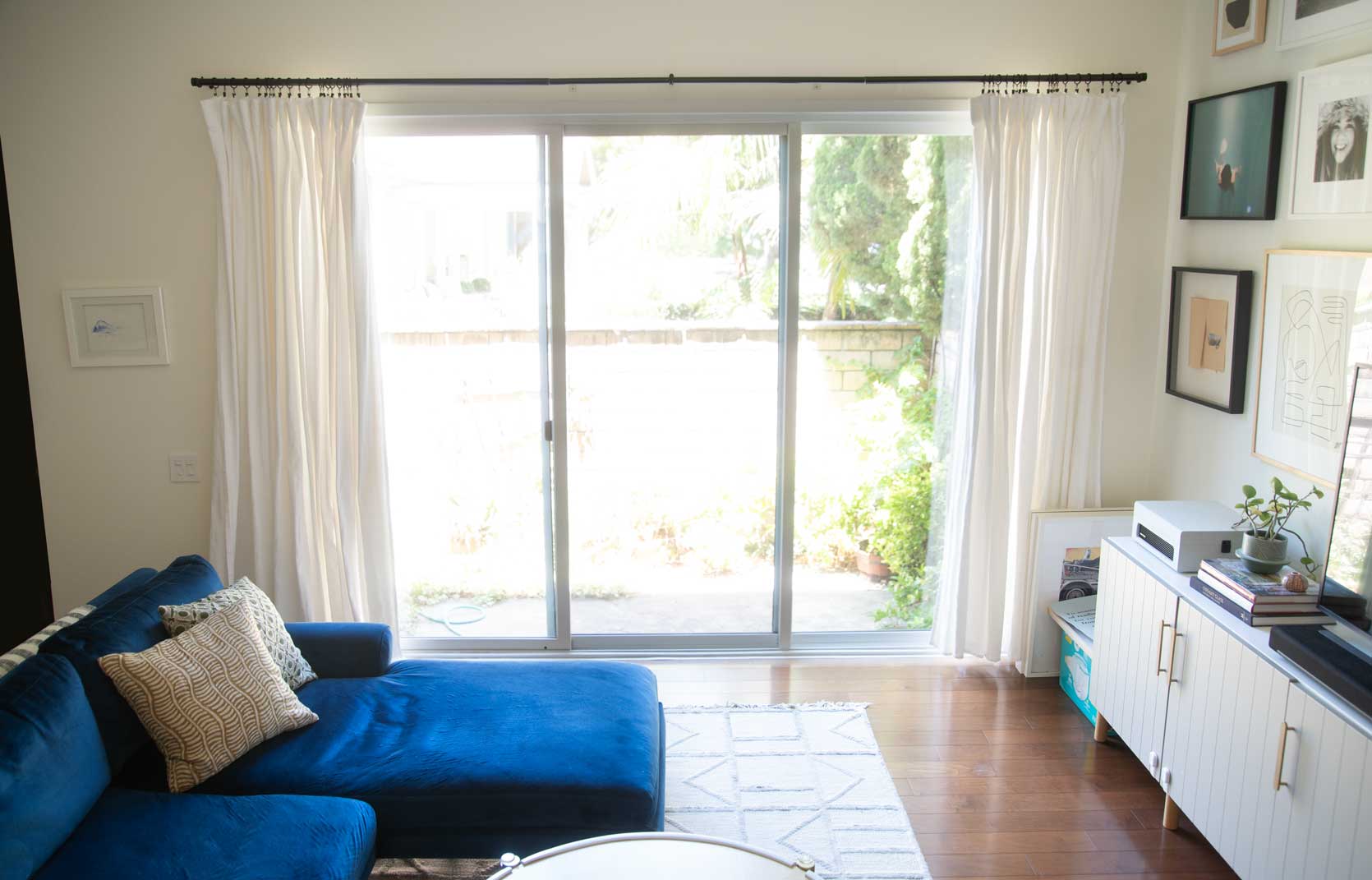
Here is a snapshot of my living room as it stands. A few things you can go ahead and ignore: the fact that my drapes are all clearly different lengths…I washed them and then only ironed half of them (the long ones) before it got dark and I had to put them all up, and then I just never got back to it. Oh, and the unkept patio behind the sliding glass doors. That’s a project for the future (stay tuned…maybe!). And of course the diaper box and unhung art in the right corner.
Do you see how the curtains feel limp, boring, and like they have the potential to be so much more? If they were the lead in a teen romcom circa 2002, they’d be on the precipice of removing their unsightly glasses, getting a chic bob haircut, and putting on a slinky red dress to inevitably win the guy and become prom queen. But for now, they’re the frumpy sad sack nerd who can’t be bothered to wear mascara.
As I mentioned, my loose inspiration is the curtains in Rose Beltran’s living room I showed above and I think that would be “easy” enough to accomplish. And by “easy,” I mean at least somewhat possible.
Take a gander at some quick Photoshop work to give you an idea of how things can look:
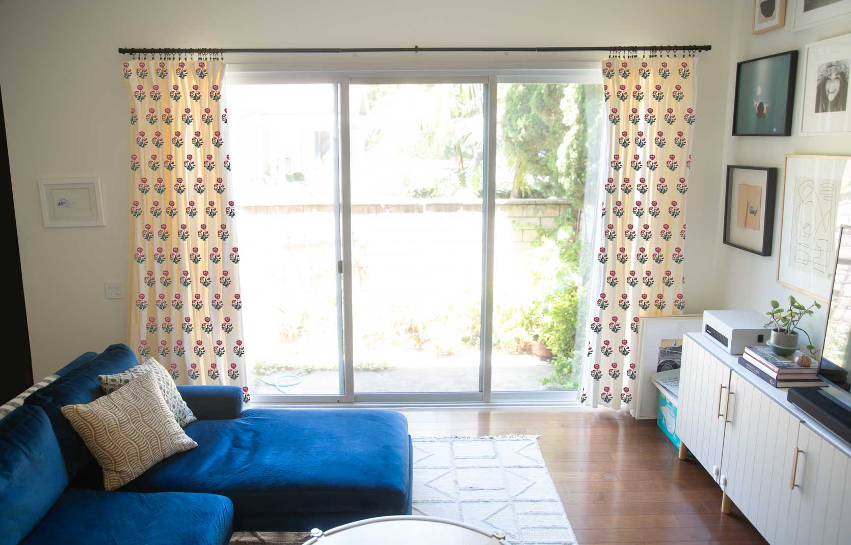
After digging around the RIT Dye website to find a combination of dyes that will turn the creamy white I have into a buttery tea-stained beige (a formulation they call Aged Ivory), I hunted down Rose Quartz and Lemon Yellow from my local art stores and started the search for a block print stamp and paint. My intention is to first dye all the panels in my washing machine (they actually suggest this, don’t be scared like Charles was when I talked him through the plan), get them all steamed and wrinkle-free, and then map out a grid for the flower print I bought.
You’ll have to imagine that the pattern isn’t straight on like that obviously, but rather folded into the curtains. I haven’t quite decided on the colors yet as I have some thinking to do with regards to an updated palette but I have ALWAYS loved a block print marigold or Scottish thistle. I mean, for well over a decade, so I just know that these will feel more me once finished. I think once I swap out some of my other soft goods like the pillows to better match the style, I’ll bring down the modern vibes to something more welcoming and charming.
If you’re wondering whether I’ve ever done this or not, the answer is a firm no, but I did one paint Kelly green chevrons on some curtains back in the chevron heyday and that turned out okay, so I think I’ve got it in me to do.
Thoughts? Prayers?
Shop the Trend
Before signing off so I can get to work rehabbing my existing curtains, I window-shopped a little for myself in case this plan goes south and I need to indeed buy new panels. Here are some of the ones I’d maybe consider, as well as a few I’ll dream about but likely won’t invest in.
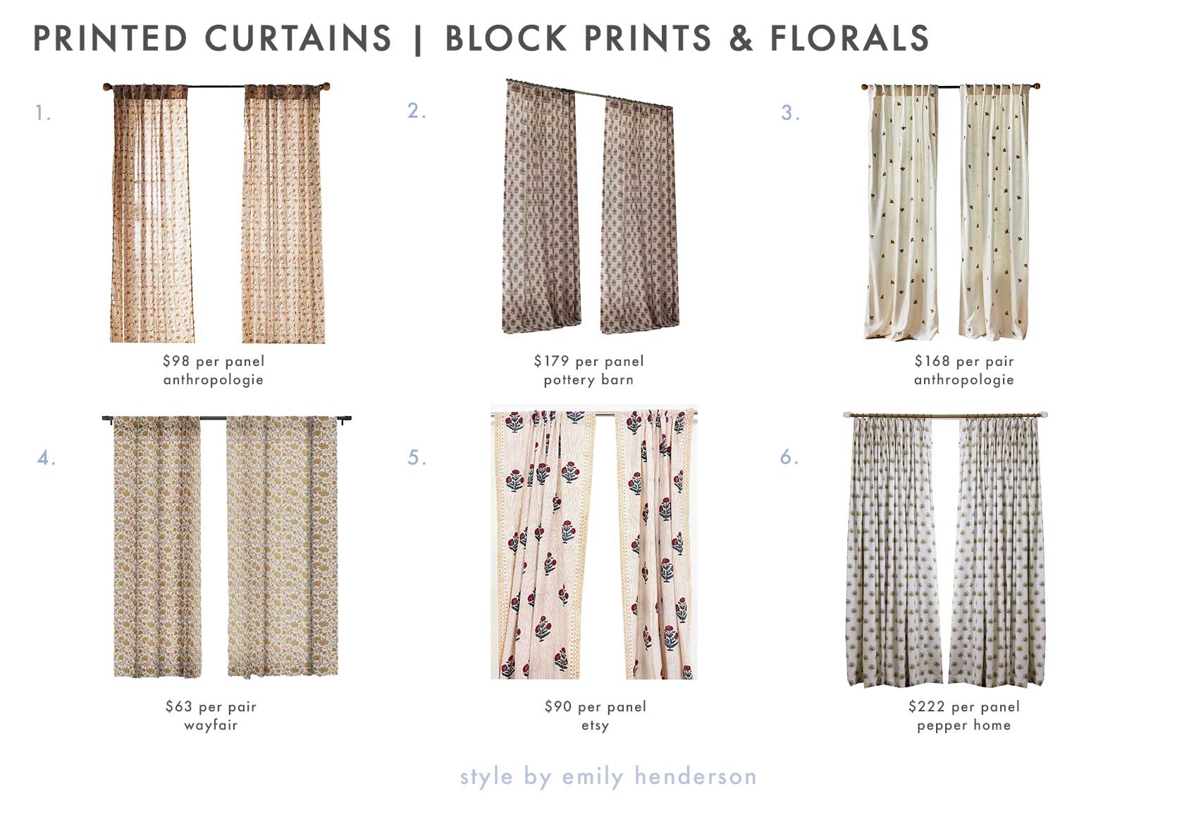
- Amber Lewis for Anthropologie Rowena Curtain 50″x96″ | 2. Arnica Bhotah Floral Curtain 50″x96″ | 3. Abeille Curtain 50″x96″ | 4. Holli Zollinger Kalami Floral 1pc Blackout Window Curtain Panel 50″x96″ | 5. Red + Blue Poppy Flower Hand Block Printed Cotton Curtains 46″x98″ | 6. Penelope Moss Custom Curtain 50″x96″
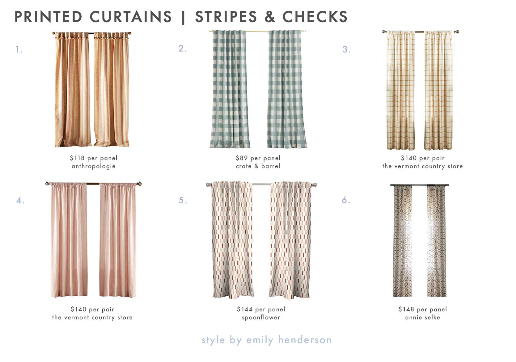
1. Pieced Stripe Curtain 50″x96″ | 2. Blue Buffalo Check Cotton Blackout Window Curtain Panel 44″x96″ | 3. Windowpane Plaid Rod Pocket Curtains | 4. Ticking Stripe Rod Pocket Curtains 100″x96″ | 5. Dash – Block Print Boho Curtain Panel by littlearrowdecor 50″x96″ | 6. Tatum Ivory Curtain Panel 50″x96″
Stay tuned EHD friends for how this all turns out. These curtains are phase 1 of a living room refresh that mostly involves new textiles and styling, but I’ll be sure to keep you posted.
Until next time…
THIS POST WAS ORIGINALLY PUBLISHED HERE.


